Time for an updated look at the big picture: is a secular commodities peak ahead or behind us?
Here is the equally weighted commodities index. It remains in the nose of a large triangle. A decisive break down through the twin supports will add weight to a secular commodities peak having already occurred in 2011, whereas an upwards break beyond down sloping resistance will add weight to a secular bull still in tact.
 Source: MCRI
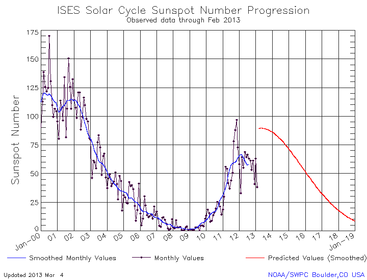
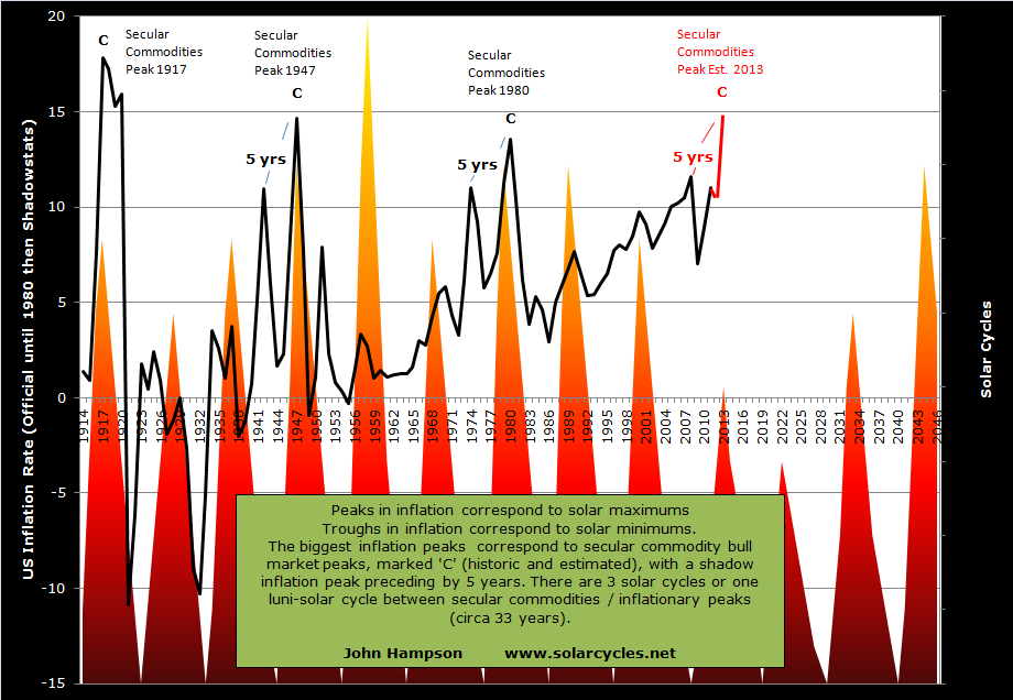
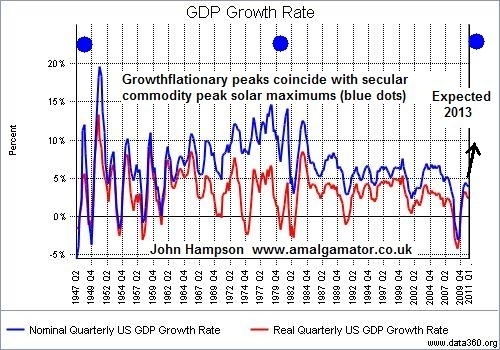
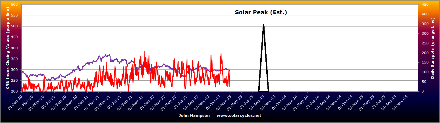
By solar/secular history, a secular commodities peak normally occurs around or closely following a solar maximum. However, that too remains in the balance as shown by the alternate predictions in the SIDC chart below – either a solar peak occurred at the turn of 2012 or a solar peak is ahead later this year.
 Source: SIDC
The most common consensus remains that the solar peak is rather ahead than behind us, with the median forecast for Autumn/Fall 2013. Planetary models predict a spike in sunspot action around Sept/Oct 2013 and some physicists also predict a burst in activity later this year, which would fulfil the NOAA red line prediction below:
However, until such a flurry is seen, it remains unresolved.
Danny challenged the 33 year secular commodities peak and solar peak correlation with this chart:
 It is an ultra long term modelling of commodity prices, to which I have added the markers to show when the industrial revolution began and when the gold standard was abolished. It can be seen that the correlation in solar peaks and commodities peaks largely failed prior to the industrial revolution. Understand that prior to this time there were only localised markets for commodities, little storage, and almost nothing in the way of demand and supply matching. Farmers tended to grow their usual crop, bring it to market, get the best price they could for it, and anything unsold went to waste. For a natural cycle that influences collective human behaviour to manifest itself, I suggest optimum conditions are instant, globalised, free markets, like we have in the current day and age. In pre-revolution conditions, it would have been impossible to draw out real cycles from slow, localised, restricted and fragmented markets. I don’t see that part of the chart as valid therefore. See also below how the solar/secular oscillation in the Dow-gold ratio became pronounced after the freeing of gold and paper:
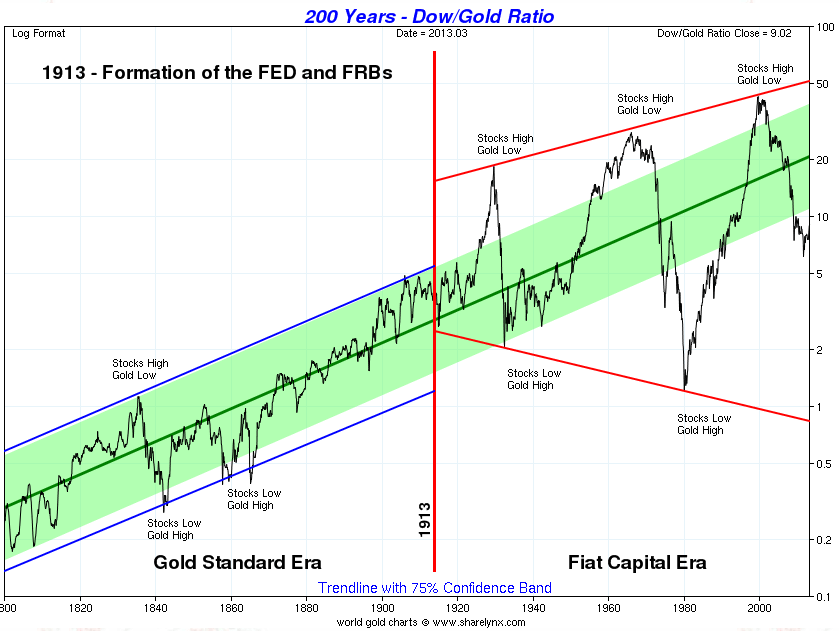
Source: Sharelynx
So, returning to the ultra long term commodities price chart above, we see an broken success rate (as shown by the circles) in the fiat era and between the industrial revolution and fiat era two successes and a potential inversion or double failure. However we classify that anomaly, such a failure could potentially reoccur in the future – unless it was the result of a non-free, slow, localised era. But a failure amongst a majority of successes would be in line with all other ‘real’ trading disciplines, i.e. there is no holy grail, nothing that works all the time, just things that work most of the time. To sum up, the solar peak is probably ahead, and the secular commodities peak is probably ahead in line with that.
Turning to climate and agricultural commodities, are we going to see another year of extreme temperatures and natural disasters, which would drive up commodity prices? The next chart reveals that the last two years have not been as severe as a cluster before that. However, they were both La Nina years, which has a cooling effect.

Source: NOAA
This year, a largely neutral year is expected (no dominance of La Nina – or El Nino either) so there is the potential for a bigger bar – unless the long term trend is now reversing.
Global warming is one factor, global wierding (rate of natural disasters) another, and in the US, drought conditions at the start of 2013 are displaying patterns that could unfold into the equivalent of the worst drought years in history. Grains took a big hit in price this last week due to higher than expected plantings and stockpiles, but there remains the potential that climate developments could drive agricultural commodities higher again in the remainder of the year.
Rising commodity prices and inflation together make a mutually reinforcing feedback loop. Escalating commodity prices drive up inflation and escalating inflation attracts money into commodities as an inflation hedge. So how do inflation expectations look, aside any climate developments? The next chart shows expectations have been on the rise since Q3 2012, with a divergence in gold that we might expect will be rectified:
 Source: M Boesler
If gold is not to make up that ground, then we might expect inflation expectations to fall instead – i.e. a period of deflation would be ahead.
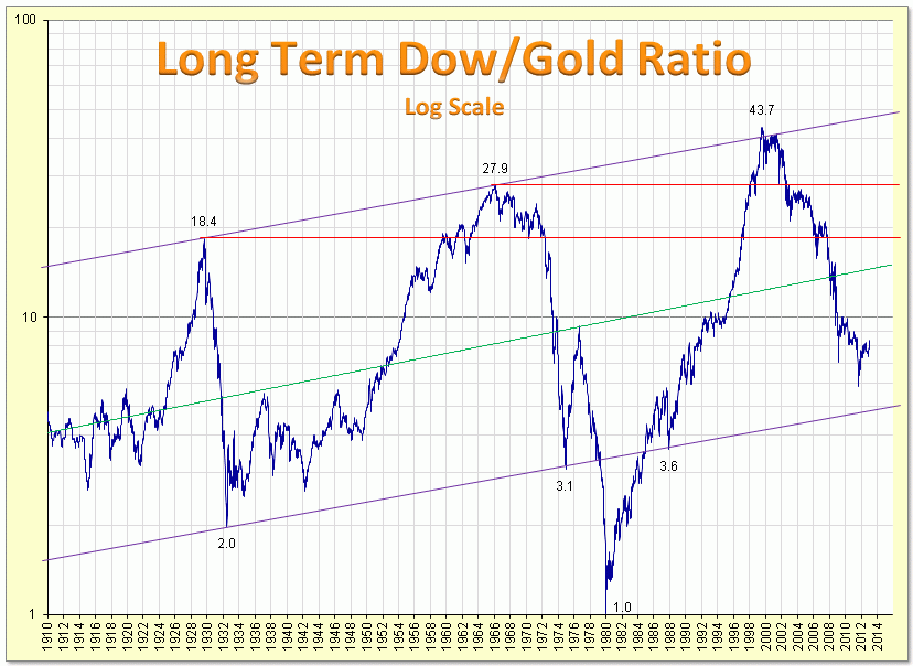
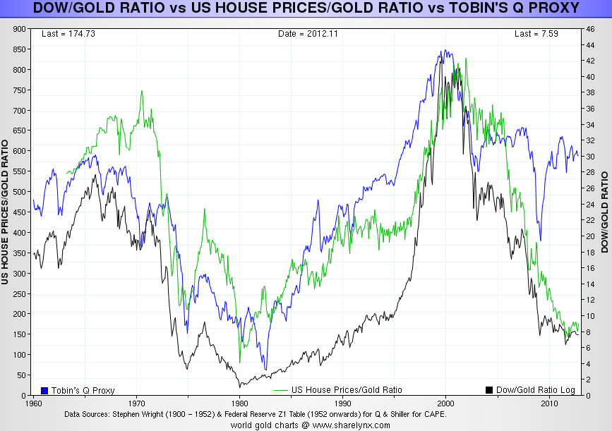
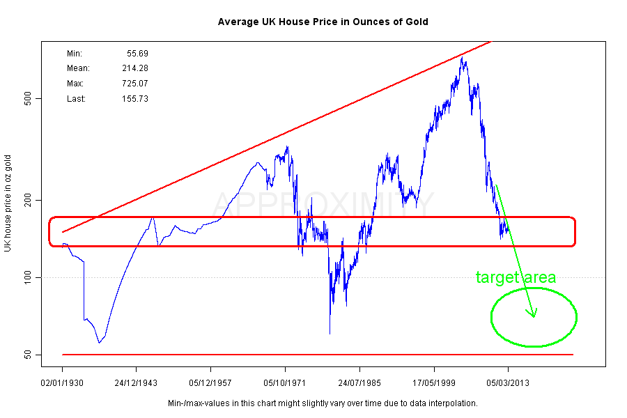
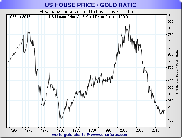
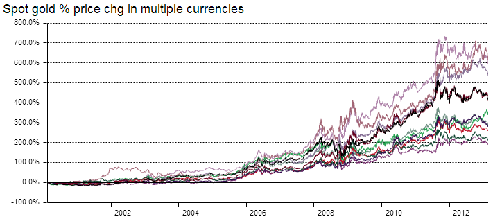
Turning to valuations, gold is historically expensive here versus stocks and real estate, but could yet become more extreme expensive before reversing.
Source: Fred
Source: Approximity
 All 3 charts reveal gold’s meteoric relative rise in price to stocks and real estate since 2000. The question is, does it have a parabolic finale yet to come in which it reaches the obvious zones, or is going to stop short and is already in relative decline?
If gold has already made its secular top (in 2011), then we would expect stocks to be now in a new secular bull. So did stocks wash out sufficiently, in terms of price/earnings and price/book valuations, to make it likely the secular bear is over? So far in the secular bear, the FTSE reached a p/e of 7, the Dax 9, the Hang Seng 8, the SP500 and Dow 9. The Nikkei only reached 13, but it made a p/b ratio of under 1. Broadly speaking, they are all low enough to satisfy secular bear cleansing, and we can add to that the extreme low p/es reached in the PIIGS at the height of the Eurozone crisis. If we look at other valuation measures in relation to the SP500 then we get a different picture:
 Source: Dshort
These four valuations combined suggest the secular bear has not washed through sufficiently, and that current valuations are closer to a top than a bottom. However, we ought to note the much higher top in 2000 and question whether central bank policies of unprecedented easing and stimulus have dragged all these measures permanently higher.
US indices aside, we have reasonable evidence from around the world that secular cleansing could be largely complete in terms of valuations reached at the bottom of the falls in 2011. Plus this year we have what appears to be a new secular bull break out in the Japanese indices.
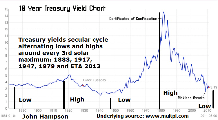
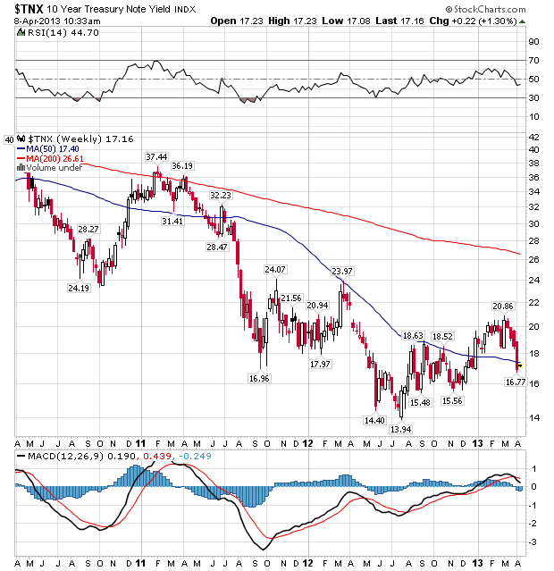
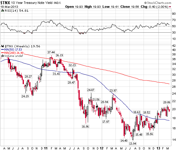
What about treasuries? This secular transition should also be accompanied by a secular transition in treasuries from a long term bull market to a new long term bear. Did treauries top – and yields bottom – in 2012? It remains to be seen as it is currently too technically ambiguous to say with confidence.
 Source: Stockcharts
Using history as our guide, if a secular commodities peak is ahead later this year (and potentially into H1 2014), then we should see a topping process in equities by around mid-year whilst commodities take over as the outperforming class. A feedback looping between inflation and commodities should occur, until too expensive commodity prices and tightening yields help push the economy into recession. That recession should be fairly mild, with stocks making a shallow bear market, whilst commodities plunge harder, in the mirror of their preceding parabolic escalation. The bottom of that shallow stocks bear would be the momentum ‘go’ point for the new secular stocks bull.
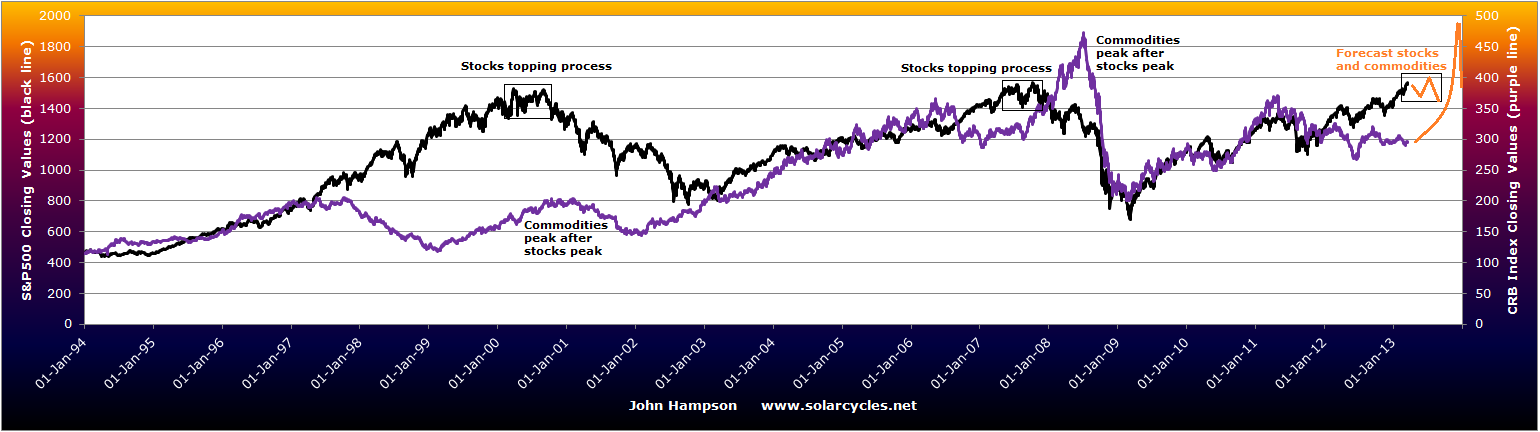
Alternatively, if a secular commodities peak already occurred in 2011, then secular bull momentum in stocks should already be underway, and we might point to action in the Nikkei or SP500 in 2013 as supporting evidence. The recession that should follow the secular commodities peak occurred then in 2011-12, with the Eurozone and the UK two notable areas that experienced this. It was not a world recession however, and we did not see typical cyclical stocks bull topping bells ringing preceding it. If we look at an overlay of the CCI commodities index on the MSCI World stock index, we can see that they topped together in April/May 2011:
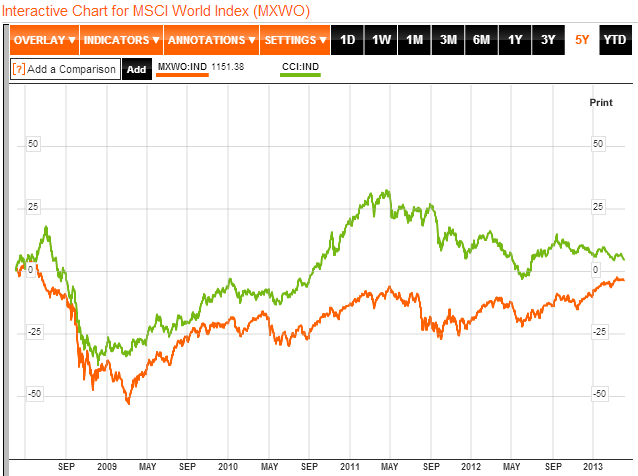 Source: Bloomberg
We did see outperformance in commodities, but not to the degree of 2008, or the last secular commodities bull peak of 1980. But silver did make a suitable parabolic blow-off in price.
To sum up, a case can be made for both competing scenarios: a secular commodities peak ahead or behind us in 2011. It remains in the balance, but not indefinitely. The CCI commodities index will break one way or the other. Gold will catch up to inflation expectations, or inflation expectations will fall. Sunspot evidence will come in more definitely in favour of a solar peak ahead or behind. Climate evidence as 2013 unfolds will drive agricultural commodities to escalating or plummeting prices. Equities will maintain secular bull momentum and outperformance of equities, or they will begin to make a topping process whilst commodities outperform.
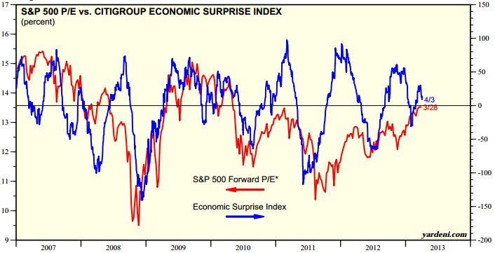
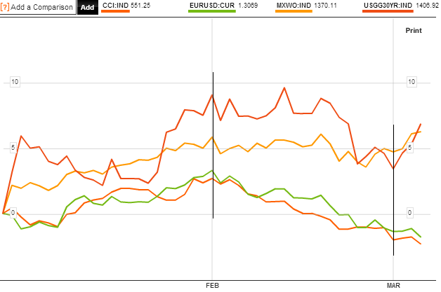
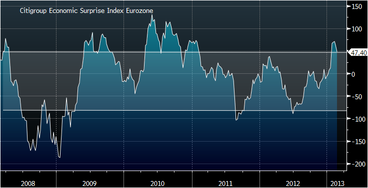
What about a third scenario: both equities and commodities drop here into a bear market, with treasuries the beneficiary? For that to occur, we should still need to see a topping process in stocks whilst leading indicators and internals deteriorate. Currently, we do not see major warning flags in either, with leading indicators and breadth supportive. However, we have lately seen changes in trend in economic surprises, both in the US and Europe:

 This coincides with the change in geomagnetism trend, and perhaps provides fuel for a pullback. I do not believe, however, that we have evidence for more than a swing pullback at this point, but it could become part of a more significant topping process that lasts several months.
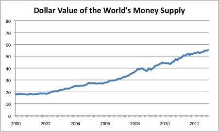
If we pull back and look at the wider environment for assets, we largely/generally have ultra low rates, central bank support, money supply growth, cash and bonds paying negligible or negative real returns, stock yields exceeding bond yields, low/spotty economic growth and not excessive inflation, and historically below average valuations for stocks and real estate. This is a fairly positive environment in which equities and housing can attract money flows, and that is what we are seeing. It would take another sharp slowdown in the world or another debt-related crisis coming to the fore somewhere, for this to change. The question is whether we have seen a sufficient cycle of cleansing since 2000 and sufficient foot-on-the-accelerator central bank action to now sustain growth. If growth can stick and even accelerate, then we have better chances of reaching growthlationary froth and the commodities/inflation feedback loop, as all the inflationary stimulus and easing could quickly become problematic, with faster money flows out of bonds.
Finally, a few more potential clues as to the likely winner in the scenarios. Crude oil inventories are approaching a record, which has the potential to pull the rug from under crude prices if growth stumbles. Inflation should make a bigger peak 5 years after 2008, which would be this year, based on secular/solar history. Emerging markets manufacturing surveys (a leading indicator) picked up to 52.6 in March (over 50 is growth), of which China is the biggest commodity consumer. Commodities generally move opposite to the US dollar, as they are priced in US dollars, and the US dollar could be ripe for a sustained decline as speculator positions hit a record and this has previously led a swing top.
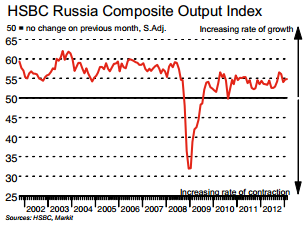
In conclusion, there remains no clear winner, with good evidence supporting a secular commodities peak ahead, or that it occurred already in 2011 and a new secular stocks bull is in progress. I maintain that the balance of probability lies with the secular commodities peak being ahead in H2 2013 – H1 2014, which should mean a cyclical stocks bull top occurring by mid-year 2013. However, if that is the case, then it should only give rise to a shallow stocks bear before new secular bull momentum. I am positioned for a secular commodities bull finale ahead, with significant exposure to precious metals, energy and agricultural commodities. I have only a position in Russia by way of equities exposure. So there is my concern: if the alternative scenario is the correct one, then my current portfolio will perform badly. However, if commodities did top in 2011, there should be an ‘echo’ bounce around 3-4 years later in line with history (as the commodities supply-demand story is not resolved overnight), which would be a belated opportunity to make some profits on those positions, with correct timing. In the meantime, evidence would increase in favour of a new secular stocks bull being underway and I would add trades there.
I will continue to weigh this up as developments come to light. Your views and any additional evidence very welcome. I have personally found that we have reached a period of time in the markets, and perhaps in my progress, where I don’t really feel there are any ‘experts’ out there I can rely on. I believe this is the difficulty of trying to navigate a secular transition, which in effect takes several years.

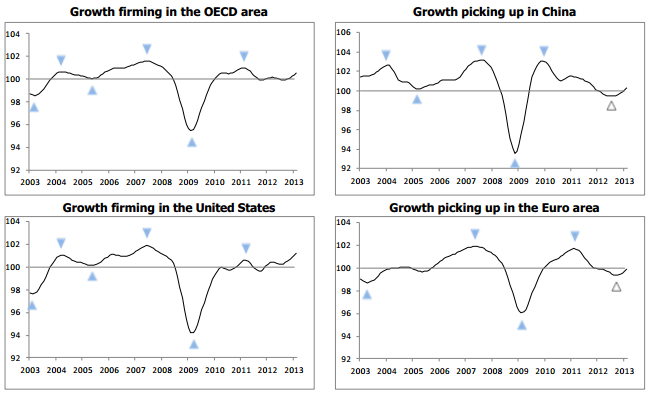 Source: OECD
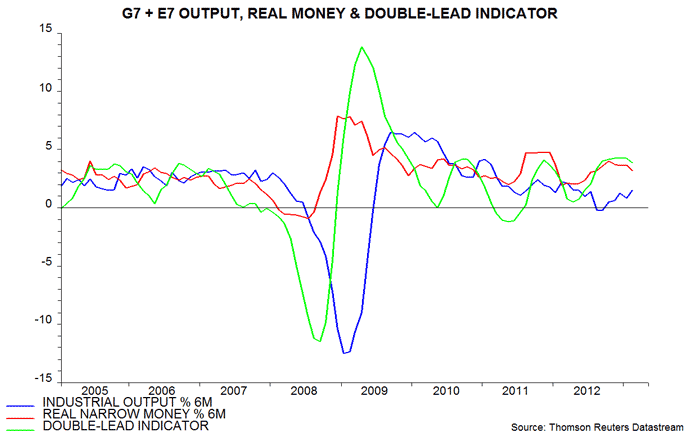 Source: Moneymovesmarkets
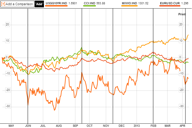 Source: Bloomberg
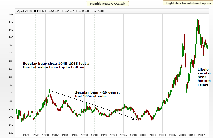


