Sunday Charts

Self-explanatory I believe, so no comments.

20nov1

19nov1

20nov3

sc-420nov30

20nov22

20nov20

Clear interest in physical gold and silver which suggests the turn should be near. For stocks it comes down to the short term waves within the overall picture of a major top. I can’t rule out a Xmas rally and no fresh falls until Jan, which would mean the US large cap indices all hit new highs (whilst not invalidating the bear). But I think the probability lies with this having been the second/retrace wave of a bear and that we tip over as soon as this coming week.

19nov20 sc2

Let’s see. Have a good week.

Just The Facts

US earnings: blended earnings growth stands at -2.2%, compared to an expected -5.2% before reporting began. So that’s quite a beat, and may account for some market fuel, but still negative. Blended revenue stands at -3.7%. With meagre sales revenues, companies have turned to buybacks and M&A. Take out the effects of oil and the dollar and earnings look better. The question remains whether oil and dollar are signs of creeping disease or whether they are more isolated issues.

Weak oil, weak commodities, strong dollar and global manufacturing flirting with recession. These are the main problems in 2015. As a result, emerging markets with more reliance on manufacturing or commodity exports are in trouble. Some refer to this as the 3rd phase of the financial crisis (P1 US financial system circa 2008, P2 Eurozone circa 2011, P3 Emerging markets 2014-5). The question is whether the world economy can recover here again and ease us away from those issues.

Disinflation remains the dominant theme. Deflation is a threat, but if we take out energy again then prices have held up better. So for now, CBs are not reaching their inflation targets but nor are we slipping into deflation. Somewhere in between.

The strength in 2015 remains in services, particularly US services. As we approach the end of 2015, leading indicators for the US have weakened whilst they have improved in China and Europe. Maybe then we are going to see another rotation in outperformance, keeping the global economy and equities supported. Or maybe the negative feedback looping is now too entrenched. If the US dollar is now kicking off a new leg higher then we are likely in for more trouble, so something to watch.

The stock market leads the economy, not the other way round. We can summarise the above by saying that the global economy is fragile and therefore that how equities perform from here is likely to dictate whether we tip over the edge into a deflationary recession or stay in disinflationary weak growth. The situation remains unclear for equities. Neither bulls nor bears can declare victory at this point. Evidence in indicators suggests a topping process has been in progress for 2 years. Torturous for both sides. Plus, we can’t rule out the prospect of an even longer sideways range trade.

By demographic trends, the age of the investor is over, at least for the foreseeable future. This is echoed in a bunch of charts that extrapolate future returns based on current valuations, market cap and more. They suggest the market is going to flirt with zero returns over the next decade.

7nov15

Source: AmericanAnnuityAdvocates

Equities struggled to make any more headway in H1 2015 with valuations in the 97th percentile historically, sentiment and leverage at all time record extremes, allocations to equities similar to previous major peaks. With a shrinking pool of buyers under demographic trends, there is a question mark over how stocks could now resume a bull market higher from here given the market appeared so saturated earlier in the year.

Here we see Rydex traders were at extreme allocations earlier this year equivalent to the 2000 mega peak, and how the recent rally has brought them back to fairly extreme levels.

7nov1

Source: Stockcharts

They appear to have been playing the Biotech mania ($IBB). Biotechs are valued at 7x price to book, which is the same as the Nasdaq was valued at, at the 2000 peak. Can Biotechs and Rydex traders resume upwards and make even greater highs here, to beat the biggest mania of all time?

The Dow Jones World index appears to show a topping process that ended in May 2015. If that is so then we ought to be on the cusp of a new leg down.

7nov4

Stocks to bonds and stocks to dollar continue to show a peak in mid-2014, equivalent to Jan 2000 or June 2007 as a lead for a bear market.

7nov7

In both that chart and the Dow World above, new highs are required by the bulls to negate the bearish patterns. New highs are some way higher, meaning that more US large cap indices could go make intermittent new highs here, without invalidating these bearish charts.

However, levels of insider selling and puts-calls suggest the rally in equities is unlikely to get much further.

Screen Shot 2015-11-07 at 10.54.57 Screen Shot 2015-11-07 at 10.54.25

Source: Barrons

Divergences in both volatility and credit spreads also cast doubt on equities breaking out of their overall topping arc.

5nov5

5nov10

Cutting across to gold, it suffered a fresh collapse this week, with commercial positioning having moved to short. As the second chart below shows, it may need to fall further yet, to new lows, before a bottom is found.

7nov70

7nov14

Source: The Daily Gold

This would fit with the new up leg in the US dollar which appears (tentatively) to have kicked off.

Regarding the sun, October was a period of low geomagnetism and increasing sunspots, both supportive of the rally in equities. Geomagnetism is back in progress the last several days and should this persist then it should act as a headwind to stocks.

7nov19

Source: Solen

All those indicators that I previously pointed out as peaking mid 2014 with the solar max remain just so. Stocks:bonds, stocks:dollar, vix (inverted) and credit spreads can all be found further up the page showing a June-July 2014 peak which is still honoured. So, for now, the idea that the mania peaked out with the solar max still has a multi-indicator case.

In summary, the big picture suggests equities are going to struggle to break out bullishly, both in the near and longer term. Equally, however, stocks have been bid back up strongly off the October lows. Therefore, we remain in limbo. Near term indicators suggest stocks should be ripe to tip over again. Meanwhile gold may need to washout further to new lows before finding a bottom. Those two don’t seem obviously compatible, unless the US dollar rallies strongly, which could well be initiating.

Lastly, global liquidity has turned negative as central banks have spent to defend their currencies and propped up their economies. The last time this occurred was 1980 to 1985.

5nov1

Source: Nowandfutures

But what saved our fortunes back then was the upturn in collective demographic trends, shown here:

7nov90

Now note the collective demographic downdraft that is in progress from here until mid-century. This suggests central banks are going to have to keep defending their currencies and propping up their economies despite massively ballooning debt and shrinking reserves already. It is very hard to see how the world can get out of this trap.

El Niño And Global Temperature

2015 so far is the hottest on record, globally land and ocean. Here is January-June:

18augu4

Source: NOAA

And here is July, the hottest month since records began in 1890:

18augu3Source: Slate

The weather phenomenon El Niño is partly responsible. El Niño years are typically hotter than others. 1997-1998 was one such event and gave rise to the outlier on the July chart above.

Sea temperatures so far in 2015 suggest this could be the strongest El Niño yet.

Screen Shot 2015-08-18 at 20.53.25

Source: CNN/NOAA

The impact is a disruption to world weather patterns, in a similar distribution to that shown here:

18augu2The trading relevance is the impact that may have on commodities:

18augu1

Source: WSJ

The stats since 1991 for El Niño years reveal this:

Screen Shot 2015-08-18 at 20.51.43

Source: FT

In short, some commodities may experience a price surge if factors converge, but a strong El Niño and record global temperatures do not guarantee a good return on a long basket of agricultural commodities, as the averages reveal. In fact Nickel turned out the best performer overall.

Agritultural commodities are currently flirting with their lows again and have come a long way down in price since 2011, but the chart shows that as a class they fell through 1997-1998 despite the weather and temperature factors:

18augu8Source: Investor Key

But things are different now to 1998. Stocks are likely making a bull market peak and deflation is the dominant theme. If we look back to the early 1930s, agricultural commodities were not immune from deflation: demand fell and so did prices. Yet, shortly after that, droughts (as may occur under El Niño) devastated harvests and prices shot up.

The other factor here is the pricing in dollars. Long dollar is a fairly crowded trade currently, and a reversal there could give softs prices a boost. But if the longer term bull trend in the dollar persists then commodities may be kept under pressure.

In summary, the potential for the hottest year and strongest El Niño on record are likely to cause natural disasters and disruptions around the world this year and into next, and certain agricultural commodities are likely to experience significant price rises where these factors converge with others. The broad agricultural ETF takes the guesswork out of which one(s), plus it is fairly beaten down and may represent a trade here. But the deflationary wave may intensify if stocks start to crumble, which could reduce demand further for commodities, and the dollar trend is also a factor.

I’m going to watch developments for signs of supply being notably disrupted and hold off until we see agri prices accordingly waking up, should that occur.


The Conundrum Of Our Times Part 2

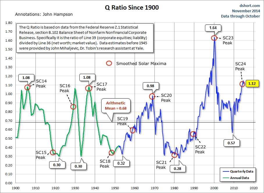
Let’s now draw in the solar cycle. Here are US equity valuations by Q ratio versus solar maxima over the last century. A relation becomes apparent with secular lows and highs.

15junn4

Source: D Short

We can see three that don’t fit so well. The 1929 stocks peak extended over a year beyond the SC16 peak, stocks sailed through the 1957 solar max and whilst the SC22 peak wasn’t so significant for US stocks it turned out the secular peak for the Nikkei.

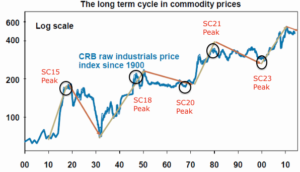
Now for the three secular ‘lows’ on the above chart (SC15, 18 and 21) we can cross reference to long term commodity prices and see that they instead marked secular highs in hard assets. Similarly, the secular stocks highs of SC23 and SC20 maxima marked secular commodities lows.

15junn3Solar science reveals peaks in human excitement at solar maxima (e.g. clusters of war). In the financial markets this appears to translate as peaks in speculation (and in the economy in peak activity). Therefore, it appears that the asset in favour at the time is bid up to a secular peak and subsequent pop around the solar max (with the rare exception, as with any indicator or discipline). So what would make the favoured asset stocks rather than commodities or vice versa?

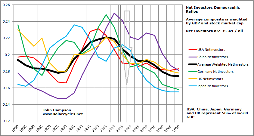
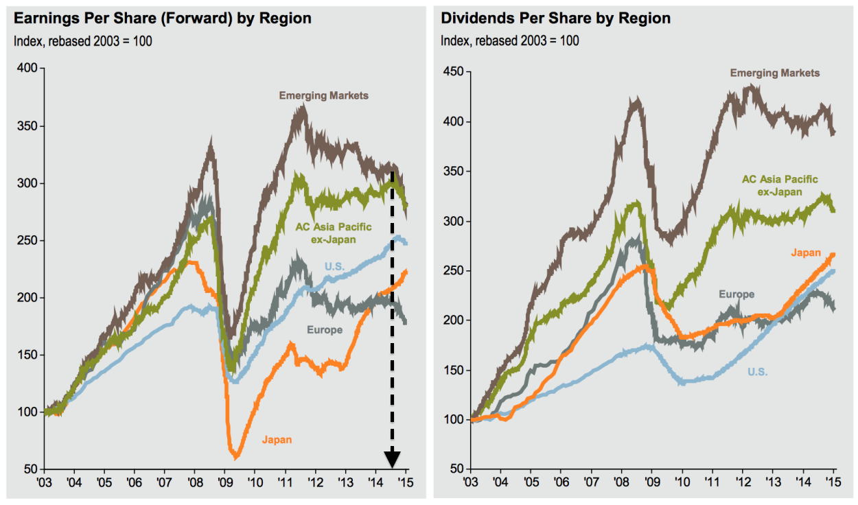
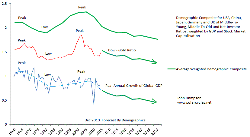
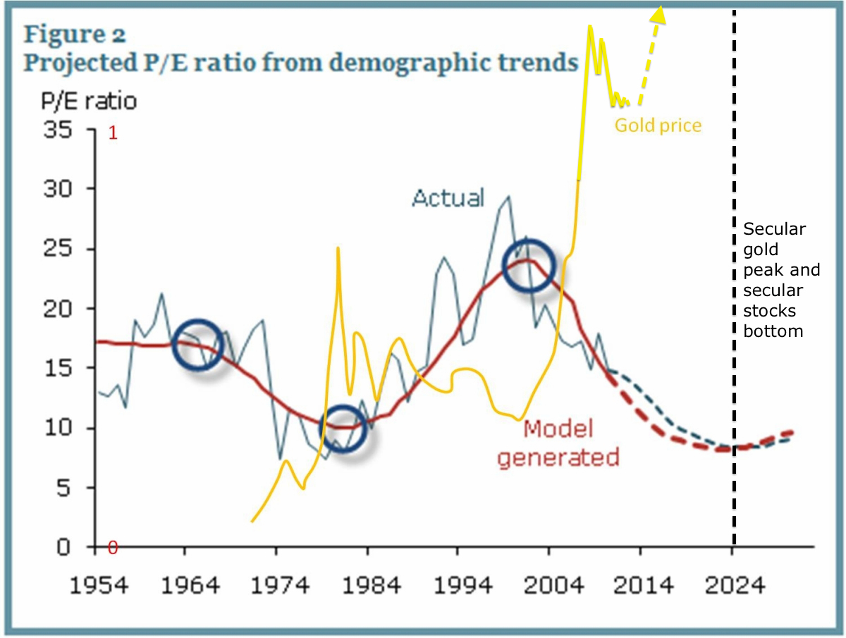
The evidence suggests it is demographics, namely that secular = demographic. The chart below reveals equity valuations tracking US demographics and gold moving in opposite directions. Therefore we see a secular peak in gold at the demographic low and a secular peak in stocks at the demographic high.

15junn13

The picture is enhanced when we discover that solar cycles influence birth rates, which may account for why demographic peaks often tie in with solar peaks.

The chart below shows how Japanese demographics peaked out first in the late 1980s, which explains why Japanese equities made their secular peak at the 1989 solar max whilst other major nation stock markets continued to advance under positive demographics.

15junn11

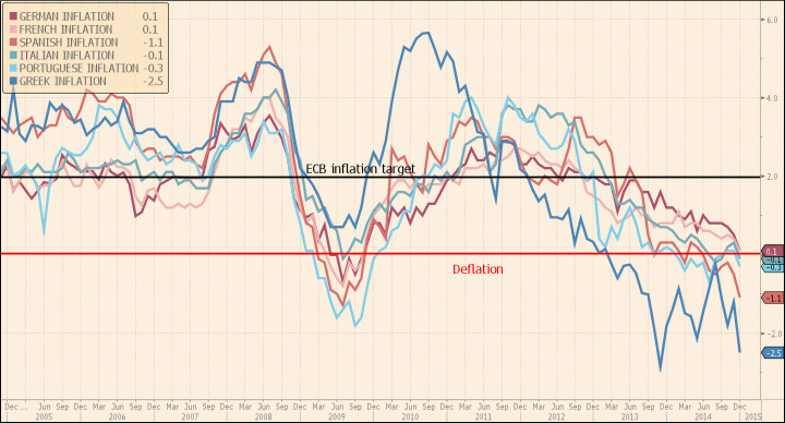
The current relevance of the chart is that the global demographic composite is definitively negative, and this is echoed in other demographic variants. Together they spell recessionary and deflationary pressures, which we are seeing in reality. But they also should be sinking equities and launching gold, which we are not (currently) seeing. More on that shortly.

15junn15

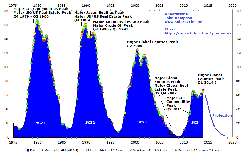
Solar cycles are long cycles, but armed with the above information we got the chance for a real time test with the SC24 max, which now appears to have been centred around April 2014 (smoothed max).

Two things were anomalous about the SC24 max. It was lower intensity (less sunspots overall) and it took longer to form (including a higher second peak).

15junn17

The average duration between solar maxima is 11 years 1 month, but the SC24 max didn’t form until 14 years 1 month after the SC23 max, which makes it an outlier. Is this relevant? Well, a major commodities peak occurred in April 2011, exactly 11 years 1 month after the SC23 max.

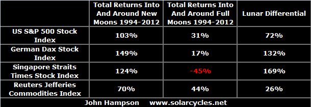
Tangent for a moment. Here is the influence of the lunar phase cycle on the markets: it makes for a fortnightly oscillation with distinct measurable returns over time.

15junn19

The most plausible explanation is the influence of nocturnal illumination levels on evolving humans. Yet, the influence is still present despite living under artificial lighting for several generations. Therefore it would appear to be hardcoded to some degree: we oscillate internally with the moon cycle, to some extent. Might the solar cycle also be to some degree hardcoded? If so, that could be a factor in the major speculative commodities peak (and associated major stocks low) in 2011, i.e. human excitement to some degree peaked into the anticipated/internalised solar max.

15junn1

Source: Stockcharts

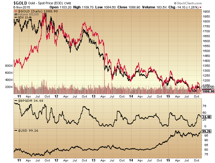
The case for that increases if we look at ‘leveraged’ commodity silver. The same kind of parabolic blow off as in 1980 occurred.

15junn18

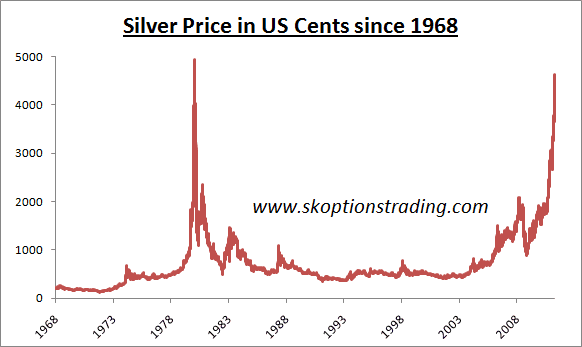
It would make the secular commodities bull 2000-2011 a mirror of the 1968-1980 bull, namely one solar cycle in length and set against a secular stocks bear, and both in keeping with demographic trends of the time. The implication would then be that commodities are now in a secular bear and stocks are in a new secular bull.

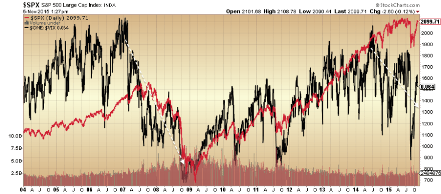
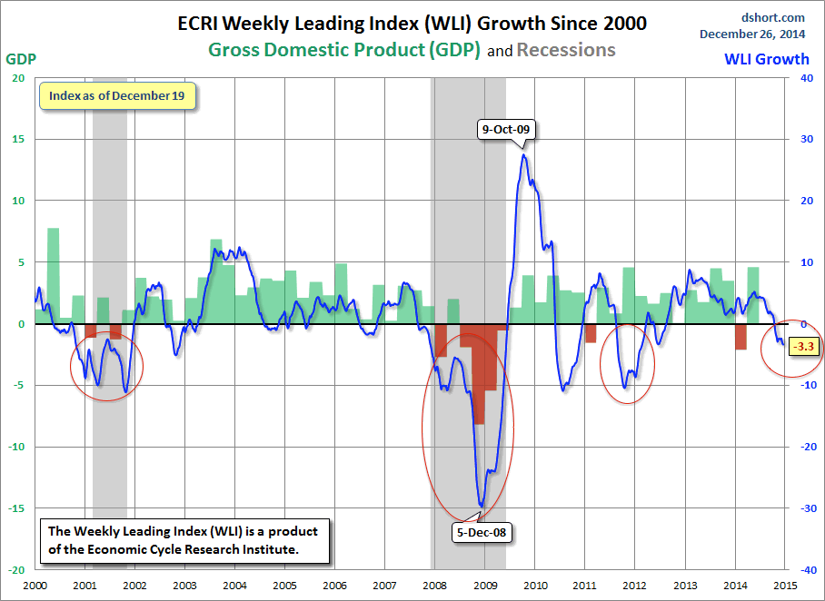
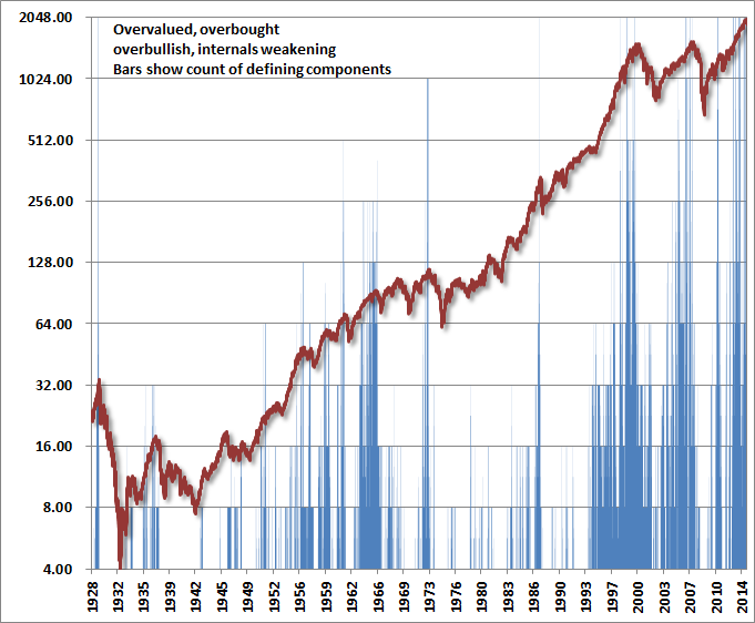
But let’s now look at the real experienced solar max of April 2014. From 2011 to 2014 stocks rallied strongly and since the start of 2013 displayed characteristics of a mania. A snapshot at April 2014 reveals many typical signs of a major market peak: extremes in valuation, sentiment, allocations and leverage; record negative earnings guidance and economic surprises all negative in the major nations; divergences in money flows and various risk-off measures; outperformance of defensive sectors and bonds; etc. At the time I gathered together 40 indicators all with different angles on a telltale top in stocks. Really, the evidence could not have been better for a speculative mania into the solar max.

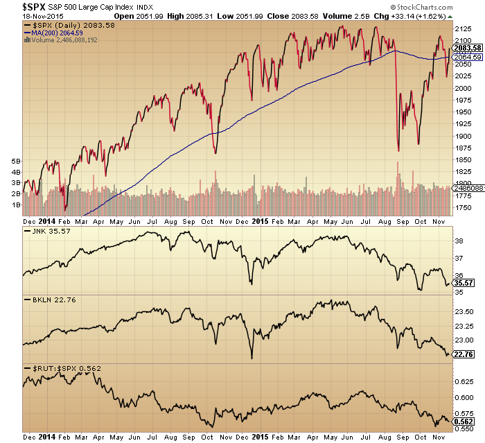
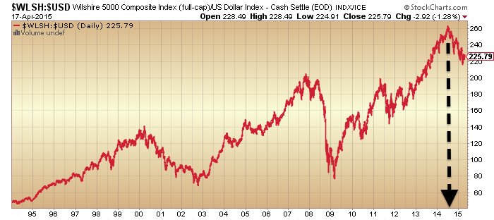
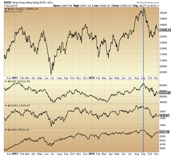
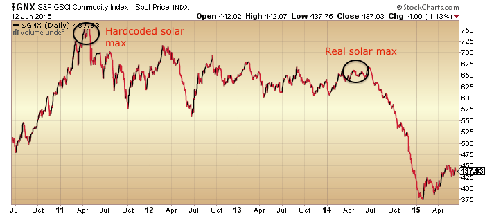
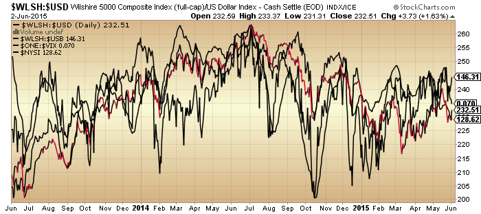
However, as we passed through the real solar max, it was commodities that fell again, rather than stocks. An oil-heavy commodity index, used for emphasis, shown here:

15junn20

Source: Stockcharts

Indeed, by the end of March 2014 large speculators had amassed an all-time record long position in the CRB commodities index, suspiciously right at the solar max. So we have a potential case here for commodities to have effectively made a double secular peak between the ‘average’ and ‘real’ solar maxima.

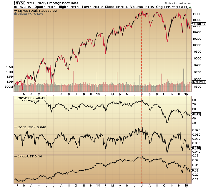
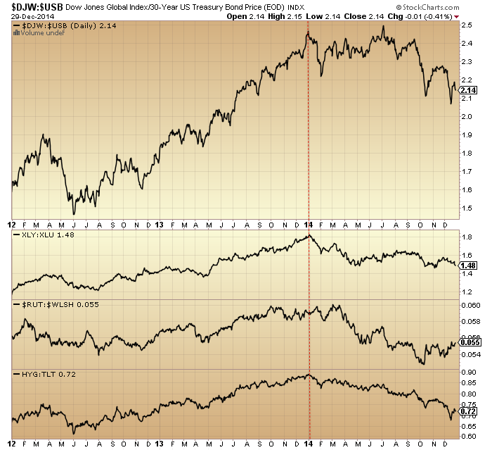
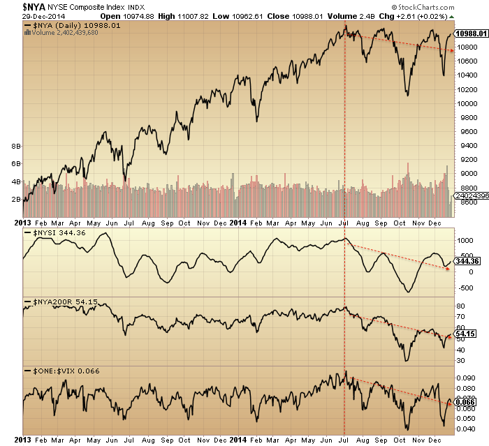
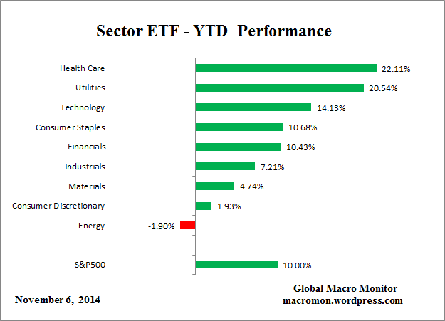
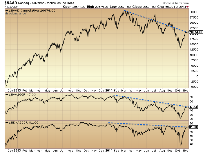
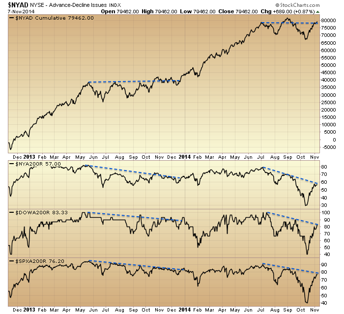
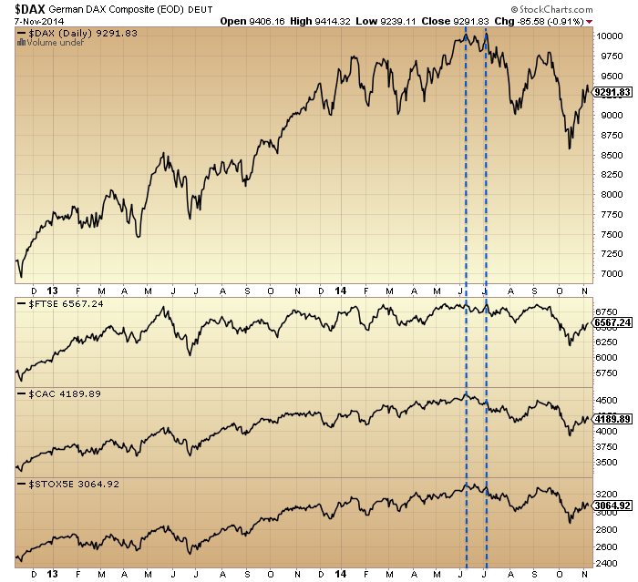
But… things get more complicated when we look under the hood at equities. Stocks:dollar, stocks:bonds, volatility, breadth and various other measures not only resemble previous major peaks but occurred together very close to the real solar max.

3junn1

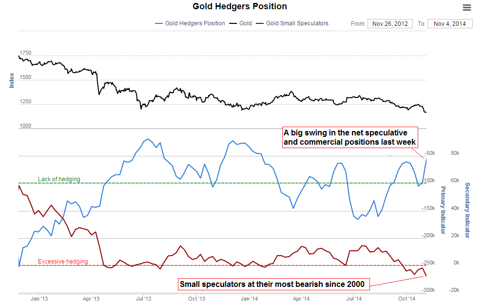
We are now waiting to see whether these will be repaired or whether nominal equity prices now fall in line. If the latter, then we have the evidence that speculation in equities peaked at the real solar max. At the same time, gold has been forming a technical bottom in recent months together supported by washout sentiment and allocation levels, which after a 4 year bear suggest it is ripe to break into a new bull. Which brings us back to demographic trends being aligned to stocks declining and gold rising: this angle on what happened would argue that the anomaly in hardcoded/real solar max produced a second speculative peak against demographic trends and in stocks, only for demographic trends to now reassert themselves (stocks complete the secular bear, as suggested in the last post, whilst gold goes to new highs).

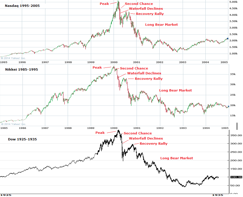
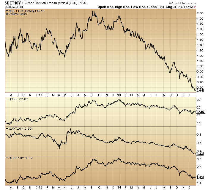
As alluded to in the last post, the closest fit historically to the current time was the peak of 1937: a solar maximum and speculative peak against a backdrop of low rates and easy conditions. Equities peaked out at high valuation (see Q ratio chart at top of page for SC17), following a front-running of prices to an expected return to normal growth that didn’t materialise. If there was any doubt this isn’t being repeated today, take a look at how analysts continually expected bond yields to rise over the last several years. Reality (demographics) has persistently denied them.

15junn32Source: Mike Sankowski

In 1937, both equities and commodities rallied into the solar max of April and both topped out around then, falling sharply for the next 12 months with both deflation and recession occurring.

15junn30


Stocks didn’t make a real (inflation adjusted or valuation) bottom until 5 years later.

Which brings me back to the unfinished business in equities and the prediction by both demographics and valuations:

12junn17

In summary, from all the topping indicators in equities, stocks should now break into a bear market, tipping the fragile world economy fully into both deflation and recession. There should be a feedback looping between the two, taking stocks down to much more appropriate washout valuation levels, whilst crises breed crises again in the economy. As in 1937, it should kick off under easy monetary conditions, limiting the toolkit of central banks, but also as then, central banks will likely resort to unorthodox (and probably ruthless) tactics. Systemic breakdown is a real risk again, with debt levels greater than in the Great Recession (hat tip Sinuhet).
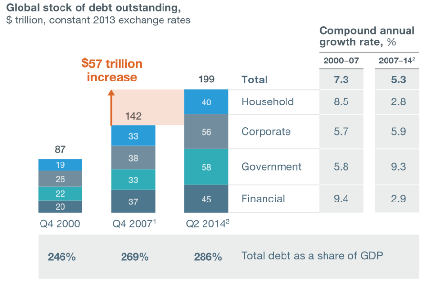
Screen Shot 2015-06-15 at 08.57.23

Source: McKinsey

Commodities (particularly industrial) should sink again too, but likely for shorter and shallower (in line with demographic pressures, as per 1937, and understanding their existing slide since 2011). However, I expect gold to break away and rally as real money. It’s not an easy call due to the limited history of gold free-floating and performing under deflationary conditions. But ultimately I maintain it is the anti-demographic ultimate safe haven, and should regain favour particularly as central banks are currently doing their best to corrupt the money mechanism with QE and ZIRP.

If I’m wrong? Well, this is where we get to the ultimate conundrum. If stocks are instead in a new secular bull (and commodities made their secular peak in 2011, doubled down in 2014) then the appropriate investments/trades are really the opposite of if they are on the cusp of a new devastating bear in an ongoing secular bear. Long stocks and short gold versus short stocks and long gold. I have been able to make cases for both in the last two posts, but I have also shown the flaws in both.

Ultimately it’s a game of probabilities. When all crunched together I see it as most likely that 40 topping indicators and an under-the-hood peak around the smoothed solar max of last year should produce an imminent meaningful correction in stocks unless those divergences start to be repaired. That would be the telling clue. Fitting with that I see gold’s technical basing as likely to produce a meaningful rally. From there I would expect to see serious troublespots emerging in the global economy (defaults, etc) and the meaningful correction in equities turn into a fully fledged bear. However, if the secular stocks bull scenario were to turn out true, then indicators should point to a recovery in equities before we hit such problems.

I have to end on a sobering note. If we do see a global bear market and recession here, then the damage will be immense. No capacity to reduce rates, QE proven to be a failure, record debt levels and increasing under deflation, and no demographic upturn in sight for some time. Accordingly, central bank response would have to get tough, such as penalising any saving, imposing capital flow controls or protectionism. The potential for civil unrest, war or systemic breakdown would increase. The outlook would be very uncertain but surely bleak for the majority of people for the period ahead. It would really be in mankind’s interest for the new secular stocks bull scenario to be true. However, both the debt and demographic problems that we now face can both be traced back to the second world war. They have been a long time growing and attempts to conceal or water down their impact cannot go on indefinitely. Printing money to buy your own debt is normally the end game, so it’s not realistic to expect ‘muddle through’ can keep going. It comes down to the complications of gauging how the end game plays out.

All Change At The Solar Max

1. The solar maximum peaked out mid-2014

19apri30

2. Geomagnetism intensified since then

19apri313. That’s twin negatives for risk assets, reflected in the drop in commodities

19apri32

4. It’s also twin negatives for the economy, reflected in data surprises

19apri20

Source: Charlie Bilello

19apri10


Source: Alhambra

5. And in earnings

Screen Shot 2015-04-19 at 05.40.59

Source: Factset

6. And in Fed money printing

19apri8


Source: Spiralcalendar

7. And deteriorating financial conditions

19apri1

Source: WSJScreen Shot 2015-04-19 at 05.19.44

Source: Bloomberg

8. Although nominal stocks continue to appear to be in a bull market, measured versus bonds and dollar the top appears to have formed at the same time as all the above

19apri2 19apri3

Source: Stockcharts

9. Plus a look at breadth, volatility and risk appetite also suggests a reversal has occurred

19apri6

10. European stocks appear to be making a blow-off top at high valuations

19apri15 19apri21

 Source: Gavekal

11. And forward earnings for all the main regions bar Japan (the only major that has a positive current demographic window) are negative

19apri23

Source: Shortsideoflong

In short, I still see strong evidence for a reversal in financial markets and economy fitting with last year’s solar maximum, with the final piece of the puzzle being the missing sharp drop in nominal equities. Whilst Friday’s sharp down candle serves only to keep us in a sideways price range, it was another failure high attempt in US equities and I expect will form part of the final roll over in stocks, to fulfil what all the charts above are telling us. Sentiment and allocations remain maxed out:

19apri40

Source: Charlie Bilello

19apri5Source: Stockcharts

Saturday Markets Update

Stocks ended the week on some buying. We are approaching this coming Tuesday’s new moon and Thursday’s ECB meeting, at which we should expect some kind of QE or new programme of action, given the Swiss central bank’s pre-emptive action this week. Therefore, I expect a little more strength in the first half of this coming week and then a sell-the-news resumption of the equities downtrend, which ought to be the definitive breakdown in stocks, as we head into the geomagnetic low of March/April.

The Dax made a new high on Friday, but this has to be seen in the context of a fast-weakening Euro, and the majority of other global stock indices still dictate the overall peak around mid-year 2014. Shown below are other European indices in comparison to the Dax plus US stocks, together with breadth, volatility and junk:treasury bonds.

17janu1 17janu2

 Source: Stockcharts

Here we see the deflation problem Europe has to address with policy response.

17janu5Source: FT

US earnings season is underway for Q4 2014 and is currently reporting a blended earnings growth rate of 0.6% and a blended revenue growth rate of 0.8%. This the weakest in some time, and earnings forecasts for 2015 are also weak, due to the combined impact of rising dollar and tumbling oil. Meanwhile, economic surprises for the US are dropping towards the zero level and leading indicators for the US continue to flag red:

17janu3Source: DShort

Therefore, supports for the bull continuation have been significantly weakened.

Here is combined smart and dumb money for US stocks: a rare lop-sided agreement that has been a marker of previous major peaks:

17janu11Source: Sentimentrader

Similar topping flags have been raised throughout 2014 but at this point we see a more united degradation in leading indicators, negative divergences, earnings, and cross-asset action. Below we see how December to January has produced intensifying developments in government bonds and currencies.

17janu6 17janu8 17janu9

Industrial commodities have also seen acceleration to the downside in that period, whilst gold has taken off. All these developments make it unlikely stocks can continue their levitation, and this divergence in growth-dependent commodities versus safe haven commodities ought to continue. But what about agri/soft commodities? Largely unloved, but climate could give them a boost. 2014 ended up as the hottest year on record:

Screen Shot 2015-01-17 at 06.38.41

Source: NOAA

Perhaps when the US dollar finally turns, agri may attract buying interest. Positioning in the US dollar remains extreme, whilst the Euro is showing signs of capitulation. Again, I would the see ECB meeting this coming week to be the sell-the-news event.

In summary, developments are now much more supportive of stocks breaking down and gold breaking up. Post-solar-max, degradation in leading indicators and earnings, sharp moves in commodities and currencies, and a lot of data pointing to a mid-year 2014 ‘real’ peak. Back in 2008, stocks and leading indicators were tumbling whilst commodities levitated, but commodities could not levitate for long under those circumstances. I see the same here in reverse, with the cross-asset and cross-indicator breakdowns the prelude for the collapse in equities.

I previously looked at the ‘second chance’ peaks of the similar examples from history, e.g. Nasdaq 2000, Nikkei 1989, Dow 1937. They all showed a main peak followed by a lower high (failed) peak, which was then the trigger for waterfall selling. Looking at stock indices charts for 2014-15, we don’t see obvious such second chance peaks. The most parabolic of the indices was the Nasdaq 100, but this has produced more of an up-and-down range over the last couple of months, than a clear second-but-failed attempt at the high. So, we need to see price develop further to assess, but the picture may be one of a topping price range instead. It does not alter the likely subsequent collapse, which is already written in highly lopsided sentiment and allocations, extreme leverage and the post-solar-maximum rug-pulling.

17janu15


End Of 2014

I’m back and refreshed. Thanks for all the messages, and for all the comments in my absence. Here is the big picture.

1. Primary shift to defensives and away from risk occurred as of January 2014, as measured by stocks to bonds, cyclical to defensive sectors, small caps to all caps and high yield to treasury bonds. Clock ticking from that point.

30dec2

 Source: Stockcharts

2. Solar maximum looks to have occurred around April 2014, marking peak speculation. Equities mania on borrowed time thereafter.

Screen Shot 2014-12-30 at 06.16.52

 Source: Solen

3. Game over effective start of July. World equities, crude oil, high yield bonds and the US dollar all turned at that point. Deflation in charge.

30dec44. US equities composite, breadth measures and volatility all show the same reversal at the same point: start of July.

30dec1

5. Those twin peaks in risk appetite at the start of the 2014 and mid-year fit the seasonal model which is from the influence of geomagnetism:

30dec12

6. Which sets us up for a final peak at the end of Dec 2014 / start of Jan 2015 for those remaining stock indices which have yet to top. I referred to this as my worst case scenario (latest peak) in 2014.

30dec15

7. Developments in December support this now happening: sharpening falls in crude and government bond yields, flattening of yield curves, blow-off top in equities allocations.

30dec530dec10

8. A new bear market in stocks will be a cyclical bear within an ongoing secular bear market. No new secular bull market as many believe.

30dec16

9. This secular position is dictated by demographics.

30dec20

10. The other play from this is that gold should enter a new cyclical bull within an ongoing secular bull, and this is supported by recent signals such as miners:gold ratio, gold/miners sentiment and price basing patterns.

12se1

 Source: Glenn Morton / My projections

11. A sampling of stock indices from around the world, below, shows 2014 has been clearly either a large topping process or a large consolidation range. If the latter, then we should have seen excesses in valuations, sentiment, allocations and leverage worked off with time rather than price, yet all those measures remain highly stretched, suggesting this is a topping process.

30dec3012. Plus, the two strongest sectors of 2014 are the two that are historical associated with outperformance after bull markets peak out:

30dec7

Source: Macromon

13. The peak-to-date in margin debt remains close to the solar maximum. This leverage, along with major extremes in sentiment, allocations, tail-risk, valuations and our post-solar-maximum status, is the set-up for a market crash. To repeat what I have said before, until/unless these measures are reset without a crash, then history dictates that is the most likely outcome. Crashes don’t occur often, but when they do, the set-up looks like the current.

30dec9

Source: DShort30dec8

14. Leading indicators and the longer term stocks:bonds ratio resemble 2000, 2007 or 2011, suggesting a minimum 19% drop in equities. This is the percentage figure I quoted as my general target for short positions because, stretching the view to the last 100 years, this is the minimum we should expect without being greedy by aggregating various angles on the market. To be clear though, the set-up is compelling for a bear market, not just a sharp correction, so I refer you to the secular bear chart above for the bigger projection.

30dec40

Source: DShort30dec41

15. Which brings us to the value of history as our guide, because 2014 taught us one key lesson: 100 years of reference points may not be enough, we need to allow for the unprecedented. An aggregation of angles shows how unprecedented 2014 became:

30dec50

 Source: Hussman

So what caused this? The most common view is that central banks brought this about with their policies of ZIRP and QE and unwavering verbal support. However, I maintain that ‘central bank policy trumps all’ was rather the mantra for this solar maximum mania than the driver. To prove this, we should now see equities collapse and gold rise despite central banks, and that is the final part of the real time test for the power of the solar maximum. If I am incorrect, then equities should continue their bull market in 2015 as central banks policies overrule. However, I refer you back to all the topping indicators and angles in equities that have amassed, together with the examples of 1930s US and 1990s Japan which revealed central banks’ true relative impotence. Ask yourself if typing numbers into a computer (ZIRP and QE) and saying a few soothing words can really work.

The crazy stretching of indicators delivered this year made for the most difficult year of trading since 2000, the last solar maximum. So if I can make one prediction for 2015, it is that it will be easier and more predictable. I am short equities and long gold and expect patience to be finally rewarded. I wish you all the best for the coming year.

Cross Asset Position

No reversal yesterday in equities but I maintain it has to be close at hand.

The Nasdaq added another day to its small sideways range. RSI divergence argues the next move should be down.

11nov8Source: Stockcharts

The SP500 is at the top of its megaphone pattern and the Dow has edged above it. Gold miners made a megaphone top in 2011 and they also edged out above it, before reversing:

11nov2The combined reading of II plus AAII sentiment is the highest on record, which casts doubt on the fuel for higher prices in equities.

11nov3Source: Lance Roberts

Positioning is extreme in the US dollar, sentiment is extreme, and there is an RSI divergence between the two recent peaks.

11nov15 11nov16

Source: Acting-Man

Gold miners bullish percent reached zero and Friday saw a voluminous bounce. Positioning in gold is also extreme and contrarian:

11nov17

Source: Acting-Man

Sentiment plus oversold conditions in commodities argue for a broader reversal too:

11nov12 11nov13

Source: Emma Masterson

Plus positioning in treasuries remains at elevated levels more in keeping with a bottom in treasuries than a top:

11nov7

Source: Zero Hedge

Add all these together and there is a compelling set-up for a major reversal out of equities and the US dollar and into gold, miners, treasuries and maybe other commodities too. If gold and miners can hold above Friday’s low then I believe the move kicked off at Friday’s full moon, but we really should see supportive developments a.s.a.p. if so. There is a geomagnetic storm in progress and the cumulative geomagnetic trend remains down, so the underlying pressure is negative on risk assets.

Here’s a look at buy/sell pressure and momentum indicators for US equities. There have been 6 major distribution days in 2014 and no major accumulation days since October 2013. This suggests underlying enduring smart selling pressure despite the higher prices. Also reflective of this are the negative divergences in the two money flow indexes CMF and MFI:

10nov2

MFI has been divergent since the turn of July, which puts us on borrowed time for stocks to peak, but CMF shows anomalous long divergence since way back in mid-2013, which I suggest shows the atypically long mania in prices.

The Chaikin oscillator and ULT momentum indicator show the same anomalously long divergence, this time since the start of 2013. I don’t believe these indicators are broken, but rather they again reflect the strength and duration of the mania this time, which in turn suggests a major crash lies ahead.

10nov3

There are multiple other indicators that reveal the mania in stocks began at the start of 2013 and is now almost two years old. Phenomenal and historic.

If we look back at the Nasdaq into its 2000 peak, to compare manias, then those two ChiOsc and ULT indicators still only made a normal 3-month leading divergence. Their divergence versus the Nasdaq in 2014 is around 12 months, which is unprecedented.

10nov8So what does that mean? I believe these indicators further cement the overall picture of one serious mega-mania which is on borrowed time and heading for a major crash. It’s just a matter of patience and money management in negotiating the short term.

So far in November we don’t see a renewed ramp up in sunspots and the probability remains that the smoothed solar max is behind us.

a2Meanwhile, the collective evidence from sentiment, allocations, negative divergences, cross-asset positioning and other market indicators make it improbable that stocks can grind higher into year end or Q1 2015 for an anomalous late peak relative to the solar max. Rather, the evidence still supports a renewed turn down in equities this week and a significant down November, keeping the bear trends in European indices in tact and completing the megaphone tops in US large caps.

Simply put, I have no case at all for higher prices from here whilst I have a multi-angled cross-referenced case for equities to turn down without delay in a last gasp of the topping process that began 1st Jan. It is what it is. So on we go, it’s a partial holiday in the US today, but stocks and futures are open whilst bonds closed.

In Perspective

1. The start of January brought the shift to defensives, measured here in 4 ways: stocks to bonds ratio, cyclical to defensive sector ratio, small caps to all caps ratio and high yield to treasuries ratio.

9nov10Source: Stockcharts

2. The best performing sectors in 2014 all year have been health care and utilities, the two defensive sectors that perform best once the stock market peak is in.

9nov15Source: Macromon

3. The yield curve, measured here by 2y versus 10 yr treasuries and 2m versus 10 yr treasuries, has flattened ever since 1st Jan. We won’t get an inverted yield curve under ZIRP so flattening takes over as a topping warning.

9nov114. The best performing asset class in 2014 has been government bonds and the chart below shows this has been a global phenomenon (Germany, Japan, UK and US quoted by 10 yr yields (bonds inverted)), again since Jan 1st.

9nov85. Looking at stock market breadth, deterioration has been under way since almost the turn of the year in the Nasdaq indices.

9nov126. Whilst the NYSE, SP500 and Dow picture reveals breadth issues since the turn of July. We can also see there was an earlier bad-breadth run into the turn of 2014 which was subsequently repaired: like an attempt at a bull market peak but it wasn’t quite ready.

9nov137. Turning to sentiment, NAAIM manager exposure to equities has been dwindling since Jan 1st, whilst Investors Intelligence bulls made a double peak 1 Jan and start of July, since which they have dwindled too. Meanwhile, Vix made its low at the start of July and has been in an uptrend since then and Skew has stayed elevated for a year, with triple peaks in Jan, July and Sept.

9nov148. Commodities have been in sharp decline since the turn of July, as the US dollar sharply rallied, in a deflationary wave.

9nov69. For US earnings, a rising dollar and falling oil prices is overall doubly negative. Q4 earnings growth has recently been accordingly cut in half to 4.5% and sales growth cut in half to 2.2%. Earnings growth has missed target in each of the first 3 quarters of this year. The average of 5 valuations puts US equities the joint second highest in history after the 2000 mania. There is a big gulf between price and earnings.

10. Global stock indices look like this. European indices peaked out by the start of July and have since made a lower high and lower low, the definition of a bear trend.

9nov2

11. The Hang Seng, Bovespa, Kospi and Australian index all made peaks at the start of September.

9nov4

12. However, the US SP500, Dow and Nasdaq, as well as the Japanese Nikkei have all made new marginal highs since then.

9nov1

13. The Russell 2000 double topped at the start of March and start of July, whilst the overall Dow Jones World double topped at the start of July and start of September. Junk bonds and leveraged loans also made July/Sept double tops and lower highs and lows since.

9nov5

Across all the above charts in this post, three dates consistently stand out: the start of Jan, start of July and start of Sept. The topping process began the 1st January and additionally the Sornette bubble end flagged on the SP500 at the start of July and on Technology at the start of September. Insider selling peaked at the turn of the year and we have seen six major distribution days since then without any major accumulation days. Put/call ratio, bullish percent and the summation index additionally point to the relevance of the start of Jan and start of July:

9nov19

Now draw in the solar cycle. The likely smoothed maximum was April 2014 (based on SIDC, Solen, NOAA, IPS and polar switch). Here’s why the smoothed sunspot maximum is important, it generates peak speculation events:

9nov22

Either side of the expected smoothed solar maximum of April 2014, we have two seasonal peaks (inverted geomagnetism peaks) of turn-of-year and mid-year:

5nov40

Homing in on the new moons of those two periods we get specific dates for a triple peak confluence of speculation/optimism: 1st January 2014 and 27th June 2014. I believe this is a compelling cross-reference for all the market charts above. We see multiple index and indicator peaks clustering at the very start of Jan and very start of July (both within two trading days of the new moon).

So I maintain this is the true picture of where we are, mirrored on the last solar maximum stock market peak of 2000:

30oc6

30oc5

And I still expect stocks to reverse here like they did at the same point in 2000:

9nov17

We have had several days of small range consolidation with a slight upward bias (averaging the 4 US indices), whilst sentiment and allocations are bumping up against invisible limits. I therefore believe the next move is down, like the subsequent red candle above. Furthermore, I believe that is then the end of the topping process in global equities. It effectively ended at the start of July, and really did for various indices shown further up, including the overall Dow World. But we have now seen new highs again in US large caps which on the surface look bullish, but underneath not.

I believe the unprecedented extremes in levels and durations of price levitation, sentiment, allocations, leverage, tail-risk, and negative divergences mean a crash is coming. Like an elastic band stretched to the limit. The superficial 2014 bull trend in US large caps is nothing of the sort under the surface, but has served to fool most into a false sense of security. This last rally from October to November has sucked everyone in again (sentiment, allocations) and we have extreme lop-sidedness in the markets. I believe equities will tip over here and fall hard and fast, with no reprieve this time. No dragging on until year end: the megaphone formations on the US large caps are ripe for resolution now and overbought/overbullish indicators support this.

7nov120

The October monthly hanging man candles suggest November should be a significant down month. I maintain the view that the evidence is too compelling now for consideration of an alternative scenario. If you remove me from the equation then there is an awful lot of fact in the above charts and many other recent charts that I have relayed that a bull needs to explain away. Simply, too many. However, we can argue there is a middle position in accepting all the warning flags but predicting prices can still yet go higher into year end under dual positive seasonality. Perhaps a scenario of increasingly thin volume and increasingly bad health but still scraping higher.

The problem with that is that whether we look at Nymo, Rydex, II, AAII, RSI or the ascent and shape of the Oct-Nov rally we see the same tell: exhaustion. Stimulative action from the BOJ and ECB in recent days have failed to catapult global equities higher. So I believe the middle position’s best hope is that equities retrace away from these exhaustion levels but then quickly washout, to enable a December rally into year end. However, I would refer you again to our positioning in the topping process. There is no case for another rally. If we tip over this week I believe that is it: equities won’t come back again. This is what I expect to happen.

Screen Shot 2014-11-04 at 07.53.54

SP500 Monthly