
This is John’s wife Gabi: Just to let you know that John is in hospital so won’t be posting at the moment.
Month: March 2014
Demographics And Secular Bull Markets
First a quick note on yesterday’s stock market action. An indecisive day overall again, and on the lowest volume yet. The biotech breakdown remains tentative, but volume has been significantly higher on the down days versus the up days such as yesterday. Volume is also rapidly accelerating into BIS Ultrashort Biotech. For the wider US markets: put-call remains 5 months under 1, Skew remains 5 months historically elevated, Investors Intelligence % bears remains 5 months in the historic low band, and breadth divergences (% stocks above MA) have been running for 5 months too. With every day that passes, the likelihood of the elastic band snapping grows.
Now to the title of this post. Secular bull markets and superpeaks have always been driven by demographics. Simply, secular = demographic. If there is a swell in the middle-aged group that is the main buyer of equities, particularly if set against declines in the young dependents and in the old age disinvestors groups, then we have the recipe for an increasing flow of money into equities until the demographic trends reverse. Note that this applies to stable, developed, free market countries – a poor country run by a dictator but with a demographic tailwind will not experience the same results.
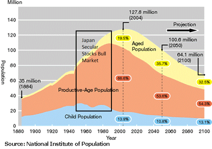
Japan’s secular bull market into 1989/1990 is explained by these two charts. A birth swell around 1950 makes for a swell in equities buyers into 1990, and from around 1950 through to 1990 there was a potent combination of a swelling middle-age group and a declining child dependent group. Thereafter the middle-age demographic trend reversed and the old-age group began to accelerate, making for a secular bear.

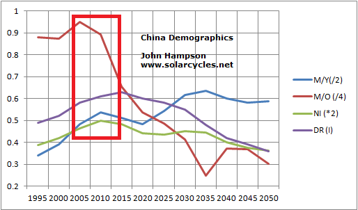
China’s Shanghai Composite superpeak appeared as its 4 demographic measures topped out, and now that stock market is currently threatening to break down even further, as all demographic measures are trending downward:
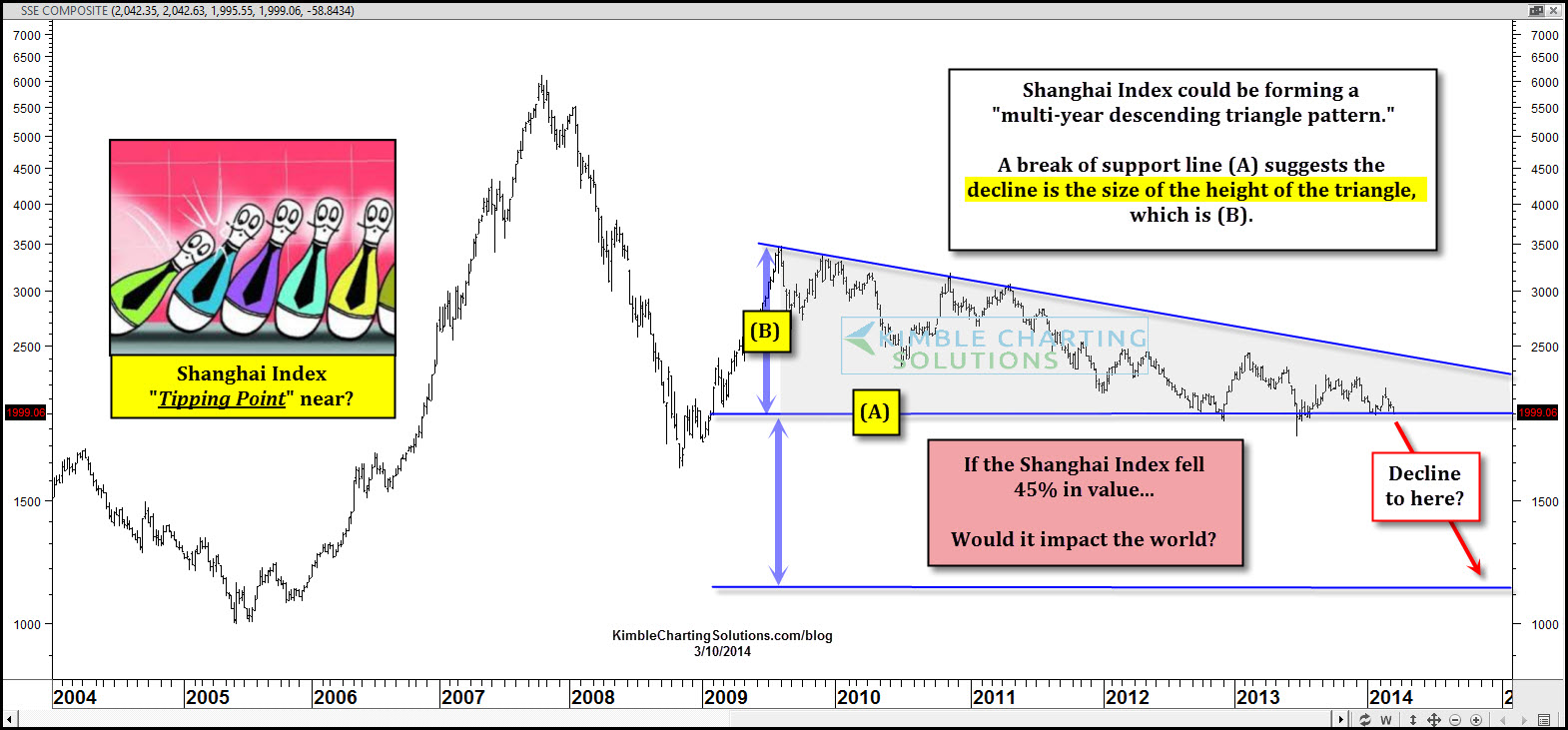
Source: Chris Kimble
The Dow secular bull and superpeak into 1929 was a result of record immigration of younger adults into the US at the start of the 1900s followed by restriction as of the 1920s, and that swell became the key middle-age group in the 1920s. Plus a decline in births in the 1920s reduced the child dependent ratio as the decade progressed.
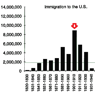
Source: Susps.org
The US stock market secular bull of 1980-2000 was the result of demographic measures trending upwards for that window of time, supplemented by similar rising demographic trends in Europe and China (and Japan in the 1980s), which added to the world boom. Thereafter US demographic measures turned down and the current downward pressure is supplemented by similar downtrends in China and Europe, the recipe for a global bust.

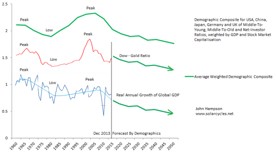 The secular bear market in stocks is still very much in play, and there should be a real lower low in global equities ahead. Gold behaves as the anti-demographic, making a secular peak into 1980 and beginning a secular bull in 2000 that by demographic trends should run on to the next solar maximum of the mid 2020s (solar maxima generate speculative peaks and there is a correlation between sunspot cycles and demographics).
Valuing country stock markets by PE or CAPE has to be considered relative to demographics. An expensive valuation is likely to become more expensive if demographic trends are upward, due to the increasing flows of new buyers. Hence, as the below chart shows, we saw the highest set of global CAPEs into 2000 due to the combined demographic uptrends of USA, Europe and China. Their combined current downtrends have produced a historically low set of overall CAPES.
 Source: Megane Faber
The US stock market is currently the second most expensive in the world by CAPE, and above all other bands in the chart above. Relative to demographics, this is very much overvalued. As per the two charts just above this one, there is a compelling case for US and global equities to enter a new cyclical bear and continue the secular gradual washout following the 2000 superpeak, whilst gold should resume its secular bull as the anti-demographic.
Monday Charts
Whilst Friday’s action in the stock markets was not decisive, it looks promising for a reversal, so let’s see how this week begins.
1. Insider selling consistent with peaks:
 Source: ShortSideOfLong
2. Euphoria model now up to +0.65:
 Source: Barrons/Citi
3. Latest Economic Surprises US:
 Source: Citi
4. IPO characteristics consistent with peaks:
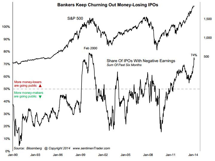 Source: Sentimentrader
5. From Kent’s link, US small caps peaked at the beginning of 2002:
 Source: ClaassenResearch
6. And that fits with the second peak of solar cycle 23:
 Underlying Source: Solen
7. The anticipated smoothed solar maximum at the end of 2013 and the February 2014 monthly sunspots spike is very similar to the solar peak at the start of 2000, and the monthly candles in the Nasdaq 100 show a similar pattern. A series of green candles into the end of 1999/2013, a red January candle, up again in February and now a potential March reversal:

The reason it is not as supersized as the 2000 peak is due to the difference in demographics, but we see a similar monthly RSI peak and by various measures the current high compares to the top of 2000 (such as margin debt, sentiment and certain valuations).
Friday Charts
1. Biotech followed through on Friday’s high volume down day with a second one yesterday:

Source: Stockcharts
2. Greed and Fear Index has rallied up to extreme greed territory:
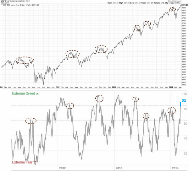 Source: UKarlewitz
3. High yield corporate bonds to 20+ year treasuries shows a divergence with the stock market that has previously marked tops:
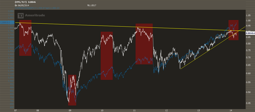 Source: Inflated Temper
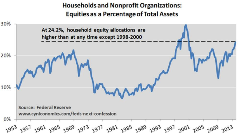
4. Household and non-profit organisations allocations to equities:
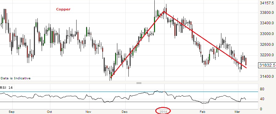
5. Dr.Copper does not think much of the global economy in 2014:
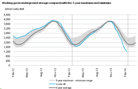
 6. Natural Gas inventories are some way below their historic normal range and I expect this commodity can make a renewed bid for $5:
 Source: EIA
Thursday Charts
Small range day for equities yesterday, on low volume, consolidating the previous day’s advance. Gold has paused at its first meaningful resistance level of 1350. Treasury yields decline also currently arrested. So are we to see precious metals and bonds reverse their 2014 trends here whilst equities break up and away? Let’s take a look at some charts.
1. We have a possible analogy from July/August last year, shown below. Then, the market appeared to be rolling over by the end of July, only for a gap-up candle to a new high, as occurred this Tuesday. In that 2013 instance, it represented exhaustion.
 Source: Stockcharts (and next two charts)
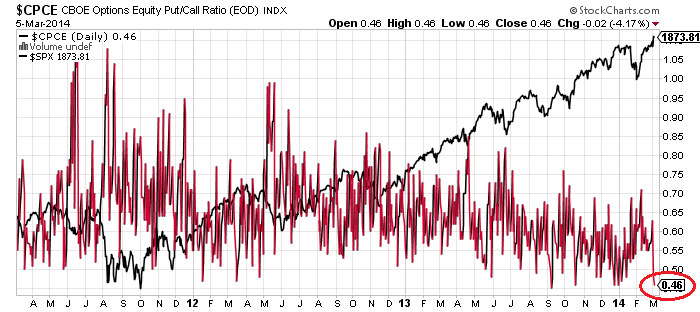
2. Total put/call ratio is now 5 months under 1.0, which is a historical extreme:
 3. Equity options put/call ratio yesterday moved back to historic extreme low:
 4. ISEE put/call index 5 day average over 200 for the second day, other instances shown:

Source: Helen Meisler
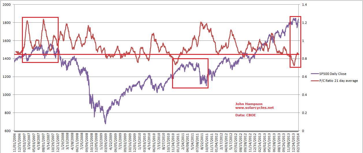
5. Skew remains historically elevated for 5th month. Weekly Skew reading suggestive of another top, as per the beginning of Jan and other historic incidences.
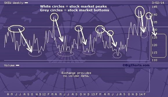 Source: Keystone Speculator
6. Investors Intelligence %bears is beneath the level associated with significant market tops in 2007, 2010 and 2011. Also note those peaks occurred on the second spike down in %bears, which is potentially what we have now (with end of Dec dip):
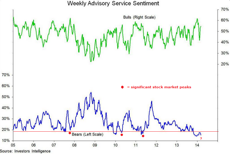
Source: Willie Delwiche (My annotations)
7. Euro-USD is at long term resistance and has had a reasonable correlation with stock market performance. Break out or break down here?

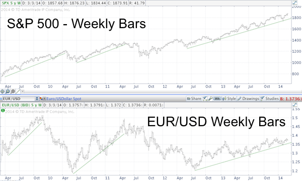 Source: Ispyetf
8. The two measures of breadth of cumulative advance-declines and % stocks above MA are divergent. Which one is more reliable as a leading indicator? The below charts show that the former (NYAD) typically expands into market peaks whilst the latter (using a combination of 50MA and 200MA) typically diverges into market peaks and is more of a leading indicator. This suggests we should be looking at a market peak now, not a break out.
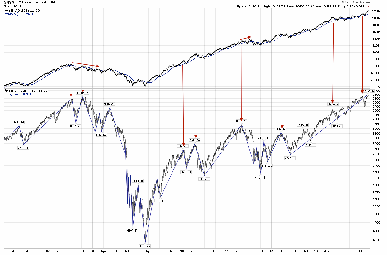
 Source: Fat-Pitch
In short, the balance of evidence still points to the stock market reversing down here, rather than breaking up and away. Maybe tomorrow’s employment report will be the catalyst.
Post Pop
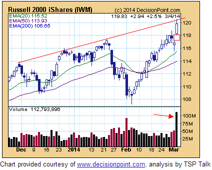
A surprising day yesterday. Russell 2000 up 2.75%, and all US indices popped strongly. Clearly nothing to do with Ukraine. If we look beyond price, not much has changed. There is still a momentum divergence on this new high. The Russell 2000 is up 15 out of 16 days, which is a record. Indicators suggest this is more likely to be an overshoot rather than a breakout. Put/call is sub 1 for 5 months now, and is 5 days away from an all-time record. Skew is is also 5 months at historic elevation levels. Investors Intelligence sentiment is back to extreme (see below). I remain confident a crash is ahead, but yesterday’s action has made the short term picture less clear. For that reason I did not add further short positions into the rip. So let’s see how today unfolds, I expect more clarity by tomorrow/Friday.
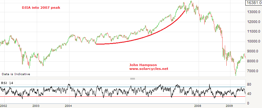
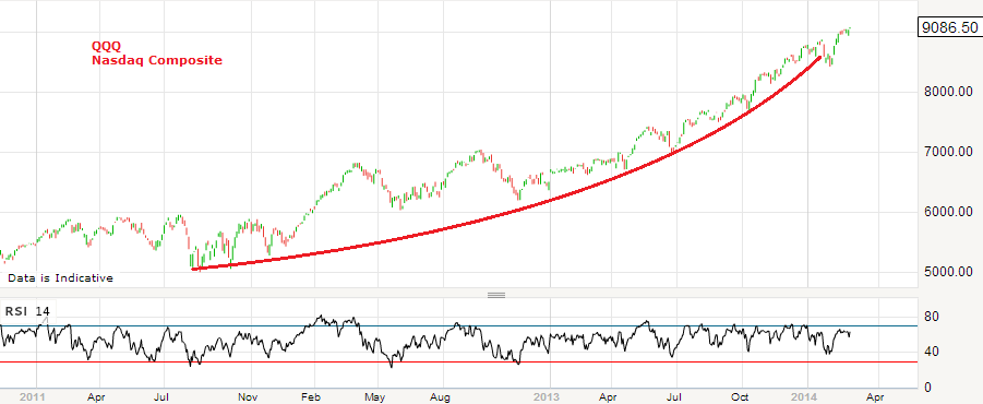
I leave you with a few charts, which are hopefully self-explanatory. At the bottom I looked to see how the Dow’s parabolic ascent into 2007’s peak terminated, which may give us clues about how the Nasdaq’s current parabolic could feasibly resolve if this short term action is an overshoot before renewed downside. The Dow made a higher high then a lower low, which was the definitive kill of the parabolic. The Nasdaq has made a higher high, but remains in the parabolic until we see a lower low.


Indicator Updates
Yesterday we saw a gap down in European and US stock markets on fears over Ukraine. Stocks then continued to sell off during market hours, but US stocks managed to recover some of the losses into the close. At the time of writing US futures are up on news that Putin ended military exercises near the Ukraine border. In fact, it had already been announced that those exercises would be completed today. News typically buffets the market but major trends and turns are set by other factors. If stock markets topped out on Friday then I suggest more relevant is the telling developments in indicators and the relevance of new moon peaks. If stocks have not yet topped out then it also won’t be due to news in the geopolitical arena, and we might point to the strength in cumulative advance-declines and renewed interest in cyclicals. So let’s put Ukraine to one side and see how things look after yesterday’s action.
1. SPY shows what looks like a bull trap. My suggestion last week was that the marginal new high on divergences would be the bait to lure in the last of the ‘dumb’ money. The rip in the overnight futures could set the scene for the gap left yesterday to be filled before downside renews. Volume and RSI divergence are bearish. Cyclicals repaired their January weakness, particularly in the last week, which is bullish, but there is a divergence with the higher high on SPY as shown. If SPY breaks higher again and cyclicals make a new high, then that top may be postponed.
 Source (and other charts below): Stockcharts
2. The Nasdaq 100 (black line) has room to pull back further before retesting the January high, whilst the breadth divergence continues:

3. On the longer term view, the Nasdaq 100 is creeping along the top of its bull channel since 2009. If it can break up and away from here that would be a particularly bullish development, but I put higher probability on it being dragged back down into the channel, with the RSI divergence joining the breadth divergence.
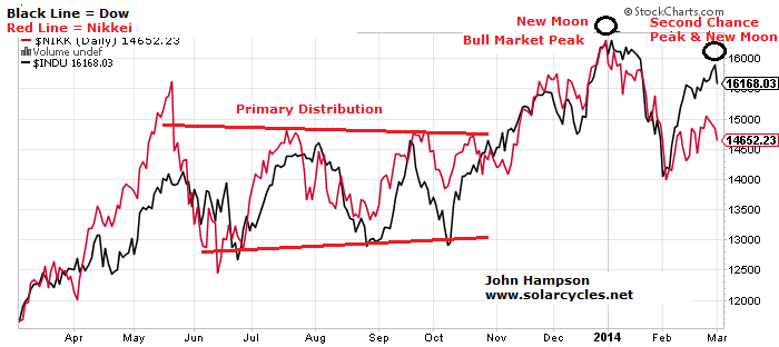
 4. The Dow and Nikkei continue to honour my 31 Dec top call, with their charts still mirroring the topping processes of the historical analogs. 31 Dec was 1 day from the new moon and at the inverted geomagnetic seasonal peak, and if Friday turns out to have marked the peaks in the other US indices then that was also one day from the new moon and at the turn into the seasonal lows of March and April.
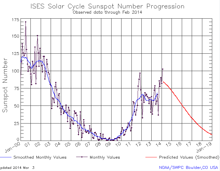
 5. My bull market peak call was also very much related to timing the solar maximum, and below are the updated sunspot charts of NOAA, SIDC and my own. It now looks more certain that the smoothed solar peak (blue line on NOAA, red line on SIDC) will turn out to be around now rather than the earlier peak of Feb 2012, which fits with speculation peaking out now rather than back then. Historically, markets tend to peak close to the smoothed solar maximum and on a monthly sunspot spike. A top at the end of December fits both, and we see evidence of accompanying developments as we turned the year such as Bitcoin peaking, trend reversals in treasuries and gold, and historically high trading volumes and insider selling in January. However, we actually made a higher monthly sunspot spike in February, and that could partially explain why other stock indices made higher highs in that month. NASA agree with NOAA and Solen in predicting the smoothed solar maximum to be behind us and waning from now, but SIDC still have that as one of two options, with the other being a mid-2014 smoothed maximum. If that turned out to be the case then that, for me, would be the strongest reason for bull market continuation until then. However, I consider this lower probability than the smoothed maximum turning out to be the end of 2013.

 6. Gold and treasuries continue to outperform stocks and is supportive of the 31 Dec relevance:
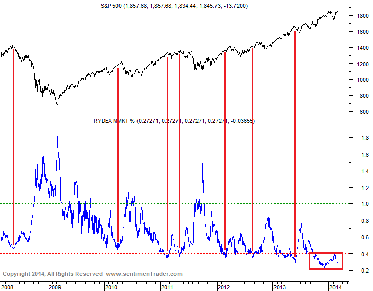
 7. Rydex cash levels and put/call 21 day average share similarities. They are not just at low levels consistent with market peaks, but at historically extreme low levels, that suggest high complacency, the kind of which could be a catalyst for the waterfall declines that I predict are imminent. The 2013 exuberance rally was key to generating these historic readings, whilst similarly postponing any meaningful correction into what I believe will be a super-correction. If we look at the the 2007 peak in the put/call chart we see less extreme complacency than now but also complacency resetting during the corrections in the topping process (the two spikes to over 1.2). This did not occur in the January 2014 sell-off and is another warning of an impending much deeper correction to come.
 Source: Sentimentrader
 8. Peak excess in equities is also reflected in these 3 charts. Retail investors have belatedly joined the party, as is typical at market tops, and global stock market capitalisation is back to 2007 peak levels whilst achieved on dwindling demographics in the major nations. We see lower overall trading volumes whilst investor net debt, real margin debt and margin debt to GDP (now at 2.72%) exceed 2007 and 2000 market top levels, i.e. less participants but more indebted and leveraged, and this fits with the historic complacency above.

Source: Ispyetf
Source: U Karlewitz Source: Scott Grannis
Biotech And Russell 2000
Just as the defining sector of the 2000 solar maximum speculative mania was Internet, a case can be made for both Small Caps and Biotech as defining manias at the current solar maximum. In 2000 the Nasdaq Composite made a parabolic blow-off and hit p/e >80 as companies were ‘revalued’ on expectations rather than earnings. The Russell 2K currently trades at p/e >80 and the index of Biotech companies trades at p/e>160, with both having a significant weighting of companies trading on expectations.
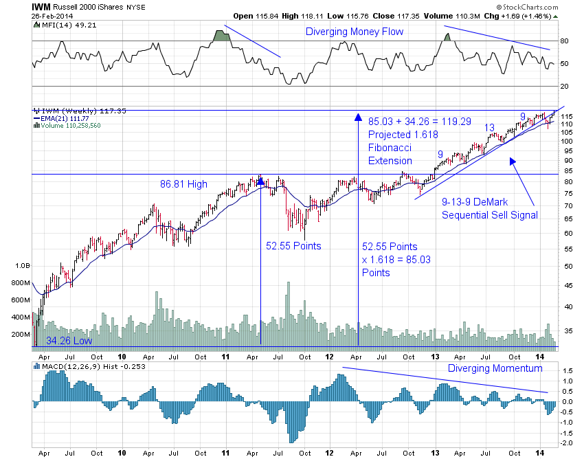
The Russell 2K trades at its most expensive historic valuation:

Source: Karla Tango
The Nasdaq Biotech sector is in a parabolic trajectory signalling imminent exhaustion:

Source: Blogspot
Marrying the two, the strength in the Russell 2K in 2014 has been dominated by Biotechs:
 Source: Bespoke
Similarly the Nasdaq Composite has been significantly driven recently by Biotech strength. So a pop in the Biotech bubble would have significant ramifications for the Russell 2K and Nasdaq, and the wider markets.
On Friday, Biotech had a significant down day on high volume, having built up a negative divergence in RSI:
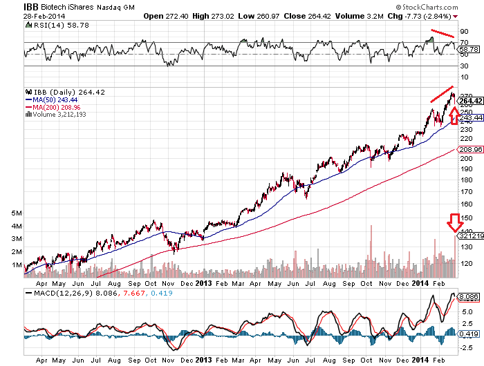 This occurred at the new moon and as we head into the inverted geomagnetic seasonal lows of March and April. Add in the near vertical trajectory of the parabolic on the longer term view and we have the potential for a top having occurred on Friday, but subject to follow through next week.
Similarly, the Russell 2K experienced a high volume reversal on Friday and shows other topping signals:
 Source: Stocktwits
To further judge the likelihood of a top, a key question is: could the R2K and Biotechs rise materially higher yet? Whilst we cannot calculate a precise answer to that, we can look to various indicators to build up a case for a limit.
The Biotech sector has risen approx 150% in the last 2 years, which is very similar to the gain in the Nasdaq Composite from 1998-2000. Real margin debt and net investor credit have both now exceeded the 2000 market peak (and 2007 peak), whilst real margin debt to GDP is at the same level as the 2000 peak.
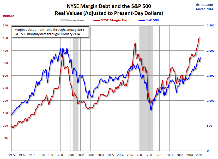
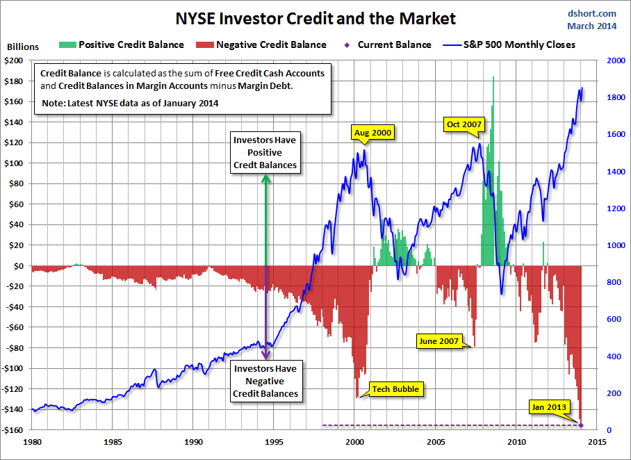 Source: DShort
Citigroup’s panic/euphoria model, which aggregates short interest, put/call ratio, retail money funds and more, is above 2007’s peak but remains some way off 2000’s mania; whilst their CEM model points to a market correction right ahead which would fit with Friday having marked a peak:
 Source: Citi / Fat-Pitch
Sentiment as measured by Investors Intelligence with 10 week smoothing is above or at levels that have previously marked tops, with an exception in 1986-7 where the market first rallied higher for several months before ultimately crashing.
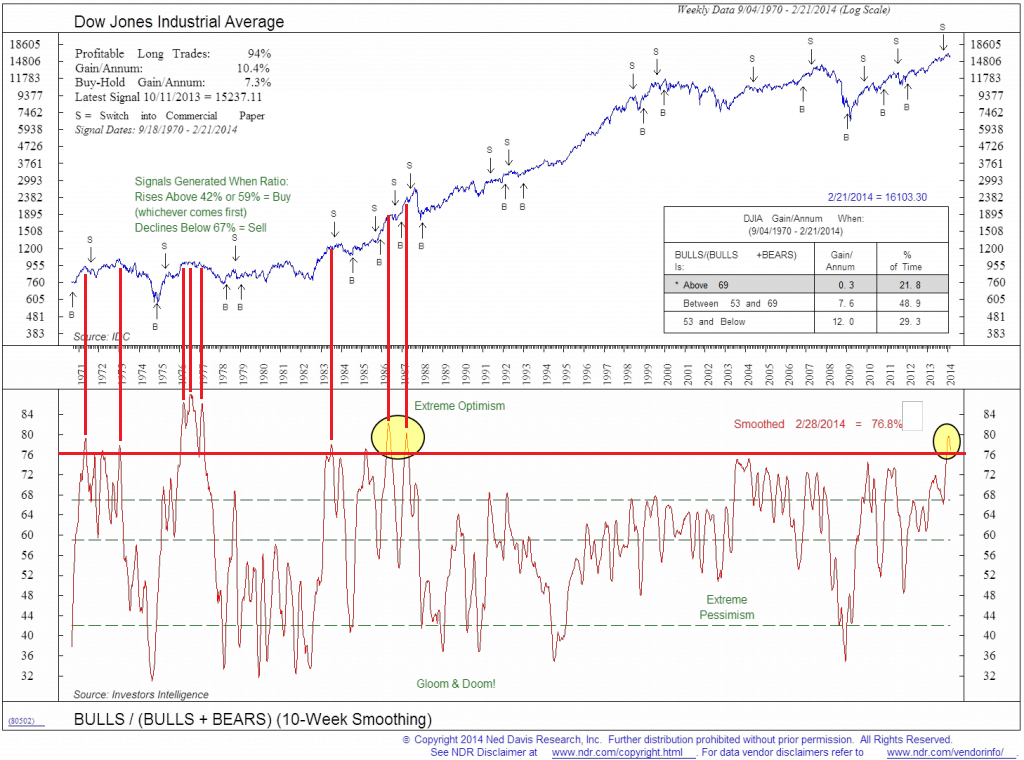 Source: CMG Wealth
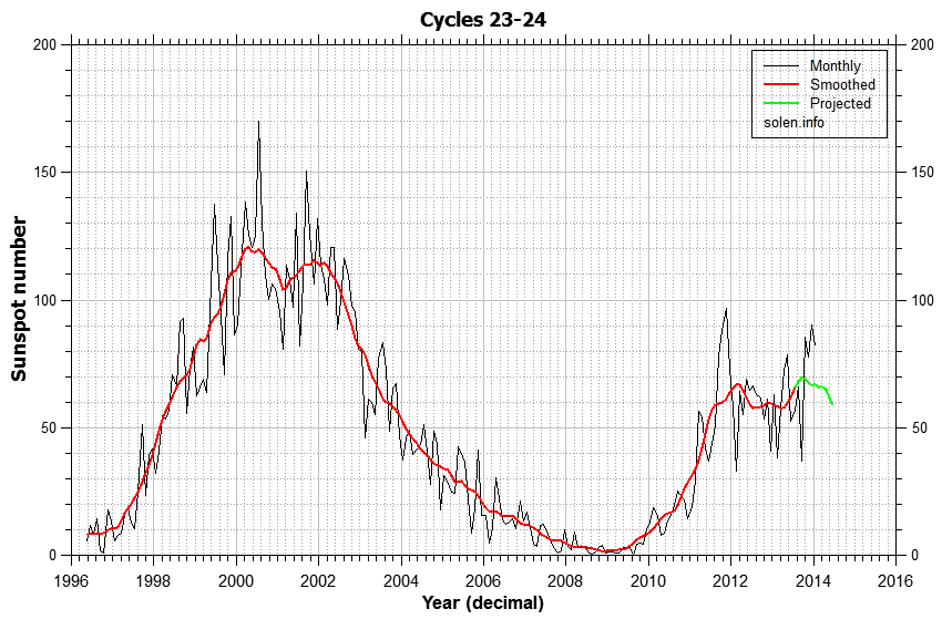
Solen’s updated solar cycle progress and prediction chart still suggests a peak at the end of 2013, which is consistent with the Dow and Nikkei having topped out then and other indices now rolling over to join, and my own daily sunspots chart also reflects this:
Source: Solen
The waning of the solar maximum has historically given rise to a recession in the US. ECRI’s leading indicators rolled over in early 2013 and have recently reasserted that downtrend. Any further deterioration from here would suggest such a recession is coming, and that sort of timing would be a general fit with the business cycle:

 Source: DShort
In keeping with that prospect, 20-year treasury bonds look to be breaking out following an 8-month basing:
 Source: Fat-Pitch
Drawing all together, I have a reasonable case for the Russell 2000 and Biotech to have peaked out on Friday, with the latter feeding into the former, and both into the wider markets. The Friday candles and volume and the negative divergences in both the R2K and Biotech suggest a peak. The Citi CEM, new moon and inverted geomag seasonal lows of March and April suggest follow through could then occur this coming week forwards. The rate of trajectory of the Biotech sector suggests terminal exhaustion should be close at hand, and that would then feed into the R2K’s fortunes as per the Bespoke table above. Valuations, leverage and sentiment collectively suggest significant further gains are unlikely. Solar speculative maximum timings suggest other US indices should now be ripe to join the Dow in rolling over, or more specifically began a topping process at the end of December which is now completing, and in so doing becoming leading indicators of a looming recession.
