Break

Dear all, it’s time for a break from the blog.

I understand that even as a free blog there is a kind of duty to the visitors so I apologise for any disappointment. I am very appreciative of the regular readers and contributors.

I need a break from punching out my postings and administrating the site and will be back in the future. Until then you know my views and as most of my stuff is medium to long term those views are unlikely to change, barring any radical developments. All the material on the site will stay where it is.

I wish you all the best.

John

High Stakes

Still the bulls have the ball, and still we can’t say for sure whether we are in a bear or a bull market.

Bullish percent, volatility and breadth still make this look like a bear market rally. The SP500 is at the 200MA. If this is a bear then it would be normal to be repelled here, making this the ideal second chance peak to short. If this is a bull then we might still expect a pullback like in 2011 before breaking back above the 200MA again.

22octo2

If instead equities power directly upwards back to the highs, then it would be another thrust like in October 2014.

Here we see that it is US large caps which are looking particularly bullish, whereas US small caps, junk bonds and the FTSE (and most other indices) all look more bearish.

23octo4

However, note how in Q4 2014 junk bonds and leveraged loans diverged negatively but turned out to be a false signal as they ultimately recovered once stocks were more cemented in new highs.

23octo1

That chart also shows that the rally this Oct has not been as impulsive as last Oct, with the RSI showing a negative divergence and not being stuck in the green.

Additionally, the chart shows the 6 month range of 2015 (boxed). Anyone who bought in that period is underwater and this should create supply from above with price now back at the bottom of that range.

Here we see NAAIM manager exposure. Typically this has been a smart indicator, diverging before important peaks. The current reading is particularly low. This and other low indicators (e.g. II sentiment, Rydex) are bearish unless they reverse. If they start to reverse strongly higher then they become a tailwind.

23octo2

And then there is gold and miners. A relief rally was due once bullish percent was at zero again around August. But is this the start of something bigger?

23octo23

So, there are various tests here. If we are indeed in a bear market (my belief) then we should see (1) stocks repelled from around the 200MA (2) continued weakness in small caps, junk bonds and other riskier assets, no catch up with large caps (3) gold maintaining outperformance relative to stocks.

As things stand, US earnings have exceeded expectations but expectations were low. Currently, Q3 blended earnings are -3.3%, revenue -3.9%. Q4 forecast blended earnings -1.2%, revenue -1.4%. If we take out energy then these turn positive. So that takes us back to the question of whether oil has been a leading indicator deflationary recession here, or whether low energy prices can be a tailwind. But either way, current earnings cast doubt on the renewed bull scenario.

ECRI leading indicators are negative whilst Conference Board leading indicators are positive, but one key difference is that CB use the yield curve whilst ECRI doesn’t. The yield curve can’t turn negative under ZIRP so that creates some artificial levitation in the CB LEI.

The global picture is one of a world economy on the edge. The question remains whether we are seeing an unstoppable negative feedback looping or just another soft patch, and this will become clearer as time passes. ECB dovishness and a China rate cut both produced positive market reactions – as has been the norm in the last couple of years – but neither ECB QE nor China rate cuts have worked so far and the question is whether central banks are fairly impotent in reality.

The world stock index looks like this:

23octo8

More in keeping with the bearish scenario than the bull.

So, can US large caps lead everything back up again, or are they the last point of strength in a succession of roll overs (oil, emerging markets, China, small caps, Biotech)? Just got to wait and see here, but we are closing on some key checkpoints.

There were lots of people bearish down at the Aug and Sept lows who are now bullish at the Oct highs. Perhaps goes without saying but that’s trading the wrong way round. If you were bullish and bought around the lows, then now may be the ideal time to lighten up as we hit the 200MA and the overhead supply zone. If you side with indicators of a bear market then now is perhaps the ideal price area to be adding or entering short. Turning long from short here or building long at this point is rather unlikely to bear fruit. Never investment advice of course, but we all see these common errors made as people are sucked into the waves of sentiment.

I maintain the likelihood is of a pullback next (historical analogs, RSI divergence, overhead supply and 200MA), from which point the bull/bear balance should start to tip decisively one way.

The Big Picture

Financial markets are the function of swells and shrinkages in buyers and leverage, brought about principally by demographics and sunspot cycles, additionally with the latter influencing the former.

The big theme in demographics over the last half century has been that the major nations have largely experienced similar swells and shrinkages in key age groups due to the post WW2 baby boom. As a swell of young adults they produced inflation in the 60s and 70s, which then turned into a middle-aged swell producing stock market and real estate booms post 1980.

This chart shows the ratio of middle-aged to all population in the major nations. This ratio experienced a major peak in each of the countries between 1989 and 2011 producing the according stock market and commodity major peaks.

5sept1

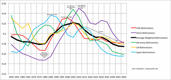
First Japan’s demographics peaked out, producing the Nikkei and Japanese real estate tops. Then the US peaked in 2000 with the resultant biggest ever stock market mania. Next UK and Germany peaked out with the 2007 stock market and real estate peak. Finally, China peaked out and as the world’s biggest consumer of commodities, the commodities index accordingly delivered a major top.

Since then demographics are united in a downtrend, which is the main reason why 6 years post financial crisis we still have ZIRP, QE and easing as the dominant central bank policies worldwide, and why the world economy is under such deflationary and recessionary pressures. Ultra low rates helped give rise to the stock market mania of 2013-2015, but otherwise we have to turn to solar cycles not demographics for the driver.

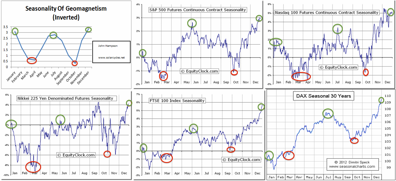
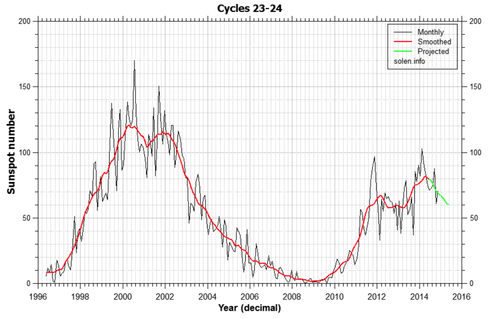
Each of the sunspot maxima in the era of globalised, free markets produced a peak speculative mania. Between July 2014 and May 2015 we saw commodities, junk bonds, leverage, breadth and stocks peak out, following the smoothed solar max of April 2014.

5sept30

That lag is not dissimilar to that in 1929: a slight overthrow beyond the solar max. In both instances breadth peaked out at the same time as the solar max but nominal stock prices didn’t top out until a year later.

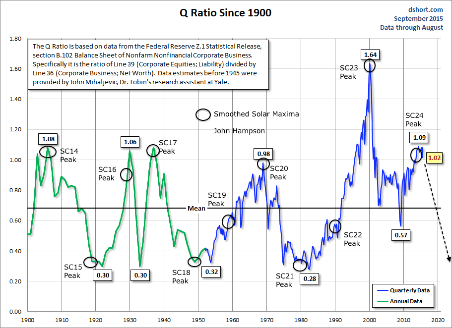
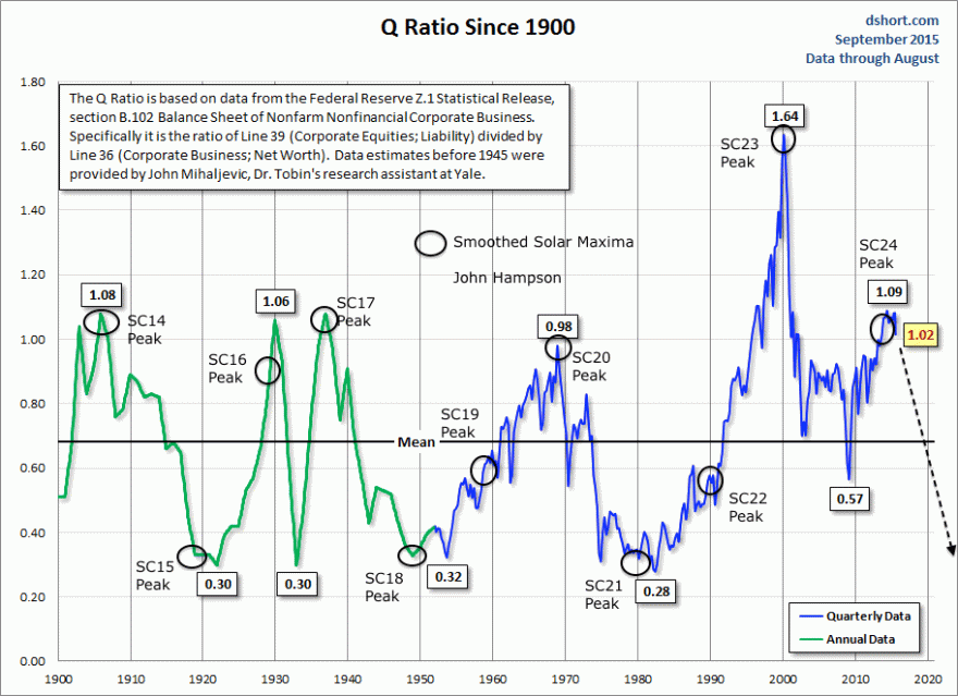
Drawing on Q ratio valuation for the big picture we can see that solar maxima typically produced high extremes in valuation which then mean reverted. Meanwhile, low extremes corresponded to major commodity or gold peaks.

5sept15

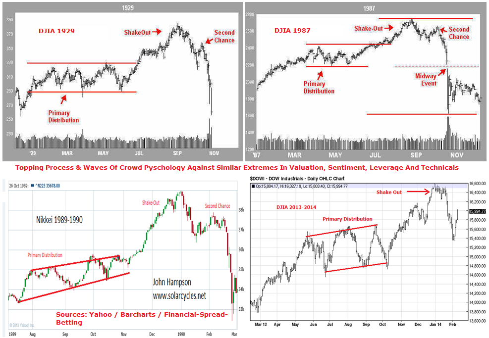
Draw together both the solar cycles and demographics above and we get the projection of the black arrow, namely that stocks should wash out to undervaluation levels by around 2025, the next solar max, and gold should rise into a major peak then. What’s key is that there is no demographic relief in any of the major nations between now and 2025 nor a solar maximum (they are roughly every 11 years). Therefore, I expect a long bear market in stocks in this window, like these examples from history:

5sept40

If I was to narrow the projection a little further, then the solar minimum of around 2018-19 is likely to mark the first major bottom within that. That means a bear from now of around 3 years, similar to those historic cases above. After that stocks ought to continue to languish, perhaps sideways Japan-1990s-style, whilst gold rises to dizzying heights to a peak circa 2025. But that time frame is a little to long to be anything more than speculative, so let’s keep the focus on the first major cyclical move, which I consider to be a bear from May this year to last some time and take valuations sub-mean.

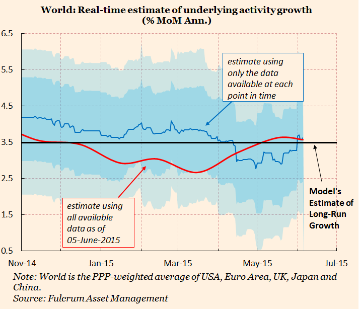
The question mark is over central bank response. They won’t stand by and watch this occur but are likely to turn to increasingly unorthodox measures. The reason demographics and solar cycles work is because the markets are globalised, free, instant voting machines that therefore capture major collective trends. If central banks ban shorting, restrict capital flows out of the country, penalise people for not investing in government bonds, penalise savings, or other such policies then the markets environment will become more distorted and we will have to adjust accordingly. So far, however, central bank distortive measures haven’t been able to override the collective demographic trends, as evidenced here in global inflation and economic trade.

5sept7

Source: Gavekal5sept5

All that stands between outright global deflation and recession is the wealth effect of the stock market. So let’s turn to that.

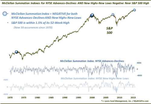
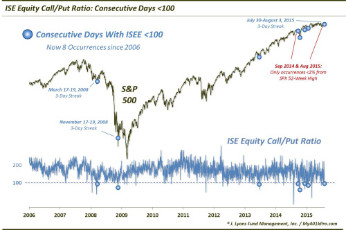
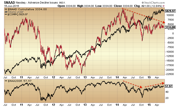
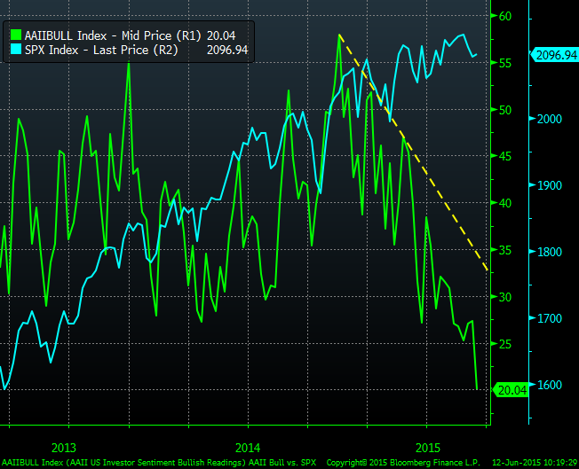
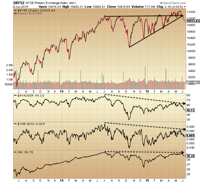
In 2014 we saw around 40 different topping indicators aggregate in the US stock market. From mid-2014 we saw multiple divergences in breadth and risk, whilst commodities and emerging markets broke down. In 2015 developed nation stock prices arched over, topped in May and snapped in August. Now, we see washout levels in commodities, emerging markets and various stock market measures such as sentiment, breadth and risk.

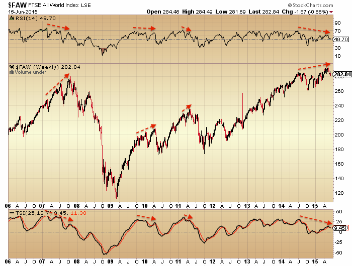
In the big picture, US stock market valuations have declined from their peak but are still highly levitated.

5sept6

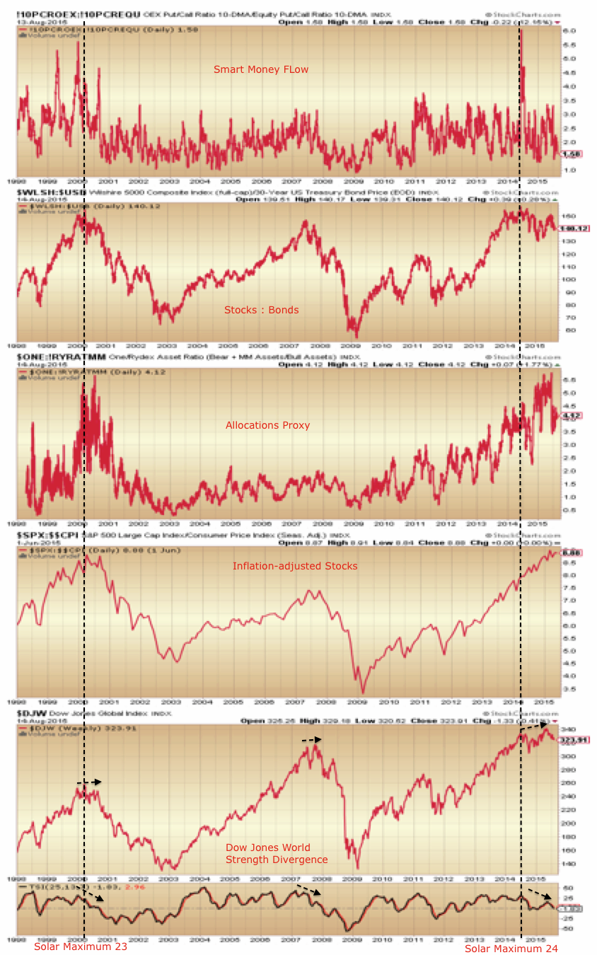
II sentiment and Rydex allocations either show a major unrepairable pop of the stock market bubble, or a healthy washout from which stocks can now in due course resume bullishly.

Screen Shot 2015-09-04 at 22.27.15

Source: Yardeni5sept51

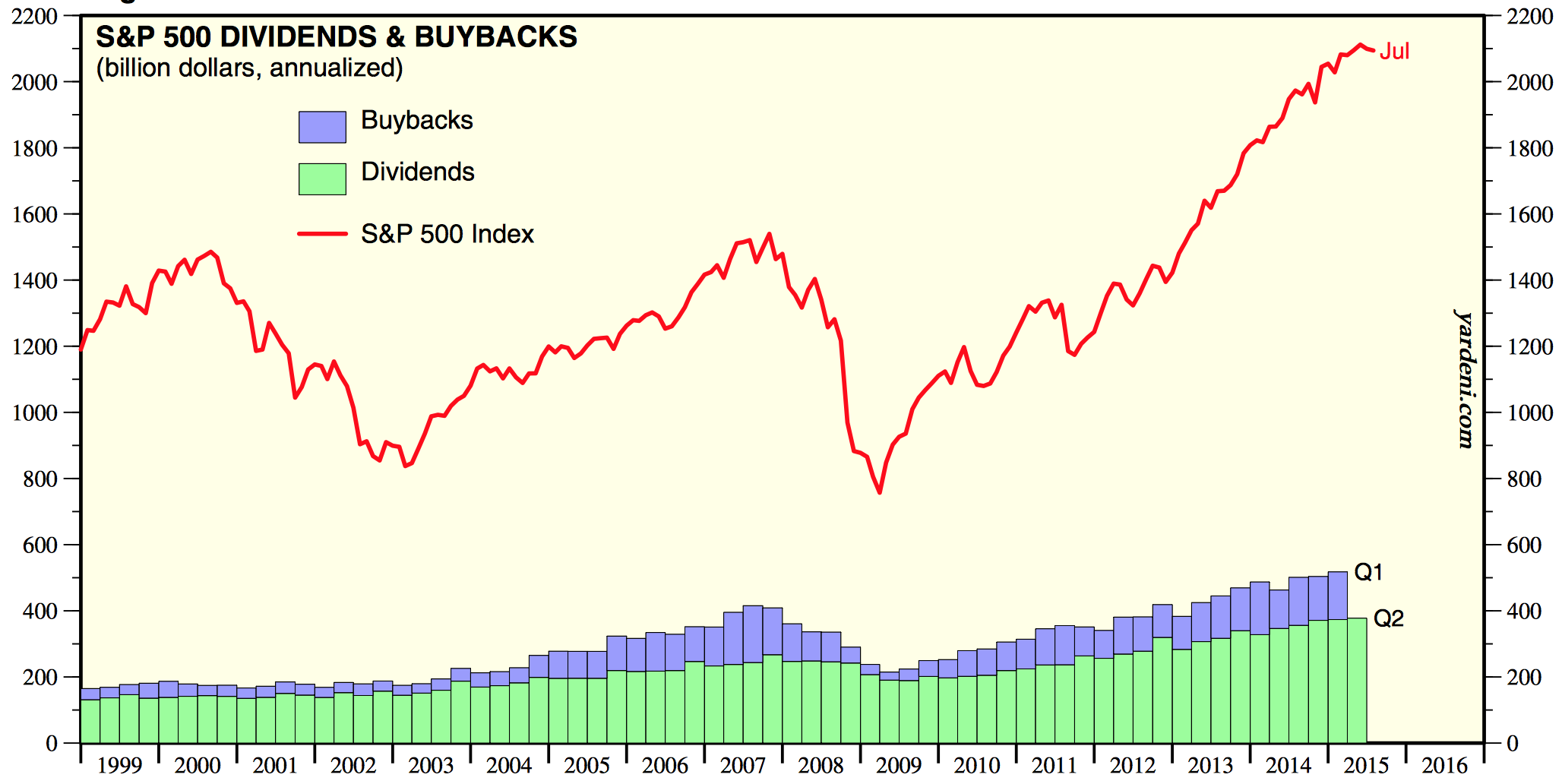
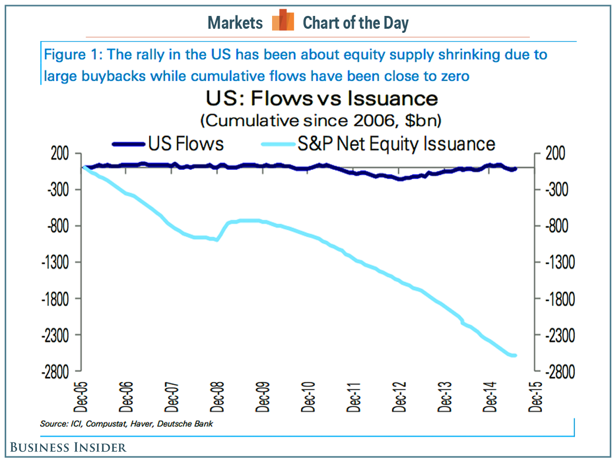
It’s clear that the mania or the last 2 years depicted in these two indicators is about as crazy as it gets and odds are much higher that that recent bursting of the bubble is likely to have ushered in a period of mean reversion. Effectively it has broken the collective complacency and the record leverage deployed in the markets is now likely to shy away from its peak. Without the demographic tailwind, leverage has been the main fuel for this bull, through both margin debt and buybacks-via-borrowing.

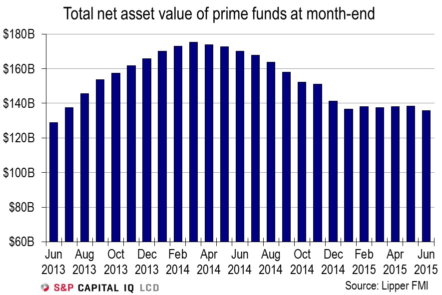
Regarding buybacks, this fuel source is likely to continue through the end of this year as companies execute their purchase plans. We can see how something similar transpired in 2007.

Screen Shot 2015-09-04 at 17.31.11

At some point, the leverage in the system will unwind in a disorderly way, producing a crash. What I am wondering is whether this may occur again once both buybacks and margin debt are declining in a more united way together (like in 2008), which would likely be once 2016 hits. Just speculation.

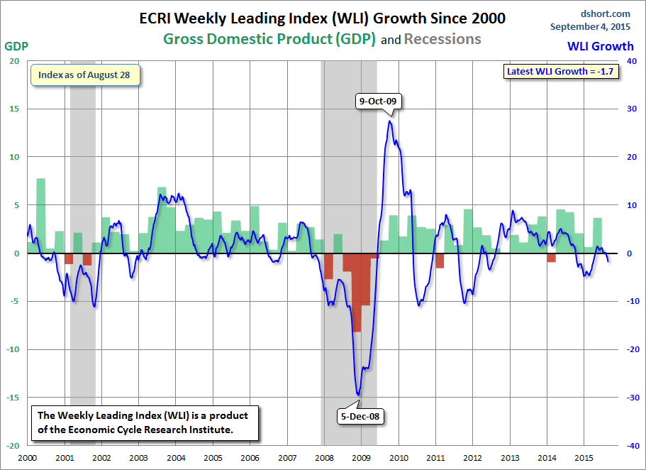
In the meantime, the August breakdown in stocks has likely done enough damage to cement the bear and kick off the negative feedback looping that will produce escalating trouble from here on. ECRI leading indicators and Bloomberg financial conditions have both slipped negative.

5sept13

Screen Shot 2015-09-05 at 08.28.15

Source: Bloomberg

Turning to the near term, this is how the SP500 looks:

5sept60

Prices are consolidating after the August drop. Breadth, Trin and volatility show similar washout readings to 2011. Nonetheless, the historic pattern is that stocks ought to retest the August lows and at that point bulls should be looking for positive divergences. An absence thereof likely spells lower prices which in turn increases the odds we are in a bear market.

If we are in a bear market then this doesn’t prevent ripping rallies. In fact they are common. What’s important is to see a pattern of lower highs and lower lows. So, should we push upwards from the current oversold/overbearish short term readings then we should stop short of the August breakdown point. Should we break downwards we should take out the October low and initiate the lower low pattern. On a longer term view, the bear market should very gradually eliminate the dip buyers, until all hope is truly lost.

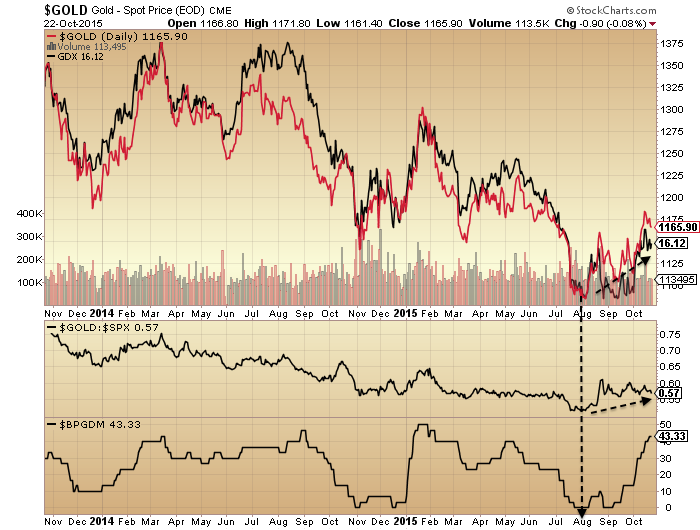
My tactics then are: hold short (Biotech, R2K, Dow), add short if we go higher, wait for August lows retest, check for positive divergences and bottoming pattern to judge whether to take profits. Cross market to gold, I am long and holding, looking for gold to cement its higher low than July and build out its rally. Were gold to break down to new lows, then it would be a warning.

Lastly, a note on washed out emerging market stocks and non-precious metal commodities. Oil has dropped from $100 to sub $40 in a short time and emerging market equity valuations are historically very low. Are they a buy?

5sept11

My perspective is that we have experienced something similar to 2006-8 whereby markets crumbled in order. Then, real estate fell first, then equities then commodities. This time, commodities and emerging markets fell earlier than developed equities. When developed equities have eventually truly washed out then there may be attractive risk-reward on emerging and commodities. But between now and then I expect a bear market and global recession, which would keep the pressure on both asset classes.

A Dumb Mechanism

Evidence reveals the financial markets to be ‘dumb’. Long term trends are dictated by demographics (swelling numbers of buyers or sellers) and solar cycles (influencing speculation levels amongst participants). Markets top out when there are no new buyers left and/or no room or appetite for existing buyers to increase debt, and bottom at the opposite. This contrasts with common wisdom that markets are instead dictated by central bank actions, economic indicators, or company fundamentals. They play a role, but the evidence shows that the stock market leads the economy, that central banks are typically behind the curve, and that stocks rise purely on multiple (valuation) expansion if there is either swelling leverage or swelling buyers (or fall vice versa).

Into 2014’s solar maximum we saw a speculative mania in equities akin to the last solar maximum of 2000. But unlike 2000, there was no demographic tailwind, instead a headwind. Without new buyer flows into the market, we have therefore seen equities bid up by (1) existing buyers leveraging up and (2) companies buying back their own shares.

This chart captures the flat money flows as predicted by demographics versus the declining share issuance due to buybacks.

15augu2Source: Business Insider

The effect of buybacks is to increase EPS and decrease P/E. The latest earnings show a blended 1% decline YOY, but without those buybacks the figure would have been closer to -4%. Revenues declined 3.3% YOY and reveal a truer picture of companies performance. Additionally, companies have largely borrowed to buy back their shares, making this market fuel particularly ‘unhealthy’.

Buybacks are likely heading for a new record this year, beating the 2007 record. This may partially account for stocks continuing to levitate despite all-round deterioration in other indicators.

15augu30Source: Bloomberg

The other fuel source has been increasing leverage. We can see that leveraged loans peaked out around last year’s solar maximum:

15augu22

Source: LeveragedLoan

Whilst margin debt lurched upwards again in 2015 to a current April high.

15augu40Source: D Short

Meanwhile in China margin debt went crazy and can be seen to be wholly accountable for the rise in the Shanghai Composite. This too fits with demographics there: no new buyers, only existing buyers leveraging.

15augu20Source: FX Street

The subsequent collapse in China’s stock market shows what happens when there is no room or appetite for further leverage amongst participants, which brings us back to the top of this post. Then, when leverage starts to unwind, it brings about forced redemptions and thus more selling, as it is effectively a ponzi scheme.

So the question is when leverage in the US and elsewhere starts to unwind. Based on historical evidence, appetite for leverage should wane post solar maximum. We see that in leveraged loans above, but margin debt has rallied further. We know from 1929 that leverage extended a year post solar maximum before collapsing, whilst breadth deteriorated over the same 12+ months. We are again producing that kind of outlier extension, set against a similar ongoing breadth deterioration since the solar max of last year.

Either the sideways range in US stocks in 2015 is the pause that refreshes the bull or it is the topping process that turns into the leverage reversal inspired sharp declines. Solar-aside, there have been so many indicators that this is a market top, sharing characteristics with 2007, 2000 and other major historic peaks, that a bull pause is highly unlikely. But what’s different is that the interest rate, QE and inflation environment, together with commodities relative performance, hasn’t been seen in 50+ years, if this is to mark a top. However, rather than that negating a top, we simply need to look further back in time for reference points. Yet, if the stock market is a dumb mechanism, then we shouldn’t even need to do that.

The solar max produced the stock market mania. Demographic trends meant it has been fuelled by leverage and buybacks. The flat market of 2015 suggests saturation has been reached. Post-solar max, appetite for speculation unwittingly declines. China has broken and all markets are off their peaks. The last several weeks, indicators that have worked for the bulls over the last 2 years haven’t been working. I think the fuel is spent. Buybacks and margin debt are the key here, but both data sets come out with a lag.

Below we see several key indicators peaked out with last year’s solar max whilst a couple of others extended beyond. Now the latter should fall in line with the former. Note how the levels reached have been largely similar to 2000’s saturation levels.

Screen Shot 2015-08-15 at 08.43.03Source: Stockcharts

We are now through the August new moon, heading into the seasonal (geomagnetic) lows of Sept/Oct. I’ve been back on the attack short stocks, with particular emphasis on Biotech.


Top Signals And Bottom Signals

The Dow and SP500 are combined flat for the year and the 7 month price range has resulted in bollinger bands that are the closest in 20 years. Behind the scenes we see evidence of a major peak in equities, making the range a likely topping process.

6augu3Source: Hussman

31juli13

Source: Dana Lyons

Screen Shot 2015-08-06 at 06.50.11

Source: Yardeni

Yet we are also seeing signs of a significant bottom.

6augu2

Data source: Rob Hannah

6augu7

Source: Dana Lyons

6augu8

Source: Fat-Pitch

These bottoming signals have formed less than 5% from the highs. So are they a springboard for a break upwards out of the price range before stocks top out? It’s one possibility.

Note that previous incidences of the topping indicators gave rise to at least a 15% sell off, whether it be more like 2011, 2010, 2007 or 2000 in nature. Meanwhile, the bottoming indicators often formed at bear market pauses, at selling exhaustion points. Has a bear market begun then? It’s another possibility, but the shallowness so far of the selling is odd.

What’s also confusing is that some indicators have washed out at this point whereas others remain at contrarian levels, such as Vix. Plus note that some indicators have produced a clustering of extremes for 12 months now, stuck at levels from which mean reversion would have historically fairly swiftly occurred. All told, it’s more history in the making and makes it difficult to call the outcome with high confidence.

Buybacks peaked out in Q1 2014, IPOs in Q3 2014. Data shows that money flows into equities have been flat in this cyclical bull, in line with demographic predictions. Without new buying sources, the bull has been fuelled by buybacks and existing participants leveraging up. With buybacks decreasing, the bull (if still in progress) is reliant on continued increases in leverage.

As things stand right now, stocks may need to move higher to neutralise those bottoming indicators. Therefore I can’t rule out the possibility of a final move higher, an overthrow, before a true rollover. However, stocks are also overdue a deep and sharp correction and the clustering of indicators, both top and bottom, within such a tight price range, could also produce a swift move lower, before a partial retrace upwards. It may be that fuel has been exhausted and certain indicators are therefore not as contrarian as they may be perceived. In short, right now I’m watching and waiting to see which we way we break before attacking again.

Comparison to 1929

Hat tips to Mark, John Li and Chien Jen.

So what’s similar to 1929?

A stock market mania to extreme valuations.

17junn2

Source: D Short

A similar low intensity solar cycle.

17junn1Source: Chien Jen

Stock market breadth peaked very close to the smoothed solar maximum (May 1928 vs April 1928, Mar/Jul 2014 vs April 2014) whilst stock index prices didn’t peak until at least a year later.

17junn5

Source: RW Nelson17junn6Source: Stockcharts

Maybe stock prices are following a similar technical pattern.

17junn8 17junn9

The timings within the year fairly closely match too. 1929 began with a range. The final push was June to Sept. Therefore, the onus is on the bulls here to push prices back up into the range and out, to prevent the breakdown from the current position.

Now what’s not similar.

Economic growth was stronger in the 1920s.

The fed funds rate was around 4-5% in 1928/9 versus zero now.

It was a demographic climax produced by peak immigration at the start of the century of the age bracket that would buy the stock market in the 1920s.

17junn20Leverage reached 12% of GDP by the peak, versus 3% now.

All things considered, I believe 1929 has more in common with 2000, which was a demographic climax following strong economic growth with fed funds rate similarly around 5%. Post 1929 we saw the Great Depression, post 2000 the Great Recession, then following both we experienced a valuations-led stock market mania into the next solar max set against easy money conditions. Hence 1937 is a better all round fit to now (see HERE for details).

However, what’s common with 1929 is important, specifically that breadth peaked out 16 months before prices, and that is was ultimately leverage that delivered the craziness into the peak. Here in 2015 margin debt is hitting new highs so maybe the game isn’t over yet.

There was always a question mark over why prices didn’t peak with the 1928 solar max but made the anomalous extension into 1929. However, now we can see that breadth peaked at the 1928 solar max, like it has at the mid-2014 solar max, so in both cases marking some kind of speculation peak. The majority of other solar maxima delivered peaks in both breadth and prices close to the sunspot peak. Assuming prices peak out within the next several months (and don’t keep going, new secular bull style) then we are again producing that kind of anomaly that we saw in 1929, namely a fairly long period of degrading internals whilst prices continue to levitate or rise. Why? It’s leverage. Saturation levels in sentiment, allocations and valuations have been in place since the start of 2014. Buybacks were significant for much of last year but now it is leverage which is left holding things up.

So what stopped it in 1929? Answer: nothing in particular. One day the market topped out without any notable trigger, like most tops. Ultimately it was a combination of the fuel for higher prices being spent, leverage at unsustainable levels, prices for stocks being fairly unpalatable, and the whole thing having become a ponzi scheme. Then I would argue that the twin downward pressures of post solar max and the geomagnetic seasonal lows of Sept/Oct produced the timing.

Which brings us to today. What’s to stop prices making a final major leg up like in June-Sept 1929? Nothing, if leverage can keep rising, and the appetite amongst participants is there. However, that ‘appetite’ is under threat due to our positioning post smoothed solar max and the seasonal downtrend from July to October.

Solar cycle 16 had a sting its tail with a final surge in sunspots from September to December 1929. As this rather fits with the declines than the final run up in prices, I don’t think it’s relevant as a cause of the last leg up.

I would summarise that stocks are on borrowed time since the solar max of mid-2014. Breadth, volatility (inverted) and various risk measures all peaked out then. Buybacks also peaked out around then, leaving leverage as the key driver. This kind of anomalous extension post solar max was only seen before in 1929. Given most things in the world are now ‘bigger, better, faster, more’ than back in the 1920s, what’s to stop us blowing that reference point out of the water with an even dizzier anomaly now? Well, I would argue that in the context of negative demographic trends we already have.

A common historic technical topping pattern looks like this.

17junn40

Bottom right is a chart from last year when it appeared to have formed into early 2014, but was a red herring. Drawing together several indices from around the world we could argue it is there again, with the primary distribution across last year and the final leg up in 2015.

17junn50Or we could argue the final leg needs to go higher yet, or has to happen yet on the main US indices. Not easy to call.

So if we stick to what we know, I suggest it’s this. Stocks are on borrowed time since mid-2014 as divergences continue to grow. The geomagnetic downtrend from July to October 2015 together with the post-solar-max downward pressure has a strong chance of killing the bull. The two things to watch are these. Can prices be bid back up into the 2015 range and out of the top? If so, a final leg up would gain weight. And can leverage keep rising? It needs to, if another leg up is to happen.


Is This ‘It’?

Why might it be?

The triple confluence peak of peak speculation: the new moon closest to the seasonal geomagnetic peak closest to the smoothed solar maximum: 27th June 2014. Many assets and indicators peaked then.

Screen Shot 2015-06-16 at 06.27.40Source: Stockcharts

Breadth bar cumulative advance declines peaked then too, with the latter having recently turned down.

16junn10

The global stock index has made a marginal new high since that point but the divergences in strength closely resemble previous major peaks.

16junn8The SP500 also shows a strength (and breadth) divergence that mirrors the 2011 major peak.

16junn3

The breadth in the Nasdaq measured two ways peaked out around the solar max of April 2014. There has been some improvement since but still divergent overall.

16junn6

Bullish percent / put call ratio shows one of the longest divergences, together with high yield to treasuries. Cyclicals vs defensives has repaired itself in 2015 but is overall flat for 18 months.

16junn12

NAAIM manager exposure shows a divergence similar to the run into the 2007 and 2011 peaks. It made ‘an attempt’ into the mid-2014 peak too, but as we know, the market managed to recover.

16junn4AAII bulls have also been making a divergence. Oddly though they have now reached the same level as March 2009, so that could be contrarian bullish. I’d just repeat that AAII sentiment survey has a poor predictive history hence I rarely post it.

16junn17AAII allocations – different to the above source – shows a bizarre rush to exit stocks. Don’t know what to make of that.

16junn22

Source: J Lyons

The Russell 2000 is one of the most bullish indices. But the same divergence is showing as the SP500 above.

16junn30

And it may be displaying that common pattern of historical major tops:

16junn31

In terms of its valuation, the latest p/e ex negative earnings is 22.38, which you can see versus history below.

16junn40

If we home in the Biotech sector, arguably the mania leader, we again see the same divergences as both above and prior peaks.

16junn41

In short, there are a whole host of negative divergences in strength, breadth, volatility, risk-off, sentiment and allocations for US and world stocks. The original set kicked off at the turn of 2013 into 2014, and have since been added to, with a concentration around the 27 June 2014 triple confluence peak.

I suggest there are only two ways to read it. Either all the supports for equities have been removed and they are about to tumble to ‘satisfy’ all those divergences. Or, stocks have held up despite all those divergences and so we now see breadth, strength, risk-on, etc, start to improve again, launching stocks higher. Needless to say, I side with the first option when we start to draw in valuations, allocations, leverage and other angles indicative of a major peak.

Today is the new moon at the seasonal geomagnetic mid-year peak. Either from this point or from the new moon of mid-July, stocks have the best chances of falling, with downward pressure into October.

30mays5In short, I’m on the attack, looking to build onto my short stocks positions (and long gold). I’m looking for an entry into the Russell 2000 as I believe it has the furthest to fall once equities break. I want to leave some allowance for a potential rally back up into the mid-July twin confluence peak, but until the evidence changes, the real peak was a year ago, putting equities on severely borrowed time and making yet another rally back up here doubtful.

The Dow, SP500 and NYSE all attempted a break out upwards from the 2015 range in May, which failed and now looks like a fakeout. The last chart here shows the NYSE in a rather textbook bearish formation: wedge, fakeout, breakdown, retest of wedge underside, repelled. That whole move has been building out since last July and now looks ripe for completion to the downside. I see this as another reason to be attacking here rather than waiting.

16junn50

Global Economy

The world economy is currently in trouble, showing both recessionary and deflationary coincident data:

10junn5

Source: Ned Davis10junn3Source: GaveKal

Given these, the resilience of equity markets has been pretty amazing, even more so as we are now a year post-solar maximum:

10junn12The last six months has been particularly weak economically, and normally historically stocks would have sold off leading into this, with stocks typically leading the economy.

In fact, under such extreme levels of valuation, allocations, leverage and sentiment, together with growth, ‘flation, and earnings all rolling over negative as well as the speculation peak of the solar maximum through, the case was extremely strong for 2014’s October sell-off to launch a fully-blown bear market. The weakening economy over the subsequent 6 months and the wealth-reduction effect of the declining stock market would then have fed off each other to create fairly significant devastation.

But it didn’t happen. Stocks were somehow saved. However, as pre previous posts, we see a lot of degradation in internals and cross-referenced data since mid last year, giving the potential for price action since then to be ‘last-gasps’. Below is the Dow Jones World stock index which reveals a similar higher high against weakening strength to the last 3 previous major tops.

10junn10Source: Stockcharts

Plus, we have seen a sell-off in recent weeks, making that higher high maybe a fake-out high. We still see saturation levels in valuations, allocations, sentiment and leverage and many negative divergences that all support the bear case.

10junn20

Source: Stockcharts

However, set against this, we have recently seen a turn up in leading indicators and what maybe a bottoming in coincident data.

Coincident:

10junn4Source: FT

Leading:

10junn2Source: Goldman Sachs

At the same time we have seen some money exiting bonds and inflation expectations recovering, suggesting some of the expected pick-up being priced in by market participants.

However, real money leading indicators predict this to be another non-sustained pick up in global growth, i.e. still not the move to sustainable strong growth that leads to central banks starting to raise rates. Rather, they predict the growth to peak by October this year and then give way to weakness again.

The key question, therefore, is whether equities can now rally again and keep the bull market going over the next few months against a backdrop of improving economic surprises. If so, then we would need to see stocks repairing this kind of bearish set-up of fake-out plus divergences:

10junn23

Source: Stockcharts

If stocks can do that, then an obvious reference point would then be 1929, with a potential Autumn/Fall peak, a similar length of time post-solar maximum, at similar extremes of valuation and leverage. Anything beyond that and there would be no further reference points. This really would be unchartered territory for world markets, whereby the ‘old rules’ no longer apply.

Here’s a look at China’s stock market. The divergence from GDP is extreme and as such valuations are now at a new record.

10junn6 10junn8Source: Sober Look

The rise in margin debt in China has rocketed. Leveraged-based stock rallies are ponzi-schemes, making for a risk of a major unwind at any point. The leverage situation around the world is similarly flagging that risk.

10junn9

Source: DShort

In summary, I believe this is where we find out what really moves the markets. My position on that: dumb forces. Demographics, solar cycles and simply running out of buyers. By the latter I refer to saturation in valuation, leverage, sentiment and allocations: everyone on one side of the boat and borrowed up to the max. We can see additional clues to the fuel drying up in divergences in breadth and other indicators.

June/July is the seasonal geomagnetic peak, so I don’t rule out the possibility of a short rally back up here in stocks. But unless all those under-the-hood July 2014 peaks are repaired, together with the bearish technical set-ups and negative divergences, then I expect leading indicators to be disregarded here, in the same way negative leading indicators were disregarded several months back. The fact that the market has risen against both positive and negative leading and coincident economic data the past 2 years is a clue that economic indicators aren’t the driver. So is central banks? I refer you back to the top two charts. After billions spent on QE and ultra suppressed rates, we still have a world economy on its knees.

More Indicator Updates

1. Topping thrusts compared:

2ja1Source: Stockcharts

That 4th chart now stands at 52 days and 15%, so ripe for conclusion.

2. Skew:

2ja2

Source: Dana Lyons

Skew is still in the elevated range warning of potential large move.

3. Put/Call:

2ja3

Source: Dana Lyons

Mirrors previous topping processes.

4. Sornette Bubble:

Screen Shot 2015-01-02 at 07.15.30

Source: Financial Crisis Observatory

SP500 bubble end still showing as start of July.

5. Sunspots:

Screen Shot 2015-01-02 at 07.19.24

Source: Solen2ja6Source: SIDC

Both sources, plus IPS additionally, show the smoothed solar maximum behind us in April 2014 with a value of around 82.

6. Gold and gold miners sentiment still at contrarian depressed levels:

2ja8

7. US Dollar still ripe for a reversal:

2ja10Summing up, the picture painted by these indicators is consistent with my last post, namely that stocks have been in a topping process in 2014, that the solar max and speculation peak is behind us, that the effective peak in stocks was end June / start July 2014 and that stocks are still set for a big move to the downside. Plus, fortunes in the US dollar and gold/miners should reverse, fitting with the reversal in stocks.

Recall the 1989 solar/stocks peak. The solar max was July 1989 and stocks (Nikkei) stretched upwards until the end of December 1989 before finally topping out and falling. However, note the new moon then was 28 Dec, providing an additional optimism peak. Here at the turn of 2014/2015 the new moons are 22 Dec 2014 and 20 Jan 2015.