What if I said the prices stock indices are at currently may never be seen again? I’ve not gone crazily bullish, but it is possible. Let me explain.
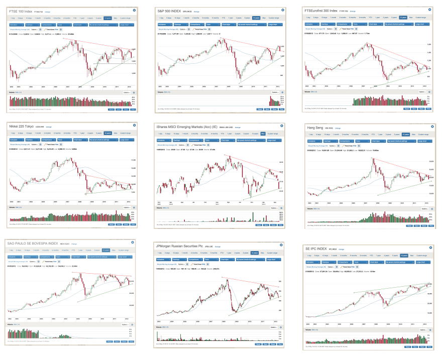
This is a compilation of global stock indices, provided by commenter John. They are all in large triangle formations. Symmetrical triangles following sideways action since 2000 is very much in keeping with previous secular stocks bears under permanent policies of inflation, namely sideways coiling.
 Source: R Bowden
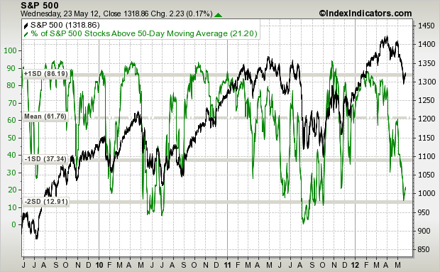
So which way are they going to break? A symmetrical triangle forming following a sideways range gives no edge technically – it can go either way. But note that the S&P500 has broken out upwards and is backtesting the triangle, whilst the Nasdaq, not shown, is even more bullish than that.
Below is the last secular stocks bear market. The secular/solar stocks peak of 1968 corresponds to the secular/solar stocks peak of 2000. The secular nominal / solar bottom of 74/75 to 2008/9. A large triangle formed (in red) and broke out to the upside. One year away from the solar/secular commodities peak of 1980 (like now, 1 year away from the Spring 2013 solar peak), stocks had also broken out and were backtesting the triangle – the We Are Here point. Now note that although stocks didn’t gain real new secular bull market traction until mid 1982 after the post-solar peak recession, they never got as low as that ‘We Are Here’ point again.

Underlying Source: Stockcharts
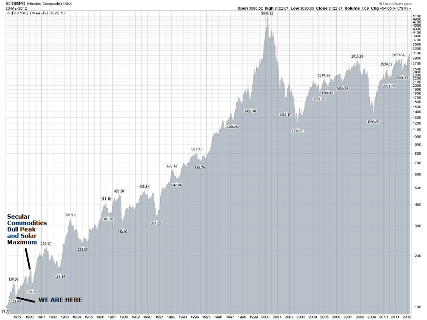
Now take a look at the Nasdaq at the same point. Even more bullish, much like today’s Nasdaq.

Underlying Source: Stockcharts
Cross over the pond, and the FTSE 100 did make slightly lower lows after the current equivalent point, but only marginally.

Underlying Source: Sharelynx
A look at the FTSE All Share paints the same picture: barely new lows after this point.

Underlying Source: Thomson Reuters
Looking at the secular bear market of the 1940s and the Dow Jones, stocks did not take off in earnest until 2 years after the equivalent current point, but again barely reached lower than the lows made 1 year before the solar peak.

Underlying Source: Stockcharts
So, using secular bear market history as our guide and combining with the timing and influence of solar cycles, we have fairly bullish roadmap for equities from here forwards. Into a solar peak we see a speculative maximum, making for secular tops. It therefore follows that stocks do not decline into a solar peak even when it is a secular commodities solar peak (and this is reflected in my historical analysis of stocks returns into solar maximums), as the pro-risk sentiment prevails. But what’s interesting is that the post-solar peak recession and bear market didn’t do much damage. It reflects what I previously said about redefining secular stocks bulls as beginning at the nominal lows of 1942, 1975 and, I argue, 2009.
In past secular bears, the low point has come in the middle of what’s commonly understood to be the secular bear range, followed by a gradual process of repair. It therefore follows that the nominal lows for equities are successively higher after that point – e.g. between 1975 and 1980, between March 2009 and 2013. Right now, things look bleak. It seems that global growth struggles to sustain without central bank stimulus. Euro debt keeps returning to the fore despite government actions. Large companies are still going under as weak economies prevail. Yet, this is how secular stocks bulls begin – a huge wall of worry, which is dismantled piece by piece. They don’t start from everything being fixed, they start from a mess, but a mess where equities are historically cheap and a lot of excess has been purged from the system. All the last 3 secular bears have had more in common than differences: problematic inflation combined with sluggish growth, geopolitical disturbance, debt crises and the loss of companies and jobs. If it seems like problems are major this time round, it was no different back then. In 1979, the equivalent point to now, there were debt crises in Latin America and Korea and the USA had to raise its debt ceiling, much like today. In 1946, again the equivalent point, excessive war debts meant that interest rates had to be kept low, despite inflation, much like today.
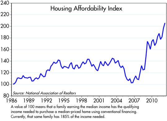
At the turn of 2009, the talk was of total system melt down. Consider that the start of the huge wall of worry, the very messiest point. Now we are no longer facing total system meltdown but facing Euro debt contagion and economies seemingly dependent on central bank stimulus. That is an improvement on 2009, and the stock market (the US stock market) has doubled since then. There has also been significant cleansing and repair since then: bloated companies purged, house prices deflated to historical normal ranges, household debt burdens back to the levels where the last secular stocks bull market began:

Source: Scott Grannis
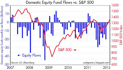
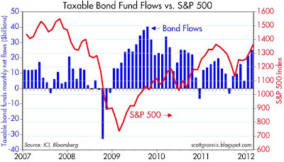
Fund flows in equities have been negative the last 5 years and continue to be outflows. Retail participation in stocks still isn’t happening. Yet participation in treasuries continues to increase despite real treasury returns being negative. In other words, the fear of stock declines is so great that people would rather be parked in something paying a guaranteed small real net loss.


Source both: Scott Grannis
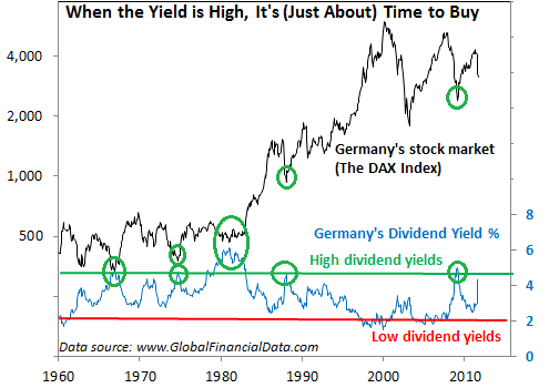
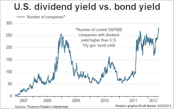
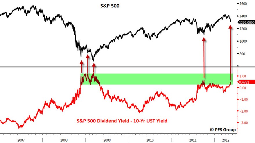
Stock dividends are highly attractive compared to treasury yields, back at levels compared to 2009. As it slowly dawns that stocks are going up, not down, money still start to flow the other way. Once that occurs the secular stocks bull will truly gain traction.

Source: Chris Puplava
Secular bear markets in stocks typically end with p/es in single digits. Current country p/e ratios that have reached single digits right now include China 7.2; Hong Kong 9.2; Norway 9.6; Russia 5.2; Singapore 8.9 and UK 9.7. Others aren’t there yet, such as US 14, Brazil 10, Germany 11, Australia 13 and Japan 14, but after the next bear and recession, circa 2014 by solar cycles, I expect them all to be there. Consider that US stocks topped around p/e 40 in 2000 – again, that’s quite a process of repair.
Once the natural cleansing cycle is close to completion, genuine global growth will get going again, without central bank support. Technological evolution will be the engine. Excess debt may have been transferred to government balance sheets, but the major economy debt to GDP levels aren’t at crisis points. Once revenues pick up and central bank support diminishes, the rate of balance sheet expansion will slow. Euro debt and the Greece situation needs further counter action currently, but governments have made it clear, both in words and actions, that they will step in to prevent worst case scenarios.
In short, I acknowledge the seriousness of the issues we face right now, but also the intent of global leadership. Most importantly though, history reveals that it is normal at this point in the secular bear to still be facing such challenges and that despite the challenges (or even thanks to them: wall of worry) we should be looking up, not down for equities. I’m not implying that all-in on equities right now is the way to go. Commodities should make their final blow-off move into next year, making them more attractive than stocks over the next 12 months, and thereafter a bear and recession should eventually provide the final great opportunity to get into equities. But there is a chance, even a likelihood, that the low in equities at that point will be higher nominally than now, which makes me reflect on all the long positions I took last week in equities.
Turning to commodities then, and using history as our guide again, there was a peak in inflation in 1942 and a higher peak in inflation in 1947, the solar / secular commodities peak. There was a peak in inflation in 1975, and a higher peak in inflation in 1980, the solar / secular commodities peak:

Source: FRBSF
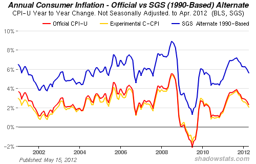
2013 is the forecasted solar peak, inflation peak and secular commodities peak by solar cycles. We saw the first inflation peak in 2008 – which would be 5 years prior, just like in the 1940s and 1970s. The chart below shows the 2008 peak and our trending upwards since then again, despite the ‘deflation’ chatter.

Source: Shadowstats
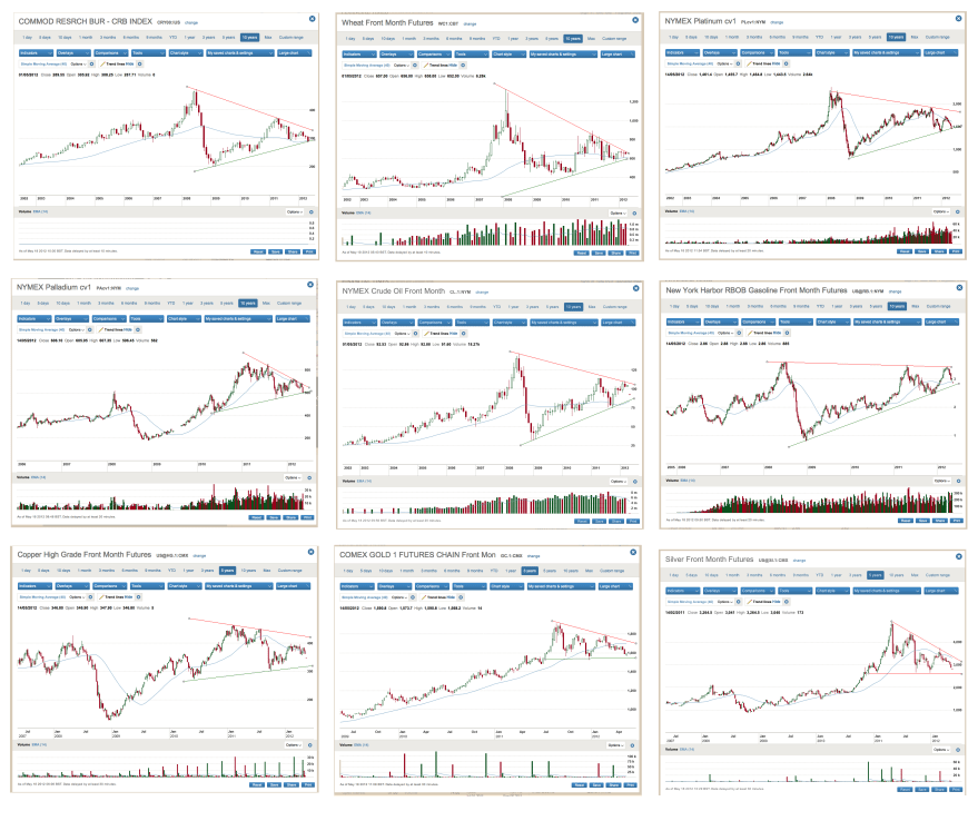
Now look at the commodities charts, courtesy of John again. Large symmetrical triangles, like stock indices, but the difference is that these formed in upward rising trends in place since 1998/2000. By the book, that makes them more likely to be continuation patterns. I believe they will break out upwards, and when they do, they should make the acceleration into the secular /solar peak, fulfilling the inflation prediction at the same time.

Source: R Bowden

