Solar, Earnings, Commercials

The R/J CRB commodities index now looks very close to the geomagnetism and lunar model in 2012:

It is a closer match than equities so far, which is in contrast to my expectation, as I predicted that commodities would pull away from the model into the solar/secular peak of 2013, whilst stocks would stay with the model. Well, that may still happen, and I believe there is a greater likelihood once sunspots pick up in a sustained way.

Above, we can see that sunspots are starting to trend up again, but we should see them push up higher and longer as we wave our way into the solar peak. That should in turn inspire speculation and inflation.

Scott Grannis has some useful insight into the apparently extreme US corporate profits. This first chart you may recognise, as its the one that suggests mean reversion should be imminent. However, the second shows corporate profits as a percentage of global GDP rather than US GDP, which shows US company profits closer to average. Because companies have globalised and emerging markets have grown faster than the US, the result has been a distortion of the first chart, with the second a more true picture.

Source: Scott Grannis

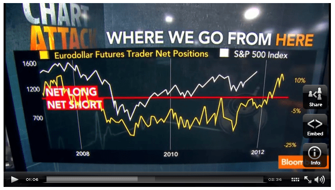
Lastly, Tom McClellan uses a model of Euro-dollar net commercial positions advanced by 12 months to predict the stock market (hat tip Gary), in other words, how the big commercials position themselves in this contract is reflected in the stock index a year later. If that sounds unlikely, here is his explanation: ” It may help to understand that the commercial traders of eurodollar futures are typically the big banks, who are using these futures contracts to manage their assets and fund flows.  So what we are seeing in their futures trading are responses to immediate banking liquidity conditions, and those actions give us a glimpse of future liquidity conditions for the stock market.  These liquidity conditions are revealed first in the banking system, and then the liquidity waves travel through the stock market a year later.”

Here it is this week, predicting consolidation in stocks from now into June, and then a rally into US elections in November:

Source: Bloomberg

Advertisement

Update

Equities: the indices have diverged to some extent. The Hang Seng has been correcting since late Feb. The Dax looks to have begun a consolidation/correction last week in my anticipated turn window, and continued it this week. The SP500 is unclear – either Monday’s action was a fakeout to the upside and the correction begun last week continues, possibly sideways, or it is still in an uptrend. The Nasdaq looks very much still in its uptrend, digesting Monday’s gains and ready for more. Apple remains in its uptrend too.

It’s unclear. We aren’t generally seeing a set of extremes in overbullish and overbought indicators (whilst recognising that we are overall elevated) – there are just a couple of indicators calling for an immediate turn – such as a persistent high extreme CS Fear Index and a Nasdaq RSI of over 75. Yet, US Economic Surprises dropped again, and we continue to see divergences in this and in my geomagnetism models from the US stock indices. Chris Puplava’s latest analysis negates the likelihood of an imminent bear market for stocks, and I generally anticipate sideways action. So I continue to wait for a better opportunity in equities – either at overbought/overbullish extremes or the opposite, whichever comes first.

Source: Stockcharts

Bond yields have fallen back in the last few sessions, perhaps following Bernanke’s dovish comments, and commodities have fallen back also, with concerns over China’s growth playing. Gold now looks to have been repelled at the 200MA so perhaps needs more time to consolidate before gaining upside traction. Oil inventories were higher than expected yesterday, putting oil at the lower side of its recent range. If oil were to break downwards out of this range, then that would also suggest more time is required before commodities are ready for a momentum rally, so let’s see. Portugese CDSs dropped out of their long term uptrend, in an interesting development. Yet Spanish CDSs have not weakened in the same way. Italy CDSs are unclear.

I have little else to add at the moment, and don’t want to post ‘filler’. It’s been a week with not much to report or analyse, so patience it is for now, and we’ll see what transpires.

Roundup

Last week gave us a correction in stocks, but upside resumed yesterday. Apple continues to print topping candles and then reversals. Broadly speaking, indicators are not screaming overbought or overbullish, so for now the medium term uptrend remains in place.

Bernanke’s dovish comments provided a trigger yesterday for gold and miners to move up, which was in line with the overbearish extremes both had reached. Oil continues to range trade but in what looks like a bullish flag. The Euro and Dollar are at an important decision point.

I have updated and extended my short and medium term models (see pages of those names). There is some near term downward pressure next week into the 7th April. Medium term, the message remains that stocks have run above the models and should now be brought back into range, in overall sideways action.

US earnings begin again 10th April. Profit margins are at a record and historically this has been mean reverting. If earnings start to disappoint, then coupled with downward trends in economic surprises, that would make further upside difficult for stocks. However, earnings may not disappoint, so let’s see. Here are suprises:

Source: Bloomberg

Quite a downtrend in place since the turn of the year, and unless this turns up then stocks should eventually exit their uptrend. Here is the updated overlay of the surprises index on the S&P500. In both recent examples of 2009 and 2011, once the surprises index topped out, the stock market moved from uptrend to sideways/down consolidation a few months later.

How’s Euro debt? Here are Spain and Portugal 5 year CDSs. They remain in their longer term uptrends. Unless they can break down decisively, then it suggests Euro debt will come to the fore again at some point in 2012. Let’s see.

Source: Bloomberg

Trading-wise, I am currently doing nothing. I am hopeful that gold may now take off, with yesterday’s trigger and the overbearish extremes reached, and I am well positioned for that. Oil looks strong, both technically and fundamentally. Agriculture is picking up again, slowly. Again, I am positioned for both those. The Euro-Dollar remains finely balanced and I continue to monitor. I have a negligible stock indices long position. I do not wish to short equities, whilst leading indicators continue to improve. I do not wish to go long equities, whilst divergences build in surprises and geomagnetism. I am awaiting a more clear cut opportunity in stocks, whenever that comes.

Gold

Let me start by saying that I’m not a gold bug. I don’t own any physical. In the event of a global mega-disaster I don’t want gold. The fiat system is unsustainable on current trends, but debt limits in the major developed nations are further out, circa 2030, so those buying gold as protection against its collapse are too early, in my view. Investment and central bank demand are the growth areas for gold, and I expect them to reverse once a new secular growth cycle emerges and dividend-less gold suddenly doesn’t look very appealing.

All that said, gold has been a source of great profits since I started trading, because of its enduring secular bull since 2000, and I am overweight precious metals currently, anticipating that the biggest gains are yet to come in an imminent finale. By solar cycles, the peak should be 2013, and thereafter I don’t want any gold in my portfolio – not until the next secular commodities bull in the 2030s. In short, I believe there is a final gold mania just ahead, which is a terrific opportunity for a trader to make big, fast profits, and yet, I don’t want to get stuck with gold so want to ensure I sell out before the peak. Therefore, I have a full long position in precious metals already, frontrunning what I believe to be a final mania (if you subscribe to the general ideas of Kondratieff, then this is a K-winter in which gold is the leading asset).

But might I be wrong? It is a tricky one to call, as it isn’t clear cut, particularly with gold currently in a down trend some way off its peak. It reminds me of the condundrum regarding equities in the second half of 2011. It was a tough call that needed repeated assessment. So here we go again…

As things stand, gold’s secular bull remains in an orderly uptrend, although it is currently beneath the 200MA, which has largely supported the bull to date. There have been notable spikes on the way since 2000, but nothing resembling historical manias. If I had to pick out a few analysts who I respect and trust, then Marc Faber remains a gold bull, Zeal LLC maintain we are still in a gold secular bull, Chris Puplava is bullish on gold to retake $1900. The alternative is that precious metals peaked in 2011 and the batton has already been passed to equities.

The major central bank policies of negligible interest rates and stimulus make for asset bubbles, hence since the secular stocks bear began in 2000 we have seen bubbles in real estate, oil, cotton, and even equities in 2007. Until their policies change more bubble-blowing is likely, and with money finally flowing out of treasuries, the likelihood of bubbles has risen again. But will equities be the main beneficiary, with their low historic valuations and good dividends, will real estate, now that it is back at historically reasonable levels, or will commodities, and if so, some or all commodities?

Let’s start with real interest rates. Negative real interest rates are typically bullish for gold. The below chart shows that certain key countries have negative real rates but the trend is currently up as money exits safe havens and inflation has eased a little following 2011’s deflationary episode.

However, with a tentative economic recovery and large debt obligations, central banks and goverments need to keep rates down. Of course, their actions and policies over the last decade have made it clear that they will and can do this, particularly if inflation is not too pressing. Real interest rates are likely to stay supportive of gold into 2013, particularly as inflation should rear again, due to oil.

Oil inventories remain above historic average levels currently, however the recent push up in the price partly reflects the worsening situation in emergency stocks, as shown:

Source: IEA

This is total OECD fallback stocks. Note that the dip in these stocks early in 2011 corresponded to the oil price accelerating in that period, only for the Euro-debt deflationary episode to deflate it for a while. But now stocks are decreasing again and the crude oil price is back over $100.

Below the global demand-supply situation. The forecast is for demand to increase later this year, which means supplies will have to increase again, if the price isn’t going to run away.

Source: IEA

But now look at global production – it has been flat the last few years, with new supply coming on stream only covering old supply ending. Although it appears from the above chart that oil supply has been rising along with demand, it partly reflects drawdown on emergency stocks.

In short, the situation for oil is tight, and a geo-political supply disruption would rapidly see price escalation. As we head into the solar maximum of 2013, increasing sunspots have historically corresponded to protest, revolution and war (such as last year’s Arab uprisings), due to increased human excitability. I believe there is a distinct possibility that we could see something that threatens supply, and potentially mirrors the 1970s:

Source: Now And Futures

Now let’s look at gold supply and demand:

Source: Morgan Stanley

Essentially, investor and central bank demand are expected to reverse as of 2015. The price is expected to be supported into 2013/2014. What might change this? Emerging central banks are switching some reserves out of diluted major currencies to gold. It is unlikely by next year that the US, UK, Japan and Eurozone will have reversed their policies to non-dilutory. Investor demand could potentially reverse if the oil price declines and economic growth continues to pick up, making equities yet more attractive. However, stronger economic growth and oil price declines are an unlikely combination.

Balance sheets of the 5 main central banks continue to grow, and as a proxy for gold now make gold appear underpriced.

Source: PFS Group

Food prices also appear to be a proxy for gold. Broadly speaking the current outlook for food prices is supported by tight supplies and increasing demand but dampened by record plantings. With trends in natural disasters still on the rise, and particulary strong in 2011, there are potential threats to the plantings and harvests, but where and on what foodstuff is hard to predict. I therefore remain exposed to agri as a whole.

Source: Casey Research

If all non-gold reserves were covered by gold then the price would be close to $10,000. As can be seen, during the last secular stocks bull of the 90s, the gap in this measure didn’t inspire it to close. Whether it could do now, in a secular gold finale, remains to be seen.

Source: Casey Research

Gold in relation to the money supply reveals we are some way from gold’s last secular peak.

Source: Casey Research

CPI inflation-adjusted gold paints a different picture, that we have aleady reached 1980’s heights.

Source: Measuring Worth

However, the same model using Shadowstats undoctored inflation data shows a very meagre gold run to date.

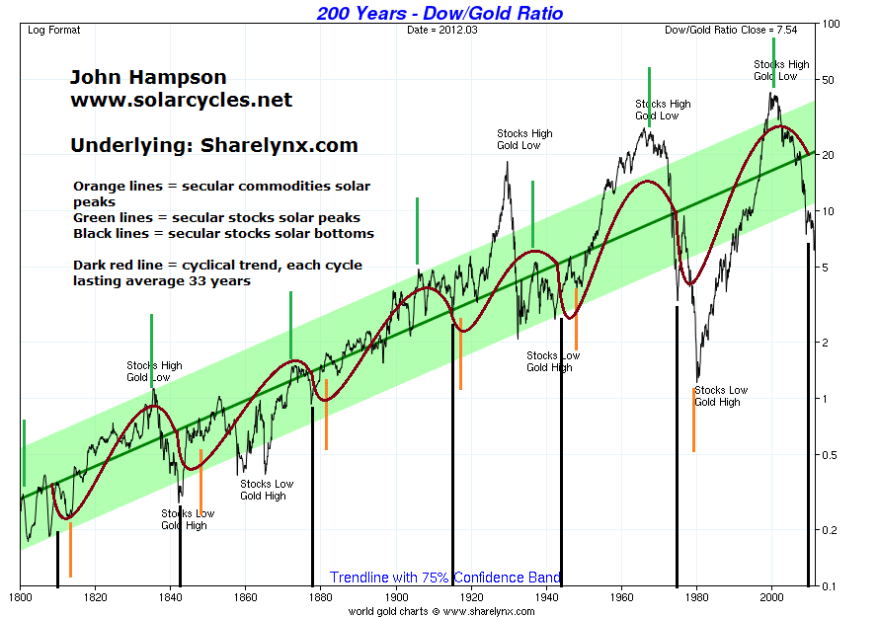
However, there is nothing to say gold ought to replicate the final height of the last gold bull. For that, we might do better looking at gold’s relative value to other assets. The Dow-gold ratio, shown in my earlier posts of this week, reveals an unclear picture. Having bottomed so far around 6, it lies beneath the long term trend line, but some way from the 1-2 reached in the last gold bull. Having begun its secular bull from a ratio of around 40, gold’s relative value has moved a long way. So we might conclude that gold is relatively expensive to stocks historically, but could potentially move more extreme yet, doubling or tripling in relative value.

We see a similar picture in gold’s relative value to real estate. Both US and UK shown.

Source: Approximity

Again, gold is historically expensive compared to real estate, but could yet become more extreme, perhaps doubling again.

Lastly, here is an overlay of the current gold bull on the last. There are some technical similarities, and the finale would be achieved by 2013, in line with my expectations. The top would be circa $6k. Again, there is no requirement for gold to replicate the last gold bull’s ferocity, but drawing in the potential to hit absolute extremes in relative value versus stocks and real estate, something of that size would fit.

Source: Now And Futures

OK, let me sum up. The balance of evidence supports further rises for gold into 2013. Demand and supply, the oil/inflation situation, real interest rates and government balance sheet. As per my post of yesterday, gold and gold stocks are currently at overbearish extremes, suggesting a rally will occur soon, supported by gold seasonals the next 2 months. The technical shaping of that rally should give further clues as to whether my favoured scenario is correct. Developments in agri and oil and economic data will also help to bolster the one scenario or the other. For now, I sit on my full set of precious metals longs. If gold was to drop out of its current consolidation to the downside, then it would make the overbearish/oversold indicators yet more extreme, and therefore a mean reversion rally as a minimum. Furthermore, historical rhymes suggest that we should get a rally here even if it made its secular top last year. So, I expect a period of rally, and then we can reassess again.

Risk Asset Cycles And Gold

In my last analysis I suggested a new secular stocks bull began 2009 lasting through to 2032, so does that mean you missed the boat if you didn’t load up in equities in 2009? Well, with the secular commodities solar peak expected around Spring 2013, take a look at the Dow action into previous such peaks, denoted by the orange lines in the long term Dow chart below. The Dow pulled back just before these peaks and tracked sideways across them, making for a higher nominal peak than denoted by the nominal low red circles, but a good buying opportunity. So, if history repeats and we see a commodities overthrow into 2013 followed by a stocks low around 2014, then the most profitable trade would be to focus investment in commodities until the 2013 solar peak and then switch to stocks at their low circa 2014.

Let’s now remove inflation and look at ‘real’ long term stocks. i.e. net of inflation – this time the SP500. I have marked the same secular and interim stocks peaks in green and commodities secular peaks in orange, plus the full risk assets cycle between the black lines. In real terms, the dip in real stocks value around the secular commodities peak each cycle is notable, followed by an upswing into the interim and secular stocks peaks. The result is a waveform, marked in dark red, known as a sine wave. This wave pattern is very common in nature, occuring in ocean waves, sound waves and light waves. Again, there is an upward trajectory to the long term wave, which reflects technological evolution and increasing human value-add. Following the waveform and the history, a lower real low for the S&P500 should be yet to come around the commodities / solar peak of 2013, and it looks like it needs to fall some way.

Source: Dshort

Yet, if we adjust for ‘undoctored’ inflation (Shadowstats figures) rather than ‘official’ inflation, the chart looks quite different, with the 2009 real low already at the low extreme:

Source: Dshort

Between the two charts, some kind of rounded bottom looks likely with another low still to come, before stocks take off in real terms, and I suggest it is indeed possible that we see a higher low in nominal terms and a lower low, or perhaps double bottom, in real terms, with inflation making the difference between the two. By solar cycles and history, inflation should peak along with solar activity and commodities, meaning the difference between the nominal and the real price of stocks may be fairly substantial at that point.

So let’s look at inflation. The chart below shows that both official inflation and Shadowstats inflation peaked in early 2008, when oil spiked. If, as some argue, we have already seen the secular peak in commodities, say with oil in 2008 and with precious metals in 2011, then we are unlikely to exceed that 2008 inflation peak.

Source: Shadowstats

The implications of that would be that the circle on the next chart would mark the inflation peak of this solar cycle, and that would be an anomaly with previous solar maxima both in time and height.

Of course if we apply Shadowstats figures to the chart, then the height of that spike would become more compelling, but nevertheless, by solar cycles and by history, the next solar maximum of 2013 should drive human behaviour to maximum speculation in commodities and maximum consumer inflation.

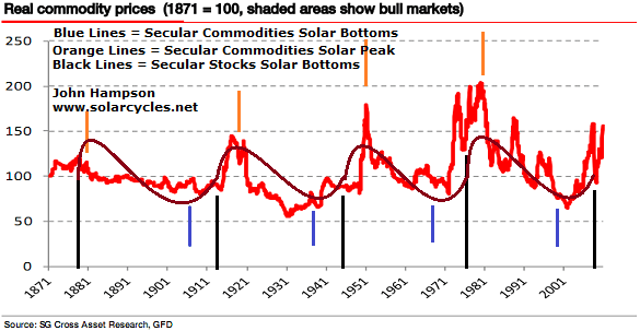
Next is a similar long term inflation-adjusted chart, but this time for commodities. Again, I have marked the same commodities peaks in orange and the risk asset cycle markers in black. I have applied waveform again, and again we see a sine wave but with reverse polarity to that of stocks.

Again, it would be an anomaly if commodities had already peaked around the solar minimum secular nominal stocks bottom of 2008/9, instead of around the next solar maximum of 2013.

One more chart – here is the long term Dow-gold ratio. Again, note the sine wave.

It can be seen that at the time of each secular nominal stocks bottoms (black lines), there was a notable spike down in the Dow-gold ratio. In fact, that spike down was sometimes the nominal bottom in the ratio. From those spike lows, the ratio then made a bounce, lasting 2-4 years, up towards the middle trend line, before typically falling again to another low around the solar/commodities peak.

Curiously, following the 2008/9 low, the ratio made only a weak bounce into 2010 before falling again. With the solar peak looming just 12 months away now, the likelihood of an intermittent bounce in 2012 up to the middle trendline, i.e a Dow-gold ratio of 20 (gold falls to 650, or Dow rises to 32,000), looks slim to say the least. Either the weak bounce is a clue that the ratio will keep dropping to a new and final low around the solar peak of 2013, as it did in 1979/80, of perhaps 1-2, or it will make some kind of W bottom, with stocks outperforming currently and then giving way to commodities again into the solar peak, with a ratio bottom of 5 or above. As the evidence further up the page suggests stocks might track overall sideways into the solar peak, the difference between the two ratio scenarios perhaps indicates the scale of a final gold ascent, ranging from meagre (maybe final gold $2000 or so) to colossal (maybe $10,000).

In my recent post of 6th March, ‘Precious Metals’, I detailed the fundamental support for gold into 2013 from negative real interest rates, central bank and investment demand. Disinvestment and greater new supply is forecast to occur after 2014. In short, the window from here into 2013 has the fundamental support to fulfil the final parabolic ascent forecast by solar cycles and historic rhymes. Not only that, but I suggest that the entry point for gold and miners is right now, and here is the evidence.

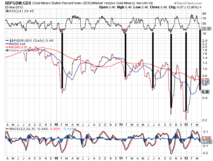
Gold miners bullish percent index / Market Vectors Gold Miners ratio is at an overbearish level that has previously corresponded to bottoms in gold (see second chart):

Source Stockcharts

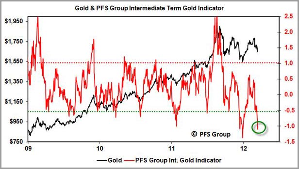
PFS’s intermediate term gold indicator is at a buy level, by history:

Source: PFS Group

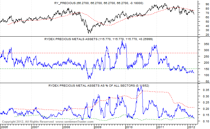
Rydex precious metals allocations are into the extreme low zone:

Source: Pater Tenebrarum / Sentimentrader

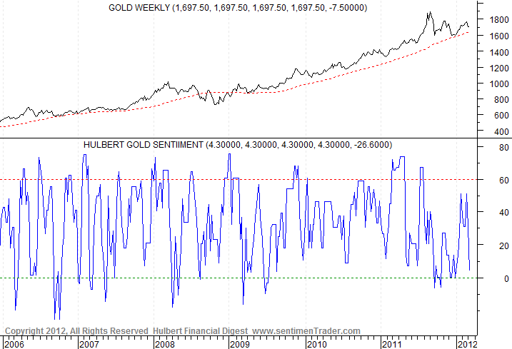
Hulbert gold sentiment in the latest reading is now -15.7. The below chart is taken prior to that reading, but note it will now be down at a level on par with 2008:

Source: Pater Tenebrarum / Hulbert / Sentimentrader

Dow at 260,000 by 2032

Secular tops in US stocks were 2000, 1968 and 1937 – 3 solar cycles apart (roughly 33 years). Secular nominal bottoms in stocks were 2009 (expected), 1975, 1944 and 1913 – 3 solar cycles apart (roughly 33 years). Secular tops in commodities were 1980, 1948 and 1918 – 3 solar cycles apart (roughly 33 years). Secular bottoms in commodities were 2000, 1968, 1938 and 1906 – 3 solar cycles apart (roughly 33 years). All these tops and bottoms fell very close to solar peaks and minima.

Is there anything special about 3 solar cycles, 33 years? Yes there is. Every 33 years the lunar calendar and solar calendar converge. A lunar month isn’t quite the same as a solar month, and so new moons and full moons gradually advance through the seasons, returning to where they began every 33 years. Most ancient calendars are luni-solar calendars incorporating lunar months plus additions to make it fit the solar year too, so societies engaged both. My detailed guide, Trading The Sun, reveals the influence of both lunar cycles and solar cycles on people, the financial markets and the economy, and the synchronisation of humans and human systems to cycles of nature. Rhythms in stocks and commodities – or more specifically human risk appetite and buy/sell patterns towards them –  have synchronised with this luni-solar cycle.

If tops and bottoms fall close to solar maxima (which are roughly 11 years apart) and solar minima (ditto), and risk assets cycle every 3 solar cycles (roughly 33 years), then we should see these cycles in spectograms of stocks and commodities. Here is one commodity, wheat, and one stock index, the Dow Jones, under spectrogram analysis, revealing actual cycles confluences around both 11 and 33 years (as well as the other interesting highlighted cycles).

Source both: Sergey Tarassov

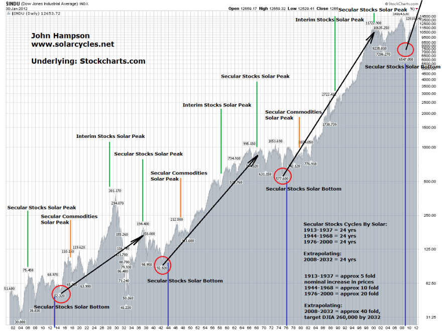
Below is the Dow Jones (DJIA) stock index in the long term view, marked with the secular tops and bottoms in stocks and commodities listed above.

Inbetween the secular tops were interim stocks tops, one being the Nikkei peak. It’s fairly clear from this Dow chart, that the interim tops are not secular tops, but the trend continues through them, with the exception appearing to be the massive peak (and massive fall) around 1930. Most analysts consider this extreme as a secular top and a subsquent secular bottom. But the comparisons suggest the secular top was around 1937 with a wild overbuying and overselling episode effectively cancelling each other out en route to the 1937 peak. For another less extreme example, the 2007 nominal stocks top exceeded the 2000 top but by other measures (such as valuations) we can identify that 2000 was the secular top for stocks.

Using solar cycle anchoring, secular US stocks bulls need redefining as around 24 years in length, or roughly two solar cycles (1976-2000, 1944-1968 and 1913-1937, shown by black arrows) beginning at the nominal low of what we currently consider to be a secular stocks bear, which falls around the solar minimums (shown by the red circles). That means a new secular stocks bull of around 24 years began at the turn of 2009 (that should be the nominal low) and should continue to around 2032. US demographic models predict a secular stocks bull lasting to 2032-2036, which provides a compelling cross-reference:

Secular commodities bulls need redefining as around 12 years in duration, or roughly one solar cycle (1906-1918, 1938-1948, 1968-1980, 2000-2013 (expected)), with some overlap with stocks (e.g. the new secular stocks bull began at the turn of 2009 whilst the secular commodities bull that began around 2000 should last to 2013). A complete risk assets cycle, incorporating both full commodities and stocks  secular cycles, lasts 33 years, the distance marked between the blue lines on the long term DJIA chart above.

Look at the black arrows on that chart, marking out the secular stocks bulls. Note how they increase in steepness as the last century progressed. Note also that this is a log scale chart. That suggests the secular bull lasting from 2009 to 2032 is going to be jaw-dropping in nominal terms. As it happens, the nominal increases in each historic secular bull show a pattern (5-fold, 10-fold and 20-fold, in order) that suggests it may terminate around 2032 with a 40-fold increase from the low that occurred around the turn of 2009. That gives us a target of Dow 260,000.

If that seems a little far fetched, then know that it is achievable with an average 16% compound return per annum, and in the last 24 year bull of 1976-2000, the Dow averaged an annual compound return of 12%.

Inflation also plays a key role in increasing nominal returns, and if we look at the trend in undoctored inflation (Shadowstats figures), then other things being equal, higher inflation alone could drag up the average annual return from 12% to 16%.

Underlying source: Dshort

Inflation aside, the ‘opportunity’ to achieve a record return lies in exponential technological evolution, whilst the ‘threat’ lies in peak resources. The long term outperformance in real terms of equities versus commodities reflects technological evolution – the human value-add in making amazing things from raw materials and fossil fuels. Railways, electricity, computers and the internet all provided paradigm shifts in efficiency and cost reduction, enabling us to produce more and for less. The trend in technological evolution is parabolic, suggesting we should see the greatest intensity yet in paradigm shifts during the next secular stocks bull, potentially from the areas of nanotechnology, biotechnology, artificial intelligence, space exploration, geonengineering and renewable energy.

The evolution of artificial intelligence is captured in this computing power trend chart. The next secular stocks bull should see a computer match the intelligence capability of a human.

Source: Ray Kuzweil

Think that the last secular stocks bull delivered the internet, mobile phones, DNA identification and other paradigm shifts. With parabolic technological progress, the next secular stocks bull should deliver a higher intensity of leaps. The threat is that we are heading towards peak energy and peak resources in the first half of this century. Essentially, technological evolution has to deliver paradigm shifts in resources and energy, to delay peak limits, such as nano-engineering at the molecular level to make any substance, and delivering large scale renewable energy solutions. Here is the global energy forecast out to 2030, by BP:

Source: BP

Coal and oil will flatten off as we head towards exhaustion, with more abundant gas partly covering, but with renewables, nuclear and hydro the main expected growth areas fulfilling global demand. It is feasible therefore that technological evolution delivers enough to push out total energy and resource limits to a future secular commodities bull in the 2030s/40s, and in so doing enable exponential technological advances to deliver revenues, efficiencies and cost reductions the drive a secular stocks bull to new all time average annual returns in the window through to 2032.

Let’s look another way at a likely Dow target – the Dow-Gold ratio, below. Note how there is a long term trend in the Dow growing in worth versus gold. Again, this represents technological evolution and human value-add. Continuing the trend, the next secular stocks bull may peak at a ratio of around 80 around 2032. If the Dow was at 260,000, gold would be $3250.

Is gold at $3250 a reasonable target for 2032? By historical rhymes and solar cycles, we should see a gold parabolic ascent and blow-off ahead in a secular commodities bull finale in 2013, followed by a fast retreat and then overall sideways tracking (as shown below) during the course of the next secular stocks bull. For example, a parabolic ascent to $6000 then a collapse to $3000, before overall sideways tracking into 2032.

Underlying Source: Saville/Laird

So let’s see how gold completes this secular bull, but just over $3000 by 2032 doesn’t appear too much of a stretch.

In summary, by extrapolating trends in (i) secular stocks bulls durations and magnitudes, (ii) compound returns, (iii) inflation, (iv) technological evolution and (v) the Dow-Gold ratio, I propose that the Dow index at 260,000 by 2032 – although initially appearing fanciful – is instead a realistic target.

This Week

Into my anticipated turn window, from last Friday to this coming Friday, and with increasing evidence for a correction in equities.

Geomagnetic disturbances perists, making a significant divergence with the S&P500.

Citigroup Economic Surprises continue to fall away, which has historically implied a correction, or sideways consolidation.

Source: Bloomberg

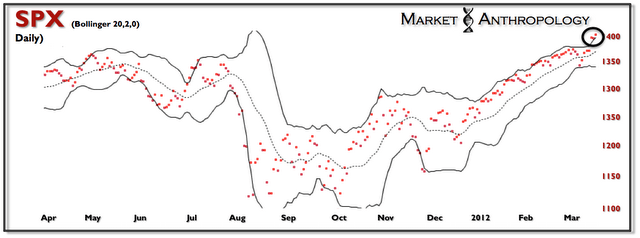
 The S&P500 is out of its upper bollinger band.

Source: Market Anthropology

The Vix is at a level that has recently implied a correction. However, note also that there is a lower historic level that Vix could fall to, between 10 and 15, that was a feature of strong bulls.

Source: Slim Beleggen

 The CS Fear Index is at an exteme high and has tipped over ahead of the market. Both aspects of this barometer have previously led to a correction in equities.

Source: Bloomberg

Dax sentiment is back to the high extreme bullish zone too. In short, the case is building for a correction and the time window is appropriate too. What form the correction or consolidation takes, we will see. Due to the trend change in treasury bonds, money flowing out of the safe haven may buy up stock dips. I therefore don’t wish to short. My favoured scenario is for stocks to consolidate overall sideways for a period, whilst money flows favour the unloved precious metals and miners for a while.

Trading Update

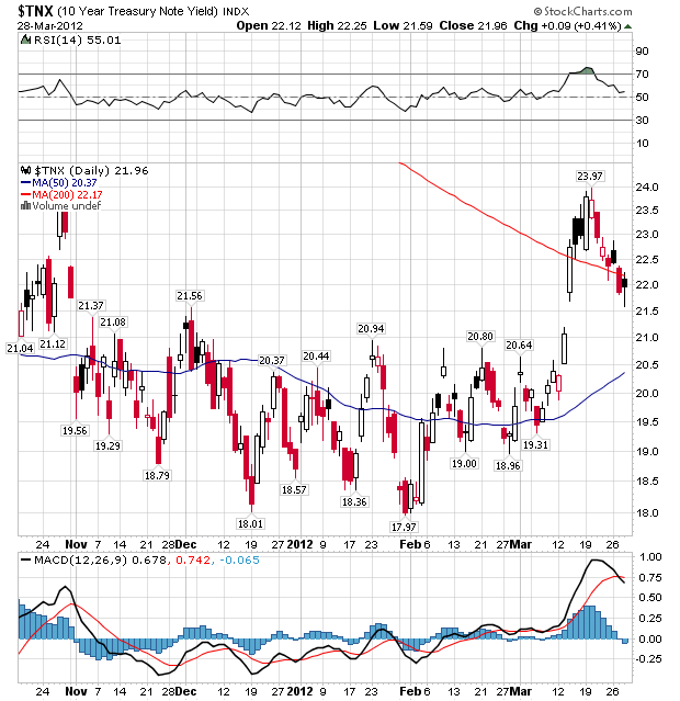
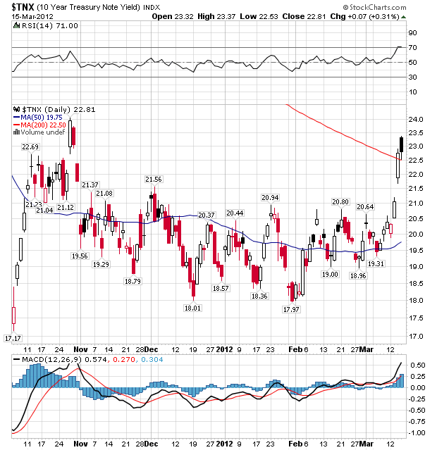
Treasury bond yields added to their breakout, making for what looks like a significant change of trend. Money should accordingly flow into pro-risk. My short treasuries trade is now in the money.

Source: Stockcharts

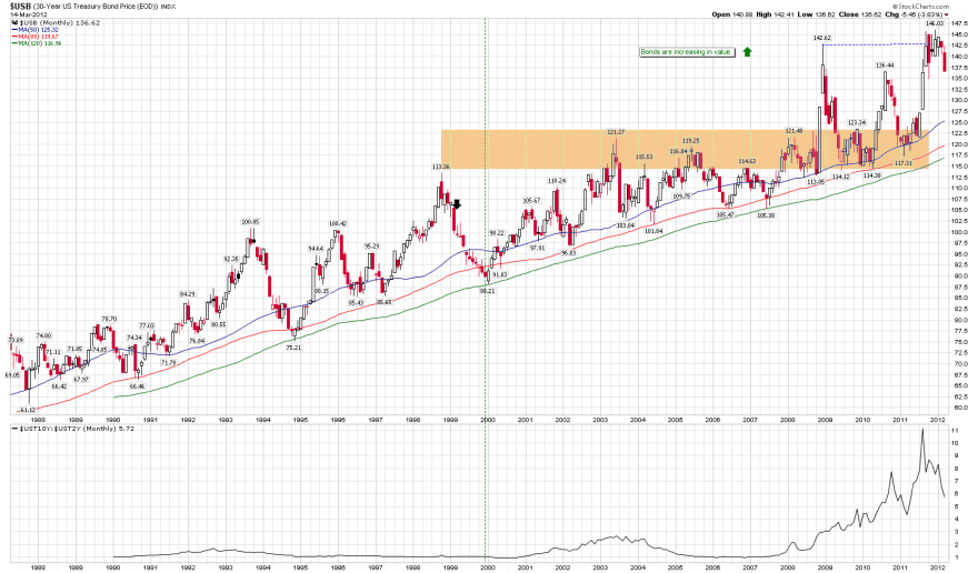
Looking at the 30 year bond, the initial target would be a return to the trend line:

Source: Stockcharts

Pessimistic sentiment is at an extreme in gold miners, and gold itself is very oversold by PFS’s intermediate term indicator, an indicator that I have found reliable for entry points in the past. I have added to my gold long position and opened a long gold miners ETF position.

Source: PFS Group

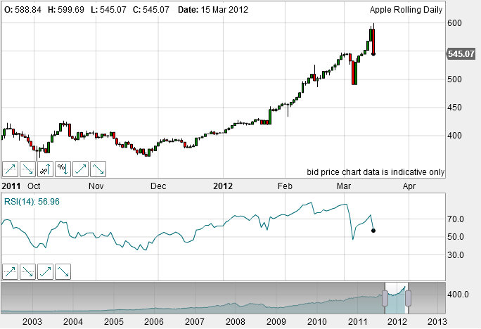
Turning to equities, Apple made a third attempt at a top yesterday, and maybe third time is the charm:

The stock indices held up despite that, but from today into next Friday we are into a likely turn window, drawing together my models, Bradley and the Equinox. Geomagnetism also continues, making for a significant gap between SP500 actuals and my model. The Dax has also moved above the model.

We see a partial set of overbought and overbullish indicators in stocks. Ideally a push a little higher into next week would give us a more complete set and make for a more compelling turn in the turn window. Here is bullish percent over call/put – into the excessive zone again:

Source: Stockcharts

I have sold part of my remaing stock indices long position today. I will sell the remainder later next week if the stock market can push on further.

I don’t see evidence of a major top in stocks here. But with Economic Surprises continuing to fall away, geomagnetism pulling the models down, and based on historic rhymes, a rounded top or flatting out or consolidation is likely. The Vix is down at its bottom bollinger band, potentially ripe to pick up again. Given the likely trend change in treasuries, reflecting the economic pick-up, stocks will remain attractive. But with gold and gold miners at pessimistic and oversold extremes it seems likely that soon we see some money flows that way. Even if you believe that precious metals topped out last year, then they should enjoy a rally, as per this post-mania parallel chart (chart from several weeks ago – silver is around 32 at the time of writing):
Source: Willem Weytjens

I maintain precious metals are due for more than just a bounce though, and will have more on this next week.

Solar Minima And The Financial Markets

If the mass human excitability that Tchijevsky identified leading into and around solar peaks translates into maximum risk-taking, speculation and buying in the financial markets, then might the mass human apathy associated with solar minima translate into conservatism, safety and maximum risk-asset selling?

The last solar minimum of December 2008 is shown below. Note that despite the official dating, solar minima are in reality drawn-out rounded affairs lasting a couple of years. The March 2009 bottom occurred in this period.

Could that be the nominal bottom of the stocks secular bear? I have advocated that it should be, using history as our guide, but interestingly, I have found that the nominal bottoms of the last 3 secular stocks bears all occurred not only in the middle of the secular bears, but all within 2 years of the official solar minima.

Here is 1932:

Source: Sergey Tarassov

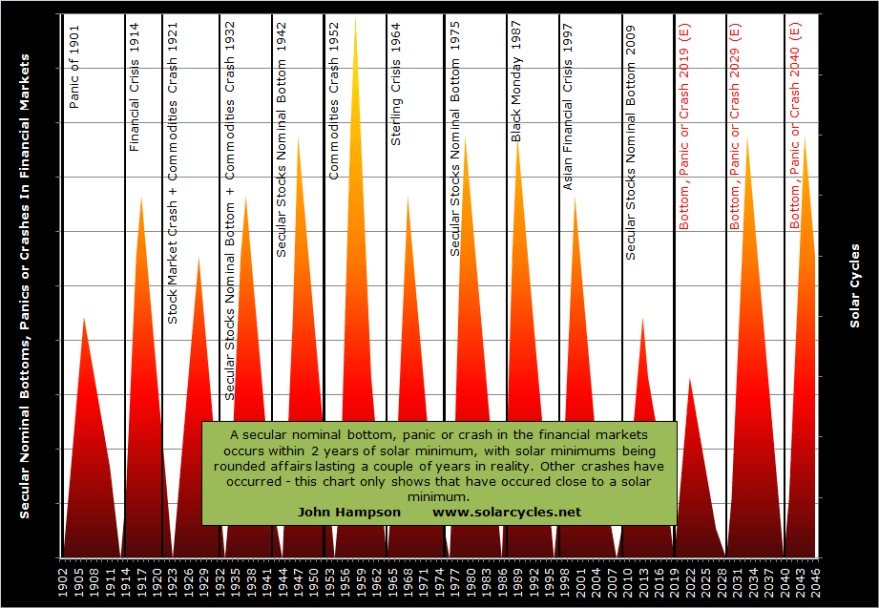
Taking this further, I have established that within 2 years of each solar minimum over the last 100 years we have experienced panics and crashes if not outright secular nominal bottoms, as shown:

First, the stock market panic of 1901 (solar minimum Feb 1902). Then the financial crisis of 1914 (solar minimum August 1913) which involved closing key global stock and commodity markets for several months. Had they not been closed, it is expected the crashes would have been worse than 1929.

We had a crash in 1921 in stocks and commodities (solar minimum August 1923), a commodities crash in 1952 (April 1954 solar minimum), the sterling crisis in 1964 (October 1964 solar minimum), Black Monday 1987 (solar minimum July 1989) and the Asian financial crisis in 1997 (solar minimum May 1996). All saw massive falls in risk assets.

We reached the nominal secular stocks bear bottoms in 1932, 1942 and 1975, corresponding to the solar minima of September 1933, February 1944 and June 1976 respectively.

Forecasting ahead, I therefore expect that the next cyclical stock market low will be higher than March 2009 and that late 2008 / early 2009 bottom will turn out to be the nominal secular bottom, falling close to the solar minimum. Also forecasting ahead, I expect another crash or panic sometime in the window 2018-2022, around the next solar minimum. Drawing solar cycle predictions together, I expect a secular commodities peak in 2013, a cyclical stocks and commodities bear 2013-2014, a new secular stocks bull to erupt 2014/5 and make a 3.5 year up cycle on to the verge of the solar minimum, at which point a crash or panic should occur as apathy and conservatism overwhelms risk appetite.