
In my last analysis I suggested a new secular stocks bull began 2009 lasting through to 2032, so does that mean you missed the boat if you didn’t load up in equities in 2009? Well, with the secular commodities solar peak expected around Spring 2013, take a look at the Dow action into previous such peaks, denoted by the orange lines in the long term Dow chart below. The Dow pulled back just before these peaks and tracked sideways across them, making for a higher nominal peak than denoted by the nominal low red circles, but a good buying opportunity. So, if history repeats and we see a commodities overthrow into 2013 followed by a stocks low around 2014, then the most profitable trade would be to focus investment in commodities until the 2013 solar peak and then switch to stocks at their low circa 2014.

Let’s now remove inflation and look at ‘real’ long term stocks. i.e. net of inflation – this time the SP500. I have marked the same secular and interim stocks peaks in green and commodities secular peaks in orange, plus the full risk assets cycle between the black lines. In real terms, the dip in real stocks value around the secular commodities peak each cycle is notable, followed by an upswing into the interim and secular stocks peaks. The result is a waveform, marked in dark red, known as a sine wave. This wave pattern is very common in nature, occuring in ocean waves, sound waves and light waves. Again, there is an upward trajectory to the long term wave, which reflects technological evolution and increasing human value-add. Following the waveform and the history, a lower real low for the S&P500 should be yet to come around the commodities / solar peak of 2013, and it looks like it needs to fall some way.

Source: Dshort
Yet, if we adjust for ‘undoctored’ inflation (Shadowstats figures) rather than ‘official’ inflation, the chart looks quite different, with the 2009 real low already at the low extreme:

Source: Dshort
Between the two charts, some kind of rounded bottom looks likely with another low still to come, before stocks take off in real terms, and I suggest it is indeed possible that we see a higher low in nominal terms and a lower low, or perhaps double bottom, in real terms, with inflation making the difference between the two. By solar cycles and history, inflation should peak along with solar activity and commodities, meaning the difference between the nominal and the real price of stocks may be fairly substantial at that point.
So let’s look at inflation. The chart below shows that both official inflation and Shadowstats inflation peaked in early 2008, when oil spiked. If, as some argue, we have already seen the secular peak in commodities, say with oil in 2008 and with precious metals in 2011, then we are unlikely to exceed that 2008 inflation peak.

Source: Shadowstats
The implications of that would be that the circle on the next chart would mark the inflation peak of this solar cycle, and that would be an anomaly with previous solar maxima both in time and height.

Of course if we apply Shadowstats figures to the chart, then the height of that spike would become more compelling, but nevertheless, by solar cycles and by history, the next solar maximum of 2013 should drive human behaviour to maximum speculation in commodities and maximum consumer inflation.
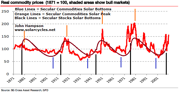
Next is a similar long term inflation-adjusted chart, but this time for commodities. Again, I have marked the same commodities peaks in orange and the risk asset cycle markers in black. I have applied waveform again, and again we see a sine wave but with reverse polarity to that of stocks.

Again, it would be an anomaly if commodities had already peaked around the solar minimum secular nominal stocks bottom of 2008/9, instead of around the next solar maximum of 2013.
One more chart – here is the long term Dow-gold ratio. Again, note the sine wave.

It can be seen that at the time of each secular nominal stocks bottoms (black lines), there was a notable spike down in the Dow-gold ratio. In fact, that spike down was sometimes the nominal bottom in the ratio. From those spike lows, the ratio then made a bounce, lasting 2-4 years, up towards the middle trend line, before typically falling again to another low around the solar/commodities peak.
Curiously, following the 2008/9 low, the ratio made only a weak bounce into 2010 before falling again. With the solar peak looming just 12 months away now, the likelihood of an intermittent bounce in 2012 up to the middle trendline, i.e a Dow-gold ratio of 20 (gold falls to 650, or Dow rises to 32,000), looks slim to say the least. Either the weak bounce is a clue that the ratio will keep dropping to a new and final low around the solar peak of 2013, as it did in 1979/80, of perhaps 1-2, or it will make some kind of W bottom, with stocks outperforming currently and then giving way to commodities again into the solar peak, with a ratio bottom of 5 or above. As the evidence further up the page suggests stocks might track overall sideways into the solar peak, the difference between the two ratio scenarios perhaps indicates the scale of a final gold ascent, ranging from meagre (maybe final gold $2000 or so) to colossal (maybe $10,000).
In my recent post of 6th March, ‘Precious Metals’, I detailed the fundamental support for gold into 2013 from negative real interest rates, central bank and investment demand. Disinvestment and greater new supply is forecast to occur after 2014. In short, the window from here into 2013 has the fundamental support to fulfil the final parabolic ascent forecast by solar cycles and historic rhymes. Not only that, but I suggest that the entry point for gold and miners is right now, and here is the evidence.
Gold miners bullish percent index / Market Vectors Gold Miners ratio is at an overbearish level that has previously corresponded to bottoms in gold (see second chart):

Source Stockcharts

PFS’s intermediate term gold indicator is at a buy level, by history:

Source: PFS Group
Rydex precious metals allocations are into the extreme low zone:

Source: Pater Tenebrarum / Sentimentrader
Hulbert gold sentiment in the latest reading is now -15.7. The below chart is taken prior to that reading, but note it will now be down at a level on par with 2008:

Source: Pater Tenebrarum / Hulbert / Sentimentrader

great job John, see the last post of Tiho
Yes, I read it, good thought-provoking stuff as usual Tiho. There are examples in history of an asset mature in its bull making a nasty drop just before going on to make its final mania. Something that looks like it the secular bull could be over, only for it to then reverse and go crazy. So I am alert for that, but right now, the extreme readings make a compelling contrarian buy, and by my solar timescale, I think it more likely gold gets into gear from here and delivers its parabolic finale, winding up gradually. Gold seasonals also are favourable from now for the next 2 months.
thanks John
Hi John some people predict that final top in commodities will be about 2020, we are in commodities super cycle,could be possible that it’s going to happen during next solar maximum? despite the fact that we might have a mini top in about 2013 after big slow down in China commodities bust, everyone is going to claim the end of commodities bull market but it’ll be the best time to buy in our lifetimes.
It doesn’t fit with my forecasts, but I don’t rule it out, namely because peak oil is there, natural disasters and unusual weather patterns are still on the up, tech evolution doesn’t yet have solutions etc. All that has to fall into place, to keep commodities down in my sceario, but I expect over the next couple of years that more supply comes to fruition, there is some switch from oil to gas, stocks become extreme cheap value versus commodities so the speculative money switches class etc. I think there will be a true crunch on commodities but I expect it to come further out 2030-2040.
Andrzej,
There are a growing number of experts suggesting that the sun is heading towards a lengthy quiet period, possibly similar to the Maunder Minimum. Evidence for this, they claim, is the late start of solar cycle 24 (three years late) and its unusual activity so far.
The three solar cycles spanning the Maunder Minimum lasted 18 years, 20 years and 22 years respectively – so it is conceivable that cycle 24 could be drawn out to 2020, as you suggest.
Some further reading here: http://wattsupwiththat.com/2012/01/08/solar-cycle-24-length-and-its-consequences/
Regards,
Mark
thank you for the link I have a look then I get time.The energy should peak soon but agri not just yet, the time wil show 🙂 the golden rule is to make some money even when you are wrong.
Boy, the last two articles on this blog have been absolutely great regardless of how one sees thing playing out. So my knowledge and hard work shared by John, so I think everyone should be very grateful for that. I personally want to say – thank you for all the hard work John!
So lets talk short to medium term PMs – I think there is a above average chance that Gold and Silver will now rally.
Public Opinion on Gold has dropped to the point it usually sets intermediate bottoms dating back to 2003, so we could now see a bottom.
Silver has dropped almost 16% from its recent peak at the start of the month, so that is very oversold from short term perspective.
From Gold equity point of view, we have extremely oversold breadth in the Gold Miners with Bullish Percent readings and oversold McClellan Oscillator diverging on the GDX too.
We also have 0% of stocks trading above 200 MA for the first time since October 2008 on the Gold Miners.Obviously, RSI just went below 30 as well recently.
I agree with John’s bullish stance without a doubt. However, from the longer term perspective, I doubt Gold will have a parabolic move after already moving up so much without a strong correction / re-tracement / cyclical bear market. I remain long PMs and short Dollar, so time will tell all.
Thanks Tiho!
I feel a separate post is needed to chart gold measured in its many different ways to really weigh how likely it is to be sucked forcibly upwards or something potentially quite opposite. It remains a tough one to call.
the last time gold peaked we had interest about 20% so until intrerest won’t move i stick to gold but even if i’m wrong and gold peaked we should still have mania in gold miners at least for 2 years so i started topping up GDX. it’ll make my loss in silver and gold.
I see you use the inflation data from shadowstats quite a bit in your arguments. I used to also believe that inflation had to be higher than official stats, and drifted to the shadowstats data.
However, it turns out the CPI as calculated is pretty darn accurate.
http://bpp.mit.edu/usa/
I was surprised to see real-world inflation data tracking the CPI this closely, but it’s all right there.
Just throwing it out there…….nice work on the site!
Thanks
Dear John,
I admire your strive for answers and perfection.
I tried astro for 7 years in personal relations.
I see you have many ideas…
I have one question only,
if PO is now, do you claim an alternative source is imminently at hand?
Hi Marif, could you rephrase your question? I’m not sure what PO stands for.
Peak Oil.
I dont know if it is for sure, but the evidence IMO suggests it.
I guess it would change your base scenarios, wouldnt it?
best
That scenario fits almost exactly with the Gann 60 yr cycle ie a mulit-year bull market in stocks has begun and we are near a top in commodities. I think the top in commodities was last year, others think one more run. As much as I see the bullishness in the stk mkt, my emotions (fundamentals) will not let me become bullish. That augments the bullish case a lot.
Gold broke out in 1999 and made a double bottom in 2001 back below it’s 200 day. Since then every trip back to the 200 day was a great buy. It has happened almost 20 times so why would this time be any different. Because that is a way bear markets start. You have a perfect set-up, oversold and sitting on beautiful long term support, so it breaks down. Gold is in the perfect position for that to occur. Corroborating that is the $, it looks very similar to gold back in 2001, at the beginning of a long term bull. Oil looks very toppy. Back in 2008 the producers panicked out of there short hedges sending oil to the moon. It appears that would have to happen again for oil to go up a lot as large speculators appear maxxed out. Producers rarely panic out like that, but speculators get stopped out and margin calls happen. There you have it, bullish on the $ and stk mkt (reluctant) and bearish on gold, oil, and commodities. Believe me, I feel alone on an island.
Kent, I find your view plausible and a very useful challenge, so keep sharing. Nothing more important than this issue to get right, as it makes for polar opposite positions if commodities have a parabolic ascent ahead, which would be a major opportunity, or if stocks and the dollar have quietly taken centre stage, and the bottom is about to fall out of commodities and precious metals in particular. So, I’ll address gold tomorrow.
I hear you.
Still, you have to answer the following question:
How come this time is different, meaning AU/DJ not meeting at 1:1?????
You say this time is 5:1 only????
best
Marif, if peak oil is already here, then going forward I would expect shorter economic and stock cycles as oil repeatedly is bid up to levels that tip the economy over. But gradually I expect gas and renewables to swtich in, and maybe eventually tech evolution can deliver some large scale replacement.
And how come John, you are the only one claiming commodities peak in 2013, when “all other” commodity bulls call for a bull market til 2015-2018????
Misperception by many as to historic commodity cycles. Drawing in solar cycles puts it all in a different light.
Regarding the Dow-gold ratio, I am open as per my analysis. We can draw in other indicators and measures, which I will do next.
“I would expect shorter economic and stock cycles as oil repeatedly is bid up to levels that tip the economy over”
well thats what JP at FSO/PFS has been saying for the last couple of years…
Does it change your overall stance?
And what is your DJ/AU ratio best estimate?
Mine is 2:1, but I guess its wishful thinking:)
A really good way of seeing what is currently happening is the following chart here. It is between Silver and USD Index. Silver topped almost 12 months ago around $49, while the USD Index bottomed around the same time around 73 points on the index. Since than Silver has fallen dramatically in a bear market which sliced 47% at one point into late December low. After almost 12 months of rising, USD Index has so far failed to take out 81 / 82 points on the index as a main resistance.
In the short term PMs sentiment is getting bearish, so when Gold and SIlver sell off a little more, say towards $30 for Silver, we will probably do a first HIGHER LOW and end the downtrend from May 2011. At the same time, USD Index will fail to make a new high above middle of January peak around 81.50 and will create a firstLOWER HIgh and end an uptrend.
I’ve been long Silver since 29th of December at $26 and shorting the Dollar via buying Swiss Francs since 16th of Jan. As the current short term sell off runs its course, I plan to buy more Silver around $30 area (5% drop from here maybe) and add some more shorts to on the US Dollar at the same time via Japanese Yen most likely. Japanese Yen is very much beaten down and everyone is extremely negative on the currency!
Gold Miners are also extremely oversold. Breadth is beaten down, technicals are beaten down and sentiment is beaten down. For those who do not buy PMs or short USD, the alternative would be to buy Miners as they could finally start to outperform other assets including Gold, S&P 500 and Treasury 30 Yr Long Bond.
So to cut the story short, my personal opinion is that we are building a large bottoming base on Silver between $26 and $30; and at the same time a large top on the US Dollar between 80 and 82 on the index.