Nasdaq And Lessons From Japan

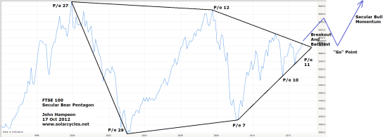
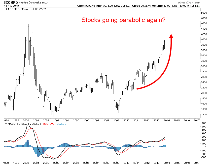
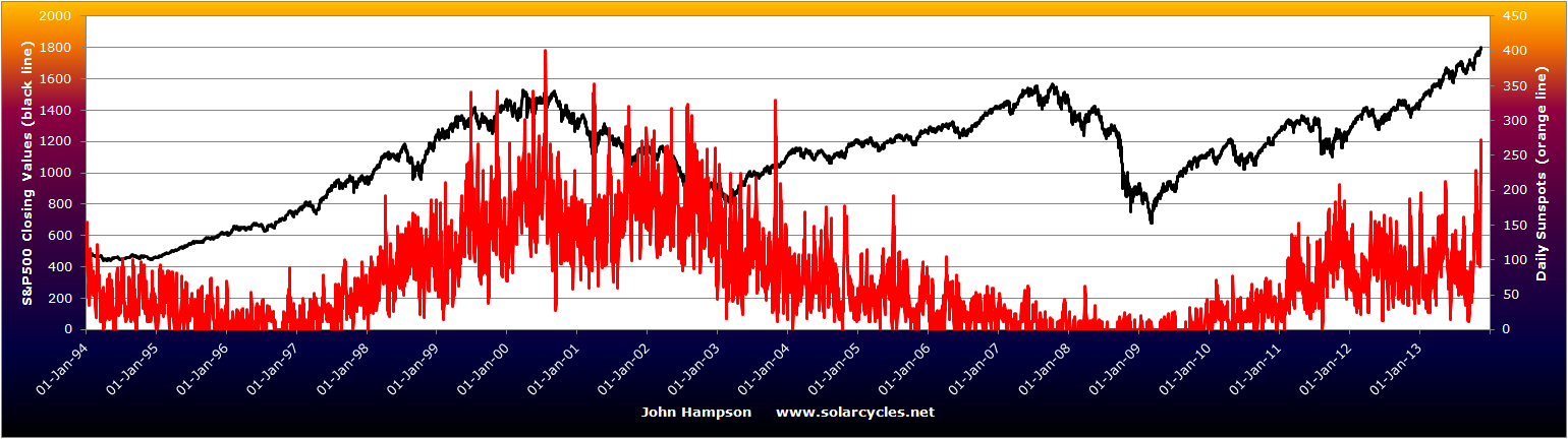
If the smoothed solar maximum for solar cycle 24 is occurring around now, and equities are the speculative target of solar inspired human excitement, and the Nasdaq remains the leading stock index, then we have evidence of such a speculative mania in the Nasdaq composite with a parabolic gaining traction, as referred to in the last post. Below is the longer term Nasdaq composite showing the last two solar peaks closely correlated in timing with Nasdaq peaks:

27nove1
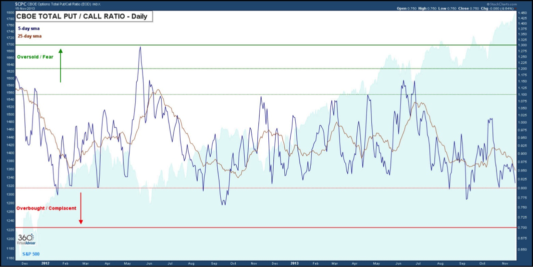
Underlying Source: Stockcharts 

Nasa predict the solar pole flip will be complete by Nov/Dec 2013, which typically signifies the solar max is complete, whilst SIDC have a sunspot projection showing a max around April 2013. Drawing those together with the possibility of a correlated Nasdaq peak, we have a window for the Nasdaq to peak out, in parabolic fashion, between now and June 2014.

If we look at the biggest four Nasdaq composite companies by market capitalisation, Amazon has at this point gone to crazy valuations under a steep parabolic, whilst Apple, Google and Microsoft are more contained. Google is the most expensive of the three at 23.9 forward p/e, whilst Apple and Microsoft are at 12.2 and 14.1 respectively. IF the Nasdaq is heading for a parabolic speculative peak (solar maxima in the past have typically correlated with parabolics in assets) then I suggest we probably would need at least another of these leaders to go to dizzy valuations like Amazon.

Now to lessons from Japan, and specifically, can the US and Europe avoid deflation or is it unavoidable?

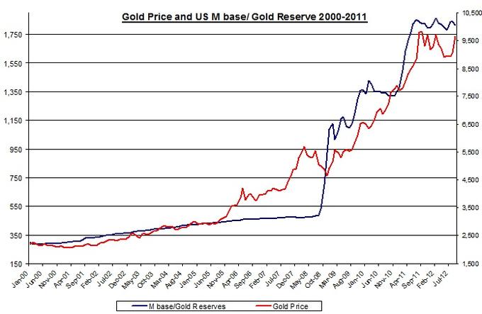
By my research, Japan’s ‘lost decade’ was due to demographics, and with US (since circa 2000), Europe (since circa 2005) and China (since circa 2010) demographics now united in an unprecedented downtrend, I believe deflation is inevitable. BUT, Japan did make some ‘mistakes’, in belatedly adopting QE, and only keeping loose monetary policy once the economy entered periods of deflation, withdrawing once back into inflation. I say ‘mistakes’, because that is up for debate. Austrians and Monetarists argue that stimulus actually has a negative effect, for example government intervention quashes private economic activity and savers and retirees see their income quashed under ZIRP so actually cut consumption. Regardless, Japan’s massive QE and government spending programmes even failed to inflate their economy against a positive global backdrop of strong growth in the 1990s. Today, 10 out of the biggest 13 economies of the world are in demographic downtrends, making for that aforementioned unprecedented collective negative backdrop.

Analysts point to several other contributory factors for Japan’s failure.

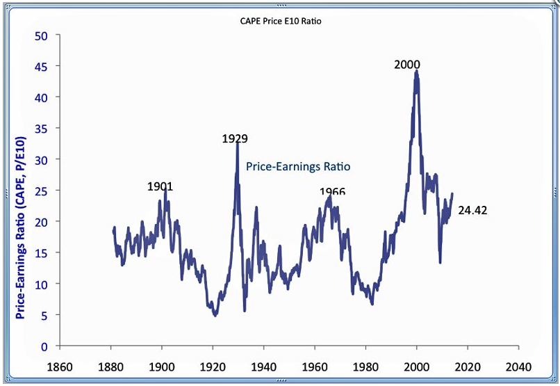
One is the starting point of a bubble in stocks and housing prices, i.e. excesses that needed washing out. We can identify something similar leading us into the current situation for US and Europe, with a stocks bubble in 2000 and a housing bubble around 2006.

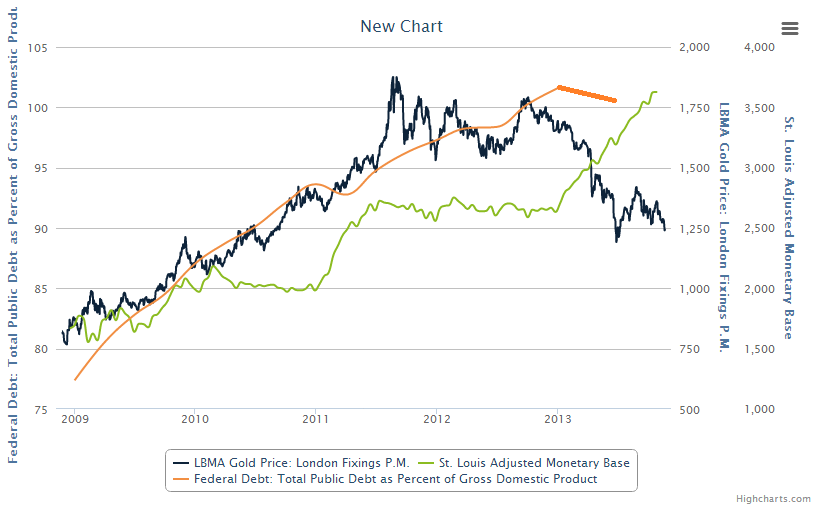
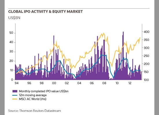
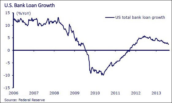
Two is associated with one, as the bursting of the bubbles encouraged households and businesses thereafter to pay down debt and not borrow, and to do so despite interest rates being brought down to negligible levels. Today we see the same occurring:

26nove3

27nove2

27nove4
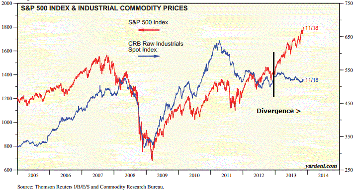
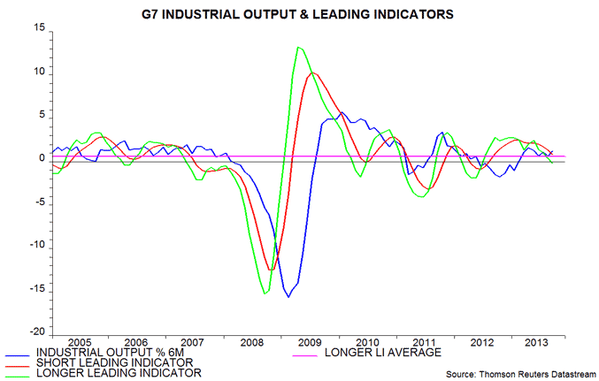
Three, low productivity, low capital expenditure and excessive capacity. Again, repeated today:

27nove5 27nove6 27nove7
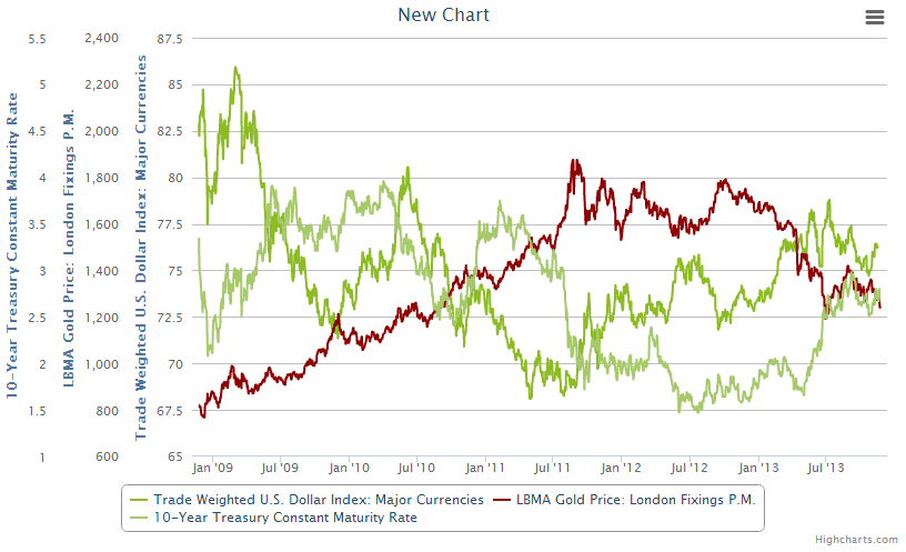
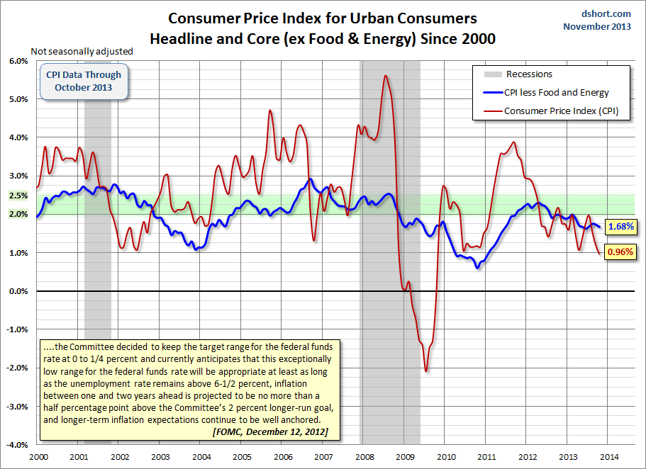
In fact, there is a theme in that US data of some key economic indicators being lower currently than at historic recession start points, and you can find the same phenomenon in data ranging from real US GDP growth to real US retail sales growth to National Activity (Chicago Fed). On which note, an inverted yield curve has historically been a reliable leading indicator of recessions in the US and the health of the curve suggests no recession on the horizon. However, the suppression of yields by the Gov/Fed essentially makes this indicator redundant, as Japan three times entered recession with a normal yield curve under the same suppression intervention.

Four, persistent fear. The financial crisis lingered in the mind, causing consumers to continue to distrust banks and feel pessimistic about the economic future, which translated into holding back on investment and spending. Below we similarly see how US consumer confidence has never really recovered since the 2008 financial crisis (whilst Eurozone consumer confidence also languishes negative, with the latest reading -15.4):

27nove8

Source: Dshort

And I shared charts in previous posts showing how private investment has dried up whilst the government has backfilled.

In short, there are broad similarities between 1990s Japan and the US and Eurozone today. But what actually tipped Japan into deflation? It didn’t happen straight away, it occurred once Japan attempted fiscal consolidation, trying to contain its ballooning public debt and high government spending. Which is where the US is today: back at the debt ceiling / fiscal cliff, aware it needs to reduce the massive QE debt ballooning. But it is in a QE trap, which Richard Koo explains like this:

The QE “trap” happens when the central bank has purchased long-term government bonds as part of quantitative easing.

  • Initially, long-term interest rates fall much more than they would in a country without such a policy, which means the subsequent economic recovery comes sooner.
  • But as the economy picks up, long-term rates rise sharply as local bond market participants fear the central bank will have to mop up all the excess reserves by unloading its holdings of long-term bonds.
  • Demand then falls in interest-rate-sensitive sectors such as automobiles and housing, causing the economy to slow and forcing the central bank to relax its policy stance.
  • The economy heads towards recovery again, but as market participants refocus on the possibility of the central bank absorbing excess reserves, long-term rates surge in a repetitive cycle I have dubbed the QE “trap.”

This year we have seen a sharp recovery in bond yields, in line with the second point, and if he is correct then we should now be seeing a reversal in automobile and housing sales, which the data from the last 3 months in the US does show:

27nove9 27nove12 27nove11

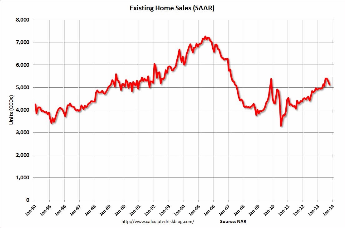
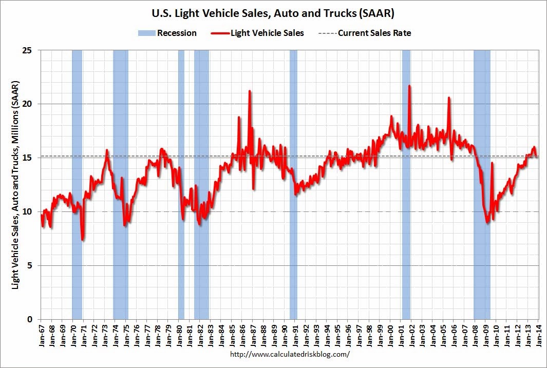
Source: Calculated Risk

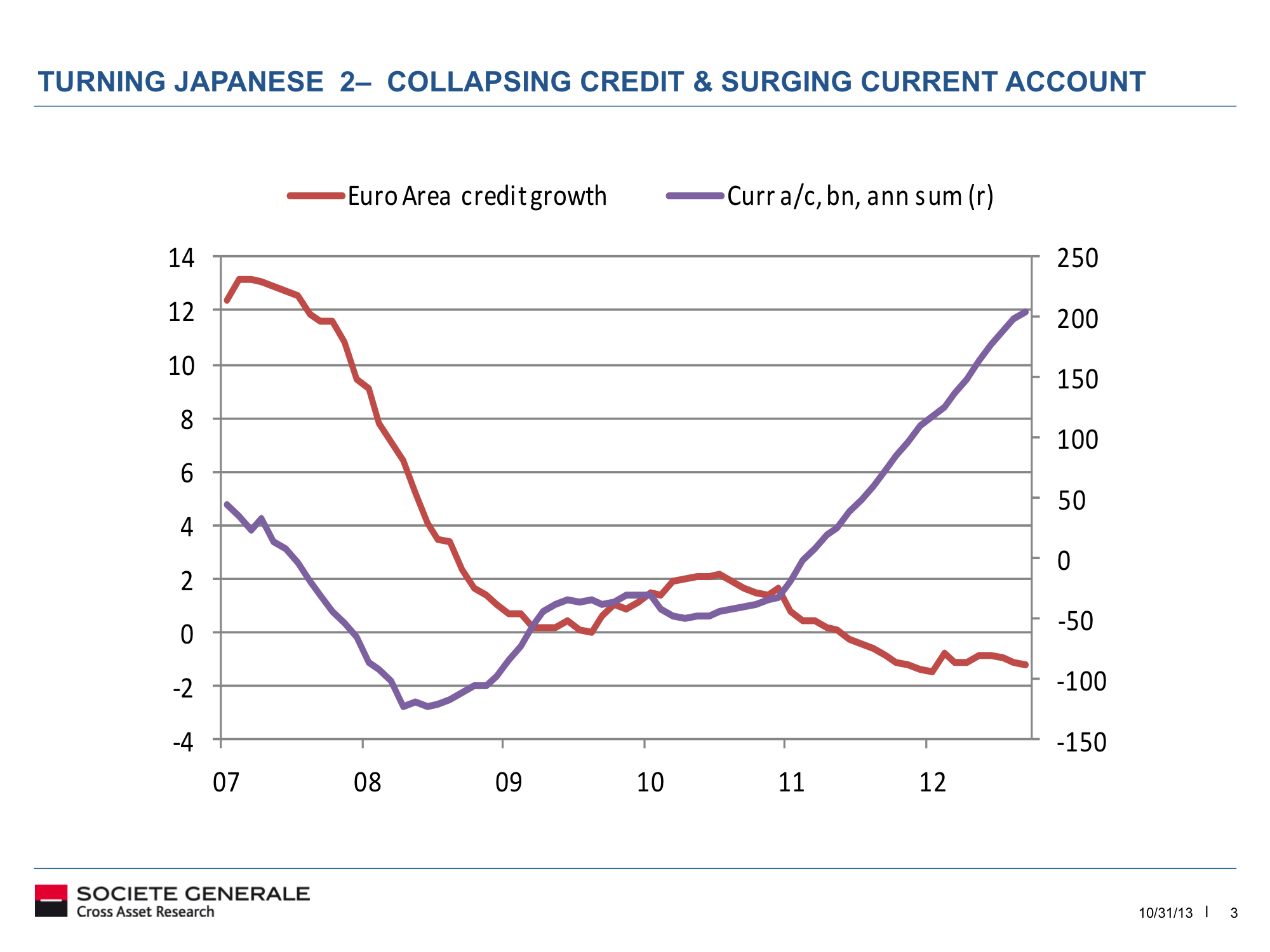
Meanwhile, the Eurozone is perhaps going to pay the price for its cautious central bank policy response since 2008 (compared to US and UK) by entering deflation first. Money supply has not grown in that period and narrow money as a leading indicator suggests the tentative recovery in Europe may be about to fizzle out again.

27nove13


27nove14


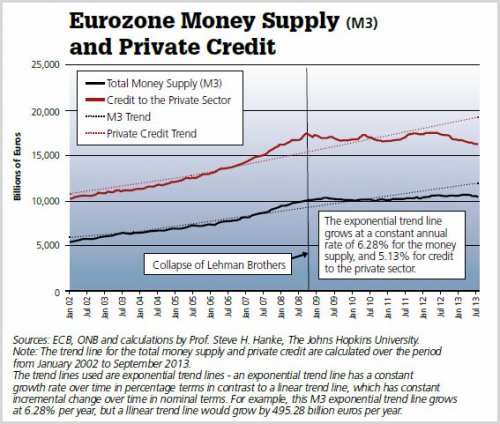
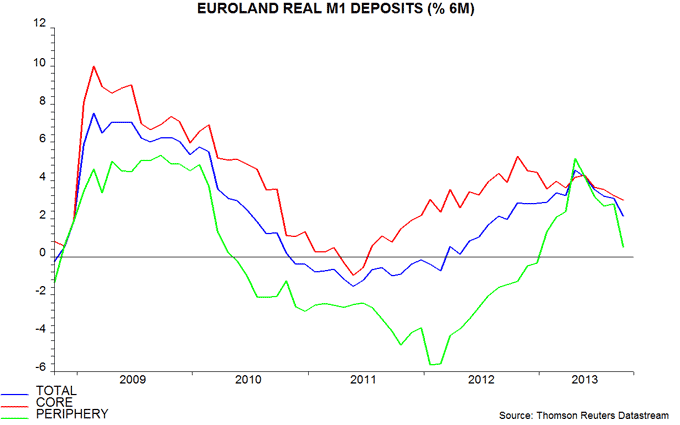
Source: MoneyMovesMarkets27nove15


Source: Yardeni

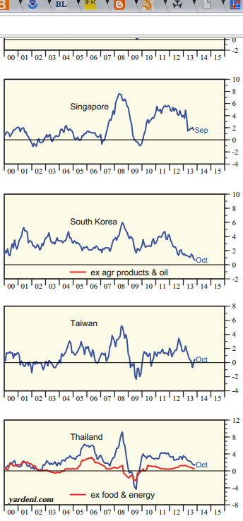
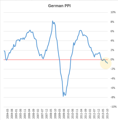
Chinese monetary trends also show a slowdown into 2014, whilst producer prices have been in deflation over the last twelve months. Add China to the European Union and the USA, and that’s more than half the world’s economy in a collective demographic downtrend, before including other similarly demographically challenged major countries such as Canada and Russia. I just don’t see how this won’t escalate into a global deflationary recessionary feedback looping. If Japan couldn’t achieve it when collective major economy demographics aside itself were positive in the 1990s, and we see similar developments in data above as occurred in Japan, then it would seem the world economy is destined to slip into a deflationary recession. A QE taper and fiscal consolidation as part of debt ceiling renegociation as we turn into 2014 could provide the extra momentum on that path in the US, whilst for Europe any additional interventionary measures may well be too late at this point (and are of questionable effectiveness anyway).


Advertisement

New secular stocks bull market?

Did a new secular stocks bull market effectively begin in 2009 or 2011, with the recent breakouts above secular bear resistance making for a golden buy opportunity?

26nove16Source: Marketoracle

Or is a secular stocks bear still in progress and we are on the cusp of a major shorting opportunity, together with a GOLD buy opportunity?

26nove17Source: Marketoracle

26nove2Source: Approximity

The case for the stocks secular bull market would be that valuations washed out sufficiently from the peaks in 2000 to the lows in 2009, that central bank stimulus is doing enough to offset collective demographic down forces, and that exponential technological evolution will drive increasing profitability and economic growth from here. Here are a couple of charts I produced last year, pre demographic research, showing the secular bear p/e valuations progress, with the lower chart showing how I expected breakout in 2013 followed by retest of the breakout level in 2014, before secular bull momentum took hold.

26nove9 26nove10


That projection was based on historic patterns, and still seems reasonable to me, if this is a new secular stocks bull. 2013 has indeed seen the ‘pentagon’ breakout in the major global stock indices, and a successful retest of the nose of the pentagon in 2014 would reset some of the froth we have built up this year as well as giving technical validation to the new bull.

However, since my demographic research, and broader thoughts progress, I have been more convinced of secular bear continuation, and the megaphone projection above. The case for secular bear continuation includes unprecedented collective demographic downtrends and overvaluation of equities by other measures. Here are Doug Short’s 4 valuation measures all showing historic overvaluation extremes, excepting the 2000 outlier:

26nove18Source: Dshort

There is a case for a breakdown to -50% if historic patterns are to be maintained, before a secular bull could be considered. The doubt is if 2000 was not an outlier but the new norm, namely a racheting up of higher and lower valuations, perhaps as a result of technological evolution also ratcheting up. Alternatively, valuations may change in context – namely that in this current era, ZIRP and QE have killed the attractiveness of cash and bonds, and we are therefore in an era where stocks are relatively more appealing:

26nove1And commodities? Deflationary demographics may have terminated the secular commodities bull before expectations, i.e. without a collective final mania. Or commodities may yet perform as late cyclicals, making a final ascent into 2014 that tips the fragile global economy into recession. The commodities indices are still in large triangles, since 2011, and whilst they remain so, the latter remains possible.

If, however, deflationary demographics are working their way through the commodities complex, then, by my research, there still remains a place for precious metals to shine, as the anti-demographic asset. The third chart down above in this post shows the progress of the dow-gold ratio, and also suggests the two secular possibilities. One, that the rising long term channel shows a repricing in the ratio in favour of equities (due to tech evolution) which means higher bottoms for the ratio and higher tops, i.e. the 2008-2011 lows were sufficient. Or two, that the fiat capital era has produced ever increasing extreme swings, which suggests the ultimate low in the dow-gold ratio is still ahead and will be the lowest yet.

Of course this will all become clear with the fullness of time. If demographics overcome central bank actions and tip the world into deflation, recession or both, then I expect stocks to lose and gold to win. If central bank actions together with tech evolution are overcoming demographics, then we should see a gradual strengthening in economic growth and profitability which should mean stocks (continue to) win and gold loses. Somewhere inbetween would be the scenarios in which rising yields or an inflationary shock (speculative run in commodities) or both tip the world into recession, which could reset stocks to some degree but keep both secular options open.

Back to the near term, we continue to see signs of froth in equities as well as signs of a melt-up in progress. That makes it difficult as it suggests it not prudent to go long here, but the short opportunity that it is setting up could be yet, 5%, 10% higher or even higher. Depends how crazy things might get, and if this the solar maximum then that potential is there.

26nove11 26nove1226nove526nove7


Stocks, Gold, Money Supply and Debt

Here is a chart from Gary Tanashian through SlopeOfHope’s charting facility, which could be argued legitimises the current steep ascent in US stocks:

24nove1Parabolic money pump, steeply rising corporate profits, and therefore equities going vertical (on a long term view).

In fact the sharply rising monetary base is directly contributing to those rising corporate profits, as government spending (debt) has been the key driver of corporate profits since 2008:

24nove2Therefore, if the US Fed begins to withdraw stimulus, disappointment in corporate profits is likely, as the chart shows the traditional profits driver of private investment has collapsed and not recovered over the last few years. Once again, this fits with demographics, and we should therefore not expect private investment to ramp up significantly again any time soon. So it’s in the hands of the US government and Fed. Maintain or increase stimulus, corporate profits should keep rising; decrease or end stimulus, corporate profits should retreat.

Turning to the monetary base, equities are not the only correlated class. In fact, gold has had a tighter correlation, until 2013. Here 2000-2012:

24nove3Source: Fool.com

Gold displayed a similar correlation with government debt, also until 2013.

24nove4

Source: RockSituationReport24nove5

Source: SlopeCharts

The first shows the debt limit, which will be back on the agenda soon, and surely must keep rising, whilst they retain the need to stimulate, which they will due to demographics. The second shows debt as a percentage of GDP, which actually fell back a little in H1 2013 (my extension on the chart). The reason for that was better than expected economic growth and a trimming in certain areas of government spending. Total debt continues to rise at a historically rapid rate.

So are these correlations with gold broken, or is gold set to come back? One more chart shows that the US dollar and treasury yields have been largely inversely correlated with gold and the pair strengthening for much of 2013 has been a key factor in gold’s decline:

24nove6Source: SlopeCharts

In my opinion, gold’s relations with money supply and debt levels are logically sound, and both money supply and debt should continue to rise into the future under the demographic trends. I therefore I expect gold can restore its bull market if the US dollar and treasury yields tip again into sideways or declining trends. If the US economy strengthens and a little inflation is restored, then this is unlikely to happen and gold will remain in the doldrums. However, demographics and debt suggest the Fed will have to keep fighting to maintain growth and keep deflation at bay (taper disappointment, yields suppression, new measures to attempt to inflate), which could bring about such a reversal in fortunes.

I still expect equities can go a little more parabolic first, under a typical solar maximum speculation push. However the warning flags already in place of dumb/smart money, trading volumes, margin debt and trading credit balances, and overvaluations (e.g. Q ratio) suggest it is most likely limited in duration and size. I would go with something like this from trader Moe:

24nove7Source: Trader Moe

A further 10% gain in a rapid time, with a catalyst being collective major breakouts in the major global indices, to get to some crazy extreme indicator readings, and a subsequent termination. My first checkpoint is the start of December, because the 3rd is the new moon and as of the 4th geomagnetism is forecast to ramp up again. If equities can rally hard and fast into that point, with a spread of indicators flashing, then I would suggest that could be the earliest point for declines to set in (barring any external shocks). If, however, equities can rally through the seasonally strong Xmas period, and solar intensity stays high into the beginning of 2014, then the next checkpoint would be early January.


Charts To Ponder

Major global equities breakouts or reversals, at these combined key levels?

21nove1Source: Chris Kimble

India’s Sensex is also flirting with a long term triple top, with peaks at the end of 2007, 2010 and now. Japan’s Nikkei has broken upwards out its consolidation range, and looks likely for another retest of long term downward resistance, joining the other indices at major resistance/breakout levels:

21nove13

Equities have struggled the last few sessions, but with various sentiment and contrarian extremes having been reached (see Sunday’s post) together with these collective technical positions, the bullish case would argue for a little consolidation to ‘deflate’ these indicators before collective breakout. Chris Puplava still sees no signs of a major top, at least in US equities.

Lately, Japan’s leading indicators and inflation data have both been positive. For me, that’s consistent with Japan’s positive demographic window and I believe it can (eventually) break free of that technical long term bear, moreover it is overdue. The case for the bulk of the other major nations is really the reverse: unprecedented collective demographic downtrends. Equities bulls have historically been killed by rising rates, excessive inflation or outright deflation, and it appears outright deflation – as collective demographics suggest should occur – is the nearest threat:

21nove8 21nove9 21nove10

Source: Ed Yardeni

21nove12

Source: Sober Look

21nove11

Source: Dshort

I revealed some charts in the last post that showed how equities (particularly developed world equities) have made notable divergences this year. I have some more to add to that collection.

Firstly, this chart shows the ‘snap’ in ‘risk-on/risk-off’ financial market correlations that occurred over the last year. Developed economy equities going separate ways from commodities and emerging market equities and currencies.

21nove7Source: Business Insider

In fact, if we look further back in time, such divergence is not so abnormal. Historically, it would normally signal a new secular bull had begun in equities, and that normal economic conditions in the major economies had been restored following financial/economic crisis. Global financial stress indices also are reflective of this currently, down to low levels, with the US government shutdown appearing as just a blip in the trend. The Vix also shows no perceived threats.

However, equities have diverged with the economy recently in the US:

21nove5Source: HighTowerAdvisors

And with consumer sentiment, which has been in decline since July:

21nove3

Source: Stockcharts

Consumer Confidence has made a similar divergence, and both measures show a fairly good historical correlation with equities over the longer term.

Global IPOs have also diverged from global equities:

21nove2

Source: IFR

Broadly speaking the reason for the decline in IPOs in the last couple of years is attributed to economic concerns. That seems reasonable, but why the divergence, when historically they have correlated with equities up and down?

These charts, and those divergence charts from the last post, all suggest we have either broken into a new norm where equities are legitimately rising despite anomalies (charging ahead as a new secular bull gradually comes to light, or under historically unprecedented conditions of central bank support) – or – we are seeing speculative levitiation before sharp declines return these divergences to normal.

Here’s the thing. This time really is different. Unprecedented global ZIRP and QE and/versus unprecedented global collective demographic downtrends. But ultimately I don’t believe central bank actions can defeat demographics, and that’s because central banks can’t force people or businesses to do anything, they can only put the conditions in place to encourage or discourage. I believe the evidence in GDP trends, trading volumes, inflation data and more, as well as the lessons from Japan’s example from the 1990s, suggest the demographics are the destiny of the economy and markets, but how long we take to get there is the question.


Divergences, Ratios and Surprises

Here are the latest economic surprises indices for the major nations:

19sept5 19sept4 19sept3 19sept2Source: Citibank

Japan aside, economic surprises for most of the majors topped out as we turned into September. Historically there has been a fairly good correlation between economic surprises and stock market returns, but the correlation has deteriorated throughout 2013 and turned negative:

19sept7

Source: JP Morgan

Is there anything about that period from early 2009 to mid 2010 where correlations also were anomalously negative? My take is that by March 2009 most of the major stock indices were at p/e 10 or below, and thereafter we saw a period of post-panic bargain hunting at historic cheapness, despite and regardless of continued disappointing economic data. That doesn’t apply at today’s valuations.

Here’s another look:

19sep1I’ve charted the peaks in US economic surprises versus the SP500. It can be seen that from 2006 to 2012, trend reversals in economic surprises reliably brought about corrections in the SP500, but sometimes with the stock market eeking out a marginal new high and then rolling over. But since the end of 2012 the two economic surprises peaks have been largely ignored by the market.

There have been other notable divergences since the turn of the year.

Equities have diverged from geomagnetism:

19sept12

Junk bonds, which have historically correlated with equities fairly well under ‘risk-on/off’ sentiment, have parted ways with stocks and are actually down for the year. Commodities likewise:

19sept11Source: Yardeni

I have extended this commodities:stocks ratio chart from early 2012 to the current level in November 2013, showing the degree to which stocks are now valued versus commodities:

19sept13Source: Stockcharts

Down to 0.15, very close to the level reached at the 2000 equities peak.

Versus bonds, equities have also made a sharp run up in relative valuation this year:

19sept14Source: ispyetf

If this is the solar maximum at the end of 2013, then it would be normal, by history, for the secular asset class of the time to be bid up in a speculative finale, diverging from normal correlations and leaving models behind, in a final overthrow. If this is occurring with equities (perhaps disinflation has killed off commodities), then the above charts would be evidence for that, and we are left trying to look for clues as to how much further, both in time and price, the speculative finale has to run. If it isn’t equities, but rather commodities that are bound for a speculative finale (as they would rather befit the ‘secular’ asset class leading into this solar peak), then the above charts are warnings that the rug could be pulled from under equities at any time.

Right now, the balance of evidence suggests that it is stocks being bid up to a speculative finale, if my solar thesis is correct. Even without solar, we see various evidence for that, in my last post and this. See how margin debt has accelerated over the last 12 months, as it did prior to the last 2 major stocks peaks:

19sept10

Source: Dshort

And now look at the decline in trading volumes:

19sept15Source: Marketwatch

There are fewer and fewer participants in the market chasing it higher, and the margin debt and credit account levels (last post) suggest increasing leverage to do so. Unless more people and institutions come to the market, then that is a recipe for a steep decline or crash ahead. By demographics, those additional participants are unlikely to materialise. Recall that demographic trends in the US were up into around 2000 and have since been downward, continuing this decade. I suggest that is what we are seeing in the trading volumes ‘mountain’ above.

In summary, I believe the equities bull is on borrowed time and that risk-reward is stacking up on the short side. But it comes down to how much further in price and time stocks can extend first. If solar-inspired speculation is at work then parabolic becomes more possible. If on the other hand equities are to make a topping ‘process’ rather than a parabolic, then by normal measures this has not started in a meaningful way so should at least extend for several months and postpone a major decline until 2014. If commodities are to become the speculative target then they should take off as late cyclicals whilst stocks make a topping process. This remains theory only, and deflationary demographics are a headwind to this occurring, so I have my doubts.

On that note, if we look at when gold really took off in the past, it was under conditions of negative real treasury yields. Rises in yields over the last 12 months, together with shrinking inflation, have taken real yields positive and are a problem for gold. Deflationary winds, due to demographics, threaten to take inflation yet lower, whilst treasury yields by late 2012 had reached historic extreme lows, suggesting renewed downside may be limited. So, if I could speculate how fortunes could be reversed in gold, it would be either the world tips into deflation and gold performs more ‘uniquely’ (gold’s performance under deflation is limited in history, but I suggest it ought to perform as the default go-to asset under such conditions when all others are unattractive) – or – central banks take renewed action against the disinflation in progress by increasing rather than decreasing stimulus, e.g. the ECB launches QE and the Fed maintains QE rather than tapers.

19sept9Source: Dshort

State Of The Markets

Starting with the equally-weighted commodities index versus the world equities index:

17nov11Source: Bloomberg

Commodities remain depressed but still within a large triangle. Last chance though here as the triangle compresses and they test horizontal support again. Their underperformance, based on supply and demand, is consistent with the demographic trends now in place in most of the major nations.

World equities broke out of their mid-year range, rendering the potential topping process redundant. That means equities need either to start over a multi-month topping process at some point ahead, or make a parabolic top instead. The increasing rate of gains, shown by the trend, suggests the latter could potentially occur (or be occurring), and this is supported by increasing evidence of a solar maximum taking place now:

17nov13Historic solar maximums have been correlated with speculative manias, such as Nasdaq 2000, Nikkei 1989, gold 1980 (last 3 solar maximums). I anticipated that commodities would be the speculative target for this solar max but there is reasonable evidence that such speculation froth is taking place in equities, as the next 5 charts show.

Firstly, Hussman’s long standing bearish call on the markets has to be taken with a pinch of salt, but the ‘bubble’ technical overlay shows what could be occurring:

17nov6Source: Hussman

Secondly, the steep wedging of both the SP500 and volatility indices is also indicative, and suggests both could be heading for a pop:

17nov5Source: Chris Kimble

Third, the situation for free cash in margin accounts together with margin debt levels reveals a dangerous extension, which is also suggestive of excessive speculation:

17nov3Source: Dshort

And fourth, a lack of hedging to go with that:

17nov2Source: Sentimentrader

Finally, fifth, the rally is now much more weighted into the hands of traditionally ‘dumb’ money rather than ‘smart’ money participants:

17nov1Source: Sentimentrader

On the flip side, we do not see significant deterioration in breadth nor rotation into defensives that would ordinarily warn of a top in the markets. The next 2 weeks are the positive lunar fornight so there is a reasonable chance that equities continue to rally through that period, and indeed could feasibly carry that through the traditionally strong Xmas period into the beginning of 2014. I believe the technical breakouts and steepening trends in stock indices together with the solar-inspired excitement could potentially make for a parabolic finale here. It’s a tough one to call because of the extremes already reached in some of the indicators above. Complacency is high and it has been a long time since a 10% correction. Stocks are also overvalued, historically, as the Q-ratio and CAPE reveal:

17nov7

17nov8The 2000 outlier shows how much further overvalued stocks could feasibly yet become, but that anomaly aside we can see that by both measures warning signs are flashing. What could tip the market over? Rising rates (bond yields are back on the rise), an inflationary shock, or a deflationary shock. Normally, stocks would tip into a cyclical bear under excessive inflation. Right now we see the opposite. Take a look at the rate if disinflation in Europe:

17nov9Source: Yardeni

Add to this a crisis emerging again in emerging Europe, and I can see a case for the ECB taking to QE. If that were to occur, then maybe commodities can catch a bid again and make their speculative rally, under a brief but significant inflationary shock. Chris Carolan’s solunar model for crude oil paints the possibility that oil could come back here:

17nov12

Source: Spiralcalendar

If the whole class cannot rise again, then precious metals alone could, under a deflationary shock, i.e. the world tips into a deflationary recession. This could occur with further commodity falls dragging global inflation rates yet lower. Emerging markets such as India and Brazil are in trouble again with low growth and high inflation, sinking currencies and debt problems. And leading indicators suggest global growth could be tipping over as of year end in the developed nations:

17nov10Source: Moneymovesmarkets

Under deflation, equities would normally fall hard and fast, to the lower ranges for CAPE and Q ratio above. That would likely mean sub 2009 lows in nominal terms. But under inflation, equities normally more slowly wind down to those valuation levels, and in nominal terms the damage is less severe. Under deflation the US dollar should rally, whereas under inflation the US dollar should break down. The US dollar was on the cusp of a major breakdown several weeks ago but has since rallied away from oversold and overbearish conditions, leaving both possibilities on the table, and its performance from here should be a key signal.

Right now, the deflationary outcome looks the most likely, which would make a short on the stock indices a very tasty trade. However, before that there is the potential for stocks to climb further, and possibly at an increasing trajectory. That makes for difficult timing. With the positive lunar fortnight right ahead, and momentum still with equities, I am expecting stocks can rally further in that period, barring any external shocks. But with various high danger levels already reached for this stocks bull, I am looking to build short here, not chase long. Regarding commodities, I continue to watch and wait, still long the complex, but not adding. I believe precious metals will come again, due to the unprecedented demographic downtrends, but am less sure about the broader complex due to the demographic impacts on demand. But let’s see – the moment of truth draws nearer – see below – and I don’t want to try to front-run or second-guess it. A speculative and final rally in commodities remains a possibility whilst the complex continues to consolidate up high. Yet if they cannot rally, and break down below the major support, I believe the global tipping into deflation will accelerate and kill equities in due course.

17nov14Source: Martin Pring