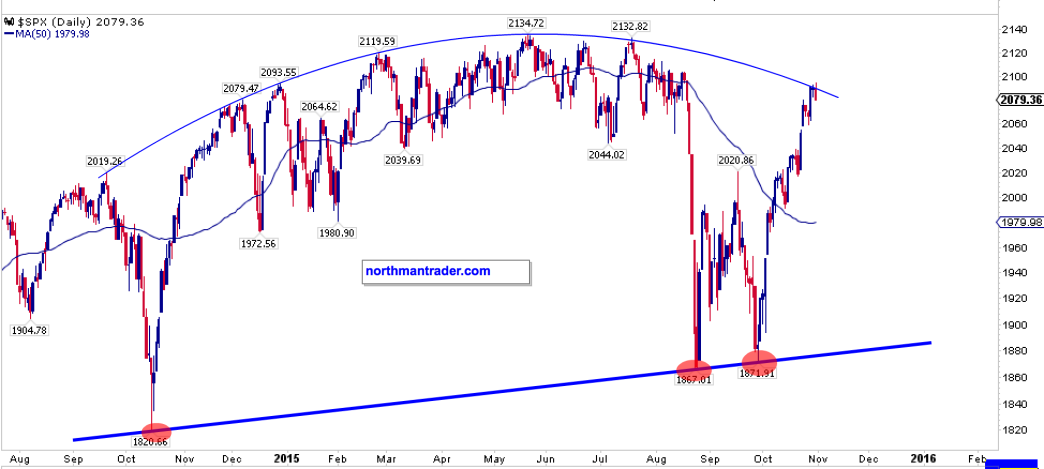
Well, is it a bear market rally or a bull market rally?
20 months after topping indicators started flagging we still can’t say for sure. That sounds incredible, but before the 1929 top the first topping indicators flagged from May 1928 onwards, and before the 2000 top the first topping indicators flagged from July 1998 onwards. So long difficult tops can and do occur.
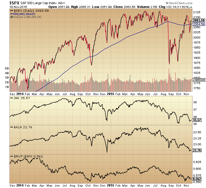
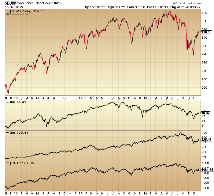
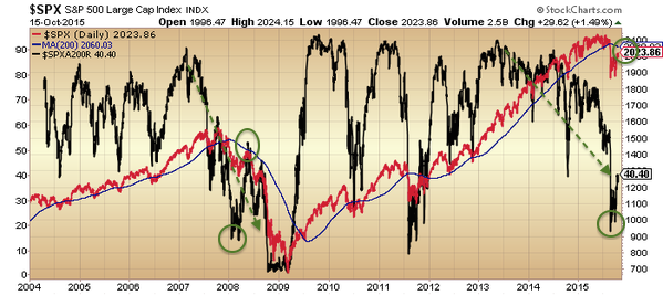
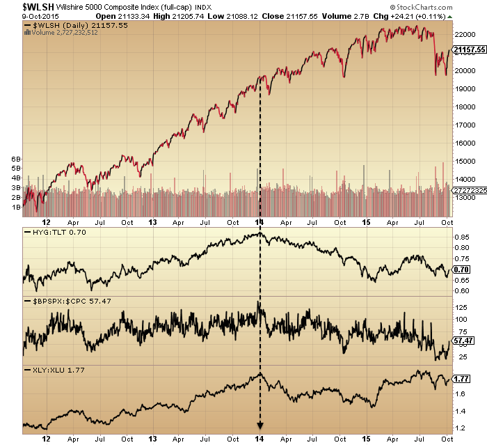
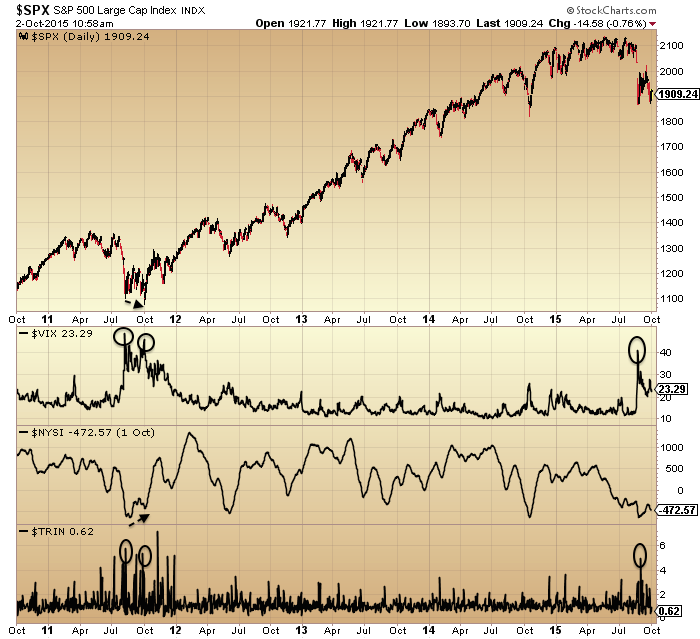
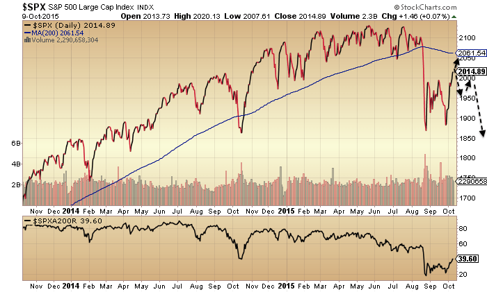
In our current scenario we can pick out these 3 as the longest standing divergences from January 2014 onwards, then picking out May 2015 as the actual bull market peak:

Source: Stockcharts
Collectively these 3 indicators represent a shift away from risk appetite, which is a typical topping process identifier. Apart from these, it’s worth recapping what other clues were there way back at the start of 2014, so this is how things stood then:
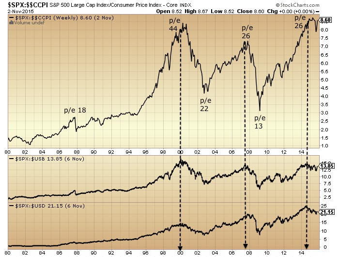
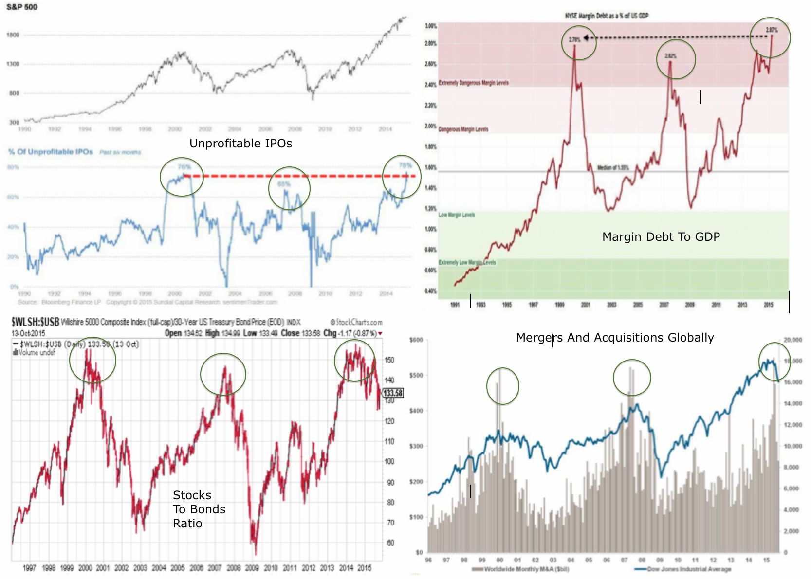
The previous 2 years rally in US stock indices was made up of less than 20% earnings growth and more than 80% multiple expansion. The last 2 such occurrences in history were 1985:1986 (leading into 1987 crash) and 1997:1998 (leading into 1999 real Dow peak).
Compound annual growth rate in equities since 2009 was only exceeded in 1929, 1937, 1987 and 2000, all of which led to steep market declines.
Valuations (aggregating various measures) were the third highest in history after the 2000 and 1929 peaks.
Russell 2000 reached trailing p/e ratio 88; Amazon trailing p/e 1440; Facebook trailing p/e 148; Twitter reached $40bn market cap with zero profits.
Declining breadth in the number of countries participating in world equities rally.
Cluster of extreme Skew readings not seen since June 1990 before recession began July 1990.
Investor Intelligence percentage bears and bull-bear spread were both at 1987 levels (market crash).
NAAIM survey sentiment was in the 98th percentile = extreme optimism.
US household exposure to equities had risen to the same levels as the 2007 top.
Fund manager allocation to global equities at levels that previously led to a market peak or correction.
Rydex bull-bear and levergaged bull-bear ratios at an all-time record.
Margin Debt had escalated to 2.5% of GDP, only exceeded at the 2000 market peak.
And the list did’t stop there. But, we can unify these varied measures and indicators as (1) evidence of an unsustainable mania and (2) divergences in breadth and risk appetite. The first warned us of a coming peak and the second of a peak in progress.
At the time solar scientists believed the solar max was already through, but this didn’t turn out to the case until mid 2014.

Fitting in with this, at mid-2014 the bulk of other negative divergence topping indicators formed. We saw a similar bulk-flagging in Jan-Mar 2000 (before the August final roll over) and in June-July 2007 (before the October final roll over).
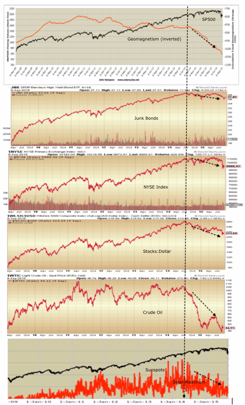
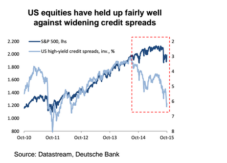
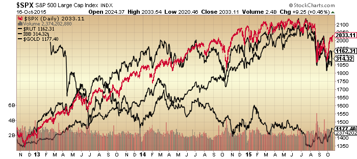
Here we see high beta to stocks, stocks to bonds, stocks to dollar and junk bonds as examples of that under-the-hood mid 2014 peak.

Shortly afterwards geomagnetism started to ramp up as is common post solar maximum and weighs negative on the market.

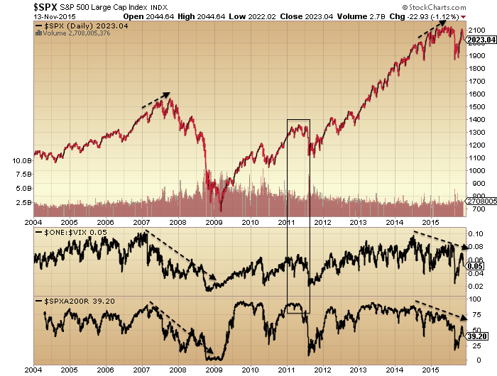
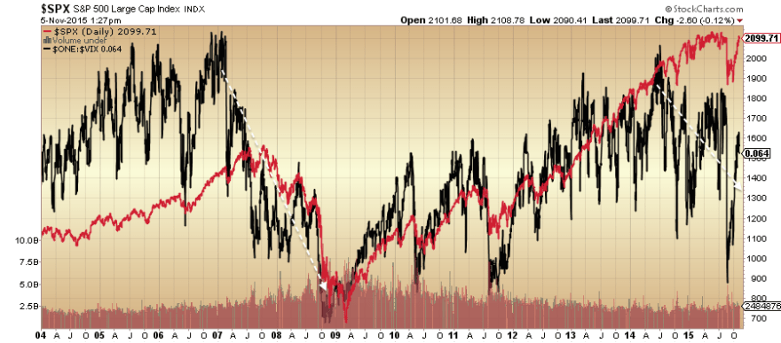
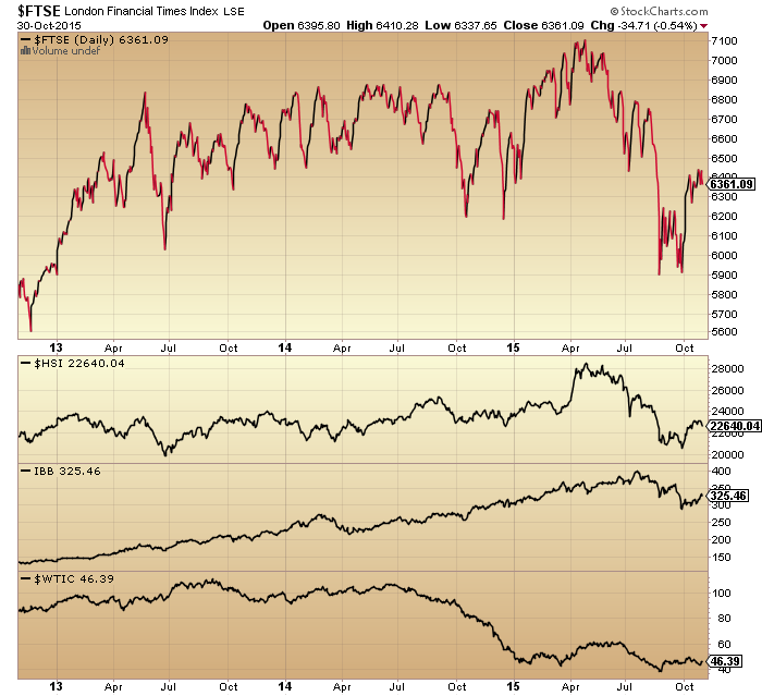
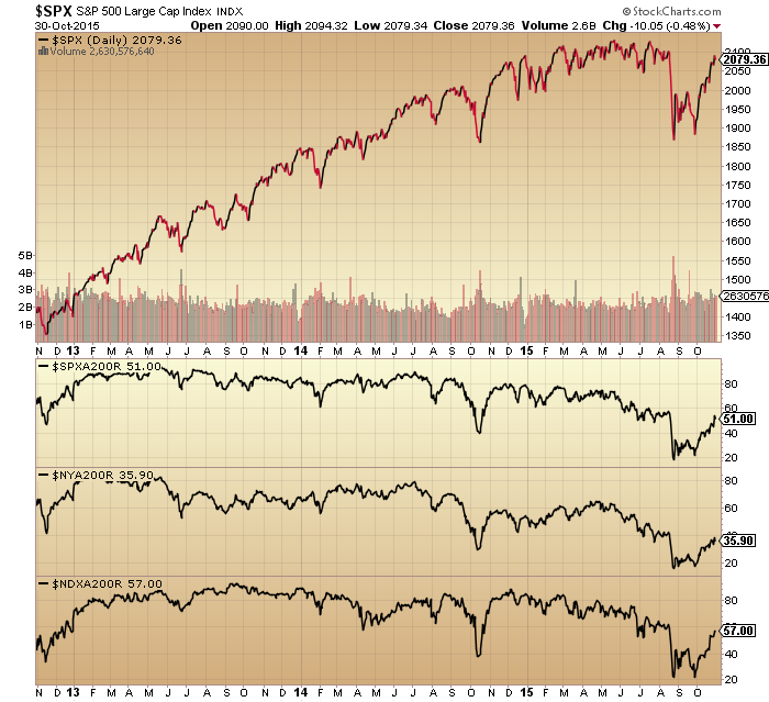
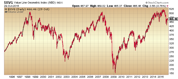
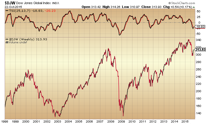
All four charts so far in this post show the same thing: peaks in the past and downtrends in place ever since. This aids our conviction for a bear market in progress.
A closer look at recent geomagnetism reveals this:
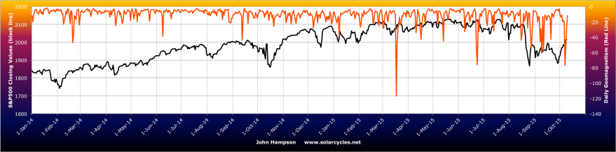
There has been an intensification of storms since around February this year, after which the market struggled to make any further gains. The latest spike down was right at the end of last week, meanwhile sunspots have dropped to close to zero, so for now solar influences are very much aligned for a bear market.
By the recent stock market low of late September, capitulative breadth, contrarian put call and sentiment readings had formed, out of which the market has made a sharp rally upwards to the current point. Bear market rallies are typically fast and furious so the strength doesn’t provide decisive confirmation of bull or bear.
The Zweig breadth thrust flagged at the recent low, and history shows that these have been potent rally initiators in bull markets but overall poor in bear markets. So again, that doesn’t particularly help us here.
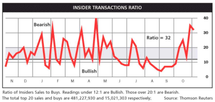
Also, insider buying flagged at the recent low, but again, history shows us that this group is a dip buyer at both bull market correction bottoms and bear market pauses, so wise enough to be buying after falls but not wise enough to differentiate between a bull correction and a bear market.
Capitulative breadth returned to zero earlier last week (i.e. bullish edge gone) and Nymo hit a rare extreme of over 90 by the end of Thursday. Here are similar such Nymo prints from the past:

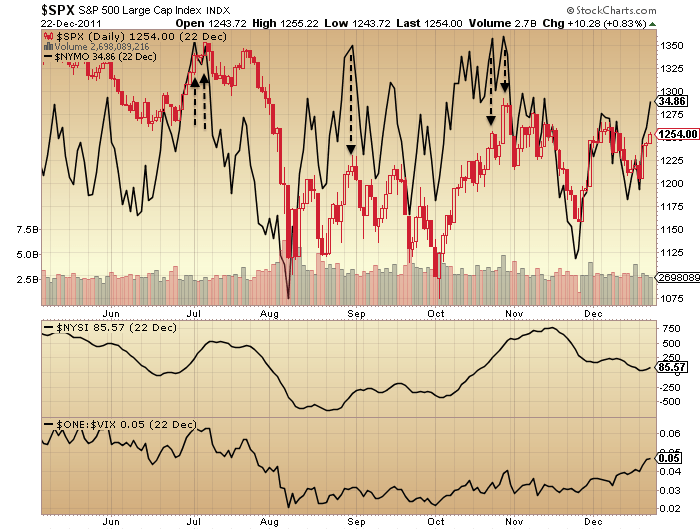


Fairly consistently they initiated a pullback in stocks either to the day or within a couple of days. At the start of this coming week we have the new moon and US earnings get going, so that, together with the very recent geomagnetism could help trigger the fresh reversal. But what then?
Drawing on historic examples of the kind of price pattern in progress, I suggest two possibilities, shown:
One is we reach up to the 200MA then are repelled back into the bear market. The other, and my favoured option, is we pull back lower, then make a lower high, then resume downwards.
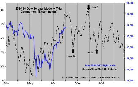
Chris Carolan merges previous similar solar lunar years from the past and creates a model. I don’t know how successful this is but the method appeals.

It might fit with my favoured scenario of pullback, rally back up to lower high, then down again properly as of November.
October is typically the worst point seasonally geomagnetically, from which pressure then eases. Plus earnings may collectively surprise worse or better. These are two wildcards for the rest of this month.
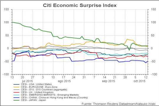
ECRI leading indicators are still negative but maybe forming a higher low, whilst narrow money leading indicators for the US suggest weakness over the next several months. Financial conditions in US, Europe and Asia are united negative.
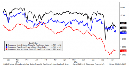
Source: Bloomberg
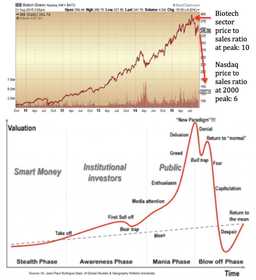
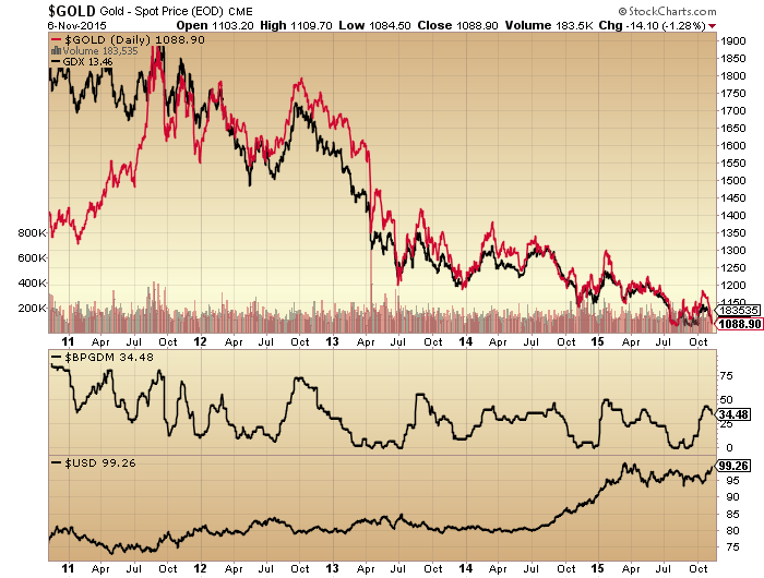
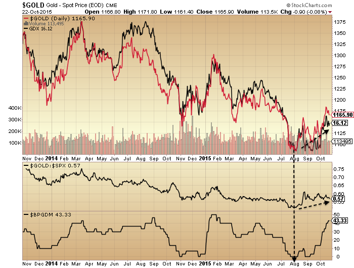
Biotech, the mania leader, and my biggest short, has only managed so far to make a bear flag down at the lows, post parabolic break. Gold and miners, my only longs, have taken off this last week, but as yet we can’t differentiate them from the bullish break upwards in oil (whether they are acting as safe havens or commodities).
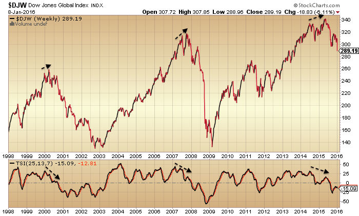
To finish, if we step back and look at the big picture again, there is considerably higher likelihood this is a bear market rally rather than bull market post-correction resumption. The US indices are currently less damaged than most others but the wider world is more convincingly bearish. The Dow Jones World index shows a fairly telltale topping process:

And Leuthold provide a nice summary of matching divergences in the US into the May 2015 peak to the 2000 and 2007 peaks.
Source: Leuthold Group