Bear V Bull

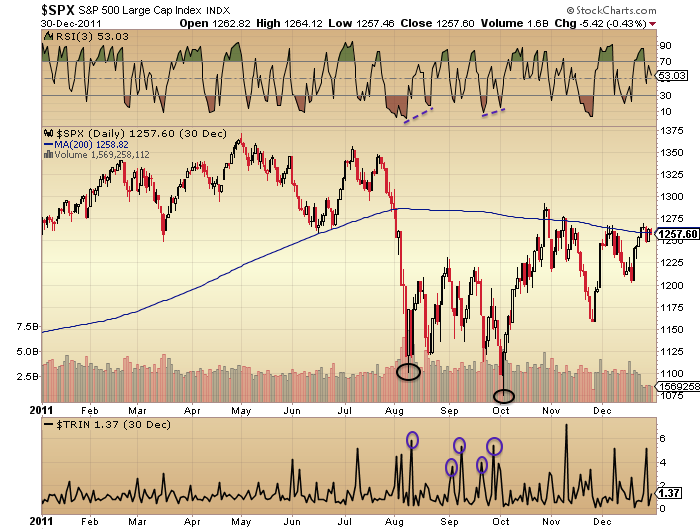
We can now see that the arching over in price in 2015 set against negative divergences in breadth and strength were indeed a prelude to a collapse in stocks like in 2011:
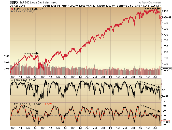
29augu1

Source: Stockcharts

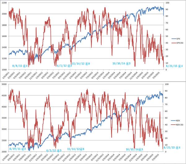
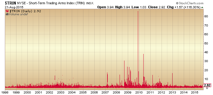
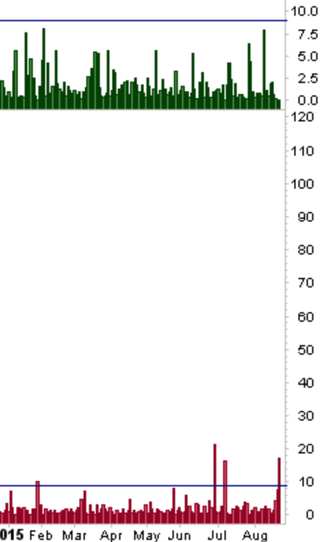
After such a steep collapse and catapult readings in fear indicators, the market historically needs some time to consolidate and recover. The pattern should be that the rally of the last 3 days gives way imminently and we retest the lows.

29augu2

Source: ShortSideOfLong

That point would then be the next key test.

Bulls should be looking to see a double bottom or lower low on positive divergences from which price then resumes a bull trend to new highs. The best fit timeline by geomagnetism/seasonals would be a bottoming out in October and Xmas new highs. Supporting this scenario is liquidity trends.

29augu3

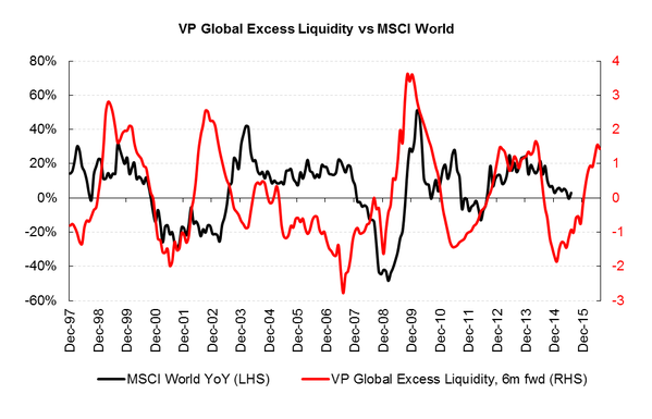
Source: Variant Perception

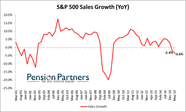
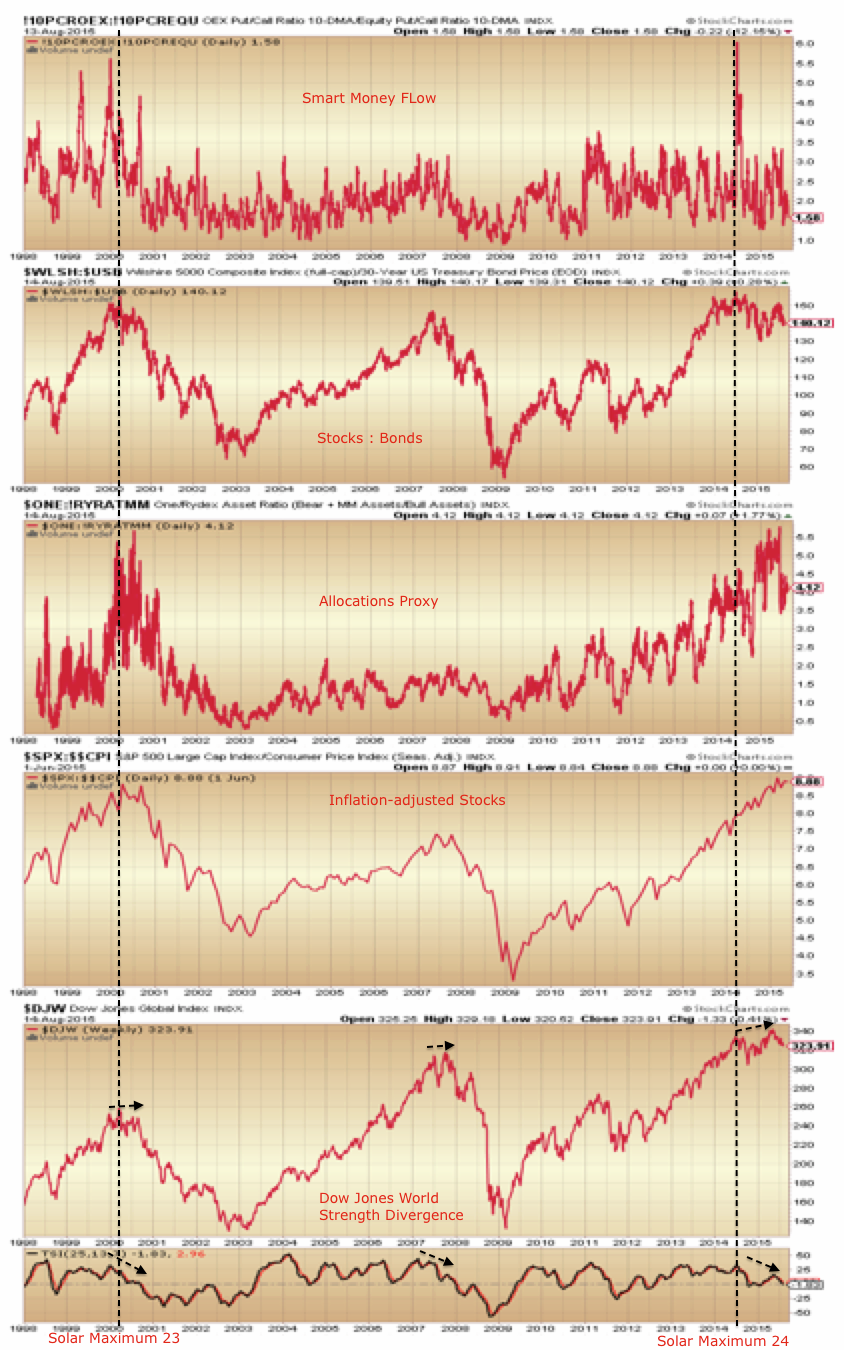
However, I rather see the overall evidence as supportive of stocks now being in a bear market. Drawing together all the indicators and disciplines that I trust, the data suggests stocks entered a topping process Jan 2014, made a first major peak in June/July 2014 with the solar max, made a first major low in October 2014 and a final second peak in May 2015. Several indicators reflect this progression, so here is one: stocks to bonds.
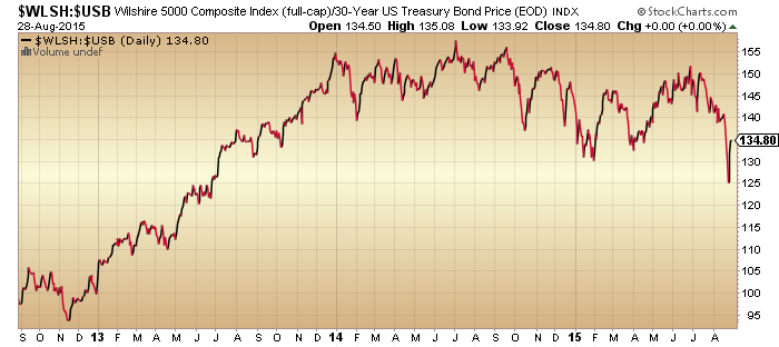
29augu4

Source: Stockcharts

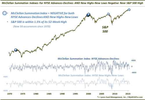
Multiple indictors have registered bear-market-bottoms readings over recent months. Here’s another one from Dana Lyons:
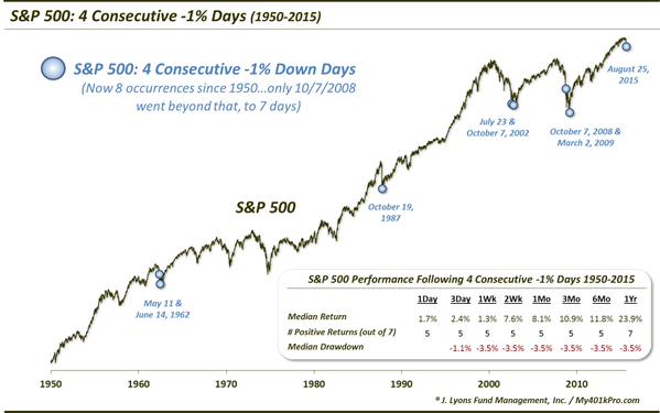
29augu5

Source: Dana Lyons

Capilulative breadth too, which hit its highest ever reading last week.

29augu8

CBI data from Rob Hannah

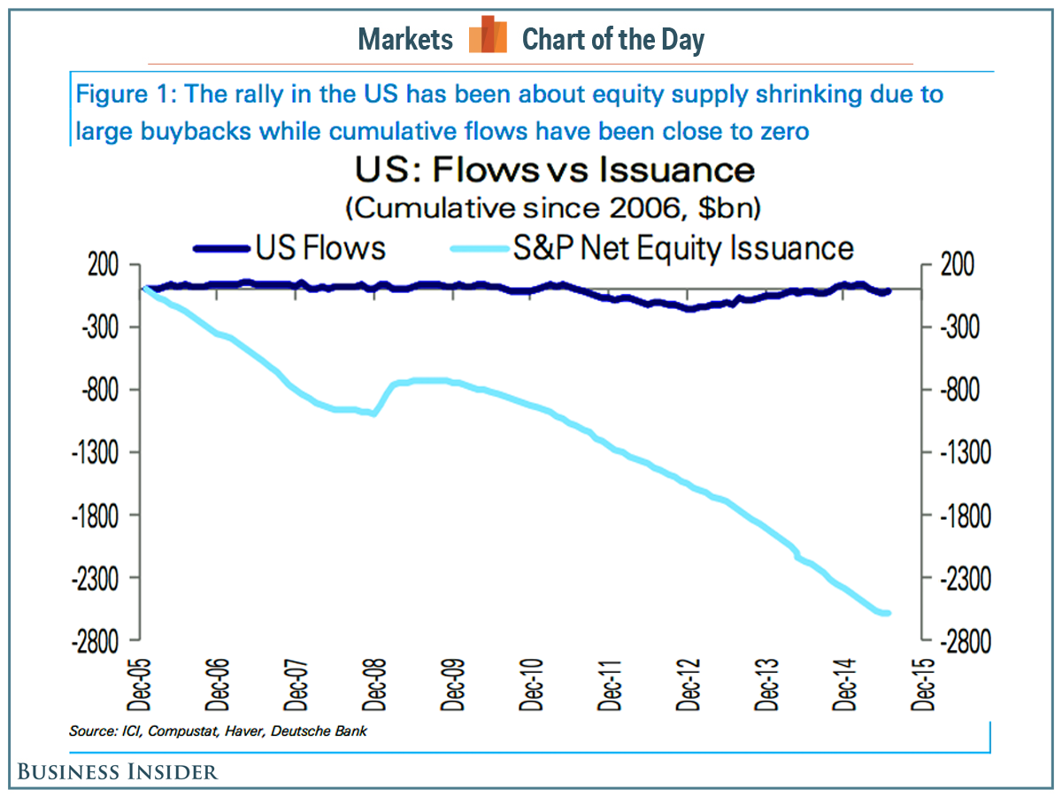
If we take the bull angle again, then we could argue that such readings are a springboard to much higher prices, but we need to explain why they have anomalously occurred at <10% from the highs. If buybacks were to blame for the shallower washout in nominal prices then we should have seen small caps and non-buyback large caps collapse whilst buyback large caps held up, but this has not been the case.

If, on the other hand, they are signals that we are in a bear market then prices should now fall again Sept-Oct and make significantly lower lows. The shaping in Biotech is supportive of this:

Screen Shot 2015-08-28 at 18.15.32

All in all, I think the extreme bearish readings we are printing this year in various indicators are a fair match for the all time record bullish readings we saw last year, namely that the markets have become excessively unbalanced.

But, what can we can say for sure is that multiple indicators that were screaming for a reset in equity prices have now been satisfied (such as breadth, sentiment divergences), which makes the next move particularly telling. Again, bulls see this as a refuel for eventual higher prices, but certain big picture indicators make any such notion that we have now reset rather foundation-less.

Valuations ought to end up negative, and leverage ought to be wound down from their extreme high readings:

29augu11 29augu10

Source: DShort

Which brings us to our particular environment not seen in over 50 years: ultra low rates, low inflation and overall deflationary trends. Are such valuations and leverage fair in the context of ZIRP? It’s a really useful test. If stocks are in a bear now and break down, then it will be without high rates or oil prices ‘choking the economy’ and despite QE ongoing in several major nations. It will be clearer that valuations do not need recalculating in the context of low rates and low inflation. In short, it will be much more supportive of my dumb model of the markets: demographics and solar cycles.

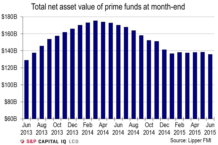
On that note, what I see as most important here is what has been offsetting demographic trends, namely increasing leverage. Buybacks through borrowing continue, but did so at record levels in 2007 despite stocks breaking down into a bear. Buybacks didn’t stop the collapse occurring last week. Margin debt dropped in July, and likely dropped harder in August. If stocks are to rally to new highs then leverage has to recover and make new highs too. However, what I see as likely is that a section of high leverage participants were wiped out last week and all-round appetite for high borrowing levels has been dealt a decisive blow. I very much doubt from here that leverage will make new highs.

Using Rydex as a proxy for retail, I would argue the craziness has been broken and we will now see a gradual reversion to mean.

29augu12

Looking cross-asset, I believe gold will now make a higher low than the July low and in so doing cement its new bull trend, completing the gold and equities flip at the cyclical level.

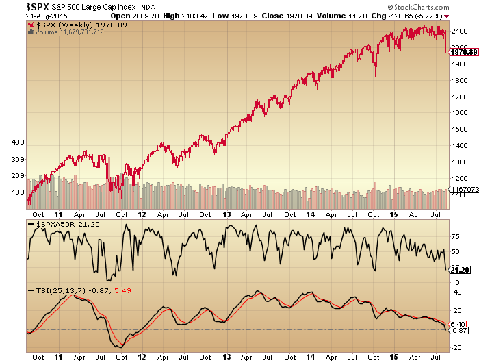
To finish, here is the SP500 big picture again. If we are in a bear then we should make lower highs and lower lows. But note that in a bear we still get some ripping rallies that test the overall downtrend.

29augu15

For now then, what’s important is that the rally of the last 3 days topples over in due course and eventually prints a lower low than October 2014 in all indices.

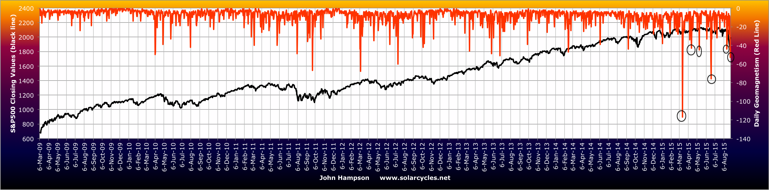
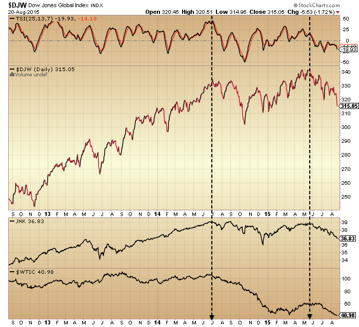
We have had significant geomagnetism in progress the last couple of days. It adds to the recent cluster which acts as a negative pressure on market participants.

29augu15

I am short Biotech, Russell 2000, Dow and long gold.

Advertisement

Sunday Indicator Updates

There are a bunch of indicators already at contrarian extremes and they would argue that stocks are close to a low. Here, ISEE put call, daily sentiment index and CBOE put call:

23augu15 23augu11 23augu1

Sources: Contrahour, Chad Gassaway, Stockcharts

Then there are others which have either not washed out sufficiently yet or at levels whereby we might argue ‘done’ if just a bull market correction or ‘just getting started’ if we are now in a bear market. Here, Investors Intelligence sentiment, AAII sentiment, SP500 new highs new lows, NAAIM manager exposure, volatility, and the Arms index.

Screen Shot 2015-08-23 at 07.43.01 23augu7 23augu6 23augu4
23augu2

Sources: Yardeni, Stockcharts

If we consider the 5% decline across the last two days of last week, it suggests we are in the territory of a nastier correction or bear market.

23augu13

Source: Ryan Detrick

Additionally, Friday was a major distribution day and one of four recent such events. Major distribution days near the highs are a typical sign of a market peak. On the chart below, green above the line = major accumulation days (none in the last 6 months), red above the line = major distribution days.

Screen Shot 2015-08-23 at 07.49.10

Source: Cobra

If we look at the SP500 chart we can see that the steepness of the declines of last week does not resemble the v-corrections of the last 2 years. It looks more like the crash of August 2011 (also preceded by both an arching over in price and divergence in breadth), but notably without the volume spike that may signal a bottom yet.

23augu30

The heaviest falls in August 2011 took place on Monday 8th. Ditto Black Monday in 1987. The reasoning is that investors have time to stew over the weekend and rush for the exits on Monday morning. Typically stocks crash from oversold overbearish conditions, not from highs. So we have a similar set up here for tomorrow (CPC, daily sentiment, RSI all at oversold, overbearish), and a major down day is possible.

23augu20

Source: Mark Minervi

Closing at the lows on Friday makes it more likely that we will open to further selling tomorrow. The question is whether buyers now step in and that can be turned into a reversal or consolidation day, which is also possible.

In short, certain indicators suggest a bounce should be near. But the steepness of the declines and the bigger picture of the (likely) bear market suggest that we could drop further and trigger the more neutral indicators to greater extremes before a bounce. I suggest the best all round fit here is that we fall hard at the start of this coming week and then get a bounce soon but from significantly lower levels. I suggest a bounce is more likely on a high volume intraday reversal hammer candle and a bottom more likely to hold if it shapes out as a lower low on positive divergences. Both are absent so far.

Here is 2011 for reference. Note we saw higher fear spikes than we currently have, two long tailed intraday voluminous reversals and two lower/twin lows on positive divergences.

23augu40

Increasing Validation

Testing several key theories here real time, it’s been a slow process, but patience is being rewarded.

Firstly, that demographic forces are more powerful than central bank actions. Look what’s happened since 2010 despite QE and ZIRP:

21augu20

Source: Don Draper

21augu23

Source: Charlie Bilello

Slow degradation and now all negative. What an expensive mistake:

21augu27

Source: FRED

Is it really a surprise? They actions amounted to entering numbers into a computer, corrupting the money mechanism and then trying to deceive the public with carefully chosen words that all is well with the economy. But that massively increased debt is real, and the plan to withdraw it gradually once the economy is booming again looks to be a pipe dream. So what do they do now? Having spent so much, they can’t admit failure and won’t give up. Expect more action and more unorthodox policies, but based on the evidence they won’t be able to stop demographics.

Secondly, that solar maxima bring about speculative peaks. As we hit the solar max of mid-2014, we saw a wide range of mania attributes in equities: valuations, sentiment, allocations, leverage, and more. What has been missing is the definitive puncture of the mania post solar max. But under the hood there has been a lot of evidence that speculation did indeed peak out then, such as in stocks:bonds, stocks:dollar and financial conditions.

21augu5 21augu6

Source: Stockcharts

Screen Shot 2015-08-21 at 08.33.14

Source: Bloomberg

Only if those ratios/indices made new highs since, would invalidation become more compelling. But a year later, they still haven’t and remain in downtrends.

That mid-2014 peak also shows among many more charts, along with a second important peak around May this year. Here, the Dow Jones World stock index (with a strength negative divergence between the two peaks), junk bonds and crude oil.

21augu1

Next, the NYSE index, with negative divergences in breadth and volatility (inverted) between the two key peaks.

21augu3

And here, a bunch of major country stock indices from around the world, showing similar twin peaks.

21augu4

We see mainly a higher secondary peak in nominal prices, but this is not atypical historically. In 2007 we experienced a higher high in October after the first peak in July, with multiple telltale negative divergences between the two.

What’s challenging is that every top is different. The duration between the two peaks in 2014 and 2015 has been a long 10 months, fooling many bears and bulls in the process. In 2000, it was just 5 months between March and August. Yet we see similar hallmarks: degradation in internals, environment and risk appetite between the two.

The situation remains tentative of course. We can’t say for sure that stocks won’t rally back up to new highs. But the sideways price range of 2015 is now breaking to to the downside, and either it has been the arching over of a top, or a pause to refresh the bull. There is a lot of evidence for the former, and very little for the latter.

Thirdly, drawing the first two theories together, that ‘central bank policy trumps all’ has been the mantra rather than the driver for this bull market mania. Just like at all other major tops it has been an excuse for excessively high valuations, but one much more readily embraced than that herd behaviour under the sun’s influence brought about the mania.

Well, if stocks are now in a bear market, and the evidence argues that we likely are since May, the central bank support idea is about to face a tough challenge. Interest rates are zero or negligible and quantitative easing has been shown to have little positive effect on the economy: central banks are at risk of being shown to be totally impotent. This, together with the record leverage deployed in equities, is the recipe for stocks to fall hard. Panic selling lies ahead at some point, and if we think of equities like Wile E Coyote running off a cliff since the solar max of last year, they have been levitating with no support. I maintain the geomagnetic seasonal down period since June-July into October this year remains the likely window for that swift acceleration to occur, meaning this week’s key technical breaks could be kicking it off.

El Niño And Global Temperature

2015 so far is the hottest on record, globally land and ocean. Here is January-June:

18augu4

Source: NOAA

And here is July, the hottest month since records began in 1890:

18augu3Source: Slate

The weather phenomenon El Niño is partly responsible. El Niño years are typically hotter than others. 1997-1998 was one such event and gave rise to the outlier on the July chart above.

Sea temperatures so far in 2015 suggest this could be the strongest El Niño yet.

Screen Shot 2015-08-18 at 20.53.25

Source: CNN/NOAA

The impact is a disruption to world weather patterns, in a similar distribution to that shown here:

18augu2The trading relevance is the impact that may have on commodities:

18augu1

Source: WSJ

The stats since 1991 for El Niño years reveal this:

Screen Shot 2015-08-18 at 20.51.43

Source: FT

In short, some commodities may experience a price surge if factors converge, but a strong El Niño and record global temperatures do not guarantee a good return on a long basket of agricultural commodities, as the averages reveal. In fact Nickel turned out the best performer overall.

Agritultural commodities are currently flirting with their lows again and have come a long way down in price since 2011, but the chart shows that as a class they fell through 1997-1998 despite the weather and temperature factors:

18augu8Source: Investor Key

But things are different now to 1998. Stocks are likely making a bull market peak and deflation is the dominant theme. If we look back to the early 1930s, agricultural commodities were not immune from deflation: demand fell and so did prices. Yet, shortly after that, droughts (as may occur under El Niño) devastated harvests and prices shot up.

The other factor here is the pricing in dollars. Long dollar is a fairly crowded trade currently, and a reversal there could give softs prices a boost. But if the longer term bull trend in the dollar persists then commodities may be kept under pressure.

In summary, the potential for the hottest year and strongest El Niño on record are likely to cause natural disasters and disruptions around the world this year and into next, and certain agricultural commodities are likely to experience significant price rises where these factors converge with others. The broad agricultural ETF takes the guesswork out of which one(s), plus it is fairly beaten down and may represent a trade here. But the deflationary wave may intensify if stocks start to crumble, which could reduce demand further for commodities, and the dollar trend is also a factor.

I’m going to watch developments for signs of supply being notably disrupted and hold off until we see agri prices accordingly waking up, should that occur.


A Dumb Mechanism

Evidence reveals the financial markets to be ‘dumb’. Long term trends are dictated by demographics (swelling numbers of buyers or sellers) and solar cycles (influencing speculation levels amongst participants). Markets top out when there are no new buyers left and/or no room or appetite for existing buyers to increase debt, and bottom at the opposite. This contrasts with common wisdom that markets are instead dictated by central bank actions, economic indicators, or company fundamentals. They play a role, but the evidence shows that the stock market leads the economy, that central banks are typically behind the curve, and that stocks rise purely on multiple (valuation) expansion if there is either swelling leverage or swelling buyers (or fall vice versa).

Into 2014’s solar maximum we saw a speculative mania in equities akin to the last solar maximum of 2000. But unlike 2000, there was no demographic tailwind, instead a headwind. Without new buyer flows into the market, we have therefore seen equities bid up by (1) existing buyers leveraging up and (2) companies buying back their own shares.

This chart captures the flat money flows as predicted by demographics versus the declining share issuance due to buybacks.

15augu2Source: Business Insider

The effect of buybacks is to increase EPS and decrease P/E. The latest earnings show a blended 1% decline YOY, but without those buybacks the figure would have been closer to -4%. Revenues declined 3.3% YOY and reveal a truer picture of companies performance. Additionally, companies have largely borrowed to buy back their shares, making this market fuel particularly ‘unhealthy’.

Buybacks are likely heading for a new record this year, beating the 2007 record. This may partially account for stocks continuing to levitate despite all-round deterioration in other indicators.

15augu30Source: Bloomberg

The other fuel source has been increasing leverage. We can see that leveraged loans peaked out around last year’s solar maximum:

15augu22

Source: LeveragedLoan

Whilst margin debt lurched upwards again in 2015 to a current April high.

15augu40Source: D Short

Meanwhile in China margin debt went crazy and can be seen to be wholly accountable for the rise in the Shanghai Composite. This too fits with demographics there: no new buyers, only existing buyers leveraging.

15augu20Source: FX Street

The subsequent collapse in China’s stock market shows what happens when there is no room or appetite for further leverage amongst participants, which brings us back to the top of this post. Then, when leverage starts to unwind, it brings about forced redemptions and thus more selling, as it is effectively a ponzi scheme.

So the question is when leverage in the US and elsewhere starts to unwind. Based on historical evidence, appetite for leverage should wane post solar maximum. We see that in leveraged loans above, but margin debt has rallied further. We know from 1929 that leverage extended a year post solar maximum before collapsing, whilst breadth deteriorated over the same 12+ months. We are again producing that kind of outlier extension, set against a similar ongoing breadth deterioration since the solar max of last year.

Either the sideways range in US stocks in 2015 is the pause that refreshes the bull or it is the topping process that turns into the leverage reversal inspired sharp declines. Solar-aside, there have been so many indicators that this is a market top, sharing characteristics with 2007, 2000 and other major historic peaks, that a bull pause is highly unlikely. But what’s different is that the interest rate, QE and inflation environment, together with commodities relative performance, hasn’t been seen in 50+ years, if this is to mark a top. However, rather than that negating a top, we simply need to look further back in time for reference points. Yet, if the stock market is a dumb mechanism, then we shouldn’t even need to do that.

The solar max produced the stock market mania. Demographic trends meant it has been fuelled by leverage and buybacks. The flat market of 2015 suggests saturation has been reached. Post-solar max, appetite for speculation unwittingly declines. China has broken and all markets are off their peaks. The last several weeks, indicators that have worked for the bulls over the last 2 years haven’t been working. I think the fuel is spent. Buybacks and margin debt are the key here, but both data sets come out with a lag.

Below we see several key indicators peaked out with last year’s solar max whilst a couple of others extended beyond. Now the latter should fall in line with the former. Note how the levels reached have been largely similar to 2000’s saturation levels.

Screen Shot 2015-08-15 at 08.43.03Source: Stockcharts

We are now through the August new moon, heading into the seasonal (geomagnetic) lows of Sept/Oct. I’ve been back on the attack short stocks, with particular emphasis on Biotech.


Top Signals And Bottom Signals

The Dow and SP500 are combined flat for the year and the 7 month price range has resulted in bollinger bands that are the closest in 20 years. Behind the scenes we see evidence of a major peak in equities, making the range a likely topping process.

6augu3Source: Hussman

31juli13

Source: Dana Lyons

Screen Shot 2015-08-06 at 06.50.11

Source: Yardeni

Yet we are also seeing signs of a significant bottom.

6augu2

Data source: Rob Hannah

6augu7

Source: Dana Lyons

6augu8

Source: Fat-Pitch

These bottoming signals have formed less than 5% from the highs. So are they a springboard for a break upwards out of the price range before stocks top out? It’s one possibility.

Note that previous incidences of the topping indicators gave rise to at least a 15% sell off, whether it be more like 2011, 2010, 2007 or 2000 in nature. Meanwhile, the bottoming indicators often formed at bear market pauses, at selling exhaustion points. Has a bear market begun then? It’s another possibility, but the shallowness so far of the selling is odd.

What’s also confusing is that some indicators have washed out at this point whereas others remain at contrarian levels, such as Vix. Plus note that some indicators have produced a clustering of extremes for 12 months now, stuck at levels from which mean reversion would have historically fairly swiftly occurred. All told, it’s more history in the making and makes it difficult to call the outcome with high confidence.

Buybacks peaked out in Q1 2014, IPOs in Q3 2014. Data shows that money flows into equities have been flat in this cyclical bull, in line with demographic predictions. Without new buying sources, the bull has been fuelled by buybacks and existing participants leveraging up. With buybacks decreasing, the bull (if still in progress) is reliant on continued increases in leverage.

As things stand right now, stocks may need to move higher to neutralise those bottoming indicators. Therefore I can’t rule out the possibility of a final move higher, an overthrow, before a true rollover. However, stocks are also overdue a deep and sharp correction and the clustering of indicators, both top and bottom, within such a tight price range, could also produce a swift move lower, before a partial retrace upwards. It may be that fuel has been exhausted and certain indicators are therefore not as contrarian as they may be perceived. In short, right now I’m watching and waiting to see which we way we break before attacking again.