Starting on the smallest timescale, and working up to the largest.
1. Timing within the month
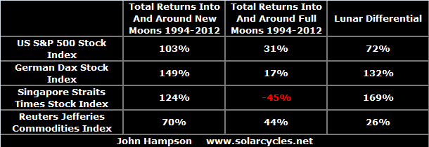
Lunar phasing influences human sentiment. It produces fortnightly oscillation in the stock market: positivity/optimism around the new moon and negativity/pessimism around the full moon. The cumulative influence of this can be seen in stock market returns over the last 20 years:

In keeping with this, we find that major market peaks typically occur close to new moons, around maximum optimism/positivity:
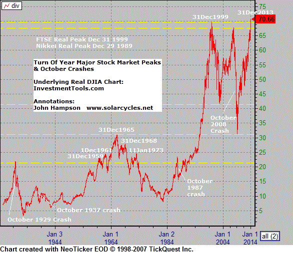
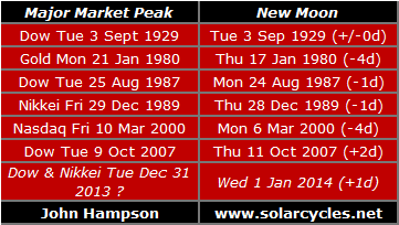 This adds to the case for a peak having occurred in equities on 31 Dec 2013 (Dow and Nikkei, plus SP500 double top with 15 Jan), associated with the Jan 1st new moon. If that proves to be false and equities break higher, then a future new moon (next one Jan 30th) may produce the timing of the major peak.
2. Timing within the year
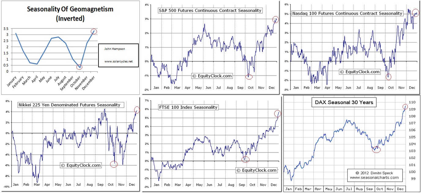
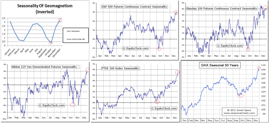
Geomagnetism influences human sentiment, with higher geomagnetic disturbance associated with negativity/pessimism. The inverted seasonality of geomagnetism correlates closely with stock market seasonality, and typically we find that major market peaks occur close to the peak in both, around the turn of the year:
 Gold made its secular peak on 21 Jan 1980.
Again, this adds weight to equities having peaked 31 Dec 2013, but if that proves false, then we might expect a final peak still to be at hand, in January, before the seasonal model turns down.
3. Timing within the decade
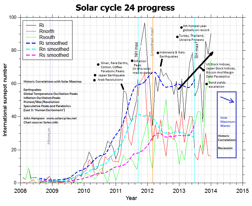
Solar maxima occur roughly every 11 years and produce human excitement, which translates as protest, war, and speculative excesses in the markets. Major market peaks typically occur at the solar maximum, close to the smoothed peak and on a monthly spike in sunspots.
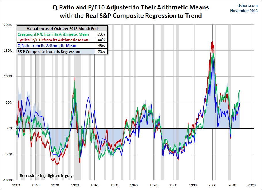
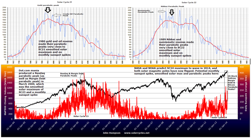 We can measure speculative excesses in terms of market valuations, sentiment readings, leverage and technical indicators and we see a cluster of these in US equities currently. Solar forecasts, solar pole flips and sunspot counts collectively suggest the smoothed maximum and monthly sunspot spike may be occurring Dec 2013 into Jan 2014, which in association with those speculative excess readings, again adds to weight to a possible peak in the Dow, SP500 and Nikkei.
4. Timing within the century
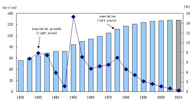
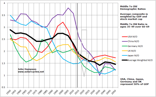
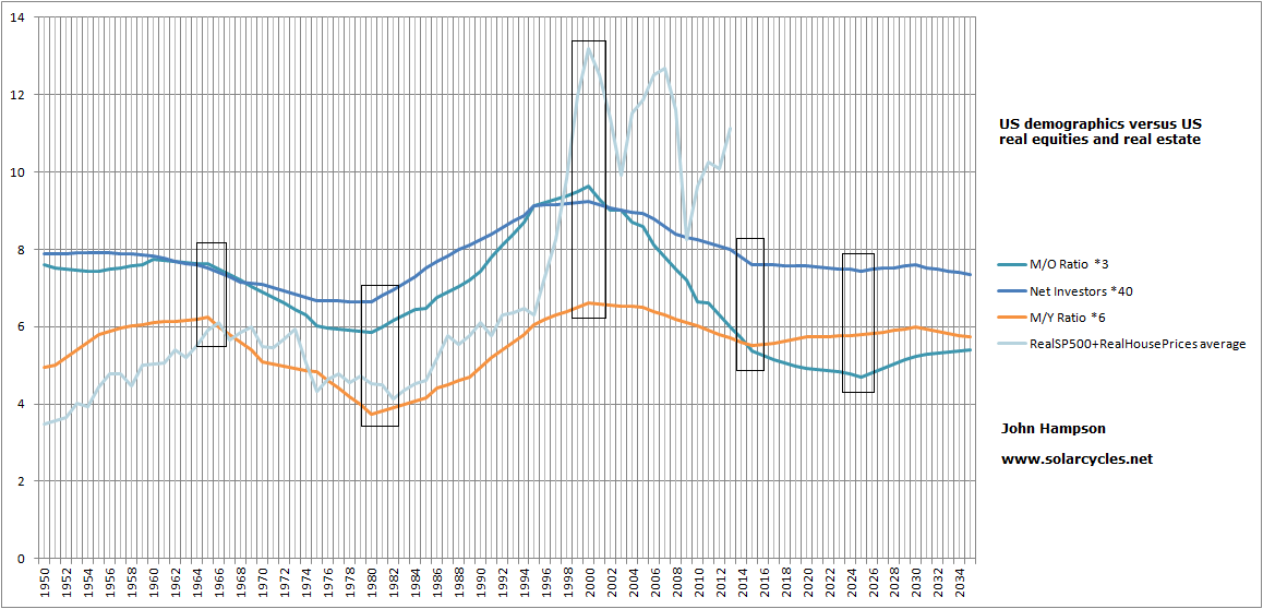
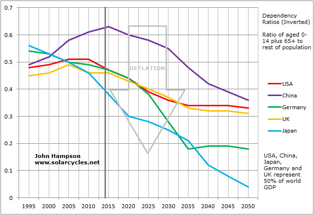
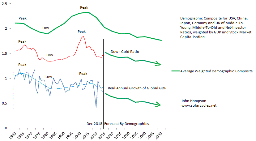
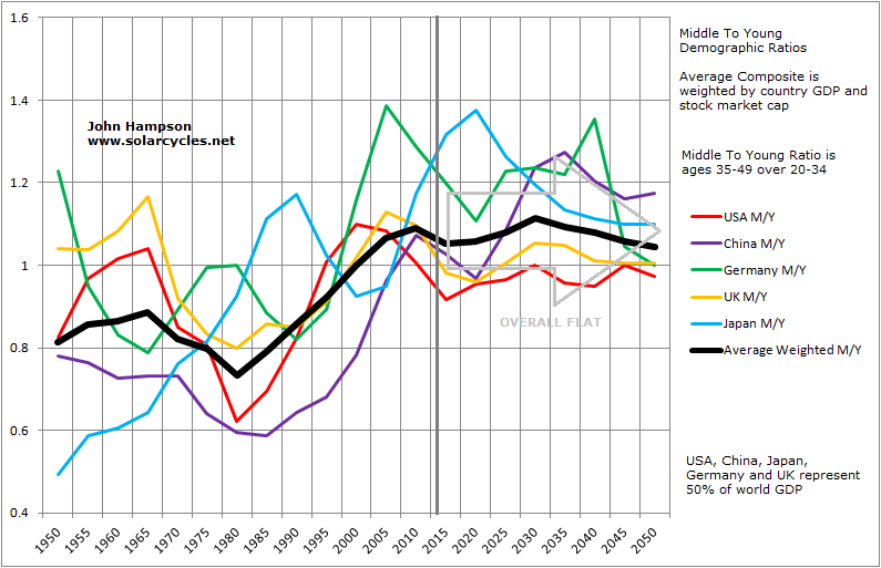
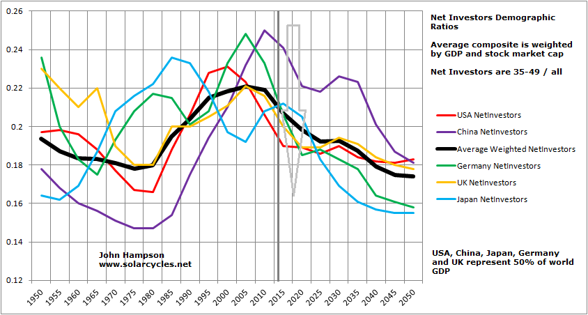
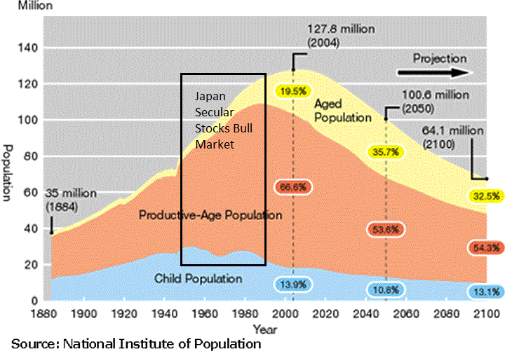
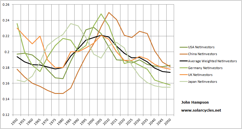
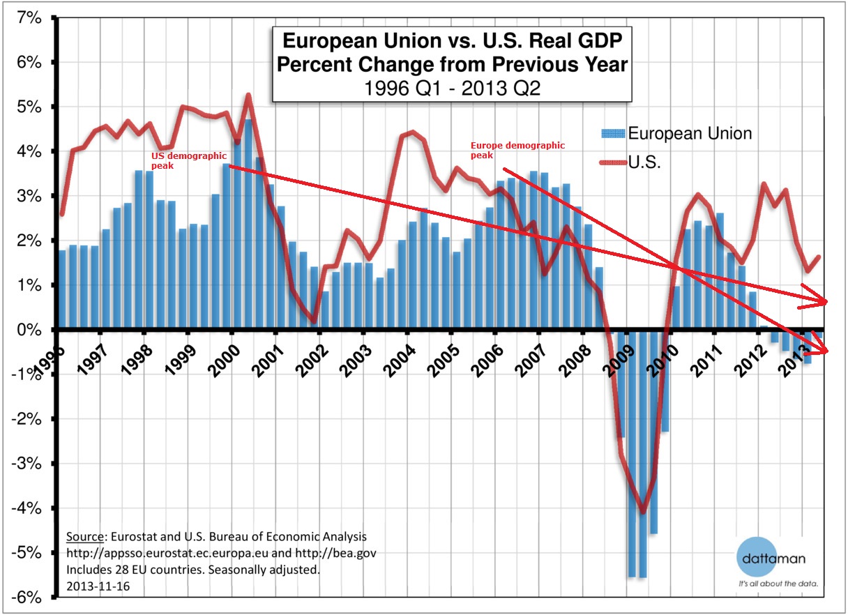
Demographics drive secular bull and bear markets, as swells in investor or disinvestor age groups produce periods of upward or downward demand for equities. Japan’s secular stocks bull ran through 4 solar cycles due to a long positive demographic trend from the late 1940s to around 1990. Japan’s middle-to-old, middle-to-young and net investor ratios all peaked in the late 1980s, and accordingly we saw Japanese equities terminate with a speculative excess at the 1989 solar maximum, and thereafter move into a secular bear in line with demographic downtrends.
US demographic measures for equities demand peaked around 1965. The real SP500 peaked November 1968, terminating with the solar maximum of November 1968. Thereafter US equities entered a secular bear market, whilst gold, as the anti-equities or anti-demographic asset, entered a secular bull market. Demographics and equities bottomed around 1980, whilst gold made its secular speculative peak, all timed with the Dec 1979 solar maximum.

US demographic ratios were collectively positive from 1980 to 2000, enabling a secular bull market in equities lasting 2 solar cycles through the speculative finale of March 2000, which was again a solar maximum. Gold endured a secular bear market through those two decades, bottoming out as demographics turned down around 2000, and entering a secular bull market.
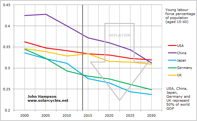
Looking forward we see a slight divergence in the 3 charted demographic measures: the middle-to-young ratio bottoms out around 2015 but the middle-to-old and net investor ratios not until around 2025 (shown boxed above). When we draw in collective downward demographic trends for Europe and China, the greater likelihood is of a secular bear in US equities (and a secular bull in gold) lasting through to around 2025, rather than ending now. Solar cycle 25 is predicted to peak around 2023-2025, which would provide the timing for a speculation secular peak in gold.
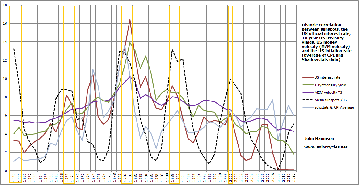
There is a correlation between solar cycles and birth rate, with evidence of an 11 yearly peak in births. There is also evidence of a link between economic prosperity and birth rate, whereby births decline in recessions and bear markets and increase in the good times. Combining the two, we have the framework for alternating positive and negative demographic swells which peak or trough around solar maxima, and hence we have historically reliably seen demographic trends and associated speculative asset bulls/bears peak and terminate around sunspot peaks.
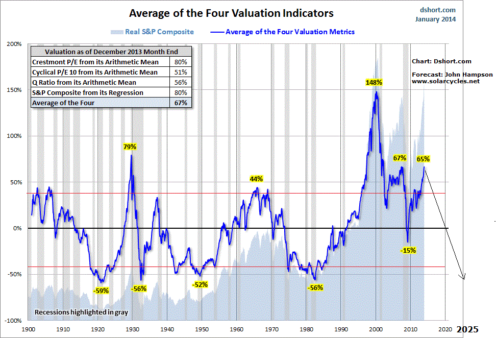
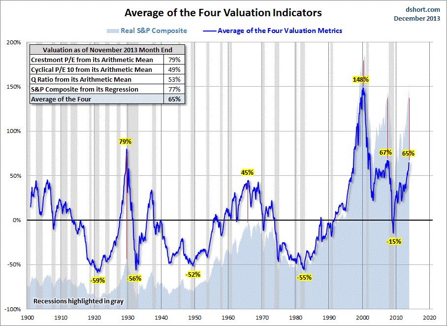
Therefore, the secular bear in US equities that began in 2000 is likely to continue through to around 2025, and the secular bull in gold that began in 2000 is likely to continue to and peak around 2025. In support of this we see current historic overvaluations in US equities that argue for further reset in stocks ahead, and a lack of speculative mania for gold at the current solar maximum.
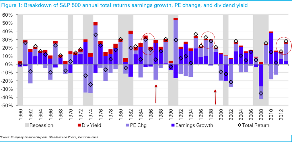
 Both charts above model the historic trends in US demographics and the terminations at solar maxima, and the projections forward are the extensions of these phenomena. The ‘mean reversion’ common to to them both reflects the transience of demographics (a young dependents swell headwind will become a middle-age swell tailwind which will become an old-age swell headwind) and the double-excess produced by solar maxima (demographics stretch demand by population, solar maxima stretch demand per capita) before sunspots cycle down again. The biggest mania of all-time is clear to see on that second chart: the dot.com boom. Not only does mean reversion subsequent to that mania have some way to go (a wash out to -50%) but demographics support this occurring.
To summarise all the above, and make it useful looking forward, we can time major asset peaks by probability (there are no dead certs, and exceptions occur). Any major asset peak will probably occur close to a new moon, typically around the turn of the year, and normally at a solar maximum. Demographics guide at which solar maximum a secular asset peak will likely occur and whether a solar maximum should deliver a secular or cyclical speculative excess.
Forecasts for gold and equities
We are currently at the likely solar maximum for solar cycle 24, at the turn of 2013 into 2014. Demographics are supportive of a secular bear in equities (that began in 2000) continuing through to the next solar maximum circa 2025, and similarly a secular bull in gold (2000-2025). The speculative excess in equities that we are seeing in association with SC24 maximum should be a cyclical peak. The timing of that cyclical peak in stocks has good odds of being around the turn of the year (2013 into 2014) and close to a new moon. That makes a top close to Jan 1st 2014 a contender, and failing that one near Jan 30th 2014 (the next new moon). Again, these are just probabilities, but if we take a different angle and look at indicators such as II sentiment, put/call ratio, skew, deviation above MA, yield-tightening ROC and margin debt, then we have a case for equities to begin to fall ‘imminently’, regardless of solar maxima and lunar phasing. Combining both, the case becomes more compelling for a top here.
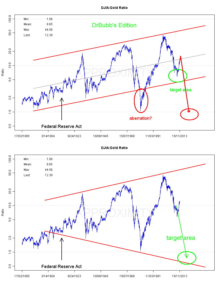
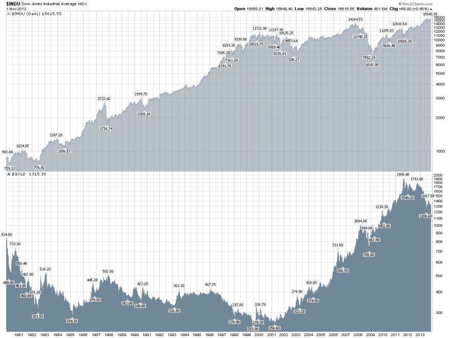
Gold’s secular bull began in 2000, and like all secular bulls, it has been in a strong dominant uptrend punctuated by occasional cyclical bears or corrections. Below we see the US equities secular bull progression 1980-2000 contrasted with gold’s secular bear in that period (cyclical bulls and bears within an overall downtrend).
 Source: Stockcharts
Gold’s secular bull of 2000-2025 should be a strong dominant uptrend like stocks 1980-2000, or like an extended version of gold’s last secular bull of the 1970s.
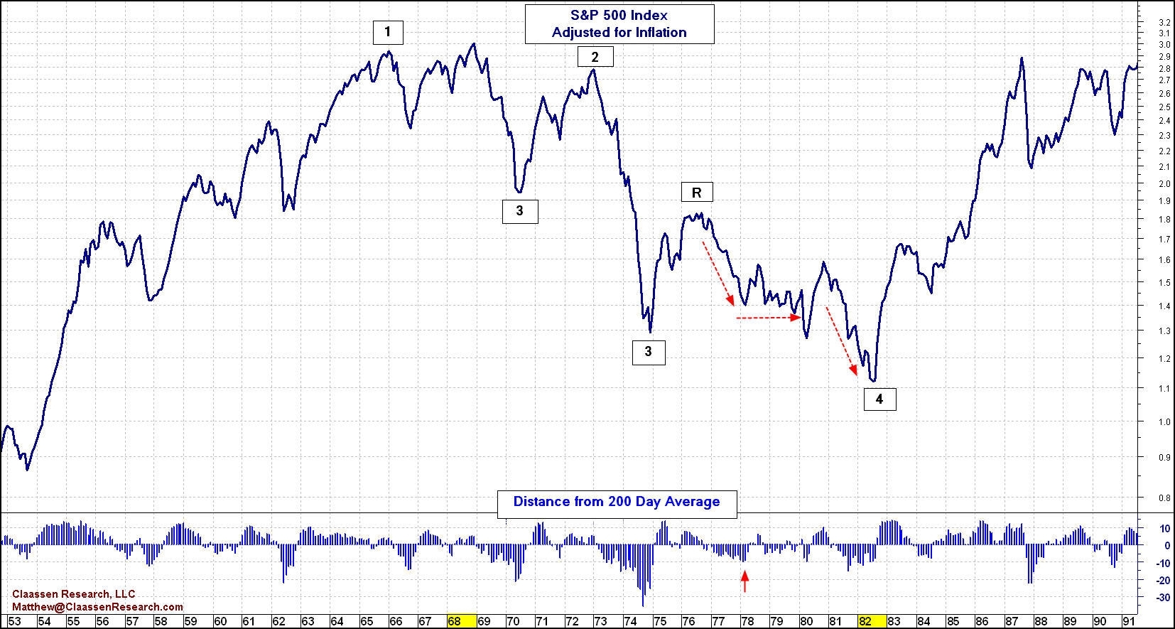
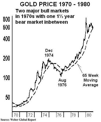 The cyclical bear of Dec 1974 to Aug 1976 occurred as the Dow rallied from a Dec 1974 low to a Sept 21 1976 top, with gold’s secular bull momentum resuming as equities topped out. We could therefore expect something similar to be occurring now, and this is supported in the oversold, overbearish extremes reached in gold and miners and the technical basing that appears to be currently taking place.
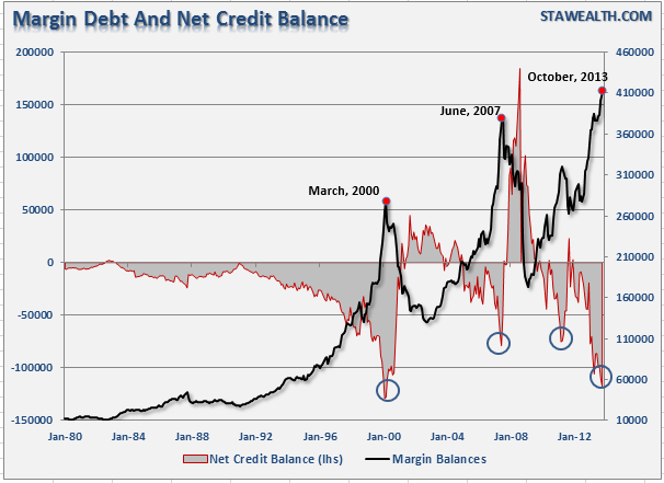
A threat to bullish resumption in gold is the current excess leverage we see in evidence in margin debt, net investor credit and Rydex leverage. If sharp falls erupt in equities then a period of forced redemptions could mean blanket selling of assets, as occurred in Autumn 1929 and Summer-Autumn 2008. Gold /miners escaped neither, in short-lived but sharp pullbacks. In THIS post I compared the topping process analogies of 1929, 1987 and Nikkei 1989 to the Dow today, and based on that we might expect sharp falls to erupt as of mid-February. There is a history of steep falls occurring at the seasonal geomagnetism peaks of around March/April and October, and occurring on Mondays once investors have had a weekend to mull over doubts. So by probability we might this time look to the particular potential of Mondays in the period March-April 2014 for heavy falls to erupt. Potentially then, we could see gold and miners rally until then, but be dragged back during such heavy stocks selling, thereafter resuming the secular gold bull in earnest.
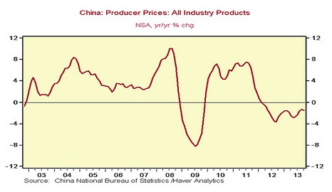
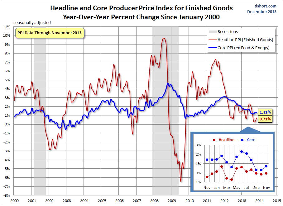
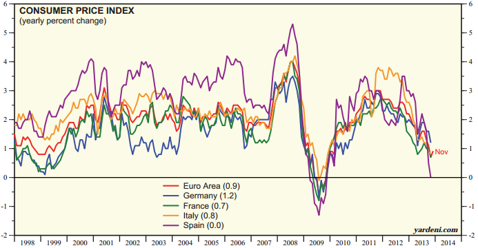
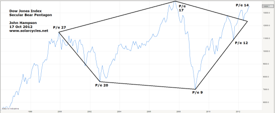
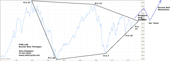
Equities should now enter a new cyclical bear market, and continue to alternate cyclical bulls and bears within a secular stocks bear through to around 2025. By demographics (and as is becoming evident in economic data) this should be under deflationary rather than inflationary conditions, and this makes an important difference to nominal prices. The path of US equities for the next 10 years should look similar to the 1990s to early 200s Nikkei or the real inflation-adjusted 1970s SP500, with lower highs and lower lows:
 Source: SeekingAlpha
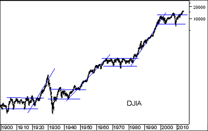
Using Russell Napier’s maths (taking valuations back to historic washout levels), then we have a target of around 3500 on the Dow by my target of around 2025. Again drawing on history, odds are we get there in a couple of cyclical bull-bear oscillations, and hence something like this:
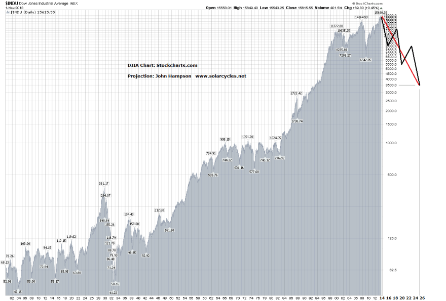 It is an initially shocking chart, but it is in keeping with deflationary demographic projections and valuations washout. Plus, this has already happened before: to the Nikkei, under the same twin circumstances.
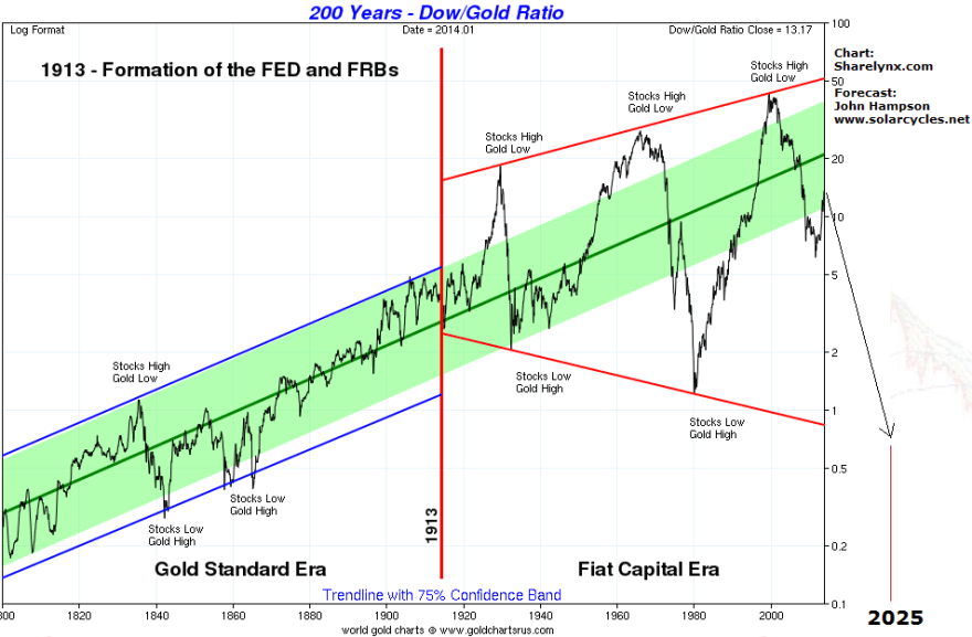
Expecting the Dow to be sub 4000 by 2025, and gold to be making a parabolic solar-max finale to a strong secular bull, the Dow-gold ratio should bottom beneath 0.5, potentially even beneath 0.1. But the one factor that I have not mentioned so far is central bank intervention.
It is certain that a tipping over into deflationary recession and equities bear will draw further response from central banks. If equities start to decline for the next couple of months but in a measured way and economic data disappoints (as predicted by certain leading indicators) then I would expect the Fed to stop tapering QE and wait-and-see, and otherwise little change. If equities then start to accelerate declines and economic troubles escalate and we enter a dangerous feedback looping, then we should expect the Fed, and other central banks, to up the ante and go more unorthodox. Quite what that will entail remains to be seen, but drawing on history, recent and past, this could mean imposing restrictions on shorting shares, preventing capital from leaving the country, ‘strong-arming’ into treasuries, and more direct, targeted inflationary tactics. There is of course the potential for increased nationalism and for hostilities between certain nations to increase (USA-China, China-Japan) as internal problems escalate.
I don’t want to speculate too far ahead, but I see major lasting opportunities at hand in short equities and long gold, tempered by realism over what central banks will do should my projections come to pass. Monetising debt whilst tipping over into deflation under unprecedented collective demographic downtrends which should mean a further decade of secular stocks bear and global economic weakness is a very bleak outlook. As a trader, I think the biggest gains are potentially to be made at the front-end of that, in case the rules get changed. Speculators making money out of an economic crisis are an easy target. It very much depends on how things come to pass, whether we are nursed through another ‘lost decade’ or whether things are about to become acute, under a global deflationary recession, a debt-monetisation end-game or a de-railing and bubble-bursting of China’s economy.
In the near term, I continue to look for clues in the markets for the equities/gold, bull/bear switch. I am long gold, short equities, and looking to add to both on further confirmations of reversals in fortunes.


 Source: TheNextRecession
 Source: TheNextRecession
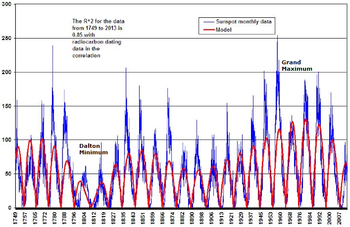 Source: WattsUpWithThat
 Source: Yardeni
 Source: Financial Press