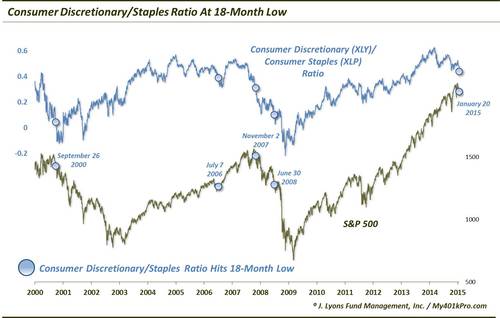
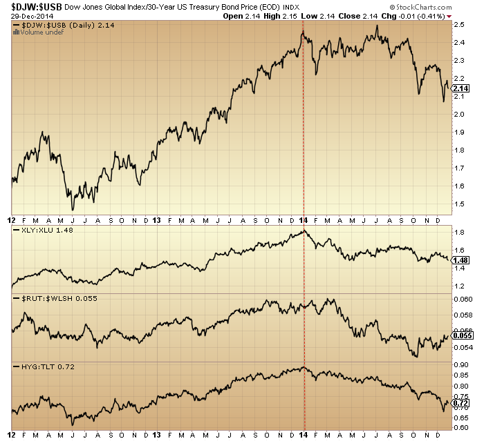
1. The start of January brought the shift to defensives, measured here in 4 ways: stocks to bonds ratio, cyclical to defensive sector ratio, small caps to all caps ratio and high yield to treasuries ratio.
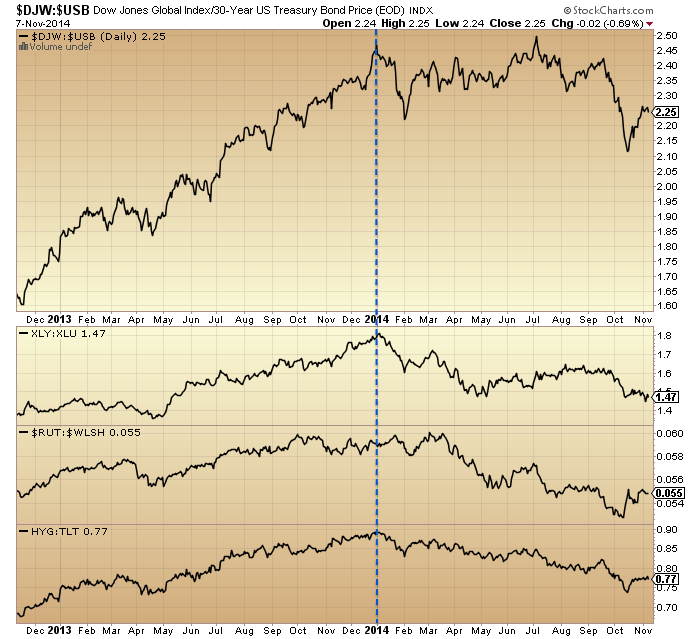 Source: Stockcharts
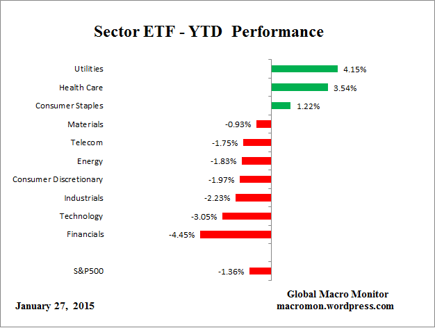
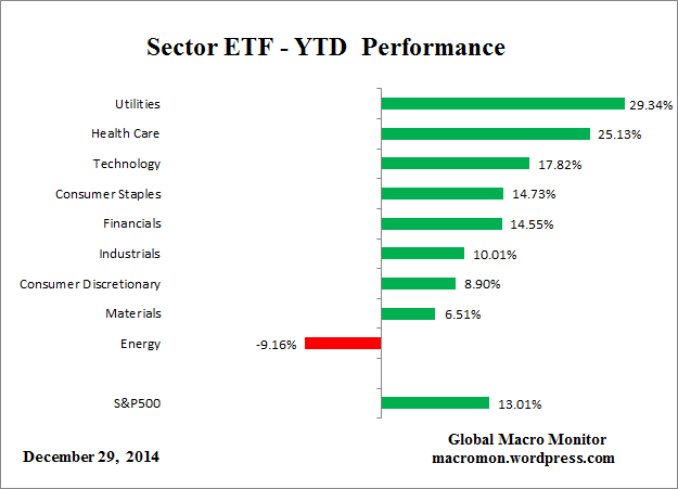
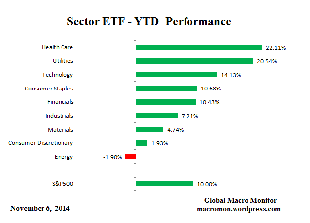
2. The best performing sectors in 2014 all year have been health care and utilities, the two defensive sectors that perform best once the stock market peak is in.
 Source: Macromon
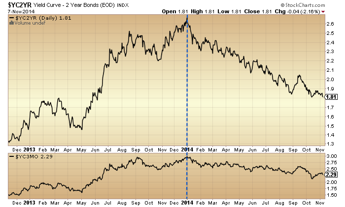
3. The yield curve, measured here by 2y versus 10 yr treasuries and 2m versus 10 yr treasuries, has flattened ever since 1st Jan. We won’t get an inverted yield curve under ZIRP so flattening takes over as a topping warning.
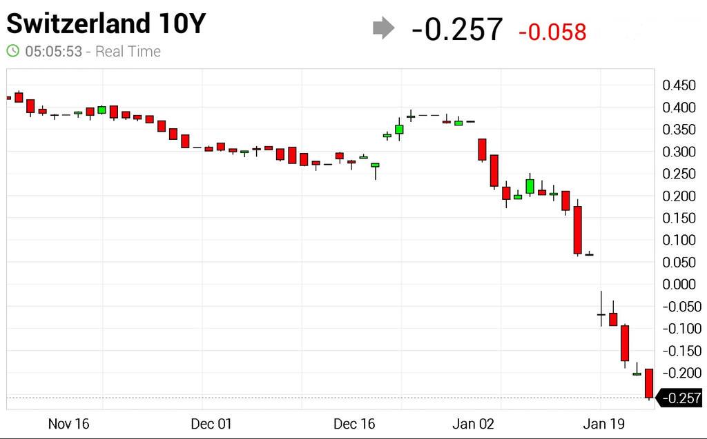
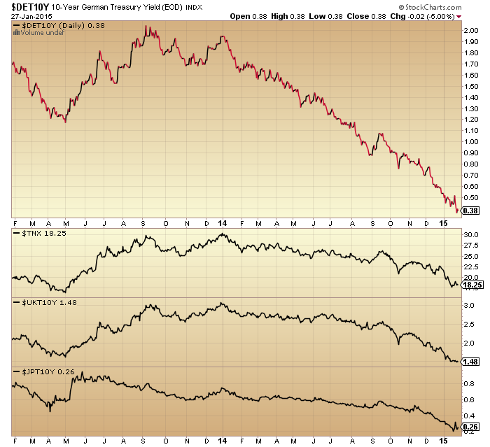
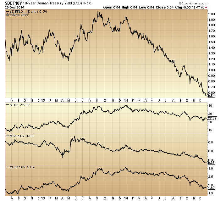
 4. The best performing asset class in 2014 has been government bonds and the chart below shows this has been a global phenomenon (Germany, Japan, UK and US quoted by 10 yr yields (bonds inverted)), again since Jan 1st.
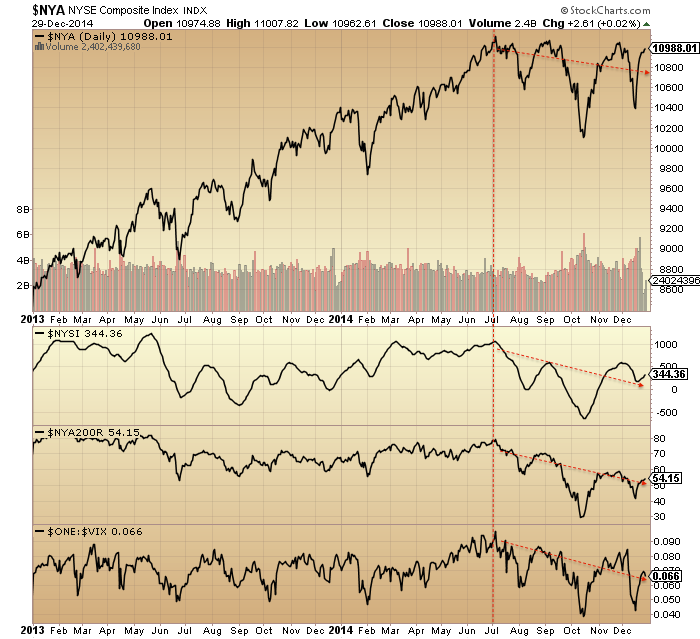
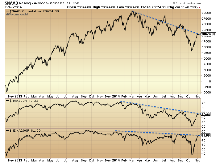
 5. Looking at stock market breadth, deterioration has been under way since almost the turn of the year in the Nasdaq indices.
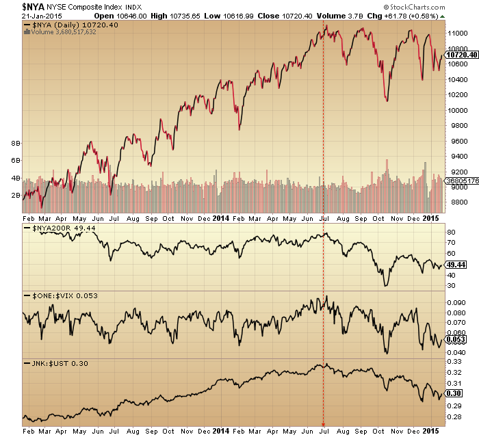
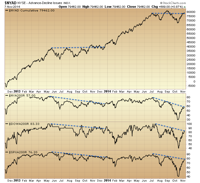
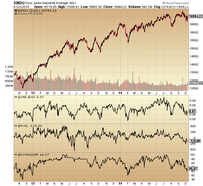
 6. Whilst the NYSE, SP500 and Dow picture reveals breadth issues since the turn of July. We can also see there was an earlier bad-breadth run into the turn of 2014 which was subsequently repaired: like an attempt at a bull market peak but it wasn’t quite ready.
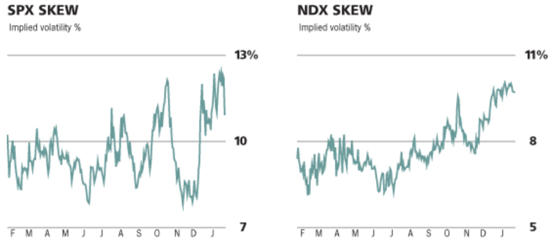
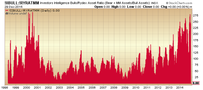
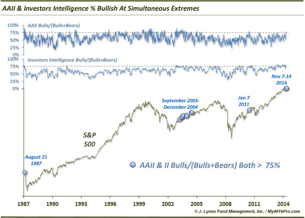
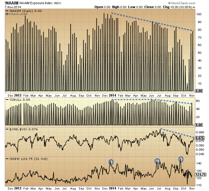
 7. Turning to sentiment, NAAIM manager exposure to equities has been dwindling since Jan 1st, whilst Investors Intelligence bulls made a double peak 1 Jan and start of July, since which they have dwindled too. Meanwhile, Vix made its low at the start of July and has been in an uptrend since then and Skew has stayed elevated for a year, with triple peaks in Jan, July and Sept.
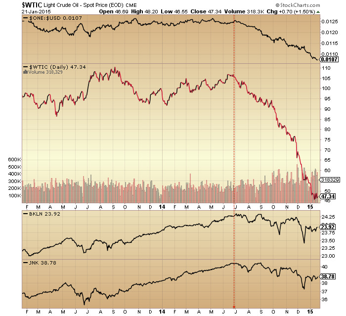
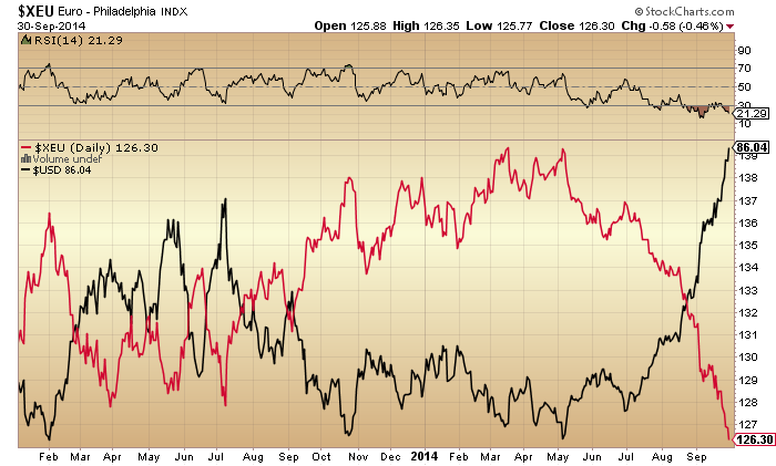
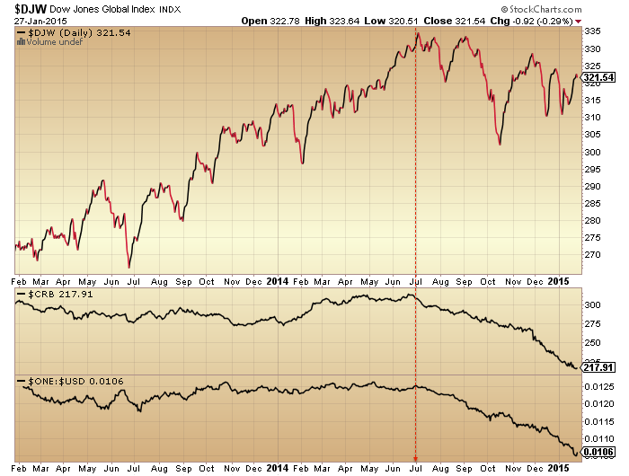
 8. Commodities have been in sharp decline since the turn of July, as the US dollar sharply rallied, in a deflationary wave.
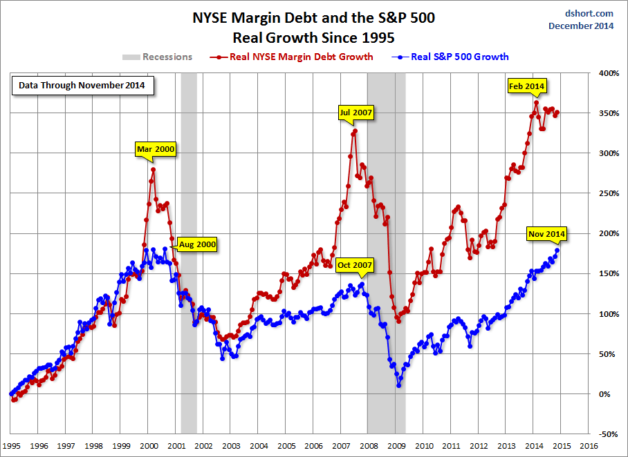
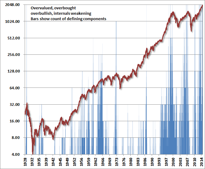
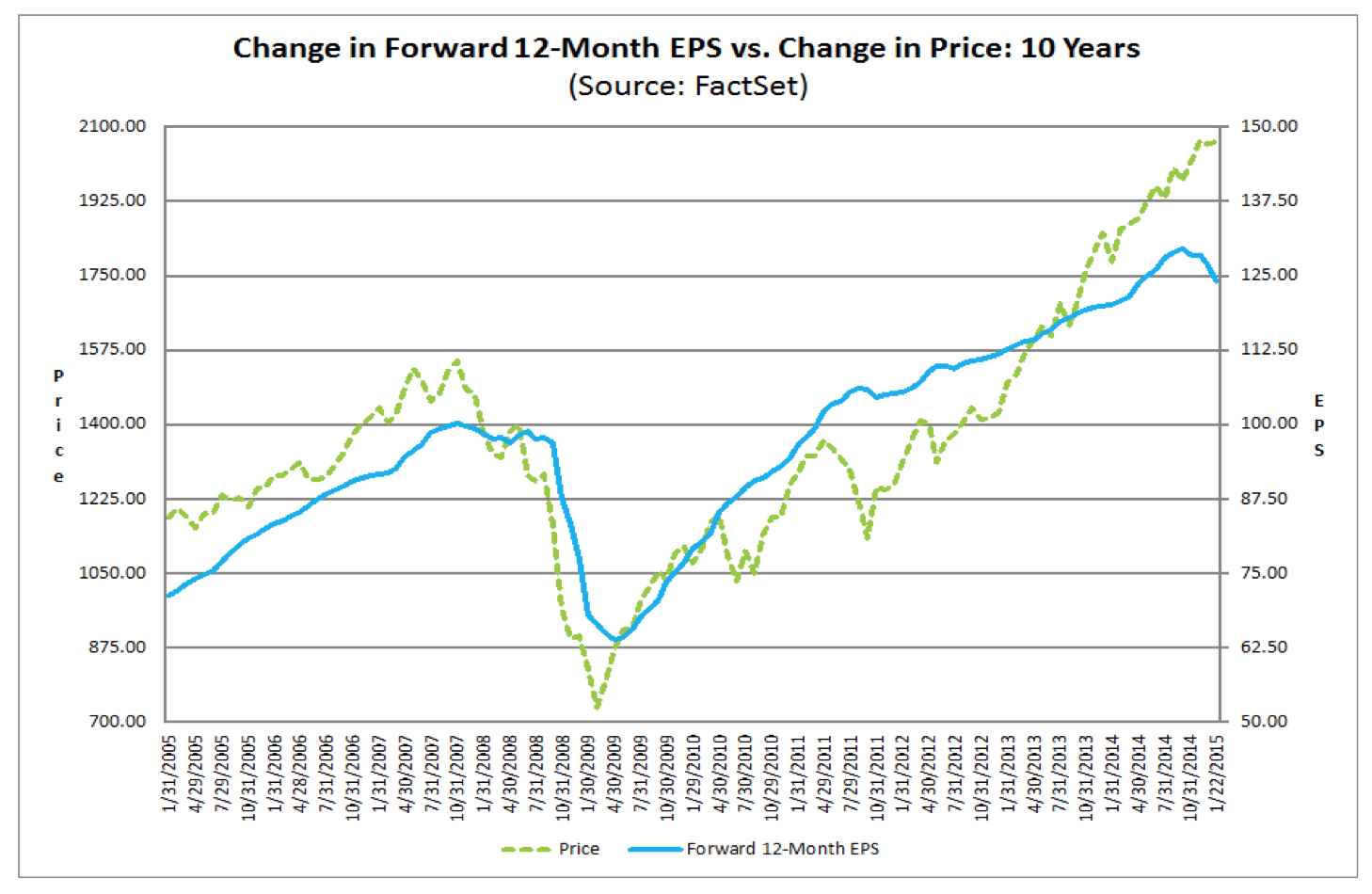
 9. For US earnings, a rising dollar and falling oil prices is overall doubly negative. Q4 earnings growth has recently been accordingly cut in half to 4.5% and sales growth cut in half to 2.2%. Earnings growth has missed target in each of the first 3 quarters of this year. The average of 5 valuations puts US equities the joint second highest in history after the 2000 mania. There is a big gulf between price and earnings.
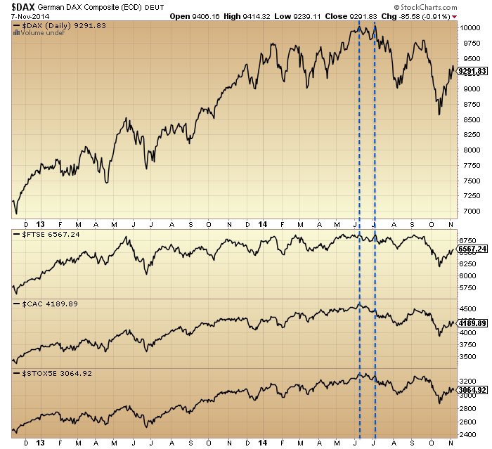
10. Global stock indices look like this. European indices peaked out by the start of July and have since made a lower high and lower low, the definition of a bear trend.

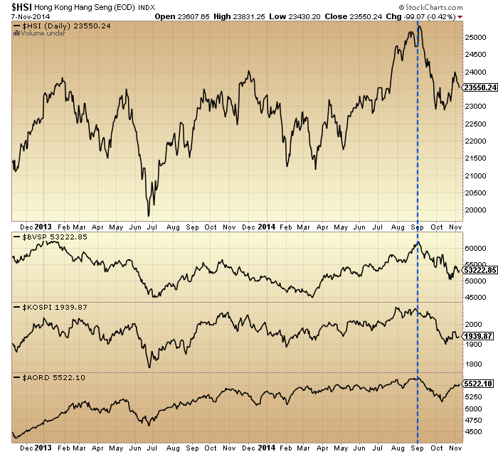
11. The Hang Seng, Bovespa, Kospi and Australian index all made peaks at the start of September.

12. However, the US SP500, Dow and Nasdaq, as well as the Japanese Nikkei have all made new marginal highs since then.

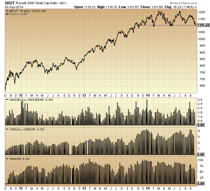
13. The Russell 2000 double topped at the start of March and start of July, whilst the overall Dow Jones World double topped at the start of July and start of September. Junk bonds and leveraged loans also made July/Sept double tops and lower highs and lows since.

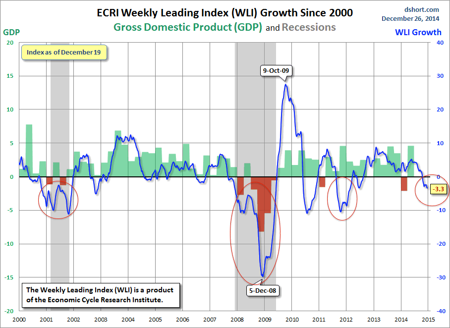
Across all the above charts in this post, three dates consistently stand out: the start of Jan, start of July and start of Sept. The topping process began the 1st January and additionally the Sornette bubble end flagged on the SP500 at the start of July and on Technology at the start of September. Insider selling peaked at the turn of the year and we have seen six major distribution days since then without any major accumulation days. Put/call ratio, bullish percent and the summation index additionally point to the relevance of the start of Jan and start of July:

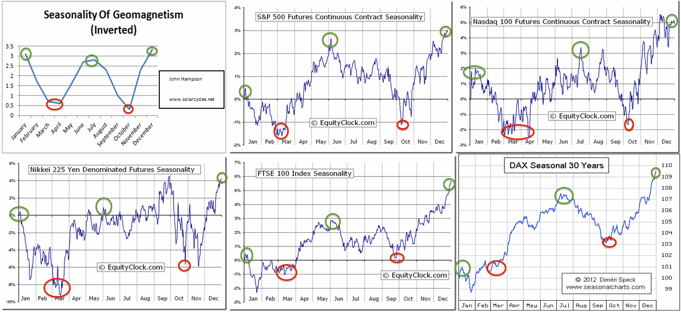
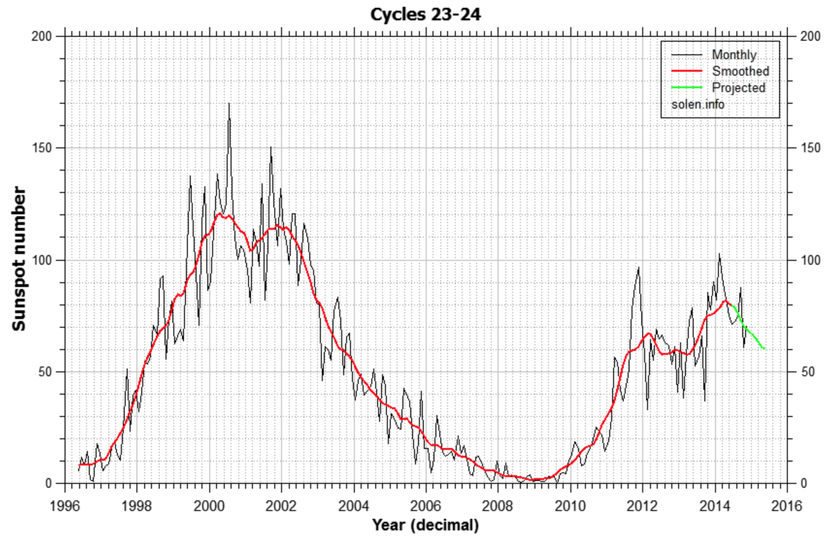
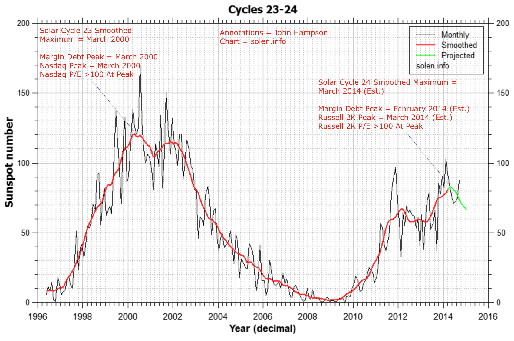
Now draw in the solar cycle. The likely smoothed maximum was April 2014 (based on SIDC, Solen, NOAA, IPS and polar switch). Here’s why the smoothed sunspot maximum is important, it generates peak speculation events:
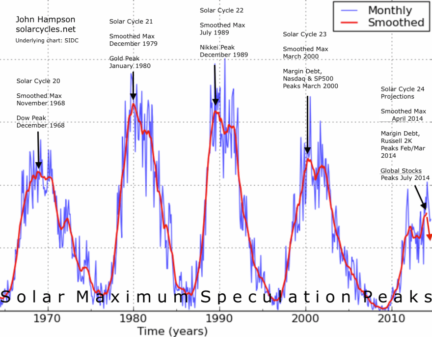
Either side of the expected smoothed solar maximum of April 2014, we have two seasonal peaks (inverted geomagnetism peaks) of turn-of-year and mid-year:

Homing in on the new moons of those two periods we get specific dates for a triple peak confluence of speculation/optimism: 1st January 2014 and 27th June 2014. I believe this is a compelling cross-reference for all the market charts above. We see multiple index and indicator peaks clustering at the very start of Jan and very start of July (both within two trading days of the new moon).
So I maintain this is the true picture of where we are, mirrored on the last solar maximum stock market peak of 2000:


And I still expect stocks to reverse here like they did at the same point in 2000:

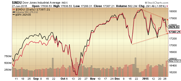
We have had several days of small range consolidation with a slight upward bias (averaging the 4 US indices), whilst sentiment and allocations are bumping up against invisible limits. I therefore believe the next move is down, like the subsequent red candle above. Furthermore, I believe that is then the end of the topping process in global equities. It effectively ended at the start of July, and really did for various indices shown further up, including the overall Dow World. But we have now seen new highs again in US large caps which on the surface look bullish, but underneath not.
I believe the unprecedented extremes in levels and durations of price levitation, sentiment, allocations, leverage, tail-risk, and negative divergences mean a crash is coming. Like an elastic band stretched to the limit. The superficial 2014 bull trend in US large caps is nothing of the sort under the surface, but has served to fool most into a false sense of security. This last rally from October to November has sucked everyone in again (sentiment, allocations) and we have extreme lop-sidedness in the markets. I believe equities will tip over here and fall hard and fast, with no reprieve this time. No dragging on until year end: the megaphone formations on the US large caps are ripe for resolution now and overbought/overbullish indicators support this.

The October monthly hanging man candles suggest November should be a significant down month. I maintain the view that the evidence is too compelling now for consideration of an alternative scenario. If you remove me from the equation then there is an awful lot of fact in the above charts and many other recent charts that I have relayed that a bull needs to explain away. Simply, too many. However, we can argue there is a middle position in accepting all the warning flags but predicting prices can still yet go higher into year end under dual positive seasonality. Perhaps a scenario of increasingly thin volume and increasingly bad health but still scraping higher.
The problem with that is that whether we look at Nymo, Rydex, II, AAII, RSI or the ascent and shape of the Oct-Nov rally we see the same tell: exhaustion. Stimulative action from the BOJ and ECB in recent days have failed to catapult global equities higher. So I believe the middle position’s best hope is that equities retrace away from these exhaustion levels but then quickly washout, to enable a December rally into year end. However, I would refer you again to our positioning in the topping process. There is no case for another rally. If we tip over this week I believe that is it: equities won’t come back again. This is what I expect to happen.

SP500 Monthly

 Source: Factset
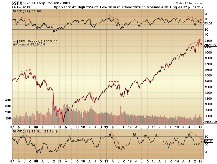
 The sector performance tale in 2015 is the same as 2014: defensives lead as they tend to post-peaks: