Markets Update

Yesterday’s upward thrust in stocks, on good breadth and volume, supports my favoured scenario of a push on into 21-23 March.

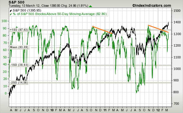
There is a potential divergence in % stocks above 50MA that could spell a period of sideways range action after that.

Source: IndexIndicators

A significant divergence is now present on my medium term model for the S&P500, whilst noting that the Dax is on model, having been playing catch up from underperformance.

A couple more sessions of contined upside for stocks and we will start to hit overbought and overbullish measures again. I still have a couple of stock indices longs and will be looking to exit them at the end of this week or the beginning of next if that occurs.

A key development yesterday was an upwards break in treasury yields – the rounded bottom is gaining momentum. There is a large wall of money in treasuries that could start to flow towards risk assets.

Source: Stockcharts

My expectation, based on my previous analysis, is that commodities should be the main recipient, and that commodities should outperform stocks leading into next year’s solar peak. Yet, what we are currently seeing is the opposite.

Here are commodities versus the medium term model – very much on model. Yet I was anticipating stocks aligning with the model whilst commodities pull away. So what’s up?

The US dollar is strong again. Good economic data from the US is helping support the USD, as well as no further indication yesterday of more, or further extended, dollar-diluting programmes. As I previously noted, the US dollar is in a delicate long term position, which I expect to break downwards, helping propel commodities to their secular conclusion. However, right now we lack a trigger for that, and with fairly neutral sentiment towards the Dollar and the Euro, that doesn’t give us a reason either.

Of course a strengthening USD does not make a commodities rally impossible. Another key factor is China. Recent Chinese data has been softer than expected, and whilst expectations are for Chinese easing/stimulus, as yet the Chinese authorities are being cautious. Here are the latest OECD leading indicators, and whilst we now see a definite up turn in most countries, China isn’t following suit yet.

Source: OECD

Here’s gold. The smaller wedge is the first potential reversal opportunity. Failing that, the confluence of long term rising support, falling s/r and the 23 fib look like the next most likely bounce point.

Marc Faber is still a longer term gold bull, but anticipates gold could fall to $1500 here. Such a move would put it below all the key moving averages that have supported the secular gold bull to date and so I think it’s unlikely, but, much like the USD, it is delicately poised, and I am closely following both.

Advertisement

Solar Cycles, Agri and Equities

Here is a chart showing the relation of between live cattle prices and solar cycles. It can be seen that cattle futures peaked very close to the last 3 secular commodities solar peaks of 1917, 1947 and 1979. This suggests cattle prices should peak close to the next anticipated secular commodities solar peak of Feb/Mar 2013.
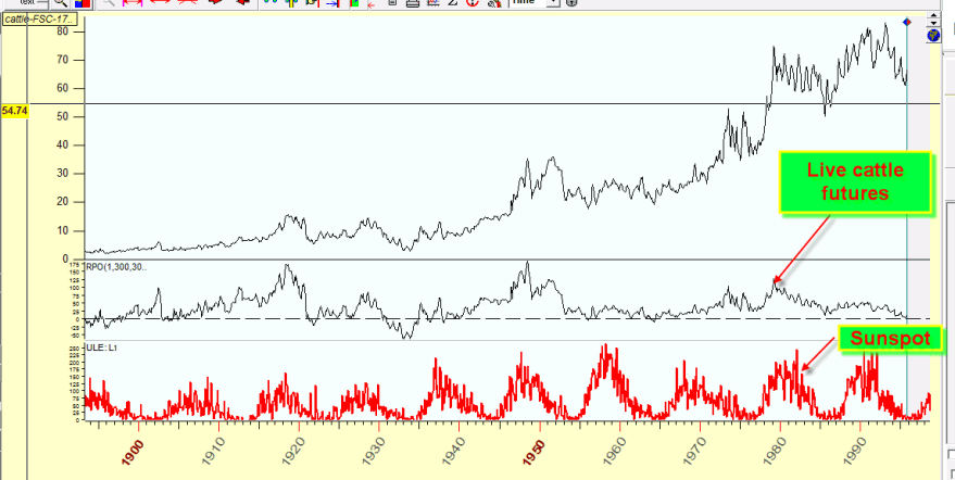
Source: Sergey Tarassov

If we bring cattle futures prices up to date in the chart below, we can see that prices have been accelerating upwards since 2010, which appears in line with historic behaviour as sunspots pick up.
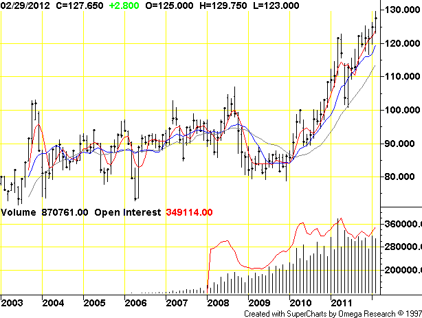
Source: TradingCharts

Both the EU and the US are forecast to produce lower meat output in 2012 and 2013, as farmers rebuild herds amongst tight supply and strong demand (from countries such as Russia and Turkey). It is not expected that supply in cattle will catch up until 2014.

Therefore, by solar cycles, cattle prices should rise into next year’s solar peak, and the demand-supply situation supports this happening. Prices have been rising quite consistently and strongly already however, and may not give traders an easy entry point.

Turning to corn, we see a similar strong relationship between prices and solar maximums for the last 3 secular commodities solar peaks of 1917, 1947 and 1979. Again, this suggests corn prices should rise into next year’s anticipated secular commodities solar peak.
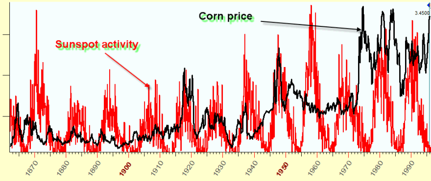
Source: Sergey Tarassov

Corn futures prices took a dip after their early 2011 peak and perhaps offer a better entry point currently, particularly as current droughts from Mexico to Argentina are expected to shrink corn stockpiles to a five-year low. However, whilst shrinking inventories are expected to push up prices over the next 6 months, record planted acres are expected to make for bumper harvests later in the year. The wildcard in this is the weather.
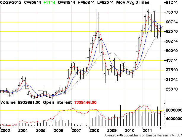
Source: TradingCharts

Now according to new NECSI research, investor speculation rather than regular demand-supply factors was instrumental in the two food price spikes of 2008 and 2011, and furthermore, they predict a third speculation-driven spike by 2013.
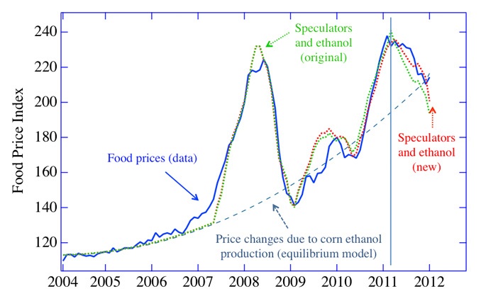
 Source: NECSI

This fits very well with what I have previously written regarding the influence of rising sunspots into the solar maximum inspiring human behaviours of buying, risk-taking, and money circulation. The drive to speculate makes for risk excesses in either stocks or commodities into solar peaks, and into 2013 we see evidence that speculation will peak in commodities, with the history in cattle and corn prices above adding to that.

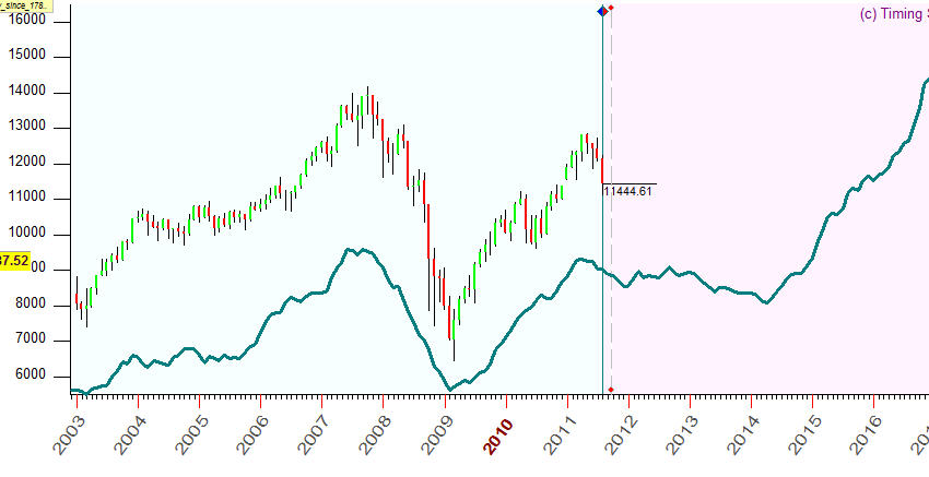
Turning to equities, there is a historically similar route map in the 2000s so far to that of the 1850s, i.e. a historical rhyme. If we amalgamate that with other such close historical rhymes, such as 1887, 1923 and 1906, the ‘average’ route map looks like this:
Source: Sergey Tarassov

That fits very well with my own findings in how the stock market performed into previous solar commodity peaks, namely overall flat, and also that the low is likely to be around 2014, but a higher low than in 2009. It also fits with a recession 2013-2014 and stocks starting a new secular bull in 2014, as a lead indicator before the recession ends.

The next two charts are spectrograms for the Dow Jones Industrials index stretching back in time, the first being older and the second more recent. These capture all the actual cycles, based on real major turns, and layer them over each other. Where we see spikes, these represent the biggest confluences of the same time cycles.
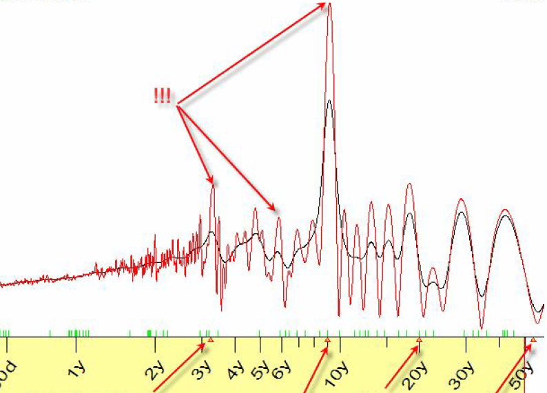
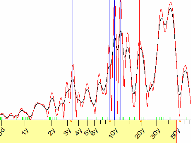
Source both:  Sergey Tarassov

Forget theoretical cycles, here we are seeing what actual cycles are observed repeatedly in this index, and there is a notable confluence of a cycle of 3.5 years in both charts. Now the current cyclical stocks bull began in early 2009, and 3.5 years later would be late 2012, which if turned out to be the cyclical top, would again fit very well with topping out ahead of the solar peak and recession, and diverging from commodities at the end, which go on to a parabolic top at or following the solar peak.

Another notable confluence on the above two charts shows that there is a cycle at work lasting 9-12 years, which happens to be the length of a solar cycle. Based on my work, we would expect to see the solar cycle visible in such an analysis, and that is a very close fit.

Which brings me to this link, which is CXO Avisory’s piece finding no notable correlation between the sunspot cycle and stock market returns. They demonstrate different approaches to finding a consistent relationship between the two, and find none. Well, if I took a similar approach to this chart of mine below it would average out at a negligible correlation too.

But that’s because the cyclical bull from 2003 to 2007 is not related to sunspots. If I look specifically at returns from solar minimums to solar maximums then I get something more persuasive, with an average 70% return in that 3-5 year period.
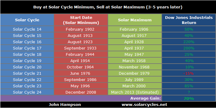
And to demonstrate the difference, here are the returns for the other period, down from the solar maximum to the next solar minimum:
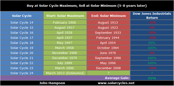
That’s an average 25% return in that 5-8 year falling sunspot period, compared to a 70% in the 3-5 year period of rising sunspots. Not only is that a substantial difference, but the 5-8 year period is significantly longer than the 3-5 year period, and in fact the difference in average returns per year is 18% in the rising sunspots period versus 4% in the falling sunspots period.

So whilst I do not deny CXO’s results, I suggest the issue is in what they are looking for. The relationships between sunspots and the financial markets lie in solar peaks, and not only that but alternating with commodities in pro-risk speculative peaks that correlate with solar peaks. Furthermore, the spectrogram further up the page displays evidence of a cycle in stocks around the same length as the solar cycle, supporting this peak/turn relationship, but CXO’s analysis is looking for a close relationship at all times rather than up into and around solar peak turns.

In short, if we consider that rising sunspots inspire human risk-taking, buying and speculation, but that other factors would also drive people to similar behaviour, then in periods of negligible sunspots we might get strong cyclical bull markets for other non-sunspot related reasons.

What’s Ahead

FOMC tomorrow. First major Bradley turn on the 16th March. Major Gann turn around the Equinox 21-23 March, which equates to the next top on my models. US Earnings Season begins again 10th April. Seasonal geomagnetism to peak in March-April and sunspots to ramp up again in the weeks ahead.
Take a look at the damage from the solar storms of the last few days:

That is an impressive spike. Now take a look how the models have tipped over on my Short Term and Medium Term models page. The message is clear – a market correction, or at least some volatility, is due. So I reiterate what I suggested at the end of last week: I expect either the markets to tip over and correct imminently, or for them to continue higher into 21-23 March, make a significant divergence from the models in doing so, and then correct.

Economic Surprises for both the US and the major economies continue to fall away from their peaks, and here’s a reminder of how stocks performed in 2009-2011 after Surprises twice peaked (blue line):

Essentially, upside was limited, the market was on borrowed time before it corrected. That said, the ‘borrowed’ time could last a couple of months, so I would want to see evidence of the market topping out from other sources, before shorting. So how do things look?

Insider selling continues to be at an extreme. Short Yen positions are also at the extreme. The former suggests stocks should pull back, and the latter that money should pour into the safe haven Yen. But these two aside, we don’t see extremes. The consolidation in pro-risk has reset some of the indicators that had were toppy, suggesting more upside may be required to reach an overbought and overbullish reversal.

If we look at the technical picture for the S&P500, we see it is flirting with its 2011 high, with potentially clear air above if it can break out, but also that it is within a rising wedge which would normally break to the downside. For my first scenario above of imminent correction, the index could potentially double top today with its high of the start of March, reversing at that horizontal resistance. For my second scenario of a push upwards into 21-23 March, the index could break out but within the wedge and overthrow to 1400 before a correction.

Meanwhile, the US dollar has been rallying, which has taken the wind out of commodities to some extent. If the Fed is dovish tomorrow, extends Twist or similar, we could see a reversal, and precious metals gaining ground again. However, if they do nothing, the USD could maintain popularity. It remains in a very delicate long term position, and whilst I continue to believe that it will ultimately break to the downside in a mirror of the 1970s, we need a trigger for that to occur.

Source: Stockcharts

I look at both precious metals and at mining stocks and see evidence for a big move up coming up, but not quite yet. Fed action tomorrow could provide a trigger, but failing that, a little more time looks needed. Treasury bonds continue to make a rounded top, yields a rounded bottom. If this is the prelude to a notable change in trend, then the Fed may have a reason to step in.

OK, let me sum up with my favoured scenario: stocks push on higher into 21-23 March, making a big divergence from the models and reaching overbullish/overbought again. I think that would then make for a nice shorting opportunity, and a subsequent period of mean reversion. I suspect that because most indicators have eased off from being toppy we need to push up to hit extremes again. Those extremes, plus some big divergences, would make for a higher probability trade than right now.

Roundup

Yesterday we had a geomagnetic storm that although forecast was stronger than predicted. Today is the full moon. Later today we have the Greek swap decision result. Tomorrow is the key US jobs report. I will be letting all that play out and see on Monday whether there might be trade opportunities.

The storm:

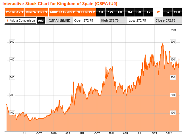
With reports of enough creditor consent to pass the Greek debt swap, the markets may get satisfaction, but as one or two on here have suggested, the Euro debt issue may rise again. I keep my eyes on CDSs and yields and although still contained currently, the Spain CDS chart looks like it has unfinished business eventually ahead – still in a solid long term uptrend:

Source: Bloomberg

Supportive of such developments would be Spain’s peak debt rollovers this year:

Source: Bloomberg / Acting Man

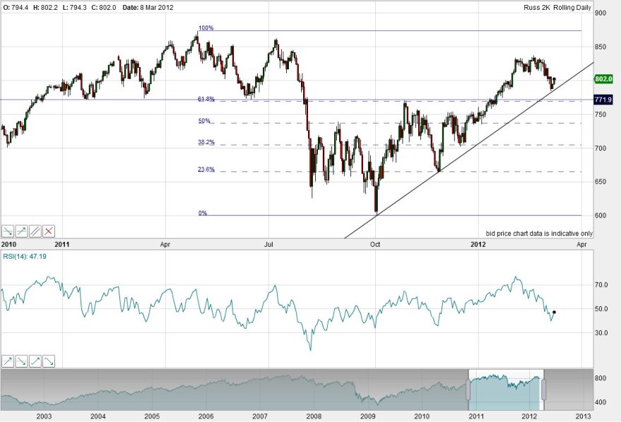
Turning to the stock market, a look at the US small caps that rolled over first shows them already at rising support, whilst there remains a lower twin support of fib and horizontal s/r.

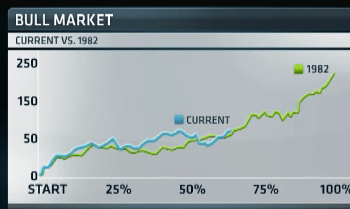
Laslo Birinyi has been in the media making analogies based on bull market internals and action that followed overall sideways years like 2011, and quotes  1982 and 1990, both very bullish years that just kept on rising.

Source: CNBC / Ticker Sense

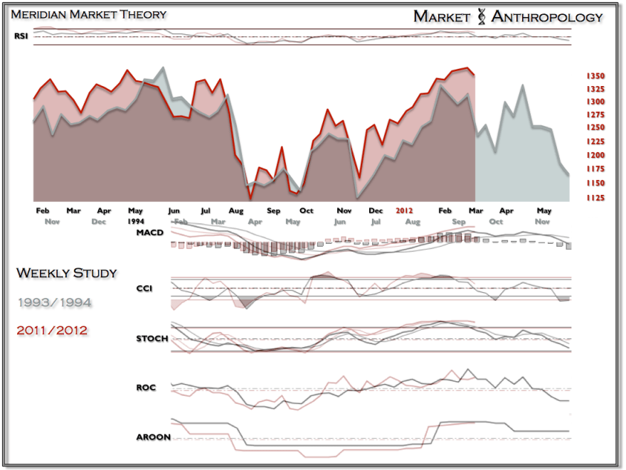
Meanwhile, Market Anthropology make an analogy with 1994 which implies first a pullback then revisit of the highs in April for a double topping process.

Source: Market Anthropology

And turning to gold, we see it has bounced at the 38 fib and has the potential to make an inverted head and shoulder pattern.

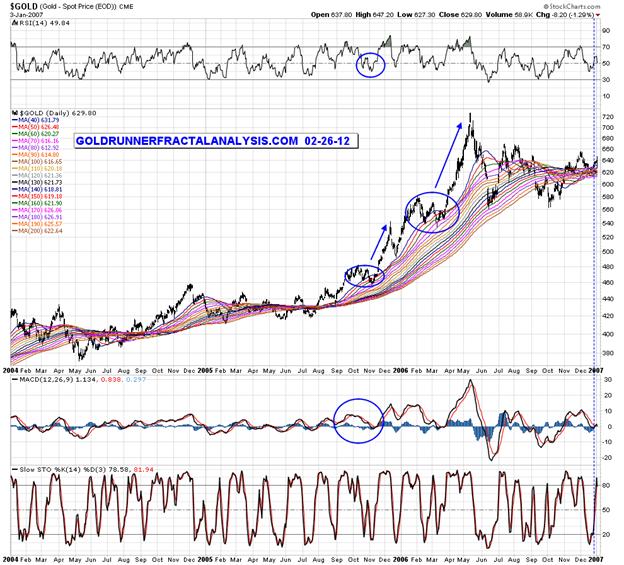
And Goldrunner indentifies similar chart patterns from 2005 and 2006 that would be supportive of a bullish upward break from here.

Source: Goldrunnerfractalanalysis

The problem with analogies and fractals is that even the most compelling can sometimes turn out to be red herrings. Recall that stocks in the first 9 months of 2011 made a series of waves that looked very similar to the 2007 top. It was only once a higher low was printed in November that the fractal was decisively negated. That said, historic repetitions and time cycles are fundamental in my approach and I can point to many that work out. The Mammis sentiment cycle was a recent example of an analogy that played out very accurately.

Sunspots and Geomagnetism

The solar peak is forecast for February/March 2013, which means sunspot counts should peak around then. The chart below shows that sunspots picked up from their December 2008 minimum gradually, becoming significant in 2011. In the last few months though, they appear to have died away.

This does not mean the solar cycle has peaked early, but reflects the oscillations of sunspot levels around a trend. Below is an overlay of this solar cycle (24) into the end of 2011 on top of solar cycle 14, which was a ‘spikey’ cycle. Less powerful solar cycles, such as both of these, are typically more spikey.

Source: SolarHam

It follows then, that we should expect an up-cycle of sunspots now, lasting perhaps several months, and if we zone in on a smaller timescale, we see evidence that this is perhaps now beginning, with a sudden increase in the last few days.

We can see from the above chart that sunspots rallied last year between February and November, or perhaps in two distinct upswings of February-April and September-November.

I have just produced a 26 page PDF on my new IN DEPTH GUIDE page which explains the relations between solar cycles and the financial markets in detail, so here I’ll just summarise that rising sunspots correlate with (i) earthquakes (ii) protest, revolution and war (iii) pro-risk and inflation.

The 7 most major earthquakes of 2011 all occurred in the two windows of Feb-Mar and Sept-Nov, corresponding to the upswings in sunspots. The Arab Spring revolutions main events began with the Tunisian overthrow in January and ending in the Libyan war finishing in October, again corresponding to the overall period of rising sunspots. And lastly, both significant inflation and outperformance in gold lasted between January and September, again tying in with the sunspot rally.

So, if sunspot counts begin to accelerate now and rise to new heights over the next few months (which we should expect as we are getting nearer to the solar peak), we should be alert for (i) earthquakes (ii) protest, revolution and war (e.g. Iran) and (iii) pro-risk and inflation, namely commodities rising and in turn inflation. Clearly (ii) could impact (iii) as oil could rise on supply jeopardy and gold as security.

As yet, we still do not see outperformance in commodities versus stocks, but at some point soon this should begin to occur, as by solar cycles a secular peak in commodities should occur in 2013. The chart below shows how stocks outfperformed commodies into their secular of March 2000, breaking away from their usual combined risk-on relations, and we should expect something similar from commodities into 2013.

Now turning to geomagnetism, we see a pick up in both actual and forecast geomagnetism that reflects the historic seasonality of geomagnetism, that typically is at a maximum in March and April. This negatively affects sentiment, and therefore we see in the models for stocks and commodities some short term downward pressure.

If we look at the medum term view we can see a clear flattening out and tipping over of the model:

This means headwinds for pro-risk until geomagnetism begins to ebb again, which by historic seasonality would be May-time.

This appears contradictory – rising sunspots ahead supportive of pro-risk, but significant geomagnetism ahead anti-risk. To further complicate things, rising sunspots typically lead to higher episodes of geomagnetism (though a lag can be common). A simplistic analogy would be that some alchohol (solar activity) makes for human excitability, but too much can also make for a lagged hangover (geomagnetism).

Returning to the chart above that shows stocks accelerating away from 1998-2000 in their secular mania finale, stocks actually took off from the geomagnetism model in this period, as might be expected in ‘irrational exuberance’. We should see the same therefore in commodities this time round into 2013. What I suggest could happen therefore, is that from amongst protests, revolution, war and earthquakes, we get a sunspot-inspired supply/security push on commodities, and a sunspot-inspired pro-risk/inflationary flow into commodity demand, which takes commodities above and away from the geomagnetism model, whilst stocks remain on the geomagnetism model track of sideways peformance. In other words, if a commodities secular finale is ahead, completing in 2013 (as solar cycles history predicts), then the period ahead is a window in which commodities should start to outperform.

Precious Metals

In the 1940s rising (secular) commodities played a key role in rising inflation. However, the US government maintained an environment of negligible interest rates, surpressed to hold down the costs of excess government debt built up in WW2. It did this by intervening in the money supply, much like today, and the result was debasement of the US dollar. Eventually it had to abandon the policy in 1951 as it had led to an explosion of debt monetization and uncontained inflation. However, the policy was successful in that it provided the sovereign debt support until a new cycle of growth was underway (a new secular stocks bull and the end of the inflationary commodities bull, a transition complete by 1951).

Source: Bianco Research

Fast forward to today and we have a very similar scenario of secular commodities bull, problematic inflation (especially when real undoctored inflation stats are considered), surpressed negligible rates, money supply intervention and currency debasement. Given the historical precedent, we might consider that central banks in the indebted developed nations might be successul in maintaining their manipulation policies until a new cycle of growth and a new secular stocks bull emerges. By solar cycles, that is likely to take hold in late 2014 or in 2015. Recently the Fed extended its commitment to ultra low rates until late 2014, which fits well.

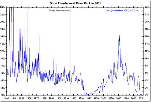
Negative real interest rates are therefore likely to persist for some time yet, not just maintained by the Fed but also by the ECB, BOE and Japanese central bank. Precious metals perform well in an environment of negative real interest rates, but also as all these major currencies are debased simultaneously, hard money becomes a refuge, maintaining value.

Source: Tom McClellan

As the above chart shows, based on the last secular commodities bull finale of the late 1970s, precious metals may cease to do well when we have evidence of real interest rates starting to trend upwards. In other words, the secular uptrends in gold and silver may come to an end when central banks begin to signal an end to low interest rates and inflation starts to ebb.

Marc Faber blames money printing and negligible rates for a series of bubbles in the early 21st century, and expects more bubbles in the next couple of years as this backdrop continues. With currency debasement and negative real returns in cash and bonds, precious metals continue to look an attractive class for bubble-blowing. If precious metals peaked in 2011, as some suggest, then we will print a historic anomaly over the next couple of years whereby hard money performs poorly in an environment of negative real interest rates and currency debasement.

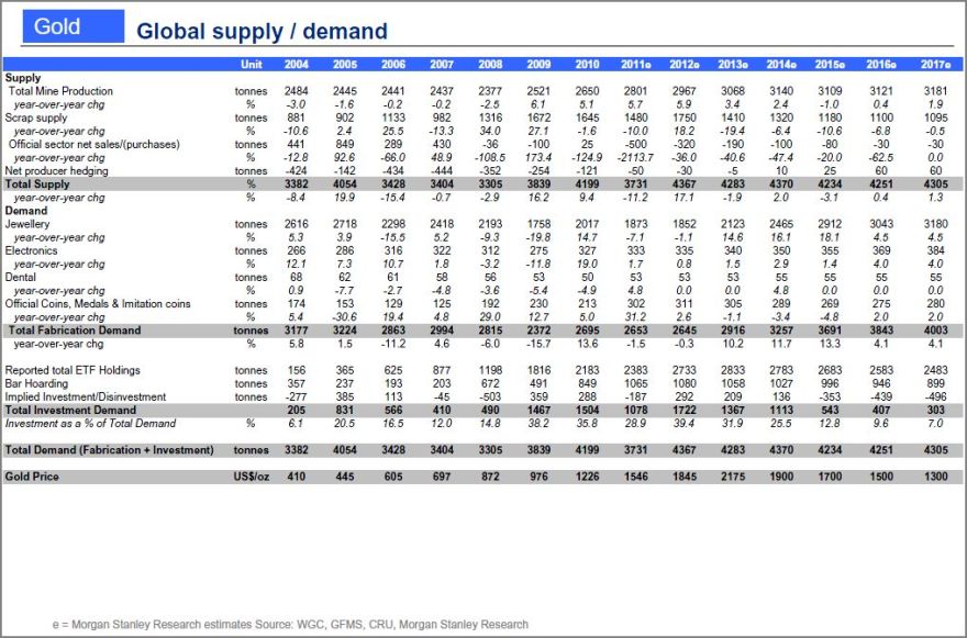
One key factor in the long term secular swinging between hard and paper assets is the supply lag of around in mines and energy fields from plan to production of around 10 years. Since the onset of the current commodities secular bull in 2000, supply in gold stayed flat through to 2010, but grew almost 4% in 2011 as new mines (initiated since 2000) finally started to reach production. However, offsetting that, central banks bought more gold in 2011 than any year since 1964, a net purchase of 440 tonnes. The central banks in question are mainly from the developing world, and they are seeking to diversify their increasing reserves away from one or two main currencies (namely, the ones being debased). Whilst demand for precious metals for technology and jewellery has weakened slightly, it remains robust. So although investment demand is the growth area in demand, it has not become totally dominant, and the situation remains healthy.

Disinvestment in gold is expected to begin around 2015 (again, fitting well with solar cycle predictions). Morgan Stanley estimates show a peak in demand in 2014, and supply increasing each year the next 3 years as more mines come on stream.

Source: Morgan Stanley

In line with the history of secular commodity inversions, that sets us up for lagged supply to be increasing as demand starts to drop, providing a gap between the two that will form the backdrop to a secular commodities bear. This change should occur around 2014-2015, just as a new growth cycle begins supporting a stocks bull, and the central banks drop their negligible interest rate policy.

Comparing previous secular commodity bull conclusions, we have not seen a speculative mania phase in precious metals, and nor have we reached the extremes in stocks:commodities and housing:commodities ratios that we would expect. We might counter that by acknowledging the commodities bull is mature and this asset class is historically relatively expensive to the others now, if not at an abolute extreme. However, looking ahead in 2012 and 2013, negative real interest rates, currency debasement and the demand-supply picture make it probable, in my opinion, that we will see that speculative ascent. The main threat to this scenario would be another major event or deflationary shock. But as we saw in 2008 and 2011, this only had a temporary effect of depressing precious metals, rather than inducing a major trend reversal.

This Week

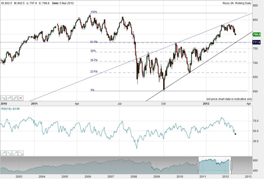
Will we finally see a downside break for equities this week? The Vix is still trying to make a rounded bottom, CS fear remains excessively high, Market Breadth has weakened, certain indicators remain overbullish and overbought. There is still no ‘screaming sell’ but note that US small caps have already broken:

I have highlighted on that Russell 2000 chart the confluence of horizontal support and the 61 fib, and the large rising wedge, which should act as support if downside in the other indices materialises. Large caps, currently outperforming, may correct less.

The full moon takes place this Thursday and the bottom by my models is around Friday. Due to some persistent geogmagnetism, my short term model has now tipped over a little. Here is it versus the CRB commodity index and around the lunar oscillations lower highs and lower lows can now be seen:

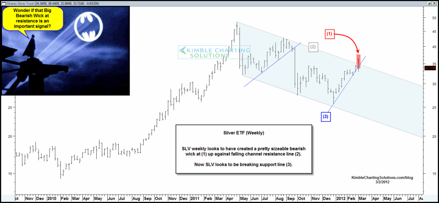
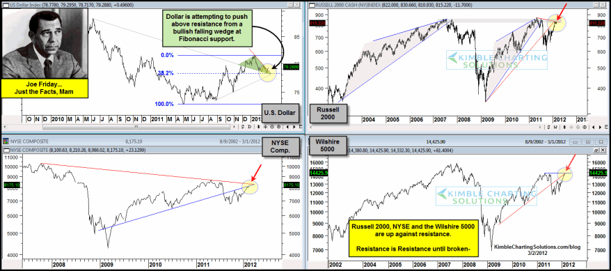
We see silver, the US dollar and stocks all at important junctions:

Source both: Chris Kimble 

So might we see the US dollar resuming an uptrend here, silver dropping to the bottom of its downward channel in a continued correction, and the stocks rally ending?

Well, by history, it is unlikely that the strong rally in equities of the last few months suddenly reverses here. We should expect a drawn out topping process as a minumum. In other words, if equities pull back here, we should expect them then to revisit the highs, or make new highs, whilst seeing internals weaken and greater divergences come to light.

There is an extreme in bullishness in energy, particularly oil. That suggests a pullback in crude is imminent. But there is likely to be demand-supply and geopolitical support from the underside. Pro-risk typically moves together. So as it is unlikely that equities enter a significant downtrend here, it is also unlikely for commodities. Neither precious metals nor agriculture display overbought or overbullish readings like energy.

On the macro front, ECRI leading indicators rose again in Friday’s reading, but China data today surprised to the downside. Euro debt and CDSs remain well contained, with the exception of Greece. Credit markets continue to improve. Some key analysts still expect the Fed to announce QE3 or some kind of new balance sheet expansion in the next 6 months. Goldmans expect it already in the first half of the year. I can’t see it on the current improvement in data, but given their expectations I will keep it on the radar. Next FOMC is 13 March.

To sum up, my personal expectation is that pro-risk markets retreat this week, into my model bottom around 9 March. I don’t see it as an opportunity to short or to pull out of commodity longs, as I expect we have not marked a major top, and that this will be digestion. Rather, we should at least be revisiting the highs, or more likely exceeding the highs, after a consolidation, and in doing so we will be able to judge better whether a topping process is unfolding. Treasury yields continue to display a potential rounded bottoming, which could signify much more pro-risk appetite ahead, fitting with a secular commodities bull conclusion, and would support only digestion of gains here.

Stocks, Surprises And Bonds

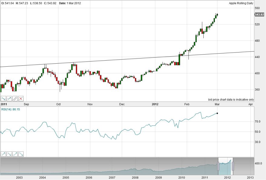
Here’s Apple again, the leading stock in the leading stock index.

The inverted hammer candle of 15 Feb didn’t turn out to be the top, despite reaching RSI over 90. Here we are now further up the parabolic curve, a curve that is unsustainable. The question is when it is going to break, because as the leading stock in the leading stock index, it’s likely to be important. On the chart above I’ve marked the long term rising upper resistance line that stretches back years but was broken early Feb 2012. At the end of yesterday RSI was at 85. I’m on the look out again for an intraday reversal and inverted daily hammer candle.

The Vix is still trying to make a rounded bottom. We still see some overbought/overbullish readings in equities, and some negative divergences. We also still see a solid uptrend, and no screaming sell.

Turning to Citigroup US economic surprises, this index appears to have topped out at the start of 2012, but it tends to lead the market. I’ve highlighted the major recent trends in this index, and applied the same to the S&P500 chart.

Source: Bloomberg

Compare the strong move up in surprises from an extreme low to an extreme high in 2009 and 2011. Both advanced off the bottom a couple of months before stocks bottomed. Back in 2009, the surprises index then topped out at the high extreme around June-July 2009, and gradually fell away to neutral into Autumn/Fall 2010. Stocks tracked overall sideways in this period, as designated by the arrow, but it is notable that stocks made their high within this range about 9 months after economic surprises topped.

In short, assuming economic surprises have topped out and now fall away to neutral (as this is a mean reverting indicator) mirror action to 2009/10 would see stocks push higher into late 2012, before being dragged back.

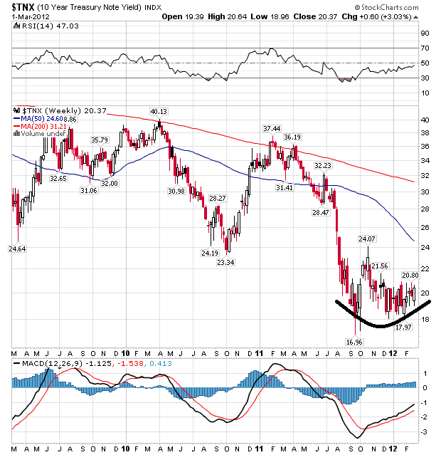
Now bonds. The 10 year treasury yield is showing evidence of building a rounded bottom.

Source: Stockcharts

The treasury bond aggregate has potentially broken down beyond rising support.

Source: Chris Kimble

Treasury bonds are at a historic extreme high, and yields a historic extreme low. If we see a significant change of trend here, then it will fuel pro-risk.

Idle Speculation – Sp500

Drawing together the historic seasonality of geomagnetism, the window of growth into mid year before headwinds in H2 as per leading indicators, the cyclical bull’s behaviour to date in fib and channel tagging, the expectation by solar cycles of stocks topping out ahead of the solar peak and noting the S&P500’s current battle with 2011’s top (but expecting it will eventually break upwards, as the Nasdaq has led the way already):

As per the title, don’t take it too seriously. But it does appear the S&P500 has a destination of the merging of the 100 fib and top channel line, and this is in line with Zealllc’s expectation of roughly where this cyclical bull will top out.