Bull Market Peak

US Stocks:dollar, stocks:bonds, junk bonds and volatility (inverted) all peaked out mid-2014 with the solar maximum.
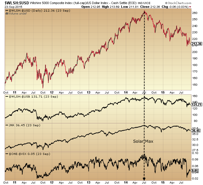
24sepe1

Source: Stockcharts

Crude oil, put/call, breadth and bullish percent did likewise.

26sepe1

Sornette’s bubble end flagged then too.

Screen Shot 2015-09-24 at 20.18.51

Source: FinancialCrisisObservatory

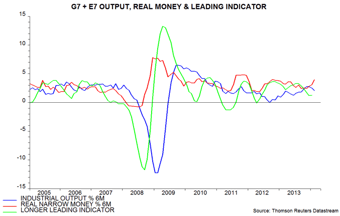
Global business activity peaked out at the same time.

22sepe9

Source: Thenextrecession

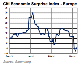
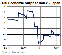
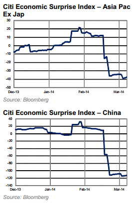
And economic surprises.

24sepe12

Source: Not_Jim_Cramer

So did financial conditions, Europe and US.

Screen Shot 2015-09-22 at 20.28.53 Screen Shot 2015-09-22 at 20.27.06

Source: Bloomberg

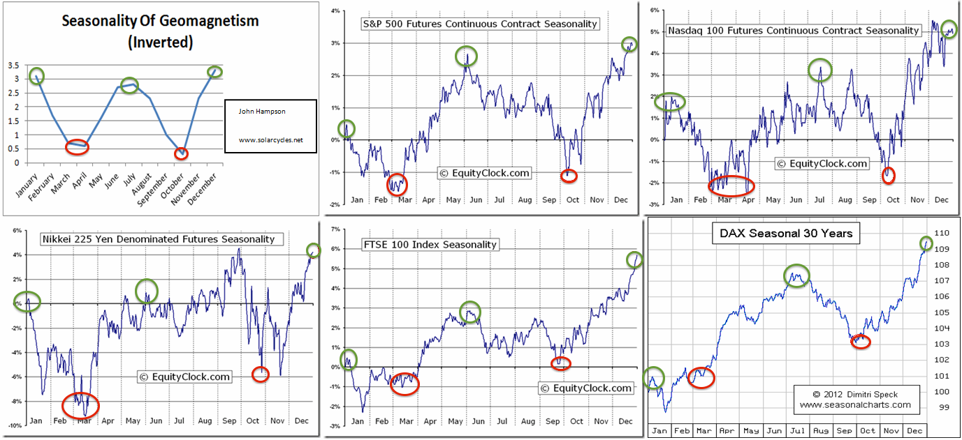
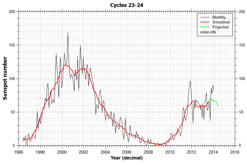
And geomagnetism has played a key role in these developments, intensifying since mid-2014.

a3

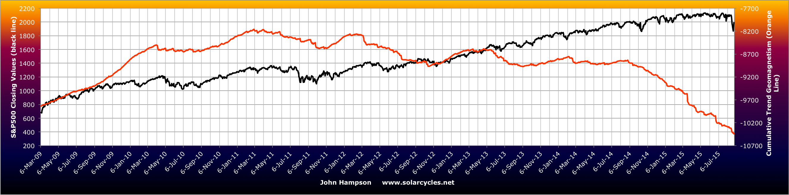
With united demographic downtrends in the major nations, solar history suggests markets and economy should tumble down to the next solar minimum.

26sepe7

Source: NOAA

26sepe2

Source: Tarassov

Drawing demographics, solar cycles and valuation together we get this:

19sepe9

It fits all three and that’s what makes it fairly compelling.

The mid-2014 peak we see in many indicators and assets is unrecognised by most. They see the August 2015 drops as the first drop in a topping process or a wave 4 in EW, both meaning we head back up. But the drops into last October fit better with this, with a secondary and final peak then forming in May 2015. The nominal price action has been uniquely confusing in this major peak, but the clues are provided by those under the hood and cross asset indicators.

What resonates with me about Elliott Waves is the waves of mass crowd psychology. We see this phenomenon playing out in solar cycles, lunar oscillation, demographics and valuation. But the weakness of Elliott Waves is that on any chart at any time multiple different counts can be produced and are then refined with time to make the count always ‘right’ with hindsight. I simply don’t see evidence that Elliott Waves are reliable market predictors (emphasis on the reliable), but the general underlying idea is very much in play in overall price action, something like this:

22sepe3

Source: ProfitF

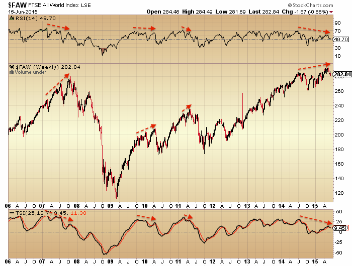
We all know an up trend rarely ends abruptly but instead typically peaks, reverses a while and next heads back up. Then, typically, the move either fails before the previous peak, double peaks with it, or makes a marginal higher high but on negative divergences, before the trend reversal takes off in earnest. All akin to turning a tanker at sea: it takes some time. Whatsmore, the last move up is typically the stage on which the retail money makes its usual late and painful act.

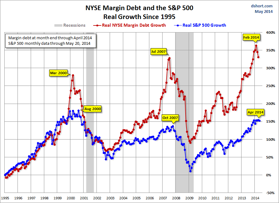
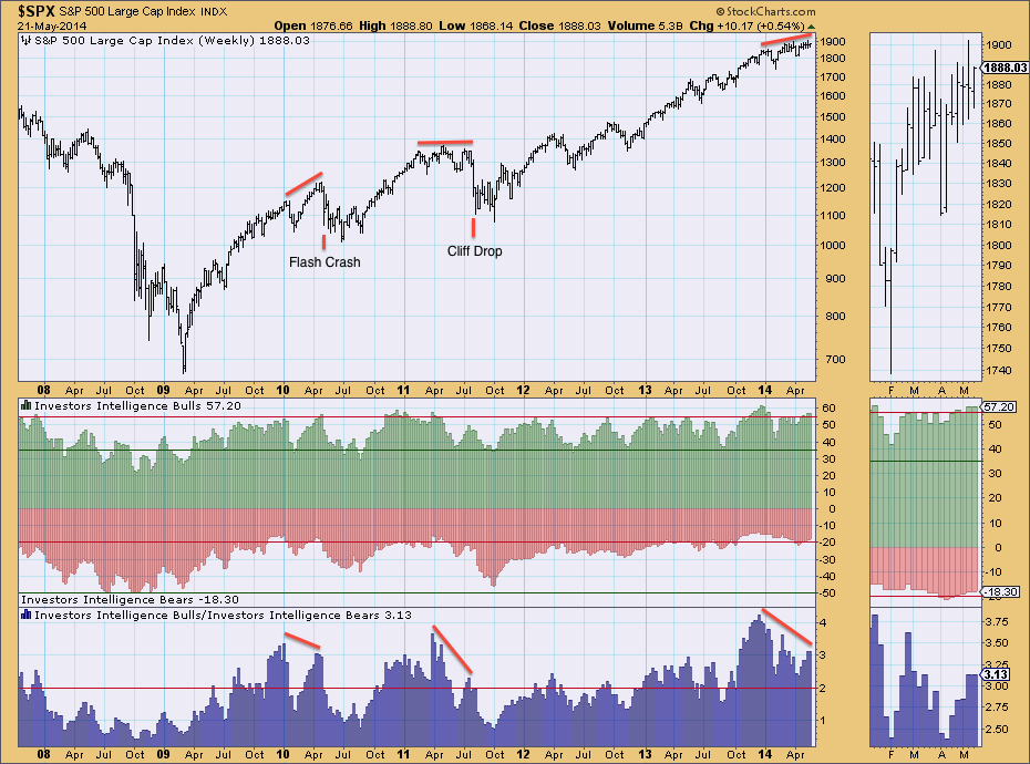
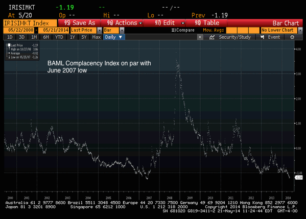
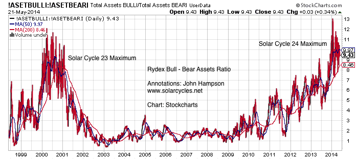
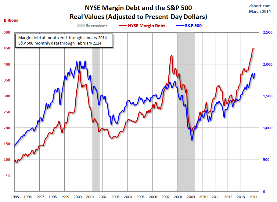
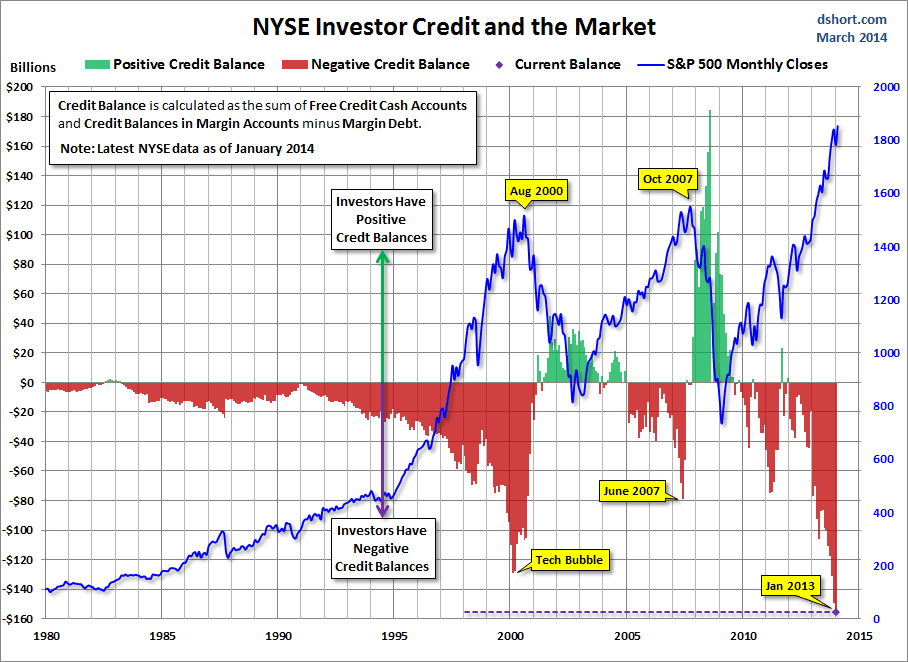
Between last July and this May we saw smart money flows weaken, dumb money indicators hit new highs, leverage jump to a new record and stock market internals notably diverge. All evidence of a wave 5, a secondary peak, or the terminal rally after the primary distribution, whatever you want to call it:

26sepe9

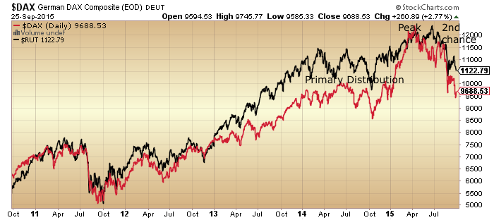
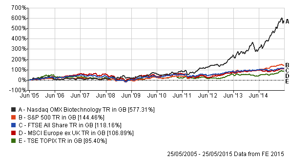
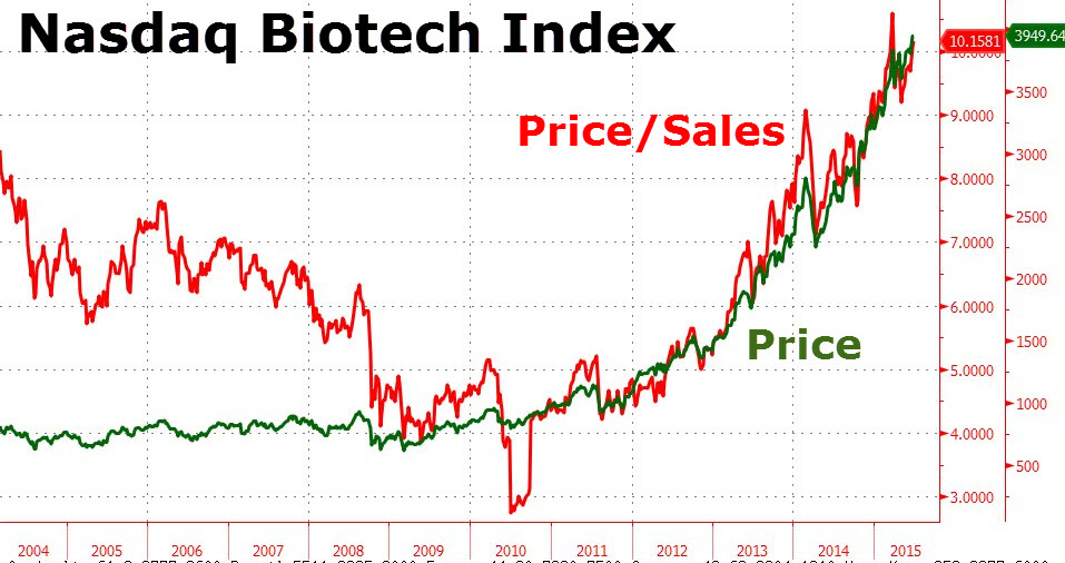
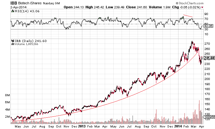
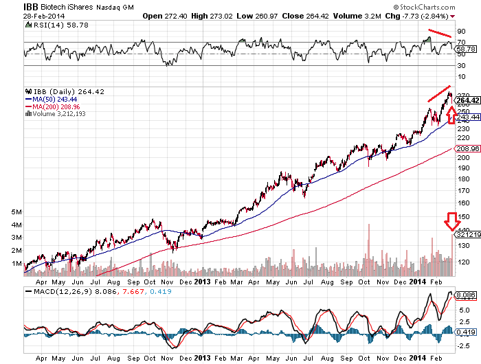
That second chance peak is now looking fairly potent on Biotech:

Screen Shot 2015-09-21 at 21.06.18
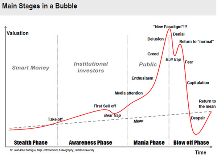
The point is that topping processes share similar characteristics which reflect how humans work. A peak takes time to form with some back and forth, some telltale signs in those leaving early and those joining late, and some health warnings.

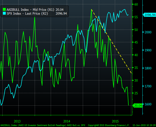
Finally, let’s recall that this has been the second biggest mania of all time, as measured by valuations, leverage, allocation and sentiment. The second major error analysts are currently making (to go with the failure to see the topping process began last July) is to see charts like this one as contrarian bullish:

Screen Shot 2015-09-26 at 07.29.22

Source: Yardeni

The jamming of the indicator at record highs last year highlights the mania that was in play. The subsequent crash is the mania bursting. The low reading is bearish, not bullish. It will take some time to recover, maybe even years. Given how ultra saturated the market was in terms of allocations, leverage and sentiment, it is unrealistic to think that the market will now go make new highs. Some of the dumb money was wiped out in the August falls, some more is selling on every move up to get out at break even.

The most bullish outcome is that the market gradually digests the falls and range trades whilst all the excesses of 2014 are gradually mopped up. But, there is no precedent for this in history. From 2014’s valuations, leverage, sentiment and allocations levels we have only seen devastating bear markets in the past. The post solar max and demographic environment add to this likelihood.

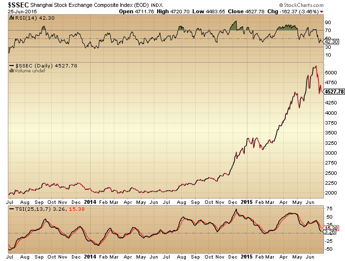
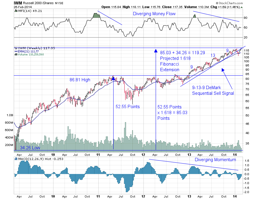
Gold looks to be completing its basing. Global stocks are now retesting their August lows. Clearly, if gold takes off here and stocks decisively break down beneath their August lows then the mood will properly change. The most bullish outcome I consider is that stocks range trade and recover some whilst the 200MA gradually arches over, as bear markets often aren’t in a rush, more of a slow bleed. However, written into the record leverage, is a period or periods of panic selling. Biotech is in an ideal technical set up for that to now occur. DAX and RUT look post second chance, which in past major peaks led to waterfall selling. So maybe we fall apart rapidly here – or, my bullish scenario – we hold up (without exceeding the highs) into the end of the year and fall apart in early 2016. Every man and his dog thinks that stocks are going to bottom out and resume bullish in October in line with seasonality so it seems likely that something else occurs. I think actual (rather than seasonal) geomagnetism is likely to play a role in this, so I am watching developments. I favour the falling apart option but you know my positions disclosure. Trades-wise I’ve been increasing shorts and adding to gold on the basing evidence, and adding stops to all of it. I’m going to carry on with this strategy unless the market bounces on positive divergences and shows evidence of a renewed move up for the bulls.

Advertisement

The Bubble Within The Bubble

Namely, the Biotech sector within the wider stock market.

Is the wider stock market in a bubble? Valuations in the 97th percentile, record extreme leverage, allocations second only to the dot.com bubble, all time record cluster of readings in sentiment, and more. Bubble deniers point to the context of ZIRP and QE as this time it’s different. Or they argue the froth we are seeing is of a new secular bull, with the stock market leading the economy. But ‘this time is different’ has rarely worked out historically and there have been many indicators acting like they did at the peak in 2000 or 2007, which I have published on the site in recent months. Here’s one:

26junn20

Source: Sentimentrader

That surge in unprofitable IPOs looks a lot like 2000, and whilst then it was particularly concentrated in dot.com companies, this time round there is a lot of Biotech.

26junn30

Source: Biospace

As we all know, into the dot.com peak of 2000, the mantra was that traditional valuations didn’t apply any more, and that stocks were ‘revalued’ on potential and expectations, justifying the crazy prices. Ultimately, traditonal valuation methods did still apply, and the pop was fairly unforgiving.

Today’s Biotech bubble is the same. Take a look at the constituents of the Nasdaq biotech index:

26junn2

Source: ZeroHedge

Just a handful of companies are making any money and the vast majority none or a loss.

Now look at how Biotech has outperformed the wider markets:

26junn10

And see how that run up in price has been solely multiple expansion, i.e. valuation rising hand in hand with price:

26junn18

Source: ZeroHedge

The price to sales ratio in Biotech is now over 10. Compare that to the SP500 which is around 1.8, which in itself is at the very top end of its historic range and close to the 2000 peak.

We can all see the parabolic, and we all know how parabolics end.

26junn7

IBB is the vehicle that mirrors the Nasdaq Biotech index.

I want to short Biotech. But we have to be careful with a parabolic because they can steepen further before collapsing. So do we know when the game is up? One is a technical breakdown. Here’s how the Shanghai Composite looks today:

26junn11

It broke mid-June. There was a divergence in strength leading into the peak, and there is such a divergence on the current Biotech chart.

The other clue is the wider market.

26junn6 26junn5 26junn39

Source: Stockcharts

26junn15

Source: John Kicklighter

The last couple of days delivered another telling bearish reversal. Those negative divergences are all still in tact. We await the news on Greece and whether some kind of deal announcement would pump the markets back up again in the short term. So whilst I’m looking for short entries on Biotech and Russell 2000, the timing has to be careful. Plus, it will be a little at first, then building up.  That building up may happen swiftly, as when Biotech breaks there are reasonable odds it will be quickly ugly.

If you have been long Biotech then sincere congratulations. It’s been the trade of the decade so far. But I would equally expect that short Biotech will be the trade of the next couple of years. It’s going to be about nimble and accurate timing and attacking. Will let you know when I enter.

26junn50

Is This ‘It’?

Why might it be?

The triple confluence peak of peak speculation: the new moon closest to the seasonal geomagnetic peak closest to the smoothed solar maximum: 27th June 2014. Many assets and indicators peaked then.

Screen Shot 2015-06-16 at 06.27.40Source: Stockcharts

Breadth bar cumulative advance declines peaked then too, with the latter having recently turned down.

16junn10

The global stock index has made a marginal new high since that point but the divergences in strength closely resemble previous major peaks.

16junn8The SP500 also shows a strength (and breadth) divergence that mirrors the 2011 major peak.

16junn3

The breadth in the Nasdaq measured two ways peaked out around the solar max of April 2014. There has been some improvement since but still divergent overall.

16junn6

Bullish percent / put call ratio shows one of the longest divergences, together with high yield to treasuries. Cyclicals vs defensives has repaired itself in 2015 but is overall flat for 18 months.

16junn12

NAAIM manager exposure shows a divergence similar to the run into the 2007 and 2011 peaks. It made ‘an attempt’ into the mid-2014 peak too, but as we know, the market managed to recover.

16junn4AAII bulls have also been making a divergence. Oddly though they have now reached the same level as March 2009, so that could be contrarian bullish. I’d just repeat that AAII sentiment survey has a poor predictive history hence I rarely post it.

16junn17AAII allocations – different to the above source – shows a bizarre rush to exit stocks. Don’t know what to make of that.

16junn22

Source: J Lyons

The Russell 2000 is one of the most bullish indices. But the same divergence is showing as the SP500 above.

16junn30

And it may be displaying that common pattern of historical major tops:

16junn31

In terms of its valuation, the latest p/e ex negative earnings is 22.38, which you can see versus history below.

16junn40

If we home in the Biotech sector, arguably the mania leader, we again see the same divergences as both above and prior peaks.

16junn41

In short, there are a whole host of negative divergences in strength, breadth, volatility, risk-off, sentiment and allocations for US and world stocks. The original set kicked off at the turn of 2013 into 2014, and have since been added to, with a concentration around the 27 June 2014 triple confluence peak.

I suggest there are only two ways to read it. Either all the supports for equities have been removed and they are about to tumble to ‘satisfy’ all those divergences. Or, stocks have held up despite all those divergences and so we now see breadth, strength, risk-on, etc, start to improve again, launching stocks higher. Needless to say, I side with the first option when we start to draw in valuations, allocations, leverage and other angles indicative of a major peak.

Today is the new moon at the seasonal geomagnetic mid-year peak. Either from this point or from the new moon of mid-July, stocks have the best chances of falling, with downward pressure into October.

30mays5In short, I’m on the attack, looking to build onto my short stocks positions (and long gold). I’m looking for an entry into the Russell 2000 as I believe it has the furthest to fall once equities break. I want to leave some allowance for a potential rally back up into the mid-July twin confluence peak, but until the evidence changes, the real peak was a year ago, putting equities on severely borrowed time and making yet another rally back up here doubtful.

The Dow, SP500 and NYSE all attempted a break out upwards from the 2015 range in May, which failed and now looks like a fakeout. The last chart here shows the NYSE in a rather textbook bearish formation: wedge, fakeout, breakdown, retest of wedge underside, repelled. That whole move has been building out since last July and now looks ripe for completion to the downside. I see this as another reason to be attacking here rather than waiting.

16junn50

Perfect Set-Up?

Speculation increasingly looks to have peaked out exactly at the solar cycle maximum again, as demonstrated by these 3 charts:

22m5

22m1

22m2If you have doubts about that beautiful triple cross-referenced set-up, then there are plenty of supporting indicators to shore up confidence:

22m3 22m8 22m9 22m10Once again: I am not an advisor, so don’t follow me. I see as perfect a set-up as I will ever get for a medium-long term trade, and the market is giving me plenty of time to position optimum short. If I wanted an opportunity to make a life-changing amount of money, here it is, and so I am positioned accordingly. Why front-run the market at all? Timing a top is very much possible, and not the game of fools: proponents of that mantra just don’t know the tools. My strongest case short was for the RUT and therefore the home of my biggest shorts – it is already down over 10%. My guess is some traders now see a potential short in that index but are waiting for a retrace that maybe never comes. The wider indices are an elastic band at snapping point. Some traders will be nimble enough to catch it, others will stand like rabbits in the headlights. Those still playing the long side at this point are the dumb money: not just my opinion but as evidenced in indicators.

A historic opportunity, which I hope we will all be celebrating together.

The State Of The Markets

Thank you so much for all the messages of support – I was really touched to read them all. I had a burn out and now have to take things easy. I was working long days with the markets and doing too much of everything on top. So my posts will be less frequent for the foreseeable future, but as my focus is on the medium and long term, less intensive tracking may be no bad thing. I come back to the markets after a couple of weeks away and although price continues to frustrate, little has changed in the big picture. Some of my near term timings didn’t work out, but the overall case remains solidly bearish, and it’s a question of patiently waiting for price to fall in line.

Focusing on US stock indices, I have updated the bearish indicators and flags and added some new ones below:

1. A 5-year bull trend only occurred once before, in the 1990s, and was followed by 3 down years

2. Historic levitation above longer term moving averages and lack of 10%+ correction since 2012

3ap35

Source: Gordon T Long

3. Last 2 years rally in US stock indices has been made up of less than 20% earnings growth and more than 80% multiple expansion. The last 2 such occurrences in history were 1985:1986 (leading into 1987 crash) and 1997:1998 (leading into 1999 real Dow peak)

4. Compound annual growth rate in equities since 2009 was only exceeded in 1929, 1937, 1987 and 2000, all of which led to steep market declines

5. Crestmont P/E is the 3rd highest in history after 1999-2000 (market peak) and 1929 (market peak), and in 97th percentile

6. This is the 2nd highest market capitalistation to GDP valuation outside of 1999-2000 (market peak)

7. This is the 2nd highest Q ratio valuation in the last 100 years outside of 1999-2000 (market peak)

8. This is the 3rd highest CAPE valuation in the last 100 years outside of 1928-1929 (market peak) and 1999-2000 (market peak), and the US is the 4th highest CAPE valuation in the world currently.

9. Russell 2000 index p/e is currently 74.8; Russell 2000 to SP500 valuation differential at all time record

10. 84% of companies have offered negative earnings guidance for Q1 2014 so far; Last quarter’s revenue growth was the lowest since 2009

11. Skew is in elevated range for the last 6 months; Cluster of extreme Skew readings not seen since June 1990 before recession began July 1990

12. Put Call ratio 21 day average over the last several months has clustered in the extreme low zone that previously led to sharp corrections

3ap1

13. Greedometer – aggregate of macroeconomic, fundamental and technical data – is at a record level exceeding the 2000 and 2007 market peaks

14. Citi Panic/Euphoria model at a level only exceeded into the 2000 peak:

3ap2

Source: Fat-Pitch

15. NAAIM sentiment remains historically high

16. Investor Intelligence % bears levels and pattern similar to previous significant stock market peaks

3ap29

17. Rydex bull ratio at extreme historic high

3ap16

 Source: Sentimentrader

18. Margin debt (updated for Feb 2014) is at an all-time record, both in nominal and real terms, and as a percentage of market cap; Net investor credit balances are at an all time low

3ap4

Source: Dshort

19. IPOs with negative earnings at levels consistent with previous market peaks

20. Leveraged loan issuance at record, surge mirrors 2007 and 2011 important stock market peaks

21. High yield corporate bonds to 20+ year treasuries shows a divergence with the stock market that has previously marked tops

22. AAII equity allocations highest since June and Sep 2007 and Dec 2013

3ap5

 Source: UKarlewitz

23. Smart Money Flow Index shows siginificant divergence in 2014

3ap6

Source: Todd Harrison

24. Biotech parabolic bubble breakdown

3ap7

Source: Stockcharts

25. Wider momentum stocks breakdown

3ap14

Source: Charlie Bilello

26. Leading indicators suggest global industrial output slowdown into a May trough, then a pick up into late summer

3ap15

Source: MoneyMovesMarkets

27. Citi Economic Surprise Indices for major global regions all negative

3ap17 3ap18 3ap19 3ap20Source: Citigroup

28. Fund manager allocation to global equities is at levels that previously led to a market peak or correction

29. Percentage of stocks hitting new highs is thinning into current new SP500 highs

3ap10

Source: Stockcharts

30. Six month breadth divergence in Nasdaq 100 in stocks above 200MA

3ap11

Source: Stockcharts

31. VXN/VIX ratio is a risk-off current flag

3ap22

Source: Stockcharts

32. Nasdaq 100 made a fake-out from its cyclical bull channel in March

3ap24

33. Best performing classes and sectors in Q1 2014 were commodities, treasuries and defensives

3ap30 3ap31

Source: Fat-Pitch

34. Late cyclical outperformance of commodities as equities top out consistent with 2000 and 2007 peaks

3ap32

35. Winding down of QE historically negative for equities, positive for bonds and gold

3ap21

Source: Jesse Felder

36. Trading in penny stocks signalling a peak

3ap36

Source: Sentimentrader

37.  Dow, FTSE and Nikkei are all at long term resistance levels (connecting 2000 and 2007 peaks)

38. Treasury Bond Yields Rate Of Change over last 12 months is at a level that previously led to market tops in 2000 and 2007

39. Rydex money market assets back to 1999 lows

40. Equities topping out with the solar maximum, in line with history

3ap23

Underlying Source: Solen.info

A 40-indicator case is a fairly strong case to go short. But we need to balance with what’s supporting the bullish case.

Cyclical stocks have broken out upwards over the last week. The cumulative advance-declines breadth measure remains in an uptrend, supporting the advance in equities. Euro Stoxx broke out to a new high. Gold and gold miners have pulled back in March, with gold having failed to hold a break out above the first meaningful resistance level:

3ap27

The question is whether a higher low can now be made in gold, to continue the bottoming process.

Margin debt, for which we have data up to the end of February, did not yet top out. I had initially expected margin debt to top out in December with an anticipated highest monthly sunspots spike at that time. However, a higher monthly sunspot spike in February suggests speculation could have topped out as we moved into March instead. We have thus far seen peaks in the Russell 2000, Nasdaq and Biotech in March, and we saw a lower monthly sunspot spike in March than in February. The consensus view is that the smoothed solar maximum for SC24 already passed at the turn of the year and that sunspots should decline from here. However, SIDC are still running a second alternative whereby a smoothed solar peak still lies ahead in H2 2014:

3ap34

 Source: SIDC

Playing to that possibility is the trend in leading indicators noted above. If stocks can hold up whilst economic data starts to improve again as of May then may be they can rally through to the Fall. On the flip side, we should have another month of disappointing data right ahead which could equally pull the rug from under equities. Were the second SIDC scenario to occur then I would expect speculation not to top out until the Fall, and a suitable technical mirror from history may be 1987 whereby sentiment reached record levels in Q1 1987 but stocks did not fall hard until Q3. But for now, the more probable scenario is of a smoothed solar maximum having passed and speculation declining from here, and for this to be confirmed I would be looking to see that the RUT and Nasdaq indices do not make a higher high from here, and that margin debt tops out. Sunspots should also notably trend down as we head into mid-year to confirm this.

3ap33

There have been a concentration of market falls occurring in the inverted geomagnetism seasonal lows of March-April and October. So again taking that primary scenario of sunspots now on the wane, I look to this new month of April to deliver major falls in equities, in line with the Nasdaq in 2000 (smoothed solar max and sunspot spike March 2000). Presidential cycles in the market suggest stocks could eek out further gains in the first part of April before falling for a period of weeks. DeMark also believes a top is within days but suggests the SP500 could reach 1931 before inverting.

The primary scenario of a smoothed solar maximum having occurred in December 2013 and a highest monthly sunspot spike in Feb 2014 is supported by a chain of events to date: Bitcoin peaked in Dec, Nikkei and Dow (very tentative at the time of writing) peaked and money flows switched into defensives at the turn of the year, the ‘theme’ stock indices and sectors of the cyclical bull exuberance phase peaked out Feb-Mar 2014. But this is all subject to confirmation or invalidation. So let’s see how April develops. I remain significantly short equities, and siginificantly long precious metals, with other smaller positions long commodities. My worst case scenario is the continuation of speculation into late summer before Q3 falls in equties, and I would hold my positioning until then if so. But for now this is the outside scenario, and I maintain good odds of April delivering significant falls in equities, and momentum returning to gold with a higher low.

Thank you for all your input whilst I was away.

Biotech And Russell 2000

Just as the defining sector of the 2000 solar maximum speculative mania was Internet, a case can be made for both Small Caps and Biotech as defining manias at the current solar maximum. In 2000 the Nasdaq Composite made a parabolic blow-off and hit p/e >80 as companies were ‘revalued’ on expectations rather than earnings. The Russell 2K currently trades at p/e >80 and the index of Biotech companies trades at p/e>160, with both having a significant weighting of companies trading on expectations.

The Russell 2K trades at its most expensive historic valuation:

2ma1

Source: Karla Tango

The Nasdaq Biotech sector is in a parabolic trajectory signalling imminent exhaustion:

2ma2

Source: Blogspot

Marrying the two, the strength in the Russell 2K in 2014 has been dominated by Biotechs:

2ma3Source: Bespoke

Similarly the Nasdaq Composite has been significantly driven recently by Biotech strength. So a pop in the Biotech bubble would have significant ramifications for the Russell 2K and Nasdaq, and the wider markets.

On Friday, Biotech had a significant down day on high volume, having built up a negative divergence in RSI:

2ma5This occurred at the new moon and as we head into the inverted geomagnetic seasonal lows of March and April. Add in the near vertical trajectory of the parabolic on the longer term view and we have the potential for a top having occurred on Friday, but subject to follow through next week.

Similarly, the Russell 2K experienced a high volume reversal on Friday and shows other topping signals:

2ma6Source: Stocktwits

To further judge the likelihood of a top, a key question is: could the R2K and Biotechs rise materially higher yet? Whilst we cannot calculate a precise answer to that, we can look to various indicators to build up a case for a limit.

The Biotech sector has risen approx 150% in the last 2 years, which is very similar to the gain in the Nasdaq Composite from 1998-2000. Real margin debt and net investor credit have both now exceeded the 2000 market peak (and 2007 peak), whilst real margin debt to GDP is at the same level as the 2000 peak.

2ma7

2ma8Source: DShort

Citigroup’s panic/euphoria model, which aggregates short interest, put/call ratio, retail money funds and more, is above 2007’s peak but remains some way off 2000’s mania; whilst their CEM model points to a market correction right ahead which would fit with Friday having marked a peak:

2ma13Source: Citi / Fat-Pitch

Sentiment as measured by Investors Intelligence with 10 week smoothing is above or at levels that have previously marked tops, with an exception in 1986-7 where the market first rallied higher for several months before ultimately crashing.

2ma12Source: CMG Wealth

Solen’s updated solar cycle progress and prediction chart still suggests a peak at the end of 2013, which is consistent with the Dow and Nikkei having topped out then and other indices now rolling over to join, and my own daily sunspots chart also reflects this:

2ma10

Source: Solen2ma15

The waning of the solar maximum has historically given rise to a recession in the US. ECRI’s leading indicators rolled over in early 2013 and have recently reasserted that downtrend. Any further deterioration from here would suggest such a recession is coming, and that sort of timing would be a general fit with the business cycle:

2ma16

2ma11Source: DShort

In keeping with that prospect, 20-year treasury bonds look to be breaking out following an 8-month basing:

2ma14Source: Fat-Pitch

Drawing all together, I have a reasonable case for the Russell 2000 and Biotech to have peaked out on Friday, with the latter feeding into the former, and both into the wider markets. The Friday candles and volume and the negative divergences in both the R2K and Biotech suggest a peak. The Citi CEM, new moon and inverted geomag seasonal lows of March and April suggest follow through could then occur this coming week forwards. The rate of trajectory of the Biotech sector suggests terminal exhaustion should be close at hand, and that would then feed into the R2K’s fortunes as per the Bespoke table above. Valuations, leverage and sentiment collectively suggest significant further gains are unlikely. Solar speculative maximum timings suggest other US indices should now be ripe to join the Dow in rolling over, or more specifically began a topping process at the end of December which is now completing, and in so doing becoming leading indicators of a looming recession.