I have enlightened myself again this weekend, and I feel just in time. More outlook changing research. These last 4 months or so have been a real leap forward in understanding, personally. So yes, some of my views have changed, parts of the site need updating, but let’s get to the important. Demographics not only dictate ‘secular’ bull and bear markets in stocks and real estate, but also play a major role in inflation, disinflation and deflation.
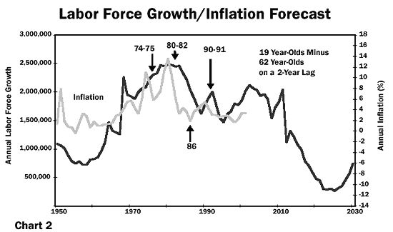
It is labour force growth or shrinkage playing a key role in price inflation. A swell of people aged 15-20 entering the workforce works up price inflation through spending, whereas more people entering old age relative to the work force is disinflationary through saving and disinvestment. There are correlations with inflation in labour force growth (15-60), young labour force percentage (15-40) and dependency ratios (inverted – old and young versus the working population), all of which are approximations of the same idea. It’s another simple but powerful mechanism, in the same way swells in the ‘investment’ age group produces equity bull markets.
Countries with ageing populations have generally experienced low inflation in recent years, whereas younger countries have experienced higher inflation, due to the resultant spending boom:
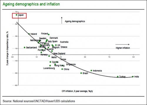 Source: Andrew Cates
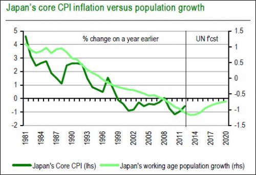
Japan’s proportion of 15-40 year olds has historically correlated with inflation levels:
 Source: James Bullard
Japan’s working force growth projection suggests Japan will not successfully reinstate inflation this decade, but will at least manage to change the trend as of around this year:
 Source: Andrew Cates
Here is the 15-40 year old ratio history versus inflation for the USA, also showing the correlation with inflation:
 Source: James Bullard
And two projections forward:

Source: James Goulding
 The charts suggest the USA should be tipping from disinflation into deflation. That is, if we assume the Fed is powerless to stop it.
Now look at dependency ratios for some of the main countries, we first see that collective trends historically matched broad global inflation history (nb: dependency ratios are not inverted in this chart):
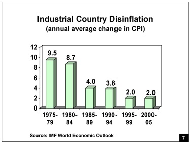
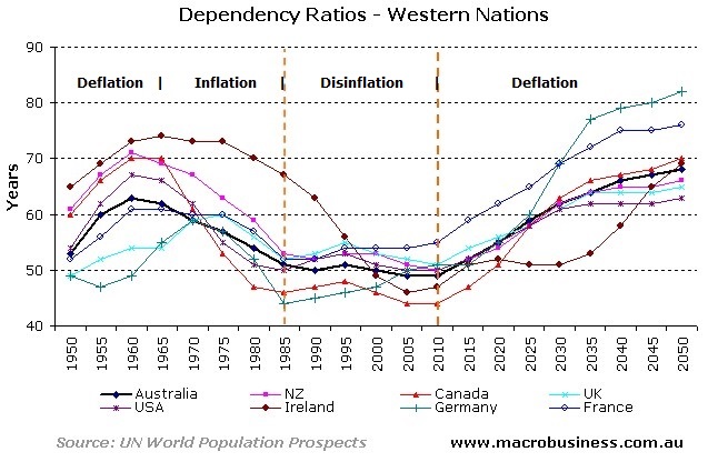 Dependency ratios collectively fell (i.e workforce proportions grew) between 1965 and 1980, which was a period of rampant inflation. Since then we have seen overall disinflation, and this is confirmed below:
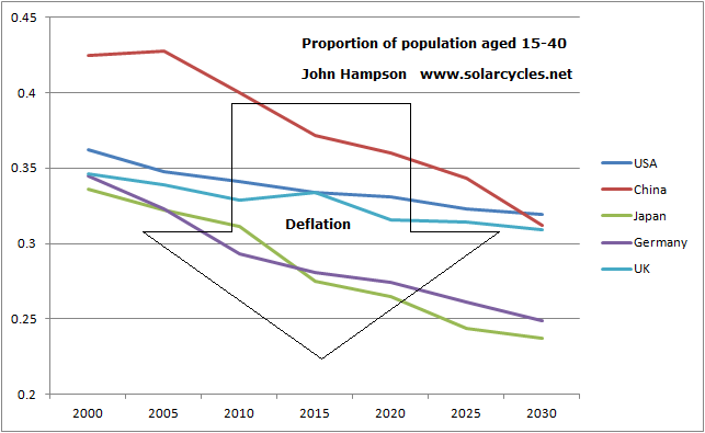
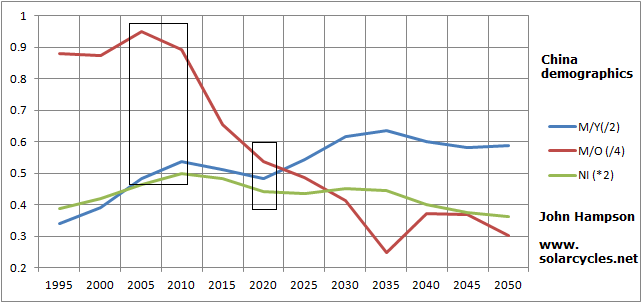
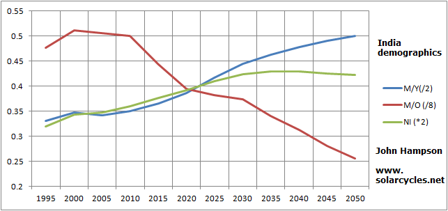
 Looking forward, we see collective deflationary dependency ratio trends in the major nations, with the exception of India and Brazil (nb: dependency ratios are inverted in this chart):

The alternative 15-40 ratio measure paints a similar picture of price deflation ahead for five of the most important economies:
 This explains why ZIRP and QE have failed to bring about inflation in Japan and now the USA. These countries want to inflate, but the demographic trends mean the public just won’t spend sufficiently in the economy for it to happen. For the majority of the major nations, this is a problem going forward, as the demographic trends persist and worsen. For the global economy, this is a problem, because the combined GDP of Brazil and India and other smaller positive-demographic countries is much smaller than the combined influence of the USA, China and Europe.
So what’s likely to happen? The central banks of these countries are largely pushing on a string. They can’t force spending and investment, they can just use ‘carrot and stick’ tools to encourage spending and investment and discourage saving and cash. The evidence suggests that disinflation should continue. The risk is that disinflation turns into deflation, as the demographic trends suggest. The global economy is at risk of falling into a new recession, or even depression. It explains why the recovery since 2009 has been spotty and weak. The central banks will likely have to persist with ZIRP and QE and perhaps also deploy other unorthodox tools, but which would likely have the same lack of potency. If deflation takes hold, then debts would grow, savers and currency holders would be beneficiaries, and investment would become unattractive because future prices would be lower. Risk asset markets would fall.
So why are equity markets so strong currently? We have disinflation and low growth, together with the ZIRP and QE easy money conditions. Whilst the former two conditions hold, then speculation is encouraged by the latter two. It would take a plunge into recession and deflation to generate the exodus out of stocks, and it is such a development that a couple of analysts that I respect are touting (e.g. Russel Napier, using the Q ratio, predicts the SP500 to bottom at 400 in 2014). With this new research, I now understand why.
But could this benign status quo continue, with low growth and pro-speculation conditions, with the central banks acting together to maintain such conditions? Well, I would repeat that all they can do is encourage and discourage through their limited toolkit. They can’t force. The demographic trends are now united negative in USA, China and Europe, which provides a powerful downward pressure. There are less new investors coming to market, and more leaving. So how can stocks keep rising? I suggest the answer lies in the current margin debt situation:
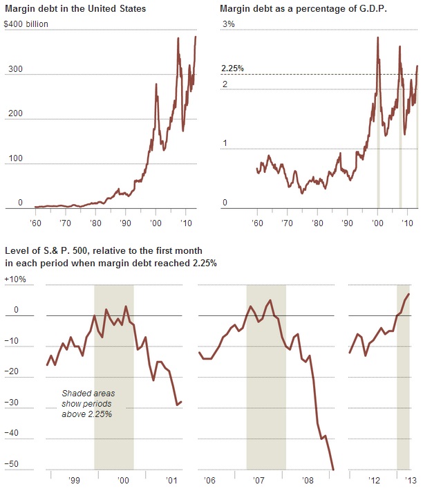
Source: NY Times
Stock market participants have increasingly borrowed and leveraged in the market. So it’s not more investors but the same investors buying more and more on credit, and as the graphic shows, when margin debt reached over 2.5% of GDP previously, the stock market fell into a cyclical bear subsequently.
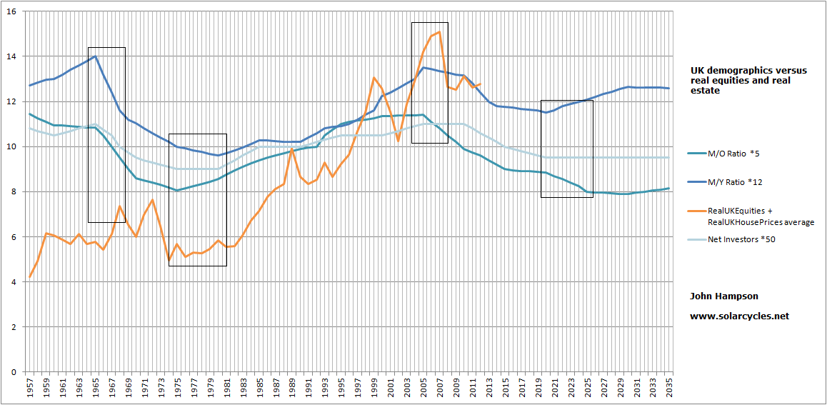
Here is the correlation between the S&P composite p/e ratio and the middle-old demographic ratio for the USA, with projection:
 It suggests a fair p/e of around 10 by next year. As of Friday’s close the p.e was 18.4. A shrinking of p/e can be achieved either by stocks holding up nominally but strong inflation eating away at the valuation, or it can be achieved by stocks tanking under no-inflation or deflationary conditions. By the demographic projections further up the page, the second option appears likely. This would also mean US stocks could be in for severe falls ahead.
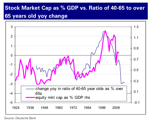
Deutsche Bank produced the next chart which shows US market cap as a percentage of GDP versus middle-old demographics. SMC as %GDP is a valuation measure for the stock market and the second chart below shows where we currently stand, which is very much overvalued versus the demographic forecast in the first chart:

Source: Business Insider

Source: Vector Grader
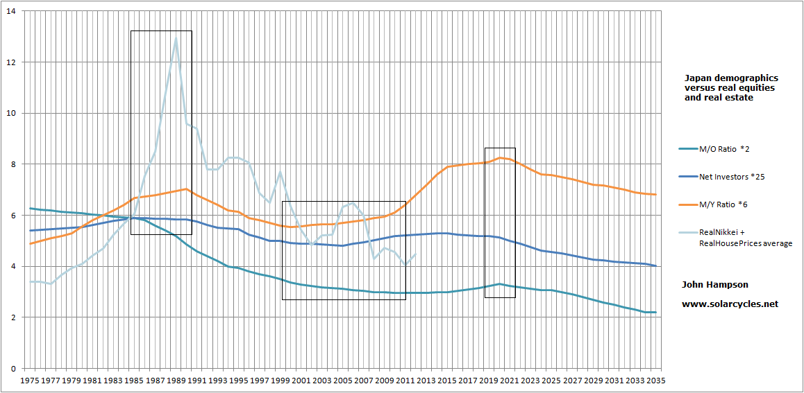
Again this suggests the US stock market should be in for sharp falls, both real and nominally, because the demographics don’t support inflation. I therefore believe US stocks should be a good shorting opportunity ahead, together with Europe and China. However, I still think Japan is set to do well as a long equities bet. The pick up in labour force growth for Japan, shown higher up the page, from this year looks set to change the deflationary trend even though true inflation looks set to remain elusive. So that suggests at least stabilisation in the economy. However, equity prices could grow much stronger, in line with the M/Y ratio:
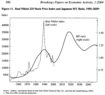
The next two years is a particularly good demographic period for Japan as middle-old and net investors measures also rise. Plus Japan is playing catch up to demographic trends that turned up as of around 2002. I maintain that Japanese stocks took off then but were pulled back by the global crisis of 2007/8. So, the question is whether they would again be dragged back by a new global recession and a stocks bear in most of the major nations. I don’t think they would be immune, but I would still expect them to outperform and eventually deliver their demographic fulfillment. Plus, there is a chance of a fast speculative boom. Current monetary conditions encourage bubbles, and the new Japanese government has upped the ante by saying it will buy equities as part of its reflationary policy. With speculative behaviour also at peaks around solar maxima, I think there is a chance Japanese equities could go crazy, and so I will maintain long Japanese equities and add on any further retreats.
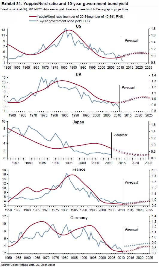
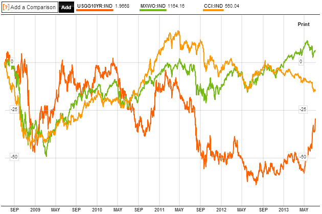
Now one more demographic correlation, this time with government bonds. This work by Credit Suisse is the same simple idea: the ratio of those who are predisposed to buying government bonds to those who are really not determines the long term path of bond yields:
 Source: Credit Suisse
For the US and Europe we see a change in demographic trend has taken place over the last 10 years which should see outflows from bonds going forward, and yields therefore rising. The US changed trends first, which suggests treasuries are belatedly falling to trend now, and that the flows out of treasuries are justified.
If a sharp cyclical bear does occur in equities, then we would have a similar deflationary shock to 2008. In that experience, most assets were sold off as people needed to raise cash to pay for losses elsewhere. Gold did not escape. It was government bonds that were the recipient of the money flows. Would they be this time?
Let’s turn to gold. Historically, gold has performed well when demographics have been in negative trends. I recently showed that the Dow-gold ratio had bottomed and topped very closely with demographic turns in both the USA and UK. Below, the same p/e demographic ratio as shown further up the page but with the gold price added also shows the inverse correlation:
 Source: Glenn Morton
You may read that in the 1970s gold rose as an inflation hedge, in the 2000s gold rose under disinflationary conditions, and gold also performed as a deflation hedge in 1933. Gold is touted as a hedge against systemic risk and financial market instability, as hard currency or as a store of value under conditions of negative rates or currency dilution. What I would suggest is that gold is the go-to, the default investment, under certain demographic conditions, i.e. ‘negative’ demographic conditions. When demographic trends are counter equities and real estate and government bonds then gold becomes attractive by default. This ‘last resort’ status is reflected in gold’s real performance over time, namely it goes nowhere in the long term.
When equity p/es are declining under m/o demographics, and stock market interest is in decline due to m/y and net investor demographics, but labour force growth demographics are inflationary, then we have disinvestment in the stock market but price inflation in the economy. This was the 1970s, and reflects the broad collective downtrends in demographics amongst the major nations at the time. Gold and commodities outperformed.
When equity p/es are advancing under m/o demographics, and stock market interest is increasing due to m/y and net investor demographics, and yuppie/nerd demographics are pro bonds, and labour force growth demographics are price disinflationary, then we have investment in the stock market and bond market and price disinflation in the economy. This was 1980-2000 for most of the major nations, although Japan changed demographic trends circa 1990 and went its own way. Equities and bonds outperformed.
From 2000 to current, we saw some divergence in demographics. For the USA, equity p/es were declining under m/o demographics, stock market interest was in decline due to m/y and net investor demographics, and labour force growth demographics were disinflationary, so we had disinvestment in the stock market (secular bear market) and price disinflation in the economy. However, Europe largely retained positive demographic trends until mid-decade and China until around 2010. China’s conditions were price inflationary, and as the biggest consumer of commodities, commodities had a demand story. Some have suggested that gold performed well in the 2000s under disinflationary conditions, i.e. that it is a beneficiary under disinflation, which may be true. However, the picture is muddied because of the price inflationary China demographics which could equally have been the story for gold’s rising, partnering with commodities again.
Which brings us to now and the next few years ahead. We see more united demographic trends again. For the USA, China and Europe, equity p/es should be declining under m/o demographics, real estate interest should be declining under m/o and dependency ratio demographics, stock market interest should be in decline due to m/y and net investor demographics, yuppie/nerd demographics should be counter government bonds, and labour force growth demographics should be price deflationary. So we should see disinvestment in the stock market and bond market and price deflation in the economies of these countries. What would be the winner under such conditions? I believe it has to be gold, as the default, go-to asset again. I suggest this would be the difference to 2008, as government bonds have changed trends and with ZIRP still making cash unattractive, money has to flow somewhere. If the solar maximum is ahead this year and this deflationary shock happens 2013-2014 with gold the recipient, then we would once again produce a secular peak close to the solar maximum.
What about commodities? I am not sure if commodities as a whole would be winners in such a deflationary shock. I have my doubts, because the demand story should be on the wane, and they are a class for inflationary trends. I believe the question is whether they collectively would become a speculative target, rather than an economic demand target. If equities are close to topping then commodities could go outperform here in the historically-usual pattern of topping last as the economy rolls over. However it would be done so most likely on speculative interest, rather than tight inventories. Geopolitical or climate events could play a part, particularly as the solar maximum has historically inspired protest, revolution and temperature peaks. The solar maximum has also historically seen speculative climaxes, so the potential for commodities as a class to rise is possible, particularly if oil took off. However, I am now very much open to the alternative, which is that the price deflationary demographic trends, particularly in China, take down commodity prices from here, and precious metals perform alone. I am therfore going to refrain from adding any more to my long commodity positions for now, and watch developments.
In short, I think calls that gold’s bull market is over are premature, as it is the counter-demographic go-to asset. Equities are on borrowed time due to counter demographic performance and margin debt. Collective demographic trends in USA, China and Europe are not in favour of stocks or real estate, nor pro-government bonds. Price deflationary trends are in place, which means falls are likely to be hard in nominal terms for risk assets. Commodities may not escape this, unless they are initially speculated to a peak and then join the falls. We don’t really have a precedent for such a coming together of trends, but I believe gold should be the winner as bonds, equities and real estate are counter demographic and cash is unattractive under ZIRP. I want to short stock indices from USA, China or Europe, but want to play long Japan, as it is the demographic exception. Brazil and India are also positive-demographic, but are not likely to escape a sell-off. I want to add long there post-falls. I will remain short treasuries and long precious metals.
I stated at the top of the post that I believed this analysis to be just in time. By that I mean I suspect equities could fall hard at any time, and that’s the position I want to add to my portfolio: short stock indices. I can now see more of a case why US equities could be in an eiffel tower formation and about to collapse. So I am going to add short without delay. If China liquidity and emerging market issues don’t escalate this week and set off sharp declines, then I would ideally still like to see a more regular topping process with another attempt at highs before rolling over, over the next couple of months.

 Source: Bloomberg
 Source: Stockcharts
 Source: Rambus / Stockcharts
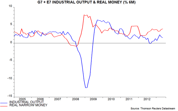
 Source: Markit
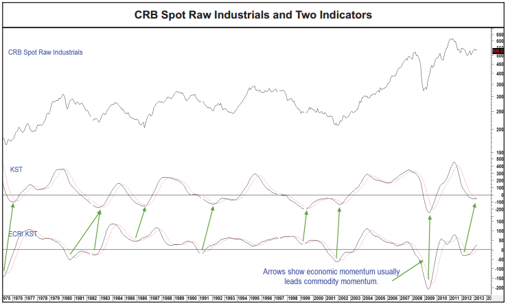
 Source: Martin Pring
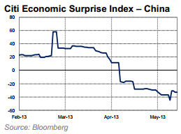
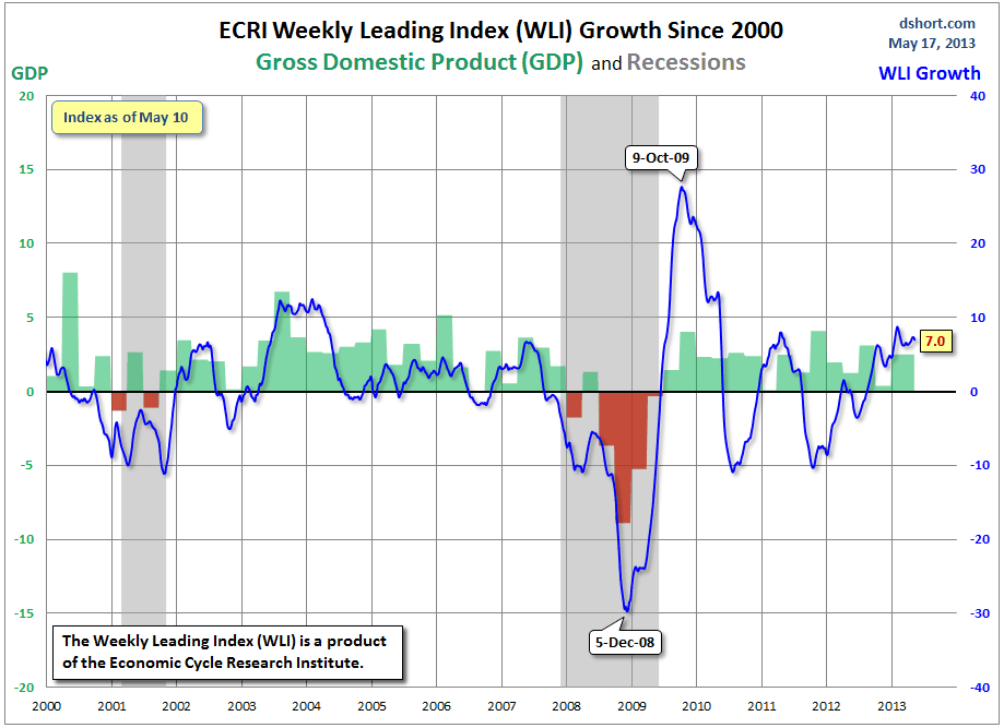
 Source: Dshort

 Source: Tarassov
 Source: TradingCharts