Velocity, Yields, Inflation, Growth And Commodities

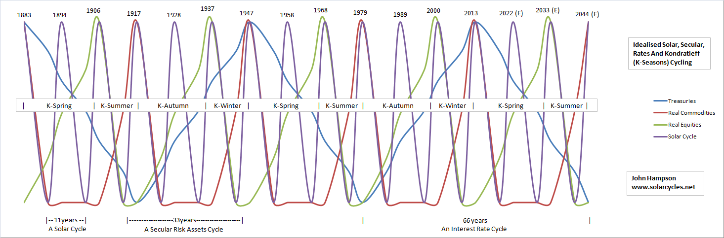
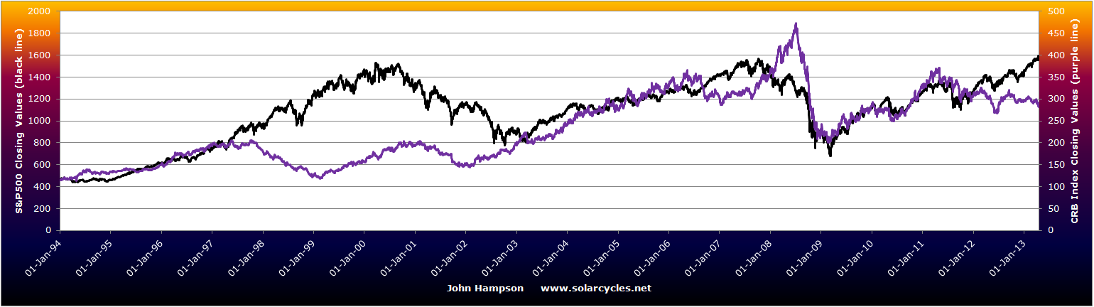
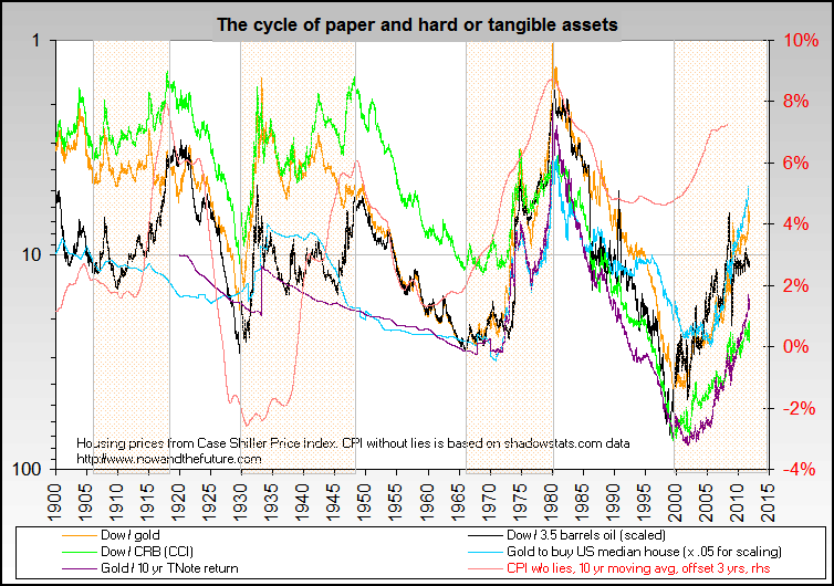
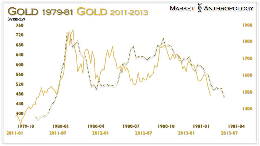
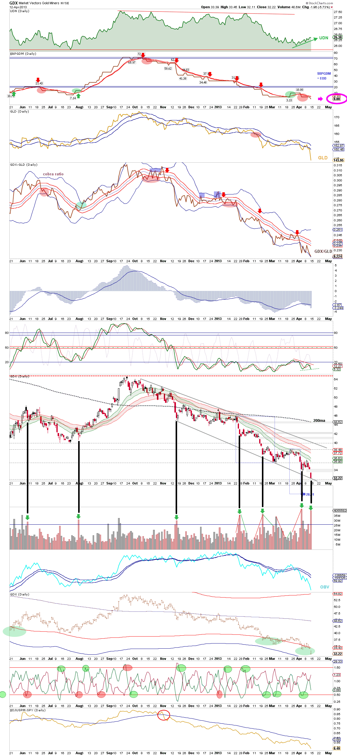
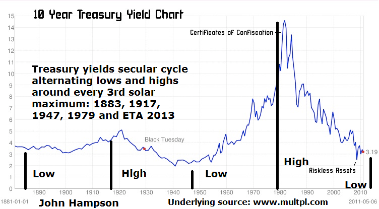
I maintain the late 1940s is our closest historical mirror, as per this chart:

Idealised Solar Cycle

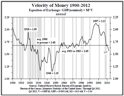
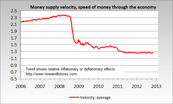
Then, as now, they had a problem with money velocity. But it reversed course and took off as of 1946.

18apr20131

Source: Hoisington

Yields also reversed course as of 1946.

18apr20132

18apr20133Source: Milton Friedman

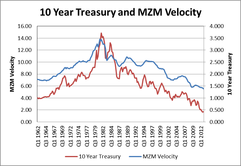
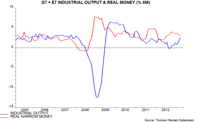
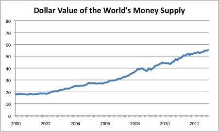
As per my last post on money velocity, there is a historical relationship between the two. Here we see it clearly:

18apr20134Source: BNVInsight

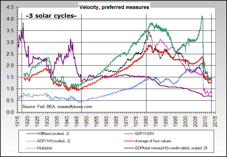
Essentially, expectations of rates, inflation and growth determine the path of yields and velocity. In 1945, like now, there were very low expectations in these three areas due to excessive post-war government debt, government controls and growth that would not stick. But then in 1946 yields and velocity began to increase and inflation took off and peaked in 1947. The picture changed.

In my recent post on money velocity I showed a selection of charts that show a current potential bottoming out of both velocity and yields, though only tentative at this stage. If this is the case, then we could also be set to see inflation take off and potentially reach a peak within a year in line with the historical mirror. If the solar peak is ahead later in 2013, this is a very good fit with 1947 which was also a solar maximum.

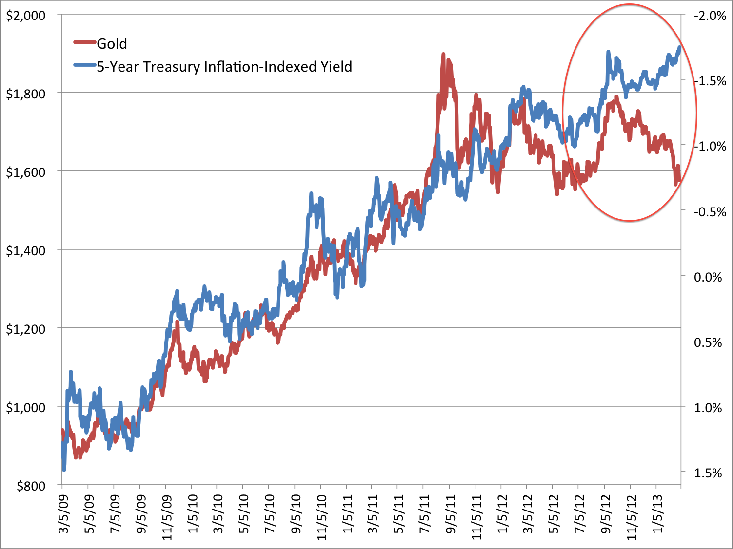
Here are 5 year treasury yields versus core inflation (excludes food and energy). We can see yields are overdue a catch up. Money is parked in bonds paying a negative real return. The divergence captures a lag in belief and sentiment that is overdue a reversal.

18apr20136

Source: Scott Grannis

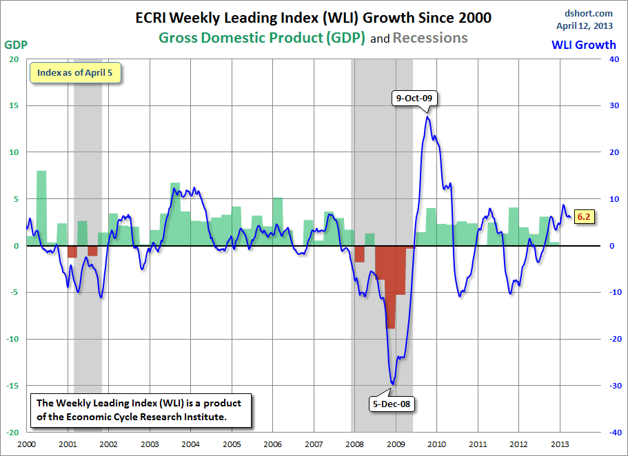
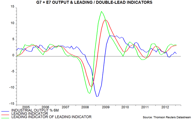
Yes the Fed is manipulating this market, but it is not the difference since 2011 – it was doing this before. Rather it is the mired perception of unsustainable growth. However, since mid-2012 we have seen a sustained positive picture in leading indicators that still persists at the time of writing. Unless leading indicators turn down again sharply soon, then I give good odds to a belated change in perception, a belief in growth, that should generate an upturn in yields, velocity and inflation.

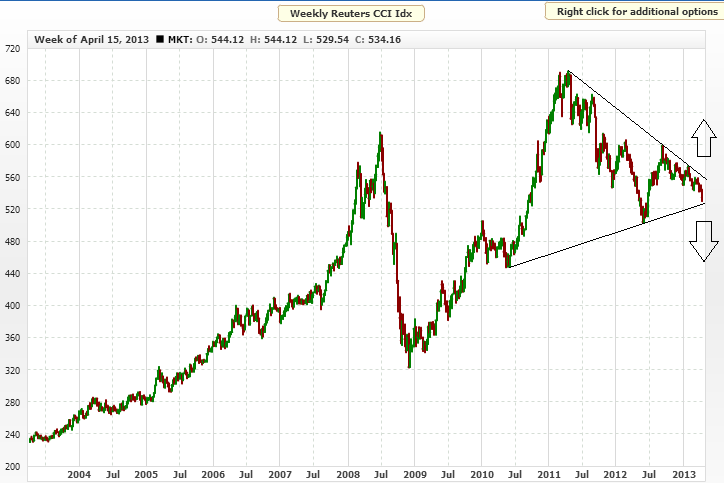
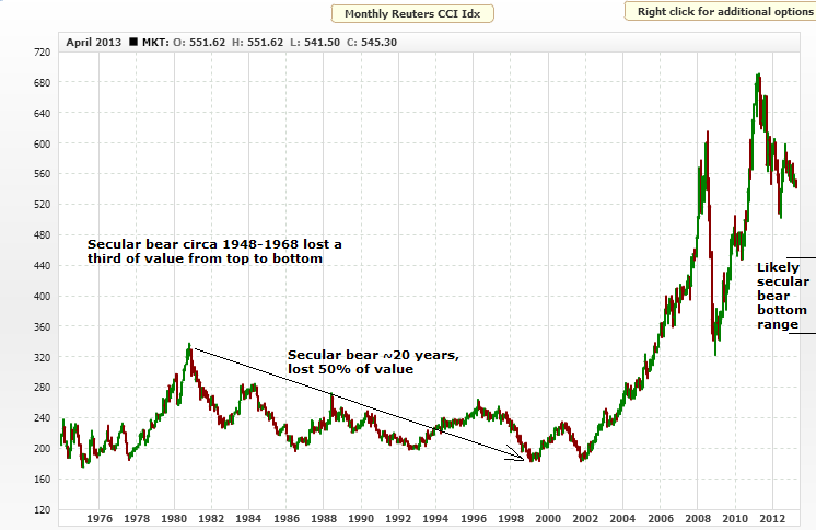
What would that mean for commodities and stocks? Using the late 1940s historical mirror, we can see that commodities were the beneficiary, with corn and copper charted here:

18apr20137

28nov201214

Both accelerated as of the turn up in yields and velocity of 1946, and had made the bulk of their parabolic rises within a year. Oats and wheat performed similarly, crude oil escalated in price by 50% from 1946 to 1947, and the CCI index as a whole made its peak by late 1947.

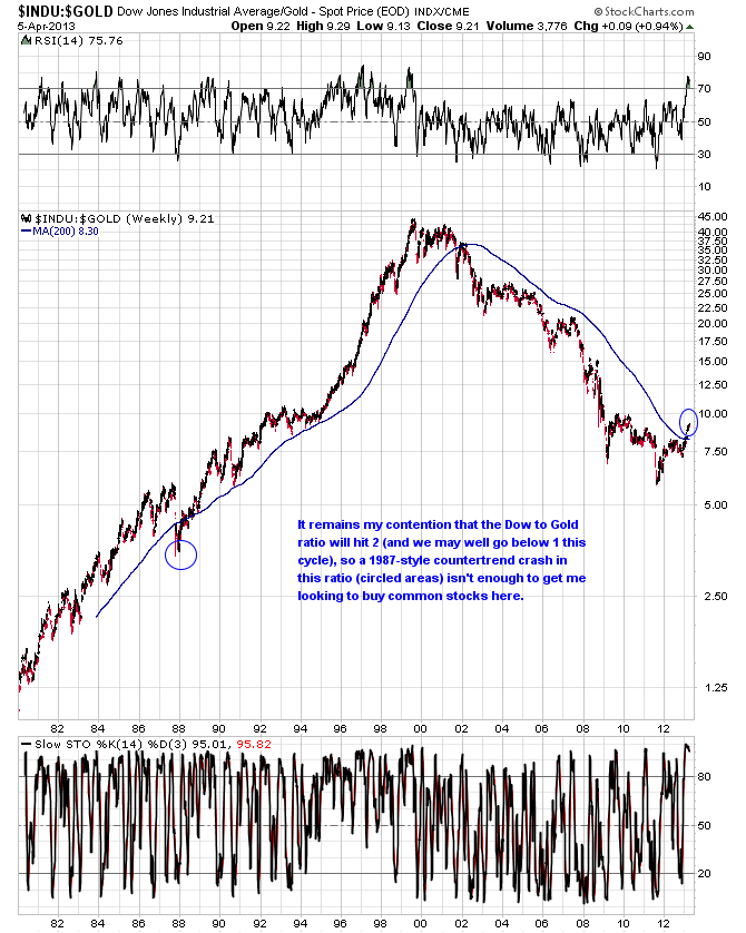
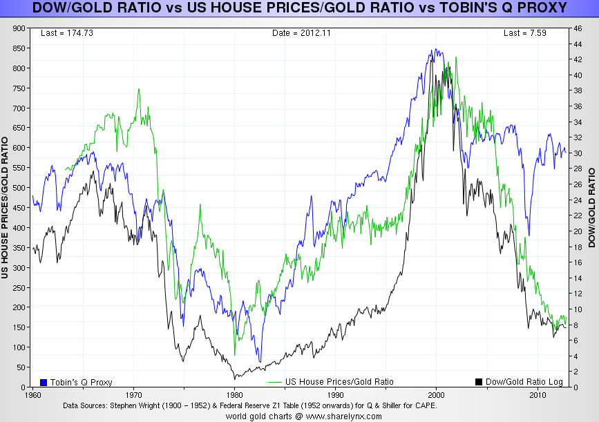
If we turn to the Dow-gold ratio, we can see that by 1947 the ratio was already in an uptrend, because stocks had been on a tear, much like now.

18apr20138

Source: Macrotrends

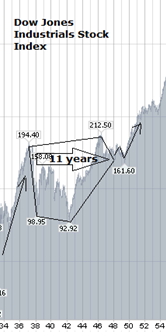
Here is the Dow Jones chart from the period in question:

18apr20139Source: Stockcharts

Stocks rose fairly steeply into a 1946 peak. That stocks perform well in an environment of low rates and low growth was in evidence then, as it has been into 2013. In 1946 stocks made a pullback and then traded sideways, before the secular stocks bull momentum ‘go’ point as of 1949. So whilst stocks consolidated around 1947, commodities esclatated.

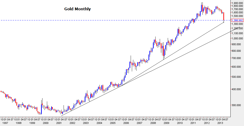
But let’s not get too carried away with the historical rhyme. Back in 1946 in the US, price controls, that had been implemented during the world war, were lifted, which along with weather-related bad harvests, helped drive up commodity prices. There are no such price controls today. The government also abolished the buying rate it had set for treasury bills, which helped free yields. In short, the government took several measures at the time to reduce its controls over the economy. Clearly there is a chime with today: the US government has supressed yields and taken controls over the economy in terms of ZIRP and QE and other policy actions. What we do not yet see is the relinquishing of such controls. However, if the US government were to announce it was stepping back from QE or eyeing an end to zero interest rates in the future, then this could have the same effect as in 1946 of yields rising, which would be accompanied by velocity, and inflation could then logically follow. Perhaps then an end to QE would not be a nail in the coffin for gold, but the opposite.

What 1946/7 and 2012/13 do have in common is the solar maximum. If you subscribe to the theory that sunspots drive human excitement and this manifests itself as speculation, buying and inflation, then we have another angle. This alone should encourage money velocity, bullish policy actions, and drive money into pro-risk.

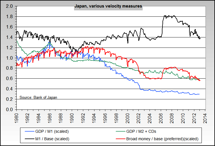
Now if you don’t buy into the solar idea, or maybe the solar maximum passed already in Feb 2012, and you don’t buy into the historical correlation with the late 1940s either, the we nonetheless still have an unsustainable situation of negative real rates and yields, and money supply and velocity at opposite historical extremes. Unless the system is broken, then at some point growth is going to stick and accelerate, and these extremes will mean revert. Is it broken? Is the US the new Japan? Unable going forward to get growth and inflation to entrench? As it is by far the largest contributor to world GDP, this would be felt globally for some time. Well, the US was keen to avoid Japan’s errors, i.e. being slow to react to deflation until it was set in. It was aggressive in response to the 2008 crisis. We also have an exponential trend in technological evolution, which at an even faster rate of paradigm shifts going forward, should be the fuel for a new secular stocks bull. The US remains a world leader in technology. Plus, through natural gas disoveries and shale oil the US has its own ample energy resources again to power growth, which Japan lacked. So time will tell, but there are reasons to believe that the US can make a normal transition into a new K-spring, and so likewise the global economy.

I suggest the natural cleansing cycle, a regular secular bear, a K-winter, has worked through within normal parameters, and we are in the realm of a secular transition. Unless you do believe the system / the US is broken, then a new cycle of growth should be emerging, and yields and velocity should be undergoing a reversal. As that occurs, it would be normal to see the fresh circulating of the parked money bring about inflation, and for commodities to enjoy another leg up. If you draw in solar cycles (assuming the solar max is ahead not behind) and the 1946/7 historical mirror to this, then the prediction is refined further: we should see stocks pull back and give way to commodities outperforming, for yields and velocity and inflaton to rise up, all around now. The Dow-gold ratio having bottomed should not be the death knell for gold, but instead reflects the environment being positive for equities as it was into 1946, and such a  pullback on equities (as occurred then) would be a buying opportunity for a forthcoming momentum ‘go’ point in stocks.

In the worst case scenario, the current status quo would persist for some years longer. Yields and rates and velocity would remain trapped at ultra low levels as sustained, entrenched growth remains elusive. Therefore, I continue to watch leading indicators closely. I believe that if they can remain positive and healthy into mid-2013 then we would have a long enough run behind us to change perception, and this should inspire the moves I am imagining.

State Of The Markets

Starting with leading indicators, the latest Conference Board table is a sea of green:

17apr201319Source: Conference Board

Global money supply suggests a flattening out of industrial output in mid-year, but at good growth levels:

17apr201318Source: Moneymovesmarkets

US leading indicators remain positive:

17apr201323Source: Dshort/ECRI

In short, the global picture looking out on the horizon is good.

However, with coincident data, things look different. Economic surprises have tumbled of late:

17apr201322Source: Brokenmarkets

If we look at relations between the CCI commodities index, the MSCI World stock index and major economy economic surprises, then we see they generally move together, but typically economic surprises lead the turn:

17apr201321Underlying source: Brokenmarkets

What is notable is that equities have diverged over the last 6 months, whilst relative weakness in commodities has been more in line with the trend in economic surprises. It suggests equities may be overdue a correction.

If we aggregate 10 year treasury yields, Euro-USD, the CCI Commodities and MSCI World Equities indices, then the collective trend changes over the last 12 months appear like this:

17apr201316Source: Bloomberg

We see a notable downtrend in pro-risk since the start of February but with equities diverging. To be specific, it is the US and Japanese stock indices that have diverged, as we see corrections more clearly over the last couple of months in the Hang Seng, STI, Dax, FTSE. And a result of outperformance in US and Japanese stocks is more expensive valuations, with both now having p/es of around 17 (compared to the other country indices listed which are between 11 and 14 p/e). So are US and Japanese stocks due a period of underperformance, a belated correction? Or do the two biggest QE programmes in the world make for a difference that will endure until those policies are reigned in?

There is a potential topping pattern in the Dow Jones currently, as shown by the historical mirror below:

17apr20137Source: HubertMoolman

The overthrow out of the wedge could be reversed. Monday’s action – when gold toppled 10% – added to the likelihood of this topping pattern. However, yesterday we saw a partial retrace. The trend in economic surprises suggests they are overdue a proper pullback, however on the flip side the geomagnetism trend has resumed upwards. If I remove lunar phasing and show the short term geomagnetic trend only versus the SP500 it looks like this:

17apr201326

A correction has given way to a new uptrend which currently extends out to mid-May. This could imply that the pro-risk chart aggregate above is due a turn into a new uptrend, in line.

If equities were to make a proper pullback, then the question is whether commodities would outperform, as they historically tend to as late cyclicals. Below we see this occurring in both 2000 and 2008.

17apr201324There is a distinct gap between stocks and commodities formed over the last 12 months. If there remains a secular bull in commodities, then we should see that close again and commodities to perform well despite a pullback in equities. On the other hand, if the secular bull in commodities is over, then we should see that divergence continue. The CCI commodities index remains tantalisingly in a triangle, as shown:

17apr201317Source MRCI

The breakdown in precious metals has pulled it to the support line, which makes the next move in commodities the key.

So imagine commodities made their secular peak in 2011 and the sharp breakdown in gold is to be followed by general steep commodity falls that take the CCI into a breakdown. Resource stocks would get hit hard, and we would see a pullback in equities accordingly. Equities would fall, commodities would fall harder, treasuries would be a likely beneficiary. However, I can’t square this scenario with the positive picture in leading indicators. Unless we see a rapid deterioration in the general picture of growth ahead then I see it as more likely that commodities will hold up, and at worse continue to build out the triangle sideways. To add to this, from my recent post on money velocity, we see a potential bottoming out in progress in money velocity and treasury yields, that I suggest could have begun in 2012. We similarly see a potential bottoming out  in UK gilt and Geman bund yields below, as of mid-2012:

17apr201310

17apr20139Source: Fxthoughts

If the wall of parked money begins to circulate a little in the economy, based on a more entrenched picture of growth, then we ought to see a pick up in pro-risk asset inflation and a pick up in price inflation. So I continue to watch leading indicators for evidence that growth is becoming entrenched or for evidence that we are cycling down into danger again, to be met by another central bank response. Right now the evidence is for the former, and so I have my doubts that the commodities secular bull is quite over. Below we see the secular bull progression in commodities since around 2000, in terms of relative expensiveness versus other assets:

17apr20138Source: Nowandfutures

It is clear that there has been a large relative repricing of commodities in that period, but it is also clear by the various measures that we have not seen levels reached in the 10s, 40s or 70s. That said, we saw a much more extended repricing of equities into 2000. So my question would be: has the exponential rate of technological evolution brought about a change whereby we see future Dow-gold ratio tops and bottoms at ever higher levels (as human progress is captured in equities)? Or is this offset by increasing scarcity of commodities and increasing demand (more humans chasing fewer resources), which means the secular commodities bull still has work to be done to drag those ratios to normal historic levels?

Below we see the Dow-gold ratio and the author (not me) questions whether what we just saw in gold was the equivalent of a 1987 event for stocks, namely a crash that appeared to spell the end of the bull market in stocks and a breakout for gold, but was swiftly reversed.

17apr201313

Source: Goldversuspaper

If that is so, then we should see buyers step back in on precious metals and retake the breakdown level of 1550 in due course.

A look at gold monthly in log scale shows the crash so far like this:

17apr201312

As things stand this is a correction that does not violate the secular bull market. UBS echo Chris Puplava’s view that the correction in gold will turn out the start of a new up phase:

17apr201325Source: UBS

And a reminder of real yields globally is still a positive environment for gold:

17apr20132

However, I maintain the picture for gold – and commodities – is very much in the balance. As you know I can write a broad-based case for commodities having peaked in 2011, aligned with a sunspot maximum in 2012, as well as a broad-based case for the secular commodities peak being ahead, in line with a sunspot maximum in late 2013. The breakdown in gold adds weight to the former. Piece by piece we will see the clear winner, and right now I look to see if buyers step in on gold to reveal a weak-hand shake-out whilst retaining its log support and whether commodities attract interest here to prevent a CCI breakdown. Sunspots have picked up, but not to new highs, and so it remains in the balance as to whether the solar maximum was in Feb 2012 or is ahead.

If gold did make its secular peak in 2011, then we could point to similar technical shaping at the end of the last secular bull:

17apr201314Since that chart was produced, gold dropped to a low of 1320, which would be equivalent to around 350 in 1981. Looking at what happened next in the 1980s, gold was then not far off a bounce, which retraced half the falls before failing again.

17apr201315In summary, I still think it remains in the balance as to whether the secular bull market in commodities and gold is still in play and has one final (biggest) leg up still to come. Since selling my stock indices longs, my positions consist of short treasuries, long multiple commodities, and long gold, silver and gold miners. I doubled up on these last three into the sharp falls. My exposure is significant, and it is going to get expensive if the secular bull market is over and more falls are ahead. However, if this was the last correction before a bull market finale, then those positions would conversely turn out highly profitable. It’s a risky business, but I am leaning towards staying put and watching developments for further clues, rather than lightening up.

More On Gold

A potential low was formed overnight in precious metals. I suggest a snapback has good odds, as yesterday’s action produced yet more extreme oversold and overbearish flags, such as this:

16apr20131Source: Bespoke

Daily Sentiment Index for gold and silver was down to 7 out of 100 at the start of the day, so I expect finished close to zero. Bullish percent for gold miners ended a second day at zero.

It’s akin to a stretched elastic band. Doesn’t mean it can’t go lower yet, but if so the relief rally would likely be bigger and faster. An obvious target for a relief rally would be the scene of the breakdown, which in gold would be around 1550. However, it would take a fairy powerful snapback to get us there and I doubt such a strong relief rally would occur if this is a new secular bear. So is it?

Many times I have documented reasons why gold is around the end of its secular bull: expensive value ratios versus stocks and real estate, solar cycle timings, bottoming out of real estate and (potentially) treasury yields, stock index p/es and p/bs having in various countries reached secular extreme lows. But this overall secular transition takes time and working out the timeline of developments is difficult.

We now see a potential bottoming in the stocks/gold ratio:

16apr20132

16apr20133

Source: Joe Weisenthal

We also have the CCI equally weighted commodities index now at the bottom of its large triangle. Further falls in commodities here would ensure a break down and pass another piece of evidence to the secular-bull-already-peaked camp. I believe the action for the remainder of this week is going to be telling. Either buyers step in significantly in gold (central banks or large investment funds buy it up) and drag precious metals back up, to eventually reveal it was a last shake-out of weak hands before a parabolic finale – or – buying interest is weak and by the end of the week precious metals have tumbled further to levels whereby the secular bull cannot be recaptured any time soon. Ironically that would be a parabolic finale, only the wrong way up.

So no time to delay, in my opinion. If you were in gold, like me, prior to the falls, then you either attack for a snapback or defend and close out or sit aside and do nothing until the dust settles. I’m sure you already made your choice, but for me if this is a new secular bear then I don’t want positions stranded further up and nor do I want to take a loss. I attack on weakness and sell into strength, and that works for me. Interestingly, yesterday was the biggest one day traffic for my site since I launched it. I imagine many were scrambling for info and ideas as they were holding precious metals and surprised by the action.

If it turns out gold did make a secular peak in 2011, then it did not make a typical parabolic secular top, but silver did. Gold instead rather made a topping range from then until last week, which is the other typical market top, if internals or indicators negatively diverge. Perhaps there were such divergences in that ‘fear’ susbided over this period, as the Eurozone finally got to grips with its debt issues, the US dollar potentially bottomed out, inflation did not materialise as expected – all reasons for/against gold.

If it didn’t make its secular top yet, then can we find other reasons for it to now do so? Gold performs well in an evironment of negative real interest rates, so if rates and yields are maintained negigible but inflation picks up it could reassert itself. For inflation to pick up it needs commodities as a whole to recapture money flows, which could occur if growth can be maintained and money velocity picks up. Leading indicators currently suggest this could occur, but there is some demand-supply slack to overcome. Another support for gold is central bank balance sheets and money supply, which can dilute currency in relation to gold. Below we see global money supply growth correlating with gold’s performance:

16apr20137

And here we see recent growth in the money supply around the world. Only the US has weakened, but collectively the global trend is still up. It would take a reversal in policy to change this. Could such a policy change be about to happen? Potentially, if growth and jobs pick up and become more entrenched. However, right now, we are seeing doubling up in efforts in Japan, and no change elsewhere.

16apr20135Source: Moneymovesmarkets

Central bank balance sheets show a similar apparent correlation with gold’s trend, and again, it would take a reversal in policies, an reduction in or end to QE to change the balance sheet trend. Once again, maybe gold’s decline is telegraphing this, but right now we are seeing more QE in Japan rather than less.

Of course it is not set in stone that gold should rise in line with balance sheets and money supply. Measured against other commodities, gold is overpriced and has advanced too far too fast. In short, there are multiple ways to value gold, and some argue for a (protracted) decline, some argue for further upside, but the bottom line is this. As things stand right now, gold is perceived as unattractive, because central bank policies have not (this far) brought about raging inflation, weak growth low rates and low fear is the general global situation, which persuades investors into stocks and real estate, particularly as both are historically cheap relative to gold, and there has been a build up in inventories in most commodities.  So it depends on what happens next, or what is perceived to happen next. Will commodities outperform as late cyclicals if stocks make a top here? Is there to be a solar max later this year which inspires speculation and inflation? Is money velocity about to pick up in a meaningful way as growth becomes entrenched, leading to inflationary froth? Or is growth to weaken again leading central banks to even greater stimulus, which inspires money into gold again? Or is moderate growth and low inflation to be the norm ahead, with central banks gradually easing off and a new K-spring already underway with momentum in stocks and real estate?

If gold still has unfinished business in any of these areas, then I suggest we should see swift repairs and solid buying interest, to reveal it was a last shake out of weak hands. If not we should see a weak response to the precious metals rout and the CCI commodities index breaking from its large triangle. An important few days.

Gold

As per comments I have attacked this morning into further selling. Added to gold and silver, and will add to miners later. Chart at end of Friday shows gold miners bullish percent hit zero and high volume day which previously correlated with bottoms:

15apr20131Source: Stockcharts / CobraMV

I am playing for the mean reversion rally, the snapback, pending resolution of whether gold remains in a secular bull or topped out in 2011. See the last secular bull for possible echoes – both green circle triangle breakdowns could apply here, with the higher the termination of the secular bull:

15apr20132Source: ActingMan / Fred

However, regarding the lower green circle, I maintain that we are not in 1975 by mirror, but 1979 or 1981, depending on whether we remain in the secular bull or not. There is a history of assets shaking out weak hands in a final flush before going on to make a parabolic peak. Gold also did this in late 1978, just over 12 months before making its secular parabolic peak:

15apr20133

15apr20134Source: SeekingAlpha

Gold has now dropped just over 20% from its 2011 peak.

So three possible scenarios for you:

1. Are we in 1975, at the start of a mid-bull cyclical bear? I don’t believe so, as it does not fit with solar cycle timing. That mid-70s correction was the half-way point for the gold secular bull, but by gold-stocks and gold-real estate ratios we are close to the end, and the gold secular bull is a good 5 years older in duration at this point.

2. Are we at the turn of 1978 into 1979, just over a year from the secular top? I still rate this as the most likely, but it is very much in the balance. If this is so, then we should quickly see a recovery in gold, now that the weak hands have been shaken out and the key technical levels broken. A large and final move up to a peak in 2014 would fit very well with my solar cycling.

3. Lastly, are we in 1981, breaking down from a secular bull that in this case ended in 2011? I rate this as higher probabilty than 1. and less than 2. There is the possibility that the smoothed solar max already occurred, plus most stock indices hit secular low valutations. Stocks-commodities and real estate-commodities ratios hit low enough by secular history, if not absolute extremes.

If the third scenario is correct, then the danger is that gold falls long and hard before recovering. Although I previously showed the CCI to have already corrected a large amount from its 2011 peak versus its likely secular bottom, gold has been the commodity that has held up the best, and thus has potentially the furthest to fall. Nonetheless, nothing goes down in a straight line, and with overbearish/oversold extremes already in play, I am attacking for a bounce and will attack lower from here.

Friday Update

The SP500 has pushed up to the 1600 zone, which fits with the Birinyi/Bannister target, in a potential overthrow move. Plus this weekend marks the shift from the lunar positive to the lunar negative period, and a geomagnetic storm is predicted to be on its way. Lastly, economic surprises for the main regions have been in collapse and a change in trend in this indicator has previously led tops in the market. So collectively reasons for a top here.

However an opposing case can be made too. We don’t see particular degradation in stocks breadth and the SP500 has broken out into clear air. We see a strong/stable position in leading indicators. Here is the latest OECD collection:

12apr20132Source: OECD

Plus CB reported Japan leading indicators at +1.0, in the first of this month’s updates. Using narrow money the updated picture is one of potentially moderating growth ahead, but as yet no significant downturn.

12apr20133Source: Moneymovesmarkets

In terms of overbought and overbullish, some measures for equities are elevated, but there is a lack of major warning signs. Conversely we do see extremes in sentiment versus some commodities and commodity related sectors but the other way: bearish.

If you are following the SP500 or Nikkei then things look to be overwhelmingly bullish, but it should be noted that these are the two countries with the most aggressive central bank stimulus/easing programmes. A wider look at pro-risk is captured through combining the world stock index, equally weighted commodities index, euro-usd and 10 year treasury yields:

12apr20131Source: Bloomberg

We see collective behaviour in pro-risk, but with under- and out-performers. So, up from June to Sept 2012, down to mid-November, up then to the turn of January into February, down into the end of last week. Could we now be the start of a new collective uptrend for pro-risk? Again, followers of the SP500 or Nikkei might find that hard to believe, but the wider look at pro-risk suggests it could be possible, and a rotation in leadership if of course feasible. The collective picture for pro-risk fits with 5-models-in-alignment:

https://solarcycles.net/2013/01/09/tools-for-2013/

Namely, a pullback from the end of Jan to Mar/April, then a final rally into around June time, to either end the cyclical bull (in my primary scenario) or produce a significant swing top (in my alternative scenario).

With US earnings season just getting under way, there is another potential mover in the markets. Let’s see.

More In The Balance

Secular commodities peak behind or ahead? Here we go again.

The last secular bear in commodities, circa 1980-2000, lost 50% in nominal value from top to bottom. The previous secular bear, circa 1948-1968 lost a third of its value top to bottom. Assume a secular bear in commodities began following the peak in 2011, then drawing on those past events we could estimate a secular bear bottom in the zone shown:

10apr20137Source: MCRI

We could go further back in time to average in more secular commodity bears, but I suggest the evironment was different, pre fiat capital era, pre free globalised markets, and pre inflationary government policies. The 1980-2000 secular commodities bear has a sideways bias, that is also shared by the 1948-1968 secular bear, and we see overall sideways action in secular equities bears too – and these are all because of modern government policies of inflation. In real inflation-adjusted terms, we see more of a downward bias, compared to the nominal.

The 1980-2000 commodities bear proceeded in waves, i.e. cyclical bulls and bears within an overall secular bear, and this too is similar to progress in secular stocks bears. If the secular bull peak for commodities is already in, back in 2011, then the chart above shows that we would already be getting towards around half way between secular bear top and bottom. Given that the secular bear progresses in waves, then a wave up ought to be soon due, perhaps like the 1982-1984 cyclical bull, post 1980 peak. As it happens, multiple commodities are currently at levels of extreme bearish sentiment, including corn, silver, copper, soybean meal and sugar, which would provide the fuel for such a potential rally. That said, overbearish or oversold increases the likelihood of a mean reversion or relief rally, but on occasion these extremes can persist and test patience, until the evironment becomes more supportive. So how does demand and supply look currently in some key commodities?

Natural gas shows a recent tightening of demand and supply, as inventories are dipping beneath the historic average. Nothing extreme though:

10apr20131

Crude oil inventories are plentiful, which is a depressant on price:

10apr20132Source: Bespoke

Both zinc and copper show increasing inventories. Both in notably different positions to 2008 when commodities made a big interim peak.

10apr20139

10apr20138

Cereals, i.e. wheat, rice, maize, show a fairly steady position, with inventories largely tracking sideways over the last 5 years:

10apr20133Source: FAO

And lastly to gold. Demand decreased last year on the year before, but remains high, with central bank and investor demand the main areas of growth the last few years:

10apr20135

Source: Moneygame

Whilst supply has been growing since a bottom in 2008, to a now all time high:

10apr20134Source: ZealLLC

In summary, the overall demand-supply situation in these key commodities is no backdrop to a major rally, at least not as things currently stand. But to return to the opening question of whether a secular commodities peak is behind or ahead of us, the clues may still be in gold. If the period since 2000 is a K-winter then gold should be the leading asset. If demand slack in other commodities reflects recent weak economic growth, then the picture for gold is more complicated, as it is less a commodity and more a hard currency. Gold can thrive in conditions of negative real interest rates and money printing (or currency dilution). That said, it is also an inflation hedge and depressed commodity prices are doing nothing to convey troubling inflation expectations. As gold is sensitive to investor interest, were there to be a shift in stance from central bank away from negligible rates and currency diluting policy action, we might have conditions in place for an enduring secular bear. Indeed, this is what I predict will happen, the question is when? Does gold have a parabolic rise left in it yet, to end its secular bull, or did that occur in 2011 with silver making such a blow-off move?

This next chart shows how we are into the region of a secular transition in stocks and real estate versus gold. Gold is relatively expensive versus both and a rounded bottoming in the ratios could be in progress:

10apr20136

Source: Sharelynx

The ratios are low enough to justify a secular reversal, or they could yet break lower to around 1980’s levels to complete the secular extreme relative valuation. The curiosity is the Q ratio, which together with CAPE for US stocks, leads some analysts to expect steep falls in US equities from here, such as to 450 on the SP500 ( Russell Napier) to rectify it. I doubt it because of secular low valuations reached already on other stock indices around the world in this secular bear: such as Japan sub p/b 1, PIIGS p/es between 2 and 7, Germany, UK and Hong Kong all reaching below 10. In the last secular stocks bear, Japan only reached a low of p/e 20, so not all indices necessarily have to wash out, as long as most do.

Add in treasury bonds, due a reversal out of a 3 decade secular bull market and potentially bottoming around now along with money velocity, and consider the rounded bottoming in progress in many real estate markets around the world, and we have a window, and evidence, here for a broad secular transition, out of a K-winter and into a K-spring, switching from a secular commodities bull to a secular stocks bull, to a new secular treasuries bear and a new bull market in real estate.

The US dollar also appears primed for a new bull market, following a decade long bear. Interestingly, although the perception is that commodities generally advance when the US dollar is declining, in fact the last secular commodities bull peak took place against a sideways dollar, and the previous two commodities peaks against a rising dollar. In the secular commodities bull since 2000 we have seen more periods of commodities rising whilst the dollar has been falling, but we have also seen periods of them moving together. In summary, it does not appear that the fortunes of the USD particularly correlate to the fortunes of commodities. So what other clues can we use to assess if commodities made a secular peak in 2011 instead of biding time before a secular peak erupts ahead?

Well, I’ve left out solar cycles until now so time to bring them in. My analysis shows commodities making secular tops close to solar maximums. Danny suggested that food and metal peaks tend to occur at different times. It is true that historically individual commodities have peaked at different times. Here is a brief summary of previous secular commodities bull peaks:

1917 solar peak: copper peaked 5 months before, wheat 4 months before, corn dead on the solar peak, silver not until 27 months after.

1947 solar peak: oats peaked 6 months after, wheat 6 months after, corn 7 months after, copper 15 months after.

1979/80 solar peak: copper peaked dead on, gold peaked 1 month after, oil 4 months after, sugar 9 months after.

There is the possibility that the tighter packing to the solar peak in 1979/80 could be related to the free-est, fast-est, most globalised conditions to enable solar-related speculation to be at its most potent, but if we exclude that then we are left between the historic examples to expect commodities to make individual peaks at various times around the solar peak window. That peak is currently anticipated for Autumn/Fall 2013. Could the peaks in copper, silver, and cotton in 2011 be near enough to be within range for solar validation? Possibly, but a little stretched, and when we consider the likes of oil and wheat made their peaks back in 2008, that becomes then too far away.

What I have previously explained is that secular asset peaks around solar maximums are speculative. The solar activity brings about buying and speculation behaviours in humans through biological changes. Spikes in inflation occur at each solar maximum as shown, within a range of about a year either side:

17sep18

Therefore I suggest it is possible through a feedback looping of commodity speculation and inflation to bring about a secular commodities peak ahead, even with looser inventories. Once demand increases and the perception is of a change in trend in inventories (rather than accute inventories) then the status quo can quickly change. However, there is no doubt that the looser inventories and weaker Chinese / global growth are a headwind. After all, there is nothing magical about the solar influence, it is just one influence in sentiment. I have also argued that the secular asset of the time becomes the target of the solar-influenced speculation, and if the perception is currently that commodities and equities have already switched secular position, then could stocks become the target of the speculative frenzy? I can’t rule it out. However, it remains that oil and other commodities tend to be late cyclicals, making a peak after stocks, so when stocks make their swing or cyclical peak, we could then see a move into commodities. As gold has built out a sideways range near its secular highs, it could then potentially break out, giving the technical break into clear air to inspire a speculative frenzy.

In conclusion, the call as to whether a secular commodities peak is ahead or behind us remains a tough one, very much in the balance. But it comes down to how to trade this, until evidence aligns more decisively one way or the other (gold breaks up or down, CCI breaks up or down, sunspots make a new high, commodities take over as the outperforming class or equities roar away). I am already positioned long a basket of commodities. Because of the uncertainty I do not wish to add here, despite the overbearish extremes. However, if commodities did peak in 2011 then as per the first chart the CCI is reaching towards a price level and time point where it is due a cyclical bull rally soon. I therefore believe that I can likely make a profitable trade out of commodities regardless of their secular position, with a little patience.

Money Velocity

The Fed, BOE and BOJ have all been busy creating money out of thin air to make purchases in the bond market. The institutions selling the bonds then have new money in their accounts and so this produces an increase in the money supply. The intention is to stimulate the economy by increasing the money supply, once interest rate cuts have been exhausted. The ECB has this kind of direct action on standby. The BOJ has just doubled its purchases. The result of these policies is that we have seen a large and unprecedented increase in the world’s money supply over the last few years:

9apr20137Source: Maomoney-maoproblems

As more money chases the same amount of goods and services, this clearly has the potential for massive inflation. Yet, so far, the banks and institutions have largely sat on their increased reserves. The new money is parked, rather than circulating in the economy. This shows the lack of confidence in growth and a persistence of fear. So the increase in the money supply has been offset by a lack of money velocity. Here are money velocity charts for Japan, the Eurozone and the US, in order: 9apr20131 9apr20132

9apr20133Source: Nowandfutures

On the US chart, which is longer term, we see the same long term cycling in money velocity as in treasury yields: treasuryyields This perhaps makes sense as money velocity would tend to be lower when money is being parked into treasury bonds in an enduring trend, and vice versa. So, are we going to see money velocity about to turn upwards, at the same time as treasuries starting a new long term bear market? Certainly, with treasury bonds up to 20 years in duration paying negative real returns (using official CPI), the potential is there. Purchasers of treasuries are buying something offering a guaranteed loss, and the main reason for that is capital preservation: they expect equities, real estate and commodities to do worse. If confidence is restored in growth and pro-risk assets then we could expect a significant reversal in money flows, out of bonds. Aggregating the US money velocity measures and zooming in on the last few years we see have seen a gradual flattening out, which raises the potential this could begin to rise in 2013: 9apr20134 By my solar cycles work, this is indeed what should occur. Growthflation, money bidding up the secular pro-risk asset into a peak, money reversing out of treasury bonds. But we need to see velocity start to pick up, rather than flatline. If we look back at our closest historical mirror, 1947, then in the US longer term velocity chart further up we can see that velocity just reversed out of its downtrend with about a year to go before the solar/secular commodities peak. Treasury bonds also topped around a year before the solar peak, which confirms the correlation between the bonds and velocity. So, with the solar peak expected around Fall / Autumn 2013, did treasury bonds top out and yields bottom some time last year? They potentially did, subject to where they go from here: 9apr20139

Source: stockcharts

And using the money multiplier measure of velocity, we also see potential this bottomed too:

9apr201310Source: St Louis Fed

Now let’s say I’m wrong about the solar maximum correlation. Unless you believe the system is broken and/or not cleansed in the cleansing cycle since 2000, then a natural cycle of growth should still take hold at some point – only the timing would differ. Once the entrenched growth becomes clear then the wall of money will be rapidly tempted out of cash reserves and bonds as it remains that they are paying negative real returns. Unless central banks then very swiftly neutralise all the new money and the easy conditions – and with history as our guide this is unlikely – then there is a high risk of major inflation in the prices of goods and in pro-risk assets. If we get such an inflationary episode, we should see the feedback looping with commodities (as hard asset inflation hedges) to deliver the secular parabolic finale that I anticipate. The alternative scenarios would be these. One, we continue to only muster low and spotty growth, nothing entrenched or sustained, which keeps the wall of money largely parked, central banks on the accelerator, and stocks gently rising. Two, all the central bank interference has prevented the cleansing cycle from doing its work, and we need a big deflationary episode before any genuine growth can be mustered. I don’t rate either of these scenarios as likely. I believe we have seen a normal cleansing cycle, with equities and real estate valuation sufficiently washed out, and private sector balance sheets significantly repaired (public sector clearly not – but it is the private sector that is the engine of growth – and public debt should not reach crunch point in the major economies until later this century on current trends). Plus the cleansing cycle has been of normal duration and characteristics. The central bank action did not succeed in restoring natural growth in this period – the cycle was king – but rather their actions are likely to supercharge what happens next. With history as our guide, it is likely that central banks will be behind the curve as inflation and speculation rapidly escalate, and with little appetite to reverse or neutralise all the new money supply. Bring back in my solar cycling theory, and we are primed for that to occur 2013 into 2014, before excessive commodity prices and belated central bank tightening tip us into a global recession again. If leading economic indicators start to turn down again, then central banks are likely to respond again, with yet more stimulus. Perhaps the ECB would join the QEers. But another cycle of indicators and asset prices falling over the next few months would start to stretch the solar timing. So I’m keen to see if the current growth is the one that sticks, and that leading indicators stay in the positive. The next chart suggests that this may be so:

9apr201311Source: Moneymovesmarkets

The leading indicator of leading indicator has just lately strengthened again instead of tumbling. If the growth can stick here, then I expect the rest to fall into place: money flows out of treasury bonds, money velocity to pick up, commodity price escalation and inflation, and all to the timing of the solar maximum. Here’s a final chart that may be predicting this:

9apr201312Source: Nowandfutures

In The Balance

Time for an updated look at the big picture: is a secular commodities peak ahead or behind us?

Here is the equally weighted commodities index. It remains in the nose of a large triangle. A decisive break down through the twin supports will add weight to a secular commodities peak having already occurred in 2011, whereas an upwards break beyond down sloping resistance will add weight to a secular bull still in tact.

4apr20131Source: MCRI

By solar/secular history, a secular commodities peak normally occurs around or closely following a solar maximum. However, that too remains in the balance as shown by the alternate predictions in the SIDC chart below – either a solar peak occurred at the turn of 2012 or a solar peak is ahead later this year.

4apr201317Source: SIDC

The most common consensus remains that the solar peak is rather ahead than behind us, with the median forecast for Autumn/Fall 2013. Planetary models predict a spike in sunspot action around Sept/Oct 2013 and some physicists also predict a burst in activity later this year, which would fulfil the NOAA red line prediction below:

4apr201311

However, until such a flurry is seen, it remains unresolved.

Danny challenged the 33 year secular commodities peak and solar peak correlation with this chart:

4apr20132It is an ultra long term modelling of commodity prices, to which I have added the markers to show when the industrial revolution began and when the gold standard was abolished. It can be seen that the correlation in solar peaks and commodities peaks largely failed prior to the industrial revolution. Understand that prior to this time there were only localised markets for commodities, little storage, and almost nothing in the way of demand and supply matching. Farmers tended to grow their usual crop, bring it to market, get the best price they could for it, and anything unsold went to waste. For a natural cycle that influences collective human behaviour to manifest itself, I suggest optimum conditions are instant, globalised, free markets, like we have in the current day and age. In pre-revolution conditions, it would have been impossible to draw out real cycles from slow, localised, restricted and fragmented markets. I don’t see that part of the chart as valid therefore. See also below how the solar/secular oscillation in the Dow-gold ratio became pronounced after the freeing of gold and paper:

4apr20135

Source: Sharelynx

So, returning to the ultra long term commodities price chart above, we see an broken success rate (as shown by the circles) in the fiat era and between the industrial revolution and fiat era two successes and a potential inversion or double failure. However we classify that anomaly, such a failure could potentially reoccur in the future – unless it was the result of a non-free, slow, localised era. But a failure amongst a majority of successes would be in line with all other ‘real’ trading disciplines, i.e. there is no holy grail, nothing that works all the time, just things that work most of the time. To sum up, the solar peak is probably ahead, and the secular commodities peak is probably ahead in line with that.

Turning to climate and agricultural commodities, are we going to see another year of extreme temperatures and natural disasters, which would drive up commodity prices? The next chart reveals that the last two years have not been as severe as a cluster before that. However, they were both La Nina years, which has a cooling effect.

4apr201312

Source: NOAA

This year, a largely neutral year is expected (no dominance of La Nina – or El Nino either) so there is the potential for a bigger bar – unless the long term trend is now reversing.

Global warming is one factor, global wierding (rate of natural disasters) another, and in the US, drought conditions at the start of 2013 are displaying patterns that could unfold into the equivalent of the worst drought years in history. Grains took a big hit in price this last week due to higher than expected plantings and stockpiles, but there remains the potential that climate developments could drive agricultural commodities higher again in the remainder of the year.

Rising commodity prices and inflation together make a mutually reinforcing feedback loop. Escalating commodity prices drive up inflation and escalating inflation attracts money into commodities as an inflation hedge. So how do inflation expectations look, aside any climate developments? The next chart shows expectations have been on the rise since Q3 2012, with a divergence in gold that we might expect will be rectified:

4apr20139Source: M Boesler

If gold is not to make up that ground, then we might expect inflation expectations to fall instead – i.e. a period of deflation would be ahead.

Turning to valuations, gold is historically expensive here versus stocks and real estate, but could yet become more extreme expensive before reversing.

4apr20133

Source: Fred4apr20136

Source: Approximity

4apr20137All 3 charts reveal gold’s meteoric relative rise in price to stocks and real estate since 2000. The question is, does it have a parabolic finale yet to come in which it reaches the obvious zones, or is going to stop short and is already in relative decline?

If gold has already made its secular top (in 2011), then we would expect stocks to be now in a new secular bull. So did stocks wash out sufficiently, in terms of price/earnings and price/book valuations, to make it likely the secular bear is over? So far in the secular bear, the FTSE reached a p/e of 7, the Dax 9, the Hang Seng 8, the SP500 and Dow 9. The Nikkei only reached 13, but it made a p/b ratio of under 1. Broadly speaking, they are all low enough to satisfy secular bear cleansing, and we can add to that the extreme low p/es reached in the PIIGS at the height of the Eurozone crisis. If we look at other valuation measures in relation to the SP500 then we get a different picture:

4apr20138Source: Dshort

These four valuations combined suggest the secular bear has not washed through sufficiently, and that current valuations are closer to a top than a bottom. However, we ought to note the much higher top in 2000 and question whether central bank policies of unprecedented easing and stimulus have dragged all these measures permanently higher.

US indices aside, we have reasonable evidence from around the world that secular cleansing could be largely complete in terms of valuations reached at the bottom of the falls in 2011. Plus this year we have what appears to be a new secular bull break out in the Japanese indices.

What about treasuries? This secular transition should also be accompanied by a secular transition in treasuries from a long term bull market to a new long term bear. Did treauries top – and yields bottom – in 2012? It remains to be seen as it is currently too technically ambiguous to say with confidence.

4apr201313Source: Stockcharts

Using history as our guide, if a secular commodities peak is ahead later this year (and potentially into H1 2014), then we should see a topping process in equities by around mid-year whilst commodities take over as the outperforming class. A feedback looping between inflation and commodities should occur, until too expensive commodity prices and tightening yields help push the economy into recession. That recession should be fairly mild, with stocks making a shallow bear market, whilst commodities plunge harder, in the mirror of their preceding parabolic escalation. The bottom of that shallow stocks bear would be the momentum ‘go’ point for the new secular stocks bull.

Alternatively, if a secular commodities peak already occurred in 2011, then secular bull momentum in stocks should already be underway, and we might point to action in the Nikkei or SP500 in 2013 as supporting evidence. The recession that should follow the secular commodities peak occurred then in 2011-12, with the Eurozone and the UK two notable areas that experienced this. It was not a world recession however, and we did not see typical cyclical stocks bull topping bells ringing preceding it. If we look at an overlay of the CCI commodities index on the MSCI World stock index, we can see that they topped together in April/May 2011:

4apr201314Source: Bloomberg

We did see outperformance in commodities, but not to the degree of 2008, or the last secular commodities bull peak of 1980. But silver did make a suitable parabolic blow-off in price.

To sum up, a case can be made for both competing scenarios: a secular commodities peak ahead or behind us in 2011. It remains in the balance, but not indefinitely. The CCI commodities index will break one way or the other. Gold will catch up to inflation expectations, or inflation expectations will fall. Sunspot evidence will come in more definitely in favour of a solar peak ahead or behind. Climate evidence as 2013 unfolds will drive agricultural commodities to escalating or plummeting prices. Equities will maintain secular bull momentum and outperformance of equities, or they will begin to make a topping process whilst commodities outperform.

What about a third scenario: both equities and commodities drop here into a bear market, with treasuries the beneficiary? For that to occur, we should still need to see a topping process in stocks whilst leading indicators and internals deteriorate. Currently, we do not see major warning flags in either, with leading indicators and breadth supportive. However, we have lately seen changes in trend in economic surprises, both in the US and Europe:

4apr201315

4apr201316This coincides with the change in geomagnetism trend, and perhaps provides fuel for a pullback. I do not believe, however, that we have evidence for more than a swing pullback at this point, but it could become part of a more significant topping process that lasts several months.

If we pull back and look at the wider environment for assets, we largely/generally have ultra low rates, central bank support, money supply growth, cash and bonds paying negligible or negative real returns, stock yields exceeding bond yields, low/spotty economic growth and not excessive inflation, and historically below average valuations for stocks and real estate. This is a fairly positive environment in which equities and housing can attract money flows, and that is what we are seeing. It would take another sharp slowdown in the world or another debt-related crisis coming to the fore somewhere, for this to change. The question is whether we have seen a sufficient cycle of cleansing since 2000 and sufficient foot-on-the-accelerator central bank action to now sustain growth. If growth can stick and even accelerate, then we have better chances of reaching growthlationary froth and the commodities/inflation feedback loop, as all the inflationary stimulus and easing could quickly become problematic, with faster money flows out of bonds.

Finally, a few more potential clues as to the likely winner in the scenarios. Crude oil inventories are approaching a record, which has the potential to pull the rug from under crude prices if growth stumbles. Inflation should make a bigger peak 5 years after 2008, which would be this year, based on secular/solar history. Emerging markets manufacturing surveys (a leading indicator) picked up to 52.6 in March (over 50 is growth), of which China is the biggest commodity consumer. Commodities generally move opposite to the US dollar, as they are priced in US dollars, and the US dollar could be ripe for a sustained decline as speculator positions hit a record and this has previously led a swing top.

In conclusion, there remains no clear winner, with good evidence supporting a secular commodities peak ahead, or that it occurred already in 2011 and a new secular stocks bull is in progress. I maintain that the balance of probability lies with the secular commodities peak being ahead in H2 2013 – H1 2014, which should mean a cyclical stocks bull top occurring by mid-year 2013. However, if that is the case, then it should only give rise to a shallow stocks bear before new secular bull momentum. I am positioned for a secular commodities bull finale ahead, with significant exposure to precious metals, energy and agricultural commodities. I have only a position in Russia by way of equities exposure. So there is my concern: if the alternative scenario is the correct one, then my current portfolio will perform badly. However, if commodities did top in 2011, there should be an ‘echo’ bounce around 3-4 years later in line with history (as the commodities supply-demand story is not resolved overnight), which would be a belated opportunity to make some profits on those positions, with correct timing. In the meantime, evidence would increase in favour of a new secular stocks bull being underway and I would add trades there.

I will continue to weigh this up as developments come to light. Your views and any additional evidence very welcome. I have personally found that we have reached a period of time in the markets, and perhaps in my progress, where I don’t really feel there are any ‘experts’ out there I can rely on. I believe this is the difficulty of trying to navigate a secular transition, which in effect takes several years.

Russian Stock Index

Russian stocks are currently very cheap. Firstly, they are the cheapest by p/e around the world in the table below (cheaper than when I last drew attention to them here), whilst paying a 4.5% yield:

2apr20133Source: FT

Secondly, they are also ultra cheap by cyclically adjusted p/e valuation:

2apr20137Plus thirdly, they are on a price-to-book ratio of just 0.68 (data as at 1st March). Anything less than 1 means that a liquidation of the entire index would return more in net assets than the current valuation. Something to bear in mind when considering how much lower they could yet fall.

2apr201311Source: Fool.com

Generally speaking historically, stock indices have been a buy when p/es have reached sub 10 and p/bs sub 1.5, i.e. they have returned consistently well when purchasing at these levels. So what’s up with Russian stocks that sees them languishing at extreme cheap valuations? Why haven’t buyers stepped in?

There are some ongoing broad issues with investing in Russia, such as a lack of political transparency, a corruption problem, and demographic issues. These collectively give Russia a risk premium, that can lead to cheaper ‘normal’ valuations. We can see this in the next chart, showing p/e trends over recent years for certain emerging markets – Russia has largely traded at cheaper levels to the others. It broke sub p/e 5 at the bottom of both of the last two cyclical bears, but the current valuation has not been beaten aside of these.

2apr20138

Compared to the other three members of the BRIC emerging group (of which China also has political and demographic challenges), the economic position in Russia stands up fairly well, with low debt to GDP and unemployment, yet it trades at a 50% discount or more:

2apr201310Source: Fool.com

Russia experienced a recession around the financial crisis of 2008 but has since maintained positive growth. That growth however is at a lower level to pre-2008, as shown:

2apr201316Source: Syz

One reason for this lower growth has been energy prices. Energy contributes up to 25% of GDP and 65% of exports. It is the largest producer and exporter of oil in the world, and has the largest reserves and is the largest exporter of natural gas. Up to and into 2008, energy was ‘hot’ and Russia benefited accordingly. Whereas since 2008, natural gas prices have tumbled, and in the last two years oil prices have largely tracked sideways.

In the next chart it can be seen that the Russian stock index has a close correlation with the oil price, up to a 0.9 correlation.

2apr201312Three companies dominate the RTS and MICEX stock indices: Gazprom, Lukoil and Sberbank, of which the first two relate to energy. Therefore, both by economic weighting and stock index weighting, Russia is an energy play, and a key question is, therefore, where are energy prices headed? To partially answer that, let me also show the association in oil demand and oil price to GDP in both USA and China:

2apr201313

2apr201314

Global economic growth is a key driver of energy prices, and therefore expectations in growth become important to the performance of the Russian stock indices. In fact, Russia is regarded as a high beta bet on global growth. As growth spurts have been weak and short-lived over the last 3 years, Russian stocks have been sensitive to that growth ‘not sticking’.

Since mid-2012, however, we have seen a fairly sustained pick up in growth and this picture still persists in leading indicators today. Has the secular cycle rinsing process combined with sustained central bank supportive actions finally produced a new cycle in growth? It is normal for there to be a growthflationary finale to the current cyclical stocks bull and secular/solar cycling, bringing about a tightening in yields and potentially rates, so I see this as very much possible at this stage.

The action in crude oil over the last two weeks also suggests belief in some sustained global growth here, as it has accelerated on good momentum to a point of potential breakout. It outperformed stocks in this period and in the chart below we can see that the Russian Micex index got left behind:

2apr201315

Source: Bloomberg

This is evidence that they do not move lock-step, and another glance at the RTS and Crude Oil longer term price correlation chart reveals that there are occasional periods where one can outperform the other. After all, both the Russian economy and the Russian stock index are not just about energy. So with that in mind, let’s take a look at leading indicators for the Russian economy as they stand currently:

2apr201317

Source: OECD2apr201318

A pick up in the Russian economy, seen here, is in line with the general global picture, and confirms that Russia is not an outlier to be avoided.

Additionally, natural gas prices have been making a potential bottom, with a reclaim of $4 last week adding to that positive technical picture.

2apr201320

Source: Trading Charts

A technical advance in gas and oil prices, together with maintained positive leading indicators of growth, ought to drag up the Russian stock index. This is also a seasonally positive time for both oil and gas, with prices typically historically on the rise over the next couple of months.

Let me draw all this together. Russian stocks are very cheap by all three valuation measures, both compared to other countries and by their own history. The Russian stock index is generally a play on energy prices and a high beta play on global growth. Global growth and energy prices correlate fairly well, so we could simplify it and say that if global growth can be sustained here, then Russian stocks are an attractive proposition at this point. Alternatively, if energy prices can rally here (which they tend to do as late cyclicals taking over from stocks), then Russian stocks may equally be an attractive proposition.

If we are unsure about the prospects for global growth or momentum in energy prices, then there may still be a mean reversion opportunity here: Russian stocks could play catch up with the oil price rises of the last two weeks, and/or pull a little away from extreme cheap valuation as investors look for value. As an additional consideration, what would happen to Russian stocks under the competing scenarios of a secular commodities finale ahead versus a secular commodities bull over and a new secular stocks bull underway? I suggest that under the former they would be a late outperforming index due to the energy correlation, and under the latter they would suffer from any sharp falls in energy prices but ultimately their cheapness and momentum in global stocks would drag them higher (a rising tide lifts all boats) eventually. Under both scenarios such developments could take time, as patience is often needed for value plays.

Finally, this is a higher risk opportunity – Russia is not the most investment-friendly country, and is more at risk from an ‘event’. That said, it is the 9th largest economy in the world and as such a key player in the global scene.

OK, I have opened a long trade in Russian stocks today. The timing of this is also not far from the start of the lunar positive period, which provides an additional potential support for the trade. I am open on the timescale involved in this trade, as it could be a swift gainer or a longer term play of patience.