More In The Balance

Secular commodities peak behind or ahead? Here we go again.

The last secular bear in commodities, circa 1980-2000, lost 50% in nominal value from top to bottom. The previous secular bear, circa 1948-1968 lost a third of its value top to bottom. Assume a secular bear in commodities began following the peak in 2011, then drawing on those past events we could estimate a secular bear bottom in the zone shown:
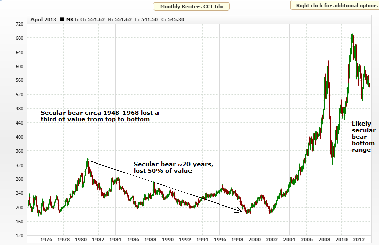
10apr20137Source: MCRI

We could go further back in time to average in more secular commodity bears, but I suggest the evironment was different, pre fiat capital era, pre free globalised markets, and pre inflationary government policies. The 1980-2000 secular commodities bear has a sideways bias, that is also shared by the 1948-1968 secular bear, and we see overall sideways action in secular equities bears too – and these are all because of modern government policies of inflation. In real inflation-adjusted terms, we see more of a downward bias, compared to the nominal.

The 1980-2000 commodities bear proceeded in waves, i.e. cyclical bulls and bears within an overall secular bear, and this too is similar to progress in secular stocks bears. If the secular bull peak for commodities is already in, back in 2011, then the chart above shows that we would already be getting towards around half way between secular bear top and bottom. Given that the secular bear progresses in waves, then a wave up ought to be soon due, perhaps like the 1982-1984 cyclical bull, post 1980 peak. As it happens, multiple commodities are currently at levels of extreme bearish sentiment, including corn, silver, copper, soybean meal and sugar, which would provide the fuel for such a potential rally. That said, overbearish or oversold increases the likelihood of a mean reversion or relief rally, but on occasion these extremes can persist and test patience, until the evironment becomes more supportive. So how does demand and supply look currently in some key commodities?

Natural gas shows a recent tightening of demand and supply, as inventories are dipping beneath the historic average. Nothing extreme though:

10apr20131

Crude oil inventories are plentiful, which is a depressant on price:

10apr20132Source: Bespoke

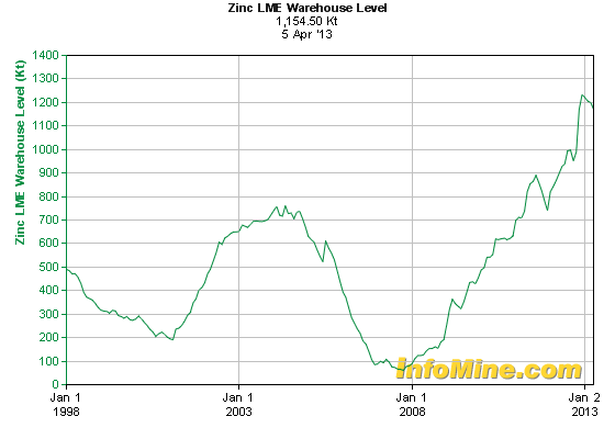
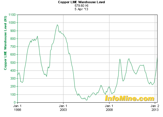
Both zinc and copper show increasing inventories. Both in notably different positions to 2008 when commodities made a big interim peak.

10apr20139

10apr20138

Cereals, i.e. wheat, rice, maize, show a fairly steady position, with inventories largely tracking sideways over the last 5 years:

10apr20133Source: FAO

And lastly to gold. Demand decreased last year on the year before, but remains high, with central bank and investor demand the main areas of growth the last few years:

10apr20135

Source: Moneygame

Whilst supply has been growing since a bottom in 2008, to a now all time high:

10apr20134Source: ZealLLC

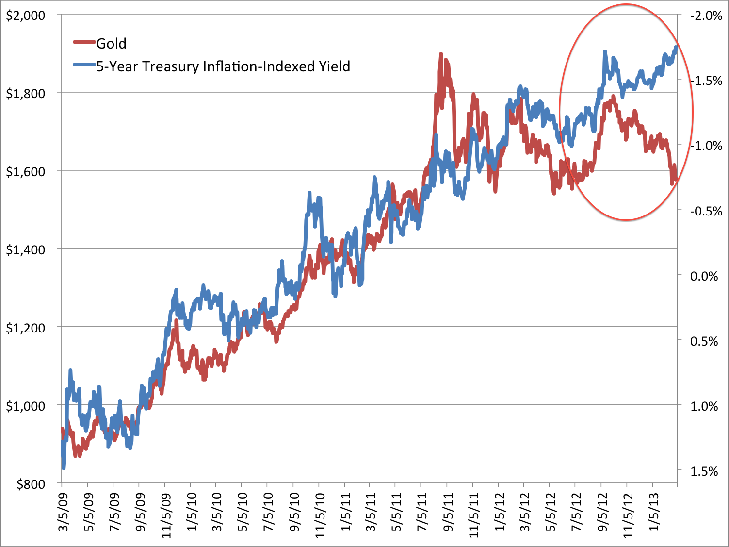
In summary, the overall demand-supply situation in these key commodities is no backdrop to a major rally, at least not as things currently stand. But to return to the opening question of whether a secular commodities peak is behind or ahead of us, the clues may still be in gold. If the period since 2000 is a K-winter then gold should be the leading asset. If demand slack in other commodities reflects recent weak economic growth, then the picture for gold is more complicated, as it is less a commodity and more a hard currency. Gold can thrive in conditions of negative real interest rates and money printing (or currency dilution). That said, it is also an inflation hedge and depressed commodity prices are doing nothing to convey troubling inflation expectations. As gold is sensitive to investor interest, were there to be a shift in stance from central bank away from negligible rates and currency diluting policy action, we might have conditions in place for an enduring secular bear. Indeed, this is what I predict will happen, the question is when? Does gold have a parabolic rise left in it yet, to end its secular bull, or did that occur in 2011 with silver making such a blow-off move?

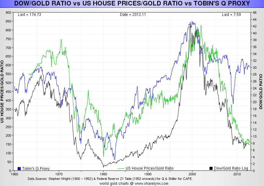
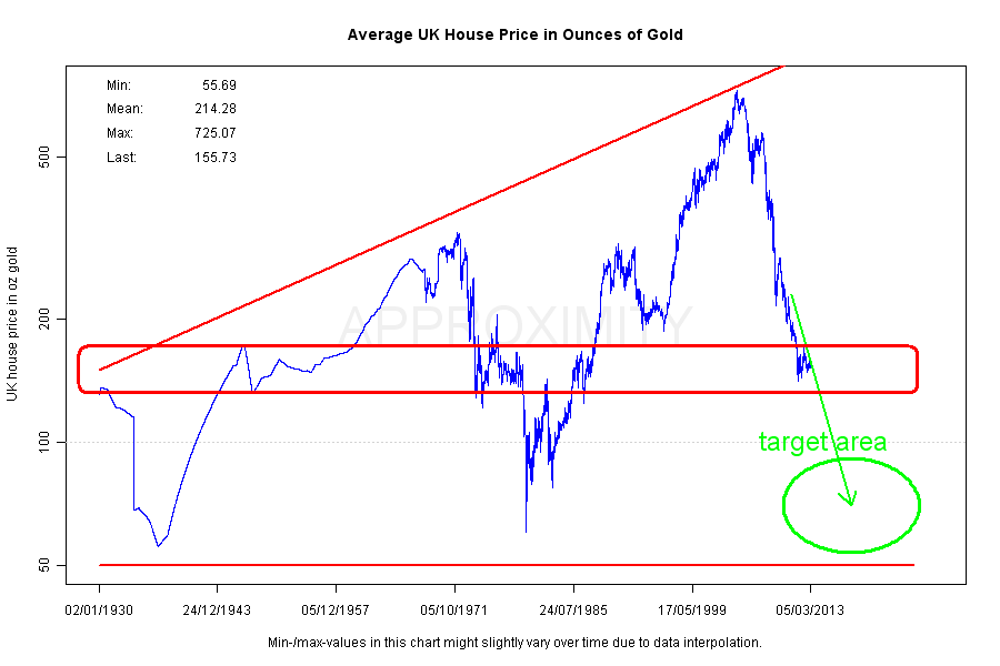
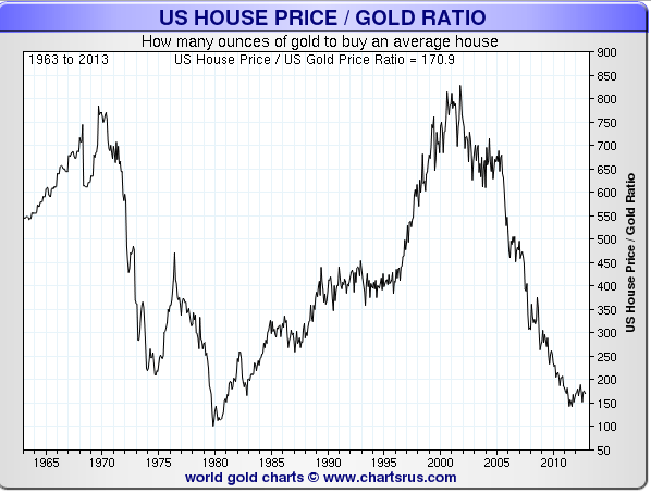
This next chart shows how we are into the region of a secular transition in stocks and real estate versus gold. Gold is relatively expensive versus both and a rounded bottoming in the ratios could be in progress:

10apr20136

Source: Sharelynx

The ratios are low enough to justify a secular reversal, or they could yet break lower to around 1980’s levels to complete the secular extreme relative valuation. The curiosity is the Q ratio, which together with CAPE for US stocks, leads some analysts to expect steep falls in US equities from here, such as to 450 on the SP500 ( Russell Napier) to rectify it. I doubt it because of secular low valuations reached already on other stock indices around the world in this secular bear: such as Japan sub p/b 1, PIIGS p/es between 2 and 7, Germany, UK and Hong Kong all reaching below 10. In the last secular stocks bear, Japan only reached a low of p/e 20, so not all indices necessarily have to wash out, as long as most do.

Add in treasury bonds, due a reversal out of a 3 decade secular bull market and potentially bottoming around now along with money velocity, and consider the rounded bottoming in progress in many real estate markets around the world, and we have a window, and evidence, here for a broad secular transition, out of a K-winter and into a K-spring, switching from a secular commodities bull to a secular stocks bull, to a new secular treasuries bear and a new bull market in real estate.

The US dollar also appears primed for a new bull market, following a decade long bear. Interestingly, although the perception is that commodities generally advance when the US dollar is declining, in fact the last secular commodities bull peak took place against a sideways dollar, and the previous two commodities peaks against a rising dollar. In the secular commodities bull since 2000 we have seen more periods of commodities rising whilst the dollar has been falling, but we have also seen periods of them moving together. In summary, it does not appear that the fortunes of the USD particularly correlate to the fortunes of commodities. So what other clues can we use to assess if commodities made a secular peak in 2011 instead of biding time before a secular peak erupts ahead?

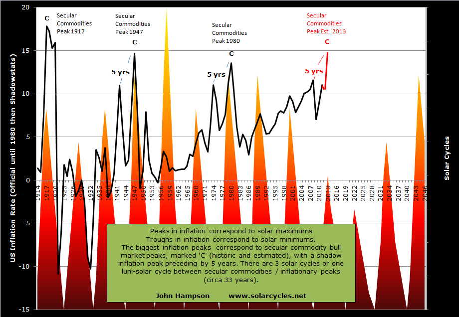
Well, I’ve left out solar cycles until now so time to bring them in. My analysis shows commodities making secular tops close to solar maximums. Danny suggested that food and metal peaks tend to occur at different times. It is true that historically individual commodities have peaked at different times. Here is a brief summary of previous secular commodities bull peaks:

1917 solar peak: copper peaked 5 months before, wheat 4 months before, corn dead on the solar peak, silver not until 27 months after.

1947 solar peak: oats peaked 6 months after, wheat 6 months after, corn 7 months after, copper 15 months after.

1979/80 solar peak: copper peaked dead on, gold peaked 1 month after, oil 4 months after, sugar 9 months after.

There is the possibility that the tighter packing to the solar peak in 1979/80 could be related to the free-est, fast-est, most globalised conditions to enable solar-related speculation to be at its most potent, but if we exclude that then we are left between the historic examples to expect commodities to make individual peaks at various times around the solar peak window. That peak is currently anticipated for Autumn/Fall 2013. Could the peaks in copper, silver, and cotton in 2011 be near enough to be within range for solar validation? Possibly, but a little stretched, and when we consider the likes of oil and wheat made their peaks back in 2008, that becomes then too far away.

What I have previously explained is that secular asset peaks around solar maximums are speculative. The solar activity brings about buying and speculation behaviours in humans through biological changes. Spikes in inflation occur at each solar maximum as shown, within a range of about a year either side:

17sep18

Therefore I suggest it is possible through a feedback looping of commodity speculation and inflation to bring about a secular commodities peak ahead, even with looser inventories. Once demand increases and the perception is of a change in trend in inventories (rather than accute inventories) then the status quo can quickly change. However, there is no doubt that the looser inventories and weaker Chinese / global growth are a headwind. After all, there is nothing magical about the solar influence, it is just one influence in sentiment. I have also argued that the secular asset of the time becomes the target of the solar-influenced speculation, and if the perception is currently that commodities and equities have already switched secular position, then could stocks become the target of the speculative frenzy? I can’t rule it out. However, it remains that oil and other commodities tend to be late cyclicals, making a peak after stocks, so when stocks make their swing or cyclical peak, we could then see a move into commodities. As gold has built out a sideways range near its secular highs, it could then potentially break out, giving the technical break into clear air to inspire a speculative frenzy.

In conclusion, the call as to whether a secular commodities peak is ahead or behind us remains a tough one, very much in the balance. But it comes down to how to trade this, until evidence aligns more decisively one way or the other (gold breaks up or down, CCI breaks up or down, sunspots make a new high, commodities take over as the outperforming class or equities roar away). I am already positioned long a basket of commodities. Because of the uncertainty I do not wish to add here, despite the overbearish extremes. However, if commodities did peak in 2011 then as per the first chart the CCI is reaching towards a price level and time point where it is due a cyclical bull rally soon. I therefore believe that I can likely make a profitable trade out of commodities regardless of their secular position, with a little patience.

In The Balance

Time for an updated look at the big picture: is a secular commodities peak ahead or behind us?

Here is the equally weighted commodities index. It remains in the nose of a large triangle. A decisive break down through the twin supports will add weight to a secular commodities peak having already occurred in 2011, whereas an upwards break beyond down sloping resistance will add weight to a secular bull still in tact.

4apr20131Source: MCRI

By solar/secular history, a secular commodities peak normally occurs around or closely following a solar maximum. However, that too remains in the balance as shown by the alternate predictions in the SIDC chart below – either a solar peak occurred at the turn of 2012 or a solar peak is ahead later this year.

4apr201317Source: SIDC

The most common consensus remains that the solar peak is rather ahead than behind us, with the median forecast for Autumn/Fall 2013. Planetary models predict a spike in sunspot action around Sept/Oct 2013 and some physicists also predict a burst in activity later this year, which would fulfil the NOAA red line prediction below:

4apr201311

However, until such a flurry is seen, it remains unresolved.

Danny challenged the 33 year secular commodities peak and solar peak correlation with this chart:

4apr20132It is an ultra long term modelling of commodity prices, to which I have added the markers to show when the industrial revolution began and when the gold standard was abolished. It can be seen that the correlation in solar peaks and commodities peaks largely failed prior to the industrial revolution. Understand that prior to this time there were only localised markets for commodities, little storage, and almost nothing in the way of demand and supply matching. Farmers tended to grow their usual crop, bring it to market, get the best price they could for it, and anything unsold went to waste. For a natural cycle that influences collective human behaviour to manifest itself, I suggest optimum conditions are instant, globalised, free markets, like we have in the current day and age. In pre-revolution conditions, it would have been impossible to draw out real cycles from slow, localised, restricted and fragmented markets. I don’t see that part of the chart as valid therefore. See also below how the solar/secular oscillation in the Dow-gold ratio became pronounced after the freeing of gold and paper:

4apr20135

Source: Sharelynx

So, returning to the ultra long term commodities price chart above, we see an broken success rate (as shown by the circles) in the fiat era and between the industrial revolution and fiat era two successes and a potential inversion or double failure. However we classify that anomaly, such a failure could potentially reoccur in the future – unless it was the result of a non-free, slow, localised era. But a failure amongst a majority of successes would be in line with all other ‘real’ trading disciplines, i.e. there is no holy grail, nothing that works all the time, just things that work most of the time. To sum up, the solar peak is probably ahead, and the secular commodities peak is probably ahead in line with that.

Turning to climate and agricultural commodities, are we going to see another year of extreme temperatures and natural disasters, which would drive up commodity prices? The next chart reveals that the last two years have not been as severe as a cluster before that. However, they were both La Nina years, which has a cooling effect.

4apr201312

Source: NOAA

This year, a largely neutral year is expected (no dominance of La Nina – or El Nino either) so there is the potential for a bigger bar – unless the long term trend is now reversing.

Global warming is one factor, global wierding (rate of natural disasters) another, and in the US, drought conditions at the start of 2013 are displaying patterns that could unfold into the equivalent of the worst drought years in history. Grains took a big hit in price this last week due to higher than expected plantings and stockpiles, but there remains the potential that climate developments could drive agricultural commodities higher again in the remainder of the year.

Rising commodity prices and inflation together make a mutually reinforcing feedback loop. Escalating commodity prices drive up inflation and escalating inflation attracts money into commodities as an inflation hedge. So how do inflation expectations look, aside any climate developments? The next chart shows expectations have been on the rise since Q3 2012, with a divergence in gold that we might expect will be rectified:

4apr20139Source: M Boesler

If gold is not to make up that ground, then we might expect inflation expectations to fall instead – i.e. a period of deflation would be ahead.

Turning to valuations, gold is historically expensive here versus stocks and real estate, but could yet become more extreme expensive before reversing.

4apr20133

Source: Fred4apr20136

Source: Approximity

4apr20137All 3 charts reveal gold’s meteoric relative rise in price to stocks and real estate since 2000. The question is, does it have a parabolic finale yet to come in which it reaches the obvious zones, or is going to stop short and is already in relative decline?

If gold has already made its secular top (in 2011), then we would expect stocks to be now in a new secular bull. So did stocks wash out sufficiently, in terms of price/earnings and price/book valuations, to make it likely the secular bear is over? So far in the secular bear, the FTSE reached a p/e of 7, the Dax 9, the Hang Seng 8, the SP500 and Dow 9. The Nikkei only reached 13, but it made a p/b ratio of under 1. Broadly speaking, they are all low enough to satisfy secular bear cleansing, and we can add to that the extreme low p/es reached in the PIIGS at the height of the Eurozone crisis. If we look at other valuation measures in relation to the SP500 then we get a different picture:

4apr20138Source: Dshort

These four valuations combined suggest the secular bear has not washed through sufficiently, and that current valuations are closer to a top than a bottom. However, we ought to note the much higher top in 2000 and question whether central bank policies of unprecedented easing and stimulus have dragged all these measures permanently higher.

US indices aside, we have reasonable evidence from around the world that secular cleansing could be largely complete in terms of valuations reached at the bottom of the falls in 2011. Plus this year we have what appears to be a new secular bull break out in the Japanese indices.

What about treasuries? This secular transition should also be accompanied by a secular transition in treasuries from a long term bull market to a new long term bear. Did treauries top – and yields bottom – in 2012? It remains to be seen as it is currently too technically ambiguous to say with confidence.

4apr201313Source: Stockcharts

Using history as our guide, if a secular commodities peak is ahead later this year (and potentially into H1 2014), then we should see a topping process in equities by around mid-year whilst commodities take over as the outperforming class. A feedback looping between inflation and commodities should occur, until too expensive commodity prices and tightening yields help push the economy into recession. That recession should be fairly mild, with stocks making a shallow bear market, whilst commodities plunge harder, in the mirror of their preceding parabolic escalation. The bottom of that shallow stocks bear would be the momentum ‘go’ point for the new secular stocks bull.

Alternatively, if a secular commodities peak already occurred in 2011, then secular bull momentum in stocks should already be underway, and we might point to action in the Nikkei or SP500 in 2013 as supporting evidence. The recession that should follow the secular commodities peak occurred then in 2011-12, with the Eurozone and the UK two notable areas that experienced this. It was not a world recession however, and we did not see typical cyclical stocks bull topping bells ringing preceding it. If we look at an overlay of the CCI commodities index on the MSCI World stock index, we can see that they topped together in April/May 2011:

4apr201314Source: Bloomberg

We did see outperformance in commodities, but not to the degree of 2008, or the last secular commodities bull peak of 1980. But silver did make a suitable parabolic blow-off in price.

To sum up, a case can be made for both competing scenarios: a secular commodities peak ahead or behind us in 2011. It remains in the balance, but not indefinitely. The CCI commodities index will break one way or the other. Gold will catch up to inflation expectations, or inflation expectations will fall. Sunspot evidence will come in more definitely in favour of a solar peak ahead or behind. Climate evidence as 2013 unfolds will drive agricultural commodities to escalating or plummeting prices. Equities will maintain secular bull momentum and outperformance of equities, or they will begin to make a topping process whilst commodities outperform.

What about a third scenario: both equities and commodities drop here into a bear market, with treasuries the beneficiary? For that to occur, we should still need to see a topping process in stocks whilst leading indicators and internals deteriorate. Currently, we do not see major warning flags in either, with leading indicators and breadth supportive. However, we have lately seen changes in trend in economic surprises, both in the US and Europe:

4apr201315

4apr201316This coincides with the change in geomagnetism trend, and perhaps provides fuel for a pullback. I do not believe, however, that we have evidence for more than a swing pullback at this point, but it could become part of a more significant topping process that lasts several months.

If we pull back and look at the wider environment for assets, we largely/generally have ultra low rates, central bank support, money supply growth, cash and bonds paying negligible or negative real returns, stock yields exceeding bond yields, low/spotty economic growth and not excessive inflation, and historically below average valuations for stocks and real estate. This is a fairly positive environment in which equities and housing can attract money flows, and that is what we are seeing. It would take another sharp slowdown in the world or another debt-related crisis coming to the fore somewhere, for this to change. The question is whether we have seen a sufficient cycle of cleansing since 2000 and sufficient foot-on-the-accelerator central bank action to now sustain growth. If growth can stick and even accelerate, then we have better chances of reaching growthlationary froth and the commodities/inflation feedback loop, as all the inflationary stimulus and easing could quickly become problematic, with faster money flows out of bonds.

Finally, a few more potential clues as to the likely winner in the scenarios. Crude oil inventories are approaching a record, which has the potential to pull the rug from under crude prices if growth stumbles. Inflation should make a bigger peak 5 years after 2008, which would be this year, based on secular/solar history. Emerging markets manufacturing surveys (a leading indicator) picked up to 52.6 in March (over 50 is growth), of which China is the biggest commodity consumer. Commodities generally move opposite to the US dollar, as they are priced in US dollars, and the US dollar could be ripe for a sustained decline as speculator positions hit a record and this has previously led a swing top.

In conclusion, there remains no clear winner, with good evidence supporting a secular commodities peak ahead, or that it occurred already in 2011 and a new secular stocks bull is in progress. I maintain that the balance of probability lies with the secular commodities peak being ahead in H2 2013 – H1 2014, which should mean a cyclical stocks bull top occurring by mid-year 2013. However, if that is the case, then it should only give rise to a shallow stocks bear before new secular bull momentum. I am positioned for a secular commodities bull finale ahead, with significant exposure to precious metals, energy and agricultural commodities. I have only a position in Russia by way of equities exposure. So there is my concern: if the alternative scenario is the correct one, then my current portfolio will perform badly. However, if commodities did top in 2011, there should be an ‘echo’ bounce around 3-4 years later in line with history (as the commodities supply-demand story is not resolved overnight), which would be a belated opportunity to make some profits on those positions, with correct timing. In the meantime, evidence would increase in favour of a new secular stocks bull being underway and I would add trades there.

I will continue to weigh this up as developments come to light. Your views and any additional evidence very welcome. I have personally found that we have reached a period of time in the markets, and perhaps in my progress, where I don’t really feel there are any ‘experts’ out there I can rely on. I believe this is the difficulty of trying to navigate a secular transition, which in effect takes several years.

Russian Stock Index

Russian stocks are currently very cheap. Firstly, they are the cheapest by p/e around the world in the table below (cheaper than when I last drew attention to them here), whilst paying a 4.5% yield:

2apr20133Source: FT

Secondly, they are also ultra cheap by cyclically adjusted p/e valuation:

2apr20137Plus thirdly, they are on a price-to-book ratio of just 0.68 (data as at 1st March). Anything less than 1 means that a liquidation of the entire index would return more in net assets than the current valuation. Something to bear in mind when considering how much lower they could yet fall.

2apr201311Source: Fool.com

Generally speaking historically, stock indices have been a buy when p/es have reached sub 10 and p/bs sub 1.5, i.e. they have returned consistently well when purchasing at these levels. So what’s up with Russian stocks that sees them languishing at extreme cheap valuations? Why haven’t buyers stepped in?

There are some ongoing broad issues with investing in Russia, such as a lack of political transparency, a corruption problem, and demographic issues. These collectively give Russia a risk premium, that can lead to cheaper ‘normal’ valuations. We can see this in the next chart, showing p/e trends over recent years for certain emerging markets – Russia has largely traded at cheaper levels to the others. It broke sub p/e 5 at the bottom of both of the last two cyclical bears, but the current valuation has not been beaten aside of these.

2apr20138

Compared to the other three members of the BRIC emerging group (of which China also has political and demographic challenges), the economic position in Russia stands up fairly well, with low debt to GDP and unemployment, yet it trades at a 50% discount or more:

2apr201310Source: Fool.com

Russia experienced a recession around the financial crisis of 2008 but has since maintained positive growth. That growth however is at a lower level to pre-2008, as shown:

2apr201316Source: Syz

One reason for this lower growth has been energy prices. Energy contributes up to 25% of GDP and 65% of exports. It is the largest producer and exporter of oil in the world, and has the largest reserves and is the largest exporter of natural gas. Up to and into 2008, energy was ‘hot’ and Russia benefited accordingly. Whereas since 2008, natural gas prices have tumbled, and in the last two years oil prices have largely tracked sideways.

In the next chart it can be seen that the Russian stock index has a close correlation with the oil price, up to a 0.9 correlation.

2apr201312Three companies dominate the RTS and MICEX stock indices: Gazprom, Lukoil and Sberbank, of which the first two relate to energy. Therefore, both by economic weighting and stock index weighting, Russia is an energy play, and a key question is, therefore, where are energy prices headed? To partially answer that, let me also show the association in oil demand and oil price to GDP in both USA and China:

2apr201313

2apr201314

Global economic growth is a key driver of energy prices, and therefore expectations in growth become important to the performance of the Russian stock indices. In fact, Russia is regarded as a high beta bet on global growth. As growth spurts have been weak and short-lived over the last 3 years, Russian stocks have been sensitive to that growth ‘not sticking’.

Since mid-2012, however, we have seen a fairly sustained pick up in growth and this picture still persists in leading indicators today. Has the secular cycle rinsing process combined with sustained central bank supportive actions finally produced a new cycle in growth? It is normal for there to be a growthflationary finale to the current cyclical stocks bull and secular/solar cycling, bringing about a tightening in yields and potentially rates, so I see this as very much possible at this stage.

The action in crude oil over the last two weeks also suggests belief in some sustained global growth here, as it has accelerated on good momentum to a point of potential breakout. It outperformed stocks in this period and in the chart below we can see that the Russian Micex index got left behind:

2apr201315

Source: Bloomberg

This is evidence that they do not move lock-step, and another glance at the RTS and Crude Oil longer term price correlation chart reveals that there are occasional periods where one can outperform the other. After all, both the Russian economy and the Russian stock index are not just about energy. So with that in mind, let’s take a look at leading indicators for the Russian economy as they stand currently:

2apr201317

Source: OECD2apr201318

A pick up in the Russian economy, seen here, is in line with the general global picture, and confirms that Russia is not an outlier to be avoided.

Additionally, natural gas prices have been making a potential bottom, with a reclaim of $4 last week adding to that positive technical picture.

2apr201320

Source: Trading Charts

A technical advance in gas and oil prices, together with maintained positive leading indicators of growth, ought to drag up the Russian stock index. This is also a seasonally positive time for both oil and gas, with prices typically historically on the rise over the next couple of months.

Let me draw all this together. Russian stocks are very cheap by all three valuation measures, both compared to other countries and by their own history. The Russian stock index is generally a play on energy prices and a high beta play on global growth. Global growth and energy prices correlate fairly well, so we could simplify it and say that if global growth can be sustained here, then Russian stocks are an attractive proposition at this point. Alternatively, if energy prices can rally here (which they tend to do as late cyclicals taking over from stocks), then Russian stocks may equally be an attractive proposition.

If we are unsure about the prospects for global growth or momentum in energy prices, then there may still be a mean reversion opportunity here: Russian stocks could play catch up with the oil price rises of the last two weeks, and/or pull a little away from extreme cheap valuation as investors look for value. As an additional consideration, what would happen to Russian stocks under the competing scenarios of a secular commodities finale ahead versus a secular commodities bull over and a new secular stocks bull underway? I suggest that under the former they would be a late outperforming index due to the energy correlation, and under the latter they would suffer from any sharp falls in energy prices but ultimately their cheapness and momentum in global stocks would drag them higher (a rising tide lifts all boats) eventually. Under both scenarios such developments could take time, as patience is often needed for value plays.

Finally, this is a higher risk opportunity – Russia is not the most investment-friendly country, and is more at risk from an ‘event’. That said, it is the 9th largest economy in the world and as such a key player in the global scene.

OK, I have opened a long trade in Russian stocks today. The timing of this is also not far from the start of the lunar positive period, which provides an additional potential support for the trade. I am open on the timescale involved in this trade, as it could be a swift gainer or a longer term play of patience.

As Things Stand

The latest CB leading indicator summary looks unequivocally strong:

28mar20131Source: Conference Board

US economic surprises are also positive and in an uptrend:

28mar20132Source: Ed Yardeni

However Eurozone economic surprises are conversely in a downtrend, and the relationship shown below suggests this disparity is the dominant factor in the declining Euro v USD FX.

28mar20133Source: Beleggenopdegolven

If we look at Eur-USD together with other specific pro-risk proxies, namely the MSCI World Stock Index, the CCI Commodities index and 30 Year Treasury Yields, this is the picture:

28mar20134Source: Bloomberg

The collective trend was up from November to the end of January. Since then it would appear that we have been in consolidation/correction mode – and this is a fit with the 5-models-in-alignment (see my Tools For 2013 post).

Currently, cheap and unloved assets are Euro, coffee, sugar and gold miners, whilst those reaching into overbought and overbullish zones include the US Dollar, Dow Transports and SP500. If we look at the bullish percent over call/put ratio for the SP500 we can see that we have been recently oscillating in the frothy zone which led to a swing top twice in 2012. However, 2010 and 2011 show things could potentially get frothier, with spikes up to 150.

28mar20136

The CCI Commodities Index and crude oil are both into the noses of large triangles, suggesting an imminent break out one way or the other. Here is crude:

28mar20135Crude has accelerated this last week with good momentum, but now encounters resistance. It does not have fundamental support from stockpiles, as they continue to be above seasonal average, but I suggest it is the global growth story that is the main reason for the advance.

Meanwhile, coffee, sugar and some other agricultural commodities are at secular bull rising support, which also puts them at a key decision point – either a break down or the start of a new upleg. I still believe the greatest likelihood is of commodities taking off and becoming the outperforming class going forward (based on sunspots, secular history, late cyclicals), and I am positioned accordingly. However, I continue to wait for specific supporting evidence to confirm this, namely a new high in sunspots, a technical break out in the CCI, and for any pullback in stocks to be counter-accompanied by an advance in commodities.

This Saturday is the start of the lunar positive period. Is there a ‘highest probability’ stock index trade on offer? Well, there is now a clear change in the geomagnetism trend, as shown here:

28mar20137

A lower low and a lower high means the geomagnetic trend can no longer be classed as up. In addition, there is some frothiness in stocks as identified above. Therefore, as per the make up of my highest probability trading analysis, I am not going to take this one.

I am now back in England.

The Lunar Edge

In my last post I suggested that using lunar phase oscillation would increase the probability of a trade. There are several papers that demonstrate this lunar edge in the markets, and underlying this is a body of research relating lunar phases to moods. The period into and around full moons can bring about pessimism in humans, and this endures despite the advent of artificial lighting. The period into and around new moons is conversely often one of optimism.

To verify the relationship in the markets for myself, I split the lunar month into the two opposing periods and studied data from the last 20 years (which covers multiple cyclical bulls and bears within secular bulls and bears) to assess any difference in returns between buying at the start of the positive lunar period and closing at the end of it, to buying at the start of the negative lunar period and closing at the end of it. Here is the summary of results for four indices:

24mar20131

All three stock indices plus the commodities index displayed a lunar edge when totalling returns over 20 years, which means there was relatively more buying-up of pro-risk assets into and around new moons, compared to full moons. The commodities index displayed the weakest edge over the period, so I suggest lunar oscillation is best pursued through the stock indices, and of those, Singapore and Germany revealed the greatest differential. This is in line with the findings of Dichev and Janes, who also identified greater lunar differential in the Dax and Straits compared to some other indices.

I don’t think it’s overstating it to say that the lunar edge in both the Dax and the Straits is pretty massive and compelling. Understand that a lunar month differs from a calendar month so that new and full moons move through the months over the years. That means we are not confusing calendar phenomena here, such as end of month or quarter window dressing. In the case of the Dax, almost all the 20-year return came from within the positive lunar periods. Nonetheless, it would still have been better to buy and hold for 20 years than only participate during the positive lunar periods, as there was an extra 17% on offer in the negative lunar periods. However, in the case of the Singapore stock index, not only would ‘long’ participation restricted to the positive lunar periods have returned more than buy-and-hold, but additionally shorting the lunar negative period would have added even more to overall returns.

To return to my opening comments from the last post, nothing works all the time, but some things work most of the time. Lunar phase oscillation is such a phenomenon. It takes persistence through successes and failures to draw out the lunar edge, but the edge is real and profitable. The next table breaks down the Dax returns by year, revealing how the 132% differential built up. As can be seen, not all years demonstrated a positive lunar edge, and the gaps in returns varied year to year.

24mar20132

Drilling down one level further, if I show a sample year from Singapore’s history with an impressive differential, it can be seen that not all lunar months within the year demonstrated a positive lunar edge, but most did.

24mar20134

So some years fail, and some months fail, but most years and months successfully return a lunar edge. This fits with my expectations, because lunar phasing influences market sentiment but other phenomena are also influential in stock market performance. So we shouldn’t expect ‘without fail’ but ‘more often than not’.

I suggest there are two trades to consider. The first trade would be a pair on the Singapore Straits: long the positive lunar fortnight, then short the negative lunar fortnight (this aims to capture the negative return made over 20 years into and around full moons). The second trade would be just long the positive lunar fortnight on the Dax, staying out of the market during the negative period (this aims to capture the biggest nominal return of all the indices over 20 years, made on the positive lunar fortnights by the Dax). A ‘failure’ month or year then depends on which of these trades we are studying – i.e. the failure is in a negative differential between the two periods or the failure is in a negative nominal return in the positive lunar periods.

Let’s take the Dax trade first: long only during the positive lunar periods. 68% of years made a positive return. 62% of lunar months made a positive return. The total return over 20 years was 149%. The worst run was 4 years of negative returns: from 2001 to 2004. The worst run within any year was 5 consecutive lunar months of negative returns. What these ‘worst run’ stats reveal is that anyone mechanically trading this idea would have had to endure some significant drawdowns that we would ideally like to avoid. So are there any patterns in the failures? Yes, the failures are largely concentrated in the cyclical bear markets (as we might expect). If we were to only trade the Dax positive lunar periods during the cyclical bull markets of the last 20 years, avoiding the cyclical bears, the returns would rise from 149% to 240%. Whilst this is an impressive increase, it involves correctly calling cyclical tops and bottoms and patiently sitting aside the cyclical bears – both easier said than done. Nonetheless, this is supporting evidence for my suggested highest probability trading technique: trading long stock indices during the positive lunar periods during cyclical stocks bull markets.

Let’s turn to the Singapore ‘twin’ trade: long the positive lunar periods and short the negative lunar periods. 74% of years produced a positive differential. 60% of lunar months returned a net positive percentage, going long into and around the new moon and then short the full. The total return over 20 years was 169%. The worst runs were 2 years of negative consecutive returns, and 7 consecutive lunar months. Again, were there any patterns in the failures? Nothing significant that I could draw out. No seasonal patterns, no concentration of note during either cyclical bulls or bears (the Straits suffered an additional bear 1996-1998). Just sometimes the lunar edge differential didn’t work, but most of the time it did. If we were to change this trade to going long only during the positive lunar periods and only during cyclical bull markets – staying the rest of the time out – then the returns would be around 170%, so no notable improvement on a mechanical ‘twin’ trade regardless of bull or bear.

24mar20134

What about shorting the negative lunar periods during cyclical bears, and staying out otherwise? Again, this would involve being able to correctly call the start and end of the bears, but even with that assumption, I found that the returns are less than if we stayed short for the duration of the cyclical bears, rather than staying out during the positive lunar periods.

So returning to my ideas for highest probability trading, what if we look at returns during cyclical stocks bulls but additionally filter on those periods when the geomagnetic trend was up and when stocks were not overfrothy (suffering overbought and overbullish readings). This gets a bit more difficult to draw out retrospectively, but I can do this for the last 4 years. The result is we would have participated in 21 positive lunar periods (effectively just a quarter of the time active in the market, the rest of the time sitting out). 19 of those would have produced a positive return (i.e 90%), producing a 47.1% gain in the 19 winning periods and a 1.5% loss in the two failed periods. Clearly, this is a high winning rate and although patience would be required to sit out of the market three quarters of the time, the technique would be to apply large exposure when these trades arose. The difficulties in applying forward are correctly assessing whether we are in a cyclical bull or bear and identifying changes in the geomagnetism trend and assessing when overbought and overbullish apply. I believe that is all possible, but it is to some degree an art.

To be clear, I am not suggesting sitting out of the markets for entire cyclical bears, making no money. The idealised trade in my terms, the trade of highest probability, may only be available during cyclical bulls under specific circumstances and parameters detailed above and in the last post, however this does not preclude making trades of lower – but still good – probability, and going forward I will continue to look for opportunities at all times. However, this research has confirmed to me that there are specific trades out there that are worth pursuing with significant funding, and I intend to announce them when they arise and record their progress and success on my site.

Specifically, I am looking to capture and draw together lunar oscillation, geomagnetic trends, cyclical bear or bull trends, sentiment and buying/selling extremes, and I aim to take such trades on the German Dax and Singapore Straits for their sensitivity to lunar oscillation, and also on the SP500 for its sensitivity to geomagnetism. There are several permutations of trades within this: a repetitive twin trade on the Straits (alternating being long positive lunar fortnights and short negative lunar fortnights), a long trade on the Dax only during positive lunar periods within a cyclical bull, and a long trade on the SP500 for the duration of a geomagnetic uptrend. So watch this space.

Highest Probability Trading

There are no dead certs in the markets, only probabilities. No discipline or indicator works all the time, but some things work most of the time. Draw those together, and I believe we get somewhere towards highest probability trading. I am sure different successful traders would have varying views on what would make up trades of highest probability, but this is how I see it:

Equities are the best performing asset class over time by far, see here:

22mar2013

So, broadly speaking, long equities is the trade. This is backed up by stats showing that stocks are in a bull market 80% of the time. Bull cycles in stocks have an average duration of 5.4 years and an average gain of 74%. Bear cycles average a duration of 1.5 years with an average loss of -12.7%. If we also include the fact that secular stocks bulls go upwards whilst secular stocks bears go sideways – rather than down – then a naturally bearish bias is an impediment in playing the markets.

I also suggest the trade is to be long a stock index rather than an individual stock. Roughly speaking, 50% of a stock’s movement is attributable to the overall stock index, 30% to its sector, and just 20% its own. Individual stocks can go bust, or plummet on surprise bad news.

I believe that the shorter the trading timescale, the more randomness and noise there is. Many people (and machines) buy and sell specific assets at many different times for many different reasons. The longer the trading timescale, the clearer the trends. However, trades left on for years will be profit-diluted by counter cycles within an overall trend. So, if we can identify when cyclical stocks bulls begin and end, we could go long the stock index for the duration, or we might look just to capture the significant upwards swings within that.

How can we identify the beginnings and ends of cyclical stocks bulls? Well, there are no hard and fast rules and it is not easy, but history, as always, is our guide. Cyclical stocks bulls normally end with yields rising, inflation rising, and tightening that chokes off growth. They end with a topping process, a price range lasting several months, with divergences in breadth and leading indicators. They end with overly-bullish sentiment and valuations. In contrast, cyclical stocks bulls begin with overly-bearish sentiment, a capitulation in breadth, positive divergence in leading indicators, and often a V-bounce price bottom. We can also draw on solar-secular history to gauge likely timings of starts and ends.

Within cyclical stocks bull markets, there are ‘swings’ which I suggest are largely sentiment-driven by levels of geomagnetism. The SP500 v. geomagnetism for the cyclical bull of last 4 years is shown below:

13mar20131

So, we might refine the highest probability trade and suggest the trade is long the stock index during cyclical stocks bulls whilst the cumulative geomagnetic trend is upward. We can identify a likely change in geomagnetic trend using the 3 week geomagnetism forecast and the typical seasonality of geomagnetism, both of which I model.

Within that, there is lunar phase oscillation. The period into and around full moons is largely one of poorer returns than the period into and around new moons. So, we might go long the stock index at the start of each positive lunar period and close at the end of the positive lunar period, during cyclical stocks bulls whilst the cumulative geomagnetic trend is upward. These trades would last around 2 weeks each.

So which stock index might we use? Dichev and Janes showed that all the major stock indices around the world show better returns around new moons than full moons, but two of those showing the biggest differentials were the German Dax and the Singapore Straits Times. Whether this is something cultural that produces greater sensitivity to lunar phasing, or whether this is because more traders use moon-phasing in these countries, would perhaps be another paper in itself. But the German Dax and Singapore Straits might offer the best returns if we are to trade the positive lunar fortnights only.

22mar20134

22mar20132

Source: Dichev/Janes

What about geomagnetism sensitivity? Krivelyova and Robotti revealed that most major country stock indices perform worse following geomagnetic disturbances. However, Germany and South Africa were the exceptions. My cumulative geomagnetism chart above calls into question their assessment of Dax non-sensitivity (I suggest this is because of method – they only looked at performance up to 6 days following a geomagnetic storm rather than using a cumulative trend in geomagnetism). Nonetheless, by their research, the stock indices with the biggest differentials for geomagnetism were the US indices.

I suggest, then, that we might trade the German Dax, the Singapore Straits Times and the US SP500, and this has the benefit of diversification, with stakes in America, Europe and Asia.

Lastly, rather than mechanically trading this idea, I would like to look at each such opportunity and assess whether the stock indices are overbought or overbullish, and how they stand technically (at support or resistance or in bullish or bearish patterns). I would be keener to take the trade if stock indices are not overly frothy, not bumping up against key resistance or carving out potentially bearish formations.

So let me sum up. My suggestion for trading of the highest probability is to go long (i.e. buy) the German Dax, the Singapore Straits and the US SP500 (for diversification and natural sensitivity) at the start of each positive lunar period and close (sell) both at the end of the positive lunar period (roughly a fortnight), during geomagnetic uptrends within cyclical stocks bull markets, repeating these trades each lunar month where the stock indices are not overly bullish or overbought or suffering bearish technicals.

What’s your take on this, and what would you consider trades of highest probability?

In the next post I will delve deeper into this idea, and offer supporting statistical evidence.

Commodities, Inflation, Sunspots And Geomagnetism

Forecasts for the smoothed solar peak still diverge as we await more a decisive sunspots trend, but the most common forecast remains for Fall/Autumn 2013 (NASA, SIBET, SIDC CM). If that proves accurate, then by history we should expect a peak in inflation and commodities within months of the solar peak. Here is the inflation guide:

17sep18

I covered commodities in detail here, showing that we might expect commodities as a class (i.e. we should not need to be picky about which commodities – there should be broad participation) to rise into and around the solar peak, with a bias towards peaking after the solar peak, which could therefore be Q4 2013 or Q1 2014 even.

If commodities do fulfill the prediction, then inflation will fall into place, as those inflation peaks marked ‘C’ above were very much resultant from escalating commodities prices. The inflation ought to be ‘growthflation’, rather than a supply-side squeeze only, as this next chart shows:

growthflation peaks

We should see growth and inflation together, but with the emphasis on inflation, until commodity prices rise too far and help tip the world into recession.

If we draw together stock market history and exclude solar theory, using Russell Napier’s work, then the current cyclical stocks bull should end with rising treasury yields (6% the historic tipping point marker) and rising inflation (to 4% as a historical marker, using the official inflation rate). In other words, it is the same target: growthflation until excessive inflation and tightening. This is an important lesson, because many have prematurely called the end to this cyclical stocks bull when conditions have appeared to be worsening. We should be looking the other way: we need conditions to become growthflationary before the cyclical stocks bull can end, and since 2009 we have only seen short cycles of growth and/or inflation giving way to short cycles of weakness and deflation. The current strength in leading indicators and coincident data looks promising to stick long enough to get the required frothiness into markets and the economy.

As the Fed has explicitly manipulated the treasury market, I suggest we ignore the 6% marker this time, but just look for evidence of persistent upward trending yields to demonstrate that money is exiting that class and pouring into commodities. We have seen yields rise 25% since 2012’s low (and I believe that move is the process beginning), but they could still potentially be in a downtrend, so I want to see them break out of the downward channel and above the 200MA.

19mar20131

Source: Stockcharts

The historic 4% official inflation marker may also need to be dropped in favour of a ‘persistent upward trending in inflation’. This is because official inflation statistics have been doctored over the years so we no longer are comparing like for like. To this end we should see the main commodities in sharply rising trends, then inflation will fall into place. Here is the equally weighted commodities index, the CCI:

19mar20132

What do you see? A secular commodities bull market that ended with a second peak in 2011? Or a secular bull market still in tact that has been consolidating since 2011? Well, we don’t have to wait long to find out the answer because of the triangle shown. Either commodities will break upwards and out, which should then inspire momentum buying, or commodities will break downwards and out, confirming a bear market in place since 2011. Based on solar-secular history, and based on the solar peak likely being ahead, I predict the former: for commodities to break out and become the outperforming class.

An acceleration in commodities should coincide with a loss of momentum in equities. It is normal for a peak in commodities to follow a peak in stocks (sequence per Hurst). Equities should begin a topping process which is an overall sideways range consisting of a swing top, a retreat, and then a marginal new high but on negative divergences (breadth, leading indicators). Whilst this process is taking place, commodities should be rising. See here:

19mar20133

I have highlighted the last two cyclical stock bulls topping processes and the associated lagged peaks in commodities. This should make it clearer why I exited my stock indices longs, because although I predict a marginally higher high ahead for equities, and we do not as yet see divergences in breadth or leading indicators, I suggest we are at the start of this pattern, and the upside remaining for equities is fairly limited.

My forecasts for inflation, commodities and equities are all based on historic norms as I see it. That does not preclude an anomaly occurring. Therefore I continue to assess whether evidence supports my case. The current trends in coincident data, leading indicators and treasury yields are all supportive. However, the missing elements remain a decisive upward break in sunspots, momentum shifting to commodities, and ideally a run against the US dollar. Chris Puplava expects this latter development – that the fear and negativity that has been directed at Europe will shift to the US for a period. Here we see the US dollar index versus gold and the potential for that to occur: the USD retreats now from resistance whilst gold pushes upwards and out of its triangle.

19mar20134Source: Stockcharts

The opposite scenario is also possible: that the USD breaks upwards and out and gold breaks down. So one relationship to watch. Personally, I am not sure whether a run against the USD will take place. However, as long as the USD range trades and does not find grounds for a bull run upwards, that should be sufficient as a backdrop for a commodities finale (as occurred for the 1980 commodities peak).

Lastly, there was a significant geomagnetic storm at the weekend. Geomagnetism has been unseasonally tame in the last few weeks so such a storm is in fact normal. The result is a shift in the geomagnetic model (all models have been updated this morning) and it is now displaying a potential top:

19mar20135

Based on this, equities may make a swing top here, or at best lose momentum looking out into April. Should this occur, then commodities should begin to outperform.

In summary, I see developments ahead likely mapped out by historic patterns. However, there are various indicators to watch to confirm or invalidate this, namely:

1. Sunspots should break upwards to add weight to a solar peak being ahead rather than behind

2. Commodities should break out – the CCI and gold from their triangles

3. Commodities should start to outperform equities, as equities make a range top

4. Inflation and treasury yields should make upward trends

5. The USD should either range trade or break down

Let’s see!

All Stock Indices Longs Closed

I have taken profits today on all remaining stock indices longs, namely Nasdaq, Austria 20, Dax, UK FTSE 100, Hang Seng, Singapore, China and Russia.

14mar20131Underlying source: Bloomberg

The Dax and SP500 reached close enough today to their respective 2007 tops (which is also De Mark’s call for a swing top) for me to decide to take profits. UBS share my view of how things may unfold with a swing top, a pullback and a marginal higher high (on divergence):

14mar20132Source: UBS

Global narrow money suggests a Spring top for global growth, PFS predict a topping out of US economic surprises and through cyclicals a market top around March, and the five models in alignment may not have fulfilled their swing low yet – it could come deeper in late March, before the push up again into mid-year. The pressure swing from new to full moon switches this weekend into to the negative. And so, I have opted to cash in and step aside, leaving long commodities and short treasuries positions, with the large weighting in the former. My expectation remains that stocks should make a range topping process from here into mid-year whilst commodities take over as the outperforming class, as money exits treasuries. The stock indices longs have paid handsomely – now can commodities go on to deliver similarly in a final secular push?

Stocks, Commodities And Geomagnetism

Four years of the cyclical stocks bull (in certain indices) gives me four years of the lunar geomagnetic model. If I remove the lunar phase oscillation (up and down alternate pressure between new and full moons) I can show you the chart showing purely geomagnetism. To be clear this is daily geomagnetism made into a cumulative trend line, with a 6 day lag as per Robotti/Krivelyova research, and nothing else added.

First is the model versus the SP500. The waves in the two lines align well, with the exception of the period mid-year last year, which appears to be inverted, similar to the inversions phenomenon we see elsewhere, such as in lunar phasing. The tail on the geomagnetic line is the NOAA forecast covering up to 3 weeks into the future. Click to view in more detail:

13mar20131

The second chart show the Dax versus geomagnetism, and whilst the Dax and SP500 have on occasions peformed differently, there is the same overall close alignment of the waves, with the same inversion exception last year.

13mar20132

The third chart shows the Reuters Jefferies commodities index, which again has gone its own way at times compared to the stock indices, but nevertheless the waves align well again, and the single exception period is the same.

13mar20133

Levels of geomagnetic disturbance in the atmosphere has been shown to impact human mood. If changes in mood subtly affect the collective behaviour of market participants then we might expect to see some correlation between risk assets and geomagnetism. I believe the above charts are good evidence that this is the case. Yet, I know of no-one else who runs a geomagnetism model and I can count on one hand the number of analysts/sites out there that track geomagnetism to use in their trading toolkit. Maybe this is more widely followed than I imagine, but it is not promoted as it would not sell to clients – I don’t know.

If the model fails badly going forward, then I will not be defending it. But looking back at the chart from the Peak v Peak page, showing geomagnetism versus the SP500 around the last secular peak, there appears to be more historical evidence that it is influential. I again have removed the lunar oscillation and show you the alignment of the waves. Once again there is a single period where the model inverts with the market, and in this case lasted around a year.

13mar20134

So how might we use this as traders and investors? I don’t see a way to parcel this up into a repetitive trade. I suggested in my Trading The Sun pdf that trades would present themselves when the market moved away from the model. But there are times when they don’t come back together for some time. I therefore suggest that it is better to follow the general path of geomagnetism, and use it as a guide. Occasionally there may be a period of inversion – for reasons unknown – but largely it should be a useful guide. To this end we can use the 3 week forecast to look ahead, and the seasonal model of geomagnetism that shows us how historically geomagnetism tends to flare at certain times of the year more than others (whilst understanding that occasionally we may see unseasonal behaviour). I therefore rate geomagnetism as an important tool to use along side other market disciplines.

To the markets. I am staying put at the moment, still expecting commodities to start to outperform stocks, and weighted accordingly. CB leading indicators for Japan and Spain came in strong. OECD leading indicators for OECD countries came in strong bar China and India. Leading indicators as a whole do not show degredation, which I would expect for a cyclical bull top. Breadth remains supportive in equities. The SP500 is within a few points of the 2007 high and I expect a touch. This is roughly where Tom De Mark expects a swing top. If we can push up to there this week I may take off some equities profits. I have hope at this point that we are headed for yields rising, inflation rising and commodities making a belated push to help tip the world into a mild recession into 2014. These are all features of how previous cyclical bulls have ended, and until now (since 2009) we have not had enough sustained growth to get us to that point. If global growth can persist a little longer, then more money should pour out of treasuries and into pro-risk. We need froth and excess and growthflation to end the cyclical bull if we are to align with history. Before reaching the cyclical bull top, a pullback in equities would be normal, followed by a higher high with divergences. Should such a pullback occur, we should see commodities becoming the target of the money flow and advancing despite equities. This is all as per history – anomalies can occur – but that is my primary scenario.