The evidence has led me to a ‘dumb’ model of the markets, whereby humans are more subjects and less intelligent creatures of free will. It’s up to you to decide whether I have simply found what suits me and filtered out the rest, i.e. dumb seeks dumb. If we remove all the noise by looking long term, I suggest sunspots and geomagnetism are two big (but very subtle) drivers of human behaviour towards risk assets, with demographics (which are influenced by solar cycles) simply providing bulges in demand to produce long term bull markets in stocks and housing.
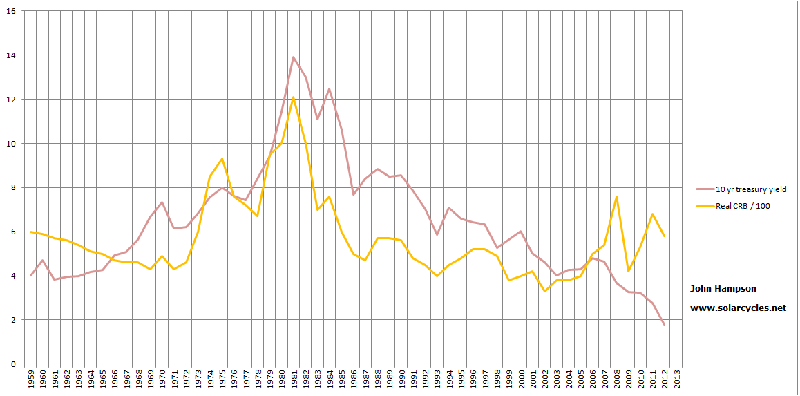
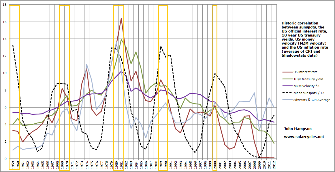
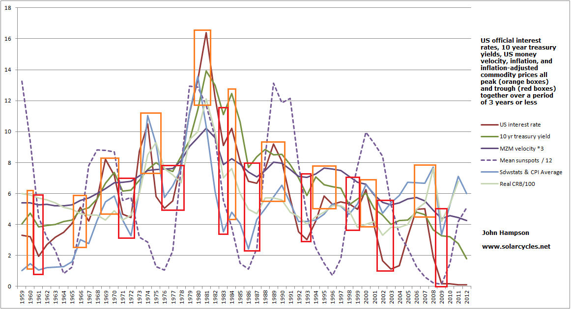
I suggest the solar phenomena are influencing human behaviour in the economy and financial markets alike, and that is why we find treasury yields, interest rates, money velocity, inflation and commodities largely correlated together. Optimism, excitement and positive sentiment driving all up, or pessimism, fear and negative sentiment driving all down. Just waves of sentiment supplied by nature. Plus, when increasing numbers join the investor age bracket of the population versus old and young over a period then enduring bull markets in stocks and housing can occur simply due to the growing demand the demographic trend provides. No complex interaction of fundamentals, just more people investing for retirement.
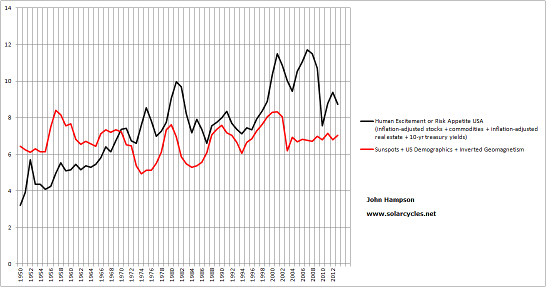
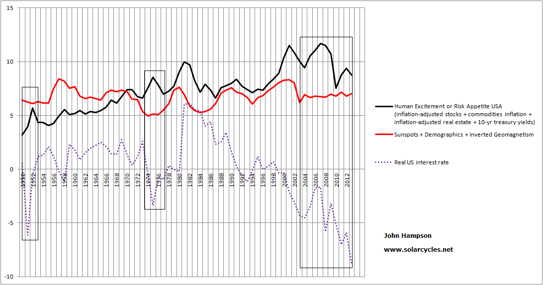
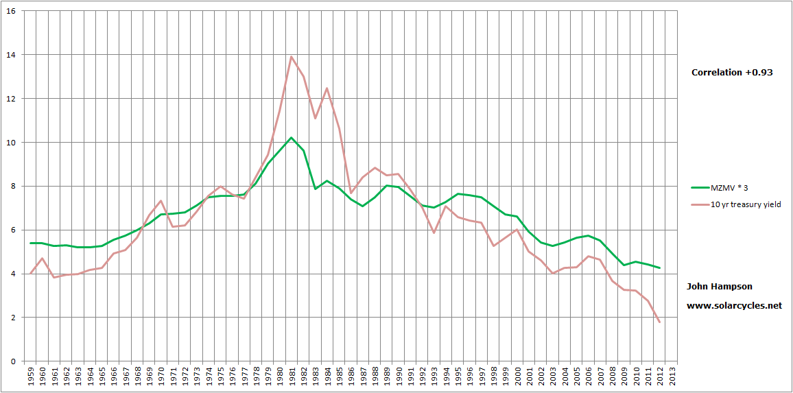
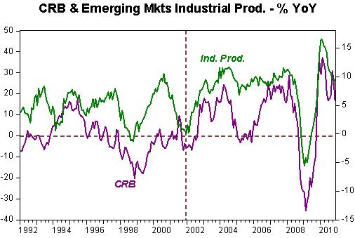
So I figured the next step was to produce a composite model of sunspots, geomagnetism and demographics for the USA over the last century to see to what degree this correlates with the long term US risk asset composite that I charted earlier in the week: namely real stocks and commodities, real house prices and treasury yields. To do make the triple ‘agent’, I used annual mean sunspots, annual average geomagnetism (inverted, because low geomagnetism is pro-risk, high geomagnetism anti-risk) and for the demographics the middle-young ratio up to 1950, then a composite of middle-young, middle-old and percentage of net investors from 1950 to current. To make the quadruple ‘subject’ I used real SP500 annual values, the Schiller real house price index, the commodities index and 10 year treasury yields.
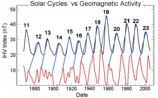
This chart shows how geomagnetism relates to sunspot cycles over the long term:
 Source: NASA
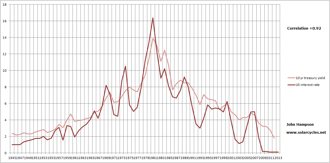
Peaks in geomagnetism occur typically 1-3 years after sunspot peaks, averaging 2 years later. This fits with recessions and unemployment peaks usually occurring within a couple of years after the solar peak, as peak geomagnetism escalates pessimism and fear. The strength in a geomagnetic peak is also a reasonable predictor of the strength of the next solar cycle.
Once I had worked back half a century, compiling the data, this is what popped out (click to view charts larger):

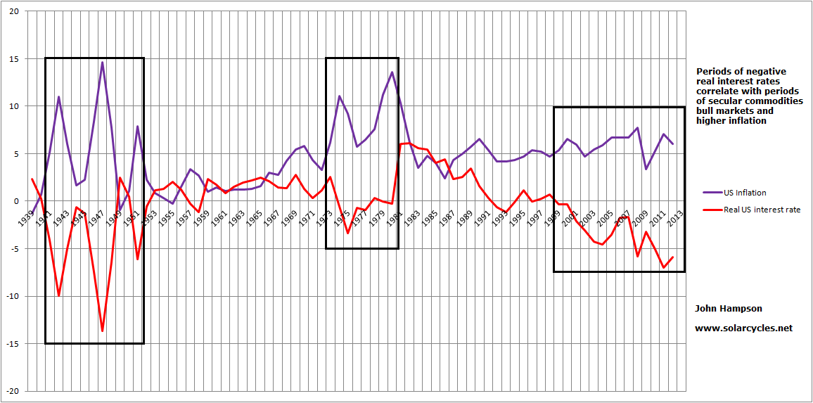
The model didn’t work out so well in the periods around 2006, 1974 and 1951. I then discovered what united the three: real interest rates were negative:

Inbetween, the model worked very well. When real interest rates were negative, risk assets (particularly commodities) got an uplift, regardless of sunspots, geomagnetism and demographics. This is because this type of inverted evironment discourages cash and savings, and encourages borrowing and speculation. People are not being compensated by leaving their money at the bank to offset the gradual erosion of purchasing power, so they seek hard assets and risk investments instead.
So I added negative real interest rates to the model (netting them from the composite where they occurred in the last century) and completed the history, and this is the result:
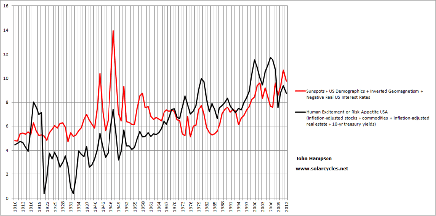
Overall a very close match with the moves into and out of stocks, commodities, housing and t-yields over 100 years.
Therefore, I am suggesting there are 4 main agents in moving financial risk asset markets: sunspots, geomagnetism, demographics and negative real interest rates. On a yearly basis, they collectively mapped the bull and bear waves up and down, with little missing.
I then attempted to project the model into the future for the next 20 years.
Demographic projections to this end are fairly reliable as those entering the key age groups over the next 20 years are largely already alive so we have a good idea of numbers moving through. I therefore used all three measures again – middle / old, middle / young and net investors – and combined into a composite.
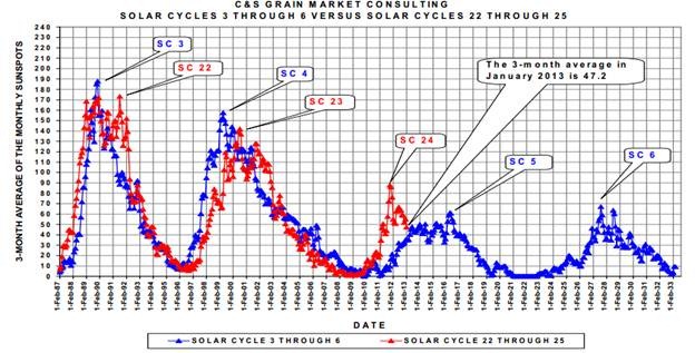
For sunspots, there is a historic rhyme with a past period of solar cycles as shown:
 Source: WattsUpWithThat
So I projected sunspots forward based on solar cycles 5 and 6. Then, using the link between a geomagnetic peak with the next solar peak, as referenced further up the page, and its typically peaking 2 years after a solar peak as well as general relations with the sunspot cycling, I constructed a geomagnetism model for the next 20 years.
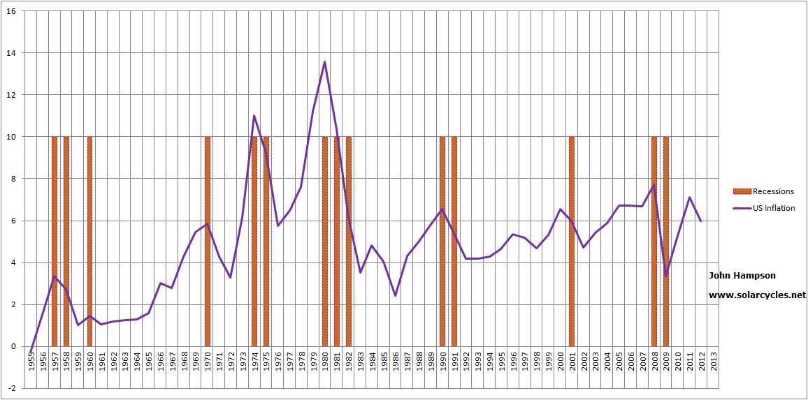
Lastly, for negative real interest rates, I used the late 1940s and 1950s as a guide due to its historical mirror, with high government debt meaning rates had to be kept low, whilst modelling inflation based on its correlation with solar maxima.
The result:
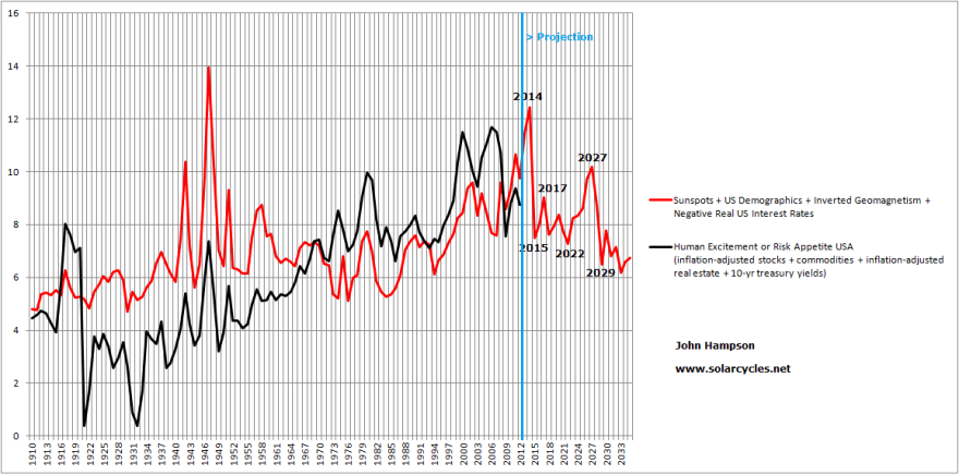
Clearly, there are assumptions and a reasonable tolerance allowance in my 20-year forecasts for the three datasets that make up the model other than demographics. One assumption is that the solar maximum is ahead this year. If that proves correct then there is a fairly potent combination of a sunspot peak with negative real interest rates, which contribute to the 2014 spike, before dwindling sunspots and peak geomagnetism arrive along with fading demographics. From 2022 to 2027 a bull market in stocks and housing should be enabled by an upturn in demographics and the next solar maximum. Overall, however, the future model is downward sloping, as demographics are poor relative to a golden period like 1980-2000, and the sun potentially enters a new ‘minima’ period as shown in the SC5 and SC6 historic rhyme above. This is also despite the built-in expectation that real interest rates may oscillate in the negative for some time yet, as the Fed only slowly and gingerly moves up rates, balancing servicing high debt with keeping inflation in check.
As time progresses, the assumptions in the projections can be confirmed or denied and the forecasts within it refined. As this is a long term model, forward validation is going to take some time. Nonetheless, the backwards validation that came out of the data confirmed the validity of what I believed mainly moves the markets over time, with negative real interest rates added to the three that I set out to test. I am well aware that this is not the mainstream view and would be a hard sell to investors: that the four agents of risk asset markets over the long term are sunspots, geomagnetism, demographics and negative real interest rates. However, drawing those together into a composite appears to account for all the major bulls and bears that we have seen in equities, bonds, real estate and commodities over the last century.
I am still formulating my thoughts on the findings of this last week, but here’s one to end the post: maybe the Fed isn’t as foolish as many make out. The reason the Fed intervenes at all in periods of ‘bust’ or cleansing is to prevent a depression, which would be much harsher on the population and likely bring about social conflict. By pushing down interest rates into the real negative, it can induce risk-asset rallies, which make the people feel better if their investments are rising, and housing rising. The problem is this action typically produces commodity inflation, which is bad for the people. Now there is a large block correlation between official interest rates, t-yields, money velocity, real commodities and inflation, and then recession and unemployment. The first five typically rise together and then produce the latter two. By acting on t-yields through QE, rather than just acting on official rates, might the Fed be able to keep the 5-correlated from rising, and thus also prevent the recession and unemployment that follows too? It would seem worth a try. If that worked, they would perhaps be able to maintain an environment of negative real rates with the beneficiaries stocks and housing, whilst preventing the undesirable trio of commodities inflation, recession and unemployment from rising until they end QE. Right now, that overall scenario seems to be what’s in play in the markets, doesn’t it? However! I am doubtful this actually works. Commodities staged a big rally in 2011 despite QE2. I believe they will do so again and normal correlations will apply.
Update:
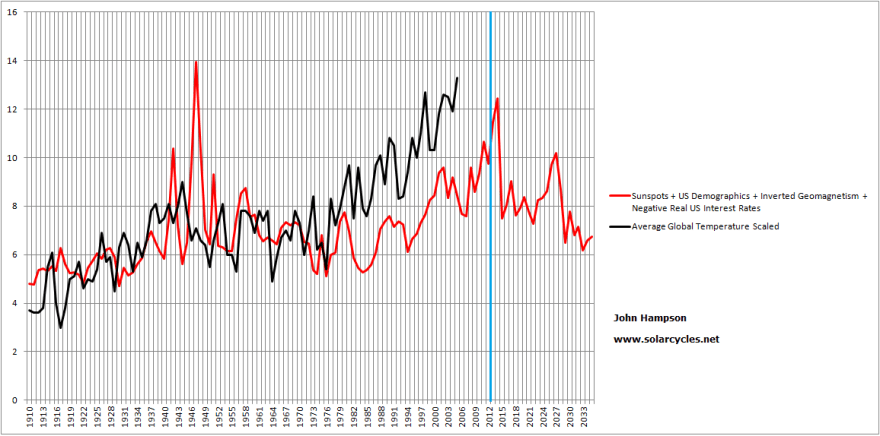
One additional chart to ponder – is global temperature correlated too? It’s tempting to shift this along and see how it matches up, but I’d need a good reason to apply a lag. Any ideas folks?:


 Source: Ino.com
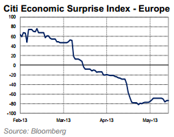

 Source: Citigroup
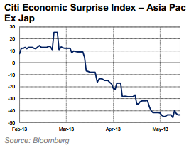
 Source: Recession Alert
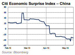
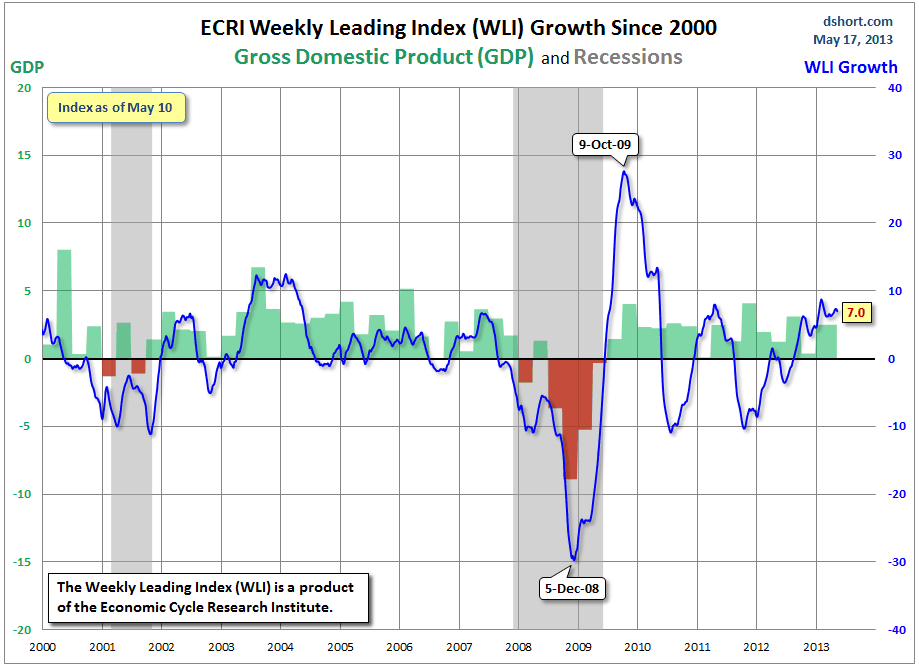 Source: Dshort