
The evidence has led me to a ‘dumb’ model of the markets, whereby humans are more subjects and less intelligent creatures of free will. It’s up to you to decide whether I have simply found what suits me and filtered out the rest, i.e. dumb seeks dumb. If we remove all the noise by looking long term, I suggest sunspots and geomagnetism are two big (but very subtle) drivers of human behaviour towards risk assets, with demographics (which are influenced by solar cycles) simply providing bulges in demand to produce long term bull markets in stocks and housing.
I suggest the solar phenomena are influencing human behaviour in the economy and financial markets alike, and that is why we find treasury yields, interest rates, money velocity, inflation and commodities largely correlated together. Optimism, excitement and positive sentiment driving all up, or pessimism, fear and negative sentiment driving all down. Just waves of sentiment supplied by nature. Plus, when increasing numbers join the investor age bracket of the population versus old and young over a period then enduring bull markets in stocks and housing can occur simply due to the growing demand the demographic trend provides. No complex interaction of fundamentals, just more people investing for retirement.
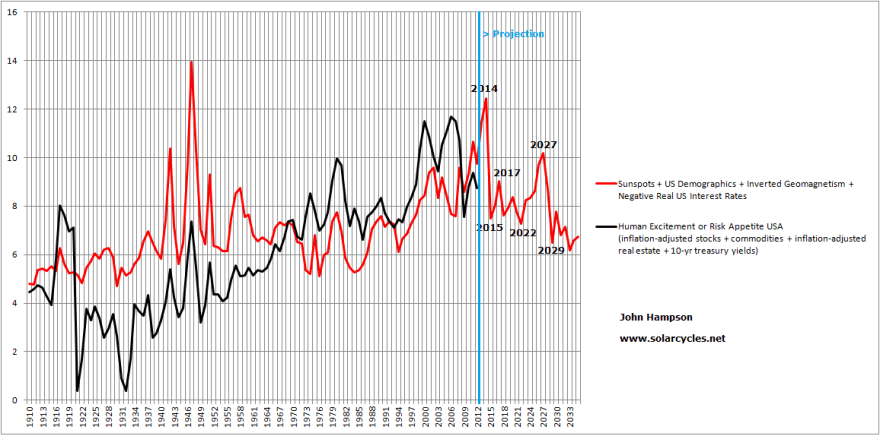
So I figured the next step was to produce a composite model of sunspots, geomagnetism and demographics for the USA over the last century to see to what degree this correlates with the long term US risk asset composite that I charted earlier in the week: namely real stocks and commodities, real house prices and treasury yields. To do make the triple ‘agent’, I used annual mean sunspots, annual average geomagnetism (inverted, because low geomagnetism is pro-risk, high geomagnetism anti-risk) and for the demographics the middle-young ratio up to 1950, then a composite of middle-young, middle-old and percentage of net investors from 1950 to current. To make the quadruple ‘subject’ I used real SP500 annual values, the Schiller real house price index, the commodities index and 10 year treasury yields.
This chart shows how geomagnetism relates to sunspot cycles over the long term:
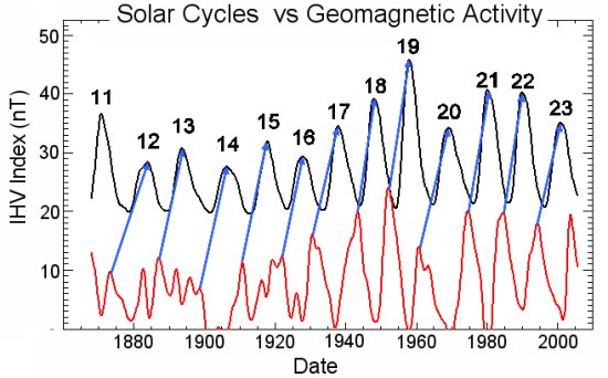 Source: NASA
Peaks in geomagnetism occur typically 1-3 years after sunspot peaks, averaging 2 years later. This fits with recessions and unemployment peaks usually occurring within a couple of years after the solar peak, as peak geomagnetism escalates pessimism and fear. The strength in a geomagnetic peak is also a reasonable predictor of the strength of the next solar cycle.
Once I had worked back half a century, compiling the data, this is what popped out (click to view charts larger):
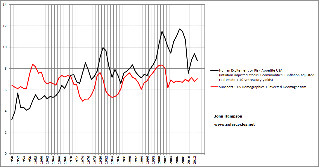
The model didn’t work out so well in the periods around 2006, 1974 and 1951. I then discovered what united the three: real interest rates were negative:
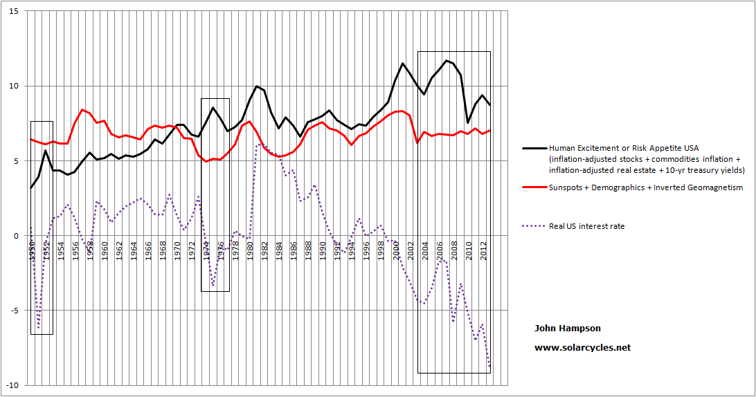
Inbetween, the model worked very well. When real interest rates were negative, risk assets (particularly commodities) got an uplift, regardless of sunspots, geomagnetism and demographics. This is because this type of inverted evironment discourages cash and savings, and encourages borrowing and speculation. People are not being compensated by leaving their money at the bank to offset the gradual erosion of purchasing power, so they seek hard assets and risk investments instead.
So I added negative real interest rates to the model (netting them from the composite where they occurred in the last century) and completed the history, and this is the result:

Overall a very close match with the moves into and out of stocks, commodities, housing and t-yields over 100 years.
Therefore, I am suggesting there are 4 main agents in moving financial risk asset markets: sunspots, geomagnetism, demographics and negative real interest rates. On a yearly basis, they collectively mapped the bull and bear waves up and down, with little missing.
I then attempted to project the model into the future for the next 20 years.
Demographic projections to this end are fairly reliable as those entering the key age groups over the next 20 years are largely already alive so we have a good idea of numbers moving through. I therefore used all three measures again – middle / old, middle / young and net investors – and combined into a composite.
For sunspots, there is a historic rhyme with a past period of solar cycles as shown:
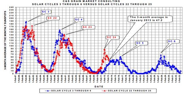 Source: WattsUpWithThat
So I projected sunspots forward based on solar cycles 5 and 6. Then, using the link between a geomagnetic peak with the next solar peak, as referenced further up the page, and its typically peaking 2 years after a solar peak as well as general relations with the sunspot cycling, I constructed a geomagnetism model for the next 20 years.
Lastly, for negative real interest rates, I used the late 1940s and 1950s as a guide due to its historical mirror, with high government debt meaning rates had to be kept low, whilst modelling inflation based on its correlation with solar maxima.
The result:

Clearly, there are assumptions and a reasonable tolerance allowance in my 20-year forecasts for the three datasets that make up the model other than demographics. One assumption is that the solar maximum is ahead this year. If that proves correct then there is a fairly potent combination of a sunspot peak with negative real interest rates, which contribute to the 2014 spike, before dwindling sunspots and peak geomagnetism arrive along with fading demographics. From 2022 to 2027 a bull market in stocks and housing should be enabled by an upturn in demographics and the next solar maximum. Overall, however, the future model is downward sloping, as demographics are poor relative to a golden period like 1980-2000, and the sun potentially enters a new ‘minima’ period as shown in the SC5 and SC6 historic rhyme above. This is also despite the built-in expectation that real interest rates may oscillate in the negative for some time yet, as the Fed only slowly and gingerly moves up rates, balancing servicing high debt with keeping inflation in check.
As time progresses, the assumptions in the projections can be confirmed or denied and the forecasts within it refined. As this is a long term model, forward validation is going to take some time. Nonetheless, the backwards validation that came out of the data confirmed the validity of what I believed mainly moves the markets over time, with negative real interest rates added to the three that I set out to test. I am well aware that this is not the mainstream view and would be a hard sell to investors: that the four agents of risk asset markets over the long term are sunspots, geomagnetism, demographics and negative real interest rates. However, drawing those together into a composite appears to account for all the major bulls and bears that we have seen in equities, bonds, real estate and commodities over the last century.
I am still formulating my thoughts on the findings of this last week, but here’s one to end the post: maybe the Fed isn’t as foolish as many make out. The reason the Fed intervenes at all in periods of ‘bust’ or cleansing is to prevent a depression, which would be much harsher on the population and likely bring about social conflict. By pushing down interest rates into the real negative, it can induce risk-asset rallies, which make the people feel better if their investments are rising, and housing rising. The problem is this action typically produces commodity inflation, which is bad for the people. Now there is a large block correlation between official interest rates, t-yields, money velocity, real commodities and inflation, and then recession and unemployment. The first five typically rise together and then produce the latter two. By acting on t-yields through QE, rather than just acting on official rates, might the Fed be able to keep the 5-correlated from rising, and thus also prevent the recession and unemployment that follows too? It would seem worth a try. If that worked, they would perhaps be able to maintain an environment of negative real rates with the beneficiaries stocks and housing, whilst preventing the undesirable trio of commodities inflation, recession and unemployment from rising until they end QE. Right now, that overall scenario seems to be what’s in play in the markets, doesn’t it? However! I am doubtful this actually works. Commodities staged a big rally in 2011 despite QE2. I believe they will do so again and normal correlations will apply.
Update:
One additional chart to ponder – is global temperature correlated too? It’s tempting to shift this along and see how it matches up, but I’d need a good reason to apply a lag. Any ideas folks?:


very good John 🙂
My thought is that rising sunspotnumber is a major piece in this puzzle, creating extensive optimism (and overbought market).
On a shorter scale, we have cycles in solar wind (1 and 6 motnhs), and the variations in sunspot and sunstorm (~4 months), and the seasonal cycle of 12 months (12 months for solar flux and 12:2=6months for geomagnetism, but the two are not equal because of solar tilt angle and magnetic polarity).
On the shorter scale these cause fluctuations, but the overall trend is connected to the sunspot cycle, AND some kind of bigger supercycle.
The supercycles(s) are still difficult to explain, and I find different ones of ~40, 60 and 80 years, and others too… but the data set(s) are to small to make good analysis.
Demographics are probably a big piece of the puzzle, and is in turn probably related to solar (super) cycles.
I think Credit must also be an important piece. But is it cause or effect?
Inflation should in my mind be caused by ONE thing – Ammount of money, which can be split up in components:
More money comes with more people (demographics) and with more credit. What creates credit? Stability, optimism, speculation (is essence all credit IS speculation on all the other reasons), emerging countries and probably many more.
Another reason is “trouble”… which gives us public debt and QE.
My concern right now, is that in US the household debt is still very high (has deflated some recent years), corporate debt is high, public/government debt is very high, and FED balance sheet is high… and still US is approaching deflation.
This looks like a credit cycle, where the US is saturated… or at the top. Inflation should be impossible with such saturated credit, and the situation is similar else in the world… probably China too.
I dont have good enough data sets to study any credit cycle. But it is probably pointing down the next 10-20 years… just as my CPI-cycle that is topping right now and going down to the 2020s.
So summing up… first one has to know the supercycle-status (demographics, credit and other, and the solar/planetary causation).
Second we must look at the sunspot cycle – so far I can find weakness around the high platou in the sunspotcycle, and often weakness near/before sunspot minima. The weakness at top is probably because of euphoria and overbought market, and stagnant+volatile solar activity.
The weakness at low is probably caused by lack of sunspots (and some kind of overbought condition).
Many thanks for your thoughts Jan.
Short term, lunar oscillation is also influential. But in the short term quite a few factors push and pull the markets around, whereas that all seems to be neutralised over the long term.
I have long operated on “inflation is always and everywhere a monetary phenomenon”, but having seen the correlation with real commodities I feel like changing ‘monetary’ to ‘commodities’.
I like your summing up – that is pretty much where I stand too.
I have just added an additional chart at the end of the post – do you have any insight on that?
Daily sunspots reached 212 yesterday – beating the previous record of this solar cycle of 208 set 9 Nov 2011 – bodes well for a solar maximum ahead rather than behind.
China CB leading indicators came in at +1.5 – which bodes well for commodities.
Hi John
I have found a correlation in Norwegian temperature over the last 100 years with geomagnetic disturbances, and with weak solar cycles and weaker geomagnetism, we should see lower temperatures in coming decades 2010-2030.
HOWEVER my last look at the data shows a possible change in the correlation, suggesting that temperatures are higher than geomagnetism is suggesting… indication a possible man-made warm up. BUT could also be that there is a supercycle lag that is the reason, and that the temperature drop is about to begin…
————-
I had a closer look at the sunspot cycle versus DOW. To compare one has to find good markers in sunspot activity. It is often difficult to pinpoint the real solar minimum and maximu, so I have used wavelet analysis to do this.
here are two diagrams, showing the average sunspot cycle around wavelet maximum and minimum, and the corresponding average DOW. I have used monthly data since the 1880s.
Careful… this is for average sunspot cycles, and the current one is not an average one. But the analysis is meant to spot the overall “mechanism”.
The first diagram is for analysis around maximum, and the most relevant one today. It shows that DOW typically has weakness at solar maximum, and in the declining stage of the sunspot cycle. Or in general: from sunspt minimum to maximum is best for DOW, and weaker from maximum to minimum. No surpise here…

The next diagram shows analysis around minimum, and has the same pattern

———–
For the current sunspotcycle, we have to be aware that this is a weak and long cycle, climbing slowly to the top. So the average projections may not be so good. The sunspot maximum will be somewhat later than normal, and the stockmarket top equally.
Further these diagrams suggest that the 2008-drop was a bit unusual.
And the drop can probably be explained by the lonog SC23 and deep long lasting solar minimum.
At the 2007 market top, in a normal sunspot cycle, we should have been in a new sunspot cycle and experienced euphoria. However the minimum was prolonged, and at the market top we suddenly “realised” that there were no sunspots supporting the euphoria. So we crashed… and then got the euphoria from SC24 in 2010-2013. And it is still going on… but not for very long i suppose…
Yes the longer cycle and the type of top could play important roles, thanks.
Hi Jan. I did the same excercise a few months ago, covering all solar cycles and you can find the chart here: http://lunatictrader.wordpress.com/2013/03/09/sunspots-high-sell-or-buy/
I couldn’t find a steady effect for Dow Jones around solar max, it has been a mixed bag.
One major assumption you make for your model projection is that negative rates continue into the future. With many holding the view that the 30 year secular bull in bonds (bear in rates) is over and that rates will probably be rising in the future, with the Fed. sending “tapering” trial balloons out, with default risk growing and not decreasing, and with markets currently at historic extremes (e.g. junk bonds), wouldn’t a 1970’s interest rate environment be worth considering as a possibility to model an alternate projection around?
Sorry about that, I meant to say 1980’s – rising rate environment. Would that materially change things?
Given the large government debt they need to keep rates low to service it. Hence alluding to the 1940s-1950s. They eventually grew their way out of the debt situation but it took until the late 1960s for interest rates to make it over 5%.
havent updated my SSN forecast, but they seem to perform well
http://www.sibet.org/solar/index.html
The short term tidal cycle suggest a maximum around this July, or winter 2014. However the bigger cycles are topping around this September, pointing to a ~July maximum and not the winter 2014…
from this I would expect general DOW weakness into year 2017-2019 sometime, probably divided in two periods. Similar to your forecast.
So soon an A-down, then ~two years B-up, and finally a C-down.
In a bullish supercycle this would be an uptrend, with B-up going to ATH around year ~2015-2016 perhaps.
But we should be in a bearish supercycle suggesting that we at best will go sideways.
So some kind of bearmarket 2013-2015, a bull in 2015-2017 that could make marginally ATH, and another bear 2017-2019. Then a bigger bull… but the supercycle is still bearish most of the 2020s…
I like to cross reference with your solar prediction because it is planetary. Would it need to be updated? I trust the planetary predictions would remain as was?
Hi John – as you suggest, the planets have not changed, and nor the forecast (unless I do some fine-tuning). My pattern-recognition has shiftet by 1month.
—
concerning debt, rates and the 1950s… the household debt was low then and could inflate. This time it is high and has less potential. Who can inflate/increase debt this time?
I don’t see that Jan – I see household and corporate debt as having been fairly well repaired, the burden transfered to gov debt. Here households US:

Here we go: temperature correlates with both sunspots and geomagnetism, hence the similar flow in the chart:

I am still catching up with all your posts. That paper (I know it was very scientific meteorological wise) but I think we have sufficient evidence to call this one. If you need the links again, I can post. NASA also had some posts on how they think the solar wind and thereby magnetic field influences the thermosphere driving downward into the troposphere.
John
Your chart shows debt burden – cost of credit?
Arent rates very low, and therefore easier to handle?
But what about the total debt? As a percentage of GDP for example?
According to my numbers (am not at home and dont have them here), the household debt is still near record high. I think it was near 100% of GDP and has fallen to 85%, or was it 200% and down to 180%… something like that. And in the 1950s I think it was 20% of GDP.
We have to check these numbers. Perhaps the most relevant number would be average household debt compared with average income…
I found this at economagic.com

John, it is such a joy for a layman economist (me) to watch your analysis unfold over the last year. I absolutely love your “out of the box thinking” and willingness to try so many variables in your analysis. I wish I was smart enough to contribute to these discussions, however, I am content with gratitude to just be a studious observer.
Thank you so much for sharing your hard work and discoveries so freely! You and your active posters have taught me so much.
Namaste,
Max
Much appreciated Max, thanks
John,
if the rise in the (sunspot plus other indicators) red line from 2022 to 2027 indicate a bull market in stocks, could the steep red line peak in 2014 indicate a blow out stock market top to around begining or middle of 2014 followed by a downward plunge?
Its interesting that in 2015 the red line goes up to 2017. The upward trend fits in nicely with the theory that stocks move up in years ending in five and also go up in the year prior to a presidential election.
Jack
It’s a composite of risk assets, and I forecast commodities to deliver the 2014 top, rather than stocks.
Check this out for gold:
Always easy to see how past performance mirrors the present in some way, but these two tend lines relate to two different stories. The halving in Gold prices from 1975 to 1977 was preceded by about 3yrs of rising prices. The recent bear market in Gold comes after Gold has enjoyed well over a decade of gains, in a distinctly parabolic move.
Based on the fact that Gold managed to rally as long as it did tells me that the bull run will be put on ice for a while. No asset in a bull market has been able to run for so long without some kind of correction. It is more likely Gold prices will continue to hibernate and drift lower for now, given the sheer damage the April crash has done to confidence amongst Gold bulls. The crisis of confidence may be compounded by the ever increasing amount of time that has passed since the 2011 peak. The longer the price remains subdued, the more impatient people will become.
If this correction in Gold persists into 2014-15, it would start becoming reasonable to assume a major secular shift has occurred, because 3-4yrs worth of price action tends to be a good indicator of the overall secular performance. It gives enough time for mini-cycles to repeat themselves. I maintain the belief that the Gold price will probably break down to lower lows at some point, as the recent correction does not give the price a significantly rounded base to rally up out of. The gains of 2010-11 will probably be lost during this correction, given that those years represent the largest gains of the Gold price bubble. I’d expect to see the price hit $1000 in the long term.
Thanks gents. I think gold has to behave like in 1976 or like the Nasdaq in 1998 – i.e. a sharp recovery within the next 2 months. Anything slower or weaker won’t do.
These charts depict a very common price behavior – descending channel, acceleration then rebound and retest of the lows. Unfortunately. it doesn’t mean that gold will behave the same way as it did decades ago. I’ve recently watched “Trader” movie (I highly recommend this documentary). Paul Tudor Jones was excited at some analog charts his co-worker showed him. They entered a trade and lost 6 million USD. ‘They will give me everything back’ – he said about the market.
Interesting, could fit with the Bennercycle for the stockmarket
Demographics are an extremely important aspect that is rarely accounted for. The investment environment/credit cycle is at least as as important and rarely accounted for by cyclic/esoteric/technical people like most on this site. The “Tapering” trial balloon is the first sign that the investment climate will be turning negative. Japan has had 30 years of this on/off QE/stimulus stuff. As soon as Japan turned them off, the economy and market turned down. Historically it has taken an inverted yield curve to stop the markets. So the question is will just a cessation of improvement be enough to let our cycles work.