Stocks, Commodities And Geomagnetism

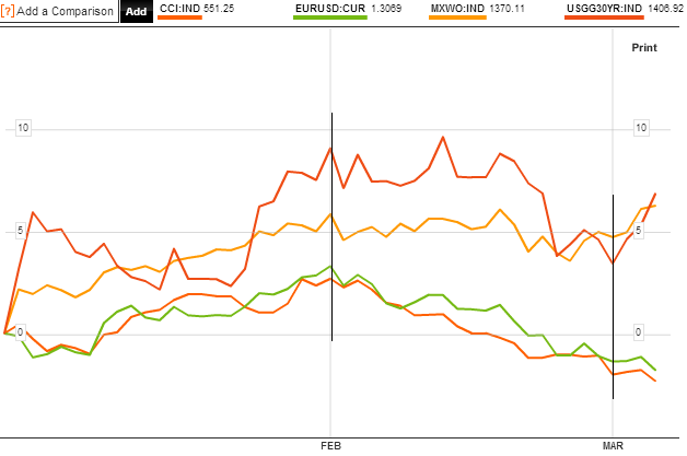
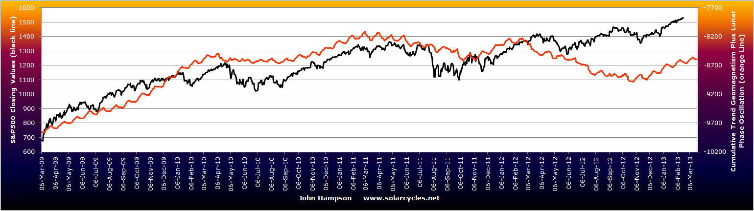
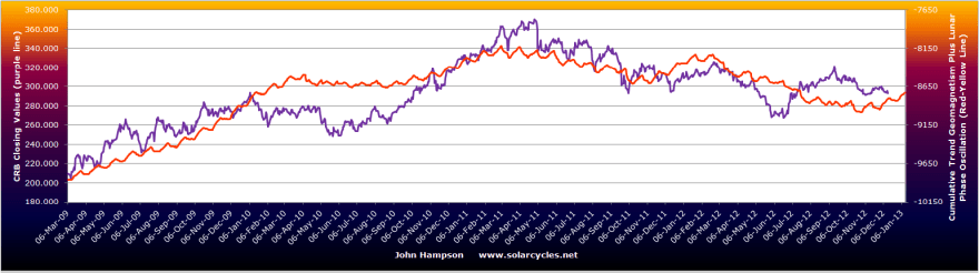
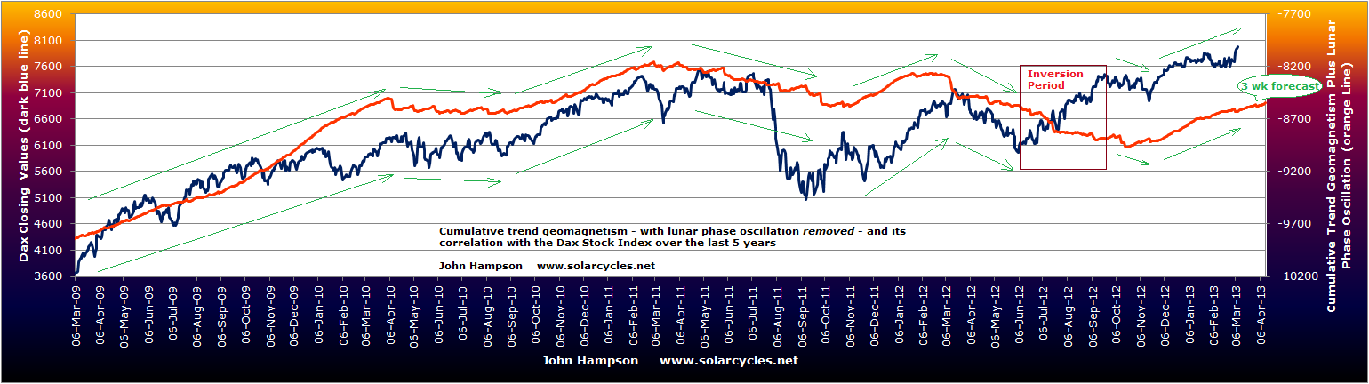
Four years of the cyclical stocks bull (in certain indices) gives me four years of the lunar geomagnetic model. If I remove the lunar phase oscillation (up and down alternate pressure between new and full moons) I can show you the chart showing purely geomagnetism. To be clear this is daily geomagnetism made into a cumulative trend line, with a 6 day lag as per Robotti/Krivelyova research, and nothing else added.

First is the model versus the SP500. The waves in the two lines align well, with the exception of the period mid-year last year, which appears to be inverted, similar to the inversions phenomenon we see elsewhere, such as in lunar phasing. The tail on the geomagnetic line is the NOAA forecast covering up to 3 weeks into the future. Click to view in more detail:

13mar20131

The second chart show the Dax versus geomagnetism, and whilst the Dax and SP500 have on occasions peformed differently, there is the same overall close alignment of the waves, with the same inversion exception last year.

13mar20132

The third chart shows the Reuters Jefferies commodities index, which again has gone its own way at times compared to the stock indices, but nevertheless the waves align well again, and the single exception period is the same.

13mar20133

Levels of geomagnetic disturbance in the atmosphere has been shown to impact human mood. If changes in mood subtly affect the collective behaviour of market participants then we might expect to see some correlation between risk assets and geomagnetism. I believe the above charts are good evidence that this is the case. Yet, I know of no-one else who runs a geomagnetism model and I can count on one hand the number of analysts/sites out there that track geomagnetism to use in their trading toolkit. Maybe this is more widely followed than I imagine, but it is not promoted as it would not sell to clients – I don’t know.

If the model fails badly going forward, then I will not be defending it. But looking back at the chart from the Peak v Peak page, showing geomagnetism versus the SP500 around the last secular peak, there appears to be more historical evidence that it is influential. I again have removed the lunar oscillation and show you the alignment of the waves. Once again there is a single period where the model inverts with the market, and in this case lasted around a year.

13mar20134

So how might we use this as traders and investors? I don’t see a way to parcel this up into a repetitive trade. I suggested in my Trading The Sun pdf that trades would present themselves when the market moved away from the model. But there are times when they don’t come back together for some time. I therefore suggest that it is better to follow the general path of geomagnetism, and use it as a guide. Occasionally there may be a period of inversion – for reasons unknown – but largely it should be a useful guide. To this end we can use the 3 week forecast to look ahead, and the seasonal model of geomagnetism that shows us how historically geomagnetism tends to flare at certain times of the year more than others (whilst understanding that occasionally we may see unseasonal behaviour). I therefore rate geomagnetism as an important tool to use along side other market disciplines.

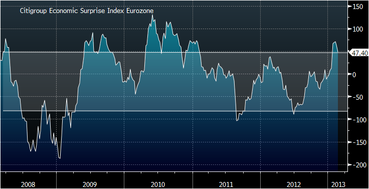
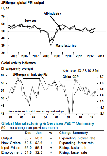
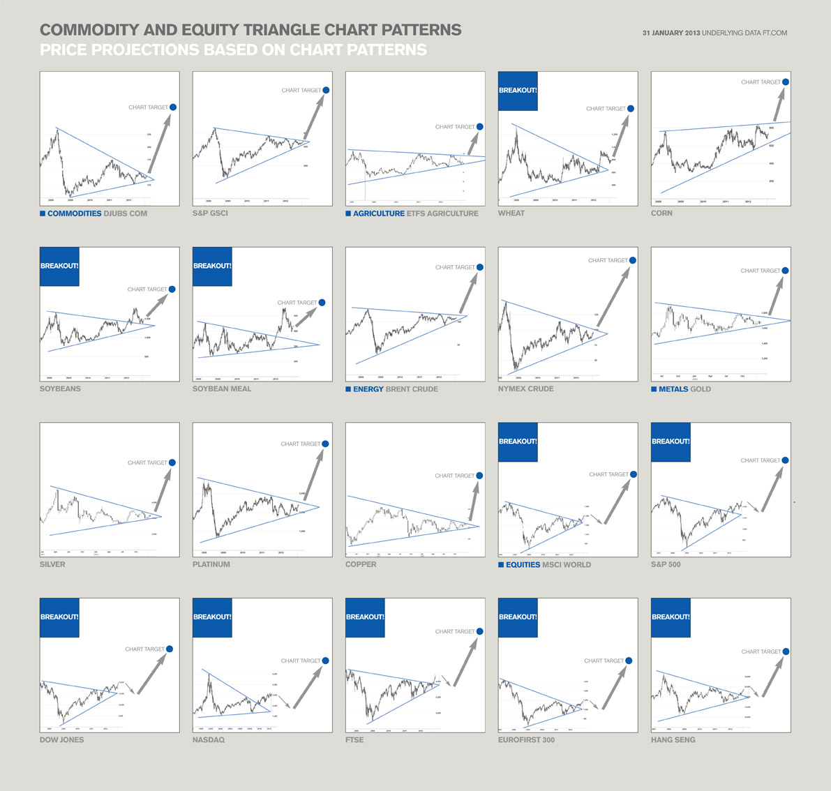
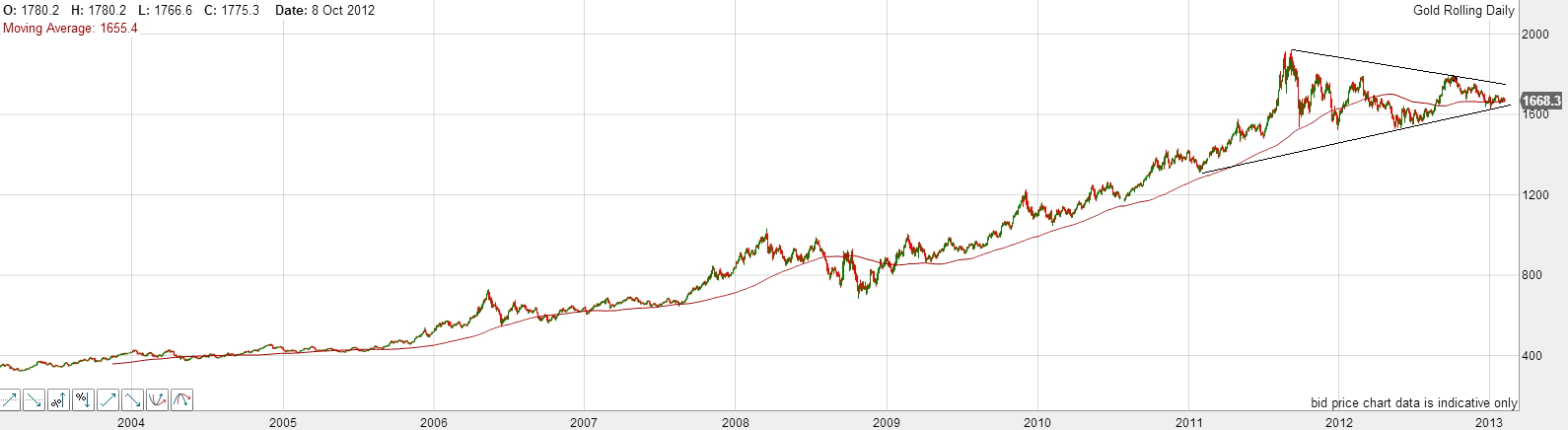
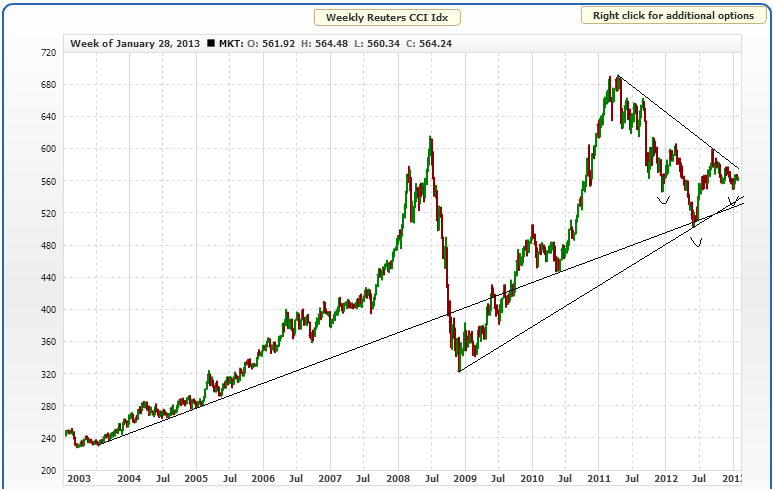
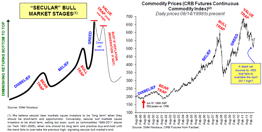
To the markets. I am staying put at the moment, still expecting commodities to start to outperform stocks, and weighted accordingly. CB leading indicators for Japan and Spain came in strong. OECD leading indicators for OECD countries came in strong bar China and India. Leading indicators as a whole do not show degredation, which I would expect for a cyclical bull top. Breadth remains supportive in equities. The SP500 is within a few points of the 2007 high and I expect a touch. This is roughly where Tom De Mark expects a swing top. If we can push up to there this week I may take off some equities profits. I have hope at this point that we are headed for yields rising, inflation rising and commodities making a belated push to help tip the world into a mild recession into 2014. These are all features of how previous cyclical bulls have ended, and until now (since 2009) we have not had enough sustained growth to get us to that point. If global growth can persist a little longer, then more money should pour out of treasuries and into pro-risk. We need froth and excess and growthflation to end the cyclical bull if we are to align with history. Before reaching the cyclical bull top, a pullback in equities would be normal, followed by a higher high with divergences. Should such a pullback occur, we should see commodities becoming the target of the money flow and advancing despite equities. This is all as per history – anomalies can occur – but that is my primary scenario.

Markets, Trades And Solar Update

Got internet this morning so time for a post.

The chart below reveals that pro-risk (proxied by MSCI World Equities, Euro-USD, CCI equally weighted commodities index and 30 year treasury yields) made a correction throughout the month of March. Today Euro-USD and commodities have popped up – not captured yet in that chart – so I suggest the correction in pro-risk may now be over. Equities remain the leading class, and various indicies have broken out to new highs in the last two days, which cements the idea of the correction is done.

8mar20131Source: Bloomberg

If you recall the 5 models in alignment, they projected a January swing top and a March swing bottom. If this is playing out, then the next and final top should be around June. With history as our guide, the stocks cyclical bull should end with a frothy overthrow, so the kind of sentiment and buying levels we are reading about should be expected. However, I am not sure whether stocks can keep pushing on from here until June. I originally targeted around 1600 for the SP500 to top out, and this was echoed in work by Laslo Birinyi and Barry Bannister. We are currently less than 4% away from that.

Again with history as our guide, we should see a topping process with weakening internals and negative divergences in leading indicators. In terms of leading indicators we don’t yet see this. The latest global PMI reading for combined services and manufacturing looks like this, still in expansion:

8mar20132Source: Markit / JP Morgan

Citigroup economic surprises are back in the positive for the US. ECRI US leading indicators have weakend a little but remain in a strong positive uptrend. The last missing update in CB leading indicators was for Euroland which came in a positive and improved +1.0. So, right now, we have a backdrop for pro-risk to advance, but I am watching for evidence of trend changes in these indicators.

In terms of market internals, stock market breadth has overall been good and confirming. We need to see those internals weaken for greater likelihood of a top. It does not mean we cannot see a deeper pullback before a renewed attempt at a high – which then displays the weaker internals – in fact that would be the historic norm. So, I am not sure about the push on until June from here, without another correction. Supporting this we see a spike in the bullish percent over call/put indicator, which has been missing, which suggests US stocks should top out soon (Tom Demark predicts at 1567). We also see daily sentiment for the Nikkei index over 90 (out of 100) and it stands on that one precarious steep leg. Plus, Monday is the new moon, which has the potential to be a swing top. So, with this in mind, I have taken profits on my Nikkei positions this morning (NZ time) and left my other stock indices positions in tact. Back in October 2012 I wrote about how cheap the Nikkei was and bought for an average of around 8700 (see here). That trade has returned 40%:

8mar20133

I believe the Nikkei has entered a new secular bull, after a 19 year cycle from nominal top to nominal low, but that this steep single leg up needs to become a more stable ‘W’ with a retracement, a higher low and then a push on again.

Commodities, as a whole, are in a different place, with sugar, coffee, precious metals, wheat, orange juice and others suffering bearish sentiment and low buying interest. However, most of those are now back to important support levels, which combined with the contrarian sentiment readings, provide a good base to rally. And so we return to the guide of solar/secular history, which suggests commodities should now take over as the outperforming class, and while equities process a top, commodities go make their secular finale. This, as you know, is subject to the solar peak timing being correct, and we still do not have decisive evidence on this, so I continue to watch sunspots.

Danny pointed out the change in IPA solar peak forecast. I now understand they are using the SIDC methodology, so it doesn’t amount to a different forecast. Here is a summary then of the solar peak projections:

NASA: Fall/Autmun 2013

NOAA: May 2013

SIBET: Sept/Oct 2013

SIDC: Either Fall/Autumn 2013 or it occurred already in Jan/Feb 2012

Polar reversal method: Q1 2013

The consensus therefore remains that it should be taking place ahead this year – and so it remains that a daily sunspot count over 200 would help sure up that likelihood. Therefore, that scenario remains my favoured and I am positioned for it, but until the alternative secnario is weakened, I am not taking on further commodities positions, despite some very attractive current plays.

TheDarkLord referred to the possibility of a twin peak, based on the similarity to solar cycle 14. I covered this last year, when the parallel was already being floated – see here. You can see in the charts on that link that SC14 was essentially a flat top as well as a twin peak, but note that the smoothed solar peak and the secular asset peak both occurred at the front peak – in fact they happened both dead on Feb 1906. So, it is the smoothed peak forecasts, as compiled above, that are key. That said, I have previously shown that there should be an echo commodities peak (a lower peak) a couple of years later, which could tie in with a second solar peak. However, I have also previously shown that by that point, being in equities is the place to be, returning better than commodities. Therefore, it does not change my strategy: assuming the consensus solar peak is correct and ahead, commodities should make their secular peak in the months following it, then I wish to exit commodities and target equities.

I have not been able to update the models this week, but will do so next week. The key points are that the new moon takes place on Monday, the geomagnetism model has weakened slightly (geomagnetism should start to seasonally worsen here) and sunspots are back up around the 100 zone.

The Next 10 Days

…I will be in a motorhome, touring NZ North Island, so internet access is going to be occasional and fleeting. So an update and roundup on the markets below, and I will post in the comments beneath it anything important in that period. After New Zealand it’s Abu Dhabi for a week, the last stop on the trip, before returning to Europe.

Let’s start with gold. Major extreme readings were reached last week in oversold and overbearish measures, in both gold and gold miners, many more extreme than in the 2008 sharp falls. I won’t reproduce them here, as many blogs and sites have shown them, but it was sufficiently extreme for me to add to both gold and miners last week as declared. Gold has since rallied away from those extremes and therefore in price, and whilst I don’t know how it will shape technically from here, the key question is whether its secular bull is over and ended in 2011 with silver’s parabolic rise and fall. So here is gold since the start of its secular bull in 2000, measured in all the major currencies. It should be clear that gold has tracked sideways since 2011 and has consolidated up high, whichever currency it is measured in.

260220139

Source: Gold.org

As a parabolic excessive-greed finale is the norm as a conclusion to an asset secular bull, and as gold is the leading asset in a Kondratieff winter (which we are concluding), I would give good odds to gold finishing with a blow-off parabolic. A comparison with gold’s last secular bull, below, shows that blow-off parabolic clearly and how gold’s secular bull this time has been fairly measured to date.

2602201310

Source: Nowandfutures

I am not suggesting that gold has to shoot as high as the comparison suggests – only rather that some kind of excessive exuberance would be a normal end. So, the lack of parabolic ending move in gold yet, together with the high sideways consolidation when the whole secular bull from 2000 is viewed, give me a couple of reasons why I believe we have been seeing a final washout of weak hands before gold breaks higher. However, I await supporting evidence such as from sunspots breaking higher (to confirm the solar peak is ahead), commodities starting to outperform equities, and inflation picking up. This is how sunspots look:

2602201313

There is a mess, rather than a trend. If the solar peak is ahead this year, which remains the most common forecast, then we need to see daily sunspots register over 200 to make the uptrend clearer. So I am looking out for that.

Since my last post on the markets it has become clearer that pro-risk did begin a correction at the turn of January into February. The chart below combines proxies for stocks, commodities, risk-safehaven FX and treasury bond yields.
260220134

I suggest there are two paths forward, both of which eventually will see equities return to their highs, in order to deliver a negative divergence top (price advances but internals weaken). The first is the five-models-in-alignment path, which suggests pro-risk may pull back into March before advancing again. The second is that pro-risk is only making a normal lunar pullback, into yesterday’s full moon, and will continue upwards over the next few weeks, for a Spring swing top. This option is supported by cyclicals as a leading indicator, and my geomagnetism model shown:

2602201312

The tail on the model stretches out into the end of March and remains in an uptrend due to unseasonally tame geomagnetism (actual and forecast). The oscillations within that are the lunar phase pressures.

There also remains a fairly benign macro-economic environment, which should support pro-risk, although we should always be alert for early warning signs of a change, and we could potentially have this in the latest PMIs.

China PMI, US PMI and Europe PMI in order below:

260220131

260220132

260220133Source: Markit

A droop in the latest data, but still positive in China and the US.

Meanwhile, economic surprises show unclear developments in both Europe and the US, but using oil prices as a leading indicator for the latter, a topping out in this measure may occur in Spring.

260220135

260220136Source: BrokenMarkets / Citigroup

US earnings season is pretty much over, and the final results in both earnings and revenues were good, and supportive for equities.

260220137

260220138Source: Bespoke

The latest Conference Board leading indicator data table looks like this:

2602201311

Source: Conference Board

Since my last market post, readings for China, Germany, US and Mexico all came in positive. The table is healthy, for now.

In summary, the picture between leading indicators and economic/earnings data is fairly supportive for pro-risk for now, unless that droop in PMI readings becomes wider weakness ahead.

There is bearish sentiment towards sugar, coffee, wheat, corn and cattle currently, as well as the precious metals, and I would add to commodity positions if we saw improved evidence of a secular commodities peak ahead, namely those developments listed above. Until that becomes clearer however, I am playing it safe and sticking largely with what I have, as both the primary (secular commodities and solar peak ahead) and alternative (secular and solar peak passed) scenarios remain in play.

As Things Stand

Gold, silver and gold miners are at extremes of oversold and overbearish readings, with possible high volume capitulation candles on the last day of last week. Mean reversion should now follow in the form or either a relief rally to work off these conditions or the start of a new upleg, but first we need to see a turnaround and some buying interest.

The majority of other stock sectors, aside gold miners, are overly bullish, and warning flags persist in equities, but without any technical break yet. Is the narrowing number of global stock indices making new highs a sign of a gradual top taking place since the end of January, or was that meagre correction only a blip in a continued advance into March? It’s not clear at this point, but here are two reasons why equities could potentially advance into March: cyclicals as a leading indicator and actual/forecast geomagnetism. So far this year actual geomagnetism has been tame and it is forecast to remain so into early March at this point – here is the latest model with the tail three weeks into the future:

20feb20131

Only in June-September last year did US stocks diverge particularly from the cumulative geomagnetism model and whilst that divergence gap has not been repaired, the market direction has since been following the model direction again.

If equities are instead in a correction that began in late January, with a couple of laggards about to turn and join (e.g. US indices), then I can refer you back to five models in alignment, and would also point to the current narrowing wedge in treasury yields which could suggest a switch to safety and away from pro-risk is coming, if yields break down:

20feb20132Source: Stockcharts

The latest leading indicator releases from CB came in flat for Korea, +1.0 for Spain (improvement on last month) and -0.1 for Australia (also). Commercial loan data for China showed quite a jump in January. US earnings beat rate for this quarter came in at an impressive 64% beat rate both in earnings and revenues. Citigroup economic surprises have turned up again in the US:

20feb20133

All in all, a continued positive environment persists for pro-risk assets and any pullback at this point should be as a result of excessive bullishness rather than a deterioration in the macro picture – at least until that changes.

I have no further evidence at this point to validate or invalidate the primary scenario (secular commodities peak and solar peak ahead) or the alternative scenario (secular commodities peak and solar peak in the past), but I expect we will see decisive evidence one way or the other within the next couple of months.

I am leaving Australia on Saturday and coming to Auckland NZ for 3 nights, before motorhoming around the rest of the North Island for 10 days.

Weekend Roundup

Mixed fortunes within asset classes heading into the weekend, but a summary chart below showing MSCI world equities and the CCI equally weighted commodities index reveals a general pullback began at the turn of February, which could mean the January swing top predicted by the 5 models in alignment could still be validated.

9feb20134Source: Bloomberg

Treasury yields also peaked at the same time, the turn of February, adding to the case.

If we look solely at US stock indices, however, it would appear that they just broke upwards out of a range on Friday, which is normally technically bullish. However, the Dax made a similar range breakout in late January only to then reversed it, and there are some clues that the same could occur here, such as the Vix divergence below:

9feb20135Source: Cobra / Stockcharts

US earnings, so far coming in at a 64% beat rate coupled with a 63% revenue beat rate, have been providing a tailwind. However, economic surprises have been weakening, and also suggest a pullback should occur:

9feb20136Note how surprises have turned negative, and that the last two times that occurred, equities made a swing top.

We also see some frothiness extremes in certain sentiment readings for US equities and also in equity fund flows. In short, I see more reasons for US equities to turn down here and pullback, rather than fulfill their breakout, and so join other pro-risk in consolidation or correction. I maintain that any pullback will be followed by a return to the highs and likely a higher high, which will mark a cyclical top if accompanied by negative divergences in breadth, leading indicators and so on, likely by mid-year 2013.

In terms of leading indicators, the global picture is still fairly healthy. Here is the latest combined global PMI (manufacturing and services) reading:

9feb20137Source: Markit / JP Morgan

To add to that, ECRI’s leading indicators for the US also show strength:

9feb20138Source: Dshort / ECRI

Copper, which is generally a bellweather for the global economy, may have broken out:

9feb20131Source: Kitco

Which brings me to a chart provided by Rob Bowden showing many commodities may be poised for such upward thrust out of large triangles, with equities largely having broken out.

9feb20133

Source: Rob Bowden

There are no guarantees commodities can break out here but the scenarios shown would largely reflect my own views – equities pull back to the nose in a final shallow cyclical bear, and commodities make a secular finale acceleration up and out.

The caveat would be if my primary scenario is incorrect (secular commodities peak and solar peak ahead), and the alternative scenario is correct (secular commodities peak and solar peak passed). NASA’s updated forecast this month continues to point to a solar peak circa September 2013, and I maintain that the probability lies with the primary scenario for now. One or the other is likely to be validated soon by action in gold, which remains tantalisingly undecided, shown here:

9feb20132

Into the nose of the triangle, it remains above the 200MA, which has largely supported the secular bull, but it remains perilously close to dropping out of the triangle and beneath that key MA. Sentiment is fairly depressed for both gold and gold miners which should be fuel for an up-move. But I do wonder whether we might see a lunge to the downside to flush out weak hands before an upwards break. We’ll see.

Lastly, here is a summary of global house prices. It’s a busy graphic but the overall theme is that in late 2011 and early 2012 we saw what appears to be a turning point for global real estate, with a pick up since then in markets such as Hong Kong, US, Switzerland, South Africa, New Zealand and Canada. Various European countries remain in downtrends but may turn out to be the laggards in a change in trend.

9feb20139This would fit with an overall transition from K-winter to K-spring. A bottoming out in real estate and a new secular equities bull emerging in due course. One last push in commodities, before money begins a secular move out of treasury bonds and commodities and into equities and real estate.

The Alternative Scenario

What if commodities already made their secular peak in 2011, as potentially shown by the equally weighted commodities index?

30jan20136Source: MRCI

If they did, then what should lay ahead (by solar/secular history) is an ‘echo’ bounce, whereby commodities rise again but fail to make a higher high. Barry Bannister modelled it so:

31jan20131Source: Barry Bannister

If this is a K-winter and the leading commodity class is precious metals, then silver fulfilled its remit to deliver a secular parabolic finale with a subsequent collapse down the other side in 2011:

31jan20132Source: Trading Charts

By solar cycles, this could be an acceptable scenario if sunspots already peaked, as per the ‘SM predictions’ alternative shown by SIDC below:

31jan20137

Source: SIDC

It would mean a solar peak occurred at the turn of 2011 into 2012, and that would make a 2011 secular commodities peak within a historically normal close time range.

The Dow-gold ratio has not hit the extreme of the last secular commodities peak (circa 1980), but could be considered to have reached low enough for a secular conclusion: out of the green band below. The low to date was reached in 2011, which fits the scenario I am outlining.

31jan20134Source: Sharelynx

If commodities already made their secular peak back in 2011, then we should be in a new secular stocks bull. So what if the final cyclical bear (with the secular bear) and secular p/e low valuations already occurred and is not ahead?

A couple of charts from October last year showing how that could be so. What if the secular bear pentagon for the Dax needs redrawing as per the red line – that the market broke out in 2011 then retested the nose level of the pentagon later that year (in a final cyclical bear at that time), reaching a final single digit p/e valuation of 9?

31jan20135

Ditto for the Hang Seng here, ending with a p/e of 8:

31jan20136Clearly p/es of 8 and 9 fit the remit for a secular bear single digit p/e cheapness conclusion. But what about the SP500? It only reached a p/e of 13 at that point. Well, at the end of the last secular stocks bear (circa 1980), although multiple country stock indices reached single digit p/es, not all did. The Nikkei bottomed at a p/e of 20.

Furthermore, if we widen to consider CAPE valuations, Greece hit the lowest ever seen of around 2 last year, i.e. a secular cheapness extreme never before reached (Thailand held the record with 3 during the Asian financial crisis). If we consider price to book valuations, Japan reached below 1 and Russia also. So again, if we are looking for evidence that the secular bear washed out equities sufficiently, then we can make a case.

If  the sharp falls in equities in 2011 represented the last cyclical bear of the secular stocks bear, then there should be some telltale pointers. For it to be a cyclical bear, it should take at least 20% off prices. For multiple indices this was so, with both the Dax and the Hang Seng dropping 30%. That cyclical bear should precede a recession, and such a recession occurred in Europe and Japan, amongst others, in 2012 (in a ‘double dip’). That cyclical stocks bear should have begun from a situation of excessive rising rates and inflation. We saw both sharply rising European yields in 2011 and a rise in inflation because of commodity prices.

If this alternative scenario is correct, then the implications would be significant. It would mean that the point at which to load up on equities already occurred in late 2011, and that what we are seeing currently is new secular bull momentum. It would mean that commodities, as a whole, should now make a lower high in a last chance to sell out of them before they are mired in a secular bear. It would imply that the current pick up in global growth is the real deal, and that growth will now sustain going forward, with central banks unwinding their support.

So what are the problems with this alternative scenario?

1. The consensus between Nasa, Sibet and SIDC (CM) is for a solar peak ahead later in 2013, so I rate a peak in the past as lower probability.

2. Although silver achieved the parabolic and the collapse in 2011, gold appears to have coiled near the highs in a more measured fashion which does not look like a secular top.

3. In the post-gold-standard world, a lower secular finale dow-gold ratio than 7 might be expected.

4. There has perhaps not been wide enough falls into secular cheap CAPE and p/e valuations, not enough country indices outside of Europe. Ditto the Q-ratio valuation for the US market.

5. Although we did see rates and inflation up in 2011, bond yields outside of Europe were conversely ultra low, and inflation did not exceed the 2008 peak.

There are a couple of ways we can judge the validity of this alternative scenario going forward. If sunspots suddenly make a sustained rally to a new high then we are likely still rising to a peak. Conversely, if stocks continue to outperform commodities and we don’t see a reversal in leadership then we are more likely in a new secular stocks bull, which would be confirmed if commodities top out at a lower high.

Kent raised a version of this scenario 12 months ago, and Barry Bannister clearly has also considered it. It is frustrating that 12 months later both this scenario and my primary scenario (solar peak and secular commodities peak ahead) are both still in play, with no clear winner, but therefore important to stay cautious. For my positioning – which is long equities but significantly longer commodities – it makes me a little nervous about the latter. If the primary scenario turns out correct then that ample commodities exposure should produce bumper profits, but if the alternative scenario is correct, the key is to identify the top of the ‘echo bounce’ or lower high in commodities, and not get stuck with tumbling positions that are unlikely to recover for a long time.

Would be interested in your input on this. If you have additional evidence for one scenario or the other, I’m all ears.

Secular Commodities Finale

The rally in equities persists. The momentum continues but the warning flags are increasing, in a fine balance. When we eventually pull back, I maintain this should then be followed by a further higher high, but with divergences and weaker internals, to make a topping process. UBS have echoed this in their chart here:

30jan20131Source: UBS

I have predicted a scenario ahead this year similar to 2007-8, marked by the box below. When stocks made a topping process in late 2007, similar to the distribution patterns shown above, commodities only made their parabolic acceleration once the equities topping process was underway.

30jan20132Both energy and basic materials are late stage cyclicals, which mean they are typically amongst the last sectors to rise and top out, and are reflective of commodities gaining momentum usually later than equities.

I am suggesting that there is a possibility therefore that we need first to see equities entering their multi-month topping pattern before commodities truly accelerate. Once stocks pull back, after this current rise, I believe that process will have begun. The question is how far and how long equities can rise in the mean time, and it’s a difficult one to call. If the pullback were to begin today I could point to a handful of indicators supporting that. Yet, as noted in the last post, both overbought and overbullish readings can persist for a little while before a pullback. So I watch and wait.

But back to commodities. Oil is the outstanding performer of the moment, most other commodities are lacking momentum. I previously studied commodities peaks and solar peaks in detail (here), which revealed that commodities should typically begin an acceleration around 12 months before the solar peak, which is currently forecast for around September of this year, but that commodities typically make their parabolic peak after the solar peak. Drawing that analysis together with the above, I would suggest that commodities, as a class, are overdue a momentum move, but could need equities to lose momentum and begin their topping pattern before commodities take over.

There is historically a close correlation between commodities. Below are shown food and oil. If oil can maintain its recent strength, food should follow (oil is a key input in the agri process).

30jan20134

Source: MD Briefing

Food and gold prices also have a close historic relationship, as shown in this previously posted chart:

22mar6

Source: Casey Research

Yet there has been a disconnect in the last 18 months between gold and general commodities, shown here:

30jan20133Source: Scott Grannis

This helps to explain why gold in particular is struggling to advance, as other commodities need to catch up (or gold pull back). So let’s see if oil is taking a role as the leader here, and that foodstuffs will join in the rally, and then precious metals.

Gold miners made what looked like a high volume capitulation at the end of last week, which together with very negative sentiment puts them in a good position to reverse trend here. But a reversal in gold itself is of more importance, and aside relations with other commodities, we can also look to the US Dollar and central bank balance sheets as a driver. Here is Euro-USD and Fed balance sheet modelled together versus gold:

30jan20135Source: Nordea / Bloomberg

In 2013 the Fed balance sheet is forecasted to expand significantly, based on its QE plan, and currently the Euro is technically bullish versus the dollar. So here is a potential catalyst for gold.

Real interest rates are also important for gold. With treasury yields rising currently but inflation fairly tame, the real interest rate trend is going the wrong way (even though real interest rates remain negative). However, a rising oil price has the potential to push on inflation and turn that trend back. Rising agricultural commodity prices would also push on inflation, and this brings us back to the feedback looping between commodities. Essentially, we need oil to maintain momentum, or, say, agri commodities to join in the momentum, for the whole complex to begin the feedback looping which should result in a parabolic finale.

A reminder of other factors. The solar maximum later this year should inspire more speculation into commodities, but also protest and war. Rising food prices typically play into the latter. The NOAA climate chart that I displayed last week showed a trend that, if still in tact, could produce a record hot year this year. If so, that would be a big push on agri commodities. And by history, the secular commodities bull should end in a parabolic mania of some degree. Below is the equally weighted commodities index – did we see that mania into the start of 2011, or is it still ahead?

30jan20136Source: MCRI

I have marked on the chart an inverse head and shoulders pattern, formed throughout 2012, that could potentially catapult commodities upwards and out of the triangle to give much greater weight to the ‘peak ahead’ camp. Alternatively, a break beneath the secular support line would make the ‘peak was 2011’  view the convincing one.

I believe the conditions are still right for the secular commodities finale to occur in 2013, potentially making a final top by as late as H1 2014. Economic data, leading indicators and US dollar fortunes all need monitoring in order to nurse those conditions forward, but it really comes down to whether commodities can now gain momentum  in that relatively supportive environment and then build to a speculative climax. I am itching for that collective momentum, but as outlined above, we may need to be patient a little longer whilst equities ease out of their momentum and into a topping process, handing the batton over to commodities and the late cyclicals.

Current State Of Play

Hi all, in a cafe with Wifi, due to storm-damaged internet access at our second hotel (neat Ubud, Bali), so will get down to it.

My trading boils down to this. I am long commodities, attempting to time the secular bull market top. I am long stocks, attempting to gauge the cyclical bull market top. And I am to a smaller extent short treasuries, believing us to have made a secular bull market top in treasuries this mid-year. Currently I believe all these still look good.

Treasuries are still ‘potentially’ making a W-bottom. By Gann they should have bottomed mid-year, and ditto by solar/secular history, which predicts yields should now rise into a stocks cyclical bull top. Still very tentative, more time is required to judge this one.

14dec20122Source: Stockcharts

Regarding the cyclical bull market in stocks (within a secular bear market), there are several ways to assess its likelihood of continuation:

1. A topping process lasting months with reversals of reversals of reversals – as the Hang Seng, Dax and now the FTSE have broken out of their long term triangles I don’t think this is happening yet, though US stocks show the most potential.

2. Overbought and overbullish extremes – we see largely neutral sentiment readings and only short term overbought readings (which I believe has produced the pullback of the last two days).

3. Breadth divergence – NYSE breadth has just made an all-time high, which is bullish.

4. New lows confluence prior to top – we haven’t seen this leading into the US Q3 highs.

5. Defensives outperforming cyclicals – again not seen, cyclicals have been strong.

6. Major distribution days near the highs – we did see these near the US Q3 highs, but since we have seen major accumulation days, which are bullish.

7. Rising inflation, tightening yields, yield curve flat or negative – we don’t yet see these macro developments

8. Rolling over of leading indicators and recession model alerts – we see evidence for growth into Q1 2013 – more below.

The latest CB global leading indicators revealed positive strong for Spain and Korea, but slightly weak for UK and Japan. The latest OECD leading indicators show weak growth but overall above long term trend for the OECD nations:

14dec20123

Source: OECD

Note the horizontal lines are the long term growth trendlines, rather than expansion/contraction divide. Drawing out the narrow money supply leading indicator, the forecast is for global industrial output to increase into Jan/Feb 2013:

14dec20124Source: Moneymovesmarkets

HSBC’s flash PMI for China today came in at 50.9 for December, a 14-month high, adding weight to an upturn in China, and Chinese stocks continue to attempt to make a bottom, with a further 3% jump today at the time of writing.

Economic Surprises have recently weakened for both the US and Asia, but both remain positive. One to watch, as a trend change in this indicator has previously led a trend change in equities.

14dec20125

Commodities have been weaker than equities this last couple of weeks, but I believe they will catch up, with support from an improving China, an improving Euro-USD, depressed sentiment in certain commodities and gold miners. We just passed through the new moon, but with very tame geomagnetism there is support for commodities to rise into year end, as shown by the new model uptrend here:

14dec20128

Finally, a look back at history reveals that the closest mirror for US equities from history is 1967, with a 90% correlation. I find this interesting, because 1968 was the secular equities top and the solar peak – around November/December 1968. In other words, equities are behaving very similarly, as we head into next year’s solar peak, which I anticipate to be a cyclical stocks peak and then secular commodities peak.

14dec20127Source: MCRI

In short, I see no current reason to change my outlook that the secular commodities bull and cyclical stocks bull will continue into the start of 2013. I continue to watch all the measures and indicators outlined above, and believe my first move will be to close of out of the bulk of equities longs, but as yet we do not see typical topping indicators nor compelling divergence in leading indicators.

Currently we are planning to spend a further week and a half in Bali. The rest of our trip is looking like this (subject to change of course, as we are booking and ‘feeling it’ as we go): Thailand, Philippines, Hong Kong, New Zealand, Fiji, Australia, Sri Lanka and maybe Maldives. There are other countries and continents we would dearly like to visit, but we have to draw the line somewhere as time is limited.

Have a great weekend all.

Friday Roundup

Breakout in the Dax:

7dec20121Source: Stockcharts

The FTSE is currently pushing for breakout too.  The US stock indices have made a little consolidation for a potential inverse head and shoulders.

7dec20123Source: Stockcharts

Break out in high yield corporate bonds:

7dec20122Source: Stockcharts

Commodities have not been as strong this week, but the collective CCI index uptrend initiated mid-2012 is still in tact. I am aware that I have hardly mentioned crude oil all year, even though I continue to hold a significant long position in this energy, but for 2 years now it has been range-trading around $100, and there has been little to say therefore about the chart action. However, the longer term picture still shows a secular bull in play since the turn of the century with an extreme episode of greed and fear around 2008, and if that trend is still valid (I believe it is) then we should see crude oil re-take $100 soon.

7dec20124Source: IndexMundi

The Markit / JP Morgan global services PMI was released this week and shows an uptick, as with the manufacturing PMI of the last post.

7dec20125

Combining the two looks like this:

7dec20126Source: Markit

Positive developments in stock indices match up with improvement in PMIs and leading indicators, and I believe we will see pro-risk advance further into year-end.

Lastly, below we see developments in industrial output in the last secular bear of the 1970s have been mirrored very closely in this secular bear. A continuation of the parallel would see a recession in late 2013 / 2014, shallower than in 2008. That would all fit with my solar/secular expectations. Of course, the parallel may fail, but I suggest that the overlay adds weight to my timings as to where we are in the overall cycle.

7dec20127Source: Moneymovesmarkets

Have a great weekend all. My current outlook in Southern Thailand (just trying to work out where we are heading next…):

Panwa