Macro And Markets

The Fed announced tapering of QE as of 2014, subject to developments of course. It will first need to taper out its QE to zero before rates can rise from ZIRP. Rates will then likely be raised slowly as in the 1950s due to high government debt. Together this means easy monetary conditions will persist until US demographics bottom out 2014-2019.  I suggest that is broadly necessary to counter the demographic downtrend and could mean that we see continued low growth with more asset bubbles appearing and then popping.

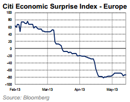
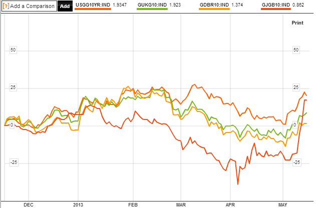
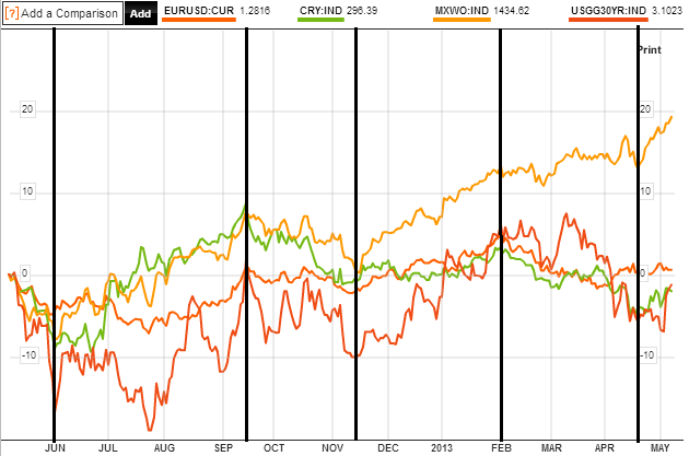
What would change this course of action? If inflation became problematic and yields rose too far too fast. Currently inflation is benign as global growth remains fairly soft. History reveals that a  low growth low inflation low rates environment is good for equities. It took the last 12 months for investors to really gain confidence in economic growth persisting (if soft) and with a gradual bottoming in government bond yields:

21jun1

Source: Bloomberg

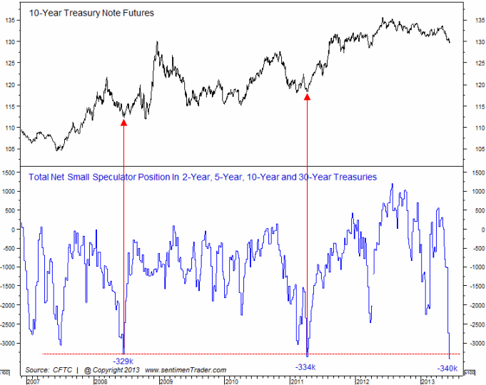
At those record low yields, investors were making a guaranteed real loss, yet money flows were still attracted into government bonds – with the assistance of QE in USA, UK and Japan – due to fear of greater losses in other asset classes. Recently that has changed, and it is because low economic growth has persisted long enough with some of the main worries (e.g. Euro debt, sovereign default) deflated. That does not preclude new crises emerging, but there has been a gradual process of repair since 2008, and I suspect we have seen the bottom in bond yields.

Because we are currently in demographic downtrends for the USA, China and Europe, I suggest it makes sense that only low growth is the current norm and that easy monetary conditions are likely to be maintained until a collective demographic improvement as of around 2020. Gains in real estate and equities should be capped by the demographic downtrends, but supported by the easy money conditions. Commodities have historically performed well during demographic downtrends, but could struggle to make large gains if soft growth holds down demand. Money should continue to flow out of government bonds, with any of those three classes the recipient, unless real yields rise too high for bonds to become attractive again. Yields cannot be allowed to rise too high because of high debt servicing and negative economic impacts. Combined, that makes for a fine balancing act between all four asset classes.

Japan is one economic giant that is in a demographic uptrend and I believe the recent surge in equities there is a belated catch up to that trend.

X2

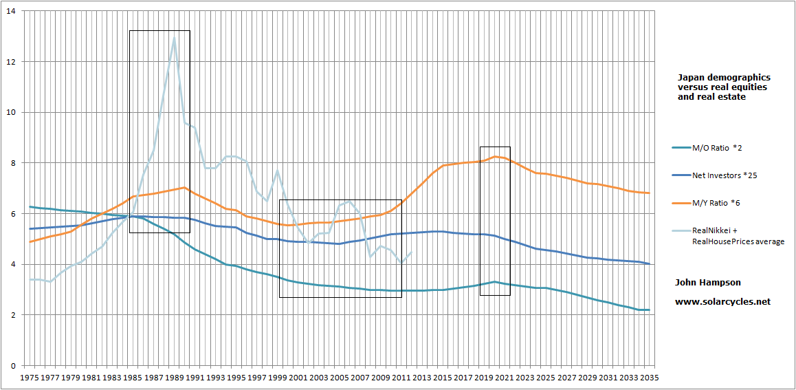
I believe Japan was ripe to bottom around 2002, along with demographics, but was then pulled back down again with the global crisis in 2007/8. The H1 2013 Nikkei rally was stopped at the long term declining resistance, but I think this time it will burst through it successfully, in due course:

21jun2

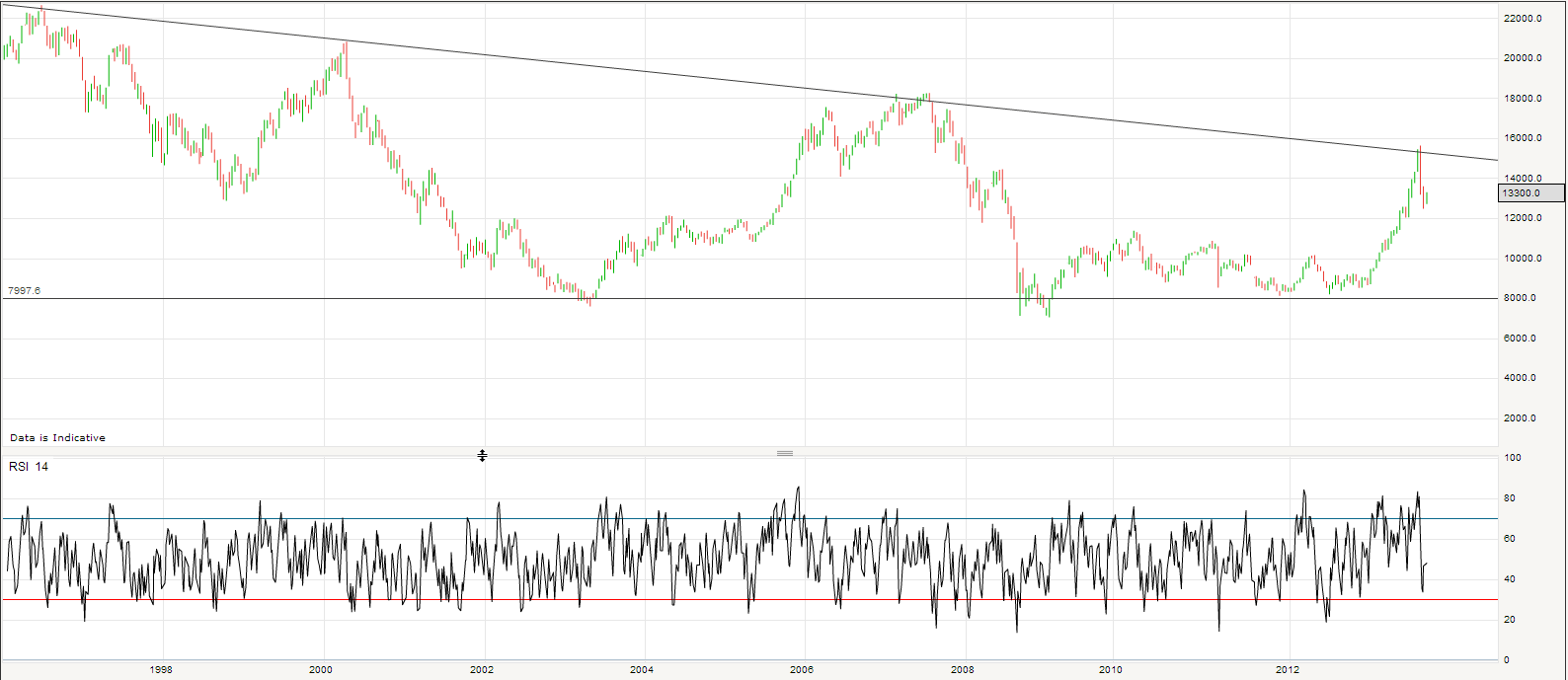
The Japanese government has declared it will do whatever it takes to re-inflate the economy and assets including buying equities. The question is how long it will take to break through. If US equities are beginning a topping process then it would seem unlikely that Japanese equities break out at this point. If emerging markets are heading into a crisis, as Russel Napier believes, then a global sell-off would likely take place again.

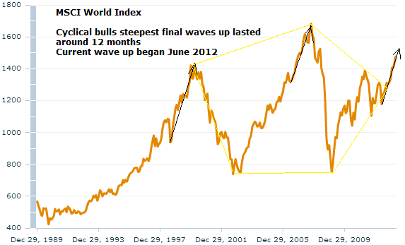
There are 3 possibilities here for US equities. One is that they have run up in an eiffel tower parabolic formation and will collapse now down the other side. Two is that they have begun a topping process whereby we should see an overall sideways volatile range over several months whilst negative divergences appear. Three is that they are consolidating before further gains.

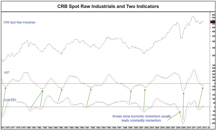
Because of the sharp run up and the demographic headwinds, I have my doubts about option three. However, cyclical stocks bulls usually end with commodities and inflation rising to become problematic and helping tip the economy into recession. Inflation rises, yields rise and the higher input costs and higher rates squeeze the economy. Bonds top first, then equities, then commodities. At this point we appear to have seen a top in bonds, but do not yet see commodities or inflation rising. Therefore we don’t see the usual historic pressures to pull down equities. Low growth, low inflation, low rates: good for equities.

For option 1, a harsh collapse, some analysts are referring to a 1987 overlay, predicting a crash. I can’t rule it out, I can just refer to that current environment again – it differs significantly from 1987 where yields and rates were much higher. We know that flash crashes can happen, where automated selling begets automated selling, but I suspect we’d need a swift change of status quo to bring it about. Something like the possible emerging markets crisis.

For option 2, a topping process, we would have time. There is no rush to short until we need more technical evidence of a topping range and negative divergences in breadth and leading indicators begin to appear.

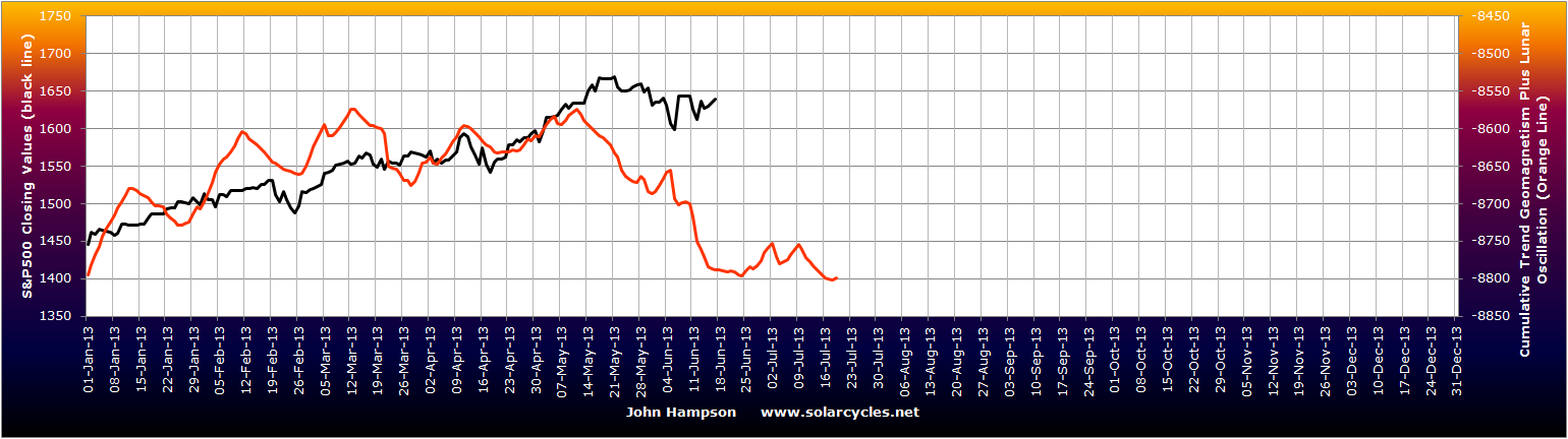
In the short term, I believe we could be reaching a point this weekend whereby equities rally up again. Passing through the full moon together with a possible bottoming out in geomagnetic disturbance – the Singapore STI shown here mapping very closely to the model:

21jun3

Plus, low Nymo and bullish percent / call put readings in US equities suggest a bounce imminently.

If equities do bounce then crude oil has a chance of holding its breakout, which it is currently backtesting. If crude cannot, and falls back into the triangle, then the textbook action to follow would be a breakdown out of the bottom of the triangle, which would likely spell prolonged doom for the commodities complex.

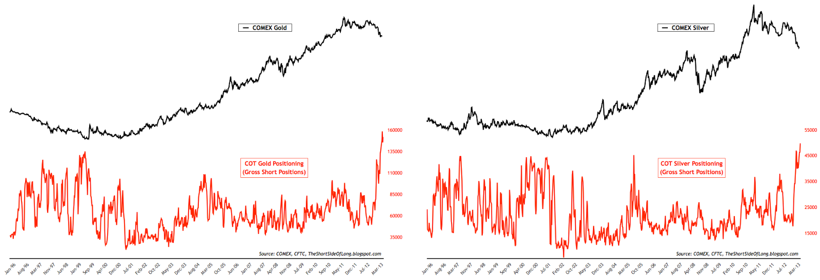
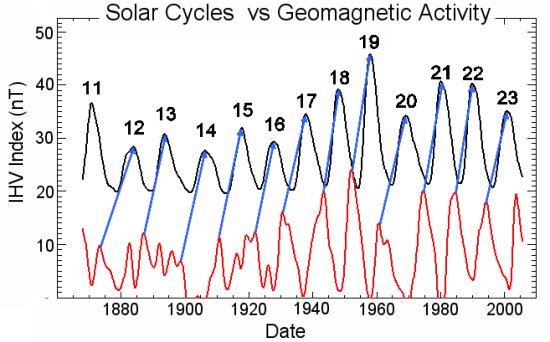
So will commodities come again? I believe they will. Nothing goes up or down in a straight line. Mean reversions eventually occur, if not something more juicy. What could give them momentum? A top in equities or concerns about the economy functioning without QE could spur money into precious metals as safety again, with a short squeeze possible on record short interest. Geopolitical developments can affect oil prices and in turn wider commodities and protests/wars are common at solar maxima. Global warming and global wierding remain risks to agricultural commodities, with May having come in at the 3rd hottest on record globally and Jan-May the 8th hottest on record. Global temperatures have historically peaked around solar maxima.

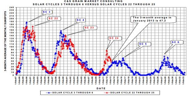
The latest on solar peak prediction is that NASA believe a summer peak in 2013 is likely, NOAA a Nov/Dec 2013 peak, and SIDC running with two options as shown:
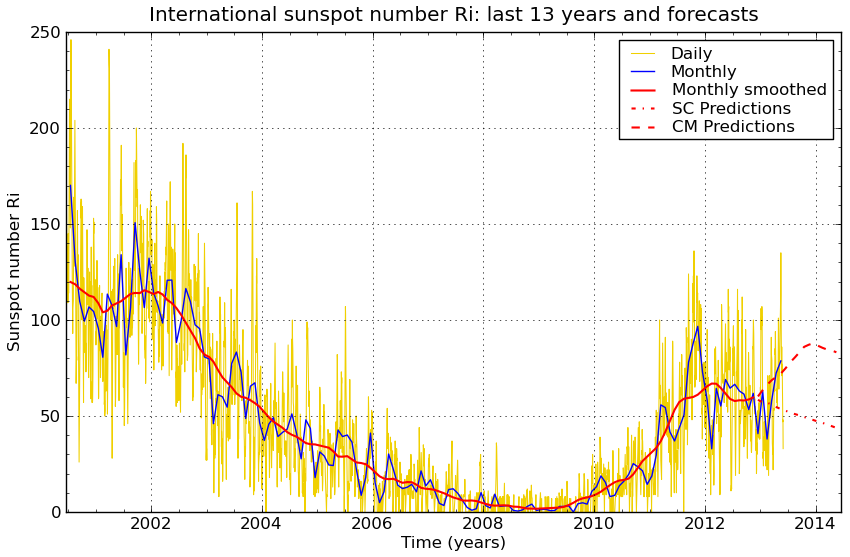
21jun4Source: SIDC

Averaging, we could look to a late 2013 smoothed maximum. Historically, secular asset peaks have been made close to solar maxima, along with inflation peaks. We should allow around 12 months for commodities to rise up and make a ‘secular’ peak and an associated inflationary peak if it is to happen along with this solar maximum, so it should be the theme from here into 2014 if it is to occur. With bonds having likely topped and equities having rallied hard, we are also ripe for outperformance to emerge in commodities. However, economic data out of China, increasing inventories, depressed sentiment in the class, and strength in the USD are some reasons why this is not occurring. Until this collective picture changes in some way, I have to remain open to the possibility that commodities will underperform through the solar maximum, and  this could mean a different asset class is bid up to a speculative peak if the solar maximum is still ahead.

From my recent Dow-gold ratio analysis, I suggested two likely bottoms in the ratio: 2014 or 2025 (approx). Either a swift run up to a speculative peak in gold into next year, or a mid-point currently on the way to a bigger gold peak a decade away at the next solar max. From the same analysis, demographics in the main nations no longer offer clear support for either equities or gold going forward, which I suggest means we are likely to see less wild swings between the two, and alternating shorter bulls. So I remain happy to average down in gold and other commodities, particularly with my new cash injection, and await either a mean reversion rally or a possible momentum move into commodities once a trigger emerges. I also would add to long Japan equities on any further drops. I am tempted by the weakness in positive-demographic Brazil and India to build more of a long positive there, but each are currently experiencing their own economic or social problems which could yet worsen so I am going to hold off. I would look to add short equities if a topping process becomes clearer with negative divergences. I remain short treasuries.

I believe the greatest risk currently to my portfolio is some kind of sharp global sell-off, a collapse in US equities infecting all pro-risk. However, I really can’t call a winner from the three options I outlined above for US equities at the moment, so await further flags and developments. If pushed, I still place greatest likelihood by a historically normal unfolding of events, namely that bonds have topped and we will see equities top as commodities outperform, with commodities topping last, helping tip the world into recession and end the equities bull; that the solar maximum will inspire speculative peak and that peak will be in commodities (or precious metals at least) due to the collective demographic downtrends aside Japan. However, I am nowadays ultimately of the view that there is complex interaction between demographics, solar cycles, fundamentals, government intervention and more, that make it a difficult calculation. I believe anomalies can occur if several of these factors conspire together to produce one, which is why there is no holy grail. However, I expect clearer ‘probabilities’ to emerge from here, one step and development at a time.

Developments

Oil broke out – upwards – though it is not yet sufficiently clear of the triangle to call it finally resolved:

18jun2

Large speculators have been betting big on such a bullish outcome:

18jun4Source: Sentimentrader

Small speculators, usually ‘wrong’, are betting big on further treasury bond declines:

18jun5Source: Sentimentrader

Which means we could see a near term pullback in yields. And that brings us to tomorow’s FOMC. Having sewn seeds of doubt that QE may see some tapering as early as in tomorrow’s announcement, I suspect whatever they say could be a catalyst for big moves in the markets. If treasuries are due a bounce, then gold is too:

18jun6Source: ShortSideOfLong

The SP500 has consolidated its pullback and is at a point whereby it could make a further leg down, in an ABC correction, or make a fresh attempt at a new high. By geomagnetism, the former is more likely:

18jun1

I remain of the view that a topping process has begun in the SP500 and that it should take several months to play out in a volatile range. A new marginal high on negative divergences would be normal, so if an ABC correction did occur we should still then see a return to the highs. Outperformance should transfer to commodities, whilst this takes place, and maybe the breakout in oil is the first key development in this.

Leading indicators have generally softened but remain positive:

18jun3Source: Conference Board

The Bradley turn for equities is 22 June and gold seasonals take off as of mid-June.

Topping Sequence

In Martin Pring’s work on the business cycle he proposes that bonds top first, then stocks, then commodities. Here is an illustration (click to view better):

10jun20131I am of the conviction that bonds began to top last year, with momentum having taken hold the last 6 weeks. Here are US, UK, German and Japanese 10 year government bond yields:

10jun20135

Source: Bloomberg

Equities have made a steep rally over the last 12 months which echoes previous cyclical bull terminal runs:

8may20139Source: MSCI

The trajectory and the duration suggest stocks should be due to top soon, however it is usual for a topping process to unfold over several months:

10jun20137Such a process usually unfolds with negative divergence warning signs. We have one current divergence in the geomagnetic model:

10jun20136Meanwhile, bond yields should continue to rise and commodities should attract momentum. ECRI leading indicators have historically given rise to commodity price action with a lag, and the LEI strength over the last 12 months should now turn commodities upwards:

10jun20132Source: M Pring

We see crude oil once again making an attempt to break upwards out of its long term coiling or triangle, with the support of an inverted head and shoulders pattern:

10jun20134And mid-June is a historic take-off point for gold:

10jun20133Source: Zealllc

By Russell Napier’s work, cyclical bulls in stocks historically end with yields rising and inflation troublesome. I see this as a fit with Pring’s work and my own, namely that we see equities rising, then yields and velocity, commodities become a beneficiary until inflation and yields start to tip leading indicators over and money exits equities, with commodities late cyclicals often rising into a peak once the business cycle has started to turn down. This, collectively, is the historic norm, and I believe we will see a repeat here, but it’s a question of timings.

I believe we are at the start of a multi-month topping process in equities, that commodities are from here going to be the momentum class, and that money should continue to exit bonds. However, we do not yet see rising inflation and we only have 6 weeks momentum out of bonds, which suggests the whole process should take some time yet.

A look at the equally weighted commodities index reveals that commodities prices are still elevated, and a momentum rally of 25% (red line) off a typical W-base would take us close again to record highs:

10jun20138Source: MRCI

That would ensure the missing inflation, but I suggest we may need one or more triggers to held generate such a move into commodities. I can only guess at such trigggers. One could be if crude oil can break out this time – as crude is an input in agricultural commodities and an important inflation driver, it could inspire price rises in both softs and gold. Another is the June 19 FOMC output, either sticking to or scaling back QE. The latter should create an initial sell-off but then I believe would translate into a faster flow out of treasuries and into commodities.

On a personal note, since moving to Austria we have been living with the in-laws. We will finally move into our new place 1 July, and we are renting there with no plans to buy in the foreseeable future. We just sold our house in the UK at the end of last week which means I now have a large lump sum in the bank account at my speculative disposal, because it is no longer stuck in the housing market. I am going to take my time to work with it and work out how best to deploy it, but it clearly alters the status quo. It means I am flush with cash, but as a trader I see this as a golden opportunity to turn it in to something much bigger. In the short term it means I can and will want to be more aggressive with opportunities, in building up my exposure, so I wanted to share it with you to set the context when announcing future trades.


State Of The Markets

The Fed’s hint of possible scaling back of QE as early as next month provided the break in the US and Japanese stock market bull runs. I suggest that QE-cut is unlikely to happen next month but the markets were ripe for a catalyst to pullback and that provided the puncture in confidence. Below is the updated lunar geomagnetic model and Sp500 chart. We are in the lunar negative period and geomagnetic disturbances have pulled the overall model down, so the market was levitating against these two trends, and therefore vulnerable to a break.

23may20139

The full moon is tomorrow and the end of the lunar negative period is Tuesday, so there is potential for more downside in the next couple of trading days. However, it is too early to say whether this week’s snap will be swiftly recovered thereafter or whether we have made a more decisive trend change. My thoughts at this point are that the Fed did enough to put uncertainty back into the markets until the next FOMC decision of 19 June. So I could foresee a correction/consolidation until then. I believe they then won’t scale back QE as early as that (though it could come in the following months) and so the markets will rally up again. Combined, that could provide a possible topping process formation.

Linked to this are the fortunes of the US dollar, gold and commodities in general. By my work, money flows should shift into cyclicals and commodities as equities enter a consolidation or topping process. Gold has potentially double bottomed this week and continues to track the Nasdaq’s correction of 1998. However, it’s too early to be sure of a bottom. The US dollar meanwhile made an intraday reversal on the Fed’s comments, which could be telling as it was the reversal of a breakout above the 2012 high:

23may201310Source: Ino.com

If US equities lose their momentum then I would expect the USD also to do so, and this could inspire a move into commodities if the global economy and leading indicators remain supportive. Crude oil once again failed to break out of its large triangle, this time to the upside, and so is back in the range lacking direction.

Here are the latest economic surprise readings:

23may20131

23may20132

23may20133

23may20134

23may20135Source: Citigroup

Bar Japan, they are all around historically low levels from which reversions normally occur. I checked the history of Citi economic surprises as a market indicator and they weren’t very meaningful in the bull of 2003-2007. However, as this is a mean reverting indicator, we can broadly expect these indices to rise going forward and thus provide some sentiment support for pro-risk. Plus there is some evidence that cyclicals tend to perform well when they are rising.

Turning to leading indicators, the situation for now is fairly positive as shown by the World LEI and CB LEIs below:

23may20136Source: Recession Alert

23may20138

Source: Conference Board

ECRI leading indicators for the US continue to be positive:

23may20137Source: Dshort

China flash PMI was weak in the latest reading, Europe PMIs improved. My overall view is that there is fairly low risk for the global economy over the mid-year given that there were rate cuts and increased stimulus in Q1 in various countries, together with fairly benign commodity price action and inflation. I think it therefore possible that money continues to flow out of government bonds into pro-risk, but the reversal in bonds and yields is a fairly new development so it is too early to be sure it is enduring.

What Really Moves The Markets

The evidence has led me to a ‘dumb’ model of the markets, whereby humans are more subjects and less intelligent creatures of free will. It’s up to you to decide whether I have simply found what suits me and filtered out the rest, i.e. dumb seeks dumb. If we remove all the noise by looking long term, I suggest sunspots and geomagnetism are two big (but very subtle) drivers of human behaviour towards risk assets, with demographics (which are influenced by solar cycles) simply providing bulges in demand to produce long term bull markets in stocks and housing.

I suggest the solar phenomena are influencing human behaviour in the economy and financial markets alike, and that is why we find treasury yields, interest rates, money velocity, inflation and commodities largely correlated together. Optimism, excitement and positive sentiment driving all up, or pessimism, fear and negative sentiment driving all down. Just waves of sentiment supplied by nature. Plus, when increasing numbers join the investor age bracket of the population versus old and young over a period then enduring bull markets in stocks and housing can occur simply due to the growing demand the demographic trend provides. No complex interaction of fundamentals, just more people investing for retirement.

So I figured the next step was to produce a composite model of sunspots, geomagnetism and demographics for the USA over the last century to see to what degree this correlates with the long term US risk asset composite that I charted earlier in the week: namely real stocks and commodities, real house prices and treasury yields. To do make the triple ‘agent’, I used annual mean sunspots, annual average geomagnetism (inverted, because low geomagnetism is pro-risk, high geomagnetism anti-risk) and for the demographics the middle-young ratio up to 1950, then a composite of middle-young, middle-old and percentage of net investors from 1950 to current. To make the quadruple ‘subject’ I used real SP500 annual values, the Schiller real house price index, the commodities index and 10 year treasury yields.

This chart shows how geomagnetism relates to sunspot cycles over the long term:

17may20131Source: NASA

Peaks in geomagnetism occur typically 1-3 years after sunspot peaks, averaging 2 years later. This fits with recessions and unemployment peaks usually occurring within a couple of years after the solar peak, as peak geomagnetism escalates pessimism and fear. The strength in a geomagnetic peak is also a reasonable predictor of the strength of the next solar cycle.

Once I had worked back half a century, compiling the data, this is what popped out (click to view charts larger):

Z16

The model didn’t work out so well in the periods around 2006, 1974 and 1951. I then discovered what united the three: real interest rates were negative:

Z15

Inbetween, the model worked very well. When real interest rates were negative, risk assets (particularly commodities) got an uplift, regardless of sunspots, geomagnetism and demographics. This is because this type of inverted evironment discourages cash and savings, and encourages borrowing and speculation. People are not being compensated by leaving their money at the bank to offset the gradual erosion of purchasing power, so they seek hard assets and risk investments instead.

So I added negative real interest rates to the model (netting them from the composite where they occurred in the last century) and completed the history, and this is the result:

Z17

Overall a very close match with the moves into and out of stocks, commodities, housing and t-yields over 100 years.

Therefore, I am suggesting there are 4 main agents in moving financial risk asset markets: sunspots, geomagnetism, demographics and negative real interest rates. On a yearly basis, they collectively mapped the bull and bear waves up and down, with little missing.

I then attempted to project the model into the future for the next 20 years.

Demographic projections to this end are fairly reliable as those entering the key age groups over the next 20 years are largely already alive so we have a good idea of numbers moving through. I therefore used all three measures again – middle / old, middle / young and net investors – and combined into a composite.

For sunspots, there is a historic rhyme with a past period of solar cycles as shown:

17may20132Source: WattsUpWithThat

So I projected sunspots forward based on solar cycles 5 and 6. Then, using the link between a geomagnetic peak with the next solar peak, as referenced further up the page, and its typically peaking 2 years after a solar peak as well as general relations with the sunspot cycling, I constructed a geomagnetism model for the next 20 years.

Lastly, for negative real interest rates, I used the late 1940s and 1950s as a guide due to its historical mirror, with high government debt meaning rates had to be kept low, whilst modelling inflation based on its correlation with solar maxima.

The result:

Z18

Clearly, there are assumptions and a reasonable tolerance allowance in my 20-year forecasts for the three datasets that make up the model other than demographics. One assumption is that the solar maximum is ahead this year. If that proves correct then there is a fairly potent combination of a sunspot peak with negative real interest rates, which contribute to the 2014 spike, before dwindling sunspots and peak geomagnetism arrive along with fading demographics. From 2022 to 2027 a bull market in stocks and housing should be enabled by an upturn in demographics and the next solar maximum. Overall, however, the future model is downward sloping, as demographics are poor relative to a golden period like 1980-2000, and the sun potentially enters a new ‘minima’ period as shown in the SC5 and SC6 historic rhyme above.  This is also despite the built-in expectation that real interest rates may oscillate in the negative for some time yet, as the Fed only slowly and gingerly moves up rates, balancing servicing high debt with keeping inflation in check.

As time progresses, the assumptions in the projections can be confirmed or denied and the forecasts within it refined. As this is a long term model, forward validation is going to take some time. Nonetheless, the backwards validation that came out of the data confirmed the validity of what I believed mainly moves the markets over time, with negative real interest rates added to the three that I set out to test. I am well aware that this is not the mainstream view and would be a hard sell to investors: that the four agents of risk asset markets over the long term are sunspots, geomagnetism, demographics and negative real interest rates. However, drawing those together into a composite appears to account for all the major bulls and bears that we have seen in equities, bonds, real estate and commodities over the last century.

I am still formulating my thoughts on the findings of this last week, but here’s one to end the post: maybe the Fed isn’t as foolish as many make out. The reason the Fed intervenes at all in periods of ‘bust’ or cleansing is to prevent a depression, which would be much harsher on the population and likely bring about social conflict. By pushing down interest rates into the real negative, it can induce risk-asset rallies, which make the people feel better if their investments are rising, and housing rising. The problem is this action typically produces commodity inflation, which is bad for the people. Now there is a large block correlation between official interest rates, t-yields, money velocity, real commodities and inflation, and then recession and unemployment. The first five typically rise together and then produce the latter two. By acting on t-yields through QE, rather than just acting on official rates, might the Fed be able to keep the 5-correlated from rising, and thus also prevent the recession and unemployment that follows too? It would seem worth a try. If that worked, they would perhaps be able to maintain an environment of negative real rates with the beneficiaries stocks and housing, whilst preventing the undesirable trio of commodities inflation, recession and unemployment from rising until they end QE. Right now, that overall scenario seems to be what’s in play in the markets, doesn’t it? However! I am doubtful this actually works. Commodities staged a big rally in 2011 despite QE2. I believe they will do so again and normal correlations will apply.

Update: 

One additional chart to ponder – is global temperature correlated too? It’s tempting to shift this along and see how it matches up, but I’d need a good reason to apply a lag. Any ideas folks?:

Z19

State Of The Markets

The latest picture for 4-way pro-risk:

16may20131

Source: Bloomberg

If a trend change occurred in late April then commodities and Euro-USD have yet to meaningfully participate. Stocks and bond yields however, have been strong.

The sharp rise in treasury bond yields continues to be reflected in German bunds and UK gilts, and the rush for the exits in bonds has been at its greatest in Japan:

16may20132

Source: Bloomberg

Here is the Japanese Nikkei monthly – an amazing six months:

16may20137If equity markets are on track, per my forecasts, for a top around June, then the Nikkei has a potential resistance there from which it could pull back.

Gold so far is progressing like the Nasdaq correction which I drew attention to HERE. I am looking for a higher low than in mid-April, or a lower low on positive divergence.

Crude oil is still in is large triangle, failing again at resistance:

16may20136As we are in the lunar negative period, we may need to wait until late May if it is going to eventually manage to break out upwards.

This chart suggests that an upturn in G10 economic surprises is required to shift outperformance away from defensives to cyclicals, which would include energy:

16may20133As economic surprises is a mean reverting indicator, the G10 indicator may have reached low enough to warrant a reversal.

Leading indicators also look supportive for this to occur as they remain overall positive. The latest Conference Board data revealed +0.4 for the UK, +1.2 for Korea and +2.1 for Japan. The latest OECD leading indicator picture is very healthy:

16may20134Source: OECD

My overall projections remain the same. A mid-year topping process for equities and rotation into commodities. Leading indicators are showing sufficient health for this to occur, and narrow money predicts emerging market outperformance going forward, which would tie in with increased strength in commodities. I am looking to see a gold bottoming formation, and an eventual break upwards in oil, as supporting developments. The sharp rise in bond yields bodes well for my overall scenario as that was a missing piece of the puzzle, and should be accompanied by a rise in money velocity. Geomagnetism has flattened out, but by seasonality there should be improvement into June/July before a trend change donwards into the Fall. Daily sunspots currently remain close to the record so far for this solar cycle – strength that looks more promising for a solar cycle maximum ahead in the Fall.


USA Financial Markets Economic Correlations

Correlations between real stocks, real commodities, real house prices and treasury yields, together with inflation, interest rates, recessions, unemployment, demographics and sunspots. A more detailed, step by step study of the correlations, using correlation coefficients, whereby +1 means a perfect lockstep relationship between two things and -1 means a perfect inverse relationship, whilst zero would mean no relationship. A reading over +0.5 is considered a strong positive correlation. Note some of the data has been scaled to share the same chart (indicated by, for example, /10 or *3). Also note for US inflation I have used an average of Shadowstats and official CPI since the 1980s, and official CPI before that. You can click on any of the charts to view larger.

Let’s start with a couple of the highest correlations:

Z1

Z2Combining the two, 10 year treasury yields, official US interest rates and MZM money velocity all move in almost perfect lockstep. They are currently all together at record lows. If one begins to rally, we should expect all to rally – with implications for the Fed.

Now let’s look at another closely correlated pair:

Z3Real commodity prices and inflation show a strong correlation. There is a feedback looping between the two as rising commodity prices cause price inflation but price inflation spurs money into commodities (hard assets) as an inflation hedge. There was a lot of debate around the 2008 and 2011 commodity spikes as to whether speculators were to blame. The trading of commodity futures has been around for 150 years in the US, and price spikes are more speculator-heavy because of the feedback looping. Regardless of which kicks off the process, the two occur together.

The next chart shows the relationship between US official interest rates and inflation. Most of the time there is a strong correlation, and as the Fed is the sole agent in rate-setting, we can say that the Fed move rates up and down either in response to or in anticipation of inflation, but largely in line with. However the late 1940s and the current period don’t match up as well as the rest.

Z4

The picture becomes clearer when we look at real interest rates (net of inflation), and extend further back in time:

Z5

We see three clear periods of negative real interest rates – which notably coincided with secular commodities bull markets. Inflation was higher during these periods. If you subscribe to the Shadowstats calculation of inflation (that official inflation stats have been significantly doctored over the last 3 decades) then the purple and red lines would be somewhat higher and lower respectively than shown at the current time. If you take the official CPI data as true, then annual inflation would be currently running around 1.5% which would still maintain the real rates line in the negative. I suggest true inflation is likely somewhere between the two, and thus as shown. As things stand currently, therefore, the environment for the secular commodities bull is still in tact.

Here is another correlation with inflation. US unemployment brought forward two years has a correlation over +0.5 with US inflation:

Z8

This is because recessions occur following inflation spikes:

Z7So we see inflation spikes bringing about recessions which bring about peaks in unemployment around 2 years after the inflation spike (due to unemployment being a lagging economic indicator).

Now let’s draw together unemployment (brought forward 2 years) and inflation, and bring solar sunspot cycles into the picture:

Z9Sunspot solar peaks correlate with inflation peaks, and unemployment brought forward 2 years. This is not a lockstep relationship – it is a correlation specifically related to the solar maxima – and the reasoning for that is the ‘excitement’ that Aleksandr Tchijevsky discovered around solar peaks in human history which is backed up by more recent research revealing bilogical changes in humans at sunspot peaks. If this ‘excitement’ translates into buying and speculation at solar peaks then we can justify spikes in inflation (with subsequent recessions and unemployment spikes).

If it is true that humans are biologically disposed to buying and speculation at solar maxima then a composite of risk assets, namely real stocks, commodities, real estate and treasury yields, should spike up at each solar maximum. Here it is:

Z10The composite uses Schiller real house price data and real SP500 index annual values. Each solar peak is accompanied by a spike in what can be termed risk appetite. There are other spikes inbetween the maxima, but what is key here is whether solar maxima reliably bring about spikes in risk assets, given that we are likely in the year of a solar maximum in 2013.

Within the risk asset composite, there are broadly speaking two pairs:

Z12

10 year treasury yields have a distinct relationship with real commodities, whilst real equities and real house prices correlate very positively together:

Z11

Yet commodities and stocks display an inverse relationship over time of around -0.5, with the result that the two above pairs are often going separate ways. Indeed, thus far in 2013 we have seen US equities and real estate rallying whilst commodities and treasury yields have been languishing. Is it time for a reversal?

If we bring in demographics at this point, and combine stocks and real estate into a composite, this is what we see:

Z13

All three demographic measures – middle to old ratio, middle to young ratio and percentage net investors – are all pointing down for the next couple of years. The stocks and real estate composite has historic correlations with the three measures ranging from +0.54 to +0.7, so all strong positive. It would therefore seem more likely that there is another leg down for real equities and real housing into circa 2015, rather than secular bull upwards action from here. Another leg down in real terms would also help satisfy secular p/e, Q ratio and regression to trend measures for equities, which all call for further washout.

Drawing all the above together, along with my previous analysis, I suggest it remains the most likely scenario that we see an inflationary peak to coincide with the solar maximum (allowing for a reasonable time window), within which commodities and treasury yields rise and stocks and real estate decline in real terms, but due to significant inflation hold up in nominal terms. A recession and peak in unemployment should then follow the inflationary peak. As of around mid-decade demographics improve sufficiently to remove the headwinds for equities and housing, which could enable a new stocks bull, with real interest rates turning positive again.

Once again, your observations and suggestions are welcome, as I believe there is more to be teased out.

Sunspots, Equities, Treasuries, Commodities, Inflation, Money Velocity, Interest Rates And Demographics

Time to draw them all together and see the full correlations. This is US-based analysis due to data availability.

The first chart (click to view larger) reveals historic spikes in US interest rates, 10 year treasury yields, MZM money velocity and US inflation (averaging official CPI and Shadowstats data) all within a 2 year period around the solar maximum (note the 1968 solar max was November and the 1979 solar maximum December, hence the 2 year boxes following; also note some of the measures have been scaled to share the same chart).

10may20131

Stepping back further in time, the 1947 solar maximum was accompanied by a 1947 inflationary peak, followed by spikes in corporate bond yields by 1948 and treasury bond yields by 1950.

If the next solar maximum is ahead in Autumn 2013, then by history we should see spikes in rates, yields, velocity and inflation within around 2 years of each other and of the solar maximum. Is it different this time because the government has acted to surpress both interest rates and bond yields? With velocity correlating closely with bond yields, is an inflationary peak not going to happen this time? I believe it will happen, as the same surpression occurred in the 1940s and yet the spikes took place.

The second chart (click to view larger) adds in real commodities using the CRB index adjusted for inflation (and again scaled). Interestingly, real commodities behave very similarly to rates, yields, inflation and velocity – all moving together into peaks (orange boxes) and troughs (red boxes), over periods lasting around 3 years.

10may20132

There is a general pattern of collective peaks around each sunspot peak, and additional collective peaks before solar mimima. I don’t yet understand why we see rallies leading into solar mimina, however they have historically set up the panics and crashes that occur at the solar minimum. Nonetheless, yields, commodities, velocity and inflation all acting together is suggestive of waves of ‘human exctitement’ that brings about speculating, buying and circulating money in the economy, or the opposite.

The third chart adds the real inflation-adjusted S&P500 and US demographics trends (middle to old and middle to young ratios combined) into the picture. Here we again see evidence of ‘human excitement’ correlating with sunspot peaks as some combination of real stocks, real commodities and inflation spike up around the solar maximum.

10may20133Demographic trends appear to be important for real stocks to peak, whilst commodities appear to behave opposite to demographics.

In summary, there appears to be a 4-way correlation between equities, sunspots, demographics and inflation, whilst there appears to be a 5-way correlation between rates, yields, velocity, inflation and real commodities. My solar-theory take on it is that the same phenomenon of human excitement (driven up and down by the solar cycle) translates into trends in buying, asset speculation and circulating money, hence the united correlations, whilst demographics (which also have a solar input: solar maximum peaks (and occasionally troughs) in births) additionally feed into equities due to investment/disinvestment in equities, relating to retirement.

I’d be interested in your thoughts on any of the correlations in the charts. I suspect there is more to be teased out.

State Of The Markets

Here is the latest picture for pro-risk proxies. A new uptrend appears to have begun in late April, following an overall downtrend since the turn of February (equities traded overall sideways).

8may20131Source: Bloomberg

Developments are still very much in keeping with 5-models-in-alignment (this post), and if their collective forecast holds good then the next and final top should be June/July for equities. As it happens, the last two cyclical bulls in equities ended with a steep wave up lasting around 12 months:

8may20139

Source: MSCI

The current wave up began June 2012 and so its termination around June 2013 would fit with the last two cyclical bulls and also the 5-models prediction.

A top right here in equities appears unlikely as divergences in breadth have been largely rectified over the past couple of weeks, which combined with breakouts in US and German stock indices, looks good for further near term gains. Plus the overall geomagnetic trend remains upward, looking out to the end of May.

Note on the Bloomberg chart the sharp upturn in treasury bond yields over the past week, and this is also reflected in action in German bunds, UK gilts and even Japanese bonds, despite the government’s doubling of QE:

8may201310

Source: Bloomberg

An interesting development. Recall the close relationship with money velocity, and the potential basing that has been occurring in both over the last 12 months. We need to see follow through on this if it is to be meaningful.

Another interesting development is in crude oil:

8may20132

Crude failed at an upwards breakout attempt in mid-April, but then failed at a breakdown attempt, and has now completed a reversal of a reversal back to the top of the large triangle. Can it break out this time?

Meanwhile gold has partially retraced its falls and we see how it shapes from here. Some kind of W-base would be normal, i.e. a second low. If that is a higher low, then that would be bullish for gold.

8may20137

Central banks are acting supportively for gold. Their combined gold purchases came in at record levels in 2012, and they continue to ease, devaluing currencies and cash, with both the Australian and Eurozone central banks cutting again in the last couple of weeks:

8may20133Source: Action Forex

This is in response to a weakening that we have seen in economic surprises and leading indicators. Here is the latest global PMI reading, still positive (i.e. growth) but weaker than last month:

8may201311Source: Markit

However, there are reasons to be optimistic for a renewed strengthening ahead in the global economy. Falling commodity prices over the last 6 months should have pulled down input costs giving the economy a boost. Plus, narrow money is still positive as a leading indicator of industrial production (normally by 6 months):

8may20134Source: Moneymovesmarkets

Furthermore, breaking down narrow money trends, emerging markets look set to outperform developed markets from here, which should produce a strengthening in emerging market industrial production:

8may20135Source: Moneymovesmarkets

And there is historically a correlation between commodity prices and emering markets industrial production:

8may20136

Source: TheFaintOfHeart

Agricultural commodities could also benefit from continued global wierding extremes. In the US, 60% of the country is in drought or dangerously dry, it is the second coldest Spring start on record, but then there is record breaking heat in the Southwest and record high river levels in the Midwest. Drought, flood, freeze and bake – really an ideal mix to decimate crops. And returning to crude, geopolitics have the potential to push oil higher if hostilities in the MiddleEast continue to escalate.

The other potential driver for commodities is the normal rotation into cyclicals at the end of a bull run. Money should switch out of defensives into oil and industrial commodities, amongst others.

One step at a time as always, but I see improving chances of my primary scenario coming good, namely that a solar-maximum inspired inflationary peak and secular commodities peak lies ahead. Sunspots have been in a solid uptrend of late, and if there is a correlation between rising sunspots into a solar maximum and speculation in the markets then speculative behaviour has certainly been in evidence. The primary scenario likelihood would be much further enhanced if treasury yields can continue to rise and with them money velocity, plus if oil can break upwards out of its triangle, and the outperformance in emerging markets and commodities takes hold. We need to see a renewed strengthening in economic data, particularly leading indicators, to provide the backdrop for speculation into risk assets. Inflation will follow if yields, velocity and commodities all rise.

In the near term I see good chances that pro-risk can rise together into June/July, so I am holding all positions for now. However, the lunar positive period ends on Monday so there is higher risk of a correction or consolidation in the subsequent fortnight.