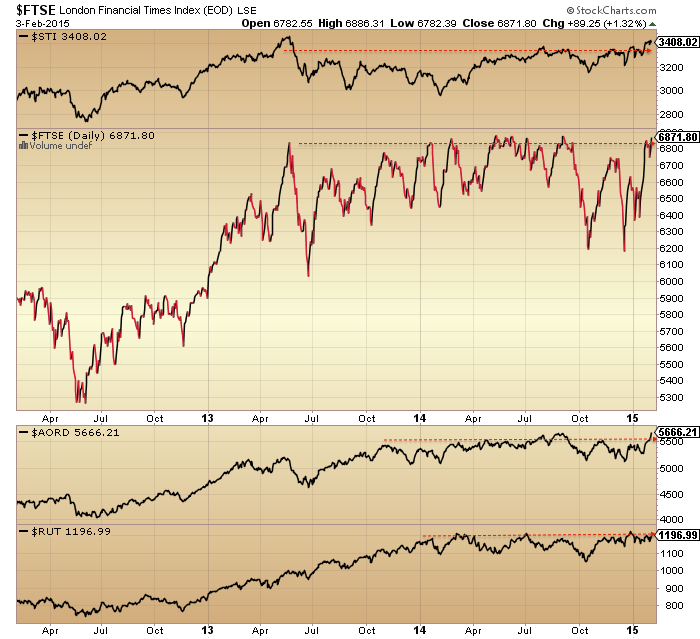
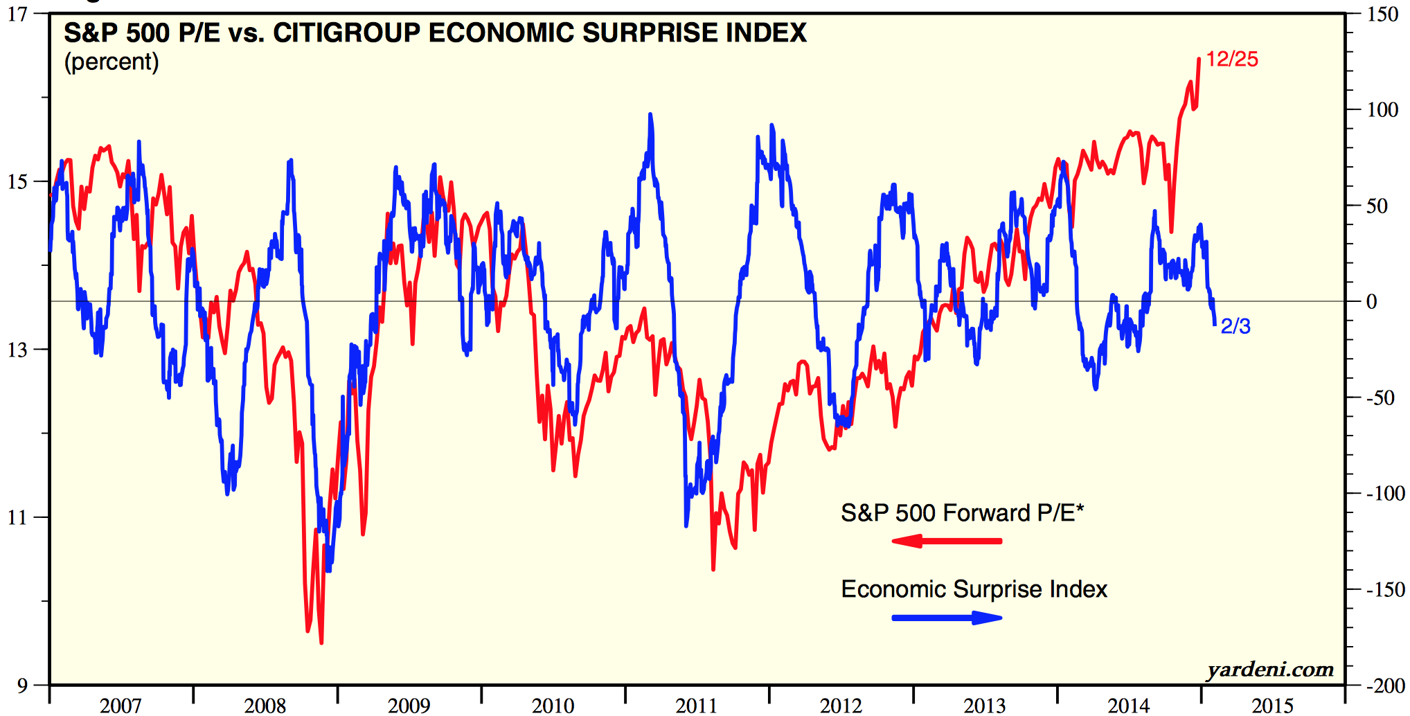
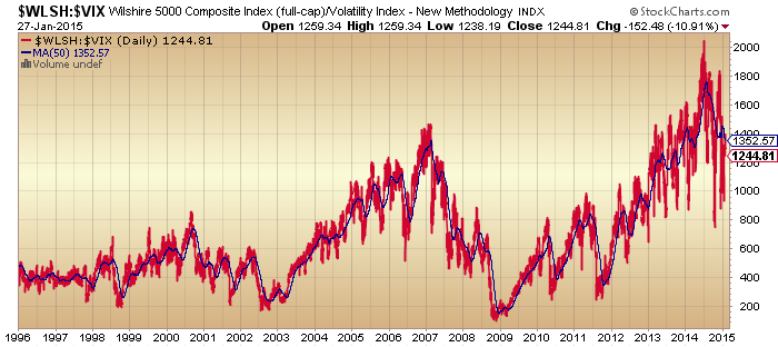
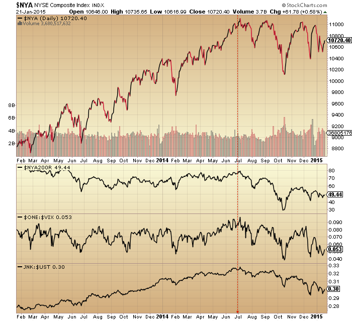
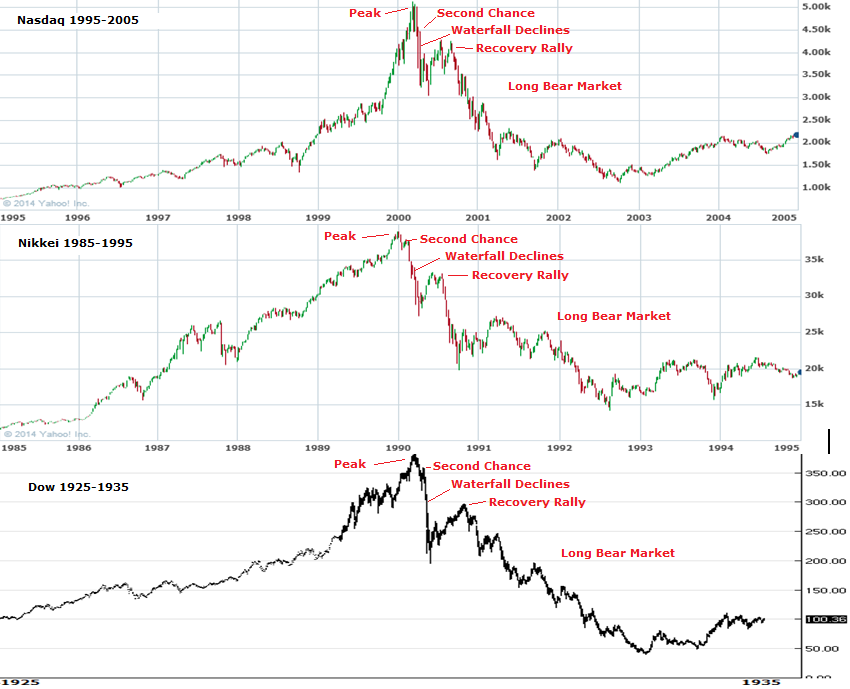
Comparing the 2000, 2007 and 2011 peaks to 2014-15.
Taking 2000 first, as that was the last solar maximum pre-2014 and therefore the most relevant, I’m using several measures that stretch back that far and show divergences pre-peak, namely Nasdaq breadth, 10 year treasury yields, cyclical to defensive sector performance and all set against the Dow Jones World stock index. Clear topping process progression and timings are labelled on the chart:

Source: Stockcharts
Now here is 2014-2015. Amazingly it is almost identical in progression and timings in both the stock index and the indicators.
 The only difference is that the July/Sept peaks in 2014 exceeded the solar maximum peak in nominal terms whilst in 2000 they were lower peaks.
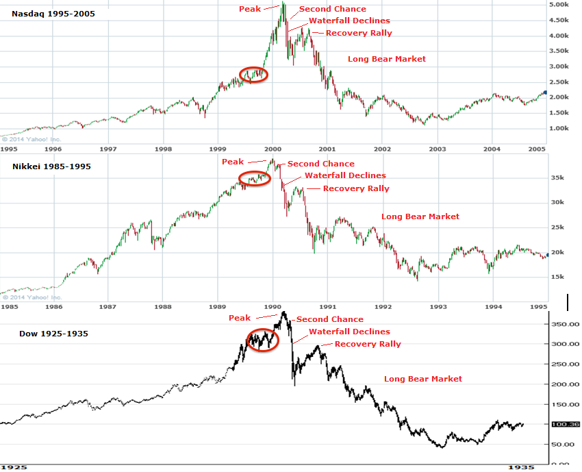
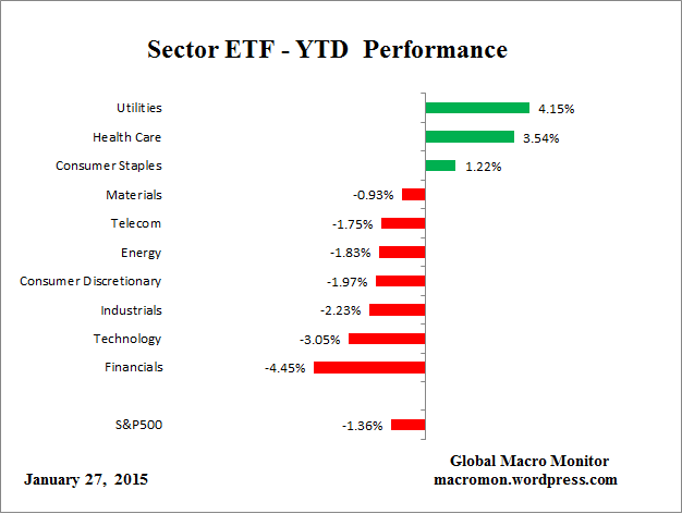
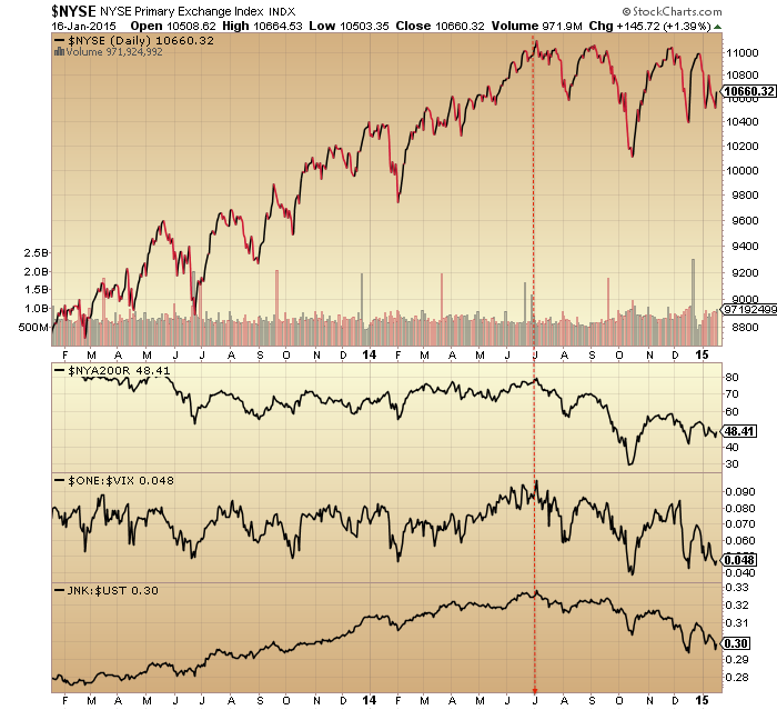
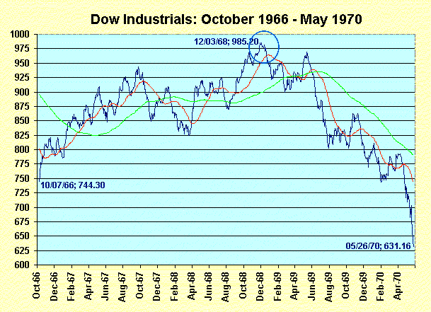
Here are the 2007 and 2011 peaks to complete the comparison. No solar maximum in these two years, but otherwise a similar topping process with leading divergences in the indicators and a notable peak in July every time.

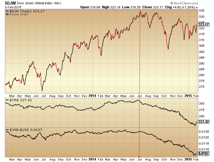
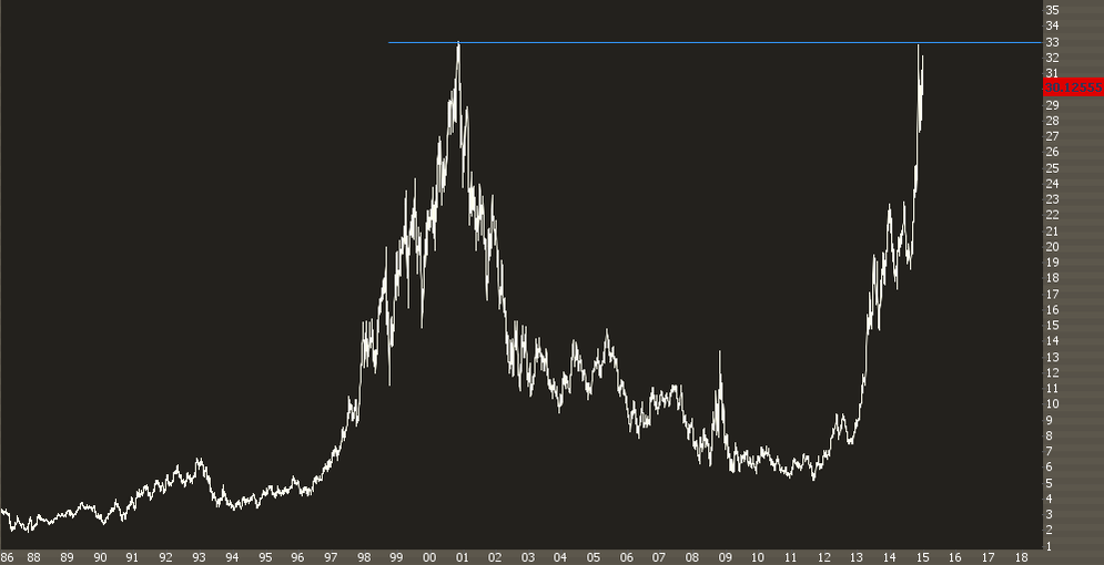
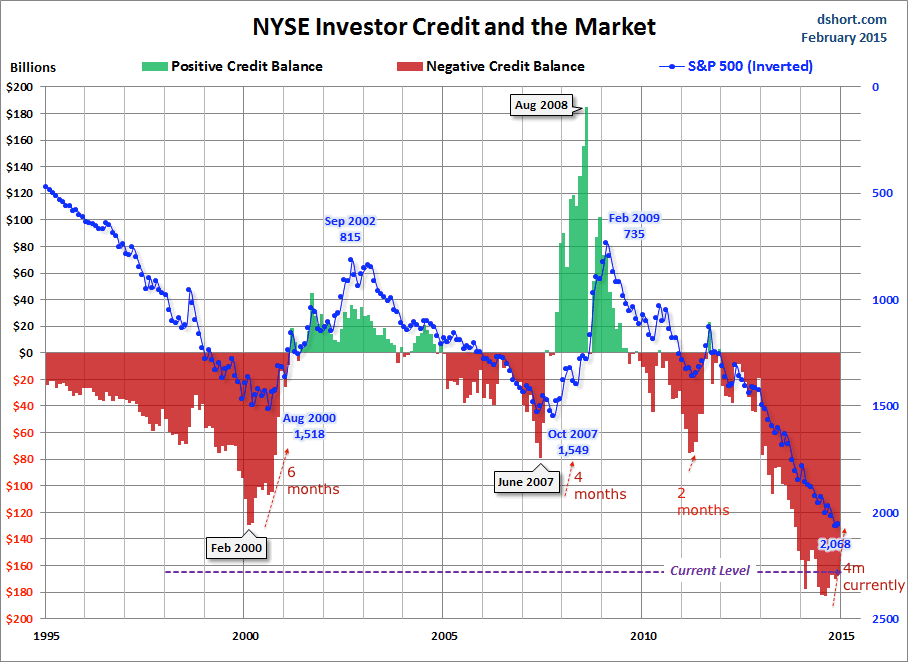
 With margin debt for December finally released here is the picture for net investor credit:
Source: Doug Short
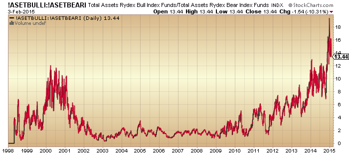
We see another leading indicator for the 2000, 2007 and 2011 peaks, varying from 2 to 6 months on the monthly SP500. Currently we have a 4 month divergence versus the December 2014 existing SP500 monthly high, fitting in the historic range.
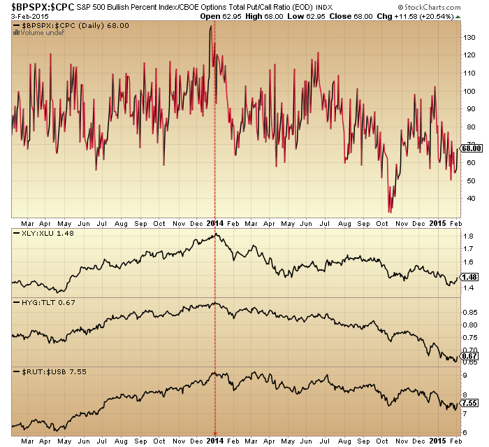
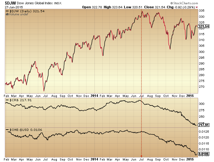
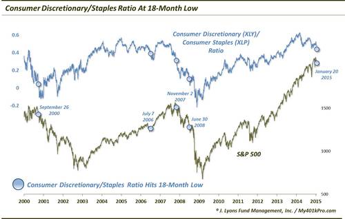
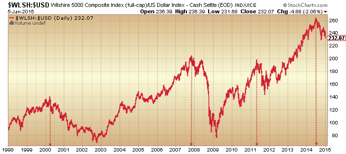
Lastly if we compare stocks:treasuries and stocks:dollar, we see additional leading indicators in a relative defensive shift with 0 to 3 month lead time for the 2000, 2007 and 2011 peaks.
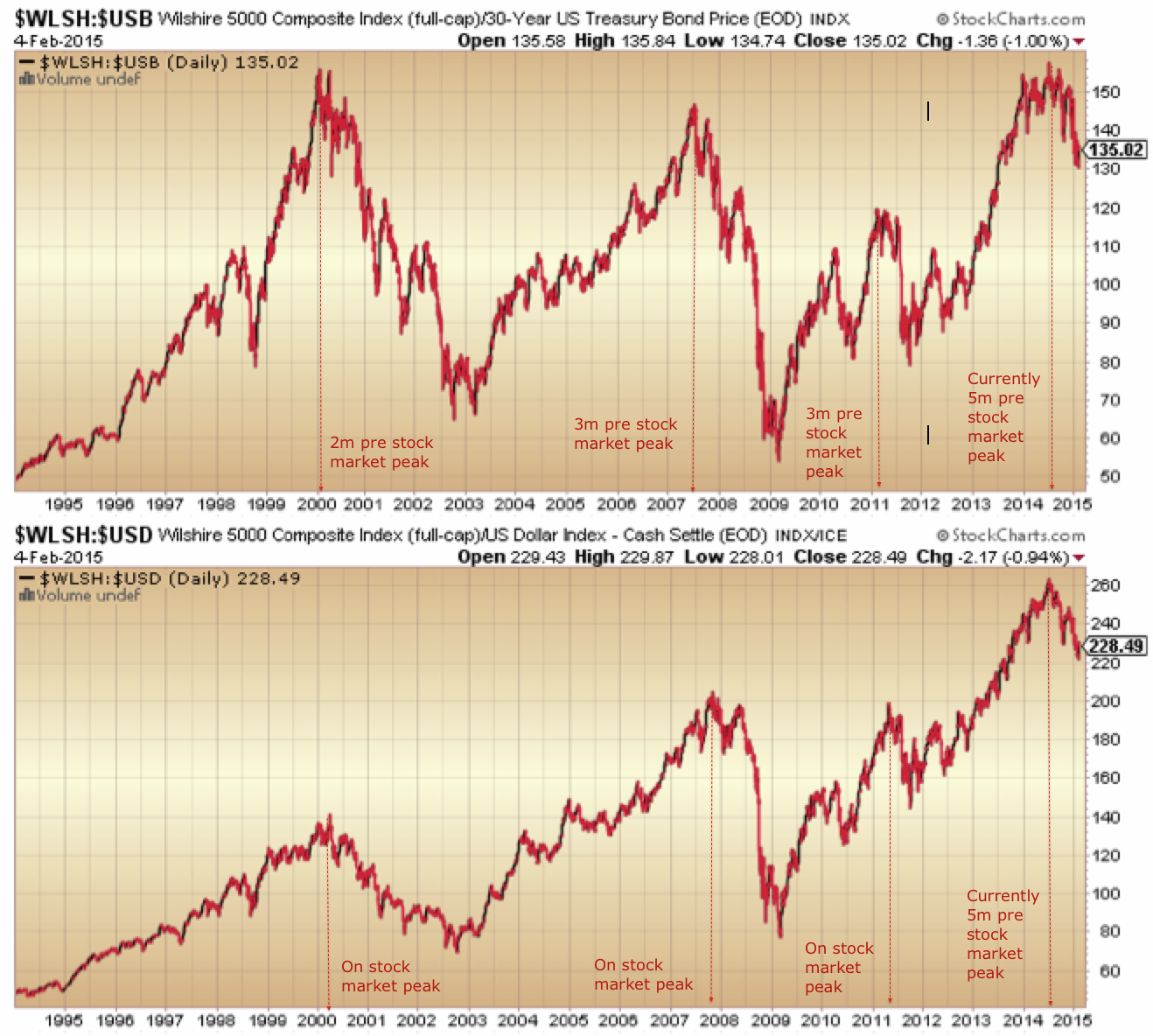
Both measures show a 5 month divergence on our current December 2014 Wilshire 5K high. Yet both measures tie in exactly with when the Dow Jones World made its peak-to-date, July 2014.
All this strongly suggests the ‘real’ peak in stocks occurred back in July 2014. So how can we square fresh nominal highs in European indices and several US stock indices challenging for new all-time highs again? We can square it if European indices are making a final blow-off top and if US indices fail to make new highs here. Back in 2001 the DJW index turned down again at the start of February, heading for Mar/Apr lows, and that fits with the geomagnetic seasonal roadmap that I have presented before. It really means stocks must be repelled back down here, whilst gold ought to break upwards from its consolidation of the last 2 weeks. Drawing together time and price factors I suggest we have just a few trading days for this to transpire. As per my last post, if price and indicators start instead to break upwards then the picture changes and breaks with the logical case.