Is This ‘It’?

Why might it be?

The triple confluence peak of peak speculation: the new moon closest to the seasonal geomagnetic peak closest to the smoothed solar maximum: 27th June 2014. Many assets and indicators peaked then.

Screen Shot 2015-06-16 at 06.27.40Source: Stockcharts

Breadth bar cumulative advance declines peaked then too, with the latter having recently turned down.

16junn10

The global stock index has made a marginal new high since that point but the divergences in strength closely resemble previous major peaks.

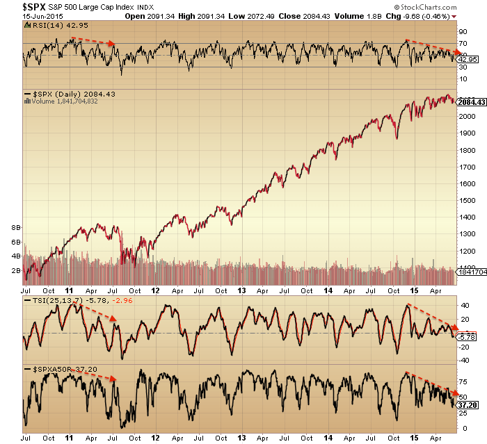
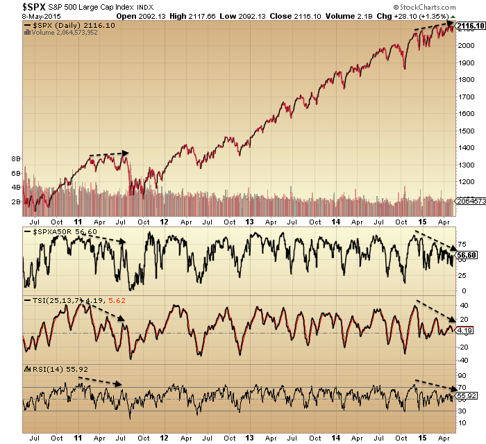
16junn8The SP500 also shows a strength (and breadth) divergence that mirrors the 2011 major peak.

16junn3

The breadth in the Nasdaq measured two ways peaked out around the solar max of April 2014. There has been some improvement since but still divergent overall.

16junn6

Bullish percent / put call ratio shows one of the longest divergences, together with high yield to treasuries. Cyclicals vs defensives has repaired itself in 2015 but is overall flat for 18 months.

16junn12

NAAIM manager exposure shows a divergence similar to the run into the 2007 and 2011 peaks. It made ‘an attempt’ into the mid-2014 peak too, but as we know, the market managed to recover.

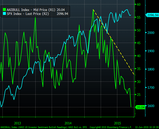
16junn4AAII bulls have also been making a divergence. Oddly though they have now reached the same level as March 2009, so that could be contrarian bullish. I’d just repeat that AAII sentiment survey has a poor predictive history hence I rarely post it.

16junn17AAII allocations – different to the above source – shows a bizarre rush to exit stocks. Don’t know what to make of that.

16junn22

Source: J Lyons

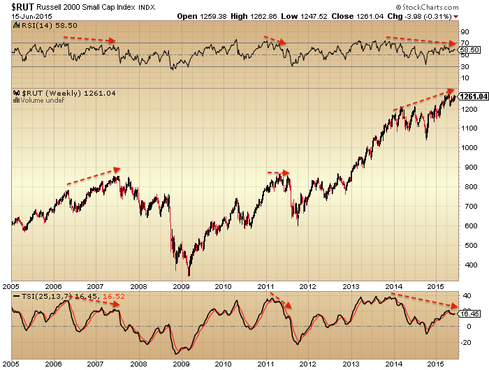
The Russell 2000 is one of the most bullish indices. But the same divergence is showing as the SP500 above.

16junn30

And it may be displaying that common pattern of historical major tops:

16junn31

In terms of its valuation, the latest p/e ex negative earnings is 22.38, which you can see versus history below.

16junn40

If we home in the Biotech sector, arguably the mania leader, we again see the same divergences as both above and prior peaks.

16junn41

In short, there are a whole host of negative divergences in strength, breadth, volatility, risk-off, sentiment and allocations for US and world stocks. The original set kicked off at the turn of 2013 into 2014, and have since been added to, with a concentration around the 27 June 2014 triple confluence peak.

I suggest there are only two ways to read it. Either all the supports for equities have been removed and they are about to tumble to ‘satisfy’ all those divergences. Or, stocks have held up despite all those divergences and so we now see breadth, strength, risk-on, etc, start to improve again, launching stocks higher. Needless to say, I side with the first option when we start to draw in valuations, allocations, leverage and other angles indicative of a major peak.

Today is the new moon at the seasonal geomagnetic mid-year peak. Either from this point or from the new moon of mid-July, stocks have the best chances of falling, with downward pressure into October.

30mays5In short, I’m on the attack, looking to build onto my short stocks positions (and long gold). I’m looking for an entry into the Russell 2000 as I believe it has the furthest to fall once equities break. I want to leave some allowance for a potential rally back up into the mid-July twin confluence peak, but until the evidence changes, the real peak was a year ago, putting equities on severely borrowed time and making yet another rally back up here doubtful.

The Dow, SP500 and NYSE all attempted a break out upwards from the 2015 range in May, which failed and now looks like a fakeout. The last chart here shows the NYSE in a rather textbook bearish formation: wedge, fakeout, breakdown, retest of wedge underside, repelled. That whole move has been building out since last July and now looks ripe for completion to the downside. I see this as another reason to be attacking here rather than waiting.

16junn50

The Conundrum Of Our Times Part 2

Let’s now draw in the solar cycle. Here are US equity valuations by Q ratio versus solar maxima over the last century. A relation becomes apparent with secular lows and highs.

15junn4

Source: D Short

We can see three that don’t fit so well. The 1929 stocks peak extended over a year beyond the SC16 peak, stocks sailed through the 1957 solar max and whilst the SC22 peak wasn’t so significant for US stocks it turned out the secular peak for the Nikkei.

Now for the three secular ‘lows’ on the above chart (SC15, 18 and 21) we can cross reference to long term commodity prices and see that they instead marked secular highs in hard assets. Similarly, the secular stocks highs of SC23 and SC20 maxima marked secular commodities lows.
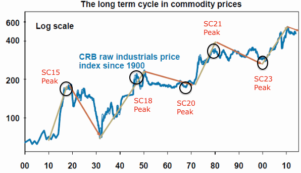
15junn3Solar science reveals peaks in human excitement at solar maxima (e.g. clusters of war). In the financial markets this appears to translate as peaks in speculation (and in the economy in peak activity). Therefore, it appears that the asset in favour at the time is bid up to a secular peak and subsequent pop around the solar max (with the rare exception, as with any indicator or discipline). So what would make the favoured asset stocks rather than commodities or vice versa?

The evidence suggests it is demographics, namely that secular = demographic. The chart below reveals equity valuations tracking US demographics and gold moving in opposite directions. Therefore we see a secular peak in gold at the demographic low and a secular peak in stocks at the demographic high.

15junn13

The picture is enhanced when we discover that solar cycles influence birth rates, which may account for why demographic peaks often tie in with solar peaks.

The chart below shows how Japanese demographics peaked out first in the late 1980s, which explains why Japanese equities made their secular peak at the 1989 solar max whilst other major nation stock markets continued to advance under positive demographics.

15junn11

The current relevance of the chart is that the global demographic composite is definitively negative, and this is echoed in other demographic variants. Together they spell recessionary and deflationary pressures, which we are seeing in reality. But they also should be sinking equities and launching gold, which we are not (currently) seeing. More on that shortly.

15junn15

Solar cycles are long cycles, but armed with the above information we got the chance for a real time test with the SC24 max, which now appears to have been centred around April 2014 (smoothed max).

Two things were anomalous about the SC24 max. It was lower intensity (less sunspots overall) and it took longer to form (including a higher second peak).

15junn17

The average duration between solar maxima is 11 years 1 month, but the SC24 max didn’t form until 14 years 1 month after the SC23 max, which makes it an outlier. Is this relevant? Well, a major commodities peak occurred in April 2011, exactly 11 years 1 month after the SC23 max.

Tangent for a moment. Here is the influence of the lunar phase cycle on the markets: it makes for a fortnightly oscillation with distinct measurable returns over time.

15junn19

The most plausible explanation is the influence of nocturnal illumination levels on evolving humans. Yet, the influence is still present despite living under artificial lighting for several generations. Therefore it would appear to be hardcoded to some degree: we oscillate internally with the moon cycle, to some extent. Might the solar cycle also be to some degree hardcoded? If so, that could be a factor in the major speculative commodities peak (and associated major stocks low) in 2011, i.e. human excitement to some degree peaked into the anticipated/internalised solar max.

15junn1

Source: Stockcharts

The case for that increases if we look at ‘leveraged’ commodity silver. The same kind of parabolic blow off as in 1980 occurred.
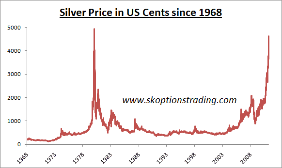
15junn18

It would make the secular commodities bull 2000-2011 a mirror of the 1968-1980 bull, namely one solar cycle in length and set against a secular stocks bear, and both in keeping with demographic trends of the time. The implication would then be that commodities are now in a secular bear and stocks are in a new secular bull.

But let’s now look at the real experienced solar max of April 2014. From 2011 to 2014 stocks rallied strongly and since the start of 2013 displayed characteristics of a mania. A snapshot at April 2014 reveals many typical signs of a major market peak: extremes in valuation, sentiment, allocations and leverage; record negative earnings guidance and economic surprises all negative in the major nations; divergences in money flows and various risk-off measures; outperformance of defensive sectors and bonds; etc. At the time I gathered together 40 indicators all with different angles on a telltale top in stocks. Really, the evidence could not have been better for a speculative mania into the solar max.

However, as we passed through the real solar max, it was commodities that fell again, rather than stocks. An oil-heavy commodity index, used for emphasis, shown here:
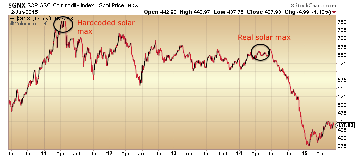
15junn20

Source: Stockcharts

Indeed, by the end of March 2014 large speculators had amassed an all-time record long position in the CRB commodities index, suspiciously right at the solar max. So we have a potential case here for commodities to have effectively made a double secular peak between the ‘average’ and ‘real’ solar maxima.

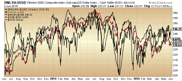
But… things get more complicated when we look under the hood at equities. Stocks:dollar, stocks:bonds, volatility, breadth and various other measures not only resemble previous major peaks but occurred together very close to the real solar max.
3junn1

We are now waiting to see whether these will be repaired or whether nominal equity prices now fall in line. If the latter, then we have the evidence that speculation in equities peaked at the real solar max. At the same time, gold has been forming a technical bottom in recent months together supported by washout sentiment and allocation levels, which after a 4 year bear suggest it is ripe to break into a new bull. Which brings us back to demographic trends being aligned to stocks declining and gold rising: this angle on what happened would argue that the anomaly in hardcoded/real solar max produced a second speculative peak against demographic trends and in stocks, only for demographic trends to now reassert themselves (stocks complete the secular bear, as suggested in the last post, whilst gold goes to new highs).

As alluded to in the last post, the closest fit historically to the current time was the peak of 1937: a solar maximum and speculative peak against a backdrop of low rates and easy conditions. Equities peaked out at high valuation (see Q ratio chart at top of page for SC17), following a front-running of prices to an expected return to normal growth that didn’t materialise. If there was any doubt this isn’t being repeated today, take a look at how analysts continually expected bond yields to rise over the last several years. Reality (demographics) has persistently denied them.

15junn32Source: Mike Sankowski

In 1937, both equities and commodities rallied into the solar max of April and both topped out around then, falling sharply for the next 12 months with both deflation and recession occurring.

15junn30


Stocks didn’t make a real (inflation adjusted or valuation) bottom until 5 years later.

Which brings me back to the unfinished business in equities and the prediction by both demographics and valuations:

12junn17

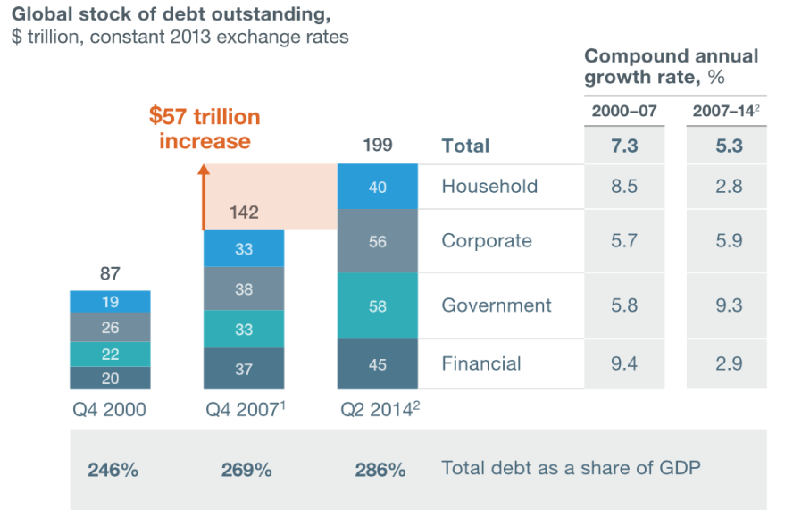
In summary, from all the topping indicators in equities, stocks should now break into a bear market, tipping the fragile world economy fully into both deflation and recession. There should be a feedback looping between the two, taking stocks down to much more appropriate washout valuation levels, whilst crises breed crises again in the economy. As in 1937, it should kick off under easy monetary conditions, limiting the toolkit of central banks, but also as then, central banks will likely resort to unorthodox (and probably ruthless) tactics. Systemic breakdown is a real risk again, with debt levels greater than in the Great Recession (hat tip Sinuhet).
Screen Shot 2015-06-15 at 08.57.23

Source: McKinsey

Commodities (particularly industrial) should sink again too, but likely for shorter and shallower (in line with demographic pressures, as per 1937, and understanding their existing slide since 2011). However, I expect gold to break away and rally as real money. It’s not an easy call due to the limited history of gold free-floating and performing under deflationary conditions. But ultimately I maintain it is the anti-demographic ultimate safe haven, and should regain favour particularly as central banks are currently doing their best to corrupt the money mechanism with QE and ZIRP.

If I’m wrong? Well, this is where we get to the ultimate conundrum. If stocks are instead in a new secular bull (and commodities made their secular peak in 2011, doubled down in 2014) then the appropriate investments/trades are really the opposite of if they are on the cusp of a new devastating bear in an ongoing secular bear. Long stocks and short gold versus short stocks and long gold. I have been able to make cases for both in the last two posts, but I have also shown the flaws in both.

Ultimately it’s a game of probabilities. When all crunched together I see it as most likely that 40 topping indicators and an under-the-hood peak around the smoothed solar max of last year should produce an imminent meaningful correction in stocks unless those divergences start to be repaired. That would be the telling clue. Fitting with that I see gold’s technical basing as likely to produce a meaningful rally. From there I would expect to see serious troublespots emerging in the global economy (defaults, etc) and the meaningful correction in equities turn into a fully fledged bear. However, if the secular stocks bull scenario were to turn out true, then indicators should point to a recovery in equities before we hit such problems.

I have to end on a sobering note. If we do see a global bear market and recession here, then the damage will be immense. No capacity to reduce rates, QE proven to be a failure, record debt levels and increasing under deflation, and no demographic upturn in sight for some time. Accordingly, central bank response would have to get tough, such as penalising any saving, imposing capital flow controls or protectionism. The potential for civil unrest, war or systemic breakdown would increase. The outlook would be very uncertain but surely bleak for the majority of people for the period ahead. It would really be in mankind’s interest for the new secular stocks bull scenario to be true. However, both the debt and demographic problems that we now face can both be traced back to the second world war. They have been a long time growing and attempts to conceal or water down their impact cannot go on indefinitely. Printing money to buy your own debt is normally the end game, so it’s not realistic to expect ‘muddle through’ can keep going. It comes down to the complications of gauging how the end game plays out.

The Conundrum Of Our Times Part 1

This is a complex time to trade the financial markets. We are trying to forecast against a backdrop of prolonged ultra low rates, collective quantitative easing programmes, united demographic downtrends and extreme debt levels amongst all the major nations. It would be generally inaccurate to say those factors are unprecedented, but they are rare historically.

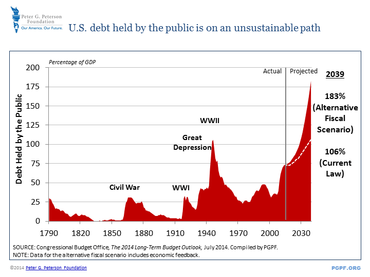
Debt to GDP levels, only like the Great Depression.

12junn1Source: Peter Peterson

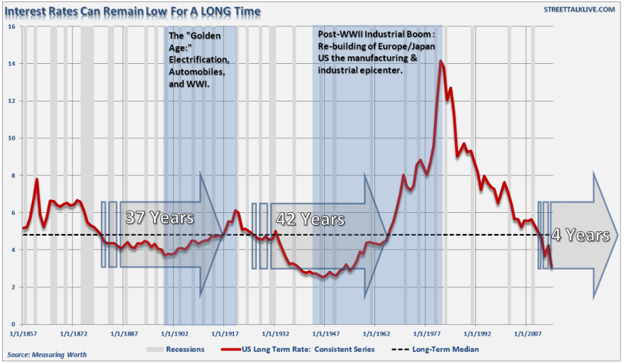
Prolonged ultra low interest rates not seen for 50 years.

12junn2Source: Lance Roberts

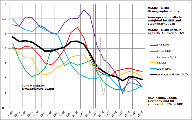
Demographics – here we are in fact making history with middle-to-old ratios, as never before has the world had such an old cohort influencing developments.

12junn4

Quantitative easing: only seen in Japan the decade prior and in some form in 1930s US.

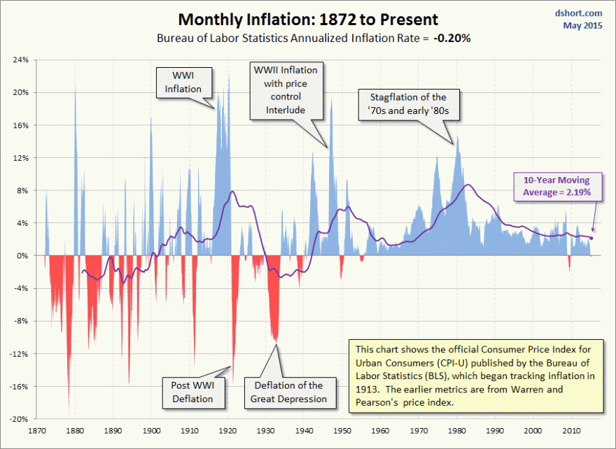
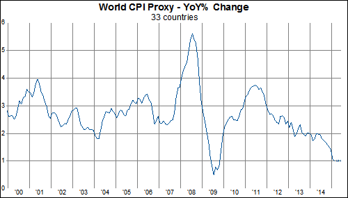
Plus, we can add that we haven’t seen such low levels of inflation for 30 years. Looking longer back in time we saw a greater spectrum of ‘flation.

12junn8

Source: DShort

We are seeing other historic extremes too. Aggregate stock market valuations only have the run into 2000 now for company.

12junn6

Source: DShort

Leverage to GDP is at the same record extreme of the 2000 and 2007 peaks.12junn5

Source: Lance Roberts

US household exposure to equities was only beaten by the run into 2000 in the last 50 years.

12junn9

Source: ShortSideOfLong

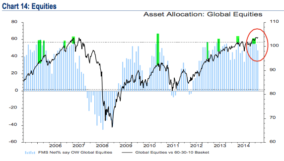
Fund manager allocations to global equities have been bumping up against equal record extremes.

12junn10

Source: Fat-Pitch

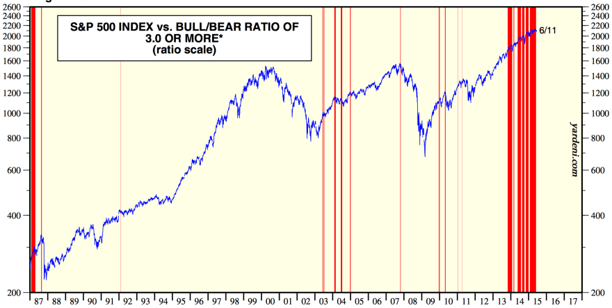
Sentiment towards equities has been record prolonged one-sided.

Screen Shot 2015-06-12 at 08.01.42

Source: Yardeni

Add these equity market indicators together and you get this kind of alert:

12junn12Source: Hussman

But now we need to add back in the environment, which is closest to the 1930s-40s. Or the last 20 years in Japan, which was the first to initiate ultra low rates and QE in the recent era, as it was the first major to go over the demographic cliff. How does this change things? Well, for example, we might look at valuations in the context of low inflation and argue they ought to go higher yet:

12junn16

Source: Richard Bernstein

Essentially, when we combine the economic/demographic environment with the financial market indicator extremes, we start to struggle for historical reference points, and therefore some kind of reliable probability calculation of where things are headed.

But there is more to add in to the mix. High frequency alto trading has become much more dominant than it ever was. Markets are globalised – and instant – like never before. Some central banks are buying equities. Plus there are two complex areas where there is a lack of full understanding: dark pools and derivatives. Dark pools are notorious for their lack of transparency, whilst the nominal amount of world derivatives now stands at over $700 trillion (around 10 times nominal world GDP) which is clearly a major threat, but to what degree isn’t truly understood.

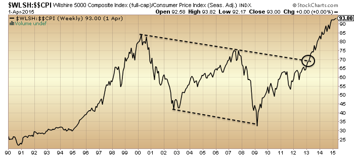
Now what does market price action tell us? Bonds are in a 30 year bull market. Commodities are in a bear market since 2011. Equities are in a bull market since 2011 (or we might argue 2009). If we look at US equities adjusted for inflation we get this picture:

12junn15

So is the equity bull a new secular bull, as per the apparent breakout?

The problem is that various measures put that start of 2013 date as the beginning of the mania in stocks, such as money flow and divorce from fundamentals, and since then we have seen 2.5 years of multiple expansion (price not earnings). Another look at the valuations chart shows the contrast now to where previous secular bull markets in stocks began:

12junn17The path designated by the arrow is the better fit with demographics and would also be historically normal from these extremes of valuation, leverage, allocations and sentiment.

However, given conditions are relatively unprecedented and we are already seeing various indicators move out of historical ranges, we have to allow for something overall unprecedented. Perhaps we could argue that valuations will be disregarded as central banks expand their purchases and in so doing overcome the demographic headwind. However, if we assume they have stepped in as a new class of buyer, then why are leverage levels so high and going higher yet? The record leverage rather fits with the demographic trends and the shrinking volumes in the stock market, namely less buyers but on more credit. However, in turn, we could argue we might see leverage taken to a whole new level (as occurred in the 1990s), much higher than currently, under continued easy money conditions, before we see a collapse. Or we could see something that hasn’t happened before from these valuations, namely that the ‘earnings’ part of the p/e catches up with price and we see all round economic improvement whist stocks tread water instead of being resolved by a bear market.


Let me sum up. 1. Stock market price argues we are in a new secular bull. 2. Stock market indicators argue we are at a major peak, specifically a cyclical bull peak within an ongoing secular stocks bear. These two are incompatible. 3. The economic environment is closest to 1930s-40s US or the last 2 decades Japan, but when all factors are considered has no reliable historic precedent. This is unchartered territory.
If the equities bull is to continue then history will be made, either by central bank purchase expansion, leverage ratcheted much higher under low rates, valuations/sentiment/allocations being reduced from these levels without a bear market, or some other unprecedented development. If a bear market is at hand, then this would fit with demographics and stock market indicator history, but would have limited historical precedent in occurring whilst rates and inflation are low, such as the 1937 stock market peak.

Part 2 ahead.


Global Economy

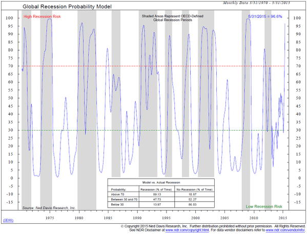
The world economy is currently in trouble, showing both recessionary and deflationary coincident data:

10junn5

Source: Ned Davis10junn3Source: GaveKal

Given these, the resilience of equity markets has been pretty amazing, even more so as we are now a year post-solar maximum:

10junn12The last six months has been particularly weak economically, and normally historically stocks would have sold off leading into this, with stocks typically leading the economy.

In fact, under such extreme levels of valuation, allocations, leverage and sentiment, together with growth, ‘flation, and earnings all rolling over negative as well as the speculation peak of the solar maximum through, the case was extremely strong for 2014’s October sell-off to launch a fully-blown bear market. The weakening economy over the subsequent 6 months and the wealth-reduction effect of the declining stock market would then have fed off each other to create fairly significant devastation.

But it didn’t happen. Stocks were somehow saved. However, as pre previous posts, we see a lot of degradation in internals and cross-referenced data since mid last year, giving the potential for price action since then to be ‘last-gasps’. Below is the Dow Jones World stock index which reveals a similar higher high against weakening strength to the last 3 previous major tops.

10junn10Source: Stockcharts

Plus, we have seen a sell-off in recent weeks, making that higher high maybe a fake-out high. We still see saturation levels in valuations, allocations, sentiment and leverage and many negative divergences that all support the bear case.

10junn20

Source: Stockcharts

However, set against this, we have recently seen a turn up in leading indicators and what maybe a bottoming in coincident data.

Coincident:

10junn4Source: FT

Leading:

10junn2Source: Goldman Sachs

At the same time we have seen some money exiting bonds and inflation expectations recovering, suggesting some of the expected pick-up being priced in by market participants.

However, real money leading indicators predict this to be another non-sustained pick up in global growth, i.e. still not the move to sustainable strong growth that leads to central banks starting to raise rates. Rather, they predict the growth to peak by October this year and then give way to weakness again.

The key question, therefore, is whether equities can now rally again and keep the bull market going over the next few months against a backdrop of improving economic surprises. If so, then we would need to see stocks repairing this kind of bearish set-up of fake-out plus divergences:

10junn23

Source: Stockcharts

If stocks can do that, then an obvious reference point would then be 1929, with a potential Autumn/Fall peak, a similar length of time post-solar maximum, at similar extremes of valuation and leverage. Anything beyond that and there would be no further reference points. This really would be unchartered territory for world markets, whereby the ‘old rules’ no longer apply.

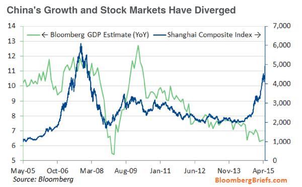
Here’s a look at China’s stock market. The divergence from GDP is extreme and as such valuations are now at a new record.

10junn6 10junn8Source: Sober Look

The rise in margin debt in China has rocketed. Leveraged-based stock rallies are ponzi-schemes, making for a risk of a major unwind at any point. The leverage situation around the world is similarly flagging that risk.

10junn9

Source: DShort

In summary, I believe this is where we find out what really moves the markets. My position on that: dumb forces. Demographics, solar cycles and simply running out of buyers. By the latter I refer to saturation in valuation, leverage, sentiment and allocations: everyone on one side of the boat and borrowed up to the max. We can see additional clues to the fuel drying up in divergences in breadth and other indicators.

June/July is the seasonal geomagnetic peak, so I don’t rule out the possibility of a short rally back up here in stocks. But unless all those under-the-hood July 2014 peaks are repaired, together with the bearish technical set-ups and negative divergences, then I expect leading indicators to be disregarded here, in the same way negative leading indicators were disregarded several months back. The fact that the market has risen against both positive and negative leading and coincident economic data the past 2 years is a clue that economic indicators aren’t the driver. So is central banks? I refer you back to the top two charts. After billions spent on QE and ultra suppressed rates, we still have a world economy on its knees.

The Influence Of The Solar Maximum

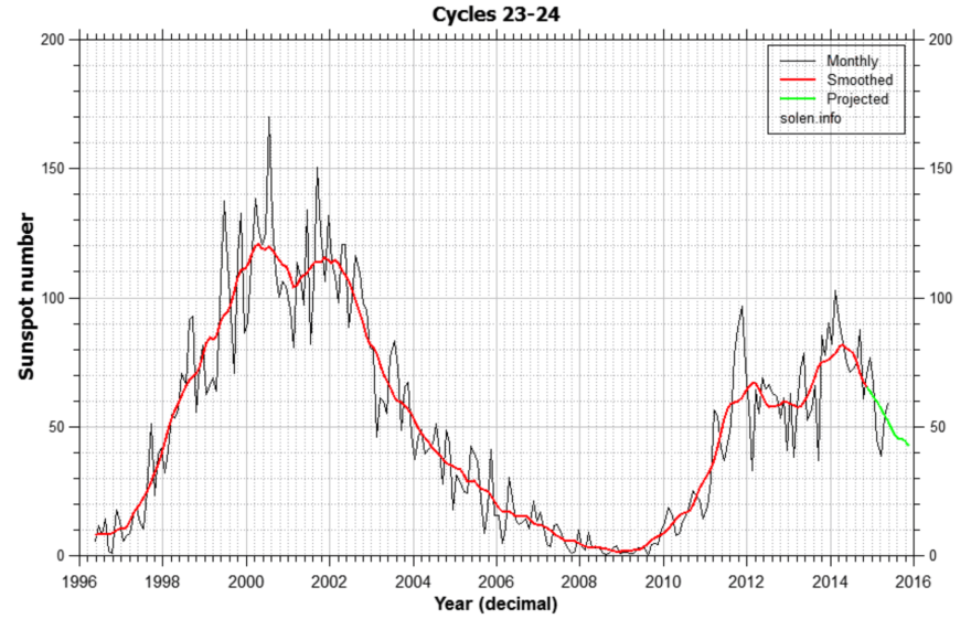
The smoothed solar maximum occurred mid-2014.

Screen Shot 2015-06-03 at 08.13.32

Source: Solen

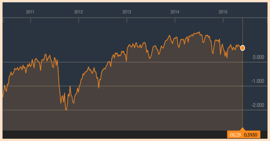
Financial Conditions peaked mid-2014.

Screen Shot 2015-06-03 at 07.35.01Source: Bloomberg

World earnings peaked mid-2014.

Screen Shot 2015-06-03 at 08.12.29

Source: Schwab

US IPOs peaked then.

3junn2Source: Marketwatch

Buybacks peaked then.

Screen Shot 2015-06-03 at 08.23.52Source: Factset

US stocks:dollar, stocks:bonds, volatility (inverted) and breadth all peaked mid-2014.

3junn1

Source: Stockcharts

Junk bonds, commodities and FX all changed course then. European stock indices have since risen in nominal terms, but if we net out the Euro’s decline from the picture then they too peaked mid-2014.

3junn10Various economic data measures peaked out then.

3junn7

Source: Alhambra

This all fits with the theory of peak human excitement at the solar maximum, translating as peak speculation and risk-taking in the markets and peak activity in the economy. However, we need to continue to see further all-round degradation as the sun moves further away from its peak over the rest of 2015, and not least, we need to see the nominal falls in equities now come to pass.


Debt And Demographics Dictating

Ever since 2009 analysts in the developed world have largely expected a return to ‘normal’ economic growth and inflation, the kind that necessitates a gradual tightening of interest rates to keep overheating in check. This is based on patterns over the last 50 years following recessions. Yet, as the US chart below shows, something has gone wrong this time, with rates at zero, six years on.

Screen Shot 2015-05-30 at 06.31.59

Source: Fred

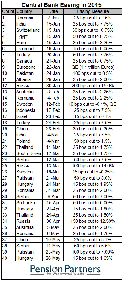
Not only that but central banks are still generally easing around the world:

30mays1Source: Charlie Bilello

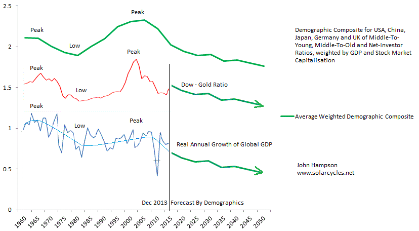
There are two reasons why global economic growth and inflation aren’t normalising: debt and demographics in the developed nations where world GDP is concentrated. When debt gets too large, too much capital has to be deployed on servicing the debt, redirected away from productive uses. When demographic trends aren’t favourable they can make for deflationary, recessionary pressures, and what is so potent about the current period is that demographics are united negative in the major nations, as per this sobering composite:

30mays2Consequently, central banks are battling to prevent recession and deflation. What does this mean for equities? The stock market has front-run a return to normal growth. As normal growth hasn’t happened, equities are now right at the top end of historic valuations. Each year since 2009 analysts have laid out their predictions for 10% earnings growth and over 3% GDP growth (US), only to see the reality fall short each time. But, the reality hasn’t yet been too dire either, and some would call this a goldilocks scenario for stocks: disinflation but no deflation, meagre growth but positive, monetary conditions kept easy and supportive. So the question going forward is whether this can be maintained.

Last year Q1 US GDP came in negative but the rest of the year recovered. This year the same has happened and whilst there is a question mark against Q2, leading indicators predict a recovery later in the year for the US and for improvement in Europe. However, there was an additional major factor last year: the solar maximum. Speculation and economic activity typically rise into the solar max and recede afterwards.

Currently, the stock market is holding things together due to its wealth effect. A stocks bear would tip the fragile global economy into outright recession and deflation. There is a yawning gap between equity valuations and economic reality, but the common view amongst analysts remains that central bank actions and the ‘normal’ business cycle of the last 50 years will yet produce the return to economic growth and inflation and that we have both a series of rate rises and problematic commodity prices to the upside to go through yet before stocks are in danger.

However, if we look back to the 1930s US or 1990s Japan then we see evidence of a different ‘normal’ in which deflationary recessions and stock bears did occur despite easy conditions in place by central banks. In both cases the yawning gap between equity valuations and persisting economic trouble was ultimately closed. The recent collapse in oil prices and cash flows into increasingly negative yielding bonds reflect bad economic realities, to which the stock market appears to be the last to catch on.

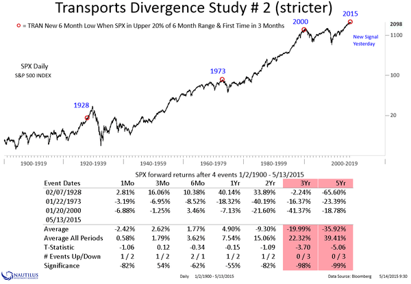
What are the odds of the stock market catching on by range trading sideways for a long period, as it has for much of 2015 so far? The answer is slim. Similar instances in the past of post solar max extreme valuation, sentiment, leverage and allocations, were not only resolved by bear markets, but by the worst bear markets in history. Here is another angle on that:

30mays4Source: Nautilus 

We also see the evidence under-the-hood that the solar max of last year was indeed the game-changer in equities:

15maya22Whilst economic data is disappointing to the downside in the period since too.

We have reached the geomagnetic seasonal mid-year point which has been a typical high marker in equities historically:

30mays5And technically we have seen a narrowing price range on waning strength and breadth.

15maya30Source: Stockcharts

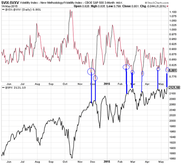
Plus we see compressed volatility and gold making a long bottoming pattern on increasing strength.

In short, I’m going to continue to attack here (short equities, long gold) because the case is strong. The main concern I have is the upturn in leading indicators (real money, ECRI), because I can’t rule out the possibility that once economic surprises start to improve again then the ageing bull gets a little refuel. However, real money leading indicators again predict this to be a transient improvement, still not the return to ‘normal’ growth, and at some point that belated realisation that normal growth isn’t coming back is going to make the max-leverage, max-bullish, max valuation stock market a house of cards, due to the exceptional skewing and distortion. Odds are this is the time, given (1) the under-the-hood peaking in indicators at the solar max of last year, (2) the current strength/breadth divergences like in 2011, (3) the mid-year seasonal geomagnetic peak, and (4) the likely disappointing data still to come out over the next few weeks. A sharp drop in equities would negate the leading indicator improvement ahead, so that’s what has to be delivered here, to give the bear case the decisive control.


On The Attack

Phasing more into long gold, short Dow, and opened ETF agri long. Don’t follow me… here is my case.

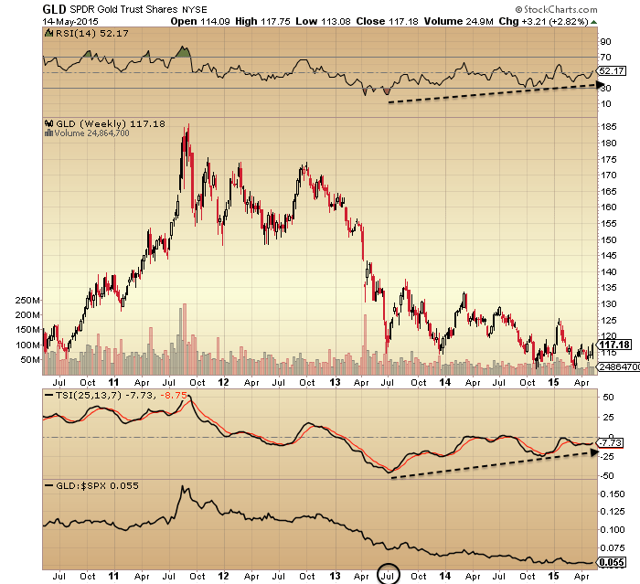
Gold has been making a long base with rising underlying strength since July last year.

15maya20

 Source: Stockcharts

US stocks have shown an underlying decline over the matching same period, as evidenced by stocks:bonds, stocks:dollar and two measures of breadth.

15maya22

 Source: Stockcharts

That turning point in both fits well with the solar maximum, a speculative peak.

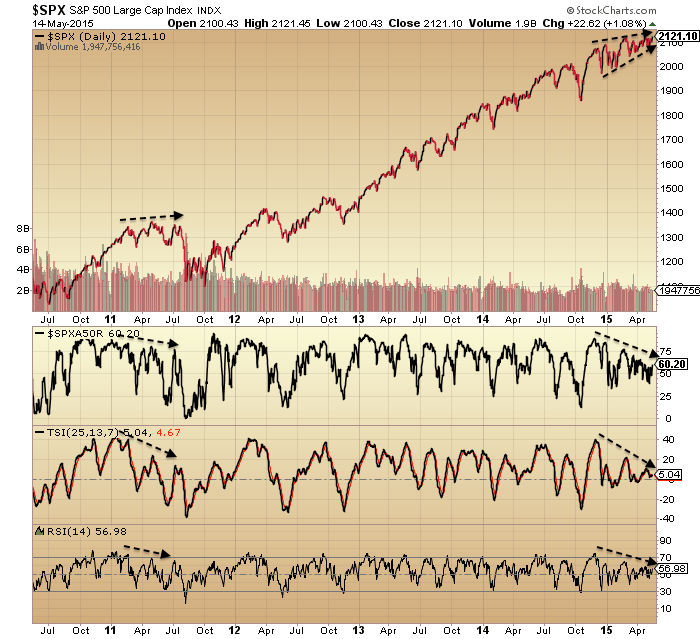
The latest attempted breakout in equities has much in common with the July peak in 2011, before the sharp falls. Volatility, momentum, strength and breadth all suggest the breakout should fail.

15maya30

Source: Stockcharts15maya2

 Source: Gavin Parks

Geomagnetism continues to bother and is another telling divergence ripe for resolution, and its overall pattern is reflected in a variety of underlying stock market indicators.

15maya15

15maya1Source: Stockcharts

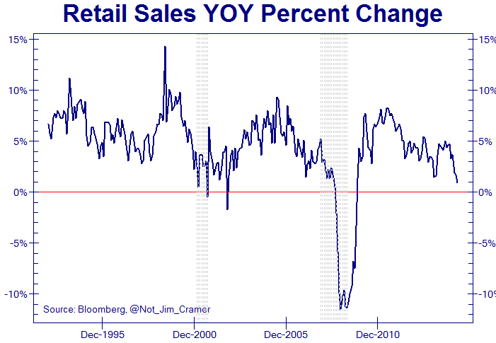
The US economy is in big trouble. If you haven’t already seen, Zero Hedge presented 7 charts arguing that the US is already in recession, to which PFS group then countered with 7 charts arguing against. I’m sure you all know to take ZH with a pinch of salt (‘fear sells’) but the charts they reference can be be seen at the likes of Alhambra and DShort on more neutral ground.

My input: the ZH charts are ‘true’ and show the US economy in deep water, whilst the PFS charts are also ‘true’, but on close inpection they mainly historically flagged once stocks had turned. In short, the stock market is precariously holding things together and is the only defence from outright disaster (as things stand) in a very fragile state of affairs. What is beyond argument is that certain economic data items are extremely ill whilst stocks are at all-time highs. In my opinion, that disconnect ‘beats’ any cherry-picking by either side and makes for a looming sharp equities correction.

15maya40

Source: Not_Jim_Cramer

15maya50

Source: WSJ

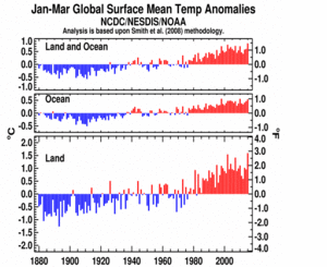
ETF Agriculture shows a similar basing to gold, with historically low current prices in various soft commodities set against a backdrop of a new El Nino and record global temperatures, which historically led to price rises.

15maya17

Source: Callum Thomas15maya10

Source: NOAA

I can’t rule out equities pushing on a little higher yet here before finally rolling over, but I see it limited to days/weeks due to all the telling flags. So my plan is to phase in rather than load in in one go, and that applies to all 3 markets.

SP500

In six charts.

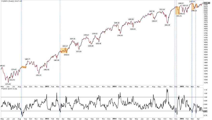
1. Showing a 6 month negative divergence in breadth and strength like that in 2011:

10mays8

Source: Stockcharts

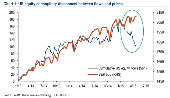
2. Plus a similar period of divergent money flows:

10mays16Source: Emma Masterson

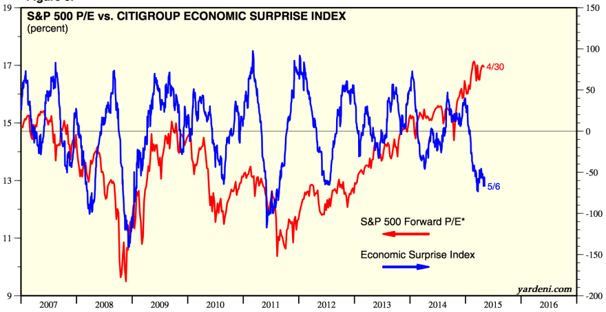
3. Plus a sharp divergence with the economy:

Screen Shot 2015-05-10 at 07.25.14

Source: Yardeni

4. A mid-2014 peak versus the dollar

10mays7

Source: Stockcharts

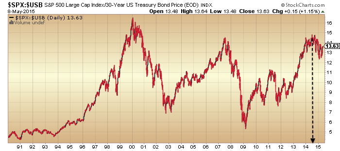
5. And a mid-2014 peak versus bonds

10mays6Source: Stockcharts

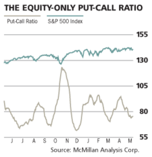
6. And put/call ratio at a level previously associated with a peak:

Screen Shot 2015-05-11 at 07.44.22

Source: Barrons


Short Term US Update

The breakout in equities is likely to become a fake-out or short final up leg, based on historical indicator patterns. Breadth and strength have negatively diverged:

26apri19Source: Stockcharts

Volatility relativity also suggests a correction or consolidation should now come to pass:

26apri1Source: Fat-Pitch

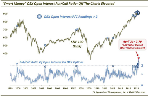
‘Smart money’ bearishness is off the scale:

26apri20Source: Dana Lyons

US economic data surprises remains deeply negative. Two updates from this week:

26apri10

Source: Sober Look

26apri5Source: Alhambra

Blended earnings for Q1 are so far better than expected: -2.8% versus -4.6%, but of course still shrinking. Blended revenues are worst than expected -3.5% versus -2.6%. ECRI leading indicators have improved but are still negative.

On the bullish side, leverage has been on the increase again.

26apri7Source: DShort

And real narrow money indicators point to economic improvement ahead.

26apri3Source: Moneymovesmarkets

There are two scenarios currently in my mind. My first and highest probability scenario is as per the first several charts above plus all the charts in my last post, namely that stocks are right at the end of a major topping process, and under the hood they already topped. That means last week’s apparent price breakout will quickly fail. I have smallish short Dow and long gold positions aligned to this, looking to build on reversal and momentum.

My secondary or outsider scenario is that US stocks have yet to join Chinese and German stock indices in a parabolic blow off ending pattern, fuelled by potential improvement in economic fortunes/prospects into summer-end. This would be similar to the lag of the Sep 1929 stocks max versus April 1928 solar max, a kind of maximum outsider in the historic range. Should this appear to be occurring I would step aside and continue to try to identify the top.

Ultimately, as things stand right now, I consider all the key supports for the bull have been removed. Earnings, economic data, smart money, allocations, sentiment, valuations, solar max, geomagnetism. We are left with dumb money on leverage, plus expectations that both the economy and earnings will recover in the remainder of 2015. We might consider the latter is key: whether data does improve again – and maybe it is. However, recall the evidence shows that the stock market leads the economy rather than the other way round. The wealth effect of the stock market. The question then is what will cause participants to pull the plug on equities? We are now in a phase of ultra-complacency where most traders can see nothing that would cause that to happen. Yet that ultra-complacency makes us at highest risk of the collapse.

A final chart: the collection of countries now paying negative returns on government bonds. Swiss 10-year bonds are amazingly now paying a guaranteed negative return. It should be clear that when money is being invested in a bond paying an assured loss for several years then it is because deflation, recession and relatively larger losses in other asset classes are expected. Either that, or investors are making a foolish mistake. So who has it right, stocks or bonds? Smart money flows, valuations, allocations and sentiment all continue to show the bubble is in stocks, not bonds. Bonds and commodities are accurately reflecting the harsh reality of current global demographics, trade, and economics, whilst equities have become a ponzi scheme divorced from fundamentals.

26apri12

Source: Emma Masterson