Historically, solar maxima have correlated with earthquakes and peaks in temperature oscillation. They have also correlated with protest/war/revolution, inflation oscillation peaks and speculative parabolic peaks (often secular bull peaks). With both magnetic poles now having flipped for SC24 maximum, I’ve annotated the following chart from Solen:
 The Japanese and Indonesian earthquakes were both amongst the highest Richter magnitude quakes ever recorded. The Italian earthquake was one of the most devastating ever in property damage.
2013 was the 4th hottest globally on record. Historically we have seen global temperature oscillate into a peak around the solar maximum.
The Arab Spring was a world-transforming series of major protests and revolutions. The Turkey, Thailand and Ukraine protests were amongst the largest ever in terms of participants.
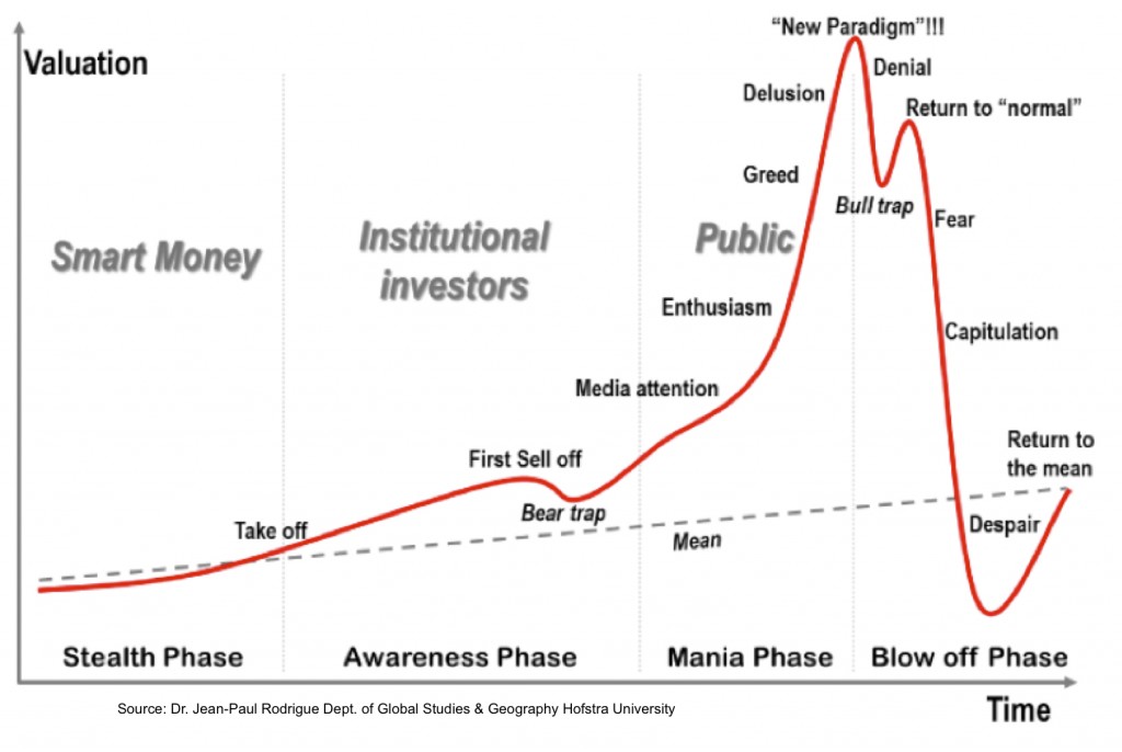
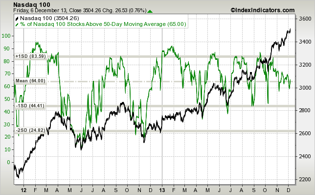
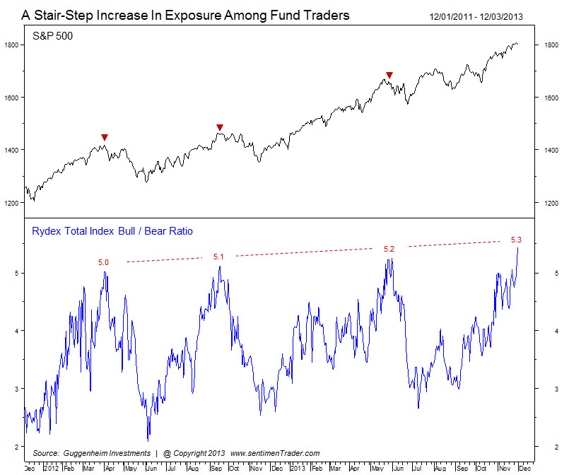
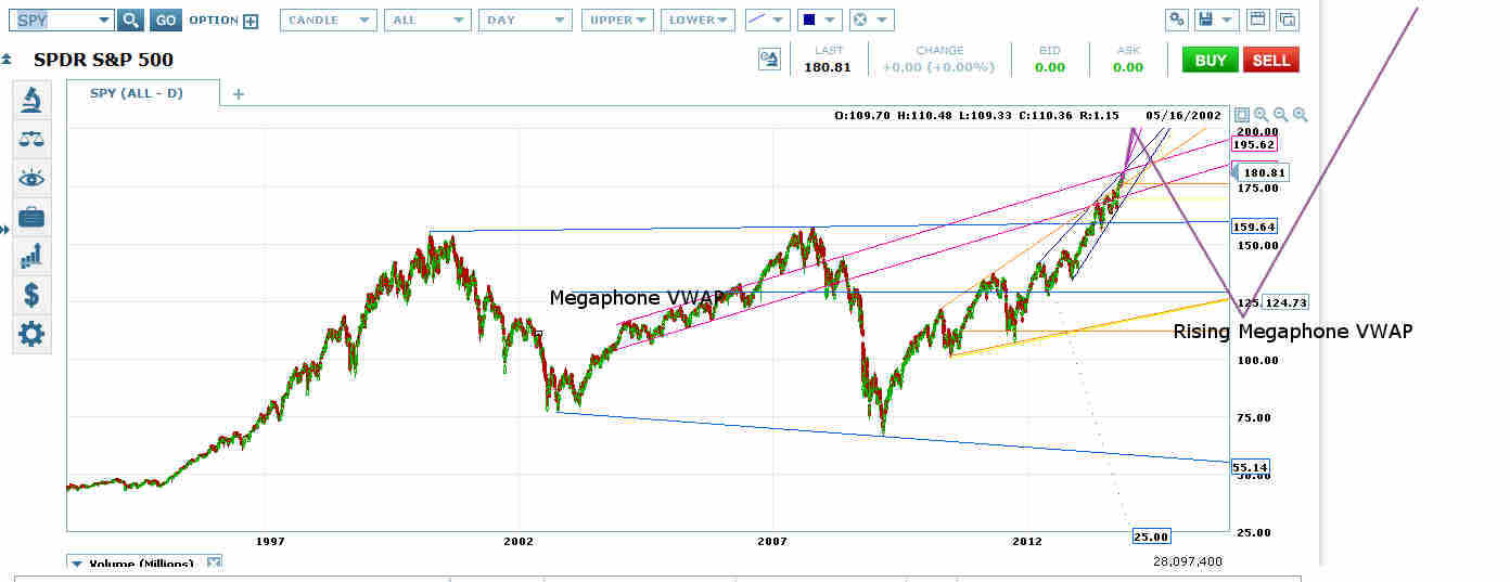
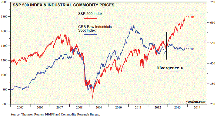
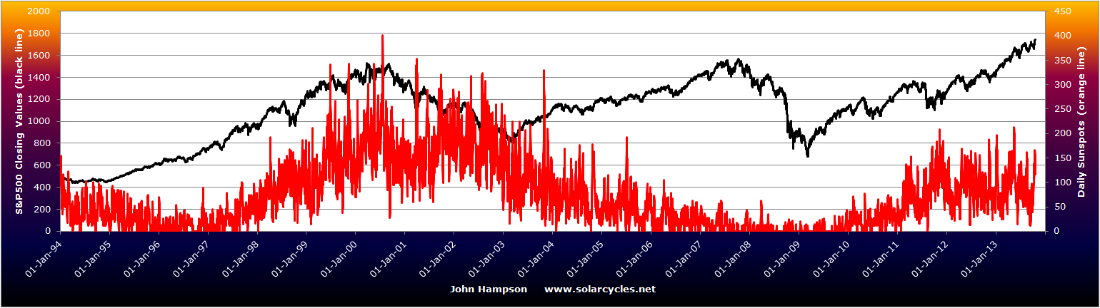
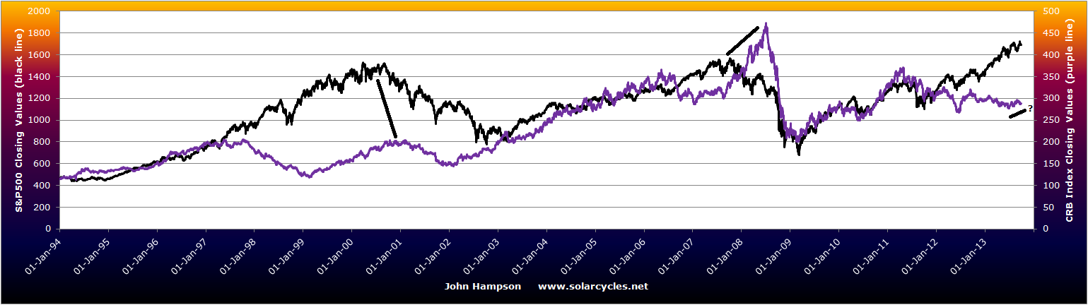
We saw a series of commodity price parabolics peaking out towards the early part of the maximum, and we currently see a series of stock index parabolics (plus margin debt parabolic), which, with history as our guide, should peak out as the solar maximum starts to wane this year. However, we don’t know at what point that waning begins. By NOAA and NASA predictions it should be now, but by SIDC’s foreast it could be as of mid-2014. With 225 sunspots currently, it still appears to be in an uptrend:
 Either way, the annotated top chart is unlikely complete. We could yet see further earthquakes, or greater temperature extremes in 2014, or more geo-political unrest, or more speculative mania. But without any more such developments, solar cycle 24 has re-affirmed those correlations.
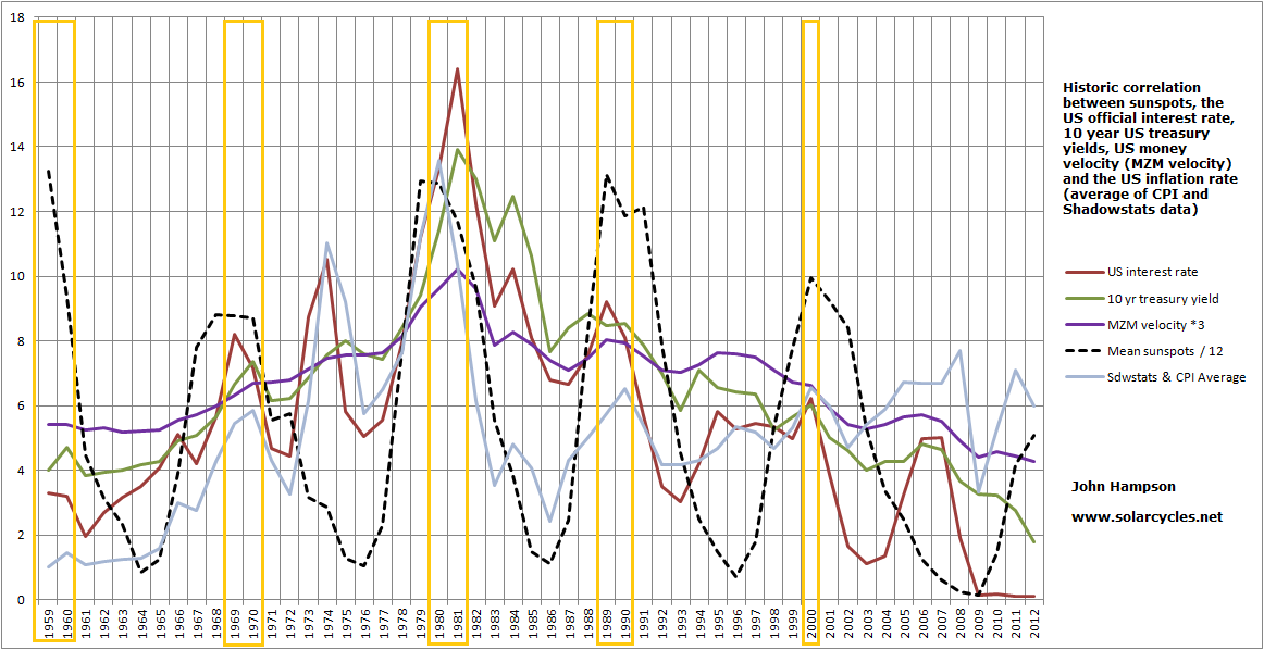
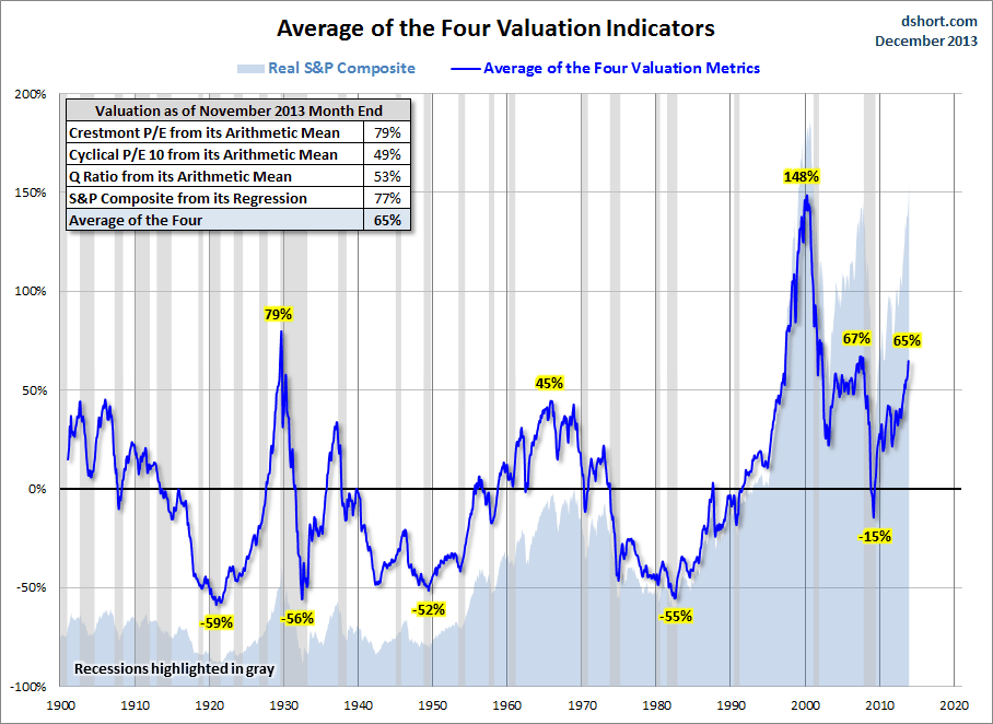
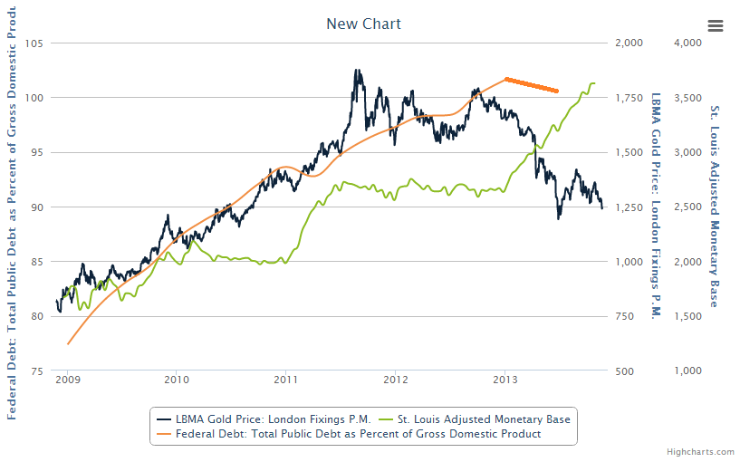
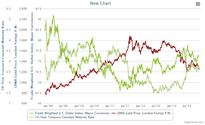
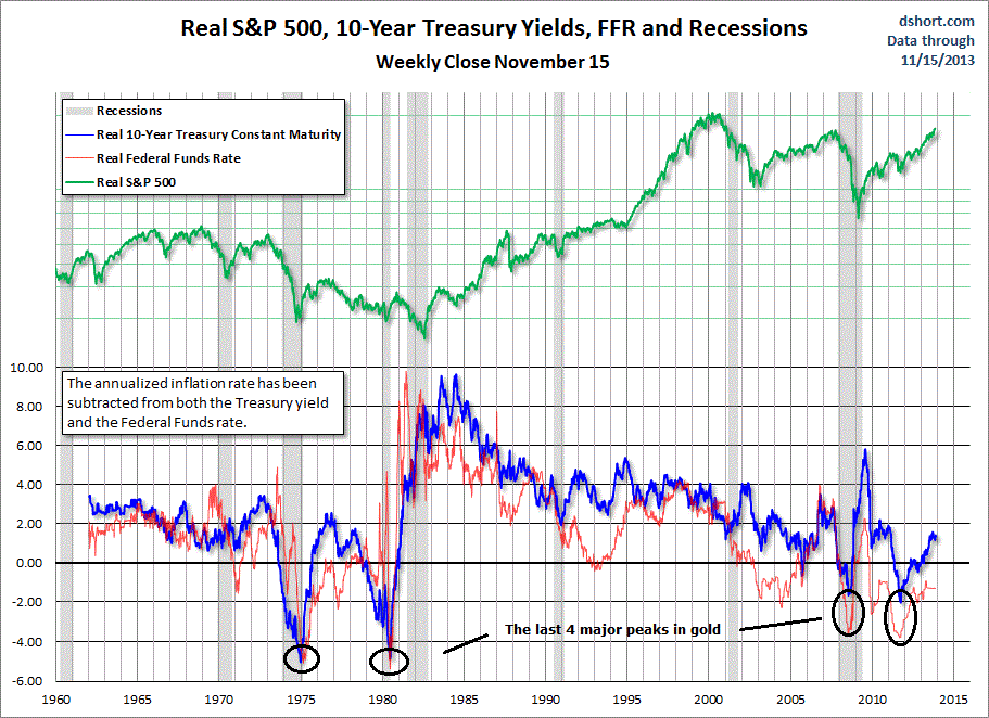
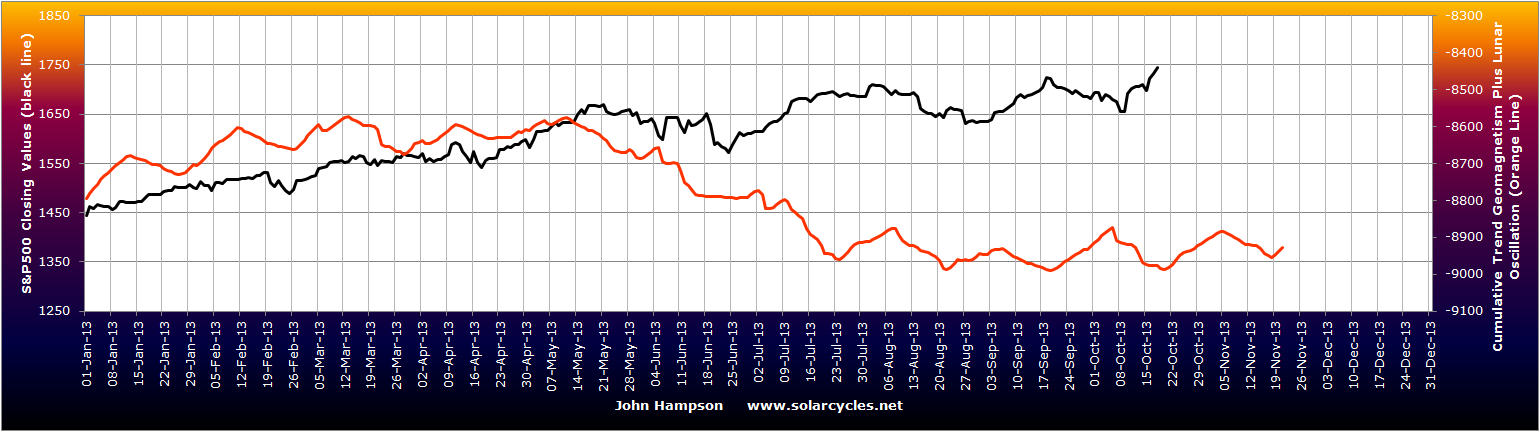
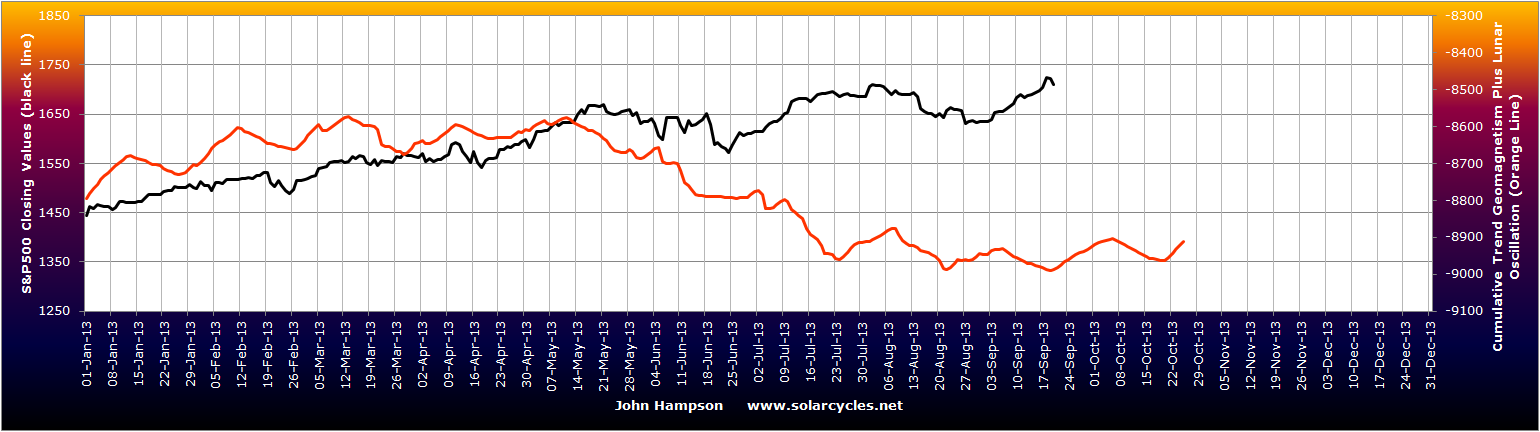
Historically, the solar max then gives way to economic recession. Global recessions (if based on where real global GDP has been less than 3%) occurred in 2001-2 (SC23 max 2000), 1990-3 (SC22 max 1989) and 1980-3 (SC21 max 1979). Several factors may contribute to why this is. Geomagnetism, which is negative for sentiment, peaks after the solar max. Inflation, yields, rates and speculation all typically peak into the solar max, which collectively can tip an economy into recession. The chart below shows those correlations.
 This time, we have not seen any interest rate rises, but we have seen a rate of change in bond yields in the last couple of years which is comparable to that marking previous tops. Inflation peaked out early in the SC24 max and is currently depressed, in keeping with collective demographic trends (money velocity has also diverged in line with demographics). There remains the possibility that commodities make a late-cyclicals charge and deliver a temporary inflation shock, but I’m not so sure.
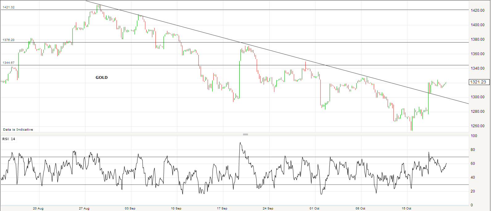
Prior to all my demographics research earlier this year, I expected commodities to be the speculative target of this solar maximum, and to make their secular peak here, with gold the leading asset. However, by demographics gold has some years further to run, and is more likely to make its secular peak at the next solar maximum, or even beyond.

That commodities have made secular peaks each 3rd solar maximum to date appears a pattern, but I believe is instead is demographic, but this will only be validated in the months and years ahead.
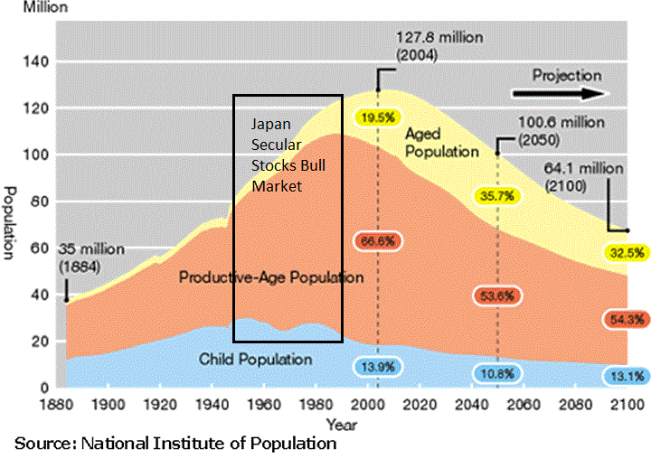
Let me explain. Japan enjoyed a long secular bull market from the late 1940s to the late 1980s, as shown in the first chart below, through 4 solar cycles. The second chart shows that this was because of a long demographic golden period, where productive-aged population ballooned, old-aged dependents stayed low, and child dependents were in decline.


The Nikkei peaked in 1989, in a parabolic, along with solar cycle 22. So it peaked at a solar maximum, but it took 4 solar cycles to exhaust the demographics.
The US demographic boom of 1980-2000 ran through 2 solar cycles. Stocks peaked in 2000, in a parabolic, at the same time as solar cycle 23.
The negative demographic period of the 1970s was a trend lasting just one solar cycle, and gold and commodities peaked out, in a parabolic, along with solar cycle peak 21.
In short, there is a history of demographics dictating secular market trends (so using secular market duration ‘averages’ is misleading), and of secular bulls peaking out at solar maxima (which average 11 years apart). We have negative collective demographic trends in the major nations lasting to circa 2025, before a flattening, which I therefore expect could deliver another full solar cycle of secular gold bull, to potentially peak out at the next solar max (which would be circa 2025). You may note though from the demographic composite that demographic trends look fairly woeful even out to 2050. It poses an interesting question as to whether this will be a different period for relative asset performance.
If commodities do not make a late surge in this solar cycle 24 maximum, then I believe we will tip into deflationary recession, as destined anyway by demographics, with the speculative manias and yields tightening assisting in this. That would then largely complete the correlations of a solar maximum.
If you are new to the site, reasoning and evidence for all these solar-related phenomena can be found by using the search facility.

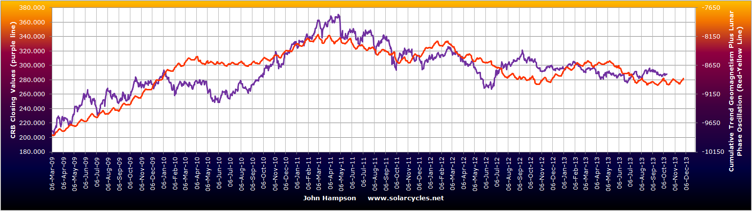
 Source: Sentimentrader
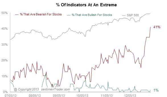


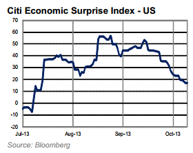
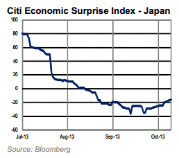
 Source: Barrons/Citi
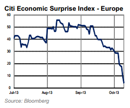
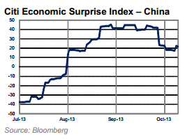
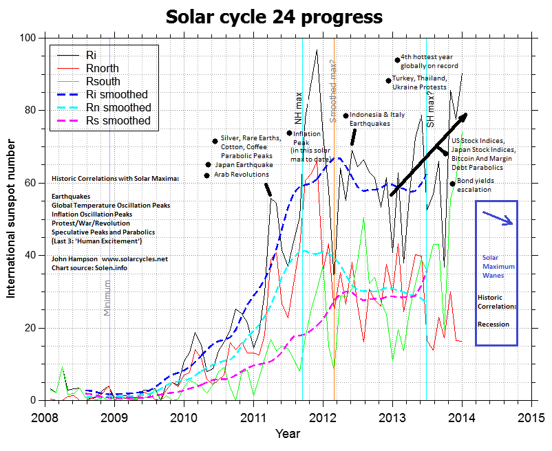


