Poland WIG, Geomagnetism and US Dollar Index

I modelled the Poland WIG in the same way as the Malaysian, Indian and Brazilian stock indices.

The lunar edge over the last 4 years for the Polish stock index looks like this, compared to the others:

28may20131A decent sensitivity.

The Polish WIG now features on the short and medium term model pages, and here it is on the latter timescale:

28may20132A pretty good tracking of the model.

The geomagnetic model has lately made a notable switch into a downtrend, shown against the SP500 on the shorter term timescale here:

28may20133There is now a notable divergence which could spell a trend change in stocks or a topping process beginning imminently. However, rising into the solar maximum has previously encouraged speculation and into the 2000 peak the market pulled away from the geomagnetic model, as the speculation overruled. So two competing things to consider, but in short the low-geomagnetism support for the market has been pulled away.

Lastly, I checked the US dollar index history to see if previous bull markets in the dollar corresponded to positive demographic trend periods. Here is the USD history since 1967:

28may20134

Source: Bespoke

The US enjoyed a positive demographic trend period from around 1980 to 2000, so both the main bull markets that can be seen fell within this. However, so did the USD bear market from around 1985 to 1995, so I don’t see a useable relationship.

I am away for a few days, back Monday. See you then.


Secular = Demographic

Secular bull or bear markets in both equities and real estate are in essence demographic bull or bear markets, with equities and real estate correlating fairly well with each other over time, and in turn with demographics. In other words, slow moving trends in demographics make for the longer term ‘secular’ bull or bear markets in stocks and housing, within which there are cyclical bulls and bears. To enable this relationship in any particular country, certain fundamental conditions are required: sufficient levels of sanitation and education, social discipline and peace, a sufficiently diversified economy and good infrastructure, i.e. what we would generally find in developed countries but may be lacking in positive-demographic but raw frontier nations.

The first chart shows US demographics, using middle-old, middle-young and net investor ratios, modelled against a composite of real stock prices and real house prices. The composite topped along with demographics circa 1965, then bottomed together around 1980, then topped again around 2000.

X1
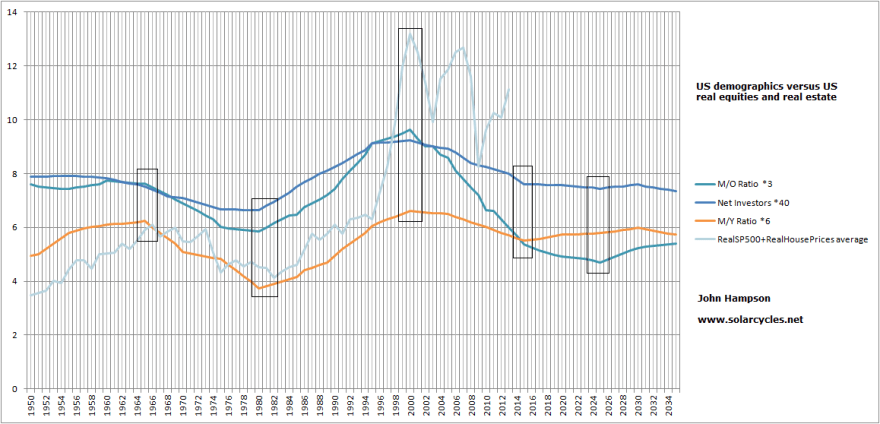
All three demographic measures swung fairly closely over that 50 year period, which perhaps explains why the composite tracked so well. We might note that the composite peak in 2000 was fairly extreme, suggesting an episode of excess greed that subsequently required wash-out, and also that the secondary peak circa 2005-7 was counter new demographic trends, and thus liable to the steep crash that then followed in the composite.

Looking forward, net investors stops falling as of around this year, the middle-young ratio bottoms circa 2015 and the middle-old ratio after 2020. This suggests there is scope for new ‘secular’ bull markets in stocks and housing, but it is unclear when they might kick off. Note though that the composite has again made a counter rally to the demographics from 2009 to 2013, which suggests another leg down in real terms would be appropriate before any new secular bull. Note also that we don’t see strong uptrends or all three measures united again, like from 1980-2000, which suggests future secular bulls in the USA may not be as powerful.

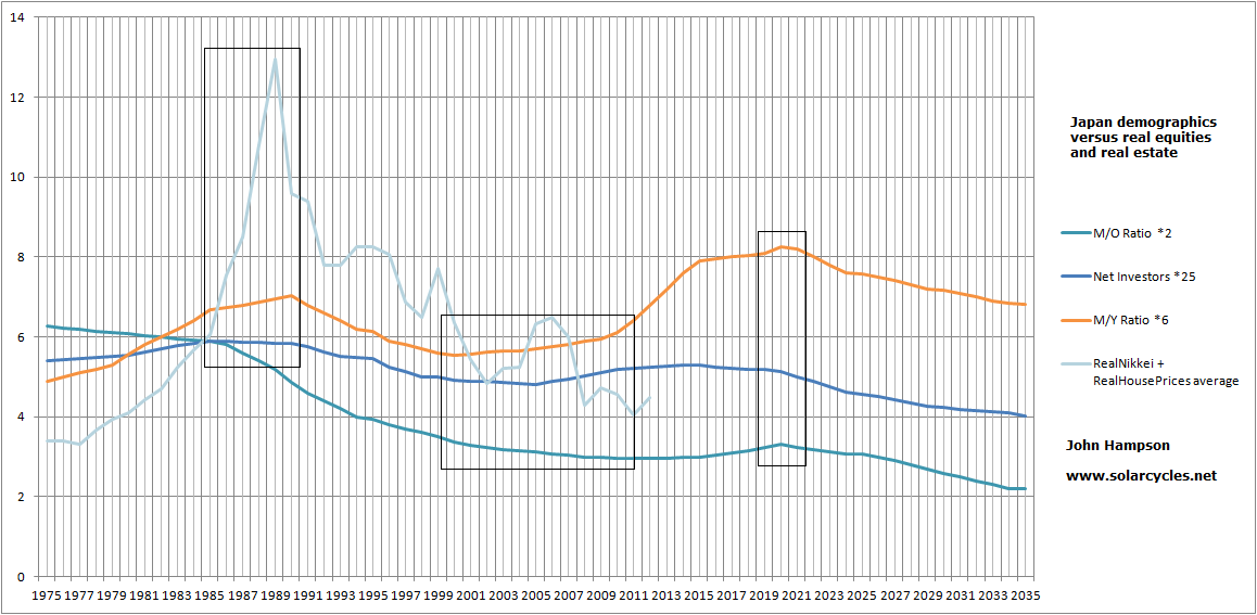
Next up is the same chart for Japan, but not stretching back as far in time. Again the equities and real estate composite peaked with the demographic measures in the late 80s, and again with a fairly excessive greed peak and subsequent harsh wash out.

X2

The composite has belatedly taken off again only in the last 6 months, with net investors and middle-young having turned positive again around 2002, continuing until around 2020. There has thus been a 10 year delay in Japanese stocks and housing in turning back up with demographics. However, this period coincides with the wash-out negative-demographic period in the USA, the largest economy in the world, which suggests Japanese risk asset markets were infected by situation in the USA.

The third chart shows the same modelling for the UK. The demographics for the UK topped out in the late 1960s and the stocks/housing composite made a top around then but went on to eek out a slight higher peak circa 1972. So again we saw belated adjustment as this was then rectified to a combined low in the late 1970s. Demographics and the composite then made a strong secular bull until the 2000s.

X3

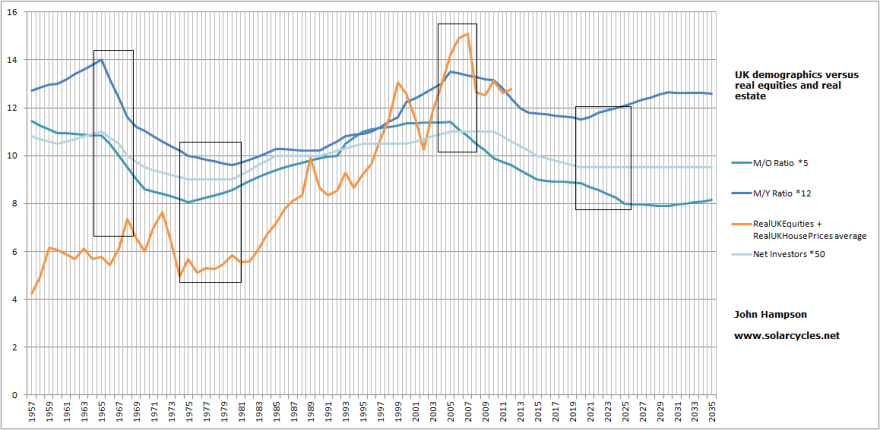
The peak in the composite for the UK was around 2007, in line with the demographic peak. For the UK this peak was higher than in 2000 and justified by the demographics. The US peak circa 2005-7 was a lower peak than in 2000 and fittingly its demographics were already on the decline. The later demographic peak in the UK was reflected in other major nations and thus possibly ‘infected’ the USA in pulling the US composite up into a decent 2005-7 peak despite the falling demographics. Looking forward, the UK faces demographic downtrends until around 2020-2025 which suggests a secular bear could be in play until then. However, we need to look at the demographic positions of the other major economies of the world so see the overall picture as evidence of cross-infection and lags are at work. To that end, here are the three demographic measures as used above for China, Germany, France and India.

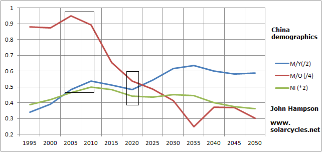
China made an excess-greed peak in equities and real estate circa 2007, tying in with the topping of demographic trends. It now faces difficulties until circa 2020.

X4

Germany faces similar headwinds until around 2020, or potentially even around 2035.

X5

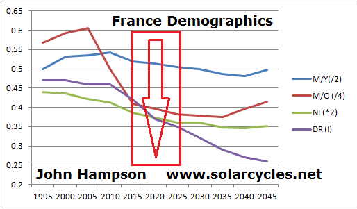
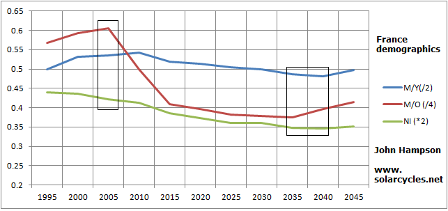
France is in a united downtrend until circa 2035.

X6

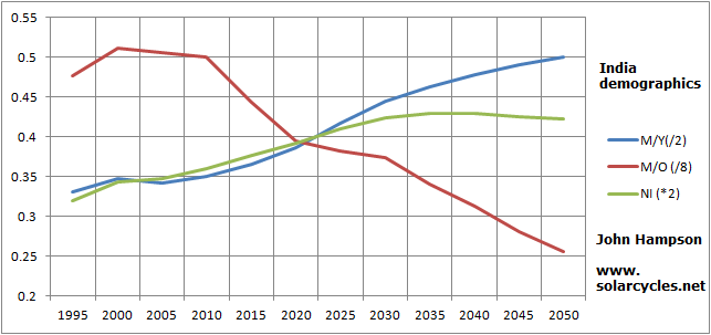
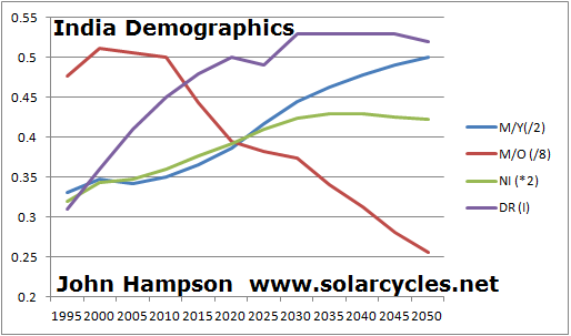
India is in an ongoing uptrend in two measures, and the middle-old ratio is a little deceptive as India is starting from a very small older population which is growing. For that reason there is a downtrend in the ratio, but it is still fairly benign compared to the more developed countries above.

X7

The chart for Brazil looks very similar to India, ongoing positive, and if we round out the top 10 major economies of the world, Italy is similar to the other European countries with unfavourable demographic trends, whilst Russia has a positive period from now until circa 2025. The caveat for Russia would be that is may not score as highly on the criteria for the relationship to fulfill, for example the stock market quite closely tracks the prices of energy commodities due to the economy not being as diversified.

So with a view of the next 10 years, the largest economy in the world, the US, has fairly flat demographics and is unclear. The second economy, China, is at risk of a secular bear until circa 2020 but then improves. The third economy, Japan, is in a positive period until around 2020, and is in fact playing catch up to demographics. The fourth largest economy, Germany, is negative until around 2020 but has better potential after that. The UK, France and Italy are part of an unfavourably-demographed Europe, whilst Brazil and India are ripe for long bull markets.

In short, from now until around 2020 Japan, India and Brazil are in positions to rally but China and most of Europe are pulling down, with the USA unclear. From circa 2020 to 2025, Germany, USA and China are in better positions for secular bulls, whilst Japan’s window closes. On balance, that suggests a global secular bull with many participants has better odds in the second part of the decade, so the question is what is going to happen between now and then, i.e. select secular bulls in those countries with favourable demographics only, or ‘infection’ from the larger economies to the others.

Most of the major economies of the world, listed above, enjoyed positive demographic trends from circa 1980 until circa 2000 or 2005. That made it easy for the world to embrace a collective strong secular bull on the whole. Looking forward, there is a large pool of countries with strong demographics for the next 20 years, but they are largely ’emerging’ countries, including Brazil, India, Turkey and Malaysia. That suggests there will be a global shift in performance over time away from the old developed world to these countries and others. However, currently, USA, China, Japan and Germany make up almost half the global GDP, which means their fortunes affect the world. It will take a long time for the emerging countries to alter this in a significant way.

This is my suggestion. If US stocks and real estate (and in turn global stocks and real estate) can make another cyclical bear leg down to bring the composite down to the demographics, and put them at better relative cheapness to  other assets, by circa 2015, then there will be better odds of a global secular bull beginning 2015 and strengthening from around 2020-2025.

Now I need to bring in solar cycles at this point, because something is going on with them, which further shapes the picture.

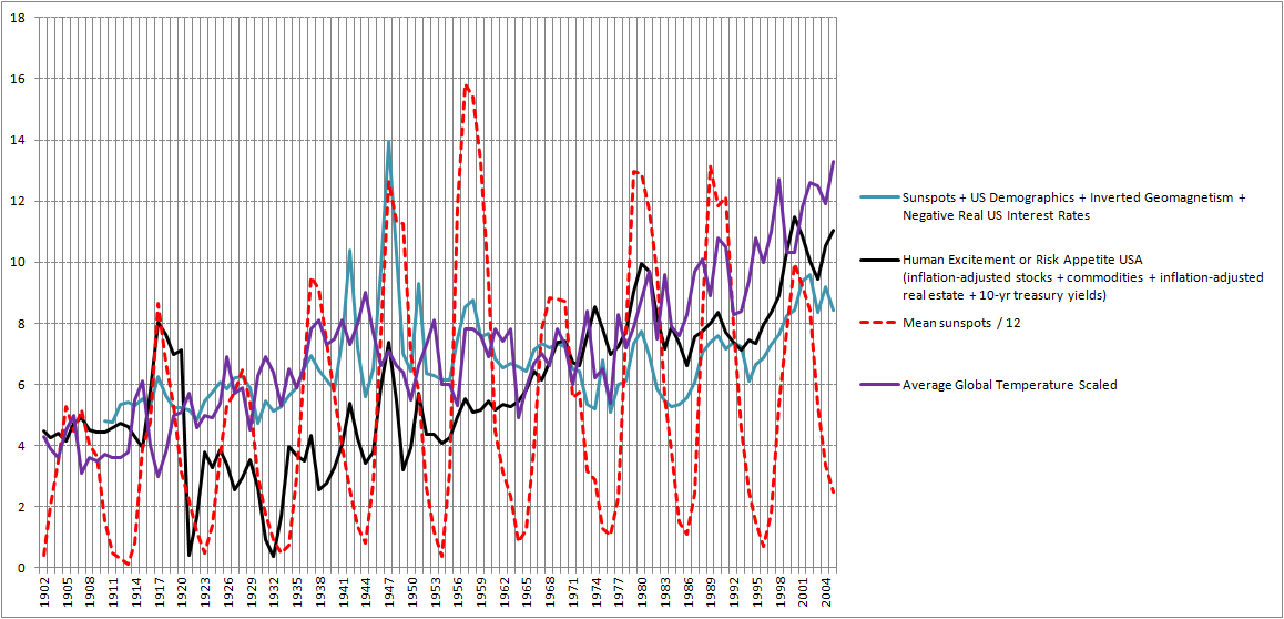
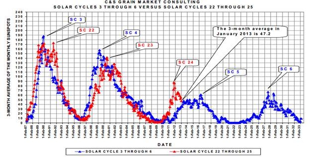
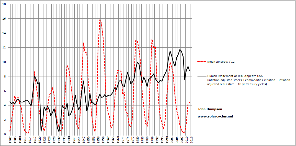
Here is the UK real equities chart versus sunspot cycles. The three major peaks in equities coincided with every third solar peaks. Inbetween interim peaks were made, also at 3-cycle intervals. And commodities also made secular peaks every third solar cycle, which were the buy points for equities.

X8

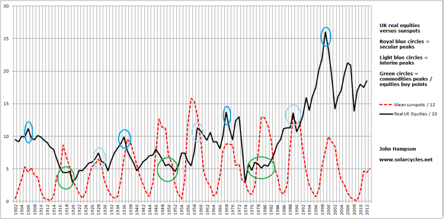
We know the performance in equities largely correlates with demographic trends, and from research in my recent posts, we know that there is a solar cycle influence on demographics. However, is that ‘every third’ solar cycle rhythm just an accident, or is it a ‘natural’ sine wave? The long term real Nikkei chart reveals links with solar peaks but no such repeating rhythm. However, commodities have made a secular bull once again over the last decade, in alignment with the pattern.

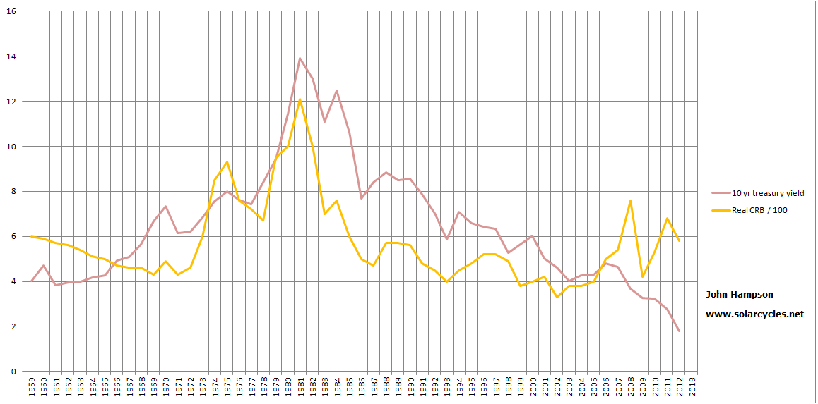
We know that over time, real commodities have gone nowhere, and have been no long term investment. They just enjoy bursts of interest.

Real Commodities Solar
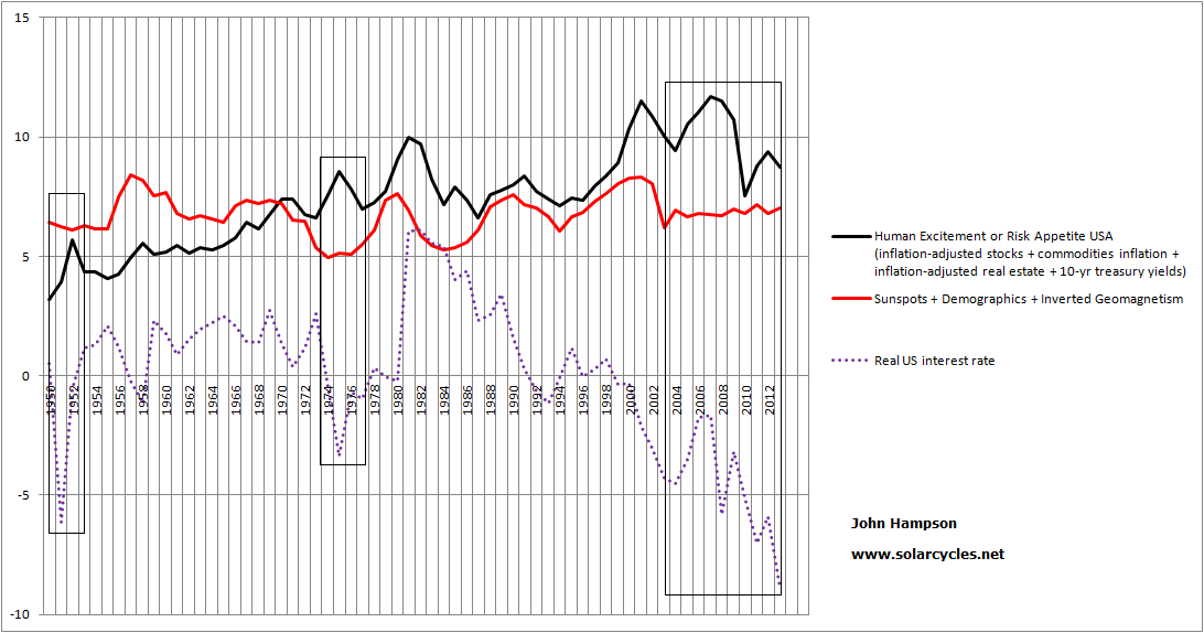
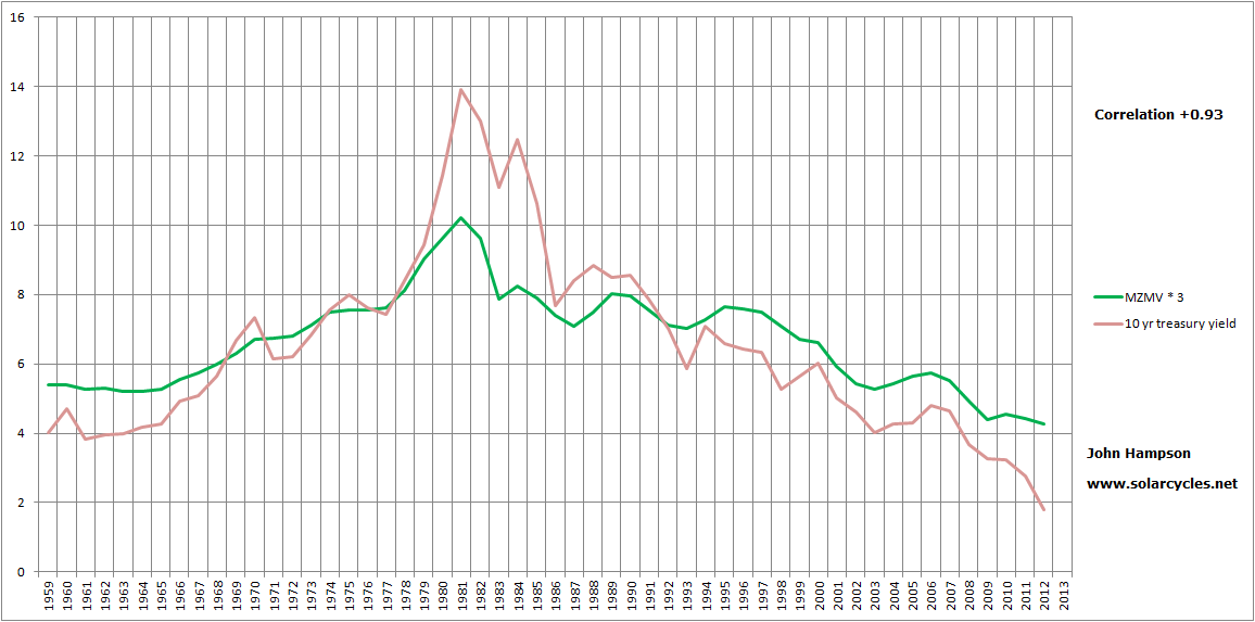
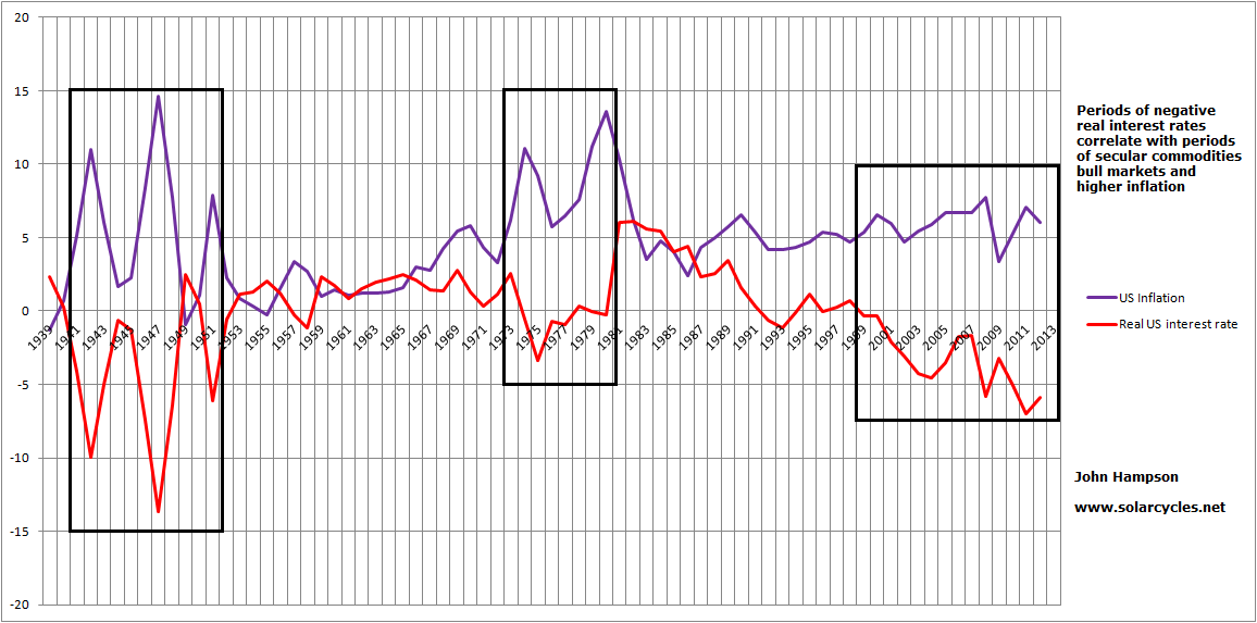
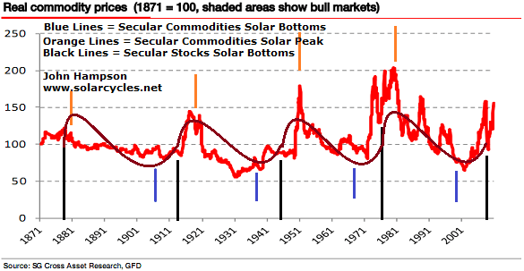
We know that they do not correlate with demographics, but rather tend to make secular peaks and troughs that are fairly opposite to equities. So do they just come into favour when stocks and real estate are out of favour? There must be more to it than that. Real negative interest rates unite the periods in which commodities soared, however, commodities are closely correlated with inflation, so their rises cause the negative real interest rates. In the 1970s interest rates were high, but real interest rates were still negative due to very high inflation.

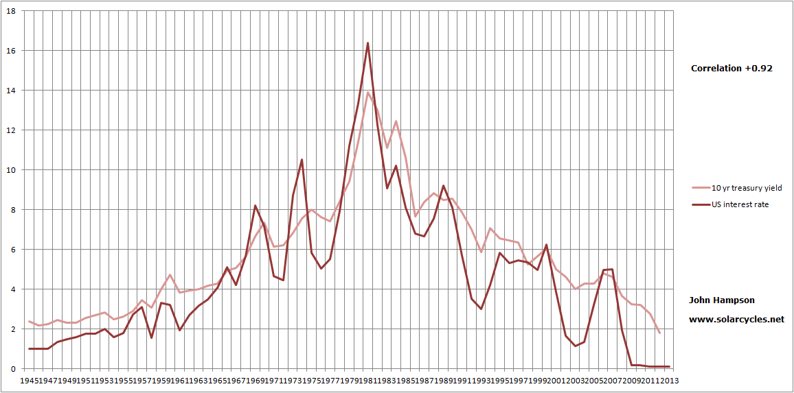
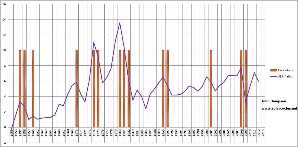
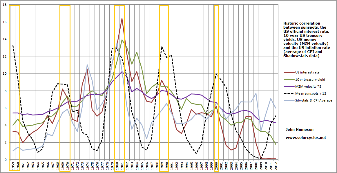
The period into 1917 was similar to 1980: high yields rates and velocity, high commodities and inflation. 1947 similar to today: low yields rates and velocity, high commodities and inflation. Right now we have only mild inflation, but there have been bursts of problematic inflation, particularly in 2008 and 2011. This chart shows those sets of relationships in the US, and the UK experienced very similar.

X9

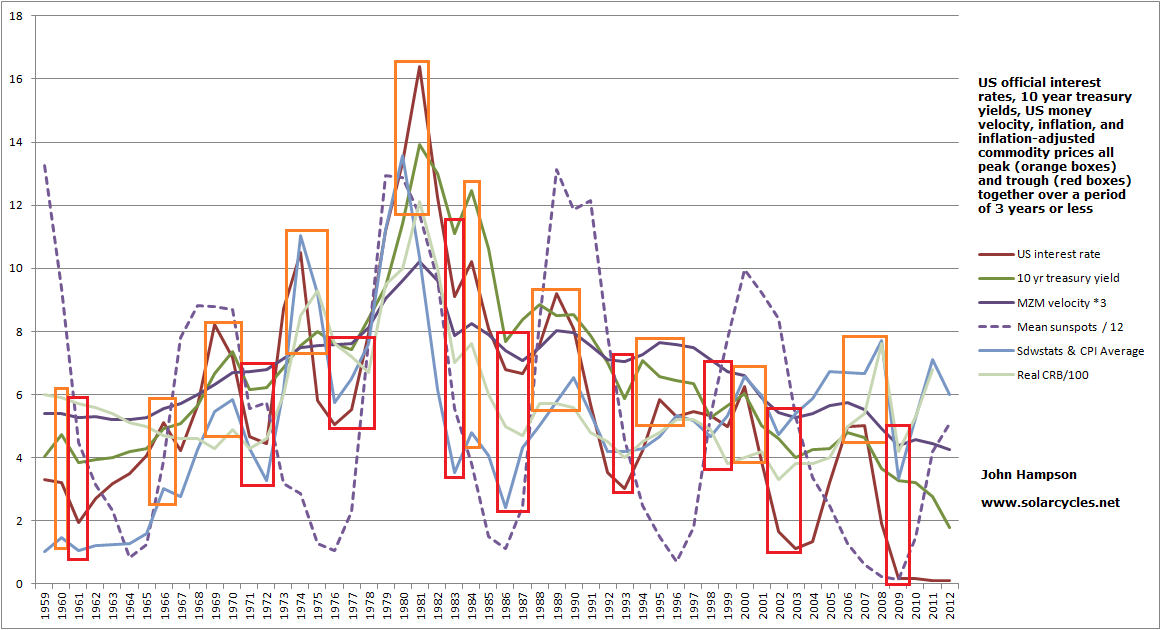
So the four commodities secular bull periods are only all united by two things: high commodities and high inflation (with the inflation being notably higher than rates, to create negative real rates). As commodities are the key driver of inflation, we are left with one uniting feature: escalating commodity prices. So what causes these periods of escalating commodity prices?

I believe it’s a multi-part answer. Supply lags is one known. It can take 10 years for a new mine or energy field to come into production. That can create a decade-long demand and supply inbalance, as periods of lower commodities demand can close down projects and therefore create problems of inelastic supply further along in time. Commodities come into favour when their relative pricing to other assets is historically low, and this occurs at the end of secular bull runs in stocks / housing (as evidenced in dow-gold or real estate-gold ratios). Demand for commodities can also increase as more countries develop and urbanise,which can occur from economic boom periods. In today’s environment of ultra low rates and yields – similar to 1947 – investors look beyond cash and bonds for returns, putting commodities in favour. Conversely in the 1970s and 1910s, investors looked to hard assets (commodities) as hedges against supply-side inflation. Common to all, stocks and housing were in down trends due to demographic trend changes so commodities then became the go-to investment.

Following a decade long commodities bull market we have reached the point today whereby commodities are relatively historically expensive to stocks and real estate, peaking in this regard so far in 2011, and whereby new supply has been catching up and coming on stream in the last few years. However, real interest rates and yields remain negative and so maintain commodities interest, whilst demographics for the major nations largely remain in downtrends which should keep equities and real estate under pressure to the benefit of commodities. It’s therefore a balanced picture, but recall that commodities have been a terrible long term investment, so if the balance tipped further towards stocks and real estate then we should expect an end to the commodities bull.

With all that in mind, this is my view on what is most likely to happen. Commodities ought to make one last bull rally, in keeping with solar cycle history: excitement and inflation into and around the peak. Both equities and commodities have a history of making major peaks near to the solar maximums, regardless of cyclical patterns. That should tip the world into a recession and equities into a bear, to take off again from yet lower relative value levels circa 2015 once demographics are bottoming out more in the US. For stocks and real estate to be already in secular bull trends at this point – say, from 2011 – is rather counter the collective demographics. This fundamental downward pressure on stocks and real estate (in certain key countries) ought to reassert itself shortly and money flows ought to move into commodities (for likely one last time) under conditions of negative real interest rates.

If there is another cyclical bear in the US, then as per the cyclical bears of 2001 and 2008, the other major country stock indices are likely to participate – i.e. all moving as one. However it ought to be shallower in those countries with more favourable demographics.
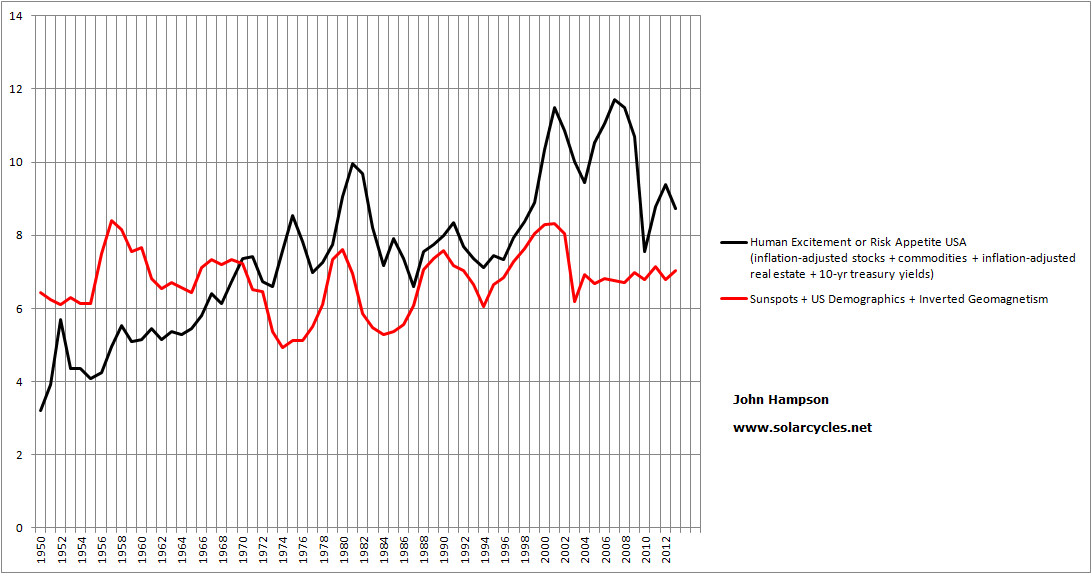
Sunspots, Geomagnetism, Global Temperature And Birth Rate

Both sunspot and geomagnetism cycles correlate with long term global temperature variation, with geomagnetism having the closest correlation co-efficient:

22may20137

Source: Landscheidt

Changes in global temperature have been demonstrated to influence fertility and birth rates. A composite of 19 countries below shows the inverse relationship between temperature and birth rate over the last century:

22may20134Source: ScienceDirect / Harry Fisch

Sunspot and geomagnetism cycles therefore affect demographics through global temperature variation.

There is also a global temperature oscillation related to solar cycling, shown below. Therefore we have two solar influences on climate: an 11 yearly oscillation and a long term trend following long term changes in solar activity.

22may201311

Source: C Camp

There is typically a spike in births around solar maxima – an 11-yearly peak – oscillating like the above:

22may20135Source: W Randall

Additionally, birth rates have been shown to vary with the economy, typically declining during recessions and rising during boom times.

22may20138

Source: Pew Social Trends

There is a pattern to recessions following solar peaks, and therefore births declining following solar peaks. The chart below shows all three for the US, with the solar peaks marked in black. There is generally a spike up in births at the solar peak followed by a pullback or flattening in births aligned with a recession.

22may201310

The major peaks in births occurred close to the solar maximums of 1917, 1958 and 1989.

Typically there is growthflation in the economy into a solar peak – which should encourage more births – and human excitement peaks with the sun. Perhaps human excitement at the solar peak also translates into more births, in terms of human behaviour effects, as snow shoe hare populations have been shown to peak around solar maximums. Then, following the solar peak recession and unemployment peaks typically occur, which would pull back the birth rate.

In asset markets we also see both an 11-yearly oscillation correlated to solar cycles and additionally a mapping of long term trend. This is a busy chart, but it attempts to show both the 11 year solar oscillation and the long term solar variance trend against risk assets, demographics and temperature – click to view larger:

Z20

So we have a six-way relationship between sunspots, geomagnetism, climate, demographics, the economy and the financial markets. The sun is the agent, and temperature and human behaviour (which translates into economic, risk asset and birth rate effects) are the subjects. There are two patterns: an 11-yearly oscillation and a long term trend variance. Within this multi-relationship there also appears to be a cause and effect chain from the sun to global temperature to birth rate (which becomes demographics) to long term risk asset performance in stocks and real estate.

If we are moving into a long solar quiet period then global cooling should become the theme and this should have implications for fertility, producing a trend of increasing global births. However, if man-made warming overrides the cycle of cooling then the opposite could occur. Whichever wins out should have implications for the world economy and financial markets later in the century.

Japan Financial Markets Economic Correlations

I wanted to test the correlations and interrelations on Japan. As it went through a different experience to the USA over the last half a century, did the same correlations in assets and the economy hold true? Data history is more limited than for the US, but sufficient to test. Correlation coefficients over +0.5 are considered strong positive correlations between two datasets, and some datasets have been scaled to share the same chart, where e.g. *3 or /10 is shown. Click on a chart to see it larger.

Firstly, I found the same five-way block correlation between interest rates, bond yields, money velocity, real commodities and inflation. Here are two pairings from that group:

Y1

Y2Note that the level of inflation was overall at a lower level than in the US over the last 3 decades but the relationship between real commodities and inflation is still clear.

As per for the US, I found this five-way block then produced the correlated-two of recession and unemployment. Below it can be seen how recession followed spikes in inflation, even if the spikes were low.

Y3

I also discovered the asset pairings are again found in Japan, with bond yields and commodities related, whilst real house prices and real equities go their own shared path. I show here real stocks and real house prices:

Y4

Uniting those two assets into a composite in the next chart, demographic trends again appear to have played a key role in their secular trending.

Y6That Japan did not participate in the secular stocks bull through to 2000 and the secular housing bull through to 2005 that the USA did, makes sense in light of the demographic trends in the period from 1990 to 2005. Additionally, the speculative peaks in Japanese stocks and housing circa 1989/1990 (around the human excitement solar maximum of 1989) were fairly extreme ‘greed’ overthrows, which then need time to washout on the other side.

However, demographic trends overall collectively turned up again from around 2005 and should continue positively until circa 2020. Japanese equities effectively made a triple nominal bottom in 2003, 2008/9 and 2011/12, whilst real estate has been basing since 2010, but a sustained rise in risk assets in Japan did not materialise until November 2012 onwards and I believe this sharp move is a belated catch up to the demographics. If 2013-to-date was added to the above chart we would see a significant pull-up in the stocks/housing composite.

Drawing in bond yields and real commodities to make a 4-way risk asset composite, and as per the USA comparing against the quadruple-agent composite of sunspots, geomagnetism, demographics and real interest rates, there is again a notable mapping between the two (again, 2013 should provide a belated pull-up to the model: a divergence being rectified):

Y7Generating the forecast into the future, but with the caveat of using assumptions and historic rhymes, we get this:

Y8The prediction will be refined over time to validate or invalidate those underlying assumptions and patterns, but the overall uptrend is due to the demographic trends that stand to boost risk assets until circa 2020 and then the next solar maximum should continue the upwards pull until circa 2025, implying there is a good chance of an overall secular bull in stocks and real estate in Japan for the years ahead.

I therefore suggest that the government’s recent doubling down on stimulus is in fact not required, and so it has the potential to supercharge proceedings. So far the yen has dropped sharply, bonds yields have taken off and inflation expectations have risen significantly:

Y9Source: BusinessInsider

As Japan is a net commodity importer, the sharp drop in the Yen pushes up import prices for energy and other resources, so they already have commodity price inflation despite commodities recently underperforming. If commodities now rise, as per my forecasts, then there is a danger that Japan suffers major commodity-based inflation, which should be correlated with money velocity soaring, and an inflationary feedback spiral develops. The government should then accordingly raise rates, but cannot raise them too fast or too far because of the record debt servicing. That, collectively, is why there is a hyperinflation risk. If problematic inflation does erupt then eventually the risk is of a stock market crash. However, until then (and maybe it does not come to pass), stocks are likely to do well based on demographics and a belated catch up, and they should also perform well under ‘some’ inflation. So the question is whether stocks will pullback sufficiently to offer an opportunity to get in or add more. I am long the Nikkei, but do not feel comfortable adding more on the long side at this point when stocks have risen almost 100% in 6 months. Conversely, despite the trade doing very well at the moment, I do not wish to take profits as I believe the major rally to be justified, and expect more gains ahead. So I stay put for now and we’ll see how things develop.

What Really Moves The Markets

The evidence has led me to a ‘dumb’ model of the markets, whereby humans are more subjects and less intelligent creatures of free will. It’s up to you to decide whether I have simply found what suits me and filtered out the rest, i.e. dumb seeks dumb. If we remove all the noise by looking long term, I suggest sunspots and geomagnetism are two big (but very subtle) drivers of human behaviour towards risk assets, with demographics (which are influenced by solar cycles) simply providing bulges in demand to produce long term bull markets in stocks and housing.

I suggest the solar phenomena are influencing human behaviour in the economy and financial markets alike, and that is why we find treasury yields, interest rates, money velocity, inflation and commodities largely correlated together. Optimism, excitement and positive sentiment driving all up, or pessimism, fear and negative sentiment driving all down. Just waves of sentiment supplied by nature. Plus, when increasing numbers join the investor age bracket of the population versus old and young over a period then enduring bull markets in stocks and housing can occur simply due to the growing demand the demographic trend provides. No complex interaction of fundamentals, just more people investing for retirement.

So I figured the next step was to produce a composite model of sunspots, geomagnetism and demographics for the USA over the last century to see to what degree this correlates with the long term US risk asset composite that I charted earlier in the week: namely real stocks and commodities, real house prices and treasury yields. To do make the triple ‘agent’, I used annual mean sunspots, annual average geomagnetism (inverted, because low geomagnetism is pro-risk, high geomagnetism anti-risk) and for the demographics the middle-young ratio up to 1950, then a composite of middle-young, middle-old and percentage of net investors from 1950 to current. To make the quadruple ‘subject’ I used real SP500 annual values, the Schiller real house price index, the commodities index and 10 year treasury yields.

This chart shows how geomagnetism relates to sunspot cycles over the long term:

17may20131Source: NASA

Peaks in geomagnetism occur typically 1-3 years after sunspot peaks, averaging 2 years later. This fits with recessions and unemployment peaks usually occurring within a couple of years after the solar peak, as peak geomagnetism escalates pessimism and fear. The strength in a geomagnetic peak is also a reasonable predictor of the strength of the next solar cycle.

Once I had worked back half a century, compiling the data, this is what popped out (click to view charts larger):

Z16

The model didn’t work out so well in the periods around 2006, 1974 and 1951. I then discovered what united the three: real interest rates were negative:

Z15

Inbetween, the model worked very well. When real interest rates were negative, risk assets (particularly commodities) got an uplift, regardless of sunspots, geomagnetism and demographics. This is because this type of inverted evironment discourages cash and savings, and encourages borrowing and speculation. People are not being compensated by leaving their money at the bank to offset the gradual erosion of purchasing power, so they seek hard assets and risk investments instead.

So I added negative real interest rates to the model (netting them from the composite where they occurred in the last century) and completed the history, and this is the result:

Z17

Overall a very close match with the moves into and out of stocks, commodities, housing and t-yields over 100 years.

Therefore, I am suggesting there are 4 main agents in moving financial risk asset markets: sunspots, geomagnetism, demographics and negative real interest rates. On a yearly basis, they collectively mapped the bull and bear waves up and down, with little missing.

I then attempted to project the model into the future for the next 20 years.

Demographic projections to this end are fairly reliable as those entering the key age groups over the next 20 years are largely already alive so we have a good idea of numbers moving through. I therefore used all three measures again – middle / old, middle / young and net investors – and combined into a composite.

For sunspots, there is a historic rhyme with a past period of solar cycles as shown:

17may20132Source: WattsUpWithThat

So I projected sunspots forward based on solar cycles 5 and 6. Then, using the link between a geomagnetic peak with the next solar peak, as referenced further up the page, and its typically peaking 2 years after a solar peak as well as general relations with the sunspot cycling, I constructed a geomagnetism model for the next 20 years.

Lastly, for negative real interest rates, I used the late 1940s and 1950s as a guide due to its historical mirror, with high government debt meaning rates had to be kept low, whilst modelling inflation based on its correlation with solar maxima.

The result:

Z18

Clearly, there are assumptions and a reasonable tolerance allowance in my 20-year forecasts for the three datasets that make up the model other than demographics. One assumption is that the solar maximum is ahead this year. If that proves correct then there is a fairly potent combination of a sunspot peak with negative real interest rates, which contribute to the 2014 spike, before dwindling sunspots and peak geomagnetism arrive along with fading demographics. From 2022 to 2027 a bull market in stocks and housing should be enabled by an upturn in demographics and the next solar maximum. Overall, however, the future model is downward sloping, as demographics are poor relative to a golden period like 1980-2000, and the sun potentially enters a new ‘minima’ period as shown in the SC5 and SC6 historic rhyme above.  This is also despite the built-in expectation that real interest rates may oscillate in the negative for some time yet, as the Fed only slowly and gingerly moves up rates, balancing servicing high debt with keeping inflation in check.

As time progresses, the assumptions in the projections can be confirmed or denied and the forecasts within it refined. As this is a long term model, forward validation is going to take some time. Nonetheless, the backwards validation that came out of the data confirmed the validity of what I believed mainly moves the markets over time, with negative real interest rates added to the three that I set out to test. I am well aware that this is not the mainstream view and would be a hard sell to investors: that the four agents of risk asset markets over the long term are sunspots, geomagnetism, demographics and negative real interest rates. However, drawing those together into a composite appears to account for all the major bulls and bears that we have seen in equities, bonds, real estate and commodities over the last century.

I am still formulating my thoughts on the findings of this last week, but here’s one to end the post: maybe the Fed isn’t as foolish as many make out. The reason the Fed intervenes at all in periods of ‘bust’ or cleansing is to prevent a depression, which would be much harsher on the population and likely bring about social conflict. By pushing down interest rates into the real negative, it can induce risk-asset rallies, which make the people feel better if their investments are rising, and housing rising. The problem is this action typically produces commodity inflation, which is bad for the people. Now there is a large block correlation between official interest rates, t-yields, money velocity, real commodities and inflation, and then recession and unemployment. The first five typically rise together and then produce the latter two. By acting on t-yields through QE, rather than just acting on official rates, might the Fed be able to keep the 5-correlated from rising, and thus also prevent the recession and unemployment that follows too? It would seem worth a try. If that worked, they would perhaps be able to maintain an environment of negative real rates with the beneficiaries stocks and housing, whilst preventing the undesirable trio of commodities inflation, recession and unemployment from rising until they end QE. Right now, that overall scenario seems to be what’s in play in the markets, doesn’t it? However! I am doubtful this actually works. Commodities staged a big rally in 2011 despite QE2. I believe they will do so again and normal correlations will apply.

Update: 

One additional chart to ponder – is global temperature correlated too? It’s tempting to shift this along and see how it matches up, but I’d need a good reason to apply a lag. Any ideas folks?:

Z19

USA Financial Markets Economic Correlations

Correlations between real stocks, real commodities, real house prices and treasury yields, together with inflation, interest rates, recessions, unemployment, demographics and sunspots. A more detailed, step by step study of the correlations, using correlation coefficients, whereby +1 means a perfect lockstep relationship between two things and -1 means a perfect inverse relationship, whilst zero would mean no relationship. A reading over +0.5 is considered a strong positive correlation. Note some of the data has been scaled to share the same chart (indicated by, for example, /10 or *3). Also note for US inflation I have used an average of Shadowstats and official CPI since the 1980s, and official CPI before that. You can click on any of the charts to view larger.

Let’s start with a couple of the highest correlations:

Z1

Z2Combining the two, 10 year treasury yields, official US interest rates and MZM money velocity all move in almost perfect lockstep. They are currently all together at record lows. If one begins to rally, we should expect all to rally – with implications for the Fed.

Now let’s look at another closely correlated pair:

Z3Real commodity prices and inflation show a strong correlation. There is a feedback looping between the two as rising commodity prices cause price inflation but price inflation spurs money into commodities (hard assets) as an inflation hedge. There was a lot of debate around the 2008 and 2011 commodity spikes as to whether speculators were to blame. The trading of commodity futures has been around for 150 years in the US, and price spikes are more speculator-heavy because of the feedback looping. Regardless of which kicks off the process, the two occur together.

The next chart shows the relationship between US official interest rates and inflation. Most of the time there is a strong correlation, and as the Fed is the sole agent in rate-setting, we can say that the Fed move rates up and down either in response to or in anticipation of inflation, but largely in line with. However the late 1940s and the current period don’t match up as well as the rest.

Z4

The picture becomes clearer when we look at real interest rates (net of inflation), and extend further back in time:

Z5

We see three clear periods of negative real interest rates – which notably coincided with secular commodities bull markets. Inflation was higher during these periods. If you subscribe to the Shadowstats calculation of inflation (that official inflation stats have been significantly doctored over the last 3 decades) then the purple and red lines would be somewhat higher and lower respectively than shown at the current time. If you take the official CPI data as true, then annual inflation would be currently running around 1.5% which would still maintain the real rates line in the negative. I suggest true inflation is likely somewhere between the two, and thus as shown. As things stand currently, therefore, the environment for the secular commodities bull is still in tact.

Here is another correlation with inflation. US unemployment brought forward two years has a correlation over +0.5 with US inflation:

Z8

This is because recessions occur following inflation spikes:

Z7So we see inflation spikes bringing about recessions which bring about peaks in unemployment around 2 years after the inflation spike (due to unemployment being a lagging economic indicator).

Now let’s draw together unemployment (brought forward 2 years) and inflation, and bring solar sunspot cycles into the picture:

Z9Sunspot solar peaks correlate with inflation peaks, and unemployment brought forward 2 years. This is not a lockstep relationship – it is a correlation specifically related to the solar maxima – and the reasoning for that is the ‘excitement’ that Aleksandr Tchijevsky discovered around solar peaks in human history which is backed up by more recent research revealing bilogical changes in humans at sunspot peaks. If this ‘excitement’ translates into buying and speculation at solar peaks then we can justify spikes in inflation (with subsequent recessions and unemployment spikes).

If it is true that humans are biologically disposed to buying and speculation at solar maxima then a composite of risk assets, namely real stocks, commodities, real estate and treasury yields, should spike up at each solar maximum. Here it is:

Z10The composite uses Schiller real house price data and real SP500 index annual values. Each solar peak is accompanied by a spike in what can be termed risk appetite. There are other spikes inbetween the maxima, but what is key here is whether solar maxima reliably bring about spikes in risk assets, given that we are likely in the year of a solar maximum in 2013.

Within the risk asset composite, there are broadly speaking two pairs:

Z12

10 year treasury yields have a distinct relationship with real commodities, whilst real equities and real house prices correlate very positively together:

Z11

Yet commodities and stocks display an inverse relationship over time of around -0.5, with the result that the two above pairs are often going separate ways. Indeed, thus far in 2013 we have seen US equities and real estate rallying whilst commodities and treasury yields have been languishing. Is it time for a reversal?

If we bring in demographics at this point, and combine stocks and real estate into a composite, this is what we see:

Z13

All three demographic measures – middle to old ratio, middle to young ratio and percentage net investors – are all pointing down for the next couple of years. The stocks and real estate composite has historic correlations with the three measures ranging from +0.54 to +0.7, so all strong positive. It would therefore seem more likely that there is another leg down for real equities and real housing into circa 2015, rather than secular bull upwards action from here. Another leg down in real terms would also help satisfy secular p/e, Q ratio and regression to trend measures for equities, which all call for further washout.

Drawing all the above together, along with my previous analysis, I suggest it remains the most likely scenario that we see an inflationary peak to coincide with the solar maximum (allowing for a reasonable time window), within which commodities and treasury yields rise and stocks and real estate decline in real terms, but due to significant inflation hold up in nominal terms. A recession and peak in unemployment should then follow the inflationary peak. As of around mid-decade demographics improve sufficiently to remove the headwinds for equities and housing, which could enable a new stocks bull, with real interest rates turning positive again.

Once again, your observations and suggestions are welcome, as I believe there is more to be teased out.

Brazilian Bovespa, Indian Sensex, Malaysian KLCI

Over the next 10 years there are certain countries (largely emerging markets) with demographic tailwinds which should enable strong equity bull markets (as per my conclusions here), whilst the majority of the G10 face demographic headwinds, which may not only offer poorer returns but potentially even losses in secular bear markets, like Japan 90-00. So I want to put greater focus on the site going forward on my pick of those with tailwinds.

Out of the 24 I studied, South Africa, Nigeria, Poland, Russia, India, Turkey, Brazil, Malaysia and Indonesia had the best demographics looking foward. Out of these I have chosen Brazil, India and Malaysia to track on my site. I selected them because of relatively low corruption, sufficiently diversified economies, and healthy reserves versus debt. Brazil has an advanced tech sector, good oil supplies and one of the richest biodiversities. Equally important was having access to them on my trading platforms and having access to the data for their respective indices. I would have liked to have added one of Poland or Turkey to make even better geographic diversification, however data for both is not readily available. I plan to still invest in one or the other – most likely Turkey – but will limit the modelling on my site to Brazil, India and Malaysia.

Of course having positive demographic trends does not make for guaranteed good returns. Political and economic mismanagement, conflict, regional crises, large natural disasters and a number of black swans are all possible. But all three countries are fairly established and large economies, on the cusp of leaving emerging to becoming developed, and my plan is to spread my risk by investing in all, with the addition of Turkey or Poland, in case one stumbles.

So, I have compiled data for the last 4 years: sufficient to judge lunar and geomagnetic responsiveness, whilst balanced against time demands. Here is the geomagnetic model for the last 4 years versus Brazil, India and Malaysia stock indices:

a40

a42

a43

All three demonstrate fairly good relations with the geomagnetic model. It is tentative of course, but none are so out of sync with the model as to render its use redundant, and this is largely to be expected as geomagnetism should affect sentiment globally. The geomagnetic forecast and models will be updated tomorrow as usual, so these three will now join the updates.

I then studied returns in relation to lunar phase oscillation over the last four years and here is the summary:

13may20131

All three countries demonstrated higher returns within the lunar positive period (buy on the 4th day after a full moon, sell on the 4th day after a new moon) compared to the lunar negative period (buy on the 4th day after a new moon, sell on the 4th day after a full moon). The least powerful differential was found in Malaysia, yet in the Dichev and Janes study which covered a longer timespan, they found the Malaysia KLCI to be one of the most sensitive to the lunar oscillation. Dichev and Janes did not include India or Brazil in their study, but the results in the table above suggest fairly potent lunar oscillation, with India particularly impressive. I therefore (again tentatively) suggest trade-timing using lunar oscillation should work in these countries.

In conclusion, the Brazilian Bovespa, Indian Sensex and Malaysian KLCI have demographic tailwinds looking out over the next 10 years, which should add to the probability of strong secular equity bulls in these countries. They also compare more favourably to other positive-demographic countries, such as Nigeria, Russia and South Africa in terms of lower corruption, unemployment or more economic diversification. Collectively, they provide sufficient risk diversification and geographic diversification, to which I will be adding Turkey or Poland. However, due to data availability, my tracking on the solarcycles.net will be limited to Brazil, India and Malaysia, and all three demonstrate sensitivity to geomagnetism and lunar phasing, which should provide two tools with which to improve trading returns in these indices.

Sunspots, Equities, Treasuries, Commodities, Inflation, Money Velocity, Interest Rates And Demographics

Time to draw them all together and see the full correlations. This is US-based analysis due to data availability.

The first chart (click to view larger) reveals historic spikes in US interest rates, 10 year treasury yields, MZM money velocity and US inflation (averaging official CPI and Shadowstats data) all within a 2 year period around the solar maximum (note the 1968 solar max was November and the 1979 solar maximum December, hence the 2 year boxes following; also note some of the measures have been scaled to share the same chart).

10may20131

Stepping back further in time, the 1947 solar maximum was accompanied by a 1947 inflationary peak, followed by spikes in corporate bond yields by 1948 and treasury bond yields by 1950.

If the next solar maximum is ahead in Autumn 2013, then by history we should see spikes in rates, yields, velocity and inflation within around 2 years of each other and of the solar maximum. Is it different this time because the government has acted to surpress both interest rates and bond yields? With velocity correlating closely with bond yields, is an inflationary peak not going to happen this time? I believe it will happen, as the same surpression occurred in the 1940s and yet the spikes took place.

The second chart (click to view larger) adds in real commodities using the CRB index adjusted for inflation (and again scaled). Interestingly, real commodities behave very similarly to rates, yields, inflation and velocity – all moving together into peaks (orange boxes) and troughs (red boxes), over periods lasting around 3 years.

10may20132

There is a general pattern of collective peaks around each sunspot peak, and additional collective peaks before solar mimima. I don’t yet understand why we see rallies leading into solar mimina, however they have historically set up the panics and crashes that occur at the solar minimum. Nonetheless, yields, commodities, velocity and inflation all acting together is suggestive of waves of ‘human exctitement’ that brings about speculating, buying and circulating money in the economy, or the opposite.

The third chart adds the real inflation-adjusted S&P500 and US demographics trends (middle to old and middle to young ratios combined) into the picture. Here we again see evidence of ‘human excitement’ correlating with sunspot peaks as some combination of real stocks, real commodities and inflation spike up around the solar maximum.

10may20133Demographic trends appear to be important for real stocks to peak, whilst commodities appear to behave opposite to demographics.

In summary, there appears to be a 4-way correlation between equities, sunspots, demographics and inflation, whilst there appears to be a 5-way correlation between rates, yields, velocity, inflation and real commodities. My solar-theory take on it is that the same phenomenon of human excitement (driven up and down by the solar cycle) translates into trends in buying, asset speculation and circulating money, hence the united correlations, whilst demographics (which also have a solar input: solar maximum peaks (and occasionally troughs) in births) additionally feed into equities due to investment/disinvestment in equities, relating to retirement.

I’d be interested in your thoughts on any of the correlations in the charts. I suspect there is more to be teased out.

Demographics And The Next Secular Stocks Bull

Four demographic measures have been demonstrated to have a correlation with economic, stock market and real estate market performance: middle to young ratio (35-49 year olds versus 20-34 year olds), middle to old ratio (35-49 year olds versus 60-69 year olds), percentage of net investors (35-39 year olds versus the whole population), and dependency ratio when inverted (0-14 year olds plus 65s and over versus 15-64 year olds). Using the population pyramids based on the United Nations 2011 population data and projections I have modeled 24 countries on all four measures and you can see these charts on my new Demographics page HERE.

The data points are 5-yearly and I have modeled the period from 1995 through to 2050, so that we can see the trend leading into our current point in time and the projections forward. Based on the wider research on my site, my forecast is for a secular transition to a new K-Spring from the period around 2013’s solar maximum, namely that secular bull markets in bonds and commodities should give way to new secular bull markets in stocks and real estate in a gradual transition, with the first phase of momentum in stocks likely from around 2015 through to the next solar maximum of around 2025. By my recent analysis, not all major countries around the world will participate in secular stocks bulls in that period, as those with particular negative demographic trends are likely to miss out. The strongest secular stocks bulls should be in those nations with particularly positive demographics based on the four measures.

So let me cut to the conclusions from the data. Those countries with the strongest demographics 2015-2025 out of the 24 modeled are South Africa, Nigeria, Poland, Russia, India, Turkey, Brazil, India, Malaysia and Indonesia (with at least 3 out of 4 measures trending positive). Those countries with the weakest demographics 2015-2025, and likely to struggle to carve out secular bull markets in equities, are China, France, Spain, Germany, Italy, Australia/New Zealand and Canada (with at least 3 out of 4 measures trending negative). And lastly those that are in between (more ‘neutral’ demographics) are USA, UK, Mexico, Canada, UAE, Ireland, Vietnam and Japan.

Therefore, based on demographics, the best returns for equities are likely to come in East Europe, South America, South Asia, ASEAN and Africa. Unimpressive returns should be made overall in the ‘developed’ world, with Western Europe perhaps struggling the most. Out of the top 10 largest economies in the world, we might expect Brazil, India and Russia to play a greater role in pulling the world economy and stock markets along, whilst China, Germany and France may be dragging their heels.

Compare Nigeria and France, at opposite ends of the demographic trend spectrum. Here is Nigeria, showing all four demographic measures (which have been scaled to share the same chart) trending positive between 2015 and 2025.

6may20131And here is France, with all four measures trending negative in the same period:

6may20132Some potential investment vehicles to capture the best demographics would be Spdr S&P Emerging Europe which is Russia(56%)-Turkey(23%)-Poland(13%), or Market Vectors Africa ETF with the two largest country holdings Nigeria and South Africa, or Advanced Frontier Markets ETF whose biggest holdings are Nigeria, Vietnam and Gulf countries, together with smaller holdings in many of the less accessible countries with better demographics. There are multiple investment options for the bigger countries such as India and Brazil. Beware ’emerging markets’ ETFs as they often include China, Taiwan and others.

If my primary forecast plays out for a secular commodities peak then a cyclical stocks bear and mild recession before a momentum ‘go’ point as of 2014-15 then the opportunity to load in to these stock markets may not be until then. However, I may be wrong with the timeline of developments, and not all markets will take off at the same point, so another consideration would be which of those positive-demographic markets are currently ‘cheap’ and therefore unlikely to be at risk of much price downside. The cheapest current by p/e include Turkey 12, Poland 10, and Russia at 5.6 with a 4.6 yield. Alternatively, Japan’s stock market appears to have technically broken into a new secular bull already and is belatedly catching up with demographics which turned upwards (not all 4 measures) as of around 2005, so I suspect could already be a buy.

Many of the ’emerging’ markets in the positive demographic list look similar to this, India’s combined chart:

6may20133Three positive trends and one negative, with the negative being the middle-old ratio. This is because until recently people in relatively poorer nations rarely reached old age. In the first half of this century they should see an increasing amount of people reaching old age and therefore the ratio versus the middle aged goes from negligible to something of significance. Nonetheless, the old age populations in these developing nations largely does not become problematic until much further out, unlike the large relative numbers reaching old age in many developed countries as of now.