Thank you so much for all the messages of support – I was really touched to read them all. I had a burn out and now have to take things easy. I was working long days with the markets and doing too much of everything on top. So my posts will be less frequent for the foreseeable future, but as my focus is on the medium and long term, less intensive tracking may be no bad thing. I come back to the markets after a couple of weeks away and although price continues to frustrate, little has changed in the big picture. Some of my near term timings didn’t work out, but the overall case remains solidly bearish, and it’s a question of patiently waiting for price to fall in line.
Focusing on US stock indices, I have updated the bearish indicators and flags and added some new ones below:
1. A 5-year bull trend only occurred once before, in the 1990s, and was followed by 3 down years
2. Historic levitation above longer term moving averages and lack of 10%+ correction since 2012

Source: Gordon T Long
3. Last 2 years rally in US stock indices has been made up of less than 20% earnings growth and more than 80% multiple expansion. The last 2 such occurrences in history were 1985:1986 (leading into 1987 crash) and 1997:1998 (leading into 1999 real Dow peak)
4. Compound annual growth rate in equities since 2009 was only exceeded in 1929, 1937, 1987 and 2000, all of which led to steep market declines
5. Crestmont P/E is the 3rd highest in history after 1999-2000 (market peak) and 1929 (market peak), and in 97th percentile
6. This is the 2nd highest market capitalistation to GDP valuation outside of 1999-2000 (market peak)
7. This is the 2nd highest Q ratio valuation in the last 100 years outside of 1999-2000 (market peak)
8. This is the 3rd highest CAPE valuation in the last 100 years outside of 1928-1929 (market peak) and 1999-2000 (market peak), and the US is the 4th highest CAPE valuation in the world currently.
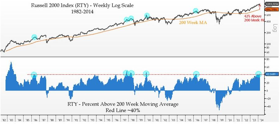
9. Russell 2000 index p/e is currently 74.8; Russell 2000 to SP500 valuation differential at all time record
10. 84% of companies have offered negative earnings guidance for Q1 2014 so far; Last quarter’s revenue growth was the lowest since 2009
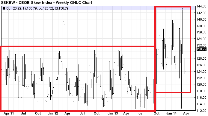
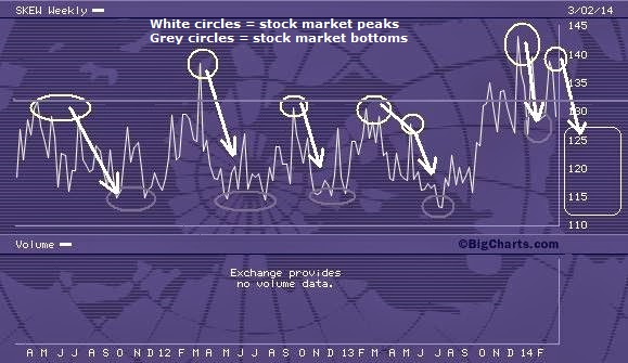
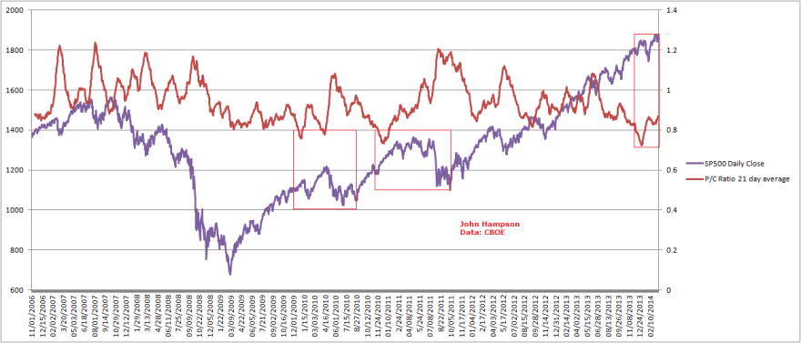
11. Skew is in elevated range for the last 6 months; Cluster of extreme Skew readings not seen since June 1990 before recession began July 1990
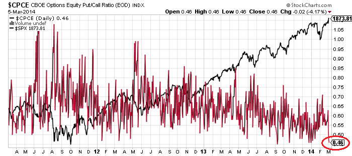
12. Put Call ratio 21 day average over the last several months has clustered in the extreme low zone that previously led to sharp corrections
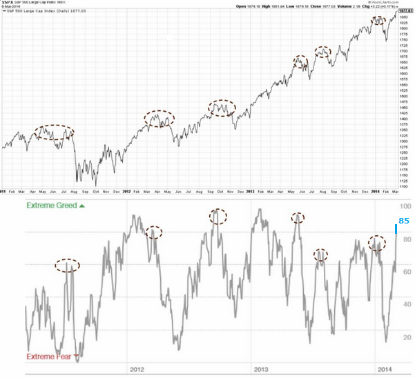
13. Greedometer – aggregate of macroeconomic, fundamental and technical data – is at a record level exceeding the 2000 and 2007 market peaks
14. Citi Panic/Euphoria model at a level only exceeded into the 2000 peak:
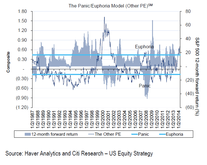
Source: Fat-Pitch
15. NAAIM sentiment remains historically high
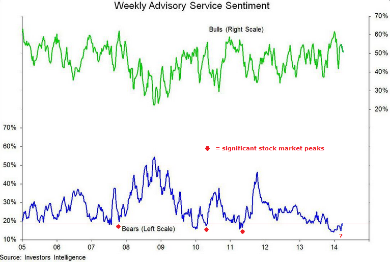
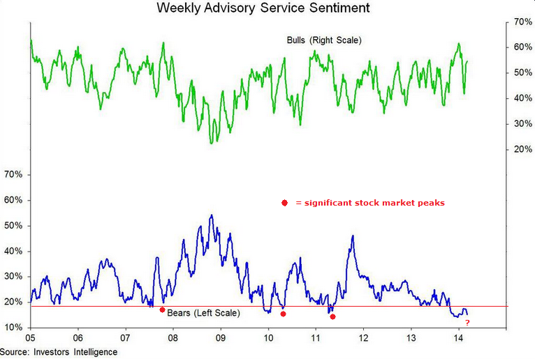
16. Investor Intelligence % bears levels and pattern similar to previous significant stock market peaks

17. Rydex bull ratio at extreme historic high
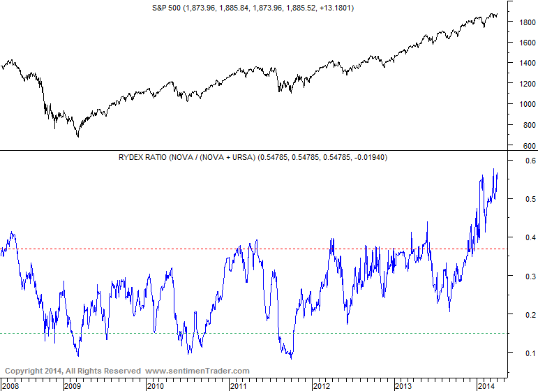
Source: Sentimentrader
18. Margin debt (updated for Feb 2014) is at an all-time record, both in nominal and real terms, and as a percentage of market cap; Net investor credit balances are at an all time low

Source: Dshort
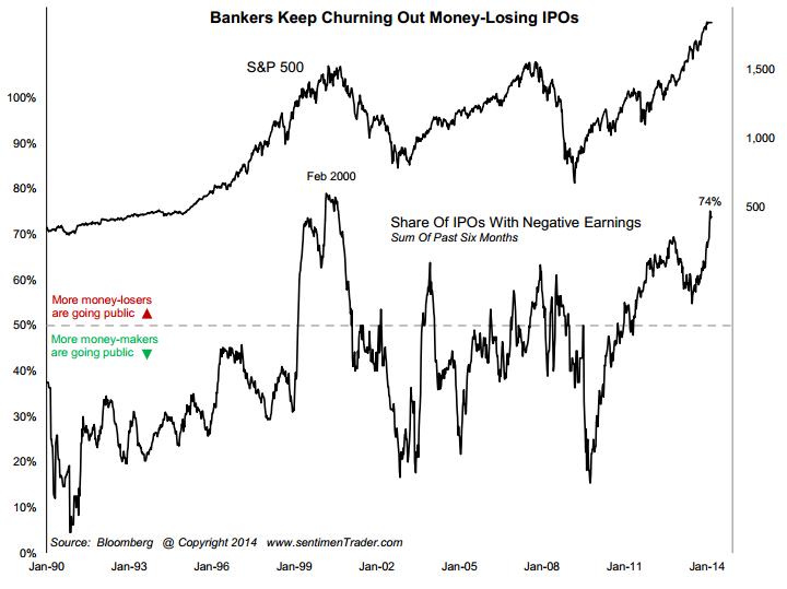
19. IPOs with negative earnings at levels consistent with previous market peaks
20. Leveraged loan issuance at record, surge mirrors 2007 and 2011 important stock market peaks
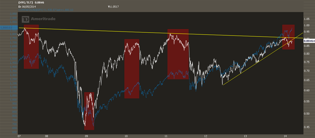
21. High yield corporate bonds to 20+ year treasuries shows a divergence with the stock market that has previously marked tops
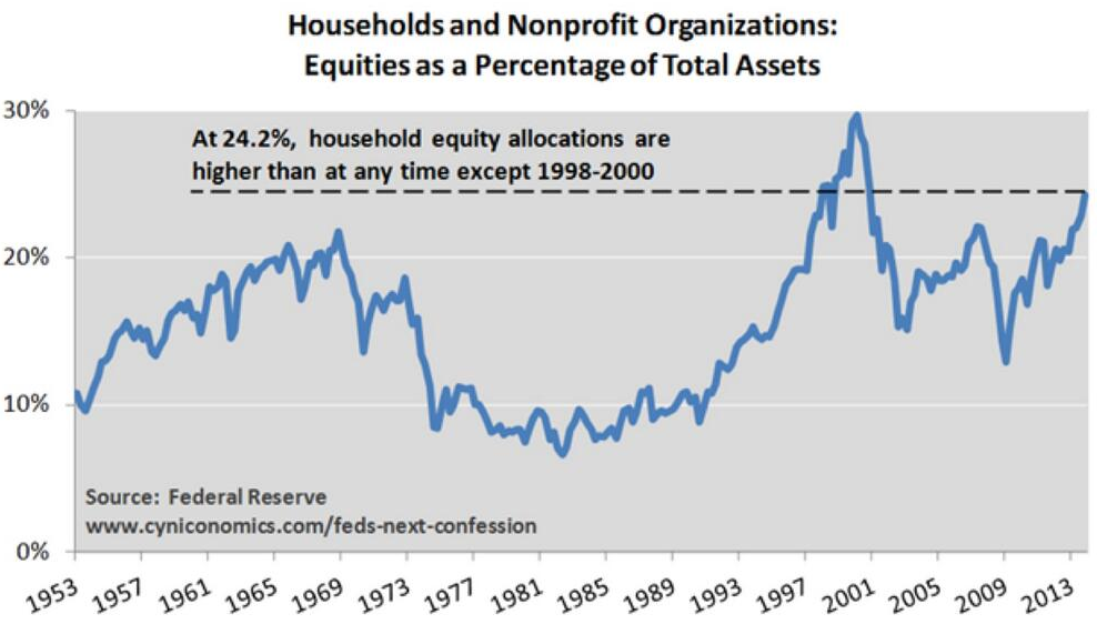
22. AAII equity allocations highest since June and Sep 2007 and Dec 2013

Source: UKarlewitz
23. Smart Money Flow Index shows siginificant divergence in 2014
Source: Todd Harrison
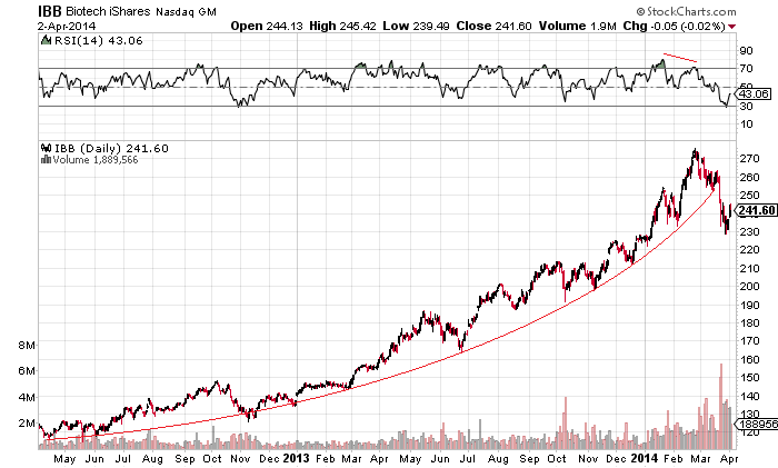
24. Biotech parabolic bubble breakdown

Source: Stockcharts
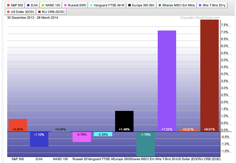
25. Wider momentum stocks breakdown
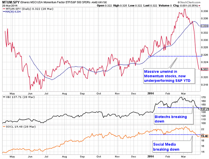
Source: Charlie Bilello
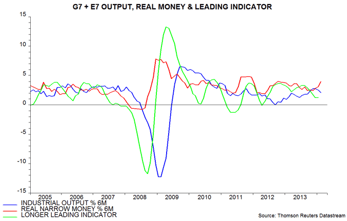
26. Leading indicators suggest global industrial output slowdown into a May trough, then a pick up into late summer

Source: MoneyMovesMarkets
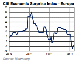
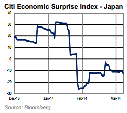
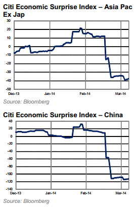
27. Citi Economic Surprise Indices for major global regions all negative
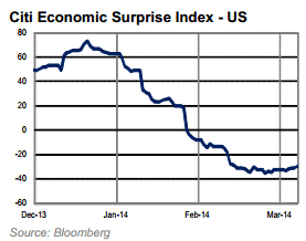


 Source: Citigroup
28. Fund manager allocation to global equities is at levels that previously led to a market peak or correction
29. Percentage of stocks hitting new highs is thinning into current new SP500 highs
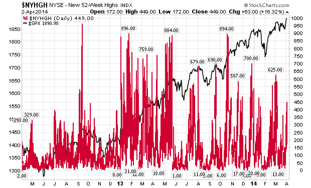
Source: Stockcharts
30. Six month breadth divergence in Nasdaq 100 in stocks above 200MA
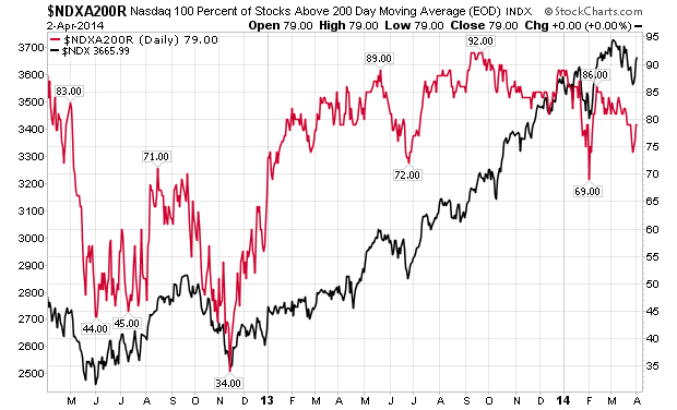
Source: Stockcharts
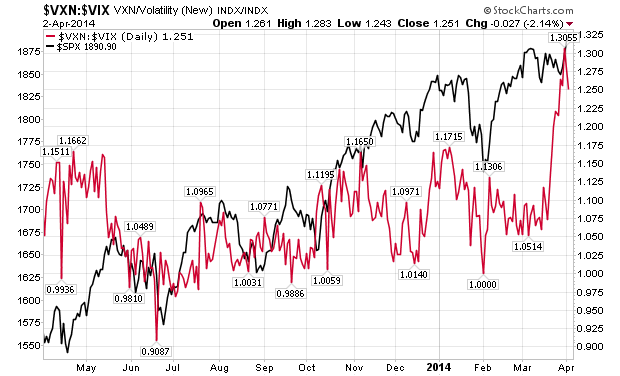
31. VXN/VIX ratio is a risk-off current flag

Source: Stockcharts
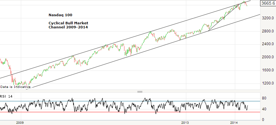
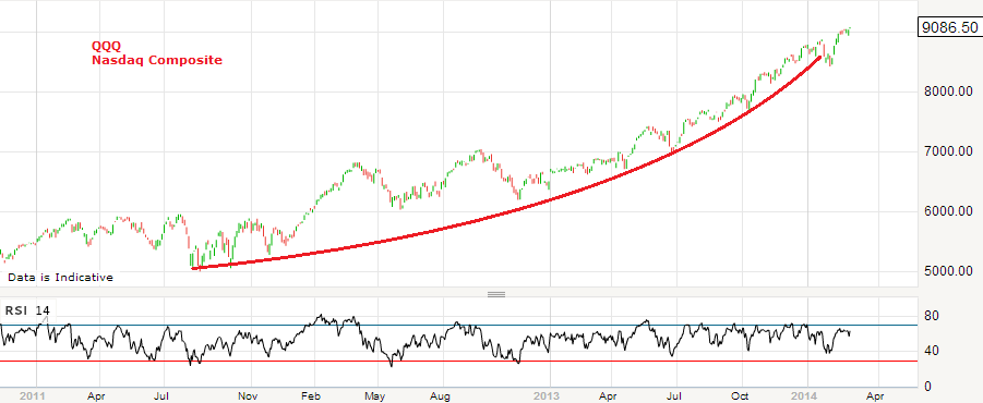
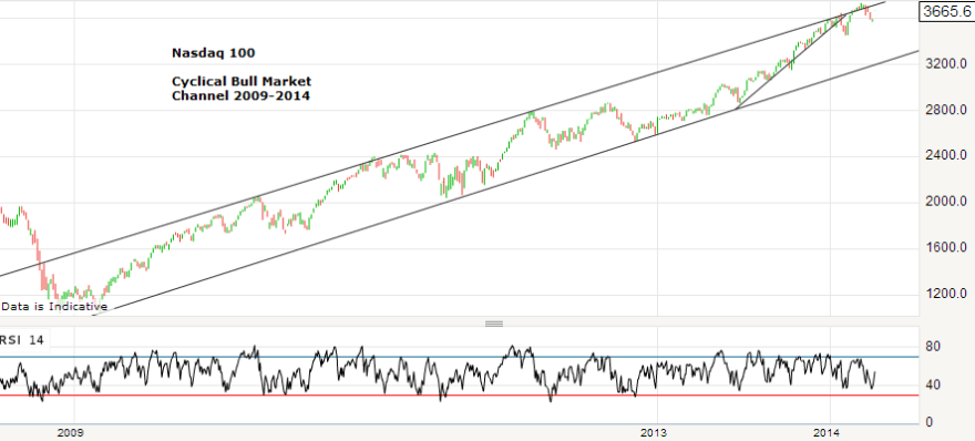
32. Nasdaq 100 made a fake-out from its cyclical bull channel in March
33. Best performing classes and sectors in Q1 2014 were commodities, treasuries and defensives


Source: Fat-Pitch
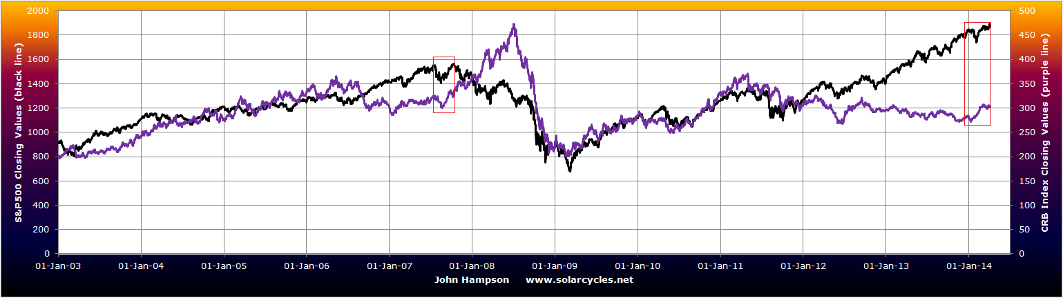
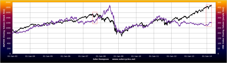
34. Late cyclical outperformance of commodities as equities top out consistent with 2000 and 2007 peaks
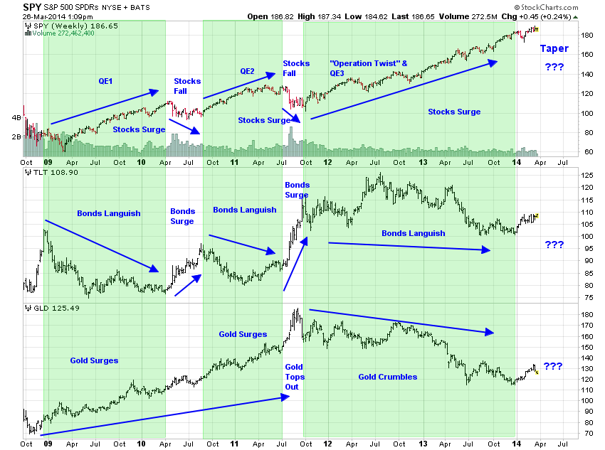
35. Winding down of QE historically negative for equities, positive for bonds and gold

Source: Jesse Felder
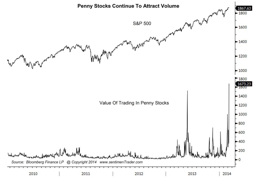
36. Trading in penny stocks signalling a peak
Source: Sentimentrader
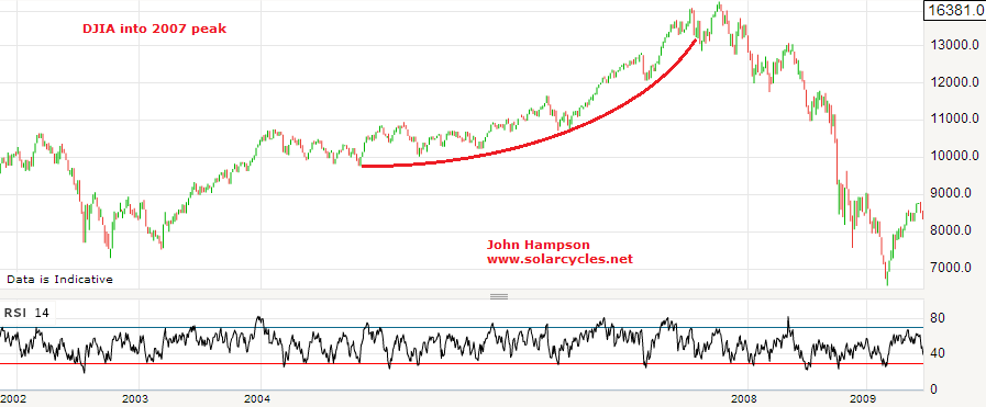
37. Dow, FTSE and Nikkei are all at long term resistance levels (connecting 2000 and 2007 peaks)
38. Treasury Bond Yields Rate Of Change over last 12 months is at a level that previously led to market tops in 2000 and 2007
39. Rydex money market assets back to 1999 lows
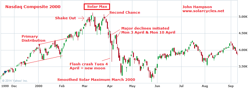
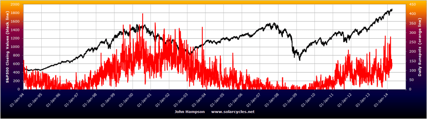
40. Equities topping out with the solar maximum, in line with history

Underlying Source: Solen.info
A 40-indicator case is a fairly strong case to go short. But we need to balance with what’s supporting the bullish case.
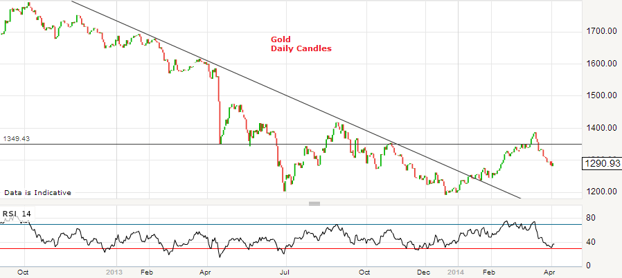
Cyclical stocks have broken out upwards over the last week. The cumulative advance-declines breadth measure remains in an uptrend, supporting the advance in equities. Euro Stoxx broke out to a new high. Gold and gold miners have pulled back in March, with gold having failed to hold a break out above the first meaningful resistance level:
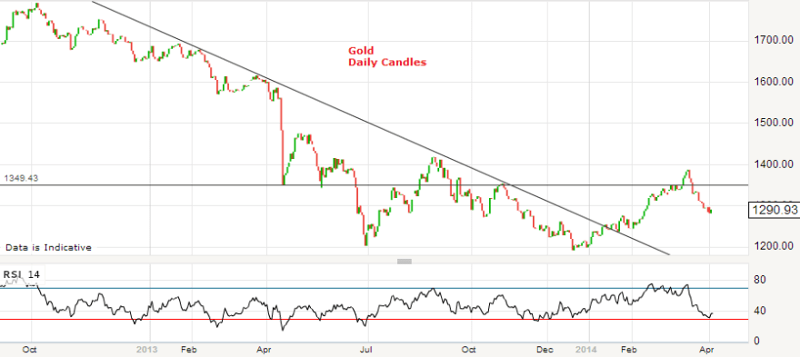
The question is whether a higher low can now be made in gold, to continue the bottoming process.
Margin debt, for which we have data up to the end of February, did not yet top out. I had initially expected margin debt to top out in December with an anticipated highest monthly sunspots spike at that time. However, a higher monthly sunspot spike in February suggests speculation could have topped out as we moved into March instead. We have thus far seen peaks in the Russell 2000, Nasdaq and Biotech in March, and we saw a lower monthly sunspot spike in March than in February. The consensus view is that the smoothed solar maximum for SC24 already passed at the turn of the year and that sunspots should decline from here. However, SIDC are still running a second alternative whereby a smoothed solar peak still lies ahead in H2 2014:

Source: SIDC
Playing to that possibility is the trend in leading indicators noted above. If stocks can hold up whilst economic data starts to improve again as of May then may be they can rally through to the Fall. On the flip side, we should have another month of disappointing data right ahead which could equally pull the rug from under equities. Were the second SIDC scenario to occur then I would expect speculation not to top out until the Fall, and a suitable technical mirror from history may be 1987 whereby sentiment reached record levels in Q1 1987 but stocks did not fall hard until Q3. But for now, the more probable scenario is of a smoothed solar maximum having passed and speculation declining from here, and for this to be confirmed I would be looking to see that the RUT and Nasdaq indices do not make a higher high from here, and that margin debt tops out. Sunspots should also notably trend down as we head into mid-year to confirm this.
There have been a concentration of market falls occurring in the inverted geomagnetism seasonal lows of March-April and October. So again taking that primary scenario of sunspots now on the wane, I look to this new month of April to deliver major falls in equities, in line with the Nasdaq in 2000 (smoothed solar max and sunspot spike March 2000). Presidential cycles in the market suggest stocks could eek out further gains in the first part of April before falling for a period of weeks. DeMark also believes a top is within days but suggests the SP500 could reach 1931 before inverting.
The primary scenario of a smoothed solar maximum having occurred in December 2013 and a highest monthly sunspot spike in Feb 2014 is supported by a chain of events to date: Bitcoin peaked in Dec, Nikkei and Dow (very tentative at the time of writing) peaked and money flows switched into defensives at the turn of the year, the ‘theme’ stock indices and sectors of the cyclical bull exuberance phase peaked out Feb-Mar 2014. But this is all subject to confirmation or invalidation. So let’s see how April develops. I remain significantly short equities, and siginificantly long precious metals, with other smaller positions long commodities. My worst case scenario is the continuation of speculation into late summer before Q3 falls in equties, and I would hold my positioning until then if so. But for now this is the outside scenario, and I maintain good odds of April delivering significant falls in equities, and momentum returning to gold with a higher low.
Thank you for all your input whilst I was away.