A long post coming up, but I found this to be outlook-changing research.
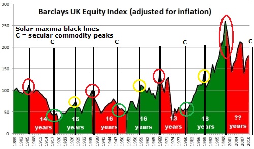
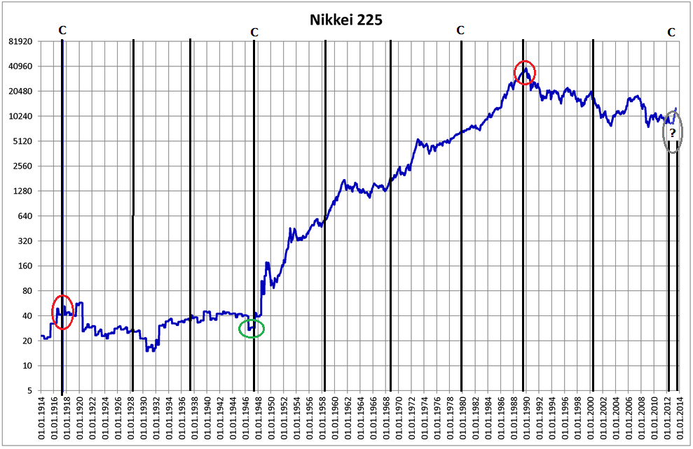
Firstly, the Japanese stock index long term chart, with solar cycle maximums marked as black lines (C for commodity secular peaks):
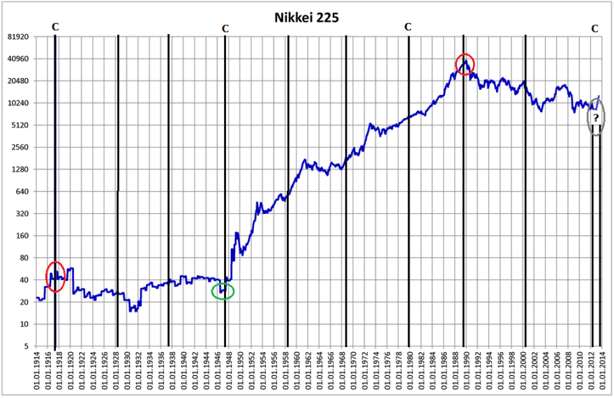 Underlying source: Wikipedia
A fairly simple 100 year history: a long secular bear followed by a long secular bull followed by a long secular bear that potentially just ended at the turn of 2012 into 2013. The secular turns fell very close to solar maxima.
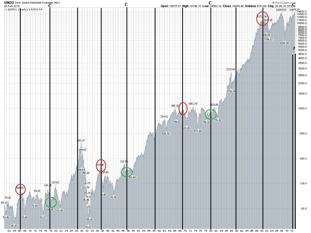
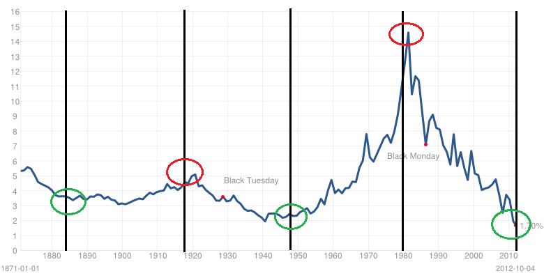
Secondly, the US Dow stock index long term, with solar maximums again marked in black.

Underlying source: Stockcharts
Alternating secular bulls and bears. I argue the mid 20s to mid 30s episode was outsized greed and fear events that cancelled each other out on the way to the true secular peak in 1937. The secular turns fell very close to solar maxima.
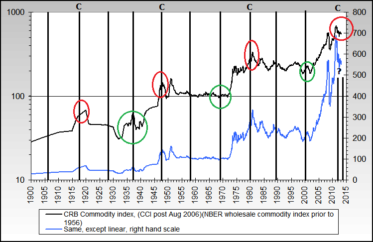
Thirdly, the commodities index long term, with solar maxima marked. Again, alternating secular bulls and bears, and again secular turns falling very close to solar maxima.
 Source: Nowandfutures
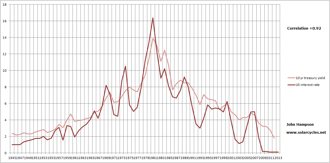
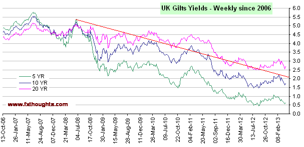
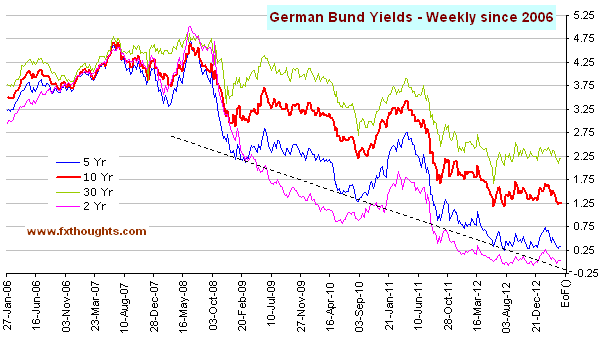
Fourthly, 10 year treasury yields long term chart, with every third solar maximum marked.
 Underlying source: Multpl
A longer term cycling of secular bulls and bears, but again the secular turns falling close to solar maxima.
Here is real estate, but only half as much history available as a global index (hat tip Rob):

Underlying Source: P Loungani
There is a tentative cycle here, with the peaks alternating on solar maxima and solar minima. Furthermore, there is the main (circadecadal) solar cycle averaging 10.66 years, and a lesser (circahemidecadal) solar cycle averaging 5.75 years. They fit rather well with the two cycle parts noted above. But a little more history going forward is required to judge this model’s validity.
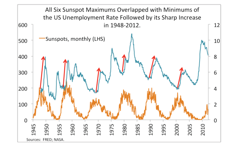
Moving on, the next chart is US unemployment versus solar cycling.
 Source: Gorbanev / Ktwop
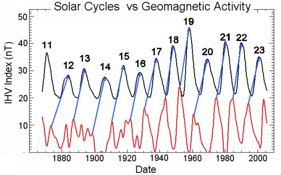
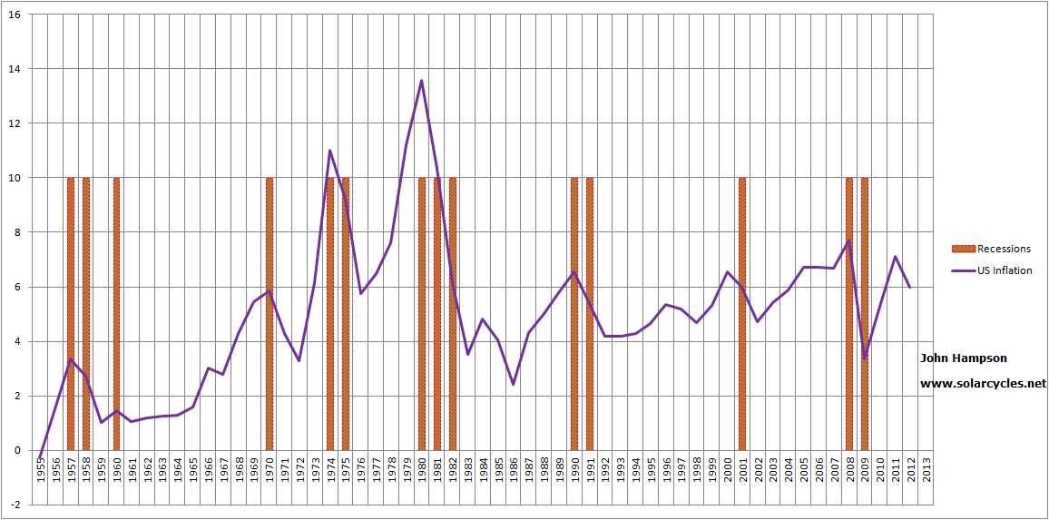
Rises in unemployment just after the solar peaks. The chart fits well with my own chart, showing recessions occurring after each solar peak (which correlates with geomagnetism peaks lagging sunspot peaks).

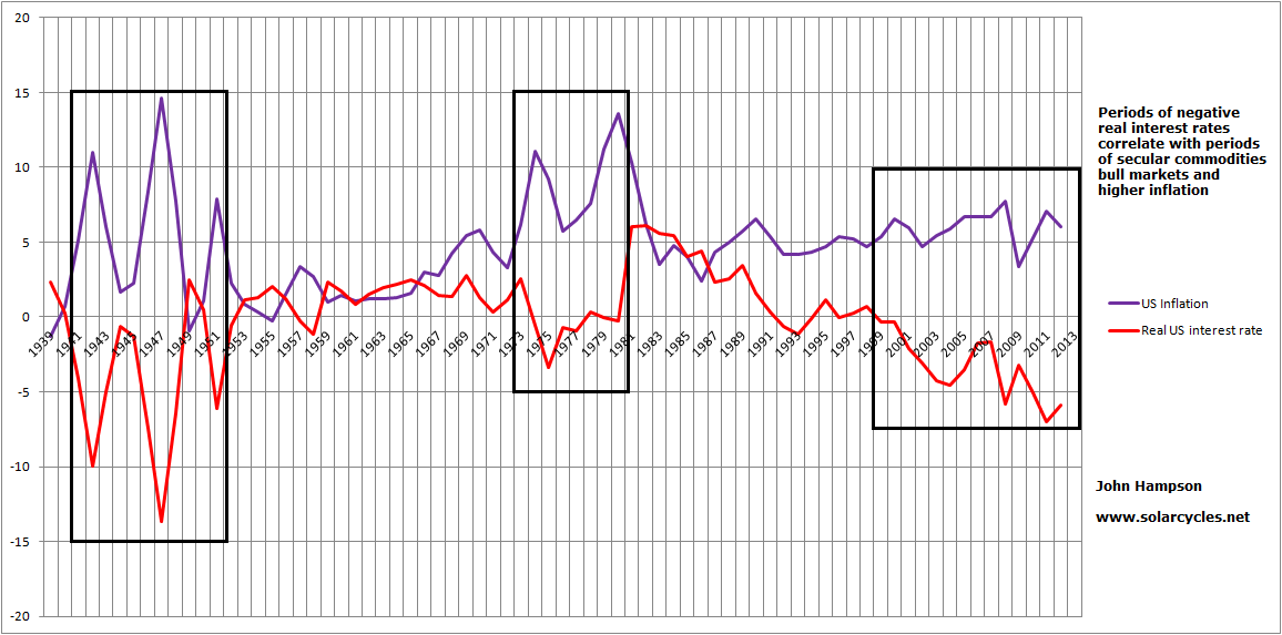
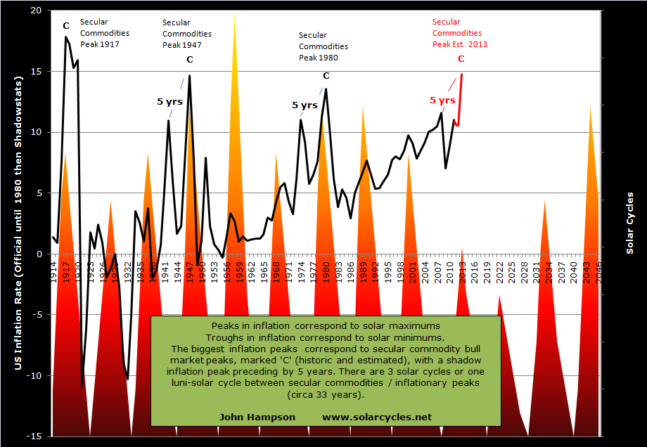
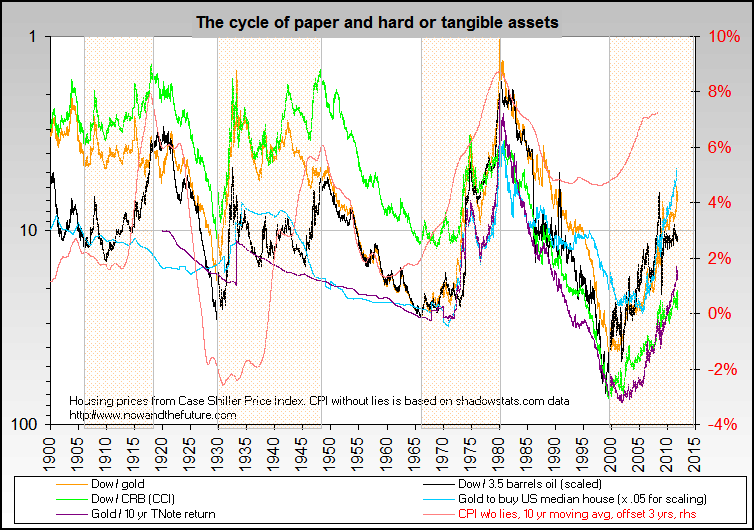
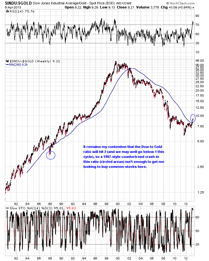
And also this chart, which shows inflation spikes occurring at each solar peak.

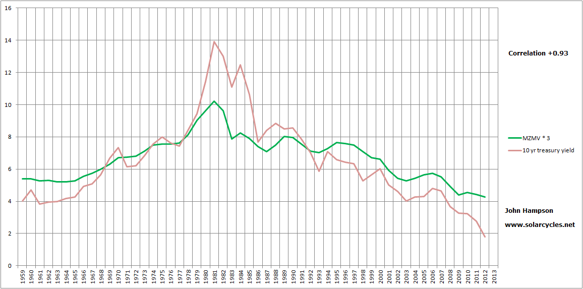
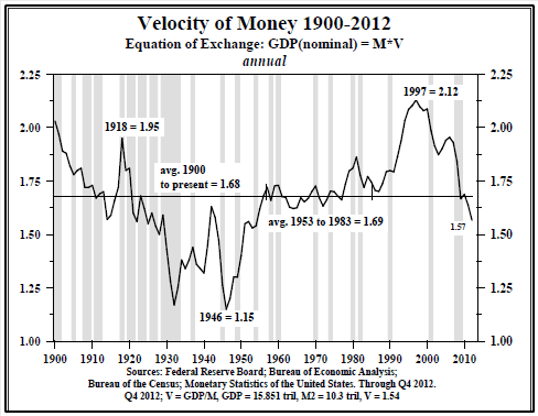
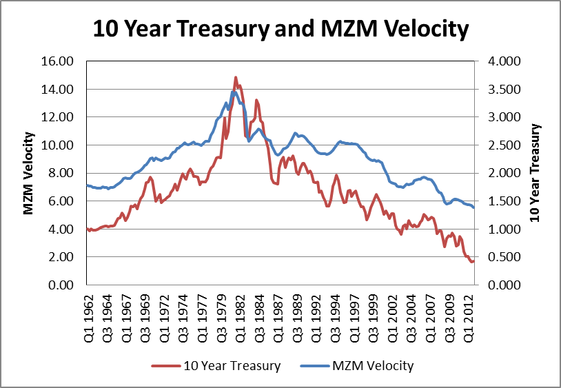
Below we see money velocity rising into solar maxima and peaking before or at the subsequent recessions:
 And the next chart shows the treasury spread (10 year treasury yields minus 3 month treasury yields) widens to a peak leading into a recession:

Source: New York Fed
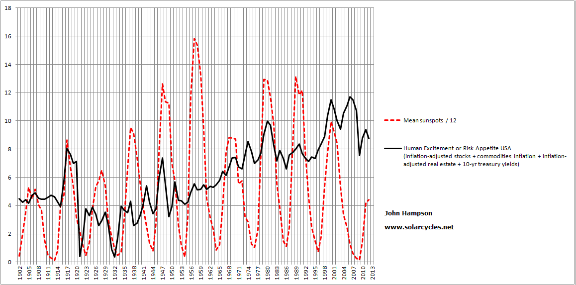
Let me draw all that together. At each solar maximum, we see a particular risk asset or assets making a secular peak, whether this be equities, commodities, real estate or bond yields. I argue this is sunspot-driven biological human excitement that translates as a speculative mania in the popular asset class of the time. We also see inflation and money velocity spikes at each solar maximum, which I argue is also behavioural effects in the economy of the same excitement phenomenon. After each solar maximum we see peaks in the yield spread and unemployment and recessions. Market history dictates that bull market cycles end with inflation rising, yields rising and overtightening, so this fits with the picture being revealed. Excessive and unsustainable speculation and buying in the markets leads to excessive inflation and tightening and tips the world into recession – economists would relate to that phenomenon as a regular cycle of greed and fear, boom and bust. But add in solar theory, and sunspot maxima biologically help inspire the greed/boom part, whilst geomagnetism maxima (lagging sunspot peaks) depress sentiment to assist in delivering the fear/bust part.
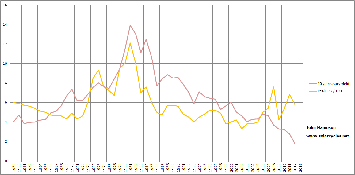
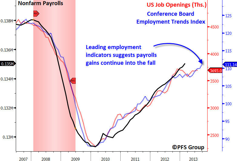
So by this modelling, we should be seeing a secular peak in commodities and a secular bottom in treasury yields around the current solar maximum, which should fall either Feb 2012 (past) or ahead in Fall 2013. Both commodities and treasuries have fulfilled secular bulls through to 2012/13, regardless of what happens next. The difficult part is in timing the turns when you are close in on the action, as we are as traders here in 2013. What is clear is that money velocity has not yet picked up and inflation has not peaked (making its high thus far in 2008). US jobs and yields spreads do not indicate a recession, and geomagnetism is currently benign. Jobs are in fact predicted to grow ino the Fall:

Source: PFS Group
Historically, recessions have begun an average 14 months after solar peaks, so we might expect to see leading indicators for jobs falling by now if the solar peak passed in feb 2012.
Collectively, these suggest the solar peak is more likely ahead in Fall 2013 than behind us in February 2012. I previously showed that world bond yield and money velocity charts could be bottoming out based on technical action thus far in 2012-2013, and in which case an escalation from here through the solar peak (assuming Fall 2013) would fit well with history. That would also suggest an inflation peak, and a secular commodities peak, lies ahead.
We can now cross-reference this solar picture with demographic models.
The next chart is a 100 year chart of the US Dow p/e ratio together with the trend in US demographics as measured by the middle-aged to young-aged ratio:
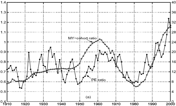 Source: CXOAdvisory
This chart is the same demographics trend shown against the inflation-adjusted Dow.
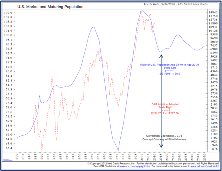 Source: CMG Wealth
Both the p/e and ‘real’ Dow do the same job of removing inflation from the picture. There is a clear correlation between equities and demographics.
Chart 14 shows the SP500 netted of inflation versus the same demographic trend, and I have added in the solar maxima (black lines) again.
 Underlying source: Chris Puplava
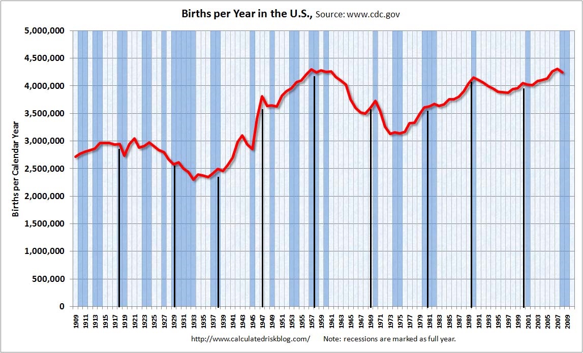
Now things get interesting, because there appears to be a three-way relationship between solar maxima, demographics and equities, with peaks and troughs in all three lining up. In my Trading The Sun PDF I noted there was some research identifying solar cycling as influential in population and demographics in other species, as well as research attempting to correlate solar cycles with longevity and mortality in humans. But I have now additionally found a research paper by Walter Randall (1991) that identifies an 11-year cycle in human births, and here is the chart showing that dominant cycle in the US:
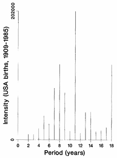
Source: W Randall
Randall also found variation in human conceptions relate to sunshine levels and geomagnetism.
I have added the solar maxima to the US births per year chart below. We see births have typically spiked up a little at the solar peaks.

Underlying Source: CalculatedRisk
And here are UK births, with solar maxima overlaid:

Some clear peaks and troughs aligning with solar maxima.
So, we have solar-inspired waves in demographics which provides a reasoning for a correlation between the two.
We can also explain the demographics correlation to the stock market. There are young borrowers/spenders, middle-aged investors (partially investing for retirement) and old-ages disinvestors. If the middle group is growing relative to the others, then we have a growing demand for the stock market. Similarly, the old and the young don’t typically buy houses, so a swelling middle-aged group relative to the others is an environment for a housing boom, and vice versa.
So there we have our three way correlation between sunspots, demographics and equities (and housing too). Because of the solar cycle related births swells, we will find certain demographic groups peaking in numbers and relative numbers around solar peaks. That provides peak demand or supply (e.g. a peak in retirees disinvesting), and together with the sun-driven biological changes in human excitement at the peaks, we have a recipe for asset invesment and speculation peaks at solar maxima.
In the US demographic chart above we can see that the steepness of the secular bull from 1980 to 2000 appears related to the steep demographic uptrend of that period. Now here is the same demographic model for Japan:

Underlying source: Chris Puplava
Again, peaks and troughs in stocks, solar and demographics line up. The steep secular bull up until 1989 again appears related to the steep demographic uptrend of that period. The reversal in demographic trend as of 1989 appears to explain why Japanese equities topped out at that solar maximum and did not keep going until the 2000 solar maximum, whereas US demographics did.
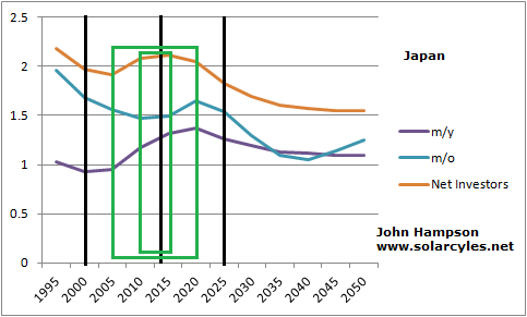
Looking forward, we can see that the US demographic model reveals a new uptrend from this solar maximum (circa 2013) to the next (estimated mid 2020s), which is supportive of a secular bull, albeit a relatively shallow one in real terms. Meanwhile, the Japanese model is already in an uptrend and is good until around 2020. Japanese stocks are currently in a sharp upswing, belatedly catching up the demographics and suggestive of a new secular bull.
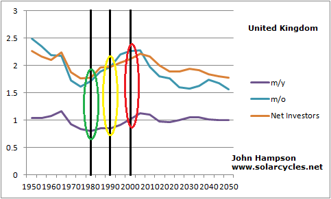
We have looked at middle-young demographics, so let’s now draw in middle-old demographics. The chart below shows the picture for the US:
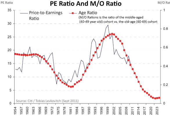
Source: BusinessSpectator
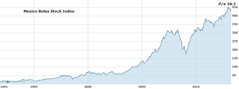
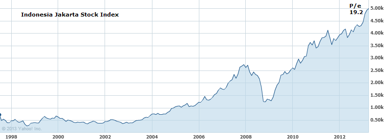
The US faces a demographic headwind looking out to 2020 in this regard, unlike its middle-young asset. Using the m/o ratio only we see a prediction for the p/e ratio to drop to just 2-3 by 2020. This should be offset to some degree by the improvement in the m/y ratio. Nonetheless, there is something notable here, which is that p/e ratios for country stock indices appear to largely reflect demographics. In other words, a country stock index with a cheap p/e is only a good buy if the demographic trend forecast reveals an uptrend ahead. Some of the most ‘expensive’ stock indices around the world right now by p/e valuation are Indonesia, Mexico and Philippines, all of which have very favourable demographic trends looking forward compard to most of the world. Rather than shying away from these indices because they appear overvalued compared to historical averages, it might instead pay to invest there, as they should get more ‘expensive’ going forward. This also explains why the Nikkei around 1982 maintained a p/e of around 20 whilst other stock indices were making single digit secular bottoms, because it was in the midst of a positive demographic trend looking out to 1989. Note this relationship is longer term and does not preclude shorter term p/e oscillations. P/e valuations will overshoot and undershoot the demographic trend but mean revert to it over time.
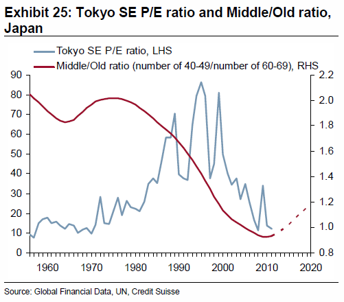
The next chart shows the middle/old trend for Japan, which is a tailwind out to 2020, like the middle/young for this country.
 Source: Zerohedge
Two more demographic measures for the US. The first chart points to a bottoming out by around 2020, followed by an upswing into 2036, which is supportive for a secular bull market.
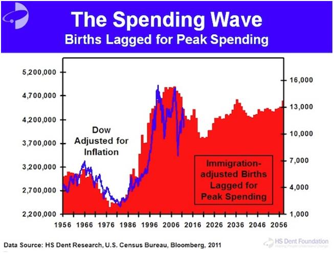
Source: HS Dent
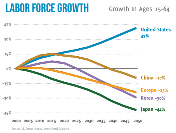
And this chart shows an enduring trend in nominal labour force expansion in the US into mid-century, standing out from the other developed countries shown.
 Source: SeekingAlpha
So combining all four demographic measures for the US, we have strong odds of a secular bull from around 2020 to 2030. Prior to 2020 it may struggle to gain traction, and need a deeper washout in p/e. Let’s not forget that we are dealing with ‘real’ Dow/SP500 and p/es, so inflation matters. A sharp rise in inflation could drive down p/es whilst the index goes sideways. A lack of inflation could mean the index falls nominally before embarking on a momentum secular bull run from 2020-2030. Either way, because this demographic uptrend from 2020-2030 is ahead, we might not expect a major washout in p/e in the US. The SP500 and Dow are amongst the more expensive indices by p/e around the world but this could reflect the positive demographics ahead.
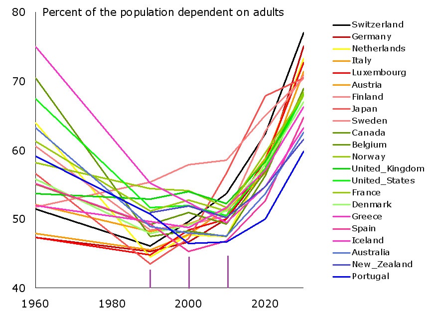
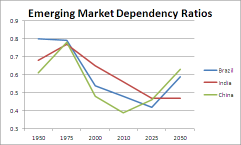
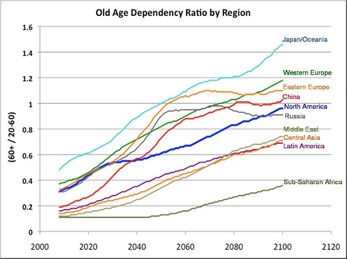
Let’s now look at dependency ratios (proportion of retired and young to the working population) demographics globally. Trends in the developed world contrast starkly with trends in emerging countries, as shown here:
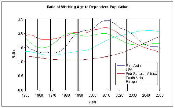
Chart 23 reveals the bad situation kicking in as of now in developed countries:

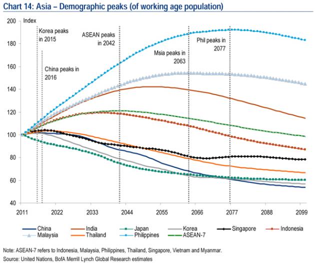
Whilst the next chart shows a particularly positive outlook for Philippines, Malaysia and India:
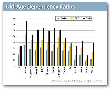
 And the next chart provides another comparison:
 Brazil looks good. The USA improves looking out to mid-century. And the worst: Japan. So let’s return to Japan, which we can also model using the dependency ratio as below:

Japan is understood to have battled with asset deflation for 2 decades. However, we see that demographics were responsible for a p/e or real downtrend in Japanese equities from 1989 to around 2000. Then the m/o and m/y demographic trends picked up again, and we can see in the chart below that the Nikkei effectively tracked sideways since then.

We might therefore take a fresh look at it and consider the Nikkei was in a downtrend for a decade (or one solar cycle) and then turned sideways as the demographic trends in m/o and m/y changed upwards. The massive spurt since October 2012 therefore looks reasonable, as a belated catch up to trend. However, not all is well for Japan. The dependency demographic trend is the worst around the world in that it is likely to become devastating by mid-century. It also has the largest debt-to-GDP ratio in the world, over 230%. Interest rates are effectively zero, and cannot be allowed to rise much because of the servicing of the debt. There is little hope of major GDP growth in the years ahead because of the dependency trends and the debt. Despite this, Japan is going hell for leather in a bid to restart the economy and ignite inflation, now doubling money supply from 29pc of GDP to 56pc of GDP by 2014. The first result of this ultra-aggressive policy has been a swift 20% drop in the yen. As Japan is an energy importer, this has immediately produced a big uplift in energy price inflation. If I am correct in predicting a pick up in money velocity here, and also correct in a commodities/inflation peak ahead relating to the solar maximum, then I suggest there is the potential for Japanese inflation to quickly become problematic. As the government cannot combat with rate rises because of the debt servicing, the risk then would be hyperinflation. I know hyperinflation is overhyped, but I just wonder whether it is worth an outside bet here.
Hyperinflation has historically been initiated by either rapid increases in either money supply or money velocity, then the other one has joined in to complete the feedback looping. Japan is obviously at full acceleration on the former. Under hyperinflation, stock markets have historically gone wild in nominal terms, but the cost of living has gone even wilder. In Zimbabwe, the stock market went up 47,000% in a year, but the cost of living rose even faster. So a Japan hyperinflation trade could be achieved either by a spreadbet on the nominal index or a long Japan fund whilst short the yen. This is how I see it: Japanese stocks should rise on the belated catch up to m/o and m/y demographic trends, regardless of the Japanese government’s policy actions, but those actions have the potential to produce wild inflation which would then take Japanese stocks in nominal terms much higher.
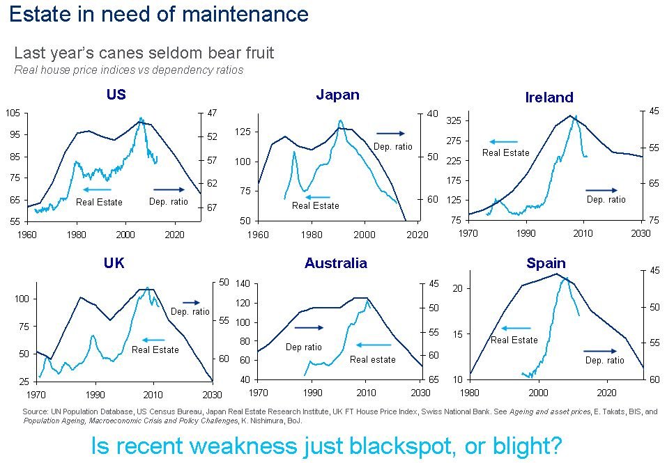
Back to demographics. The headwinds facing many developed countries in dependency trends are problematic. Here is real estate modelled against dependency for six developed nations:
 Source: Business Insider
If we refer back to the global house index chart further up the page, that cyclical model projected no real take-off in global house prices until 2019. These dependency charts suggest headwinds that further cement the likelihood that housing won’t offer a great return for the next few years in the developed world, applying equally to most other European countries, New Zealand and Canada. China and Korea also faces the same dependency trend issues starting around now.
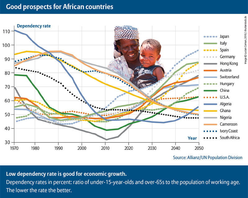
The countries with the best demographic trends looking forward include India, Brazil, Mexico, Indonesia and Philippines. South Asia, ASEAN and South America look particularly fruitful regions going forward, and Sub-Saharan Africa too. If this is a global transition into a K-Spring, then investments in equities and real estate (K-Spring’s champions) might do best in these countries and areas. The USA should perform well too, from 2020 to 2030, but the period before 2020 is less certain.
Brazil and Mexico have good prospects until around 2025 but India and Philippines extend until 2040. Contrast this with China, which is just hitting trend reversal point into a negative trend, and we can see the likelihood of China stepping back from being the world’s leading growth engine, and in doing so maybe provide a backdrop to a secular commodities bear (as it is the world’s largest commodity consumer).

Source: DarwinsMoney
Dependency ratio trends and projections for select nations:

Source: John Eyers
Maybe the investment star of the next two decades will be India, which could feasibly rise for multiple solar cycles in a powerful secular bull that resembles the Nikkei into 1989 or the Nasdaq into 2000. With its 1.2 billion inhabitants it has the potential to mobilise something significant. But India, just like Brazil or Philippines or Mexico or Indonesia is an emerging country, with emerging risks. Let’s say the demographic outlook provides potential for great returns in these countries, but the structure to achieve it is less reliable than in the developed nations. The developed nations conversely have the track record but now the demographic headwinds.
To draw back together demographic trends, solar cycling and equities, we might expect that the positive demographic trends that have been in place in some of these emerging countries to have provided a secular bull over the last solar cycle, much like the Nikkei powered its way through 4 solar cycles in a secular bull set against a positive demographic backdrop. This is indeed what we see:
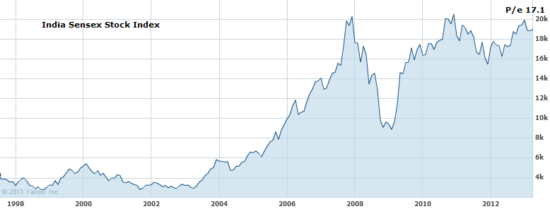

Source: Yahoo Finance
Over the last solar cycle, from 2000 until now, all the four country indices shown have made secular bull markets, not secular bears, in line with the demographic trends. They are all also amongst the most ‘expensive’ countries in the current p/e spectrum in the world, again in line with the demographic trend. I suggest that the ‘expensiveness’ of a country’s p/e rather has to be measured in terms of its relativity to its demographic trends. I also suggest that due to the demographic trends in all four remaining positive for another solar cycle, they should go on to continue their secular bull over the next solar cycle. I suggest that may be at a steeper rate, because it will be against the backdrop of a global K-spring, an up-cycle. As a reference point, see how the Nikkei secular bull (first chart in the article) that lasted for 4 solar cycles was at its steepest in the solar cycles of 1947-1958 and 1980-1989, both of which were global upcycles, a K-spring and a K-Autumn.
To conclude, these are the opportunities that I see (for myself of course… I am not an advisor).
1. Long Japan, due to m/y and m/o demographic uptrends until 2020, and an outside bet for hyperinflation. Averaging into any falls. We can see Japan’s little window of positivity here, in the upturn in the green line between 2005 and 2020:
2. Long USA, but more compelling as of 2020. At risk of a p/e washout before then. These two charts show head and tail winds respectively for the US market from now until 2020:


Source: Informed Broker
3. Long a basket of emerging markets with the best demographic outlooks: choosing from India, Philippines, Indonesia, Brazil, Mexico and potentially sub-Saharan Africa. Averaging into any falls.
Here is the very long term look at dependency ratios to end:
 Source: Appliedmythology
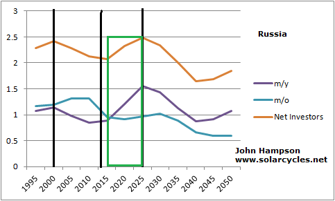
If these projections hold true, then the four lowest listed regions should offer the best opportunities over the next solar cycle. The following solar cycle the USA stands to fare well (where the blue line flattens). And later his century Russia and Eastern Europe may get their shot at being investment gold.
Additional chart: prospects for specific sub-Saharan African countries: positive demographic trends for the next solar cycle for Algeria, Ghana, Nigeria, Cameroon, Ivory Coast and South Africa:


 Note that the level of inflation was overall at a lower level than in the US over the last 3 decades but the relationship between real commodities and inflation is still clear.
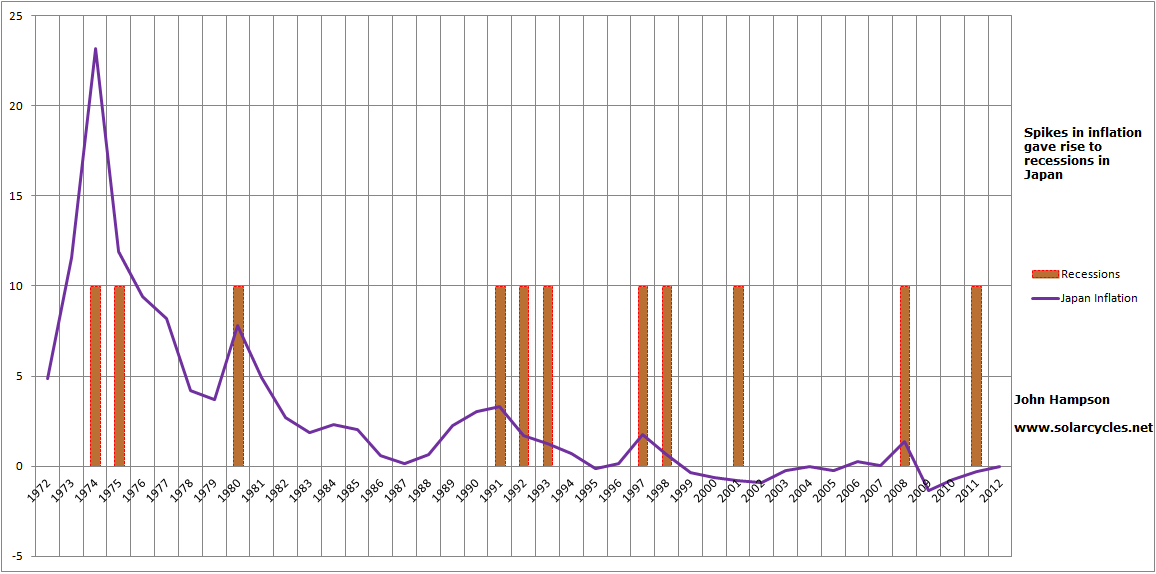

 That Japan did not participate in the secular stocks bull through to 2000 and the secular housing bull through to 2005 that the USA did, makes sense in light of the demographic trends in the period from 1990 to 2005. Additionally, the speculative peaks in Japanese stocks and housing circa 1989/1990 (around the human excitement solar maximum of 1989) were fairly extreme ‘greed’ overthrows, which then need time to washout on the other side.
 Generating the forecast into the future, but with the caveat of using assumptions and historic rhymes, we get this:
 The prediction will be refined over time to validate or invalidate those underlying assumptions and patterns, but the overall uptrend is due to the demographic trends that stand to boost risk assets until circa 2020 and then the next solar maximum should continue the upwards pull until circa 2025, implying there is a good chance of an overall secular bull in stocks and real estate in Japan for the years ahead.
 Source: BusinessInsider