Historically, demographic trends have correlated with secular bulls and bears in financial assets, economic growth/recession and inflation/deflation. Demographic forecasts are reliable because future trends were set in place with past swells and shrinkages in birth numbers. They would change if a country was subject to large scale death (war, pandemic, or similar) or the government henceforth adopted radical immigration policies. Demographics are particularly potent in countries that are relatively closed to migration, so understand that China has the smallest percentage of immigrants of any country (0.1% of the population), and Japan just 1.9% (compared to USA, UK and Germany all over 10%). My focus is on USA, China, Japan, Germany and UK, as collectively they make up 50% of world GDP. Know that whilst the European Union abolished barriers to movement within it, the demographics across all the member nations are uniformly poor.
1. DEFLATION
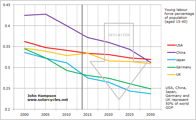
Young labour force percentage of population (aged 15-40) and dependency ratios (inverted – old and young versus the working population) have both historically correlated with inflation/deflation. A swell of people entering the workforce works up price inflation through spending, whereas more people entering old age relative to the work force is disinflationary through saving and disinvestment (read more HERE).
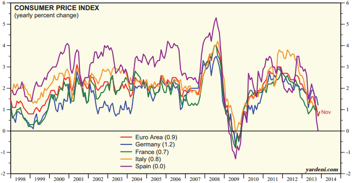
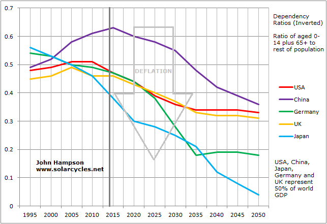 In the first chart above, we see the UK alone is currently in a small window of young labour force growth, whilst in the second chart China is just peaking out in dependency ratio (inverted). This is reflected in reality, with the UK currently registering the highest producer price inflation and China the highest consumer price inflation of the five. At this point in time, we generally see trends of disinflation. Demographics predict this will turn into outright deflation, and that deflation should be the norm for the next couple of decades (barring countries with inflationary demographics becoming much more dominant globally, such as India and Brazil).
2. GLOBAL RECESSION
Due to globalisation and an increasingly open world economy, recessions around 2009, 2001, 1998, 1991 and 1982 have all been global in nature. Due to the US contributing 22% of world GDP, particular attention needs to be paid to indicators of future US growth, with China second.
Dependency ratios (inverted – old and young versus the working population) have historically correlated with economic growth / recession. That chart is presented in section 1. above. The picture for the next 2 decades is bleak.
Stepping aside from demographics for a moment, levels of debt have also been shown to assist or impede growth historically. Where public debt to GDP has exceeded 90%, economic growth has struggled. For 2014, Japan will be around 230%, UK and USA around 115% and Germany 85%. China has the lowest ratio of public debt of the five, but its broader debt has been ballooning since 2008. Including corporate and household debt, China’s total debt to GDP has reached 218% of GDP (from around 130% in 2008).

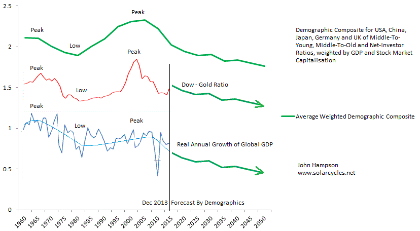
3. EQUITIES BEAR, REAL ESTATE BEAR
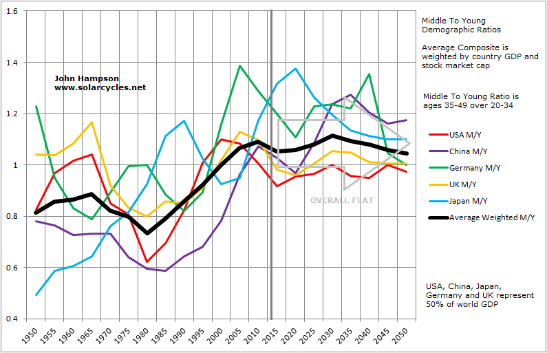
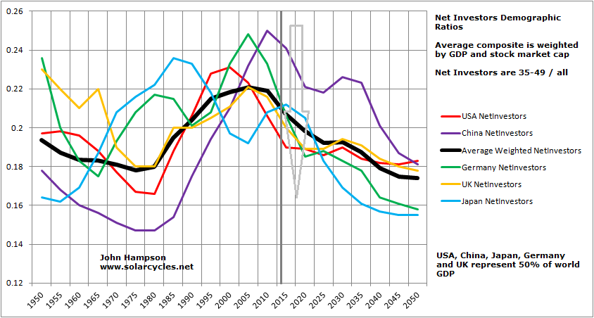
Demographic trends in middle-to-young ratio (aged 35-49 / 20-34), middle-to-old ratio (35-49 / 60-69), percentage net investors (35-49 / all) and dependency ratios (charted in 1. above) have all been shown to have a correlation with stock market and real estate market performance historically, on a longer term secular level. There are young borrowers/spenders, middle-aged investors (partially investing for retirement) and old-ages disinvestors. If the middle group is growing relative to the others, then we have a growing demand for the stock market. Similarly, the old and the young don’t typically buy houses, so a swelling middle-aged group relative to the others is an environment for a housing boom, and vice versa (read more HERE).

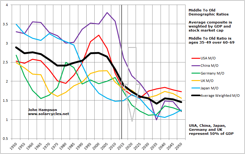
 Using the weighted average composite as our overall guide looking out to mid-century, M/Y is flat whilst M/O and NI are down, suggesting long term ‘buy and hold’ may be a strategy doomed to the past, to be replaced by ‘short and hold’. Add in Dependency Ratios from 1. above and the picture worsens further. Within those overall trends there are positive windows for individual countries, for instance the USA sees M/Y, M/O and NI measures rising together between around 2025 and 2030, and the composites also suggest that period could be the backdrop to a cyclical bull. However, when the composite trends above from 1980-2000 are compared to what lies ahead of us now, the contrast is stark and suggests enduring downwards pressure on equities and real estate, in long secular bear markets.
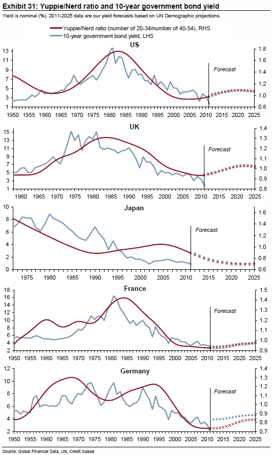
The longer term fortunes of bonds have also historically correlated with demographic trends.
 This CS graphic suggests yields will remain fairly low and contained, as demand for bonds will be maintained. However, through to 2020, the bias in yields, aside Japan, is overall upwards, suggesting net selling on balance. It is my view that gold, as the historic anti-demographic, is due to be the lead asset in the period ahead, as the collective trends above suggest deflation, recession, and net selling of equities, real estate and bonds.
SUMMARY
A) Historic correlations in demographic trends and secular asset cycles, growth/recession and inflation/deflation. B) Unprecedented collective demographic downforces now in place, with evidence of impact in economic data. C) Downtrends in play for much of the first half of this century, suggesting tough times for the global economy and no safety in equities or real estate.
Europe has structural problems, a cautious central bank, and a relatively strong currency, mirroring 1990s Japan and making it the candidate for the first into deflation. China is closed to migration and thus trapped in a sharp demographic reversal, largely the result of its 1 child policy. Previous breakneck growth was built on exports, the market for which collapsed in recent years, leaving it with declining GDP and excess capacity. Stimulus response in 2008 was to invest in even more infrastructure, increasing the excess capacity issue. Non-public debt is ballooning whilst the authorities attempt to tighten, resulting in two cash crunches already this year, as well as high profile company bankruptcies. That makes China the candidate for delivering a 2008-style global crisis.

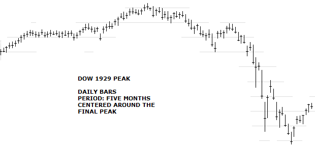
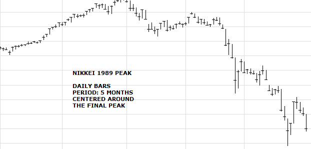
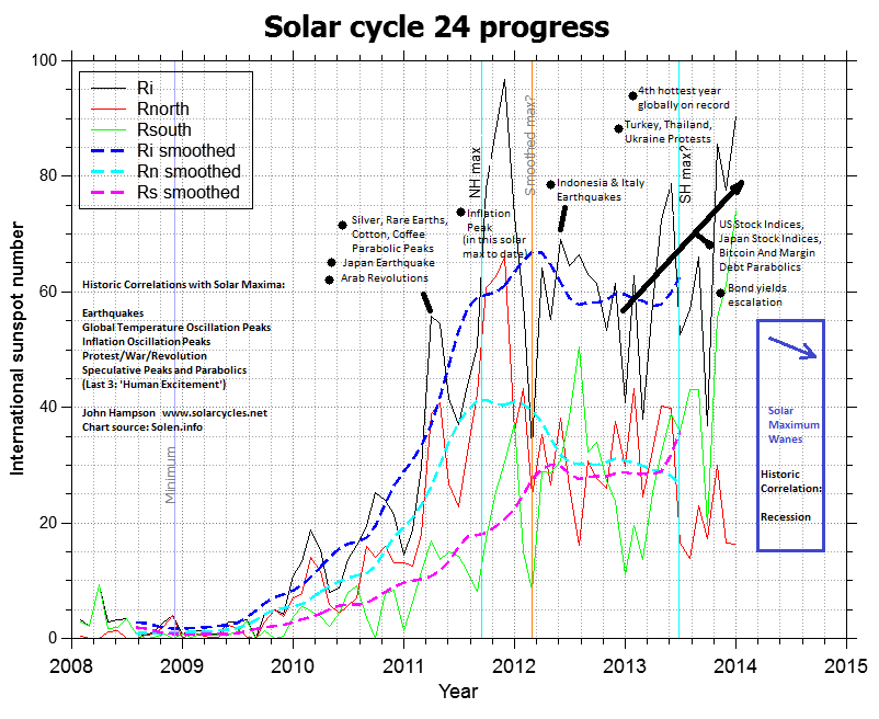
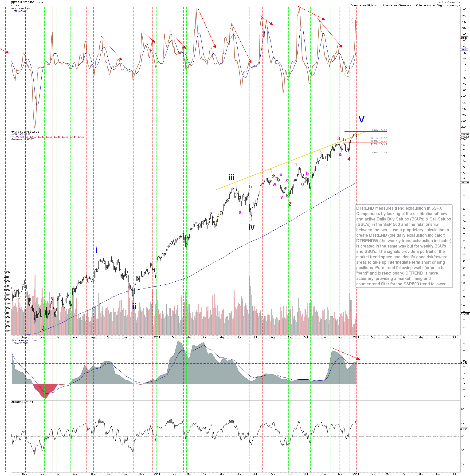
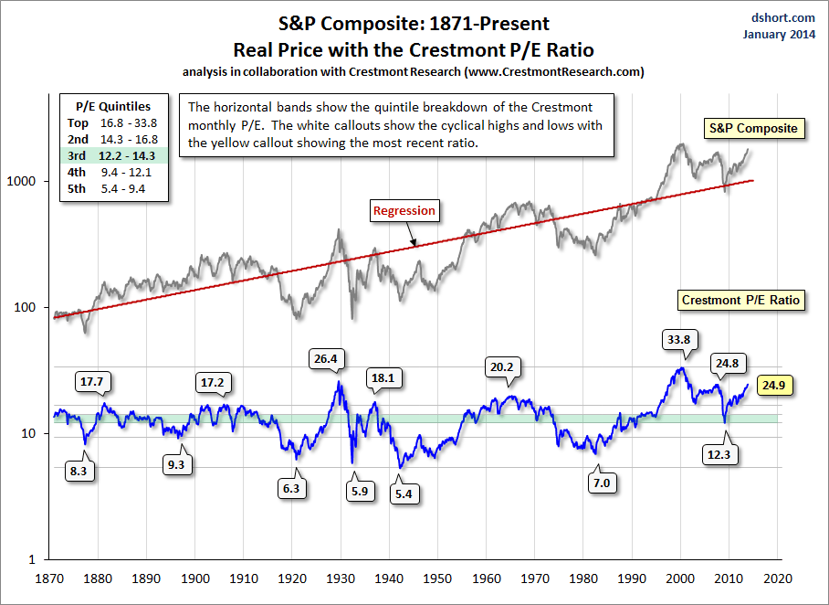
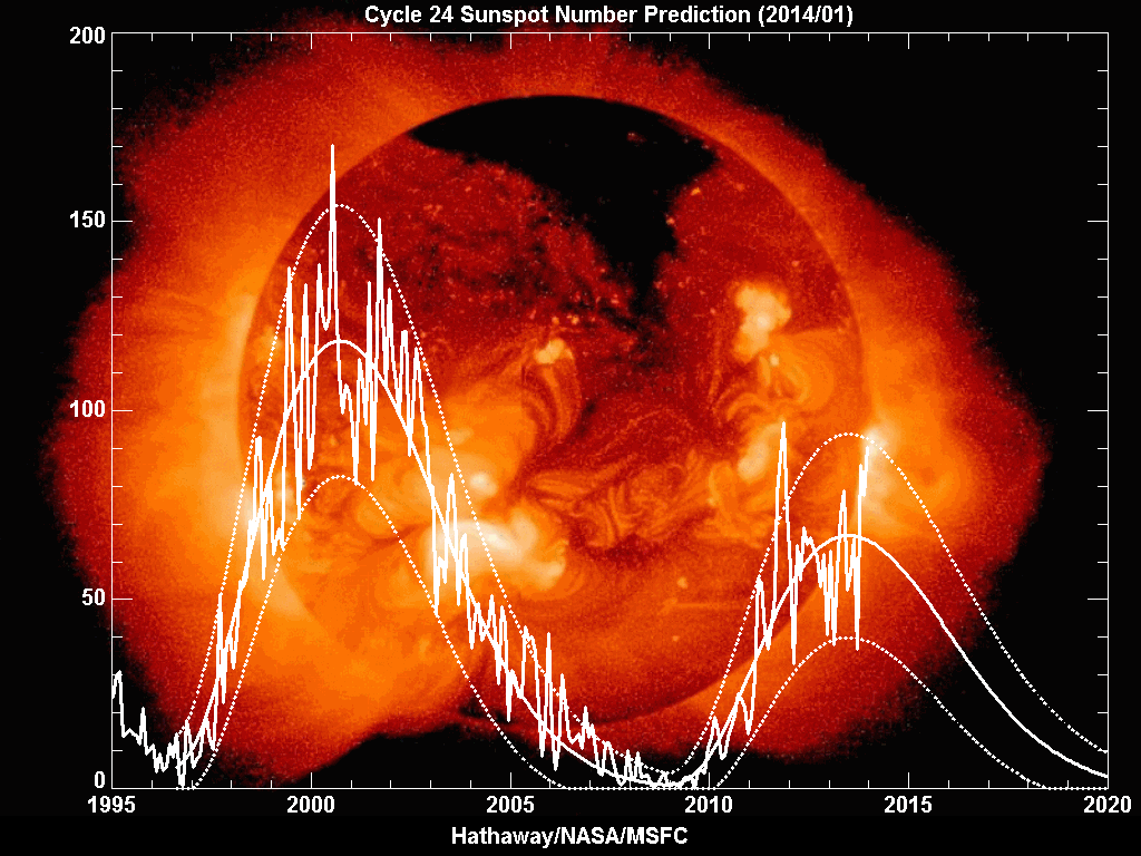
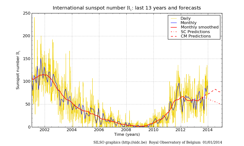
 2. Solar maximum alignment (sunspot maxima – human excitement peaks – speculative parabolic peaks): based on Solen’s forecast this is likely to have been December 2013, with associated monthly spike in sunspots (implications on second chart beneath):
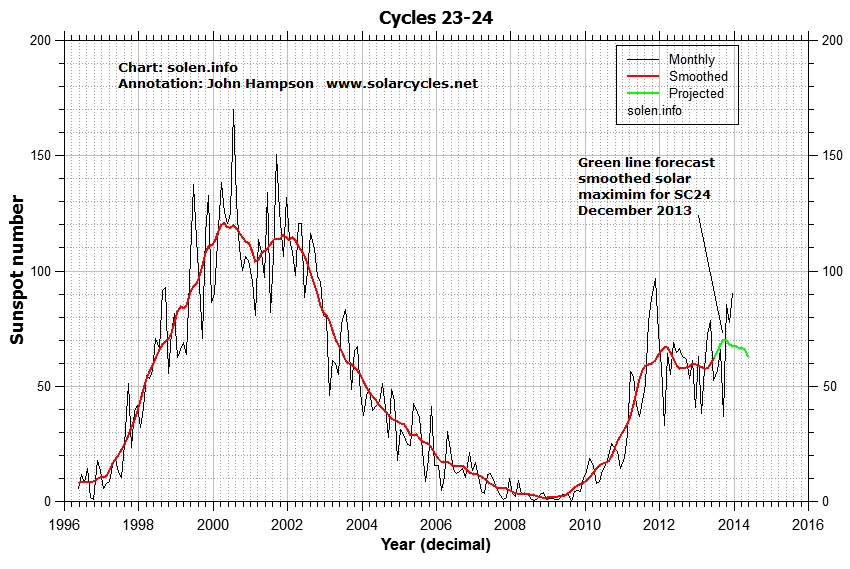
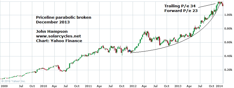
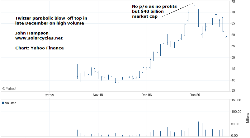
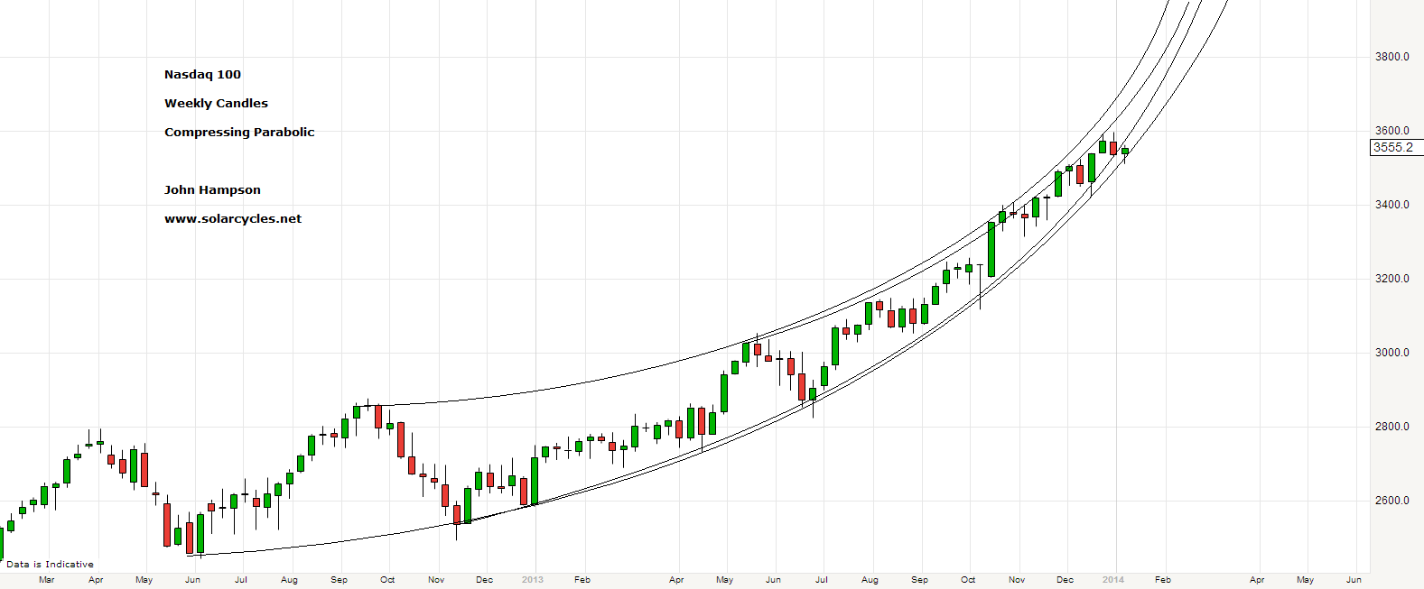
 3. The embodiment-stocks of this earnings-less, multiple-expansion bull market parabolic finale, potentially peaked out in December or are blowing-off now:

 4. Solar maximum speculative parabolic peak also in evidence in Bitcoin, which potentially topped out in December:
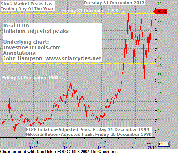
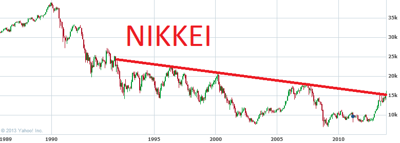
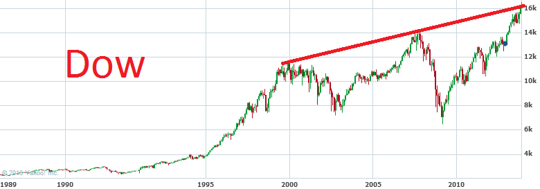
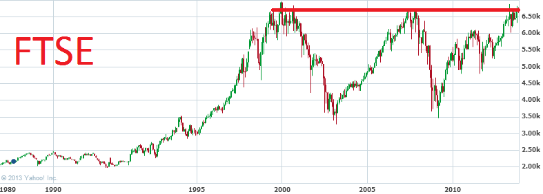
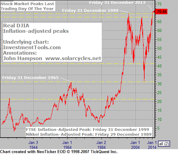
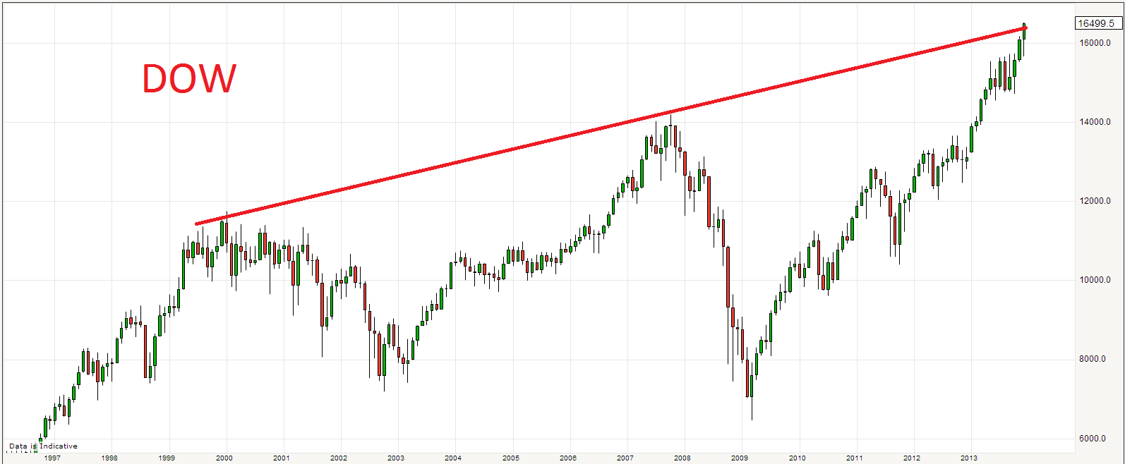
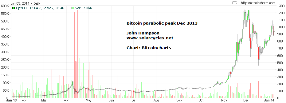 5. Dow, FTSE, Nikkei all collectively at long term major resistance:
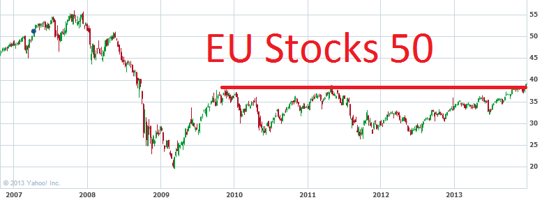

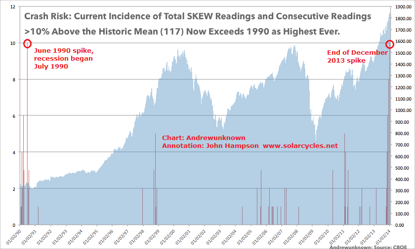
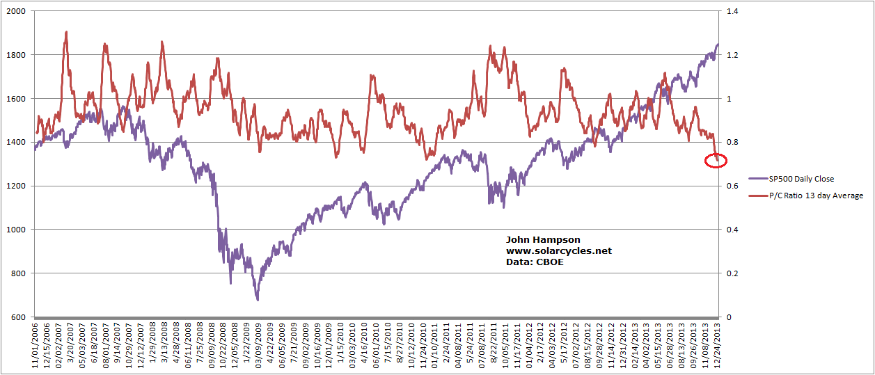
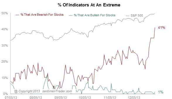
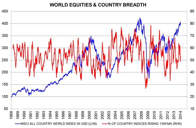
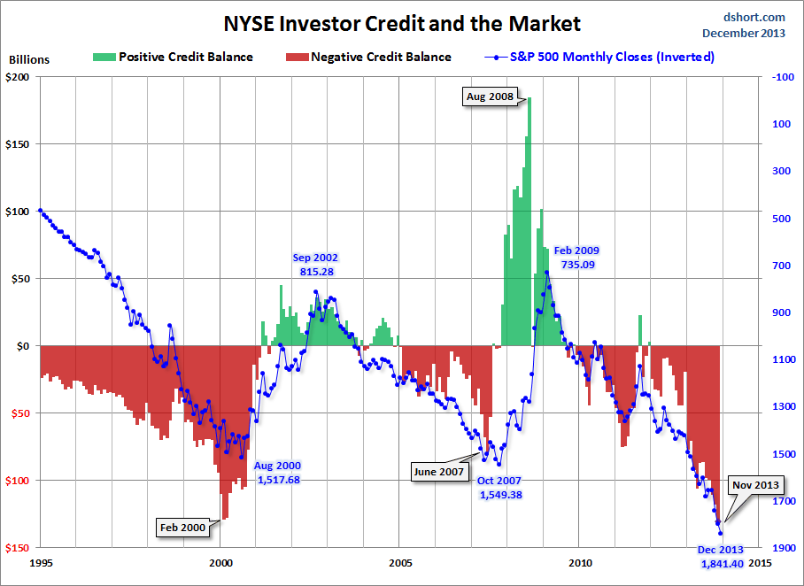
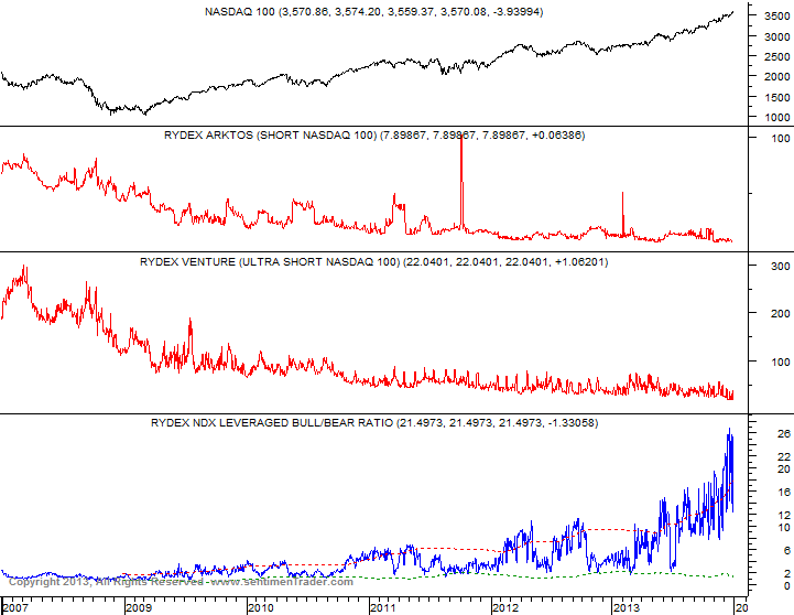
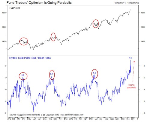
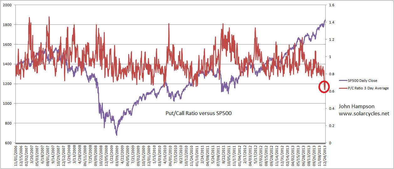
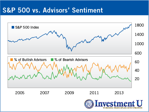
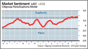
 6. Collective warnings in sentiment, valuations, topping patterns, leverage and more congregated in late 2013:
 7. Some additions/updates:


