The Only Chart That Matters

Ask 100 analysts and traders what that is, and chances are that not one of them will point to this:

Screen Shot 2014-10-07 at 07.15.41
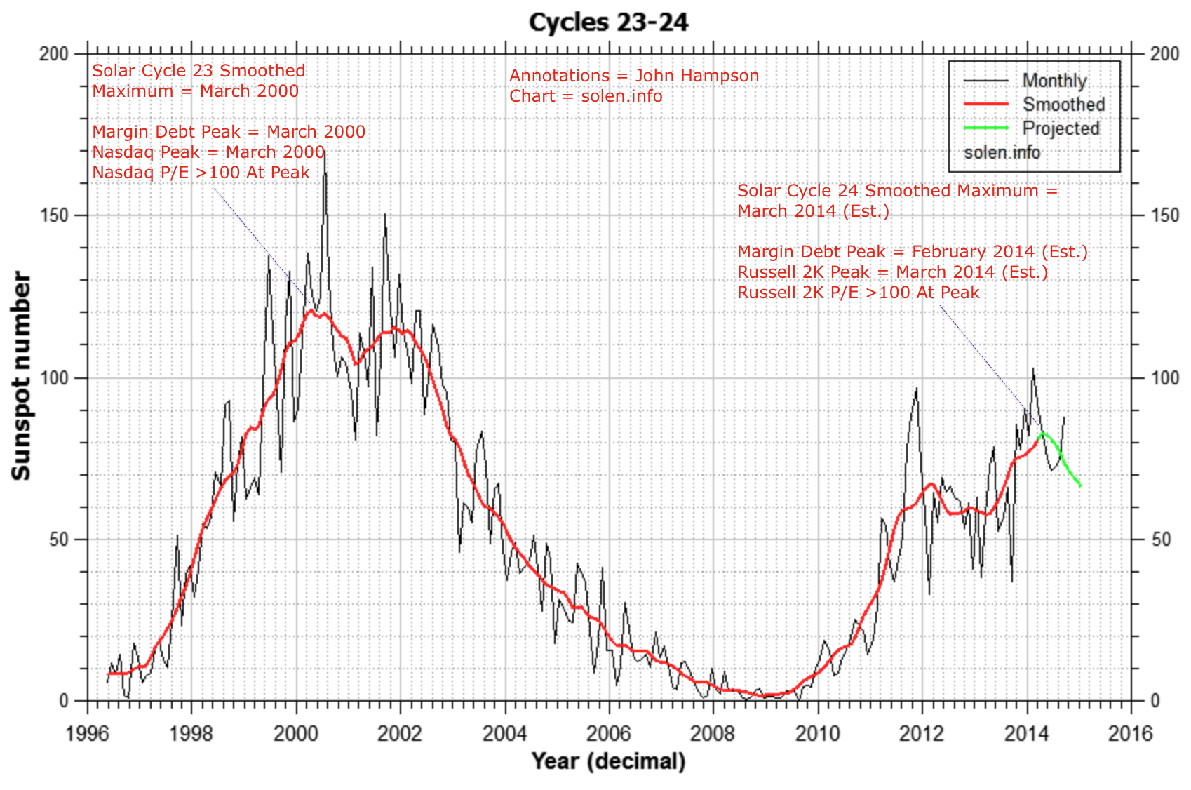
Yet I maintain that this is it. The last 5 solar cycles all produced speculative peaks within 5 months of the smoothed solar maximum, and in this era of global, instant access, it seemed reasonable to expect something similarly tight at this peak, which, in this real time test, appears to be the case. We see evidence that small caps were the main speculative target of this solar max, with the R2K p/e reaching over 100 at the top, like the Nikkei did in 1989 and the Nasdaq in 2000. We won’t know all this for sure for several more months, but with each month that passes the likelihood grows.

So am I delusional, or are other analysts failing? I am open to both possibilities and I mean that sincerely: I am just one self-taught guy, so how come all the veterans in the business aren’t aware of this phenomenon or don’t rate it?

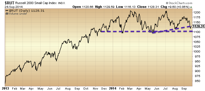
I have doubters amongst you readers too. However, for the chart to be invalidated, we would need to see small caps and leverage make new highs whilst the solar maximum wanes. That would imply the 2014 formation in the R2K is not a topping process but a consolidation or coiling for a move higher. Chances of that are slim:

7oc1

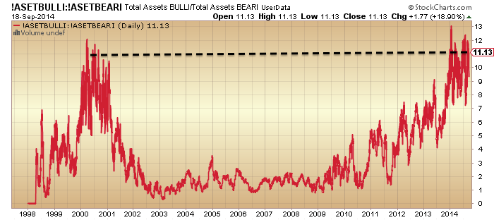
 Source: ShortSideOfLong
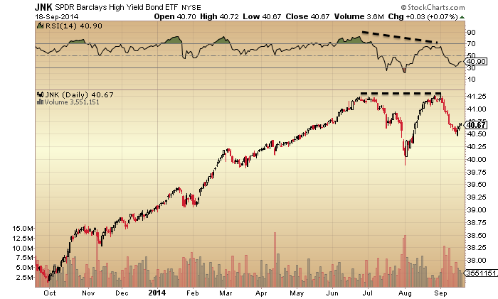
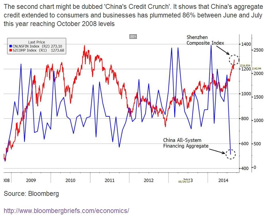
Screen Shot 2014-10-07 at 06.46.34

Source: WSJ

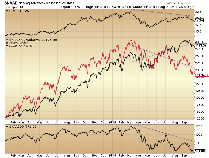
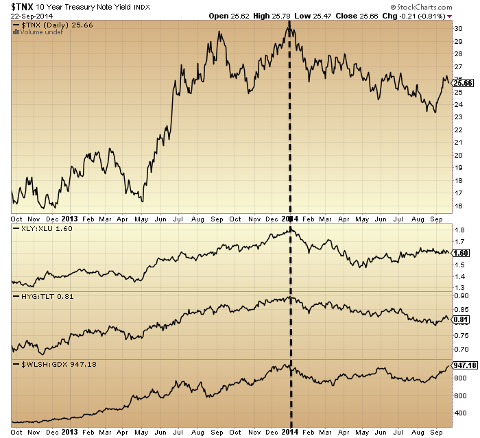
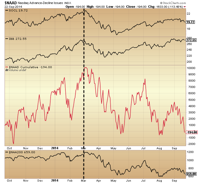
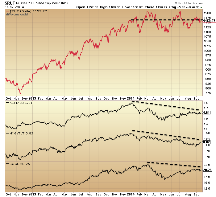
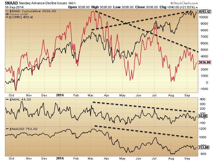
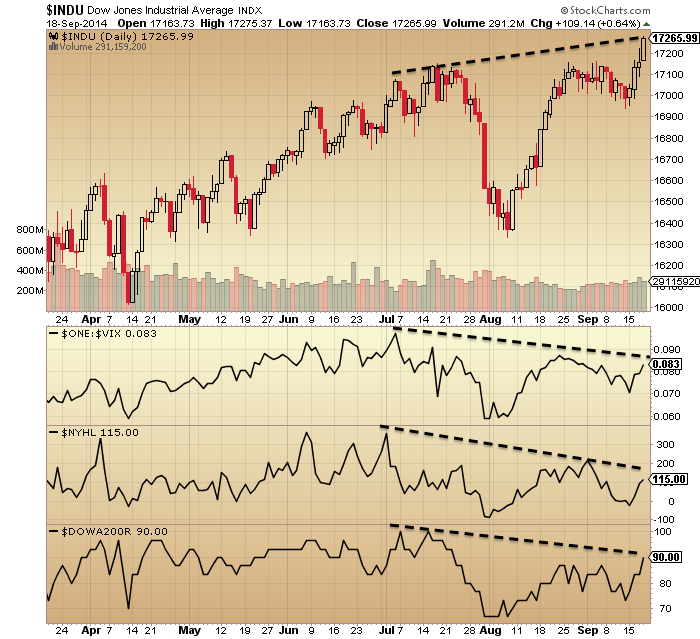
The topping option gains further weight when we look at relative performance to large caps:

7oc3Source: Charlie Bilello

Plus, many topping indicators for equities have congregated since the end of 2013, which I have covered exhaustively on this site. And to be clear, if small caps break down then large caps will follow, in line with history.

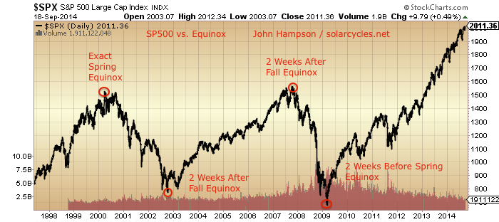
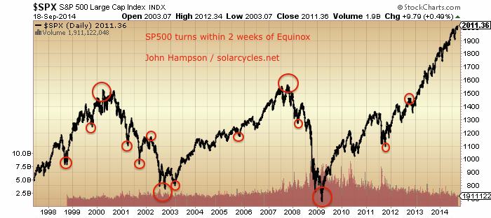
There is still a question mark over whether the smoothed solar maximum is definitely behind us, but the majority of solar models predict so. Therefore, as things stand, we have pretty good evidence of a speculative mania in the markets centred on a particular asset class or index topping out very close to the solar smoothed maximum, just like in 2000 (Nasdaq) and 1989 (Nikkei, 5 months after smoothed solar max) and 1980 (gold, 1 month after smoothed solar max).

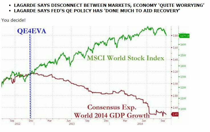
Going back to the title of this post, I believe the most popular answer amongst analysts for ‘the only chart that matters’ would be the QE versus stocks chart, but in a recent post (here) I instead showed that ‘Fed policy trumps all’ has been the mantra rather than the driver, just as into the year 2000 internet stocks were ‘revalued’ on expectations rather than earnings. In other words, the speculative mania is driven by the influence of the sun but people unwittingly assign some other justification for buying high: a ‘new normal’ which ultimately fails to be.

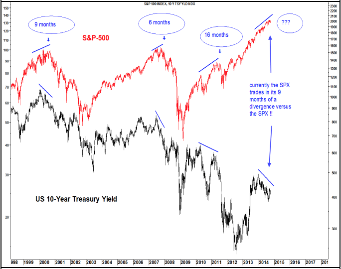
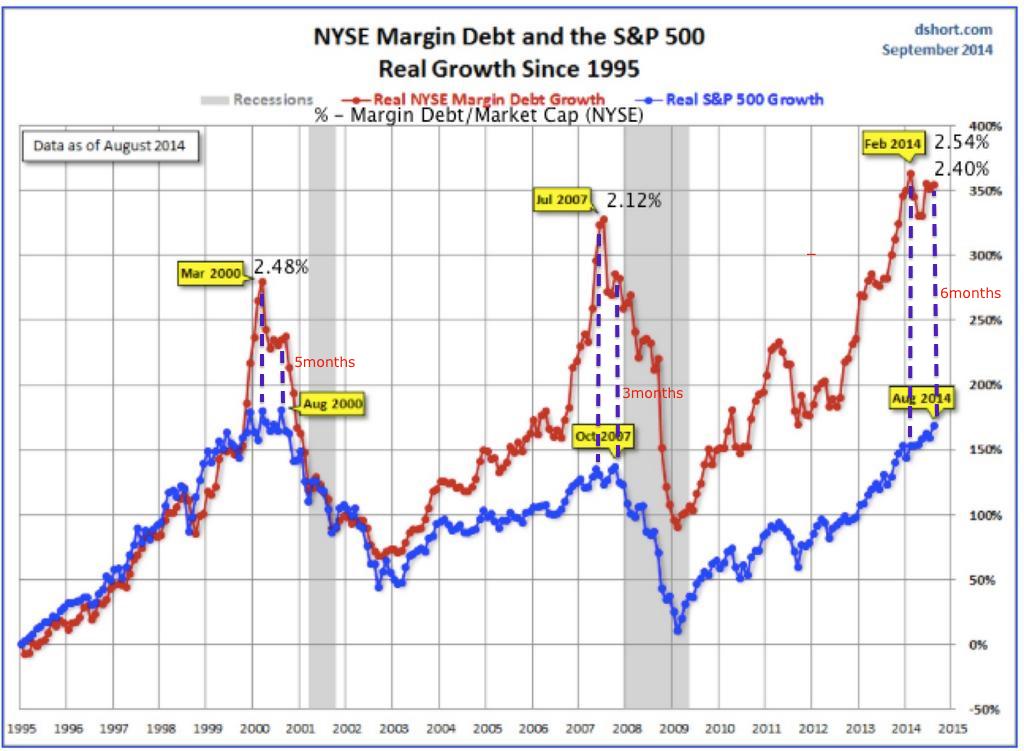
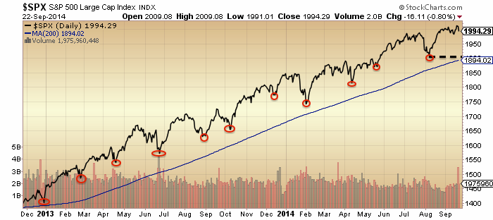
As stock indices were down for September, we can expect that margin debt retreated in that month, which keeps the leverage peak close to the smoothed solar max. If the R2K can break down decisively here in October – and it is currently at the critical last support – then it would likely seal the joint solar/speculation peak around March time. Should that occur, then the implications are major, namely that much of what is written about the markets is not true, and that humans, including central bank members, are more dumb subjects and less intelligent creatures of free will. But more on these implications once we have the validation seal.

It wasn’t easy trading this in real time, trying to gauge where both the speculation peak and the smoothed solar maximum fell. With both variables unknowable in advance it has been a process of cross-referencing and leaning on prediction probabilities, only made more certain with hindsight. Nonetheless, in trying to gauge the peak in the markets, there appears to have been no more critical factor to consider. However, we now need the decisive breakdown in equities to confirm it.

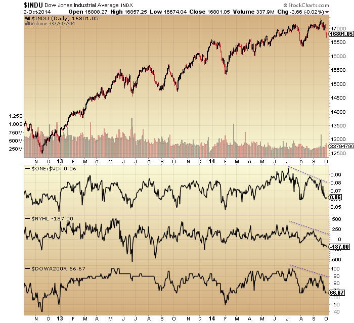
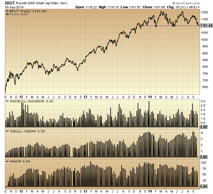
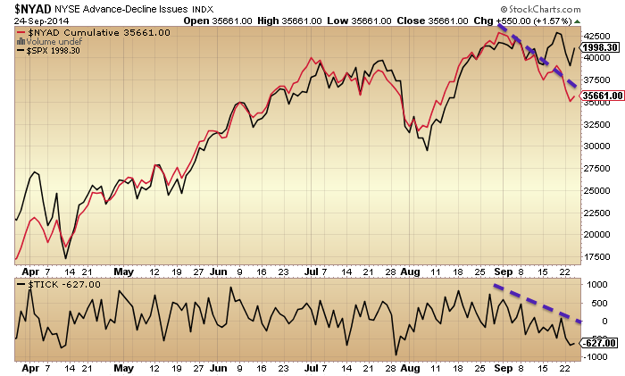
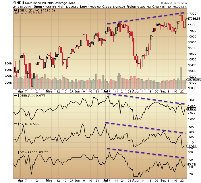
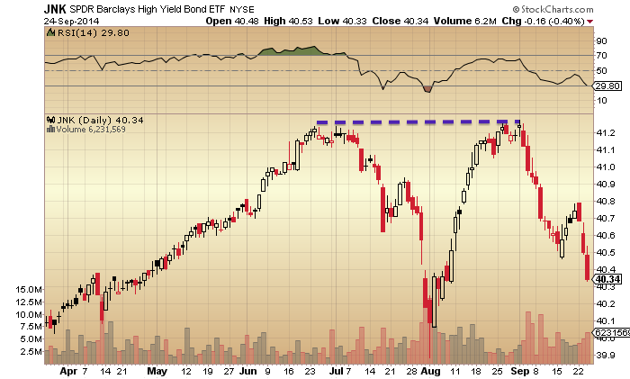
In the very short term, indicators still point to the bounce Thursday-Monday being short-lived and giving way to a lower low than last week. So, per my last post, this would likely entail the Russell 2000 making a decisive break beneath the last line of support. If this transpires then the selling should gain momentum and that would be the validation seal that I am looking for.

V-Correction Or Breakdown?

The bounce yesterday in equities arrived at an appropriate point when stock indices are cross-referenced technically: channel support on the SP500 and key horizontal support on the Russell 2000:

Screen Shot 2014-10-03 at 09.04.23 Screen Shot 2014-10-03 at 09.33.33

Plus rising support on the Hang Seng – which has generated what could be a fake-out above the long term wedge followed by a breakdown (if it can break):Screen Shot 2014-10-03 at 09.05.12So can all these indices break down, or are we to see another dip-buying v-correction?

3oc11

 Source: Stockcharts

On the above chart a positive RSI divergence was a reliable signal for a v-correction bottom. We do not have that yet, which suggests there should be another leg down of selling, even if shallow, where momentum wanes, if this were to be another v-bounce. This period into next Wednesday’s full moon is the likely window for this additional selling to occur.

However, beyond the prospects of a slightly lower low ahead, could this be the correction that does not produce another V above the 200MA, but forms a ‘true’ correction? I believe the clues are in what’s different this time compared to the previous corrections:

Breadth has made a lower low on the SP500 this time:

3oc10

Breadth deterioration is notable on the Dow since the last peak, plus Vix divergence:

3oc8

Nasdaq breadth has deteriorated sharply since the last correction:

3oc9The bubble-end flagged strongly on technology at the latest peak:

Screen Shot 2014-10-03 at 08.57.14

Source: Sornette

Junk bonds double-topped at the last peak and have since made a lower low:

3oc7

Recent deterioration in stock market internals has been a global phenomenon:

3oc4 3oc3

Source: GaveKal Kapital

The disconnect between global GDP trends and global stocks reached its greatest in the last couple of months:

3oc5Source: Zero Hedge

And inflation expectations have dropped to the lowest since the 2011 bottom:

3oc6

Source: Sober Look

By yesterday’s bounce in equities, NAAIM exposure had pretty well washed out, whilst conversely Investors Intelligence bears remain extreme at 15%. Put-call had reached a suitable extreme for a bounce whilst exhaustion signals are still largely absent. So, some case for a longer bounce here, and some case for the markets to continue downwards. However, note that the extremes in II, Rydex and Skew and the lack of fear spike in the Vix are at this point very mature and at every correction the odds increase that we see the true breakdown.

If we tie in the worst seasonal geomagnetic month of October, an earnings season beginning next week that should cement the disconnect between reality and valuations/projections, the ‘borrowed time’ clues post-solar-maximum (circa March), and the extreme positioning in gold and silver (which I believe are ripe for a short squeeze as/if stocks fall through support), then the case grows for this being the correction that becomes the breakdown.

3oc1

Source: Market Anthropology

To sum up, there has been a broad deterioration over the last 3 months that suggests this should be it: namely, the correction that becomes the breakdown. Stocks bounced yesterday at necessary levels to prevent such a breakdown, but drawing on the historical analogs any attempted rally out of that should be quickly reversed by the bears. The lack of positive divergence at yesterday’s low suggests there should be a lower low ahead, which could then provide the technical break for a much more voluminous sell-off. At that point (the dawning of this being the dip that isn’t bought), I expect precious metals to finally take off, creating a sharp short-squeeze in gold and silver.

Last Quarter Of 2014

September finished as a down month for all US stock indices, which means the peak in margin debt should remain as February. Cross-referencing: SOCL, RUT and Nasdaq breadth peaks are still signalling a likely Feb/Mar speculation top, whilst biotech remains tentatively supportive, at a double top with March. The smoothed solar maximum continues to look like it occurred around March, so the whole picture remains strong for a sun-driven speculation peak around March and a period of ‘borrowed time’ for equities since.

1oc9

1oc2 1oc3

The SIDC chart shows that they are still running with an alternative in which the smoothed solar max double tops ahead at the end of the year, but the majority of other solar scientist models are aligned to their SC prediction (smoothed max behind us, circa March). By cross-referencing with measures of speculation above, the behind-us scenario gains further weight.

The Russell 2000 has now reached the key technical level around 1100 for triggering potential waterfall declines, and it arrives here at the most bearish point in the year, the seasonal geomagnetic low of October supplemented by downward pressure into the full moon of next Wednesday 8th.

1oc1Conversely, if the RUT and other US stock indices can hold up through the full moon and the rest of October, then a year end peak in large caps would gain weight, with the seasonal upward pressure out of November. As things stand though, the recent collapses in junk bonds and inflation expectations, the September declines in all stock indices and the acuteness and maturity of many different stock market indicators (which I have detailed on this site) all support the October breakdown option.

Turning to other markets, the US dollar is in a parabolic ascent, the Euro a parabolic descent, and the slide in precious metals continues. All three show extremes in positioning and indicators that are suggestive of a reversal, and the parabolic trajectory of the FX pair suggest a snapback should be imminent, but when?

1oc8 1oc5I see it as linking in nicely with the situation in equities. If US equities break down through the key technical supports (to clearly kill the prospect of another v-bounce), then gold should at that point reverse course, and the dollar may then be sold off. Much of my recent work on stock market indicators shows that the case is strong for equities to break down without delay, suggesting these intercorrelated reversals ought to indeed occur here in this pertinent window at the beginning of October.

The rising Dollar negatively affects 45% of S&P companies. Earnings season for Q3 gets underway next Wednesday, and the predicted earnings growth rate is 4.7%. This stood at 8.9% on June 30th and 12.2% at the start of the year. For the YTD picture, US earnings growth forecasts at the start of 2014 were Q1 4.4%, Q2 9.2%, Q3 12.2%, Q4 13.5%, whilst actuals are Q1 2.2%, Q2 7.7%, Q3 4.7% (est). In other words, to justify valuations, average quarterly 10% earnings growth was required and projected, but the reality looks like less than half that. As earnings season typically have a ‘sell’ or ‘buy’ theme, I suggest odds are this one will be a sell (as reality dawns), and help pull down equities in October.

At the macro economic level, economic surprises in Europe and China continue to languish negative, whilst the US remains positive. The global real narrow money leading indicator predicts a slowdown once we hit 2015, whilst ECRI leading indicators for the US remain poised at a low level from which a fall in equities would likely tip then negative. This brings me back to what leads what. I recently covered that equities in fact tend to lead leading indicators by a month on average and that previous major tops reversals in leading indicators only occurred once equities had made initial hard falls, which in 2014 they have yet to.

This in turn leads me to the question of whether equities could yet have a second chance peak ahead, like in August 2000 (after the first March peak) or October 2007 (after the June top). In both those scenarios, large caps dropped around 15% before rallying to the second chance peak, whilst leading indicators diverged negative into the second chance peak. The possibility here would be for large cap stocks to break down in October, perhaps 15% again, but then rally back up towards the recent peaks by year end, perhaps for a 31 Dec second chance (lower) peak.

Well, the speculative targets of RUT, SOCL and IBB all show second chance peaks already. Developments in margin debt, HYG:TLT, NAAIM, Rydex and various mature divergences also suggest we should be at second not first chance peak. But the price patterns in large caps don’t really fit. UBS side with the year-end second chance prediction, shown below, yet beneath that their TNX divergence chart is another indicator conversely suggesting we should be at second chance peak already:

Screen Shot 2014-10-01 at 12.12.28 Screen Shot 2014-10-01 at 09.56.18I suggest that if we are post-second-chance but having ‘cheated’ a decent first chance correction (and this is the picture painted by most stock market indicators), then the falls from here should be twice as hard and echo action post-second-chance in 1929, 1987, or 1989 (Nikkei) whereby the falls become waterfall declines or panic selling. If the selling is more measured and back and forth then we should alternatively look to indicators to washout and align for a bottom at perhaps a 10% or 15% correction, before a potential rally into year end.

This last quarter was the best quarter so far for viewing stats on solarcycles.net. The best month was this last month (shown below), the best day just yesterday. So, thanks for reading my analysis and thanks to all those who contribute and make for a good discussion board.

Screen Shot 2014-10-01 at 10.01.55

To sum up, I’d give 80% odds to equities falling in October through technical supports and cementing a new bear market. I’d give 20% odds to equities holding up into or making a second chance peak at year end (both around 31 Dec). I don’t have a case for a bull market extending into 2015, as this would invalidate a variety of historically reliable indicators with different angles on the market.

As this is the last quarter, it seems appropriate to stick this up: predictions from the professionals at the start of 2014 for year-end. We can see that all were bullish on equities, predicting an up-year (accepting that they largely play it safe and align with each other). As you know, I was bearish at the turn of 2014 and always expected us to end the year in a bear market, so it’s a black mark against me if we don’t. But I believe the weight of evidence still supports the markets swinging to me by year-end, so let’s see at 31 Dec.

Screen Shot 2014-10-01 at 13.10.46

Population, GDP, Debt, War And Solar Variation

On a longer term view, these all fit together, and understanding their relationships can help us predict what’s coming.

The grand solar minima correlate with clusters of war:

29se1

War clusters / cycles

The grand minima were periods of lower population growth and lower GDP growth whilst conversely the grand solar maximum of the 1960s-70s was a period of peak population growth and GDP, shown here:

29se3 29se4

So, broadly speaking, the grand solar minima have equated to war, low GDP growth and low population growth, whilst the recent grand solar maximum was the opposite.

Benjamin Friedman established the correlation throughout history of declining economic growth giving rise to war. Extremists are brought to power under economic suffering. Revolutions occur when people are struggling (most recently, the Arab uprisings when food prices had risen to price people out of the basics).

World wars 1 and 2 were periods of low GDP growth, and WW2 occurred out of the Great Depression:

29se5

The end of that double great war period gave rise to a global baby boom that produced a young adult price-inflation swell in the 1970s then a middle-aged stock market boom swell between 1980 and 2010 (phased across individual countries).

Since then demographics are united in downtrends in the major nations producing this sobering composite:

29se8

Global GDP growth is struggling and should do so for an extended period, and stock markets should suffer likewise.

Meanwhile, solar scientists predict that we are tipping into a new grand solar minimum. The predicted low GDP growth above fits with the grand solar minimum predicted below, making for a compelling cross-reference.

29se9The last piece of the puzzle is debt. Debt is prosperity taken from the future and has been increased with each war and each major recessionary/depressionary period, to pay for or offset those events:

29se8

The resultant long rising debt trend means more productive receipts have to be spent on servicing the debt, which crimps the economy beyond that of demographics.

The end game for debt is QE. Printing money to buy your own debt is the policy of last resort. The only way out of this is if demographics point to much higher receipts ahead, but in fact they show the opposite.

Drawing all these relationships together, the outlook is grim. The next couple of decades will be characterised by low global GDP (as written in demographics), which puts the world at risk of war (at both national and international levels). The debt situation threatens to accelerate out of control in certain countries (Japan is at highest risk) as central banks offset even lower GDP and potentially have to pay for war additionally. Major war would cut both GDP and overall population further, making for even greater per capita debt burdens.

These are the major themes. The specifics by country and by timeline are more difficult to predict. But at the global level, the negative feedback looping between solar, population, GDP, debt and war, suggest the crunch is unstoppable for the world.

Eventually, these interconnected phenomena will turn into a positive feedback looping. Out of the ashes of a grand solar minimum with a purge of population, the devastation of war and bankruptcies should come a new solar normal with another baby boom and some anticipated revolutions in systems and organisation (financial, economic, social). True new ways of doing things only occur when circumstances force.

Set against the bleak outlook of the next couple of decades is the continued parabolic rise of technological evolution. Developments in nanotechnology, biotechnology, artificial intelligence, space exploration, geonengineering and renewable energy may produce paradigm shifts that assist with GDP and debt, and accordingly could ease the conditions for war. However, the negative feedback looping captured above extends its grip over this too, as corporate investment has been shrinking across the world in recent years, in accordance with lower economic demand and higher uncertainty.

29se11

Declining levels of investment and R&D worsen the outlook for the future and add to the downward spiral.

We could argue that the global secular bear in the economy and stock markets began in 2000 and that as yet we have avoided major war. However, collective demographics have worsened since then, as Europe and China tipped over to join the US and Japan. With a comprehensive case for stock market peak here in 2014, the next leg down both in equities and the global economy should be the worse yet. To add to this, a large percentage of the population has seen little improvement in personal finance for some years (as the cyclical recovery since 2009 has been very unevenly distributed), which creates bubbling trouble.

The situation in Ukraine and between Russia and the West may be a fruition of these themes. Economic troubles were a major factor in bringing about the revolutions in Ukraine. The sanctions against Russia are hurting both the Eurozone and Russian economies, which are already struggling, thus worsening the situation for both parties. Protectionism was a theme of the Great Depression, and is a self-defeating policy, but it will most likely increase here with the anticipated next leg down in the global economy and markets, as nations turn to helping themselves and trying to prevent domestic unrest. There is the risk that China and/or Russia sell chunks of their large US treasury holdings and destabilise global markets in a major way. Both countries have been increasing gold holdings in recent years. Indeed, ‘war’ could take a new form in this era of global, interconnected and instant: financial markets may be targeted, adding to the risks for traders.

Putting such speculation aside, the trends in debt, demographics and solar variation combine to make a compelling case for a period of serious economic trouble. That period kicked off in 2000 but is now strengthening in intensity, and stock market indicators assess us to be on the verge of the next leg down, which should be the worst yet. The conditions for war are in place, and it seems fairly sure that trouble around the world will intensify. The question is to what degree and how matters unfold. The recent deterioration of relations between the West and Russia is an ominous development if we are now heading into a major breakdown in the markets and global economy at the end of 2014. Major international conflict is by no means certain, but if we were looking for the appropriate conditions for it, then they are in place.

Increasing Deterioration

A rally in equities yesterday on increasing under-the-hood deterioration.

1. SP500 breadth measures not confirming:

25se21Source: Stockcharts

2. Dow negative divergences persist:

25se93. Nasdaq breadth divergences continue to worsen:

25se224. Russell 2000 made the smallest bounce of the four and remains in danger:

25se305. Junk bonds had another big down day:

25se7

6. Financial conditions have diverged since the start of July:

25se3

Source: PFS Group

7. Skew reached reached a par with its highest ever (in 1998) at Friday’s close:

25se2

Source: ISpyETF

8. Investors Intelligence sentiment remains at the extreme this week, with 15% bears:

25se27

9. Rydex allocations also remain at the extreme at the end of yesterday, with the Friday-Tuesday sell-off not having dented confidence:

25se20

10. Margin debt for August was released and shown below. The February high remains in tact, which adds further weight to the speculation peak having occurred close to the smoothed solar maximum around then, and weight to the stock market being at the end of its topping process. September may seal it, subject to how the month closes.

25se11Source: DShort / UKarlewitz annotations / My annotations

11. Gold, Euro and US Dollar positioning continue to suggest a reversal is likely, in favour of gold and the Euro and away from the Dollar, with associations for equities.

25se12

Source: @Market_Time25se19

Source: @Sobata416

12. Sornette bubble end flag for US tech has now reached 0.6, which is an extreme high reading historically:

Screen Shot 2014-09-25 at 08.36.41Source: Financial Crisis Observatory

Four trading sessions left in September. I stick with my call that we have peaked. The internals reveal a very weak picture behind yesterday’s rally in equities, whilst we have an associated brewing reversal across gold, Euro and USD. I believe the breakdown in small caps and junk bonds in September, together with the potent negative divergences in equities this month have secured the broad markets peak and that we will not extend to year-end. The latest solar and margin debt data add to this likelihood.

In the very short term, yesterday’s rally broke the bearish momentum, setting up alternatives for how this week ends. Based on the deterioration covered above, it may be that yesterday’s bounce is quickly engulfed by the bears, to continue the downtrends, or it maybe that stocks can rally back up a little further and precious metals leak more before breaking (down/up respectively) in earnest. Either way, the next two weeks down into the full moon of October have great potential to trigger the true breakdown in equities and the squeeze in PMs.

Topping Timeline And Targets

I played the long side of the stock market from 2009 to 2013, which longer term readers can vouch for. I reiterate that in case there is any doubt amongst newer readers that I may be a permabear. However, I would rather hope you can see my work is as objective as I can make it, bearish as it now is.

I began my series of bearish posts in December 2013 as topping indicators began to accumulate and I entered my opening shorts. I made my first topping call in early January as 31 December 2013, and here is the link to that post: click.

In that analysis I cross-referenced over 30 topping indicators and I therefore don’t have many regrets. It was a strong case, and it did capture certain peaks in risk and the likely beginning of the topping process, as shown here:

23se5At that time, leading indicators were predicting a weak Q1, which then shocked to the downside, and earnings guidance was the worst on record. Solar scientists predicted the smoothed solar maximum was already through by the end of 2013, so the whole set up looked very promising.

However, solar scientists got it wrong, as sunspots continued to a (likely) peak of around Feb/March 2014. Therefore, I can now retrospectively account for speculation increasing from 31 Dec through to the start of March, and the negation of my original topping call. But at the time, not much I could do.

Below I present evidence of that Feb/Mar speculation peak in social media, biotech, Nasdaq breadth x2 (i.e. Nasdaq stocks started to break down here), and relative European and UK small caps performance:

23se7 23se1 Screen Shot 2014-09-23 at 08.00.55All peaked at the turn of Feb into March, and this fits with margin debt leverage which currently peaked in February. My biggest short position is in US small caps, the Russell 2000, and this index also peaked at the turn of March, adding to the collective case for speculation and the solar max to have peaked at this time.

23se8

In a recent post (click) I detailed the comprehensive case for the market peak but stated we were missing a technical break. That R2K chart above shows the likely trigger for waterfall selling. A decisive break below 1100 would confirm and seal the topping process.

Meanwhile, on the SP500, I suggest the technical break is around 1900, where the 200MA and August low now collide:

23se10A decisive break below 1900 would produce a lower low, a move under the 200MA (after 2 years levitating above it) and a break in the pattern of v-bounces. When I look at that chart I see clear evidence of the sun-inspired speculative mania, whereby every dip is swiftly bought up and levitation is sustained. Could Elliot Waves or other pattern techniques really predict that chart, and its ultimate conclusion too? I find that hard to believe, as I see a mania which is only predicted by the solar maximum, and the chart does not have a more ‘usual’ ebbing and flowing of sentiment waves. However, something sustained the speculation in large caps between March and now, so what did?

Certain additional topping flags have congregated in the last 2 months: vix divergence, extremes in volume, more negative divergences, higher Sornette bubble end flag intensity. But none of these offer anything revolutionary to what was present at the start of the year. Certain divergences were not so mature in January, but equally certain divergences are now too mature (versus historic norms). In short, I don’t see anything major now present as a topping flag that was missing before, but rather only a few subtle additions which add to the case. However, I put that out to you readers for your views.

The Nikkei did not top until 5 months after the smoothed solar max in 1989, so a top at the turn of August-September in 2014 fits that kind of lag, though here we could argue that the speculation targets were RUT, SOCL and IBB and have conformed to a tighter fit with the solar peak. Either way, I believe the market is on borrowed time since the March speculation peak, which now looks fairly clear. This window around October is the most likely for the falls to erupt, and various measures of ‘fuel’ suggest continuation of the bull market to year end is unlikely. Friday and Monday action looks very promising, and now I look for further follow though to confirm it. But I’ll stick my neck out again and say I believe this is finally it.

So a reminder of targets. Falls were swift and nasty under similar historic conditions:

Dow 1929: 3 weeks 44% declines

Dow 1937: 8 weeks 38% declines

Dow 1968: 8 weeks 18% declines

Dow 1987: 2 weeks 34% declines

Nikkei 1989: 6 weeks 27% declines

Nasdaq 2000: 3 weeks 35% declines

SP500 2011: 2 weeks 18% declines

I am therefore looking for a minimum of 18% declines over a period of 2-8 weeks. I believe such waterfall selling will kick off once the technical price breaks noted above are made, and I expect precious metals at that point to accelerate in the opposite direction. However, history is not clear on which way gold mining shares should go at that point, as they may only take off after the waterfall declines, and precious metals could be held back to some degree by forced redemptions under cross-asset selling.

I believe Friday kicked off the downward momentum in stocks, and that what looks like a breakdown in precious metals will now become a fake-out that is reversed.  The very skewed positioning in FX completes the picture for an all round reversal in assets.

Indicators put us at the end of the topping process in equities. This means no ‘second chance’ ahead. Rather, we can see the second chance peaks already on RUT, IBB, SOCL, European indices and in behind-the-scenes indicators, so I believe US large caps are displaying a false safety in their price trends and that those who think a topping process has yet to form from here will be mistaken. If I am correct in where the markets are in the timeline, then bears should remain firmly in control now. Not every day will be down, but the trend will be fairly unforgiving, with little chance for anyone to get out or in. The technical breaks should then trigger the panic selling and the devastation will be through by November. From there the market should begin a slower partial retrace of the falls into year end. This is all based on historical analogs.

My aim is to close out of shorts once the panic selling leg is through, as the partial retrace of the falls should be multi-month. So I’ll be doing my best to use indicators to try to gauge where and when the bottom is in the waterfall selling. Might selling be more measured, say like after the 2007 October peak to year end? I don’t believe so because of various factors: the solar max, leverage, sentiment, allocations, skew, levitation above 200MA / pent up correction. Rather, the set up is for particularly heavy waterfall selling, and the closest analogs listed above. They average at 30% declines over 4-5 weeks.

Stock Market Vs. Equinox

Tuesday 23rd September is the Fall/Autumn equinox. Equinoxes occur twice a year, the other being around 20th March.

The last 4 major tops and bottoms in the SP500 all fell within 2 weeks of an equinox:

19se1

Extending this to include major turns in the period that took place within 2 weeks of an equinox, we get this:

19se2In total 10 bottoms and 4 tops. The dominance of bottoms fits with the seasonal model of the stock market, which is based on the seasonality of geomagnetism, and has lows near the two equinoxes:

19se4The two red arrows on the ‘seasonality of geomagnetism’ chart show when stock market crashes have predominantly occurred in history. Therefore, bottoms or lows not far from the equinoxes make sense.

Highs around the equinox? Inversions happen occasionally in lunar phasing. Full moons bring about pessimism and typically mark lows, but now and again they can invert as a high. As geomagnetism is a similar sentiment phenomenon, I expect the same sometimes happens here, but I can’t be more scientific. Nonetheless, if next week’s equinox is to have any relevance, then it would most likely be as a top, or inversion high, because we have not seen a period of selling into it for it to mark a low, as we did into the lows 1998-2011 shown above.

Looking further back in stock market history, in 1987 stocks peaked 1 month before the Fall equinox and completed their devastation one month after, so centred around it. The 1976 top and 1978 bottom in the Dow were both within 2 weeks of equinoxes, but other major tops and bottoms in the 1970s secular bear didn’t align, clustering rather at the turn of the year and seasonal high. In 1929 there was a mini-crash March 25 (equinox), the Dow topped 3 September, the London stock exchange crashed 20 September (equinox), and the whole combined crash process was done by November 13.

In short, I would summarise that maybe there is an equinox phenomenon. The most compelling reason for it is the stock market seasonal lows that occur close to them (circa March and October), driven by geomagnetism which affects human sentiment. On these grounds, most major turns would be lows at equinoxes, and just occasionally we would see an inverted high.

One more add: next week’s equinox falls one day from the new moon and new moons typically mark highs (both minor turns and major peaks) so if it were to mark a high then there’s an additional reason for it to do so. For this to have any merit, stock market indicators would need to be signalling such an imminent peak.

Yesterday was a bullish day for large caps and overnight action looks to have cemented a break out. Small caps and junk bonds again didn’t share the optimism, negative divergences persist on large caps, sentiment and allocations are very stretched, and ‘normally’ this would mean an attempted breakout becomes a fake-out. Wider indicators continue to warn that this is the last gasps of a topping process, and as I have covered recently there is no case for a rally much higher or much longer. e.g. 20% higher into mid-2015, as this would negate a whole host of reliable indicators. The evidence leads me to believe that the stock market will peak here and collapse through the seasonal low of October – or, failing that – it presses on and peaks at the seasonal high of the year-end (a historical clustering targets 31 Dec).

I have difficulty believing the end-of-year option because indicator extremes and divergences are already very mature, whilst sentiment and allocations suggest little fuel for higher or longer. We would need to print anomalies in various indicators with different angles on the market to achieve it, and it would be a major stretch to achieve. Additionally, the smoothed solar max looks likely to have been around March and various risk measures peaked then or either side of that, which suggests this is already ‘borrowed time’. That said, price just won’t obey yet and until it does, I have to consider this possibility.

If large caps consolidate their breakout and push on through the new moon and equinox, pulling up small caps and other laggards too, then the end-of-year option will gain weight. If stocks hold up through the month of October then that would seal it, in my opinion.

But… the charts below show how things stand, and these are why I just can’t believe the market can truly break out upwards here. These charts are indeed supportive of a new moon / equinox peak. Plus it’s the week after expiration, normally bearish, and also a week of geomagnetic disturbance is predicted.

19se5 19se8 19se719se2119se1119se1019se9I may cut back short positions if (despite the indicators) stocks collectively motor here, but my eye is on the new moon / equinox combination next week. UBS see high likelihood of an important reversal in the next 3 sessions, and FX positions and technicals continue to be extreme, suggestive of an imminent reversal with associations for risk.

US Demographic Peak Of 2000

The US enjoyed united demographic uptrends from 1980 to 2000 and since then united downtrends. Here are a collection of charts that show the powerful reality of this influence.

1. Risk assets markets in real terms trended accordingly, and are calling for another cyclical bear down within a secular bear underway since 2000:

18se27

2. Real economic growth trends also align:

18se4

18se10

3. A dwindling proportion of people in jobs:

18se54. With associated lower household incomes:

18se8

5. Means that there is less dollar circulation in the economy Screen Shot 2014-09-18 at 07.18.07

6. And consumer sentiment is overall waning.

18se77. Turning to the supply side of the equation, business capacity utilisation is in decline:

18se198. And corporate investment too:

18se21

9. However, corporations have been doing better than households:

18se310. As they have cut staff, replaced with tech, and kept wages low for retained staff:

18se29Source: ForexLive

11. With shrinking real demand in the economy and in asset markets, the Fed has attempted to offset this by depressing rates:

18se2Source: Gary North

12. And ‘printing money’:

18se2413. The stock market has to a degree been a beneficiary as investors search for yield and corporations indulge in buybacks rather than business investment. However, this has all been sponsored by increasing debt, enabled by the low rate environment:

18se28


Drawing this together, demographic trends are creating a negative feedback looping between jobs, wages, incomes, spending, business investment and utilisation in the economy. Lower demand and lower supply. QE and ZIRP can’t really influence this because they are nothing ‘productive’ (tinkering with the money mechanism), and they are also only policies of encouragement rather than policies of force. However, they have served to shore up the banking sector, to keep debt costs low, and to push some people and businesses to look for yield, driving up some asset markets with an associated wealth effect. Equally though they have detrimental effects by postponing necessary economic cleansing, driving up asset prices through increasing debt (i.e. unsustainable), discouraging more productive use of money and in some ways worsening the economic situation by reducing incomes dependent on saving rates. Nonetheless, the Fed was keen to avoid the 1930s front-loaded deflationary devastation and has succeeded in this. But have they prevented it, or just postponed it? On a long term view, they have of course only postponed it, because the massive borrowing that they have undertaken is wealth taken from the future. But for us traders, the shorter term outlook is key.

I believe the above collection of charts demonstrate clearly that the Fed’s policies do not overcome the overarching demographics as they all show a series of stair-steps downward since 2000. If we contrast it with the 1930s we see evidence that the Fed has helped to phase the devastation, but the charts show they have not been able to neutralise it. When we consider the unprecedented collective demographic downtrends in place now in all the major nations, I believe it is clear we are on the cusp of another leg down, both in economic measures and asset markets, that will take us to a new level in all lower than 2008/9. We can cross reference this with the stock market currently at extremes in valuation, sentiment, leverage, buybacks and allocations: namely it has the attributes of a ponzi scheme wealth effect, at high risk of full reversal. When the stock market collapses, the next leg of demographic devastation will wash through, revealing the relative impotence of the central banks.

18se30

Problems in China

1. China tipped over the demographic cliff circa 2007-2010. Here are middle to young, middle to old, net investors and dependency ratio (inverted) measures:

16se152. China’s stock market enjoyed a parabolic mania at the demographic peak, like the US did in 2000 and Japan in 1989.

Screen Shot 2014-09-16 at 07.39.37

Source: Yahoo

3. China’s stock market correlates closely with commodities:

Screen Shot 2014-09-16 at 07.33.17

Source: Yardeni

4. Demand for commodities is weakening as the economy weakens:

Screen Shot 2014-09-16 at 07.25.48Source: Yardeni

5. Chinese official GDP stats are questionable, so proxies are used for greater reliability. Here, steel, cement and electricity output show a wilting in 2014, flirting with the zero level:

16se9

Source: Bloomberg

6. Imports and exports are at much weaker growth levels since the demographic peak, and both have seen lurches below zero in 2014:

Screen Shot 2014-09-16 at 07.26.24

Source: Yardeni

7. Government spending has shrunk:

16se7Source: AlphaNow

8. Producer prices are mired in deflation:

Screen Shot 2014-09-16 at 07.26.59

Source: Yardeni

9. And certain indicators have suddenly become more acute in 2014, starting with foreign direct investment:

16se3

Source: ZeroHedge

10. Then the housing market:

16se6Source: AlphaNow

11. The shadow banking market:

16se2Source: Investment Watch

12. And lending:

16se18History shows that economies which expand at breakneck speed typically derail at some point. A potential hard landing for China has been discussed in the media for a long time, but analysts don’t largely understand that it is only in the last 3-4 years that this has become more realistic, since China fell over the demographic cliff. Their one child policy has a nasty sting in its tail. The key is whether the Chinese government can roll out measures that nip the sharp 2014 declines in the bud (which would postpone rather than prevent the devastation), before the negative feedback looping becomes too acute.

In my view, it is the unprecedented collective demographic downtrends in USA, Europe, Japan and China that are tipping the global economy into an unstoppable negative spiral here (only currently propped up by the wealth effect of the stock markets) and central banks will not be able to prevent it. Japan, USA, Europe and China all took turns to be the engine of the world economy between 1980 and 2010 but now we are engineless until circa 2020/2025. By demographics that means a global deflationary recession, or a depression. Passing through the solar maximum here in 2014 should produce dwindling speculation and economic activity and nudge the stock markets and world economy over the edge, feeding off each other.