

First, a compilation of indicators and flags warning of a major market top in US equities:
Bull Market History Statistics
Dow is up more than 5% five consecutive years now and a sixth such year has not happened before in history.
A 5-year bull trend only occurred once before, in the 1990s, and was followed by 3 down years.
Last 2 years rally in US stock indices has been made up of less than 20% earnings growth and more than 80% multiple expansion. The last 2 such occurrences in history were 1985:1986 (leading into 1987 crash) and 1997:1998 (leading into 1999 real Dow peak)
Compound annual growth rate in equities since 2009 was only exceeded in 1929, 1937, 1987 and 2000, all of which led to steep market declines
Valuations
Crestmont P/E is the 3rd highest in history after 2000 (market peak) and 1929 (market peak), and in 97th percentile
The 2nd highest market capitalistation to GDP valuation outside of 2000 (market peak)
The 3rd highest Q ratio valuation in the last 100 years outside of 1929 (market peak) and 2000 (market peak)
The 3rd highest CAPE valuation in the last 100 years outside of 1929 (market peak) and 2000 (market peak)
Russell 2000 trailing p/e ratio 88; Amazon trailing p/e 1440; Facebook trailing p/e 148; Twitter reached $40bn market cap with zero profits
Earnings guidance for US Q4 most negative on record
Technical Indicators
US stock indices are in an unsustainable compressing parabolic / Sornette bubble price formation
6 month breadth divergence on US indices in the percentage stocks above 200MA
Declining breadth in the number of countries participating in world equities rally
Dow, FTSE and Nikkei are all at long term resistance levels (connecting 2000 and 2007 peaks)
Treasury Bond Yields Rate Of Change over last 12 months is at a level that previously led to market tops in 2000 and 2007
Second highest Skew reading ever (protection against outsized move)
Cluster of extreme Skew readings not seen since June 1990 before recession began July 1990
Put/Call Ratio 10 day average is at an extreme that previously marked significant corrections, including May 2010 flash crash
SP500 distance above 100MA is the highest of all time
Sentiment/Euphoria
Investor Intelligence percentage bulls are at 2007 levels (market peak)
Investor Intelligence percentage bears and bull-bear spread are both at 1987 levels (market crash)
NAAIM survey sentiment is in the 98th percentile = extreme optimism
Citigroup Panic/Euphoria model is now 2 months above the Euphoria threshold
Credit Suisse Risk Appetite US model is into Euphoria
Greedometer aggregate of macroeconomic, fundamental and technical data is at a record level exceeding the 2000 and 2007 market peaks
Equities Exposure And Leverage
US household exposure to equities has risen to the same levels as the 2007 top
Fund manager allocation to global equities is at levels that previously led to a market peak or correction
Rydex bull-bear and levergaged bull-bear ratios are at an all-time record
Margin Debt has escalated to 2.5% of GDP, only exceeded at the 2000 market peak
Investor Credit balances are at an all-time record negative
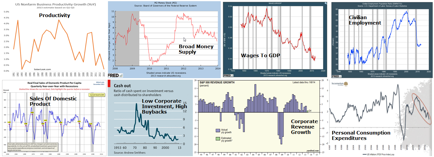
Second, the US economy is in trouble (click to view larger):
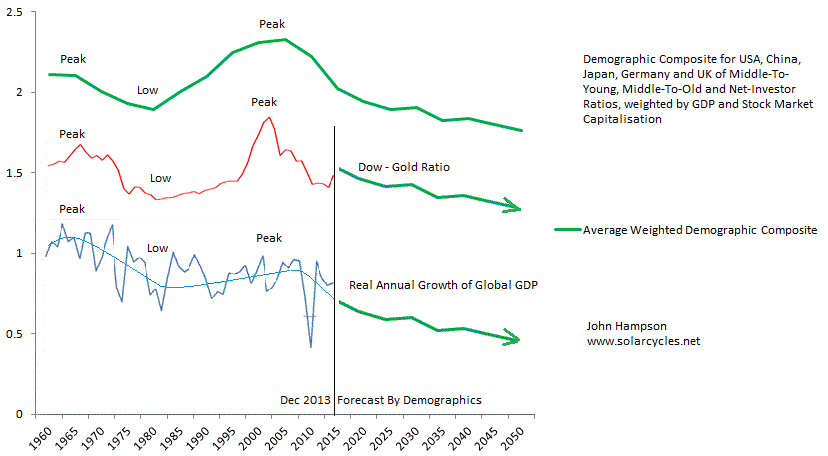
Third, this is reflective of both the record levels of debt and unprecedented collective demographic downtrends which are now in place in US, Europe and China and are deflationary, recessionary and equities-bearish.
Fourth, equity markets have historically made major peaks at the turn of the year:
 Market peaks at the turn of the year correlate with the seasonal yearly lows of geomagnetism, which inversely correlates with market sentiment. Market crashes in October (also shown above) correlate with the seasonal yearly highs of geomagnetic disturbance, and there is a close fit in the full yearly seasonality of global stock indices to the annual pattern of geomagnetism (inverted):
 Most analysts are unaware of this underlying cause of stock market seasonality. Geomagnetic activity is demonstrated to make people more irritable and aggressive, and can affect melatonin synthesis and blood pressure. There is a correlation between geomagnetic storms and depression in humans. Here is a chart showing daily geomagnetic disturbance versus the SP500 over the last 5 years:
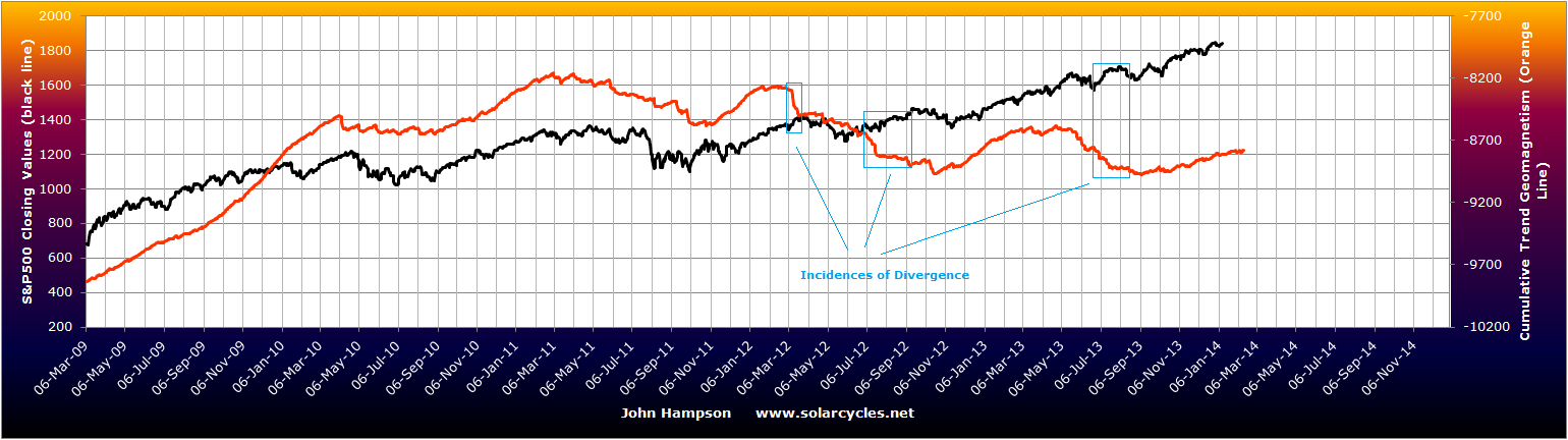
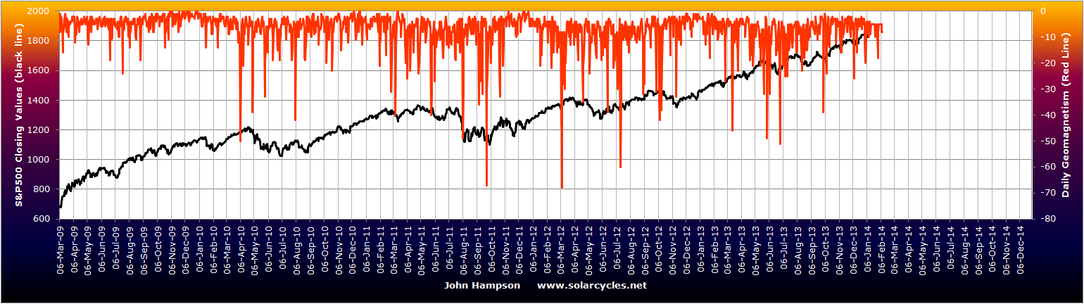 The bigger the geomagnetic disturbance, the bigger the spike. By turning this into a trend line we see the ebb and flow of the SP500 correlates with the ebb and flow of actual geomagnetism, with the only exceptions marked in blue:
 The correlations of the Singapore STI stock index and the TR CRB commodities index to the geomagnetic guide are closer still, which demonstrates the link between geomagnetism, sentiment and risk asset performance:

 Fifth, major speculative peaks have historically occurred at the solar maximum, which is occurring now.
Peaks in solar sunspot activity occur on average every 11 years and have historically correlated with human excitement peaks in the form of protest, war, growth-flation and major speculative parabolic peaks. Again there is biological evidence for this in elevations in oral temperature, pulse rate, blood pressure, and respiration rate, and again few analysts are aware of this critical influence.
The majority of the famous secular speculative parabolic peaks in history took place on monthly sunspot spikes close to the smoothed solar maximum:
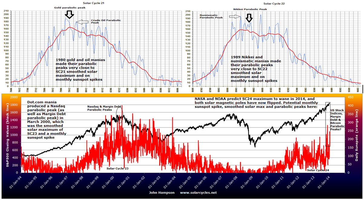 We see a spiking in sunspots from late 2013 currently taking place, and this is predicted to mark the smoothed solar maximum and the high of this solar cycle:
 The evidence for a peak in speculation can be seen at the top of this article, in the congregation of extremes in sentiment, leverage, technical and valuation indicators.
Sixth, drawing all together, there is a case for the US stock market having peaked on the 31st December 2013.
A) We see a wide range of indicators and flags, ranging from valuations to sentiment to leverage to technicals, all pointing to a major peak, right at hand. B) The assumption that the US economy will return to normality this year is one of hope, neither reflected in the data nor in the demographic/debt backdrop. C) Historically major peaks often occurred around the turn of the year, with a cluster falling exactly on the last trading day of the year, and this reflects the annual seasonal peak which is caused by the seasonality of geomagnetism. D) Historically, major speculative parabolic peaks have terminated at the solar maximum on a monthly sunspot spike, which is likely occurring now in Dec 2013 / Jan 2014.
Specifically, where solar maxima have fallen near the turn of the year, speculative parabolics have tended to terminate on the last trading day of the year, in line with the seasonal peak. The real highs of FTSE 31 Dec 1999, Dow 31 Dec 1999, Nikkei 29 Dec 1989, and Dow 31 Dec 1968 were all such occurrences. This is a dual confluence of peak sunspots and peak inverted geomagnetism.

The evidence is v compelling.
Once the market turns it will surely become a stampede given the leverage and trend-following strategy of so many players.
Bit it’s already been irrational beyond (my) belief. Sornette called a peak in May… It ain’t over until break those moving averages.
Good luck,
Filip
Sent from my iPhone
30 Year US-Treasure Bond Yield might have peaked for now.
http://stockcharts.com/h-sc/ui?s=$TYX&p=D&yr=2&mn=0&dy=0&id=p73607442874&a=278897820&r=1389614966044&cmd=print
Monthly chart.
http://stockcharts.com/h-sc/ui?s=$TYX&p=M&st=1986-01-13&en=%28today%29&id=p06820691323&a=331626627&r=1389614999223&cmd=print
http://stockcharts.com/h-sc/ui?s=$TYX&p=D&yr=4&mn=0&dy=0&id=p39769681853&a=213788312&r=1389615124424&cmd=print
30 Year US-Treasure Bond Price about to turn up again if it follows usual cycle.
http://stockcharts.com/h-sc/ui?s=$USB&p=M&yr=20&mn=11&dy=30&id=p53263513541&a=235025241&r=1389615204506&cmd=print
TLT made a gap-up move last Friday… telegraphing today’s move. Let have a correction. Much needed.
Thanks guys
the price level that all the technical traders who are looking for a correction to complete and a new high to follow is being hit…… if it gives way the bears will be in control.. 313pm
my focus is short term index trading… in the context of john’s powerful work, i have been hitting every sell signal since the first trading day of year… at today’s high, EVERY index triggered a sell within a few minutes of each other, something that has become rare unless a sharp move is to follow….at today’s low every index hit downside targets… maximum downside targets in the sense if price goes even a little past…the chance of another move to new highs drops greatly in my work and john’s call for high in place looks good to me.
Still early days, but yesterday’s action helped fill in a few gaps. 80% down day, inverted hammer candle on the biotech sector, breakout in gold miners, Nikkei retraced its post taper gains.
John,
In your Dec 27 post you provided charts of markets demonstrating the following pattern:
1. Euphoric rise
2. A small drop
3. A second chance rise
4. A steep prolonged drop
Do you expect the S&P to follow a similar pattern? How long do you expect the steep drop will last?
Jack
Yes something of that nature. I would expect a gradual transfer from bulls to bears, a bit of a battle, before a ‘realisation’ in terms of a steep drop.
In 1987 the steep drop was 1 day, in 1929 it was 4 days of outsized falls, and the Nikkei’s first plunge was about 3 days of outsized falls.
1987 crash was Monday; In 1929 the steepest drop came on Tuesday, with historians suggesting investors mulling things over the weekend prior was a factor. For the Nikkei, the market broke down into its drop from Mon 19 Feb all that week and delivered its biggest drop on Mon 26th Feb. There were then two further sets of steep drops on the Nikkei, starting with big down days Mon 19 Mar and Mon 2 April. So there is a theme of crashes happening after a weekend, once people have had time to think things over. Something to bear in mind.
The 3 analogies all suggest we might need around 4 weeks from here of bull-bear battling before a sharp drop occurs, i.e. mid-Feb. If I draw on the idea up the page about crashes occurring at peak seasonal geomagnetism, then that would be March.
Nasdaq crashed March and April of 2000; Silver crashed late March 1980 (Silver Thursday); Nikkei crashes were centered around March 1989 (Feb-Apr); That’s the last 3 solar peaks covered, and all a fit with the seasonal geomag mar/apr peak;
Draw all the above together and highest odds for a market crash would be the Mondays in March 2013.
Two of the Nasdaq’s biggest one day drops in 2000 were Mon 3 April and Mon 10 April
I sent a link to Jamie Dimon. This appears to be assisting.
OECD derived leading indicators suggest Jan/Feb global economic peak; Narrow money leading indicators suggest peak occurred around November
hi john,
please kindly post the geomagnetic forecast for 2014
See geomagnetism page in sidebar
I hate to be the lone dissenter on this Blog, but as I wrote before the charts are all wrong because retail investors have not even begun to climb onto the bandwagon. That’s why the volumes have been declining throughout the later stages of this bull market.
Solarcycles is suffering its own “Black Swan” event in the shape of a never ending Bull. Why?Because the U.S. and European economies are so weak that they will have to continue QE far longer than originally anticipated. An “end of QE in 2013” has become “an end of QE in 2015”. Cheap interest rates will continue boosting stocks. The ECB is discussing negative interest rates, so where will investors place their money? In zero- or negative paying bank accounts? Or in stocks tht are rising 20 % every year?
I am fully invested and will remain so until I see massive froth/bubbles combined with excessive valuations. I don’t see ether of these yet, so in the meantime the charts are just pretty pictures and the “historical” parameters of “maximum 5 year bull markets” are just one of many rules that are just waiting to be broken.
The charts and the Gurus have been negative since early 2013, based on negative technical divergences and historical precedent. And they’ve both been dead wrong, as they will continue to be. There’s another 20 % upside left in this market.
The evidence you are looking for in terms of froth/bubbles and excessive valuations is all laid out at the top of this article. Not sure how you can’t see it, very rarely is a trader treated to such a confluence of warnings and flags.
Found an article referring to a 6-7yr cycle, mostly 7yrs in length, which corresponds to peaks in the Dow since 1939. 2007 was the last peak, and based on that logic, a peak this year could statistically be likely. I’m sure someone will remember I used to put stock into a 6-yr cycle, myself, especially during the last 14 years. Trough in 2002-03, 2008-09, what about 2014-15, who knows?
The awkward thing is, cycles can be proven wrong. Just because there’s been a 6-7yr peaking cycle since 1939, why wasn’t there one until 1939, and what if the markets carry on rising on into 2015-2019? It’s a mixed bag. But it certainly does say that, traditionally, markets have tired from rallies by the 6th or 7th year, and this one is quite possibly ripe for a new correction, maybe 20% or something.
http://www.marketoracle.co.uk/Article43958.html
FWiW, Tom McClellan has noticed that the Presidential cycle is inverting. http://www.mcoscillator.com/learning_center/weekly_chart/presidential_cycle_inverting/
HI Stosh,
The presidential cycle doesn’t work every time (look at 2008) and also didn’t work pre 1952. This article explains more.
http://intel.harriman-house.com/trading/halloween-indicator-timing-market-significantly-beats-time-market/
Kerry
Hi Pete,
My cycle work indicates peak to peak or torugh to trough cycles of 6.6 years (2.2 years down and 4.4 years up).
http://www.17yearstockmarketcycle.com/2013/05/secular-bear-market-vs-cyclical-bull.html
Kerry
Hi John and those who commented on the Presidential cycle article I posted. The point of the article isn’t how reliable or accurate the cycle is, rather the point of the article is that so far, the S&P 500 is following a path that is the opposite of what would be expected based on an “average Presidential cycle”. In other words, it zigs when it usually zags and vice versa. That is what is meant by the term “inverted”. I found this anomalous behavior interesting enough to draw attention to it here. But, I guess it’s not.