
Focussing on the US stock market, I’ll divide this into two: what’s currently flagging a peak, and what’s – arguably – missing.
First, the different angles and disciplines that are signalling a top.
A. Valuations
(1) CAPE, (2) CAPE/Baa yield, (3) Crestmont, (4) Q ratio, (5) Stock market to GDP ratio, (6) Median stock, (7) Relative pricing to bonds and commodities, (8) Relative pricing to other countries, and (9) Relative pricing to demographic trends: all show extreme overvaluation, fitting with previous major peaks.
B. Sentiment & Allocations
(10) Investors Intelligence, (11) Rydex, (12) Fund Managers, (13) AAII allocations, (14) Households, (15) Put/Call Ratio. We don’t need to speculate about whether this is ‘the most hated rally’ or whether Joe Public has yet to get involved. These measures collectively tell us that allocations and bullishness are extreme high and echo previous major peaks.
C. Dumb Money
(16) Retail v. Institutional, (17) Major distribution days, (18) Multiple Expansion, (19) Money losing IPOs, (20) Buyback levels. Again, these all resemble previous peaks.
D. Leverage
(21) Margin Debt, (22) Net Investor Credit, (23) Leveraged loan issuance. Compensating for a lack of demographic tailwind these have been driven to new all-time records.
E. Negative Divergences
(24) Stocks over 200MA, (25) New high-lows, (26) Nasdaq advance-declines, (27) NAAIM exposure, (28) High-yield to treasuries, (29) Consumer discretionary to utilities. These have broadly been in place since the turn of the year and are now mature versus previous major peaks, suggesting we should be around the end of a topping process.
F. Technical Indicators
(30) Skew, (31) Extreme low volume (Nasdaq and SPY volume on up down days), (32) Extreme low volatility (levitation above 200MA, weeks without a 3% move), (33) Sornette bubble end flag, (24) Compound annual growth. A variety of angles, each with a case for a peak.
G. Sector & Asset Rotation
(35) Best performing asset in 2014: Treasuries; (36) Best performing sectors: Utilities & Healthcare; (37) Hot assets, sectors and indices broke down from parabolics: Bitcoin, RUT, SOCL, IBB (tentative). In summary: out of speculative and cyclical and into defensives.
H. Natural Force Timing
(38) Peaks typically occur close to solar maxima (est. March 2014 (RUT)), at (39) Inverted geomagnetic seasonal peaks (Dec/Jan (risk, Nikkei), Jun/July (Dax, Dow)) and (40) Close to new moons (in Jan, Mar, Jul and Aug). The solar maximum is the question mark, because it is an estimate currently, but we know we are in the timezone of a smoothed solar maximum and from history a market peak is likely near.
Drawing all these angles and disciplines together it should be clear that we are in the vicinity of a stock market peak. You may take issue with a particular discipline or a particular angle or those indicators with shorter histories, but the collective case overwhelms. If you take issue with the collective case by arguing that is has all been distorted by QE and ZIRP, then I would point to 1930s US and 2000s Japan where the conditions were the same and we nonetheless experienced bear markets and recessions. But I’ll tackle this distortion idea more below.
Let’s now turn to what may be missing for a stock market peak and thus keeping the bear market at bay.
I. Topping pattern and technical breakdown
Nikkei, FTSE, Dax, Russell 2K are all overall flat for 2014 and display typical topping patterns. Yet, the other US indices remain in clear uptrends, India’s Sensex remains in a steep ascent, and the Hang Seng recently broke out. So the overall picture is mixed. None of the indices have made a decisive technical breakdown at this point.
J. Leading Indicators, Corporate Profits, Recession models, Financial Conditions
Conference Board LEI, ECRI WLI, corporate profits, yield curve recession model, other proprietary recession models. Corporate profits have turned down by certain measures but not all and the rest of these indicators display no clear warnings currently. Economic surprises are currently positive and the US economy is generally doing ‘fine’. More on these below.
K. Inflation & Rate Tightening
Commodities and inflation rallied from Nov 2013 and peaked out in May 2014, but still at overall historically low levels. Yields tightened into the end of 2013 but since then have reversed and eased. The Fed remains on zero rates but is tapering QE to an Oct 2014 termination. This is a general misfit with recent bull market peaks that have seen higher inflation and a series of interest rate rises. More on this below.
L. Question marks over (i) The solar max, (ii) Sornette bubble end flag, and (iii) NYSE Advance-Declines
Most solar models predict the smoothed solar max to be behind us, circa March 2014. However, SIDC are still running with an alternative model that peaks at the turn of 2014-2015. Also, Mark has a theory that under weaker solar maxima, like this one, speculation runs beyond the smoothed solar max, which would also take us beyond the end of 2014. The Sornette bubble end that flagged in July was at a lower intensity than mirror bubble ends in history, allowing for a potential greater flag ahead (which would imply the market needs to rally further yet). NYSE advance-declines have not negatively diverged yet unlike previous recent major peaks, however they did not at all peaks, and Nasdaq advance-declines have been divergent for 6 months.
More on these below.
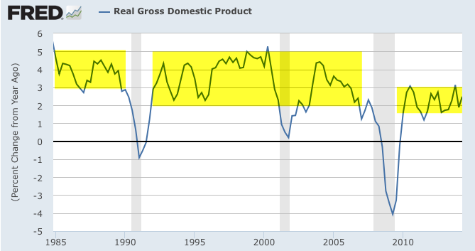
Leading indicators by CB and ECRI typically do a good job of announcing recessions ahead of time (though there have been some false positives and false negatives). However, they are not a good predictor of the stock market, with research showing they are typically coincident with each other.
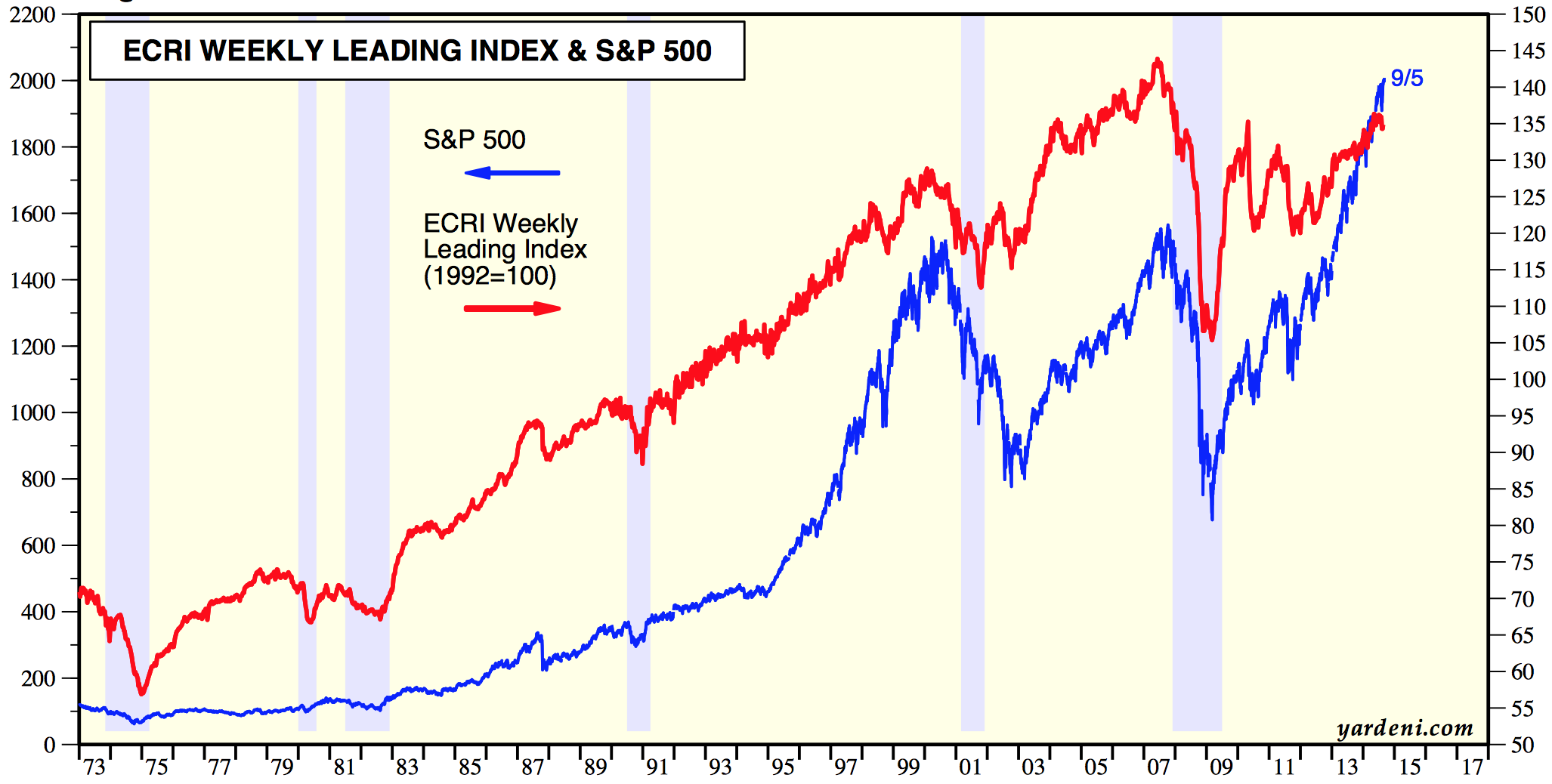
Source: Yardeni
The stock market is a leading indicator of recessions itself, and in fact an agent, due to the wealth effect. Both ECRI and CB accordingly include the stock market performance in their leading indicator calculations.
ECRI WLI growth turned negative in 2000 and 2007 after the SP500 had suffered initial falls of around 15% in both cases (from March 2000 and from June 2007). In 2014 we have seen no such damaging break yet, but with ECRI WLI down to 1.8, a true technical break in stocks would likely pull it below.
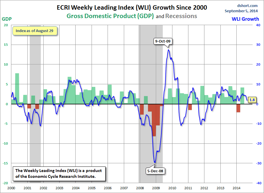
Source: DShort
CB LEI topped out with the market in March 2000, and whilst it topped in early 2006 ahead of the 2007 market peak, it didn’t fall until stocks fell in 2007.
Turning to corporate profits, they also typically turndown as a leading indicator of a recession, but there are different ways of calculating this indicator.
The first method below shows profits peaked ahead of the stock market peak six times, coincident twice and after once. By this measure corporate profits peaked at the end of 2013, and are diverging in line with the majority of historic cases.
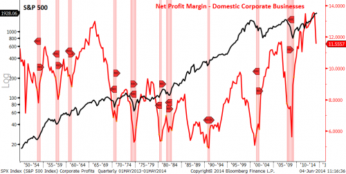
Source: PFS Group
A second method shows that corporate profits peaked out coincidentally with the stock market the last two times (or along with the initial falls of ~15%), and accordingly this measure is still levitating with stocks in 2014.
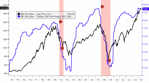
Source: PFS Group
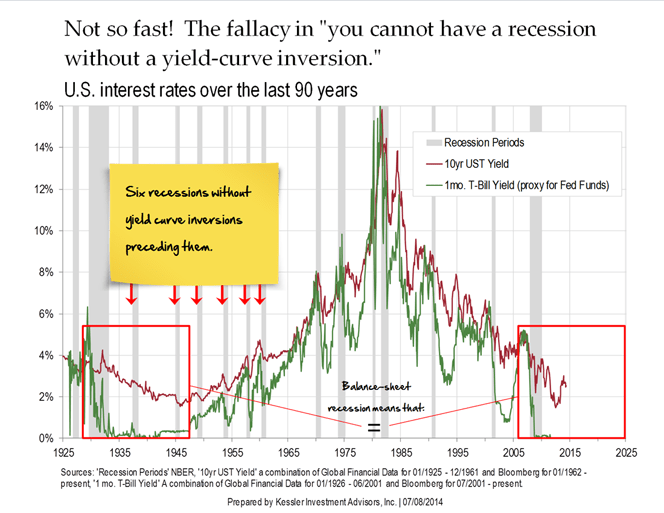
The yield curve as a recession predictor does not work under ZIRP. Japan three times entered recession without yield curve inversion under ZIRP, and the US did likewise in the 1930s-40s.
Source: ZeroHedge
PFS’s recession model is proprietary but note how it only took off once stocks fell hard in the last two peaks:
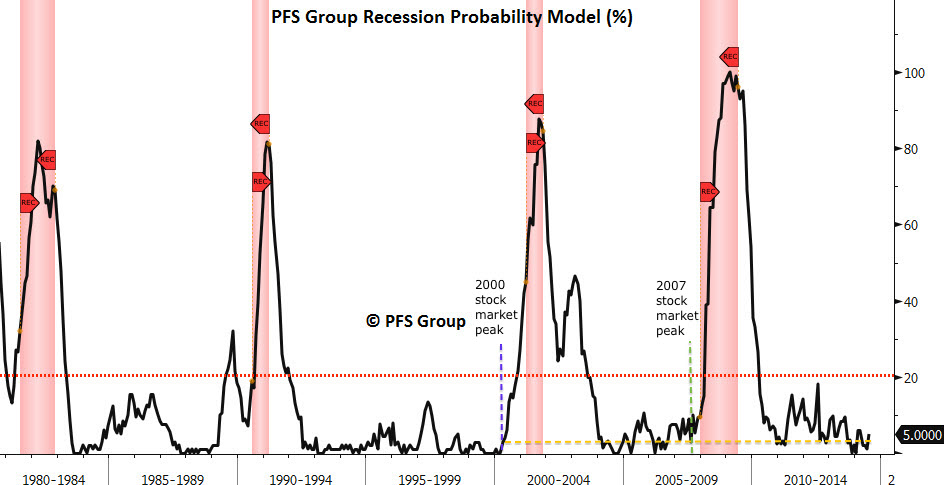
Source: PFS Group
Like ECRI and CB leading indicators, it is coincident with the stock market.
Similarly, financial conditions also did not fall until the stock market peaked in June 2007, May 2010 and July 2011.
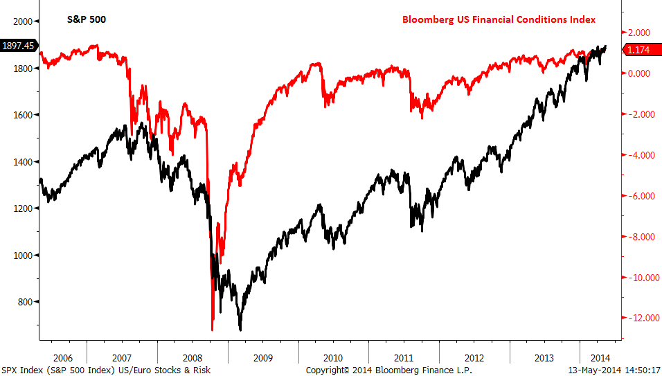
Source: Financial Sense
In short, leading indicators, financial conditions and valid recession models are benign whilst the stock market continues to levitate. Once it falls, they will begin to flag, as the wealth effect rapidly declines. The yield curve model is invalid and corporate profits are either coincident or warning with negative divergence, depending on the method. So, none of these indicators are bullish support for the stock market.
US QE is being wound down and will end in October. The stats show that 80% of QE money is parked as excess reserves at the Fed paying a meagre return to the banks. This is because they can’t lend it out: the demand simply isn’t there under demographics. The money multiplier and money velocity are both still in decline. So, 80% of QE money is impotent for now, but this is a threat for the future once demographics improve and demand comes back. The other 20% of QE money is difficult to track, but under conditions of ZIRP we can assume some has entered the stock market searching for yield and return. Ultimately though, QE does not create economic growth: it is just corruption of the money mechanism. Therefore, price rather than the earnings has risen significantly in stock market, making for valuations on a level with previous major peaks. Zero interest rates encourage money to search for yield but also can only tweak demand, not revolutionise it. Also, a large swathe of retirees have less income under ZIRP which acts as a drag in the economy.
The reality is that the US economy is overall chugging along at a lower rate than in the past when demographics (and debt levels) were more favourable. As in the 1930s US and 2000s Japan, QE and ZIRP can only have limited effect whilst demographics dictate.
Source: Fat-Pitch
Demographics are both deflationary and recessionary. Therefore, we have seen overall low inflation recently and the Fed does not have the luxury of rate rises. The point about both inflation and rate rises is that they choke the economy in rising input prices and tightening. Yet demand is too weak to stoke inflation and the economy too weak for rate rises. The tightening is coming from QE wind-down, but as noted the overall effects of QE are less than touted. I would argue that a sharp fall in equity prices is all that is missing from tipping the economy over, and that we again have to look to 2000s Japan and 1930s US as the most relevant analogs here.
We could argue that falling commodity prices lower input costs and are a driver for the economy and that falling yields are effective as easing. However, if we are in the last gasps of a stock market top then both treasuries and commodities are acting as per a deflationary recession.
The ECB cut rates and launched a form of QE last week. Does that offset the Fed winding down? Analysis of the ECB package shows it to be more window-dressing than content. The Eurozone economy is 3.5 times the size of Japan yet its package amounts to just one tenth the size of what Japan is doing, whilst the rate cuts were largely symbolic. Despite Japan’s aggression, the effects have been disappointing, which brings us back to the point about what QE actually does: it does not drive economic growth, and therefore, the new ECB actions are unlikely to make a significant difference.
Leading indicators predicted a mid-year upturn in US economic growth and this has occurred. Accordingly, economic surprises have leapt into the positive. However, leading indicators predict a peak in growth around now, which should set the scene for disappointment in data in Q4. As this coincides with the termination of QE, maybe this combination will unsettle the ‘Fed policy trumps all’ crowd perception.
In summary, the evidence suggests policies of ZIRP and QE are limited in their potency. They may both play a role in current higher stock market valuations, but the disconnect between prices and earnings/growth is bearish, as it was in 1937. The weak economy under demographic trends is unable to support inflation and rate rises, and I believe is at the mercy of the stock market. Namely, if the stock market falls, the economy will tip over. If it doesn’t it will continue to chug along.
So what is the trigger for the stock market? History shows that major peaks typically occurred without a major trigger, and then sharp falls occurred once there was a suitable technical break. So what factors bring about the topping out?
The evidence suggests one is saturation or buyer exhaustion. We have very recently seen sentiment, allocations and leverage all back to extremes of extremes. I therefore believe we are running out of fuel to go higher: everyone bullish, no-one left to buy, credit facilities stretched.
A second one is natural force timing, and the biggest factor in 2014, I believe, is the solar maximum. Most models point to a smoothed solar max being behind us, around March. Most market peaks, and growthflation peaks, occurred very close to the smoothed solar max, so we should be able to cross reference this.
As things stand, margin debt peaked Feb, the Russell 2K and social media peaked Feb/Mar and biotech is making a double peak now with Feb/Mar. Also, commodities and inflation peaked around April time, and we have seen various indices and risk measures peak out between December and August, either side of this kind of epicentre. So it looks promising.
However, as noted, SIDC are still running a model with an end of year smoothed solar max, and Mark’s theory is that weaker cycles such as this won’t see speculation peak until later in the maximum, not until 2015. Playing into these possibilities we see biotech, junk bonds, the Dow, and (likely) margin debt challenging their highs and attempting breakout. We can also monitor sunspots in real time to see if likely to exceed Feb.
So, I believe we have a useful combined measure there: if JNK, INDU, IBB, leverage and sunspots all break upwards and out to new highs then peak speculation is delayed, and we might then also look to the Sornette bubble end flag to rally again to a higher intensity. However, cross-referencing further, with sentiment and allocations last week back to record extremes, I see a breakout will be very hard to achieve here. Plus, the mature divergences in the market suggest this should be the last gasps of the topping process, not earlier in the process, and we are in the relevant time of the year for the falls to occur. I therefore continue to believe that the most likely scenario is that this rally since August 8th is the terminal rally, shown arching over on the 4-hourly SP500 below, and that JNK, INDU and IBB will all double top out.
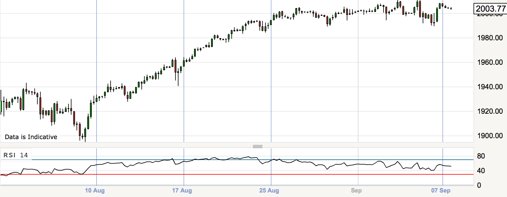
SP500 4-hourly
Summary
40 indicators in 8 angles argue for a stock market peak. The only question is the timing, and that is the difficult calculation. The best-fit remains an epicentre of March 2014, placing us now in last gasps. Breakouts from here in several speculation measures would negate that and postpone the top. When the stock market falls it should trigger the ‘missing’ alerts in recession models, financial conditions and leading indicators. The effects of QE are overstated, whilst ZIRP and disinflation reflect the overarching weakness in demographics. Whilst the stock market levitates, the economy should continue to chug along, but if the market falls meaningfully then the economy should tip over into deflation and recession. I believe the two key and associated drivers of the peak are buyer exhaustion and the solar-speculation-maximum, and it appears they came together to peak levels between January and now, making a topping process. Helping tip the perception should be the inverted geomagnetic seasonal lows of Sept-Nov, the predicted disappointing economic data ahead, and the termination of QE support. For this not to materialise, sentiment, allocations and leverage will all have to stretch to new levels of excess to enable a higher stock market. Whilst not impossible, it is not probable.

Brilliant analysis John. Thanks.
Appreciated, Andre
Most hated bull market in history?……….ya gotta laugh. How many times did we hear that in previous bull markets?
I have no doubt whatsoever that this is the most over-leveraged market in history brought about by QE and ZIRP.
Corporate debt has lead to the biggest corporate buy backs in history, the highest corporate debt to cash ratios in history, which has maked the underlying decay in real economic expansion.
If you need evidence that this economy has not transitioned to recovery look no further than wages growth. The worst ever in post revovery bar none.
Productivity increases are a myth, jobs growth is a myth and corporations continue to spend less on future developmentnand more issuing junk and buy backs.
$1 T issued to date in 2014 I believe.
Good on ya Fed heads. You have achieved 3 bubbles in 14 years and now the greatest bubble in history and convinced more people than ever before that stocks are going to da moon and the only place to be.
Unbelievable!
Oh and just to add. There is no comparing now to 2000. This is far far worse.
2000 was limited to the dot.com bubble. This time around there are bubbles in all but one sector of the economy. Stocks, real estate, bonds, antiquities, art you name it.
It is gob smacking to me that they and most others are not so alarmed at what the consequences of this will be because to be perfectly honest I am S#*T scared!
The DeMark perspective from tradetrekker.com:
…the sights for the S&P 500 (SPX) are at the 2027.81 TD Trend Factor level. It is considered an important level, and it especially powerful if combined with TD Sequential. [We will likely print a 13 exhaustion on the monthly TD Sequential in September.]
DeMark had experimented with Fibonacci ratios and came up with these TD Trend Factor levels he often cites in the media as major reversal points. Just as occurred with the previous 1979.49 TD Trend Factor on the SPX, recorded back in July 3, 2014, these levels often provide equities angst. But they should always be paired with TD Sequential to strengthen the price exhaustion signal.
[Lastly, a price “flip”, in this instance down, is required to confirm the top.]
Great I am studying Demark’ now, glad to see people who like minded
what does it take to get “a price flip”?
Ask the right question get told no lies.
Another hypcritical article from Mr Armstrong:
http://armstrongeconomics.com/2014/09/05/are-markets-manipulated-all-the-time/
Reblogged this on thedarklordblog and commented:
Brilliant analysis IMVHO.
Thanks TDL
Need to factor in lack of El Nino and Drought. Still reviewing but I do see you made a point to address my thought I raised so thumbs up to sharing perspective and research from that.
Am still tracking global weather but so far it hasn’t made a hit on agri supply/demand
Excellent John! My previous posts suggested that the size of the solar maximum is not related to the timing or size of the bubble, from studies from 1800 to present.
Thanks John
I am in Cape Cod right now. I notice a lot of low end vacation homes on sale while the high end is doing well. Rich get richer is the type of bubble we have — not 1929 where everyone gets rich.
There is a NOAA research center here, but they don’t seem particularly excited compared to us.
I like your comment that crashes happen without major incident. That is what I am looking for right now, rather than a crash on war or other news which is immediately retraced.
America’s wealth gap ‘unsustainable,’ may worsen: Harvard study
https://news.yahoo.com/americas-wealth-gap-unsustainable-may-worsen-harvard-study-110255435–business.html
Truly exceptional article John. Probably the best and most comprehensive one I have read in the short time I have been keeping up with your site.
Appreciated Duncan
Tour de force, John.
Thank you Kent
thank you John for the very good short case write up!
Status of the all important carry trade or USD/Yen is a 2nd touch of the 61.8% Fibonacci from the 2007-2012 move this morning around 105.5 which could be important if it holds.
Thanks Pegasus
Another master piece of analysis John. Much appreciated your insights.
I assume you are still 100% short? No plans to sit on cash if the markets keep chugging up this week or until the FOMC meeting on 09/17?
Thanks Erick. Yes 100% short. I’m reluctant to get out believing this to be last gasps. But taking it day by day.
John this is BRILLIANT. Please can you send a ‘subscription’ invitation to Janet Yellen and her ‘crowd’. Ta. 🙂
Thanks Purvez
Again awesome set of evidence from John. And still decent opportunity to get short at S&P 2K+. Much more interesting though is current juncture in Gold and USD. I still do not fully buy USDJPY breakout higher and Gold being in slow motion crash. This still might be a bear trap. But on the other hand I do not see anything positive for gold to go higher now. Therefore I stay neutral. Only if it regains 1280 I will go long.
Thanks Bunell
KISS –
pretty much toast across all time frames and risk measures
http://stockcharts.com/h-sc/ui?s=JNK&p=D&yr=0&mn=6&dy=16&id=p73886382909&a=357560080&r=1410191242321&cmd=print
XRT below 88 will get this rolling down hill quick
yup – the spirit has left the building! roflmao
Thanks for the excellent post, John.
Why not one more valuation indicator: Market Cap to GDP (The Buffett Valuation Indicator)?
“In a CNBC interview earlier this spring CNBC interview (April 23rd), Warren Buffett expressed his view that stocks aren’t “too frothy”. However, both the “Buffett Index” and the Wilshire 5000 variant suggest that today’s market is indeed at lofty valuations, now above the housing-bubble peak in 2007.”
http://www.advisorperspectives.com/dshort/updates/Market-Cap-to-GDP.php
Thanks Jazzman
I especially valued your dismantling of the supposed “leading indicators”–I’ve never seen such a comprehensive take-down of the received wisdom that leading indicators must roll over prior to a decline in equities.
It surprised me
Not many bears excited about the sell off so far today. Something tells me that we will get a lot of bears jumping in soon, and so we can sell off to the 50SMA as momentum builds.
Is my Squak box broken? How come no one is explaining this drop to me? As I said, John, I like the idea of a drop without an event.
Guess you didn’t read my post yesterday. 😉
I expect an finnish above SPX2005
John Li, I’m feeling a bit lost here on your comments. Are you expecting a drop or a ramp, please? Ta.
I think the market will have a bigger drop in the second half of September. Until then it will hopefully just move up and down over a 100 point range as it has done so in the last few days.
I have been expecting a drop. I have lost a lot shorting — no making any excuses. I have not gone long and will not go long. But unlike John, I have stopped out of my positions and have tried entering them again every time the market dips. My fear is that we will go parabolic up and I can’t take that risk any longer.
I thought today’s drop can be sustained but apparently I am wrong again.
@John Li. Thanks for your answer below to my question (also below). Unfortunately I can’t reply directly to your answer as there isn’t a ‘Reply’ link there.
@John Hampson, would you know why there is no ‘Reply’ link further down?
Ohhh Kayyy!! This is weird. The reply link just underneath the ‘Squak Box’ comment puts the reply at the bottom. This is first time I’ve seen this behaviouir.
The site allows 3 levels of replies in the comments. After that you just use the reply button further up.
I got a hunk a hunk a burnin’ stock wooow!
http://stockcharts.com/h-sc/ui?s=$NAAD&p=D&yr=0&mn=6&dy=0&id=p67310719968&a=313444570&r=1410198628467&cmd=print
thanks for the great analysis John. For those interested in space weather, the 27 day outlook is predicting a massive planetary A event on 9/25 (18) and going at above normal readings to 9/30. Current reading is 10 with 9/10-11 at 8 before it settles down to the usual 5. 18 is very high and very unusual.
Thanks Peggy
http://stockcharts.com/h-sc/ui?s=$SPX&p=D&yr=0&mn=11&dy=0&id=p63230921744&a=362736286&r=1410207901435&cmd=print
the dotted fractal continues to be active as resistance
likely breakdown after an morning ramp…
everything impacted by US Fed QE has peaked now: the carry trade (usd/yen), indices, house prices, treasury bond yields. Plus we are in the zone of previous bubble pricking starts (early september 2000 and 2011). Key reversal moment and key time to be holding short via various means so as to accommodate price swings.
yen/usd long positions by commercials (http://finviz.com/futures_charts.ashx?t=6J&p=w1) back to 5 year highs or as they were back in December 2013 just before the nice January action. Ready to rumble.
My indicators show SPX has to get to 2,045 – 2,063 before any significant drop !
If 2,063 holds then we are going parabolic towards 2,200 !!
I’ve been lurking for many months and I finally thought I should join the conversation. Really appreciate all your hard work, John!
I am invested in an equity market neutral (EMN) strategy (approx 60 ASX shares long, 60 ASX shares short, same $ amount invested long and short) that typically does well in good times and really well in bad times.
What is very interesting is that this strategy (and every EMN fund I follow) have been doing poorly since the start of 2014, which John identified as the turning point. Two factors we can identify are the level of M&A activity (which hurts the short positions) and “Dumb Money” buying, both of which tend to ignore the fundamentals of the companies involved.
However, I also suspect that the manipulation of the markets generally may have something to do with it.
Hopefully the major correction that John is predicting here will finally bring fundamentals back into play and the EMN strategy I use will kick-ass again like it usually does.
Finally, another market correction indicator that you could add to the 40 you already have, John, is Mark Cook’s Cook Cumulative Tick which showed an extreme divergence like 2000 and 2007 in April 2014: see http://www.marketwatch.com/story/this-top-trader-sees-3-clear-dangers-for-stocks-2014-08-18?dist=beforebell
It was also Cook who said recently: “It’s like being in the Twilight Zone. Imagine going outside when it’s raining and getting sunburned. That’s the environment we’re in right now.”
I couldn’t agree more!
Thanks Alfred
Excellent article as always john. So thorough!
I simply can’t argue with the information you present. It’s incredibly compelling. But at the same time, I simply cannot ignore what I’m seeing with my own eyes and hearing from those around me regarding tax grabs and capital fleeing countries and general parts of the world.
We have a sovereign debt crisis inching closer and closer in Europe and the UK is on the brink of some sort of possible disaster next week if the Scots decide to go it alone. The UKs’ debts are historically high and it’s questionable whether they can ever be paid off. Realistically, never. If Scotland goes, the costs of borrowing will escalate over night and sterling will implode. Waterfall declines will commence. Of that I’m sure.
The fact is though that central banks are now buying into the private sector – the stock markets above everything else, and property assets too. There is plenty of evidence on the internet but sovereign wealth funds are taking larger and larger stakes in companies around the world. Why are they doing this? To maintain pension funds primarily and to keep them growing. Also to offset the interest payable on national debts and to claw some of those deficits back over the longer term. There is also a drive to diversify assets generally. This is the paradigm shift I referred to a couple of days ago when I posted. Central banks are new long term buyers in the stock market and I am positive this is leading to the inverse activity we are now witnessing in stock markets. The dollar is rising rapidly and I expect US stock markets to break out later this month.
This is a major trend that simply cannot be ignored. The shift of central banks buying into stock markets has been occurring for several years now but the momentum is now is now really starting to kick in. Two or three per cent falls are bought up rapidly and the markets now have an incredibly strong underpinning.
I admire those of you who are short and I have been for sometime this year too, but I am seeing things differently now. We may still get a correction but I expect the DOW to be north of 20,000 next year. I can’t see anything else but the US Dollar and the US equity markets being the only plays in town. Time will tell I suppose. At the moment, I am long the Dollar, shorting the Euro and Pound. I am biding my time with regards to stocks, but expecting a break out upwards.
Thanks Jonathan
BRICS, especially Russia and China, are trying to dethrone USD as the international reserve currency, note the trend in recent years about trade agreements through local currency swap. It is a matter of time.
The recent strength of USDX is due to the weaknesses of Euro and Yen, but not truly because of the so-called ‘strong’ US recovery, which they want you to believe.
New post out