Dow 1929 vs Nikkei 1989 vs Nasdaq 2000 vs Today

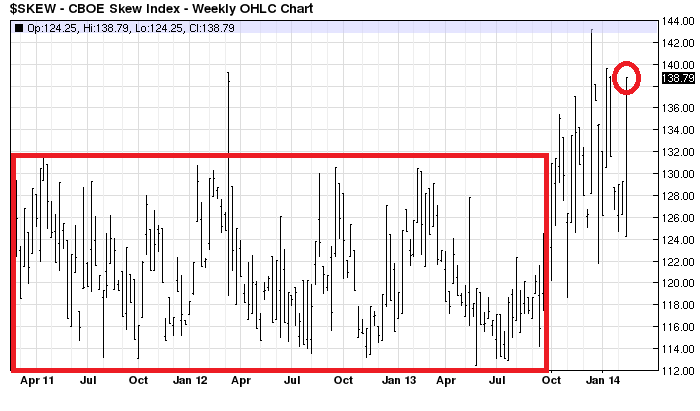
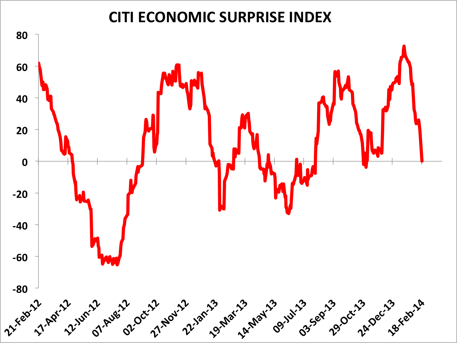
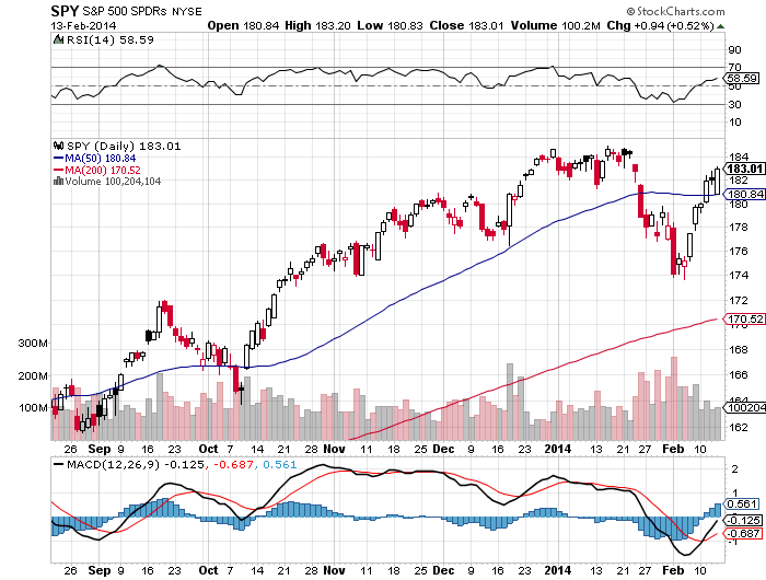
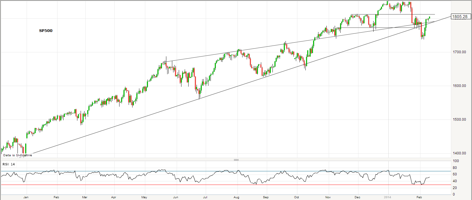
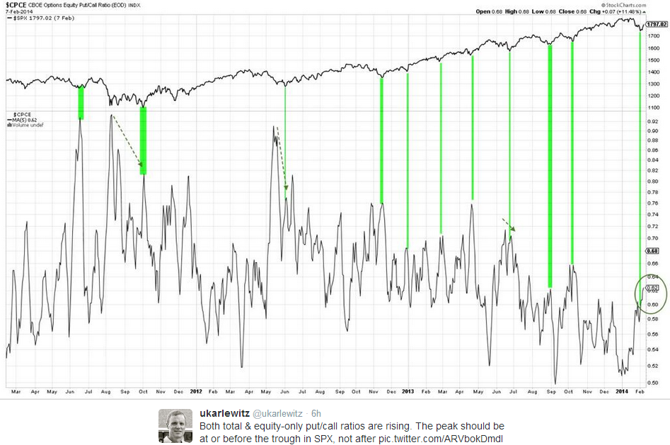
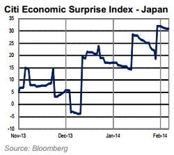
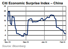
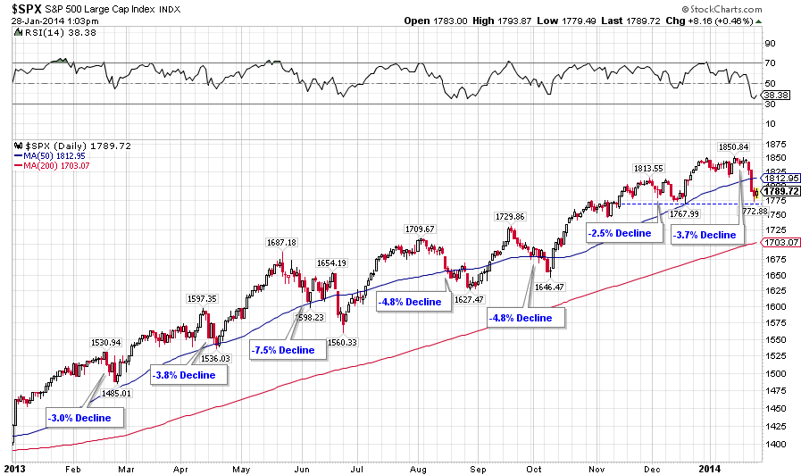
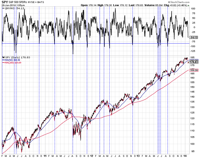
Yesterday saw a failed breakout on the SP500 on high volume which suggests exhaustion. The Skew print came in still historically high and the put/call print historically low again, which continue to signal bullish complacency and high risk of an outsized move to the downside. Economic data disappointed again, and the latest economic surprise readings are below:
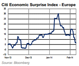
25fe10 25fe11 25fe12

Source: Citi

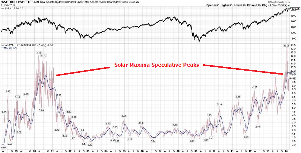
The geomagnetic storms over the last week broke the model’s multi-month uptrend (red line) and along with the NOAA forecast reveal downward pressure this week:

25fe13If you are new to the site my models are updated weekly.

The significant outstanding bubble in the markets remains the Nasdaq Biotech sector, but the unsustainable parabolic is ripe to pop:

25fe14

Source: Yahoo

Less than one third of this sector’s 122 companies earned any money in the last 12 months.

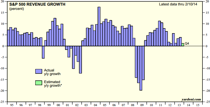
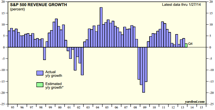
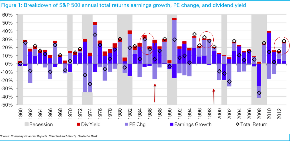
The last 2 years gains in the wider US markets were approximately 80% multiple expansion and 20% earnings growth. The justification for the multiple expansion was (1) ‘Fed policy trumps all’ and (2) stocks frontrunning a ‘normalisation’ in economic growth and earnings. Now: QE is being wound down, Q4 2013 GDP and Q1 2014 GDP estimates are being revised downwards, earnings estimates are being revised downwards and for Q1 2014 82% of companies so far have issued negative earnings guidance. Those justifications have largely evaporated.

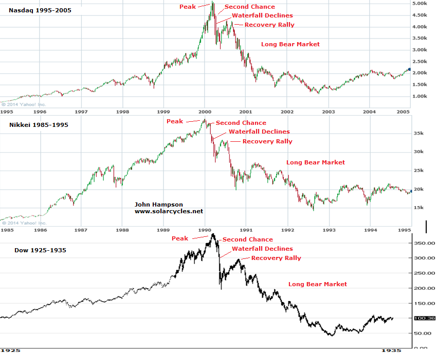
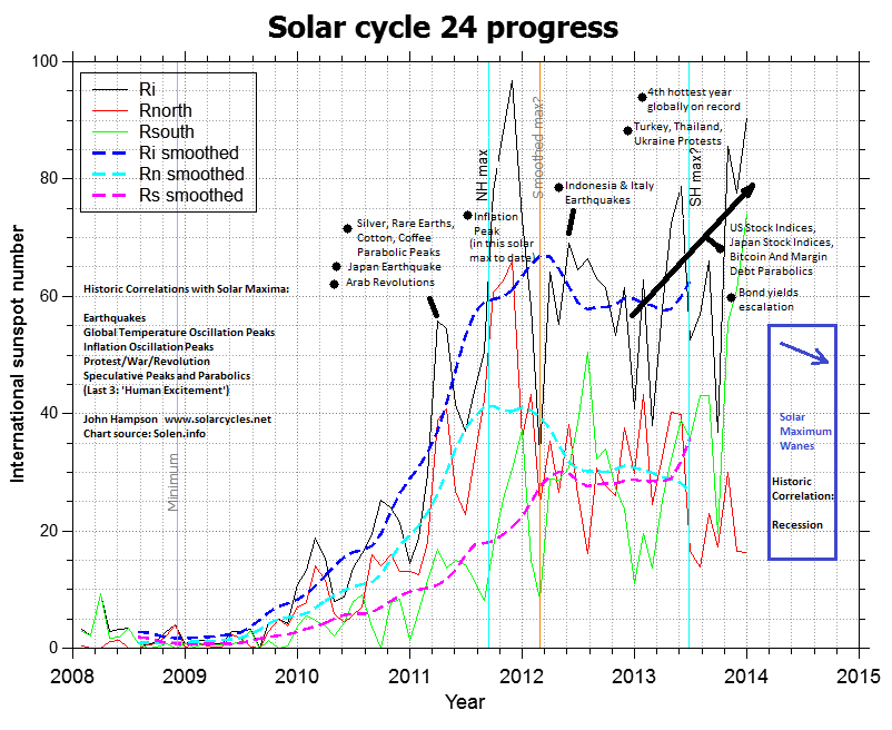
The lesser known reason for the big run up in price into the end of 2013 is the speculation peak driven by the solar maximum, and this was shared in the superpeaks of Dow 1929, Nikkei 1989 and Nasdaq 2000. A reminder that there are 3 ingredients for a superpeak: (1) speculative mania by solar maximum (2) increasing number of buyers through demographic swell and (3) increasing use of leverage amongst buyers. Both (1) and (3) apply to the current US markets but (2) is absent. There is a shrinking rather than swelling demographic pool, and for that reason we do not have a supersized peak. Otherwise, the analogies are very much applicable.

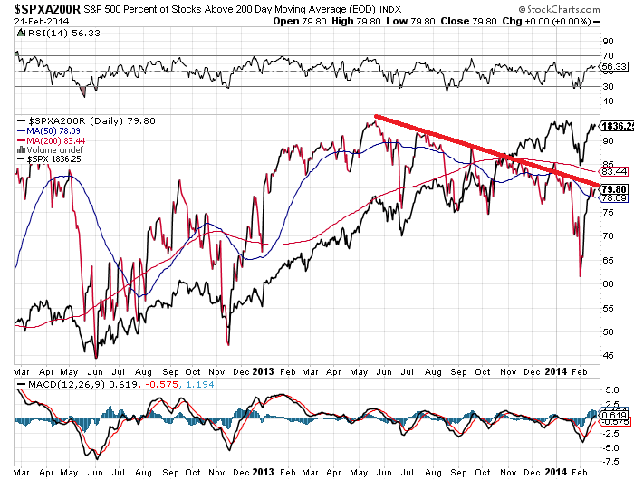
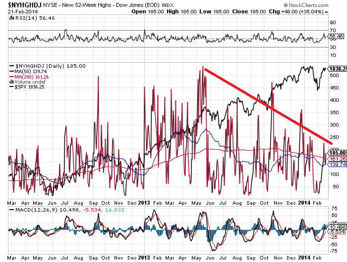
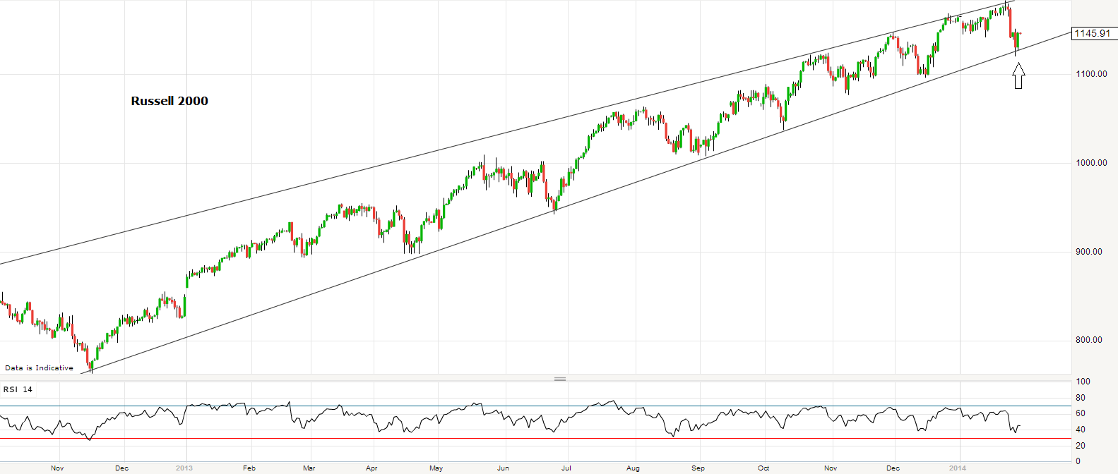
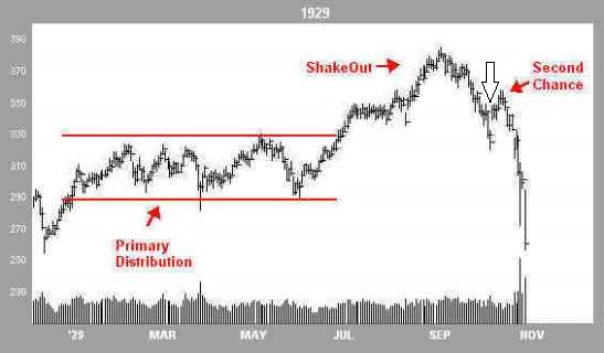
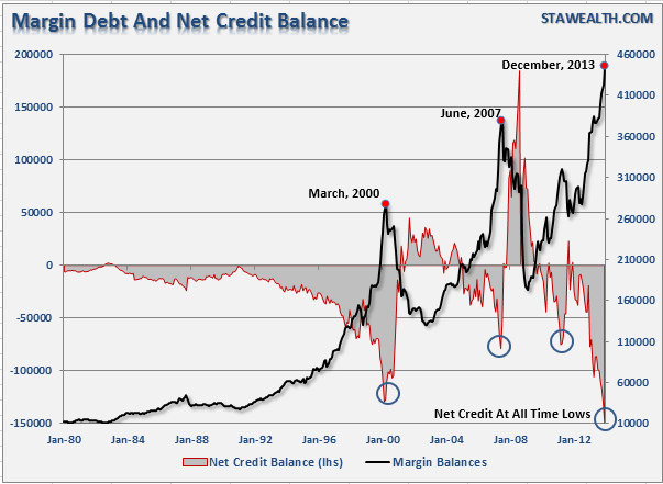
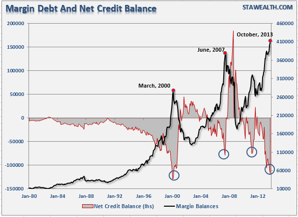
In 2013 US markets ran up in a parabolic shaping, generating historic levitation above moving averages and producing an anomalous lack of a ‘proper’ correction. Sentiment reached levels not seen since previous major peaks, and euphoria only historically exceeded in the dot.com boom. We have reached valuation levels in the Q ratio equivalent to the TOP in 1929 and in stock market capitalisation to GDP equivalent to the TOP in 2000. Leverage levels equal the TOP in 2000 as measured by margin debt to GDP and beat the 2000 top in other measures. The blow-off topping process in the current Dow so far mirrors that shared by the 3 analogs, and the peak-to-date occurred at the solar maximum.

In short, the ‘size’ of the peak in current US markets does not compare to the analogs because of the key demographic difference, but in many other ways these analogs are particularly apt. What comes next in the analogs is waterfall declines, and we have a case for the same in the current US markets due to (1) historic levitation away from moving averages or parabolic rise on long term view (2) historic time since significant correction and historic compound gains and bull duration (3) 80% multiple expansion 3-pronged justification case shattered (4) ‘all-in’ measures of sentiment, leverage and fund flows ripe for unwinding. We are likely through the solar maximum peak and the speculative excess into the peak is now vulnerable to pop.

Here are the analogs on a 10 year view centered around the peak:

25fe7Alongside I’d like to remind you of the relevance of the (inverted) seasonality of geomagnetism for the timing of peaks and falls:

13fe4

Nikkei 1989: Waterfall declines from second chance lasted about 6 weeks, centered on March (geomagnetism (inverted) seasonal low), and took off 27% from peak; Recovery rally then lasted 3.5 months from April to July, back up 20% (through seasonal high); Then 2.5 months more waterfall declines, mid July to beginning of October down 40% (through seasonal low).

Dow 1929: Waterfall declines from second chance lasted 1 month, centered on October (seasonal low), and took 48% off from peak; Recovery rally then added back on 50%, lasted 5 months from November to april (through seasonal high); Then long period of declines lasting a couple of years.

Nasdaq 2000: Waterfall declines from second chance lasted about 6 weeks, March-April, and took 36% off (seasonal low); Recovery rally lasted about 3.5 months from May through to beginning of Sept, adding back on 34% (through seasonal high); Then long period of declines lasting a couple of years.

So, averaging them out and applying to the current US markets, we could expect waterfall declines of around 35% lasting around 5 weeks, and this should occur in the seasonal low of March-April. That would then be the time to take off short positions for a recovery rally of around 35% lasting around 4 months from April to August or so, through the seasonal high. A second set of steep declines should then unfold through the seasonal low of September-October.

25fe8By that model the initial waterfall declines should wipe out all of 2013’s gains in the space of a month. I refer you to the case for waterfall declines further up the page as to why this is reasonable, and I suggest the consensus view once this occurs will belatedly point to similar factors. However, once the recovery rally then erupts, as can be seen from the 3 analogs on the 10 year view, it will keep the ongoing bull market option in play. I suggest 1987 will likely be quoted as benchmark: a harsh correction that was a golden buying opportunity. But, once the recovery rally tops out short and rolls over into more steep declines, there will be broad acceptance of the new bear.

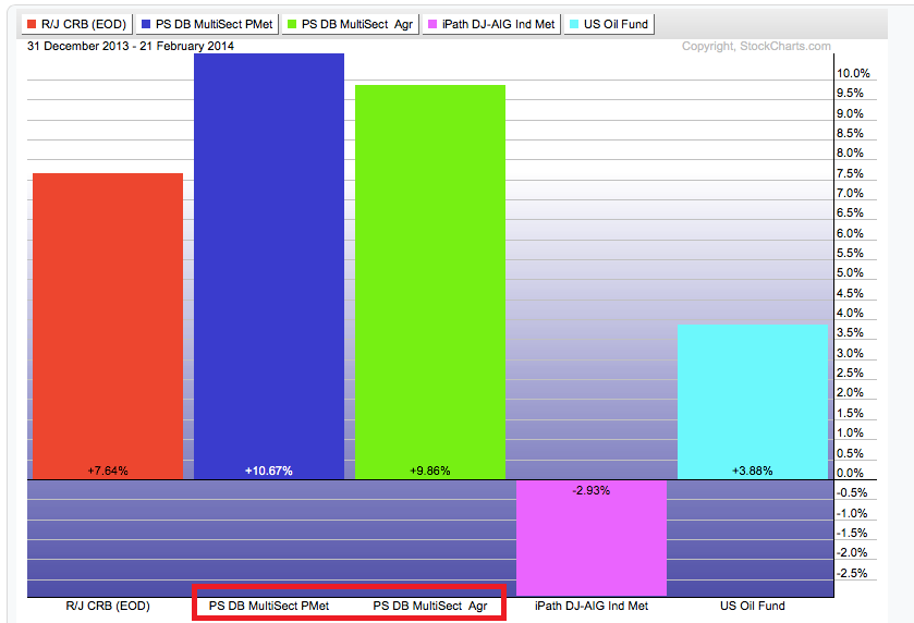
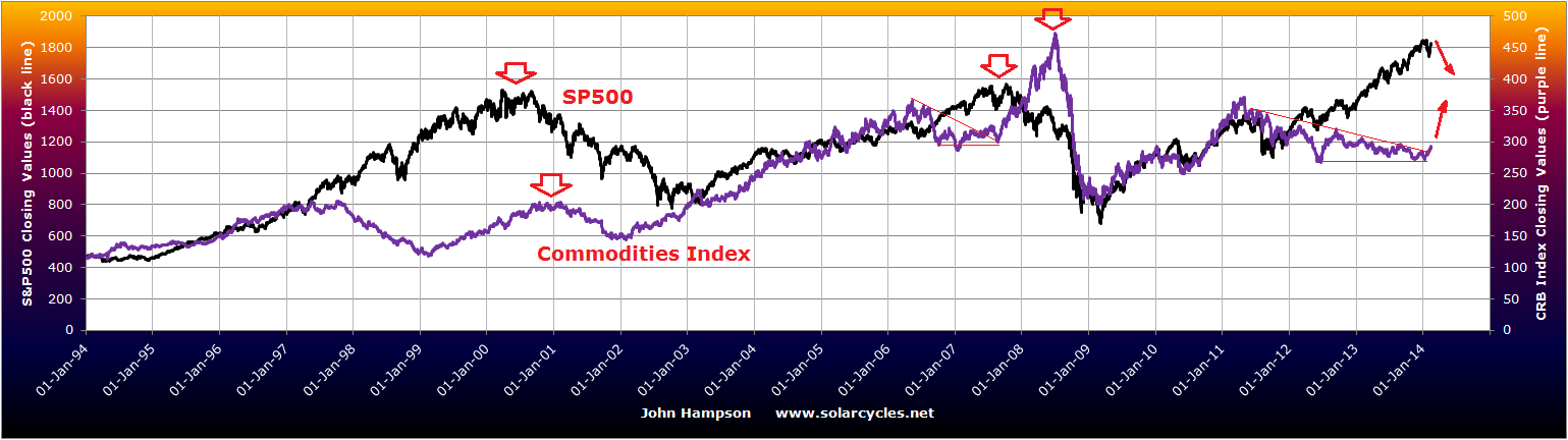
What will happen to commodities under waterfall declines? Understand that such unforgiving drops will bring about forced liquidations as leverage is unwound so there will be some blanket selling. In all 3 analog waterfall decline periods, commodities (including precious metals) fell too, whilst the US dollar largely rallied. The same occurred in October 2008’s sharp falls. That suggests it may be prudent to pull back on or even exit commodities long positions once we get a whiff of steep declines erupting.

Previous major commodities peaks have been speculative to a large degree, but also typically founded on a fundamental supply/demand case. For energy and industrial metals the latter is currently weak, and we see oil and copper in long term ranges rather than in major breakouts. Various soft commodities have enjoyed steep moves up as shorts have scrambled to cover, but whether there can be an enduring supporting story this year remains to be seen. I am skeptical as to whether commodities as a class can make a major rally to beyond 2011’s CCI peak this year, anticipating they may sell off under the waterfall declines and perhaps struggle for a case under deflationary recession fears. However, maybe they can outperform during the ‘recovery rally’ over mid-year and particularly if the US dollar is less seen as a safe haven this time, so I remain open to the possibility that maybe they can beat 2011’s peak, but currently see this as less likely. The case for previous metals differs from other commodities, and as I have outlined before I see gold’s 2011-2013 bear as a pause in a longer term secular bull market likely to terminate at the next solar maximum. My tactics will be to reduce all commodities long positions bar precious metals once it looks likely that equities are on the cusp of waterfalling, anticipating some blanket selling across all assets in that period, and then review again as we approach the end of that event.

Looking back to the Great Depression, banking panics began in 1930 and swapping dollars for gold in 1931. In other words, it took time for things to unfold, and I would expect similar this time around. Whilst I cannot be sure, I do not expect a sudden chain of bankruptcies under the first waterfall declines, but for the real ‘trouble’ to unfold gradually and likely after the recovery rally peaks out. First things first then: I expect a major short equities opportunity to unfold swiftly from here through March and into mid-April, and am positioned for that. I will be looking to exit all equities shorts as I try to time the end of that event.

Sunday Charts

1. Bearish candles on US stock indices on Friday with volume continuing to be greater on down days versus up days:

23fe4

Source: Stockcharts

2. Put/call ratio finished at extreme low again, which is more consistent with peaks rather than breakouts:

23fe2Source: Stockcharts

3. Trend exhaustion indicator also suggests breakout now unlikely:

23fe7

Source: Rory Handyside

4. Skew finished at extreme high again, which signals amplified risk of an outsized move ahead:

23fe1Source: Barcharts

5. Two breadth measures remain in six month divergences:

23fe3Source: Stockcharts

23fe6Source: Stockcharts

6. Economic growth is also divergent, and this is reflected in the advance in commodities being weighted to precious metals and agriculture rather than industrial metals and energy:

23fe5Source: Citi

23fe11Source: U Karlewitz

7. Long term view of Rydex bull/bear ratio points to a market top, specifically a solar-maximum speculative-excess market top:

23fe10Source: U Karlewitz

Friday Morning Update

Yesterday was an up day for bonds, commodities, gold/miners, and equities, i.e. both pro-risk and anti-risk. Confused?

Retail sales came in weak, not just for last month, but for the revised previous month too. The string of poor economic data, in line with leading indicator forecasts of growth having peaked out, has resulted in progressive revisions to Q4 2013 GDP estimates – here is Barclays:

14fe7

Source: Business Insider

Q1 2014 GDP estimates have also been cut, with Credit Suisse reducing from 2.6% to 1.6%.

The latest picture for the Q4 earnings season shows blended revenue growth at just 0.8%, and of those companies who have given forward guidance for Q1 2014, 80% have given negative rather than positive guidance.

14fe3

Source: Ed Yardeni

Last year’s multiple-expansion rally in equities was justified on the stock market front-running a return to ‘normal’ economic growth and earnings growth, as well as the underpinning of ‘Fed policy trumps all’. With QE now being wound down, economic data worsening rather than improving, and earnings still disappointing both in terms of revenues and forward guidance, the case for anti-risk is strengthening, and the rally in stocks suspect.

Yesterday ahead of US stock market open, futures were down and equities around the world were struggling to attract buyers, then the retail sales data hit and the scene was set for a bearish US session. But the opposite occurred: a ‘stick save’ as short stops were run and bulls delivered a trend day up. We saw this occurring in January:

14fe8Eventually this gave way to the high volume decline days.

Yesterday’s volume was again weak, relative to the declines leading into the 6 day rally:

14fe6

Source: Stockcharts

Complacent put/call went lower, Skew remains elevated, and defensive rather than cyclical sectors continue to lead in 2014:

14fe1

Source: Charlie Bilello

From a bullish perspective, small caps outperformed yesterday and advance-declines continue to be strong:

14fe2

Source: Charlie Bilello

Today is the full moon, which could spell an inversion in equities. The Nasdaq 100 joined the Nasdaq Composite yesterday in making marginal new highs, but it did so on a divergence in breadth (as measured by % above 200MA). So I now watch to see whether the other US indices follow suit or all roll over from here. If the latter, then it could turn out to be the sweet spot of the top of the ‘second chance’, namely the optimal time to short, but if the former, it would open up the prospect of a longer topping process in equities. That makes it a fairly delicate position. If you have been reading my recent posts, then I have a multi-angled case for equities to roll over from here, and the developments behind the price action (volume, defensive asset flows, economic data, etc) have strengthened that case rather than weakening it. So I continue to gradually add shorts into this rally and rebuild towards my intended ‘full’ short position, until the ‘clues’ change.

The case for commodities making a late cyclical charge now looks more compelling, with new broad momentum in the class, and siginificant breakouts. Commodities typically top out after equities and once the economy has begun to weaken, sucking the remaining life out of it. On the chart below we can see the last two such occurrences. In 2007 commodities broke out of their consolidation and into a steep rally as equities topped, and I expect similar developments this time. We have been seeing the US dollar weaken on the down days for equities, which should accelerate commodities as equities fall.

14fe4

Chart Updates

1. SP500 – the rally since Thursday has kept both bull and bear cases open:

11fe112. However, volume has been weak on the rally versus the falls – the reverse of December’s rally from correction:

11fe183. Call/Put versus SP500 – see U Karlewitz comment at bottom of chart:

11fe24. Rydex Bull-Bear versus SP500 – again see U Karlewitz comment at foot:

11fe15. Cyclicals continue to display relative weakness despite the rally:

11fe196. The Nasdaq 100 is the most bullish looking US index, but continues to reveal underlying breadth divergence:

11fe127. The Russell 2000 is currently the weakest index, but still has a long way to fall to mean-revert in valuation:

11fe178. Bull-defining parabolic stock, sector and index charts which have yet to break down (whilst others have):

11fe3 11fe411fe69. Economic Surprise Index latest – a reversal of fortunes in 2014 bar Japan:

11fe7 11fe8 11fe9 11fe1010. Commodities inventories latest – tightening broadly in progress (and echoed in some softs):

11fe13 11fe1411fe16 11fe15

Gold, gold miners and treasury bonds continue to attract money flows despite the stock market rally of the last few days. I have added to my short stock index positions today and will add more if we move higher still. Based on the indicators in my last post and this, I expect the rally to top out imminently and revisit the lows of last week. At that point we can review to see if indicators have washed out more thoroughly. Based on bigger picture indicators I don’t expect the market to recover from there, but first we can judge that nearer term picture for clues. I would stop adding shorts if US indices rallied back up to their highs on good breadth, volume and renewed cyclical strength, with accompanying weakness in gold and treasuries. Yellen speaking today and likely some market reaction to her overall tone.

Where Are We?

So far in 2014, the SP500 has made a correction similar to those of 2013, and a larger correction remains historically overdue:

29ja1Source: Charlie Bilello

Yesterday’s bullish candle also came at a key support level, shown dotted above.

The bull save came at an important point on the Russell 2000 also, at channel support:

29ja2

Both teasingly keep bull and bear cases in tact.

Tomorrow is the new moon and we are still in a seasonal low period for geomagnetism. Barring any adverse reaction to today’s FOMC output or economic/earnings data, the next few days would ordinarily be bullish on that moon/geomagnetism combination, before we roll over on both:

Guide2014

However, the potential for a market crash remains present with the extremes reached in sentiment, leverage, Skew and positioning, echoing May 2010 and 1987.

The Dow looks like this, and I have marked the potential position on the analog, given that we have pulled back to the top of the primary distribution range:

29ja3

29ja4

A little more retracing of the falls over the next few days would fit, creating a head and shoulders pattern and teeing up declines in February.

Why not head to new highs on all indices? Firstly, I had a multi-angled case for a market top 31 December 2013, which is so far being honoured on Dow and Nikkei (and Sp500 double top). Secondly, this is a parabolic top rather than a topping range, and we see typically see similar lower-high second-chance patterns on parabolic bubble charts, as opposed to marginal higher highs on divergences in topping ranges. Thirdly, there is a change in backdrop here in January: economic data has started to disappoint in line with leading indicators having predicted an economic peak between November-February and we have seen money flows into treasuries and defensive sectors away from cyclicals. Fourthly, the correction in equities over the past week has further to go, by multiple indicators.

The put/call ratio still signals complacency:

29ja5Source: Stockcharts

Nymo suggests more downside is required to complete a wash-out:

29ja6Source: Charlie Bilello

Friday was a 90% down major distribution day, and typically from a new high they normally come in clusters of more than one. Yesterday’s volume was unimpressive which also hints at more downside ahead. Skew remains elevated and divergence in breadth has increased. Sentiment measures are still lopsided.

December margin debt data is in, hitting a new record and an even steeper spike:

29ja7

Source: STA Wealth

It has now reached 2.6% of GDP, similar to peaks in 2000 and 2007. With January’s price action in the stock markets, I expect that may turn out to be the peak in leverage. If margin debt, stock indices and the solar maximum peaked out at the end of December it will echo March 2000 where all peaked out together.

It remains too early to judge whether commodities are going to rally as a class as late cyclicals. Precious metals continue to base but are as yet without momentum. I believe that will come once equities more clearly enter a downtrend. Energy has been firmer, in part linked to the US cold spell, but whether oil and gas can rally if stocks more sharply decline remains to be seen. The risk-off days that we have seen have typically been pro-yen and anti-dollar, which could mean we see the support for commodities of a declining US dollar, should those equity declines erupt again. Soft commodities have yet to advance in a meaningful way, but scientists believe El Nino is forming and historically this has been positive for agri prices through the supply effects of increased droughts and floods. El Nino years have produced some of the hottest years on record. Global temperature variation has a correlation with solar cycling once the global warming trend is removed, so the combination of the solar maximum and El Nino would give potential for a new hottest year on record, but we will see how things develop.

China’s repo rate remains elevated heading into their week-long holiday. The markets welcomed Turkey’s large rate hike, but emerging market issues continue to simmer. US earnings reports this season have so far had a similar theme to previous quarters: poor revenues or weak sales guidance, profits through cost cutting, and share buybacks. The blended earnings growth rate for Q4 is 6.4% so far, but the blended revenue growth rate is just 0.7%.

29ja8Source: Yardeni

Barring some stellar revenue reports in the remainder of the earnings season, this is another impediment to further price gains in US equities.

Red Flags Update And More Solar Research

First, the flags:

1. China repo rate has escalated sharply today suggesting another cash crunch may be at hand:

20ja1Source: Chinamoney

2. Insider selling in the US is now historically high, a further sell signal for equities:

20ja2Source: Barrons

3. Comex gold stocks that are eligible for delivery versus open interest has risen to a historic extreme of 112:1. This means that the gold owners will demand higher prices to put their gold up for delivery and is bullish for gold prices.

20ja3Source: Jesse / goldchartsrus

Now to the solar findings.

Below is a chart showing the last 4 solar cycles. In the last 4 decades there have been 3 major real estate peaks in the US and UK: 1979, 1989 and 2006/7. There has been one in Japan: 1991. In the last 4 decades there have been 2 secular peaks in the CCI commodities index: 1980 and 2011 (which exceeded the 2008 high). In the same period we saw one major secular equities peak in Japan in 1989 and two major global equities peaks in 2000 and 2007. All are annotated below.

SCsThe theme of major market peaks falling at solar maxima is again revealed, but two recent anomalies stand out: the equities and real estate peak of 2007 falling at a solar minimum, rather than a solar maximum; and the commodities speculative peak of 2011 falling on the rise towards SC24 maximum.

Tackling the first, that 2007 peak gave way to the 2008 financial crisis, in which we saw crashes in real estate, equities and crude oil prices. This is in keeping with other crashes and crises that have historically occurred around solar minima. 1987’s historic crash in equities took place near a solar minimum. 1994 delivered a treasury bond market crash. 1997 saw the Asian financial crisis and a crash in equities. 2008 the aforementioned multi-asset crashes and financial crisis, and 2010 the flash crash in global stocks. All saw significant price rises into the crashes/crises. Central bank policies of this last decade were particularly friendly to asset bubbles, hence a suitably large boom and bust.

Turning to the second anomaly, one possibility is that commodities have not yet peaked and go on to make a higher high than 2011 in a late and swift cyclical charge as equities top out.

20ja4Source: MCRI

If they have already made their highs, then one explanation for their early peak on the SC24 maximum could be that China’s demographics topped out around 2010, and as the main driver of commodities demand the speculative finale had an earlier bias. China’s demographic trending to peak is perhaps better reflected in the bull market in commodities from 2000 than in their brief stock market mania around 2007.

But there is something else. Solar cycles average 11 years 1 month, but there have been outliers as short as 9 years and as long as almost 14 years. Here are the smoothed solar maxima of the last 100 years:

Aug 1917 (+11y6m after the previous solar maximum)

Apr 1928 (+10y8m)

Apr 1937 (+11y)

May 1947 (+10y1m)

Mar 1958 (+10y8m)

Nov 1968 (+10y8m)

Dec 1979 (+11y1m)

Jul 1989 (+9y7m)

Mar 2000 (+10y9m)

Dec 2013 ? (+13y9m)

Most aren’t far from average cycle lengths, but May 1947 was a year shorter, July 1989 shorter still, and if this smoothed solar maximum turns out to be around December 2013, that will be a much longer one than any of the others. Even if the smoothed maximum turns out to be Feb 2012 (the smoothed max to date) it will still be an outlier on the long side.

If lunar phasing still works despite artificial lighting and is to some degree ‘hard coded’ in human evolution, could sunspot cycles be too? Do we see evidence of human excitement through speculative peaks occurring around 11 years 1 month after the last solar maximum on those occasions where solar maxima occur significantly earlier or later?

The last smoothed solar maximum was March 2000. Add 11 years 1 month and we get April 2011, which is where we saw speculative peaks in silver, cotton, coffee, rare earths and others. However, we also see evidence of a speculative peak occurring now, at the likely smoothed solar maximum, as evidenced in many indicators and measures of equities.

July 1989 was an early outlier. 11 years 1 month from the previous peak would have been January 1991. Close to that, Japanese real estate peaked June 1991 and crude oil peaked in October 1990 in a war-associated major spike. However, we also saw US and UK real estate and Japanese equities peaking close to the actual solar maximum of July 1989.

May 1947 was an early outlier. Had it been a more regular May 1948, then we saw wholesale prices and crude oil peaking out around 1948. Yet commodities such as wheat, corn and oats peaked close to the 1947 actual smoothed maximum.

That may suggest there is some degree of hard coding of rhythm in human excitement, as well as some degree of variance in speculative peaks according to when actual solar maxima fall. However, when we look at the solar cycle progression charts,  we find that the tops of the solar maxima stretched across 1989-1991 and 1947-1948, which suggests there was no anomaly: speculative peaks were in line with actual solar maxima. But this is not really the case for the 2011 speculative peaks which fell on the rise into SC24 maximum. Therefore, we need to wait to see if commodities do make a late charge to a high exceeding 2011, wait to see if the solar maximum is falling and completing now, and also to wait to see if equities top out here and deliver a peak aligned with that potential solar maximum, before we can judge this further.

Solar Maximum Delivers Speculative Parabolics

Historically, solar maxima have correlated with earthquakes and peaks in temperature oscillation. They have also correlated with protest/war/revolution, inflation oscillation peaks and speculative parabolic peaks (often secular bull peaks). With both magnetic poles now having flipped for SC24 maximum, I’ve annotated the following chart from Solen:

6ja1The Japanese and Indonesian earthquakes were both amongst the highest Richter magnitude quakes ever recorded. The Italian earthquake was one of the most devastating ever in property damage.

2013 was the 4th hottest globally on record. Historically we have seen global temperature oscillate into a peak around the solar maximum.

The Arab Spring was a world-transforming series of major protests and revolutions. The Turkey, Thailand and Ukraine protests were amongst the largest ever in terms of participants.

We saw a series of commodity price parabolics peaking out towards the early part of the maximum, and we currently see a series of stock index parabolics (plus margin debt parabolic), which, with history as our guide, should peak out as the solar maximum starts to wane this year. However, we don’t know at what point that waning begins. By NOAA and NASA predictions it should be now, but by SIDC’s foreast it could be as of mid-2014. With 225 sunspots currently, it still appears to be in an uptrend:

A2Either way, the annotated top chart is unlikely complete. We could yet see further earthquakes, or greater temperature extremes in 2014, or more geo-political unrest, or more speculative mania. But without any more such developments, solar cycle 24 has re-affirmed those correlations.

Historically, the solar max then gives way to economic recession. Global recessions (if based on where real global GDP has been less than 3%) occurred in 2001-2 (SC23 max 2000), 1990-3 (SC22 max 1989) and 1980-3 (SC21 max 1979). Several factors may contribute to why this is. Geomagnetism, which is negative for sentiment, peaks after the solar max. Inflation, yields, rates and speculation all typically peak into the solar max, which collectively can tip an economy into recession. The chart below shows those correlations.

10may20131This time, we have not seen any interest rate rises, but we have seen a rate of change in bond yields in the last couple of years which is comparable to that marking previous tops. Inflation peaked out early in the SC24 max and is currently depressed, in keeping with collective demographic trends (money velocity has also diverged in line with demographics). There remains the possibility that commodities make a late-cyclicals charge and deliver a temporary inflation shock, but I’m not so sure.

Prior to all my demographics research earlier this year, I expected commodities to be the speculative target of this solar maximum, and to make their secular peak here, with gold the leading asset. However, by demographics gold has some years further to run, and is more likely to make its secular peak at the next solar maximum, or even beyond.

DemographicsDowGoldRatioGlobalGDP

That commodities have made secular peaks each 3rd solar maximum to date appears a pattern, but I believe is instead is demographic, but this will only be validated in the months and years ahead.

Let me explain. Japan enjoyed a long secular bull market from the late 1940s to the late 1980s, as shown in the first chart below, through 4 solar cycles. The second chart shows that this was because of a long demographic golden period, where productive-aged population ballooned, old-aged dependents stayed low, and child dependents were in decline.

26dece126dece2

The Nikkei peaked in 1989, in a parabolic, along with solar cycle 22. So it peaked at a solar maximum, but it took 4 solar cycles to exhaust the demographics.

The US demographic boom of 1980-2000 ran through 2 solar cycles. Stocks peaked in 2000, in a parabolic, at the same time as solar cycle 23.

The negative demographic period of the 1970s was a trend lasting just one solar cycle, and gold and commodities peaked out, in a parabolic, along with solar cycle peak 21.

In short, there is a history of demographics dictating secular market trends (so using secular market duration ‘averages’ is misleading), and of secular bulls peaking out at solar maxima (which average 11 years apart). We have negative collective demographic trends in the major nations lasting to circa 2025, before a flattening, which I therefore expect could deliver another full solar cycle of secular gold bull, to potentially peak out at the next solar max (which would be circa 2025). You may note though from the demographic composite that demographic trends look fairly woeful even out to 2050. It poses an interesting question as to whether this will be a different period for relative asset performance.

If commodities do not make a late surge in this solar cycle 24 maximum, then I believe we will tip into deflationary recession, as destined anyway by demographics, with the speculative manias and yields tightening assisting in this. That would then largely complete the correlations of a solar maximum.

If you are new to the site, reasoning and evidence for all these solar-related phenomena can be found by using the search facility.

2014 For Equities

Dow is up more than 5% five consecutive years now. A sixth such year has not happened before in history. A 5-year bull trend only occurred once before, in the 1990s, and was followed by 3 down years. Russell 2k rallies of similar size and duration to 2013’s (excluding accelerations from major bear lows) are shown below. In each case all the gains were given back the following year.

22dece1

Source: Fat-Pitch

2014 is the second year in the Presidential cycle, and is the weakest historically by returns, averaging flat. The logic for this is that is it a time for governments to deploy tougher, unpopular policies. The Investors Intelligence bull-bear ratio currently exceeding 40% also forecasts a flat return for the SP500 by the end of 2014, by averaging history, whilst the II bear percentage alone, around 15% the last 4 weeks, has historically produced returns of -5% to -20% over the next 6 months.

The Citigroup Panic/Euphoria Model, having crossed the Euphoria threshold, predicts an 83% chance of losses in 2014. Goldman’s analysis of performance following a year of 25% gains or more point to a median drawdown of 11% in the next 12 months.

Next is a chart highlighting a couple of previous occurrences similar to 2012 and 2013 where stock index rises were dominated by multiple expansion, not earnings growth.

22dece3Source: Fat-Pitch

In both instances the following two years saw better earnings growth. But notably the next two years were 1987, stock market crash, and 1999, at the end of which the Dow peaked, suggesting a common theme of pre-correction exuberance.

Both the following charts reveal that 10 year stock market returns are closely correlated to deviations from norms 10 years earlier. The first correlates average investor allocations and the second market cap to GDP. I have added the blue horiztonal line averages, revealing both are overvalued currently, but one more extreme than the other.

22dece4

Source: Philosophical Economics22dece5Source: Hussman

The logic behind both is that mean reversion always occurs. The bigger the deviation build the bigger the subsequent normalisation, as ‘this time is different’ each time is disproven. For US markets currently, we see the second highest market cap to GDP valuation outside of 2000, the 4th highest Q ratio valuation and 4th highest CAPE valuation in history. In all the other such historic outliers, a bear market followed to correct the extreme, there was no orderly consolidation of prices whilst the underlying fundamentals accelerated to catch up. ‘This time is different’ thinking argues that because the Fed has suppressed cash and bond yields, equities have to be revalued higher, so this valuation outlier doesn’t count, and there will be an orderly normalisation of valuation as earnings and GDP will accelerate and yields rise slowly, without any crash in equities.

Interesting to discover that the rally in the 1990s was also at the time considered to be Fed-induced and prolonged. Also interesting to find out that the rally in 1980s, where price also accelerated beyond earnings, was achieved in the opposite environment to today where bond yields were record high and twice as high as equity yields at the time. So for no risk, investors could choose bonds at twice the yield, but still went big into equities as they were at historically cheap valuations and were bought up to mean reversion. Today, investors can choose equities at higher yield than bonds, but equities are conversely at historically expensive valuations. No ‘revaluation’ was required in the 80s, so maybe none is required today and equities will be sold down to mean reversion.

Spikes in margin debt and net investor credit balances to extremes have never previously been resolved in an orderly manner, always leading to bear markets or sharp corrections (as in 2011).

20dece4Source: STA Wealth

If ‘this time is different’ we would need to see an orderly reduction in leverage whilst lots of new buyers come to market. But recall through demographics, net investor populations are shrinking across USA, Europe and China, and this is reflected in declining trading volumes.

11dece3We therefore have a gradually thinning investor population, which adds weight to the likelihood of the current leverage excess spike being resolved in the usual historic manner, namely a deep correction or bear market.

However, in the near term, we could yet see more equities allocation and potentially even more leverage. How much higher could equities run before a bear market or a proper correction erupts? I say proper correction, because none of the pullbacks in 2013 have displayed the usual correction characteristics in terms of depth, duration, and flush-out or spike in breadth and vix. They have been shallow pullbacks, with keen buy-up. To this prolonged lack of correction we can add the deviation in distance above the 200MA of the major indices, the excessive bullish sentiment and the current divergences in breadth, and history is fairly compelling in suggesting high risk of a sharp correction. But again, the question is when, and from how much higher?

The 2007 top in US equities was marked by a steeper ascent in the last 12 months of the bull, but this is beaten in steepness by 2013’s rally. In fact, stocks have moved into a parabolic pattern:

20dece12Source: Sy Harding

Parabolic rises are typically resolved in a crash of similar steepness and depth. Comparisons to 1929 are valid if we consider the parabolic ascent, exuberance extremes in valuations, leverage and debt extremes, and a ‘this time is different’ mantra. Where 1929 differs is that it was the culmination of an economic boom with a demographic dividend. The current episode is neither.

History suggests a combination of internals degradation, buyer exhaustion and one or more ‘triggers’ are the likely terminators of a parabolic bull. We see breath divergence, but this should yet degrade further. In a normal topping process, there would be thinnest participation at the final push, but if this is a parabolic top, then we should see increasing divergence as we move higher. There is evidence of buyer exhaustion in sentiment and leverage extremes. We lack the trigger or triggers for the shift in perception. One potential trigger is the earnings season in January, as negative guidance is at a record extreme. A second is that the boost in GDP due to inventory build is likely to be reversed ahead as inventories give-then-take. A third potential trigger is if we see evidence that the current pick up in growth turns out to be a peak in growth rather than a new dawn.

22dece6Source: Moneymovesmarkets

The above chart is derived from OECD’s leading indicators and predicts a peak in industrial output between Dec and Feb.

The case that we are in a new secular bull market for equities relies on growth picking up in a meaningful way from here. For forward earnings calculations to be valid, GDP next year would have to average over 3% for the year and earnings growth come in around 10%. If global growth were to pick up, then we would likely see relative outperformance in emerging market equities and in commodities relative to developed market equities, as both are at relative cheapness to the latter and both are beneficiaries of a growth theme.

However, the history of demographics suggest a sustaining economic revival is unlikely to occur in the foreseeable future. Collective demographic trends in USA, Europe, other developed countries (aside Japan) and China are now both recessionary and deflationary, and we can see that in evidence below:

22dece9

Source: dattaman

22dece10

Source: Yardeni

The only G7 country in a positive inflationary trend is the only G7 country in a curent demographic tailwind window: Japan.

The demographic trends are pretty fixed on a medium term view, and historic evidence suggests that government / central bank intervention cannot force people to borrow or spend. Hence we see continued weakness in bank lending in Europe and the US, and real final sales of domestic product at previous recessionary levels.

5 years after the financial crisis, ZIRP is still in place across most of the developed world, and large QE programmes are still required in USA, UK and Japan. The global economy is fragile, and this puts it risk of rising bond yields and/or commodity price increases snuffing out any pick up in growth, as the former two tend to accompany the latter. The US cannot afford bond yields to rise much further because it would have a detrimental effect on interest sensitive sectors such as housing and autos (and also because of the servicing costs of its ballooning debt), whilst rising commodity prices, particularly energies, are input cost drags on all sectors.

To sum up, from a pure statistical perspective, removing any notion of the bigger picture, the probability for 2014 is at best a flat year for equities with a significant drawdown on the way, and at worst a significant down year. Stats are just a guide, but we see united predictions across a range of measures, drawn together at the top of the page.

However, when we look at similar episodes of stock market rises without earnings growth, similar outliers in stock market valuations to now (market cap to GDP, Q ratio, CAPE), similar historic spikes and extremes in margin debt, and similar extremes in bullish sentiment or euphoria as are currently in place, the same mirrors from history keep cropping up: 1929, 1987, 2000, 2007. Together, these signals point to something more historic and devastating at hand, and the ‘fundamentals’ for that occurring are provided by demographics. Yet the bullish momentum of the market and ‘this time is different’ thinking (Fed trumps all, equities need revaluing due to suppressed bonds and cash yields) are making for widespread complacency about (and dismissal of) the parallels.

Whilst we should not overly rely on any one indicator or discipline, it’s the collective case that gives me such conviction on the short side (disclosure: short stock indices). Now do me a favour and give me a convincing case below for why equities will rise in 2014.

Tower Of Sand

The last two years gains in the SP500 have been mainly through multiple expansion, i.e. just price not earnings:

18dece1Source: Guggenheim Partners

This year, so far, earnings growth has accounted for just 17% of the gains. Digging into that earnings growth, revenues have been weak:

18dece2Source: Yardeni

So companies have boosted earnings-per-share through buybacks, at a rate on par with 2007.

18dece3Source: CNBC

Historically, companies have funded buybacks through borrowing:

18dece4Source: FT

This time is no different.

18dece5Source: NakedCapitalism

October produced a record in corporate debt issuance, and investors have piled in to this market to drive spreads to record lows this year. They have even snapped up the riskier Covenant-Lite corporate debt which offers little protection if the company gets into trouble – to another record level:

18dece6Source: SoberLook

In short, investors have gone all-in on the corporate sector, both in equities and debt. The corporates have used the debt to buy back shares, thus artificially boosting earnings-per-share whilst revenues languish. Even with that, earnings growth has only accounted for 17% of share price rises this year. The rest has been speculation built on the ‘new norm’ of Fed accommodative policy trumps all. Record low debt spreads and historic extreme equity valuations result, and now present high risk to those invested.

Earnings guidance for Q4 (reporting season kicks off in early January) is the most negative on record:

13dece7

Source: Thomson Reuters

The main reason for this is because companies have expected revenues to improve, so cut their guidance for earlier quarters but kept their year end targets in tact. Revenues have failed to materialise and therefore there is a big gap between year end forecasts and actuals, producing that big red bar for Q4 earnings.

Here we can see the persistent theme over the last two years of companies having to lower their quarterly guidance in line with economic reality:

18dece7Source: Bespoke

Of course, in response to lowering guidance analysts then reduce estimates, and with the bar set very low, companies can then peversely exceed estimates and produce a satisfying earnings beat rate, which helps shore up investor confidence. The truth of the meagre earnings and dire revenues becomes distorted.

The bidding up of equity prices without associated earnings growth has produced historic extreme valuations, averaged below:

13dece5

Source: Dshort

I suggest there are 3 secular cycles in the above chart. The 1920s saw an economic boom period with a positive demographic dividend, and by the end of the decade the thinking was that this boom was here to stay, a new norm, which gave rise to the speculative bubble and then collapse in 1929. It was not a new norm after all, and it took around 18 years to wash out excesses, to take valuations to a low enough level from which a new secular bull could erupt.

The 1950s and 60s was another (post war) economic boom period with a positive demographic dividend, and again new norm thinking took valuations to greed levels. The wash out was also around 18 years until valuations were at similar secular bull starting levels (note the demographic dividend was absent in the washout period).

The 1980s and 1990s then provided a third economic boom period with a demographic dividend in the major nations, excepting Japan in the second decade. This concluded with another ‘new norm’ bubble, and dot.com thinking took valuations to an all time exuberance record, and since then I believe we are in a gradual process of washout which should last another few years yet. US demographics peaked around 2000, Europe around 2005 and China around 2010, and we won’t see a collective demographic dividend return until 2020 or beyond. I believe this is why we face a weak economy and a gradual slide into deflation, and central bank intervention can do little to change this. Rather, central bank actions only encourage people into riskier assets by suppressing cash and bond returns, and make the cost of borrowing to do this ultra low. Hence we see another big disconnect now between the stock market and the economy.

Look again at the high outliers in the valuations average chart above: all were the peaks of economic and demographic booms (even 2007 where developing countries contributed a much bigger share to global GDP as China rose towards its demographic and economic peak). In contrast, the current exuberance is set against a weak economy and unprecedented collective demographic headwinds, which I believe makes it the most dangerous outlier yet. The ‘new norm’ this time is the Fed accommodative policy trumps all. It is a bubble.

There are multiple signs that we are reaching the top of this equities bull market (see my recent post Equities Bear Market Coming), and I believe we will see a bear market that will finally produce the washout to low extreme valuations. The negative demogaphic window is set to make this bear a deflationary shock, which means nominal values will have little protection. In other words, stock market falls will be harsh. On these grounds, Russell Napier quotes 400 on the SP500 as a possible bottom. This is maths plus history, not the peddling of fear.

The result would be something like this: a large megaphone with a lower nominal low than 2009:

26nove17Based on margin debt, euphoria, and valuation, the bear market looks set to erupt imminently. That means the Fed would be effectively out of ammo. It has had not the usual opportunity to end stimulus and raise rates to more regular levels, from which it can then ease in the face of a downturn. This should add to the ferocity of the downdraft.

By leading indicators the current window of positive economic data should turn out to be a peak, rather than the global economy finally seeing a new dawn. With commodities finely poised, I do not know whether they will rally as equities top out (in late cyclical style, similar to 2007-8) or break down as demand-supply slack outweighs. If the former, then we would see a temporary inflation until rising commodities help tip the fragile world economy into a deflationary recession. If the latter, then further commodity falls should do the job of completing the slide into outright deflation. Because of the credit excesses again (margin debt, corporate debt), a bear market would likely be unforgiving similar to 2008, i.e. forced liquidation of assets, with few asset classes spared. This time, however, treasury bonds would not seem so safe. Gold has a limited performance history under deflation, but I believe it has potential to be the go-to asset here.

The pretender to the throne, Bitcoin, which temporarily became as valuable as an oz of gold, looks to have burst, whilst gold’s washout looks very similar to 1976:

18dece8Source: Citi

The weak hands have been purged and equities show signs of topping. The next few years are an ideal anti-demographic window for gold to shine, and deliver the dow-gold ratio extreme which we have so far not seen. The question is whether it an escape a downward spiral of forced liquidations.