Developments

Yesterday’s action produced a doji in US large caps, or indecision, so we roll over to today. This is how the Dow and R2K look:

13au6

Source: Stockcharts

The Dow has been saved 3 times by the 200MA and the R2K 3 times at horizontal support. Looking for a technical trigger for the waterfall declines: both to break down and initiate the voluminous selling. The small red arrow shows that volume has ebbed away the last 3 sessions; volume remains more dominant on down days.

Biotech is in the nose of a triangle, ripe for resolution, adding to the case for the downside break to be close.

13au8

Source: Stockcharts

Crude oil also looks ripe for resolution. Weak growth and deflationary pressures suggest this will fall, along with equities. Meanwhile, gold and gold miners continue to make  a sturdy base and I believe they will rise as safe havens.

13au9

 Source: StreetSmartPost

Demand for safe havens is high, with German 2-year bond yields turning negative. Investors are choosing a guaranteed small loss over the alternatives.

13au1

Source: SoberLook

There has been a hurried exit from high yield bonds, an asset class that had become very lop-sided like equities. Investors went all-in on corporates in both shares and debt.

13au7

Source: BusinessInsider

An updated look at sector performance year-to-date shows an alignment with the top of the stock market cycle and suggests we are beyond the peak:

13au10 13au11

Source: TradersLog

The SP500 levitation above the 200MA is second in duration to the the one that terminated in 1998. The subsequent 6 week 20% drop that occurred then is similar in speed and severity to the other analogs I recently drew together, and occurred in the typical window for drops: July to October.

13au4

Source: JohnKicklighter13au3

Source: Ciovacco

Japanese Q2 GDP, net of the sales tax, came in negative. Like the US Q1 GDP print, which net of the cold weather was still negative, it reveals a world economy still in trouble.  More reliable on China data shows weakness too:

13au14 13au15

Source: FT

Fed officials’ vocalisations of ‘secular stagnation’ are being reported in the media, namely their belated realisation that maybe the economy is not going to normalise after all but remain weak and troubled. This was written in demographics all along and suggests they did not and do not understand that driver.

Timing Major Market Peaks: Revisited

In the original post (HERE) I showed that major market peaks typically occur:

1. Within the month – at new moons (optimism peaks)

2. Within the year – at inverted geomagnetism seasonality peaks (optimism peaks)

3. Within the decade – at the solar cycle maximum (speculation peaks)

Demographic trends determine which asset is the speculative target and whether the peak at the solar maximum is cyclical or secular.

My case is that stock indices have now all peaked out in 2014 and we are post smoothed solar maximum, so on those assumptions, here is how things stand.

The major world stock indices largely topped out close to new moons between Jan and July 2014 as shown in bold in the table, aligning with historic norms:

Screen Shot 2014-08-11 at 07.48.57The major indices, with the exception of the Russell2K, also peaked out at the seasonal geomagnetic peaks of the turn of the year and mid-year as shown below:

10au2The R2K peaked along with the hot sectors of IBB and SOCL, and margin debt, at the turn of Feb/Mar which is the projected smoothed solar maximum:

Screen Shot 2014-08-10 at 16.30.44

To complete the picture, demographics show us that this is a cyclical bull peak within a longer secular bear:

10au6In summary, equities were speculated up to a solar maximum major peak, making a cyclical bull peak within an ongoing secular bear that began in 2000. The topping process lasted from January to July 2014, centred around the smoothed solar maximum / margin debt / RUT / IBB / SOCL peaks of Feb/Mar. The Nikkei and various risk measures such as high yield:treasuries and dow:gold all peaked at the turn of 2013-14 at the year end inverted geomagnetism peak, and the remaining stock indices peaked throughout the month of July at the mid-year inverted geomagnetism peak. The majority of peak closes fell around new moons.

In short, the market peaks in 2014 align well with historic norms, if they were the ultimate peaks. If higher highs are still ahead in equities, then we are moving away from the (likely) smoothed solar maximum and out of the mid-year seasonal peaks into a less typical zone. We could make an outside case for final higher highs around the new moon of Aug 25, but this possibility is weakened further when we cross-reference with market indicators (see HERE), which also point to the topping process completing in July. Therefore, the case is strong for the top being in.

So to the short term. Markets appeared to invert at the full moon (Sat) on Friday, starting with a big drop in the Nikkei and ending with a firm close and downtrend breakout in the US. This has relieved the oversold indicators that were gathering, but paves the way for further gains in the first part of this week. If I am correct about our positioning post-second-chance then bull action should be weak and bears should regain control fairly swiftly. So I am looking for fresh lows later this week.

Eurozone

In the last decade, demographic trends in the Eurozone turned from growth-positive and inflationary to recessionary and deflationary.

Screen Shot 2014-08-07 at 09.27.41

Cross-validating this, we see a trend of disinflation since the peak that is threatening to turn into outright deflation:Screen Shot 2014-08-07 at 09.27.05

We also see overall slowing economic and credit growth since that demographic inversion:7au12

Meanwhile the rise in stock prices over the last 2 years has been multiple-expansion rather than earnings based, in keeping with the weak economy (and the solar maximum driving the speculation):7au8In the latest data: Economic surprises for Europe continue to stay below zero; Italy has re-entered recession; German and Spanish bond yields are at record lows; German industrial orders contracted at their fastest rate since 2011; Eurozone retail sales have fallen sharply since June.

In short, Eurozone equities are due a sharp correction and the negative effect from falling stock markets is likely to tip the weak economy into outright recession and deflation, an outcome that was written some time ago in the demographic trends. Those trends suggest the next 2 decades will be difficult for the Eurozone, and that picture is consolidated rather than offset by demographic trends in USA, UK, Japan and China.


Short term US equities: Little movement the last 2 days. Stocks consolidated their breakdown, or exhausted their selling momentum, take your pick. Oversold indicators remain in place arguing for a bounce, but indicators for the overall correction suggest more downside is ultimately required. By my work we are post-second-chance and drawing on the analogs bulls should get little look in. The best fit then would be another leg down here into the weekend’s full moon, continuing to make it difficult for people to get in or out of the market, and gradually ramping up the fear. Gold broke up over 1300 again yesterday, and its large basing pattern continues to build.

Market Crashes

Here are some of the all-time records delivered in 2014:

1. Highest ever Wilshire 5000 market cap to GDP valuation for equities

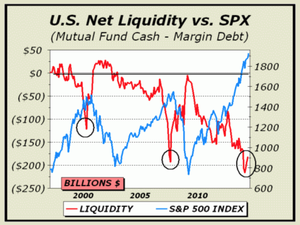
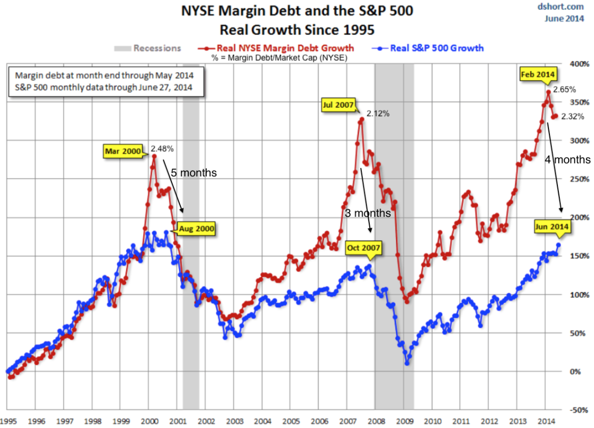
2. Highest ever margin debt to GDP ratio and lowest ever net investor credit

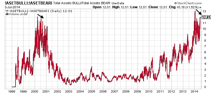
3. Record extreme INVI bullish sentiment for equities

4. Record extreme bull-bear Rydex equity fund allocation

5. All-time low in junk bond yields

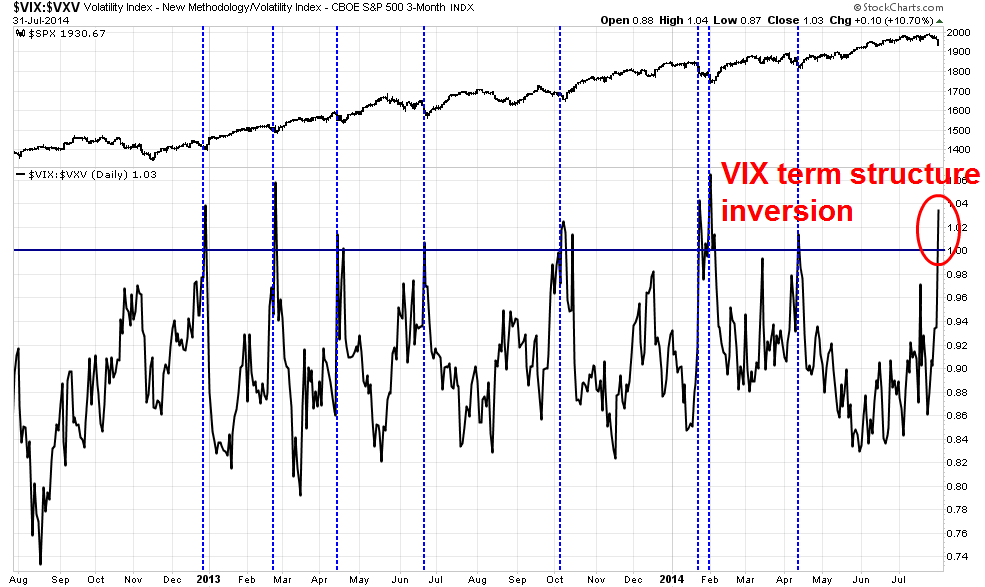
6. All-time low in the VXO volatility index (the original Vix)

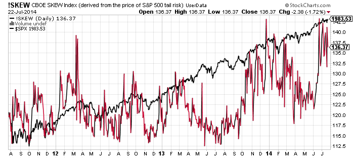
7. Highest ever cluster of extreme Skew (tail-risk) readings in July

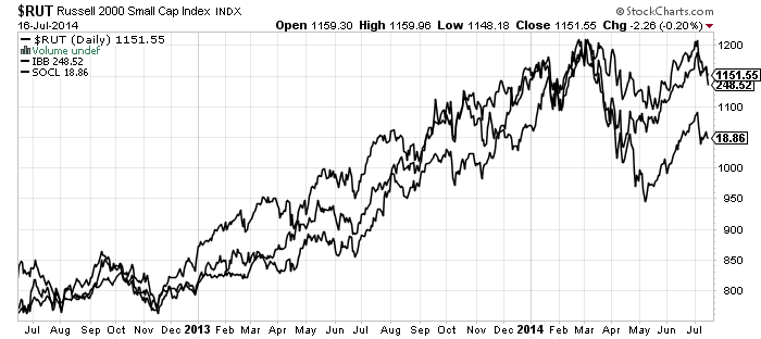
8. Highest ever Russell 2000 valuation by trailing p/e

9. Lowest ever Spanish bond yields

10. Lowest ever US quarterly GDP print that did not fall within a recession

And this week:

11. Lowest HSBC China services PMI since records began

12. Lowest ISE equity put/call ratio since records began


What I have been pondering is, what are the chances that we see not just a market crash but an all-time record market crash, given the elastic band is more stretched than ever?


Here are the biggest crashes in history, covering US, UK and Japan stock indices:

2011 August world indices

2010 May flash crash US

2008 Sep-Nov world indices

2001 Sep FTSE

2000 Mar-May Nasdaq

1990 Feb-Apr and Jul-Sep Nikkei

1987 October world indices

1929 Sep-Nov Dow

1907 Feb-Mar, Aug-Oct Dow

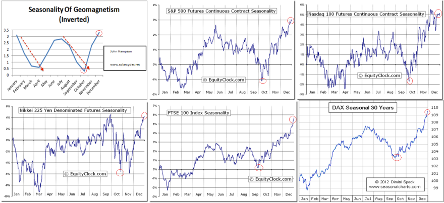
Draw them together and all the crashes happened in two windows in the year: Feb-May and July-November, with the latter period being the most dominant. This fits with the seasonal model of the stock markets, where geomagnetism influences collective optimism and pessimism. The two red dotted lines show the scenes of the crashes, both running from peak optimism to greatest pessimism.

5au1What also unites those historic market crashes is the preceding extremes in valuations, sentiment, leverage, allocations and complacency. The current US stock market set-up is a mirror in all those regards and global stock indices appear to have finally rolled over in July as we entered the most common window for market crashes. So it is fairly clear that we have a crash ‘set-up’ if not a crash.

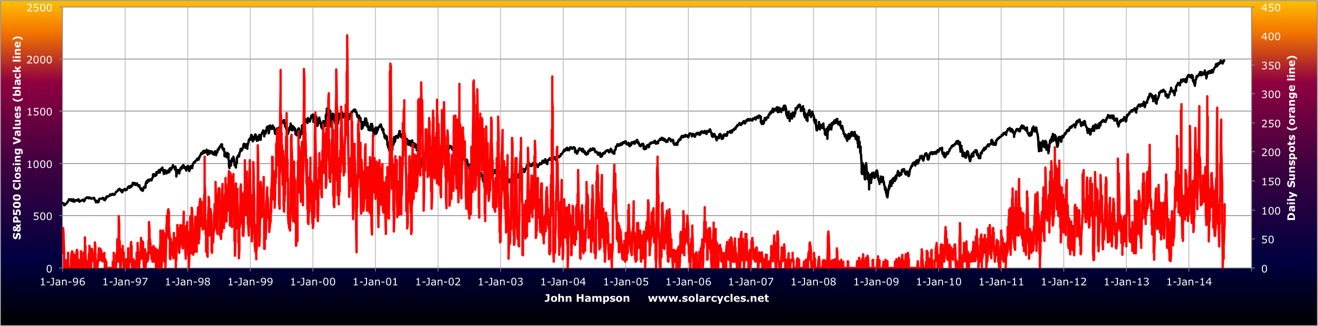
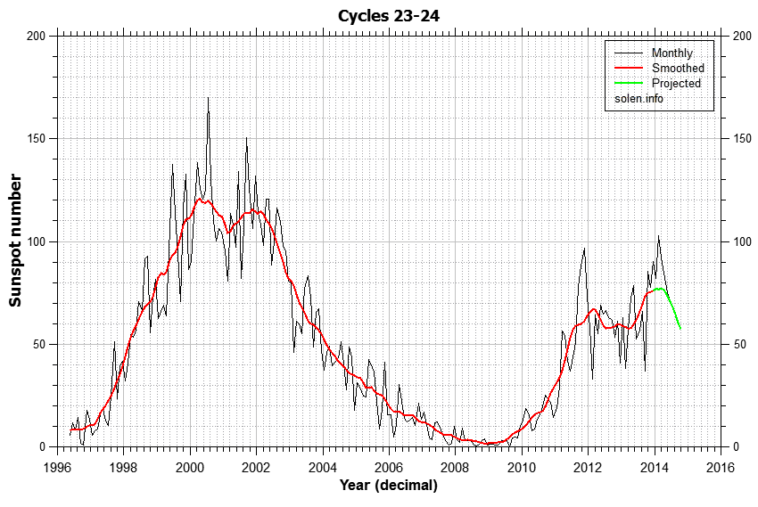
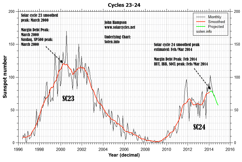
Additionally, those crashes of 1907, 1929, 1990 and 2000/1 took place in the waning of the solar maximum, with the sun first driving the speculative mania to achieve the extremes and then pulling the rug from underneath. Based on the latest solar data, we appear to be a similar position now, i.e. through the smoothed solar maximum.

2au11

To realise the biggest crash in history we would need to see the market halve in value in this window between now and November, which would mean the SP500 dropping to 1000 to August 2009 levels, i.e. the majority of the 5 year bull wiped out in a couple of months. That sounds utterly crazy, yes, but at the heart of a market crash is panic selling, whereby the selling reaches sufficient momentum to bring about a critical mass of forced redemptions and rapidly unwinds all the leverage. Sell levels trigger further sell levels and the process becomes unstoppable and out of control until exhausted. Given we are in many measures at the extreme of extremes, that process of exhaustion may cut deeper.

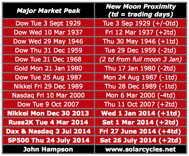
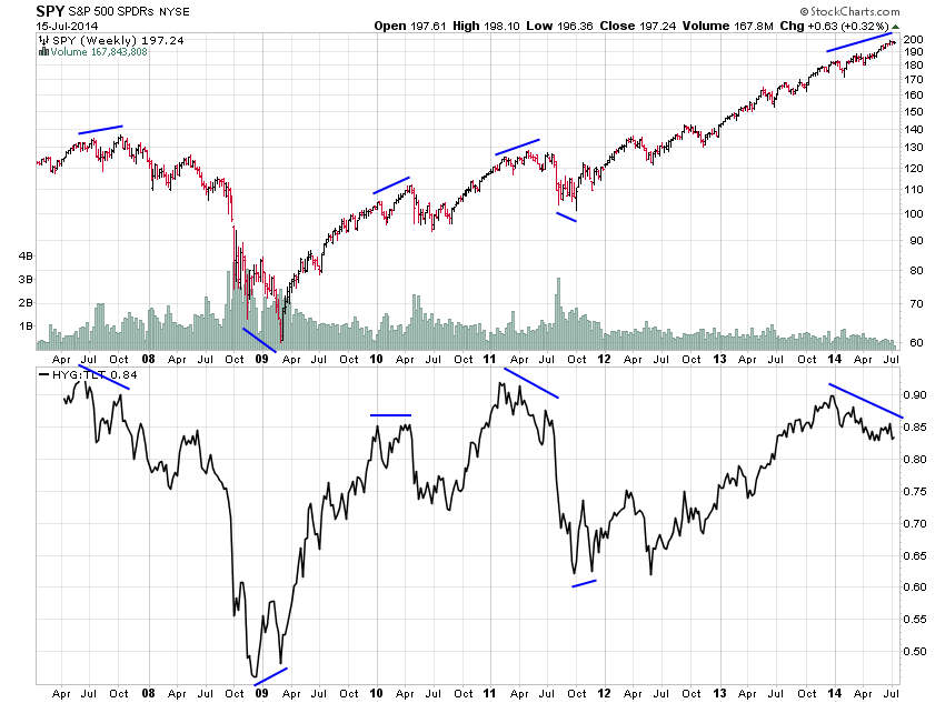
Amongst the historic crashes we see a cluster of big down days occurring on Mondays and Tuesdays (after weekend worrying) and close to new moons and full moons (at sentiment extremes). Also the waterfall selling typically erupted with the breaking of a notable technical support level following the passing through of a second chance peak (a failure high). I have argued that we have passed through the second chance peak as evidenced on RUT, IBB and SOCL and behind-the-scenes indicators for large caps. If I am wrong about that and large caps need to yet rally up again to a lower failure high then it would delay the initiation of the panic-selling. If however I am correct then the panic selling should be close at hand and we might then look to these possible dates for initiation, based on those historic patterns:

Mon 11 Aug, 1 day after full moon

Mon 25 Aug, new moon

To sum up, IF we were to experience the worst market devastation ever, then the set-up that we have would be pretty ideal for it, namely all-time extremes in valuation, sentiment, leverage, complacency, cross-asset valuation and allocations, the waning of the solar maximum, and the period of the year July-November.  Initiation for waterfall selling could potentially trigger around one those August dates.

I am not peddling fear, I am just drawing together the common themes of historic crashes and pointing out how we fit in. We fit in well, so we need to consider the range of potential results. I am not predicting the worst crash in history, but I am predicting there will be a period of waterfall selling at some point to wash out the leverage and I see no compelling case for that episode to be mild and anomalous compared to the others. We are flirting with deflation and nominal values are therefore at greater risk. Therefore, considering the possibility of the worst ever crash does not seem inappropriate.

Would central bank reactive measures nip a crash in the bud more easily now? These crashes all happened quickly: between 1 day and 8 weeks. That doesn’t allow them to do much. Would circuit breakers and exchange closures alter things now? They may cap the devastation on any one day, but spread it out to the following days or weeks. Might any crash be restricted to the hot targets of RUT, IBB and SOCL? It could be worst there, but unwinding leverage should affect all assets. Could any crash and unwinding of leverage be postponed until 2015? I can’t rule it out, but it doesn’t fit with the patterns in those historical mirrors. We could look to the end of October 2014 as a marker for that: if hard falls have not erupted by then, the likelihood would transfer to such steep declines not occurring until the Feb-May 2015 window.


Turning to the near term, yesterday’s bounce was in line with indicators, and sufficiently contained to be no real threat to the bear case so far. I have no expectations for today but want to see the markets turn down again into the coming weekend’s full moon. If I am correct about our positioning post-second-chance then essentially we should see bears resume control quickly. Another two day’s rallying from here, clawing back much of the 31 July falls, would not be in keeping with that.

Fire Is Lit

The fire is lit and should burn through pretty quickly, because if I am correct about this being the second chance peak (see HERE) then the mirrors from history reveal the end of the topping process gave way to rapid, deep declines:

Dow 1929: 3 weeks 44% declines

Dow 1937: 8 weeks 38% declines

Dow 1968: 8 weeks 18% declines

Dow 1987: 2 weeks 34% declines

Nikkei 1989: 6 weeks 27% declines

Nasdaq 2000: 3 weeks 35% declines

SP500 2011: 2 weeks 18% declines

They average out at 30% declines over 4.5 weeks. If it seems unlikely that we could see such a swift collapse after seeing such persistent strength, then know it is exactly what happened under these historic instances of similar extremes in valuations, sentiment, allocations, leverage, divergences and – for some – the peaking of the solar cycle. The lop-sidedness in sentiment and allocations, the excess leverage, the levitation above the 200MA, the mature divergences in place since the start of January: all together produce the ideal set up for waterfall declines or panic selling.

Yesterday, 31 July, finally delivered the kind of day I’ve been waiting for: a big gap down, selling that ran, a close at the lows and a major distribution day. It is also significant because I believe it is likely to cement the margin debt peak as February (all the indices ended down for July bar NDX, which was flat) along with bull market peaks in IBB, SOCL and RUT at the Feb/Mar turn. Plus, I believe it will cement the SP500 peak at 1987 (likely to get some coverage once the panic selling erupts) on July 24, which fell very close to the new moon and seasonal inverted geomagnetism (i.e. a twin optimism peak):

1au9

All the indices look to have made ultimate highs or lower highs around those twin peaks in the middle of that chart. My seasonal chart then shows the potential for weakness from here down to October, as does the Presidential chart below:

1au2

Source: Stock Traders Almanac

That gives us a window of 2-3 months in which we could see market falls, but the ranges from the historical mirrors further up are shorter at 2-8 weeks. So might I be wrong about the significance of yesterday (could we now rally up and print a new high in August before seeing the hard declines?) or might I be wrong about this being the ‘second chance’ peak (could large caps fall some more but then rally up again to a lower high in August/September, before hard falls erupt?)? I can’t rule either out, and the window we have (August-October) allows for both possibilities. However, my analysis puts us at the second chance peak, and the speculative-target sectors and indices of IBB, SOCL and RUT have all made clear lower highs making them likely to erupt from here into heavy falls. Could they potentially diverge from large caps? Also not impossible, but I suggest it is unlikely that small caps see panic selling whilst large caps rally or consolidate.

This is how the Dow stands after yesterday’s selling:

1au5

 Source: Stockcharts

The wedge is clearly broken, so horizontal dotted support or the 200MA might now come into play. Nymo and Vix:Vxv are showing a potential bounce:

1au4

Source: Stockcharts
1au1

 Source: Cam Hui

However, if that was the second chance peak giving way, then there should be little chance given now to either get out of longs or add short, i.e. any bounce should be short-lived and the down days very unforgiving.

If the markets were to sell off again today, then historically we have seen some instances of heavy falls on the Monday following weekend worrying, so something to bear in mind. We have another week of negative lunar pressure next week, which adds to the bearish set-up. But let’s see if a bounce can be mustered today per those indicators.

If I am correct about the waterfall declines hitting now in this Aug-Oct window then drawing on those historical mirrors again, we ought then to expect a subsequent slower partial retrace of those falls lasting around 4 months. So hard falls averaging 30% over 4 weeks followed by a 50%+ retrace of those falls averaging 4 months, before we tip conclusively into a full bear market. The key then will be trying to gauge by when and at what level the panic selling leg is complete. As an initial marker, the lightest falls in those historical analogs were 18% which would be 1629 on the SP500 from the 24th July top. So as a guide I will be looking to refrain from taking any short profits until we hit at least there, but indicator readings will help refine that as we progress.

All subject to confirmation of course from the markets. It was just one day yesterday, but it does look like a killer punch, at the right time.

QE is mantra rather than driver

This is widely presented as the only chart that matters:

31jul10

Or like this:

31jul3

Namely, that QE has been the driver of the stocks bull market and its corrections, and the Fed is in control.

Yet, if we take a bigger picture view of the correlation it doesn’t look so compelling:

31jul4

Furthermore, the two corrections of 2010 and 2011 took place once we hit typical topping levels of bullishness, overbought indicators and divergences.

31jul8 31jul5 31jul2 31jul5Additionally, the stocks bull market took off at the solar minimum and, subject to confirmation, is topping out at the solar maximum, in line with history, rather than it being a Fed-induced bull market by QE.

31jul9Lastly, here is Japan’s initial QE programme in the early 2000s. It did not prevent 43% falls over its first year.

31jul1

Japan’s most aggressive programme yet, Abenomics 2013-2014, has also thus far failed to produce equal results in the economy and stock market.

In short, QE is overhyped. We would have had a bull market anyway from solar minimum to solar maximum. The corrections of 2010 and 2011 would have happened because of excess bullishness, overbought and technical indicators and divergences. Rather, the wealth effect of stock market strength into 2010 and 2011 aided the Fed in stopping QE, and their corrections in restarting it. QE was coincident or even lagging. The first two charts in the post look convincing, but under scrutiny are less so.

I am not saying QE is impotent, but it is not the driver for this stocks bull. ‘Fed policy trumps all’ is instead the mantra for the stock market mania into 2014, just as ‘valuations revised from profits to expectations’ was the mantra for the stock market mania into 2000. In fact both were solar maximum induced manias, and both excuses for extreme overvaluations. The sun did it, not the Fed or the revolution of the internet.

What has then QE achieved? Shoring up bank balance sheets, shoring up confidence, pressing down treasury yields, helping create asset bubbles around the world. As I’ve argued before, the Fed can delay the full impacts of demographics but it cannot overcome, and it is still subject to the solar cycle, not agent. In keeping with that, we have seen a broad range of topping indicators congregating at the solar maximum and I await the validation that passing through that maximum is all that was required to peak and then kill the stocks bull, regardless of what the Fed is doing.

Short term: yesterday we saw a doji candle in the markets and few clues from the indicators, so need to see how today plays out.

The Macro Picture

An important week this week: more big earnings, first Q2 GDP release, FOMC and the last week of July.

Stock price increases the last 2 years have been 80% multiple expansion, front-running an anticipated return to ‘normal’ GDP growth of around 3% and earnings growth of around 10%, which has yet to occur. Stocks are now at historic overvaluation by any measure apart from forward p/e, which is based on such expectation rather than the reality-to-date. Demographics and debt tell us such normalisation is in fact not going to occur this time, and when stocks have reached these valuation levels historically, they have always tumbled into a bear market.

The earnings growth rate for each quarter of 2014 was initially estimated at 10%. Q1 came in at 2.2%. Q2, so far, has come in at 6.7%. Qs 3&4 are still pitched at 10%, but for Q3 so far, 32 companies have issued negative EPS guidance and 15 positive. The message is expectations for earnings are still exceeding reality. Even though Q2 earnings have so far been better than Q1, they do not meet requirements, and stocks have struggled to advance in July. The implication is Q3 and Q4 would need to deliver serious bumper earnings to sustain the bull market.

The lack of realism extends to the economy. Q1 GDP came in at -3%. That means Qs 2,3&4 need to deliver 5% growth each to hit the 3% averaged annual. Yet data items already released for Q2 have caused analysts to reduce their forecasts for Q2 GDP to 3% average. If that is anywhere near the reality, then as per earnings it implies Q3 and Q4 need to be bumper, to keep EOY on track. Yet as things stand, leading indicators predict growth to peak out in Q3 and economic surprises continue to weigh negative. Jobs are improving but they are a lagging indicator.

Screen Shot 2014-07-29 at 07.56.58

Source: Ed Yardeni

Why are many analysts and economists stubbornly unrealistic about earnings and the economy? I suggest they don’t understand the role of demographics and the unprecedented collective demographics downtrends in the major nations, which are preventing the return to ‘normal’. Historically, we typically saw the economy heat up by this point leading to a rate tightening cycle which played a role in terminating the bull market in equities. Central banks don’t have the luxury this time – no rate rises are possible as the weakness persists. The tightening is in the form of QE tapering, as rates have been made redundant as a tool.

The low rate environment is touted as a positive for equities, that valuations must be considered relative to rates. Yet as Schiller says, low or high rates have not historically affected the predictiveness of CAPE. Similarly, I have pointed out before that in the 80s rates were at historic highs yet investors marched in to equities due to low valuations, and 1937 is a good mirror to now where high valuations and low rates gave way to a bear.

Another misperception is that we in a secular bull market in equities since the SP500 decisively broke above its 2000 and 2007 highs in 2013; that valuations washed out sufficiently in 2009 as a secular low; and that as we have yet to go even begin the series of interest rate rises that will eventually choke off the economy we have fuel to keep rising until 2016 or so.

Firstly, net of inflation the SP500 is still beneath its 2000 peak.

29jul9

Secondly, secular bulls and bears are always demographic bulls and bears, and the message is that we are still very much in a long term bear that began around 2000:

29jul29

Thirdly, valuations have a long way down to go before washing out to historic norms:

29jul30

And, as already covered, central banks do not have the luxury have a series of rate rises.

Margin debt has been released for June, and in keeping with the bullish breakout in equities in that month, it rallied. July so far has been overall flat in the markets, hence an important last few days of the month this week. Barring a significant bullish breakout, I would not expect margin debt to exceed its Feb high in July, which would keep the topping epicentre as Feb/Mar. But the sharp increase in margin debt in June has made that more critical.

29jul1

Source: DShort / UKarlewitz

I suspect tomorrow’s Q2 GDP print is going to be the key. As things stand (see last 4 posts) the evidence supports a top being in in equities, which implies disappointment in reaction tomorrow and ultimate breakdown in this Dow wedge:

29jul18Two quarters earnings data and two quarters GDP data may provide the tipping point in perspective on equities rather being simply extreme overvalued rather than front-runners of a strong recovery. If equities break down the last few days of July it will make a key difference on many charts.

Last Gasps

New moon this coming weekend and the seasonal geomagnetic model peak.

23jul11SP500 is still in a topping range since July 3, with RSI and Vix divergences.

23jul1Source: Stockcharts

Skew continues to flag an imminent correction.

23jul5

Source: Stockcharts

Small caps are at historic overvaluation.

23jul8Stocks earnings relative to bond yields at historic level. 2014 is 1937 to 2000’s 1929: one solar maximum later and a similar backdrop.

Screen Shot 2014-07-23 at 10.48.14

Source: Martin Pring

Margin debt to GDP: 1987, 2000 and 2007 all gave rise to waterfall declines.

Screen Shot 2014-07-23 at 10.48.55

Source: Martin Pring

Investors Intelligence sentiment. A 6 month double peaked concentration of excessive bullishness, like 1987.

Screen Shot 2014-07-23 at 10.04.24

Source: Ed Yardeni

Liquidity negative spike as per 2000 and 2007 peaks.

Screen Shot 2014-07-23 at 10.10.57

Source: Cross-Currents.net

Baltic Dry Index collapsed again.

23jul6

Source: Stockcharts

The solar maximum has waned sharply.

23jul23

I’m feeling confident that this is finally it. It’s been a 7 month topping process, during which we’ve seen extreme indicator readings and negative divergences develop, margin debt, hot sectors and the solar maximum peak out, and two distinguishable peaks behind the scenes. I’ve been able to publish 100+ charts warning of the top between December and now, with some of the latest charts filling in the missing gaps.

Small caps and European indices have already broken down, leaving US large caps to now join and complete. Large caps may potentially overthrow to new highs into the coming weekend’s new moon but if so it will be on negative divergences and unsustainable. Thereafter we tip into negative lunar pressure and August to October provides the seasonal backdrop to market falls, due to the seasonality of geomagnetism. A congregation of indicators suggest the sharp falls will erupt in this period.

I’ve done my best to produce a cross-referenced multi-angled case for why this is a (i) stock market peak that will give way to (ii) waterfall declines within a new (iii) bear market. If you are sceptical about it, you are right to be: until price turns down definitively then it’s just theory. But it’s the strength of the case which gives me the confidence – once large caps break I will be looking to add short with stops and build in as much as possible, on top of the existing short portfolio. It’s another decade until the next solar maximum, and I see this is as a golden opportunity.

Second Chance Peak

Friday was a bullish fightback, but I still think the roll over is in gradual progress here. Here’s why I think the markets are at the second chance peak, rather than earlier in the topping process.

It’s fairly clear on RUT, IBB and SOCL: the nominal peak was Feb/Mar and second chance lower highs have since been made, in keeping with historic norms.

19jul7

Source: Stockcharts

It looks acceptable on COMPQ too – a marginally higher high on negative divergences is not uncommon. But the large cap indices of SPX, INDU and NDX don’t appear to conform, making significantly higher highs, which are not in keeping with, for example, 2000, 2007 or 2011.

Nonetheless, we can see divergences initiated at the turn of 2013 into 2014:

19jul9

Source: Stockcharts

Bubble end flagged once around then and again now:

19jul5

Source: Financial Crisis Laboratory

In II bull-bear spread, we have seen two extreme peaks plus a divergence between them, which positions us where the markets tanked in both 2010 and 2011 (rather than earlier in those peaking processes).

19jul4

 Underlying source: Jack Damn

Ditto the HYG:TLT divergence. We are more like where the markets finally rolled over in 2007, 2010 and 2011, than earlier in the process.19jul1

 Source: Jesse Felder

Put/call and Skew tell similar tales.

We also have seen extreme peaks and divergence in Rydex assets, which would position us where the wider markets finally broke down in Autumn 2000, rather than earlier in the topping.

19jul3

Source: Stockcharts

Margin debt peaked out in Feb. The 2000 and 2007 analogs again position us at the second/final peak, with July 2014 being 5 months after.

19jul2

Source: Dshort

We are likely now 4-5 months or so after the smoothed solar maximum. That would also position us around the second chance peak of 2000, rather than the initial peak (March 2000).

19jul10

Source: Solen.info

So what happened next in each of the applicable historic mirrors?

In 2011, the markets fell heavily over the course of 2 weeks. In 2010, the markets fell heavily over the course of 3 weeks, including an intraday flash-crash.

In 2007 and 2000, the markets entered definitive bear markets at this point. Bears firmly in control, with periodic heavy selling. I suggest 2000 is a more compelling mirror than 2007, because this is a solar maximum like 2000, with RUT and biotech p/es reaching similar craziness levels to internet stocks in 2000. Rydex, market cap to GDP and q ratio all look more similar to 2000 too. What’s missing here in July 2014 is that by this point in 2000, the speculative targets of the Nasdaq indices had already suffered waterfall declines, washing out that excess leverage that had built up. That hasn’t happened yet in 2014 (RUT, SOCL, IBB or COMPQ have seen no heavy selling) meaning it’s still ahead.

Going further back in time, I maintain 1937 as the closest historical mirror. As then, if this is the second chance peak, it falls around 5 months after the smoothed solar maximum. At this point in 1937, two months of heavy selling erupted.

19jul12

Drawing it all together, the messages are that heavy selling should be imminent, at least in the key speculative target indices and sectors, and that in the wider markets there should be no second chance retrace peak ahead for the bulls, but that we are rather currently rolling over into the definitive bear trend, at the end of a topping process that began in January. Yes, US large caps have made significantly higher highs versus Q1 2014, but the divergences and indicators tell the hidden story of this being the second chance peak.

I believe the definitive bear process has initiated on US small caps and European indices, since the turn of July. US cumulative advance-declines also peaked out then, and Vix bottomed. SP500 has yet to beat its start-of-July high, and although the Dow and Nas 100 have, they have done so on negative RSI divergences. Therefore, Friday’s up day should form part of the rolling over process for large caps, and nothing more.