The Alternatives

Alternative 1: The Bull Is Safe

Stocks are in a new secular bull market. This cyclical bull began from the low in 2011. The economy is recovering and we need a series of rate rises before the bull’s termination is likely. If so, the bull, right now, is faced with these:

1. Over 80 weeks levitation above the 200MA on SP500

2. Over 80 weeks with no 3% change

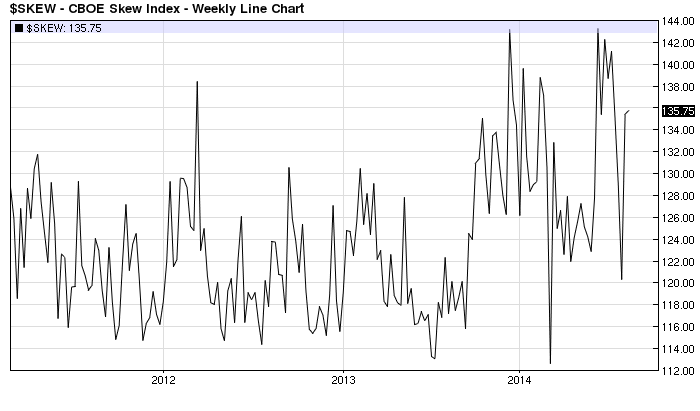
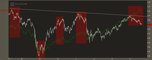
3. Biggest ever cluster of extreme Skew readings over the last 10 months

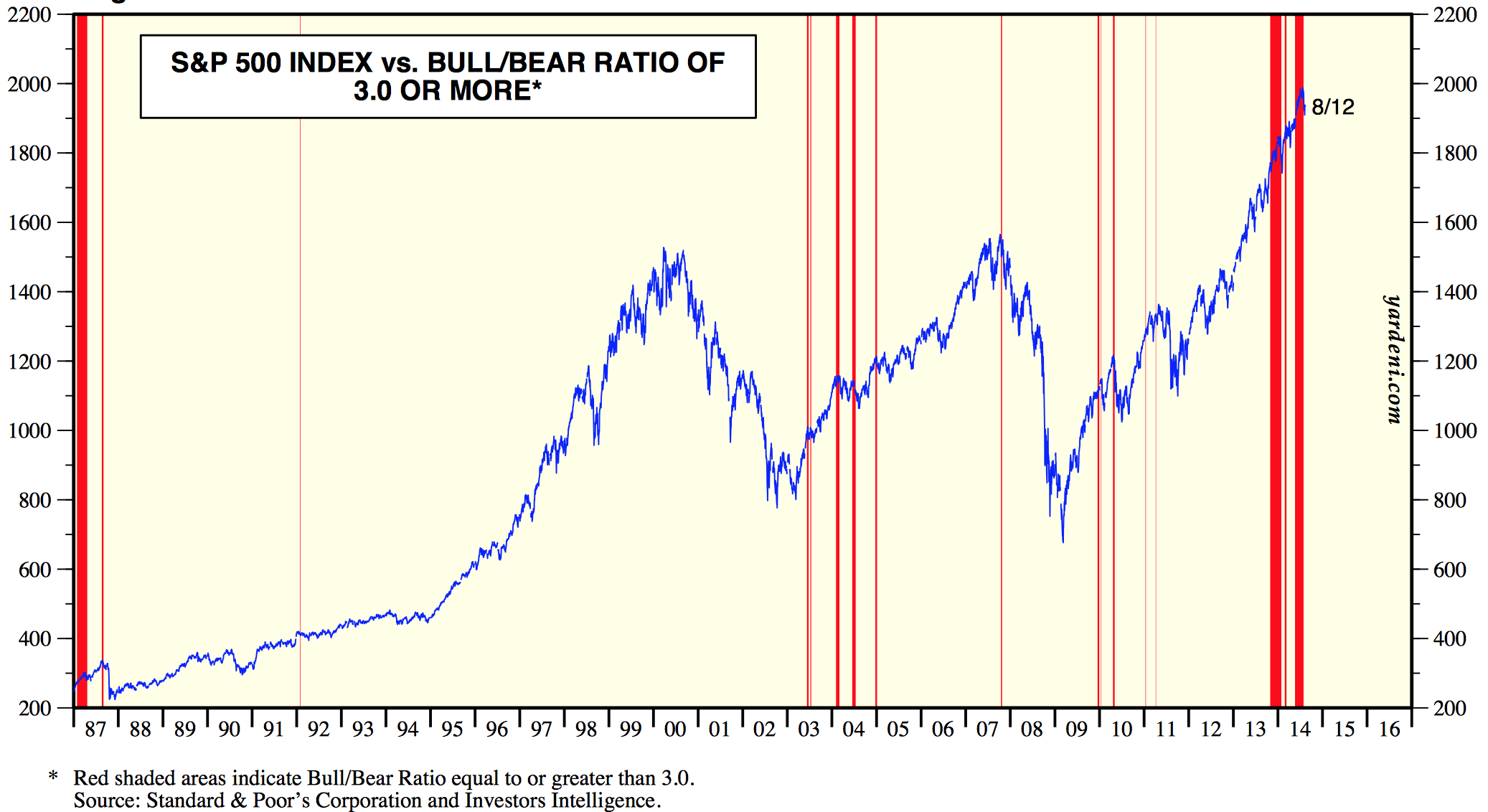
4. Biggest ever cluster of extreme Investors Intelligence bull-bear spread over the last 10 months

5. Lowest ever net investor credit and highest ever margin debt to GDP ratio

6. Highest ever Rydex bull-bear asset spread and cluster of fund manager equity allocations

7. 8 months of ‘risk-off’ behaviour in HYG:TLT, WLSH5:GDX, XLY:XLU

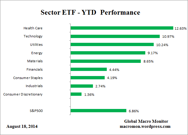
8. Best performing sectors being those defensive sectors associated with a market peak

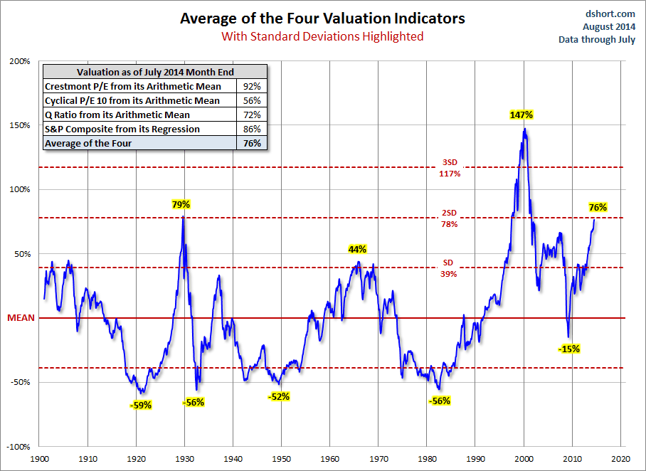
9. Averaging 4 valuation measures the market has reached a par with the peak of 1929 in terms of expensiveness

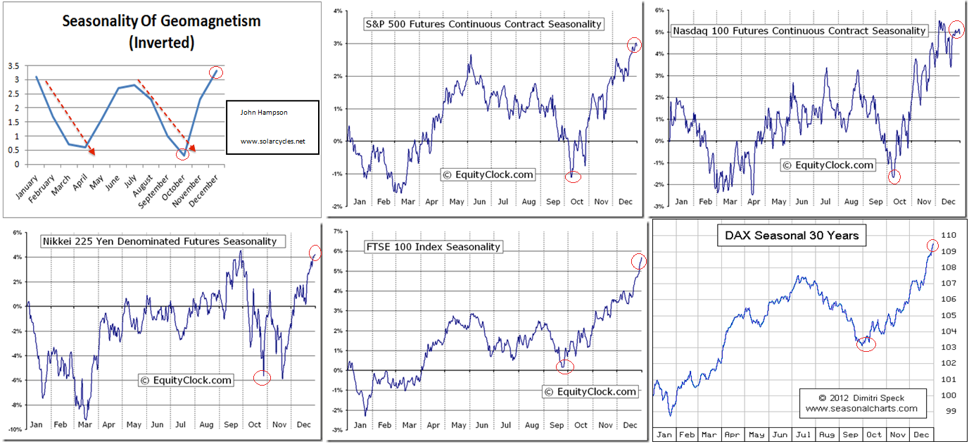
In other words, this market needs a reset to continue. The duration and magnitude of these indicator extremes mirrors 1987. The market is a mean-reverting mechanism and like an elastic band it will snap back. Therefore a significant reset is on the cards, and every day it has gone without a washout correction has stored up a major correction when it occurs. Therefore, even if the market were in a secular bull heading much higher, it is over-ripe for a cleansing. The maturity of the divergences and readings suggest the inverted geomagnetic seasonal downtrend from August to October is the most likely window for that to occur. The secular bull break outs post 1930s and 1970s also saw a reset shortly after breakout.

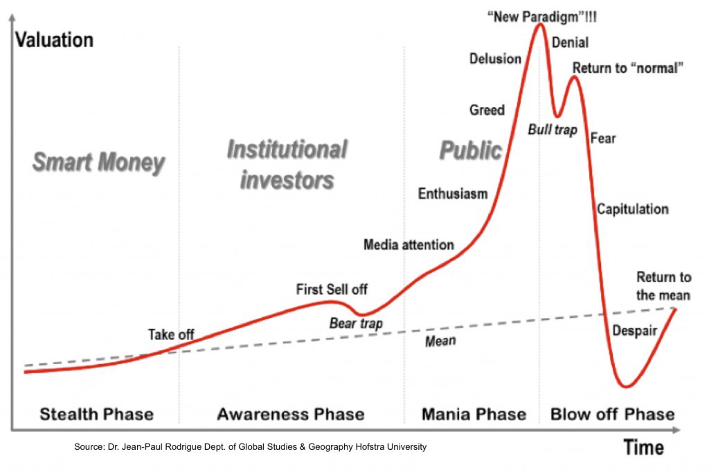
Alternative 2: The Terminal Melt-Up

Stocks, although stretched, are heading for a blow-off top. The kind of unsustainable trajectory that everyone knows can’t last but no-one wants to miss out on. A crazy rate of ascent to crazy valuations, and then ultimately an even more devastating pop than stored up currently. Like the Nasdaq in 2000, the Nikkei in 1989, the Dow in 1929. Although neither a demographic peak nor an economic boom peak like those three events, the combination of QE, low rates and a goldilocks economy (neither too hot nor too cool) provides different ingredients for the same kind of mania result.

(Understand, I disagree with a lot of what I am writing in these first two alternatives, I am just presenting the opposition).

The most likely candidate for that currently is the Nasdaq 100, which is the most parabolic of the indices. I’ve labelled the chart to show a potential mirror with the action in 2000 and where we might be:

Screen Shot 2014-08-23 at 16.02.59

Label (1) in both periods shows a first burst to what participants expect to be the peak, only for a running correction (2) to give way to an even steeper final termination leg higher (3). 5 months of crazy gains from ‘Here’ would take us to a January 2015 peak, which fits well as the other inverted geomagnetic seasonal peak of the year. If the index did break into the kind of terminal velocity of phase (3) then, make no mistake, it would be the biggest stock market mania ever, because to accomplish it we would see the highest ever valuations, leverage, allocations, sentiment and more.

Apple is the dominant stock in the Nas100 and as shown it has just made a potential breakout on the monthly view above its 2012 high:

Screen Shot 2014-08-23 at 16.17.22

If Apple can finish August by consolidating this breakout, then it could be set for further gains in clear air above, leading the Nas100 higher. If Apple is repelled this week, it would keep the double top option in play.

Alternative 3: The Bull Market Ends Here

As you know this is my favoured option and I have detailed my case for this many times over, so if you are new to my site, read back through a few recent posts.

This is the alternative to which all the evidence fits the best. Valuations and demographics show us to be at a cyclical bull peak within an ongoing secular bear, whilst the list of indicator extremes and divergences are features of a major peak, rather than anomalies in a bull market.

In the same way as for alternative 1, the stretched elastic band that those indicators depict means a period of heavy selling will feature in the erupting bear market, and the maturity of the indicator readings and divergences imply their satisfaction is likely very close at hand, in the period Aug-Oct 2014. Therefore, I would argue that alternatives 1&3 are similar in offering likely >20% bear gains imminently, whilst alternative 2 is the threat to my bearish stock-indices positioning.

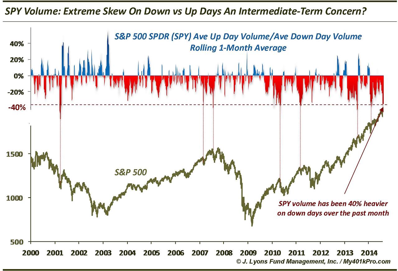
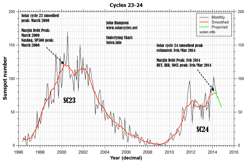
If alternative 2 fulfils, then, because of the demographic headwind, it will require all-new levels of leverage, equity allocations and skewed-positioning. In thin volume, like in 1937, a smaller group of participants has been able to rally the market to the current level by taking Rydex and fund manager allocations, margin debt and net investor credit to beyond those previous major peaks. In all 4 of those measures we already exceed the biggest mania of all time, 2000. So, with less people available to buy the stock market, the only way to achieve the current market highs has been to stretch individual positioning and leverage to record extremes.

All the big blow-off top stock index manias of the past required leverage to rise into the peak. Therefore, with margin debt having so far peaked out in February, one important development would be that leverage peak being taken out. Tying in with that we would see various speculative targets break upwards. Expecting margin debt to be down in July, due to indices being down in that month, this last week in August becomes key, and we enter that with various investments showing obvious lines in the sand.

If IBB’s bubble has burst then it should tip over here under negative divergence. If not, it should break upwards and re-take the March high.

Screen Shot 2014-08-19 at 14.12.09

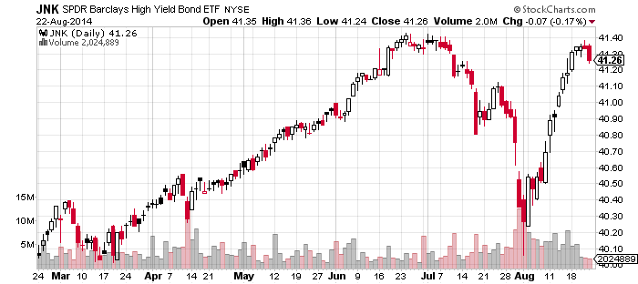
If JNK’s collapse in July was a true warning, then it should break down again here. New highs would invalidate.

25au1

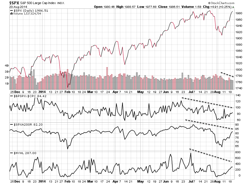
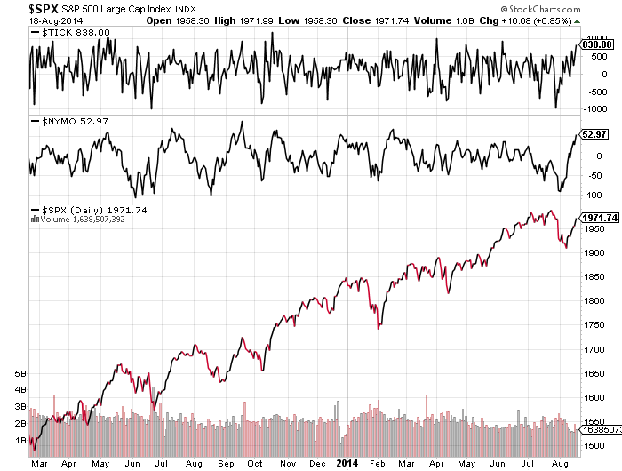
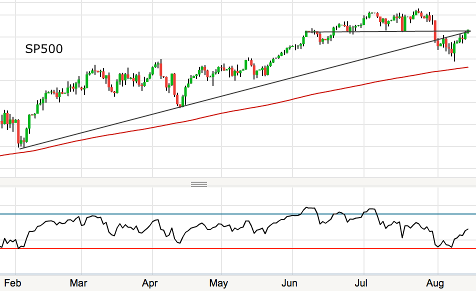
The SP500 will either tip over here with a marginal higher high on multiple negative divergences, or it will ignore those indicators and cement an upward breakout.

22au15

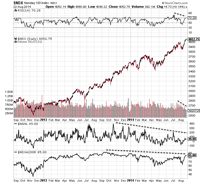
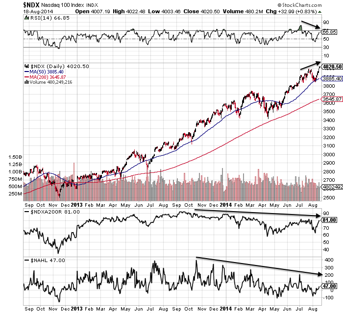
The Nasdaq indices are also operating on very clear divergences:

23au1 24au2

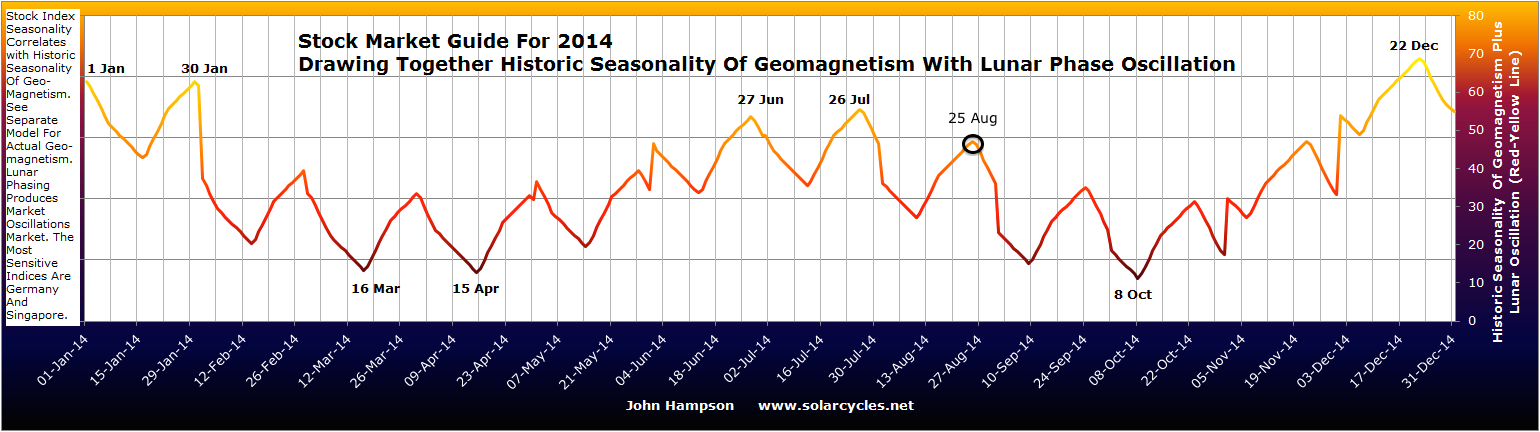
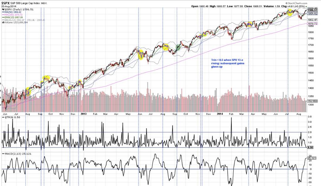
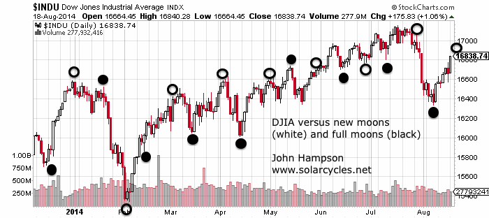
I believe the next 2 weeks will be highly revealing. It is the lunar negative fortnight and indicators argue for a retreat. DeMark sell signals were reached at the end of last week, whilst today is the new moon and the last likely seasonal peak of mid-year. If stocks retreat from here it will make the SP500 breakout a fakeout and Dow will put in a lower high than July. The February/March peak in speculative indices and sectors and margin debt will likely be maintained. All those indicators that have been screaming ‘correction’ will move further towards validation.

If, on the other hand, stocks rally this week and next and various speculative measures break or cement upwards, then the melt-up alternative will gain weight. At that point I would consider stopping my positions, moving aside and waiting, because it would put great doubt on the epicentre of the top as the speculation peak of Feb/Mar with margin debt, IBB, SOCL and RUT.

Some further charts to consider:

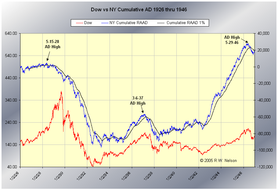
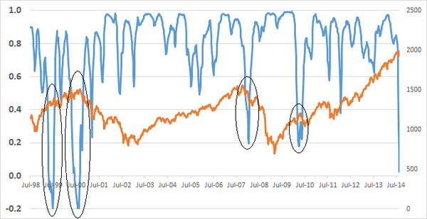
The Nasdaq chart above shows advance-declines have diverged. But NYSE advance declines continue to rise in line with the SP500. Does it need to diverge too before we see a proper correction? The chart below shows a divergence into 1929 but a simultaneous peak in 1937 and 1946. With other breadth divergences in play in 2014, I’m not convinced it does.

25au2

The Sornette bubble end flagged in July 2014, but the peak nominal level of DS LPPL reached so far is lower than for previous major events:

Screen Shot 2014-08-25 at 08.44.39

Screen Shot 2014-08-25 at 08.39.51 Screen Shot 2014-08-25 at 08.40.37 Screen Shot 2014-08-25 at 08.40.50

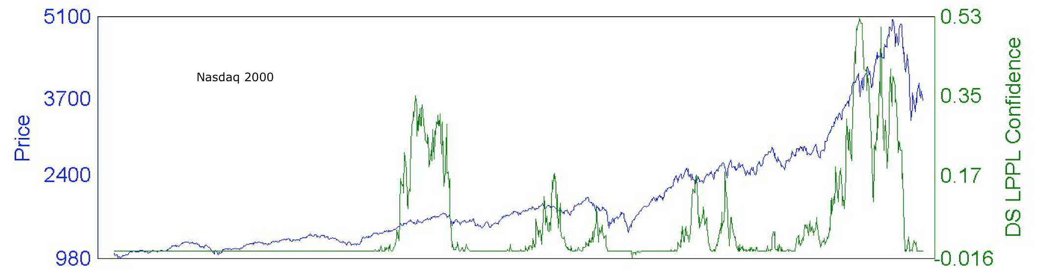
As the three historical charts show, the ultimate market peak was always accompanied by a spike in DS LPPL, just not necessarily the highest spike. That means either July was the ultimate peak, or stocks are heading higher and we will see another spike in DS LPPL ahead, probably to a higher intensity level.

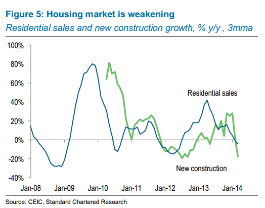
Is the global economy chugging along nicely? Germany, Japan and Russia GDP readings came in negative for Q2, France flat. China’s housing market is dropping sharply:

25au7

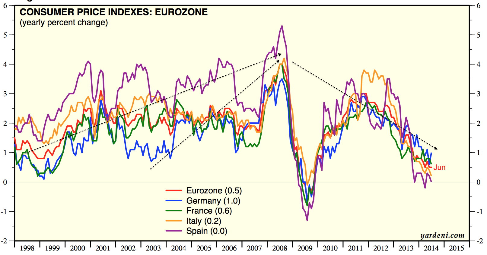
Global leading indicators predict a growth peak at the end of Q3. Therefore, although the US has produced some recent good data, that may be about to roll over, and data from the other majors in turn worsen. Deflationary trends are strengthening again in 5 year break-evens and in commodities:

25au6

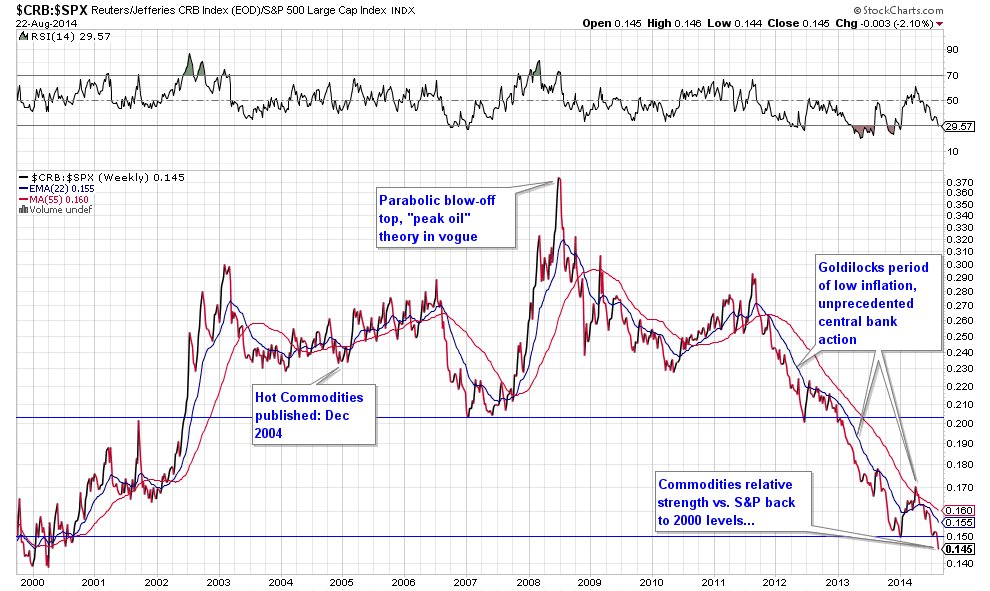
With Europe on the cusp of deflation, waning commodities prices may provide the tipping point.

I would argue that those who believe we need to see a series of rate rises before the bull ends are failing to see that we do not have the luxury this time. Rate rises help kill bulls because they help choke off the economy. The global economy is too weak for rate rises, the choking is occurring without them.

Lastly, there has been some debate about the validity of the high CAPE valuation for the market. So here is 5 year, rather than 10 year CAPE, produced by J Lyons as an alternative:

5au12
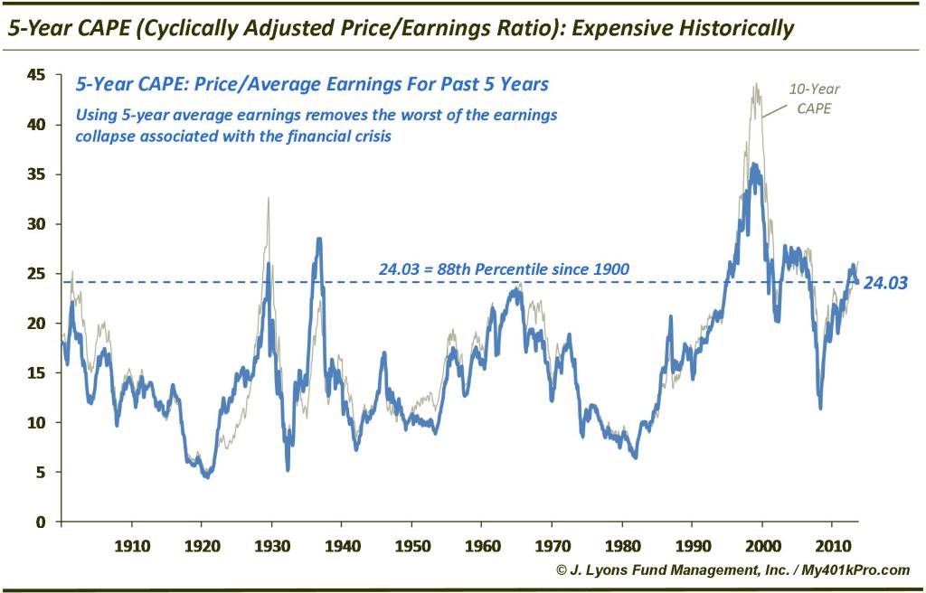
It still shows us having reached the same overvaluation as the 1929 peak, and this is echoed in Doug Short’s aggregate of 4 valuation measures:

25au19

Which brings me back to alternative 2, the melt-up. Can we really challenge the biggest mania of all time without a demographic tailwind nor a booming economy, and from already-record leverage, sentiment and allocations? I find that extremely unlikely, but if we really can, then we surely equally see the biggest crash of all time as that is unwound.

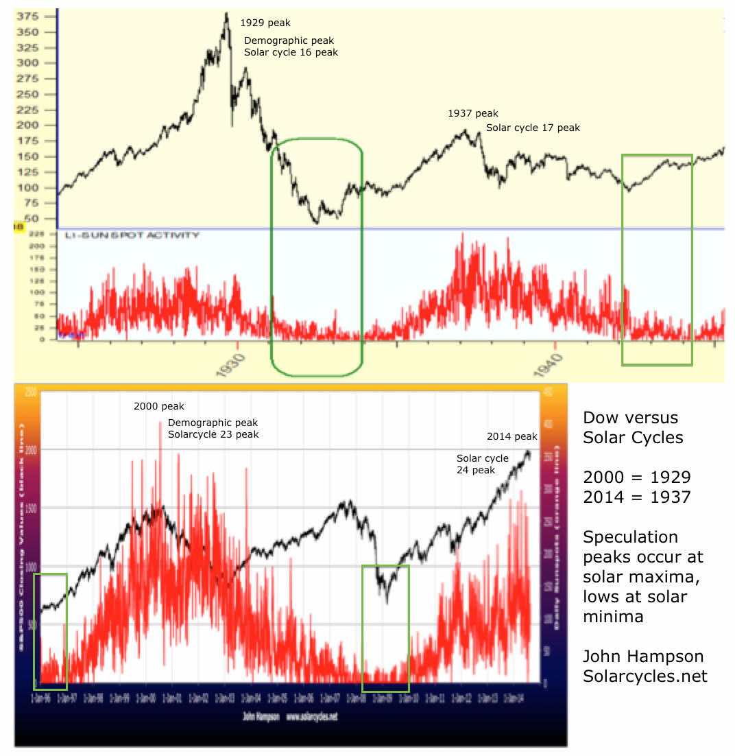
Instead, the evidence supports us being in a 1937 peak to the 1929 demographic/economic peak (1929 being 2000 in this case). 1937 did not see a parabolic blow-off, but rolled over with sufficient disconnect between valuations and the economy.

The evidence still supports us being here in the last gasps of a topping process that began Dec 31st with a peak in risk, then followed with a speculation peak in Feb/Mar, then a final peak in July. European indices appear to have decisively broken down, and US small caps are some way from their highs. The Dow broke down from its 2014 wedge in July, and volume has been very thin in US equities on this August rally back up. I have outlined my lines-in-the-sand above and see the next 2 weeks as the crucial confirmation or invalidation.

Short Term Update

With Monday being August’s new moon, we arrive at the last higher-probability topping point mid-year 2014 for those indices which have not yet topped out:

22au9

With SP500 and Nasdaq overbought and showing negative divergences, their breakouts this week have the potential to become fakeouts here.

22au10Source: Stockcharts

SP500 hourly RSI reached >95 and previous occurrences are shown in yellow on the two charts below, i.e. typically a pullback followed:

22au7 22au8Source: U Karlewitz

ISEE put/call ratio is 3 days over 200 and the last such occurrence led to a drop in January and the previous time before that in 2011:

22au2 22au3Source: Ryan Detrick

Thursday produced the most NYSE unchanged issues since 22 Feb 2007 (source: Dana Lyons), which could be a sign of complacency as last time it preceded a 3.5% drop on 27 Feb 2007. This is supplemented by Skew which is back at historical elevation warning of a potential big down move:

22au6Source: Big Charts

Nasdaq reached a Demark exhaustion sell signal on Thursday and SP500 is expected to today.

Gold has weakened as the US dollar has surged higher. However, positioning in the Euro, which acts inversely to the USD, suggests that may be about to reverse:

22au13

Source: Emma Masterson22au12

 Source: J Lyons

In short, we have the set-up for a reversal here in both equities and USD, for at least a partial retrace of the recent gains, and as we pass through Monday’s new moon the set-up looks good for a down week next week. Margin debt has yet to be released for July, but with indices overall down in that month I expect a decline. However, if stocks were to rally further next week it would raise a question mark over margin debt in August, whilst taking the Dow to new highs and cementing the breakouts of the SP500 and Nasdaq. Alternatively a down week next week should create fake-outs on the SP500 and Nasdaq and set up the possibility of a full retrace of the rally of the last 2 weeks. The negative divergences on the new marginal high in SPX versus the July peak support this occurring:

22au15Source: Stockcharts

Double Top Or Breakout

A double top here on the SP500 or another breakout to new highs? Below shows Aug 8th was another channel hold, so is it bull-business as usual or has something changed?

21au8

Source: Stockcharts

The vertical dotted lines show the last two times Nymo surged from oversold to overbought like now: one chopped sideways and one retreated. The CPCE and Vix indicators show that there were some changes under the hood in the last couple of months: possible capitulation in the Vix and big volatility in put/call. These developments may have meaning because the Sornette bubble end flagged at that time:

Screen Shot 2014-08-21 at 08.44.35Source: Financial Crisis Observatory

There are also several negative divergences now in place in breadth, bullish percent and volume, with the July peak:

21au9

Source: Stockcharts

Volume has been particularly weak on this rally whilst continuing to be dominant on down days recently. The relevance of that is shown here, i.e. often associated with significant peaks:

21au1

Source: Dana Lyons

Trin closed low yesterday at 0.5 and suggests sideways chop then pullback may be next, previous occurrences in yellow below:

21au2

Source: U Karlewitz

The new moon is on Monday and therefore we might expect the markets to roll over after that.

The European markets were weak yesterday. Below is the German Dax performance relative to the SP500 over time. Such notable divergence has previously been associated with major peaks:

21au2Source: @Market_Time

US small caps underperformed yesterday and the Nasdaq gave back all its day’s gains in the last 15 minutes.

In summary, the stronger case is for the rally to end here. A marginal higher high on SP500 would not negate that. Around this weekend’s new moon is the most likely scene for that to occur if it is to. But effectively a double top, with indicators and divergences calling for chop-then-retreat or just retreat. The two longer term charts above add to the comprehensive case for this being a major peak, and along with Rydex, II sentiment, Skew, sector rotation and risk-measure peaks call for the top being ripe or through.

The evidence still supports the sequence of events: risk peaked 31 Dec 2013 (HYG:TLT, INDU:GLD, XLY:XLU and more); speculation peaked Feb/Mar 2014 (smoothed solar max, margin debt, IBB, SOCL, RUT) and the topping sequence completed in July (European indices, Dow, Sornette bubble, various indicator completions). So the last week in August – next week – is important. If it is an up-week then it will cast doubt on some of those peaks, if it is a down-week it will further cement them.

The united picture of solar maxima and valuations and the relevance of 1937 to now:

Screen Shot 2014-08-20 at 15.47.48

21au6

Failure High

The potential post-second-chance positioning was negated as the rally since the 8th August gained momentum, albeit out of hours momentum. So the question is whether this rally now produces the failure high second chance peak, i.e. a lower peak than July, and thereafter we tumble into the bear-controlled post-second-chance market.

Whilst the Nasdaq has made a marginal higher high, the RUT, DJIA and European indices are some way from their peaks and as we reach increasingly overbought here, the odds favour those indices turning down again to cement lower highs. Plus, the Nasdaq has made the higher high on negative divergences, making the potential to become a fake out. If that is to occur, and with the SP500 not far from its July peak again, a renewed move to downside has to happen fairly promptly. With the new moon several days away providing such a potential peak (an optimism peak), that now becomes my most probable case: markets topping by the end of this week, making a lower peak to July on the majority of indices, and a critical lower high / failure high.

Tick and Nymo amongst those indicators showing overbought:

19au5

Nasdaq 100 negative divergences in place since late 2013, plus short term RSI divergence:

19au29

R2K, SOCL and IBB still peaked Feb/Mar but need to turn down soon to maintain the lower high / failure high patterns. A look at IBB shows the typical bubble model has played out and the short term RSI divergence shows the potential for another leg down. If that does occur, then it should be the major bear leg down. However, the recent rally has made the turn-down fairly urgent.


19au26 19au25The Dow versus lunar phase oscillation shows the potential for a peak around the new moon of August 25th, which would also likely be a lower high, adding to the case of the late-July breakdown:

19au27


The bigger picture argues that a major peak in equities is in, and if not in, then overdue. Ten different angles on a stock market peak produce a cross-referenced case:

1. HYG:TLT divergence at major peaks:


19au8

 Source: InflatedTemper

2. Implied correlation at major peaks:

19au22

 Source: Rory Handyside

3. Skew at major peaks:

19au23

Source: Rory Handyside

4. Sentiment at major peaks:Screen Shot 2014-08-19 at 08.26.30

Source: Ed Yardeni

5. Valuations at major peaks:

19au24


Source: DShort

6. Sornette bubble end flagged at the start of July:Screen Shot 2014-08-19 at 08.27.23

 Source: Financial Crisis Observatory

7. Various risk measures peaked, along with the Nikkei, at the turn of the year:

19au10

8. Rydex allocations echo the 2000 peak:

19au9

9. Sector rotation shows the two post-peak sectors of health care and utilities performing strongly relative to others:

19au2

 Source: Macromon

10 Sunspots continue to be in a waning trend since their February peak, and a smoothed solar maximum of Feb/Mar ties in with margin debt and hot sector/index peaks of Feb/Mar as the speculation peak epicentre:
Screen Shot 2014-08-10 at 16.30.44


To sum up, I am looking for European indices, RUT, SP500 and DJIA to make lower highs / failure highs / second chance peaks by the end of this week around the new moon, and thereafter break downwards into post-bubble-pop momentum, into the geomagnetic seasonal low of October. Past analogs show hard falls lasted up to 8 weeks, which ties in with the available window from late August into late October. The mulit-angled case is still strong for a major peak not just being at hand but being in already, and the out-of-hours, low volume nature of this rally since 8th August add to the likelihood of it failing and cementing the broad July final peak in risk, in a topping process that began at the turn of the year.

New Secular Stocks Bull

Is not underway:

14au22

Does not begin at these valuations:

14au16

And can not occur under these demographic trends:

14au15

Rather, those charts collectively present the real story. This is a cyclical bull market peak (per valuations) within an ongoing secular bear that began in 2000 (per demographic trends). The inflation-adjusted SP500 and gradual downtrend in p/e valuations show the secular bear  in progress. The destiny (per demographics) is single digit p/es, in line with historic normalisation and necessarily befitting the greatest mania ever. The reason the cyclical bull peak is particularly high in nominal and valuation is the speculative drive of the solar maximum, with the current peak being one solar maximum after the mania peak, as 1937 was to 1929:

15au2


Turning to the near term. We’ve seen a partial retrace of the falls, but all the evidence suggests this will now roll over and firm up the new downtrend, the new bear market. On European indices the technical breakdown is clear and the current retrace barely a blip in the downtrend so far. Germany announced negative GDP and France zero GDP yesterday.

14au10

The SP500 now stands at twin resistance and this is an obvious point for the rally to roll over.

Screen Shot 2014-08-14 at 19.00.01A look under the hood shows that volume has been thin and waning each day of this rally, and the best performing sectors have been healthcare and utilities, the post-peak duo. US small caps underperformed, treasury yields made new lows and crude oil broke down yesterday – all risk-off developments. Therefore I expect bears to resume control today or Monday.

Developments

Yesterday’s action produced a doji in US large caps, or indecision, so we roll over to today. This is how the Dow and R2K look:

13au6

Source: Stockcharts

The Dow has been saved 3 times by the 200MA and the R2K 3 times at horizontal support. Looking for a technical trigger for the waterfall declines: both to break down and initiate the voluminous selling. The small red arrow shows that volume has ebbed away the last 3 sessions; volume remains more dominant on down days.

Biotech is in the nose of a triangle, ripe for resolution, adding to the case for the downside break to be close.

13au8

Source: Stockcharts

Crude oil also looks ripe for resolution. Weak growth and deflationary pressures suggest this will fall, along with equities. Meanwhile, gold and gold miners continue to make  a sturdy base and I believe they will rise as safe havens.

13au9

 Source: StreetSmartPost

Demand for safe havens is high, with German 2-year bond yields turning negative. Investors are choosing a guaranteed small loss over the alternatives.

13au1

Source: SoberLook

There has been a hurried exit from high yield bonds, an asset class that had become very lop-sided like equities. Investors went all-in on corporates in both shares and debt.

13au7

Source: BusinessInsider

An updated look at sector performance year-to-date shows an alignment with the top of the stock market cycle and suggests we are beyond the peak:

13au10 13au11

Source: TradersLog

The SP500 levitation above the 200MA is second in duration to the the one that terminated in 1998. The subsequent 6 week 20% drop that occurred then is similar in speed and severity to the other analogs I recently drew together, and occurred in the typical window for drops: July to October.

13au4

Source: JohnKicklighter13au3

Source: Ciovacco

Japanese Q2 GDP, net of the sales tax, came in negative. Like the US Q1 GDP print, which net of the cold weather was still negative, it reveals a world economy still in trouble.  More reliable on China data shows weakness too:

13au14 13au15

Source: FT

Fed officials’ vocalisations of ‘secular stagnation’ are being reported in the media, namely their belated realisation that maybe the economy is not going to normalise after all but remain weak and troubled. This was written in demographics all along and suggests they did not and do not understand that driver.

Timing Major Market Peaks: Revisited

In the original post (HERE) I showed that major market peaks typically occur:

1. Within the month – at new moons (optimism peaks)

2. Within the year – at inverted geomagnetism seasonality peaks (optimism peaks)

3. Within the decade – at the solar cycle maximum (speculation peaks)

Demographic trends determine which asset is the speculative target and whether the peak at the solar maximum is cyclical or secular.

My case is that stock indices have now all peaked out in 2014 and we are post smoothed solar maximum, so on those assumptions, here is how things stand.

The major world stock indices largely topped out close to new moons between Jan and July 2014 as shown in bold in the table, aligning with historic norms:

Screen Shot 2014-08-11 at 07.48.57The major indices, with the exception of the Russell2K, also peaked out at the seasonal geomagnetic peaks of the turn of the year and mid-year as shown below:

10au2The R2K peaked along with the hot sectors of IBB and SOCL, and margin debt, at the turn of Feb/Mar which is the projected smoothed solar maximum:

Screen Shot 2014-08-10 at 16.30.44

To complete the picture, demographics show us that this is a cyclical bull peak within a longer secular bear:

10au6In summary, equities were speculated up to a solar maximum major peak, making a cyclical bull peak within an ongoing secular bear that began in 2000. The topping process lasted from January to July 2014, centred around the smoothed solar maximum / margin debt / RUT / IBB / SOCL peaks of Feb/Mar. The Nikkei and various risk measures such as high yield:treasuries and dow:gold all peaked at the turn of 2013-14 at the year end inverted geomagnetism peak, and the remaining stock indices peaked throughout the month of July at the mid-year inverted geomagnetism peak. The majority of peak closes fell around new moons.

In short, the market peaks in 2014 align well with historic norms, if they were the ultimate peaks. If higher highs are still ahead in equities, then we are moving away from the (likely) smoothed solar maximum and out of the mid-year seasonal peaks into a less typical zone. We could make an outside case for final higher highs around the new moon of Aug 25, but this possibility is weakened further when we cross-reference with market indicators (see HERE), which also point to the topping process completing in July. Therefore, the case is strong for the top being in.

So to the short term. Markets appeared to invert at the full moon (Sat) on Friday, starting with a big drop in the Nikkei and ending with a firm close and downtrend breakout in the US. This has relieved the oversold indicators that were gathering, but paves the way for further gains in the first part of this week. If I am correct about our positioning post-second-chance then bull action should be weak and bears should regain control fairly swiftly. So I am looking for fresh lows later this week.

Eurozone

In the last decade, demographic trends in the Eurozone turned from growth-positive and inflationary to recessionary and deflationary.

Screen Shot 2014-08-07 at 09.27.41

Cross-validating this, we see a trend of disinflation since the peak that is threatening to turn into outright deflation:Screen Shot 2014-08-07 at 09.27.05

We also see overall slowing economic and credit growth since that demographic inversion:7au12

Meanwhile the rise in stock prices over the last 2 years has been multiple-expansion rather than earnings based, in keeping with the weak economy (and the solar maximum driving the speculation):7au8In the latest data: Economic surprises for Europe continue to stay below zero; Italy has re-entered recession; German and Spanish bond yields are at record lows; German industrial orders contracted at their fastest rate since 2011; Eurozone retail sales have fallen sharply since June.

In short, Eurozone equities are due a sharp correction and the negative effect from falling stock markets is likely to tip the weak economy into outright recession and deflation, an outcome that was written some time ago in the demographic trends. Those trends suggest the next 2 decades will be difficult for the Eurozone, and that picture is consolidated rather than offset by demographic trends in USA, UK, Japan and China.


Short term US equities: Little movement the last 2 days. Stocks consolidated their breakdown, or exhausted their selling momentum, take your pick. Oversold indicators remain in place arguing for a bounce, but indicators for the overall correction suggest more downside is ultimately required. By my work we are post-second-chance and drawing on the analogs bulls should get little look in. The best fit then would be another leg down here into the weekend’s full moon, continuing to make it difficult for people to get in or out of the market, and gradually ramping up the fear. Gold broke up over 1300 again yesterday, and its large basing pattern continues to build.

Market Crashes

Here are some of the all-time records delivered in 2014:

1. Highest ever Wilshire 5000 market cap to GDP valuation for equities

2. Highest ever margin debt to GDP ratio and lowest ever net investor credit

3. Record extreme INVI bullish sentiment for equities

4. Record extreme bull-bear Rydex equity fund allocation

5. All-time low in junk bond yields

6. All-time low in the VXO volatility index (the original Vix)

7. Highest ever cluster of extreme Skew (tail-risk) readings in July

8. Highest ever Russell 2000 valuation by trailing p/e

9. Lowest ever Spanish bond yields

10. Lowest ever US quarterly GDP print that did not fall within a recession

And this week:

11. Lowest HSBC China services PMI since records began

12. Lowest ISE equity put/call ratio since records began


What I have been pondering is, what are the chances that we see not just a market crash but an all-time record market crash, given the elastic band is more stretched than ever?


Here are the biggest crashes in history, covering US, UK and Japan stock indices:

2011 August world indices

2010 May flash crash US

2008 Sep-Nov world indices

2001 Sep FTSE

2000 Mar-May Nasdaq

1990 Feb-Apr and Jul-Sep Nikkei

1987 October world indices

1929 Sep-Nov Dow

1907 Feb-Mar, Aug-Oct Dow

Draw them together and all the crashes happened in two windows in the year: Feb-May and July-November, with the latter period being the most dominant. This fits with the seasonal model of the stock markets, where geomagnetism influences collective optimism and pessimism. The two red dotted lines show the scenes of the crashes, both running from peak optimism to greatest pessimism.

5au1What also unites those historic market crashes is the preceding extremes in valuations, sentiment, leverage, allocations and complacency. The current US stock market set-up is a mirror in all those regards and global stock indices appear to have finally rolled over in July as we entered the most common window for market crashes. So it is fairly clear that we have a crash ‘set-up’ if not a crash.

Additionally, those crashes of 1907, 1929, 1990 and 2000/1 took place in the waning of the solar maximum, with the sun first driving the speculative mania to achieve the extremes and then pulling the rug from underneath. Based on the latest solar data, we appear to be a similar position now, i.e. through the smoothed solar maximum.

2au11

To realise the biggest crash in history we would need to see the market halve in value in this window between now and November, which would mean the SP500 dropping to 1000 to August 2009 levels, i.e. the majority of the 5 year bull wiped out in a couple of months. That sounds utterly crazy, yes, but at the heart of a market crash is panic selling, whereby the selling reaches sufficient momentum to bring about a critical mass of forced redemptions and rapidly unwinds all the leverage. Sell levels trigger further sell levels and the process becomes unstoppable and out of control until exhausted. Given we are in many measures at the extreme of extremes, that process of exhaustion may cut deeper.

Amongst the historic crashes we see a cluster of big down days occurring on Mondays and Tuesdays (after weekend worrying) and close to new moons and full moons (at sentiment extremes). Also the waterfall selling typically erupted with the breaking of a notable technical support level following the passing through of a second chance peak (a failure high). I have argued that we have passed through the second chance peak as evidenced on RUT, IBB and SOCL and behind-the-scenes indicators for large caps. If I am wrong about that and large caps need to yet rally up again to a lower failure high then it would delay the initiation of the panic-selling. If however I am correct then the panic selling should be close at hand and we might then look to these possible dates for initiation, based on those historic patterns:

Mon 11 Aug, 1 day after full moon

Mon 25 Aug, new moon

To sum up, IF we were to experience the worst market devastation ever, then the set-up that we have would be pretty ideal for it, namely all-time extremes in valuation, sentiment, leverage, complacency, cross-asset valuation and allocations, the waning of the solar maximum, and the period of the year July-November.  Initiation for waterfall selling could potentially trigger around one those August dates.

I am not peddling fear, I am just drawing together the common themes of historic crashes and pointing out how we fit in. We fit in well, so we need to consider the range of potential results. I am not predicting the worst crash in history, but I am predicting there will be a period of waterfall selling at some point to wash out the leverage and I see no compelling case for that episode to be mild and anomalous compared to the others. We are flirting with deflation and nominal values are therefore at greater risk. Therefore, considering the possibility of the worst ever crash does not seem inappropriate.

Would central bank reactive measures nip a crash in the bud more easily now? These crashes all happened quickly: between 1 day and 8 weeks. That doesn’t allow them to do much. Would circuit breakers and exchange closures alter things now? They may cap the devastation on any one day, but spread it out to the following days or weeks. Might any crash be restricted to the hot targets of RUT, IBB and SOCL? It could be worst there, but unwinding leverage should affect all assets. Could any crash and unwinding of leverage be postponed until 2015? I can’t rule it out, but it doesn’t fit with the patterns in those historical mirrors. We could look to the end of October 2014 as a marker for that: if hard falls have not erupted by then, the likelihood would transfer to such steep declines not occurring until the Feb-May 2015 window.


Turning to the near term, yesterday’s bounce was in line with indicators, and sufficiently contained to be no real threat to the bear case so far. I have no expectations for today but want to see the markets turn down again into the coming weekend’s full moon. If I am correct about our positioning post-second-chance then essentially we should see bears resume control quickly. Another two day’s rallying from here, clawing back much of the 31 July falls, would not be in keeping with that.