Gold Update

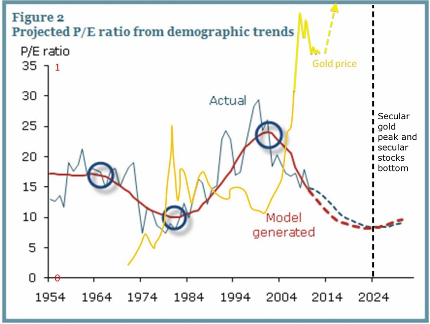
Gold behaves as the anti-demographic. This chart shows US demographics versus p/e ratio (equivalent to inflation-adjusted stocks) and gold price on a long term view. P/es or real stocks trend with demographics in secular fashion and gold the inverse.

12se1

Underlying Chart: Glenn Morton / My annotations

In the 1970s we saw a gold secular bull as demographics declined, then 1980-2000 the inverse. Demographics turned again around 2000 and put us in a secular stocks bear and secular gold bull from then through to circa 2025, which makes the gold correction since 2011 a pause in proceedings, similar to the Dec 1974 – Aug 1976 correction in the last secular gold bull:

12se8The late 20s stock market peak was equally a demographic peak and gave rise to a stocks bear / gold bull combination. Homestake Mining is used as a proxy here:

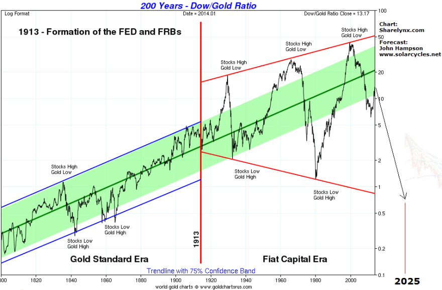
Screen Shot 2014-09-12 at 08.10.01Gold should make a speculative mania into solar cycle 25’s peak, circa 2025, with this target on the dow-gold ratio:

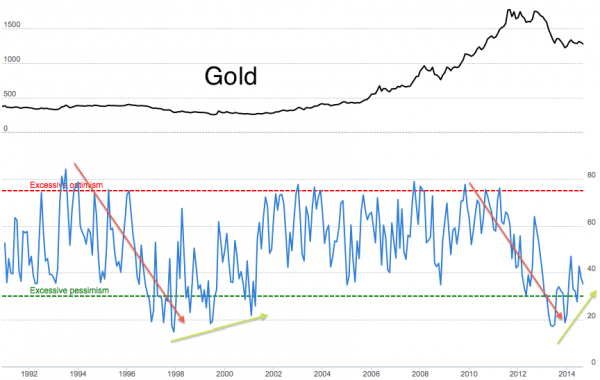
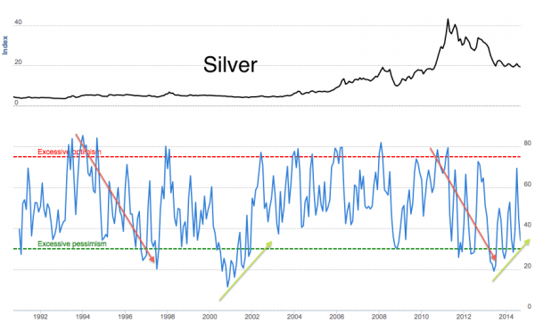
12se7A look at long term gold and silver sentiment shows a pattern has developed over the last year similar to the lift-off in 2000.

12se3 12se4Source: Jeremy Lutz

Cross-referencing with the current position in stocks, we see a range of topping indicators and extreme overvaluation in equities, which sets the scene for a new cyclical stocks bear (within an ongoing secular bear) to erupt imminently whilst gold resumes its secular bull. So I am looking for a floor in precious metals around here (I am long and looking to add).

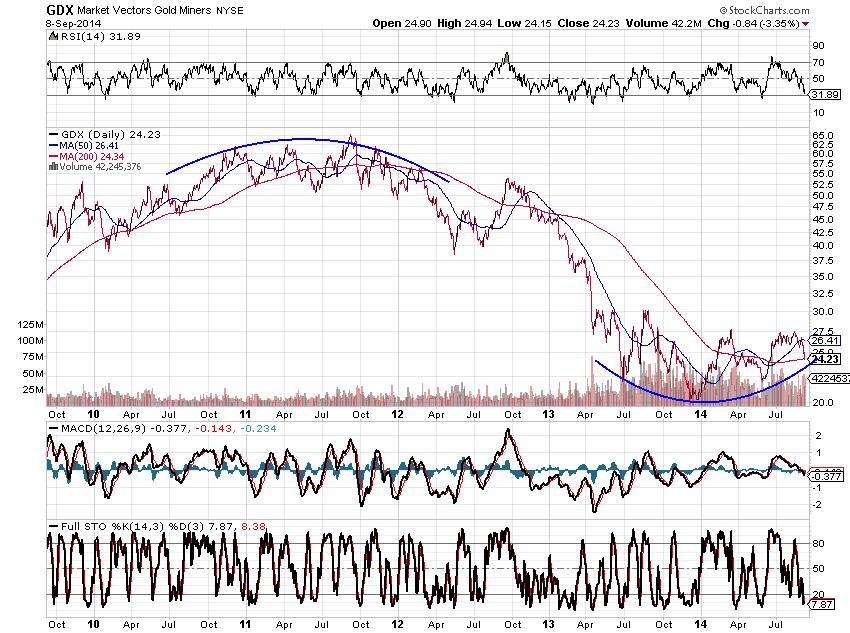
Gold miners show a rounded bottom whilst gold sentiment has reached bottoming levels:

12se10

Source: Emma Masterson12se5

Source: Mark Hulbert

Gold has been falling the last several weeks in dollar terms as the USD has rallied strongly, but gold in yen, sterling and euros looks more healthy. The rising dollar is consistent with the deflation theme that is powered by demographics, and this theme should pull the rug sharply from under stocks in due course. When that occurs, gold should lift off, as in 1987:

29au14Source: P De Graaf


10 Indicators Cross-Referenced

1. Investors Intelligence

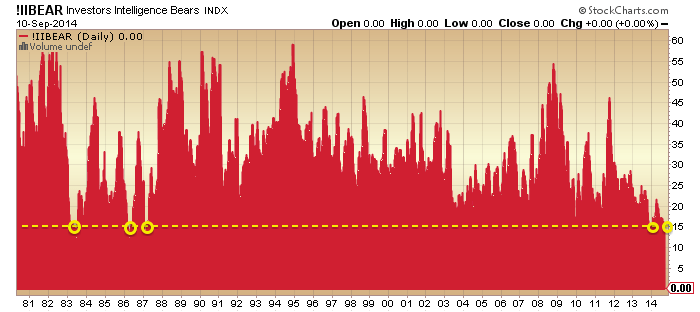
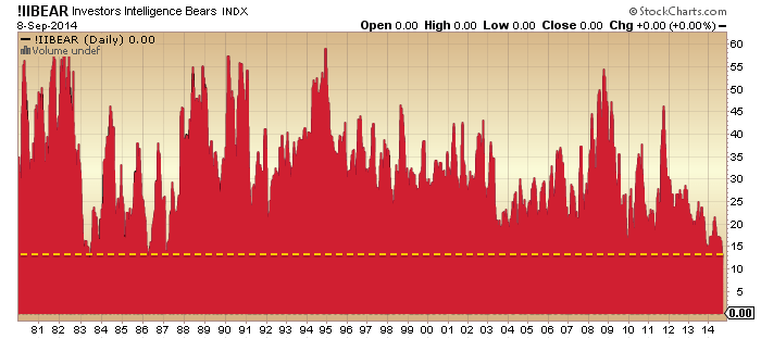
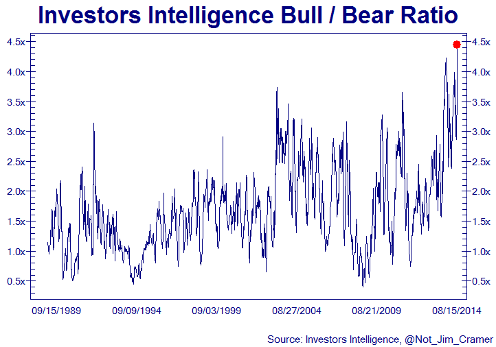
II Bears (advisor sentiment) is sub 15 again this week, previous clusters shown:

11se1

 Source: Stockcharts

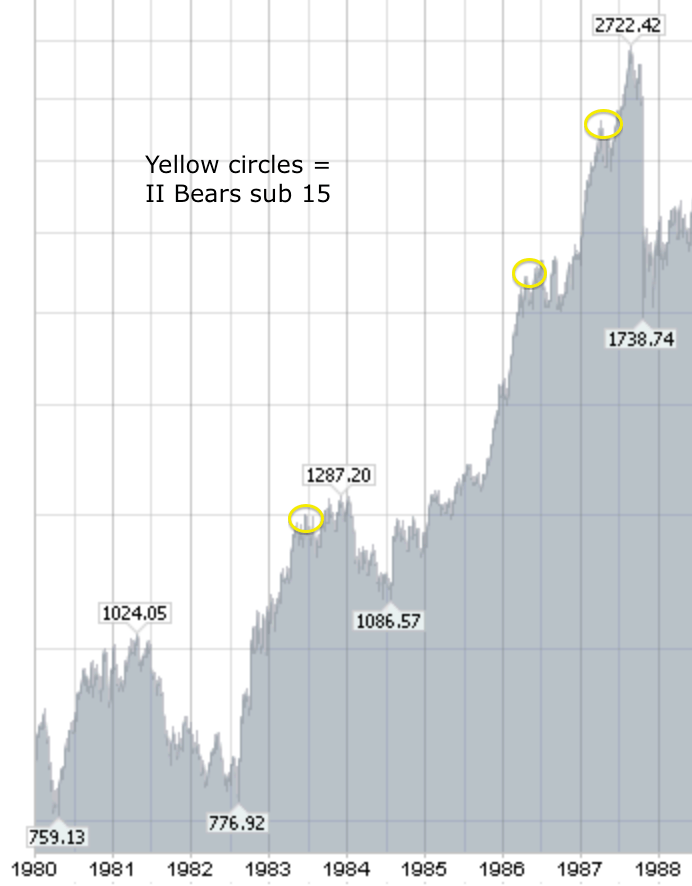
Here are those sub 15 readings on the 80s Dow:

Screen Shot 2014-09-11 at 09.09.12

 Source: Stockcharts

The 1983 extreme II reading occurred 12 months after the new bull market kicked off, and is comparable to the spike down in early 2010 in the first chart that didn’t quite reach <15 bears. The 1986 and 1987 double (circa 5 years post bull launch) is comparable to the Dec 2013 and current extreme pair, but note how stocks rallied for 5 months after the 1987 extreme before collapsing.

2. Rydex

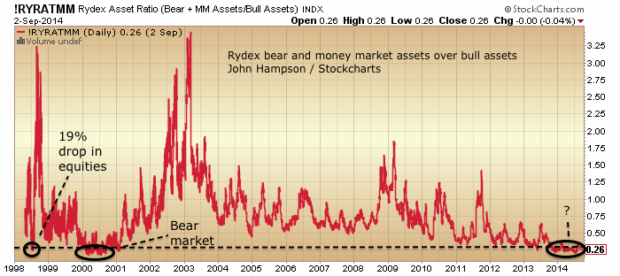
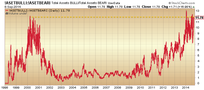
Rydex asset ratios (Rydex family of funds) current extremes are most similar to the 2000 period, namely a time band of extremely skewed holdings lasting for around 7 months in 2000, as we are seeing in 2014 (9 months mature).

3se13

Source: Stockcharts

But note that within that 2000 time band we saw two periods of major sell-offs: March to May and September to December. We have not experienced either so far in 2014.

3. NAAIM

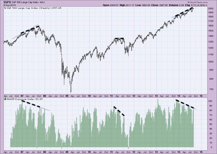
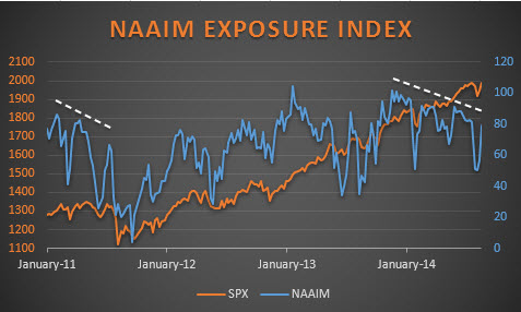
NAAIM exposure (managers US equities exposure) made a pattern of extremes-plus-divergence at both the 2007 and 2011 market peaks:

11se3

 Source: Acting-Man / My annotations

We see similar extreme high readings plus the same gradual divergence since November 2013. The pattern is most similar to 2007, where it lasted 10 months before the market finally entered a bear market. Here in 2014 the pattern has also been in play for 10 months.

4. HYG:TLT

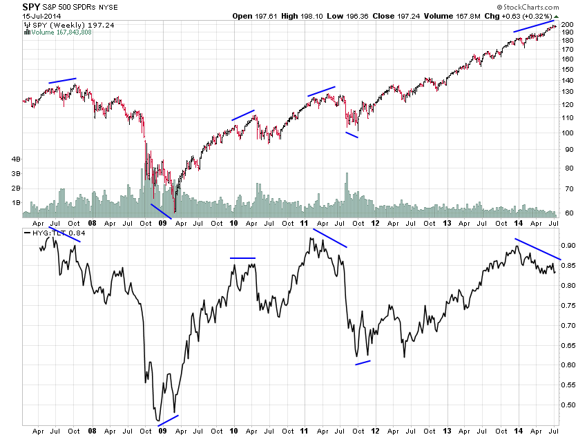
The high yield to treasury bond divergence (a risk off measure) lasted 4 months, 5 months and 5 months at the 2007, 2010 and 2011 market peaks. The 2014 divergence has been running 8 months and is therefore excessively mature.

11se8

 Source: Jesse Felder

5. Skew

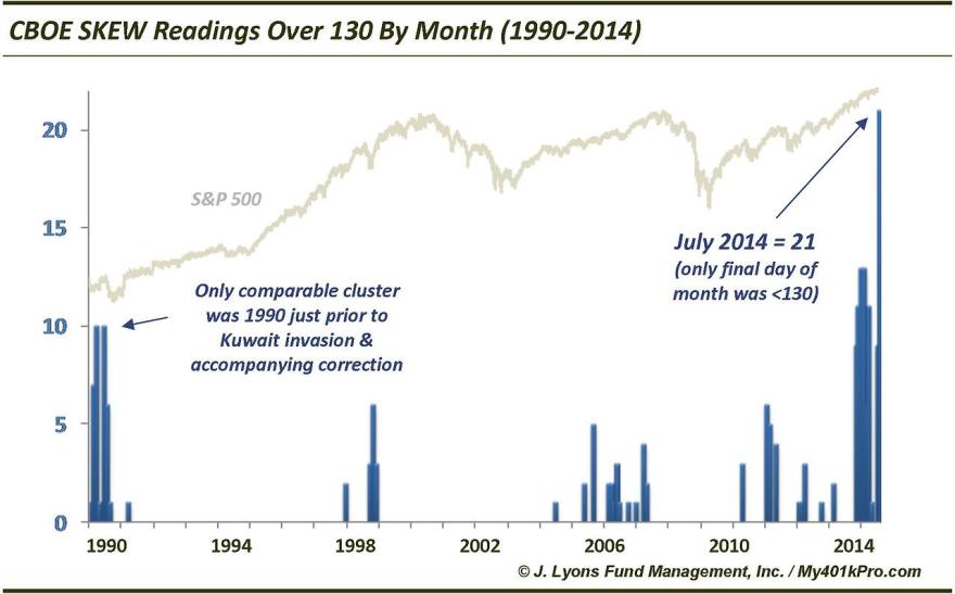
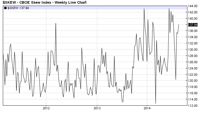
The persistent extremes in Skew (risk of outsized move) beats any historic parallel, but we could point to 1990, and the most recent cluster in 2011, both which produced 20% sell offs in the market. The 1990 cluster lasted 7 months which makes the 2014 cluster, at 10 months, again excessively mature.

11se10

 Source: Dana Lyons

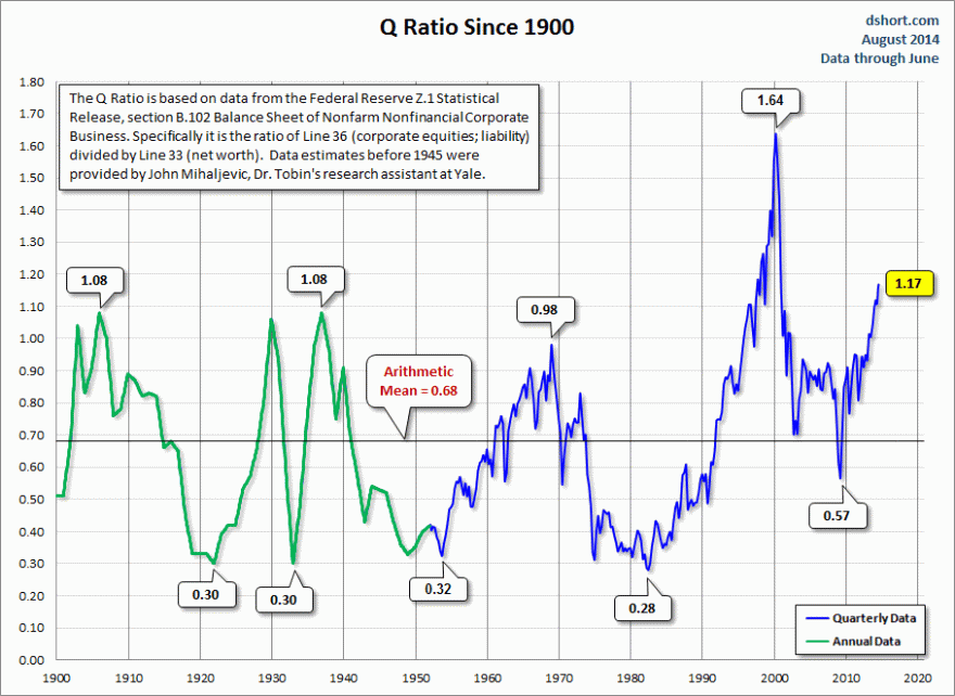
6. Q ratio

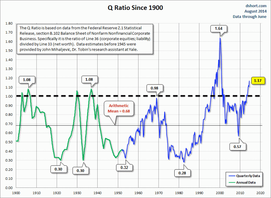
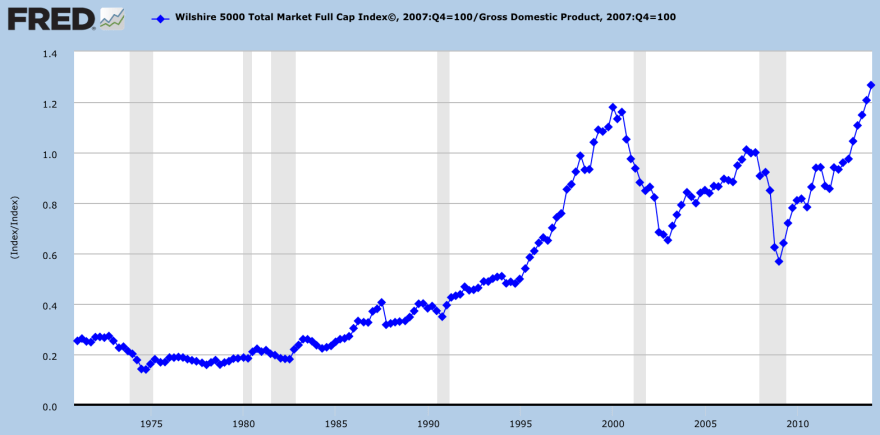
Q ratio valuation (replacement cost of stock index companies) shows that flirtations with an extreme value of 1 were historically swiftly repelled (by bear markets) with the exception of 1996-2000.

11se12

Source: D Short

With the stock market now 2 years above the 1-level, the closest parallel is that period into 2000. Note there was a 20% correction half way in 1998. However, the run up to 2000 was a demographic peak, this is not, and valuations need demographic context. I believe 1937 is the most applicable mirror which puts us ripe to fall.

7. Household Equity Allocations

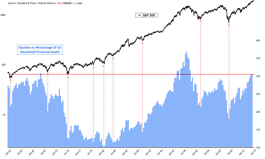
Equities as a percentage of US household financial assets have historically signalled market peaks once flirting with the 30% region, with the exception of 1997-2000. Again, demographics do not support this indicator rising to higher levels, so I would mark this indicator as similar in outlook to the one above.

11se27

 Source: ShortSideOfLong

8. Margin Debt

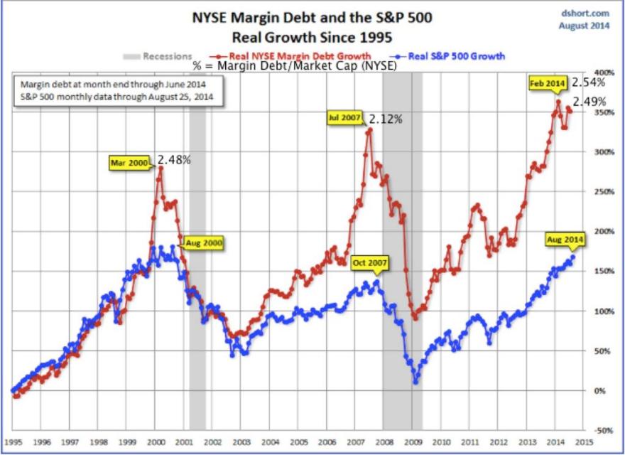
Margin debt (investor leverage) surged for 15 months into 2000’s peak and 10 months into 2007’s peak whilst the surge into the Feb 2014 peak lasted 18 months, so relatively mature. Whilst the Feb 2014 margin debt peak is only tentative currently, it occurred 6 months ago, versus 5 months and 4 months pre-peak in 2000 and 2007, so also relatively mature.

11se6

 Source: D Short / U Karlewitz

9. Sornette Bubble

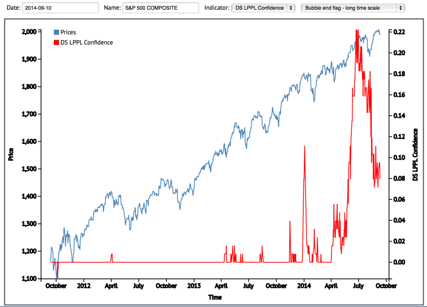
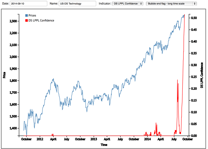
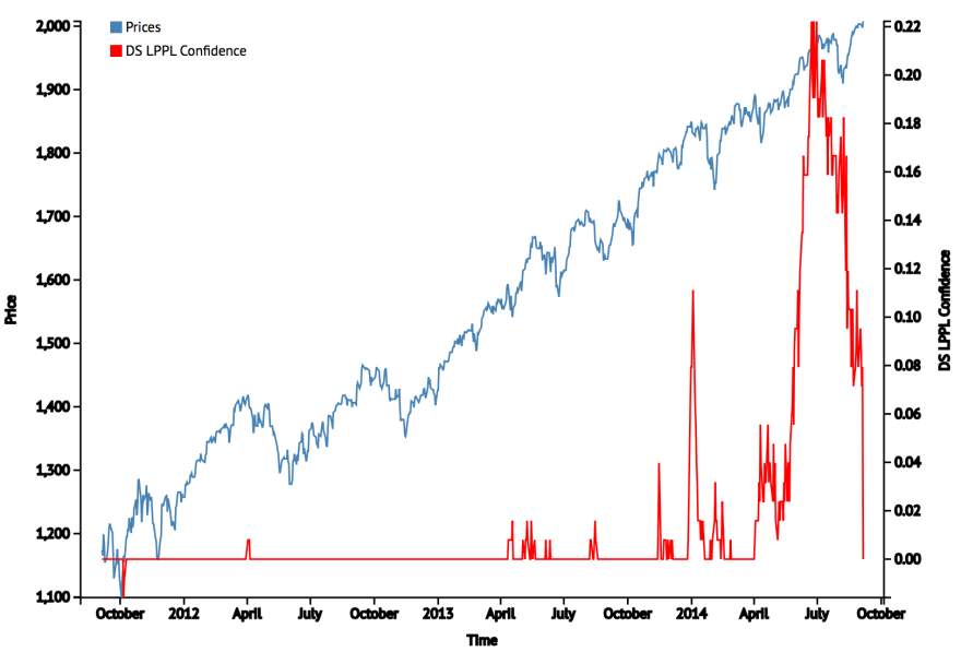
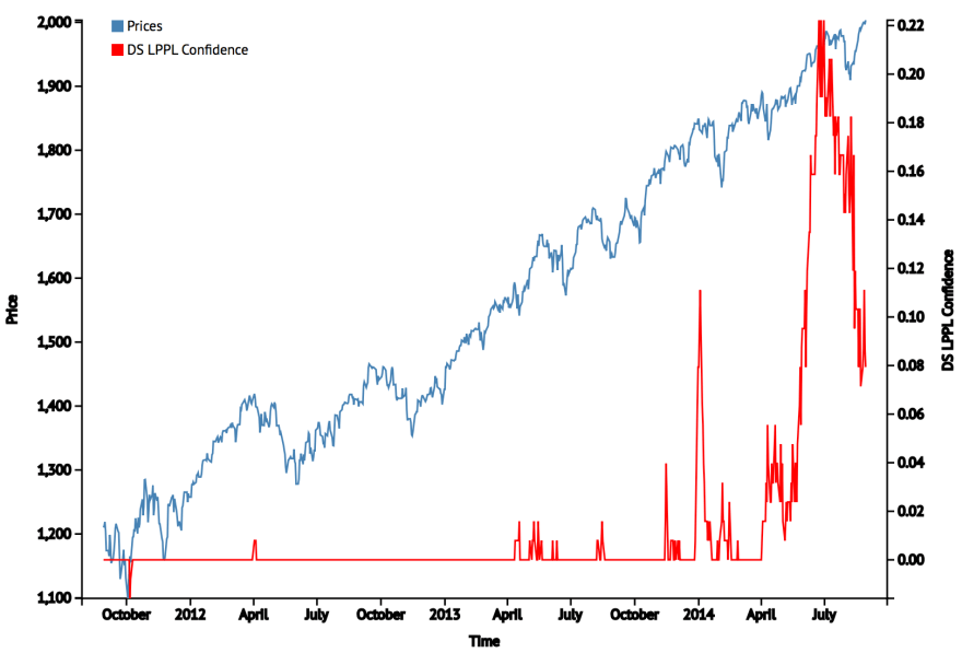
Sornette’s bubble end flag calculation looks like this currently on the SP500 and the US tech sector:

Screen Shot 2014-09-11 at 10.37.45 Screen Shot 2014-09-11 at 10.38.29

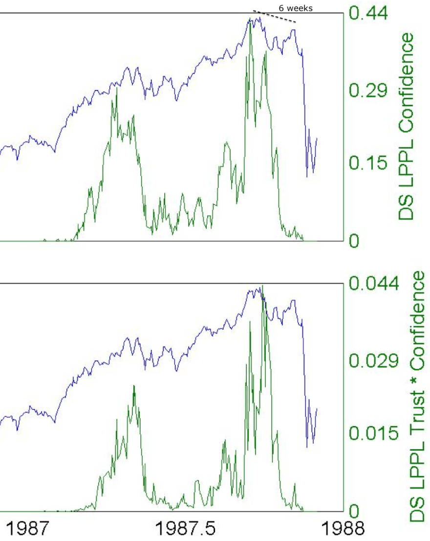
Compared to historic examples, the SP500 has not flagged at as higher intensity, whereas the tech sector now has. On the other hand, the tech sector flag looks fairly ‘new’, whereas the SP500 flagging has built up gradually. Neither have spiked multiple times in an extended period like in 1929 or 2000 (which both lasted around 2 years). At this point, the picture is most similar to 1987 of the three.

11se25

11se21 11se23

 Source: Financial Crisis Observatory

10. Solar maximum

By most solar models, the smoothed solar maximum is behind us, circa March 2014. If this is so, then the last four solar maxima delivered the asset mania peak within 5 months, which makes the current peak ripe.

Screen Shot 2014-08-10 at 16.30.44

There are question marks over how close the timing ought to be (looking further back in history), and we cannot yet be sure the smoothed solar max is behind us. However, this is where cross-referencing comes in useful.

Investors Intelligence argues the top should be before 2014 is out, whilst NAAIM calls for one straight away. Rydex, Skew and HYG:TLT all argue a sharp correction circa 20% or a bear market is overdue, and margin debt tentatively does too. Meanwhile, Q ratio and household allocations argue for a sharp correction circa 20% imminently or a bear market too.

All these indicators cast great doubt on the speculation peak being some way ahead in 2015. Collectively they argue for us to be in the last gasps of a topping process that began at the turn of the year. If stocks were to continue to rally into 2015 then we would print major anomalies in all these indicators: they all worked historically, but this time is different. I don’t buy that.

The Sornette bubble either places the market at a 1987 style peak now, or will come again at a higher intensity any time up to the end of 2015. The solar cycle places us either ripe to fall, 5-6 months post smoothed solar max, or also may allow for a peak up to the end of 2015.

I therefore believe that the logical case is for the eight market indicators to work once again and deliver a peak now, which then fits with the 1987-style Sornette reading and the most likely smoothed solar max / speculation peak lag combination. It all fits together, it all fits with history.

Short Term Clues

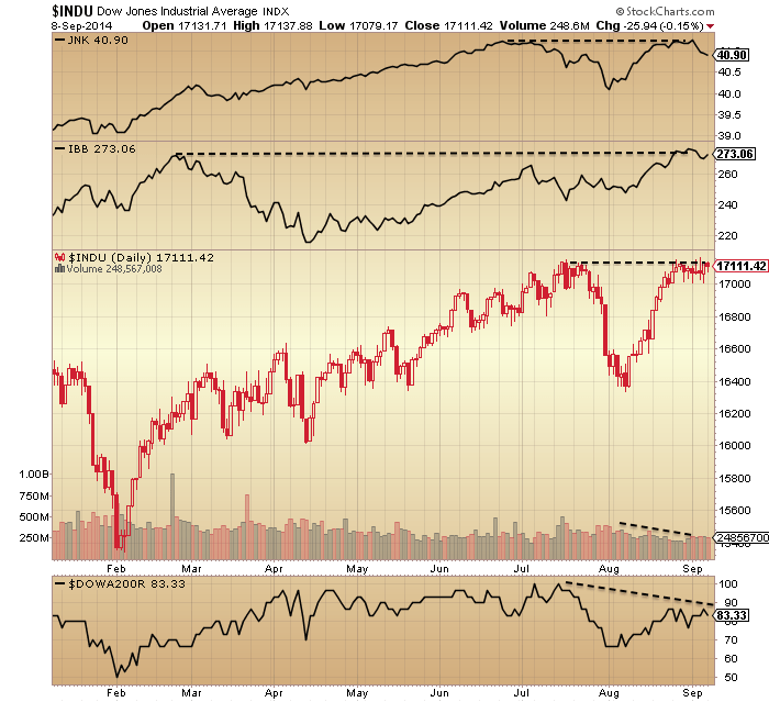
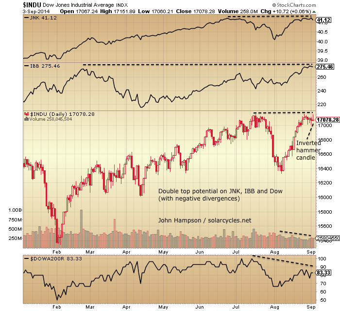
The Dow, Biotech and Junk bonds are all still flirting with double tops and are unresolved at the time of writing, though JNK has been the most repelled (Stockcharts):

9se18

In the last two weeks before yesterday, all the gains in SPY came out of hours (Fat-Pitch).

The best performing sector of the last two weeks was Utilities, in line with the YTD (Macromon).

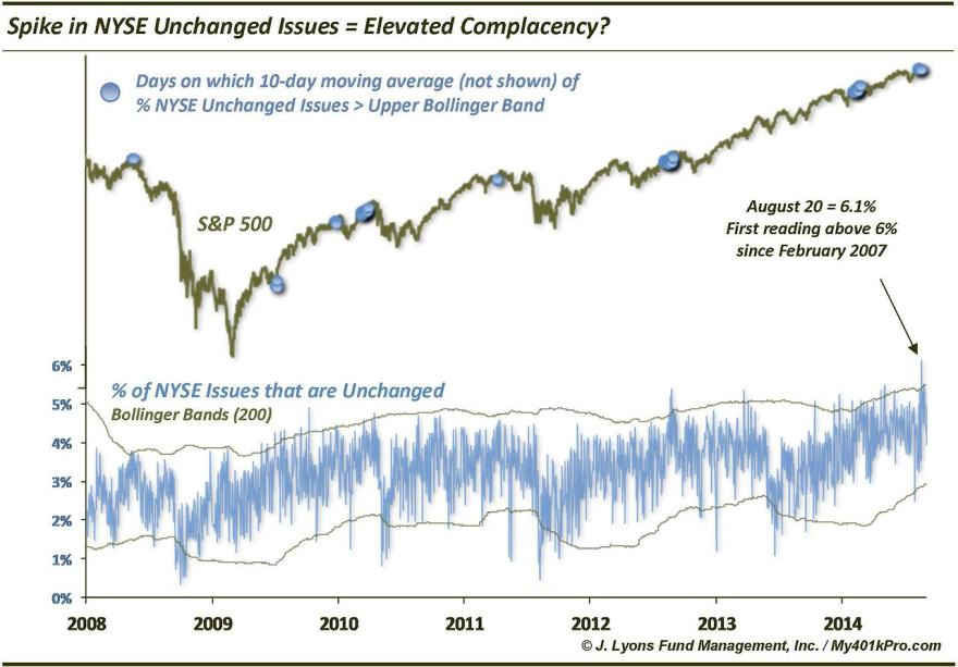
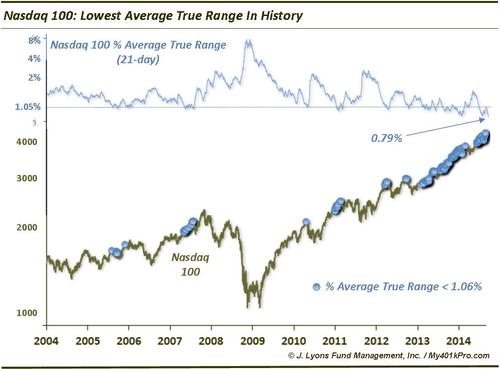
Volatility reached new lows, and suggests complacency which occurred into and around previous peaks (J Lyons):

9se9

9se10

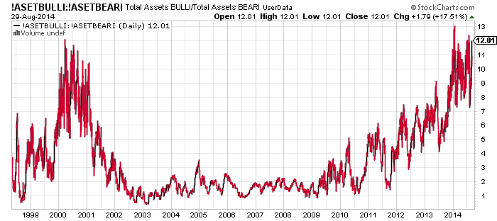
Rydex bull/bear assets at the end of yesterday are back up to near 12x levels, on a par with the 2000 peak and all-time extremes.

9se14

Investors Intelligence percentage bears is down to 13, on a par with the 1980s lows:

9se15

The Sornette bubble end flag has dropped to zero (Financial Crisis Observatory):

Screen Shot 2014-09-09 at 10.26.37If the July flagging was the bubble end, then it would fit with the model from 1987, which flagged and then several weeks later the market collapsed:

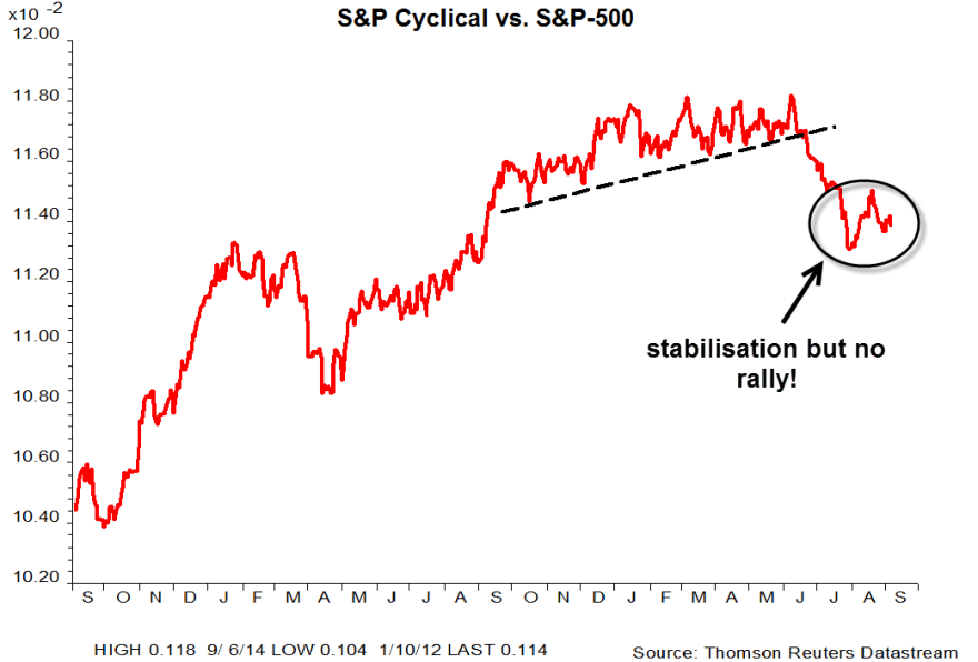
Screen Shot 2014-09-09 at 12.03.44In support of the July bubble pop scenario, cyclicals broke down around that time (UBS):

9se3

If July wasn’t the final peak, then the Sornette bubble should rise again and flag at a higher intensity in the future.

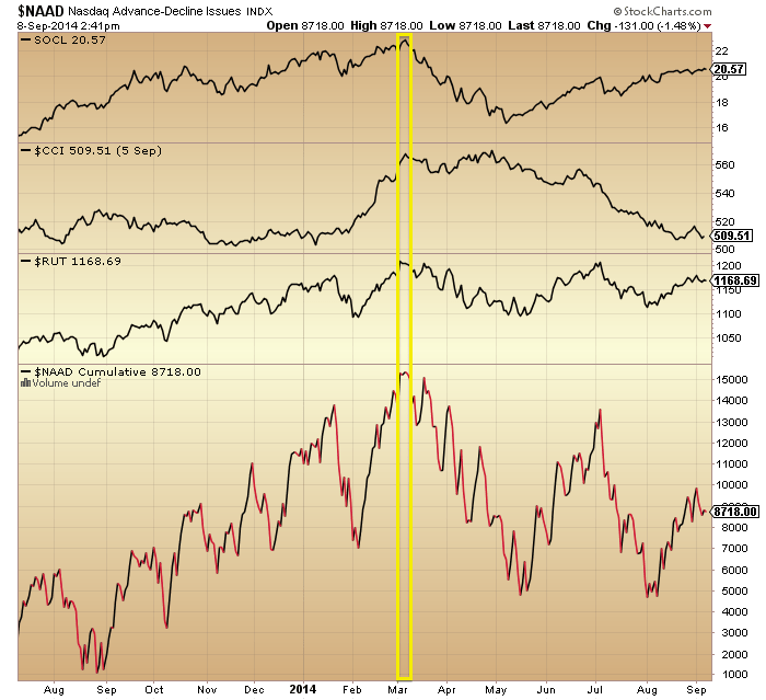
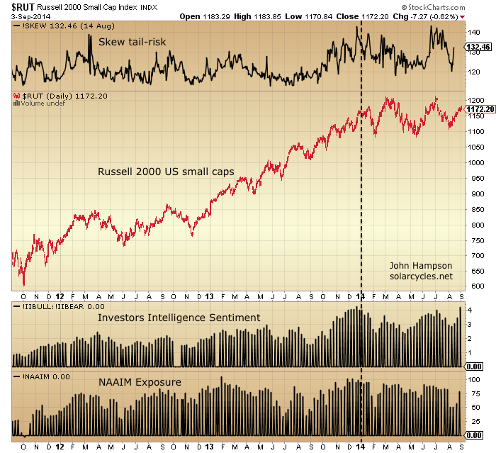
Evidence in support of the speculation/solar maximum being around March time and behind us comes from the current peak margin debt reading and the first of the double tops in biotech, but also seen here in peaks in social media, commodities, Russell 2000 and Nasdaq advance-declines:

9se20

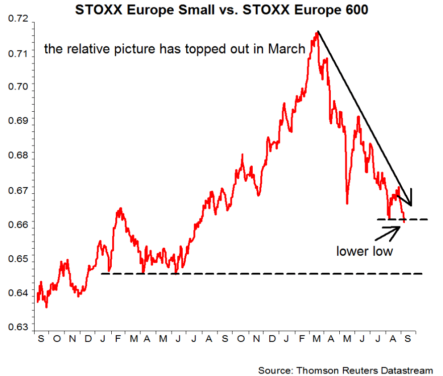
Like US small caps, the relative performance of European small caps also peaked out at that time.9se1Today is the full moon. Let’s see what it brings.

Characteristics Of A Stock Market Peak

Focussing on the US stock market, I’ll divide this into two: what’s currently flagging a peak, and what’s – arguably – missing.

First, the different angles and disciplines that are signalling a top.


A. Valuations

(1) CAPE, (2) CAPE/Baa yield, (3) Crestmont, (4) Q ratio, (5) Stock market to GDP ratio, (6) Median stock, (7) Relative pricing to bonds and commodities, (8) Relative pricing to other countries, and (9) Relative pricing to demographic trends: all show extreme overvaluation, fitting with previous major peaks.

B. Sentiment & Allocations

(10) Investors Intelligence, (11) Rydex, (12) Fund Managers, (13) AAII allocations, (14) Households, (15) Put/Call Ratio. We don’t need to speculate about whether this is ‘the most hated rally’ or whether Joe Public has yet to get involved. These measures collectively tell us that allocations and bullishness are extreme high and echo previous major peaks.

C. Dumb Money

(16) Retail v. Institutional, (17) Major distribution days, (18) Multiple Expansion, (19) Money losing IPOs, (20) Buyback levels. Again, these all resemble previous peaks.

D. Leverage

(21) Margin Debt, (22) Net Investor Credit, (23) Leveraged loan issuance. Compensating for a lack of demographic tailwind these have been driven to new all-time records.

E. Negative Divergences

(24) Stocks over 200MA, (25) New high-lows, (26) Nasdaq advance-declines, (27) NAAIM exposure, (28) High-yield to treasuries, (29) Consumer discretionary to utilities. These have broadly been in place since the turn of the year and are now mature versus previous major peaks, suggesting we should be around the end of a topping process.

F. Technical Indicators

(30) Skew, (31) Extreme low volume (Nasdaq and SPY volume on up down days), (32) Extreme low volatility (levitation above 200MA, weeks without a 3% move), (33) Sornette bubble end flag, (24) Compound annual growth. A variety of angles, each with a case for a peak.

G. Sector & Asset Rotation

(35) Best performing asset in 2014: Treasuries; (36) Best performing sectors: Utilities & Healthcare; (37) Hot assets, sectors and indices broke down from parabolics: Bitcoin, RUT, SOCL, IBB (tentative). In summary: out of speculative and cyclical and into defensives.

H. Natural Force Timing

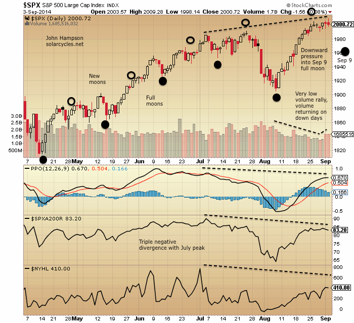
(38) Peaks typically occur close to solar maxima (est. March 2014 (RUT)), at (39) Inverted geomagnetic seasonal peaks (Dec/Jan (risk, Nikkei), Jun/July (Dax, Dow)) and (40) Close to new moons (in Jan, Mar, Jul and Aug). The solar maximum is the question mark, because it is an estimate currently, but we know we are in the timezone of a smoothed solar maximum and from history a market peak is likely near.


Drawing all these angles and disciplines together it should be clear that we are in the vicinity of a stock market peak. You may take issue with a particular discipline or a particular angle or those indicators with shorter histories, but the collective case overwhelms. If you take issue with the collective case by arguing that is has all been distorted by QE and ZIRP, then I would point to 1930s US and 2000s Japan where the conditions were the same and we nonetheless experienced bear markets and recessions. But I’ll tackle this distortion idea more below.

Let’s now turn to what may be missing for a stock market peak and thus keeping the bear market at bay.


I. Topping pattern and technical breakdown

Nikkei, FTSE, Dax, Russell 2K are all overall flat for 2014 and display typical topping patterns. Yet, the other US indices remain in clear uptrends, India’s Sensex remains in a steep ascent, and the Hang Seng recently broke out. So the overall picture is mixed. None of the indices have made a decisive technical breakdown at this point.

J. Leading Indicators, Corporate Profits, Recession models, Financial Conditions

Conference Board LEI, ECRI WLI, corporate profits, yield curve recession model, other proprietary recession models. Corporate profits have turned down by certain measures but not all and the rest of these indicators display no clear warnings currently. Economic surprises are currently positive and the US economy is generally doing ‘fine’. More on these below.

K. Inflation & Rate Tightening

Commodities and inflation rallied from Nov 2013 and peaked out in May 2014, but still at overall historically low levels. Yields tightened into the end of 2013 but since then have reversed and eased. The Fed remains on zero rates but is tapering QE to an Oct 2014 termination. This is a general misfit with recent bull market peaks that have seen higher inflation and a series of interest rate rises. More on this below.

L. Question marks over (i) The solar max, (ii) Sornette bubble end flag, and (iii) NYSE Advance-Declines

Most solar models predict the smoothed solar max to be behind us, circa March 2014. However, SIDC are still running with an alternative model that peaks at the turn of 2014-2015. Also, Mark has a theory that under weaker solar maxima, like this one, speculation runs beyond the smoothed solar max, which would also take us beyond the end of 2014. The Sornette bubble end that flagged in July was at a lower intensity than mirror bubble ends in history, allowing for a potential greater flag ahead (which would imply the market needs to rally further yet). NYSE advance-declines have not negatively diverged yet unlike previous recent major peaks, however they did not at all peaks, and Nasdaq advance-declines have been divergent for 6 months.

More on these below.


Leading indicators by CB and ECRI typically do a good job of announcing recessions ahead of time (though there have been some false positives and false negatives). However, they are not a good predictor of the stock market, with research showing they are typically coincident with each other.
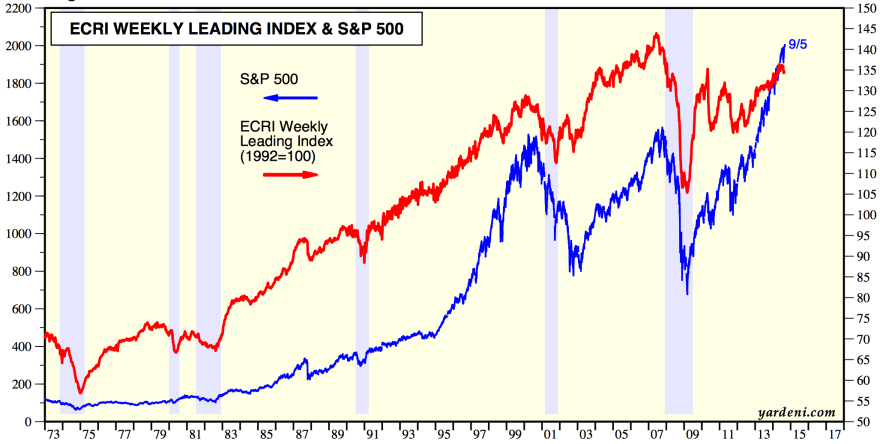
Screen Shot 2014-09-08 at 08.16.18

Source: Yardeni

The stock market is a leading indicator of recessions itself, and in fact an agent, due to the wealth effect. Both ECRI and CB accordingly include the stock market performance in their leading indicator calculations.

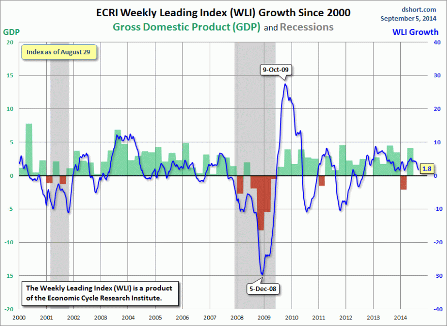
ECRI WLI growth turned negative in 2000 and 2007 after the SP500 had suffered initial falls of around 15% in both cases (from March 2000 and from June 2007). In 2014 we have seen no such damaging break yet, but with ECRI WLI down to 1.8, a true technical break in stocks would likely pull it below.
7se8

Source: DShort

CB LEI topped out with the market in March 2000, and whilst it topped in early 2006 ahead of the 2007 market peak, it didn’t fall until stocks fell in 2007.

Turning to corporate profits, they also typically turndown as a leading indicator of a recession, but there are different ways of calculating this indicator.

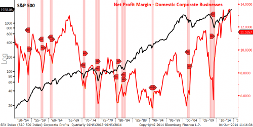
The first method below shows profits peaked ahead of the stock market peak six times, coincident twice and after once. By this measure corporate profits peaked at the end of 2013, and are diverging in line with the majority of historic cases.
7se8

 Source: PFS Group

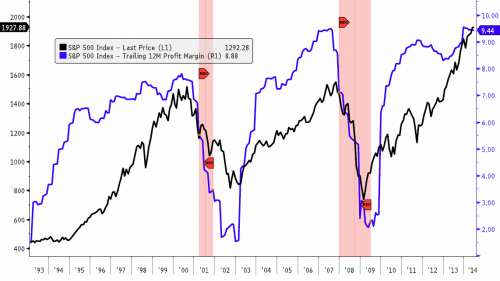
A second method shows that corporate profits peaked out coincidentally with the stock market the last two times (or along with the initial falls of ~15%), and accordingly this measure is still levitating with stocks in 2014.
7se9

Source: PFS Group

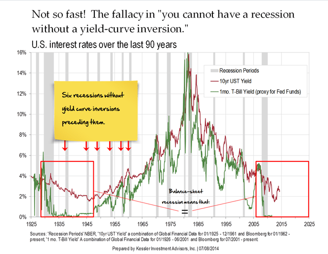
The yield curve as a recession predictor does not work under ZIRP. Japan three times entered recession without yield curve inversion under ZIRP, and the US did likewise in the 1930s-40s.
7se3

 Source: ZeroHedge

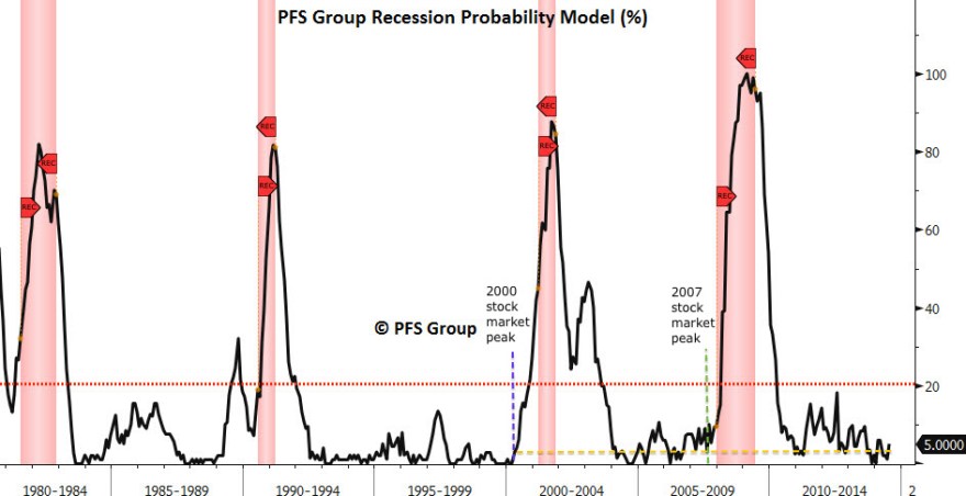
PFS’s recession model is proprietary but note how it only took off once stocks fell hard in the last two peaks:
7se10

Source: PFS Group

Like ECRI and CB leading indicators, it is coincident with the stock market.

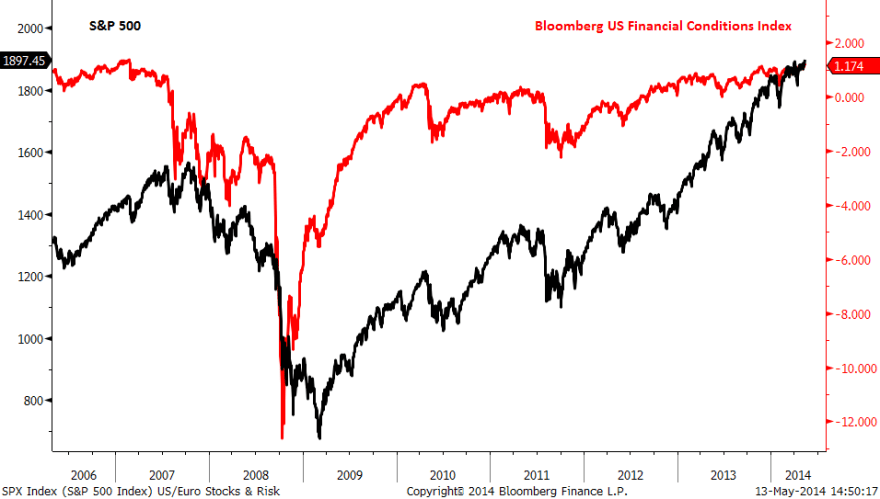
Similarly, financial conditions also did not fall until the stock market peaked in June 2007, May 2010 and July 2011.
7se5

 Source: Financial Sense

In short, leading indicators, financial conditions and valid recession models are benign whilst the stock market continues to levitate. Once it falls, they will begin to flag, as the wealth effect rapidly declines. The yield curve model is invalid and corporate profits are either coincident or warning with negative divergence, depending on the method. So, none of these indicators are bullish support for the stock market.


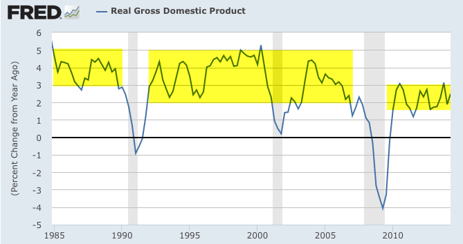
US QE is being wound down and will end in October. The stats show that 80% of QE money is parked as excess reserves at the Fed paying a meagre return to the banks. This is because they can’t lend it out: the demand simply isn’t there under demographics. The money multiplier and money velocity are both still in decline. So, 80% of QE money is impotent for now, but this is a threat for the future once demographics improve and demand comes back. The other 20% of QE money is difficult to track, but under conditions of ZIRP we can assume some has entered the stock market searching for yield and return. Ultimately though, QE does not create economic growth: it is just corruption of the money mechanism. Therefore, price rather than the earnings has risen significantly in stock market, making for valuations on a level with previous major peaks. Zero interest rates encourage money to search for yield but also can only tweak demand, not revolutionise it. Also, a large swathe of retirees have less income under ZIRP which acts as a drag in the economy.

The reality is that the US economy is overall chugging along at a lower rate than in the past when demographics (and debt levels) were more favourable. As in the 1930s US and 2000s Japan, QE and ZIRP can only have limited effect whilst demographics dictate.
8se10

 Source: Fat-Pitch

Demographics are both deflationary and recessionary. Therefore, we have seen overall low inflation recently and the Fed does not have the luxury of rate rises. The point about both inflation and rate rises is that they choke the economy in rising input prices and tightening. Yet demand is too weak to stoke inflation and the economy too weak for rate rises. The tightening is coming from QE wind-down, but as noted the overall effects of QE are less than touted. I would argue that a sharp fall in equity prices is all that is missing from tipping the economy over, and that we again have to look to 2000s Japan and 1930s US as the most relevant analogs here.

We could argue that falling commodity prices lower input costs and are a driver for the economy and that falling yields are effective as easing. However, if we are in the last gasps of a stock market top then both treasuries and commodities are acting as per a deflationary recession.

The ECB cut rates and launched a form of QE last week. Does that offset the Fed winding down? Analysis of the ECB package shows it to be more window-dressing than content. The Eurozone economy is 3.5 times the size of Japan yet its package amounts to just one tenth the size of what Japan is doing, whilst the rate cuts were largely symbolic. Despite Japan’s aggression, the effects have been disappointing, which brings us back to the point about what QE actually does: it does not drive economic growth, and therefore, the new ECB actions are unlikely to make a significant difference.

Leading indicators predicted a mid-year upturn in US economic growth and this has occurred. Accordingly, economic surprises have leapt into the positive. However, leading indicators predict a peak in growth around now, which should set the scene for disappointment in data in Q4. As this coincides with the termination of QE, maybe this combination will unsettle the ‘Fed policy trumps all’ crowd perception.

In summary, the evidence suggests policies of ZIRP and QE are limited in their potency. They may both play a role in current higher stock market valuations, but the disconnect between prices and earnings/growth is bearish, as it was in 1937. The weak economy under demographic trends is unable to support inflation and rate rises, and I believe is at the mercy of the stock market. Namely, if the stock market falls, the economy will tip over. If it doesn’t it will continue to chug along.


So what is the trigger for the stock market? History shows that major peaks typically occurred without a major trigger, and then sharp falls occurred once there was a suitable technical break. So what factors bring about the topping out?

The evidence suggests one is saturation or buyer exhaustion. We have very recently seen sentiment, allocations and leverage all back to extremes of extremes. I therefore believe we are running out of fuel to go higher: everyone bullish, no-one left to buy, credit facilities stretched.

A second one is natural force timing, and the biggest factor in 2014, I believe, is the solar maximum. Most models point to a smoothed solar max being behind us, around March. Most market peaks, and growthflation peaks, occurred very close to the smoothed solar max, so we should be able to cross reference this.

As things stand, margin debt peaked Feb, the Russell 2K and social media peaked Feb/Mar and biotech is making a double peak now with Feb/Mar. Also, commodities and inflation peaked around April time, and we have seen various indices and risk measures peak out between December and August, either side of this kind of epicentre. So it looks promising.

However, as noted, SIDC are still running a model with an end of year smoothed solar max, and Mark’s theory is that weaker cycles such as this won’t see speculation peak until later in the maximum, not until 2015. Playing into these possibilities we see biotech, junk bonds, the Dow, and (likely) margin debt challenging their highs and attempting breakout. We can also monitor sunspots in real time to see if likely to exceed Feb.

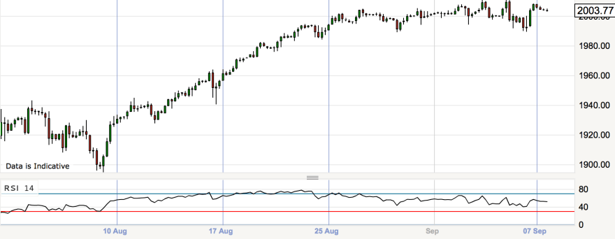
So, I believe we have a useful combined measure there: if JNK, INDU, IBB, leverage and sunspots all break upwards and out to new highs then peak speculation is delayed, and we might then also look to the Sornette bubble end flag to rally again to a higher intensity. However, cross-referencing further, with sentiment and allocations last week back to record extremes, I see a breakout will be very hard to achieve here. Plus, the mature divergences in the market suggest this should be the last gasps of the topping process, not earlier in the process, and we are in the relevant time of the year for the falls to occur. I therefore continue to believe that the most likely scenario is that this rally since August 8th is the terminal rally, shown arching over on the 4-hourly SP500 below, and that JNK, INDU and IBB will all double top out.
Screen Shot 2014-09-08 at 10.16.32

 SP500 4-hourly


Summary

40 indicators in 8 angles argue for a stock market peak. The only question is the timing, and that is the difficult calculation. The best-fit remains an epicentre of March 2014, placing us now in last gasps. Breakouts from here in several speculation measures would negate that and postpone the top. When the stock market falls it should trigger the ‘missing’ alerts in recession models, financial conditions and leading indicators. The effects of QE are overstated, whilst ZIRP and disinflation reflect the overarching weakness in demographics. Whilst the stock market levitates, the economy should continue to chug along, but if the market falls meaningfully then the economy should tip over into deflation and recession. I believe the two key and associated drivers of the peak are buyer exhaustion and the solar-speculation-maximum, and it appears they came together to peak levels between January and now, making a topping process. Helping tip the perception should be the inverted geomagnetic seasonal lows of Sept-Nov, the predicted disappointing economic data ahead, and the termination of QE support. For this not to materialise, sentiment, allocations and leverage will all have to stretch to new levels of excess to enable a higher stock market. Whilst not impossible, it is not probable.

As Things Stand

The stock market topping process began at the turn of the year:

4se44se3

Speculation peaked in Feb/Mar along with the likely smoothed solar maximum:

Screen Shot 2014-09-02 at 16.34.44

So, topping process phase 1: turn of the year risk peak; topping process phase 2: Feb/Mar speculation peak. Topping process phase 3: mid-year bubble end peak:

Screen Shot 2014-09-04 at 10.13.48

The major stock indices peaked suitably at the seasonal highs close to new moons, either side of the speculation peak epicentre:

4se7The SP500 and Dow peaks are tentative at the time of writing but the signals are promising.

4se1 4se2

The Nasdaq has been the leader but also put in a potential topping candle yesterday.4se5

Has normality now been resumed? By normality, I mean negative divergences, volume patterns, sector rotation, lunar phasing, excessively frothy sentiment and allocations would all typically pull down the market. But the power of the solar maximum has trumped all, keeping the market levitated despite these being in play since the turn of the year. If the market still continues higher from here, then the sun’s influence isn’t through. But if the solar effect on humans is now waning, then the market should return to respecting those indicators of an imminent correction, and in doing so honour the phasing of the topping process as outlined above with a final roll-over here, into the typical period for market falls, Sept-Oct.

As previously noted, the aggregation of indicators and analogs suggests we should be in for a minimum 18% correction but most likely a bear market, and here is one more chart in support of that:

3se13


Last 30 Years

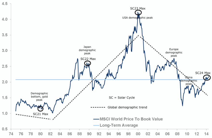
MSCI world equity index valuation chart for the last 30 years:

3se1

Source: Investec

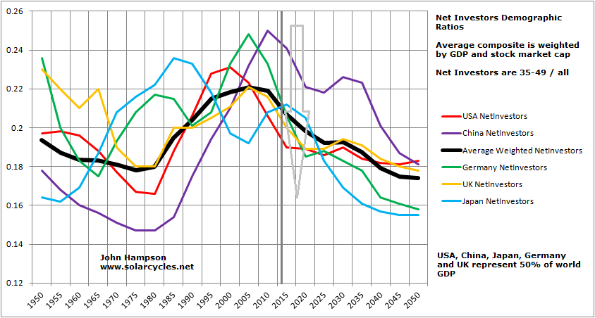
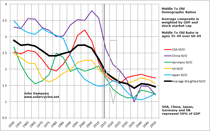
The overall dotted line trend matches the black global demographics composite in the next two charts:

3se2 3se3

Conventional analysis of equity valuations considers cheapness relative to history and averages as a predictor of returns. But valuation has to be considered relative to demographics, or rather, long term trends in valuation ARE demographics. Expensive will get more expensive if you have an increasing swell of people in the right age group to buy the market, and vice versa. By global demographics, we are destined for cheaper valuation yet, and the current bull rally is a counter-trend solar-maximum-inspired speculation peak.

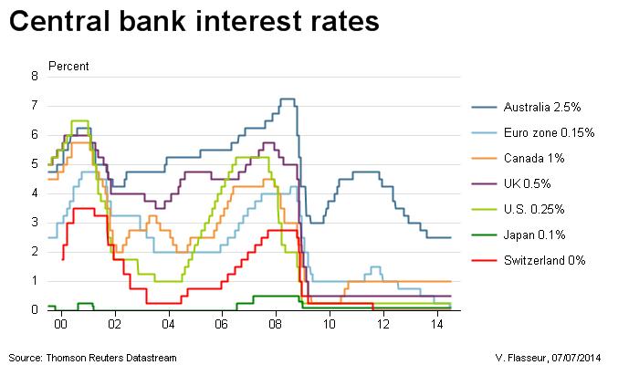
The MSCI world index is weighted like my demographic composites. Therefore the US demographic peak was the most important peak and put in the main top. Since then Europe and China have joined the trend change, making post-2009 the most heavy collective demographic pressure yet. Accordingly, we have seen interest rates held at unprecedented low levels due to the resultant economic weakness.

3se9


If demographics are so dominant then we should see evidence in the current counter-trend bull of major weakness under the hood, which we do.

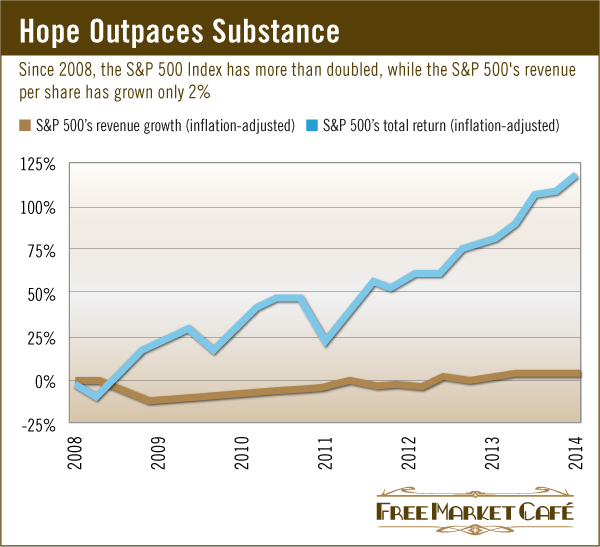
Whilst the SP500 has grown 120% in real terms since 2008, real revenues have grown just 2%. Companies have engaged heavily first in cost cutting then in buybacks. Sales remain elusive.

3se4

Also, the last 2.5 years in US stocks have been over 80% multiple expansion versus less than 20% earnings expansion, and this price-based rather than earnings-based expansion in equities whilst the economy has remained weak has taken stocks cap to GDP to an all-time record:

Screen Shot 2014-09-03 at 09.00.19

With a dwindling pool of stock market buyers under demographics, the market has been bid up on lower volume and increasing use of debt, taking the latter also to a new all-time record:

3se10Source: DShort / UKarlewitz

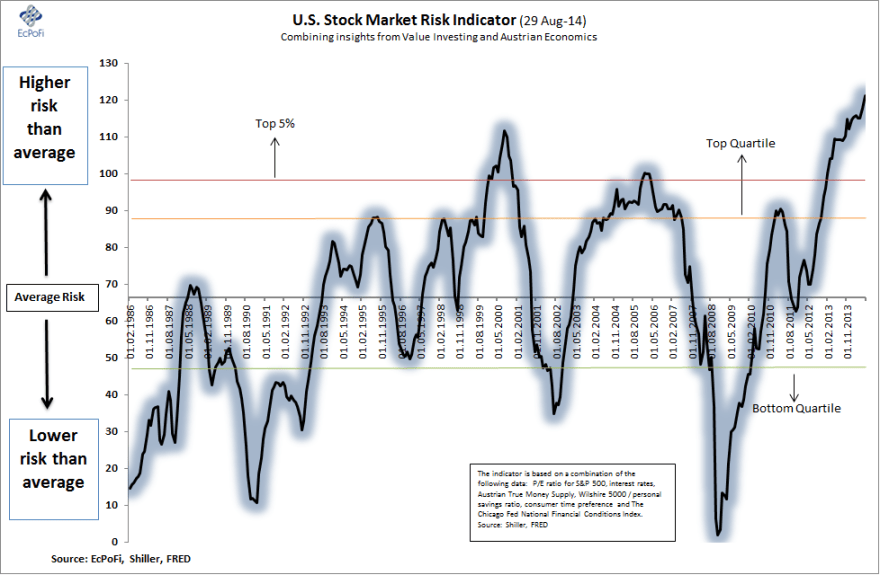
This mix of unhealthy attributes has taken stock market risk to an appropriate record:

3se9Source: EcPofi

In summary, the stock market rally since 2009 has been built despite demographics, largely through QE money, stocks buybacks, private investor leverage and a speculative pull into the SC24 solar maximum. But accordingly it is a rally at high risk of total reversal, it is a tower of sand.

It is the unprecedented collective demographic downtrend now in place between USA, Europe, Japan and China that make it so potent. World trade is depressed and each of these areas is struggling individually. Europe is on the cusp of deflation and recession. Japan’s Abenomics is not working. The USA, although outperforming currently in certain measures, is still operating at a lower all-round level of economic performance versus previous decades. And China, the last to tip over the demographic cliff, is now facing a bursting housing market and shrinking growth. In the 2000s China was driving the world economy, offsetting the USA which had gone over the demographic cliff. Now the world economy has no driver, with India’s economy still too small to offset all the majors. It makes for a negative feedback looping that ZIRP and QE should be powerless to stop.

Turning to the near term. Froth has gone back up to the max.

3se8 2se3Increased volume did return yesterday post Labour Day, to test the validity of last week’s rise. Indecision was the result, so we roll over to today. The market is up so far with a burst on Ukraine peace news. Recall the Bin Laden top? Bin Laden captured and killed 2 May 2011, the market burst up, closed down and it marked the top for the year. With the Dow, JNK and IBB all still at double tops, it could go either way here. So let’s see how today closes.

US Stock Market Valuation

Firstly, trailing 12m p/e valuation. This chart clearly shows this measure is a rather useless tool, and can be disregarded:

1se1

Source: D Short

Secondly, forward p/e (12m) valuation. This measure is based on expectations and guidance from companies and analysts. Under- and over-estimating is common for a myriad of reasons (some deliberate, some unrealistic), so this measure lacks reliability and produces another poor chart:

1se3

 Source: Invesco

Thirdly, dividend yield valuation. Also a valuation measure with problems, due to companies increasingly having moved away from paying dividends in favour of share buybacks:

Screen Shot 2014-09-01 at 15.47.11

 Source: Vector Grader

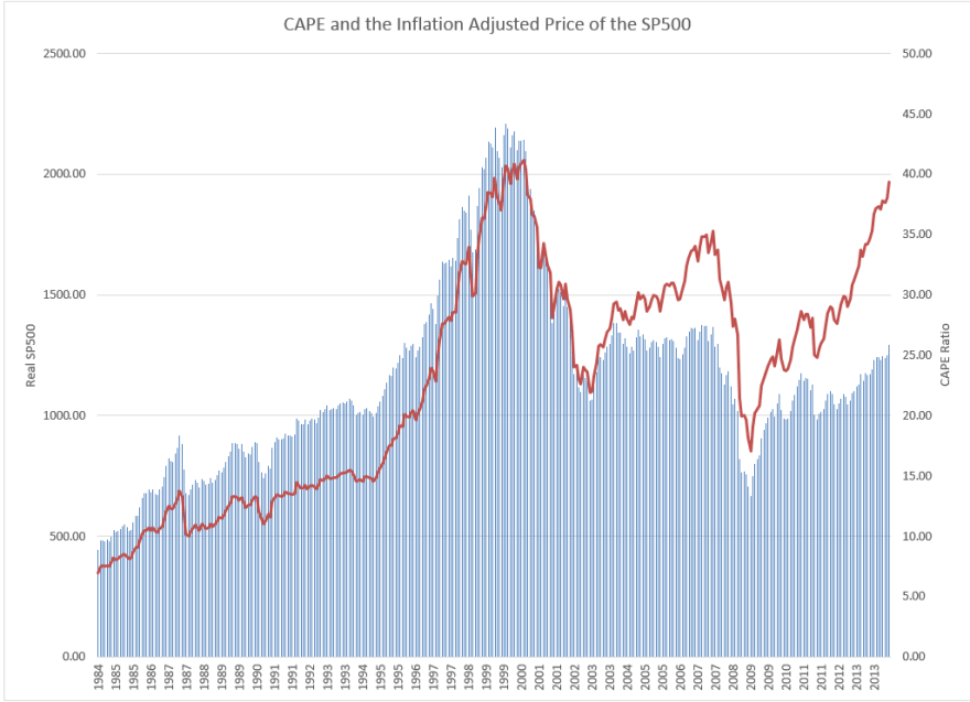
Fourthly, CAPE (or Shiller) valuation. Takes the last 10 years earnings inflation adjusted, and is much more reliable, with a 0.9977 historic correlation with the real SP500:

1se5

 Source: D Short

By CAPE valuation the SP500 is in the 93rd percentile of all historic valuations.

However, the last couple of years have seen the real SP500 diverge from CAPE, suggesting an additional degree of exuberance is in play:

1se6

 Source: Lucretalk

This is resolved by using, fifthly, the Crestmont p/e. Similar to the CAPE but uses a different method of normalising the EPS, which makes for an even tighter fit including that additional recent exuberance. By Crestmont p/e US stocks are in the 98th percentile historically:

1se8Source: D Short

Sixth, the Q Ratio. This is a totally different approach based on the market divided by the replacement cost of all its companies. It, however, produces a similar compelling result historically, and estimates stocks to be in the 97th percentile historically, cross-referencing with Crestmont:

1se9Source: D Short

Seventh: Market Cap to GDP. We can add in Warren Buffet’s preferred valuation measure as additional confirmation of the extreme historic over-valuation:

1se10Source: D Short

Using the level playing field of the CAPE measure, we can see how the US’s valuation stands up relative to other countries:

1se11


Source: Seeking Alpha

By this comparative measure, US stocks are again extremely expensive, almost the dearest in the world.

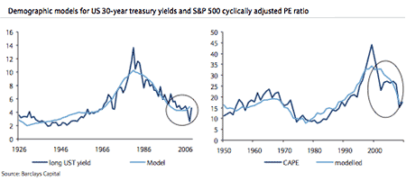
Now we need to draw in demographics. Here are treasury yields and SP500 CAPE versus their respective US demographic trends:

1se14Source: Barclays 

The implication is that market valuation has to be assessed in the context of demographics. An expensive market will get more expensive if there is a swelling population of the age that would buy stocks (or bonds), and vice versa.

US demographic trends argue for lower valuations ahead, lower real stock prices:

USDemographicDestiny

Therefore, the extreme valuations in US stocks, both relative to history and relative to other countries (with more favourable demographics) argue for a bear market. There is no demographic tailwind to take them to even higher valuations.

The question is, why have US stocks run up so far?

Is it the aggression and support of the Fed? If so, then with QE scheduled to end in October, the market should be readying to fall. But, as per my recent post, I rather believe ‘Fed policy trumps all’ has been the mantra for the mania rather than the driver.

Is it the relative economic performance versus Europe and Japan, including its progress from energy importer to exporter? The problem is that all that is priced into the valuations, i.e. price has nonetheless run up far beyond earnings.

Is it the safe haven perception of US equities and the US dollar? Perhaps.

Is it the propensity for US companies to equity buybacks or for US investors to draw on loans and margin, both propelling prices higher? Could be.

Or is it that US stocks began the process still elevated following 2000’s biggest mania of all time? The valuation charts show this to be so.

I believe I can explain the mania of the last 18 months with the solar cycle. The sunspot maximum has driven the speculation to take US equities to these dizzy valuations and cast doubt on the secular bear progression since 2000, as the current bull has been given an exuberant last leg into 2014’s solar max (see my recent Last 18 Months post). However, now that we are through the smoothed solar maximum, the combination of valuations (CAPE, Crestmont, Q ratio and market cap to GDP) and demographics argue for a new bear market at hand within an ongoing secular bear to take us to the kind of washout valuations that 2002 and 2009 so far failed to deliver. Rather, we have stair-stepped our way down since 2000 in alternating cyclical bulls and bears, and we can see this in other economic measures:

1se17

Source: D Short

1se18

Source: Fat-Pitch

Screen Shot 2014-09-01 at 16.53.35Source: Fred

Demographics and valuations both argue for another step (or even steps) down lower from here.

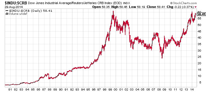
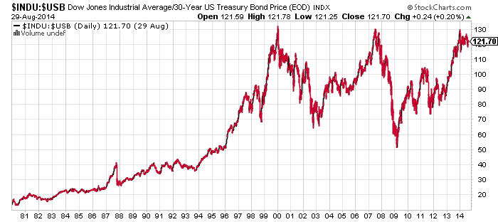
One more valuation measure to finish: we can look at US stocks pricing relative to commodities and relative to bonds. In both regards US equities are now at the same extreme relative pricing as 2000’s peak.

1se19 1se20

Source: Stockcharts

Therefore, by CAPE, Crestmont, Q ratio and market cap to GDP; by relative expensiveness to commodities and bonds; by relative valuation to other stock markets around the world; and all in the context of demographics: I believe US equities are very clearly a major SELL.

Last Trading Day Of August

The most likely scenario is August closes around the current highs on another day of ultra low volume. I expect margin debt for August will challenge the February highs. By history, increased volume should return next week after US Labour Day. Negative divergences on marginal highs, double tops, lunar negative period, 3rd day of geomagnetic disturbance and all those indicator readings would ordinarily mean volume should return on the sell side. The day after Labour Day marked the 1929 peak, whilst the 1987 peak and the 1937 secondary peak both occurred in the second half of August, so this is an opportune window for the peak to finally occur.

The ultra low volume in context:

29au4Source: John Kicklighter

Wednesday’s ultra low volatility in context:

29au7Source: Eric Scott Hunsader

Rydex bull-bear assets are back over 10, ten months in an extreme high band.

29au12

 Source: Stockcharts

Investors Intelligence sentiment is also 10 months at historical extreme and showing a divergence from the turn of year high:

29au13

 Source: Decision Point

NAAIM exposure similar, in extremes duration and divergence:

29au9

 Source: Ryan Detrick

AAII sentiment has leaped back up to the bullish extreme following this latest V-bounce:

29au6Source: Pension Partners

Skew is 10 months in an extreme high band and rising back up to maximum acute:

29au3Source: Barcharts

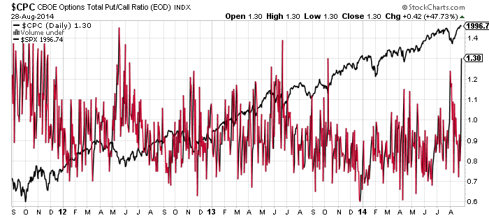
CPC put call registered an extreme yesterday normally associated with the bottom of a washout, though clearly this has not been the bottom of a washout:

29au2Source: Stockcharts 

So what does odd reading mean? What do all the atypical and outlier readings in the 8 charts above mean?

Historic evidence says this is the prelude to an imminent collapse. Not a mild correction, but something truly devastating. The depth and maturity of the extremes and divergences does not mean safety is on the bulls’ side. Instead, history shows that the bulls needed these indicators to be resolved at lower readings and earlier in the timeline to prevent something irreparably nasty erupting. Panic-selling and crashes may not occur often, but all the ingredients for when they do occur are present.

Some final charts.

Money-losing IPO prevalence:

29au5

Source: Sentimentrader

Eurostoxx shows the parallel with 1937:

Screen Shot 2014-08-29 at 08.34.30

Source: Nautilus Research

German bond yields echo the deflationary trends of Japan:

29au10

Source: Holger Zschaepitz 

Italy has moved into outright deflation; Spain too:

29au8

Source: Sober Look

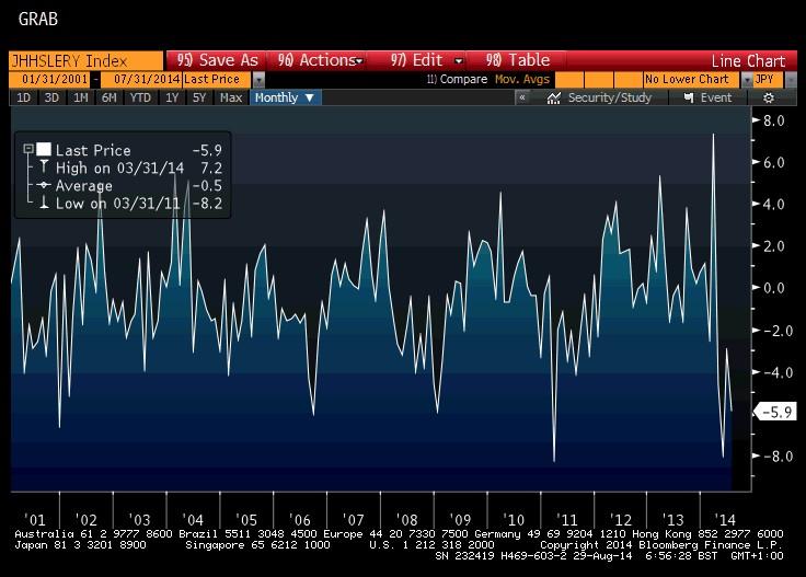
Japanese household spending is down 5.9% yoy – QE isn’t working:

29au3Source: Market Timing

With a global softening in economic growth predicted by leading indicators in Q4, I believe the recent beats in US economic data will give way to disappointments as the stock market rolls over, and the worsening economic problems in Europe, China and Japan will help produce global negative feedback looping.

If the stock market rises next week then it will really produce the greatest anomaly yet with the scene-set:

1. The next few sessions are lunar negative for sentiment

2. We have current geomagnetic disturbance which is negative for sentiment

3. We are entering the inverted geomagnetic seasonal low for the year which is negative for sentiment

4. The solar maximum continues to wane from its Feb peak, which should cap speculation

5. We have mature indicator extremes in place since the turn of the year which show divergences too

6. We have a variety of short term divergences between the SP500 July peak and the August peak

7. We have have rallied since Aug 8th on extreme low volume which makes the new high sticking unlikely

8. We appear to have already put in peaks in Japan and Europe stock indices, US small caps and various risk measures.

So if it ignores all this and rises anyway? Then it becomes difficult. Get out and miss a flash crash which could occur any day, from which the market does not recover. Stay in (short) and risk the market melting up further.

I don’t share the view that the market will give us time to get short with an observable topping out process from here. By various indicators we are equivalent to the collapse point in 1987 or 2011, as examples, rather than earlier in the process. I believe one day soon we will wake up to a large gap down that runs and runs, and that we can already see the topping process going through the previously noted Jan-Mar-July phases leading into that.

Last 18 Months

Over the last 18 months, US equities rose on 80% multiple expansion and just 20% earnings, and they diverged from economic fundamentals.

Screen Shot 2014-08-27 at 14.45.02Source: Yardeni

Institutions were net sellers in this period whilst retail investors became the buyers, typically the ‘dumb money’ and a sign of a peak.

27au1

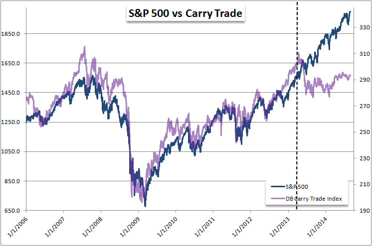
The carry trade ceased to be fuel for higher prices.

28au7

Source: John Kicklighter

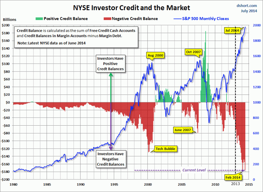
Instead, retail investors went all-in on bullish equities allocations and then leveraged up in a major way, to propel equities higher.

27au2

Source: Stockcharts27au4

 Source: D Short

28au8Source: Sentimentrader

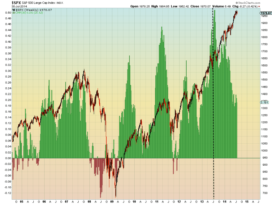
We see a trend of distribution in this period, both in major accumulation days (just 1) versus major distribution days (12) and in Chaikin money flow, which suggests underlying building smart selling pressure.

28au9Source: Ponzi World

In short, the stock market mania of the last 18 months has been fuelled by the retail crowd and their credit facilities, not manipulated by the big institutions in some sort of cartel as some suggest.

The whole process can be explained by the rise into the solar maximum, driving people to speculate.

The process is mature and here in mid-2014 we see a range of indicators suggesting termination:

1. The best performing asset in 2014 is treasuries.

2. The best performing sectors in 2014 are utilities and healthcare, the defensives that typically outperform post market peak.

3. The hot speculative targets of Bitcoin, social media stocks and small caps all appear to have topped out, with Biotech a question mark but having made no progress since February.

4. Margin debt has also made no progress since February, which remains the peak.

5. Divergences have grown in breadth, sentiment and risk measures.

6. Volume on down days versus up days resembles previous peaks.

7. Sornette bubble end has flagged and extreme Skew continues to warn of a big move to the downside.

8. The smoothed solar maximum appears to have passed around Feb/March time.

9. Valuations have reached dizzy levels, with the median stock average valuation higher than in 2000 which was more concentrated in tech stocks:

28au3

Source: Hussman

Turning to the short term, yesterday was another record ultra low volume day. Also, $SPY remained in a 1 cent range for 18 minutes, almost dead, beating a Nov 2006 extreme of 10 minutes. Indices went nowhere overall, so we roll over to today. Geomagnetic disturbance is underway.

To sum up, my bottom line is this. Whatever research angles I collate always point to the same: a comprehensive multi-angled case for a bull market peak, and not just a peak some time soon, but the last gasps of a peak that has been in progress all year. We can argue over select indicators and doubt them individually, and no-one can avoid confirmation bias. But the breadth of the indicators and differentiation of the angles make for a multi-way, cross-referenced set that is surely something objective and compelling. The evidence just does not support a bull market continuation from here nor a parabolic blow-off top from here. The evidence says we should collapse any moment, not just into a correction, but into a devastating bear market with all that retail leverage and skewed allocations unwound in a very painful way.

Clearly price is all that ultimately counts, and therefore you should maintain a healthy doubt about my case until price proves it. But, rightly or wrongly, I still think this is it:  the stock market mania began 18 months ago; risk peaked 31 Dec 2013; the solar max, margin debt, hot sectors and indices peaked Feb/Mar 2014; and the last phase of the top was July/Aug with the Sornette bubble peak, European indices peaks and US indices peaks. I believe the current ultra-low volume double tops / marginal higher highs on negative divergences in Dow, SP500, JNK and IBB will resolve to the downside, and the devastation be reaped in September and October.