Timing The Peak In Equities And Margin Debt

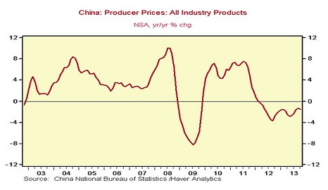
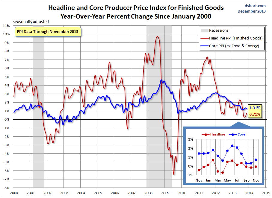
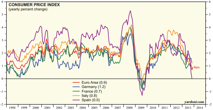
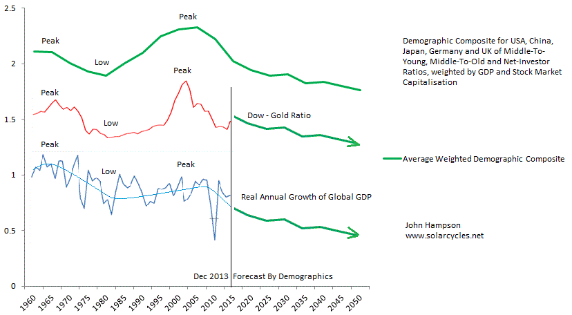
The less orthodox way, that is. Click to view larger, read the comments on the charts, then my comments below.

SolarMaximaParabolicPeaks

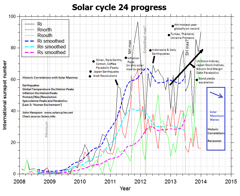
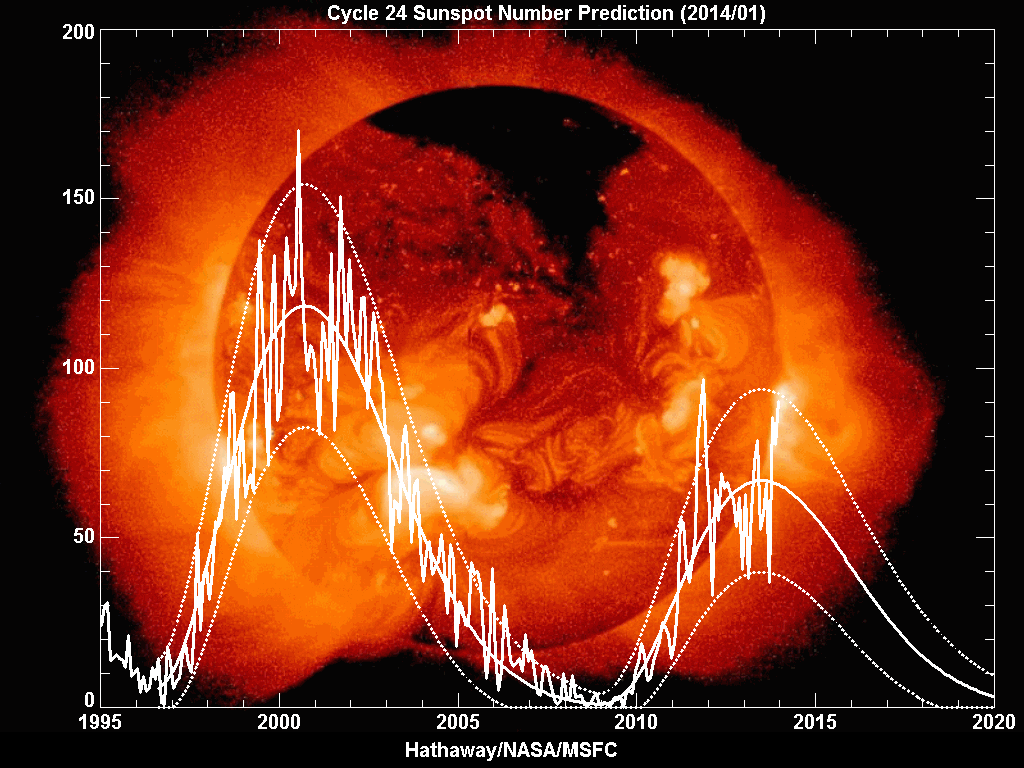
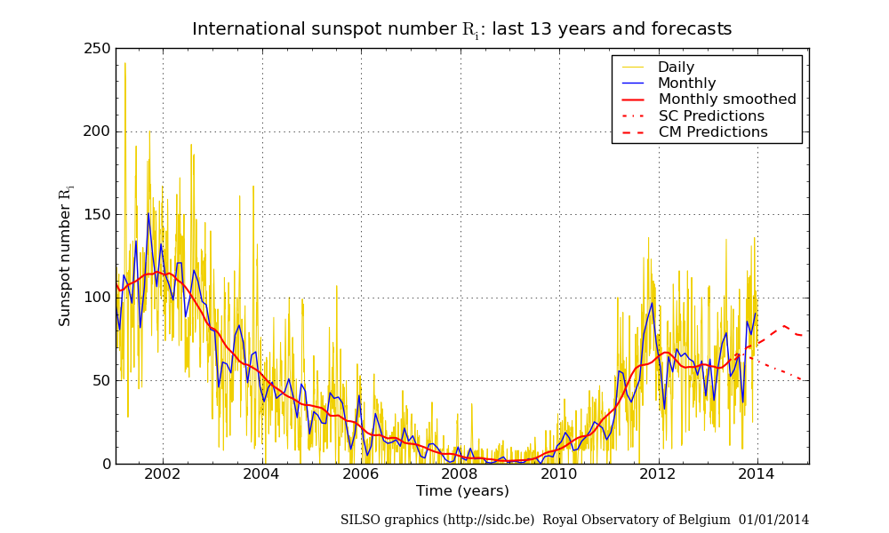
245 sunspots yesterday, third highest daily count of this solar cycle. The current cluster of solar activity, related to the recent southern pole flip, looks set to drag up the smoothed-max of SC24 and override the previous high of Feb 2012. No guarantees of course, until we see with hindsight. Also no guarantees that the sun does not yet become busier still. With SIDC’s CM prediction forecasting a mid-year smoothed solar maximum, there remains the potential for a peak any time up to then, which by association could mean a peak in US indices any time between now and then. However, SIDC’s SC foreast, NASA and NOAA models, confirmation of the pole flips, and our own Jan Benestad’s methods, support waning from now. So let’s see how this month progresses.

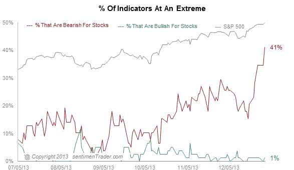
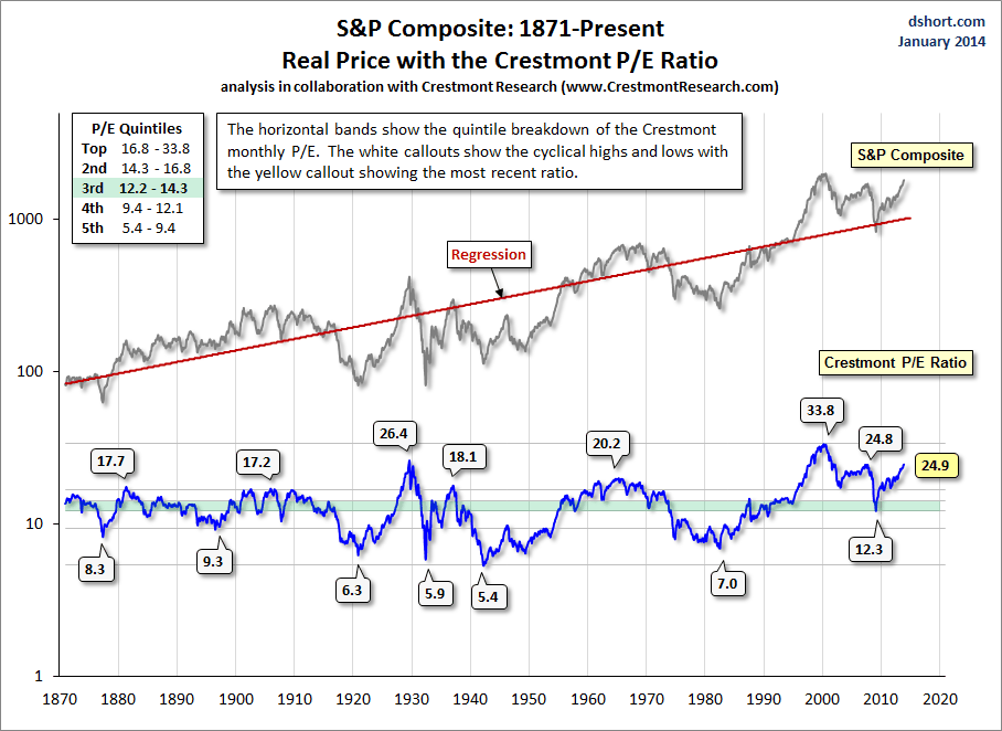
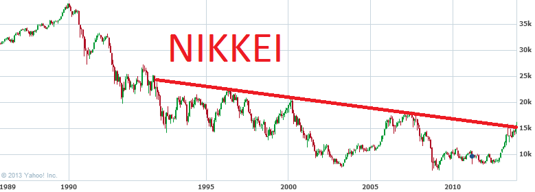
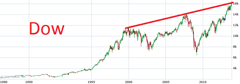
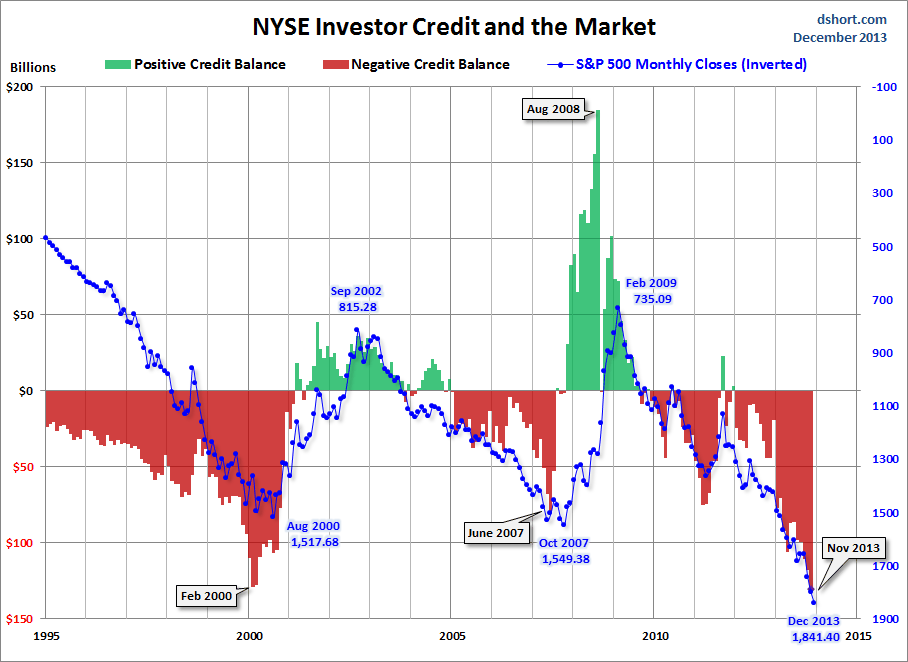
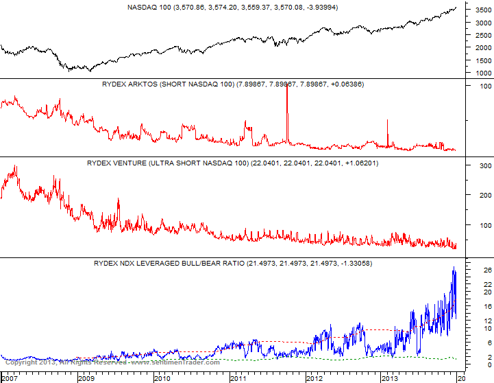
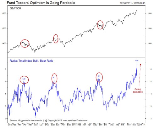
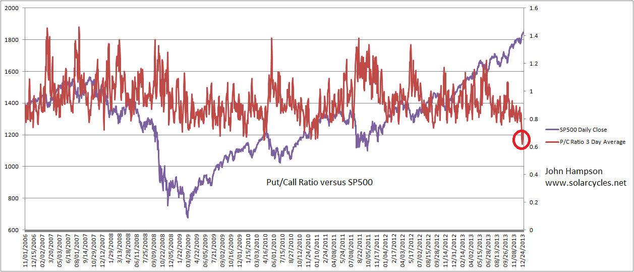
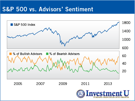
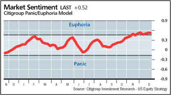
The gold and oil parabolic peaks of 1980 were unprecedented and historic. The Nikkei mania famous, and the numismatic bubble the only major one in its history. The dot.com boom the biggest mania of all time, by various measures, so does the current US stock indices rally measure up as a suitable solar-inspired excitement mania? If it is, then we will look back on it as the second largest and third longest equities bull of the last 80 years, where margin debt and investor credit spiked to dot.com peak levels (highest ever), where Market Cap to GDP valuation reached the second highest ever (first: the dot.com peak), where we printed some all-time record sentiment readings, including the highest ever II bull/bear spread, and stocks rose into their peak in a compressing parabolic, chasing price without earnings for 2 years into the peak. It definitely measures up.

However, caveat again. It does not preclude things going even crazier yet, before we roll over.  But whether we look at what’s going on with the markets or what’s going on with the sun, they are both sounding the siren for a top.

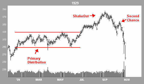
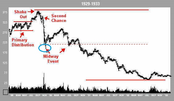
Below I’ve zoomed in on the daily action into the 1929 Dow and 1989 Nikkei tops (see post HERE for why these analogies carry weight). On a longer term view these were parabolic compressions, but we can see from the daily bars that at the peak there was no high volume climax and collapse (as might see in individual stocks), but rather a gradual transfer from bulls to bears, with some backing and filling until the bulls finally capitulated and a crash resulted.

Dow1929 Nikkei1989
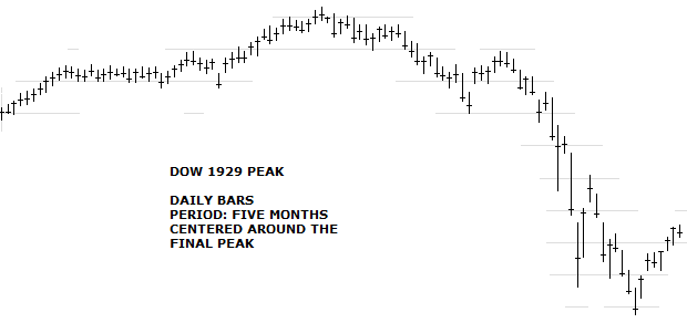
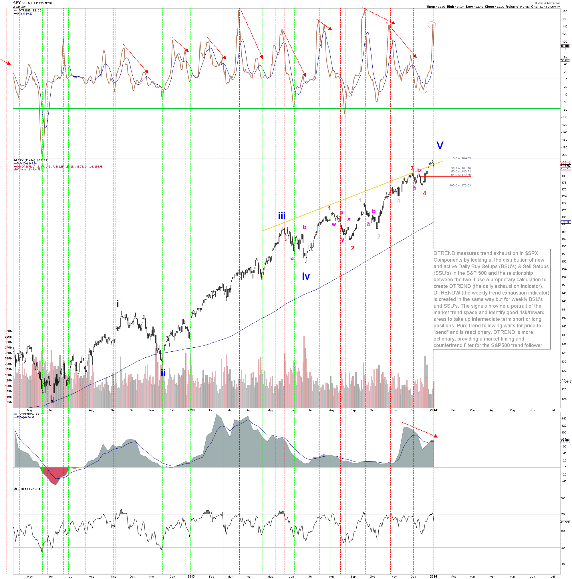
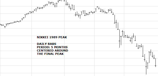
So we can look out for something similar occurring now the markets are correcting from their 31 Dec high. If equities break upwards to new highs on strong momentum then chances are we are going more parabolic yet before termination. If equities stay beneath their 31 Dec highs or make a marginal higher high on divergences, then the case will build for a topping pattern similar to the above.

If 31 Dec turns out to be the market top, it was the last trading day of the year. The last time a stock index topped out on the last day of the trading year was the Nikkei in 1989.

Demographics: Bear Market, Global Recession And Deflation

Historically, demographic trends have correlated with secular bulls and bears in financial assets, economic growth/recession and inflation/deflation. Demographic forecasts are reliable because future trends were set in place with past swells and shrinkages in birth numbers. They would change if a country was subject to large scale death (war, pandemic, or similar) or the government henceforth adopted radical immigration policies. Demographics are particularly potent in countries that are relatively closed to migration, so understand that China has the smallest percentage of immigrants of any country (0.1% of the population), and Japan just 1.9% (compared to USA, UK and Germany all over 10%). My focus is on USA, China, Japan, Germany and UK, as collectively they make up 50% of world GDP. Know that whilst the European Union abolished barriers to movement within it, the demographics across all the member nations are uniformly poor.

1. DEFLATION

Young labour force percentage of population (aged 15-40) and dependency ratios (inverted – old and young versus the working population) have both historically correlated with inflation/deflation. A swell of people entering the workforce works up price inflation through spending, whereas more people entering old age relative to the work force is disinflationary through saving and disinvestment (read more HERE).

Deflation2

Deflation1In the first chart above, we see the UK alone is currently in a small window of young labour force growth, whilst in the second chart China is just peaking out in dependency ratio (inverted). This is reflected in reality, with the UK currently registering the highest producer price inflation and China the highest consumer price inflation of the five. At this point in time, we generally see trends of disinflation. Demographics predict this will turn into outright deflation, and that deflation should be the norm for the next couple of decades (barring countries with inflationary demographics becoming much more dominant globally, such as India and Brazil).

7ja1 7ja3 7ja4

2. GLOBAL RECESSION

Due to globalisation and an increasingly open world economy, recessions around 2009, 2001, 1998, 1991 and 1982 have all been global in nature. Due to the US contributing 22% of world GDP, particular attention needs to be paid to indicators of future US growth, with China second.

Dependency ratios (inverted – old and young versus the working population) have historically correlated with economic growth / recession. That chart is presented in section 1. above. The picture for the next 2 decades is bleak.

Stepping aside from demographics for a moment, levels of debt have also been shown to assist or impede growth historically. Where public debt to GDP has exceeded 90%, economic growth has struggled. For 2014, Japan will be around 230%, UK and USA around 115% and Germany 85%.  China has the lowest ratio of public debt of the five, but its broader debt has been ballooning since 2008. Including corporate and household debt, China’s total debt to GDP has reached 218% of GDP (from around 130% in 2008).

DemographicsDowGoldRatioGlobalGDP

3. EQUITIES BEAR, REAL ESTATE BEAR

Demographic trends in middle-to-young ratio (aged 35-49 / 20-34), middle-to-old ratio (35-49 / 60-69), percentage net investors (35-49 / all) and dependency ratios (charted in 1. above) have all been shown to have a correlation with stock market and real estate market performance historically, on a longer term secular level. There are young borrowers/spenders, middle-aged investors (partially investing for retirement) and old-ages disinvestors. If the middle group is growing relative to the others, then we have a growing demand for the stock market. Similarly, the old and the young don’t typically buy houses, so a swelling middle-aged group relative to the others is an environment for a housing boom, and vice versa (read more HERE).

BM1

BM2

BM3Using the weighted average composite as our overall guide looking out to mid-century, M/Y is flat whilst M/O and NI are down, suggesting long term ‘buy and hold’ may be a strategy doomed to the past, to be replaced by ‘short and hold’. Add in Dependency Ratios from 1. above and the picture worsens further. Within those overall trends there are positive windows for individual countries, for instance the USA sees M/Y, M/O and NI measures rising together between around 2025 and 2030, and the composites also suggest that period could be the backdrop to a cyclical bull. However, when the composite trends above from 1980-2000 are compared to what lies ahead of us now, the contrast is stark and suggests enduring downwards pressure on equities and real estate, in long secular bear markets.

The longer term fortunes of bonds have also historically correlated with demographic trends.

23jun16This CS graphic suggests yields will remain fairly low and contained, as demand for bonds will be maintained. However, through to 2020, the bias in yields, aside Japan, is overall upwards, suggesting net selling on balance. It is my view that gold, as the historic anti-demographic, is due to be the lead asset in the period ahead, as the collective trends above suggest deflation, recession, and net selling of equities, real estate and bonds.

SUMMARY

A) Historic correlations in demographic trends and secular asset cycles, growth/recession and inflation/deflation. B) Unprecedented collective demographic downforces now in place, with evidence of impact in economic data. C) Downtrends in play for much of the first half of this century, suggesting tough times for the global economy and no safety in equities or real estate.

Europe has structural problems, a cautious central bank, and a relatively strong currency, mirroring 1990s Japan and making it the candidate for the first into deflation. China is closed to migration and thus trapped in a sharp demographic reversal, largely the result of its 1 child policy. Previous breakneck growth was built on exports, the market for which collapsed in recent years, leaving it with declining GDP and excess capacity. Stimulus response in 2008 was to invest in even more infrastructure, increasing the excess capacity issue. Non-public debt is ballooning whilst the authorities attempt to tighten, resulting in two cash crunches already this year, as well as high profile company bankruptcies. That makes China the candidate for delivering a 2008-style global crisis.

Equities Red Flags

1. Nasdaq Big Money Shorts:

7jan1Source: Sentimentrader

2. Percentage Of Indicators At Bullish Or Bearish Extremes:

7jan2

Source: Sentimentrader

3. NAAIM Sentiment Survey:

7jan4

Source: PensionPartners

4. Margin Debt Relative To GDP:

7jan3

Source: GuruFocus

5. Lunar Geomagnetic Model January Peak:

Guide2014

6. Citi Panic/Euphoria model further into Euphoria (to +0.6 from 0.52):

7jan5Source: Barrons/Citi

Solar Maximum Delivers Speculative Parabolics

Historically, solar maxima have correlated with earthquakes and peaks in temperature oscillation. They have also correlated with protest/war/revolution, inflation oscillation peaks and speculative parabolic peaks (often secular bull peaks). With both magnetic poles now having flipped for SC24 maximum, I’ve annotated the following chart from Solen:

6ja1The Japanese and Indonesian earthquakes were both amongst the highest Richter magnitude quakes ever recorded. The Italian earthquake was one of the most devastating ever in property damage.

2013 was the 4th hottest globally on record. Historically we have seen global temperature oscillate into a peak around the solar maximum.

The Arab Spring was a world-transforming series of major protests and revolutions. The Turkey, Thailand and Ukraine protests were amongst the largest ever in terms of participants.

We saw a series of commodity price parabolics peaking out towards the early part of the maximum, and we currently see a series of stock index parabolics (plus margin debt parabolic), which, with history as our guide, should peak out as the solar maximum starts to wane this year. However, we don’t know at what point that waning begins. By NOAA and NASA predictions it should be now, but by SIDC’s foreast it could be as of mid-2014. With 225 sunspots currently, it still appears to be in an uptrend:

A2Either way, the annotated top chart is unlikely complete. We could yet see further earthquakes, or greater temperature extremes in 2014, or more geo-political unrest, or more speculative mania. But without any more such developments, solar cycle 24 has re-affirmed those correlations.

Historically, the solar max then gives way to economic recession. Global recessions (if based on where real global GDP has been less than 3%) occurred in 2001-2 (SC23 max 2000), 1990-3 (SC22 max 1989) and 1980-3 (SC21 max 1979). Several factors may contribute to why this is. Geomagnetism, which is negative for sentiment, peaks after the solar max. Inflation, yields, rates and speculation all typically peak into the solar max, which collectively can tip an economy into recession. The chart below shows those correlations.

10may20131This time, we have not seen any interest rate rises, but we have seen a rate of change in bond yields in the last couple of years which is comparable to that marking previous tops. Inflation peaked out early in the SC24 max and is currently depressed, in keeping with collective demographic trends (money velocity has also diverged in line with demographics). There remains the possibility that commodities make a late-cyclicals charge and deliver a temporary inflation shock, but I’m not so sure.

Prior to all my demographics research earlier this year, I expected commodities to be the speculative target of this solar maximum, and to make their secular peak here, with gold the leading asset. However, by demographics gold has some years further to run, and is more likely to make its secular peak at the next solar maximum, or even beyond.

DemographicsDowGoldRatioGlobalGDP

That commodities have made secular peaks each 3rd solar maximum to date appears a pattern, but I believe is instead is demographic, but this will only be validated in the months and years ahead.

Let me explain. Japan enjoyed a long secular bull market from the late 1940s to the late 1980s, as shown in the first chart below, through 4 solar cycles. The second chart shows that this was because of a long demographic golden period, where productive-aged population ballooned, old-aged dependents stayed low, and child dependents were in decline.

26dece126dece2

The Nikkei peaked in 1989, in a parabolic, along with solar cycle 22. So it peaked at a solar maximum, but it took 4 solar cycles to exhaust the demographics.

The US demographic boom of 1980-2000 ran through 2 solar cycles. Stocks peaked in 2000, in a parabolic, at the same time as solar cycle 23.

The negative demographic period of the 1970s was a trend lasting just one solar cycle, and gold and commodities peaked out, in a parabolic, along with solar cycle peak 21.

In short, there is a history of demographics dictating secular market trends (so using secular market duration ‘averages’ is misleading), and of secular bulls peaking out at solar maxima (which average 11 years apart). We have negative collective demographic trends in the major nations lasting to circa 2025, before a flattening, which I therefore expect could deliver another full solar cycle of secular gold bull, to potentially peak out at the next solar max (which would be circa 2025). You may note though from the demographic composite that demographic trends look fairly woeful even out to 2050. It poses an interesting question as to whether this will be a different period for relative asset performance.

If commodities do not make a late surge in this solar cycle 24 maximum, then I believe we will tip into deflationary recession, as destined anyway by demographics, with the speculative manias and yields tightening assisting in this. That would then largely complete the correlations of a solar maximum.

If you are new to the site, reasoning and evidence for all these solar-related phenomena can be found by using the search facility.

Updates

1. Investors Intelligence bulls now highest since Oct 2007:

3jan1Source: Investors Intelligence

2. Short term trend exhaustion on SP500:

3jan2Source: Rory Handyside

3. Parabolic and compression on SP500 shown here:

3jan3Source: AfraidToTrade

4. Breadth divergence on SP500 as measured by % stocks above 200MA:

3jan7Source: Index Indicators

5. Crestmont P/E now 3rd highest in history after 2000 and 1929, and in 97th percentile:

3jan4Source: Dshort

6. Solar cycle 24 updates from NASA and SIDC – potentially a higher smoothed max, but either way a second peak, which fits with current speculation excesses:

3jan5 3jan6Sources: NASA and SIDC

7. Misc:

Lunar negative fortnight begins this weekend

Some geomagnetic disturbance in progress

US Q4 earnings season effectively begins with Alcoa 9th January

Portfolio rebalancings so can’t read too much into action at the start of January whilst this is taking place

China liquidity eased, but rates remain at elevated levels

Timing And Assessing The Top In Equities

A compilation of indicators at historic extremes, together with other current major flags, and an aggregation of their forecasts from history, which have generally reliably played out. Individually each signal is just a guide, always at risk of printing an anomaly, but collectively they are offering something united and compelling, particularly as we see signals across valuations, euphoria, exhaustion and technicals.

EquitiesFlags

How Equities Begin 2014

Major global stock indices at long term resistance levels:

31dec4 31dec5 31dec6 31dec731dec8

Declining breadth in number of country indices participating in world equities rally:
31dec9

Source: Moneymovesmarkets

US margin debt and investor credit balances at all-time record:


31dec10Source: Dshort

Rydex Nasdaq leveraged bull/bear ratio at all-time record:


31dec11

Source: Sentimentrader

Rydex Total Index bull/bear ratio going parabolic:

31dec12

Source: Sentimentrader

CBOE put/call ratio 3 day average at historic extreme:

31dec13

Investors Intelligence Bullish at highest since October 2007, Bearish at lowest since March 1987:

31dec14Source: InvestmentU

Citigroup Panic/Euporia Model now 5 weeks above Euphoria threshold:

31dec15Source: Barrons/Citigroup

Earnings guidance for US Q4 most negative on record, and equities rallying on earnings disappointment:

31dec16Source: Business Insider

Skew now at 133, still one of the highest readings on record.

US equities second highest market cap to GDP valuation outside of 2000, the 4th highest Q ratio valuation and 4th highest CAPE valuation in history.

My opinion really should not matter. Best of luck for 2014.

US Stock Market Top

Time for another run through the checklist of typical cyclical bull tops in stocks.

1. Market valuation excessive

Second highest market cap to GDP valuation outside of 2000, the 4th highest Q ratio valuation and 4th highest CAPE valuation in history, last two years gains more than 80% multiple expansion and less than 20% earnings growth – CHECK

2. Evidence of overbought and overbullish extremes

II bears highest since 1987, II bulls highest since October 2007, CS Risk Appetite US model into Euphoria; Citi Panic/Euphoria model into Euphoria; Put/Call ratio at extreme low; Second highest ever Skew reading; Greedometer at extreme; Margin Debt at all-time record; Twitter up 80% in a month to a $40bn market cap despite zero profits – CHECK

3. Major distribution days near the highs

In total in 2013 we have had just one major accumulation day and seven major distribution days, which is divergent and atypical for a bull year; We should see further distribution days once the current melt-up breaks – WATCH

4. Rolling over of leading indicators

ECRI WLI is in a downtrend, OECD-derived leading indicators and narrow money point to a topping out at the turn of the year, whilst CB and Markit leading indicators still show strength – MIXED

5. Excessive Inflation

No, we are instead flirting with deflation, in line with demographics trends, which is a potentially bigger threat to a stocks bull but historically atypical. However, commodities remain on the cusp of a potential breakout and a potential typical late cyclical outperformance, whilst the US dollar is potentially flirting with breakdown, which together could provide a short inflation shock; If commodities instead break down, then that should ensure the drop into deflation – WATCH

6. Tightening Of Rates

We see this in the recent sharp rise in treasury yields, touching 3% yesterday; This development is echoed in bond yield rises in both developed and emerging markets globally; Plus China is actively trying to reign in its credit excesses by tightening, which led to the recent cash crunch issues – CHECK

6. Cyclical sectors topping out before the index top and money flow into defensives

This bull market has been dominated by flows into low-beta, dividend paying defensives, which again reflects demographic choices, whilst cyclicals have been more shunned, thus making this indicator less potent – so more N/A

7. Market breadth divergence

We see some breadth divergences in stocks above 200MA in place now for several months, whilst similar divergence in Advance-Declines has been reset by the strong rally of the last two weeks – MIXED

8. A Topping Process/Pattern – I want to focus on this, so:

We see evidence of a ‘blow off top’ pattern. Parabolic shape on the indices long term view. Corrections increasingly shallow. Permabears capitulating and converting to bulls. Perception market can only go in one direction. Euphoria. 

Blow off tops increase the likelihood of a crash, rather than a more leisurely ‘topping process’ range. There are some well known examples from history, and they display a similar technical unfolding to each other.

27dece2

27dece3

Source: Financial-Spread-Betting. Their labelling, but others might recognise the pattern as a kind of wedge-overthrow-top, or a blow off top, where the final rally beyond the consolidation range is the blow-off part, characterised by euphoria and capitulation.

We see a similar pattern unfolded into the Nasdaq’s 2000 peak, and also on the Nikkei’s 1989 top:

27dece4

On a longer term view, we see a parabolic rise and collapse, but it’s in the Daily view action prior to the collapse that we see the clues in the pattern.

The Dow today:

27dece1

The pattern is there, the euphoria is there. A little more breadth divergence would be more compelling, but this could potentially accumulate into the ‘second chance’ point.

So increased chance of a market crash ahead, and if we draw on history again then the combination of a sharp sell-off together with the record high leverage extremes currently in play (margin debt, Rydex), suggest an episode of forced-selling and margin-calls similar to 2008 or 1929, where little will be spared.

Here is the bigger picture for the 1929 crash. Note that all assets sold off together in the crash down to where I have marked a blue circle. After that, gold stocks took off and diverged from the bulk of equities which progressed into a bear market.

27dece5Source: Financial-Spread-Betting

Therefore, although I expect precious metals and miners to return to a bull market as equities top out here, we have to be aware that a market crash could see EVERYTHING sell off due to forced redemptions (1929, 1987, 2008), before PMs can take off in earnest.

More Red Flags

1. Spike in SP500 Bullish Percent over Put/Call Ratio:

24dece1Source: Stockcharts

2. Spike in Skew:

24dece3Source: J Lyons

3. MACD and RSI divergences versus Dow, courtesy of Karni:

24dece8

4. Parallax SP500 topping signal:

24dece2Source: Larry Footer

5. Greedometer at extreme:

24dece4Source: Greedometer

6. Margin Debt for November at new record high:

24dece5Source: Greedometer

7. Second highest ever short position in treasuries:

24dece6Source: Sentimentrader

8. Corporate profit margins may be rolling over which has been a precursor to a recession in the past:

24dece7Source: Business Insider

9. Spike in China repo rate and Shibor. Liquidity issues in the credit markets (which have ballooned in the last couple of years to 220% of China’s GDP) led to a spike in June and a spike now. China is trying to deflate it again by pumping in liquidity today, but analysts suggest there are danger signs. It is a potential trigger that needs watching. More here: http://www.businessinsider.com/patrick-chovanec-on-the-spike-in-chinese-interbank-rates-2013-12

24dece9Source: Shibor