Q4 2015

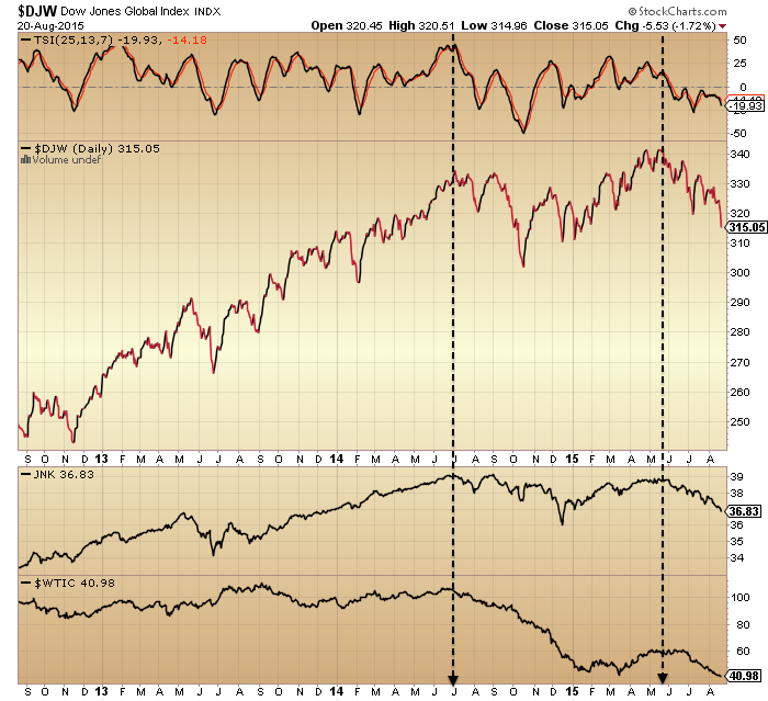
A recap of the big picture.

In 2014 around 40 stocks bull market top indicators gathered. The list includes valuations, leverage, allocations, sentiment, money losing IPOs, buybacks, breadth and risk divergences. Collectively, they depict what we just experienced as the second biggest mania of all time.

Here is the SP500 price to sales ratio reaching a record in 2015.

28sepe2

Now understand that the Nasdaq price to sales ratio escalated to 6 at the 2000 peak but the Biotech (poster boy for this mania) price to sales ratio reached 10 at the 2015 top.

The caveat to all the above is that conditions are historically anomalous: low inflation, falling commodity prices, ultra low interest rates and QE. Nonetheless, conditions were indeed similar to this in 30s US and 90s Japan and tellingly both bear markets and recessions occurred, i.e. stocks did not need ‘repricing’ or otherwise recalculating.

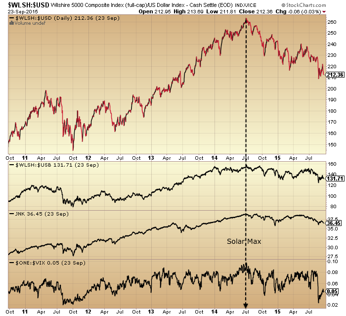
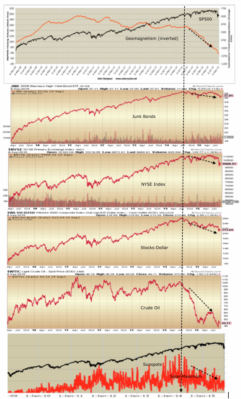
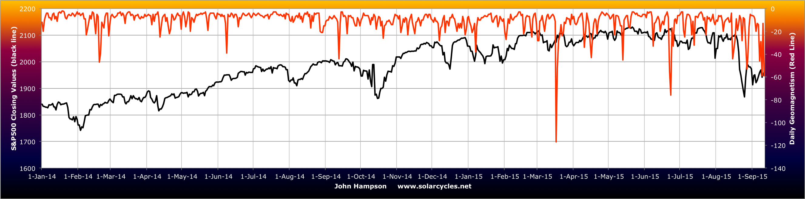
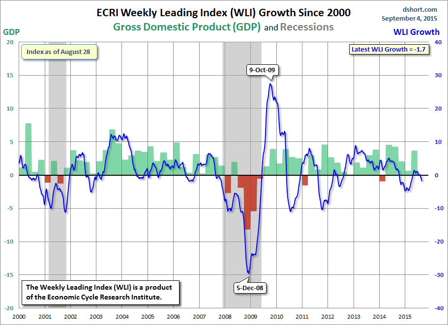
Add in the solar max for timing and we can see that under the hood multiple financial and economic indicators peaked out mid 2014 along with the solar reversal, adding to the likelihood that we are now in a bear market and heading into a recession.

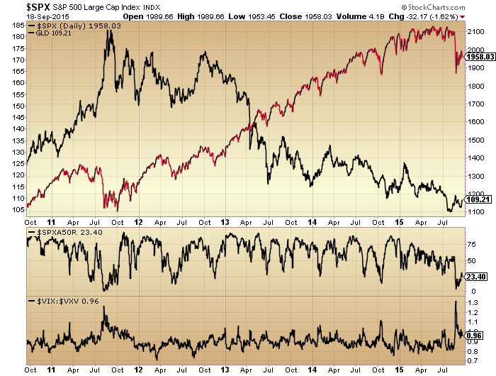
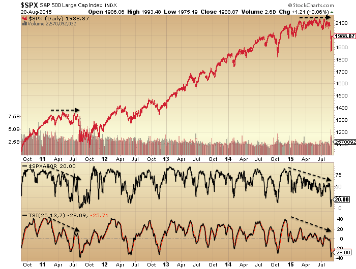
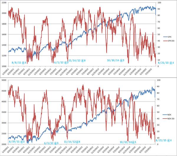
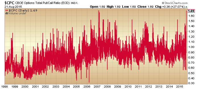
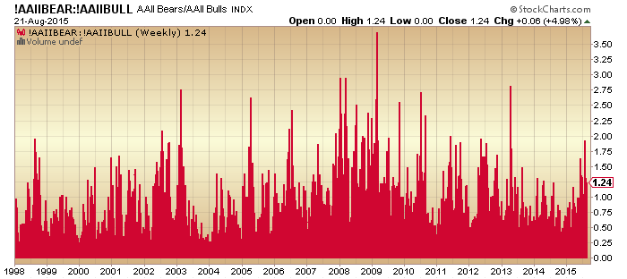
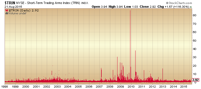
The mania burst in August, with a fairly vertical 10% price drop. Certain indicators that had been stuck at extreme bullish (contrarian bearish) fell sharply to low levels. These include sentiment surveys, put call ratios and inverted volatility. Based on the new readings in these indicators, some analysts are calling for a price bottom and bull market resumption. However, be aware that certain other indicators such as valuation, leverage and household allocations are still very high and a long way from mean reversion.

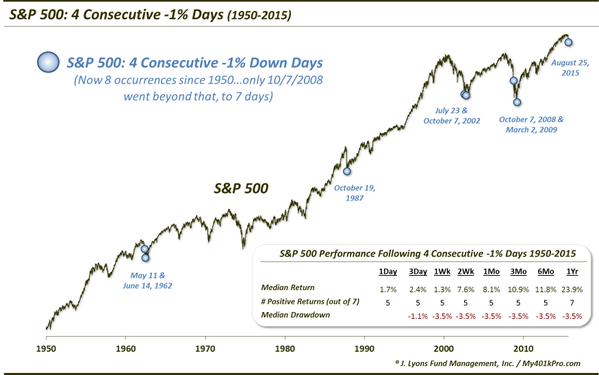
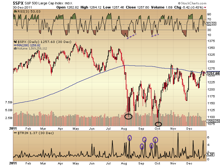
Many depict what we are going through as similar to 1998 or 2011. So here are the charts.

2octo2 2octo1

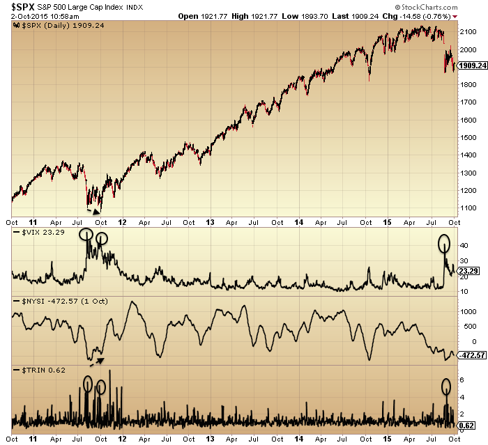
In both instances price made a lower low on a second capitulation reading before taking off again. Bringing us right up to date, the price reversal of this last week did not occur from a similar high volume high fear secondary low, which may mean a lower low is still ahead.

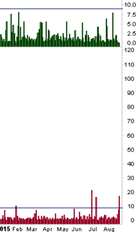
As an example of that partial case only, here is bullish percent to call out showing a suitable washout but volatility to stocks not there.

29sepe3

29sepe5

However, rather than 1998 or 2011 I think a more pertinent comparison is a bull market mania peak, such as this:

2octo3

The arrow denotes a possible analog. The sharp declines and post sharp declines stabilisation are similar, followed by a couple of days rally into the arrow that then failed.

Should last week’s price recovery instead be built upon next week and through October, then we may be looking at a slower bear market initiation, whereby we perhaps head back up towards the 200MA like in early 2001 or 2008 before rolling over again.

3octo3

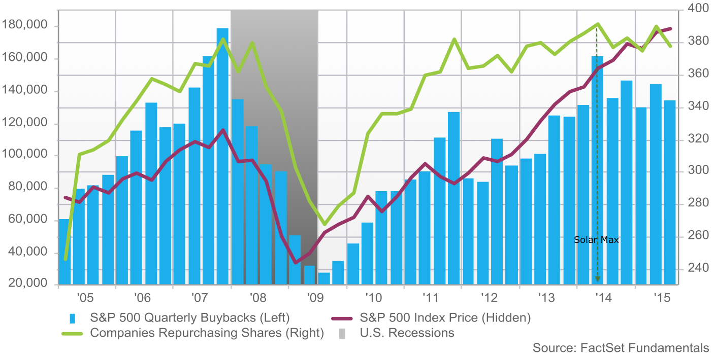
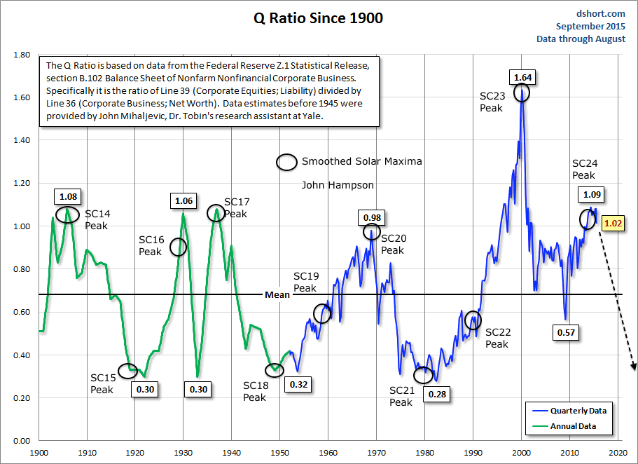
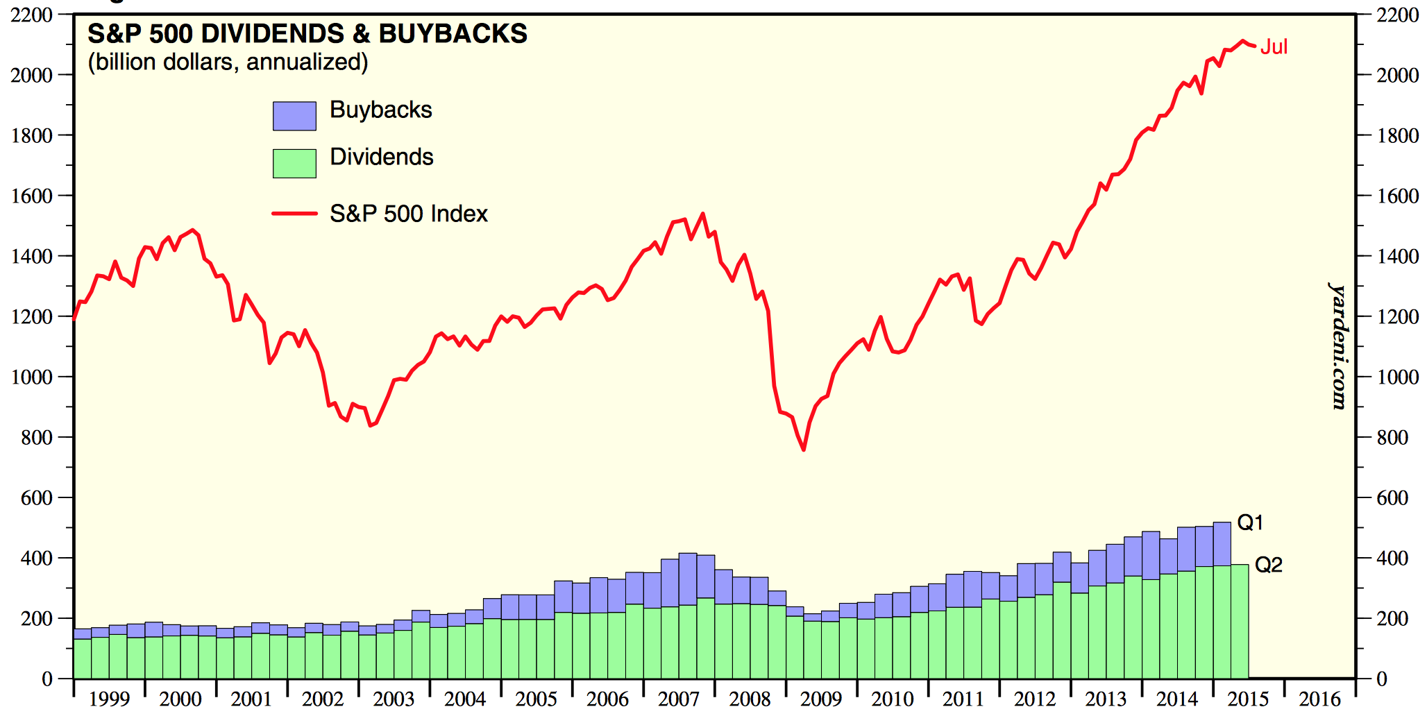
At this point I give negligible odds of the market resuming in a bull market and making new highs. Understand that we saw max saturation in terms of allocations, leverage and buybacks, whilst we have negative demographic trends in the major nations meaning a shrinking buyer pool. For prices to rally to new highs from here we would need to see allocations and leverage break to new collective records.  The bursting of the mania that we just saw makes this very unlikely, plus buybacks peaked back with the solar max.

Screen Shot 2015-09-27 at 19.18.33

On the flip side of equities, gold and miners have been either basing or languishing: which one is yet unclear. Yesterday may have been a key day as they both rallied on the poor jobs number and did not then reverse, unlike equities. So, we see how they develop next week too.

Earnings season kicks off again this next week.

My positions:

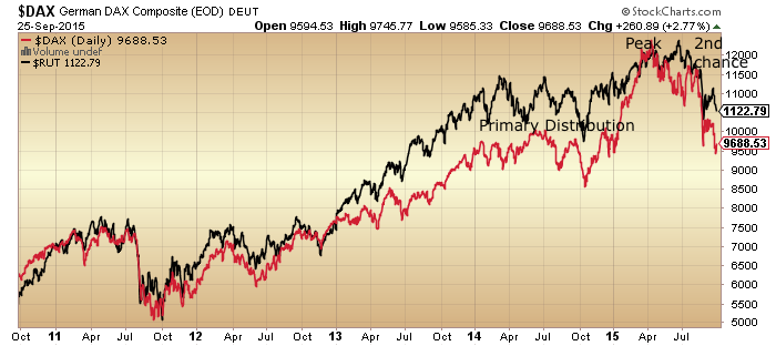
Short Biotech – I see the mania as burst, the parabolic broken and the second chance done. Therefore, I expect hard and fast falls to resume here promptly.

Short R2K – the R2K reached its highest ever valuation at this peak and history suggests small caps should retrace their full gains under a bear.

Short Dow – more likely to hold up than the others but a lower high or sideways range trade are the most bullish outcomes that I can conceive.

Long Gold – has been unnervingly weak but I continue to believe it must be the beneficiary once stocks are more clearly cemented in a bear.

Long gold miners – new position as indicators depict washed out and positive divergence. A position on which I will rigidly use stops, however, due to uncertainty as to how this asset performs if stocks break lower.

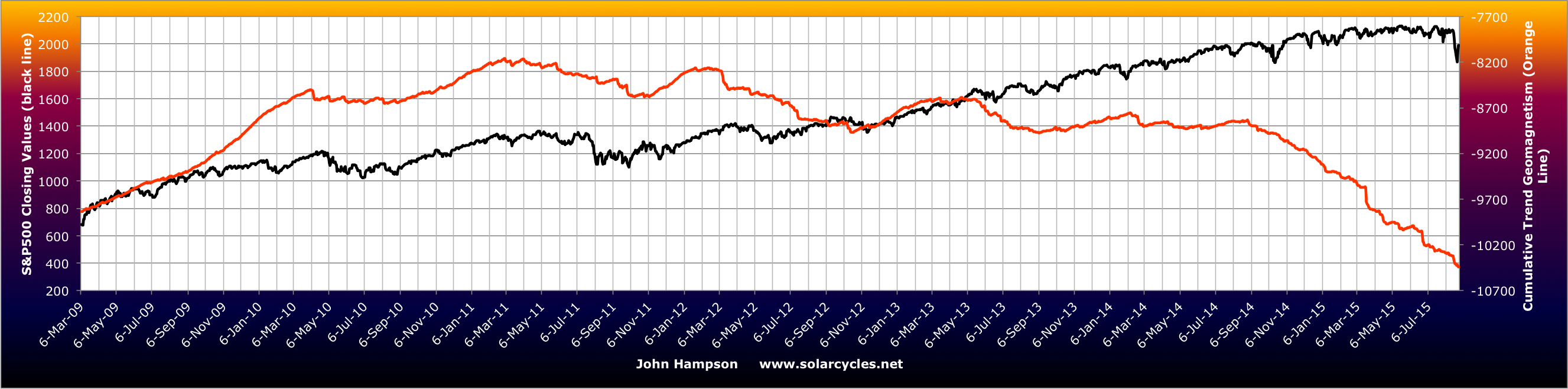
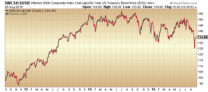
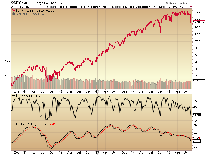
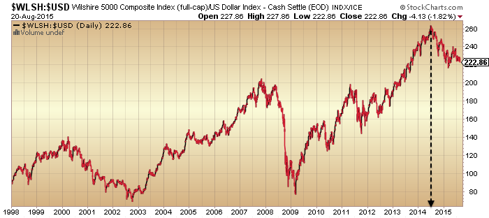
To finish here is US equities on a longer term view:

Screen Shot 2015-09-30 at 19.58.58


Advertisement

Bull Market Peak

US Stocks:dollar, stocks:bonds, junk bonds and volatility (inverted) all peaked out mid-2014 with the solar maximum.

24sepe1

Source: Stockcharts

Crude oil, put/call, breadth and bullish percent did likewise.

26sepe1

Sornette’s bubble end flagged then too.

Screen Shot 2015-09-24 at 20.18.51

Source: FinancialCrisisObservatory

Global business activity peaked out at the same time.

22sepe9

Source: Thenextrecession

And economic surprises.

24sepe12

Source: Not_Jim_Cramer

So did financial conditions, Europe and US.

Screen Shot 2015-09-22 at 20.28.53 Screen Shot 2015-09-22 at 20.27.06

Source: Bloomberg

And geomagnetism has played a key role in these developments, intensifying since mid-2014.

a3

With united demographic downtrends in the major nations, solar history suggests markets and economy should tumble down to the next solar minimum.

26sepe7

Source: NOAA

26sepe2

Source: Tarassov

Drawing demographics, solar cycles and valuation together we get this:

19sepe9

It fits all three and that’s what makes it fairly compelling.

The mid-2014 peak we see in many indicators and assets is unrecognised by most. They see the August 2015 drops as the first drop in a topping process or a wave 4 in EW, both meaning we head back up. But the drops into last October fit better with this, with a secondary and final peak then forming in May 2015. The nominal price action has been uniquely confusing in this major peak, but the clues are provided by those under the hood and cross asset indicators.

What resonates with me about Elliott Waves is the waves of mass crowd psychology. We see this phenomenon playing out in solar cycles, lunar oscillation, demographics and valuation. But the weakness of Elliott Waves is that on any chart at any time multiple different counts can be produced and are then refined with time to make the count always ‘right’ with hindsight. I simply don’t see evidence that Elliott Waves are reliable market predictors (emphasis on the reliable), but the general underlying idea is very much in play in overall price action, something like this:

22sepe3

Source: ProfitF

We all know an up trend rarely ends abruptly but instead typically peaks, reverses a while and next heads back up. Then, typically, the move either fails before the previous peak, double peaks with it, or makes a marginal higher high but on negative divergences, before the trend reversal takes off in earnest. All akin to turning a tanker at sea: it takes some time. Whatsmore, the last move up is typically the stage on which the retail money makes its usual late and painful act.

Between last July and this May we saw smart money flows weaken, dumb money indicators hit new highs, leverage jump to a new record and stock market internals notably diverge. All evidence of a wave 5, a secondary peak, or the terminal rally after the primary distribution, whatever you want to call it:

26sepe9

That second chance peak is now looking fairly potent on Biotech:

Screen Shot 2015-09-21 at 21.06.18The point is that topping processes share similar characteristics which reflect how humans work. A peak takes time to form with some back and forth, some telltale signs in those leaving early and those joining late, and some health warnings.

Finally, let’s recall that this has been the second biggest mania of all time, as measured by valuations, leverage, allocation and sentiment. The second major error analysts are currently making (to go with the failure to see the topping process began last July) is to see charts like this one as contrarian bullish:

Screen Shot 2015-09-26 at 07.29.22

Source: Yardeni

The jamming of the indicator at record highs last year highlights the mania that was in play. The subsequent crash is the mania bursting. The low reading is bearish, not bullish. It will take some time to recover, maybe even years. Given how ultra saturated the market was in terms of allocations, leverage and sentiment, it is unrealistic to think that the market will now go make new highs. Some of the dumb money was wiped out in the August falls, some more is selling on every move up to get out at break even.

The most bullish outcome is that the market gradually digests the falls and range trades whilst all the excesses of 2014 are gradually mopped up. But, there is no precedent for this in history. From 2014’s valuations, leverage, sentiment and allocations levels we have only seen devastating bear markets in the past. The post solar max and demographic environment add to this likelihood.

Gold looks to be completing its basing. Global stocks are now retesting their August lows. Clearly, if gold takes off here and stocks decisively break down beneath their August lows then the mood will properly change. The most bullish outcome I consider is that stocks range trade and recover some whilst the 200MA gradually arches over, as bear markets often aren’t in a rush, more of a slow bleed. However, written into the record leverage, is a period or periods of panic selling. Biotech is in an ideal technical set up for that to now occur. DAX and RUT look post second chance, which in past major peaks led to waterfall selling. So maybe we fall apart rapidly here – or, my bullish scenario – we hold up (without exceeding the highs) into the end of the year and fall apart in early 2016. Every man and his dog thinks that stocks are going to bottom out and resume bullish in October in line with seasonality so it seems likely that something else occurs. I think actual (rather than seasonal) geomagnetism is likely to play a role in this, so I am watching developments. I favour the falling apart option but you know my positions disclosure. Trades-wise I’ve been increasing shorts and adding to gold on the basing evidence, and adding stops to all of it. I’m going to carry on with this strategy unless the market bounces on positive divergences and shows evidence of a renewed move up for the bulls.

What Causes Bear Markets And Recessions?

Firstly, the definitions of a bear market (20% decline) and a recession (two consecutive quarters of negative growth) are arbitrary, but a line has to be drawn somewhere. Secondly, there is a lot of misinformation spread about this question, so let the evidence speak.

This chart shows US bear market and recessions. Mainly they occurred together but we can see a couple of recessions without stocks bears and a handful of stocks bears without recessions.

19sepe5

Source: Ritholz

The deep recessions always correlated with a stocks bear and the deep bear markets always went hand in hand with a recession.

You’ll hear a lot that recessions cause bear markets, but quarterly GDP prints at bull market peaks say otherwise.

US quarterly GDP growth at past major stock market peaks:

Q4 2007 4.4%
Q1 2000 6.18%
Q3 1987 6.08%
Q1 1973 11.91%
Q4 1968 9.84%

Leading indicators can help us identify the onset of recessions ahead of time. The way it works is the economy does not roll over all at once. Certain activities peak first and others lag (e.g. firing and hiring is one of the last processes). These leading indicator indices identify manufacturing new orders, money supply and interest rate spreads amongst those first to diverge.

19sepe20

In the chart above we can see that CB and ECRI leading indicators have recently diverged from one another. CB is fairly benign currently whereas ECRI has turned negative.

19sepe21

The complete list of differences isn’t published. However, there are two important things to note. First of all, both use the stock market as one of their leading indicators: further evidence that it isn’t the economy that leads the stock market but the other way round. Secondly, all they are doing is identifying the first dominos to fall in a recession, therefore they flag only when the economy and stock market are already flagging in certain ways. So useful, but not a stand alone predictor.

Related to leading indicators are recession models. They too try to pick out the leading variables and typically include the likes of real income, trade sales and industrial production. Once again they flag as these first parts of the economy roll over, so cannot be considered as ‘predictors’.

19sepe7

Next, you’ll hear a lot that tightening, either through oil prices or interest rates, are the typical causes of tipping the economy into recession. The two charts below appear to echo that.

19sepe10 19sepe9

However, we see that further back in time crude wasn’t a major factor in recessions and Japan provides a useful example of recessions occurring despite ultra low rates.

19sepe30

19sepe13

Source: ETF Guide

Associated with the latter is the interest rate spread. The yield curve is perceived to be a reliable recession predictor: when it turns negative recession is looming.

19sepe8

The reasoning is that buyers would rather take up a 10 year bond at meagre rates because they have such little confidence in the economy ahead. If that is so then it is the market leading the economy again.

However, the Japan experience shows that we can have recessions without an inverted yield curve, and again looking further back in time at the US we can see the same occurred there too.

19sepe10

Below we can see the relationship between inflation (with oil prices being a key factor) and interest rates.

19sepe6

Source: Yellowstone Partners

And here the rise of deflation.
19sepe3

Accordingly, our current circumstances have more in common with the 1930s when low oil prices, low rates and non-inverted yield curves were in play and notably were not recession triggers.

The supposed ‘mistake of 1937’ alludes to the central bank tightening to early and bringing on a recession. This is part of the wider misinformation that central bank actions lead us into and out of recession. Once again the example of Japan in the 90s and 00s show us that despite QE and ultra low rates, both bear markets and recessions still took place. Now we see that repeating but on a global scale. The US may have ended QE but it continues in the UK, Europe and Japan, whilst ZIRP is the norm around the developed world and there have been many fresh cuts and easing measures in 2015. Despite all this the world is quietly slipping into recession. Below are the real indicators of China’s economy, notably diverging from the ‘official’ GDP.

19sepe2

And here we see US economic indicator surprises have stayed negative all year.Screen Shot 2015-09-19 at 06.27.32

Negative leading indicators (ECRI) and negative coincident indicators (above). No surprise then the Fed left rates at zero. This is going to help with the myth debunking. If we are now in a bear market and tipping into a global recession, as I believe, then central bank ‘tightening’ can’t be fingered.

Moving on, high valuations are considered a bear market trigger. The chart below reveals this may be so, but with a notable outlier in 2000. Much like the charts of interest rates and crude oil above, if there is a relationship then it doesn’t tell us at what level (oil price, interest rate or equities valuation) or at what point in time the economy or stock market will tumble over. However, high levels in any of the three would represent notable flags that a reversal lies ahead.
19sepe9Similarly, high sentiment, allocations and leverage are flags for a stock market peak. But again they don’t tell us when or at what level the reversals will occur. They are warning signs that mania is taking place, but what causes that mania?

On the chart above are labelled what I consider the real predictors: solar cycles. They enable us to time the market peaks on a longer term view, with the major lows above equating to major peaks in commodities. Below we see that the influence extends to the economy with relations to unemployment and recessions.
19sepe11 19sepe12

But not all bear markets and recessions can be associated to sunspot peaks, which brings us to the other main cause: demographics.

Screen Shot 2015-09-19 at 06.26.55

This is the overarching reason why the global economy is in trouble: the collective negative demographic trends in the major economies. Again, demographics influence both the markets and the economy, and as they are to a large degree set into the future we can predict what lies ahead. As the chart above shows, that would be ‘trouble’.

Demographics and solar cycles are related, with the latter influencing the former, and as we can identify their influence in tipping the market and economy over, we can likewise see how they bring about manias in both into demographic and solar peaks. Therefore into both types of peak, it is normal that oil prices may rise, unemployment may fall, stocks may boom and rates may be tightened.

The major peaks in 2000 and 2014/5 were solar. The major peaks in 2000, 2007 and 2011 were demographic. Perhaps we then we can see why 2000 was so outsized: it was both solar and demographic together.

To summarise, demographics and solar cycles are the main causes of bear markets and recessions. Within that, we can identify those indicators that lead in the economic downturn, which make up the leading indicator and recession probability model components. Notably, these include the stock market. The yield curve, interest rates and oil prices can also be useful such flags but there are circumstances when they don’t apply. Those circumstances are demographic, and that non-application is in play now, as it was in 90s Japan or 30s US. So, should we now be tipping into a bear and recession, that will help invalidate some of the misinformation spread.

There are no dead certs in the economy or markets. The best way to phrase it is that typically stocks bears and recessions occur together, normally the former leads into the latter, usually the cause is either demographic solar or both, and that often we see flags being raised by several of the following: valuations, sentiment, leverage, allocations, oil prices, inflation and interest rates.

Turning to the short term markets briefly to close, the recovery rally in stocks has been enough to neutralise several of those indicators that had turned excessively bearish. Gold has been able to make a higher low last week and the next confirmation would be a higher high. I expect stocks to break downwards again in due course and I maintain the bear kicked off in earnest in May, with the topping process having showed clearly as starting in 2014 at the solar max.

19sepe40

Stock Market, Sunspots And Geomagnetism

The smoothed solar maximum was April 2014. Geomagnetism intensified as of August 2014. This is normal progression: positive pressure up into the sunspot peak, then negative pressure as both sunspots wane and geomagnetism ramps up in the following window. The influence on financial markets is captured here:

Screen Shot 2015-09-11 at 16.29.43

We can see that the solar-inspired speculative mania effectively ended in that window of mid-year 2014, with stocks making a topping process between then and May 2015.

Daily geomagnetism reveals an intensification in recent months.

12sept1

Something similar happened in 2000.

12sept4

Stocks were led into a 2 year bear.

Back to the current, the overdue snap in equities in August 2015 changed the picture. No V-bounce like in 2013-2014, plus a sharp escalation in complacent indictors. This is not like those 2013-4 corrections.

12sept10

Various indicators which were stuck at bullish extremes in 2014 have now not only mean reverted but have moved all the way to bearish extremes. Amongst these are Investors Intelligence bulls, US equity outflows, capitulative breadth, Trin and a cluster of 90% down volume days. Collectively they represent bear market bottom readings, leading some analysts to call time on the current the correction in equities and predict a bull market resumption.

In that scenario we need to square why stocks only corrected 10%. In the first chart at the top we can see a year long stealth bear in progress, more apparent in some markets and indicators than others. So did stocks correct in time rather than price? Proponents of that option then have a problem with big picture indicators, in that both valuations and leverage are still a long way from mean reversion.

12sept20
29augu10Source: DShort

Due to the lack of demographic tailwind, the bull mania was fuelled by debt: traders leveraging up and companies leveraging up to make buybacks. For the bull market to continue, both those would need to rise to new record highs. Given the sharp snap in equities in August, the appetite for that is likely absent, at least for some time.

Rather, in my opinion, that was the point at which the mania popped, at which record complacency and froth was finally shot down. The bear market bottom readings in certain indicators are indeed a sign of a bear market: a pause in the downdraft. These indicators show selling and fear and are only bullish if they revert. Case in point: in 2014 they were stuck at extreme bullish and did not revert, hence stocks continued to edge up. The question is why they were stuck at record bullish extremes, and the answer is the hidden force of the solar maximum. Now we have the twin powers of waning sunspots and intense geomagnetism, which are likely to keep these indicators bearish.

There is a common misperception that the economy (i.e. recession) causes bear markets, but the data in fact shows that the stock market leads the economy.

US quarterly GDP at past major stock market peaks:

Q4 2007 4.4%
Q1 2000 6.18%
Q3 1987 6.08%
Q1 1973 11.91%
Q4 1968 9.84%

Rather it works like this: demographics and sunspot cycles bring about the major peaks and troughs. In our current case, the rise into the mid-2014 solar max caused the speculative mania in the markets, identified by extremes in valuations, sentiment, allocations and leverage. Then the wane from the solar max and associated intensification in geomagnetism have brought about the burst. That burst isn’t complete until valuations and leverage have reverted sub-mean, a process that is already fixed in demographic and solar trends right ahead.

October is the seasonal peak intensity for geomagnetism. This is the reason for a cluster of major historic drops to lows in October. We are finely poised leading into it. Stocks have made a triangle consolidation following the August drops. Gold has a weak higher low, as a tentative basing. For equities a retest of the August lows would be historically normal following such sharp drops, whether bull or bear bigger trend. But, various indicators are already at bearish extremes, i.e. contrarian bullish, so we could move further sideways or upwards before heading down again. Friday was the new moon, so we are now tipping over again into negative pressure, and this is assisted by current raging geomagnetism. FOMC and OpX this week.

My view. Stocks are in a bear since May 2015. That means no new highs and another lurch down lies ahead. Given the collective shock at the August drop in equities – despite 40+ topping indicators forming last year – another leg down to lower lows would have a major effect on the masses. If indicators can’t pull up now from their current extreme bearish readings, then that’s the recipe for another sharp break downwards in the current geomagnetic environment. Odds are this can transpire as we move into October. Invalidation would be stocks holding up through this window, gold breaking down, and equities indicators pulling away from bearish levels.

The Big Picture

Financial markets are the function of swells and shrinkages in buyers and leverage, brought about principally by demographics and sunspot cycles, additionally with the latter influencing the former.

The big theme in demographics over the last half century has been that the major nations have largely experienced similar swells and shrinkages in key age groups due to the post WW2 baby boom. As a swell of young adults they produced inflation in the 60s and 70s, which then turned into a middle-aged swell producing stock market and real estate booms post 1980.

This chart shows the ratio of middle-aged to all population in the major nations. This ratio experienced a major peak in each of the countries between 1989 and 2011 producing the according stock market and commodity major peaks.

5sept1

First Japan’s demographics peaked out, producing the Nikkei and Japanese real estate tops. Then the US peaked in 2000 with the resultant biggest ever stock market mania. Next UK and Germany peaked out with the 2007 stock market and real estate peak. Finally, China peaked out and as the world’s biggest consumer of commodities, the commodities index accordingly delivered a major top.

Since then demographics are united in a downtrend, which is the main reason why 6 years post financial crisis we still have ZIRP, QE and easing as the dominant central bank policies worldwide, and why the world economy is under such deflationary and recessionary pressures. Ultra low rates helped give rise to the stock market mania of 2013-2015, but otherwise we have to turn to solar cycles not demographics for the driver.

Each of the sunspot maxima in the era of globalised, free markets produced a peak speculative mania. Between July 2014 and May 2015 we saw commodities, junk bonds, leverage, breadth and stocks peak out, following the smoothed solar max of April 2014.

5sept30

That lag is not dissimilar to that in 1929: a slight overthrow beyond the solar max. In both instances breadth peaked out at the same time as the solar max but nominal stock prices didn’t top out until a year later.

Drawing on Q ratio valuation for the big picture we can see that solar maxima typically produced high extremes in valuation which then mean reverted. Meanwhile, low extremes corresponded to major commodity or gold peaks.

5sept15

Draw together both the solar cycles and demographics above and we get the projection of the black arrow, namely that stocks should wash out to undervaluation levels by around 2025, the next solar max, and gold should rise into a major peak then. What’s key is that there is no demographic relief in any of the major nations between now and 2025 nor a solar maximum (they are roughly every 11 years). Therefore, I expect a long bear market in stocks in this window, like these examples from history:

5sept40

If I was to narrow the projection a little further, then the solar minimum of around 2018-19 is likely to mark the first major bottom within that. That means a bear from now of around 3 years, similar to those historic cases above. After that stocks ought to continue to languish, perhaps sideways Japan-1990s-style, whilst gold rises to dizzying heights to a peak circa 2025. But that time frame is a little to long to be anything more than speculative, so let’s keep the focus on the first major cyclical move, which I consider to be a bear from May this year to last some time and take valuations sub-mean.

The question mark is over central bank response. They won’t stand by and watch this occur but are likely to turn to increasingly unorthodox measures. The reason demographics and solar cycles work is because the markets are globalised, free, instant voting machines that therefore capture major collective trends. If central banks ban shorting, restrict capital flows out of the country, penalise people for not investing in government bonds, penalise savings, or other such policies then the markets environment will become more distorted and we will have to adjust accordingly. So far, however, central bank distortive measures haven’t been able to override the collective demographic trends, as evidenced here in global inflation and economic trade.

5sept7

Source: Gavekal5sept5

All that stands between outright global deflation and recession is the wealth effect of the stock market. So let’s turn to that.

In 2014 we saw around 40 different topping indicators aggregate in the US stock market. From mid-2014 we saw multiple divergences in breadth and risk, whilst commodities and emerging markets broke down. In 2015 developed nation stock prices arched over, topped in May and snapped in August. Now, we see washout levels in commodities, emerging markets and various stock market measures such as sentiment, breadth and risk.

In the big picture, US stock market valuations have declined from their peak but are still highly levitated.

5sept6

II sentiment and Rydex allocations either show a major unrepairable pop of the stock market bubble, or a healthy washout from which stocks can now in due course resume bullishly.

Screen Shot 2015-09-04 at 22.27.15

Source: Yardeni5sept51

It’s clear that the mania or the last 2 years depicted in these two indicators is about as crazy as it gets and odds are much higher that that recent bursting of the bubble is likely to have ushered in a period of mean reversion. Effectively it has broken the collective complacency and the record leverage deployed in the markets is now likely to shy away from its peak. Without the demographic tailwind, leverage has been the main fuel for this bull, through both margin debt and buybacks-via-borrowing.

Regarding buybacks, this fuel source is likely to continue through the end of this year as companies execute their purchase plans. We can see how something similar transpired in 2007.

Screen Shot 2015-09-04 at 17.31.11

At some point, the leverage in the system will unwind in a disorderly way, producing a crash. What I am wondering is whether this may occur again once both buybacks and margin debt are declining in a more united way together (like in 2008), which would likely be once 2016 hits. Just speculation.

In the meantime, the August breakdown in stocks has likely done enough damage to cement the bear and kick off the negative feedback looping that will produce escalating trouble from here on. ECRI leading indicators and Bloomberg financial conditions have both slipped negative.

5sept13

Screen Shot 2015-09-05 at 08.28.15

Source: Bloomberg

Turning to the near term, this is how the SP500 looks:

5sept60

Prices are consolidating after the August drop. Breadth, Trin and volatility show similar washout readings to 2011. Nonetheless, the historic pattern is that stocks ought to retest the August lows and at that point bulls should be looking for positive divergences. An absence thereof likely spells lower prices which in turn increases the odds we are in a bear market.

If we are in a bear market then this doesn’t prevent ripping rallies. In fact they are common. What’s important is to see a pattern of lower highs and lower lows. So, should we push upwards from the current oversold/overbearish short term readings then we should stop short of the August breakdown point. Should we break downwards we should take out the October low and initiate the lower low pattern. On a longer term view, the bear market should very gradually eliminate the dip buyers, until all hope is truly lost.

My tactics then are: hold short (Biotech, R2K, Dow), add short if we go higher, wait for August lows retest, check for positive divergences and bottoming pattern to judge whether to take profits. Cross market to gold, I am long and holding, looking for gold to cement its higher low than July and build out its rally. Were gold to break down to new lows, then it would be a warning.

Lastly, a note on washed out emerging market stocks and non-precious metal commodities. Oil has dropped from $100 to sub $40 in a short time and emerging market equity valuations are historically very low. Are they a buy?

5sept11

My perspective is that we have experienced something similar to 2006-8 whereby markets crumbled in order. Then, real estate fell first, then equities then commodities. This time, commodities and emerging markets fell earlier than developed equities. When developed equities have eventually truly washed out then there may be attractive risk-reward on emerging and commodities. But between now and then I expect a bear market and global recession, which would keep the pressure on both asset classes.

Bear V Bull

We can now see that the arching over in price in 2015 set against negative divergences in breadth and strength were indeed a prelude to a collapse in stocks like in 2011:

29augu1

Source: Stockcharts

After such a steep collapse and catapult readings in fear indicators, the market historically needs some time to consolidate and recover. The pattern should be that the rally of the last 3 days gives way imminently and we retest the lows.

29augu2

Source: ShortSideOfLong

That point would then be the next key test.

Bulls should be looking to see a double bottom or lower low on positive divergences from which price then resumes a bull trend to new highs. The best fit timeline by geomagnetism/seasonals would be a bottoming out in October and Xmas new highs. Supporting this scenario is liquidity trends.

29augu3

Source: Variant Perception

However, I rather see the overall evidence as supportive of stocks now being in a bear market. Drawing together all the indicators and disciplines that I trust, the data suggests stocks entered a topping process Jan 2014, made a first major peak in June/July 2014 with the solar max, made a first major low in October 2014 and a final second peak in May 2015. Several indicators reflect this progression, so here is one: stocks to bonds.

29augu4

Source: Stockcharts

Multiple indictors have registered bear-market-bottoms readings over recent months. Here’s another one from Dana Lyons:

29augu5

Source: Dana Lyons

Capilulative breadth too, which hit its highest ever reading last week.

29augu8

CBI data from Rob Hannah

If we take the bull angle again, then we could argue that such readings are a springboard to much higher prices, but we need to explain why they have anomalously occurred at <10% from the highs. If buybacks were to blame for the shallower washout in nominal prices then we should have seen small caps and non-buyback large caps collapse whilst buyback large caps held up, but this has not been the case.

If, on the other hand, they are signals that we are in a bear market then prices should now fall again Sept-Oct and make significantly lower lows. The shaping in Biotech is supportive of this:

Screen Shot 2015-08-28 at 18.15.32

All in all, I think the extreme bearish readings we are printing this year in various indicators are a fair match for the all time record bullish readings we saw last year, namely that the markets have become excessively unbalanced.

But, what can we can say for sure is that multiple indicators that were screaming for a reset in equity prices have now been satisfied (such as breadth, sentiment divergences), which makes the next move particularly telling. Again, bulls see this as a refuel for eventual higher prices, but certain big picture indicators make any such notion that we have now reset rather foundation-less.

Valuations ought to end up negative, and leverage ought to be wound down from their extreme high readings:

29augu11 29augu10

Source: DShort

Which brings us to our particular environment not seen in over 50 years: ultra low rates, low inflation and overall deflationary trends. Are such valuations and leverage fair in the context of ZIRP? It’s a really useful test. If stocks are in a bear now and break down, then it will be without high rates or oil prices ‘choking the economy’ and despite QE ongoing in several major nations. It will be clearer that valuations do not need recalculating in the context of low rates and low inflation. In short, it will be much more supportive of my dumb model of the markets: demographics and solar cycles.

On that note, what I see as most important here is what has been offsetting demographic trends, namely increasing leverage. Buybacks through borrowing continue, but did so at record levels in 2007 despite stocks breaking down into a bear. Buybacks didn’t stop the collapse occurring last week. Margin debt dropped in July, and likely dropped harder in August. If stocks are to rally to new highs then leverage has to recover and make new highs too. However, what I see as likely is that a section of high leverage participants were wiped out last week and all-round appetite for high borrowing levels has been dealt a decisive blow. I very much doubt from here that leverage will make new highs.

Using Rydex as a proxy for retail, I would argue the craziness has been broken and we will now see a gradual reversion to mean.

29augu12

Looking cross-asset, I believe gold will now make a higher low than the July low and in so doing cement its new bull trend, completing the gold and equities flip at the cyclical level.

To finish, here is the SP500 big picture again. If we are in a bear then we should make lower highs and lower lows. But note that in a bear we still get some ripping rallies that test the overall downtrend.

29augu15

For now then, what’s important is that the rally of the last 3 days topples over in due course and eventually prints a lower low than October 2014 in all indices.

We have had significant geomagnetism in progress the last couple of days. It adds to the recent cluster which acts as a negative pressure on market participants.

29augu15

I am short Biotech, Russell 2000, Dow and long gold.

Sunday Indicator Updates

There are a bunch of indicators already at contrarian extremes and they would argue that stocks are close to a low. Here, ISEE put call, daily sentiment index and CBOE put call:

23augu15 23augu11 23augu1

Sources: Contrahour, Chad Gassaway, Stockcharts

Then there are others which have either not washed out sufficiently yet or at levels whereby we might argue ‘done’ if just a bull market correction or ‘just getting started’ if we are now in a bear market. Here, Investors Intelligence sentiment, AAII sentiment, SP500 new highs new lows, NAAIM manager exposure, volatility, and the Arms index.

Screen Shot 2015-08-23 at 07.43.01 23augu7 23augu6 23augu4
23augu2

Sources: Yardeni, Stockcharts

If we consider the 5% decline across the last two days of last week, it suggests we are in the territory of a nastier correction or bear market.

23augu13

Source: Ryan Detrick

Additionally, Friday was a major distribution day and one of four recent such events. Major distribution days near the highs are a typical sign of a market peak. On the chart below, green above the line = major accumulation days (none in the last 6 months), red above the line = major distribution days.

Screen Shot 2015-08-23 at 07.49.10

Source: Cobra

If we look at the SP500 chart we can see that the steepness of the declines of last week does not resemble the v-corrections of the last 2 years. It looks more like the crash of August 2011 (also preceded by both an arching over in price and divergence in breadth), but notably without the volume spike that may signal a bottom yet.

23augu30

The heaviest falls in August 2011 took place on Monday 8th. Ditto Black Monday in 1987. The reasoning is that investors have time to stew over the weekend and rush for the exits on Monday morning. Typically stocks crash from oversold overbearish conditions, not from highs. So we have a similar set up here for tomorrow (CPC, daily sentiment, RSI all at oversold, overbearish), and a major down day is possible.

23augu20

Source: Mark Minervi

Closing at the lows on Friday makes it more likely that we will open to further selling tomorrow. The question is whether buyers now step in and that can be turned into a reversal or consolidation day, which is also possible.

In short, certain indicators suggest a bounce should be near. But the steepness of the declines and the bigger picture of the (likely) bear market suggest that we could drop further and trigger the more neutral indicators to greater extremes before a bounce. I suggest the best all round fit here is that we fall hard at the start of this coming week and then get a bounce soon but from significantly lower levels. I suggest a bounce is more likely on a high volume intraday reversal hammer candle and a bottom more likely to hold if it shapes out as a lower low on positive divergences. Both are absent so far.

Here is 2011 for reference. Note we saw higher fear spikes than we currently have, two long tailed intraday voluminous reversals and two lower/twin lows on positive divergences.

23augu40

Increasing Validation

Testing several key theories here real time, it’s been a slow process, but patience is being rewarded.

Firstly, that demographic forces are more powerful than central bank actions. Look what’s happened since 2010 despite QE and ZIRP:

21augu20

Source: Don Draper

21augu23

Source: Charlie Bilello

Slow degradation and now all negative. What an expensive mistake:

21augu27

Source: FRED

Is it really a surprise? They actions amounted to entering numbers into a computer, corrupting the money mechanism and then trying to deceive the public with carefully chosen words that all is well with the economy. But that massively increased debt is real, and the plan to withdraw it gradually once the economy is booming again looks to be a pipe dream. So what do they do now? Having spent so much, they can’t admit failure and won’t give up. Expect more action and more unorthodox policies, but based on the evidence they won’t be able to stop demographics.

Secondly, that solar maxima bring about speculative peaks. As we hit the solar max of mid-2014, we saw a wide range of mania attributes in equities: valuations, sentiment, allocations, leverage, and more. What has been missing is the definitive puncture of the mania post solar max. But under the hood there has been a lot of evidence that speculation did indeed peak out then, such as in stocks:bonds, stocks:dollar and financial conditions.

21augu5 21augu6

Source: Stockcharts

Screen Shot 2015-08-21 at 08.33.14

Source: Bloomberg

Only if those ratios/indices made new highs since, would invalidation become more compelling. But a year later, they still haven’t and remain in downtrends.

That mid-2014 peak also shows among many more charts, along with a second important peak around May this year. Here, the Dow Jones World stock index (with a strength negative divergence between the two peaks), junk bonds and crude oil.

21augu1

Next, the NYSE index, with negative divergences in breadth and volatility (inverted) between the two key peaks.

21augu3

And here, a bunch of major country stock indices from around the world, showing similar twin peaks.

21augu4

We see mainly a higher secondary peak in nominal prices, but this is not atypical historically. In 2007 we experienced a higher high in October after the first peak in July, with multiple telltale negative divergences between the two.

What’s challenging is that every top is different. The duration between the two peaks in 2014 and 2015 has been a long 10 months, fooling many bears and bulls in the process. In 2000, it was just 5 months between March and August. Yet we see similar hallmarks: degradation in internals, environment and risk appetite between the two.

The situation remains tentative of course. We can’t say for sure that stocks won’t rally back up to new highs. But the sideways price range of 2015 is now breaking to to the downside, and either it has been the arching over of a top, or a pause to refresh the bull. There is a lot of evidence for the former, and very little for the latter.

Thirdly, drawing the first two theories together, that ‘central bank policy trumps all’ has been the mantra rather than the driver for this bull market mania. Just like at all other major tops it has been an excuse for excessively high valuations, but one much more readily embraced than that herd behaviour under the sun’s influence brought about the mania.

Well, if stocks are now in a bear market, and the evidence argues that we likely are since May, the central bank support idea is about to face a tough challenge. Interest rates are zero or negligible and quantitative easing has been shown to have little positive effect on the economy: central banks are at risk of being shown to be totally impotent. This, together with the record leverage deployed in equities, is the recipe for stocks to fall hard. Panic selling lies ahead at some point, and if we think of equities like Wile E Coyote running off a cliff since the solar max of last year, they have been levitating with no support. I maintain the geomagnetic seasonal down period since June-July into October this year remains the likely window for that swift acceleration to occur, meaning this week’s key technical breaks could be kicking it off.

El Niño And Global Temperature

2015 so far is the hottest on record, globally land and ocean. Here is January-June:

18augu4

Source: NOAA

And here is July, the hottest month since records began in 1890:

18augu3Source: Slate

The weather phenomenon El Niño is partly responsible. El Niño years are typically hotter than others. 1997-1998 was one such event and gave rise to the outlier on the July chart above.

Sea temperatures so far in 2015 suggest this could be the strongest El Niño yet.

Screen Shot 2015-08-18 at 20.53.25

Source: CNN/NOAA

The impact is a disruption to world weather patterns, in a similar distribution to that shown here:

18augu2The trading relevance is the impact that may have on commodities:

18augu1

Source: WSJ

The stats since 1991 for El Niño years reveal this:

Screen Shot 2015-08-18 at 20.51.43

Source: FT

In short, some commodities may experience a price surge if factors converge, but a strong El Niño and record global temperatures do not guarantee a good return on a long basket of agricultural commodities, as the averages reveal. In fact Nickel turned out the best performer overall.

Agritultural commodities are currently flirting with their lows again and have come a long way down in price since 2011, but the chart shows that as a class they fell through 1997-1998 despite the weather and temperature factors:

18augu8Source: Investor Key

But things are different now to 1998. Stocks are likely making a bull market peak and deflation is the dominant theme. If we look back to the early 1930s, agricultural commodities were not immune from deflation: demand fell and so did prices. Yet, shortly after that, droughts (as may occur under El Niño) devastated harvests and prices shot up.

The other factor here is the pricing in dollars. Long dollar is a fairly crowded trade currently, and a reversal there could give softs prices a boost. But if the longer term bull trend in the dollar persists then commodities may be kept under pressure.

In summary, the potential for the hottest year and strongest El Niño on record are likely to cause natural disasters and disruptions around the world this year and into next, and certain agricultural commodities are likely to experience significant price rises where these factors converge with others. The broad agricultural ETF takes the guesswork out of which one(s), plus it is fairly beaten down and may represent a trade here. But the deflationary wave may intensify if stocks start to crumble, which could reduce demand further for commodities, and the dollar trend is also a factor.

I’m going to watch developments for signs of supply being notably disrupted and hold off until we see agri prices accordingly waking up, should that occur.