Firstly, the definitions of a bear market (20% decline) and a recession (two consecutive quarters of negative growth) are arbitrary, but a line has to be drawn somewhere. Secondly, there is a lot of misinformation spread about this question, so let the evidence speak.
This chart shows US bear market and recessions. Mainly they occurred together but we can see a couple of recessions without stocks bears and a handful of stocks bears without recessions.

Source: Ritholz
The deep recessions always correlated with a stocks bear and the deep bear markets always went hand in hand with a recession.
You’ll hear a lot that recessions cause bear markets, but quarterly GDP prints at bull market peaks say otherwise.
US quarterly GDP growth at past major stock market peaks:
Q4 2007 4.4%
Q1 2000 6.18%
Q3 1987 6.08%
Q1 1973 11.91%
Q4 1968 9.84%
Leading indicators can help us identify the onset of recessions ahead of time. The way it works is the economy does not roll over all at once. Certain activities peak first and others lag (e.g. firing and hiring is one of the last processes). These leading indicator indices identify manufacturing new orders, money supply and interest rate spreads amongst those first to diverge.
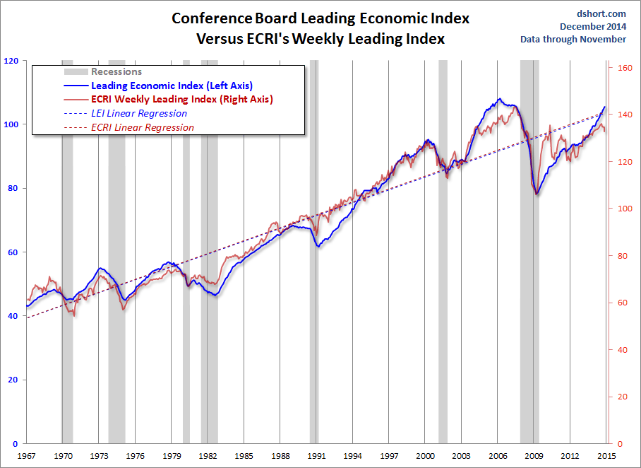
In the chart above we can see that CB and ECRI leading indicators have recently diverged from one another. CB is fairly benign currently whereas ECRI has turned negative.

The complete list of differences isn’t published. However, there are two important things to note. First of all, both use the stock market as one of their leading indicators: further evidence that it isn’t the economy that leads the stock market but the other way round. Secondly, all they are doing is identifying the first dominos to fall in a recession, therefore they flag only when the economy and stock market are already flagging in certain ways. So useful, but not a stand alone predictor.
Related to leading indicators are recession models. They too try to pick out the leading variables and typically include the likes of real income, trade sales and industrial production. Once again they flag as these first parts of the economy roll over, so cannot be considered as ‘predictors’.

Next, you’ll hear a lot that tightening, either through oil prices or interest rates, are the typical causes of tipping the economy into recession. The two charts below appear to echo that.
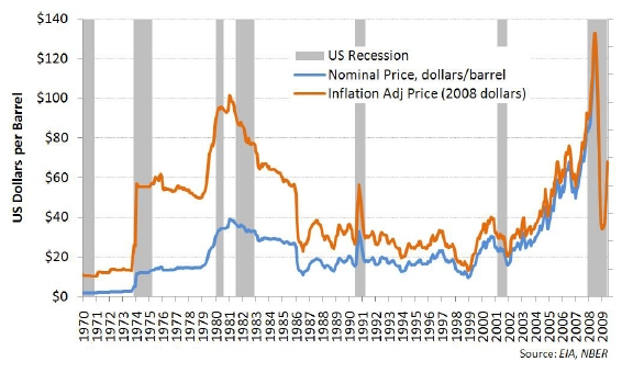
However, we see that further back in time crude wasn’t a major factor in recessions and Japan provides a useful example of recessions occurring despite ultra low rates.


Source: ETF Guide
Associated with the latter is the interest rate spread. The yield curve is perceived to be a reliable recession predictor: when it turns negative recession is looming.

The reasoning is that buyers would rather take up a 10 year bond at meagre rates because they have such little confidence in the economy ahead. If that is so then it is the market leading the economy again.
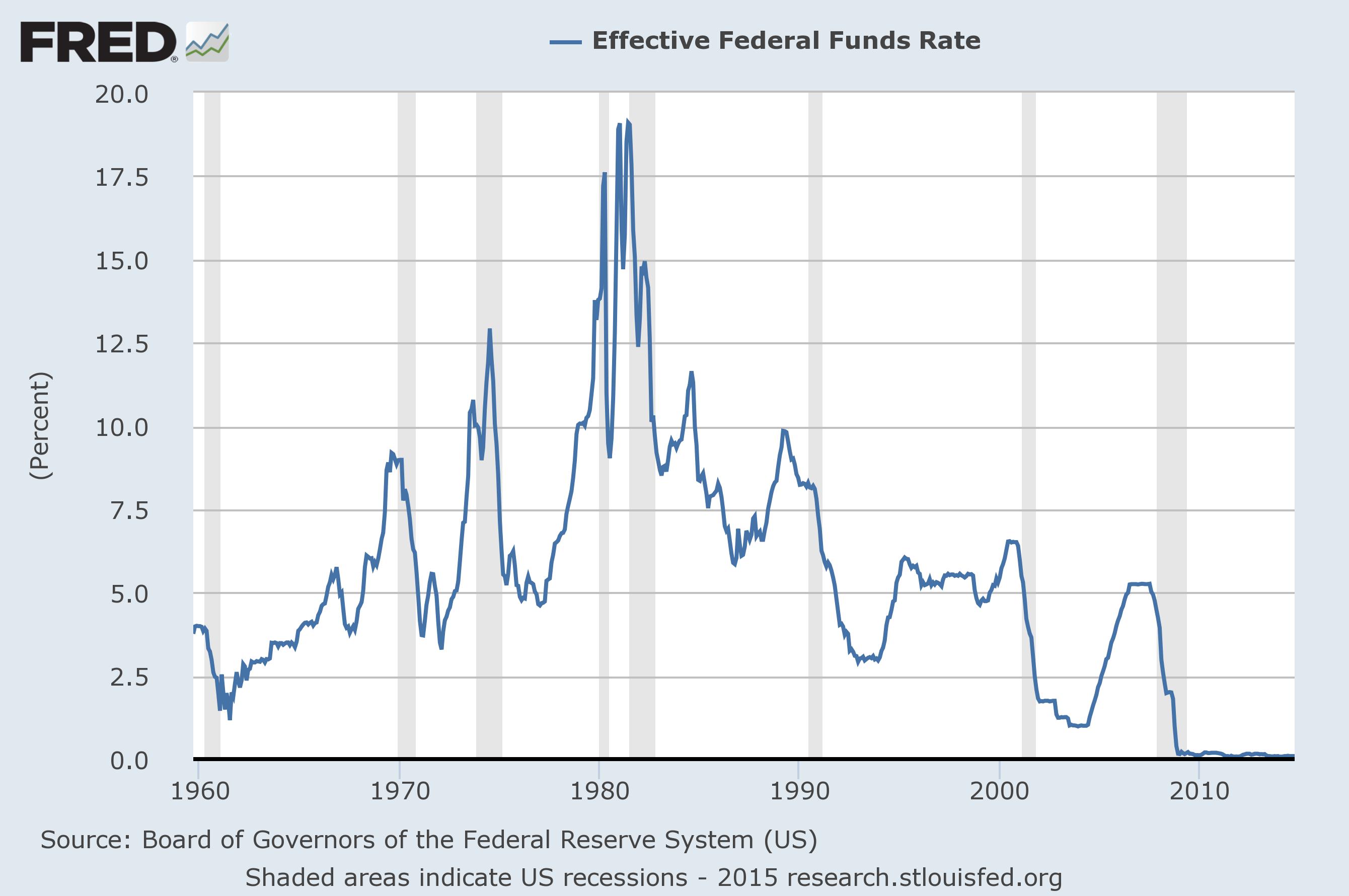
However, the Japan experience shows that we can have recessions without an inverted yield curve, and again looking further back in time at the US we can see the same occurred there too.

Below we can see the relationship between inflation (with oil prices being a key factor) and interest rates.

Source: Yellowstone Partners
And here the rise of deflation.

Accordingly, our current circumstances have more in common with the 1930s when low oil prices, low rates and non-inverted yield curves were in play and notably were not recession triggers.
The supposed ‘mistake of 1937’ alludes to the central bank tightening to early and bringing on a recession. This is part of the wider misinformation that central bank actions lead us into and out of recession. Once again the example of Japan in the 90s and 00s show us that despite QE and ultra low rates, both bear markets and recessions still took place. Now we see that repeating but on a global scale. The US may have ended QE but it continues in the UK, Europe and Japan, whilst ZIRP is the norm around the developed world and there have been many fresh cuts and easing measures in 2015. Despite all this the world is quietly slipping into recession. Below are the real indicators of China’s economy, notably diverging from the ‘official’ GDP.

And here we see US economic indicator surprises have stayed negative all year.
Negative leading indicators (ECRI) and negative coincident indicators (above). No surprise then the Fed left rates at zero. This is going to help with the myth debunking. If we are now in a bear market and tipping into a global recession, as I believe, then central bank ‘tightening’ can’t be fingered.
Moving on, high valuations are considered a bear market trigger. The chart below reveals this may be so, but with a notable outlier in 2000. Much like the charts of interest rates and crude oil above, if there is a relationship then it doesn’t tell us at what level (oil price, interest rate or equities valuation) or at what point in time the economy or stock market will tumble over. However, high levels in any of the three would represent notable flags that a reversal lies ahead.
 Similarly, high sentiment, allocations and leverage are flags for a stock market peak. But again they don’t tell us when or at what level the reversals will occur. They are warning signs that mania is taking place, but what causes that mania?
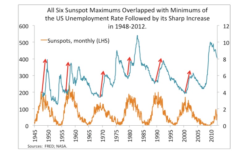
On the chart above are labelled what I consider the real predictors: solar cycles. They enable us to time the market peaks on a longer term view, with the major lows above equating to major peaks in commodities. Below we see that the influence extends to the economy with relations to unemployment and recessions.

But not all bear markets and recessions can be associated to sunspot peaks, which brings us to the other main cause: demographics.
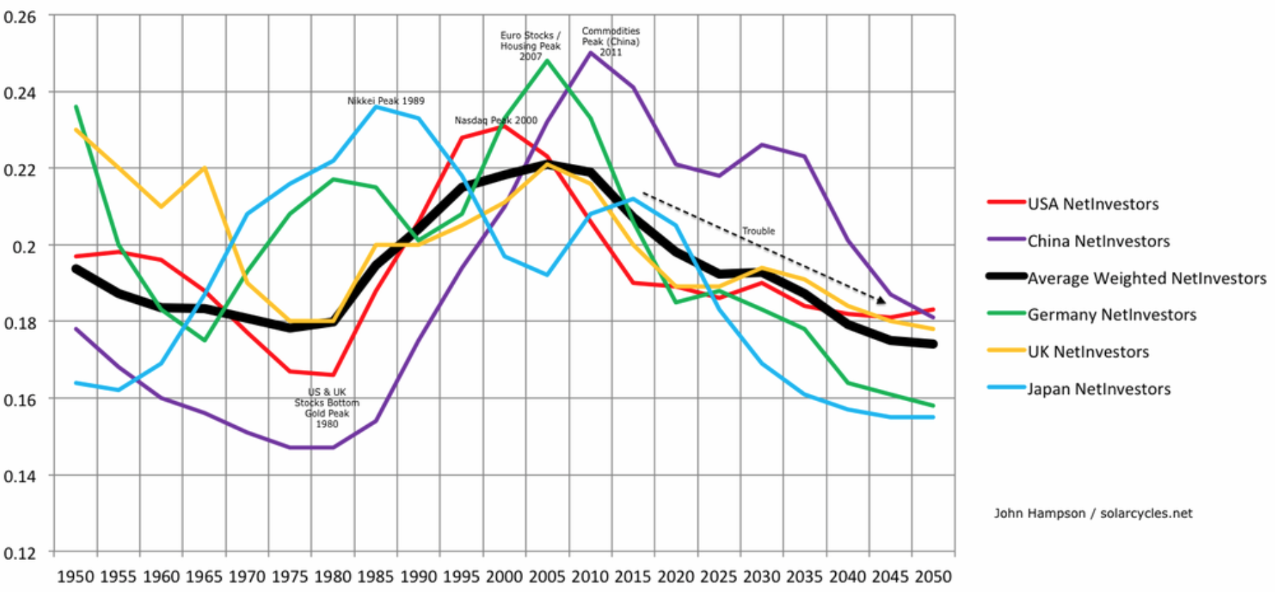
This is the overarching reason why the global economy is in trouble: the collective negative demographic trends in the major economies. Again, demographics influence both the markets and the economy, and as they are to a large degree set into the future we can predict what lies ahead. As the chart above shows, that would be ‘trouble’.
Demographics and solar cycles are related, with the latter influencing the former, and as we can identify their influence in tipping the market and economy over, we can likewise see how they bring about manias in both into demographic and solar peaks. Therefore into both types of peak, it is normal that oil prices may rise, unemployment may fall, stocks may boom and rates may be tightened.
The major peaks in 2000 and 2014/5 were solar. The major peaks in 2000, 2007 and 2011 were demographic. Perhaps we then we can see why 2000 was so outsized: it was both solar and demographic together.
To summarise, demographics and solar cycles are the main causes of bear markets and recessions. Within that, we can identify those indicators that lead in the economic downturn, which make up the leading indicator and recession probability model components. Notably, these include the stock market. The yield curve, interest rates and oil prices can also be useful such flags but there are circumstances when they don’t apply. Those circumstances are demographic, and that non-application is in play now, as it was in 90s Japan or 30s US. So, should we now be tipping into a bear and recession, that will help invalidate some of the misinformation spread.
There are no dead certs in the economy or markets. The best way to phrase it is that typically stocks bears and recessions occur together, normally the former leads into the latter, usually the cause is either demographic solar or both, and that often we see flags being raised by several of the following: valuations, sentiment, leverage, allocations, oil prices, inflation and interest rates.
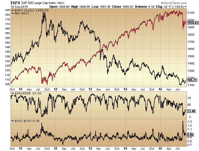
Turning to the short term markets briefly to close, the recovery rally in stocks has been enough to neutralise several of those indicators that had turned excessively bearish. Gold has been able to make a higher low last week and the next confirmation would be a higher high. I expect stocks to break downwards again in due course and I maintain the bear kicked off in earnest in May, with the topping process having showed clearly as starting in 2014 at the solar max.