Addendum to Forecast 2013 series

Two great charts from readers, worthy of a few more comments.

Firstly, from Robert Bowden, a long term chart of the Dow and the lunisolar 33-year cycle. Great work from Robert, I would just repeat my 1930s tweak, that the secular bear sideways range contraction would take place after 1937 rather than after 1929. Regardless, in each instance the market coiled into the solar peak in red and there was a great buying point for equities following.

Source: Robert Bowden

The second chart was provided by Mike, and is from NowandFutures. This long term chart for commodities fits very well with the long term equities chart above, showing the inverse secular relationship between the two. Nowandfutures have identified a ~30 years cycle in commodity peaks and by including their Elliott Wave count we already peaked.

Source: NowandFutures

Bring together this chart with the above equities chart, and multiple charts from my Forecast 2013 series, the evidence is pretty compelling that we are at a secular inflection point, in the long term view. If I was a very long term investor, I could sell out of commodities and bonds and buy equities and not look again for 10 years, and only a new paradigm would prevent that from returning handsomely. As I have argued, I don’t believe we have a new paradigm at this point in human history. We have thus far seen typical secular development and indicators suggest we are in the area of what should be a typical secular inversion.

However, as a secular inversion is a messy affair over a window of a few years, and I am a medium term trader whose main focus is to make a strong return each calendar year, getting the timing of when to enter and exit which asset class is crucial. So, my arguments for a commodities peak ahead next year, rather than already achieved in 2011, can be summarised like this:

1. Solar cycles are the underlying. The ~30 year cycle NowandFutures have identified is in fact 3 solar cycles or one lunisolar cycle. Maximum human excitability occurs around solar maximums which is revealed in my own charts by secular stocks peaks and secular commodities peaks all occurring close to solar maximums, as well as inflation peaks i.e. peak speculation and buying. The solar maximum ahead next year therefore suggests 2013 for a commodities peak rather than 2011.

2. Previous secular commodities peaks have all occurred with a subsequent shadow peak, or bounce, around 3 years later (as the demand-supply balance is not transformed overnight). 1980s secular peak, 1983 bounce (all lower highs). 1947 secular peak, 1950 bounce (just oil made a higher high). 1917 secular peak, 1920 bounce (just oil made a higher high). In each case, when the economy gained some momentum after the secular peak, commodities joined in the pro-risk party for a last push, but by that point, the best investment was equities, which were already in new secular bull momentum. Exrapolating, we should see a secular commodities peak in 2013, and a shadow bounce around 2016.

3. Secular asset peaks normally end with a parabolic mania, a blow-off top. In this K-winter since 2000, the leading asset has been gold, and gold has yet to make such a parabolic. Furthermore, the technical shaping of gold suggests that it has just broken upwards out of a 9-month coiling from 2011 to 2012, which should power it to new highs. Could it do so alone, without other commodities? It’s not impossible, but as I showed in my forecast series, there is feedback looping between commodities and normally close correlations in performance. Commodities:stocks and commodities:bonds ratios are supportive for a final mania in oil and gold, and Goldmans have just upped their forecast for commodities for the next 12 months for an 18% collective rise.

4. Grains have made new secular highs in mid-2012. That is supportive of a secular commodities bull still in tact. However, until we see other commodities at new secular highs, then the possibility of a 2011 peak remains open, with grains an anomaly.

5. I’m not a big fan of Elliott Waves because a variety of interpretations can be applied to any chart under consideration. Of all the market disciplines (and I have been open to all) I find them one of the least predictive. However, I generally subscribe to the idea that markets move in waves and that there is some logic to a 5-wave or 3-wave count. I can see a 5-wave count on the CCI commodities index since 2000. I think the 1970s 5-wave count above is less compelling and more of a retrofit. In short, I accept the 5 waves since 2000 to 2011 is a warning, but it would not be alien for commodities to make a new high next year and an alternative count applied. It comes down to weightings. I give more weighting to solar cycles, gold technicals, asset ratios, real interest rate trends, food price inflation, central bank reflationary actions and so on, than to Elliott Wave counts.

In summary, more evidence in the above charts that we are at a secular inversion point in history. I believe the Nowandfutures chart needs a little tweaking to make accurate, and as it is a long term chart, that tweaking makes all the difference, namely from 2011 to 2013 for a commodities peak. A prudent investor might choose to sit out what is a messy, tricky period to time in terms of which assets when. However, if there is a commodities parabolic ahead, that is a great opportunity for a trader, and I believe there is. Drawing together multiple disciplines, I believe the probability lies with the peak ahead. If I am wrong, then nearer term clues will start to appear in favour of the alternative, and my approach as always is to keep analysing day by day to see if this is so. In recent months however, the nearer term clues have grown more in favour of a peak ahead, than in the past, thanks to renewed QE and Chinese infrastructure programmes, grains making new highs feeding into food price inflation ahead, bullish technicals in precious metals, renewed US dollar weakness, and improving leading indicators.

Update: extra charts from Tiho, Shortsideoflong:

I’ve just added the solar peaks.

Forecast 2013 Part 4: New Secular Bonds Bear Market

US treasuries have been in a 30 year bull market and have reached all time highs in 2012, with yields at all-time lows. Other major nation government bonds have hit similar levels.

Considered net of inflation, bonds are at even greater extremes and are paying negative real returns.

Fear has been the biggest driver of this excessive move into bonds. But by Gann methodology, their recent mid-2012 peak may mark the end of the secular bull.

On the short term view, 10 year treasury yields have made an inverse head and shoulders formation, which should lead to yields breaking upwards and treasuries breaking downwards.

This is supported by a longer term view of 30 year treasuries, which shows that bonds made a recent parabolic move to the top of their long term channel, which historically led to treasuries falling sharply over the next 12 months.

Underlying Source: Stockcharts / James Craig

In addition, the performance of bonds following the announcement of QE3 should be one of steady retreat, as this occurred during QE1 and QE2, whilst pro-risk rallied – see here:

Source: Scott Grannis

Interestingly, QE3 is open-ended, which could therefore provide the backdrop for treasuries to fall gradually, despite the Fed being a buyer in the market (as other buyers exit).

Taking the very long term view, treasuries have alternated secular highs and lows every 30 years or so, close to solar peaks. The next solar peak is 2013.

Not only are treasuries currently paying negative real yields, but the relative earnings yields of US equities is at a record. In other words, if confidence returns to equities there should be a large money flow from treasuries to equities in search of better yield.

Source: Aberdeen Investment Management

An alternative view of the same relations shows that earnings yields have reached a similar level of extreme attractiveness relative to bonds that previously marked a secular inversion (the end of the 1970s).

As 2013 should mark a secular shift from commodities and bonds to equities and real estate, as covered in the other parts of Forecast 2013, I believe now is the ideal time to position short treasuries (or long treasury yields), for a longer term hold.

That concludes my 4-part forecast looking out to 2013. To summarise my overall approach, I am using a combination of solar cycling, secular cycling and historic repetition that allows me to forecast by time, i.e. a time range of what should happen when in different assets by aggregating the previous repetitions. I am cross-referencing this with technical indicators and fundamentals. Using technical indicators that have previously marked cyclical or secular inversions is also using history as a guide, whereas assessing fundamental developments is ensuring that history is still an appropriate guide in the current circumstances. The evidence generally suggests that we have seen a TYPICAL secular stocks bear and TYPICAL secular commodities bull since 2000 and that the guide of solar/secular and technical history is indeed appropriate today. If evidence were to start to mount that this were not the case then I would change my positioning and go cautious until it became clear what exception was occurring or what new rules were being written. Until then I am long commodities looking for a secular peak (by both time and technical indicators), long stocks looking for a cyclical peak (by both time and technical indicators), and short treasuries looking for a longer term secular hold.

Considering the wider implications of cycles, historic repetition and rhyming, and technical indicators marking secular, cyclical or swing inversions in the same repeated manner (e.g. asset price ratios at certain levels, sentiment indicators at certain levels, yield curve shape, parabolic price action, breadth divergence and so on), it reveals a welcome limit to randomness in the markets. As traders we can use that non-randomness to obtain a predictive edge. For sure, there is a degree of self-fulfilling prophesy in that market participants seek order and in so doing apply a degree of order to the markets. However, nature is full of cycles and repetitions, and humans and their systems are very much of nature, therefore the absence of natural cycles and mirrors in time would be more shocking than their presence, in both the financial markets and economy. My own personal approach has been this: if there is both compelling evidence AND scientific reasoning, then I can forgo a degree of free will and embrace the likes of sunspots and geomagnetism. 2013 will be a significant validator – or otherwise – of solar’s role in the markets and economy.

Forecast 2013 Part 3: Equities Wind Out Of Secular Bear

Secular stocks bear markets track overall sideways in nominal terms due to inflation, whilst price/earnings valuations gradually fall from expensive to cheap. The shape and development of the current secular bear market, which began in 2000, bears resemblence to the secular bear of the 1970s and the secular bear of the 1940s.

Here is the MSCI world index and the secular bear that began in 2000, compared to the SP500 in the 1970s and the DJIA in the 1940s.

Here are the individual SP500, Dax and FTSE charts overlaid on each other for the current period, showing that they all made the similar pattern.

In the last couple of years of the pentagon patterns in the previous secular bears, the markets contracted into a range and coiled, before breaking out to the upside, then backtested the breakout level before advancing in a secular bull of real momentum. In that pre-breakout phase, the markets were characterised by a loss of appetite for equities – the final washout after a decade long sideways grind.

We see that in the current market environment, through shrinking stock market volume, declining reading/viewing figures for financial media and equity fund flows persistently negative despite the stock market performing fairly well and bonds at extremes of expensiveness paying negative real returns. The chart below shows the difference in fund flows into those two asset classes despite equities yields at record attractiveness compared to bond yields.

This next chart shows that flows into bonds or equities largely followed the fortunes of the two classes, but since 2009 there has been a disconnect, whereby funds have flowed into bonds despite equities’ performance improving in relation to bonds. This also demonstrates a washout in appetite for equities.

Source: JP Morgan

A common way of measuring the end of a secular stocks bear market is by price/earnings valuation, with the rule of thumb that valuations have to reach single digits to become extreme cheap enough to bring about a secular inversion. However, the valuation reached depends upon the measure of inflation used, because, for example, for p/e10 a higher inflation estimate increases average real earnings over the 10-year period, and thus lowers the P/E10 ratio. Official CPI inflation stats calculations have changed since  the 1980s but these form the basis for most p/e calculations.

Nowandfutures generate their own inflation data to compensate for the CPI changes, and the real inflation adjusted long term Dow moves from the blue line to the green line in the chart below. That makes a big difference, as it makes the 2009 low an extreme secular low and our current position still below the long term trend, i.e. a longer term buy rather than a sell.

Source: Nowandfutures

Similarly, Shadowstats provide their own inflation measure that attempts to keep inflation calculations consistent over time. Dshort’s real S&P Composite Index adjusted for Shadowstas inflation paints a similar picture to the one above, which is that 2009 marked a secular low extreme and that equities are still an attractive buy at the current level, 45% below long term trend.

Using the same Shadowstats data, a discontinued Dshort chart reveals that the S&P p/e10 would be currently around 15, having come down from around 35 at the secular 2000 peak. With history as our guide, we should expect this p/e10 to drop again below 10. This can be achieved by stocks falling, by inflation rising, or some combination of both.

A look at price-to-book valuation also shows that both US and European equities are approaching previous secular lows, but could drop a little further yet.

Shiller p/es reveal Europe to be closing in on secular cheapness.

Looking at Japan, the cyclically adjusted p/e shows a similar picture: getting there, almost extreme.

MSCI’s global equity index forward p/e valuation is currently around 11, which is also approaching secular cheapness, but could fall a little further yet.

An alternative view of secular bear progress comes through US consumer confidence, which reveals similar developments in the 1970s and today. A further dip in confidence would complete the pattern and this would probably occur with an economic slowdown or stocks bear.

Underlying source: Sentimentrader

Returning to the secular bear pentagon patterns at the top of the article, after stocks broke upwards out of the pentagon in the 1940s and 1970s, stocks retreated again the following year in a successul backtest of the breakout level, before advancing in earnest in a secular bull of momentum. I suggest we are currently breaking out of the pentagon in the final third of 2012 to complete an overthrow for equities as we move into 2013, before we make that retreat in stocks to retest the breakout. That retreat, accompanied by rising inflation, should provide the drop to single digit valuations for those indices that still haven’t hit extreme cheapness. Bear in mind that not all indices will hit single digits as, for example, Japan ended the last secular bear at CAPE 20.

Following the secular bottom, in this instance 2008/9, there is a gradual process of repair. From financial system meltdown in 2008 to European debt crisis in 2011/12, that’s improvement in terms of global accuteness and that improvement is reflected in stocks moving higher.

Recall how derivatives had mushroomed into a major system threat by 2008. Since then the size of these markets has gradually come under control.

Source: Nowandfutures

Recall the accute sovereign default risks in certain countries in 2011 and earlier this year. The past 6 months has seen reductions in default risks across the globe.

Source: Bespoke

Recall the major real estate bubble into 2005/7. Since then real home prices have been fully deflated (in the US).

Recall household indebtedness, related to the real estate bubble, had reached excessive levels. This too has been repaired with time (US chart again).

Clearly not everything has been repaired. Global economic growth is currently fragile, and leading indicators generally weak. Central banks are still intervening with support and stimulus. However, secular stocks bulls don’t begin with everything repaired, they begin from very dire circumstances. I can argue that the secular stocks bull really begins at the secular nominal bottom, in this case December 2008 / March 2009, which was when things were at their worst. Federated Investors echo this view:

Source: Federated Investors

What secular history shows us is that stocks are unlikely to return to those 2009 lows or get anywhere near them. Our closest historical mirror is the 1940s secular bear because interest rates were kept negligible due to excessive debt. With central banks committed to keeping interest rates low in our current environment until recovery is entrenched (which will by association mean a secular bull is entrenched) we have even more reason to expect stocks to perform well, because their attractiveness strengthens relative to bonds and cash. Stocks dividend yields are at record highs versus treasury bond yields. This could mean that this time round, US equities do not need to drop to single digit p/es, because they are already at secular cheap valuations in terms of comparative yields.

Let’s draw in solar cycles and understand that a recession has always followed a solar maximum, and the solar maximum is forecast for 2013. Based on previous timings, we might expect that recession to come to pass 2014-15. Using the 1940s as our closest historical mirror, the recession could well be mild, as ultra low rates and central bank support are likely to persist through it.

Usually, stocks turn down roughly 6 months before a recession begins, as a leading indicator. This is how I see the price action in equities unfolding:

The topping out in the stocks cyclical bull (since 2009) should be a process – a trading range at the top, as seen in 2007 and 2000 on the chart. A high and then a retest of the high, but with negative divergences telling at the second attempt. I suggest stocks will top out as commodities really take off, with a big move in commodities bringing about an economic slowdown / recession. Stocks should therefore act as a leading indicator of that slowdown. I suggest stocks can reach 1600 on the Sp500 before topping (1600 is not my call for a top but a reachable level), and then retreat in a mild cyclical bear to go with the mild recession. As per the pentagon charts at the top of the article, stocks may pullback to 1300 or so in that cyclical bear, before advancing in earnest in a secular bull as of sometime in 2014.

Let me finish by contrasting my forecast with the very bearish projection that some others are promoting, because it clearly has huge implications for positioning. This is a chart with text from the Financial Tap, but I’m not singling them out – there are several well known sites publishing something similar.

Source: FinancialTap

It looks technically compelling, and the supporting arguments run something like this: despite all the easing and stimulus the world economy can’t get any sustainable growth, and when the penny drops that central banks are impotent, the bottom will fall out of the market. Not only that but excessive debt has not been resolved, and a sovereign is going to default sooner rather than later. Excuse me paraphrasing, but you get the idea.

My argument is this. There is no historical precedent for that major third collapse from previous secular bears. Any ‘third’ low is much higher. The shaping out of the 1940s and 1970s bears from this point is bullish, not bearish. Furthermore the current environment is one of ultra easy monetary policy, together with central bank commitment to stimulate and support like never previously, which really provides great support for yielding asset prices from underneath (cash and bonds are paying guaranteed negative returns, which improves the picture for equities yet further). What is more, equities are historically at cheapness extremes versus bonds, and also cheap in relation to commodities. Some European countries are at absolute secular valuation lows. The Eurozone is committed to staying together and to not allowing a default in any of its members. Their step by step measures, and other repairs in the global economy and the markets since 2008/9, are genuine reasons for equities to be much higher. Sustainable growth will be the last piece: once we are growing sustainably (technological evolution continues its parabolic ascent), the secular bull will be mature and some way higher.

What if this time is different? It is absolutely concerning that exponential trends in population, consumption and debt (brought forward consumption) are unsustainable in a world of finite resources, and our debt-based money system and policies of permanent inflation threaten to eventually accelerate to either system collapse or hyperinflation if no changes are made. However, none of those issues are at crunch point YET – we are just further up the curve. On current trends, humanity faces a true crunching of these issues from around 2030 to 2060. Between now and then things may change and exponential technological evolution has the potential to deliver solutions to some of these issues. Should no solutions be found, then we still have ‘room’ for a secular bull market in stocks before the crunch. An acceleration of the debt parabolic has defined these last few years, but once sustainable growth re-emerges, we will see an end to these large debt accelerations (not a resolution, just a slowing). I predict debt to be maintained at ratcheted-higher levels, and inflation to be permanently ramped higher, with the latter assisting in containing the former.

Coming Next: Forecast 2013 Part 4: New Secular Bonds Bear Market

Forecast 2013 Part 2: Secular Commodities Peak

Forecasting a secular commodities bull market peak is two-part: why commodities should make a blow-off price acceleration and why commodities should then fall out of favour in an enduring way.

Let me start by showing that commodities have been a particularly poor-performing asset class over time:

In real terms, commodities have gone nowhere in almost 150 years, whilst the best performing asset class has been equities. In short, the large difference between the two is the value-add of humans, real economic growth through technological evolution. On closer inspection, the chart reveals that commodities have enjoyed short periods of real price surges around 30 years apart, and the latest such secular commodities bull market has been underway since around 2000. We can see this clearer in the chart below.

Commodities follow a sine wave over time, and the next peak is projected to be 2013.

Here is the equally weighted CCI commodities index chart, showing a secular bull trend still in tact.

Source: Stockcharts / Niels Orskov

The previous secular commodities bull markets ran roughly 1906-1918, 1938-1948 and 1968-1980, all around 12 years in duration. Based on these historical precedents (current bull 12 years old), plus the longer term trend in real commodities, we have reasons to expect that the secular commodities bull market should be coming to an end imminently, UNLESS there has been a paradigm shift. That paradigm shift would be fossil fuel exhaustion and natural resources depletion, i.e. that humans have spent their natural resource heritage in order to fuel economic growth, and commodities are now being repriced permanently upwards as they start to run out. Indeed, historic projections put peak oil around now. However, the picture for future energy supply has improved due to large gas finds and expansion of renewables – see chart below.

Source: BP 

Considering gas, water, copper and others, the crunch point shouldn’t occur until beyond 2030, based on current trends.

In addition, new mines and new energy fields are coming on stream, typically taking up to 10 years to reach production from initial plans, and adding to supply. Once commodity prices take off in a new secular bull, there is a lag in new supply coming in stream. Below we see copper production projections ramping up ahead, particularly in 2014.

Next we see OPEC crude oil production stretching back to the 1970s. Note how the oil secular bulls of then and now correspond to declining or flat production, whereas the oil secular bear was set against steadily rising production. Looking forward, some new supply is coming on stream from non-OPEC countries.

Here is gold mining in the long term view. Here you can see that secular bull markets in gold typically occurred in the face of declining production, until new supply caught up. Note that gold production has been on the rise again in the last 3-4 years of the current secular bull, suggestive of an imminent new secular bear.

The precious metal’s appeal, despite increasing supply, is in part due to a persistent environment of negative real (inflation-adjusted) interest rates. Gold has no yield, so comes into favour when cash and bonds are paying negative real yields. The chart below shows how the last two secular gold bulls have been set in that kind of environment, and the 1940s bull was also.

The 1940s secular commodities bull perhaps shares the greatest similarities with our current one, in that interest rates were kept negligible despite inflation, due to excessive debt. The chart below shows US inflation versus interest rates, including both periods. Note that the secular commodities bull of the 1940s topped out in 1947 (measured by the CCI index) just as a trend reversal in interest rates began. In other words, although real interest rates at that time were still negative and remained so into the 1950s, it was enough for a programme of rate rises to BEGIN to end the secular commodities bull market, as the focus turned in favour of yielding assets.

As well as yield, relative value has also been a key factor in marking the beginnings and ends of secular asset bull and bear markets. First we see a long term view of UK house prices measured in gold, i.e. a real estate to gold ratio, and this chart reveals that we are into the zone of extreme expensiveness for gold versus UK housing.

Source: Approximity

Secondly we see gold versus US real estate, and a similar picture of extreme cheapness in real estate compared to gold. These charts are suggestive of an imminent secular reversal between the two assets.

Thirdly, we see gold versus equities, as measured by the DJIA stock index. Here we can see that the ratio has fallen from 43 in 2000 to single digits today i.e. from stocks being expensive and gold cheap to the opposite. Based on the long term trend lines, this ratio could fall further to around 4 (or even lower, per 1980) before signalling an imminent reversal.

Source: IntelligentBear/Sharelynx

If we consider the Dow Jones stock index relative pricing to Brent crude oil, we see something similar, namely that oil is historically expensive versus equities, but that the ratio could well move further to the extreme before signalling a reversal.

Source: Approximity

Several such ratios are united in the chart below, which provides a useful overall view of where we stand. I have marked the secular commodities bull market peaks with  a C, and have added the black horizontal line, which I suggest is the level over which the ratio lines ought to reach before this secular commodities bull reverses.

Source: Nowandfutures

But should could real estate and equities drop in price, rather than commodities rising in price, to achieve the ratio extremes?

Considering global real estate against rents and income, we can see that in several countries house prices have currently reached extremes of historic undervaluation, whilst in others not yet.

Source: The Economist

And likewise equities have reached extreme undervaluation – sub CAPE 10 – in certain countries, whilst in others not yet.

Source: Megane Faber

Meanwhile, the most widely held global government bonds are typically paying negative real returns, as is cash.

In summary, certain countries’ stock indices and real estate markets have reached secular extreme cheapness and should rise rather than fall in price, which puts some support under both asset classes globally, particularly as we see that real estate and equities are into the zone of historical relative major value to bonds and commodities. With bonds and cash paying negative returns, but money parked there through fear, there is the potential for large money flows into pro-risk assets if confidence grows. Real estate is the second best long term returner after equities.

If pro-risk rallies, then commodities outperform in relation to equities before reaching major secular expensiveness extremes, but any parabolic rise in commodities from here would likely be the last of their secular bull, as precious metals in particular would reach expensiveness extremes and investors would begin to abandon gold with its lack of yield or usefulness and long term poor real performance.

So, if we consider there is the potential for just one more major ascent for commodities, secular history suggests that this should indeed occur. Secular bull markets typically end with a blow-off finale, a mania. In previous secular commodities bull markets, commodity prices have accelerated roughly 6 months prior to the ultimate peak, and gone crazy with roughly 6 weeks to go. So, we can look for a combination of a parabolic unsustainable price rise together with extremes in overbought and overbullish indicators, lining up with true extremes in the relative asset value ratios above. They would be the clues to exit commodities.

Secular history reveals that prices should fall hard following the peak, and then gradually recover to make a smaller shadow bounce a couple of years later, before settling into a long term sideways secular bear market.

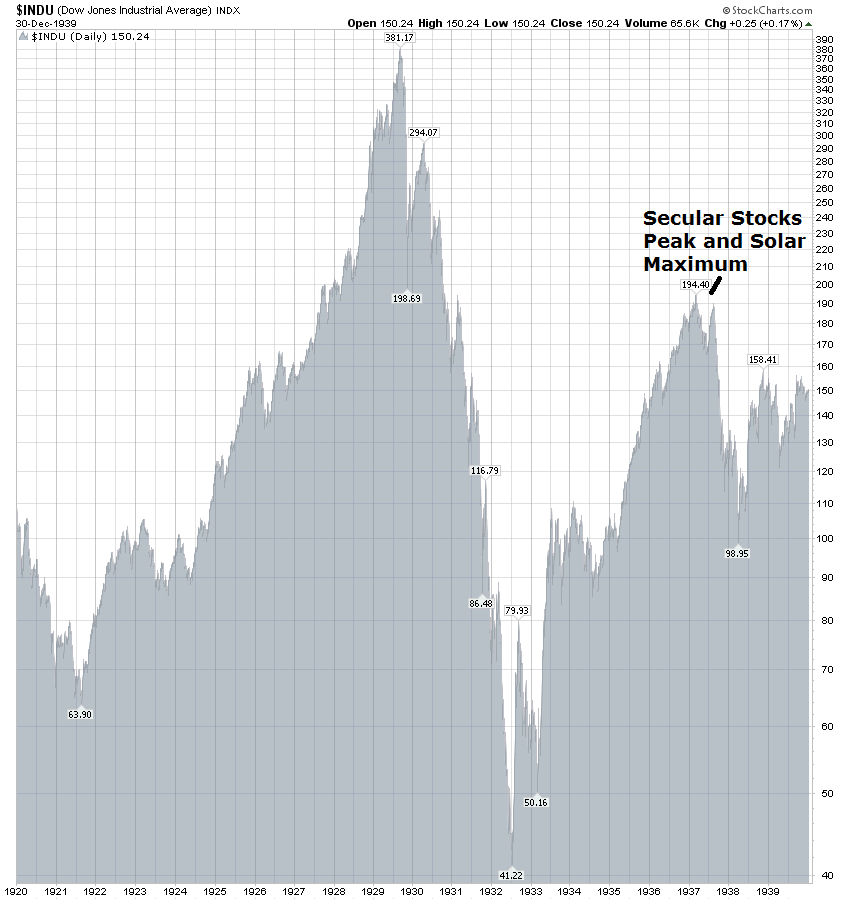
We can have a stab at timing the secular commodities peak, through solar cycles. Bearing in mind that solar maximums occur only roughly every 11 years, previous secular commodities peaks, and associated inflation peaks, have fallen close to the solar maximums.

Drawing together the last 3 secular commodities bulls shown, we could anticipate that commodities and inflation should peak in 2013, as the solar maximum is currently forecast between Spring and Fall/Autumn 2013. If the solar peak occurs at the latter or later, there is the potential for the ultimate peak in commodities to stretch into early 2014, but otherwise it could occur in 2013.

Not only have secular commodities bull market peaks fallen close to solar maximums, but secular equities bull market peaks have all done likewise. The reason is that solar activity maximums cause maximum human exciteability (Alexander Chizhevsky) which translates into speculation and risk-taking in the economy and markets. The asset class in a secular bull market is excitably speculated to a peak of excessive valuation.

In support of a peak next year, we see current extreme climate issues and forthcoming food price inflation, commodity and social conflict feedback looping, global central bank inflationary stimulus and currency devaluation all converging. This is all covered in Forecast 2013 Part 1: Inflation.

The biggest threat to a commodities peak next year is weakness in global economic leading indicators, particularly in China. China is the biggest consumer of commodities with its breakneck economic expansion over the last 2 decades. History reveals that economies that developed at such a pace historically invariably derailed at some point. The inbalances in China in its real estate market and export/domestic economies as well as the demographic challenges (chart below) put the country at such risk. A de-railing of China would provide a suitable backdrop for a secular commodities bear market over the next decade, were it to occur.

Source: Barry Bannister

The question is whether China and the global economy can reflate sufficiently into 2013 to enable commodities to make their secular finale, before any more serious Chinese slowdown comes to pass (if it does). I expect the last six months of global interest rate cuts, together with renewed US and Japanese QE, to provide that reflation, and perhaps most importantly, the new programme of infrastructure projects in China, that not only should support their economy, but also plays into a secular commodities finale, drawing on both energy and natural resources in its fulfillment. There is some tentative evidence in global leading indicators that the reflation is coming.

The last chart is my projection for how the price action will unfold into 2013. I have drawn together price action for stocks and commodities into the last secular commodities bull market peak, from the shadow inflation peak of 2008 (boxed) and used estimated solar maximum timing. Commodities should start to outperform equities but with both performing bullishly in a pro-risk environment into the end of 2012. Then as commodities start to go parabolic, stocks should top out their cyclical bull and disconnect. The commodities price peak should be around or following the official solar maximum, which is currently predicted between Spring and Fall/Autumn 2013.

Using the 1940s as our guide, with its similar environment of secular commodities bull, negligible interest rates and high government debt, a mild recession should follow in 2014, partially brought on by the excessive price rises in commodities preceding it. The 1948-9 US recession was only a shallow economic downturn lasting less than a year, as ultra low rates supported the economy. The combination of an economic recession together with a preceding price blow-off to extreme valuation, should ensure commodities tumble.

In conclusion, by asset ratios we are into the mature end of the valuation spectrum for the commodities secular bull, and by both secular and solar history, we are into the mature end of the timeline for the secular commodities bull. History suggests we should see a parabolic finale, and we might therefore expect that to come soon, and indeed be final. Commodities should outperform equities from here and at some point equities should diverge and top out, before commodities make their real blow-off top. Thereafter, we might expect a combination of extreme valuation and a tipping into recession to bring about sharp falls, and then a combination of increased supply, a trend reversal in interest rates, and a potential de-railing of China to provide the backdrop to a new secular commodities bear.

Coming Next: Forecast 2013 Part 3: Equities Wind Out Of Secular Bear

Forecast 2013 Part 1: Inflationary Peak

Agricultural commodities prices resumed upward trends in June 2012, largely due to drought conditions in key global farming areas on top of existing low inventories. Extreme global conditions continue, with the period June-August of 2012 the hottest such period historically on record.

Source: NOAA

Taking a broad agricultural commodities ETC (ETF), we can see that softs are now back up into the price range experienced in 2011, and not far from 2008’s peaks.

Agricultural commodity price rises typically feed through to retail food prices 4-6 months later, which means we could expect food prices to really escalate as of the final quarter 2012. Here is the UN food price index up to the end of August 2012:

Source: Food And Agriculture Organisation Of The United Nations

Now take a look at how the 2008 and 2011 episodes of rising food prices brought about social unrest and political upheaval in poorer countries across the world:

Source: NECSI

The chart shows when outbreaks of violence erupted in different countries. As food prices escalate towards those levels again as we reach into 2013, the likelihood is of renewed protest and conflict.

We can cross-reference this with solar cycle studies. 2013 is the year of the forecasted solar maximum. Alexander Chizhevsky’s analysis of 2500 years of human history and solar cycles revealed that the period into and around solar maximums (4 years) was historically one of protest, revolution and war. Last year’s North African and Middle Eastern revolts fit with this, as does the prospect of food-price based protest and conflict into 2013.

The Arab Spring revolutions and protests in 2011 brought about oil supply disruption, both real and perceived, which in turn rallied oil prices. Rising oil prices feed back into food prices through processing and distribution. Precious metals in turn benefit as inflation hedges.  A price feedback loop develops between these different commodities, and a feedback loop also occurs between commodity price rises and social conflict.

These two charts confirm the close inter-relations of food prices with oil and gold:

Source: Prudent Investor

Source: Casey Research

As we stand in September 2012, energy and metals are lagging soft commodities as supportive evidence for an inflationary spike in 2013. Global economic weakness is the reason, whilst grains have accelerated largely on extreme weather conditions. In response to the economic slowdown, central banks have cut interest rates and renewed stimulus (such as China’s infrastucture programme and US Quantitative Easing (QE) 3). This in turn should be reflationary, which should lift commodities as a class. In reponse to the US Fed’s announcement of renewed QE, five year inflation breakeven expectations surged, as shown in the chart below. Official inflation, CPI, has historically followed this indicator with a lag, suggesting inflation should accelerate as we enter 2013.

Source: Zerohedge

There is a feedback loop here too, as rising inflation inspires more money into hard assets as inflation hedges, which lifts commodity prices, which in turn brings about higher inflation.

With renewed QE, the US Fed continues its policy of massive money supply expansion, although this is not as potent as it might be, due to a weak money multiplier. However, the money multiplier shows evidence of having bottomed out and dollar circulation in the economy is beginning to gather pace, which can be inflationary.

Source: St Louis Fed

Renewed QE also devalues the currency. As the US dollar is the world’s reserve currency, to which many nations peg their currencies, a US dollar devaluation acts as a global devaluation. As commodities are priced in US dollars, this global currency devaluation typically brings about a commodities revaluation (hard assets rising in value versus paper).

The first chart below shows that the US dollar is labouring at secular lows in real terms, whilst the second chart shows that it is gradually making a rounded base around these levels. Its recent technical behaviour post QE announcement, namely the loss of a key support, in addition to its languishing near secular lows, suggests that it can provide the backdrop for an inflationary finale into 2013, before a new secular dollar bull gradually emerges.

Source: Scott Grannis

Source: Stockcharts / James Craig

Inflationary monetary policy has become the norm, not just in the US but throughout indebted nations globally. Official US CPI inflation calculations have been gradually changed since the 1980s, but John Williams’ Shadowstats data provides a more consistent picture of inflation over time and reveals that the Federal Reserve has been successful in restoring price inflation since 2008’s deflationary panic. I have used official US stats until 1980, then Shadowstats, to maintain a continuous picture of real US inflation:

This chart also show the compelling historic relationship with solar cycles.

2013 is forecast to be the solar maximum, and if history repeats, we should see an inflationary peak close to the solar peak. As the chart shows, peaks in inflation correspond to solar maximums and troughs in inflation to solar minimums, historically. The biggest peaks in inflation corresponded to secular commodities peaks, as we might expect due to commodity prices fuelling inflation. These secular commodities peaks all occurred close to the solar maximums, with one luni-solar cycle between each, which is around 33 years. These ultimate peaks in inflation / commodity prices were preceded by a shadow peak 5 years prior.

The last secular commodities peak was 1980. One luni-solar cycle later is 2013. The solar maximum for solar cycle 24 is forecast for 2013, 5 years later than 2008, when we experienced a (shadow) inflation/commodities peak. Drawing together secular, solar and inflation history, I can therefore forecast a secular commodities peak and an inflation peak in 2013. Regular readers know this is a forecast that I have held for some time, and as we close in on the end of 2012, we see increasingly supportive evidence for its fulfillment, as documented above: forthcoming food price inflation from current soft commodity price rises; social conflict from food price inflation; central bank policies of reflation and paper/hard asset revaluations.

This table shows how close the inflation peaks were in relation to the official solar peaks: between 2 months before and 4 months after.

Currently NASA forecast the solar maximum for around September 2013, whilst SIDC project around March 2013. I expect the difference to be resolved one way or the other as we end 2012, as the sunspot data gradually gives more clues.

From a fundamental perspective, an inflationary peak in 2013 could be justified by a three-way feedback looping between commodities and other commodities, between commodities and conflict, and between commodities and inflation, supported by inflationary monetary policies. From a solar studies perspective, maximum solar activity brings about maximum human biological and behavioural excitability, which manifests as buying, speculation and risk-taking in the markets and economy, and the feedback loops are therefore between solar peaking, secular asset peaking (in this case commodities) and inflationary peaking (speculation into commodities and buying/risk-taking mania). From this alternative perspective, it is the solar maximum of 2013 which is the key driver. Either way, evidence is building towards a fulfillment of an inflationary peak in 2013, and I am positioned accordingly, with my biggest weighting long commodities.

Next: Forecast 2013 Part 2: Secular Commodities Peak

Solar Cycle 24 Peak

NASA’s latest solar cycle peak timing projection now puts the likely peak at Fall/Autumn 2013. This was previously Spring 2013.

Source: NASA

SIDC’s forecast currently remains for a Spring peak:

Source: SIDC

If NASA are correct, this has implications for my market forecasts, as everything is pushed out by 6 months.

This is the timetable that you have seen before, based on a Spring 2013 solar peak:

If NASA’s new prediction is more accurate, then the top line in the table changes to this:

It would mean that commodities may not make their parabolic finale until late 2013 or early 2014. Working backwards, commodities could therefore begin to truly accelerate from as early as Spring to as late as Fall/Autumn 2013. The post solar peak recession would be pushed out to starting likely 2014. (Remember, this is a guide based on the previous three secular commodity bulls and associated solar maximums – outliers are possible). This shift would not affect my commodities strategy: hold long until we get to a parabolic ending move, and add on any major weakness. I will be looking to exit commodities on evidence of (i) an unsustainable parabolic move (ii) overbought and overbullish extremes and (iii) extremes in stocks:commodities and realestate:commodities ratios.

Based on this new September (approx) 2013 solar peak, here are the US stock index charts again showing our current secular position based on historical repetition, updated. The first shows the SP500 in the 1970s secular bull. Stocks rallied from here into the solar peak, i.e. for another 12 months, but with a lot of back and forth, and then stocks fell right after the solar peak, as high commodity prices helped bring on a recession.

Next we see the 1940s secular commodities bull period and the Dow Jones. Apologies but it is split across two charts. From the current point, stocks would be peaking, making a swift 20%+ fall, and then tracking sideways into the solar peak, and thereafter taking some time to pick up momentum. I believe the 1940s is the closest mirror of our current secular commodities bull, due to the shared ultra low interest rates environment.


And below we see the 1910s secular commodities bull period. Stocks rallies from here for a couple of months and then fell back again, falling around the solar peak, as commodities peaked at different times.

Below is our current secular bull period. Note the two bottoms that I have labelled, and see that all the 3 charts above share the same two important bottoms. In all 3 secular periods above stocks did not return to those kind of levels i.e. any third low was some way higher up. I have suggested before that since the 2009 low we are in a gradual process of repair. From financial system meltdown to something less armageddon-like and then something less bad still. We still have many issues, but once we have few, the new secular stocks bull will already be mature. For me, there is slim chance of stocks breaking down to 2009’s lows, as evidenced in these charts. Based on these historical mirrors, the next cyclical bear should be 20-80% higher than the 2009 low, i.e. 800-1200 on the SP500.

Underlying Source All Charts: Stockcharts.com

The three historical precedents don’t provide a united picture for where stocks go next, over the next 12 months. One went up, one down, one up then down. If the solar maximum occurs in Spring, rather than Fall/Autumn next year, per SIDC’s continuing forecast, then the ‘we are here’ markers shift along 6 months. In all 3 previous secular comparisons that would put us more into a sideways range period, making stocks neither a buy nor a sell.

However we have other means to identify when stocks are making a cyclical bull top:

(i) overbullish and overbought indicator extremes

(ii) a back and forth range in price (a price topping process) whilst negative divergences appear, particularly in breadth.

(iii) tightening of interest rates, either by central banks or by the markets pushing up bond yields.

(iv) leading indicators falling

(v) economic surprises falling

(vi) earnings falling short

(vii) inflation rising to over 4% official, or thereabouts

(viii) yield curve abnormal or inverted

All these have historically marked equity cyclical bull endings. A separate post would be needed to go through these in detail with chart evidence, but suffice it to say that currently we don’t see enough of these flagging red.

Yesterday’s developments very much strengthened the case for more gains ahead for stocks. A voluminous technical breakout to new bull market highs for the SP500 and Nasdaq and a reversal back up into the range for the Dow Transports (looking like a fakeout breakdown the day before). Plus, not only did the ECB delivered a bond-buying action to the market’s satisfaction, but China approved large scale infrastructure plans in a bid to revitalise the economy, which has propelled Chinese stocks this morning. This kind of stimulus is good news for the commodity bull case.

Treasury yields moved higher, adding to the H&S formation. Gann Global suggest that treasury yields will not revisit their lows of mid 2012, that the secular bull in treasuries ended here, based on historical mirrors. That fits with the chart I presented yesterday suggesting treasuries should fall over the next 12 months and also my cyclical bull ending criteria that rates should rise. It would also provide the backdrop to a commodities finale. Gann Global also project that commodities will pullback soon and provide a last buying opportunity before beginning their run away move.

Back to equities, I suggest we have some room to add to gains and consolidate the breakout, into next weekend’s new moon. Generally speaking stocks are not yet overbought and overbullish, but we are heading towards those levels. So a bit more upside yet, plus the potential announcement of QE or some other stimulus at next week’s FOMC. I will review how things stand heading into that.

Final Third 2012

One third of the year left to go. As of a couple of weeks ago the SP500 was up 12% for the year, whilst the average hedge fund was up just 4.6%, with just 11% of hedge funds exceeding the SP500 return of 12%. 2011 was also a tough year for hedge funds, compared to previous years. In my personal experience, 2011 and 2012 have seen certain reliable analysts calling it wrong, some usually reliable indicators pointing different ways rather than in alignment, up/down moves of shorter length, and some degree of disconnect between some usually connected assets. In my opinion, this is all due to the transition period that we are in, from K-winter (gold, bonds) to K-spring (stocks, real estate), bringing about come confusion in assets, indicators and analyst calls. The transition is gradual – the nominal bottom in stocks and real estate likely already occurred, the inflation-adjusted low likely ahead, the secular bottom in treasuries is perhaps occuring right now, the secular top in commodities I project next year. A messy, gradual transition rather than a clean switch.

I have found 2011 and 2012 trickier than previous years for those reasons listed above. Having to go against analysts that I respect, having to choose between indicators, having to make sense of assets going different ways. Ultimately, secular and solar anchoring has seen me through I believe, and will continue to do so. I am currently 20% up for the year. My target, as every year, is 40%, which makes me behind target with 3 months to go. Usually I try to steer myself to towards the year-end target as best I can (over-exposing and under-exposing, bigger and smaller risks). I achieved my 40% in 2008, 9 and 10 in that manner, but fell short trying last year, making only 15%. This year I don’t have the same approach, because I am looking out to what I project to be the secular peak in commodities in 2013, a potential opportunity for parabolic gains. My plan then is to maintain my bulk long commodities positions into 2013, rather than trying to partially close down and trade shorter term into year end. If my projections are correct, then commodities should continue to rise in Q4 2012. What I consider most important to my year end tally is calling when to exit equity longs. At some point I want to exit the bulk of those, and that may be before year end 2012.

On Friday at Jackson Hole, Bernanke added weight and justification to his easing bias, whilst falling short of committing to it. The reaction was pro-risk, and US stock indices still look like they are in a bull flag preparing for a break out over the year’s highs, as shown below. Currently, we are back up to the top of that flag. I have also marked the new and full moons. We saw one lunar inversion at the beginning of July, but otherwise the typical lunar oscillation has been in play. On Friday we made a bottom with the full moon and can now potentially make a high around the new moon of Sept 16.

The potential is there, both by technical picture and lunar phase, for stocks to break out. If they can break out then a melt-up would be likely, providing great returns for equities longs. We have the ECB meeting on Thursday this week, with the potential for interest rate cut and bond buying programme announcement, and we have the FOMC on the 13th September with the potential to announce QE3 or some other novel measures. Of course, both provide the potential for disappointment too. A lack of action could lead to a siginificant sell off. Also on the flip side we currently have a geomagnetic storm in progress and more geomagnetism is predicted for today and tomorrow.

The Dow and Nasdaq are in similar positions, but a quick look at the Dow Transports shows a more precarious position. Dow theory says this is a negative divergence. Let’s see if the Transports can catch up here, or alternatively breakdown.

Source: TSP Talk

Sticking with the USA, economic surprises continue to rise in an uptrend, ECRI leading indicators turned positive on Friday, and Presidential seasonality suggests upside into November. The US economy continues to perform better than most in the world and that should mean support for the US dollar.

Source: See It Market

As can be seen above, the US dollar is now at support and an important junction. I suggest that the FOMC outputs next week could influence which way this goes. A lack of QE should mean support for the US dollar due to the better US economic data. However, QE3 should rally the Euro at the expense of the dollar, and the technical chart for the Euro provides weight for that occurring:

Source: Chris Kimble

For my projections of an overthrow in equities in the final part of 2012 and then a parabolic finale in commodities in 2013, announcement of QE3 would really seal the deal I believe. Money would pour into pro-risk and commodities would benefit from the weakening dollar. Let’s see.

A look at treasuries shows us that the stronger hints of QE have reversed yields in the short term but also set up a potential inverse head and shoulders.

Underlying source: Stockcharts

Both QE1 and QE2 led to prolonged periods of rising treasury yields, after the initial move the other way, as money poured out of bonds into pro-risk. So again, QE3 would likely provide further fuel for pro-risk. It is on my mind that previous cyclical stocks bulls ended with treasury yields rising to levels where interest rates stifled the economy. Whilst we have the kind of ultra low rate levels here that echo the 1940s, I would still expect them to rise into the end of the cyclical bull to some degree. Currently, they are moving the other way, so let’s see if this large H&S now plays out.

Ed Yardeni produced a chart showing the SP500 has diverged from its fundamentals since June this year. My geomagnetic-lunar model charts also show stocks going opposite ways since June (all models updated this morning).

Source: Yardeni

Together that would ordinarily provide a good cross-reference for a short. However, speculation increases into the solar peak, and as per my Peak v Peak page, at the last solar peak we saw stocks break away from the geomagnetic model for some time before returning to it post solar peak. It is not something measurable, but I can point to each secular parabolic peak in stocks and commodities occurring close to the solar maximums as evidence that this occurs. I therefore look at the divergences in Yardeni’s and my own models and suggest this may be occurring.

Sentimentrader have produced two new charts that add weight however to the bear case:

Source: Sentimentrader

Hopefully those two charts are self-explanatory. As per my last post though, Technical US Stock Indices, there is evidence supporting the bullish case too. And so we return to my opening comments about indicators pointing opposite ways.

Looking wider, we continue to see poor technical performance in emerging market stock indices. There is a significant divergence in European and US indices versus Asia and Latin America, reflecting the weak leading indicators in those regions. On the plus side, economic surprises for emerging markets continue to rise in an uptrend:

Source: Bloomberg

So are the economies of China and Korea and Japan (and Germany) to improve? If not, can US leading indicators really continue to trend upwards without being infected? All eyes on the next round of global leading indicators these next two weeks from OECD and Conference Board.

Euro debt accuteness remains contained and well off its highs of H1 2012, so for now that remains supportive for stocks. The US fiscal cliff looms at the end of 2012, and once the US election is out of the way, presidential seasonality is no longer supportive. The ruling party has the option to implement unpopular policies in the first two years. It may therefore choose fiscal policy which increases recession risk. I maintain the projection of global recession 2013-2014 as per solar/secular history, and this could be one factor, together with parabolic commodity prices and bond yields rising. China may also de-rail to provide a backdrop to a new secular commodities bear starting next year. The question remains whether China can remain strong enough to fulfil the commodities secular peak before that occurs.

In summary, I am looking for my exit point for stock indices longs (not commodities), as by time I believe this could occur any time as of now into early 2013. The technical picture is mixed and indicators are mixed, but US stock indices are within touching distance of a breakout to new highs. For now I am going to stay put, and await ECB and FOMC decisions this week and next, along with the latest global leading indicator data. Market tops are usually a process, so more evidence should build whilst stocks range trade, if this is to be a major top.

Secular Solar Conclusion

A brief macro and technical update first. Euro debt continues to ease on the whole. Economic Surprises for G10 and emerging markets continue to trend upwards. Leading indicators continue to be the problem area, with a mixed to negative picture, but tentative signs of improvement: ECRI leading indicators in a 6 week uptrend to break even, and CB Eurozone leading indicators in a 3 month uptrend also to breakeven. China and its local trading partners remain a particular problem area, reflected in the continued Shanghai index downtrend. Western stock indices and commodities remain in bullish trends, having consolidated their recent gains just below key resistance levels for US indices and precious metals. Some overbought/overbullish readings in both commodities and stocks had been reached, but not the kind of comprehensive and extreme readings to signal a top. I therefore maintain that this is a pause before a breakout, supported by presidential, secular and solar cycles, and have maintained all my long positions. The full moon is this Friday, which is also the Jackson Hole Fed meeting. Whilst the latest Fed minutes suggested a greater likelihood of QE, Jackson Hole is not a policy meeting (a FOMC) so we may get no action plans, just more supportive words. The usual lunar oscillation would see the consolidation / correction persist into this Friday and a sell-off on disappointment is not out of the question. As of next week though lunar positive pressure should re-emerge and I expect stocks and commodities to break upwards.

The anchoring of this expectation is in secular / solar cycling. I expect stocks to overthrow and make their cyclical bull peak, whilst commodities accelerate and make their parabolic secular finale. The stocks peak should occur before the secular commodities peak – with stocks foretelling recession by 6 months or so, and commodities (oil and food) playing a key part in tipping the world into recession. Here is the timetable again:

Bear in mind the forecast for the solar peak – currently March 2013 – could change, and also that the forecasts along the top row are ranges based on the last 3 solar cycles but we could potentially print slight outliers to these ranges.

Growthflation, speculation and revolution/war have been three key themes into solar peaks. I therefore expect leading indicators to pick up in H2 2012, enabled by the global central banks recent easing / stimulus and a natutral upswing in growth. I expect inflation to pick up, and this should be the case as soft commodities took off in June 2012 and this typically feeds through to the food price index 6 months later. I expect speculation, particularly in commodities, to accelerate, and for there to be a supply side push in commodities, not just from climate/weather but also from war-related disruption. At some point commodities should de-couple from stocks.

Looking back to 2007/2008, the last time commodities de-coupled from stocks, and also 1979-1980, the last secular commodities conclusion where commodities de-coupled from stocks, there are similar themes. In 2007/8, climate disruption, perceived supply threat (peak oil, geopolitical), the intercorrelation of commodity prices (food switched to biofuels, oil being key input in food process, precious metals hedge for inflation) and an upward spiral of speculation drove commodities to peaks beyond the fundamentals. In 1979/1980, the Iranian revolution, Iran-Iraq war, curtailment of oil supplies, and a spiral of speculation (particularly in silver) did likewise. In both cases, the parabolic rises began from conditions of easy money, inflation and growth – emerging markets increased demand for food played a role in 2007/8 and increased global oil demand a role in the 1970s. So if we are to see a parabolic conclusion in commodities in 2013, as I expect, then we should see leading indicators pick up in H2 2012 and provide the ‘positive’  backdrop against which commodities can begin a parabolic climb, then coupled with other factors, namely climate a supply-side push on agri (as we are seeing), revolution/protest/war disrupting energy supply (such as the Iran situation boiling), and then the intercorrelated factors. These intercorrelated factors would be increased inflation from commodities rising inspiring more money into commodities as a hedge, increased energy prices pushing up food prices, precious metals rising as a hedge, switching between commodities in line with price rises then bringing up the laggards too, and lastly a spiral of speculation which should take over from everything else into the peak. I might also draw in 2011 whereby we also saw food price acceleration and revolution both driving up commodities into short term parabolic moves, as expected rising into the solar maximum, but also noting that the food price acceleration was a key factor in bringing about protest and that the subsequent region disruption then drove up oil prices. So once again, an interconnected spiral.

For the ‘purest’ solar-secular peak, commodities and inflation would peak close to the solar maximum, projected to be March 2013. The economy should tip into a recession following that. Working backwards, stocks could therefore start to turn down as of October 2012, whilst commodities make their parabolic move. Commodities should begin to truly accelerate as of 6 months before the peak – roughly Sept 2012 – and make their mania move as of 6 weeks before the peak. However, note this is only an idealised timeline – the table above provides the reality. Still, it gives us a guide. If stocks can break up to new highs soon, then I am looking for an overthrow move to extremes of overbought and overbullish together with negative divergences and a topping process (a messy up and down range period) into this Autumn/Fall to provide a suitable coming together of timing and technical indicators to exit equity longs. Whilst that occurs, commodities should take over as the outpeforming class.

The greatest thorn in the side of these projections is the weakness in China. As the world’s largest commodity consumer, a hard landing here would surely de-rail a broad acceleration in commodities. Is China decelerating to a hard landing? I suggest it isn’t. Leading indicators point to a mild upswing in H2 2012. If China were to add further stimulus or easing to this, it may provide the necessary conditions for commodities to make their move, together with the other factors that I listed above. One analyst that I read believes that China has the ability to push the economy once more, but getting less bang-for-buck each time that would likely be the last before a true recession. If that were so, that would fit well with commodities making their grand finale before recession 2013-14 and also a new secular commodities bear erupting (as China derails for a while from breakneck growth).


New Highs or Double Top?

…for US equities? As we stand, the SP100 already made new highs. Apple has since broken upwards to new highs. The Nasdaq, Dow and SP500 are all back at their March 2012 highs (the SP500 including dividends is now at an all time high). Either it’s time to get out of all US stock indices longs, or the melt up is just about to begin. In stark contrast to the US stock indices predicament, the Chinese stock index is at 3-4 year lows.

Source: Bloomberg

Supportive of US equities breaking upwards from their March highs, we have (i) global and US economic surprises still in an uptrend, (ii) Spanish and Italian CDSs still in a downtrend, (iii) money exiting US treasuries as 10 year yields have risen from 1.4 to 1.8 in just 3 weeks, and (iv) ECRI US leading indicators trending upwards, almost back to positive:

Source: Dshort / ECRI

Turning to global leading indicators, this last week’s data from the Conference Board delivered positive readings looking forward for USA and Spain, but badly negative readings for Japan and Korea. So it is unlikely that US and European equity advances are based solely on hope for QE in those two regions. This East-West divergence is likely to be resolved one way or the other: Asia and emerging economies turn up, or US and European equities top out. So which is it to be?

I deliberated on Friday at the new moon about whether to take some profits, but decided against. Geomagnetism is currently tame and it means the lunar-geomagnetic model currently has a mild uptrend into mid-September (all models upated this morning). Furthermore, the occasions historically when lunar phasing tends to fail in trading  are usually when there is a strong up or down trend. Clearly lunar phasing is not the only influence on trader sentiment, so in times of strong momentum one way or the other lunar phasing may be overridden. The current crawling up the upper bollinger band on US indices is reminiscent of the strong uptrends of the last two years that followed mid year consolidations. So I am suggesting there is a chance we are in a similar sweet spot for stocks.

I maintain that two developments would bring about a melt-up: (i) breakouts to new highs, into clear air and (ii) a turn up in leading indicators. German leading indicator data has just been released this morning, coming in at minus 0.8. That’s worse than last month’s reading and adds to the muddy picture in global leading indicators. So whilst a breakout to new highs in US equities looks technically more probable than a double top here, we can’t say we have the support of the global leading indicators. For this reason we see certain global stock indices still festering, and the likes of copper still languishing, rather than a full risk-on party.

What if global leading indicators didn’t turn up? Is it possible we could still see my forecast come good of an overthrow peak in equities in late 2012 and then a secular peak in commodities in 2013? Something like in 2007-8 where stocks first outperformed and then peaked whilst commodities took over and peaked longer and higher?:

Well, looking back to the last secular commodities peak of 1980, both stocks and commodities did make such moves even though leading indicators had been trending downwards for some months. In other words, speculation drove them on despite the worsening fundamentals, and this fits with my theory that increasing sunspots into the solar peak brings about speculative climaxes in risk taking and buying.

Getting technical again, US stock indices do not yet show overbought or overbullish readings. Were they to reach those levels, I would be much keener to offload some longs and take profits. The Euro is also showing signs of solidifying its base above 1.2 versus the US dollar. Gold is similarly building up its base and as can be seen below could be close to a break out of horizontal resistance, having successfully broken and backtested falling resistance.

In summary, at the moment the general overall picture is supportive of my forecast and my long pro-risk positions. Whilst there remain issues and areas of doubt – as there always are – I feel comfortable sticking with my trades as they are for now and continuing to watch indicators and data for further developments. We are at another siginificant point however, in whether US stock indices (and gold) can breakout or are sold back. Whilst a failure (in both) would be a set back for the bulls, it may mean more time is required, rather than it isn’t going to happen. But for equities bears this is the last stand and if this is to be a major double top then we should look for overbought and overbullish readings coming to pass as well as increased negative divergences supporting the exiting of longs.