
Two great charts from readers, worthy of a few more comments.
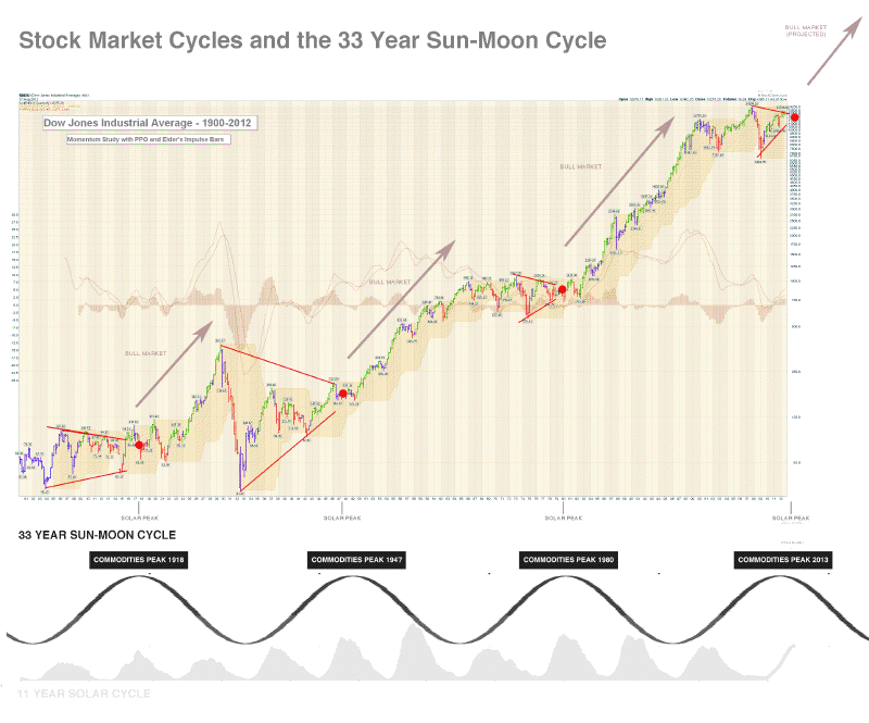
Firstly, from Robert Bowden, a long term chart of the Dow and the lunisolar 33-year cycle. Great work from Robert, I would just repeat my 1930s tweak, that the secular bear sideways range contraction would take place after 1937 rather than after 1929. Regardless, in each instance the market coiled into the solar peak in red and there was a great buying point for equities following.
 Source: Robert Bowden
The second chart was provided by Mike, and is from NowandFutures. This long term chart for commodities fits very well with the long term equities chart above, showing the inverse secular relationship between the two. Nowandfutures have identified a ~30 years cycle in commodity peaks and by including their Elliott Wave count we already peaked.

Source: NowandFutures
Bring together this chart with the above equities chart, and multiple charts from my Forecast 2013 series, the evidence is pretty compelling that we are at a secular inflection point, in the long term view. If I was a very long term investor, I could sell out of commodities and bonds and buy equities and not look again for 10 years, and only a new paradigm would prevent that from returning handsomely. As I have argued, I don’t believe we have a new paradigm at this point in human history. We have thus far seen typical secular development and indicators suggest we are in the area of what should be a typical secular inversion.
However, as a secular inversion is a messy affair over a window of a few years, and I am a medium term trader whose main focus is to make a strong return each calendar year, getting the timing of when to enter and exit which asset class is crucial. So, my arguments for a commodities peak ahead next year, rather than already achieved in 2011, can be summarised like this:
1. Solar cycles are the underlying. The ~30 year cycle NowandFutures have identified is in fact 3 solar cycles or one lunisolar cycle. Maximum human excitability occurs around solar maximums which is revealed in my own charts by secular stocks peaks and secular commodities peaks all occurring close to solar maximums, as well as inflation peaks i.e. peak speculation and buying. The solar maximum ahead next year therefore suggests 2013 for a commodities peak rather than 2011.
2. Previous secular commodities peaks have all occurred with a subsequent shadow peak, or bounce, around 3 years later (as the demand-supply balance is not transformed overnight). 1980s secular peak, 1983 bounce (all lower highs). 1947 secular peak, 1950 bounce (just oil made a higher high). 1917 secular peak, 1920 bounce (just oil made a higher high). In each case, when the economy gained some momentum after the secular peak, commodities joined in the pro-risk party for a last push, but by that point, the best investment was equities, which were already in new secular bull momentum. Exrapolating, we should see a secular commodities peak in 2013, and a shadow bounce around 2016.
3. Secular asset peaks normally end with a parabolic mania, a blow-off top. In this K-winter since 2000, the leading asset has been gold, and gold has yet to make such a parabolic. Furthermore, the technical shaping of gold suggests that it has just broken upwards out of a 9-month coiling from 2011 to 2012, which should power it to new highs. Could it do so alone, without other commodities? It’s not impossible, but as I showed in my forecast series, there is feedback looping between commodities and normally close correlations in performance. Commodities:stocks and commodities:bonds ratios are supportive for a final mania in oil and gold, and Goldmans have just upped their forecast for commodities for the next 12 months for an 18% collective rise.
4. Grains have made new secular highs in mid-2012. That is supportive of a secular commodities bull still in tact. However, until we see other commodities at new secular highs, then the possibility of a 2011 peak remains open, with grains an anomaly.
5. I’m not a big fan of Elliott Waves because a variety of interpretations can be applied to any chart under consideration. Of all the market disciplines (and I have been open to all) I find them one of the least predictive. However, I generally subscribe to the idea that markets move in waves and that there is some logic to a 5-wave or 3-wave count. I can see a 5-wave count on the CCI commodities index since 2000. I think the 1970s 5-wave count above is less compelling and more of a retrofit. In short, I accept the 5 waves since 2000 to 2011 is a warning, but it would not be alien for commodities to make a new high next year and an alternative count applied. It comes down to weightings. I give more weighting to solar cycles, gold technicals, asset ratios, real interest rate trends, food price inflation, central bank reflationary actions and so on, than to Elliott Wave counts.
In summary, more evidence in the above charts that we are at a secular inversion point in history. I believe the Nowandfutures chart needs a little tweaking to make accurate, and as it is a long term chart, that tweaking makes all the difference, namely from 2011 to 2013 for a commodities peak. A prudent investor might choose to sit out what is a messy, tricky period to time in terms of which assets when. However, if there is a commodities parabolic ahead, that is a great opportunity for a trader, and I believe there is. Drawing together multiple disciplines, I believe the probability lies with the peak ahead. If I am wrong, then nearer term clues will start to appear in favour of the alternative, and my approach as always is to keep analysing day by day to see if this is so. In recent months however, the nearer term clues have grown more in favour of a peak ahead, than in the past, thanks to renewed QE and Chinese infrastructure programmes, grains making new highs feeding into food price inflation ahead, bullish technicals in precious metals, renewed US dollar weakness, and improving leading indicators.
Update: extra charts from Tiho, Shortsideoflong:

I’ve just added the solar peaks.

John, I don´t want to be annoying, But the charts you show today are very clear that the solar peak sin 1918-47-80 don´t concur with bullish market in the case of the Industrials, on the contrary, with a second big drop in the case of this roofing markets durin 17 years, about -0,618, about -30% down from the top.
Sorry for the disturbances.
I don’t see how it’s inconsistent with what I have been saying. A breakout above the secular bear triangle or pentagon, then a pullback as a lead indicator into the post solar peak recession, then take off with momentum.
I am looking for a cyclical bull market top in equities before the solar peak and secular peak in commodities, a point at which equities start to decline ahead of the solar/secular peak whilst commodities make their parabolic finale.
Something along the lines of equities cyclical peak at the start of 2013, solar peak mid 2013, secular commodities peak Fall/Autumn 2013. I believe that’s consistent with what I’ve been saying and what’s in the charts.
From 1980 to 2013> 33 years.
I see firs peak 2005 and the second 2007 an final in the 55-30 years of commodities peaks ( K-waves cycles)
John,
Great group of posts over the previous week or so. I personally believe we are now in a period around 1940s (not sure if it is early or late part) just like you do too and we will eventually move toward a trough in interest rates and a trough in equities, together with a peak in commodities. That is because we are in a deflation period and banking collapse just like in 1930s/40s, with very low Bond yields.
Historically, according to my research, majority of commodities that tend to peak in a parabolic first, before the switch elsewhere happens. Afterwards, a recession follows. Commodities can rise, while stocks fall, as recession starts… just like we saw in 2007/08 period. I believe this is about to happen again in coming months, quarters and year(s).
Here is the chart from the secular Kondratiev switch in late 1940s and late 1970s. In late 1940s, Gold wasn’t traded and neither was Crude Oil, so I used prices of Corn. Instead of a 10 Yr Treasury Yield, I’ve used Moody’s AAA corporate bond yield, which tracks the secular cycles just a perfectly.
As we can see green assets (commodities) peak first, like Corn in 1949 and Gold / Crude Oil / Copper in 1980. This is followed by a sell off in stocks (blue) during a recession and the final cyclical bear market of 20% or more. Commodities fall hard during this phase from their parabolic peaks. Afterwards, stocks and rates (red) inverse and new cycle starts.
Over the next few quarters or years (depending on how it all plays out), commodities and especially PMs should spike in a parabolic manner. This should be followed by a recession and a third and usually the final bear market for stocks (there are always at least three major one in a secular sideways trend).
Afterwards, stocks will be a major buy for the next 15 years or so, while commodities shall go sideways majority of the time in a secular bear market. Finally, interest rates should start to rise for about 30 years or so from that occurrence.
I am positioned by being long commodities like PMs (especially Silver) and Agriculture, and I am hedged by being short stocks. I believe stocks will decline while commodities rise, just like 2007/08. Semiconductors, Industrials and Dow Transports have already started falling. Global economy is already super weak. Earnings have already started to drop. Only a matter of time until Apple parabolic peaks, which is holding up the whole market.
At the same time, commodities can do well at the begging parts of a slowdown as we move toward a recession. Silver could spike a lot from here. My historical reach shows that in 1979/80 period, Silver did the following:
– Silver managed to achieve over 750% gain in the last 14 months of its 1970s bull market
– Silver manned to more than triple in the last 6 weeks of its 1970s bull market
– Silver managed to achieve a gain of more than 50% (one half) in the last 8 daily candle of 1970s bull market
Finally, I believe a major low in stocks and a major low in bond interest rates will come after a European default occurs. It could most likely be Greece, but it could be someone else. On the day of default, the bottom will be in. Why? Because historically the bottom has always come after a default from Argentina, to Russia and from Mexico etc etc.
Consider that in August 1982, Mexico defaulted on its debt and devalued the Peso. The day of default was the day of Dow Jones bottom at 777 (lucky triple seven). From that day onwards, the Dow took off like a rocket and never looked back. Look it up in history. Major catalysts always mark lows, like US default in March 1933 (while not official default, it was through 40% devaluation of US Dollar in just one single day).
Therefore, I still think you are too early to short Bonds and be long Stocks, for the reasons I’ve explained above, including the fact that commodities have not yet peaked (as they do first), and stocks have one more cyclical bear market, a recession, a drop in earnings and even a default to see through.
The bond bubble, while overvalued after a 31 year run, could do a blow off top even higher than right now, above the technical channel in your previous chart. After all in 1999, when everyone thought Nasdaq was a mature bubble, it than doubled once again in a total parabolic.
But hey, what do I know… regardless of what anyone of us think, the market will play it out its own way. I completely agree with you that the best asset class to own going forward for the very long term will be stocks, but in my opinion, only after they sell off one more time and bottom in 2013/14/15 (whichever way it plays out).
Regards,
Tiho
Great summary and great charts Tiho, thanks. I’ve recopied the FRED ones to the post above and added the solar peaks.
We clearly come to similar conclusions about how it will unfold. But I maintain the relations with solar cycles and therefore am more adamant about where we are in the process.
Subject to sunspot development, we are 6-12 months away from a solar peak, by Nasa and SIDC, so let’s say 9 months. So I place us roughly 9 months before the orange solar peaks on the charts above, and it very much confirms what I’ve said. Commodities should peak close to the solar peak, as corn and gold did in the two periods. Commodities should break away from stocks to make their parabolic, in line with what you say. Stocks could fall up to 20% or just range sideways, but nothing more dramatic to the downside. Bond yields in the parallel 1940s would have just bottomed, which is the essence of the Gann calculations, and rising yields should be requried to tip over the cyclical bull.
You imply that I am long stocks for the long term, but I’ve made it clear all along that I am long for the cyclical bull top, and that I expect that prior to the solar peak next year. I maintain stocks could run up to 1600 and then make their top, falling back to 1300 or so before we get that new secular bull momentum.
One more take away from those Tiho/FRED charts: the ‘go’ point for stocks – the point at which they took off with true secular bull momentum was roughly 2 years after the solar peak, which would be roughly mid-2015. But it’s noteworthy that between the solar peak and that go point, stocks didn’t go any lower in nominal terms in either period, and any higher was retraced. So we shall have to stay nimble with equities and use cyclical and swing top/bottom indicators for guidance on short/long in that period.
Very sound analysis Tiho as ever. Gold going parabolic and then popping is what will primarily convince me of a secular inversion, as it will only peak when fear in markets reaches a fever pitch, to the extent that the fear is overly excessive.
Something I’ve touched on numerous times before is the 6yr pattern.The 2003-2007 period echoes the 2009-2012 period very strangely. Should this be the case a stock peak could take place next year, as it did in 2007, but gold and commodities won’t peak until early to mid 2014, when the next recession is already underway. By the time we get to the 6th anniversary of the 2009 low in 2015, stocks could be starting to recover as economies pick up, whilst commodities and gold would either be slumping or making a shadow high, lower than the peak before resuming a sideways market for the next decade or two.
I’ve zoomed in on 70s-80s chart and the 40s-50s Dow chart, and a monthly close above the 12 month SMA works as a reasonable entry signal for equities after the solar peak in both periods. So this long-term buy signal may be worth keeping an eye on this time around too.
Correction: there would be two buy signals on each chart (both profitable or break even) but the second signal – roughly two years after the peak would be the valid signal.
Thank you for your updates John.
Gold peaking in 2013 without a mania phase (that normally lasts atleast 1.5 years) is something that is very interesting in your analysis. Do you have any thoughts on that?
Not sure I follow. I do predict a mania phase for gold. Can you clarify?
I apologize. Let me clarify. You mentioned that the commodity bull will end in 2013 Fall/Autumn. Doesn’t that mean that all we have is 1 year for this mania phase to start and end? OR do PMs not fall under the “Commodity” category.
Thank you very much
The mania is normally very swift, the last 6 weeks or so. The acceleration 6 months or so leading up to it.
Gold is a special commodity as it doesn’t actually correlate with inflation really, making it have the potential for an even greater bubble. The 1968-82 gold bull was the first gold bull market of its kind, and this current one, which started in summer 1999 share interesting similarities.
However, we can’t be 100% sure that what happened in 1980 will happen in 2013-15, but we can guess that with no gold standard that gold prices will continue to be volatile. John posted an image of global gold production in a previous post recently, and it’s interesting that gold production worldwide has actually grown since the crash of 2008, yet gold has risen by about 100% since then.
The gold bull has gone through quite a decent rise since 1999, displaying a slightly parabolic rise, but it won’t start making record price rises until we get to the very peak of the gold bubble, as the previous gold bubble was burst, when gold was seen to double within about just 3 months, between October 1979 and January 1980.
As I said, when we see something ridiculous like gold doubling within just a matter of months, it’s time to watch out for a spectacular crash very shortly. Gold production hasn’t crashed, and so the supply of gold is increasing greatly, meaning a price rise loses credibility as the price of gold soars ever higher.
This PDF of Monthly Nearby Gold(CMX) looks fairly parabolic and could argue in favor of the thesis for a commodities peak in 2011.
And the (de)beat goes on.
Wonderful analysis that also looks like something that’s morphing into a very long term study of considerable import. Thanks for sharing.
Gold is an asset just like any other, but its primary purpose has always been to act in some shape or form as a money or the backing of money (reserve), so one should measure it with that in mind. While your chart in nominal US Dollars shows Gold has gone up a lot, almost as if it is a “parabolic”, as you stated… one should try and understand a basic factor:
– Since US Dollar has been devalued a lot since 1970s, current value of $1 is not the same as $1 in 1970s, so measuring the current rally against the previous one in your chart “seems” as if Gold has gone parabolic.
But has it really, if the money value itself has lost so much purchasing power?
So let us re-adjust Gold’s value to the purchasing power of US Dollar in 1979/80. In this chart you see that if we used American Dollars from 1970s, also known as King Dollar or hard currency back in those days, Gold has not gone parabolic and is actually amazingly cheap.
Quite the opposite has occurred. The Dollar you are using has been devalued and diluted substantially, so it is giving you the “appearance” that Gold has gone parabolic. But how much purchasing power does your unit of measurement hold compared to 1970s unit of measurement?
In my opinion, as the chart above shows, Gold would have to go back towards $8,000 to become a parabolic similar to the last secular mania top. Will it or won’t it? That is for the market to decide…
I’ve just updated all the models. Will get back to the near term analysis in my next post.
Thank you for your reply and or your updates. I was thinking that gold will peak in Fall of 2014.
It’s gonna get very interesting. If we are to top in Fall 2013, gold needs to start going parabolic ASAP. As Tiho pointed out, commodities need to go up atleast 6x in the next year or so to have a mania phase.
The definition of a mania phase is pretty nebulous to be honest. For example, I get the impression that a mania phase or bubble would only be evident if something doubled in price within a short time scale, but that’s just my interpretation.
Even though there is a chance that John’s prediction might fail to mirror the future perfectly, his forecast is certainly a scenario which must be considered, because we have been in a situation so similar to this one in the late 1970s.
Imagine living in September 1978, having a price of gold hovering at about $200, first seen in 1975. It would have been ridiculous for some to claim gold would be soaring to $400 by September 1979, but that’s exactly what happened, and then by January 1980, gold had doubled again, to over $800.
We’ve had gold hovering between $1550-1900 since last September, and it’s taken just a couple of months to break out of a tight range, after a slow decline over 9 months. Based on John’s forecasts, and the strange way with which the markets behave, I think it is totally possible that gold could peak at any point between autumn 2013 and autumn 2014. Whatever happens, right now is an exciting time, as we see the transition from one period of turbulence into a new period of economic history.
Thanks for that nowandfutures chart which agrees with my bearish scenario. It does however leave room for a 5 of 5 of 5 of 5 final high. And this “counter trend” rally has been harrowing. The previous commodity peaks were rolling affairs as I believe the 1950 top was various commodities peaking from 1947 to 1953. This one has been from 2008 to now, again leaving time for more topping but I don’t think any major overall blow-off.
Thoughtful analysis John……..and you deserve your break!
Thanks John. I have learned a lot from your in-depth research. You present a great case for an ultimate secular commodities peak in 2013. I like Kent’s comment inferring that some commodities may reach new peaks, but I’m still unsure if the indexes overall will see a new high. The dollar index (cycle?) puzzles me.

However, I suppose it’s only in relation to other currencies, all trying desperately to devalue against each other. In other words, I suppose commodities could still rise in the face of a rising Dixie.
Thank you all for your comments and insight.
Mike, I concur the US dollar looks to be basing in the long term view, but I think it can stay weak and elongate the base for a commodities finale, thanks to open ended US QE and a Euro in recovery.
Great post John
i learn more and more everyday from this community
How I wish I could sit behind you and follow your thoughts
Kind regards
bobc
Thanks Bob
Really great stuff everyone. The stk mkt has been in a 13 year plateau, very similar to previous solar/lunar 33 year cycle crests. Ditto for commodities being at, near or past secular peaks. James Flannagan of Gann global thinks the commodities have one more run and the stk mkt has already bottomed. Very interesting and exciting times.