
Agricultural commodities prices resumed upward trends in June 2012, largely due to drought conditions in key global farming areas on top of existing low inventories. Extreme global conditions continue, with the period June-August of 2012 the hottest such period historically on record.

Source: NOAA
Taking a broad agricultural commodities ETC (ETF), we can see that softs are now back up into the price range experienced in 2011, and not far from 2008’s peaks.

Agricultural commodity price rises typically feed through to retail food prices 4-6 months later, which means we could expect food prices to really escalate as of the final quarter 2012. Here is the UN food price index up to the end of August 2012:

Source: Food And Agriculture Organisation Of The United Nations
Now take a look at how the 2008 and 2011 episodes of rising food prices brought about social unrest and political upheaval in poorer countries across the world:
 Source: NECSI
The chart shows when outbreaks of violence erupted in different countries. As food prices escalate towards those levels again as we reach into 2013, the likelihood is of renewed protest and conflict.
We can cross-reference this with solar cycle studies. 2013 is the year of the forecasted solar maximum. Alexander Chizhevsky’s analysis of 2500 years of human history and solar cycles revealed that the period into and around solar maximums (4 years) was historically one of protest, revolution and war. Last year’s North African and Middle Eastern revolts fit with this, as does the prospect of food-price based protest and conflict into 2013.
The Arab Spring revolutions and protests in 2011 brought about oil supply disruption, both real and perceived, which in turn rallied oil prices. Rising oil prices feed back into food prices through processing and distribution. Precious metals in turn benefit as inflation hedges. A price feedback loop develops between these different commodities, and a feedback loop also occurs between commodity price rises and social conflict.
These two charts confirm the close inter-relations of food prices with oil and gold:

Source: Prudent Investor

Source: Casey Research
As we stand in September 2012, energy and metals are lagging soft commodities as supportive evidence for an inflationary spike in 2013. Global economic weakness is the reason, whilst grains have accelerated largely on extreme weather conditions. In response to the economic slowdown, central banks have cut interest rates and renewed stimulus (such as China’s infrastucture programme and US Quantitative Easing (QE) 3). This in turn should be reflationary, which should lift commodities as a class. In reponse to the US Fed’s announcement of renewed QE, five year inflation breakeven expectations surged, as shown in the chart below. Official inflation, CPI, has historically followed this indicator with a lag, suggesting inflation should accelerate as we enter 2013.

Source: Zerohedge
There is a feedback loop here too, as rising inflation inspires more money into hard assets as inflation hedges, which lifts commodity prices, which in turn brings about higher inflation.
With renewed QE, the US Fed continues its policy of massive money supply expansion, although this is not as potent as it might be, due to a weak money multiplier. However, the money multiplier shows evidence of having bottomed out and dollar circulation in the economy is beginning to gather pace, which can be inflationary.


Source: St Louis Fed
Renewed QE also devalues the currency. As the US dollar is the world’s reserve currency, to which many nations peg their currencies, a US dollar devaluation acts as a global devaluation. As commodities are priced in US dollars, this global currency devaluation typically brings about a commodities revaluation (hard assets rising in value versus paper).
The first chart below shows that the US dollar is labouring at secular lows in real terms, whilst the second chart shows that it is gradually making a rounded base around these levels. Its recent technical behaviour post QE announcement, namely the loss of a key support, in addition to its languishing near secular lows, suggests that it can provide the backdrop for an inflationary finale into 2013, before a new secular dollar bull gradually emerges.

Source: Scott Grannis

Source: Stockcharts / James Craig
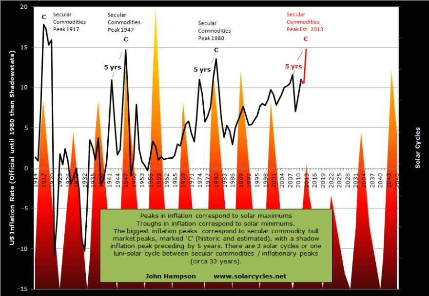
Inflationary monetary policy has become the norm, not just in the US but throughout indebted nations globally. Official US CPI inflation calculations have been gradually changed since the 1980s, but John Williams’ Shadowstats data provides a more consistent picture of inflation over time and reveals that the Federal Reserve has been successful in restoring price inflation since 2008’s deflationary panic. I have used official US stats until 1980, then Shadowstats, to maintain a continuous picture of real US inflation:

This chart also show the compelling historic relationship with solar cycles.
2013 is forecast to be the solar maximum, and if history repeats, we should see an inflationary peak close to the solar peak. As the chart shows, peaks in inflation correspond to solar maximums and troughs in inflation to solar minimums, historically. The biggest peaks in inflation corresponded to secular commodities peaks, as we might expect due to commodity prices fuelling inflation. These secular commodities peaks all occurred close to the solar maximums, with one luni-solar cycle between each, which is around 33 years. These ultimate peaks in inflation / commodity prices were preceded by a shadow peak 5 years prior.
The last secular commodities peak was 1980. One luni-solar cycle later is 2013. The solar maximum for solar cycle 24 is forecast for 2013, 5 years later than 2008, when we experienced a (shadow) inflation/commodities peak. Drawing together secular, solar and inflation history, I can therefore forecast a secular commodities peak and an inflation peak in 2013. Regular readers know this is a forecast that I have held for some time, and as we close in on the end of 2012, we see increasingly supportive evidence for its fulfillment, as documented above: forthcoming food price inflation from current soft commodity price rises; social conflict from food price inflation; central bank policies of reflation and paper/hard asset revaluations.
This table shows how close the inflation peaks were in relation to the official solar peaks: between 2 months before and 4 months after.
 Currently NASA forecast the solar maximum for around September 2013, whilst SIDC project around March 2013. I expect the difference to be resolved one way or the other as we end 2012, as the sunspot data gradually gives more clues.
From a fundamental perspective, an inflationary peak in 2013 could be justified by a three-way feedback looping between commodities and other commodities, between commodities and conflict, and between commodities and inflation, supported by inflationary monetary policies. From a solar studies perspective, maximum solar activity brings about maximum human biological and behavioural excitability, which manifests as buying, speculation and risk-taking in the markets and economy, and the feedback loops are therefore between solar peaking, secular asset peaking (in this case commodities) and inflationary peaking (speculation into commodities and buying/risk-taking mania). From this alternative perspective, it is the solar maximum of 2013 which is the key driver. Either way, evidence is building towards a fulfillment of an inflationary peak in 2013, and I am positioned accordingly, with my biggest weighting long commodities.
Next: Forecast 2013 Part 2: Secular Commodities Peak

I find difficult to believe that the inflation is around 10% as per Shadowstats, do you really see that in your day to day life? Think about the prices just 3 or 4 years back.
In my own opinion, something nearer to Shadowstats than CPI.
Consider this example. In 2002-4 average official CPI in the US was 3.3%. During the same period in the US the annual average prices rises were 14% for housing, 7% for food, 9.5% healthcare, 6% education and 20% gasoline.
Just reading the sentiment of people these days is a perfect barometer for where we are today in relation to the conclusion of this secular bull in commodities. Gold bugs are getting more and more convinced about things like gold being actual money and a new gold standard. I think there’s a theory that secular inversions take place just as one group of people start flocking towards a belief in a new paradigm, just like stock bulls back in 1999 thought the Dow would soar all the way to 36,000 very soon.
Thanks for this analysis.
I think with “Qe3” tha inflation can rise.
http://research.stlouisfed.org/fred2/series/MZMV?cid=32242
This certainly looks like the flip side of U.S. Treasuries, and if you think they’ve topped (as I think is probable, and if not, probably in the process), then you’ve also got good reason to think this has bottomed, and that, in turn, plays positively into you’re inflationary argument.
This is a great read. Personally, I am extremely long PMs, especially Silver, and also have held Agricultrue positioning since December of 2011. At the same time I am short cyclical stocks, especially Dow Transports. I’m even short Apple with long dated OTM puts.
Fundamentally, I see weakening global growth moving towards stall speed and eventually a recession, while I see central banks printing and devaluing currencies as they fight for export market share and ultimately trying to limit losses in risk assets (good luck with that).
Commodities can do well during low growth or stall speed periods with money printing, but stocks usually do not, and as soon as earnings start to fall reality quickly comes back in form of gravity. Revenues and/or profits are already dropping almost everywhere (think: Intel, Burberry, UPS, FedEx, McDonalds, Nike etc etc I could go on forever).
I am hedged long / short because I do not know which side will win out. No one does 100%, even though I am a commodity bull due to is secular theme. I hold PMs and Agriculture due to improving fundamentals, while I believe we are overdue for one more cyclical bear market in this secular sideways trend that started in March 2000. We could drop by 30% to 40% from here after elections. Hopefully I am right on both the longs and shorts year(s) from now. We will see…
My question for John is, what if this event does not occur and you get caught heavily long sided, just as market participants wake up and see that QE infinity won’t change anything meaningful in final sales, global demand and consumer spending? Do you have any hedges, any shorts, any backup plans, during this all-bullish risk chasing times, when a bear does not exist (especially after central bank mania in the last two weeks)?
Hedging is effectively profit dilution. My protection against being wrong is not going all in (keeping ample powder dry) and not putting all my eggs in one basket (I normally have a mix of commodities and stock indices, and something from bonds and currencies). Sure, I’m currently 100% pro-risk, but I keep analysing developments to make sure that’s right.
John,
Whats your take on the money velocity chart posted by HighRev? Why is it dropping if we are approaching inflationary blow off top? Something does not add up.
Thank you.
Money supply is massively growing and money velocity shrinking. If velocity was high, we’d have hyperinflation on our hands with that money supply growth. There’s an awful lot of money parked in bonds and idle reserves that isn’t circulating. Clearly that’s the current challenge in not being able to get the economy expanding in an enduring way, and so the Fed has pushed again on the money supply – the one it can affect. If now we get money reversing out of bonds in a meaningful way, hard assets can likely make a big rally. Commodity prices were the biggest factor in those largest inflation spikes on the chart.
so we have to see a meaningful outflow of money from bonds. So, do you see significant upside for TBT and similar funds in the coming months?
Thank you.
Hold that question. There are parts 2,3 and 4 of my 2013 forecasts to come.
The exit of money from bonds into other assets will probably be a gradual one. A sudden rise in bond yields will only be caused by an event similar to what has been crippling Greece, which could happen to the US, only really if the fiscal cliff isn’t prevented, which it probably will. It took the whole of the 1940s for bond yields to form a base and then rise up into their 1980 peak.
There is money to flow out of bonds and into equities – however we have been hearing this for some time and have not seen it. In some cases, we continue to see equity outflows and bond inflows.
One can look at the ICI data for mutual funds and see since January 2007, bond inflows have been $1.1 trillion while equity outflows have topped $360 billion. The direction of these trends is holding. Time will tell if people (MF investors, retail, etc) will chase these gains.
If so, to John’s point, commodities are poised to go higher. Equities as well. I am still short CAD for the short-term against the USD for positioning reasons.