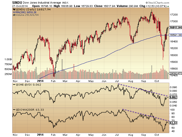
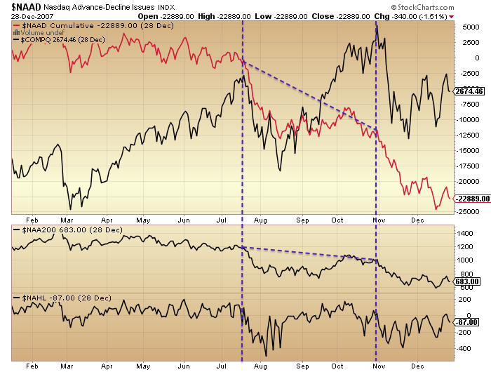
The most common idea I’m reading on Twitter currently is that the current stock market correction is an echo of July 2007, implying a rally back up to marginal new highs may be next. However, these traders are mistaken in where we are in the topping process.
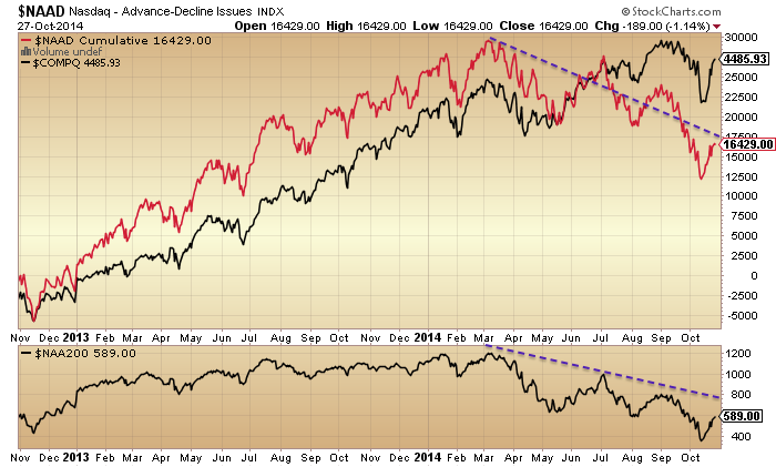
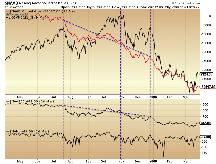
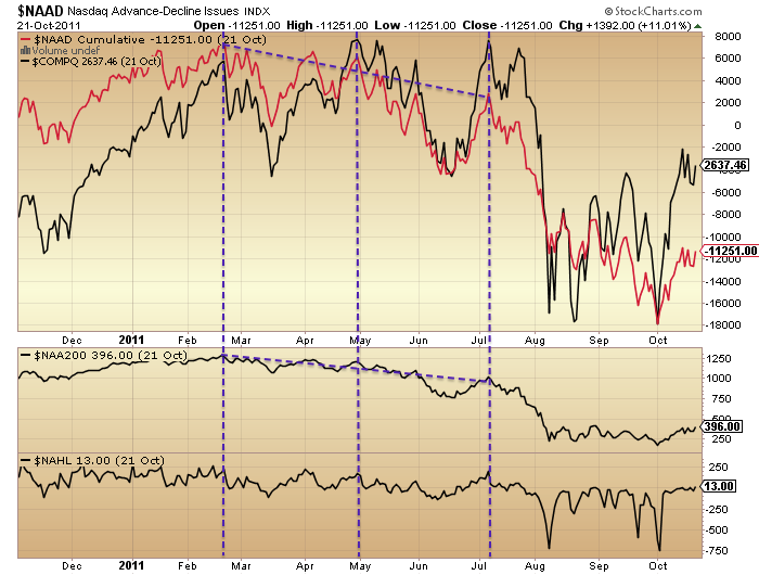
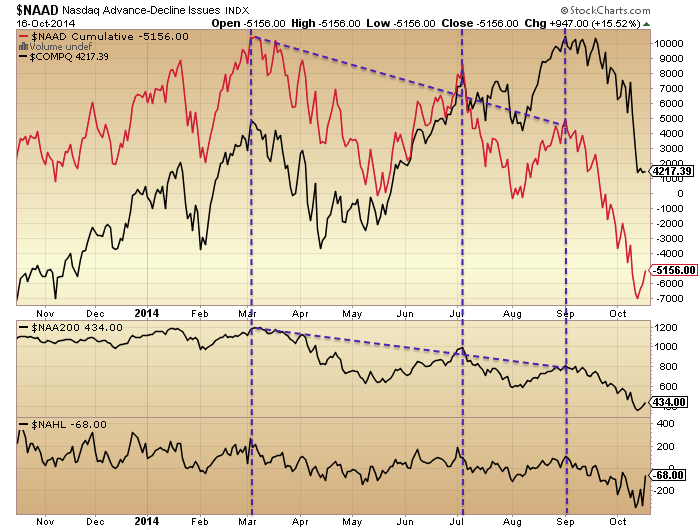
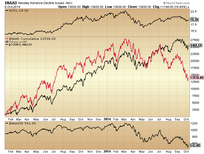
Comparing 2000, 2007, 2011 and 2014 tops, here are two measures of Nasdaq breadth: cumulative advance-declines and stocks over 200MA (the latter not available for 2000). Breadth diverges at stock market peaks. All 4 periods saw a topping process lasting around 6 months with 3 Nasdaq peaks. Over the 6 months and from the 1st to last peak we saw consistent degradation of breadth.
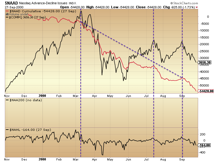

Source: Stockcharts
The last chart shows that here in 2014 we have also seen a 6 month topping process with 3 Nasdaq peaks and both breadth measures diverging from the 1st to the last peak. If we were now in July 2007 then we should be at the start of the topping process, about to begin the breadth divergences. Instead the comparisons put us at the end of the topping process, akin to December 2007.
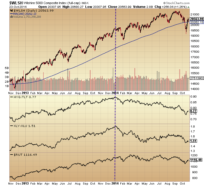
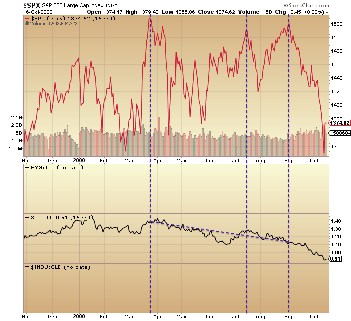
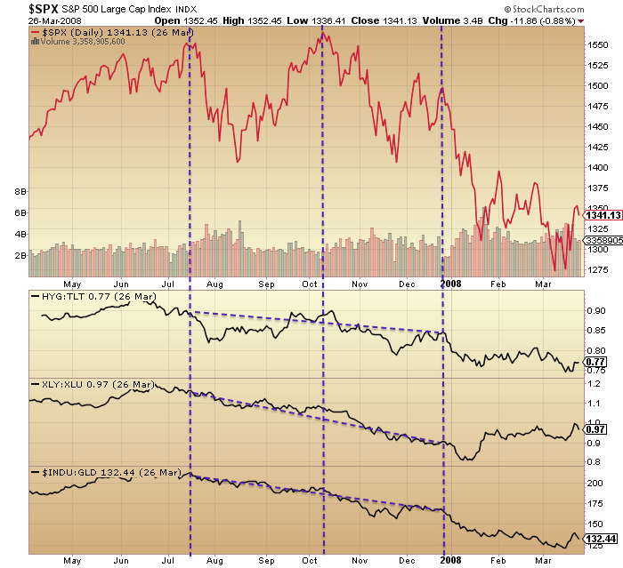
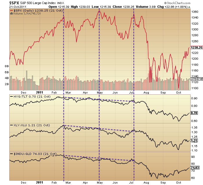
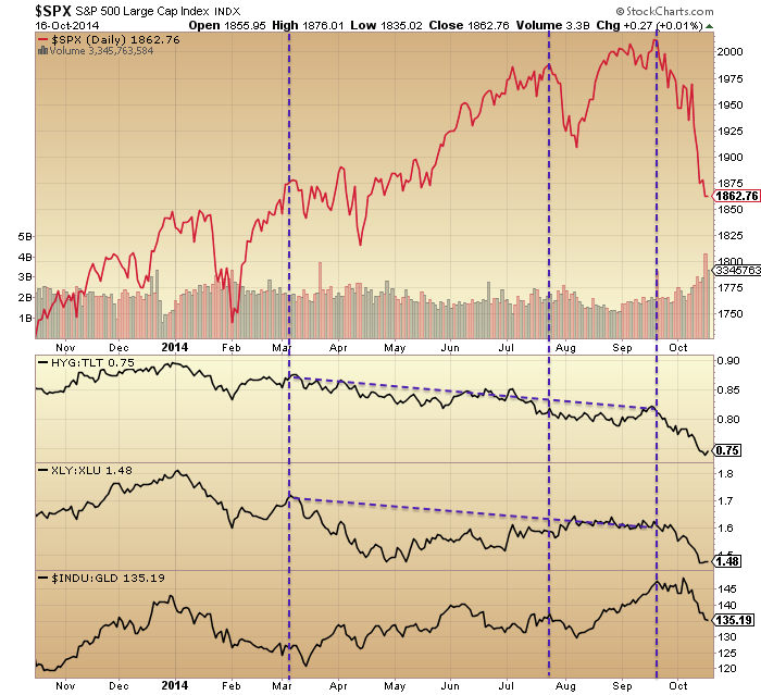
Next, here is the SP500 versus three different indicators of a market peak: high yield bonds to treasuries ratio (not available for 2000), consumer discretionary sector to utilities ratio, and Dow-gold ratio. They also all typically diverge during a topping process, showing an underlying shift to defensives. Once again we see in all periods the 3-peaked 6-month topping process, and the divergences beginning at the 1st peak and completing by the final peak.

 The last chart shows 2014 has produced an anomaly in the Dow-gold ratio (it is flat, rather than down, for the year), but the other two indicators mirror the previous peaks, and again their progression would put us in December 2007 not July 2007.
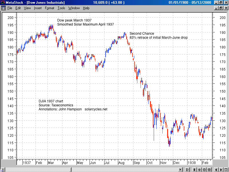
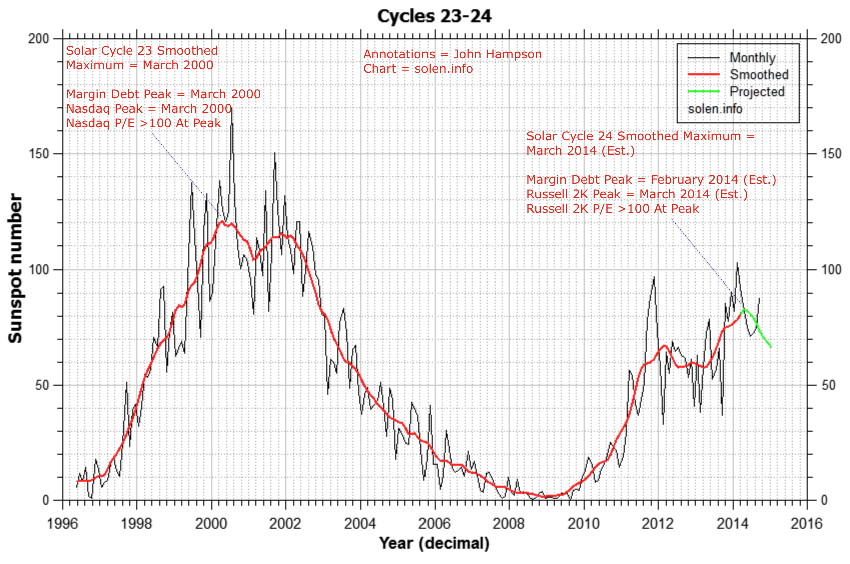
I’d like to stress I don’t think 2007 is the best mirror (in case you are now studying the action post December 2007). 2000 was a solar maximum like 2014, and shows marked similarities in Rydex and Q-ratio, amongst others. I have made a case that 1937 is the most appropriate mirror from history, but most indicator data does not stretch back that far. Rather, my aim here is to disprove the idea that we are at the beginning of a topping process.
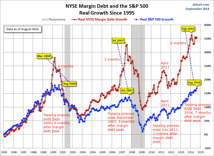
Next, here is margin debt. Whether we measure from real margin debt peak to real SP500 monthly peak, or from nominal margin debt peak to the end of the nominal topping process (the third peak), the range is between 3 and 7 months from margin debt peaking to the market beginning major declines in earnest. So it is another leading indicator, or divergent during the topping process.
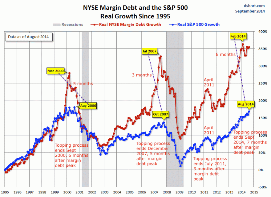
Source: DShort / My annotations
In 2014, margin debt peaked in February and given market declines in September and October we can be confident that peak will continue to be honoured. This again makes a case for stocks now being at the end of the topping process, tipping into the major declines.
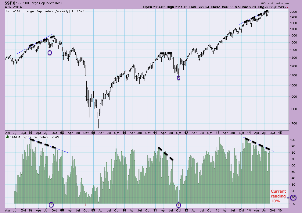
And lastly, NAAIM manager exposure to equities is also doing the rounds on Twitter currently, due to the latest reading having sunk to 10% (note this chart below is from 4 Sept so I have added the latest reading). The chart shows that NAAIM is smart money, or again a leading indicator / divergent during the topping process.
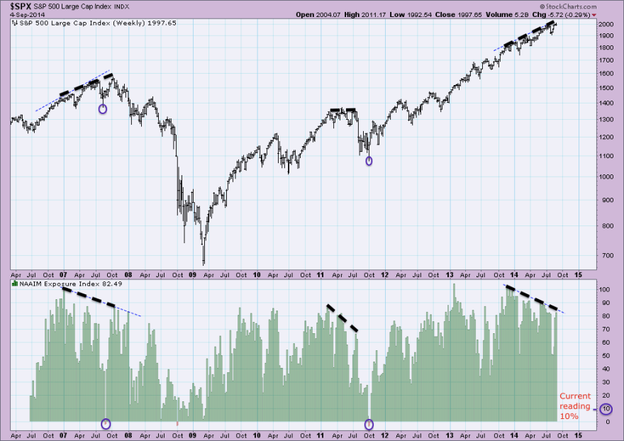
Source: Acting-Man / My annotations
The period of divergence in 2014 echoes that in 2007. Once again, this suggests we should be at the end of the topping process, not the beginning. We can see that NAAIM actually went negative in the corrections of July/August 2007 and Sept/Oct 2011, so lower than +10% is possible, but rare. We can also see that in January 2008, just after the topping process completed in December 2007, NAAIM dropped sharply to just over 10%, and this in fact reflected the true start of the bear market, rather than a washout buying opportunity. Given the other indicators above would also position us in January 2008, and around 40 indicators called a bull market peak this year, then this is also most likely the tipping point into real bear market declines, not a buying opportunity.
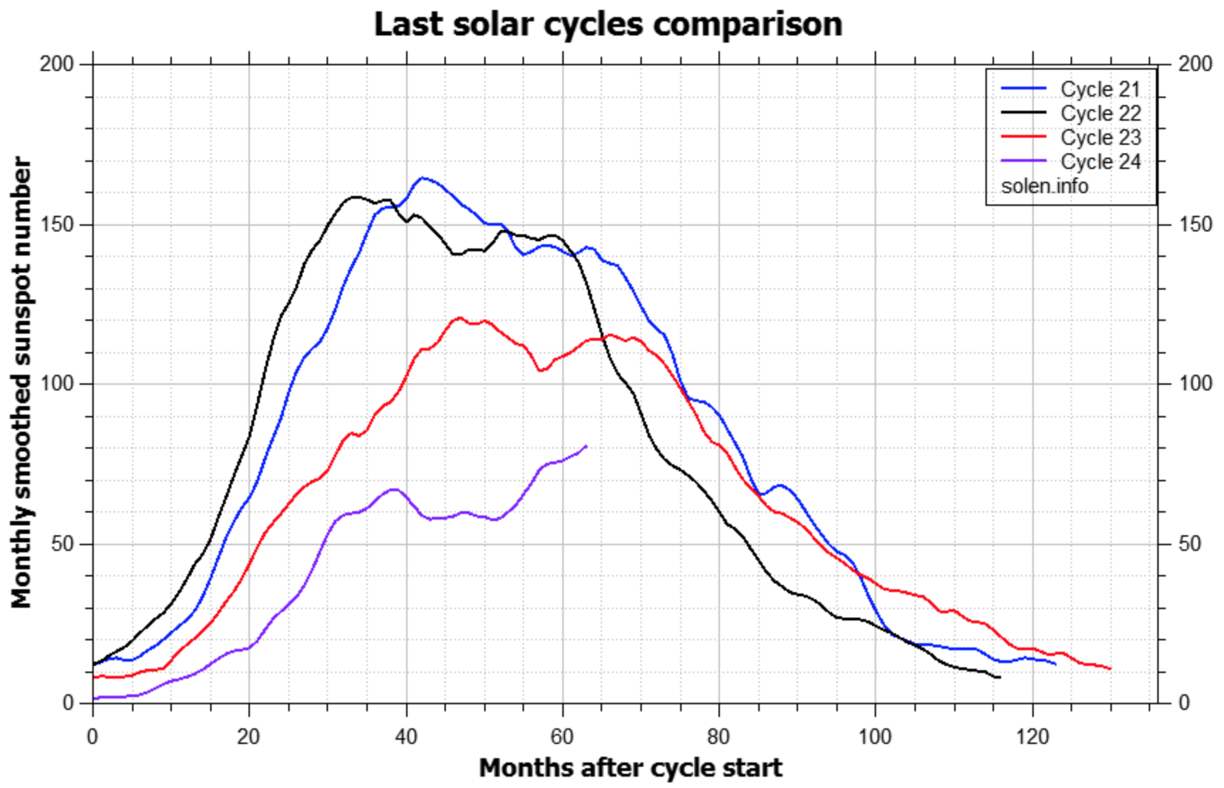
Finally for today, just a quick note on the 64-month bubble idea (this article). Cal referred this latest update to me and WT suggested the same conclusion that I will. The writer claims that bubbles last 64-65 months from start to peak. Having done my own calculations, I argue he has used some artistic licence, because the range of his examples are rather from 36-85 months. Various start dates that he has used are highly questionable. Nonetheless, if we give him some leeway then the range could be tightened up to perhaps +/-10 months around 64, and this broadly fits with the period from solar minimum to solar maximum, or from a speculation low to a speculation peak. Some of his examples are exactly that, e.g. the Nasdaq into 2000 or the Nikkei into 1989.
 Source: Solen
He doesn’t have a compelling reason for why bubbles would last 64 months, and that’s not good enough for me. Whatever the discipline or angle, I want to see a correlation and a scientific or logical reasoning for it. So in short, the data suggests a range for bubble durations, making his quote an average at best, and it fits the solar cycle duration, for which we have evidence of biological effects on humans that cause fluctuations in excitement and speculation. Ultimately, trying to time a peak using a 64-month calculation is likely to fail.
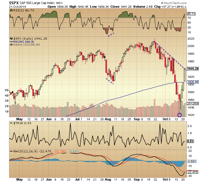
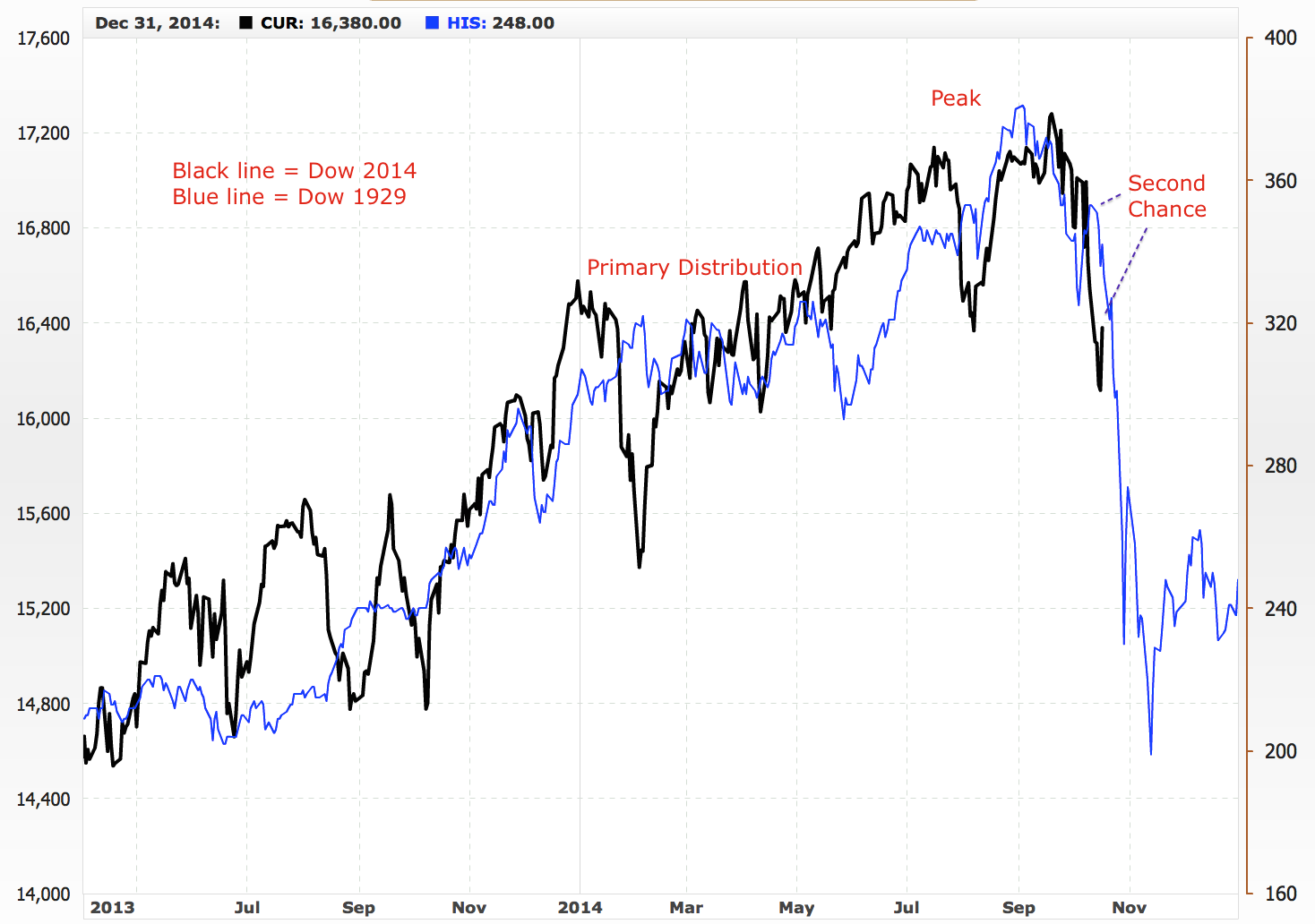
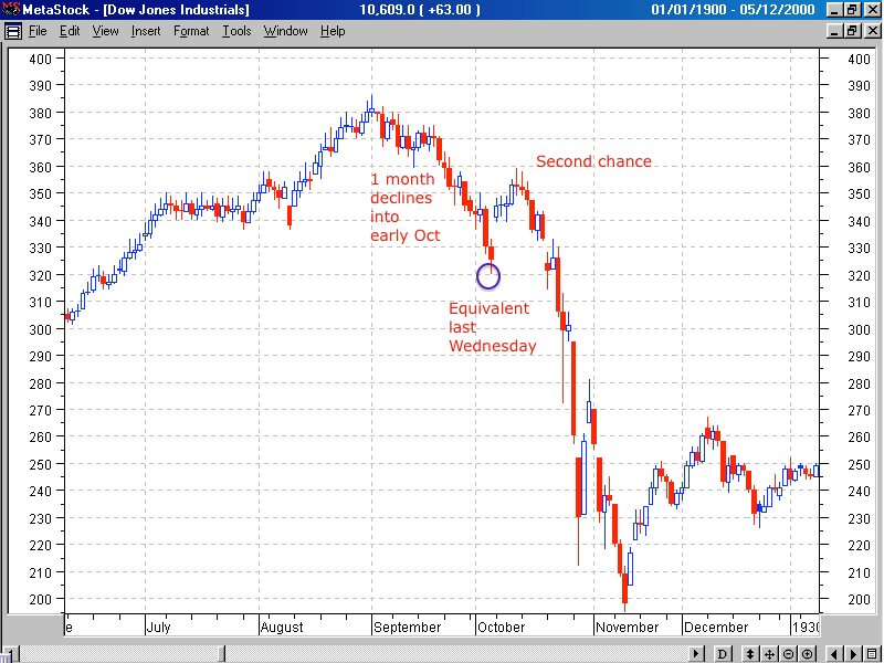
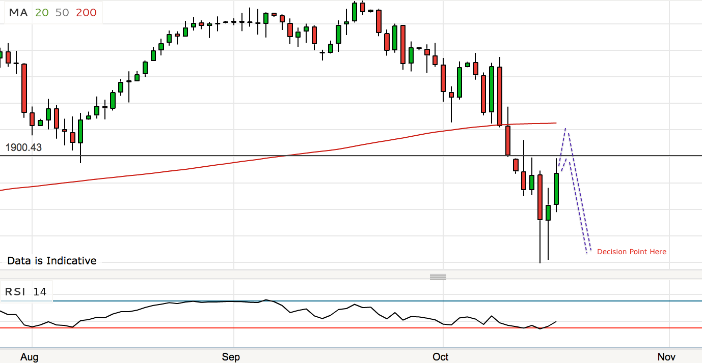
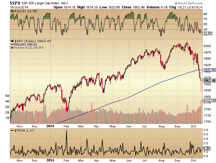
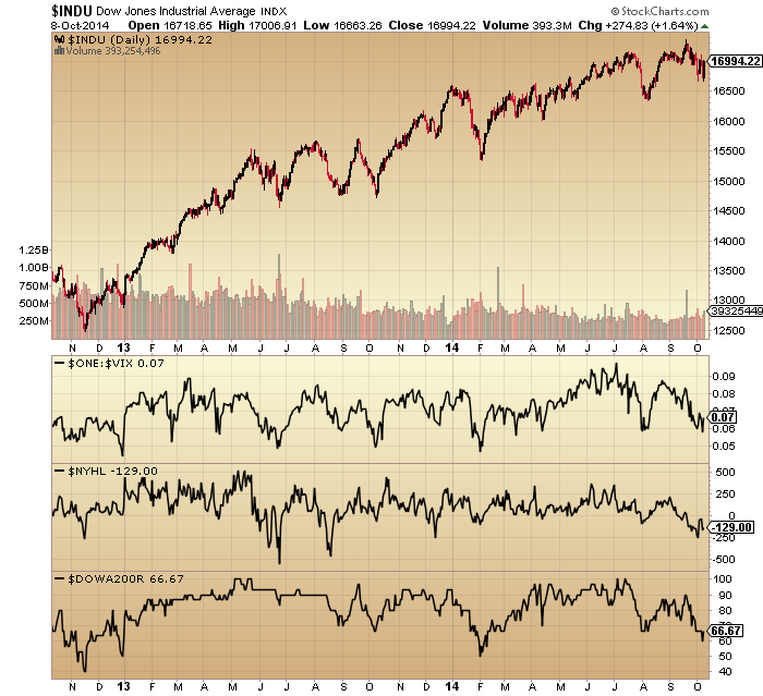
To the markets short term. Yesterday produced a doji candle in US large caps so we roll over to today. The balance of evidence still suggests we are post-second-chance, or post-3rd-and-final-peak in the above analysis today. Therefore, there should be no rally back up towards the highs and I believe we will soon engulf Wednesday’s candle to the downside.
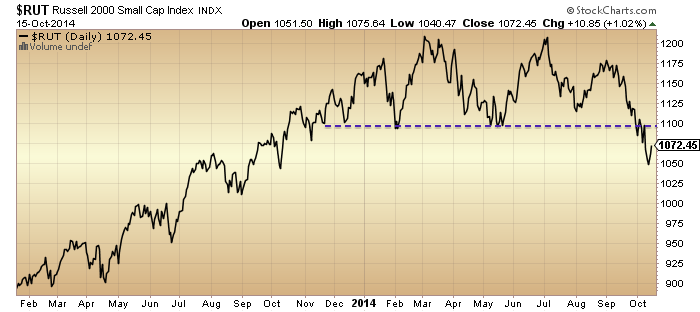
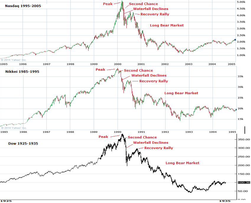
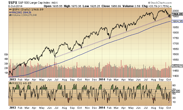
What today’s analysis shows is that the anomaly is in price here in 2014, in that the July and September highs were higher highs in the SP500 and Nasdaq, making for what looks like an uptrend rather than a 3-peaked topping process. But in fact the behind-the-scenes indicators reveal the topping process and that those September highs are equivalent to September 2000, December 2007, or July 2011. Much later in the topping process than many analysts think. What’s also important to note is that those three topping processes all involved a decent correction during their formation, whilst in 2014 a meaningful correction has been avoided until now. That implies we have stored up a mega-correction, and this idea has support from indicators such as Investors Intelligence, Skew and Rydex which have been held at major extremes this year, like highly stretched elastic bands. Therefore, not only are we now most likely already in true bear market declines, but there is a strong likelihood of a crash akin to 1929, 1987 or 2008 at the centre of those declines. Most analysts are going to be completely wrong-footed by what transpires.
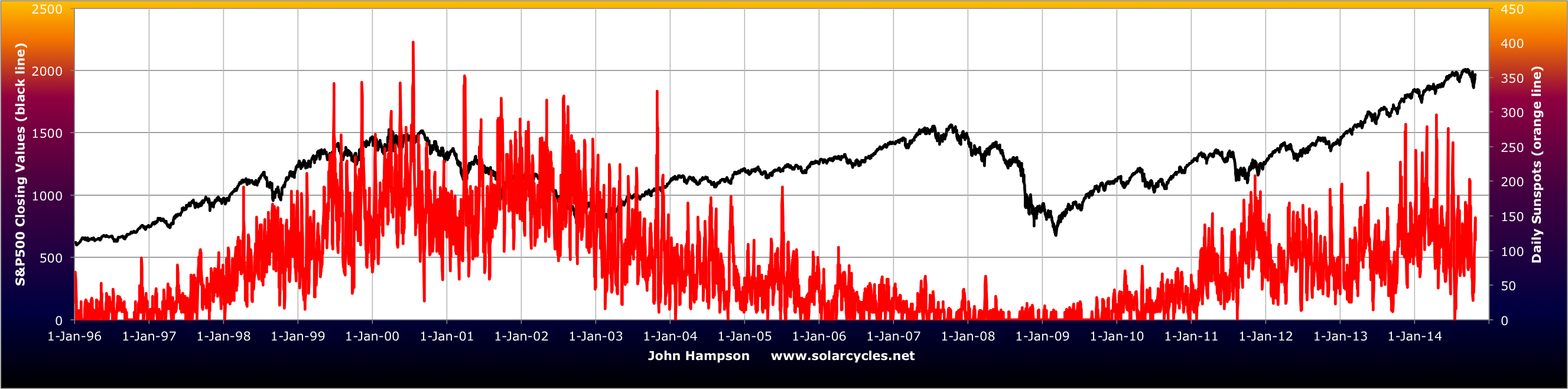
Recall that Rydex, margin debt, loan issuance, Investors Intelligence, fund manager allocations, household allocations and other indicators collectively revealed a situation of stock market participants being all-in on equities with totally lop-sided portfolios and having taken on as much borrowing as they could to further invest. Maximum speculation as generated by the solar maximum. I referred to his before in trying to gauge ‘fuel spent’ for the stock market, as it strongly looked like we had reached saturation.
Now here we are in Q4 2014 post-solar-maximum, with people unwittingly less keen to the buy the dip, and even less so at the seasonal geomagnetic sentiment low of October. We saw a change in market character in September, at which point I believe the smart longs got out. The falls in October to a lower low and sub 200MA cemented the new reality and the next level of players exited. The next development I believe is that we see no rally back up towards the highs but instead collapse further and sharper, at which point the remaining dumb money will be scrambling for the exits, resulting in a crash. Because, the point is, all those indicators collectively showed that we had reached effective market saturation: no bears left to convert, no more fuel to buy, and tremendous lop-sidedness. With a demographic headwind, the market needed the steep increase in leverage to push it higher, but this has to be fully repaid and history argues by way of forced redemption panic selling. Who will step in to buy and shore the market up? All those indicators plus collective demographics in the major nations suggest the queue to buy the stock market is now fairly empty. Therefore, the current trickle over to the bear camp, to selling and shorting, has very little counterbalance. Stock market declines should therefore come easy, and once the trickle becomes a flow, the market should accordingly crash.

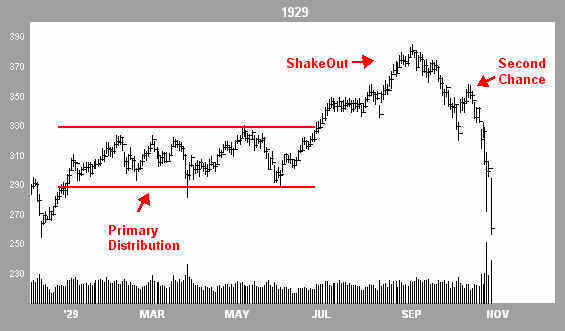
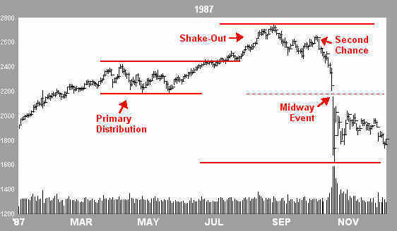
 In summary, I still expect the markets to roll over here, providing the missing lower high in US large caps to go with the lower low (and existing lower highs in other indices). With a doji candle yesterday in US indices, a further doji candle today would provide the roll over set-up similar to 1987 and 1929. The likelihood of the Fed sticking with their QE exit in tomorrow’s FOMC output could then provide the trigger for the falls to initiate. The triple negative of the period into the full moon, the geomagnetic seasonal peak and the post-solar-maximum hangover provide the backdrop for this all to occur. I believe we are already in a bear market in equities but this isn’t going to be clear for a little while.
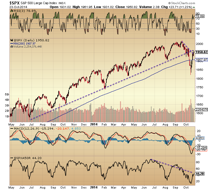


