A Topping Candle

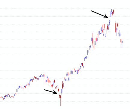
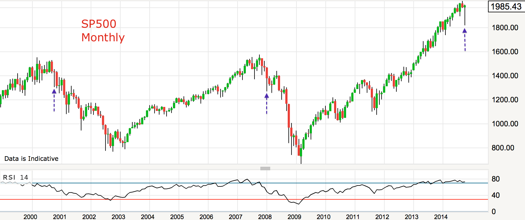
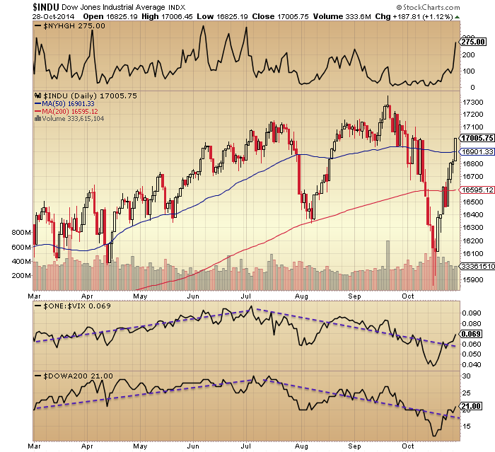
Yesterday produced a topping candle in US stock indices, but was it the topping candle?

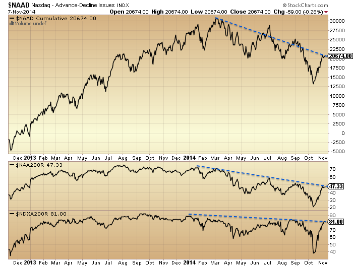
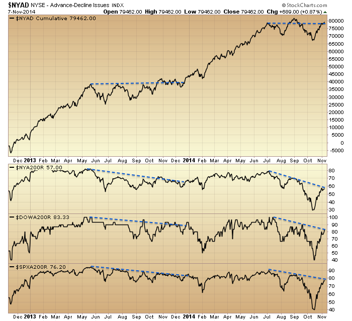
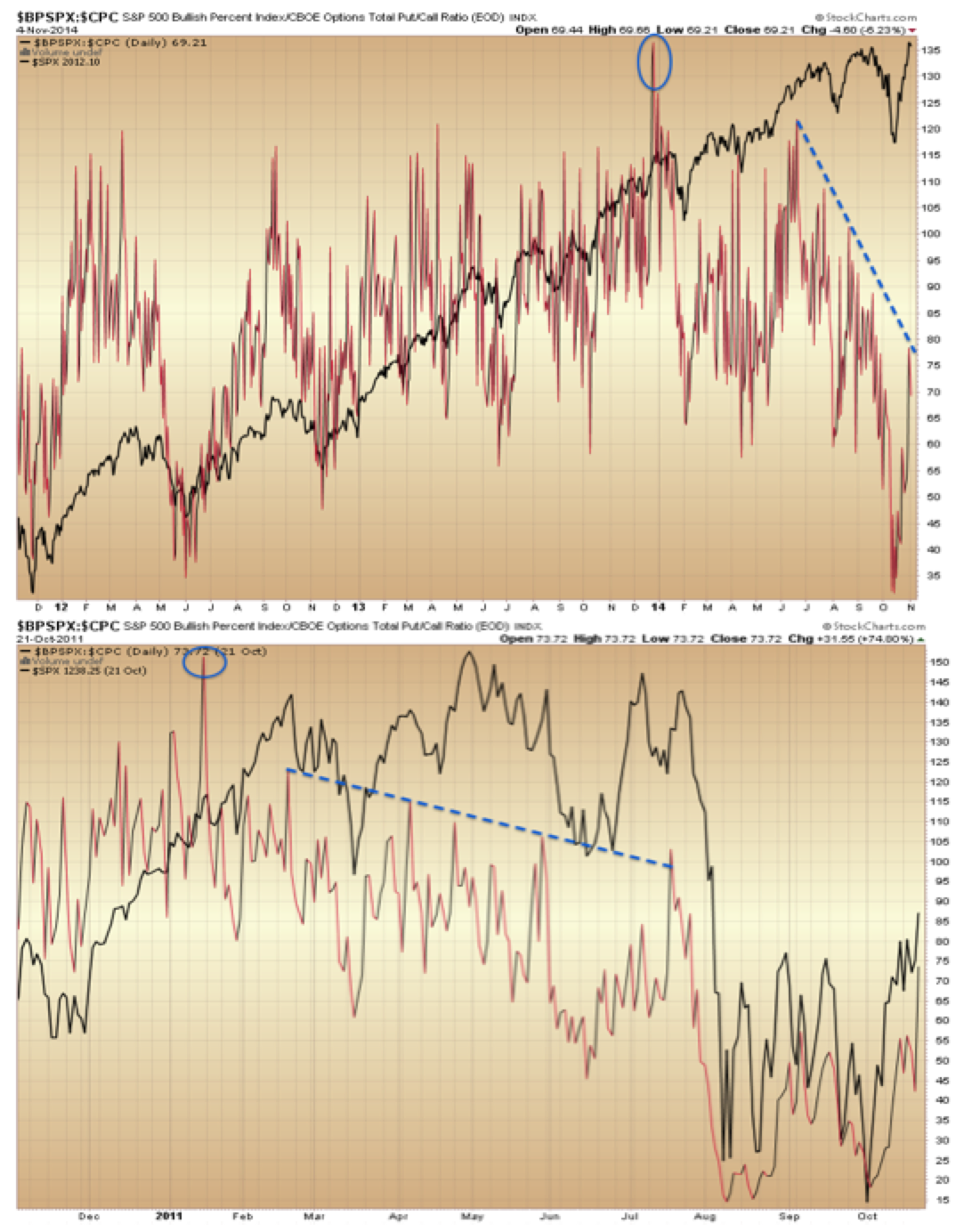
The SP500 closed with a marginal 0.04% gain but advance-decline volume was 1:2 (Urban Camel). It was the 2nd-worst breadth day ever when the S&P 500 was up and so near a 52-week high (Jason Goepfert).

ISEE put/call closed over 230 for the second day in a row, suggesting major contrarian lop-sidedness. Previous instances in 2014 marked below reveal they occurred near tops but tended to be markers of subsequent sideways churn.

Screen Shot 2014-11-14 at 05.30.51
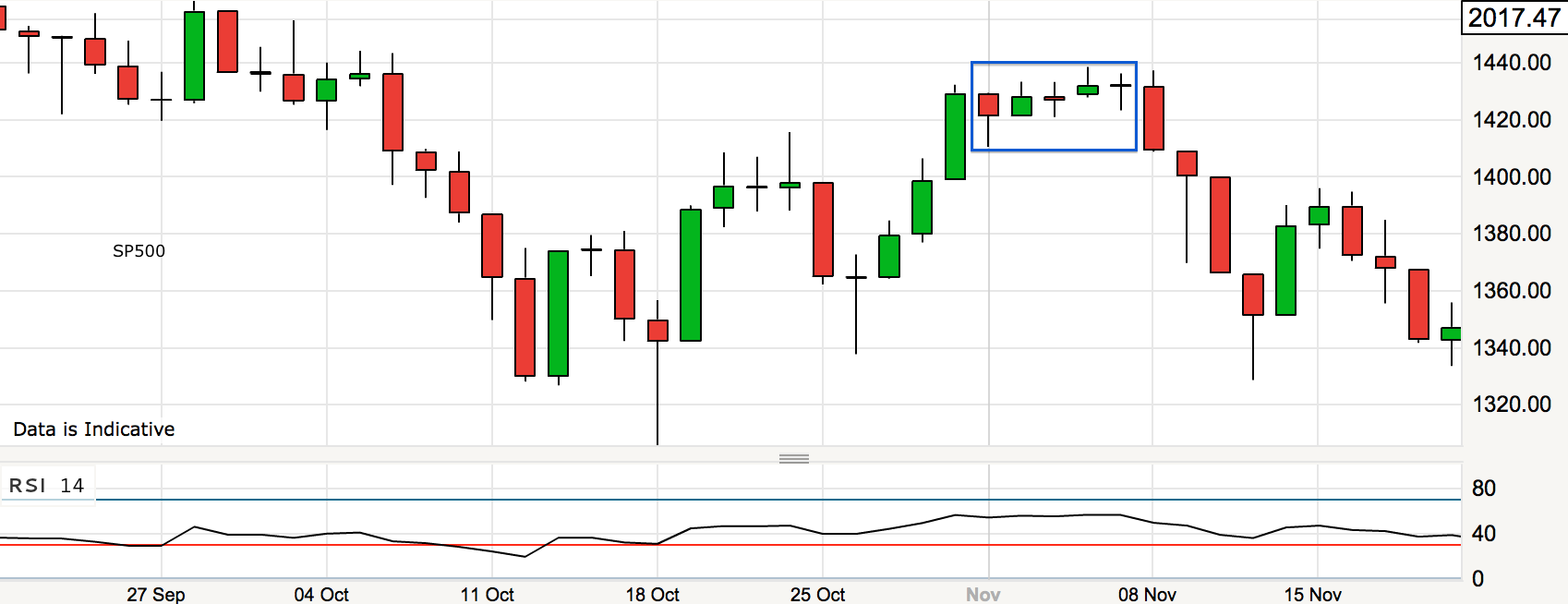
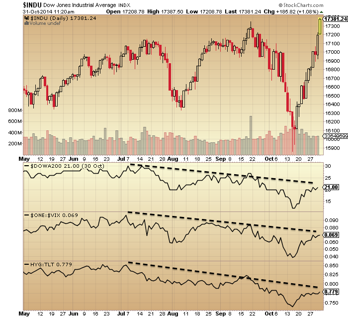
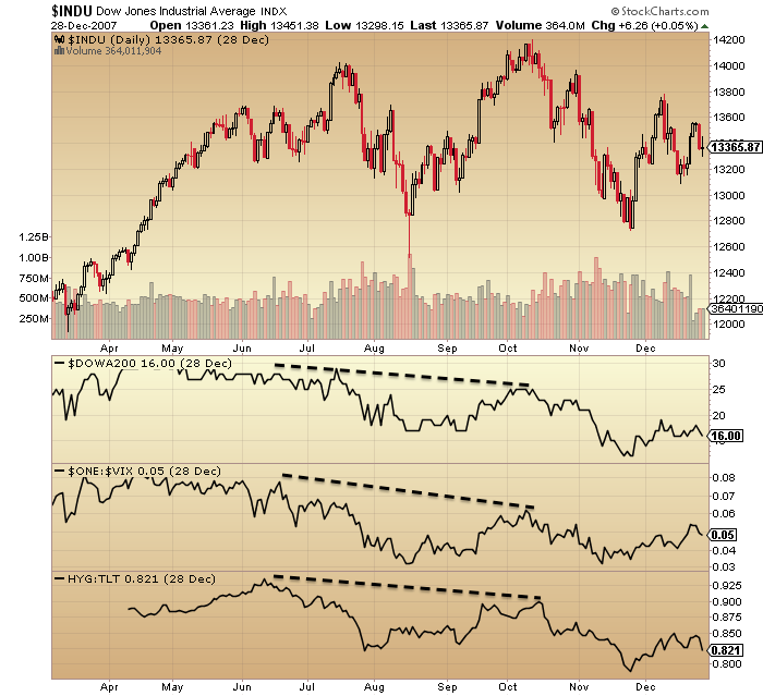
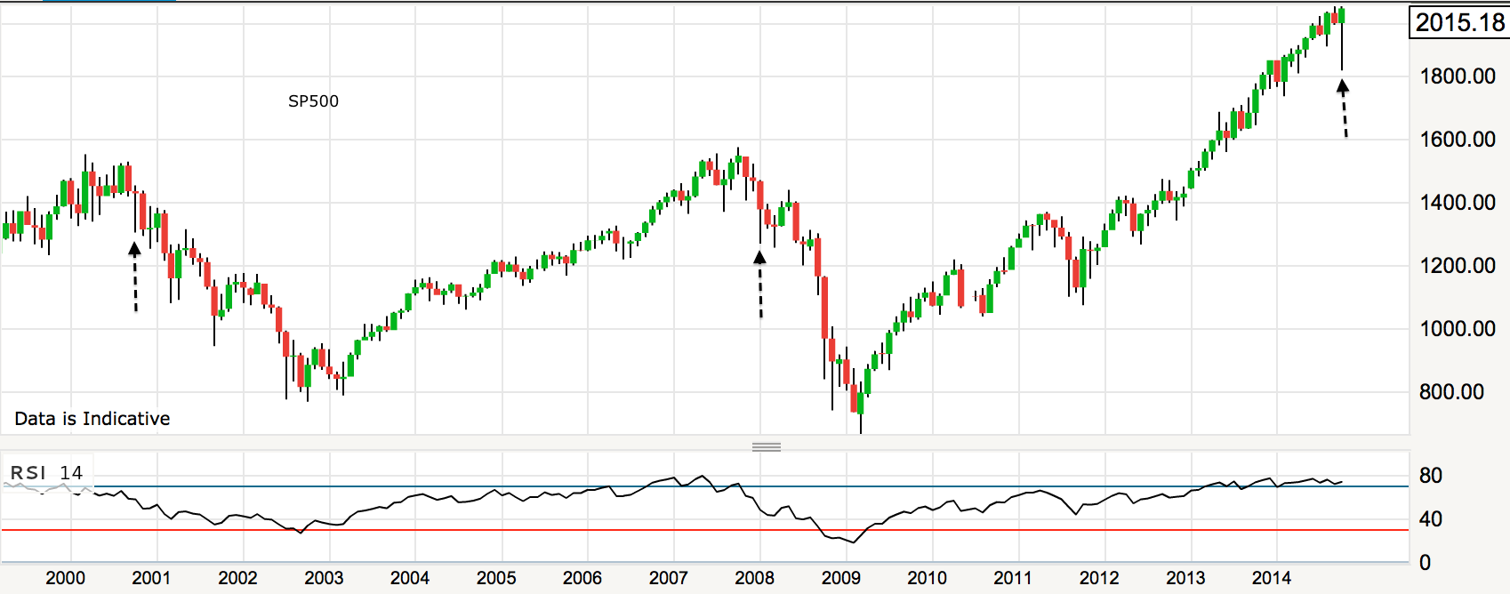
That chart also shows the RSI divergence which ought to eventually lead to a leg down.

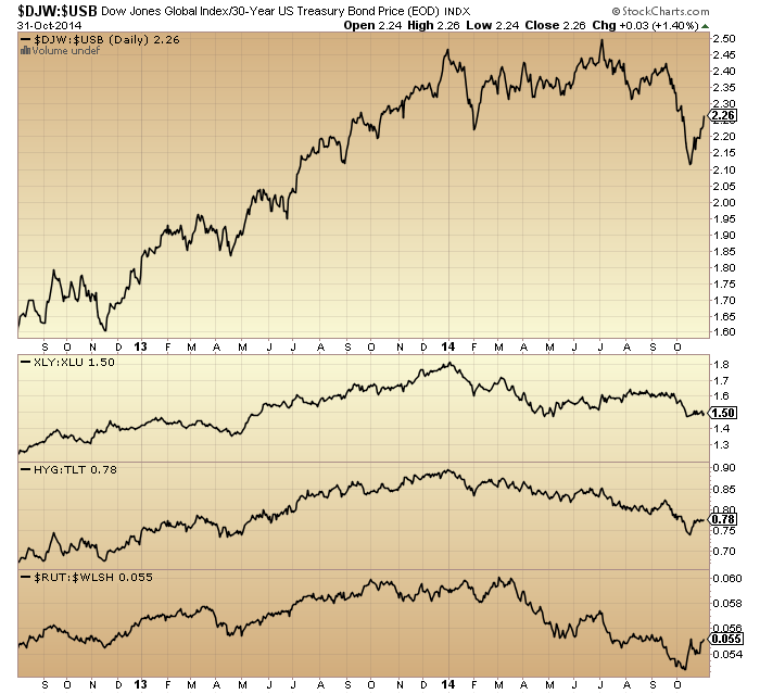
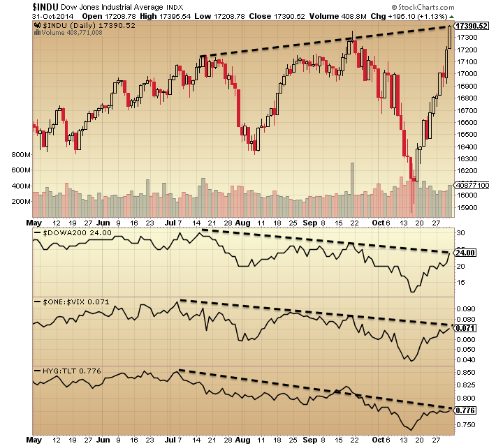
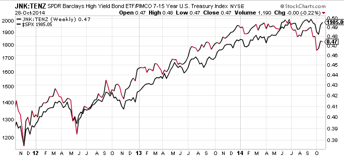
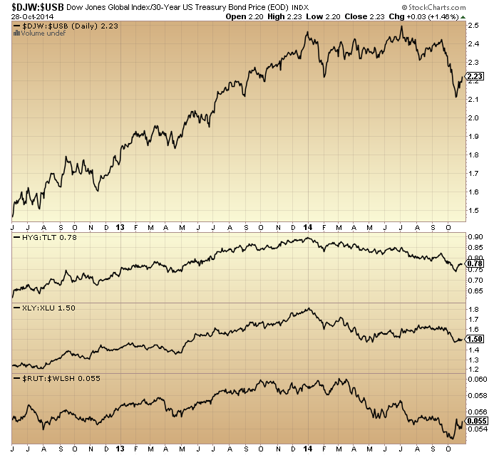
Small caps and junk bonds had the biggest down days yesterday, both risk-off flags which argue a notable drop in large caps should follow sooner rather than later.

14nov9Source: Stockcharts

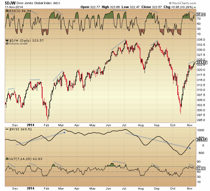
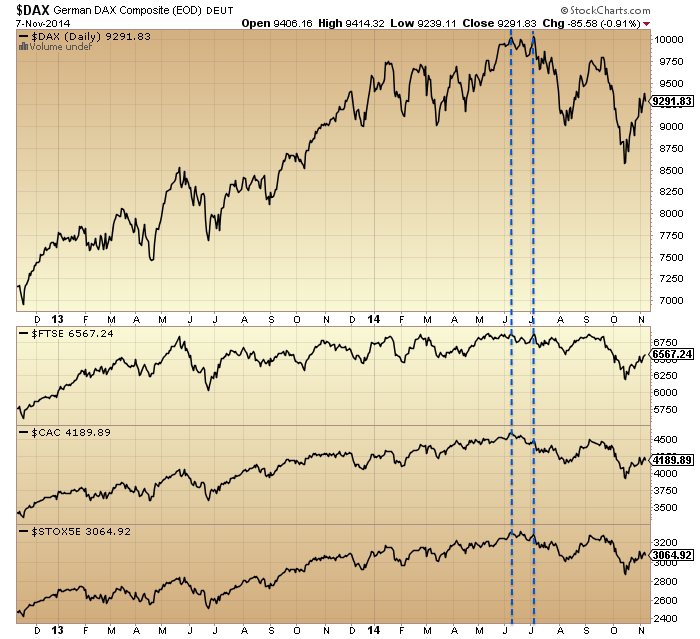
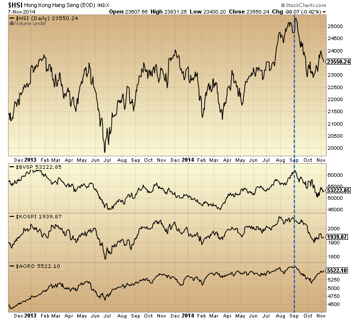
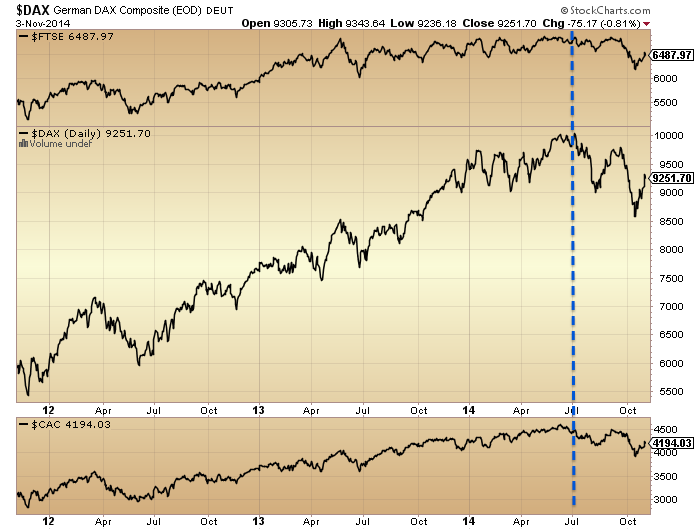
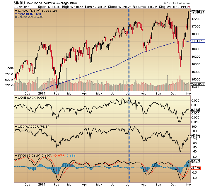
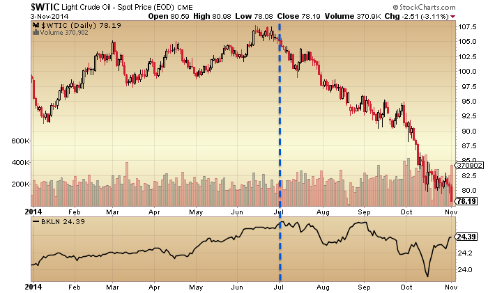
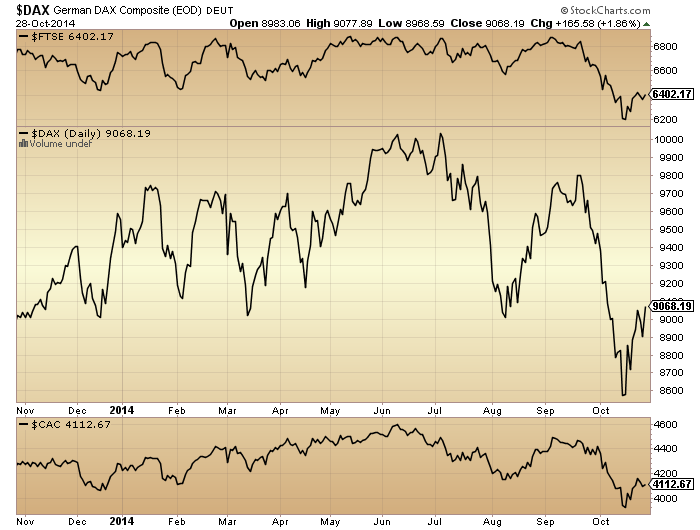
European indices moved further to the precipice in European hours yesterday. At this point European indices and US small caps topped out by June 2014, and most other major global indices in September, just leaving US large caps, the Sensex and the Nikkei as the notable indices still to peak. Drawing on previous major tops (2007, 2000, 1989, 1968) stock indices peaked out within 4 months of each other. Therefore, if I am correct in my assessment of where we stand then those remaining indices should top out without delay and this fits with the picture painted by most indicators: November ought to end as a down month.

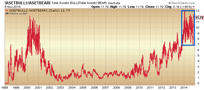
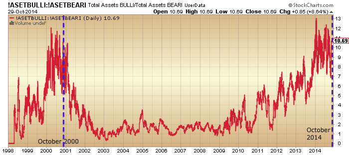
Rydex allocations hit the highest ever level yesterday aside from mid-January 2014, which suggests a top in equities should occur:

14nov10

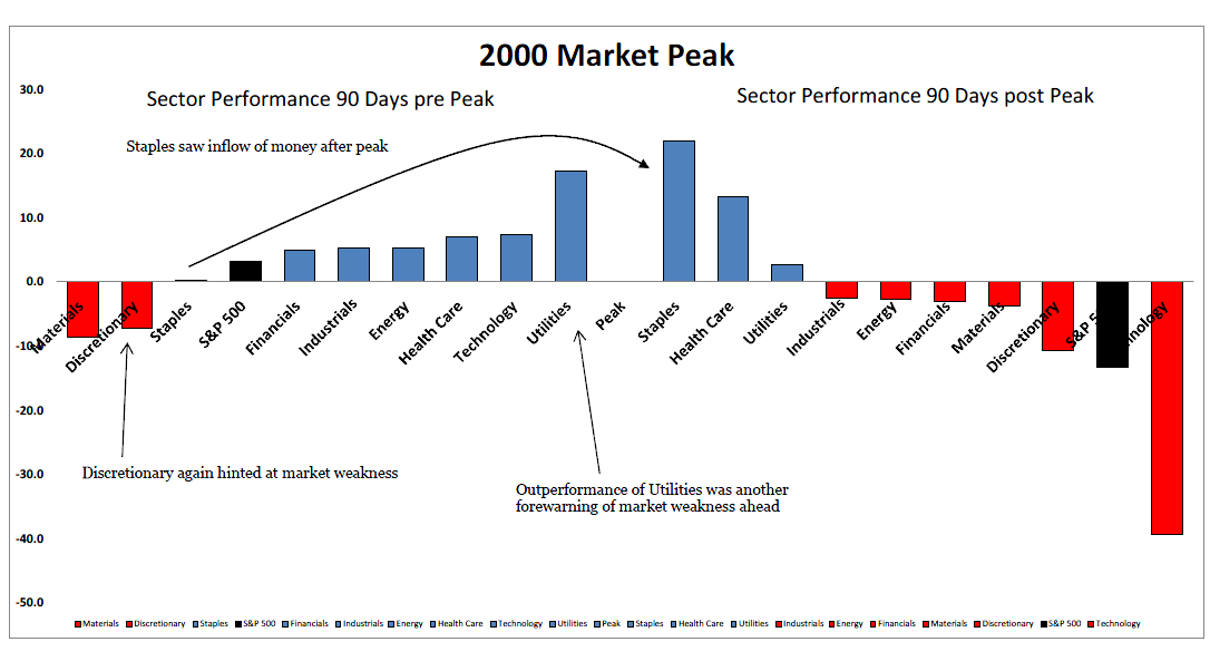
Here is the comparison of the 2000 topping process, confirming that Rydex spikes to extremes typically marked tops:
14nov11

Combining the current extreme readings in II and AAII sentiment, these are the mirrors from history:
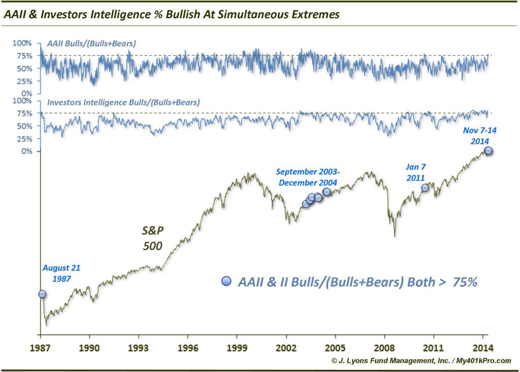
14nov4

Source: Dana Lyons

1987 marked an important top. January 2011 was an early warning of an important top. 2003-2004 was ‘healthier’ froth that sometimes occurs during early bull market progress, so I suggest that cluster is less relevant here.

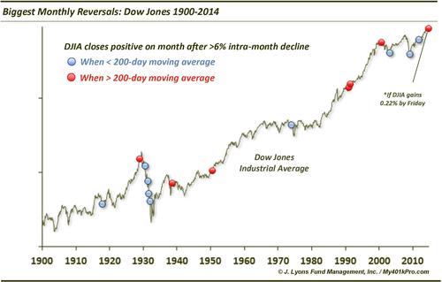
MACD on the Dow produced a reading only seen 3 times before. All were pullback signals on the short term, but different results in the medium term.

14nov5

Source: Northman

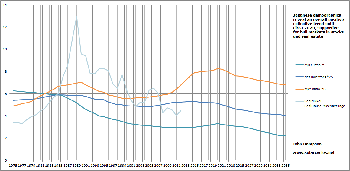
Four headwinds for US equities: a) monetary trends point to a weakening ahead in the US economy relative to Japan and the Eurozone (chart below), b) QE support has ended, c) the rising US dollar and falling oil prices have resulted in a cutting-in-half of earnings and revenue forecasts for US Q4, d) the US stock market is the most expensive in the world of all major countries (table below).

14nov18

Source: Moneymovesmarkets

Screen Shot 2014-11-14 at 08.23.06

Source: Telegraph / ZeroHedge

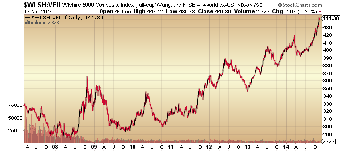
If we could argue that until now a relatively stronger economy in the US coupled with the relatively most aggressive / supportive central bank made for outperformance in US stocks (shown below relative to the rest of the world equities) then that fundamental case looks to be reversing here.

14nov30

The case for the US dollar to reverse too is added to with the below contrarian Euro positioning and sentiment.

14nov2

 Source: Nautilus

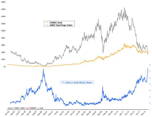
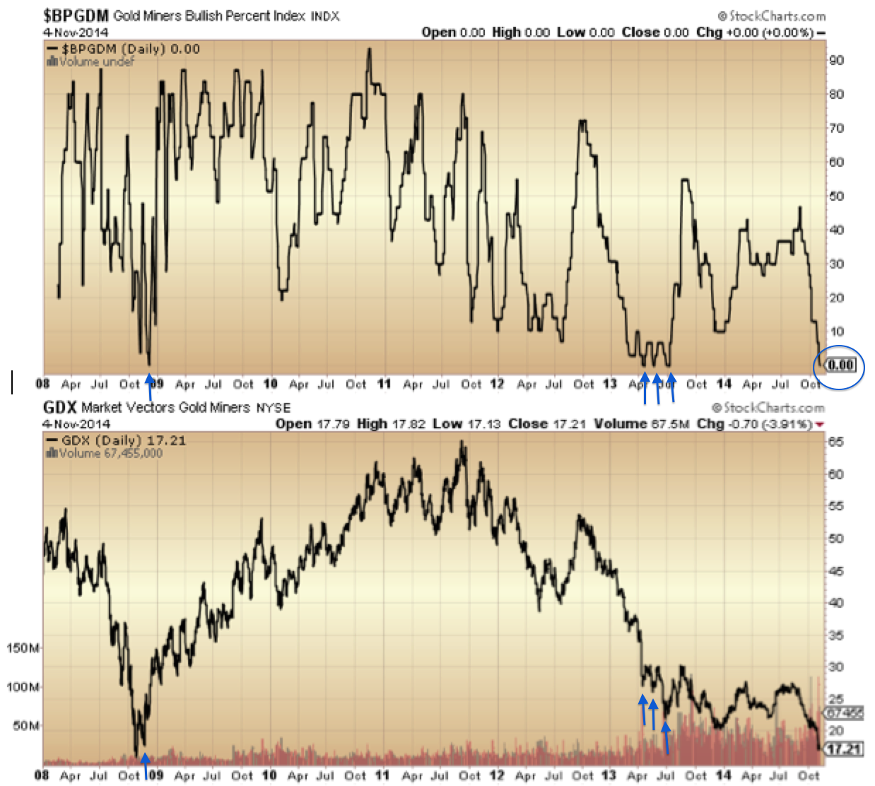
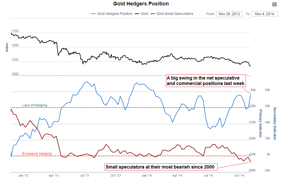
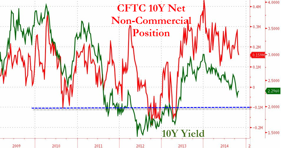
And this would fit with a reversal in gold which looks to be basing. Here is another angle on gold that suggests we are at a similar point to the secular bottom in gold at the end of 2000.

14nov18

Source: Sentimentrader

Drawing in other evidence from previous posts, there is a compelling case for a major cross-asset reversal here, out of the USD and into gold and out of equities, particularly US equities.

In the very short term, yesterday’s US equities intraday reversal candle together with the Rydex spike, junk bonds drop and very precarious European indices technicals set up the potential for a follow through to the downside either today / early next week. My case is that this is the last peak in the topping process and if so we should see at least one large voluminous down-day over the next several sessions. If instead we churn sideways in a range for the remainder of November then support would grow for an end-of-year peak, but with every man and his dog expecting positive Nov/Dec seasonality to take stocks higher the stage is set for the opposite, particularly as actual geomagnetism (the underlying source of seasonality) is trending downwards currently.

Cyclical / Secular

The short term first. The Dow Jones World stock index looks like this:

12nov1

Source: Stockcharts

The current high is someway beneath the July/Sept highs and the lower high lower low trend in tact. The last week and a half has produced negative divergences in RSI and ULT and the previous highlighted instances add to the case for the rally imminently failing.

Bullish percent to put/call ratio and cyclical sector to defensives ratios also show a telling divergence since we turned into November, suggesting the edging up in price over the last few days will be reversed.

12nov2

By cross-referencing indicators I’ve previously explained why the most relevant analog puts us equivalent to November 2000, and I am still looking for the bar following this box to be delivered this week to mark the trend change:

12nov8

Interestingly, precious metals and miners have built out a potential reversal base these last few sessions, and back in 2000 at the exact same point gold made its secular bear market low, marked above.

We can cross-reference this with the gold/miners ratio that has reached the same washout level as 2000:

2nov9

 Source: ShortSideOfLong

And gold miners sentiment which also reached bottoming levels:

Screen Shot 2014-11-05 at 12.54.51

With equities at the end of their bull market topping process, this set-up looks compelling as the launch point for gold into a new cyclical bull within an ongoing secular bull. By demographics, the cyclical bear in gold from 2011-2014 has just been a pause in a longer term bull market that should extend to the next solar maximum of circa 2025.

12nov9

On the flip side of that, equities should now enter a new cyclical bear within an ongoing secular bear. One of the most common misperceptions out there is that stocks are in a new secular bull market. But demographics, inflation-adjusted stocks and p/e valuations reveal otherwise:

Screen Shot 2014-11-11 at 19.05.37

Viewing stocks relative to treasuries reveals more clearly the major tops and bottoms. Below, RSI and TSI show an early warning system for the major peaks. They flagged again by the end of 2013 and have since been divergent, as stocks:bonds has made an identifiable topping process.

11nov22The Nasdaq 100 index has had the most parabolic shape of all the major stock indices, but we can see below the same telltale buy/sell pressure and momentum divergences as the previous major peaks have been in place since the turn of July 2014. Those divergences lasted 3-5 months in the earlier events, and the current divergence has now been 4 months.

11nov14

Finally for today, here are the smoothed solar maxima of the last 11 cycles plotted against Q ratio valuation for equities. Barring the 2000 outlier it has reached the same topping valuation level here at the 2014 solar max as previous solar cycle highs, and should be destined for a true washout level of circa 0.3 before the secular equities bear is over.

10nov1

Underlying chart: Doug Short 

Cross Asset Position

No reversal yesterday in equities but I maintain it has to be close at hand.

The Nasdaq added another day to its small sideways range. RSI divergence argues the next move should be down.

11nov8Source: Stockcharts

The SP500 is at the top of its megaphone pattern and the Dow has edged above it. Gold miners made a megaphone top in 2011 and they also edged out above it, before reversing:

11nov2The combined reading of II plus AAII sentiment is the highest on record, which casts doubt on the fuel for higher prices in equities.

11nov3Source: Lance Roberts

Positioning is extreme in the US dollar, sentiment is extreme, and there is an RSI divergence between the two recent peaks.

11nov15 11nov16

Source: Acting-Man

Gold miners bullish percent reached zero and Friday saw a voluminous bounce. Positioning in gold is also extreme and contrarian:

11nov17

Source: Acting-Man

Sentiment plus oversold conditions in commodities argue for a broader reversal too:

11nov12 11nov13

Source: Emma Masterson

Plus positioning in treasuries remains at elevated levels more in keeping with a bottom in treasuries than a top:

11nov7

Source: Zero Hedge

Add all these together and there is a compelling set-up for a major reversal out of equities and the US dollar and into gold, miners, treasuries and maybe other commodities too. If gold and miners can hold above Friday’s low then I believe the move kicked off at Friday’s full moon, but we really should see supportive developments a.s.a.p. if so. There is a geomagnetic storm in progress and the cumulative geomagnetic trend remains down, so the underlying pressure is negative on risk assets.

Here’s a look at buy/sell pressure and momentum indicators for US equities. There have been 6 major distribution days in 2014 and no major accumulation days since October 2013. This suggests underlying enduring smart selling pressure despite the higher prices. Also reflective of this are the negative divergences in the two money flow indexes CMF and MFI:

10nov2

MFI has been divergent since the turn of July, which puts us on borrowed time for stocks to peak, but CMF shows anomalous long divergence since way back in mid-2013, which I suggest shows the atypically long mania in prices.

The Chaikin oscillator and ULT momentum indicator show the same anomalously long divergence, this time since the start of 2013. I don’t believe these indicators are broken, but rather they again reflect the strength and duration of the mania this time, which in turn suggests a major crash lies ahead.

10nov3

There are multiple other indicators that reveal the mania in stocks began at the start of 2013 and is now almost two years old. Phenomenal and historic.

If we look back at the Nasdaq into its 2000 peak, to compare manias, then those two ChiOsc and ULT indicators still only made a normal 3-month leading divergence. Their divergence versus the Nasdaq in 2014 is around 12 months, which is unprecedented.

10nov8So what does that mean? I believe these indicators further cement the overall picture of one serious mega-mania which is on borrowed time and heading for a major crash. It’s just a matter of patience and money management in negotiating the short term.

So far in November we don’t see a renewed ramp up in sunspots and the probability remains that the smoothed solar max is behind us.

a2Meanwhile, the collective evidence from sentiment, allocations, negative divergences, cross-asset positioning and other market indicators make it improbable that stocks can grind higher into year end or Q1 2015 for an anomalous late peak relative to the solar max. Rather, the evidence still supports a renewed turn down in equities this week and a significant down November, keeping the bear trends in European indices in tact and completing the megaphone tops in US large caps.

Simply put, I have no case at all for higher prices from here whilst I have a multi-angled cross-referenced case for equities to turn down without delay in a last gasp of the topping process that began 1st Jan. It is what it is. So on we go, it’s a partial holiday in the US today, but stocks and futures are open whilst bonds closed.

In Perspective

1. The start of January brought the shift to defensives, measured here in 4 ways: stocks to bonds ratio, cyclical to defensive sector ratio, small caps to all caps ratio and high yield to treasuries ratio.

9nov10Source: Stockcharts

2. The best performing sectors in 2014 all year have been health care and utilities, the two defensive sectors that perform best once the stock market peak is in.

9nov15Source: Macromon

3. The yield curve, measured here by 2y versus 10 yr treasuries and 2m versus 10 yr treasuries, has flattened ever since 1st Jan. We won’t get an inverted yield curve under ZIRP so flattening takes over as a topping warning.

9nov114. The best performing asset class in 2014 has been government bonds and the chart below shows this has been a global phenomenon (Germany, Japan, UK and US quoted by 10 yr yields (bonds inverted)), again since Jan 1st.

9nov85. Looking at stock market breadth, deterioration has been under way since almost the turn of the year in the Nasdaq indices.

9nov126. Whilst the NYSE, SP500 and Dow picture reveals breadth issues since the turn of July. We can also see there was an earlier bad-breadth run into the turn of 2014 which was subsequently repaired: like an attempt at a bull market peak but it wasn’t quite ready.

9nov137. Turning to sentiment, NAAIM manager exposure to equities has been dwindling since Jan 1st, whilst Investors Intelligence bulls made a double peak 1 Jan and start of July, since which they have dwindled too. Meanwhile, Vix made its low at the start of July and has been in an uptrend since then and Skew has stayed elevated for a year, with triple peaks in Jan, July and Sept.

9nov148. Commodities have been in sharp decline since the turn of July, as the US dollar sharply rallied, in a deflationary wave.

9nov69. For US earnings, a rising dollar and falling oil prices is overall doubly negative. Q4 earnings growth has recently been accordingly cut in half to 4.5% and sales growth cut in half to 2.2%. Earnings growth has missed target in each of the first 3 quarters of this year. The average of 5 valuations puts US equities the joint second highest in history after the 2000 mania. There is a big gulf between price and earnings.

10. Global stock indices look like this. European indices peaked out by the start of July and have since made a lower high and lower low, the definition of a bear trend.

9nov2

11. The Hang Seng, Bovespa, Kospi and Australian index all made peaks at the start of September.

9nov4

12. However, the US SP500, Dow and Nasdaq, as well as the Japanese Nikkei have all made new marginal highs since then.

9nov1

13. The Russell 2000 double topped at the start of March and start of July, whilst the overall Dow Jones World double topped at the start of July and start of September. Junk bonds and leveraged loans also made July/Sept double tops and lower highs and lows since.

9nov5

Across all the above charts in this post, three dates consistently stand out: the start of Jan, start of July and start of Sept. The topping process began the 1st January and additionally the Sornette bubble end flagged on the SP500 at the start of July and on Technology at the start of September. Insider selling peaked at the turn of the year and we have seen six major distribution days since then without any major accumulation days. Put/call ratio, bullish percent and the summation index additionally point to the relevance of the start of Jan and start of July:

9nov19

Now draw in the solar cycle. The likely smoothed maximum was April 2014 (based on SIDC, Solen, NOAA, IPS and polar switch). Here’s why the smoothed sunspot maximum is important, it generates peak speculation events:

9nov22

Either side of the expected smoothed solar maximum of April 2014, we have two seasonal peaks (inverted geomagnetism peaks) of turn-of-year and mid-year:

5nov40

Homing in on the new moons of those two periods we get specific dates for a triple peak confluence of speculation/optimism: 1st January 2014 and 27th June 2014. I believe this is a compelling cross-reference for all the market charts above. We see multiple index and indicator peaks clustering at the very start of Jan and very start of July (both within two trading days of the new moon).

So I maintain this is the true picture of where we are, mirrored on the last solar maximum stock market peak of 2000:

30oc6

30oc5

And I still expect stocks to reverse here like they did at the same point in 2000:

9nov17

We have had several days of small range consolidation with a slight upward bias (averaging the 4 US indices), whilst sentiment and allocations are bumping up against invisible limits. I therefore believe the next move is down, like the subsequent red candle above. Furthermore, I believe that is then the end of the topping process in global equities. It effectively ended at the start of July, and really did for various indices shown further up, including the overall Dow World. But we have now seen new highs again in US large caps which on the surface look bullish, but underneath not.

I believe the unprecedented extremes in levels and durations of price levitation, sentiment, allocations, leverage, tail-risk, and negative divergences mean a crash is coming. Like an elastic band stretched to the limit. The superficial 2014 bull trend in US large caps is nothing of the sort under the surface, but has served to fool most into a false sense of security. This last rally from October to November has sucked everyone in again (sentiment, allocations) and we have extreme lop-sidedness in the markets. I believe equities will tip over here and fall hard and fast, with no reprieve this time. No dragging on until year end: the megaphone formations on the US large caps are ripe for resolution now and overbought/overbullish indicators support this.

7nov120

The October monthly hanging man candles suggest November should be a significant down month. I maintain the view that the evidence is too compelling now for consideration of an alternative scenario. If you remove me from the equation then there is an awful lot of fact in the above charts and many other recent charts that I have relayed that a bull needs to explain away. Simply, too many. However, we can argue there is a middle position in accepting all the warning flags but predicting prices can still yet go higher into year end under dual positive seasonality. Perhaps a scenario of increasingly thin volume and increasingly bad health but still scraping higher.

The problem with that is that whether we look at Nymo, Rydex, II, AAII, RSI or the ascent and shape of the Oct-Nov rally we see the same tell: exhaustion. Stimulative action from the BOJ and ECB in recent days have failed to catapult global equities higher. So I believe the middle position’s best hope is that equities retrace away from these exhaustion levels but then quickly washout, to enable a December rally into year end. However, I would refer you again to our positioning in the topping process. There is no case for another rally. If we tip over this week I believe that is it: equities won’t come back again. This is what I expect to happen.

Screen Shot 2014-11-04 at 07.53.54

SP500 Monthly

Charts Update

The exhaustion gap (from Friday) is still in play, and I’m now looking for a gap down day. The current Nasdaq is shown below followed by a typical exhaustion gap pattern:

6nov85

Source: Stockcharts6nov82

Source: TraderPower

The equivalent point from the year 2000 looked like this on the SP500:

Screen Shot 2014-11-06 at 06.29.45It took a few days to reverse, but the key is no significant break higher. Today is the full moon (or early tomorrow if in the US) which could mark the reversal, plus we have a potential gap down trigger from ECB disappointment. If the ECB surprise to the upside then I still don’t have a case for a continued rally, and that’s because I don’t see the fuel for higher.

The latest II % bears reading is 15, which has been the historic limit, and AAII bears also now stand at 15%, which is their lowest reading since 2005. Rydex closed yesterday just below 12 which is thereabouts the historic limit too. Here we can see the market went down or sideways-then-down at such high allocation readings:

5nov62

Add in the overbought indicators and current geomagnetic disturbance and it is likely the next move is down. Junk bonds appear to be leading this move.

6nov80Plus note at the foot of the chart the renewed move lower in defensives versus cyclicals: XLY:XLU.

Bullish percent over put/call ratio is showing a five month divergence following a turn-of-year spike peak. The only mirror I can find for this is 2011, where something very similar occurred.

Screen Shot 2014-11-05 at 12.33.33For those who missed it, gold miner bullish percent is now at zero and suggests an imminent bounce or bottom for GDX:

Screen Shot 2014-11-05 at 12.54.51

This is the flip side of the equation: gold and miners are capitulating whilst stocks top out. Reversals in both should occur together. I wondered previously whether gold miners would be sold off in a steep stocks sell-off, but the difference this time, say compared to 2008, is that they start from total washout levels, so I see the only way is up.

Moving on, a bubble I noted previously was the Dubai stock index. The parabolic terminated in May and there is a clear second chance peak since. This is a text book bubble/pop chart as it stands, and plays into the solar max being behind us circa April.

Screen Shot 2014-11-06 at 06.30.52Source: Bloomberg

The bubbles in Indian and US stocks look to be the the last to pop.

The mania in US stocks has been unprecedented in history in various ways:

2nov9

Source: Dana Lyons
Screen Shot 2014-11-02 at 07.16.11

Source: Ed Yardeni

6nov87

Source: Rory Handyside6nov89Source: Doug Short

6nov90

In short, sentiment, allocations and leverage have stretched to levels and durations not seen before. The unprecedented v-bounce cluster or swift dip buying has, in my opinion, stored up a mega-correction, and the record Skew level and duration warns of such a large drop. The October drop in equities did nothing to reset sentiment or allocations. I won’t be shifted from my stance that this is the set-up for a crash unless these indicators reset without a crash (which would also be a first in history).

It’s clear to me that the solar maximum has driven the mania and the lack of demographic tailwind has been compensated for by investors going all in on allocations, leverage and bullishness. With the mantra for the mania being central bank policy trumps all and the Fed being the most aggressive CB (until BOJ this year) I believe that’s why the stretching has been so pronounced in US markets. But ultimately, no-one could be prepared for this set of unprecedented developments in the markets. History has been well and truly made this year.

Recall at the October low we saw a capitulative breadth reading similar to bear market bottom lows? Bullish percent shows something similar:

Screen Shot 2014-11-05 at 12.27.19

Drawing in the nature of the reversal…

6nov85Source: Dana Lyons

…similar reference points are popping up. Namely, what happened in October is either a sign of a market top or early bear, or it is a bear market bottom or major (~20%) correction bottom. It is neither of the latter two, so I suggest it is in fact the market peak / early bear sign and I have shown similar hanging man candles to October’s at the end of the 2000 and 2007 topping processes. However, there is one other option: it is an unprecedented catapult to an even bigger leg up in equities, which would fit with an anomalous delayed solar peak, if the bulk of the solar scientist models have it wrong, as well as the general ‘unprecedented’ markets theme.

I can’t rule that out. But it’s the cross-referencing again that keeps me from giving that serious probability. Leverage has failed to increase since February, sentiment and allocations are at an invisible limit. Negative divergences in breadth, defensives, volatility, smart money and other indicators are mature, and particularly compelling since the start of July. Since that point we have lower highs and lower lows on European indices and US small caps, which I believe are in bear markets. The positioning by indicators puts us right at the end of the topping process, meaning the next leg down is the definitive. In my opinion the case is so strong now that I can’t give an alternative much weight. So I continue short stock indices and long precious metals, but I am ready to step aside and wait if the market decides otherwise.

UBS see similar signs for a leg down from here but believe we will then scrape another marginally higher high by the end of December – but just in US large caps. I know this fits with some of your views that the final peak won’t happen until then. So, I would say: let’s see what indicator signals we get if and when this November leg down erupts. I believe this will be the definitive fall, but the possibility of a year-end peak would become clearer if we were to see swift capitulation again.

Game Over Start Of July

Many charts and indicators say equities finally topped out at the start of July.

1. European stock indices peaked out at that time and have since made a lower high and lower low.

4nov3Source: Stockcharts

2. US small caps and the Dow Jones World index show likewise:

4nov21

3. Whilst Dow Industrials shows a megaphone formation since then, Dow breadth and Vix (inverted) reveal a similar decline since the start of July.

4nov44. The SP500 shows a megaphone too, however its breadth followed the same declining pattern since the dotted line. NYSE advance-decline volume and the high yield to treasuries ratio also reveal the start of July peak.

4nov95. Ditto the Mclellan Summation Index and the trend change in put/call ratios:

4nov7

6. Nasdaq breadth significantly diverged at that point.

4nov8

7. Oil took on a deflationary track at the start of July and leveraged loans made their peak.

4nov18

8. And lastly, the Sornette bubble end flagged on the SP500 at that time:

Screen Shot 2014-11-04 at 08.00.44Source: Financial Crisis Observatory

Why the start of July? It is the mid-year geomagnetic (inverted) seasonal peak, falling close to the June 27 new moon (2 trading days away) and the first such double optimism peak following the April smoothed solar maximum. If we think of the idealised speculation peak being the triple confluence of solar, geomagnetic (inverted) and lunar peaks, then 27th June would be the closest to that.

4nov15

On which note I’d like to point out the increased recent actual geomagnetism which has caused a declining cumulative geomagnetic trend over the last couple of months, aligning with action in most of the above indicators and indices. Here shown with the Dax:

4nov16

In short, the ‘red herring’ is the higher highs in price in the SP500, Dow and Nasdaq. They appear to the untrained eye to still be in bull market uptrends, but analysis says otherwise.

By various indicators, November 2014 should be equivalent to the two monthly arrows shown in the last two major SP500 peaks here:

Screen Shot 2014-11-04 at 07.53.54

The previous month in each case was a large hanging man candle (long-tailed). November should be a down month in price and the large price megaphones in large caps resolved to the downside.

Bullishness and allocations are back to their invisible limits at this point:

4nov19 4nov1Whilst it is mathematically possible that they could both reach further extremes, these levels – which are absolute historic extreme levels – have so far acted as a cap, so the next move in equities should be down.

We can add to that the diminishing fuel over the last few months from put/call ratios and NAAIM exposure (a smart money indicator), as well as the number of stocks that are serving to rally the markets and the number of stock indices participating, plus the risk appetite proxies such as junk bonds and cyclical sectors versus defensives, all suggesting the rug is being gradually pulled from underneath stocks.

Friday’s gap up in price was a potential exhaustion gap. Add to this that Nymo reached over 80 for the second time in 5 days and previous instances from recent history that suggest a reversal should be swift and decisive. Yesterday’s candle has the look of a reversal candle too. The second chart below shows such combinations of exhaustion gap plus Nymo>80 from 2011, and what happened next.

4nov2 3nov1Stocks should roll over this week. Then November should be a big down month. This really should be game over for the bulls.

November

October ended with new marginal highs on the SP500, Dow and Nasdaq. The bottom line is: my analysis doesn’t change. Here’s why.

There are too many stock market topping indicators for this not to be a bull market peak. I refer you to this list:

Screen Shot 2014-10-16 at 17.57.40

We can add to this now that ECRI leading indicators have turned negative, financial conditions are in decline and we have various additional negative divergences.

We can then cross-reference the list with the solar maximum for timing. Being able to refine with hindsight, the smoothed solar maximum looks likely to have been April 2014, with SIDC no longer running an alternative model with a higher high ahead. That puts the stock market on borrowed time since April.

Screen Shot 2014-11-02 at 06.44.48Source: Solen

We have evidence the stock market topping process initiated 31 Dec 2013, with a persistent move to defensives since then.

2nov3Source: Stockcharts

Plus dumb money flow took over from smart:

31oc20Source: Fullertreacymoney

The stock market topping process appears to closely mirror the last solar/stocks peak of 2000, putting us right at the end of the process:

30oc530oc6The question mark is over the higher highs in price here in 2014. US large caps have now made yet another higher high in October. However, they do so on negative divergences, similar to 2011 or 2007’s peaking (just marginal highs on clear divergences).

31oc2 31oct1

Indeed this powerful rally in price over the last two weeks is weak under the hood, with multiple further divergences:

2nov6 2nov7 2nov8This rally ought to fail imminently, and this is backed up by overbought stats: Nymo hit over 80 on Friday for the second time in 5 days. Per Andrew Kassen, this twin-occurrence happened 9 times before, resulting in an 11% average fall, with 8 out of 9 of them turning down the day after this signal.

That means Friday’s gap up could turn out to be an exhaustion gap. But it’s fairly unequivocal: stocks ought to turn down at the start of this coming week, and being just several days from the full moon the pressure ought to be downward. We can draw into this picture the position in gold and miners, which appear to be capitulating on heavy volume:

2nov10

Source: Dr.Cooper

The extremes reached echo the 2000 bottom:

2nov9

Source: ShortSideOfLong

I’m looking for a high volume intraday reversal candle on gold and miners to tie in with a peak in stocks.

Also unequivocal is that November should be down, per the positioning in the topping process by multiple indicators. October 2014 is matched up with its counterparts in the last two major tops below:

Screen Shot 2014-11-02 at 07.10.34The long tails look the same, but the candle tops do not. Things are different this time. Look at the clustering of V-bounces and of extreme lop-sided sentiment:

2nov9

Source: Dana Lyons
Screen Shot 2014-11-02 at 07.16.11

 Source: Ed Yardeni

Unprecedented. It seems fairly certain that both are reflective of a mania but does it mean a stock market topping process won’t play out in the ‘usual’ way? It’s not easy to answer that without a historical precedent.

However, this brings us to the bull case which would advocate that central bank policies have caused this and postponed any bear market. Supporting this we have once again made new highs on large caps following a very strong buying-of-the dip, whilst seasonality is doubly positive from here into year end (geomagnetic, Presidential). The Japanese BOJ shocked the markets with increased QE and the Japanese pension fund announced increased purchases of Japanese equities. So is it a losing battle fighting such intervention and support? Could those 37 topping indicators shown above all be attributed to ZIRP and QE making equities the only home for a decent return, and therefore this time not actually signals for a market peak?

I just don’t believe that. If you don’t agree with me, then I’m fine with that: you’ll find plenty of bullish blogs to follow. Understand that I’m feeling the pain with a significant drawdown on my short positions, so it’s imperative that I try to be as objective as possible. Ultimately, this is about my money and my life. I go over and over the data and come to the same conclusions:

I see a large cluster of market topping indicators aligning with timing by solar maximum. I see multiple negative divergences on this last rally up. I see lower highs and lower lows on US small caps, European indices and junk bonds since July, making the price action in US large caps the anomaly that will be the last to resolve. I see a positioning by indicators right at the end of the topping process. I see a mantra for this mania of ‘central bank policy trumps all’.

Note: I would not want to be short Japanese equities here. I may go long this week with a stop if the Nikkei can hold its breakout. Japan is in a slight demographic tailwind window in contrast to the other majors, and the direct buying of stocks by the Government is notable.

2nov15

But this doesn’t affect my view on US and European equities where I remain short, and gold where I remain long. By my analysis it’s fairly clear that a renewed turn-down in these stock indices and a capitulative low in precious metals should occur within the next few days and November should be a strong down month for stocks, as this is the only fit by indicators. If this doesn’t happen I will be stepping aside, closing positions and waiting. I am not being stubborn or wedded to a view, I just have such an overwhelming multi-angled bearish topping case that I think even if I was a total delusional, it has to be right.

So, it looks like we are making a megaphone top on the Dow and SP500. There is room for just a fraction higher into the top of the megaphone but the reversal ought to be close at hand. Nymo suggests as soon as Monday, so let’s see.

2nov20

October 2000 vs. October 2014

By various indicators, equities in 2014 align well with the last solar maximum year of 2000.

The topping process began in January. The solar maximum occurred in March with an associated speculation peak (margin debt peak, speculative target index peak with p/e>100 (Nasdaq in 2000, R2K in 2014)). A double top occurred in July and September, and an initial washout low in October (capitulative breadth spike >10). All this is captured in these two charts, using the Dow Jones World Index:

30oc6 30oc5

Source: Stockcharts

The July/Sept double top in price was higher in 2014 than the March peak (vs. lower in 2000), but the indicators reveal the topping process proceeding in the same way since the turn of the year.

We can see the top performing sectors align (defensives signalling a market peak):

30oc20

Source: All Star Charts

30oc21Source: Macromon

The extreme high banding in allocations aligns too. The October capitulative low failed to wash this out, just like in 2000.

30oc8Indicators position us equivalent to October 2000 (and January 2008 if we tie in the 2007 peak). Subject to how October closes, the monthly candles look similar:

Screen Shot 2014-10-29 at 15.50.58

The long-tailed candle, rather than being a bullish development, instead appears as the first evidence of real selling befitting the end of a topping process. That makes the rally a rip to sell.

The candle comparison unites with the positioning by indicators (solar max, topping process, margin debt, breadth, treasuries, sector performance, allocations), so it seems right. A negative November looks to be on the cards.

Explosive Rally Again

Another surprising day. Strong bullish action in US stock indices with leadership by cyclical sectors and small caps putting new highs within reach on most indices, and actually achieved by Dow Transports. The monthly candle on TRAN is something to behold, fairly unprecedented in the last 2 decades.

29oc9Source: Northman Trader

Ditto on the other US stock indices, which makes drawing on a historical analog for guidance difficult. With 3 sessions left in October, we would need to see a significant reversal to negate this current candle. Should that not occur, then I have to allow for the prospect of a continued bull market into year end, given the seasonal tailwinds, breakouts in Biotech, Apple and a decisive move back upwards in the R2K. However, I still rather see the weight of evidence as supportive of the wider markets having peaked, putting us in the early stages of a bear market.

European indices show a fairly clear lower high and lower low, and the October rally looks like a relief rally and nothing more:

29oc15

 Source: Stockcharts

Turning to the US, here is the Dow (Industrials). We can see clear divergences in breadth and the Vix that still suggest we may have indeed made a switch from bull to bear at the start of July, but the price action is nowhere near as clear cut.

29oc10The trajectory of the October rally is powerful but unsustainable. Nymo over 80 is a measure of how overbought we have become and previous such occurrences shown below led swiftly to significant reversals 8 times out of 9:

29oc1

Source: Jack Damn

Therefore, the rally ought to reverse today or tomorrow and the FOMC output may provide the trigger.

Credit spreads have not confirmed this rally and are also showing a peak at the start of July:

29oc2Source: Michael Gayed

Nasdaq breadth diverged significantly at the same time and remains non-confirming of the October rally:

29oc3An overall topping process in equities still appears to have begun at the turn of the year, with various angles on this:

29oc7Again, there has been little repair from this powerful October price rally.

Skew remains in an extreme high band since late 2013, warning of an outsized move in price.

29oc11Source: Barcharts

Investors Intelligence sentiment has been in a similar extreme high band over a similar period. Ditto Rydex allocations:

29oc8These are all particularly mature flags now.


The key question is whether US stock indices can rally to new highs here and squeeze the bull market into year end. I have kept this as my worst case scenario for some time. Given the mature divergences and topping indicators that have been in place since the turn of the year, it remains questionable that they can extend that far. When we add in the additional non-confirmations that have been in place since the start of July, the probability further shrinks. However, given the breakouts in certain stocks, sectors and indices and the power of the October rally, I have to respect that it could happen.

The sharp rise in the Vix into early October and the subsequent collapse is unprecedented in speed, magnitude and reversal. Like the monthly candles on the stock indices we don’t have a mirror from history to guide us. If we are set for decisive new highs in stocks then I believe it will be clear with hindsight that the solar maximum was not through yet. If so, maybe that October spike in solar flux holds some weight:

29oc16

Source: Solen

For now, the weight of evidence still supports the smoothed solar max being behind us, along with the speculation peak in equities. The weight of evidence supports a topping process in stocks that began at the turn of the year and peaked in early July, and a bear market being in progress since then despite wild oscillations in price. If instead price can make new highs here (in US large cap indices), then indicators suggest that much like the September marginal highs they should be short-lived. However, given how overbought the rally has become, it appears likely that price should retreat before this week is out, which would likely create the missing lower high in US large caps. After that, we would then turn attentions to whether price can base above the October lows.

My opinion on today’s FOMC is that it will be a market mover, and that they will stick to their QE exit. It seems the likely point for the markets to reverse back down, in a sell-the-news scenario, but given the power of the October rally, we will just have to see. Either way, the power has generally been in price, not in health. I see no reason to be bullish here unless many of those indicators and divergences can be repaired. However, we are once again at a crunch point, as this is about as high as we could expect for a ‘second chance’ lower peak. We have currently retraced 83% of the October falls on the SP500, exactly like the 1937 second chance lower peak. That, plus the Nymo and FOMC provides a set-up for a reversal here. No change in my positions until we see if that materialises.