End Of 2014

I’m back and refreshed. Thanks for all the messages, and for all the comments in my absence. Here is the big picture.

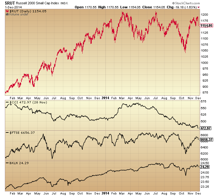
1. Primary shift to defensives and away from risk occurred as of January 2014, as measured by stocks to bonds, cyclical to defensive sectors, small caps to all caps and high yield to treasury bonds. Clock ticking from that point.

30dec2

 Source: Stockcharts

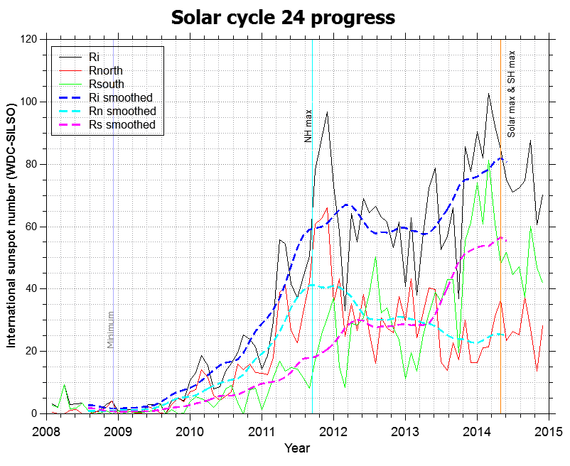
2. Solar maximum looks to have occurred around April 2014, marking peak speculation. Equities mania on borrowed time thereafter.

Screen Shot 2014-12-30 at 06.16.52

 Source: Solen

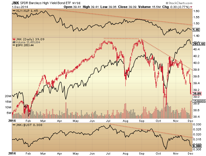
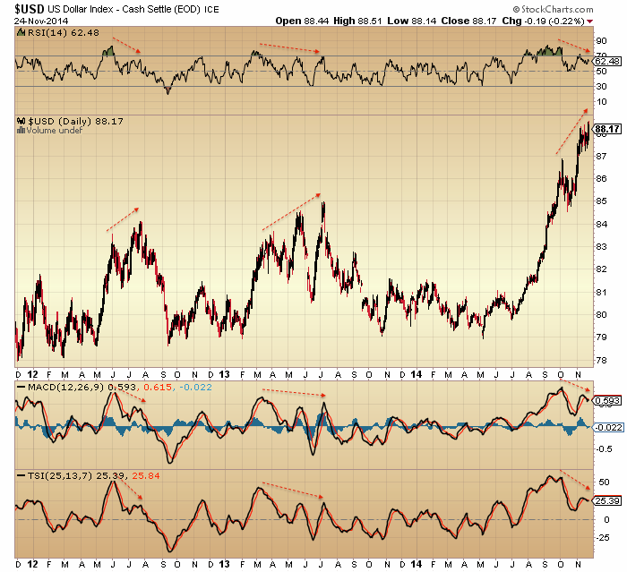
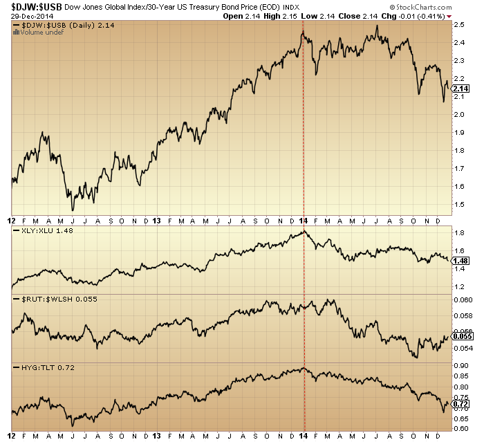
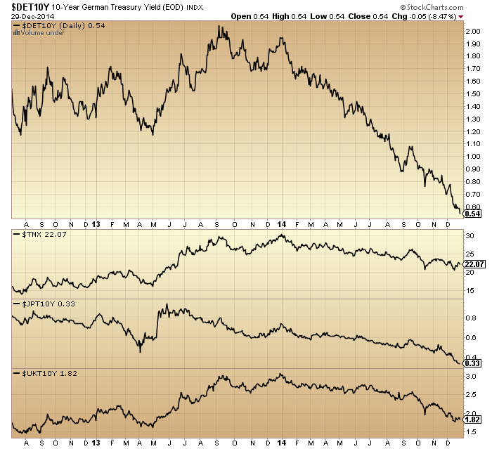
3. Game over effective start of July. World equities, crude oil, high yield bonds and the US dollar all turned at that point. Deflation in charge.

30dec4
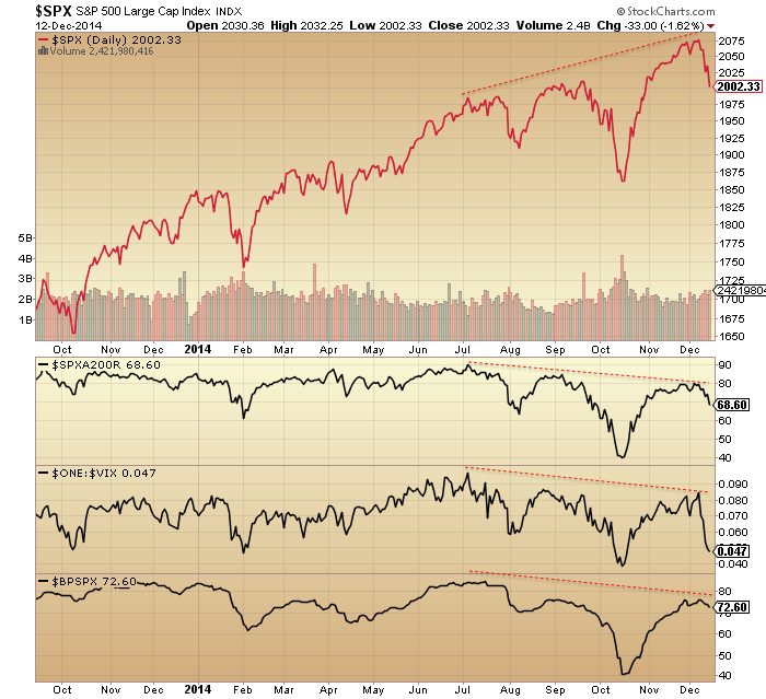
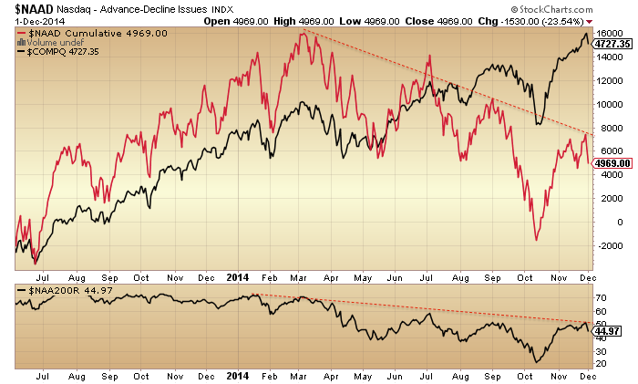
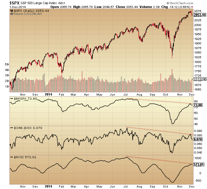
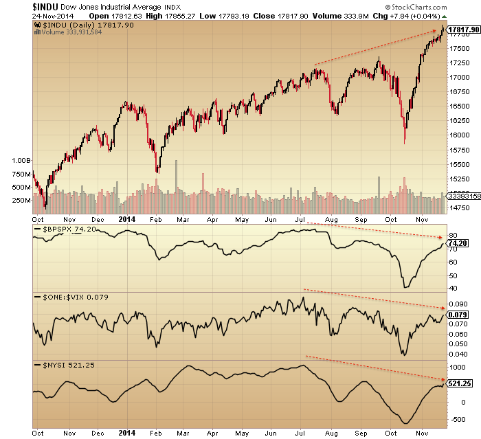
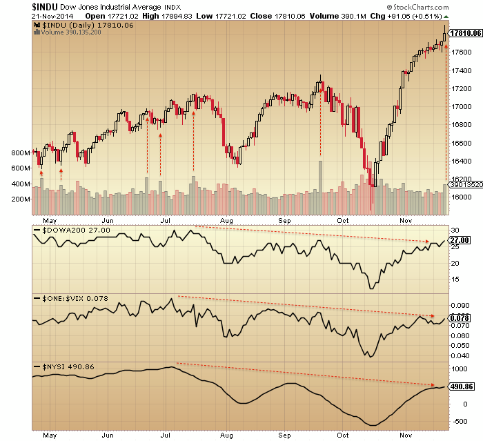
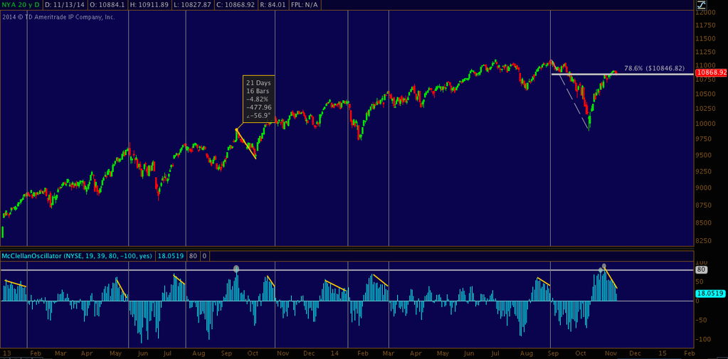
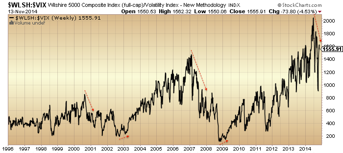
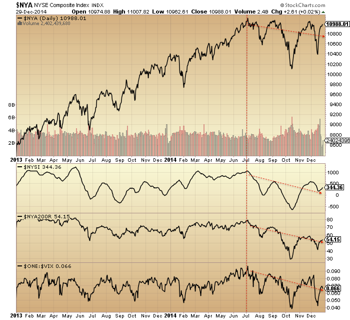
4. US equities composite, breadth measures and volatility all show the same reversal at the same point: start of July.

30dec1

5. Those twin peaks in risk appetite at the start of the 2014 and mid-year fit the seasonal model which is from the influence of geomagnetism:

30dec12

6. Which sets us up for a final peak at the end of Dec 2014 / start of Jan 2015 for those remaining stock indices which have yet to top. I referred to this as my worst case scenario (latest peak) in 2014.

30dec15

7. Developments in December support this now happening: sharpening falls in crude and government bond yields, flattening of yield curves, blow-off top in equities allocations.

30dec530dec10

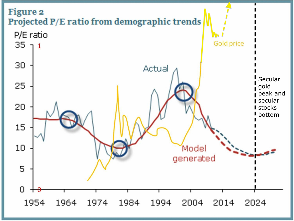
8. A new bear market in stocks will be a cyclical bear within an ongoing secular bear market. No new secular bull market as many believe.

30dec16

9. This secular position is dictated by demographics.

30dec20

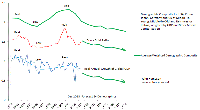
10. The other play from this is that gold should enter a new cyclical bull within an ongoing secular bull, and this is supported by recent signals such as miners:gold ratio, gold/miners sentiment and price basing patterns.

12se1

 Source: Glenn Morton / My projections

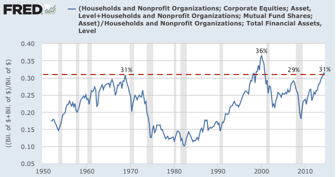
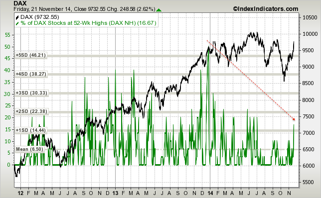
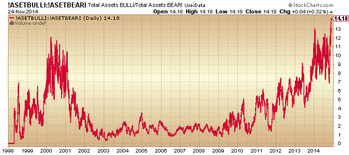
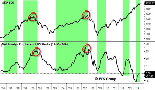
11. A sampling of stock indices from around the world, below, shows 2014 has been clearly either a large topping process or a large consolidation range. If the latter, then we should have seen excesses in valuations, sentiment, allocations and leverage worked off with time rather than price, yet all those measures remain highly stretched, suggesting this is a topping process.

30dec30
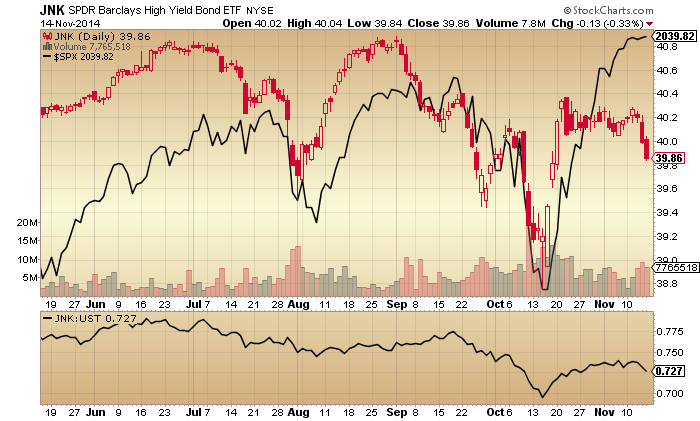
12. Plus, the two strongest sectors of 2014 are the two that are historical associated with outperformance after bull markets peak out:
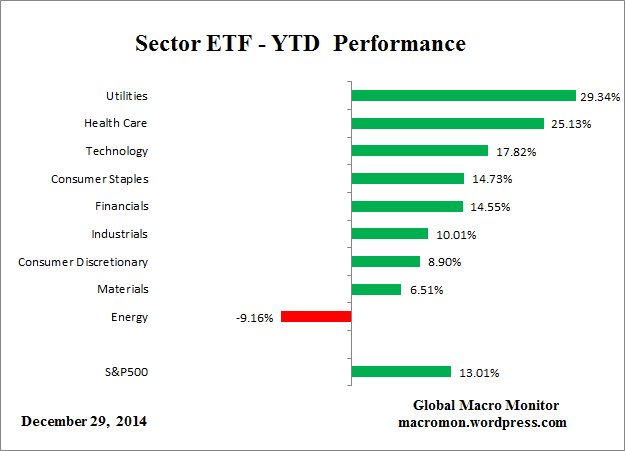
30dec7

Source: Macromon

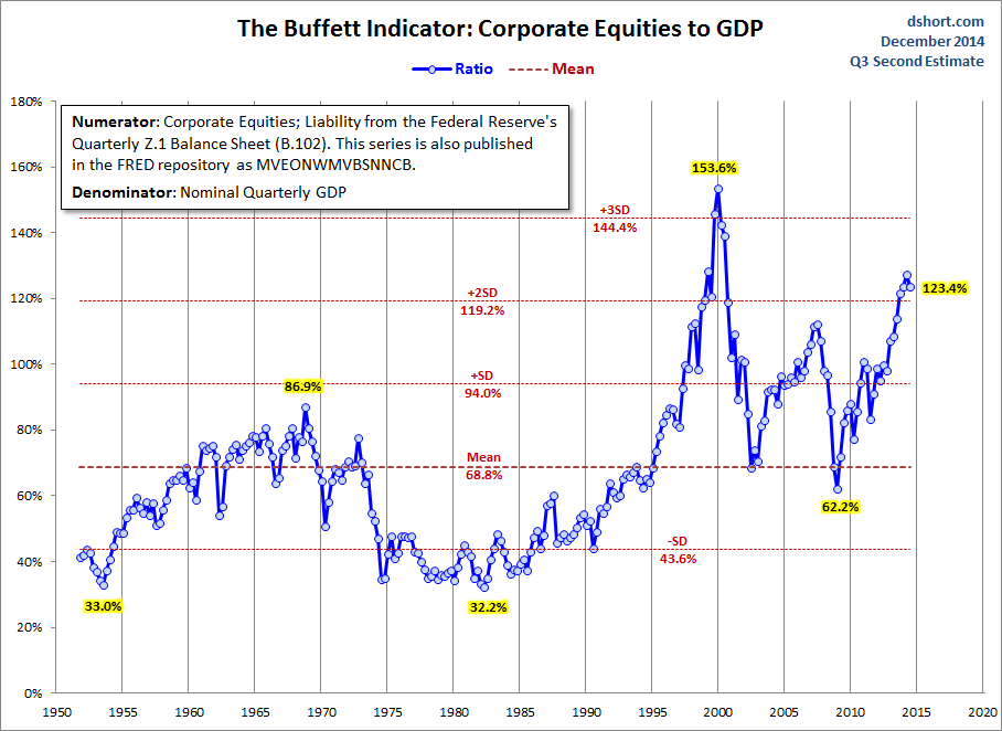
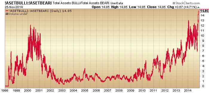
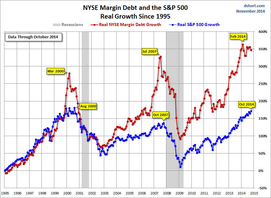
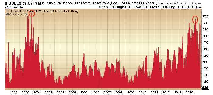
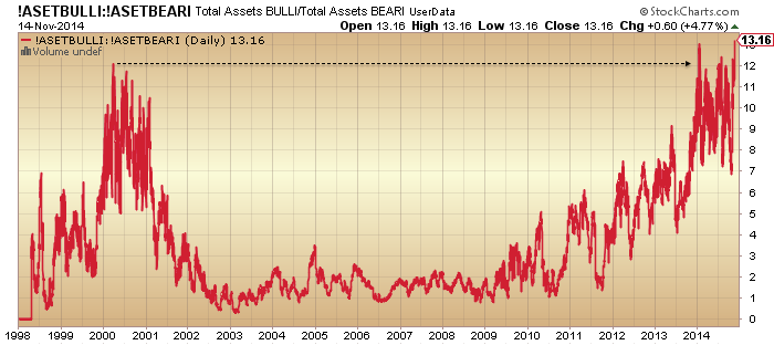
13. The peak-to-date in margin debt remains close to the solar maximum. This leverage, along with major extremes in sentiment, allocations, tail-risk, valuations and our post-solar-maximum status, is the set-up for a market crash. To repeat what I have said before, until/unless these measures are reset without a crash, then history dictates that is the most likely outcome. Crashes don’t occur often, but when they do, the set-up looks like the current.
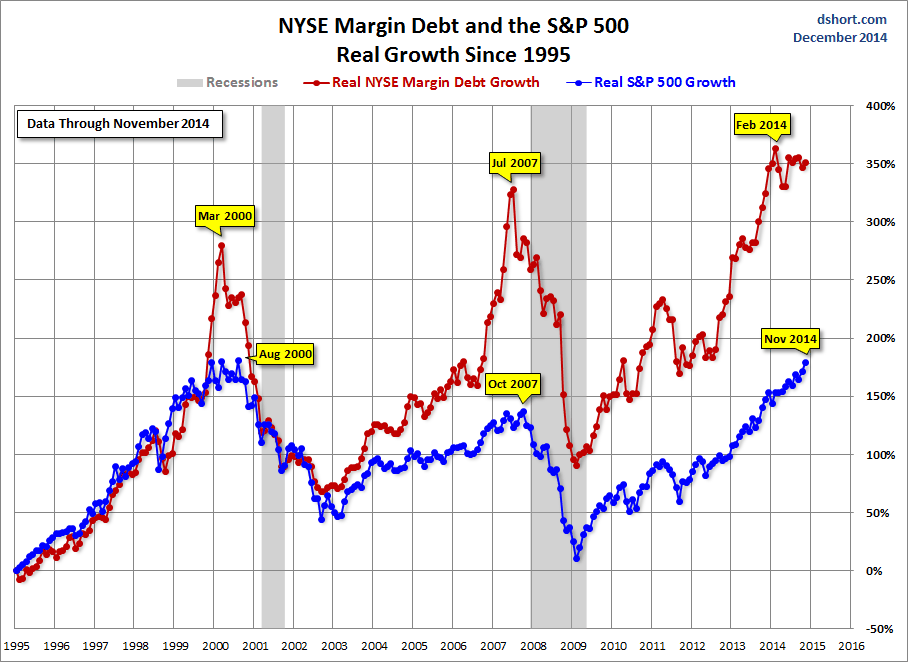
30dec9

Source: DShort30dec8

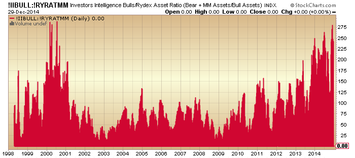
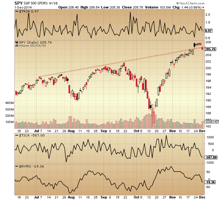
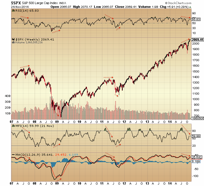
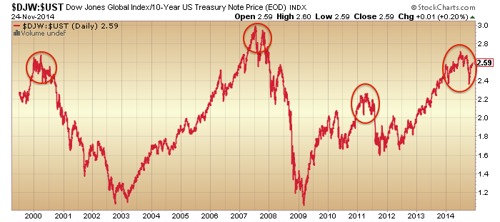
14. Leading indicators and the longer term stocks:bonds ratio resemble 2000, 2007 or 2011, suggesting a minimum 19% drop in equities. This is the percentage figure I quoted as my general target for short positions because, stretching the view to the last 100 years, this is the minimum we should expect without being greedy by aggregating various angles on the market. To be clear though, the set-up is compelling for a bear market, not just a sharp correction, so I refer you to the secular bear chart above for the bigger projection.
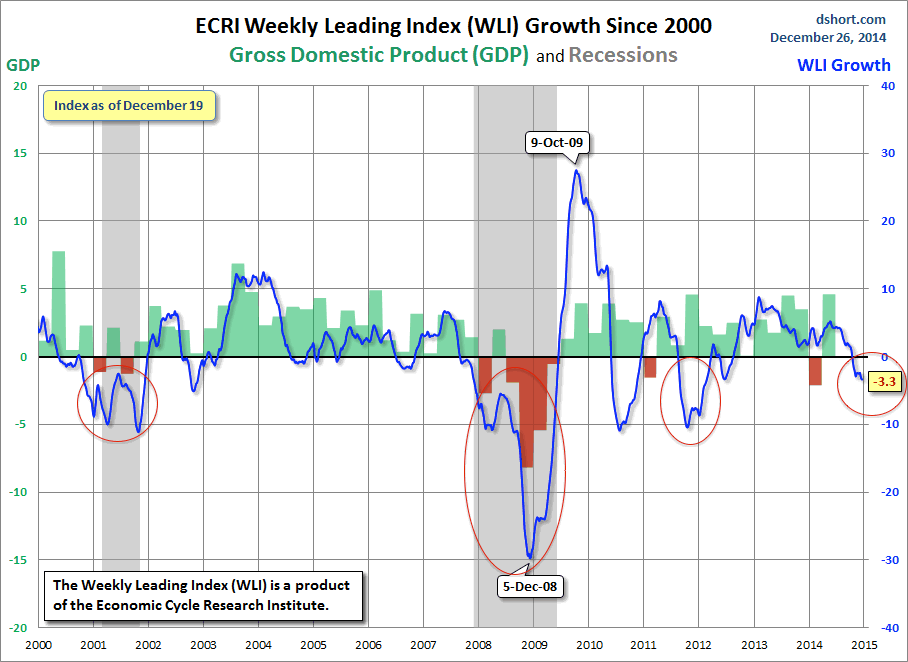
30dec40

Source: DShort30dec41

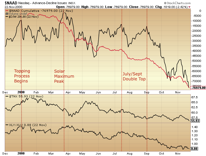
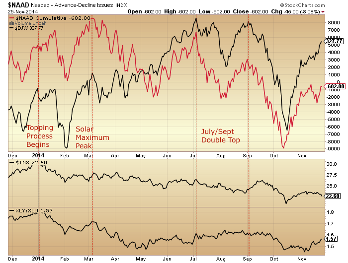
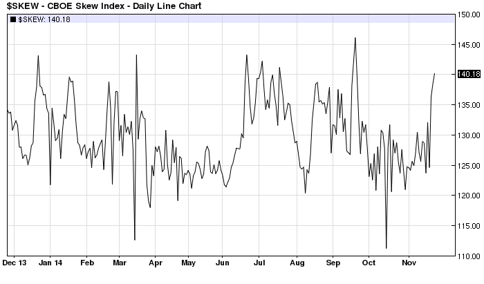
15. Which brings us to the value of history as our guide, because 2014 taught us one key lesson: 100 years of reference points may not be enough, we need to allow for the unprecedented. An aggregation of angles shows how unprecedented 2014 became:
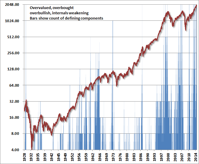
30dec50

 Source: Hussman

So what caused this? The most common view is that central banks brought this about with their policies of ZIRP and QE and unwavering verbal support. However, I maintain that ‘central bank policy trumps all’ was rather the mantra for this solar maximum mania than the driver. To prove this, we should now see equities collapse and gold rise despite central banks, and that is the final part of the real time test for the power of the solar maximum. If I am incorrect, then equities should continue their bull market in 2015 as central banks policies overrule. However, I refer you back to all the topping indicators and angles in equities that have amassed, together with the examples of 1930s US and 1990s Japan which revealed central banks’ true relative impotence. Ask yourself if typing numbers into a computer (ZIRP and QE) and saying a few soothing words can really work.

The crazy stretching of indicators delivered this year made for the most difficult year of trading since 2000, the last solar maximum. So if I can make one prediction for 2015, it is that it will be easier and more predictable. I am short equities and long gold and expect patience to be finally rewarded. I wish you all the best for the coming year.

Break

With my current illness, then Xmas and NY, and what looks like a bounce/pause in the declines off that breadth capitulation, I’m going to take a break from what’s been relentless toil this year for little reward.

I can NOT regret my analysis: by the 1st Jan there were around 30 topping indicators for equities, and they have remained in place all year. But 2014 turned out to be a once in a decade or generation style event, taking sentiment, allocations, valuations and leverage to unprecedented stretching.

As a real time test of the influence of a solar maximum on speculation it has been better than could have hoped, but the associated collapse remains elusive for now. Those super-stretched multi-angled indicators suggest it’s coming, however. Plus, a little more hindsight on the solar data front will allow us to tidy up both sides of the equation.

So, enjoy the festivities and thanks for all your contributions.

John

State Of The Markets

It’s been a while, so here’s how things now stand.

1. The topping process kicked off at the turn of the year with a gradual shift to defensives, as represented here by stocks:bonds, consumer discretionary:utilities, high yield:treasuries and small caps:all caps.

13dec10

Source: Stockcharts

2. The shift to defensives was a global phenomenon, shown here by German, Japanese and UK bond yields, as well as US.

13dec13

3. The smoothed solar maximum is likely to have been April 2014. Historically, peak speculation and appetite for risk assets has topped close to that:

Screen Shot 2014-12-13 at 11.05.52Source: Solen

4. In keeping with that, margin debt peaked in February, the commodities index peaked in April and certain breadth measures peaked around that time:

13dec16

5. Then either side of that, the move to defensives occurred as of January and the price topping formation in equities took place in the window from July to November, with US large cap stock prices rising in a megaphone formation whilst the remaining supports for equities were dismantled and many flags were raised. Here shown are breadth, volatility, bullishness, junk bonds and leveraged loans as examples.

13dec18 13dec19

6. Considering the final thrust to the peak to be the rally from October to the start of December, then its size and duration fits in well with similar topping thrusts from history:

2000: 17% in 23 days

2007: 15% in 39 days

2010: 16% in 55 days

2014: 14.5% in 37 days

So is this finally it? Dare we dream that equities have topped out and are now in a bear market? Yes we do.

7. A key change in the last two weeks has been that the remaining leaders appear to have finally reversed, such as the Sensex, Nasdaq 100, Apple, USD/JPY and the Nikkei. These are tentative reversals but the point is they have aligned in the declines.

8. Looking at the bigger picture, households are about as exposed to equities are they likely to be (given no demographic tailwind):

13dec30

Source: Fat-Pitch

9. Dittto, valuations are as high as they likely to reach:

13dec40

Source: DShort

10. Sentiment is as lop-sided as it could be:

Screen Shot 2014-12-13 at 13.58.23

Source: Yardeni

11. Leading indicators for the US are negative:

13dec50

Source: DShort

12. Corporate earnings for Q4 have been sharply revised downwards due to both the high dollar and falling oil price.

13. Put/Call ratio is signalling further price declines:

Screen Shot 2014-12-13 at 07.01.14

Source: Barrons

14. Stocks are nowhere near oversold yet:

13dec60Source: Charlie Bilello

15. However, Rob Hannah’s capitulative breadth hit 5 at the close of the week, suggesting more selling Monday/Tuesday could take this to exhaustion levels.

16. Which brings us to the phenomenon I have covered before: selling right into the close on Friday can trigger steeper selling on Monday due to weekend reflection. Is this finally going to happen? Allocations, sentiment and Skew are all set for it to occur.

17. But what about the favourable seasonality of year end, the ‘Santa rally’ in the second half of December?:

13dec70Source: Sentimentrader/UKarlewitz

There is upward pressure into the Dec 22 new moon and a limited history of bull market peaks occurring near the last trading day of the year. Offsetting that, we have downward real geomagnetism pressure at this time of year, and that megaphone price topping formation which ought to now have a destiny with the lower boundary given the overthrow turned out to be just that. Meanwhile gold has built out a compelling bottom and is ready for a rally at the expense of stocks.

The whole topping process is already on borrowed time versus the solar maximum, and indices such as RUT and DAX stretched about as far as they could again in November without jeopardising the topping process. Therefore, I see reasonable odds that the Santa rally won’t happen. In mirror topping years 2000 and 2007, December was a down month both times.

Let’s see if Monday opens the selling floodgates. The key should be a gap down open, with weakness starting from early in Asia/Europe. Should stocks alternatively garner support again then maybe they can hold up into the end of Dec before finally rolling over. But it’s high time we saw weakness into Friday’s close follow through, against that sentiment/allocation/skew backdrop.

Happenings

Oil plunging. High yield dropping. New all-time lows for bond yields in many European counties and Japan. Gold and silver major reversal. Apple large down day. Crazy spike in Rydex allocations.

ECRI leading indicators for the US negative. A combination of oil price drops and US dollar gains adding to sharp earnings projections revisions. On Sept 30th, earnings growth for Q4 was projected to be 8.3% and revenue growth 3.8%, but now these are more than halved to 3.8% and 1.5% respectively.

SPY looks like this:

2dec2Source: Stockcharts

Currently an island/overthrow top. But now we need follow through.

The Russell 2000 looks like this:

2dec20

Repelled at a critical point. Same for the FTSE shown underneath. If these indices were to maintain their 2014 topping processes then they couldn’t stretch much further upwards.

Indicators largely rolling over again, also suggesting equities turn here.

2dec6 2dec8 2dec1

So it seems like indicators and cross-asset developments are turning the tide on equities just at the critical point.

I believe it comes down to how the price process now plays out. As previously noted, we might see a price range play out from here on divergent momentum which could hold equities up into late December, or we might see a more straight forward reversal from that island top / megaphone overthrow and print a significant down month for December.

We don’t yet see a significant reversal in the US Dollar, and the Indian, Japanese, Chinese and German stock markets are still motoring. Plus, Apple and the Nasdaq 100 reversal candles yesterday need follow through. So these are the threats, but it may be the point at which US equities start to lead to the downside.

Commodities started plunging in May 1929 and forewarned of the stock market woes (hat tip Edward Dowd). They began to tumble in May of this year too. Some are quoting oil’s fall as a stimulus, but it should be clear from associated developments in government bonds and the USD that this is a deflationary wave more in tune with 1929. But this doesn’t pin down when equities might tumble, only that they should be on borrowed time. The latest sunspot update suggests the same:

2dec7

With the story of the topping process in stocks (which I have laid out in detail on the site) revealing a kick off Jan 1st 2014 and an intensification from the start of July, I maintain the probability that stocks are completing their topping out now, and keep a lesser likelihood as the end of December. Given the recent cross-asset developments in gold, high yield, government bonds and oil, I don’t see a stocks bull market extending into 2015. The Rydex allocations spike looks fairly terminal too.

2dec30

The situation is fairly delicate at the moment, as a little more craziness can’t be ruled out. So we need to see a follow-though day to the downside. But I believe we are into the final price manoeuvrings before the heavy falls finally come to pass.

Price Anomaly

The 2 days either side of Thanksgiving are typically bullish so there are reasonable odds November ends as an up month, which would negate the October monthly hanging man candle. However, the last 3 daily candles, two black and one red, suggest a brewing reversal. Seasonality doesn’t always work, so let’s see how today and Friday play out.

26nov15

 Source: Stockcharts

Apple made a notable intraday reversal and closed down yesterday, so I am now looking for follow through from this leader. Meanwhile, bonds and miners had strong up days yesterday, adding to the likelihood painted by other indicators of a turn in equities being close at hand.

All year I have pointed out the outperformance of the defensive sectors normally associated with market tops. Below are highlighted previous years where defensive sectors made the top two rankings like 2014.

26nov17

Source: Charlie Bilello

1990 finished the year down -6.56%, with a 20% drop within the year. 2000 ended down -10.14% and 2008 down -38.47%. 2011 finished exactly flat, but experienced an 18% drop within it. Yet 2014 is so far up +11.83%. How can we reconcile this?

One way is for 2014 to yet end much lower, with a steep down December. The other way is somehow ‘this time is different’.

Here is the updated comparison of the topping processes of 2000 and 2014, using the Dow Jones World index. The timeline runs similar due to the solar maximum occurring at a similar time of year. In both cases the topping process began in January with divergences from that point in breadth and defensives. The solar maximum itself provided a second peak, followed by a double top in July/Sept to complete the topping process. The notable difference in 2014 is that the double top was higher than the previous two peaks and the subsequent rally back up in price stronger too.

26nov2 26nov1

This fits with the picture painted by the defensive years shown further up, namely that the anomaly is in price action. Again, this could be resolved with a sharp crash late in 2014, with price belatedly converging with indicators. Or, option 2 again: somehow it’s different this time.

Another version of the 2000/2014 comparison is shown below, using the Wilshire 5000. In 2000 we saw notable divergences in sentiment/allocations (mania), volatility and breadth as of around July. Price then followed down. In 2014 we see similar divergences from a similar point, but price has so far gone the other way.

26nov10 26nov11

I suggest the same two options: a sharp crash is coming to rectify the anomaly, or this time is different.

One way this time could be different is if these divergences are repaired, resetting the topping process. But with froth this extreme, is that realistic?:

26nov19

Margin debt was released for October. A decline from September, keeping the peak-to-date still as February.

26nov20Source: DShort

Net investor credit also declined, with its peak-to-date being August. Clearly the progression in margin debt looks a little different from the 2000 and 2007 peaks, but this again fits with the strong action in price. Nonetheless, the current peaks in both leverage measures fall either side of the expected smoothed solar maximum of April, which fits with the mania peaking around then, putting stocks on borrowed time.

Historically, manias saw (and needed) leverage rise into the peaks. With leveraged loans as well as margin debt having apparently peaked out, it suggests stocks really ought to snap or have snapped, which takes us back to the conundrum of price action, as US stocks are at all time highs here in November.

In the comments yesterday I shared the below comparison of final price thrusts into major peaks, with the rally since October in 2014 being similar in size and duration, although arguably with a little room for more of both:

Screen Shot 2014-11-25 at 12.47.57All the evidence I have shared in recent posts points to this indeed being a final rally, the last peak in the topping process. If so, then we need to be aware of the way these rallies peaked in the past: sometimes with an inverted hammer candle (a strong intraday reversal), sometimes with a topping range whilst momentum diverged.

In other words, if the last 3 sessions have been markers of a change in trend and an end to this 14% rally completing around the new moon then we could see either a strong reversal and no revisit of the highs or we could see a sideways range lasting a couple of weeks as momentum diverges. That both options are possible doesn’t make it easy, so we will just have to take it day by day.

Perspective Again

Take a step back and the topping process since the start of July can be seen in RSI, money flow and MACD divergences:

25nov1Source: Stockcharts

The same divergence processes in 2007 and 2011 lasted around 5 months. From the start of July 2014 that would equate to a final peak around now.

We also see the same NAAIM manager exposure divergence as the 2007 and 2011 peaks:

Screen Shot 2014-11-25 at 06.33.07Plus we see a topping process more clearly in the relative performance of stocks to bonds:

25nov16

Junk bonds double topped in July and September and are now divergent to equities, and previous divergences were leading indicators of where stocks were headed next:

25nov12

We see peak mania at the inverted geomagnetic seasonal mid-year peak closest to the smoothed solar maximum peak, via sentiment and allocations, just like at the last solar peak in 2000:

25nov20

a2

The sunspots chart shows the waning since around April 2014, putting stocks on borrowed time.

Offsetting the October-November rally in equities, we see gold and miners advancing and treasuries too, with the yield curve flattening further (equivalent to inversion under ZIRP):

25nov6

Plus we see various divergences in place since the turn of July contrasting with price, including bullish percent, volatility and breadth:

25nov30

A peak across the pond at the Dax reveals a similar topping process in place as measured by true strength and breadth indicators:

25nov40 25nov41

Source: IndexIndicators

To sum up, there is a ‘normal’ topping process occurring behind the scenes, yet most are oblivious. If your arguments are either that indicators don’t work any more or that central banks’ actions trump all, then history is not on your side. I’m no permabear, rather the evidence is far too compelling to be anything other than bearish on equities here. This remains a truly golden opportunity for ‘reverse value investing’ yet right now appears to be the point at which the least number of participants can see it.

If it seems like price can only go up and that all weakness is bought, then recall just a few weeks ago the situation was similar but in mid-Sept suddenly bears took control with several engulfing down days. The evidence above reveals this is going to happen again, and argues that this time will be definitive. The key point is that behind the scenes and cross-asset we can see that things clearly changed as of the turn of July and that this latest leg up in price is part of a topping process not a bull market trend. It’s just about the timing for capturing what should be the final peak.

Skew is back elevated like mid-Sept or mid-July, the last two times the market rolled over:

25nov2Source: Barcharts

We can add to that recent readings in ISEE put/call and Nymo for evidence a roll over is imminent.

Allocations look truly exhausted:

25nov33

We are heading into the negative lunar period this week, and the real geomagnetic trend remains down:

a4 a7I am looking for the leading stock and leading index to roll over to cement the trend change, namely Apple and the NDX. Microsoft, the other main driver, has now broken, leaving Apple left to pop its parabolic.

25nov10

And for the US dollar to break too. It shows the same negative divergences that marked previous peaks:

25nov46

I believe gold has bottomed in line with October 2000, and that the break in both the USD and equities will send it soaring.

Friday Blow-Off Top?

Was Friday a blow-off top?

It was a higher volume reversal/exhaustion/black-bar candle with similarities to previous peaks.

23nov4

Source: Stockcharts

It occurred with a super-spike in allocations.

23nov3

And it occurred at the new moon, which often marks peaks.

Skew is back to high elevation, Trin ended Friday at the very low extreme and we can add to those the recent readings in ISEE put/call and Nymo for an overall case for stocks to move downwards from here.

Additionally, various indexes such as the Russell 2000 and the Dax have now risen as far as they should without jeopardising their ‘top is in’ status. Similarly, the divergences in breadth measures would be at risk if the upward break in equities is maintained. Recall the ‘failed’ top attempt at the turn of 2014: breadth was subsequently repaired and the process began again at the turn of July:

23nov5All year I have kept my worst-case scenario as a bull market top not occurring until the end of December 2014, and I still do. However, if equities were to keep rising from here for another 4 weeks, then I would expect the topping patterns in various indexes and the breadth divergences to be neutralised again. That would reset the topping process for a third time. I have great doubts that could occur but how/why might it?

I don’t see anything in November sunspot developments to suggest scientists have it wrong. The trend is still waning since April, which puts stocks on borrowed time. Yes, seasonality is now positive, and maybe for buybacks too. But the real geomagnetic trend remains down, which pulls the other way on sentiment. With the extreme readings in allocations, sentiment and put/call I doubt there is fuel for yet higher prices. Could we see a middle-ground whereby stocks hold up but trade sideways, thereby not resetting the topping process but holding them up until year-end? I can’t rule it out.

It all comes down to what happens this coming week. Recall the October monthly hanging man candle. By my calculations (positioning in the topping process and analogs) November should accordingly end down. That means we should see at least a 3% drop in equities this week from last Friday’s close. What might cause that? Exhaustion, I believe. See the mid-September topping candle in the first chart above, compared to Friday’s. A similar candle from a similar all-in / stocks can only go up positioning, and a sudden switch to bears in control followed.

If we look cross-asset, the behaviour in gold, miners, junk bonds, Vix and treasuries all support a break down in equities. But it has to happen now.

I was asked if I added short, but I am waiting for a clear reversal. If Friday was a blow-off top then we should see follow through to the downside as early as Monday. Should this occur I will be looking to add short positions with stops as we move down anticipating we won’t come back this time. But I want to see that clear follow through move to the downside.

Bear Market Bottom

Are we at a bear market bottom in equities? Take a look:

1. Cash holdings of fund managers like the major stocks lows.

19nov2Source: U Karlewitz

2. Short Interest like the major stocks lows.

15nov83Source: PFS

3. Capitulative Breadth in mid-October like major stocks lows.

Screen Shot 2014-11-19 at 07.10.26(CBI by Rob Hannah)

4. Volatility drops like the major stocks lows in 2008, 2002, 1990 and 1987.

19nov10

 Source: Dana Lyons

5. And yesterday the Vix put/call ratio reached the same level as the major lows in stocks in 2011 and 2010:

Screen Shot 2014-11-19 at 06.44.47Source: Ycharts

How could this occur as stocks reached all time highs yesterday? And how do we square all the above indicators with contrasting bull market topping readings in valuations, leverage, sentiment, allocations, dumb money flows, sector and asset rotation and others (all documented in detail on this site)?

One thing should be clear. We are not at a bear market bottom – we are at all-time highs, the very opposite. So in line with readings on some other indicators, we are in the realm of the unprecedented.

Look again at the first chart: fund manager cash. Note how it moved inversely to stocks until the start of 2013. After that, cash rose steadily as the stock market advanced. Same for the second chart of short interest: generally inverse to the market but not as of 2013. In that same period, institutions have been sellers whilst retail and buybacks have propelled prices higher, so maybe this accounts for what we are seeing.

19nov17

Look, if you want to take a bullish view on the all the above, no-one can argue against you. In the realm of the unprecedented, the implications of these readings will only be clear with hindsight. But, drawing all market disciplines together, my take remains that the most likely outcome is that we are heading for a steep and swift crash. All the terrific imbalances in the market, both in levels and durations, I believe are most likely to be resolved with a major reset. It’s either that or we are now in a new normal in which many traditional indicators no longer have validity. I don’t buy that.

Yesterday was another painful day, but the clues that a reversal is close at hand remain. Small caps and junk bonds declined again, defensive sectors outperformed, negative divergences persist and gold miners advanced again. Recall gold miners popped out of the top of their topping megaphone formation in 2011, only to be swiftly reversed with a long tailed candle to the upside. So I am looking for something similar. Maybe we have to wait until the weekend’s new moon, we will see. But, the lop-sidedness in the markets is more extreme than ever, when we look at Vix, Rydex, II&AAII and ISEE p/c all combined.

Lastly, here is sentiment over allocations which reveals stock market mania, tying in with the sunspot maxima.

Screen Shot 2014-11-17 at 12.28.43


Weekend Update

A doji on the SP500 on Friday, making for a week of sideways range. But there is one index still not slowing down, the Nasdaq 100. Apple and Microsoft are still in steepening uptrends, dragging this index higher. Note that these two stocks outperformed right into the end of 2007, later than most, so their rollover may be the last domino to fall. Unlike the other indices, the Nasdaq 100 is showing no major breadth issues, but does have divergences in bullish percent and volatility.

15nov42 15nov61

Source: Stockcharts

The longer term Nasdaq 100 chart does however show typical major topping divergences:

11nov14So, I’d like to see large intraday reversals / voluminous down candles on Apple and Microsoft and in turn the NDX as a sign of a peak.

The last dominos to fall idea is supported by the bigger picture. Various risk measures peaked out in January, European stock indices and US small caps topped out around June, other global indices peaked out in September, and breadth has been diverging on the SP500, Dow and Nasdaq composite. Look at the Nasdaq composite breadth compared to the NDX, it now has 4 lower highs and lower lows over an 8 month period:

15nov10

The Dow Jones World index is shown below. A clear double top and lower high/low, with divergences on this rally since the turn of November. John Li raised the possibility that US large caps may still need a ‘second chance’ peak given they have made new highs again, and I can’t rule that out, but on DJW this is a fairly typical second chance peak should stocks now roll over.

15nov20

Here’s why stocks should be ready to now finally roll over. The McClellan Oscillator has diverged as it did at previous recent peaks:

15nov97

Source: Andrew Kassen

ISEE put/call ended over 200 again on Friday, making for 4 prints over 200 in the last 2 weeks. These extremes are signs of topping.

15nov99

Source: Andrew Kassen

Rydex allocations made a new all-time record at the end of Friday. Take a look at the Rydex history in conjunction with AAII bears and II bears history versus current readings:

15nov41 15nov89 15nov98

All at absolute extremes. If a bull market top occurs when there are no bears left to convert then these three proxies are screaming exactly that.

However, here is short interest, which appears to reflect the opposite:

15nov83

Source: PFS

Either this is supremely bullish, like previous major lows, or something else is going on. It should be clear that we are not at a significant low like 2009 or 2011, and the October correction didn’t get close to a washout in sentiment or allocations like the other two lows shown, so how can we explain it? Look at the rising trend since the turn of 2013 which is when the mania began. I suggest this is hedging. Similar to the persistently high range in Skew that has been in place.

On a related note, look at foreign buying of US stocks, below. This also diverged from the turn of 2013 when the mania began. PFS see the current reading as bullish, but it should be clear again that something else is going on. Foreign purchases trended closely with the SP500 until the turn of 2013, after which they stopped tracking. Again the idea that this level is synonymous with a major low in stocks is clearly wrong. We know that buybacks and US retail clients have been the two main drivers of the mania phase and that leverage and allocations have been take to record extremes. We know that institutions have been net sellers in the mania phase and the below chart reveals there has been dwindling fuel from overseas too. Therefore, the combination of companies borrowing to buy their own shares back and retailers buying high and going all in on leverage is the worst possible foundation for current prices.

15nov81

Treasuries rallied on Friday, precious metals burst upwards, and junk bonds had another down day. All these developments suggest stocks should be about to fall.

15nov70

Vix rose last week and continues its overall divergence which again warns of a change in trend in stocks. Look at the similarities in stocks:volatility to the previous major peaks:

14nov15

In short, I still think stocks will see a voluminous down day in the next few days and kick off the new and final leg down. There is no fuel for higher by various indicators above, so I believe the flattening out of the SP500 last week is the prelude to the next big move: down. I am not a fear-monger but given the incredible extreme state of multiple indicators, the ferocity and exhaustiveness of the rally since mid-Oct, and the large megaphone formation on US large caps, I believe an almighty crash is going to occur. In the last solar maximum mania of 2000, the Nasdaq’s mania from the start of 1999 to March 2000 was all retraced by the end of 2000. I equate us to November 2000 but here in 2014 we have postponed any true correction as the year has progressed, making for what may become a mega-correction right at the end of the year. How the mania reversed hard in 2000:

15nov88

ECRI leading indicates for the US have dropped further. Their shaping level now mirrors 2011, 2010, 2007 or 2000: all significant market peaks.

15nov1

 Source: DShort / ECRI

Lastly, the Sornette bubble end flag remains at July for the SP500 and September for US Tech. There has been no rebubbling since.

Screen Shot 2014-11-15 at 05.20.34Source: Financial Crisis Observatory

Looking for an analog where the Sornette bubble ended before stocks made marginally higher highs and then fell, there are only a couple of examples from history. In 2007, the bubble-end flagged in June/July and then stocks made their marginal higher high on multiple divergences in October 2007. In Russia 1998, something similar:

15nov60

Screen Shot 2014-11-15 at 05.20.07

It was the same phenomenon: marginally higher highs but on multiple negative divergences. Same as now: a lot of divergences have developed since the start of July whilst we have gone on to make marginally higher highs.

15nov12

So, it’s more support for the case that stocks should turn down here at their marginal higher highs in a final manner, rather than breaking upwards.

We have a week left until the new moon. Can equities hold up or even rally into then? Hold up with a few more dojis whilst we see further deterioration? Maybe. Rally? I just can’t see it when allocations and sentiment are so super-stretched. Rather, I still expect we will end November down and follow through on the large monthly October hanging man candle. That would imply stocks should fall before we get to the new moon. I am looking for a large red daily candle early next week, with the behaviour in gold, junk bonds, European indices and small caps last week as the lead in.