
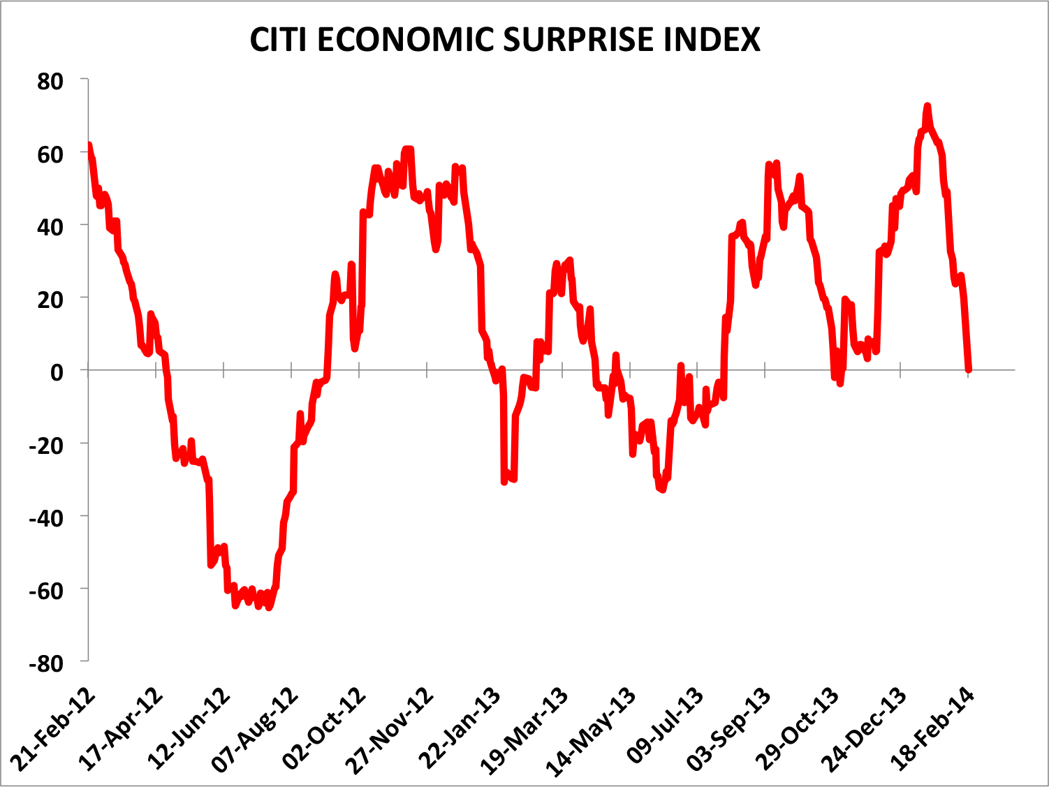
Yesterday we saw a gap down in European and US stock markets on fears over Ukraine. Stocks then continued to sell off during market hours, but US stocks managed to recover some of the losses into the close. At the time of writing US futures are up on news that Putin ended military exercises near the Ukraine border. In fact, it had already been announced that those exercises would be completed today. News typically buffets the market but major trends and turns are set by other factors. If stock markets topped out on Friday then I suggest more relevant is the telling developments in indicators and the relevance of new moon peaks. If stocks have not yet topped out then it also won’t be due to news in the geopolitical arena, and we might point to the strength in cumulative advance-declines and renewed interest in cyclicals. So let’s put Ukraine to one side and see how things look after yesterday’s action.
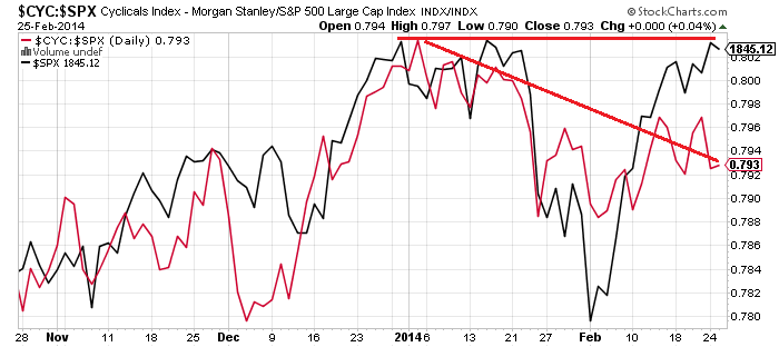
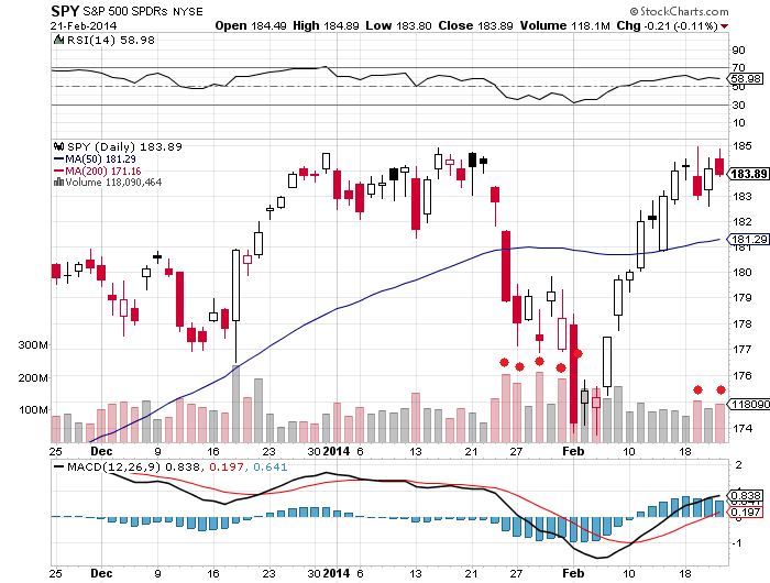
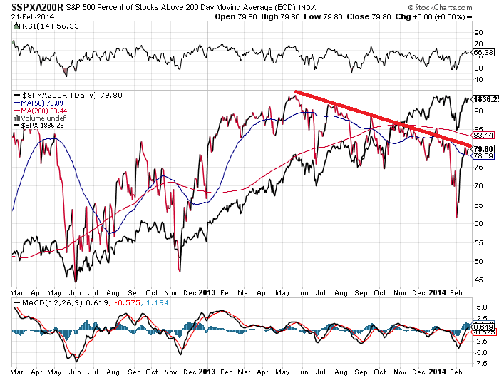
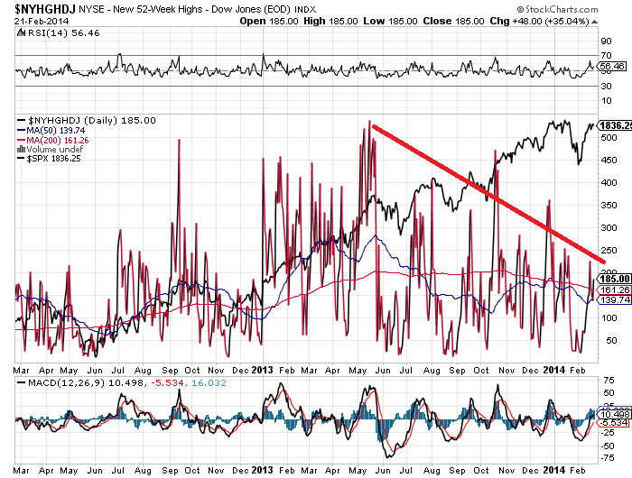
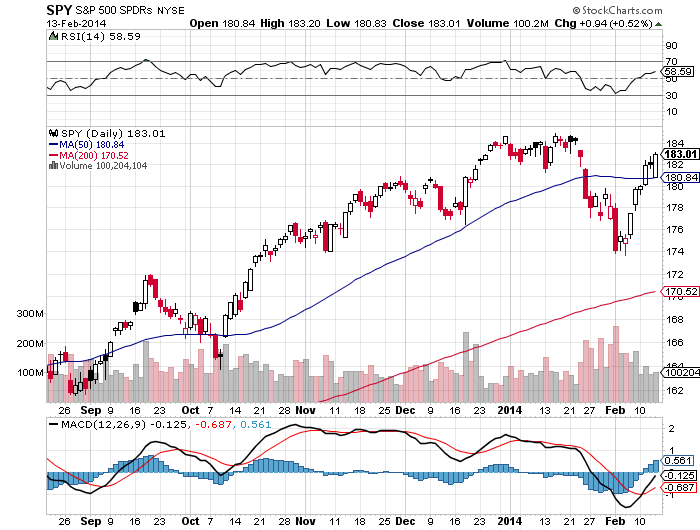
1. SPY shows what looks like a bull trap. My suggestion last week was that the marginal new high on divergences would be the bait to lure in the last of the ‘dumb’ money. The rip in the overnight futures could set the scene for the gap left yesterday to be filled before downside renews. Volume and RSI divergence are bearish. Cyclicals repaired their January weakness, particularly in the last week, which is bullish, but there is a divergence with the higher high on SPY as shown. If SPY breaks higher again and cyclicals make a new high, then that top may be postponed.
 Source (and other charts below): Stockcharts
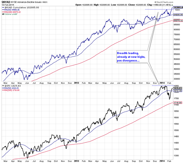
2. The Nasdaq 100 (black line) has room to pull back further before retesting the January high, whilst the breadth divergence continues:

3. On the longer term view, the Nasdaq 100 is creeping along the top of its bull channel since 2009. If it can break up and away from here that would be a particularly bullish development, but I put higher probability on it being dragged back down into the channel, with the RSI divergence joining the breadth divergence.
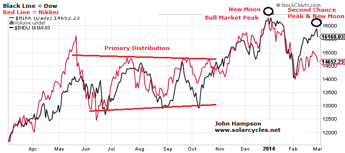
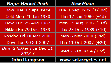
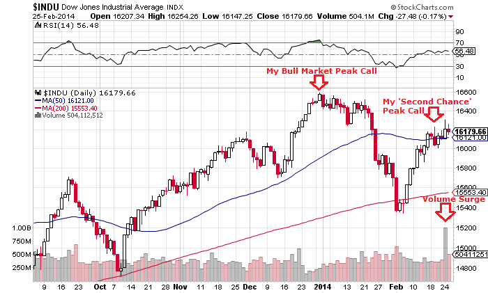
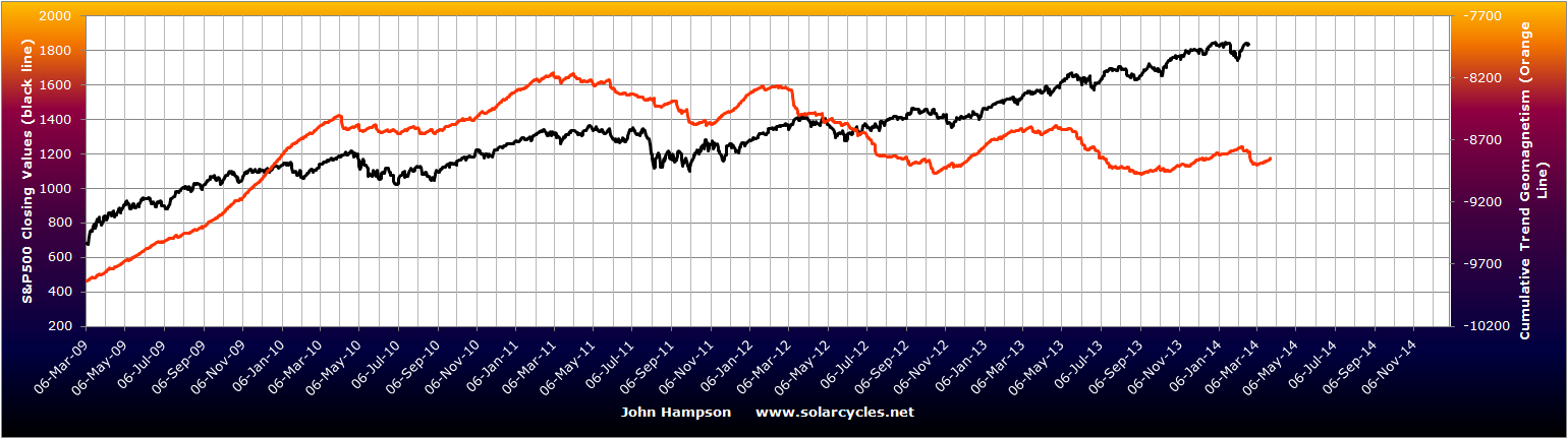
 4. The Dow and Nikkei continue to honour my 31 Dec top call, with their charts still mirroring the topping processes of the historical analogs. 31 Dec was 1 day from the new moon and at the inverted geomagnetic seasonal peak, and if Friday turns out to have marked the peaks in the other US indices then that was also one day from the new moon and at the turn into the seasonal lows of March and April.
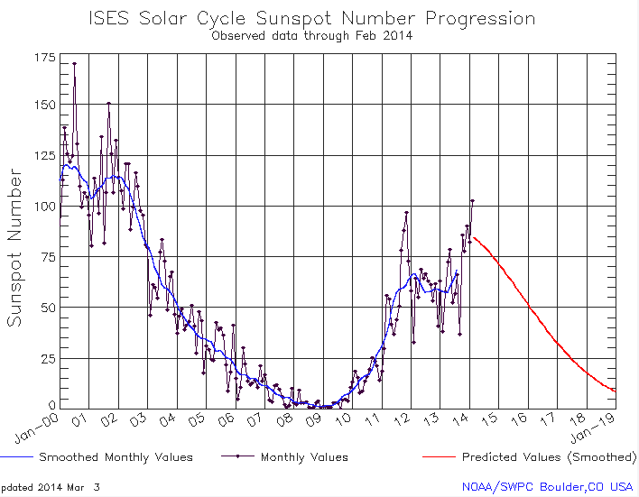
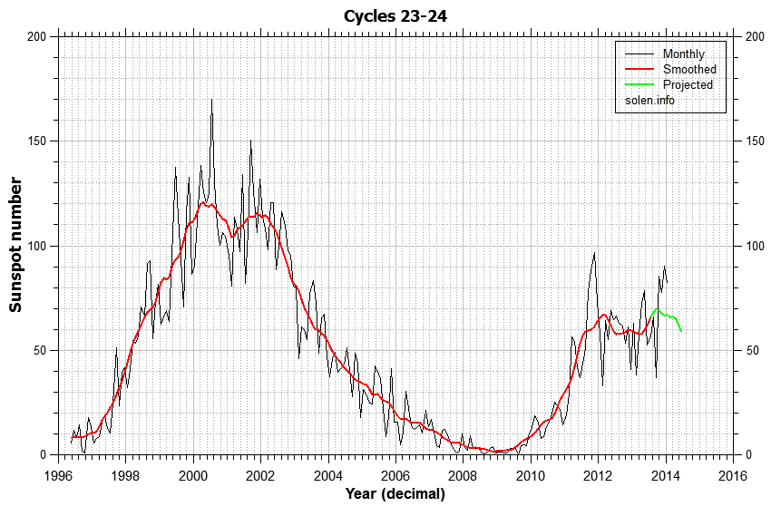
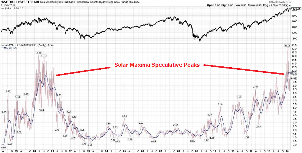
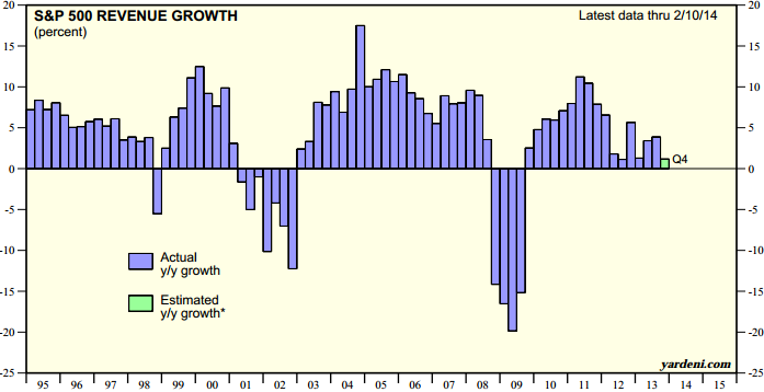
 5. My bull market peak call was also very much related to timing the solar maximum, and below are the updated sunspot charts of NOAA, SIDC and my own. It now looks more certain that the smoothed solar peak (blue line on NOAA, red line on SIDC) will turn out to be around now rather than the earlier peak of Feb 2012, which fits with speculation peaking out now rather than back then. Historically, markets tend to peak close to the smoothed solar maximum and on a monthly sunspot spike. A top at the end of December fits both, and we see evidence of accompanying developments as we turned the year such as Bitcoin peaking, trend reversals in treasuries and gold, and historically high trading volumes and insider selling in January. However, we actually made a higher monthly sunspot spike in February, and that could partially explain why other stock indices made higher highs in that month. NASA agree with NOAA and Solen in predicting the smoothed solar maximum to be behind us and waning from now, but SIDC still have that as one of two options, with the other being a mid-2014 smoothed maximum. If that turned out to be the case then that, for me, would be the strongest reason for bull market continuation until then. However, I consider this lower probability than the smoothed maximum turning out to be the end of 2013.

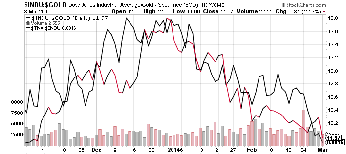
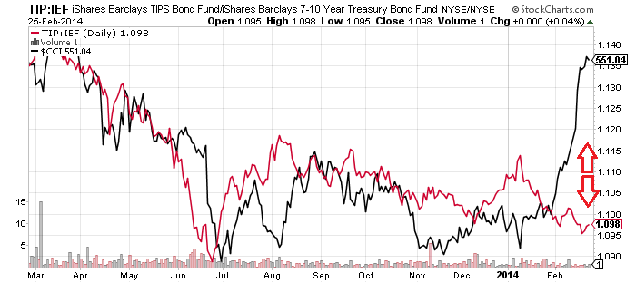
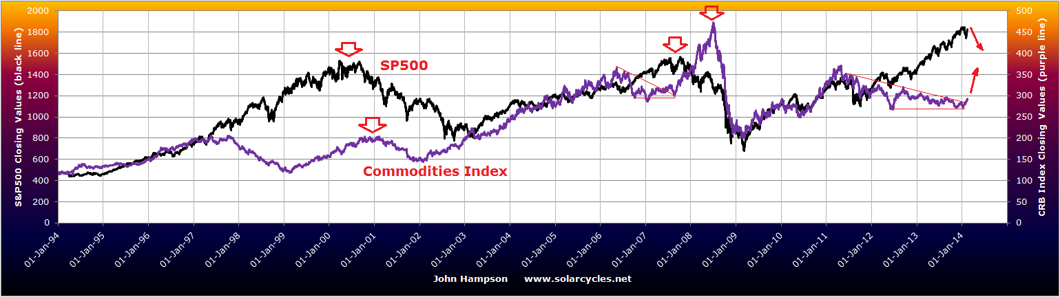
 6. Gold and treasuries continue to outperform stocks and is supportive of the 31 Dec relevance:
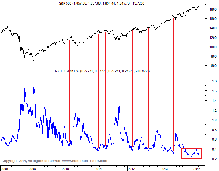
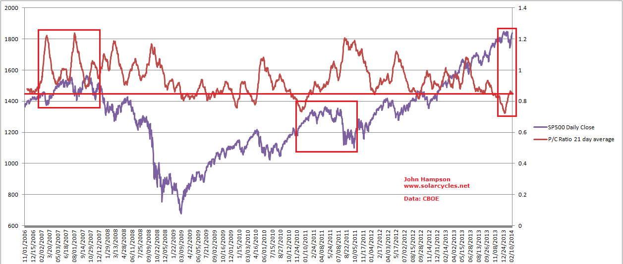
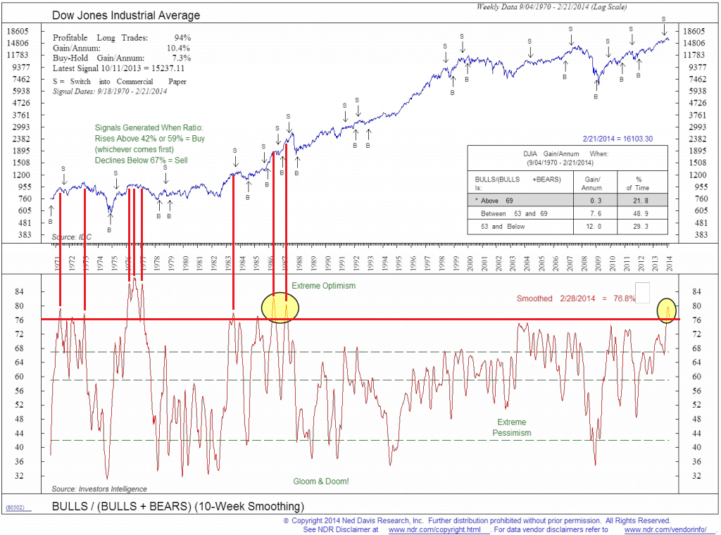
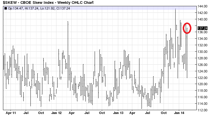
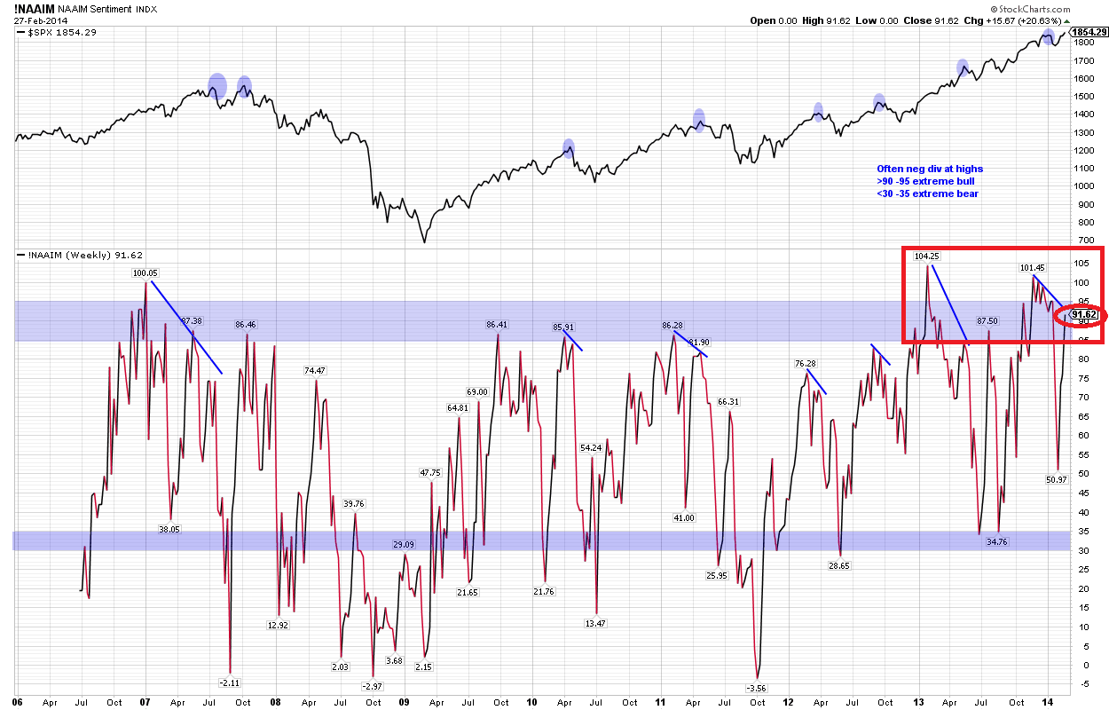
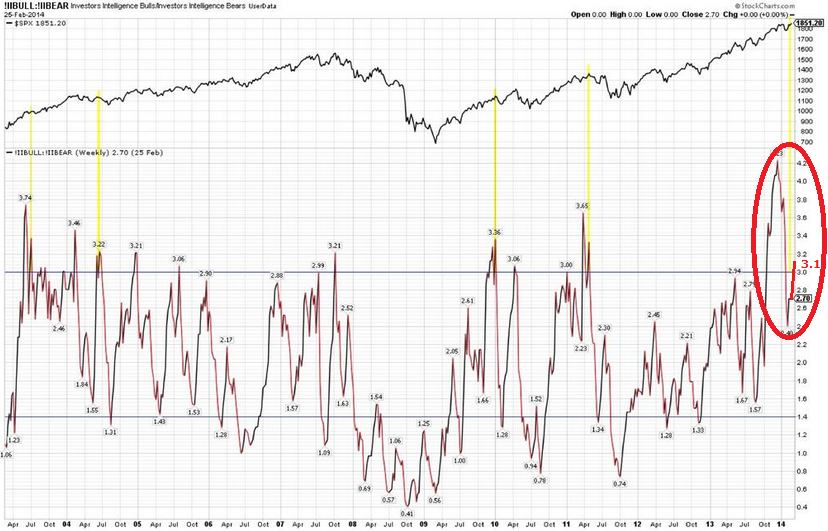
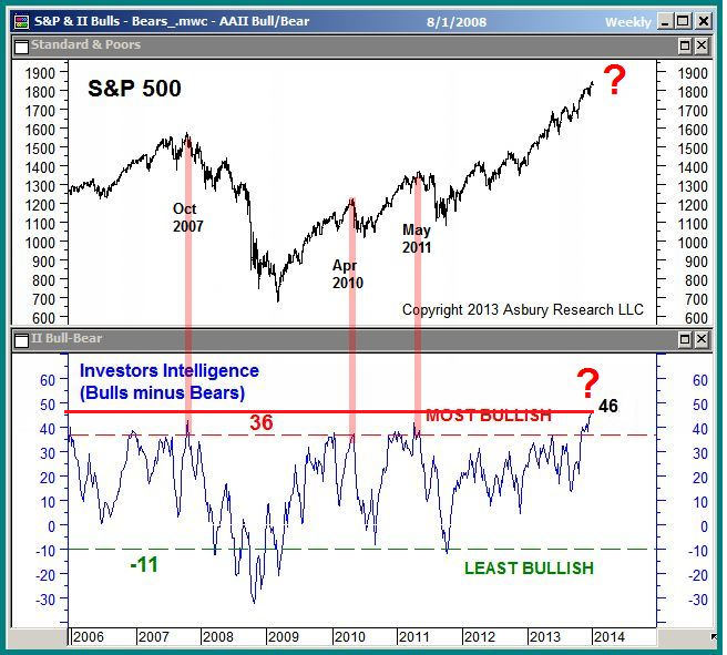
 7. Rydex cash levels and put/call 21 day average share similarities. They are not just at low levels consistent with market peaks, but at historically extreme low levels, that suggest high complacency, the kind of which could be a catalyst for the waterfall declines that I predict are imminent. The 2013 exuberance rally was key to generating these historic readings, whilst similarly postponing any meaningful correction into what I believe will be a super-correction. If we look at the the 2007 peak in the put/call chart we see less extreme complacency than now but also complacency resetting during the corrections in the topping process (the two spikes to over 1.2). This did not occur in the January 2014 sell-off and is another warning of an impending much deeper correction to come.
 Source: Sentimentrader
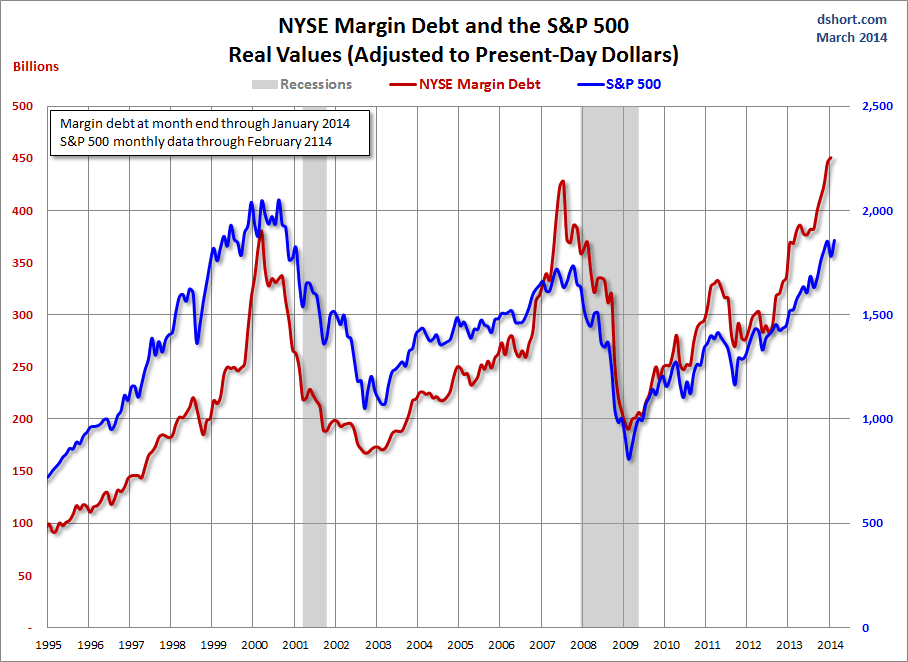
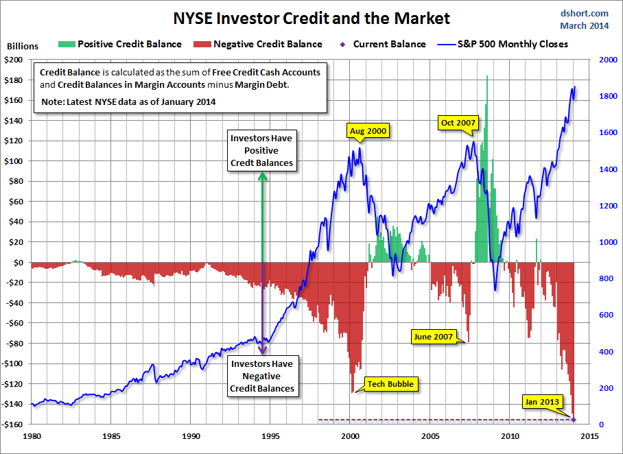
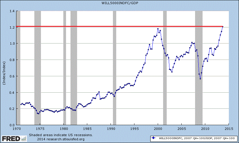
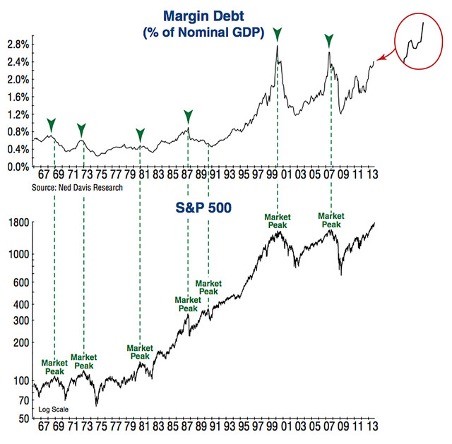
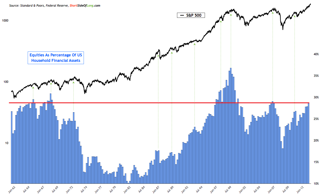
 8. Peak excess in equities is also reflected in these 3 charts. Retail investors have belatedly joined the party, as is typical at market tops, and global stock market capitalisation is back to 2007 peak levels whilst achieved on dwindling demographics in the major nations. We see lower overall trading volumes whilst investor net debt, real margin debt and margin debt to GDP (now at 2.72%) exceed 2007 and 2000 market top levels, i.e. less participants but more indebted and leveraged, and this fits with the historic complacency above.

Source: Ispyetf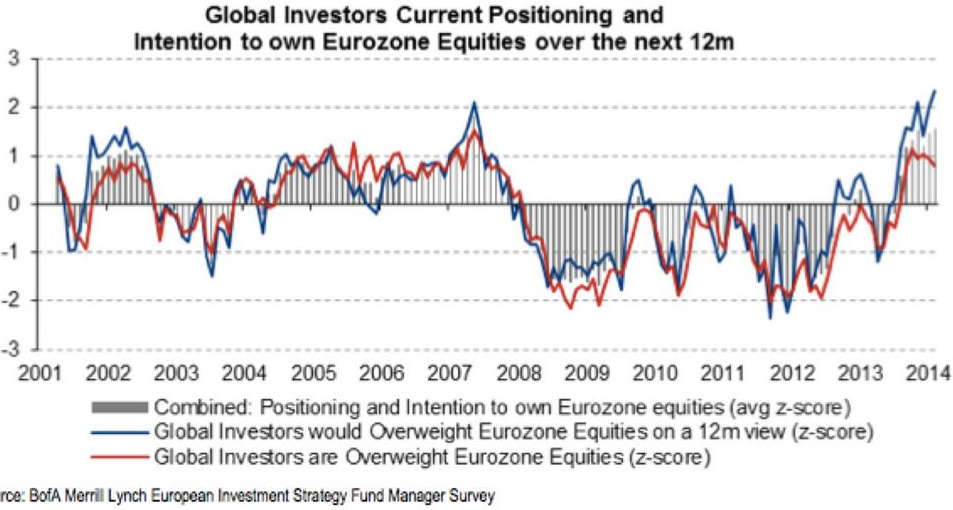
Source: U Karlewitz Source: Scott Grannis


