Brazilian Bovespa, Indian Sensex, Malaysian KLCI

Over the next 10 years there are certain countries (largely emerging markets) with demographic tailwinds which should enable strong equity bull markets (as per my conclusions here), whilst the majority of the G10 face demographic headwinds, which may not only offer poorer returns but potentially even losses in secular bear markets, like Japan 90-00. So I want to put greater focus on the site going forward on my pick of those with tailwinds.

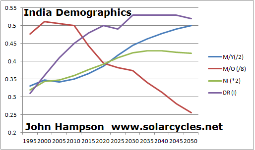
Out of the 24 I studied, South Africa, Nigeria, Poland, Russia, India, Turkey, Brazil, Malaysia and Indonesia had the best demographics looking foward. Out of these I have chosen Brazil, India and Malaysia to track on my site. I selected them because of relatively low corruption, sufficiently diversified economies, and healthy reserves versus debt. Brazil has an advanced tech sector, good oil supplies and one of the richest biodiversities. Equally important was having access to them on my trading platforms and having access to the data for their respective indices. I would have liked to have added one of Poland or Turkey to make even better geographic diversification, however data for both is not readily available. I plan to still invest in one or the other – most likely Turkey – but will limit the modelling on my site to Brazil, India and Malaysia.

Of course having positive demographic trends does not make for guaranteed good returns. Political and economic mismanagement, conflict, regional crises, large natural disasters and a number of black swans are all possible. But all three countries are fairly established and large economies, on the cusp of leaving emerging to becoming developed, and my plan is to spread my risk by investing in all, with the addition of Turkey or Poland, in case one stumbles.

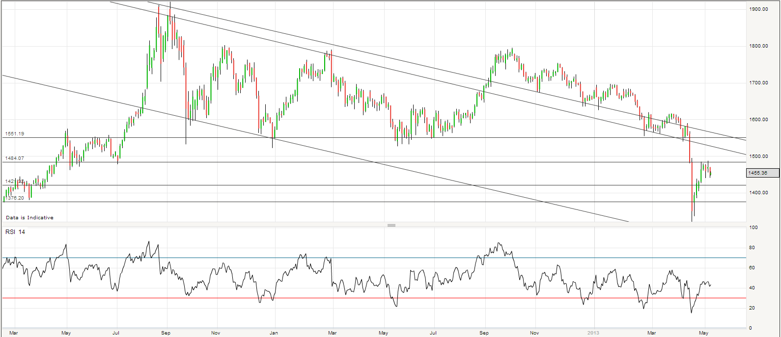
So, I have compiled data for the last 4 years: sufficient to judge lunar and geomagnetic responsiveness, whilst balanced against time demands. Here is the geomagnetic model for the last 4 years versus Brazil, India and Malaysia stock indices:

a40

a42

a43

All three demonstrate fairly good relations with the geomagnetic model. It is tentative of course, but none are so out of sync with the model as to render its use redundant, and this is largely to be expected as geomagnetism should affect sentiment globally. The geomagnetic forecast and models will be updated tomorrow as usual, so these three will now join the updates.

I then studied returns in relation to lunar phase oscillation over the last four years and here is the summary:

13may20131

All three countries demonstrated higher returns within the lunar positive period (buy on the 4th day after a full moon, sell on the 4th day after a new moon) compared to the lunar negative period (buy on the 4th day after a new moon, sell on the 4th day after a full moon). The least powerful differential was found in Malaysia, yet in the Dichev and Janes study which covered a longer timespan, they found the Malaysia KLCI to be one of the most sensitive to the lunar oscillation. Dichev and Janes did not include India or Brazil in their study, but the results in the table above suggest fairly potent lunar oscillation, with India particularly impressive. I therefore (again tentatively) suggest trade-timing using lunar oscillation should work in these countries.

In conclusion, the Brazilian Bovespa, Indian Sensex and Malaysian KLCI have demographic tailwinds looking out over the next 10 years, which should add to the probability of strong secular equity bulls in these countries. They also compare more favourably to other positive-demographic countries, such as Nigeria, Russia and South Africa in terms of lower corruption, unemployment or more economic diversification. Collectively, they provide sufficient risk diversification and geographic diversification, to which I will be adding Turkey or Poland. However, due to data availability, my tracking on the solarcycles.net will be limited to Brazil, India and Malaysia, and all three demonstrate sensitivity to geomagnetism and lunar phasing, which should provide two tools with which to improve trading returns in these indices.

Sunspots, Equities, Treasuries, Commodities, Inflation, Money Velocity, Interest Rates And Demographics

Time to draw them all together and see the full correlations. This is US-based analysis due to data availability.

The first chart (click to view larger) reveals historic spikes in US interest rates, 10 year treasury yields, MZM money velocity and US inflation (averaging official CPI and Shadowstats data) all within a 2 year period around the solar maximum (note the 1968 solar max was November and the 1979 solar maximum December, hence the 2 year boxes following; also note some of the measures have been scaled to share the same chart).

10may20131

Stepping back further in time, the 1947 solar maximum was accompanied by a 1947 inflationary peak, followed by spikes in corporate bond yields by 1948 and treasury bond yields by 1950.

If the next solar maximum is ahead in Autumn 2013, then by history we should see spikes in rates, yields, velocity and inflation within around 2 years of each other and of the solar maximum. Is it different this time because the government has acted to surpress both interest rates and bond yields? With velocity correlating closely with bond yields, is an inflationary peak not going to happen this time? I believe it will happen, as the same surpression occurred in the 1940s and yet the spikes took place.

The second chart (click to view larger) adds in real commodities using the CRB index adjusted for inflation (and again scaled). Interestingly, real commodities behave very similarly to rates, yields, inflation and velocity – all moving together into peaks (orange boxes) and troughs (red boxes), over periods lasting around 3 years.

10may20132

There is a general pattern of collective peaks around each sunspot peak, and additional collective peaks before solar mimima. I don’t yet understand why we see rallies leading into solar mimina, however they have historically set up the panics and crashes that occur at the solar minimum. Nonetheless, yields, commodities, velocity and inflation all acting together is suggestive of waves of ‘human exctitement’ that brings about speculating, buying and circulating money in the economy, or the opposite.

The third chart adds the real inflation-adjusted S&P500 and US demographics trends (middle to old and middle to young ratios combined) into the picture. Here we again see evidence of ‘human excitement’ correlating with sunspot peaks as some combination of real stocks, real commodities and inflation spike up around the solar maximum.

10may20133Demographic trends appear to be important for real stocks to peak, whilst commodities appear to behave opposite to demographics.

In summary, there appears to be a 4-way correlation between equities, sunspots, demographics and inflation, whilst there appears to be a 5-way correlation between rates, yields, velocity, inflation and real commodities. My solar-theory take on it is that the same phenomenon of human excitement (driven up and down by the solar cycle) translates into trends in buying, asset speculation and circulating money, hence the united correlations, whilst demographics (which also have a solar input: solar maximum peaks (and occasionally troughs) in births) additionally feed into equities due to investment/disinvestment in equities, relating to retirement.

I’d be interested in your thoughts on any of the correlations in the charts. I suspect there is more to be teased out.

State Of The Markets

Here is the latest picture for pro-risk proxies. A new uptrend appears to have begun in late April, following an overall downtrend since the turn of February (equities traded overall sideways).

8may20131Source: Bloomberg

Developments are still very much in keeping with 5-models-in-alignment (this post), and if their collective forecast holds good then the next and final top should be June/July for equities. As it happens, the last two cyclical bulls in equities ended with a steep wave up lasting around 12 months:

8may20139

Source: MSCI

The current wave up began June 2012 and so its termination around June 2013 would fit with the last two cyclical bulls and also the 5-models prediction.

A top right here in equities appears unlikely as divergences in breadth have been largely rectified over the past couple of weeks, which combined with breakouts in US and German stock indices, looks good for further near term gains. Plus the overall geomagnetic trend remains upward, looking out to the end of May.

Note on the Bloomberg chart the sharp upturn in treasury bond yields over the past week, and this is also reflected in action in German bunds, UK gilts and even Japanese bonds, despite the government’s doubling of QE:

8may201310

Source: Bloomberg

An interesting development. Recall the close relationship with money velocity, and the potential basing that has been occurring in both over the last 12 months. We need to see follow through on this if it is to be meaningful.

Another interesting development is in crude oil:

8may20132

Crude failed at an upwards breakout attempt in mid-April, but then failed at a breakdown attempt, and has now completed a reversal of a reversal back to the top of the large triangle. Can it break out this time?

Meanwhile gold has partially retraced its falls and we see how it shapes from here. Some kind of W-base would be normal, i.e. a second low. If that is a higher low, then that would be bullish for gold.

8may20137

Central banks are acting supportively for gold. Their combined gold purchases came in at record levels in 2012, and they continue to ease, devaluing currencies and cash, with both the Australian and Eurozone central banks cutting again in the last couple of weeks:

8may20133Source: Action Forex

This is in response to a weakening that we have seen in economic surprises and leading indicators. Here is the latest global PMI reading, still positive (i.e. growth) but weaker than last month:

8may201311Source: Markit

However, there are reasons to be optimistic for a renewed strengthening ahead in the global economy. Falling commodity prices over the last 6 months should have pulled down input costs giving the economy a boost. Plus, narrow money is still positive as a leading indicator of industrial production (normally by 6 months):

8may20134Source: Moneymovesmarkets

Furthermore, breaking down narrow money trends, emerging markets look set to outperform developed markets from here, which should produce a strengthening in emerging market industrial production:

8may20135Source: Moneymovesmarkets

And there is historically a correlation between commodity prices and emering markets industrial production:

8may20136

Source: TheFaintOfHeart

Agricultural commodities could also benefit from continued global wierding extremes. In the US, 60% of the country is in drought or dangerously dry, it is the second coldest Spring start on record, but then there is record breaking heat in the Southwest and record high river levels in the Midwest. Drought, flood, freeze and bake – really an ideal mix to decimate crops. And returning to crude, geopolitics have the potential to push oil higher if hostilities in the MiddleEast continue to escalate.

The other potential driver for commodities is the normal rotation into cyclicals at the end of a bull run. Money should switch out of defensives into oil and industrial commodities, amongst others.

One step at a time as always, but I see improving chances of my primary scenario coming good, namely that a solar-maximum inspired inflationary peak and secular commodities peak lies ahead. Sunspots have been in a solid uptrend of late, and if there is a correlation between rising sunspots into a solar maximum and speculation in the markets then speculative behaviour has certainly been in evidence. The primary scenario likelihood would be much further enhanced if treasury yields can continue to rise and with them money velocity, plus if oil can break upwards out of its triangle, and the outperformance in emerging markets and commodities takes hold. We need to see a renewed strengthening in economic data, particularly leading indicators, to provide the backdrop for speculation into risk assets. Inflation will follow if yields, velocity and commodities all rise.

In the near term I see good chances that pro-risk can rise together into June/July, so I am holding all positions for now. However, the lunar positive period ends on Monday so there is higher risk of a correction or consolidation in the subsequent fortnight.

Demographics And The Next Secular Stocks Bull

Four demographic measures have been demonstrated to have a correlation with economic, stock market and real estate market performance: middle to young ratio (35-49 year olds versus 20-34 year olds), middle to old ratio (35-49 year olds versus 60-69 year olds), percentage of net investors (35-39 year olds versus the whole population), and dependency ratio when inverted (0-14 year olds plus 65s and over versus 15-64 year olds). Using the population pyramids based on the United Nations 2011 population data and projections I have modeled 24 countries on all four measures and you can see these charts on my new Demographics page HERE.

The data points are 5-yearly and I have modeled the period from 1995 through to 2050, so that we can see the trend leading into our current point in time and the projections forward. Based on the wider research on my site, my forecast is for a secular transition to a new K-Spring from the period around 2013’s solar maximum, namely that secular bull markets in bonds and commodities should give way to new secular bull markets in stocks and real estate in a gradual transition, with the first phase of momentum in stocks likely from around 2015 through to the next solar maximum of around 2025. By my recent analysis, not all major countries around the world will participate in secular stocks bulls in that period, as those with particular negative demographic trends are likely to miss out. The strongest secular stocks bulls should be in those nations with particularly positive demographics based on the four measures.

So let me cut to the conclusions from the data. Those countries with the strongest demographics 2015-2025 out of the 24 modeled are South Africa, Nigeria, Poland, Russia, India, Turkey, Brazil, India, Malaysia and Indonesia (with at least 3 out of 4 measures trending positive). Those countries with the weakest demographics 2015-2025, and likely to struggle to carve out secular bull markets in equities, are China, France, Spain, Germany, Italy, Australia/New Zealand and Canada (with at least 3 out of 4 measures trending negative). And lastly those that are in between (more ‘neutral’ demographics) are USA, UK, Mexico, Canada, UAE, Ireland, Vietnam and Japan.

Therefore, based on demographics, the best returns for equities are likely to come in East Europe, South America, South Asia, ASEAN and Africa. Unimpressive returns should be made overall in the ‘developed’ world, with Western Europe perhaps struggling the most. Out of the top 10 largest economies in the world, we might expect Brazil, India and Russia to play a greater role in pulling the world economy and stock markets along, whilst China, Germany and France may be dragging their heels.

Compare Nigeria and France, at opposite ends of the demographic trend spectrum. Here is Nigeria, showing all four demographic measures (which have been scaled to share the same chart) trending positive between 2015 and 2025.

6may20131And here is France, with all four measures trending negative in the same period:

6may20132Some potential investment vehicles to capture the best demographics would be Spdr S&P Emerging Europe which is Russia(56%)-Turkey(23%)-Poland(13%), or Market Vectors Africa ETF with the two largest country holdings Nigeria and South Africa, or Advanced Frontier Markets ETF whose biggest holdings are Nigeria, Vietnam and Gulf countries, together with smaller holdings in many of the less accessible countries with better demographics. There are multiple investment options for the bigger countries such as India and Brazil. Beware ’emerging markets’ ETFs as they often include China, Taiwan and others.

If my primary forecast plays out for a secular commodities peak then a cyclical stocks bear and mild recession before a momentum ‘go’ point as of 2014-15 then the opportunity to load in to these stock markets may not be until then. However, I may be wrong with the timeline of developments, and not all markets will take off at the same point, so another consideration would be which of those positive-demographic markets are currently ‘cheap’ and therefore unlikely to be at risk of much price downside. The cheapest current by p/e include Turkey 12, Poland 10, and Russia at 5.6 with a 4.6 yield. Alternatively, Japan’s stock market appears to have technically broken into a new secular bull already and is belatedly catching up with demographics which turned upwards (not all 4 measures) as of around 2005, so I suspect could already be a buy.

Many of the ’emerging’ markets in the positive demographic list look similar to this, India’s combined chart:

6may20133Three positive trends and one negative, with the negative being the middle-old ratio. This is because until recently people in relatively poorer nations rarely reached old age. In the first half of this century they should see an increasing amount of people reaching old age and therefore the ratio versus the middle aged goes from negligible to something of significance. Nonetheless, the old age populations in these developing nations largely does not become problematic until much further out, unlike the large relative numbers reaching old age in many developed countries as of now.