Second Chance Peak

Friday was a bullish fightback, but I still think the roll over is in gradual progress here. Here’s why I think the markets are at the second chance peak, rather than earlier in the topping process.

It’s fairly clear on RUT, IBB and SOCL: the nominal peak was Feb/Mar and second chance lower highs have since been made, in keeping with historic norms.

19jul7

Source: Stockcharts

It looks acceptable on COMPQ too – a marginally higher high on negative divergences is not uncommon. But the large cap indices of SPX, INDU and NDX don’t appear to conform, making significantly higher highs, which are not in keeping with, for example, 2000, 2007 or 2011.

Nonetheless, we can see divergences initiated at the turn of 2013 into 2014:

19jul9

Source: Stockcharts

Bubble end flagged once around then and again now:

19jul5

Source: Financial Crisis Laboratory

In II bull-bear spread, we have seen two extreme peaks plus a divergence between them, which positions us where the markets tanked in both 2010 and 2011 (rather than earlier in those peaking processes).

19jul4

 Underlying source: Jack Damn

Ditto the HYG:TLT divergence. We are more like where the markets finally rolled over in 2007, 2010 and 2011, than earlier in the process.19jul1

 Source: Jesse Felder

Put/call and Skew tell similar tales.

We also have seen extreme peaks and divergence in Rydex assets, which would position us where the wider markets finally broke down in Autumn 2000, rather than earlier in the topping.

19jul3

Source: Stockcharts

Margin debt peaked out in Feb. The 2000 and 2007 analogs again position us at the second/final peak, with July 2014 being 5 months after.

19jul2

Source: Dshort

We are likely now 4-5 months or so after the smoothed solar maximum. That would also position us around the second chance peak of 2000, rather than the initial peak (March 2000).

19jul10

Source: Solen.info

So what happened next in each of the applicable historic mirrors?

In 2011, the markets fell heavily over the course of 2 weeks. In 2010, the markets fell heavily over the course of 3 weeks, including an intraday flash-crash.

In 2007 and 2000, the markets entered definitive bear markets at this point. Bears firmly in control, with periodic heavy selling. I suggest 2000 is a more compelling mirror than 2007, because this is a solar maximum like 2000, with RUT and biotech p/es reaching similar craziness levels to internet stocks in 2000. Rydex, market cap to GDP and q ratio all look more similar to 2000 too. What’s missing here in July 2014 is that by this point in 2000, the speculative targets of the Nasdaq indices had already suffered waterfall declines, washing out that excess leverage that had built up. That hasn’t happened yet in 2014 (RUT, SOCL, IBB or COMPQ have seen no heavy selling) meaning it’s still ahead.

Going further back in time, I maintain 1937 as the closest historical mirror. As then, if this is the second chance peak, it falls around 5 months after the smoothed solar maximum. At this point in 1937, two months of heavy selling erupted.

19jul12

Drawing it all together, the messages are that heavy selling should be imminent, at least in the key speculative target indices and sectors, and that in the wider markets there should be no second chance retrace peak ahead for the bulls, but that we are rather currently rolling over into the definitive bear trend, at the end of a topping process that began in January. Yes, US large caps have made significantly higher highs versus Q1 2014, but the divergences and indicators tell the hidden story of this being the second chance peak.

I believe the definitive bear process has initiated on US small caps and European indices, since the turn of July. US cumulative advance-declines also peaked out then, and Vix bottomed. SP500 has yet to beat its start-of-July high, and although the Dow and Nas 100 have, they have done so on negative RSI divergences. Therefore, Friday’s up day should form part of the rolling over process for large caps, and nothing more.

Update

US equities unresolved still at the time of writing, but unlikely for long.

US small caps and European stock indices made a definitive trend change around the start of July, making what looks like second chance lower high peaks. The RUT was just unable to to take out its 4 March closing high, and as things stand the main speculation-excess targets of the R2K, biotech and social media all peaked end Feb / start March along with margin debt and the likely smoothed solar maximum. That’s a very close mirror of March 2000.

17jul4 17jul7There has been a sharp deceleration in sunspots over the last few days as can be seen on the chart above, which further enhances the likelihood of the smoothed maximum being behind us, putting equities on borrowed time.

Based on the analogs of 1929, 1937, 1987, 2000 US indices and 1989 Nikkei, the second chance peak in these speculative indices and sectors should give way to a fairly relentless bear trend. Since July 3rd, they have indeed been suitably persistently weak, despite large cap strength.

For the large caps, the danger, to the bears, can be seen on the monthly charts. The NDX and SPX are still in accelerating trends:

Screen Shot 2014-07-17 at 08.19.55 Screen Shot 2014-07-17 at 08.21.01The price action is consistent with the Nasdaq into 2000 or the Nikkei into the end of 1989. On a zoomed-out monthly view the shaping looks to some degree parabolic, but on a daily basis the action was not always up and nor is it now.

Despite the Dow printing a new high again yesterday, there have been some subtle changes recently. Gaps up have not run but petered out, some gaps down could not be recaptured intraday. NDX, INDU and SPX are all in the realm of potential double tops with 3 July, and volume has picked up the last couple of days. Divergence with small caps and European indices is unlikely to be maintained for long, meaning either they pull up and recover or US large caps roll over. I refer you to my last post and many previous charts as to the compelling case for it being the latter, and here a couple more:

17jul1

Source: Rory Handyside17jul2

Source: Jesse Felder17jul3Source: AThrasher

The record stretching of indicators, both in values and by time, means the correction, when it comes, is likely to be nasty. The leverage and lop-sidedness that has been built up suggests there will be a period of waterfall selling. I don’t share the view that the stock market will correct, say, 10% and make a new high into 2015. When US large caps roll over, too many indicators suggest that will be it. As noted above, I believe this is the second chance peak leading to the eventual sharp falls. Unlike 2000 and 2007, large caps have made higher high second peaks, rather than lower peaks, perhaps in keeping with the solar cycle and its unusual higher second peak. But behind these large caps higher highs second peaks, the divergences and indicators have been telling, such as margin debt declining.

What I’m looking for. Those subtle changes, yesterday’s Bradley turn, and the potential double top here: large caps can roll over here and fulfil the last post’s charts warning of immediate decline, resolving the divergence with small caps and Europe to the downside. This is my focus. If large caps do tip over here, I will be back on the attack on the short side. If they do not, I will be looking towards 26 July, the new moon, and the rolling over of the geomagnetic seasonal calendar, as the next potential peak. I still can’t rule out the possibility of large caps continuing to accelerate upwards, but the developments in small caps and Europe and the subtle behind-the-scene changes mean the odds have shifted yet further towards large caps finally giving up. Regarding gold: it could not build up on the recent breakout so was sold-off again. I believe it will take off when large cap equities finally roll over.


Charts For A US Stock Market Peak Here And Now

1. Put-call extremes plus negative divergence as per previous peaks:

7ju3

Source: Rory Handyside

2. Skew extremes and clustering greater than 2011 peak:
7ju1

Source: James Goode

3. Implied correlation volatility reflects previous significant peaks:7ju2

Source: Rory Handyside

4. Investors Intelligence sentiment extremes and negative divergence per previous significant peaks:7ju8

Source: Jack Damn / my annotations

5. Sornette bubble end pop flagging:

Screen Shot 2014-07-07 at 07.53.18Source: Financial Crisis Observatory

6. Rydex assets extremes and negative divergence per 2000 peak:

7ju9

Source: Stockcharts

7. Margin debt already rolled over:

Screen Shot 2014-07-07 at 08.35.28

 Source: DShort / Fat-Pitch / my annotations

8. The solar maximum appears to be waning since a smoothed max of Feb/Mar 2014. In the modern era the biggest slack in smoothed maximum to market peak was the Nikkei 5 months after the smoothed solar maximum in 1989. June/July 2014 is 5 months after.

SolarCycleSpeculationPeaks 7ju10Source: Solen.info

 9. Asian indices appear to have already peaked:

7ju11Source: Stockcharts

10. European indices appear to have already peaked:

7ju12Source: Stockcharts 

11. Which leaves US stock indices, which are ripe to fall under divergences:

7ju13 7ju14 13ju17 7jul15Source: Stockcharts

There’s a lot to negate here if the end isn’t close at hand. Let’s see how this week develops…

Burned By The Sun

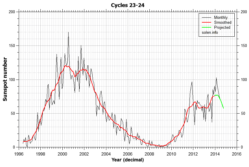
The evidence for a speculation peak delivered at the solar maximum is better than I could have hoped, yet I’m on the wrong side of it and feeling the pain. When I look back at this post that I wrote January 13, the multi-angled case that I had for a top is still very much applicable. So why have equities gone up not down since?

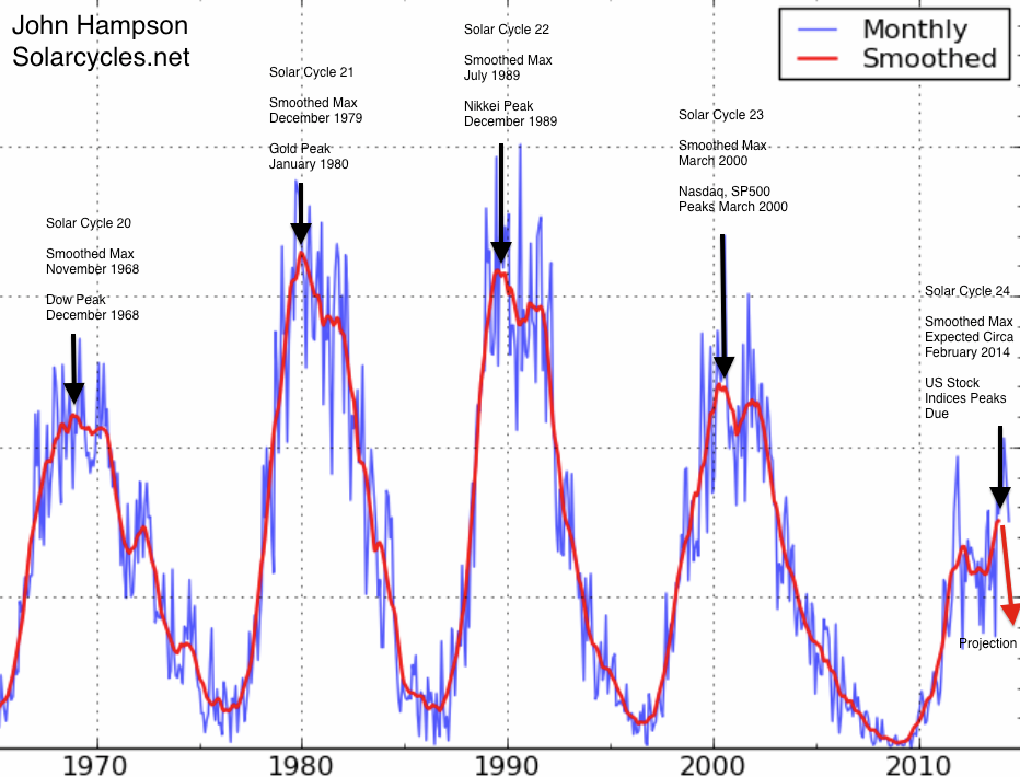
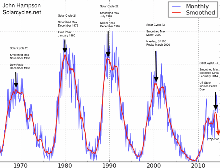
Firstly, the solar max extended beyond scientists’ predictions from late 2013 to what looks like a smoothed peak circa Feb/March 2014. Not much I could do about that. Since then we have seen solar activity retreat, along with margin debt. Drawing on the history of both combined, we can account for stock indices rising into Feb/March but not since. Some retrace in equities was historically normal, but not these persistent higher highs.

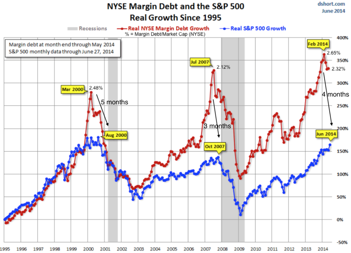
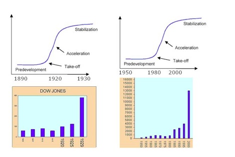
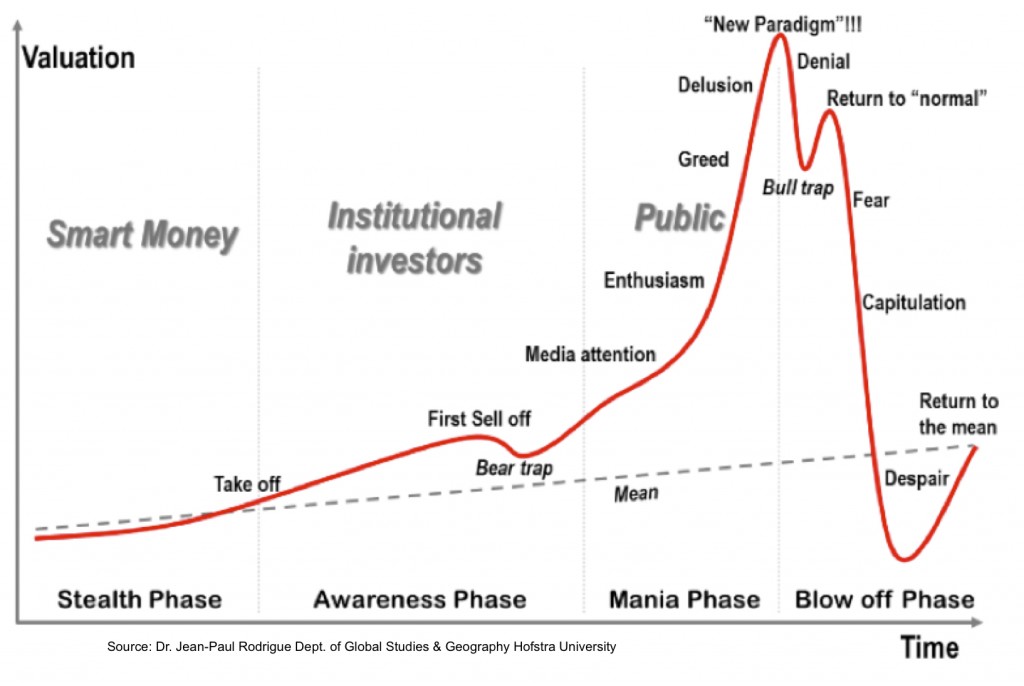
Secondly, it would appear we needed more mania. When looking back at gold 1980, Nikkei 1989 and Nasdaq 2000, it’s clear that the manias were fairly intense. Therefore, the record-breaking stretching of indicators that we are seeing seems appropriate with hindsight. I wasn’t trading in 2000 to experience it. The question is when is it all going to snap? There is evidence of both capitulation and ‘all-in’ which suggest the snap should be close, but more melt-up could yet occur before it finally rolls over.

Thirdly, leading indicators, as measured by narrow money, suggested a pick-up in the economy as of May. As equities were able to range-trade until we reached that point, strengthening data has since given them a tailwind to rally further. Those leading indicators now suggest growth could peak out at the end of Q3. So could equities rally and melt upwards for weeks and months yet? A more detailed look is required, so here goes.

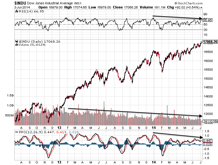
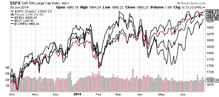
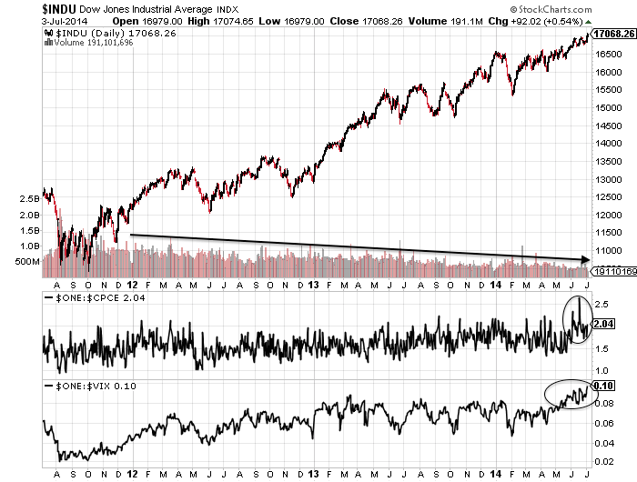
This is how the Dow looks. Volume has been ebbing away. Stocks can rally on thin volume, but those rallies don’t tend to stick. Volume is likely to return once it tips over. The action in the Vix and put/call ratio have an air of capitulation.

4jul11

 Source: Stockcharts

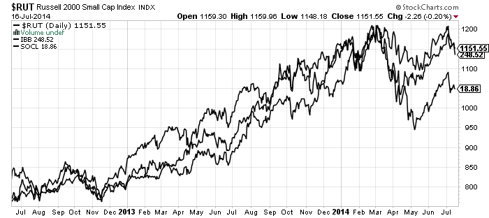
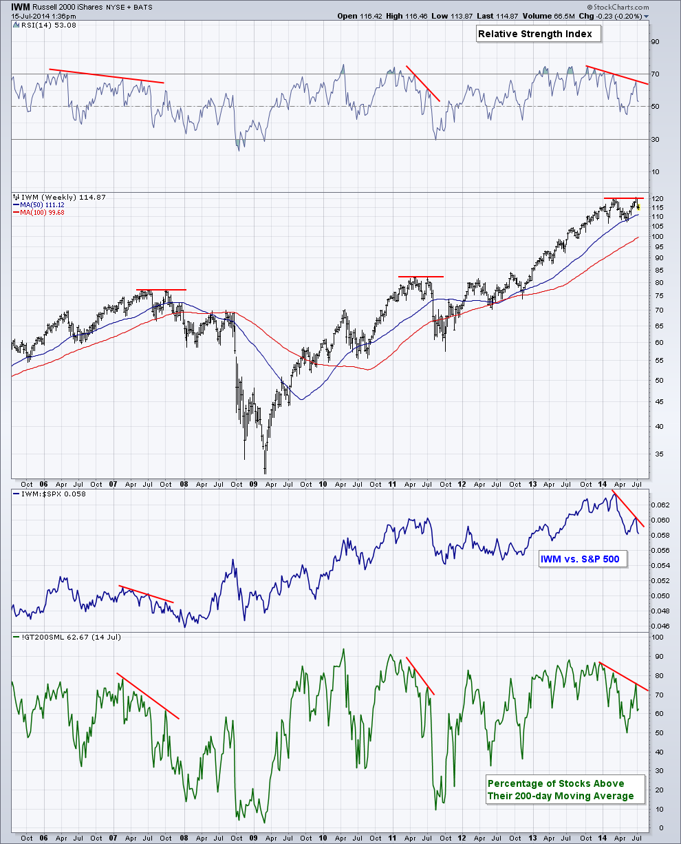
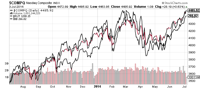
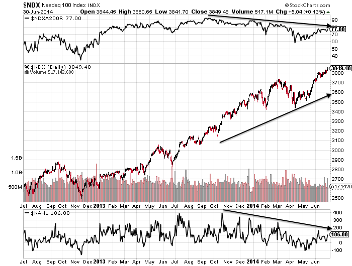
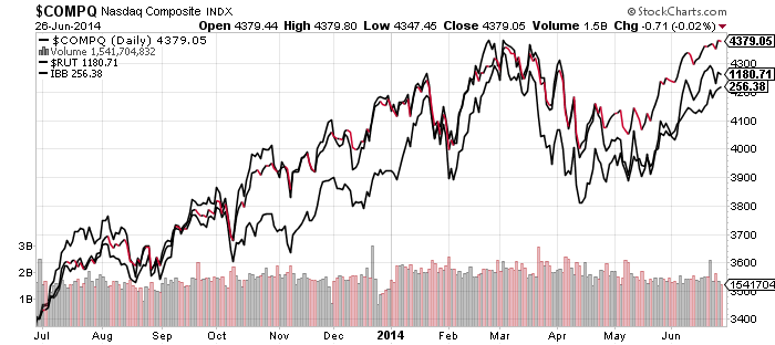
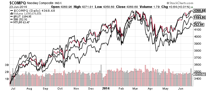
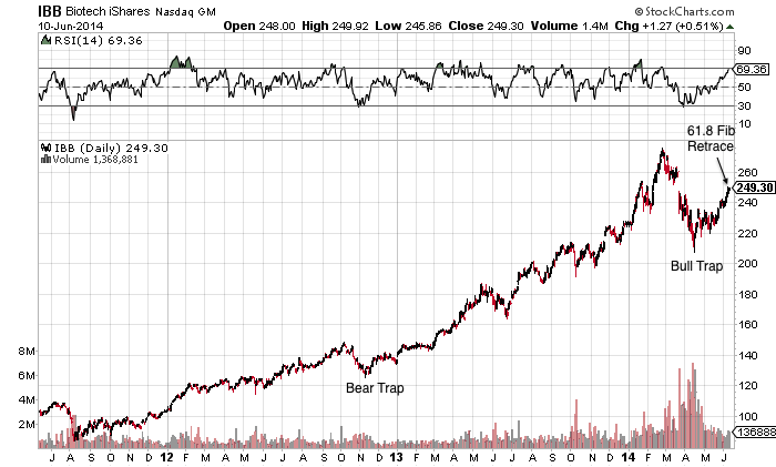
This is how RUT, COMPQ and IBB look:

4jul30

Source: Stockcharts

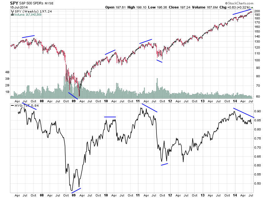
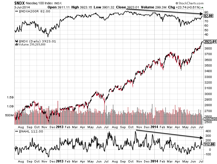
If equities were to roll over here, it would be more in keeping with developments in the solar max and margin debt.  The Feb/Mar peaks in RUT and IBB, two of the key speculative mania targets, would be maintained and this would fit with the likely smoothed solar max. Speculative peaks have aligned closely with the smoothed solar max in the era of global instant access, whilst certain indices peaked the same month as margin debt both in 2000 and 2007.

SolarCycleSpeculationPeaksIf, on the other hand, RUT and IBB break upwards and out in July and COMPQ puts some distance above its Feb/Mar peak, then it would be more anomalous. How do we account for stocks rising whilst leverage declines? Buybacks still strong, CLO leveraged loans still strong in Q2, thin volume rises, short covering? All applicable to some degree, but it’s still anomalous.

The way things stand, the best fit is still that we are in the vicinity of the last peak in a trio that began at the start of the year. That this is a final melt-up in large caps before the roll over. A trading range (primary distribution) before a final leg up was seen in 1929, 1987 and on the 1989 Nikkei. At the reverse end of the spectrum, 2009 saw a trading range before a final leg to the downside.

Screen Shot 2014-07-04 at 09.55.55 Screen Shot 2014-07-04 at 09.57.08

Screen Shot 2014-07-04 at 10.02.59

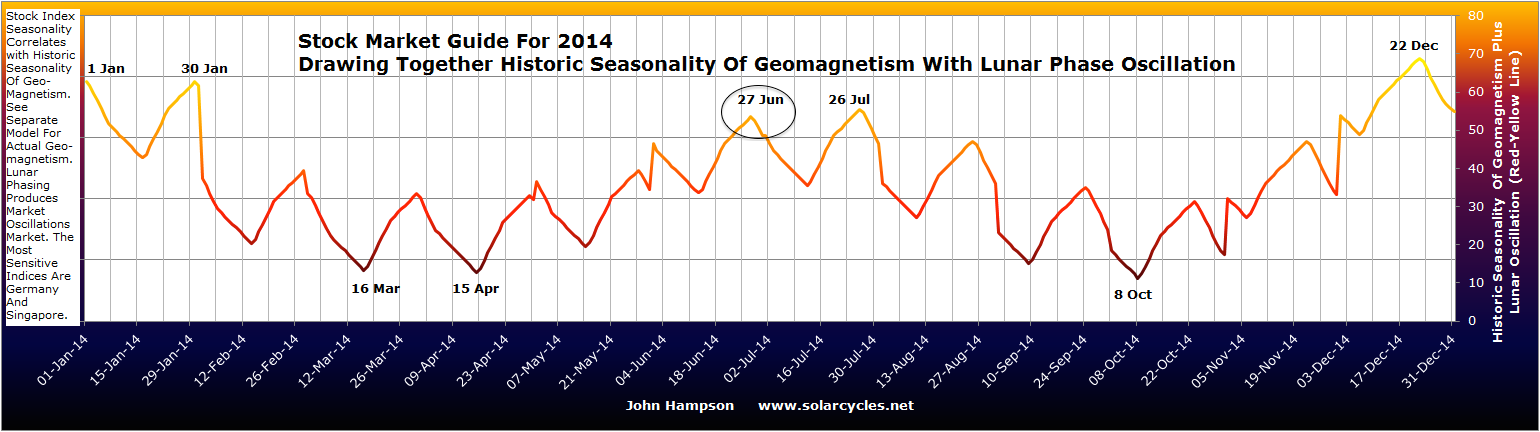
In all instances, the final overthrow leg lasted around 4 to 8 weeks. The current break out up leg on the SP500 is just entering that range. Averaging the price increases/decrease, we might expect the SP500 to reach over 2000 before rolling over. Earnings season starts next week, others have mentioned 15 July as relevant, and the seasonality of geomagnetism turns down definitively as of July. So maybe stocks can rally a few days more, reach over 2000, and then roll over against an earnings season backdrop.

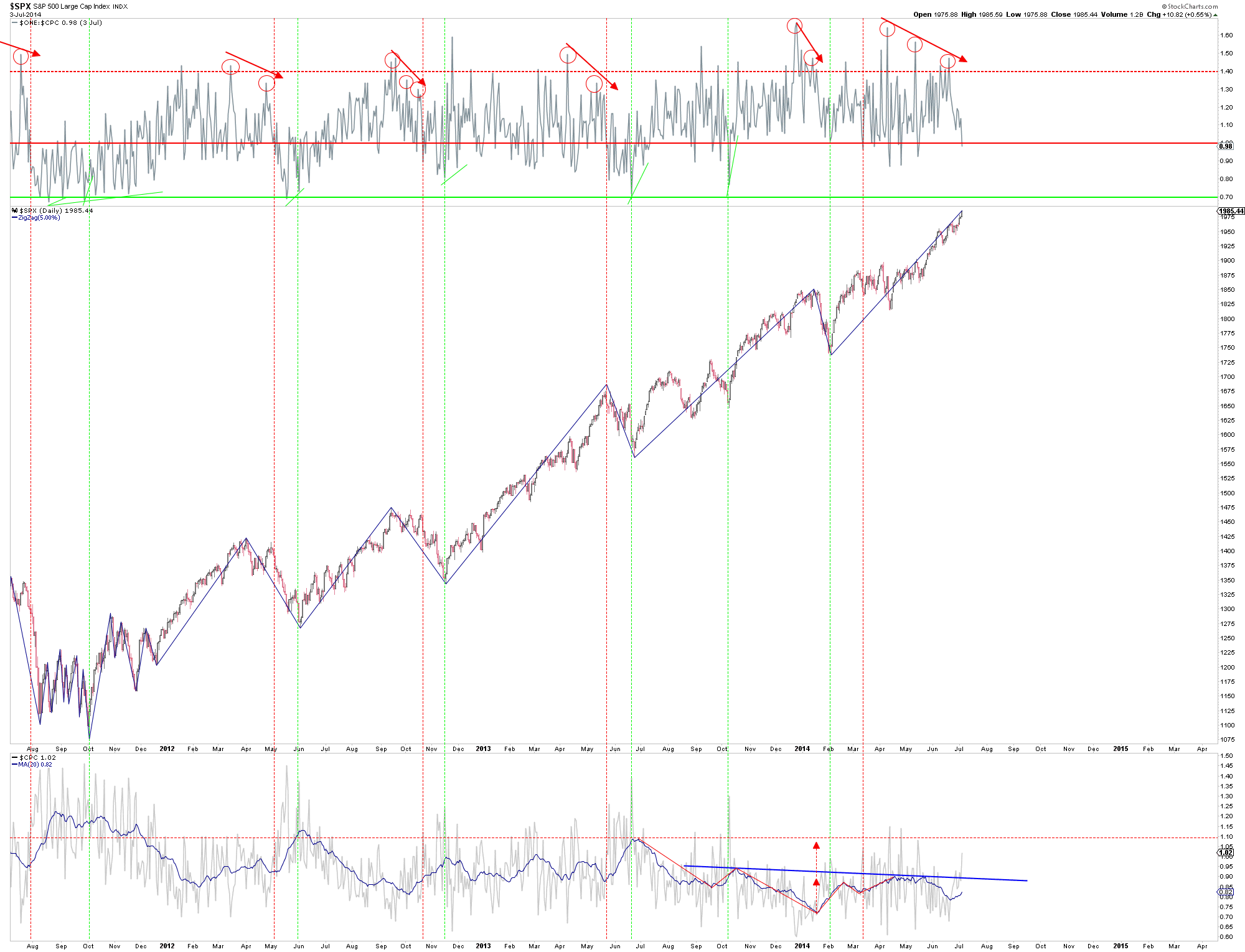
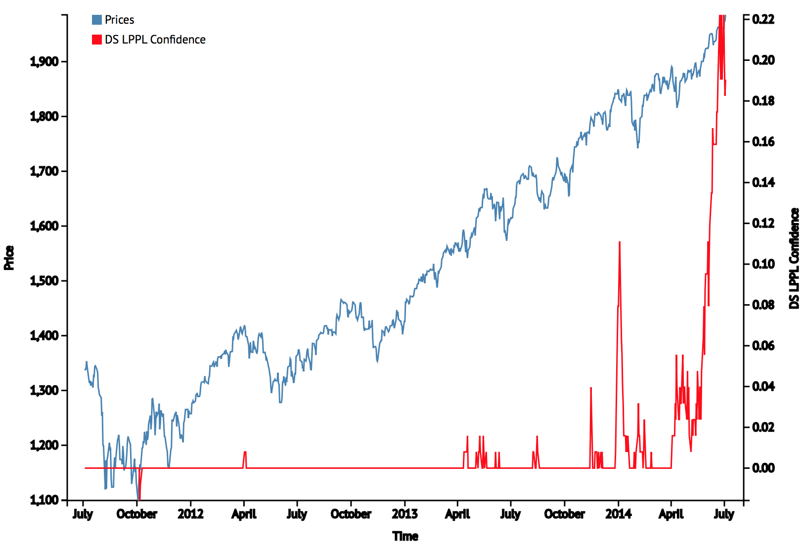
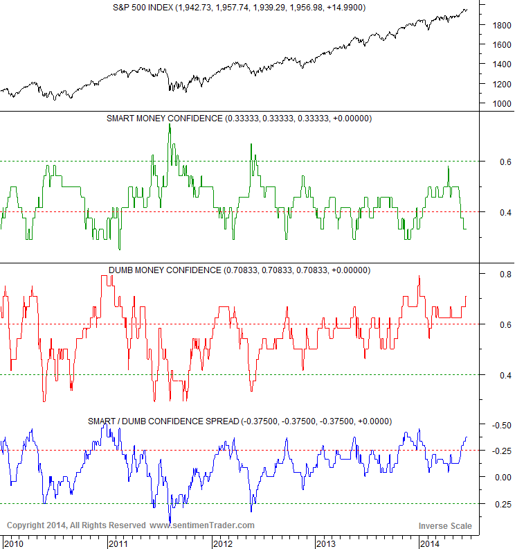
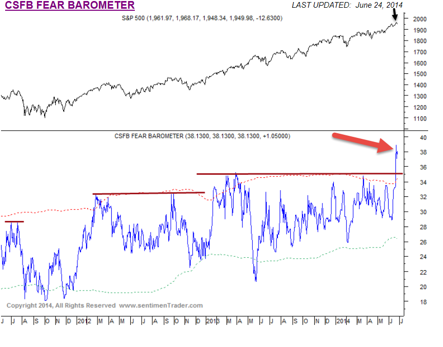
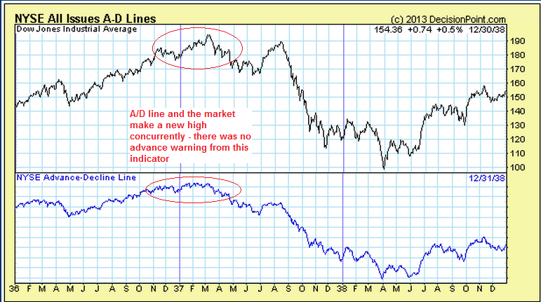
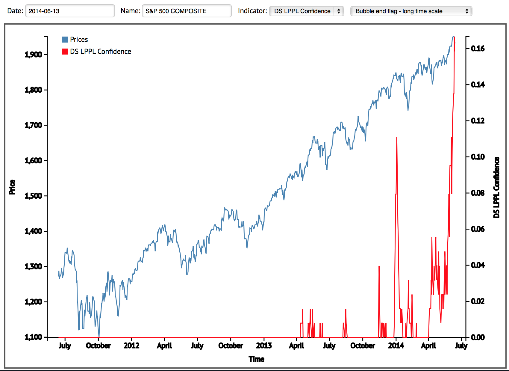
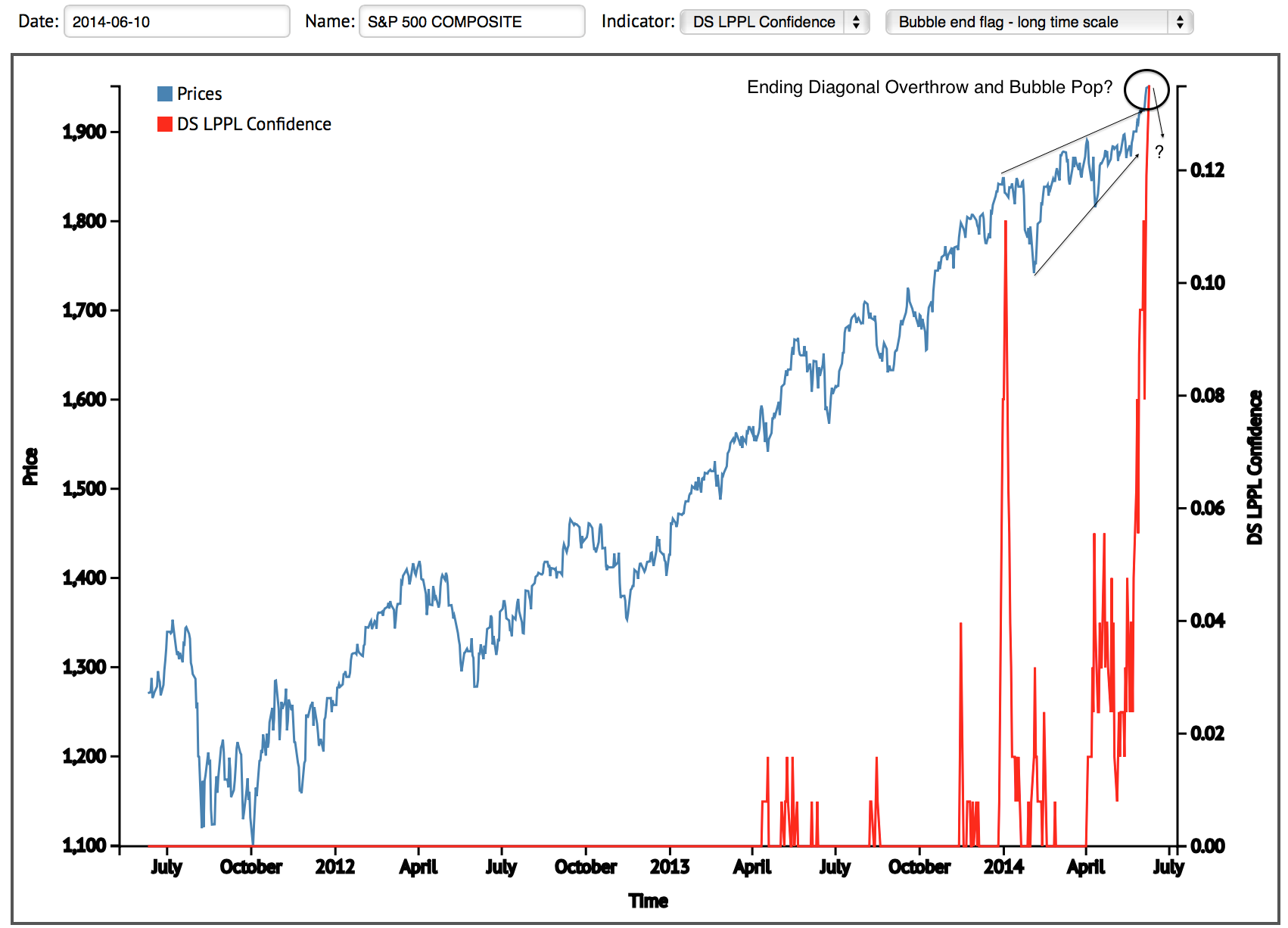
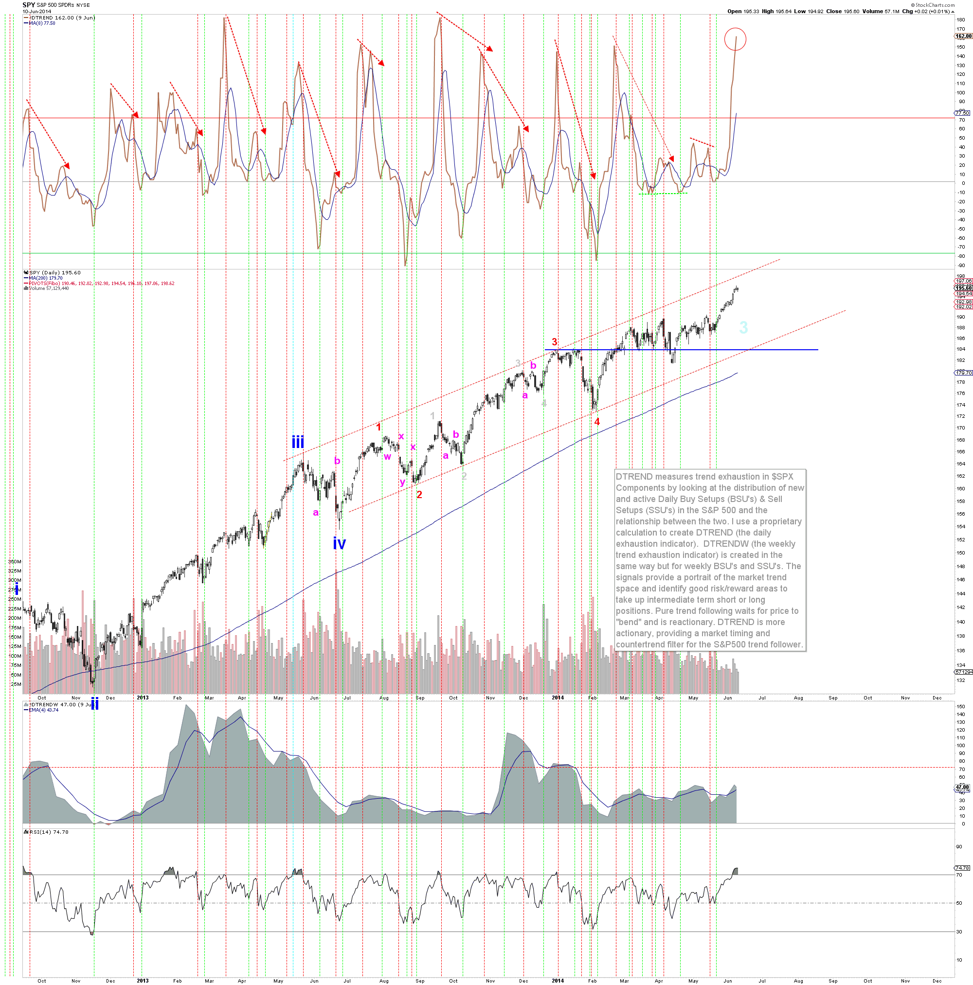
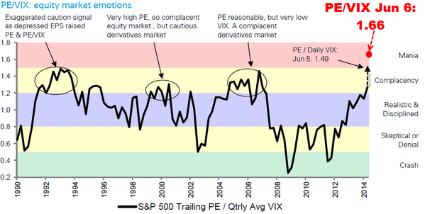
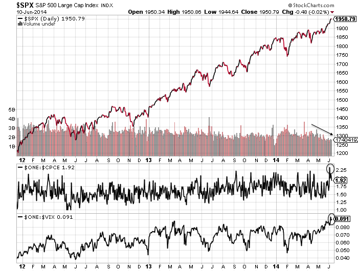
These six indicators are calling the market down with little scope for delay:

Screen Shot 2014-07-04 at 09.34.42

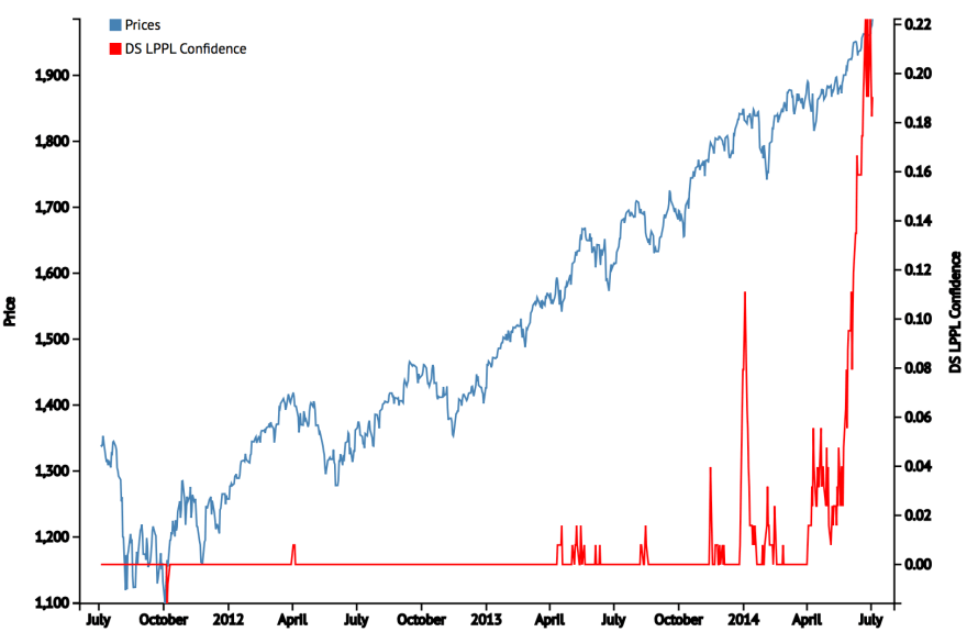
Source: FinancialCrisisObservatoryScreen Shot 2014-07-04 at 07.41.55

Source: Barrons4jul1

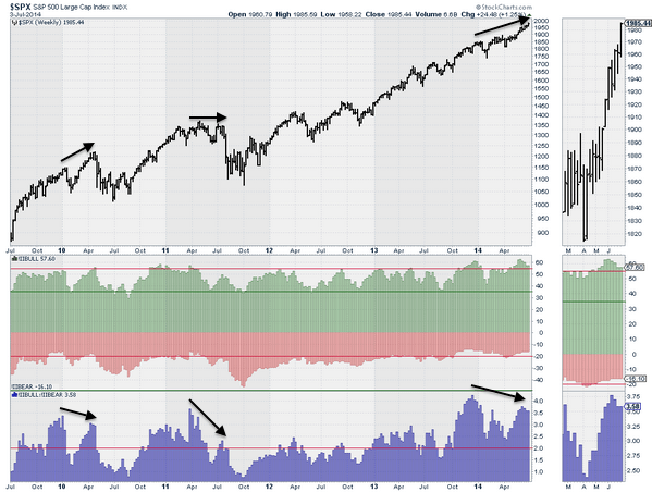
Source: Jack Damm / Stockcharts
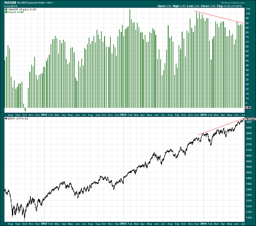
4jul20

Source: Stockcharts4jul10

Source: Stockcharts4jul16

Source: Sentimentrader

So I would be nervous about hedging with longs here, and won’t be doing that.

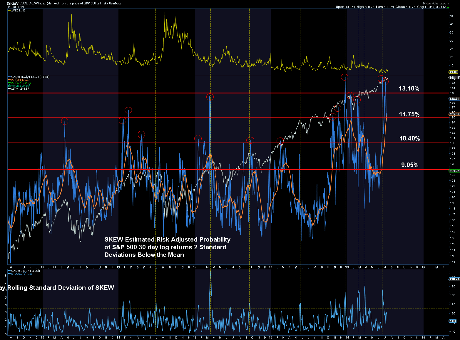
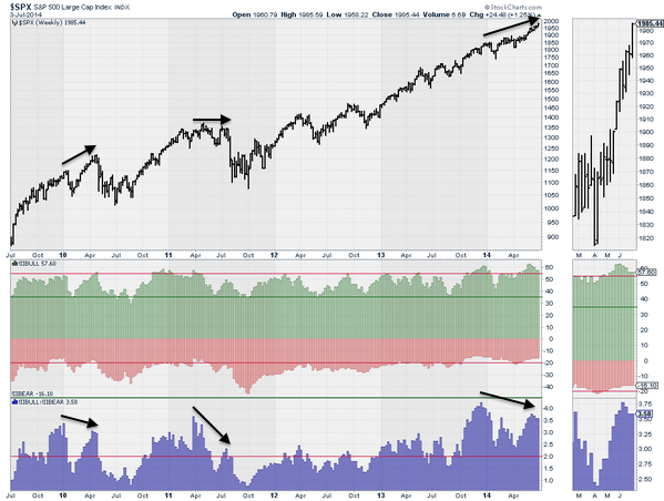
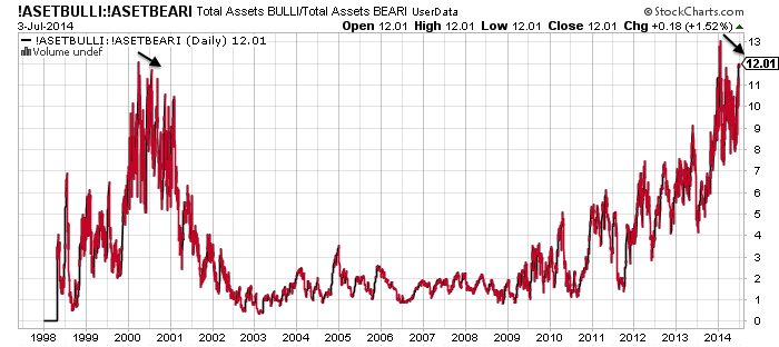
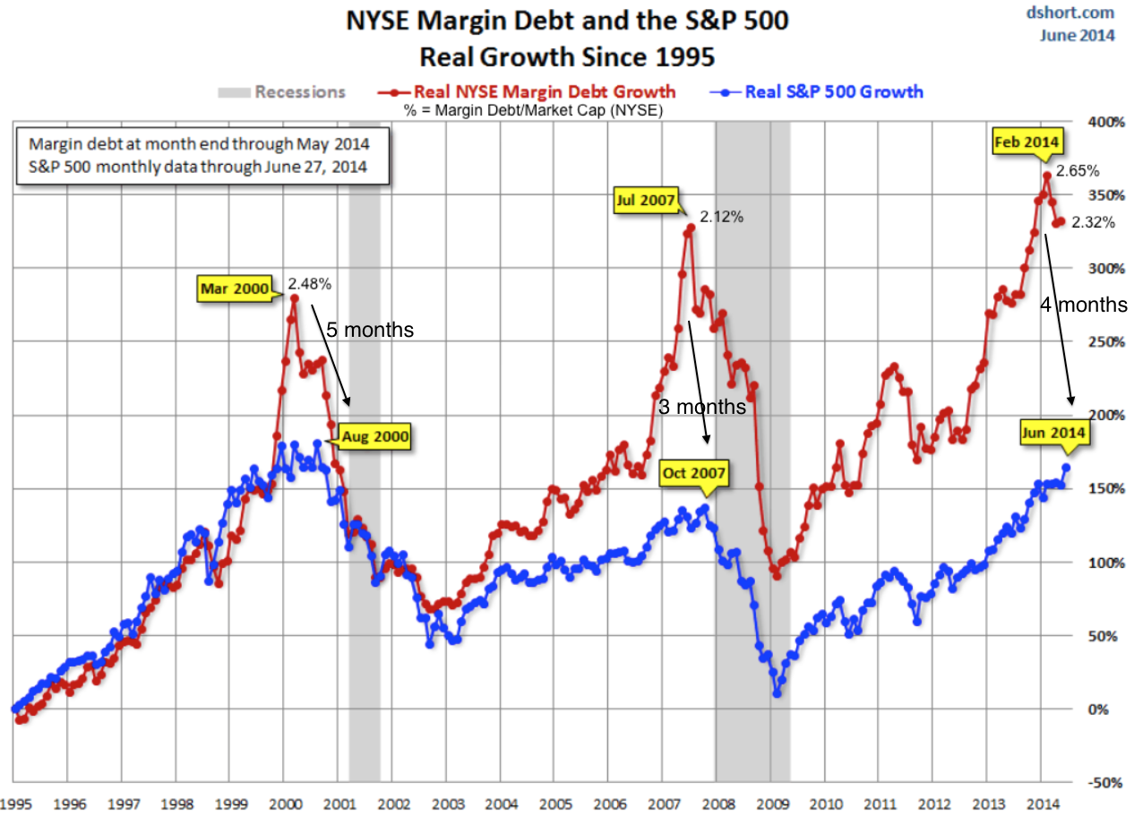
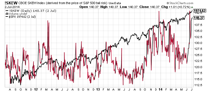
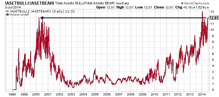
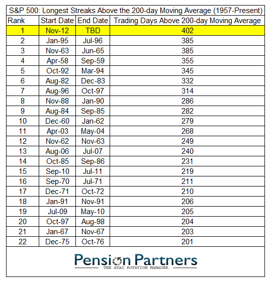
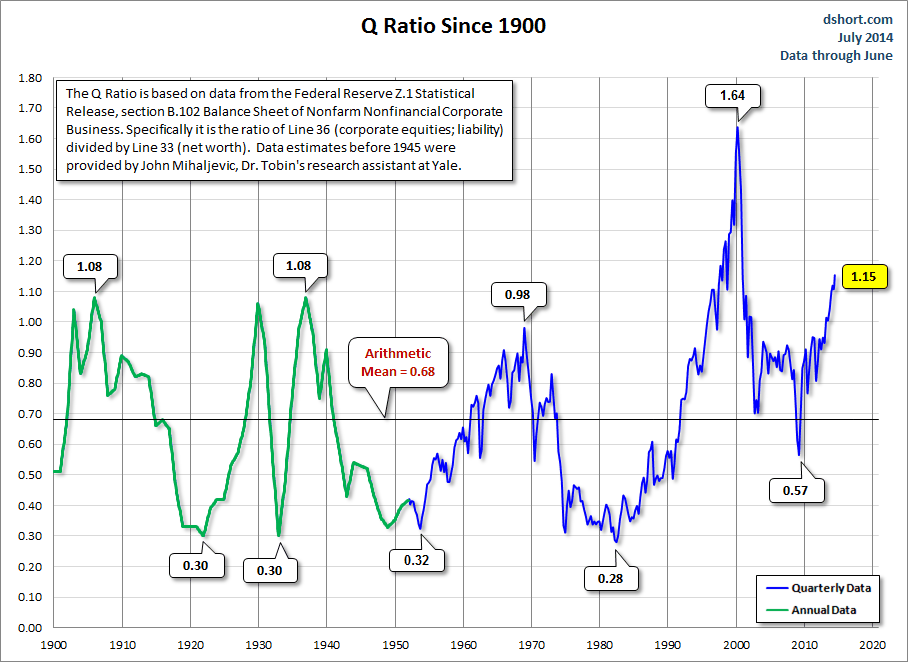
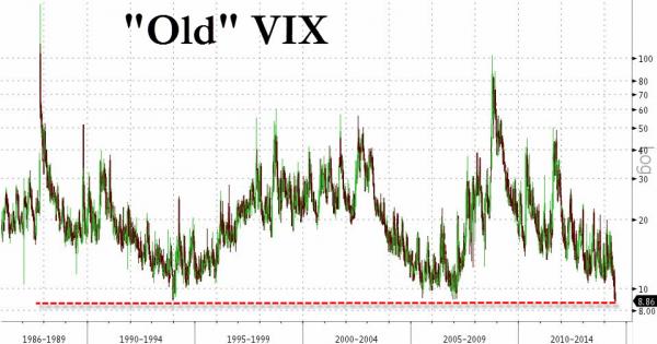
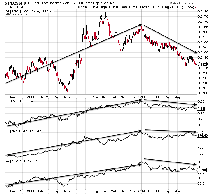
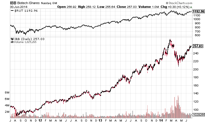
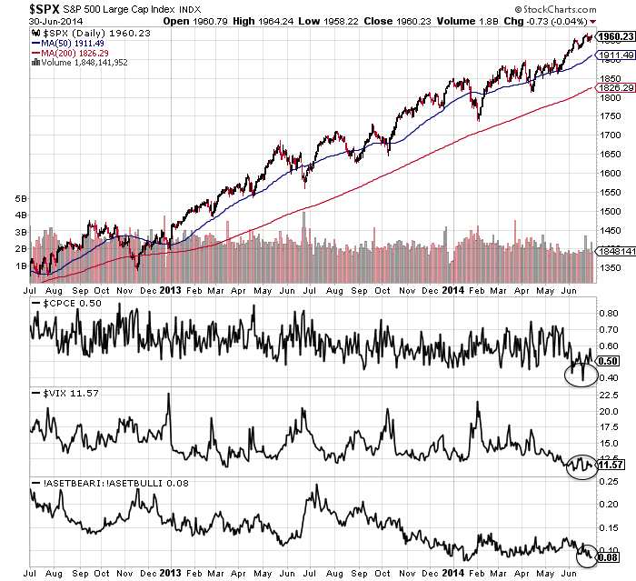
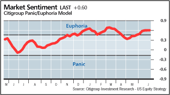
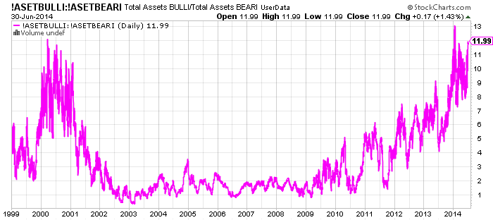
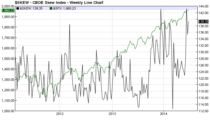
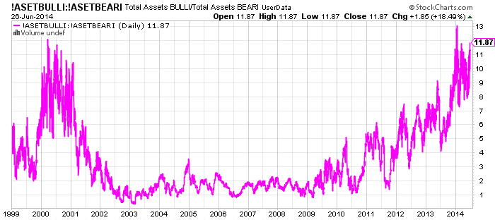
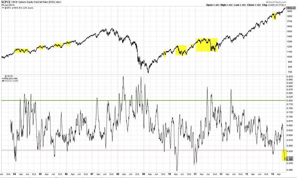
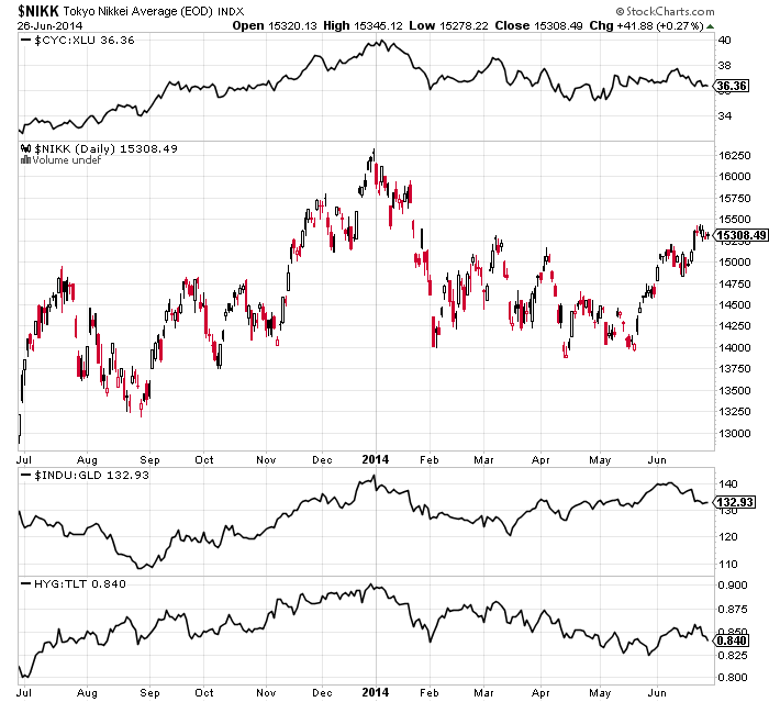
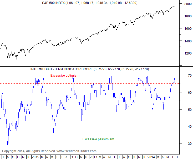
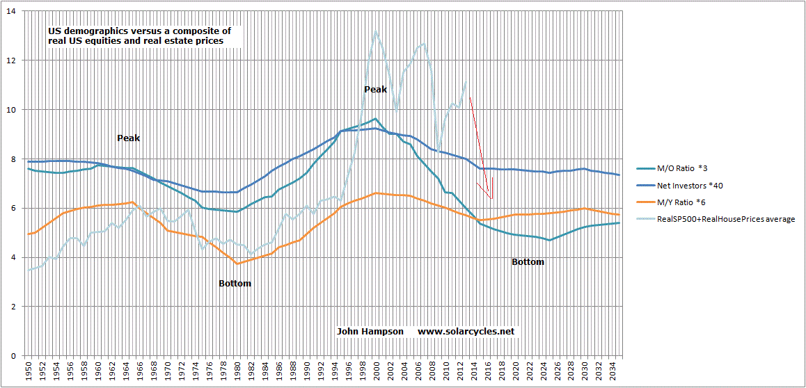
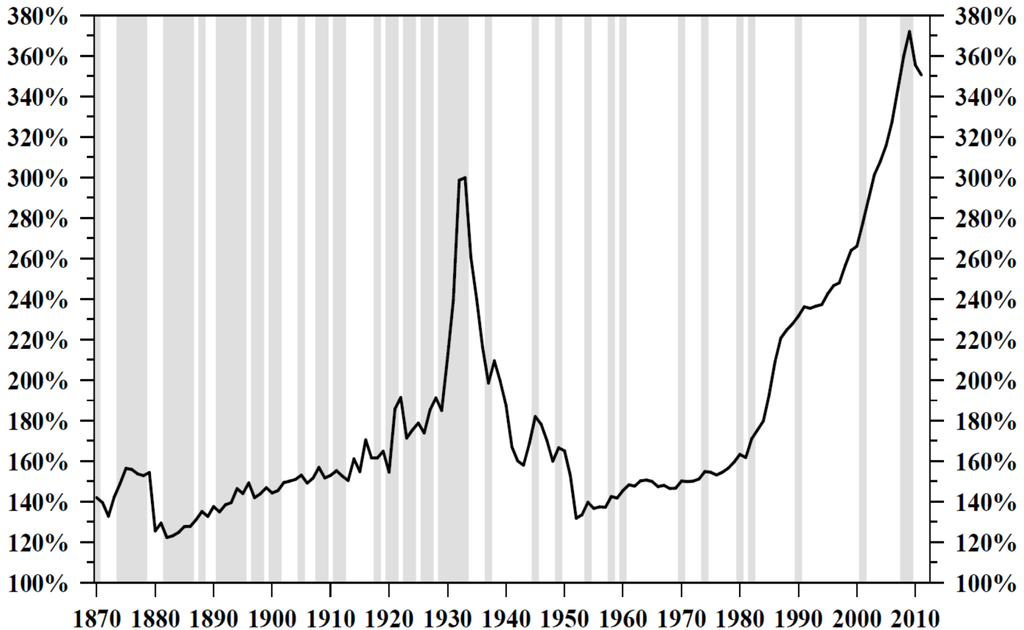
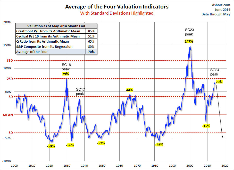
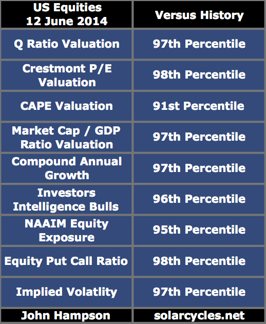
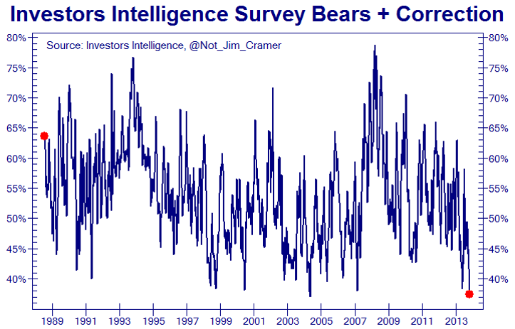
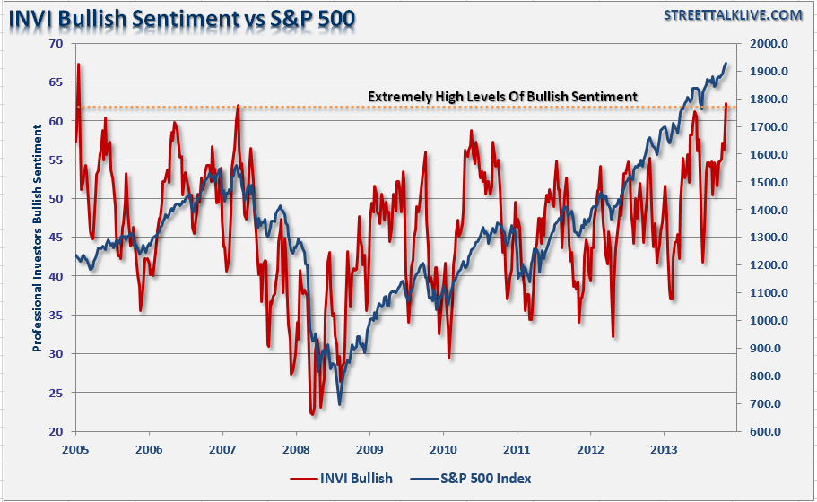
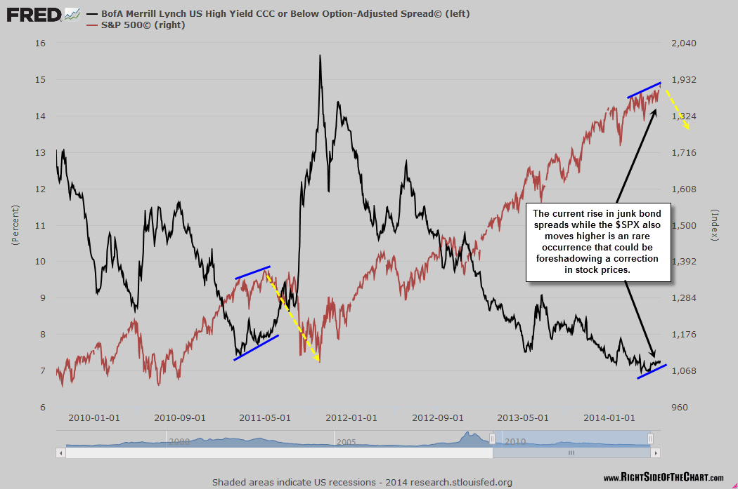
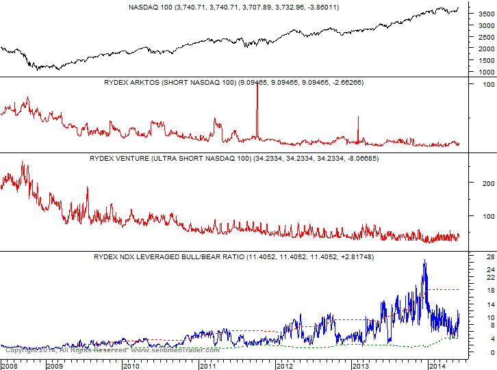
The next four charts show evidence of the mania.

4jul15

Source: Stockcharts4jul24

Source: Charlie Bilello
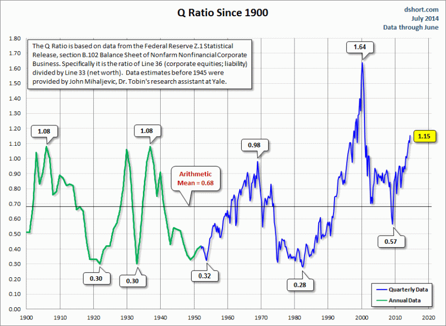
4jul19

Source: Dshort4jul2

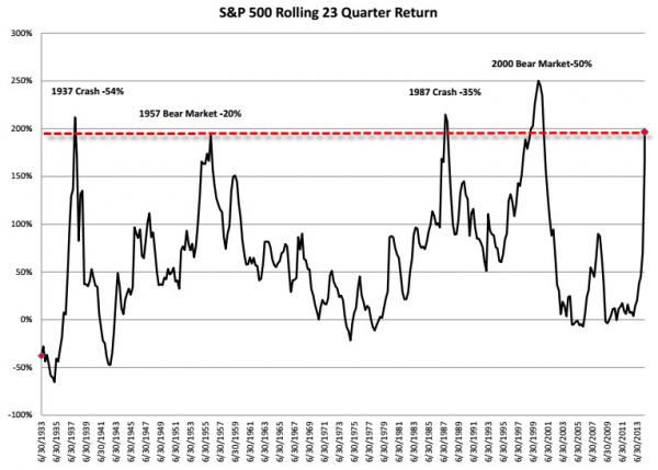
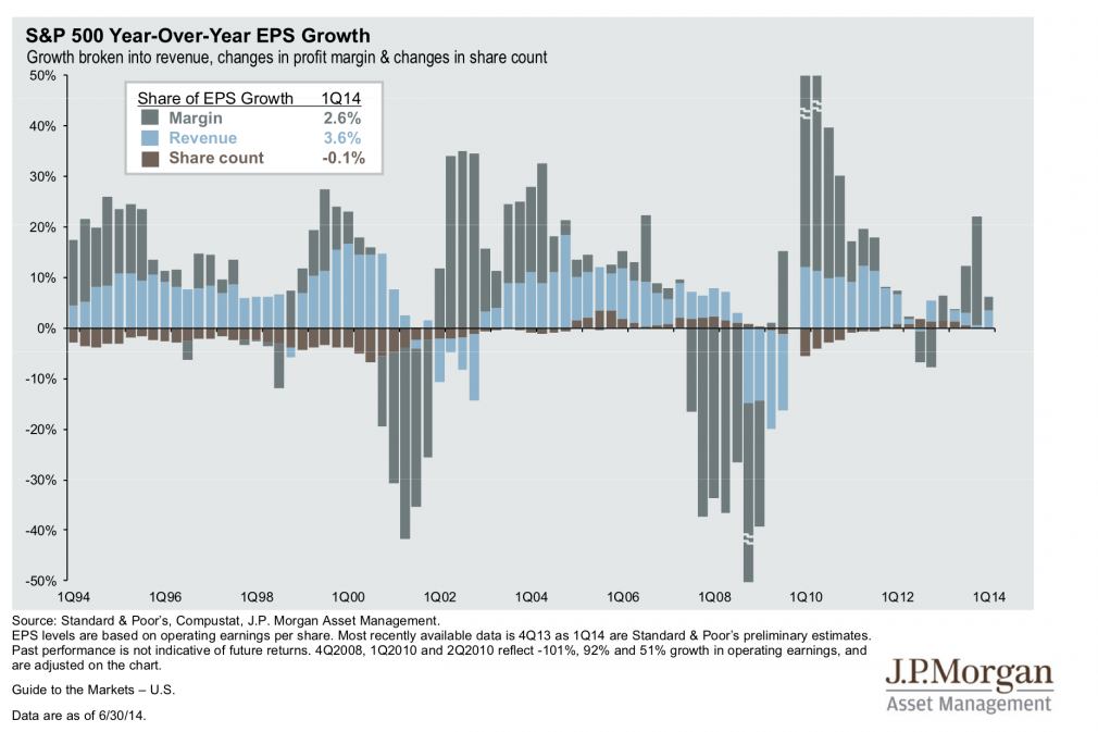
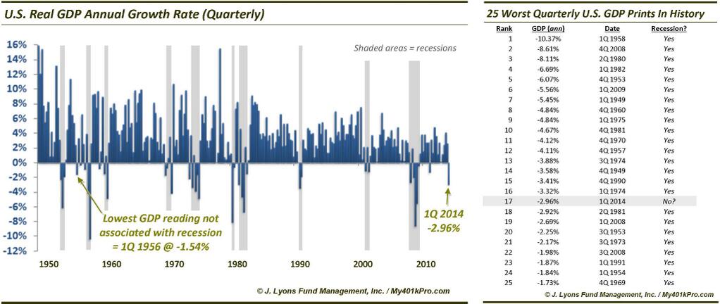
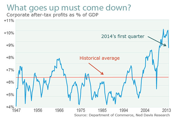
Turning to fundamentals, equities have front-run a return to normal: 10% earnings growth and 3% economic growth.

Economic data in 2014 has been overall reflective of mediocre growth. Barclays estimate for Q2 growth is 2.7%, add to Q1’s -2.9% and H1 is overall negative. Not on track for 3% annual growth. Data items such as the employment report or financial stress conditions appear superficially bullish, but reflect conditions just before previous market peaks.

4jul27

Source: Chris Puplava

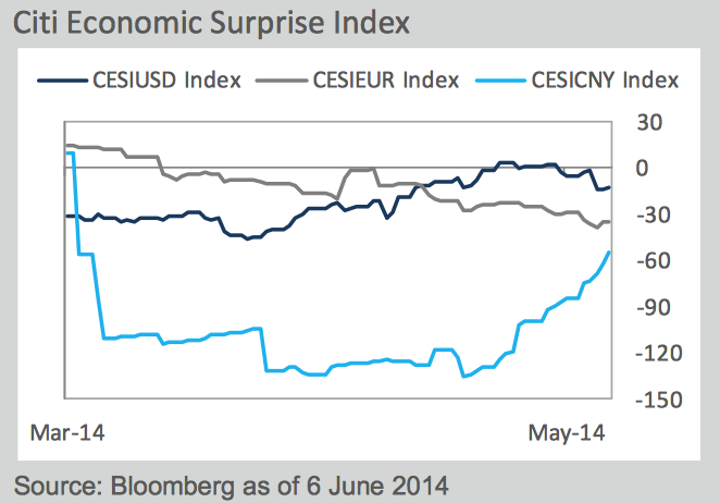
Economic surprises are still negative for the US, but as stocks have largely ignored the bad items, I think it’s fair to say the perception is they have been largely positive.

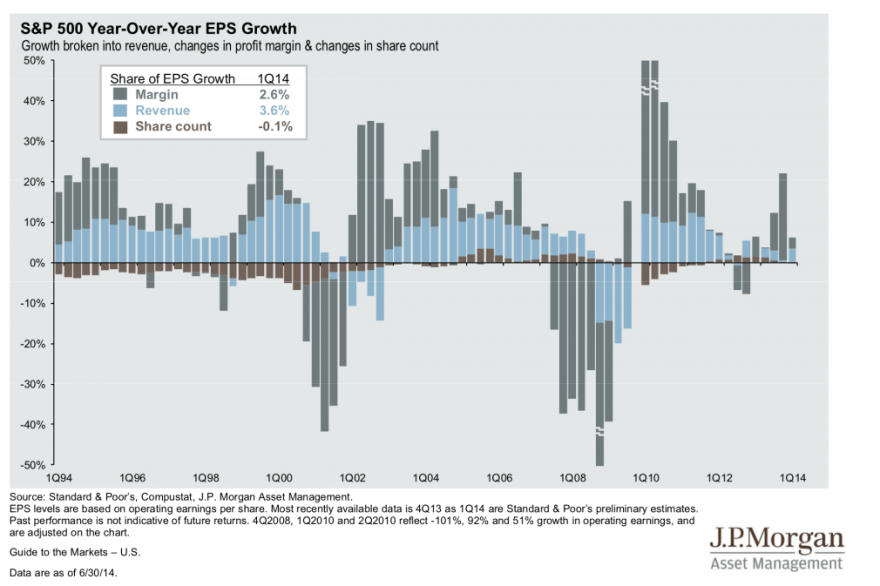
Earnings season begins again this week with 75% of companies having issued negative guidance pre-season. The theme of margin expansion not revenue growth continues to dominate into 2014:

4jul5

 Source: Fat-Pitch

Continued disappointment in both the economy and earnings is likely given demographics and debt. So, in short, at some point equities will turn down as their front-running is proven to be just overvaluation, and earnings season presents a chance for that to materialise. A glance back up at the ‘mania’ charts shows that when equities do turn down, they will likely enter a devastating bear market. There has never been a gentle normalisation from such lofty valuations, euphoria, leverage and compound growth extremes.

Some final charts:

4jul25

Source: Marketwatch4jul7

Source: ShortSideOfLong4jul23

Source: Fat-Pitch4jul12

Source: ZeroHedge4jul17

Source: FinancialIceberg

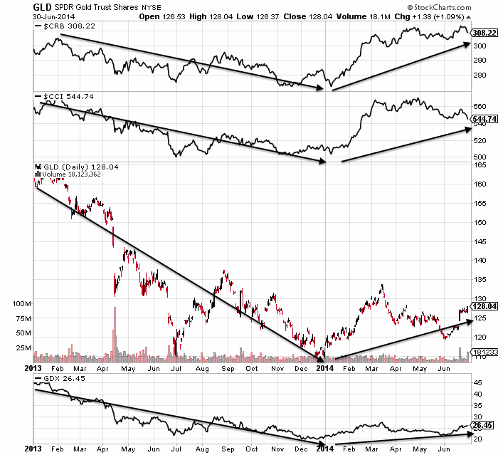
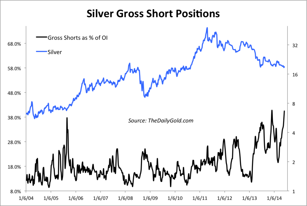
That last chart shows very skewed positioning in crude oil, the message being that it may well tumble going forward. That would be consistent with a deflationary shock rather than an escalation of inflation. I maintain my caution on commodities, aside from precious metals.

Time to sum up. I’m short equities and underwater, feeling the pain. I expect some of you are too, and maybe annoyed for having ‘bought into’ my analysis. Personally, I can’t regret too much, as I don’t think my analysis has been particularly lacking. Rather I have consistently presented a cross-referenced, multi-angled case and the large part of that analysis remains applicable today, despite 6 months having passed since I was first convinced. My distinguishing research thread is the solar cycle, and I believe we are seeing firm proof that the solar maximum does inspire speculative peaks, in a real-time test, but equities now have to turn down, and into a bear market, within a short time of the solar max, before that can be truly confirmed. Frustratingly I’m on the wrong side of it currently, having been too early with shorting, as certain reliable indicators have been overrun by the mania-drive of the sun. Lesson learned. Now it is a practical matter of managing the drawdown. As noted further up, there are several indicators that suggest the turn ought to be close at hand so I do not want to hedge with longs. I have refrained from adding any more short whilst we see if the melt-up steepens further. I will stop some trades if things go crazier yet, and re-open once the market has more definitively turned. But I am not keen to do that as I believe the turn has to be close at hand.

I have two scenarios in mind. One is that the RUT, COMPQ and IBB have to turn down here to honour the Feb/Mar solar/leverage peak. That makes a top fairly pressing and would fit with those indicators calling for little delay. Next week is the descent into the full moon and the start of earnings season, so they could fit into the scenario. The SP500 could reach over 2000 within a couple of sessions to fulfil.

The second scenario is that the melt-up steepens and all indices break out. Positive economic data expected through the summer assists, and maybe the solar maximum has another big burst coming. The issue I have with this continues to be the ‘fuel’ for the rally, given that margin debt is declining, households are already highly exposed, volume is waning, sentiment and euphoria suggest bear capitulation, and various divergences are mature. None of these have stopped the rally yet, so I have to respect that it may still be possible. If all indices do break out then I’d be looking for an eventual top followed by a ‘second chance’ retrace before ultimate steep falls.

Three Peaks

By the end of 2013 we saw various divergences emerge that warned of a potential trend change ahead, and still do:

1jl1 1jl2The first major peak point occurred at the turn of the year, around the 2 Jan new moon and at the inverted seasonal geomagnetism peak (i.e twin optimism peaks), as these charts show:

1jl6 1j18There were inversions at this point in different assets and sectors, and the Nikkei peaked-to-date 31 Dec. Various risk-off, defensive and late cyclical assets and sectors have been the dominant money flow targets since then.

The second major peak was the central peak: where the solar maximum, margin debt and the speculative-targets of RUT, IBB and COMPQ likely made aligned tops, close to the 2 Mar new moon optimism peak:

1jl22

1jl10 1j12

The third peak, I believe, occurred at the end of June, close to the 27 June new moon optimism peak and the mid-year inverted geomagnetism seasonal peak (again, twin optimism peaks), to complete the topping process:

Screen Shot 2014-07-01 at 08.16.14 1jl9

Indicators showing the three peaks:

1jl15 1jl3 1jl5Screen Shot 2014-07-01 at 08.15.22The four main US indices aggregated also show the three peaks:

1jl20

And this echoes what happened in 2000, where there was a first peak around the turn of the year (real Dow, Nikkei and FTSE all peaked 31 Dec), a second central peak around March (hot sectors, margin debt and smoothed solar maximum), and a third and final peak around August:1jl19So could stocks then run higher yet and postpone the final peak until late summer or even further out? I can’t rule it out, and it is the main threat to my positions: greater drawdown before it swings definitively my way. However, the trend in leverage suggests further price gains from here are unlikely. The COMPQ is at a suitable double top, whilst the RUT and IBB should make lower highs here to honour the Feb/Mar central peak. Various indicators are stretched to levels that are suggestive of ‘all-in’ or imminent reversal. We have mature divergences seeking satisfaction and fundamental doubts through Q1 GDP, negative economic surprises and Q2 earnings warnings.

The bull case: low rates, benign leading indicators, cumulative-advance declines. But the rhyme with 1937 is still very applicable here in my view. Low rates and a/d breadth accompanied stocks to a high overvaluation peak, like today, front-running a return to normal growth and earnings that didn’t happen, and peaking out with the solar maximum. Q1 GDP has gone some way to puncturing that normalisation assumption again, adding to the other factors being in place. Earnings season could now add to that. Once stocks fall, the wealth effect from a rising equity market will evaporate, helping tip the fragile economy over, as it did in 1937.

Turning Point?

New moon today, and a seasonal geomagnetism (inverted) peak around now:

27ju1

Sunspots have been rapidly waning too.

Price action in US equities has been up and down this week, but there has been a more pronounced trend change in European indices. Meanwhile, precious metals have consolidated their breakout and treasuries have advanced again.

Utilities continue to outperform and at the end of Q2, YTD sector performance looks like this:

27ju9

Which fits with this:

27ju13

Bears have largely capitulated, as evidenced in readings in Investors Intelligence, NAAIM, Rydex, and more, whilst complacency is extreme, as evidenced by put/call ratios, Vix and more.

27ju5 27ju10

Cyclicals to utilities, high yield to treasuries and Dow-gold ratios have all turned down again, signalling risk off:

27ju8

Several Sentimentrader charts are signalling a trend change:

27ju2 27ju3 27ju12Whilst the Sornette bubble continues to flag as ripe to pop.

The US indices are ideally placed to turn, with the Nasdaq Composite at a double top, and RUT and IBB at potential lower high second chance peaks.

27ju6And we had a major bad economic data item this week in Q1 GDP:

27ju11

Equities have frontrun a return to ‘normal’ growth in both the economy and earnings, yet neither are occurring. Earnings season beginning early in July has the potential to add to the GDP disappointment and help cement the doubt and feed a downtrend.

To add to all the above, various divergences and indicator flags are mature. I maintain the reason for price advancing despite all these headwinds is the solar maximum driving speculation. If price continues to advance from here then I suggest the solar maximum isn’t done. However, evidence still points to the smoothed max likely being behind us, befitting peaks in markets spreading from December to June, around a Feb/Mar centre. If so, equities are ripe to fall here and deliver the potential of the combined above set-up.

As Things Stand

1. SP500: bulls still in charge, whilst put/call, vix and volume continue to warn of a likely pullback.

24ju62. The speculative-target sectors and indices are still able to print double tops or lower highs here, there has been no breakout as yet:24ju83. Gold, silver and miners got a burst higher last week. Needs follow through this week if not just a short covering rally.

24ju94. Skew has leapt back up to historic extremes:

24ju25. Buying climaxes surged last week:

24ju16. Bubble-end still flagging:

Screen Shot 2014-06-24 at 07.24.14

Plus, various sentiment measures still at high froth levels.

Sp500 is within touching distance of 2000, so maybe it can tag that before reversing. This Friday is the new moon, which is another potential top marker. Various indicators are repeating in June what they did in December-January, which was before the deepest pullback of the year, so maybe we finally see exhaustion here. I am holding my positions and watching and waiting.

Cross Referencing

Wim Grommen argues there have been 3 industrial revolutions: 1780-1850, 1870-1930 and 1940-2000. They terminated with major peaks in the stock market and then gave way to degeneration phases.

11ju5

Source: Wim Grommen

My perspective is demographic booms in the 1920s and in 1980-2000 made for economic and stock market booms, culminating in mania peaks at solar cycle maxima, and then giving way to prolonged economic downturns and secular bear markets once demographics turned.

13ju15

A third perspective is that both episodes in history were based on a major run up in debt, or prosperity taken from the future:

11ju7

In short, the two periods rhyme. Parallels have been drawn between the Great Depression and the Great Repression in terms of severity of crisis, slowness of jobs recovery and bank failure risks. Similarly, central bank intervention became a dominant factor, with ZIRP and emergency spending programmes being required.

However, the Great Depression was much worse in impact when we consider number of failed banks, level of economic decline, drop in prices, and this despite the 2000 asset boom being a more extreme mania than 1929. One key reason for that was the aggressiveness of central bank response this time round, with more flexibility and conviction to draw down harder and faster on prosperity from the future.

Central banks cannot overcome demographic trends and post-mania busts, but they can postpone their full impacts if they are prepared to pay for it, helping stop the devastation being so front-loaded. So, the bear market from 1929 to 1932 was totally devastating and took valuations straight to bottoming levels (shown at -56% below), whilst the 2000-2003 bear was halted at still expensive valuations. 2009 then washed out valuations lower, and I believe we are on the cusp of another bear which will wash out properly. In other words, central banks have succeeded only in phasing the devastation, and the next leg down ought to be the worse: more of a deflationary depression.

12ju5Source: DShort

That projection can be cross-referenced with the demographic trends chart further up the page, and is further strengthened at a global perspective by similar demographic trends in Europe and China.

Between 1932 and 1937 a cyclical bull market erupted with distinct similarities to today (see post here). There was one solar cycle between the 1929 and 1937 peaks, and one between 2000 and 2014 (shown above). The 32-37 bull topped out along with the solar maximum in Spring 1937 with no divergence in cumulative advance-declines, which I believe will mirror today: an all-in peak at extremes in valuation, sentiment, leverage and complacency.

11ju9Source: DecisionPoint

Here is evidence that we have reached such extremes:

12ju1

And the bubble-end flag is raised:

Screen Shot 2014-06-14 at 12.31.20Source: Financial Crisis Observatory

And this fits with solar cycle maximum peak-speculation timing.SolarCycleSpeculationPeaksFriday’s session provided a bounce at the full moon. The bounce came at an important level in the large cap indices: a backtest of the ending diagonal or wedge. As full moons often mark inversions, that gives two reasons for stocks to rally again from here. However, by various indicators further declines appear more likely, and such a development would then fulfil the ending diagonal overthrow pattern, whilst ensuring lower highs are maintained in the small caps. That would then enhance the likelihood of all the indices having peaked and the smoothed solar maximum having passed. Emerging new up legs in gold, miners and silver are another clue that could be occurring, whilst geopolitical developments in oil could be a catalyst to end the complacency.

The best cross-referenced case I have currently is that the smoothed solar maximum, RUT, COMPQ, IBB and margin debt all peaked out around February/March. The majority of solar forecasts support this, and we have seen various asset peaks between December and June around this centre. The Sornette bubble-end is flagging again here as sentiment, valuations and complacency are all at the level of extreme that would fit a reversal, plus certain divergences are mature. The selling on Wednesday and Thursday did little to reset the short term indicators that would suggest stocks rally again now.

However, the risk remains that the solar maximum could potentially get stronger yet. Solar scientists have not so far done great in their predictions for this cycle. They are generally united in projecting a waning sun for the rest of this year, but SIDC still continue to run with an alternative model which would delay the smoothed maximum until the end of 2014.

13ju13

Source: SIDC

Right now sunspots are high again as the sun has leapt back to busy in June after three months of waning, so I continue to monitor. Cross-referencing again, if the smoothed solar maximum were still ahead, then we ought to see large caps hold their breakout here and continue to advance, the other indices break upwards to new highs (invalidating their Feb/Mar peaks) and margin debt reverse its waning trend.

So, as things stand, the highest probability case is for this to be the end of a topping process that began at the turn of the year, with the solar and speculation peak centred around Feb/Mar. If so, then stocks should fall again this coming week, fulfilling the ending diagonal and bubble-popping, and completing the ‘second chance’ lower peaks in RUT and COMPQ. If instead the large caps hold the break and rally upwards, taking the Nasdaq Composite along to new highs in the process, then it would strengthen the case for the solar maximum and peak speculation to be shifted along to at least June, but potentially to even further out in the year. An important week.

The End Is Nigh

1. Sornette bubble end flagging and potential ending diagonal overthrow price pattern on SP500:

Screen Shot 2014-06-11 at 09.04.51

Source: Financial Crisis Observatory / my annotations

2. Dtrend flagging uptrend exhaustion:

11ju10Source: Rory Handyside

3. P/e over Vix ratio at peaking level:

11ju1Source: ZeroHedge

4. Put/call, volatility and volume collectively suggesting an inversion:11ju12

Source: Stockcharts

5. Sentiment at lop-sided extreme:11ju3

Source: Not_Jim_Cramer

11ju19Source: STA Wealth

6. Junk bond spreads divergence as per the 2011 peak:

11ju4

Source: RightSideOfTheChart

7. Biotech has made a 61.8 fib retrace of the decline from the parabolic peak, as a potential lower high per the bubble anatomy model:

11ju14 11ju15

8. Rydex data provides another example of the peak in leverage now being in the past, which along with margin debt should mean the markets are on borrowed time:

5ju10Source: Sentimentrader

9. A geomagnetic storm hit at the weekend and we are heading into this coming Friday’s full moon: twin negative pressures on sentiment.

11ju17

10. Economic surprises are negative in USA, Europe and China:

Screen Shot 2014-06-11 at 08.56.43

Source: Citigroup

11. 75% of companies in the US that have issued earnings guidance for Q2 2014 have issued negative guidance.

12. Gold and silver short interest at levels suggestive of a rally in precious metals, which would fit with a decline in stocks.

11ju21Source: TheDailyGold

In summary, it’s another compelling set-up. Whilst I cannot rule out stocks breaking higher and going crazier yet, I have to doubt whether sentiment, complacency and bubble/froth indicators really can get more extreme. As per my Sunday post, Piecing It All Together, my primary case is for this being the last piece of the topping process, particularly so in honouring the combined February peaks in the sun, in margin debt, and in RUT, IBB and COMPQ, i.e. lower highs here are important. If selling can initiate here, then exit will be through a keyhole due the lopsided all-in extremes.