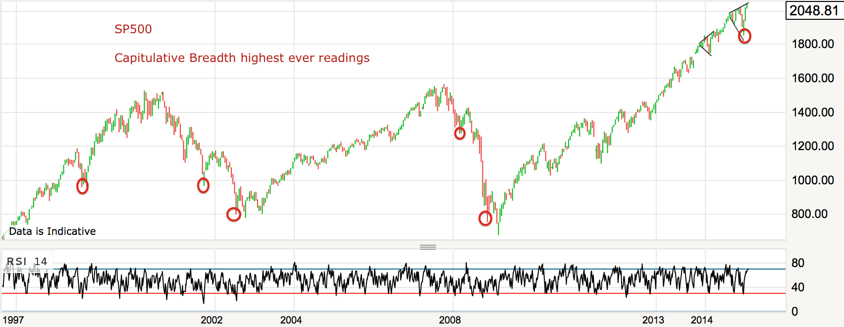
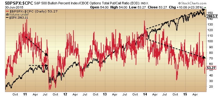
Capitulative breadth now down to 6 on the rally in stocks, but still suggestive of some more upside for equities to properly neutralise it.

Source: Rob Hannah
Today is the full moon, and lunar phasing for 2015 looks like this:

Not all have been compelling turns but nonetheless shorting each new moon and going long on each full moon would so far have made a profit every time this year. Historically, lunar phasing has worked better in periods of sideways chop like this. Based purely on the moon, we could expect stocks to peak out again in mid-August. But at some point this price range will break one way or the other.
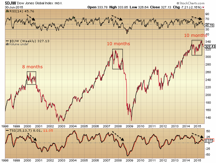
As you know there have been many technical indicators for a bull market peak, suggesting that price range to be a topping process. Here are two more from Dana Lyons:
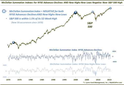
 Source: Dana Lyons
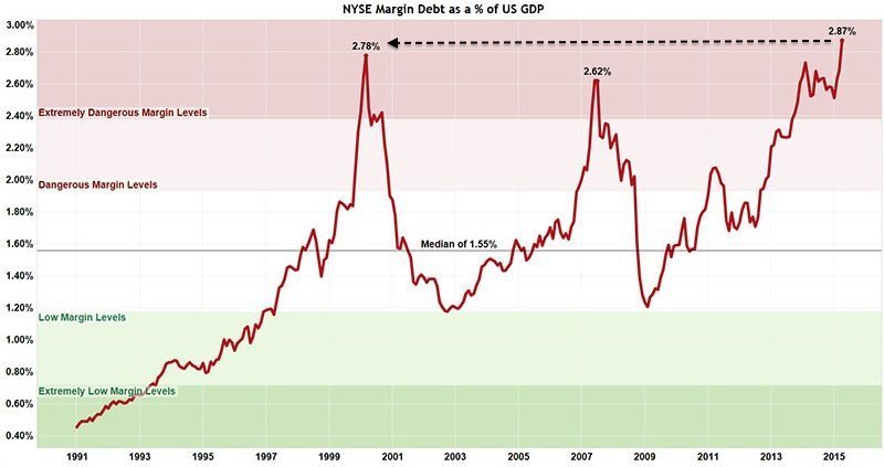
Valuations are crazy high:

And US small caps are the most expensive they’ve ever been.

Source: Meb Faber
But whilst stocks continue to levitate the key question remains whether excesses in valuations, sentiment, allocations and leverage need to be reassessed in the context of ZIRP and QE, and don’t pose the same threat as typically historically. That analysis is further complicated by not having experienced this combination of negligible rates, low inflation, low growth and high debt for over half a century.
However, the reason for ZIRP and QE is that the world economy has been in serious trouble since 2008, with demographic trends in the major nations all having turned negative. Below we can see the break in the long term trends of US growth and employment and how they remain broken:
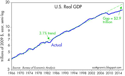

Source: Scott Grannis
So, either (1) the stock market is majorly divorced from reality and reverting to mean soon, or (2) the economy finally picks up from here and catches up with stocks having led, or (3) this is a new norm skewed by central banks whereby current indicators of a top that resemble 2007, 2000 and others no longer apply. You know where I stand on this question, but the sideways price range of 2015 has yet to validate or invalidate any of the options.
Leading indicators still largely point to a pick up now and towards the end of 2015.

Source: Variant Perception
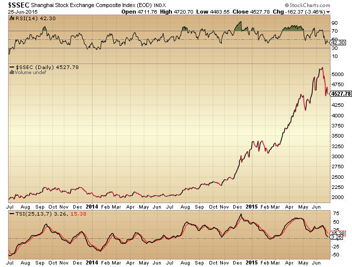
Whereas China looks to be in trouble.
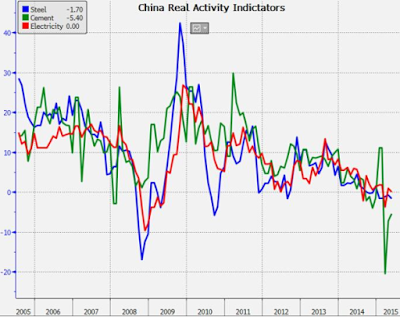
Source: Cam Hui
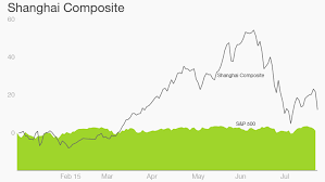
Source: CNN
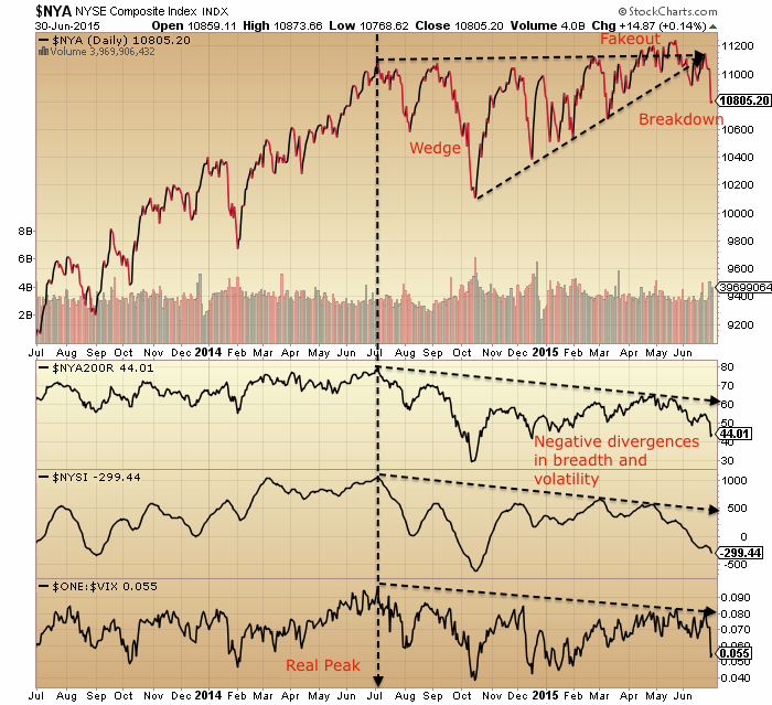
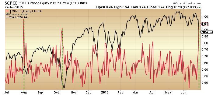
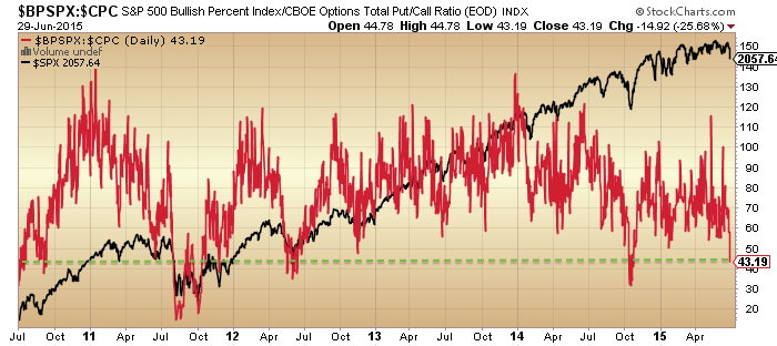
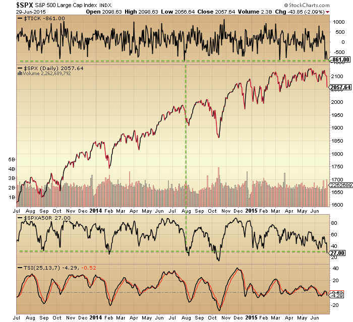
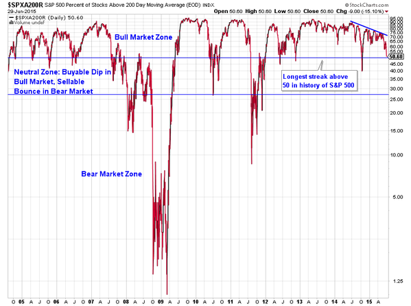
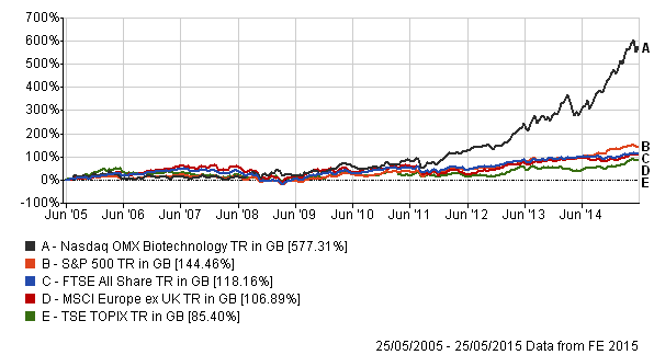
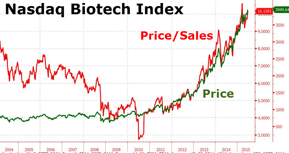
Biotech is also wobbling currently, testing the bottom of the parabolic. So are these the last gasps of a topping process? Or is the price range of 2015 in broad equities the pause that refreshes the bull? We saw some evidence of reset by the end of last week: AAII sentiment, bullish percent, capitulative breadth, put-call all suggestive of a significant low. However, in the bigger picture historically, these look like a low in a bear market, i.e. from which a counter rally erupts before lower lows ahead. What’s confusing is their occurrence just 5% from the highs in nominal terms.
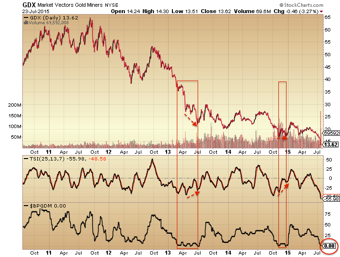
Right now I expect stocks can move higher before they move lower again. So I am waiting and watching for evidence they are rolling over again. The key is whether they do so before they reach the July highs and then the May highs. At the same time I am looking for a lower low in gold and miners on positive divergence.
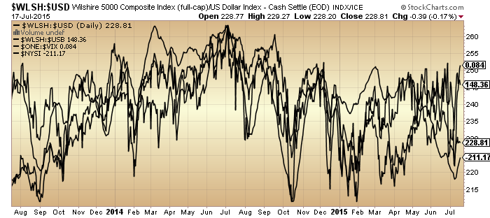
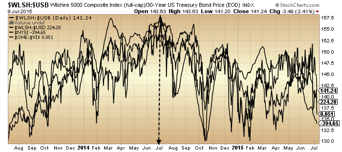
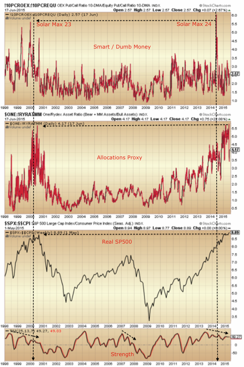
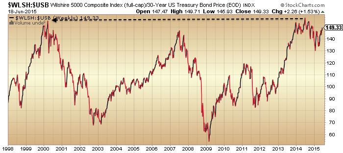
We still have a host of indicators pointing to an underlying peak around the solar maximum of last year:

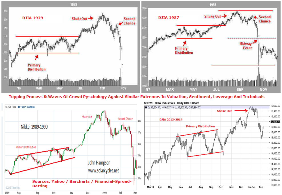
 That June/July 2014 peak remains in play unless we see those indicators reverse and reset. 12 months later they still haven’t. So I remain of the opinion that equities will ultimately break downwards. It’s just a matter of gauging the shorter term waves. On which note I have to prudently add that I can’t rule out a final move up to new highs before a collapse. It happened in 1987 and 1929. A range trade over the first half of the year and then a final rally to a peak in Aug or Sept:


Source: Financial-Spread-Betting
That extreme reading in capitulative breadth may support this occurring, so have to stay open minded. Hence the importance of watching indicators and price for evidence of a roll over before the July highs, then the May highs.