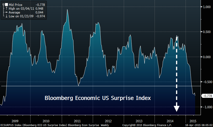
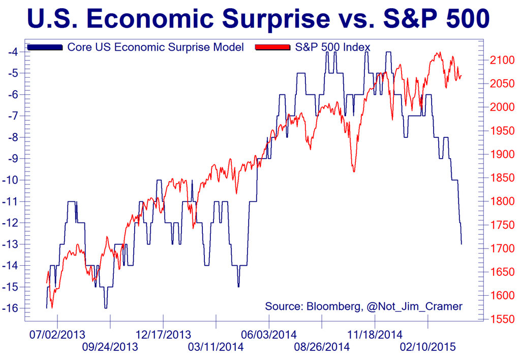
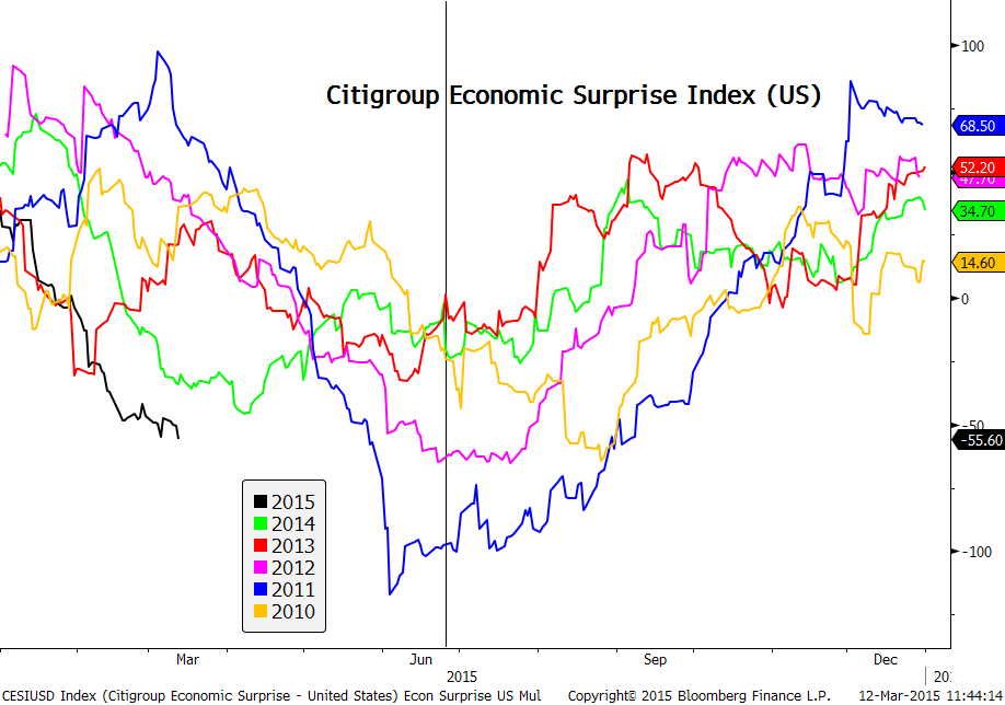
US economic surprises are now at their worst level since 2009:
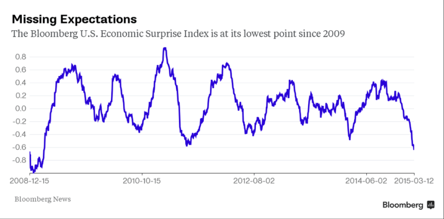 Source: Bloomberg / Jessie Felder
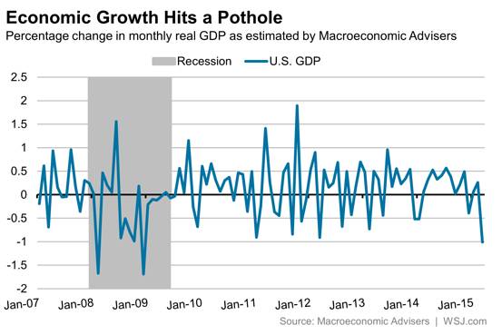
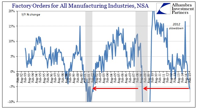
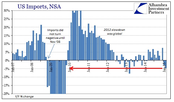
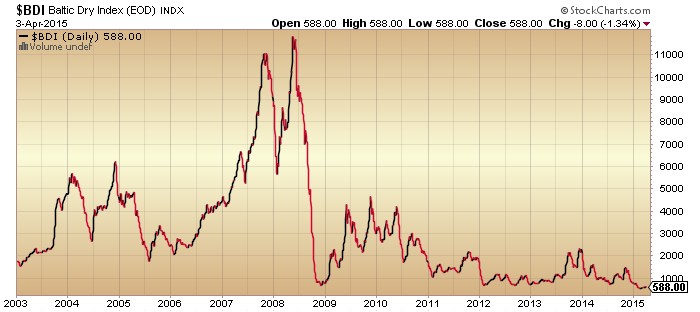
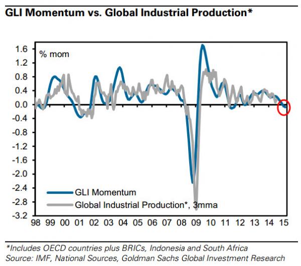
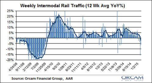
A trio of such bad data releases are charted here: retail sales, wholesale sales and rail traffic:

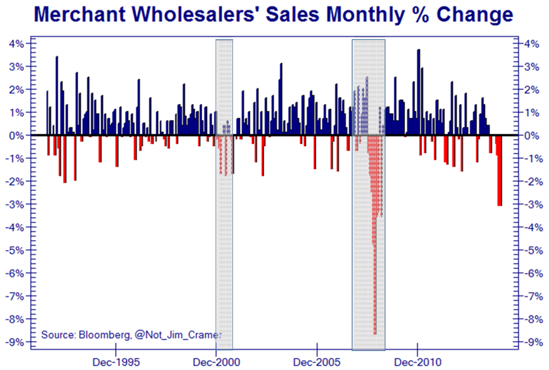 Source: Not_Jim_Cramer

Source: Callum Roche
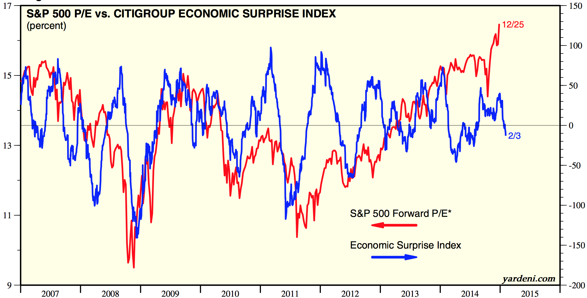
They are all recessionary. But Charlie Bilello hypothesises that the pattern in economic surprises over recent years could be inspiring stock market participants to hold through:

Source: Charlie Bilello
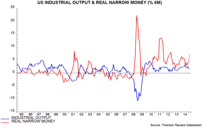
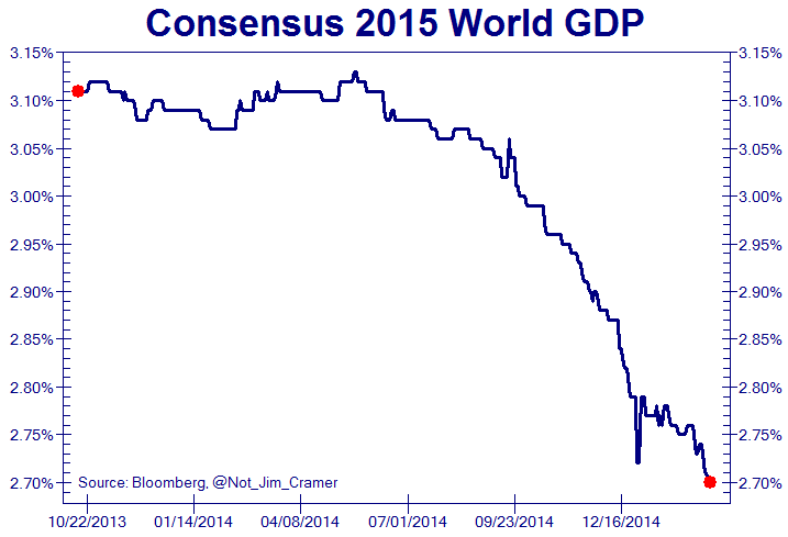
That pattern is a bit of a mystery and could suggest problems with the Citigroup calculation. Regardless, our positioning post-solar maximum should spell recession, no recovery this time:

(my chart)
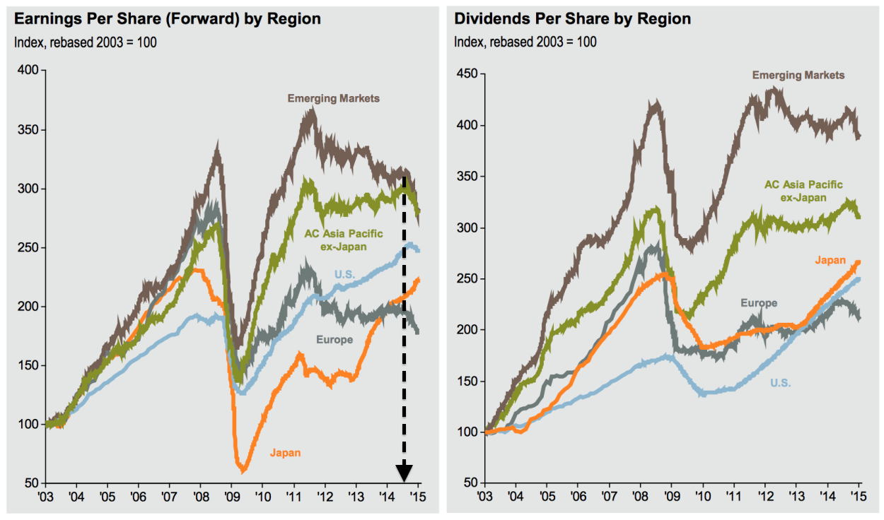
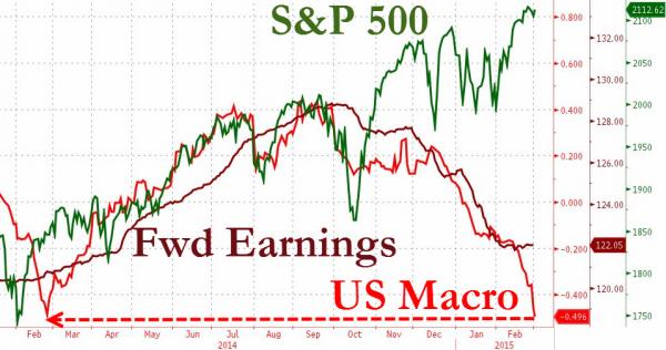
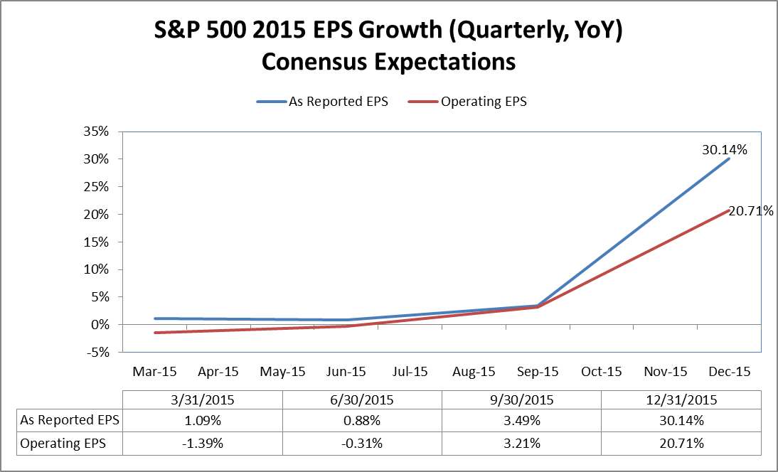
The picture is similar for earnings. Forecasts for the near future are negative, yet further out participants expect earnings to recover dramatically again:

Source: Charlie Bilello
As things stand, the estimated earnings decline for Q1 is -4.9% which is the largest drop since 2009, and the bigger picture for declining EPS is shown here:
 Again this would be consistent with a bear market and recession, unless that dramatic recovery later in the year is to take place.
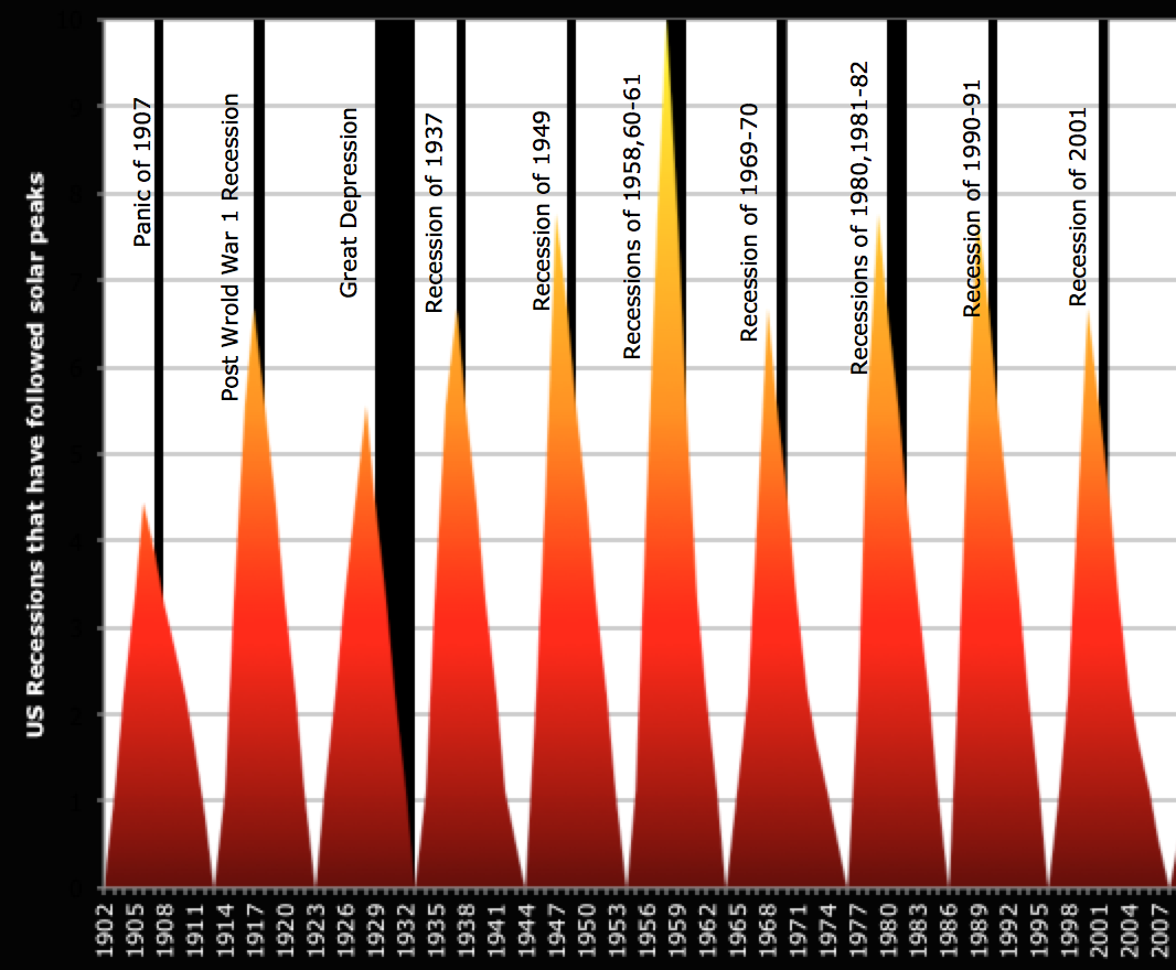
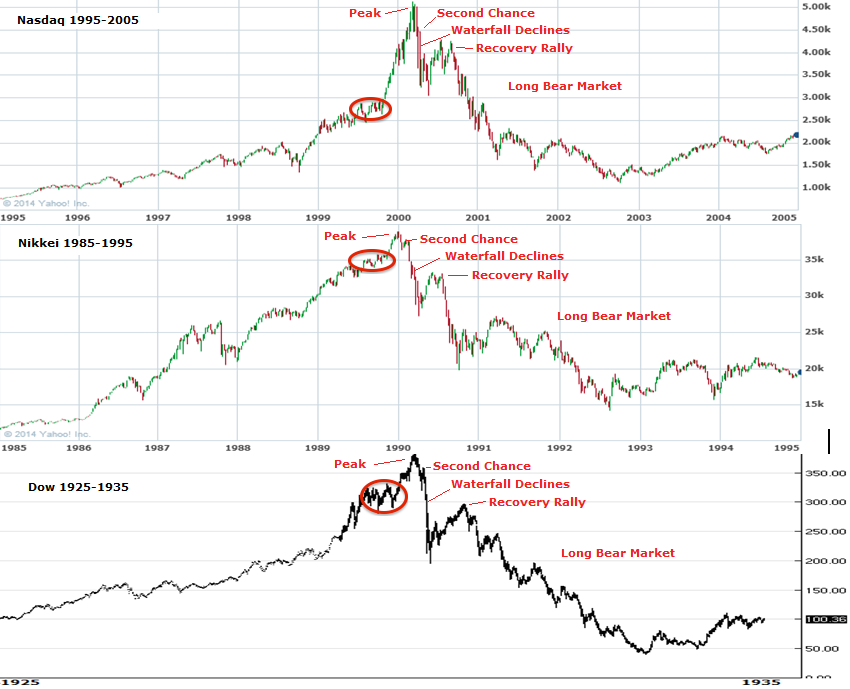
Solar theory argues that we see a speculative bubble into the sunspot maximum, which then pops post solar peak. People unwittingly buy and speculate both in the economy and financial markets into the smoothed solar maximum, and then do the opposite once the sun’s activity starts to wane.
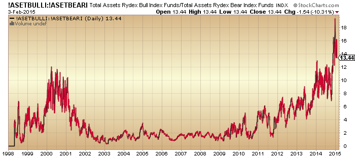
There is some argument that government bonds are in a bubble, given their long bull market and ultra low yields. However, a look at household and fund manager allocations reveals the bubble to be in equities not bonds:


 Source: Fat-Pitch
And the bubble in stocks becomes clear when we consider valuations, sentiment, dumb money flows, leverage, and more.
Commodities may have undergone recent falls but they were not in a bubble leading into the solar peak. Real estate has recovered some in the last several years, but does not show bubble characteristics. Sentiment and allocation to bonds has remain depressed throughout. Cash allocations are at low levels.
A common argument is that ZIRP encourages money into equities. Bonds and cash are returning nothing. At least some yield can be found in stocks.
Perhaps this explains why sentiment, allocations, valuations and leverage have remained at ‘saturation’ levels. Money has flowed in to maximum levels, producing common bubble characteristics, but money hasn’t flowed out the other way whilst ZIRP persists. The shallow corrections in equities have swiftly seen those measures topped back up to full.
Which brings us to this week’s FOMC. As things stand, analysts expect rate rises to start in several months time. Yet economic data of late has been fairly dire, which means the Fed may play safe and delay. If the Fed now resets expectations for rate rises (to start later) then will the correction of the last 2 weeks in equities be swiftly brought to an end and stocks rally to new highs on all-in measures again? I consider it a key test of whether ZIRP is the main driver.
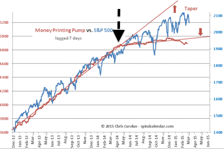
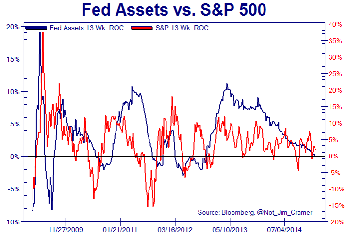
It’s a test I expect to fail as I don’t believe it. I maintain the driver is the solar maximum, and that we see a range of evidence that speculation and the economy did indeed peak around the mid-year 2014 smoothed solar max. Even central bank balance sheet expansions topped out around then, as they too are subjects of the sun:
 Source: Chris Carolan
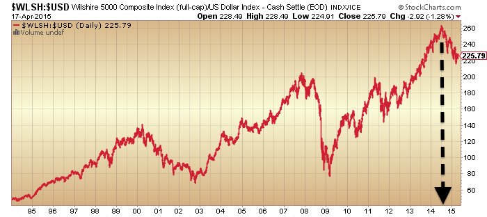
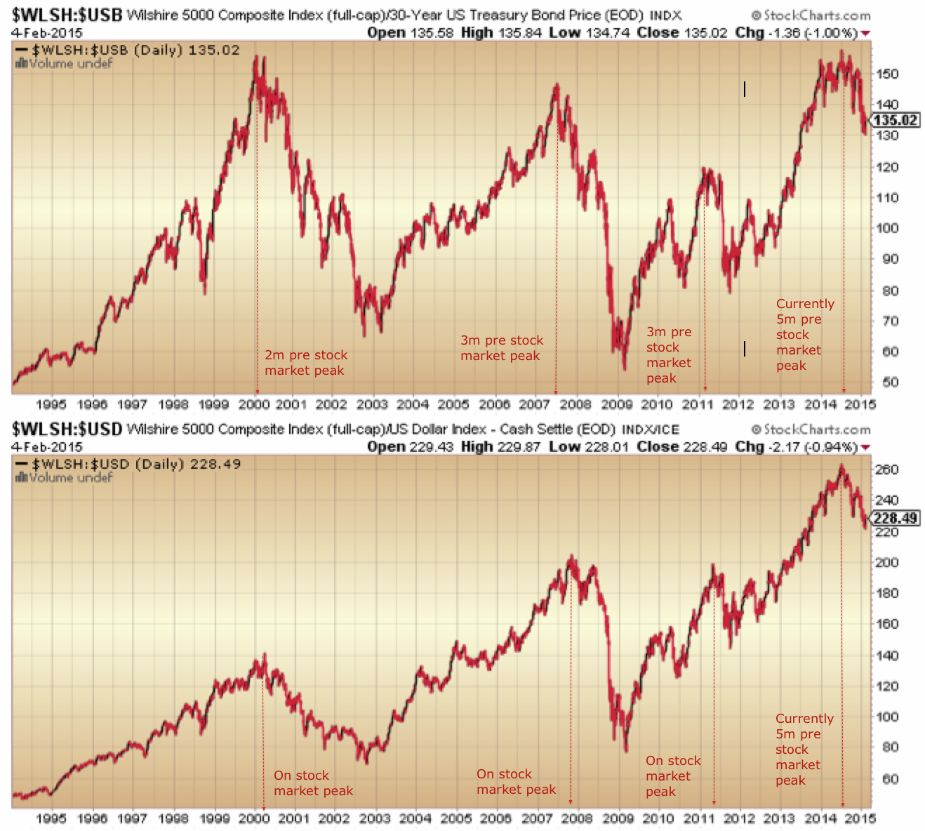
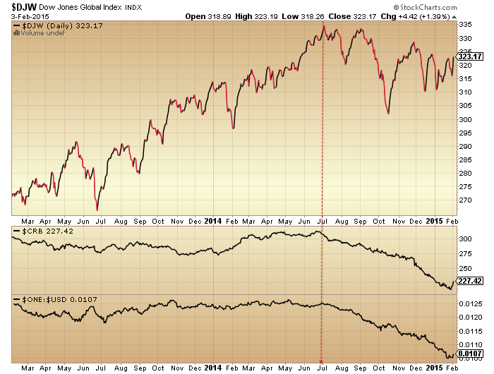
Stocks:dollar continues to show a clear peak at that time:

Source: Stockcharts
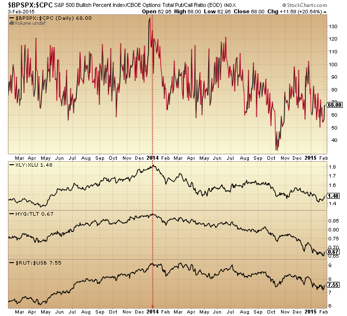
The negative divergences in volatility, junk bonds and breadth remain in place since then:

Source: Stockcharts
All this should mean we are at the end of a topping process.
But how do we square this with action in the Dax and Eurozone indices? I suggest as a function of the sharply declining Euro:

Remember the Euro was traditionally seen as risk-on? Hence the Dax and Euro largely moving in the same direction pre-mid-2014. But then, post solar max, things changed and remain changed.
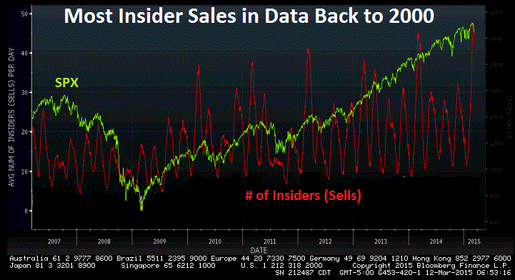
Flipping back to the US, insider selling has leapt to a major warning level:

Source: Bloomberg / Nautilus
If we combine that with the commercial positioning, maybe the market can finally roll over here.
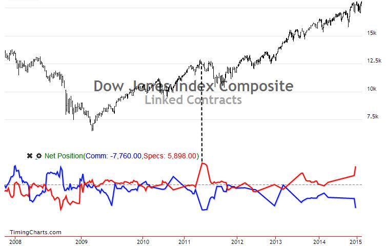
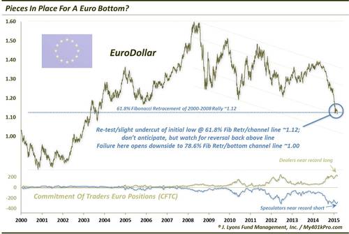
Source: Timing Charts
The Euro-dollar remains set for a significant reversal (positioning, sentiment, oversold/bought). Maybe then we can see a sell-off in US stocks and out of the US dollar occurring together: a contra-US move reflective of the current relative economic and valuation divergences. Just a guess.
By geomagnetic seasonality I still have my eyes on a March/April bottom, but this would be a significant low. This would imply a sharp sell-off erupts out of the initial falls of the last two weeks. Should that not occur then the case would build for the markets not properly rolling over until mid-year, and that would still not be inconsistent with the insider/commercials charts above (markets peaked but then took some time to roll over).
Select indicators hit washout levels by the end of last week, but the majority not. However, that keeps options open into the FOMC.
In the bigger picture, this is what I see: valuations, sentiment, leverage and allocations have been flagging a top for some time. Insider selling and commercial positions now join them. Various measures and indicators show peaks mid-year 2014 at the solar max and remain in divergences since. Earnings and economic data (concurrent and leading) have turned negative and Fed balance sheet expansion drawn to a close. If the solar theory is correct then earnings and economic data won’t come back here, and the realisation of this will finally see the scramble for the exits. Based on history a crash is already written in the leverage and highly skewed exposure and sentiment. Set against all this, central banks largely still continue to ease and keep conditions favourable for speculation. The outcome will be extremely telling.


 Source: Stockcharts