Final Month Of 2012

Certain key assets are finely poised as we enter December. The UK FTSE is once again attempting upside breakout from its long term triangle.

4dec20124

The German Dax is also back attacking key resistance. Yesterday it was repelled at this key level. I suggested yesterday it may need a couple of sessions’ consolidation before a breakout – and this is because it has already travelled a fair way since mid November on ‘one leg’.

4dec20123

The Nasdaq (and equally the Dow) is attempting to reclaim its 200MA (the SP500 is clear above). The Nasdaq remains in its neat cyclical bull channel, and stocks in general continue to display good breadth and cyclicals performance that are not suggestive of a top.

4dec20125

That said, a combined failure in the FTSE and Dax at upper resistance and the Nas and dow at their 200MAs would open up the possibility of a renewed leg down, and for the two US indices that would then look more like a major top had occurred.

I maintain a bullish outlook for equities into year end, due to positive seasonality (including Presidential), tame forecast geomagnetism, a lack of common cyclical bull topping indicators in the US indices, and renewed breakout attempts in the FTSE and Dax (typically resistance caves in under repeated attacks, the Hang Seng has already led the way, and by solar/secular history an upwards breakout at this point would be normal). We have a period now into and around the new moon of 13 December which should also be supportive. So let’s see if I am correct and all these indices break upwards.

Let me just list one or two other ‘important’ dates into year end. The Puetz crash window extends into the end of this week. The Mayan global transformation / apocalypse is 21 December, the last major Bradley turn is 22 December. The last full moon of the year is 28 December and the fiscal cliff deadline is the end of December. Out of those five, I am not convinced of the first three, but it does no harm to maintain awareness.

The finely poised position in key assets extends to commodities and Euro-USD. The broad CCI commodities index is at downsloping resistance in a potential bullish head and shoulders formation. Ditto the Euro-USD.
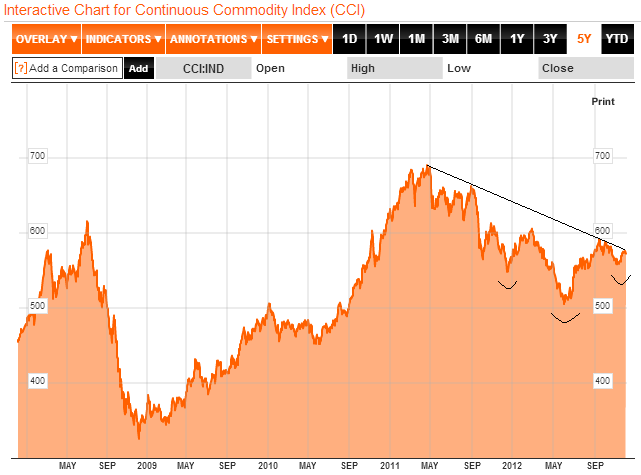
4dec20121

Source: Bloomberg4dec20122

Combining stocks, commodities and Euro-USD, we have two clear paths forward: one, pro-risk breaks out (the correction in October / November was a correction in an ongoing cyclical bull), and two, pro-risk is repelled here and resumes downward (the rally in the second half of November was a relief rally in a new downtrend). As is usual when the markets are finely poised, some confusing and teasing action could occur this week, with both bulls and bears prematurely claiming victory before true resolution comes to pass.

Besides the reasons above, one other key reason why I favour a bullish year end for pro-risk, is the improvement in global leading indicators. Markit released many individual country PMI reports yesterday, including fresh growth in China (whether looking at official or HSBC data). Below is the combined global picture, and the theme is fairly clear: a distinct up-tick. This is echoed in Conference Board global leading indicators. The general improvement is not in doubt, the question is whether this is just a temporary relief rally in a continued downtrend, or whether leading indicators have bottomed out.

4dec20126Source: Markit

And here we get to the real key issue. By solar cycles, a growthflationary finale should occur into next year’s solar peak. By stock market history, cyclical stocks bulls end with excessive inflation and overtightening of rates. A cyclical stocks bear here and a tipping into global recession at this point into 2013 would mark an anomaly in both those historic indicators. It would be evidence that central bank actions in cutting rates and applying stimulus have been impotent in this cycle, and that too would also mark an anomaly in history, because historically interest rate cuts have had a positive impact on the economy between 9 and 24 months after cutting cycles, and Quantitative Easing has so far been shown to work its impact through in the two years following asset purchases. The two charts below show the renewed easing and stimulating efforts over the last 18 months – not as dramatic as in 2008-9 but nonetheless a fresh round of pro-action and intervention.

4dec20127

4dec20128
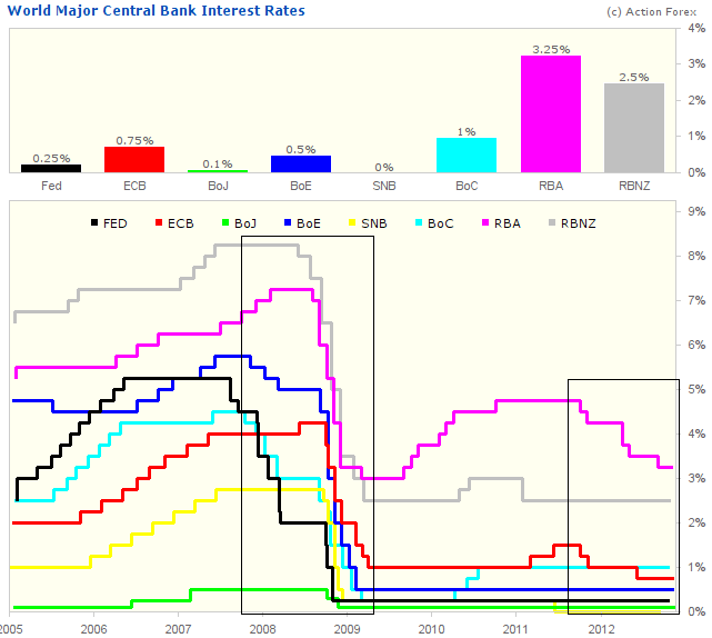
Source: Action Forex

If the mechanism is not broken, and such action is not impotent, then we ought to see economic improvement occurring now and into next year. I believe this is the case, as currently global leading indicators are improving, PMIs are improving, and growth in narrow money suggests global industrial output will increase ahead. It is possible that we therefore do see that growthlationary finale next year and we do get normal cyclical stocks bull termination under conditions of excessive frothiness and an upswing in market rates. But one step at at time – first we need to see a couple of months of continued improvement in leading indicators to be confident that this is a new up trend and a normal positive impact lag to central bank actions together with normal buying/speculating/risk-taking behaviour into the solar maximum. If this does not occur and instead we topple over again in terms of leading indicators and key assets, then either (i) the triple historic anomaly would have indeed come to pass (‘it’s different this time’) or (ii) yet further central bank action and unorthodox policy tools are deployed soon ahead before we finally do get that growthflationary finale not too far from the solar peak.

Until evidence points otherwise, I side with it not being different this time and that we will see normal behaviour into the solar maximum, aided by lagged impacts from central bank actions, and normal conditions to come to pass for a cyclical stocks bull end. I believe the current technical action in risk assets is supportive of this, in that we see certain key stock indices pushing to break out, an absence of normal cyclical stocks bull topping indicators (such as breadth divergence and defensives outperforming) and gold in a renewed up trend back above its 200MA following an 11 month consolidation.

Commodities Peaks And Solar Peaks

Today’s exercise is to look  back in history at the previous secular commodity peaks of 1917, 1947 and 1980, that correlate with the solar peaks of August 1917, May 1947 and December 1979, and see how close to the solar peaks individual commodities peaked. This can then assist in expectations for commodities into and around 2013’s solar peak, which I suggest will again be the scene of a secular commodities peak. The data available is spotty, so I have to make do with a selection of four differing commodities for each of the 3 periods in history, but it is nonetheless a useful guide.

Firstly, 1917. Copper, corn and wheat all peaked between 5 months before and on the actual official solar peak. Whilst silver did not peak until 2 years later, its acceleration began around 12 months before the solar peak.

Source: St Louis Fed

Secondly, 1947. Oats, corn and wheat all peaked around 6 months after the solar peak. Whilst copper did not top out until 15 months after the solar peak, the bulk of its gains occurred in the run up into the solar peak.

Source: St Louis Fed

Thirdly, 1980. Copper and gold peaked with the sun, with oil and sugar peaking 4 months and 9 months after the solar peak respectively.

Source: St Louis Fed

Source: Speculative Investor

On current forecasts, a solar peak should occur sometime between Q2 2013 and Q4 2013, with SIDC projecting nearer the former and NASA and Jan (of Sibet) closer to the latter. Based on the historical examples above, we might therefore look out for commodities making final parabolic tops as of the start of 2013, right through to 2014. The bias from history is more towards commodity price peaks later than the official solar peak, so we might rather look to the second half of 2013 or even early 2014, subject to solar progress. To add to this, another look at the charts above shows that most of the commodities made a big acceleration of around a year’s duration before reaching their tops (or the solar tops). Right now, the CCI commodities index (a broad measure of commodity momentum) is some way beneath its 2011 high and not yet in a major acceleration. By Gann, that acceleration should just have begun, in late November. I believe Gann methodology to some degree reflects solar methodology, in that it draws together mirrors from history to predict the future – only by my reckoning, it is the influence of the sun that makes for these repetitions in time. Nevertheless, it’s a cross reference.

One further conclusion from the above charts is that there was broad commodities participation in each period, so we might also expect the majority of, or even all, commodities to participate in a final ascent (though perhaps with a lag between individual peaks) this time round. If we consider our current period as a K-winter, similar to 1947, where gold is the lead asset, then nevertheless we can see back in 1947 a range of commodities also participated in parabolic ascents into and around the peak. Therefore, exposure to a range of commodities ought to serve well this time around, without the need to specifically cherry pick.

To repeat, 2013 is a major test for my solar theorising. I consider I have a true sample of 3 from history (three secular commodities / solar peak correlations), which by any statistician’s measure is a fairly meagre sample, and a 4th would add substantial weight. However, when we draw in my historical correlations between solar peaks and secular stocks peaks, and solar minimums with crashes, panics and bottoms, the relations through history between secular asset cycles and solar cycles are more compelling and the sample significantly larger. I also look on it another way, in that commodities secular peaks occur only every 30 years or so, and it has been amazing how close to solar maximums these secular commodities peaks have all fallen (including several exact hits shown above), given that huge window in time. The validity of this current cycle is already partially formed in that commodities again broke into a secular bull market in the decade leading up to the solar peak and the secular commodities peak occurred at the earliest 2011 (until that CCI high is taken out), which is again close to the solar maximum, in the context of a 30 year cycle. But I maintain 2011 was not the high, and that the secular peak will be closer to the solar peak, and that the final parabolic ascent is right ahead. If commodities rather continue to rise for some years following the solar peak, rather than topping out with the sun, then that would of course reduce the validity. As fossil fuel exhaustion and natural resource scarcity are real threats, that could be caused by a paradigm shift whereby commodities are permanently repriced higher. However, by my previous analysis, I do not expect that scenario in this secular cycle, but rather in the next secular commodities cycle of mid-century.

I maintain a broad long commodities exposure, with the largest exposure in precious metals, but significant positions in energy and agriculture too.

In Charts

The CB leading indicators for Germany came in at +0.1 (previous month flat), and for USA +0.2 (previous month +0.5). The summary table is below and shows the overall positive global picture.

Source: Conference Board

Next are the Markit PMIs released this week for the Eurozone, USA and China. The Eurozone remains weak in this leading indicator, but USA and China both show pick up and positive readings.

Source all: Markit

I maintain the opinion that leading indicators globally are overall showing renewed positivity, and that should bode well for risk assets into year end. Presidential seasonality and Gann are also supportive.

Source: Bespoke / Moneygame / my update

To counter that, we have down pressure into next week’s full moon. Today, the Friday after Thanksgiving, has a positive historical seasonality, but not Monday. Given the v-bounce in US stocks, I believe there are several reasons why the market may pull back next week, and the question is whether this produces a dynamic ‘W’ base from which to then rally into year end, or whether the market drops lower than the mid-November low and makes a positive divergence (or even lack of positive divergence).

Below is the SP500. The overall wedge shape is bearish, but the market met twin support (shown) at the mid-November lows, together with bottoming indicators such as Nymo and capitulative breadth. A drop back to the lower support or just below, before advancing, or a move up to the top of the wedge for a slightly higher high (with potential negative divergences, if this were a topping process), would both be possible outcomes here. However, the swift reclaim of the 200MA this week could provide additional support for the market holding up here rather than dropping down to the lower boundary again.

Next is the Nasdaq, which has been the neatest index technically since the cyclical bull began. Here again we can see the market reached rising support at the mid-November low. A lower low would therefore spell trouble, and, given the improving global picture ahead, and the normal topping process (push back up to the highs with negative divergences) if this index is already topping, then a higher low or continued uptrend seems more likely, in my opinion.

Looking wider, I noted a few days ago that the Hang Seng was backtesting the breakout of its long term triangle, and it has since advanced again, suggesting a successful backtest. It’s still tentative at this stage, but looks promising.

The Morgan Stanley China A shares ETF shows a tentative breakout from a declining wedge on positive RSI divergence.

The UK FTSE is still within its long term triangle, but is again pushing back up towards the declining resistance. By solar secular history, a breakout would be normal, followed by a pullback towards the triangle nose, before secular bull momentum begins – all taking place over the next 18 months or so.

The German Dax remains technically bullish. Various supports and resistances are shown, with the Dax flirting with breakout of the longer term resistance also.

Looking at other assets, gold is looking technically positive to eventually make new secular highs. A breakout upwards out of the 11 month consolidation (shown), and a bounce above the 200MA again, which has largely supported the secular bull to date, are evidence for this. We are in a positive seasonal period of the year for precious metals also.

10 year treasury yields are still toying with a potential bottom. A positive RSI divergence on the longer term view:

Source: Yahoo

And a similar scenario in the nearer term view, as well as a potential higher low in November than in July. That the mid-year low will hold here is unproven, but I have previously outlined reasons why I believe it will do so, and that it could mark the secular low for bond yields.

Source: Stockcharts

Next I show coffee and sugar, both at extreme low levels of sentiment/oversold. I suggest both are ripe for a bounce here, but whether they can muster new uptrends at this point is unclear. The parabolic moves in both are recent, and therefore more time may be needed. However, if my predictions for secular finales in commodities and inflation come good, then I would expect most commodities to be dragged upwards again.

Source: TradingCharts

The following chart is an ETF for grains, which were the best performing commodities of mid-2012, due to adverse weather conditions. They have now made a 50% retrace of that upmove and on positive RSI divergence. By Gann, commodities should begin a large upmove as of now, so this could be a suitable point at which to resume an uptrend.

In short, in the near term next week, I predict some degree of correction or consolidation in stocks, which could imply pro-risk in general. Thereafter I expect a push upwards into year end, supported by improving leading indicators, positive technical setups, and Gann and seasonals. What would change my mind? Other leading indicators foretelling contrasting global weakness, greater evidence of cyclical stocks topping indicators, or a technical breakdown in key assets, such as a breakdown from the Nasdaq channel.

Reversal Ahead

For NYSE stocks, take a look at the Mclellan Oscillator as at the end of Wednesday’s session:

Source: Breakpoint Trades /My positive divergences in green added

Out of the lower bollinger band and sufficiently oversold to suggest a bounce right ahead. The question is whether US stocks are a buy here or whether they need to print a lower low following a relief bounce with a positive Nymo divergence – see green highlights.

Here is the Nasdaq Mclellan Oscillator, and the same applies:

Source: Breakpoint Trades /My positive divergences in green added

The Nasdaq RSI is also sufficiently oversold to suggest a bounce. I have highlighted previous such occurences and the story is similar to above – either a reversal occurs, or stocks need to print a lower low in the weeks ahead with a positive RSI divergence (again shown in green):

And here is the Russell 2000 index, with the same message as above:

To add to this, Sentimentrader reveals that the majority of US stock market sectors are at bearish sentiment extremes, and stocks above the 50MA have reached the lowest range. So there are reasons to expect a bounce in US equities as early as today. The unknown is whether they will reverse course, or merely make a relief bounce before a lower low with positive divergence.

Looking wider, daily sentiment index extremes are currently showing for treasury bonds (extreme bullish) and Nikkei, soybeans and coffee (extreme bearish). This suggests a bounce in US stocks may well be part of a broader bounce in pro-risk and away from safety.

We have just seen a lunar inversion – stocks declining into this week’s new moon. That gives potential for a brief relief rally before a lower low into the week commencing 26 November – the week of the full moon. That would roughly tie in with the Gann predicted take off point for commodities (and reversal in stocks) around 21 November. Alternatively, lunar inversions have sometimes historically meant trend changes, so there is the potential to rally from here and not look back, which would be in line with the presidential seasonality and geomagnetism I presented earlier this week, and also close enough to the Gann take off.

Both Chinese stocks and US treasury yields are still trying to carve out bottoms, both holding above their lows and with the potential to make inverse H&S patterns, and doing so on extreme cheapness. Potential bottoms only of course, but with justifications.

Source: Cobra / Stockcharts

Source: Stockcharts

Russian stocks have also dropped further since I opened a position last week, now at a p/e of just 5.8. Coffee public sentiment is at an extreme low not seen since 2001.

In short, there are a few candidates in my mind to play a bounce in pro-risk – and that includes US equities – and I’m just weighing up where and if I want to add today. The ‘if’ part is related to the potential for a lower low ahead, where a positive divergence in breadth or RSI is required.

We do not as yet see a washout in other indicators, such as sentiment surveys. These might also suggest caution. However, I maintain that if this is a topping process in stocks then we should see up-down volatility near the top, rather than the kind of deep cleansing washout that enables a bull market to continue.

Will post in the notes if I add positions.

Into Year End

If the secular commodities finale is to play out as I predict, then this should be about the point that commodities, led by gold, start to outperform. Supporting this is Gann methodology, which suggests commodities should take off in a large up-move into 2013 as of around 21 November. Here is my suggested historical mirror, with the previous square showing how things might progress:

What could give commodities such a thrust? Strengthening in China for one, and we see this in the latest data. Industrial production rose 9.6% year on year, retail sales beat expectations at 14.5% year on year, and auto sales rebounded strongly from September’s weak number. Commodity technicals could also assist, with gold having bounced at the 200MA again which has largely supported the secular gold bull to date, soybeans having retraced sufficient of their mid year gains to reach just 8% bullish daily sentiment, and coffee having reached an all time record speculator short position.

Tame geomagnetism could also help, and it can be seen from the chart below that the geomagnetic model is finally showing an upturn into year end, as negligible geomagnetism is forecast (all models have been updated this morning):

Such tame geomagnetism should also be positive for equities, with Presidential seasonality too:

Source: Bespoke / Moneygame / My Update

Potentially we could see pro-risk wash out a little more in sentiment before take-off next week, but I predict the next move will be a rally in both stocks and commodities whereby equities (globally speaking) re-reach for their Q3 highs, but make negative divergences in internals (if they are to be topping out), whilst commodities outperform upwards. I am watching leading indicators to judge whether there is ‘sufficient’ growthflation ahead to enable this scenario. The rest should be fulfilled by the influence of solar maximum activity on humans collectively. 2013 is the big test for my solar theories.

I leave Kuala Lumpur tomorrow for 6 nights in Penang, continuing to explore Malaysia.

Monday Roundup

A bit more on China first. I acknowledge Marketguy15’s point about Chinese stocks having made a parabolic top in 2007. It was a speculative parabolic, with the Shanghai Composite reaching a p/e of around 70, and these take time to wash out. If we consider other historic examples of speculative parabolics on stock indices, then the 1989 Nikkei perhaps didn’t make its ultimate bottom until 19 years later (if the Oct 2008 low remains in tact), whilst the 1929 Dow made its nominal bottom 3 years later, as did the 2000 Nasdaq. But we could also note that the 1929 Dow didn’t gain true upward traction again until 12 years later, around 1942, and the 2000 Nasdaq had a major setback again in 2008. So, the Shanghai Composite may not reach back up to its 2007 peak of over 6000 any time soon. However, it’s the valuation that draws me in. The p/e of 7.8 is the lowest since the Shanghai Composite index’s inception, and globally historically buying indices sub p/e 10 has returned handsomely for the next 10 years. The Nikkei never reached undervaluation for most of the 19 years it took to wash out. The Nasdaq at its nominal bottom in 2003 was still overvalued at at p/e of 34.

The Shanghai Composite is also yielding 3.8%, and this is almost parity with the 7 year bond, which has attracted buyers historically.

The technical set up looks promising for a reversal, as shown in the last post. My buy order went through on Friday.

On to global macro. The aggregate of economic surprises for the US, China and Europe is still in an uptrend.

ECRI leading indicators the US have paused, but are still positive 5.9. US earnings have improved as the season has progressed, and the beat rate currently exceeds recent seasons.

Source: Bespoke

US jobs data should continue to improve into the start of 2013 then roll over.

Source: PFS Group

And the performance of US cyclical stocks suggests the SP500 should rally into early 2013 before rolling over.

Source: PFS Group

Marc Faber is now forecasting that stocks could make a counter trend rally into the start of 2013 before continuing downward – i.e. no new highs, but a rally that falls short of the existing 2012 highs. That fits fairly well with Tom Demark’s counter trend rally forecast (though he expects a SP500 marginal high, whilst the Nasdaq makes no new high), and to some degree the late November market top predicted by Eurodollar COT.

The markets should also rally by presidential seasonality around the US elections. I believe the uncertainty due to the neck-and-neck polls have postponed this, but assuming there is a clear victor I expect the markets to rally later this week. Continued outperformance in cyclicals (versus the wider Sp500) supports this, as does the pick up in earnings beats.

So I still maintain my forecast for stocks to change trend here to rallying, and then will judge developments in leading indicators, breadth and so on, whilst that occurs, to assess whether we are likely making a topping process already or whether we can push on upwards into the start of 2013. There remain notable differences in how US, European and Asian indices are poised. The Hang Seng broke out of the long term triangle and has pushed on bullishly whilst US indices have corrected. The Nasdaq looks bad technically, yet the Dax has held up well in what still appears to be a bull flag above 2012’s previous highs. The FTSE remains in its long term triangle but like the Dax has held up well over the last few weeks. Should we now get a rally in global equities, the FTSE is likely to break out, like the Hang Seng.

As for commodities, the current correction could continue into late November, by Gann, before they begin their parabolic ascent. The COT picture and technical picture for the Euro-Dollar, together with the US elections, suggests the US dollar could rally here for a little period and that could continue to impede commodities into late November. Gold made a big red candle on Friday through 1700 support, suggesting it needs longer yet to correct and consolidate.

Until/if gold breaks out upwards, there remains the possibility that it peaked in 2011. I don’t want to re-analyse gold here, but on balance of probability, I still maintain that it is heading for such a breakout, and that it recently broke upwards out of its 11 month consolidation, with this pullback of the last couple of weeks being a consolidation only before further gains. However, it’s worth a look at this chart from Barry Bannister. Could we have just seen the post peak value trap bounce and now we proceed lower? The gold peak of 2011 wasn’t much a parabolic, but the silver peak certainly was.

If we look wider, at the CCI commodities index, then, again, how do you read the chart compared to the above model? I would suggest the best fit is for the two spikes are the bear trap and bull trap, with the greed parabolic still to come ahead. If so, that would fit with my solar work and Gann projections, both of which suggest commodities are about to take off on their major final upleg of the secular commodities bull.

If that isn’t so, and the parabolic peaks in commodities have largely passed, with oil in 2008, silver in 2011, cotton in 2011, rare earths in 2011 and so on, then what we would have seen over the last few months would amount to dead cat bounces in commodities (such as gold, soybeans, corn) which should now fail and break into downtrends with momentum, as per the model above. I suggest such a scenario would be accompanied by a new stocks bear and a global recession, and out of that stocks bear new secular bull momentum would be born. The whole process would have been brought forward compared to my solar/secular projections (and Gann also) which suggest commodities should make their parabolic finale into 2013 and then a recession comes to pass after that.

I have not changed my mind. I maintain my commodities long positions on balance of probability (by my references). But there’s a clear dividing line in the leading commodity of this K-winter secular commodities bull – gold – either it is in a renewed uptrend to new highs and is soon to complete the correction of the last several weeks and burst upwards, or it now gathers momentum to the downside and breaks beneath 1600, adding weight to a failure beneath the highs. So once again, it is delicately poised.

Key Assets In Charts

The Hang Seng is at long term resistance, attempting to break out. By my secular/solar history analysis, the kind of path shown by the arrow would be appropriate, i.e. a breakout here, a rally away from the range, then a pullback in keeping with a final bear and mild recession before a new secular bull takes off with momentum.

The German stock index and US SP500 stock index share a similar look to each other: battling to hold the breakouts made above the March 2012 highs. My leaning is that they are making bull flags above the breakout, successfully backtesting before advancing. This consolidation of several weeks post QE announcement fits the action post QE2 announcement before advancing, and it also fits with Presidential seasonality, namely a consolidation mid-October before a rally around the US elections.

Crude oil appears to be making a rounded bottom:

Gold has paused at horizontal 1800 resistance, and has made a 23 fib retrace. It could potentially drop further to make a 38 fib retrace, but either way I believe gold will shortly resume its uptrend and break through 1800, targetting the next resistance at 1900. Supporting that, seasonality is most positive for gold Sept-Feb, gold has been building energy in an 11 month consolidation, and if pro-risk breaks out as I predict above, I expect precious metals to also.

The Euro-USD pair is at an important juncture. Either it is completing a bull flag in an ongoing uptrend and is about to break out above horizontal and down-sloping resistance, or its rally is going to end here at those key resistances and it will eventually break down beneath rising support. I favour the former, in line with pro-risk.

A broad agricultural commodities ETF is shown below. After the fierce rally of mid-2012, brought about by extreme global weather conditions, softs have pulled back to between a 38 and 50 fib retrace currently. This is in line with Gann predictions for a partial retrace before a renewed rally to new highs emerges as of now, so perhaps once at the 50 fib, I expect softs to renew their upward trend.

Supporting a rewewed advance in softs, the latest NOAA climate data for September came in as the hottest globally land/ocean for that month on record, and the latest US Department of Agriculture report revealed even tighter grains supply than previously understood.

Supporting a wider rally in pro-risk from here we have (i) US economic surprises still trending up, (ii) US ECRI leading indicators still trending up, (iii) US retail sales and consumer sentiment surprising to the upside, (iv) money supply and export data from China surprising to the upside, (v) money market spreads in Europe and the US back to benign levels, (vi) German investor sentiment rising more than expected. In short there is growing evidence of global reflation, and there is a useful chunk of data coming out this week that will either add to or subtract from that, namely, Conference Board LI data for several key countries, some key China data including GDP, and some big US earnings reports.

I believe pro-risk assets are primed to resume advancing technically, subject to supportive reflation evidence, and that recent data is supportive for reflation. I therefore maintain my pro-risk portfolio as it is.

I have updated all models this morning.

Gold And Apple

The exponential or parabolic or Hubbert phenomenon typically looks like this:

Source: Wikimedia Commons

It occurs in nature and it occurs in the markets. Occasionally the exponential run up is followed by a flattening out at the top, to make an S-curve:

Source: Wikimedia Commons

But most of the time there is a collapse down the other side, fairly equal to the run up, and here are some examples of that:

Source: Chris Kimble

Apple is the world’s biggest stock by market capitalisation and now dominates the fortunes of the Nasdaq. Apple’s chart has gone parabolic over the last few years:

Source: Stockcharts / Yahoo

So is it due to collapse? Well, here’s the thing about exponentials: they can get steeper and steeper, putting on faster and faster gains.  Recognising the pattern therefore isn’t enough, plus there is the possibility that a chart that has gone exponential flattens out into an S-curve rather than collapses. Typically, a parabolic that reflects a speculative mania to valuation excess will result in a collapse, whereas a parabolic that reflects genuine growth or fair value may flatten out.

In this next chart we can see that Microsoft was bid up to a forward p/e of 67 in 2000, compared to a historical average around 15. The new internet companies of the time reached 8% of the total US stock market capitalisation, the SP500 reached a p/e of over 40, and the Dow-gold ratio reached an all time high of just under 50. By various measures, it was clear the tech parabolic became a speculative mania, and a collapse followed. Of course, timing the exit from the parabolic was difficult – it only looks easy with hindsight.

Source: Reuters

As can be seen, Apple is currently valued at just a 13.8 forward p/e, which is cheaper than the historical average, and it is cheaper than the majority of SP500 companies currently. So whilst it has exceeded Microsoft’s capitalisation of 2000, it isn’t the same kind of speculative bubble.

The near term view of Apple looks like this. A correction is occurring, following a higher high on negative volume divergence.

 Source: AfraidToTrade

That suggests it may correct further yet, and in so doing it is dragging down the Nasdaq. As the Nasdaq is usually the leading index, other indices are usually affected. So Apple’s fortunes are important. But Apple’s parabolic does not suggest a collapse as its rise is based on genuine growth and its valuation is still relatively cheap. Barring an economic downturn whereby all stocks are affected, I expect Apple to resume its uptrend post-correction, or to flatten in an s-curve if Apple’s growth starts to slow.

Turning to gold, we see the same exponential pattern over the last few years. At any point up the curve a trader could have called a top based on an unsustainable trajectory, but the curve just got steeper. The 9 month consolidation from 2011-2012 brought about bigger calls for a top, but again it appears to be resolving upwards into what should be an even steeper parabolic.

Source: Valcambigold

Assessing the parabolic for gold is more complex than for equities, because there are multiple valuation measures for gold as it fulfils various purposes from inflation hedge to hard currency to commodity. The publisher of that chart compares the percentage of assets in the gold sector as one measure. Certainly the 1% current position is not excessive compared to 26% in 1980 or dot com companies reaching 8% of the US market in 2000.

Valued as a reserve currency in the face of large monetary base expansion, its parabolic appears to reflect genuine fundamentals.

Source: Economicsfanatic

As a non-yielding asset that fares well when real interest rates are negative and declining, it has also been rising at ‘fair’ value.

Source: Moneyweek

However, when we look at its relative expensiveness to real estate or equities, it is into the historic extreme zone. Versus equities, it could yet become more relatively expensive to reach down to the 1980 level, but on this measure alone the gold parabolic does reflect some speculative froth.

Source: Sharelynx

Other ways to value gold include its relative price to food or broad commodities (due to close relations) and the proportion of its demand from investment (central banks and investors) versus supply growth. Drawing all together, I would suggest the picture for gold is one of a parabolic so far based largely on fundamentals, i.e. a genuine ‘growth’ based exponential rather than a speculative mania. However, I also suggest that this is likely to change ahead. I have argued elsewhere that yields should begin to rise now, that ‘investment’ demand for gold is due to top out in the next 18 months whilst supply is already growing, and that a whiff of policy change in relation to rates was enough in the 1940s to kill the gold bull (rather than requiring real rates to go positive). I believe we will get that whiff once we reach an inflationary spike next year.

I predict a speculative mania in gold will occur, based on historical mirrors, and we will then see the divergence from fundamentals that will bring about a huge run up followed by a collapse. But thus far, gold’s parabolic is not particularly speculative, and that does suggest that the Dow-gold ratio could reach 1980s levels before reversing. There is no easy way to time an exit from a speculative parabolic that has diverged from fundamentals, only to recognise it and then choose your weapon. That weapon could be trailing stops, or solar cycle timing, or technical indicators such as overbought/overbullish extremes together with negative internal divergences. But first, let’s look for evidence of transition from value parabolic to speculative parabolic.

Kondratieff And Solar Cycles

Kondratieff was a Russian economist who argued that there was a long sine wave cycle in the economy lasting around 60 years broken down into 4 seasons each lasting around 15 years. There proposed reason for the cycle is…. other cycles. In other words, cycles of demographics, credit cycles, capital investment cycles and more, generate these long repetitions over time. Clearly that’s slightly unsatisfactory, unless we can explain the cycles of the source phenomena. Today, I am going to argue that Kondratieff cycling actually reflects solar cycling.

Here is the Kondratieff cycle and its subseasons:

Source: The Long Wave Analyst

We should be in a K-winter since around 2000, with gold and treasuries king. With both gold and treasuries having performed handsomely over the last decade and recently reached all time nominal highs, evidence is supportive.

The general theme of the K-winter should be deflation and cleansing. When Kondratieff wrote his theory, central banks did not have the freedom they have now to counter-attack with intervention and monetary inflation. Using Shadowstats data, we can see that the results of their actions in the US: high price inflation rather than deflation.

Source: Dshort

However, when US GDP is netted of this inflation, we can see that the K-winter appears to have fulfilled: a period of shrinkage, or cleansing.

Source: Dshort

We can measure this another way: stocks have tracked overall sideways since 2000 but when adjusted for inflation have significantly dropped. This is reflected in price/earnings ratios gradually falling since 2000 by more than half.

There has been a lot of debate about which of the two ‘flations is and has been occurring over this last decade, and it’s understandable. There has been major monetary inflation, and this has resulted in significant price inflation particularly in hard assets such as commodities. Yet, there have been characteristics of deflation: real economy shrinkage, a decline in money velocity (cash hoarding), debt deflation (in households and companies), and liquidity traps.

I suggest that some kind of K-winter has indeed been playing out since 2000 as per the theory, and that governments have been unable to prevent that, but they have been able to prevent a social-conflict-inducing depression by tinkering in the economy with what they can (rate cuts, bailouts, money supply increase, balance sheet expansion). The result is two-fold: (i) in nominal terms the economy and asset prices have held up because inflation has offset real declines (a popular illusion) and (ii) a lighter rather than deeper cleansing has been possible in the economy and assets because public balance sheets have been expanded to simply transfer some of the previous excesses rather than purging them. There is no magic to the public balance sheet expansion: this is simply prosperity taken from the future.

So, central bank large-scale intervention in a ‘natural’ period of cleansing (following the excesses of the 1980s and 1990s) has changed the parameters understood by Kondratieff. The result of pushing easy money onto an economy in cleansing is a series of speculative bubbles from real estate to oil to agriculture to bonds to precious metals to equities. Over the last decade we have seen them take turns in making parabolic rises. Be aware though that much of this action is in nominal terms, i.e. net of inflation the gains are much less impressive. Nevertheless, if Kondratieff theory is valid, then our current K-winter is as much dominated by assets that perform well under inflation, such as commodities, equities and real estate, as dominated by gold and bonds as safe havens.

What if there is a K-winter finale ahead, in which outright deflation reasserts itself and just gold and bonds rise (perhaps in a parabolic)? Those who advocate that we are tumbling into recession currently and that this will reveal central banks to be powerless (given rates at zero and stimulus back on) could perhaps buy into that scenario. Let’s compare the last K-winter and see if this happened.

The last K-winter was the late 1930s and the 1940s. As now, equities were in a secular bear market, economies were in trouble following the excesses of the preceding decades. The world war pushed debt to high levels and so governments had to keep rates low. Inflation was problematic accordingly, and we saw a similar inflation/deflation mix to the current K-winter, in that economies shrank but assets such as commodities performed well due to easy conditions. The K-winter did not draw to a close with a deflationary assertion and a huge money flow into just bonds/precious metals and out of pro-risk, but rather a general commodities peak and associated inflation peak in 1947, followed by a gentle coiling of equities and then true secular equities bull momentum as of 1949.

I have maintained that the 1940s is our closest mirror to our current period since 2000, due to the secular commodities bull and secular stocks bear, the combination of ultra low rates and problematic inflation, and by solar cycle timing. The Kondratieff cycle would calculate this too, as it was the last comparable K Winter season. So let me now draw together solar/secular cycling and Kondratieff cycling (click to enlarge):

This diagram is an idealised cycles model, all based around solar. In my previous work I have demonstrated that solar peaks occur roughly every 11 years and that secular peaks in equities and commodities occur close to solar peaks. There is a sine wave in long term real stocks and an opposite-polarity sine wave in long term real commodities, both which have around a 33 year (equivalent to 3 solar cycles or 1 lunisolar cycle) duration, as shown in the charts below. Treasuries (or inverse rates/yields) move in around a 66 year cycle (2 lunisolar cycles) with peaks and troughs converging with secular commodities peaks. The result is we see two different kinds of secular commodities bulls: one set against rates moving to a peak, and one set against rates moving to nothing.

I believe that idealised combined cycles model fits very well with Kondratieff theory. The only adjustments I have made were to slightly shorten the summer and winter seasons by slightly extending the spring and autumn seasons, which doesn’t stray too far from his time ranges for the seasons. The combined model does suggest that there are differences between our current period and the 1970s or 1910s, which were both previous secular commodities bulls and secular stocks bears. They were K-summers where inflation was the only ‘flation in town, whereas today’s K-winter and the 1940s K-winter both had elements of inflation and deflation: a natural deflationary cycle offset by inflationary central bank actions. Regardless, the K-summers and K-winters ended in a similar way: with an inflationary peak and a general commodities peak, and a range-trading for equities.

Picture the current K-winter without central bank intervention. A deflationary depression would likely have occurred. Unemployment and defaults would have been much more severe, cleansing much deeper. Social conflict would likely have been much greater. But the natural process of cleansing would have given way to a new cycle of growth ahead in the same way with or without intervention. What the intervention has done is make the K-winter process less severe all round by some can-kicking (a lot of the ‘bad’ has been absorbed into new public debt, which will have to be paid for at some point, but not now). By keeping rates ultra low and bailing out companies and countries that could have had much wider impacts we are moving towards that new K-spring and cycle of growth with a significant helping hand (putting future generation implications aside).

I suggest that Kondratieff found evidence of cycles that were actually approximations of solar cycles. In other words, he uncovered repetitions in time in the economy and financial markets that ultimately are caused by the sun’s cycle of activity and its influence on humans. The long term sine wave to which he refers is apparent on my charts above for real equities and real commodities due to the speculative pulls into the solar peaks, and there is a similar relation with treasuries/rates. The idealised model that I have produced shows that the relations between these 3 asset classes and solar peaks produces one 66-year cycle within which there are 4 different periods, as the different assets are pulled to the solar peaks with different frequencies and alternations. These four periods fit very well with Kondratieff’s seasons by their characteristics, and the whole cycle likewise. I believe that a few tweaks are needed to K-theory to make it more accurate: the two shorter and two longer seasons per my model, and the K-winter now featuring central bank intervention and a mix of inflationary characteristics as well as deflationary (with associated implications for hard assets).